Let’s talk about the future of spending: Generation Z. By 2030, their spending power is projected to reach $12T globally, and you can’t afford to ignore them. Born between 1997 and 2012, this demographic is the first truly digitally native generation, raised with immediate access to online information.
The result? Their consumer behavior has changed significantly compared to previous generations. They grew up spotting marketing tricks from a mile away, care about real value, and question every ad that comes their way.
In this article, you’ll discover key insights about marketing to Gen Z, along with their traits, preferred marketing channels, and tactics that can help you reach them more effectively. Also, you’ll learn tips to address them without compromising your brand’s core identity.
Decoding Gen Z’s Consumer DNA & Key Marketing Trends
Gen Zers have a unique consumer mindset. Let’s explore their main traits to understand them better.
Authenticity and transparency
Young consumers seek value and authenticity. They support brands that align with their personal ethics and are brave enough to take a public standpoint. Moreover, Gen Z can easily distinguish between proactive and performative marketing.
For example, they’re more likely to choose brands that follow environmentally friendly practices. Eco-friendly packaging, sustainable sourcing, and social responsibility actions should be high on every retailer’s and manufacturer’s agenda to win the trust of Gen Z. These practices should be presented with full transparency. Brands should openly share data on their initiatives and impact, not just make generic statements.
So what makes an authentic marketing experience for Gen Z? It’s a “come as you are” brand mindset. They want brands that welcome individuality, whether through online and offline engagement events or gamified spaces where they can create profiles or avatars and show who they are.
Conversational and real-time communication
Being digital natives definitely changed the game for Gen Z’s communication preferences. They pretty much live in digital messaging channels and social media, which they can easily access on their smartphones, and often skip traditional ones. Instagram and WhatsApp, for instance, are essential for them.
This generation is all about immediacy and speed. They don’t want lengthy conversations, but quick responses. Emojis, memes, GIFs, and reels are sent more often and win out over text-heavy messages. Plus, Internet slang, acronyms, and lo-fi content are definitely on their bucket list.
Finally, Gen Z wants to keep it real. They prefer to communicate in ways that let them express their authentic selves, rather than participate in formal transactions. And of course, they expect the same energy from the brands they interact with.
Social media shopping
For younger generations, social media platforms aren’t just for communication. Social commerce is already dominating their shopping habits, with 58% of Gen Zers having made a purchase directly through a social media channel.
Short-form video platforms like TikTok, Instagram Reels, and YouTube Shorts are often outperforming traditional search engines for this cohort. To keep up, brands are now incorporating Video Search Optimization (VSO) into their overall SEO strategy.
Influencer marketing and user-generated content (UGC) play a key role here. This trend reflects Gen Z’s preference for community and peer validation over fancy brand messaging.
Since all this shopping is happening on social media, Gen Z’s purchase journey is mainly mobile-first. Every experience should be responsive and seamless. Offering dedicated apps and implementing one-click checkout are essential for maximizing conversion rates.
Hyper-personalization and data privacy
Gen Z expects deep customization rather than simple personalization. That’s why many brands are introducing features like Augmented Reality (AR) try-ons, custom recommendations, and interactive design tools.
Also, since this generation was practically raised by the internet, they demand immediacy and have short attention spans. To tackle this, marketers must hook them straight away.
Brands use machine learning to adjust their messaging and tailor the experience as much as possible. AI-driven gamification, real-time performance previews, or live events that seamlessly blend online and traditional marketing drive more engagement.
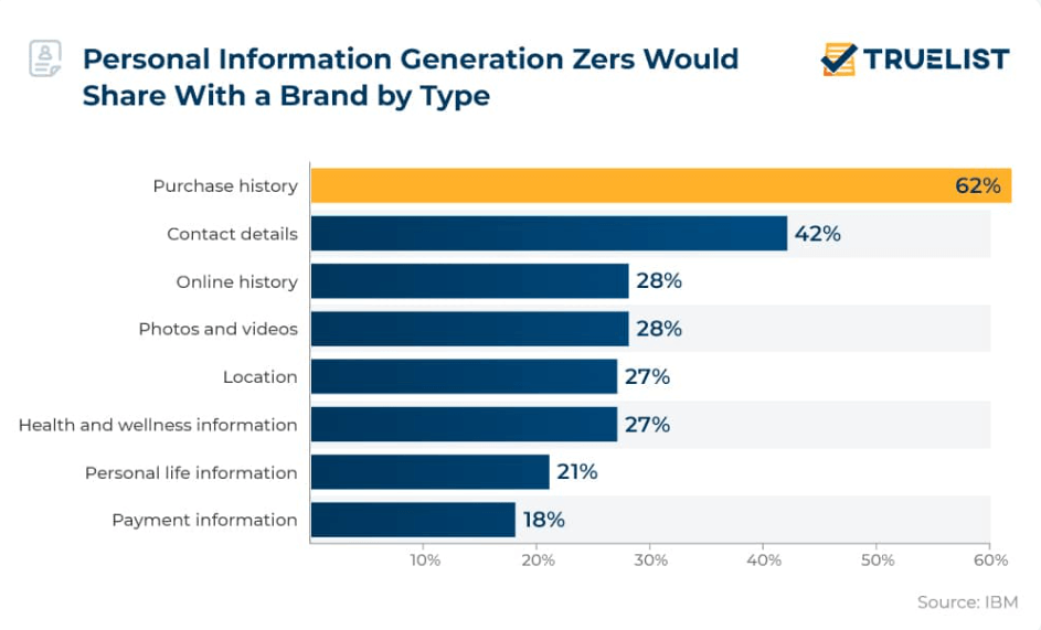
All this customization comes with a trade-off, as Gen Z is usually concerned about sharing their private data. However, when presented with the right incentives, they’re more willing to share it.
Social responsibility
Mental health, sustainability, and inclusivity are not just trending topics for this generation of consumers, but top priorities. Gen Z is deeply attuned to these causes and actively supports brands that take a similar stance. If you follow and believe in an ethical marketing agenda, you can gain their trust.
Remember, this generation isn’t just a passive observer. For them, by-standing is a major red flag. Brands are expected to integrate these values into their business, and anything less will be seen as a failure of social responsibility.
Budget-consciousness and impulse-buying
While they’re often described as super risk-averse, almost one in two Gen Zers actually admit to making emotional, impulsive purchases. This clearly shows that emotions often drive their behavior.
However, brands should handle this sensitivity with care. Given their high standards for authenticity and genuineness, manipulative tactics like FOMO and fake scarcity are instantly spotted. Trying those old tricks often backfires, leading straight to distrust.
Does Gen Z Require A Whole New Marketing Approach?
Are you wondering if your existing marketing strategy is enough to appeal to younger audiences? The answer is, it depends on your mindset. If segmentation and personalization are already in your toolkit, you’re definitely headed in the right direction. However, if you’re still relying on a one-size-fits-all strategy, it’s time to rethink your approach.
The opportunity for growth lies in moving beyond mass broadcast messaging and embracing data-driven personalization and conversational tools. Gen Z can easily tell when their data is used responsibly and view thoughtful personalization as a sign of responsible marketing.
So, what happens to businesses that aren’t inherently digital-first or currently lack the “Z-friendly” go-to tactics? Are they doomed or obsolete?
As long as authentic and transparent methods remain key for your business, you’re already halfway there. You can embrace the new and strategically evolve in the areas you can.
How to Include Gen Z Tactics into Core Marketing Functions
Here are some quick, non-disruptive fixes to target Gen Z, allowing you to gradually evolve your strategy without changing it to the core.
1. Turn long-form content into snackable
Their preference for short-form video and reels shows that Gen Z is less likely to read through long text, especially if it isn’t easily scannable. The same limited attention applies to videos that require extended watch time.
Propose rich, long-form content for this segment by slicing it into smaller, digestible formats. A quick TikTok video, a Snapchat reel, or even an engaging LinkedIn infographic can significantly move the needle.
For example, if email works well for your brand, segment your Gen Z audience and send them short, visual emails instead of long newsletters, and then adjust based on how they engage.
Check out this email from Bubble. The content is playful, inclusive, and snappy, which is the perfect formula for attracting young people.

2. Prioritize micro-influencers and user-generated content
While many brands focus on broad partnerships and paid media campaigns, micro-influencers seem to have greater influence over Generation Z. Niche content creators with in-depth knowledge thrive within their smaller communities. This lets them form stronger, more credible connections with customers, and that’s something the new generation trusts immediately.
To double this effect, brands need to actively encourage their own customers to share content online using their products and services. This is how you gain organic traction.
A highly effective approach is to run a giveaway contest where you invite followers to share your new products online using a specific branded hashtag. In exchange, offer a prize to a lucky winner. This tactic transforms customers into genuine brand advocates and generates a steady stream of authentic UGC that Gen Z favors over traditional ads.
3. Hyper-personalize content with AI
The rise of AI is not a future trend for Gen Z. They grew up on the TikTok “For You” algorithm and Netflix’s tailored home screens. As a result, they do not just accept AI personalization; they absolutely expect it.
Here’s how to future-proof your marketing strategy and stay relevant to Gen Z:
- Deliver real-time product recommendations based on interests and behavior
- Craft ads and content that look and feel like they belong on the feed of each social platform
- Improve customer service through AI chatbots and virtual assistants for immediate response
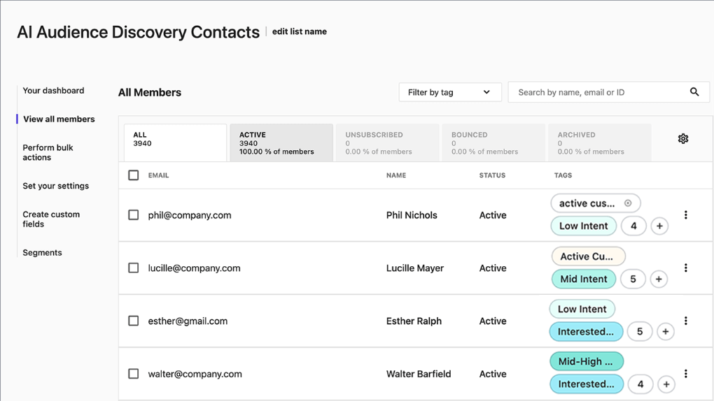
Many marketing tools, such as email and CRM software, have integrated AI recommendation capabilities. By integrating them with your eCommerce store, you can access lookalike audiences and group prospects by interests or customer behavioral data to deliver relevant recommendations.
An ethical warning: Request an explicit data disclosure agreement and an opt-in to deliver those experiences. Gen Z consumers are oversensitive to data violations and eager to point them out, so do everything by the book.
4. Optimize the mobile social commerce journey
Gen Z expects mobile-first shopping, and a standalone website isn’t always where discovery happens. You must actively leverage social media shopping options, such as Instagram Shop, to create a unified mobile-first experience.
Every single customer who discovers your products on their smartphone needs to be just one or two clicks away from checkout. Social commerce options help remove that friction by letting users browse, select, and buy without ever leaving the platform.
On top of that, make sure you offer a variety of secure payment methods, including “Buy Now, Pay Later” (BNPL) options, because this is heavily favored by the generation that prioritizes savings.
Also, adding interactive elements, such as AI-powered product recommendations and custom filters, will win you extra loyalty points by making the process seamless and engaging.
5. Embrace community marketing methods
If you’re serious about building strong connections with your younger audience, you need more than basic transactional campaigns. Your goal should be to create opportunities for real-time communication through community marketing efforts.
Think about hosting online live sessions, dedicated private groups, or engaging Q&A sessions. These are the conversations that build genuine loyalty.
These vital connections can also take place offline. For example, you can invite Gen Z customers to pop-up events, offering selfie spots or photo-friendly setups, allowing them to hang out with other Gen Zers, and offering behind-the-scenes access that feels exclusive and “postable.”
This approach is powerful because it rewards customers with experiences, transforming them into a loyal community and fostering authentic, long-term brand advocacy.
6. Show your brand’s values through action
Generation Z strongly disapproves of brands that fail to live up to their mission and disrespect their public values. To earn their trust, you have to walk the walk, not just talk the talk.
To reduce the risk of a PR disaster, you should prioritize subtle, verifiable cues over loud marketing campaigns that can be instantly dismissed as greenwashing or performative activism.
For instance, embed ethical resources directly on your product pages and commit to full transparency about business processes. This quiet confidence will prove that your values are integrated into your daily operations, not just something you say in your advertising.
7. Optimize your content for AI tools
Gen Z already treats AI tools as part of their daily workflow. Early data shows they see ChatGPT as a resource and even a coworker. As these tools become embedded in shopping journeys, brands will need to consider how their product catalogs, messaging, and recommendations appear within AI-driven chats.
You should actively monitor these integrations and prepare for conversational shopping as an emerging channel. This trend reinforces the broader narrative that Gen Z expects speed, convenience, and conversational interactions across every touchpoint.
Move Beyond Gen Z Marketing Trends
Even though Generation Z is a force in the spending economy, their core values and consumer habits are still in progress. Technology is moving so fast that predicting exactly how this generation will adapt to our ever-evolving economic environment is challenging.
So, what’s the ultimate strategy? Move beyond just tracking trends. Create an open, genuine communication channel with young consumers to learn first-hand what they need and how they want it delivered. This continuous dialogue is what builds authenticity and, ultimately, secures the long-term loyalty of a generation that puts values and transparency above all else.
FAQs
Let’s explore the most frequently asked questions regarding marketing to Gen Z:
1. What are the best social platforms for reaching Gen Z?
The most popular social platforms for Gen Z are YouTube (especially Shorts), Instagram (Reels), TikTok, and Snapchat. These are closely followed by Facebook, Discord, and X.
2. How can brands leverage TikTok to reach Gen Z?
To use TikTok effectively, brands should prioritize authentic and entertaining short-form videos. This includes actively participating in platform challenges and trends, and creating genuine collaborations with their favorite content creators and micro-influencers.
3. What does Gen Z value in marketing?
Gen Z supports brands that align with their values and prioritize authenticity. They appreciate flexible payment options (like BNPL), hyper-personalized marketing experiences, and genuine community participation initiatives.
4. What role does gamification play in Gen Z marketing strategies?
Generation Z is fond of interactive experiences that adhere to their preference for engaging, short-form content and personalization.
Choosing the right newsletter platform can make or break your audience-building strategy. Both beehiiv and Mailchimp promise to help you grow, engage, and monetize your subscribers. Yet they take very different approaches.
In this post, we’ll compare the two head-to-head across the features that matter most to newsletter creators: ease of use, customization, automation, monetization options, and pricing.
Whether you’re an independent writer, a media brand, or a growing business looking to build a loyal readership, let’s see which platform delivers more value and why.
Save $$$ of your marketing budget by switching to Moosend today!
beehiiv vs Mailchimp: Feature Comparison
Let’s break down how beehiiv and Mailchimp compare feature-by-feature to help you decide which platform better fits your newsletter goals.
| beehiiv | Mailchimp | |
| Free plan | ✔️ | ✔️ |
| Pricing | $49/month | $20/month |
| Best for | Newsletter creators, bloggers, and media brands | Small businesses, ecommerce, and marketing teams |
| Ease of use | 4.5/5 | 4/5 |
| Email editor | Text editor | Drag-and-drop |
| Marketing automation | Basic automations (welcome series, audience triggers) | Advanced workflows with conditional logic and segmentation |
| Forms | ✔️ | ✔️ |
| Landing pages | Simple, newsletter-focused templates | Multiple templates with ecommerce support |
| Reporting & analytics | Audience growth, open rates, referral tracking | Detailed analytics with campaign insights |
| Monetization options | Built-in referral program, paid subscriptions, and direct sponsorships | Limited (relies on integrations) |
| Customer support | Email and community support | 24/7 chat and email |
| Website builder | ✔️ | ✔️ |
Key takeaways:
- beehiiv is purpose-built for newsletter growth. Its focus on simplicity, storytelling, and built-in monetization tools makes it ideal for independent writers, niche publishers, and media creators.
- Mailchimp, on the other hand, offers broader marketing capabilities. It’s a better fit for brands and small businesses that need multi-channel automation, ecommerce integrations, more advanced analytics, and a drag-and-drop email builder.
- For creators prioritizing audience connection and monetization, beehiiv delivers more direct value. But if you want a complete marketing suite that extends beyond newsletters, Mailchimp remains a strong all-rounder.
Setup & Ease of Use
beehiiv:
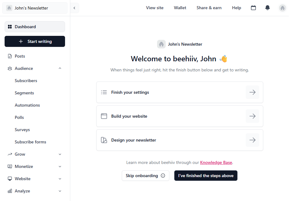
beehiiv is built with simplicity in mind. Its clean interface and straightforward setup make it easy for writers to launch a newsletter in minutes.
The onboarding flow walks you through creating your publication, customizing your theme, and connecting your domain. It feels like writing on a modern blogging platform rather than using a traditional email builder.
Overall, users can quickly become familiar with the tool and use all its features effectively.
Mailchimp:
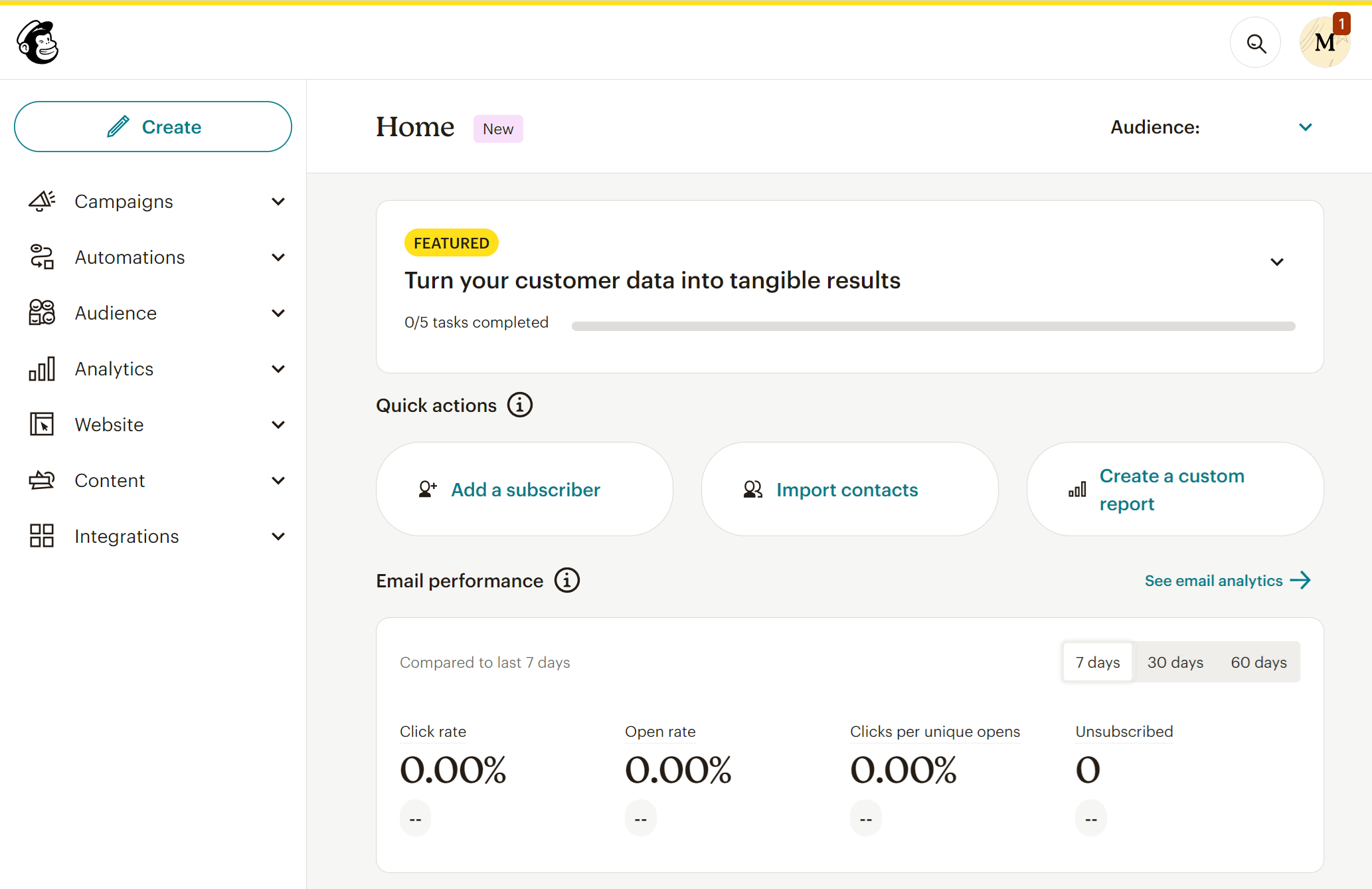
Mailchimp, on the other hand, offers a more comprehensive dashboard suited for marketers.
While its drag-and-drop editor and pre-made templates simplify design work, the platform can feel overwhelming for new users due to the number of settings and tools it offers.
However, it’s great for users who plan to run multiple campaigns beyond newsletters, such as product promotions or customer journeys.
Winner: beehiiv. It offers a smoother overall user experience.
Email Builder
beehiiv:
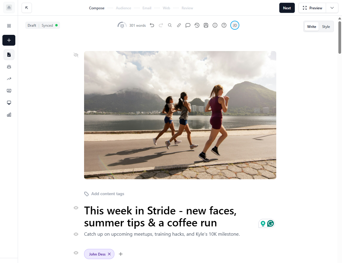
beehiiv’s email builder is simple. When you first open it, you’ll notice that it looks more like a writing platform than a traditional email tool. It’s built for creators who want to focus on words first, and then design.
The editor works much like a modern blogging interface. You can format text, insert images, add buttons, and embed links or videos without dealing with complex layouts. You won’t find drag-and-drop blocks or endless menus here. Instead, beehiiv uses a forward slash (/) command to provide quick access to a variety of formatting and dynamic content blocks.
During our review, we found that beehiiv’s biggest strength lies in its clean writing experience and automatic design consistency. Every newsletter you create automatically adapts to mobile and web views, keeping typography and spacing neat across all devices. The platform also lets you preview your campaign in both light and dark modes, a nice touch for creators who care about readability. We also liked that content creation follows a clear path (compose-audience-email-web-review).
However, there are trade-offs. beehiiv doesn’t yet support advanced design customization or HTML editing (though there is a code block). So, while it’s perfect for personal or publication-style newsletters, it may feel limiting if you need branded layouts or heavy visuals.
Mailchimp:
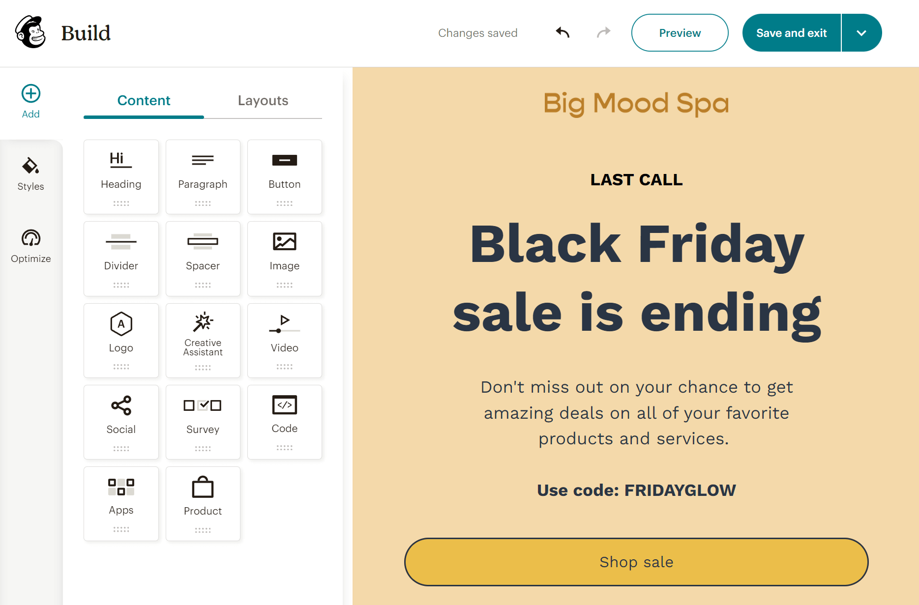
Mailchimp’s email builder takes a very different approach. It’s visual, flexible, and loaded with customization options. You get a user-friendly drag-and-drop editor with dozens of content blocks for images, buttons, social icons, product grids, surveys, and more. Each element can be edited or rearranged instantly, and the real-time preview shows exactly how your campaign will look on desktop and mobile.
Compared to beehiiv, Mailchimp feels more like a design studio. You can insert your own HTML, adjust padding and colors, and even use dynamic content blocks to tailor messages to different audience segments. During testing, we found the “Creative Assistant” especially useful. It can automatically pull your brand colors, logo, and fonts to generate on-brand templates.
Mailchimp also includes helpful productivity tools. The “Optimize” feature checks for missing links, typos, and layout issues before you hit send. Paid plans even include an AI content generator to help you write subject lines and email copy faster.
That said, Mailchimp’s flexibility comes with a learning curve. For creators who want to write and send a clean newsletter, the extra settings might feel overwhelming or overkill.
Winner: It’s a tie, since it depends on your individual needs.
Templates
beehiiv:
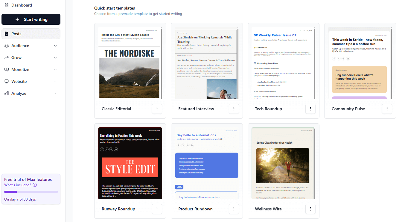
beehiiv prioritizes readability and simplicity. There aren’t dozens of email newsletter templates to choose from. Instead, it gives you 7 clean, modern layouts explicitly designed for newsletters. They are all well-designed and eye-catching, giving you a great starting point to create your newsletter.
These templates also adapt automatically to your brand colors, logo, and typography settings once you’ve configured them in your publication settings. You can tweak font styles, colors, and accent elements, but the customization options are intentionally limited to keep the focus on your writing.
We particularly liked that every beehiiv newsletter template is automatically optimized for both web and email reading, so subscribers who click “View Online” see a seamless version hosted on your beehiiv site. That integration makes it easy to maintain a consistent brand look across email and web versions of your publication.
However, if you’re looking for variety, beehiiv may feel restrictive. There’s no template marketplace or library like other tools offer.
Mailchimp:
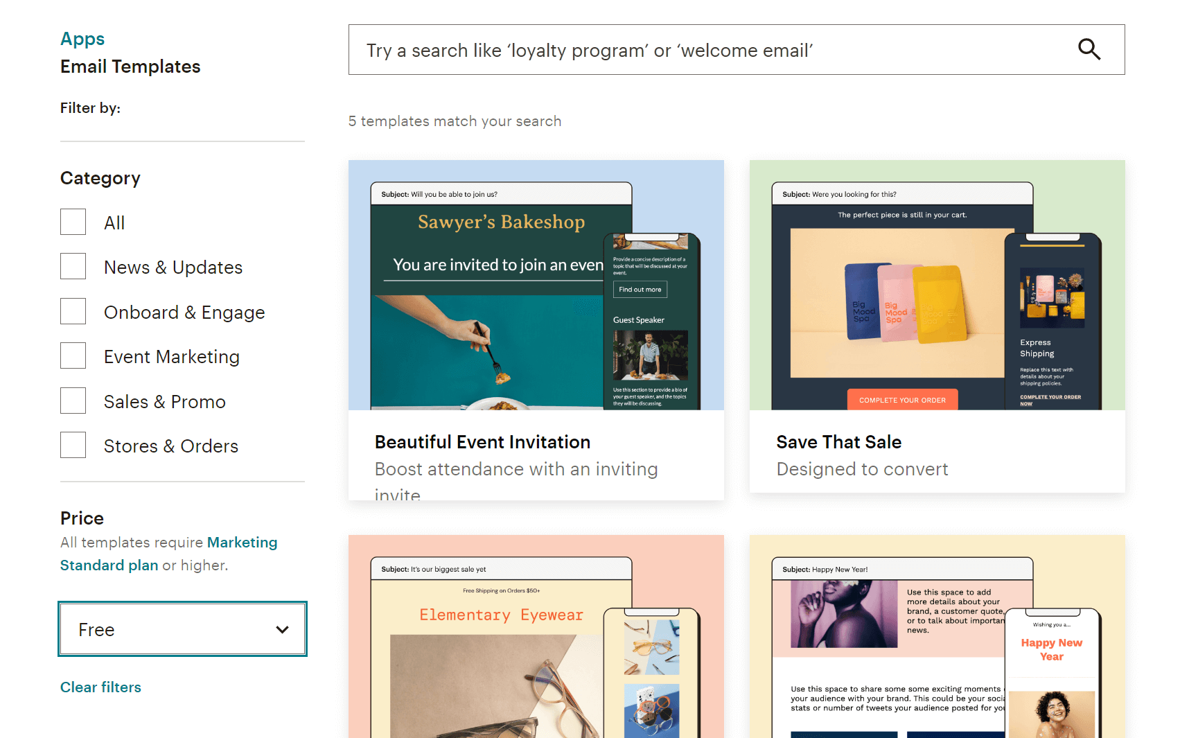
Unlike beehiiv, Mailchimp offers a broader email template library. Specifically, you get more than 130 newsletter template designs for various use cases like product announcements, event invites, and blog digests. These templates are also categorized to help users identify quickly what they’re looking for.
What’s more, each template is fully customizable through Mailchimp’s drag-and-drop editor. You can swap content blocks, adjust colors, add brand elements, or save your own layouts for future use. This flexibility makes Mailchimp ideal for marketers who need to send different types of content regularly, not just text-based newsletters.
We also liked the “Saved Templates” and “Themes” options. They let you maintain consistent branding across campaigns without having to start from scratch every time. Plus, if you’re on a higher-tier plan, you can upload your own HTML templates or import designs built in other tools.
The only downside is that customizing templates takes a bit longer compared to beehiiv’s one-click simplicity.
Winner: Mailchimp offers more pre-built designs out of the box, so it takes this win.
Marketing automation
beehiiv:

Moving on to beehiiv’s automation, we were surprised by how easy and smooth everything feels. The platform has a visual automation builder that lets you create multi-step journeys using various triggers, including subscription events (e.g., sign-up, survey submission, poll response, upgrade to a paid subscription). There are also 8 pre-built workflow templates that serve as a great starting point for your email strategy.
With beehiiv, you’ll be able to create both simple and sophisticated flows. The automation builder lets you use branching logic and set up conditional actions. You can also add time delays so your readers receive the right content at the right time.
I also liked that beehiiv’s automation integrates seamlessly with its referral and monetization tools. For example, you can automatically email subscribers when they reach referral milestones or when new paid content goes live. This functionality will be particularly appealing for writers and media creators who value simplicity and direct growth tools.
Mailchimp:
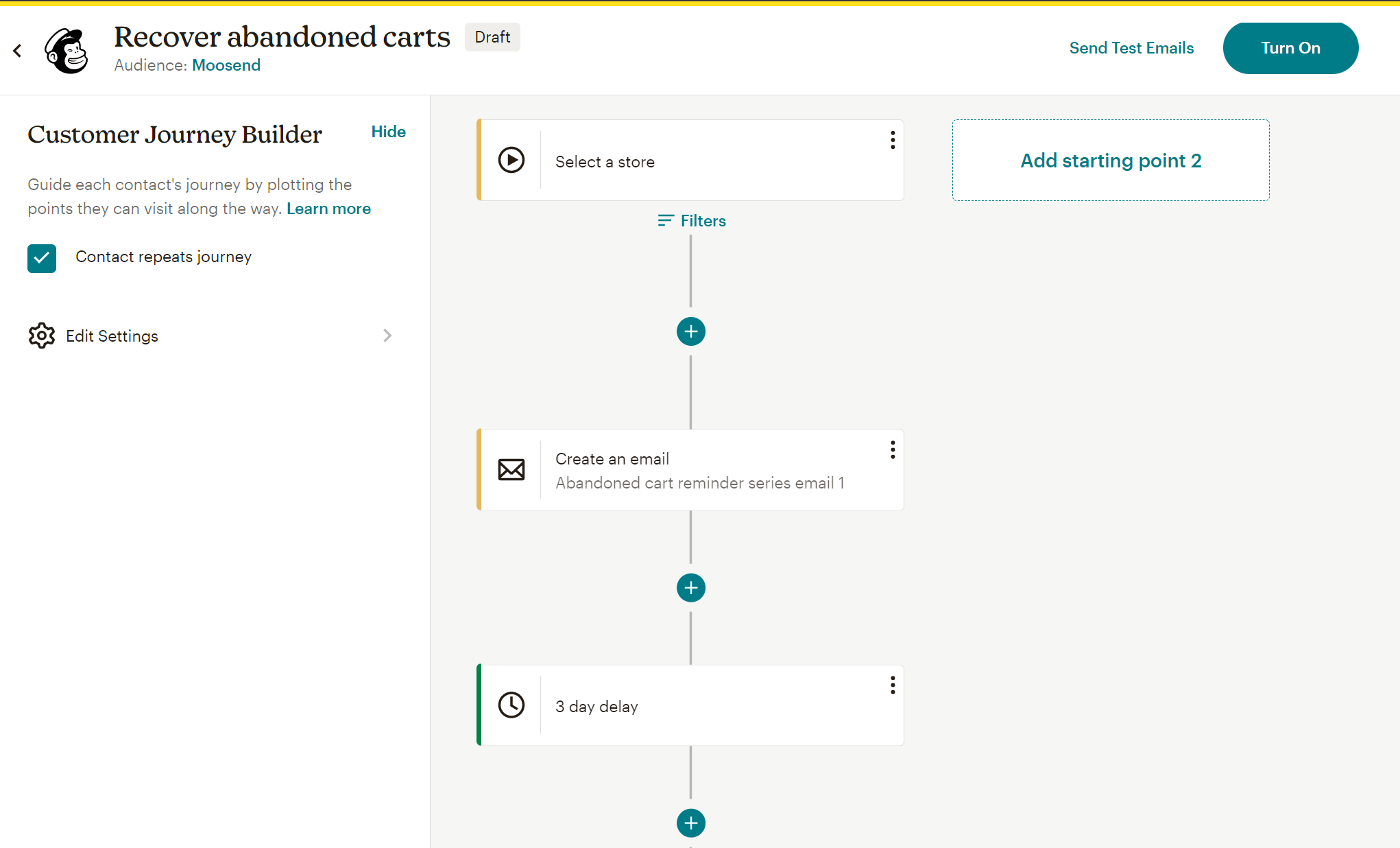
Like beehiiv, Mailchimp incorporates a powerful, visual workflow editor (Customer Journey Builder). You can create multi-step workflows and use branching logic, but these features aren’t available across all paid plans (you need at least the Standard plan). Free plan users have access only to a free preview of the feature.
Despite that, Mailchimp’s automation workflows surpass what beehiiv offers, since you can include SMS in your automations and use behavior-based triggers such as cart abandonment and product purchase.
You also get more than 100 pre-built automation templates. These include welcome series, onboarding sequences, product recommendations, birthday offers, and post-purchase follow-ups. These templates will be great for kicking off your digital marketing strategy, but they won’t be as helpful if you want to create newsletter-oriented automations or monetize your audience directly.
The main downside to Mailchimp’s automation is that the dashboard can feel cluttered at first. You’ll likely need some trial and error to fully grasp all available triggers and conditions. But once you get used to it, it’s one of the most versatile systems on the market.
Winner: Both services can get the job done, yet Mailchimp can do much more once you set it up.
List management
beehiiv:
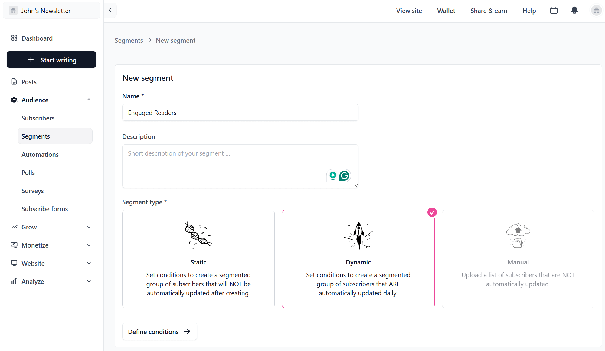
In beehiiv’s Audience dashboard, you can see all subscribers with their key metrics such as subscription type (free or paid), engagement level, and referral source. Segmentation options are fairly straightforward.
You can group subscribers by factors such as subscription status, engagement (opens or clicks), and custom fields you define. What’s more, you have the option to create static or dynamic segments. The latter are automatically updated daily based on conditions you set.
What stood out to me was the Referral Tracking feature. It automatically tags subscribers who joined via your referral program, letting you identify top advocates and reward them through automated campaigns. This function, combined with clear engagement analytics, gives creators valuable visibility into how their audience grows organically.
Mailchimp:
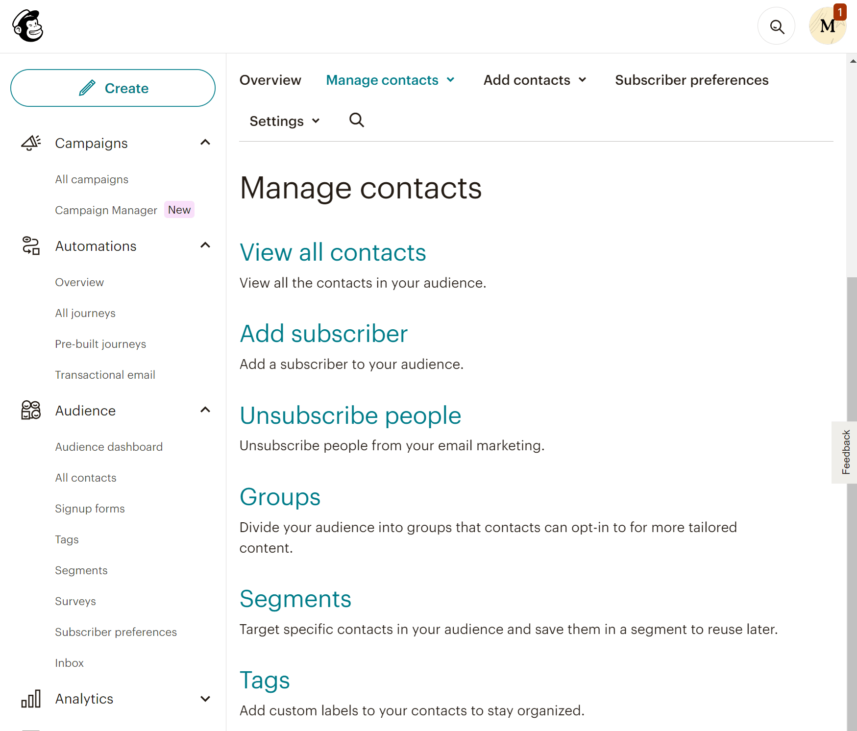
Mailchimp offers a different audience management system. You can create lists (called Audiences) that work as exclusive entities. For example, if a subscriber exists on more than one list, you’re charged for that same subscriber as many times as they appear. This can incur additional costs.
Your audience can be organized into groups based on the content they want to receive, as well as segments that update automatically based on their behavior. You also get custom labels (tags) to keep your contacts organized. For many users, this distinction can be confusing at first, so it will take some familiarization.
With Mailchimp, you can also build dynamic segments using multiple conditions, like combining engagement behavior, signup source, and purchase frequency. On more expensive plans, you can even use predicted insights to target specific groups more effectively.
Winner: beehiiv wins this one since it offers a more flexible and straightforward approach to audience management.
Reporting & Analytics
beehiiv:
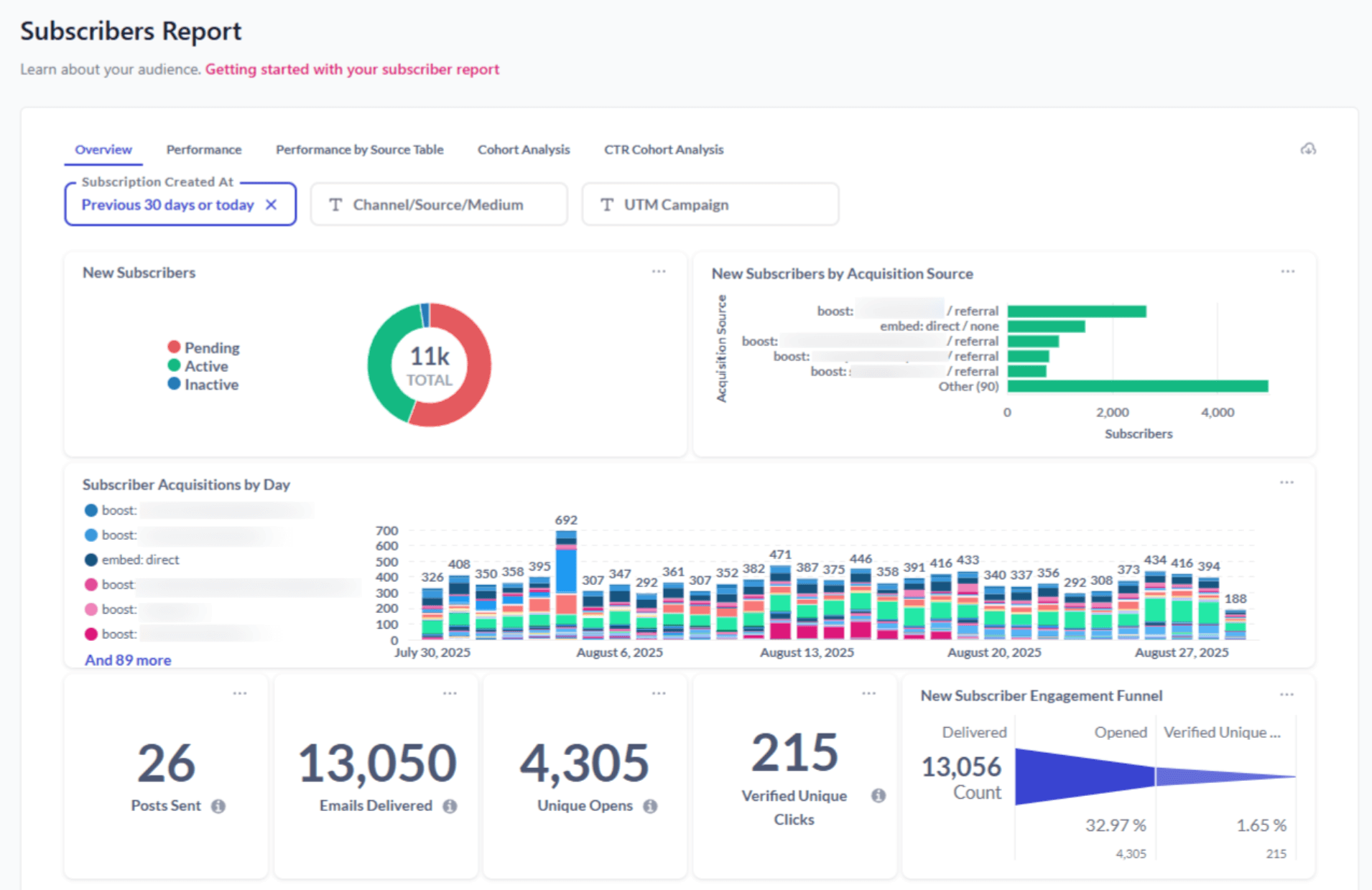
beehiiv offers a streamlined analytics dashboard that focuses on the essentials you actually need (opens, clicks, growth rate, and referral performance). Reports are organized into three categories: Subscriber reports, Post reports, and Click reports.
The platform allows you to break down your analytics by timeframe, acquisition source, and campaign, helping you uncover clearer patterns and understand what drives your performance. This makes it easy to track how each newsletter performs and identify which content resonates most with your readers.
We also found the Referral Analytics very helpful, as it shows how many subscribers came from word-of-mouth sharing or specific campaigns.
Mailchimp:
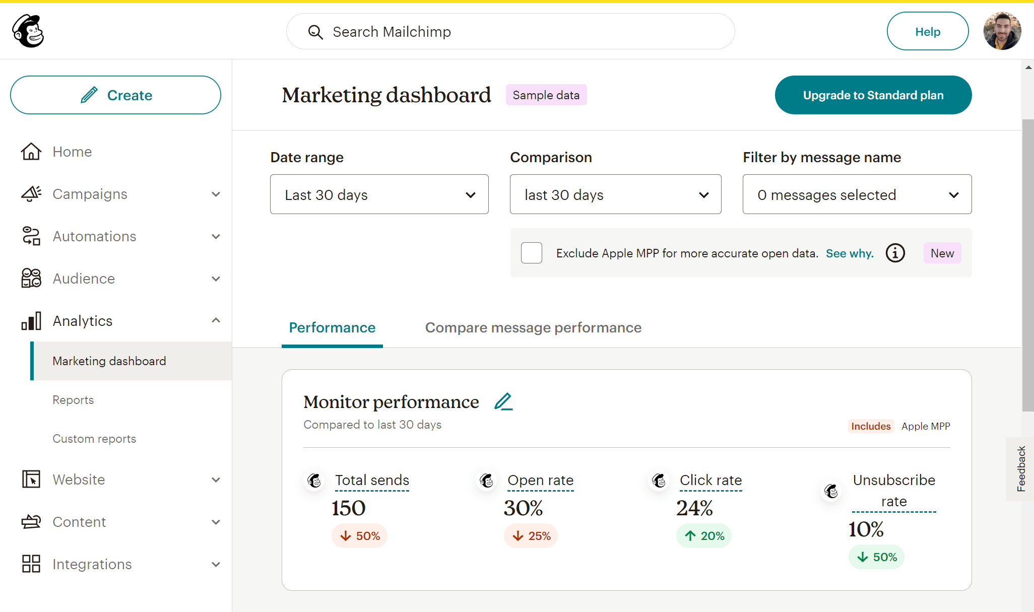
Mailchimp delivers a comprehensive analytics suite, ideal for data-driven email marketing. You can track essential metrics such as opens, clicks, unsubscribes, and engagement over time, as well as advanced ones like subscriber lifetime value, revenue attribution, and predicted demographics. On more expensive plans, you can even compare how different campaigns perform via the Comparative Report feature.
Overall, Mailchimp’s visual reports are detailed yet intuitive, and integrations with tools like Google Analytics give you a complete view of how your emails influence website traffic and sales.
Winner: Mailchimp’s platform offers a broader range of reporting tools, and its analytics capabilities surpass those of beehiiv.
Monetization Options
beehiiv:
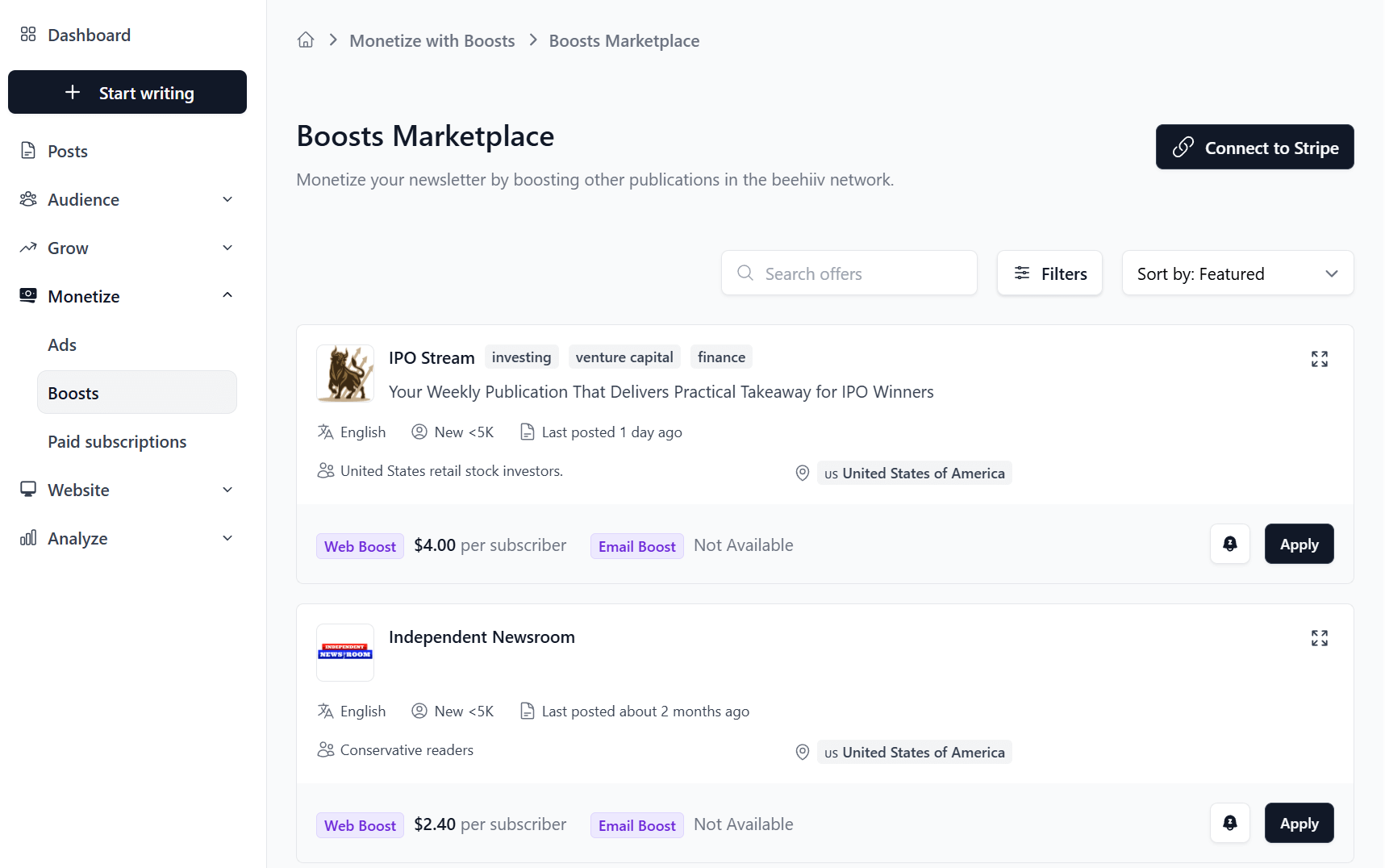
beehiiv positions itself as the one place to build newsletters and monetize your content. And rightfully so, since it is extremely easy to turn newsletters into revenue streams without relying on third-party tools.
You can set up paid subscriptions directly through beehiiv, offering premium editions to paying readers while continuing to send free content to your broader audience. Payments are processed seamlessly via Stripe, and the entire process from signup to payment management is integrated into your dashboard.
There’s also the Ad Network, where writers can access sponsored placements and brand partnerships inside their newsletters. You can opt in, approve sponsors that fit your niche, and earn revenue per send. It’s a fully native monetization option that simplifies how creators manage both subscriptions and sponsorships from one place.
Finally, the Boosts marketplace lets you get paid by other creators for sending them new subscribers.
Mailchimp:
On the other hand, Mailchimp’s platform doesn’t offer built-in monetization tools for your newsletters. You do get product recommendations and promo codes, but these features are mostly suitable for eCommerce businesses. You can also sell digital products like courses and ebooks, but you’ll still need to rely on external tools or payment processors.
For affiliate marketers, Mailchimp imposes certain policies that they must adhere to. Generally, affiliate links are allowed, but you must follow the platform’s policies on acceptable content.
Winner: beehiiv provides multiple ways to monetize your newsletters while keeping 100% of your earnings.
Integrations
beehiiv:
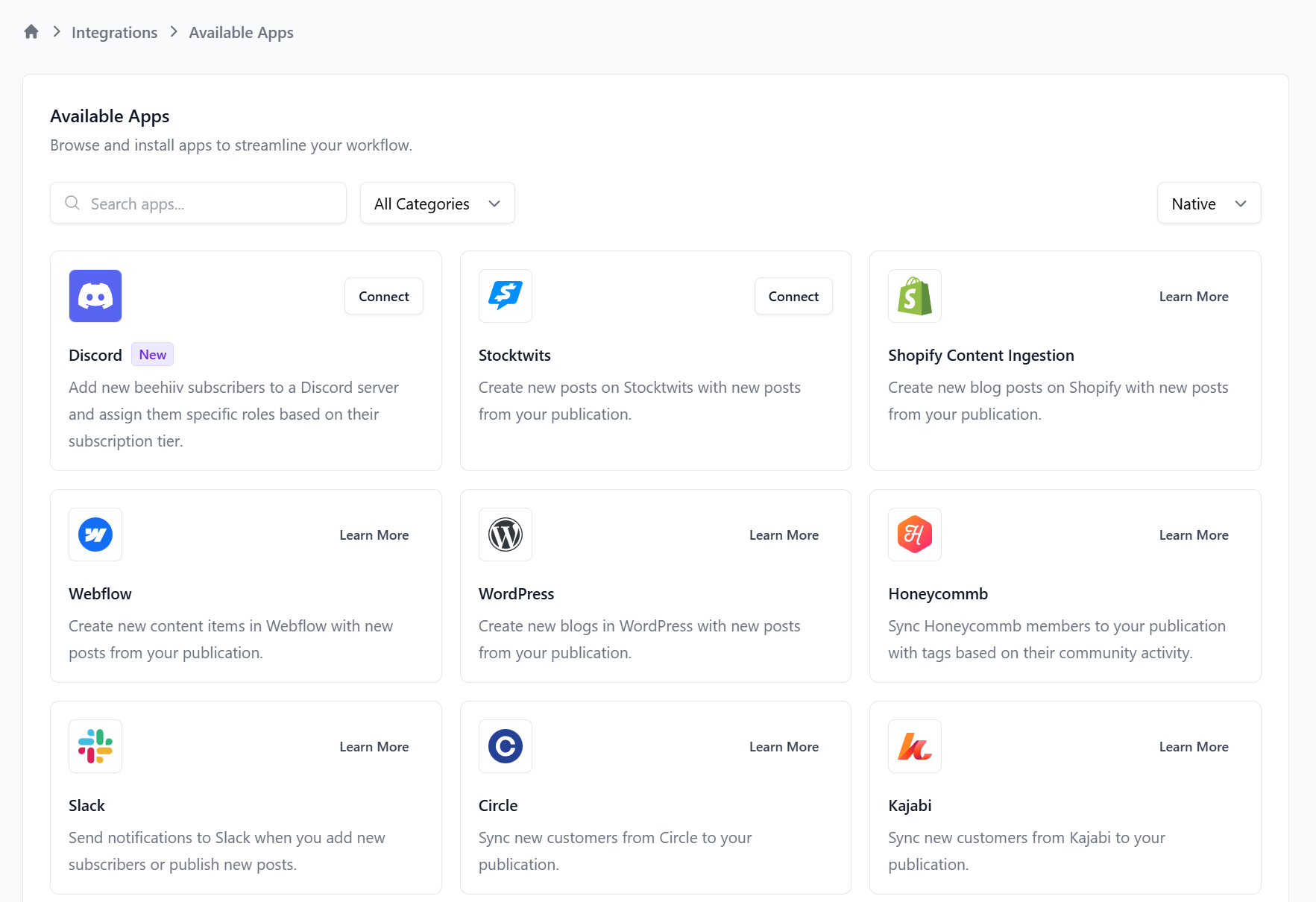
beehiiv offers a growing selection of integrations, primarily for newsletter-focused workflows. You can connect with popular tools like Zapier, Stripe, and Typeform, as well as analytics and referral systems such as Google Analytics and SparkLoop. These connections make it easy to sync subscribers, manage payments for paid newsletters, and track performance across channels.
While its native integration library isn’t as extensive as older platforms, beehiiv’s API and Zapier support fill most gaps, allowing creators to link with CRMs, ad platforms, and social tools. For independent writers and media brands, this setup covers monetization, growth tracking, and data syncing without unnecessary complexity.
Mailchimp:
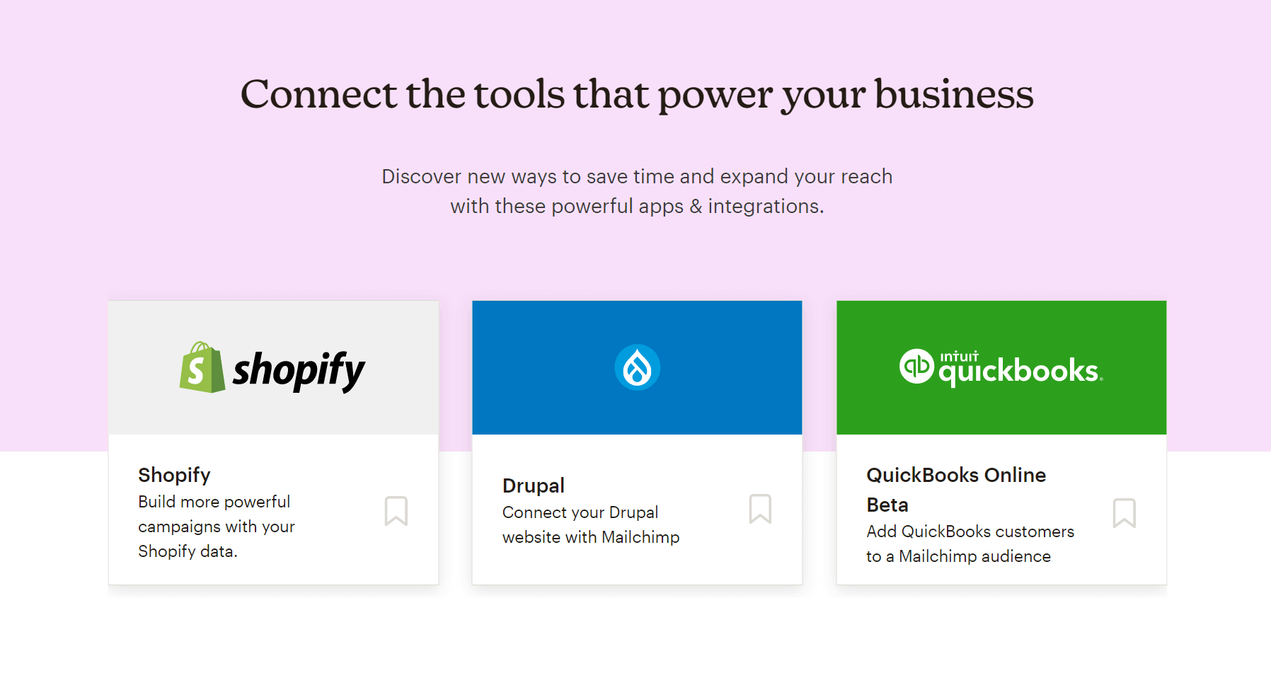
Mailchimp offers a long list of integrations, supporting hundreds of third-party tools across ecommerce, CRM, social media, and analytics. You can connect directly with Shopify, WooCommerce, Salesforce, HubSpot, and Meta Ads, making it ideal for brands managing multiple marketing channels.
For newsletter creators, integrations with design tools like Canva and content platforms like WordPress are particularly useful, streamlining workflows from content creation to distribution. However, some integrations (especially ecommerce ones) are better suited for businesses than individual writers.
Winner: It’s a tie.
Customer support
beehiiv:
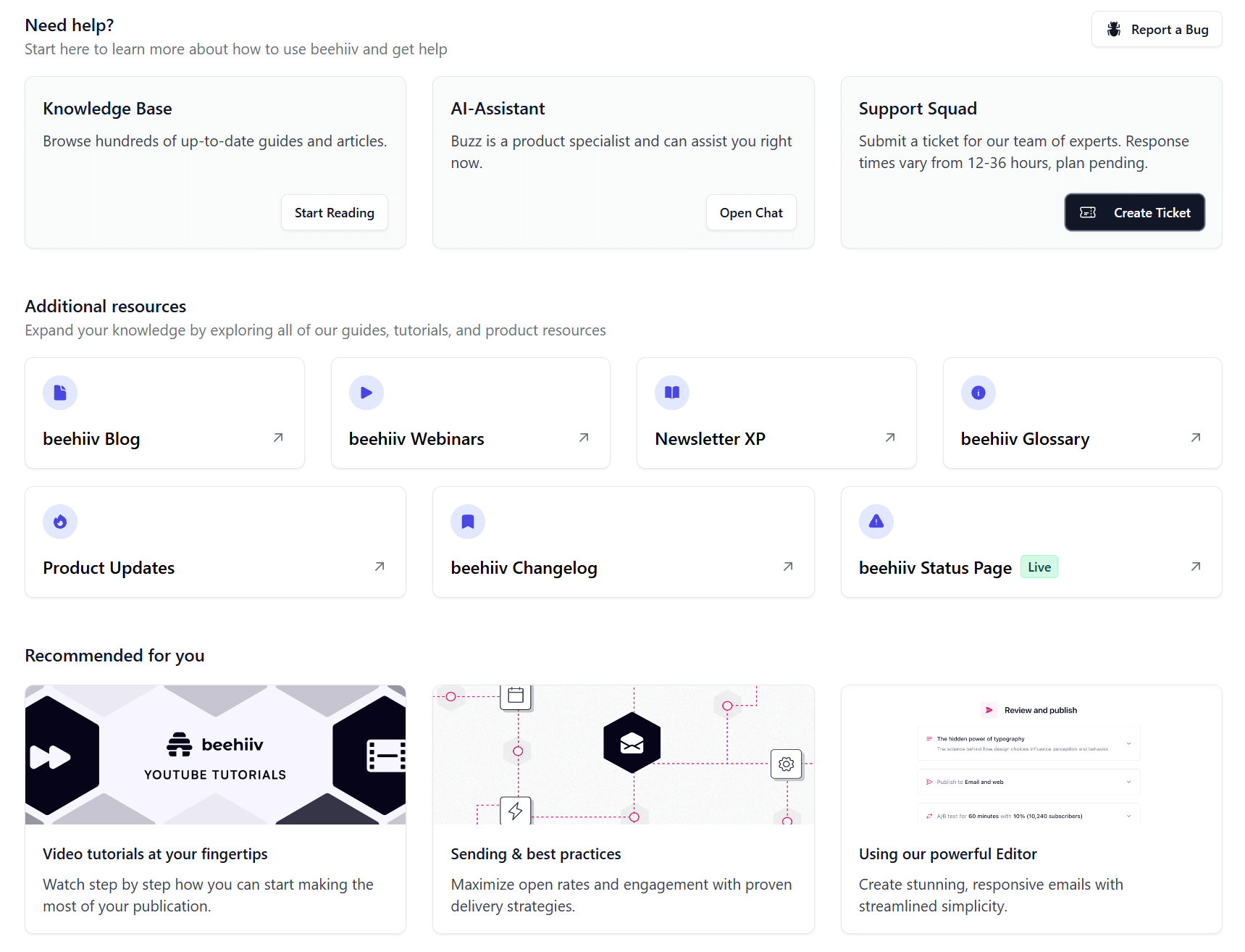
On its pricing page, beehiiv boasts “Human Support.” You can contact the Support Squad via ticket, with response times varying from 12 to 36 hours depending on your plan. There is also an AI Assistant available 24/7. Additionally, you can get help from the extensive knowledge base, which includes guides and tutorials for common issues.
Regarding support quality, G2 users report slow response times and ineffective AI chatbot assistance.
Mailchimp:
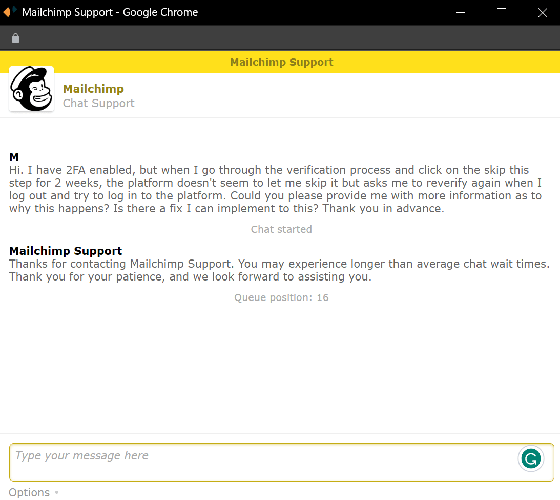
Mailchimp’s support infrastructure is more robust, since it includes 24/7 live chat, email support, and (for higher‐tier plans) phone support and dedicated account representatives. Free plan users get email support only for the first 30 days.
All these seem great. However, as with beehiiv, many Mailchimp user reviews indicate inconsistent service quality. For example, one review notes that support can be slow to respond, leading to unnecessary frustration when immediate assistance is needed.
This is a pattern we’ve been seeing lately in Mailchimp reviews regarding its customer support.
Winner: This is a tie, since both competitors have significant improvements to make in the support department.
Mailchimp vs beehiiv: Pricing
Now, let’s compare the two newsletter platforms in terms of their pricing.
beehiiv:
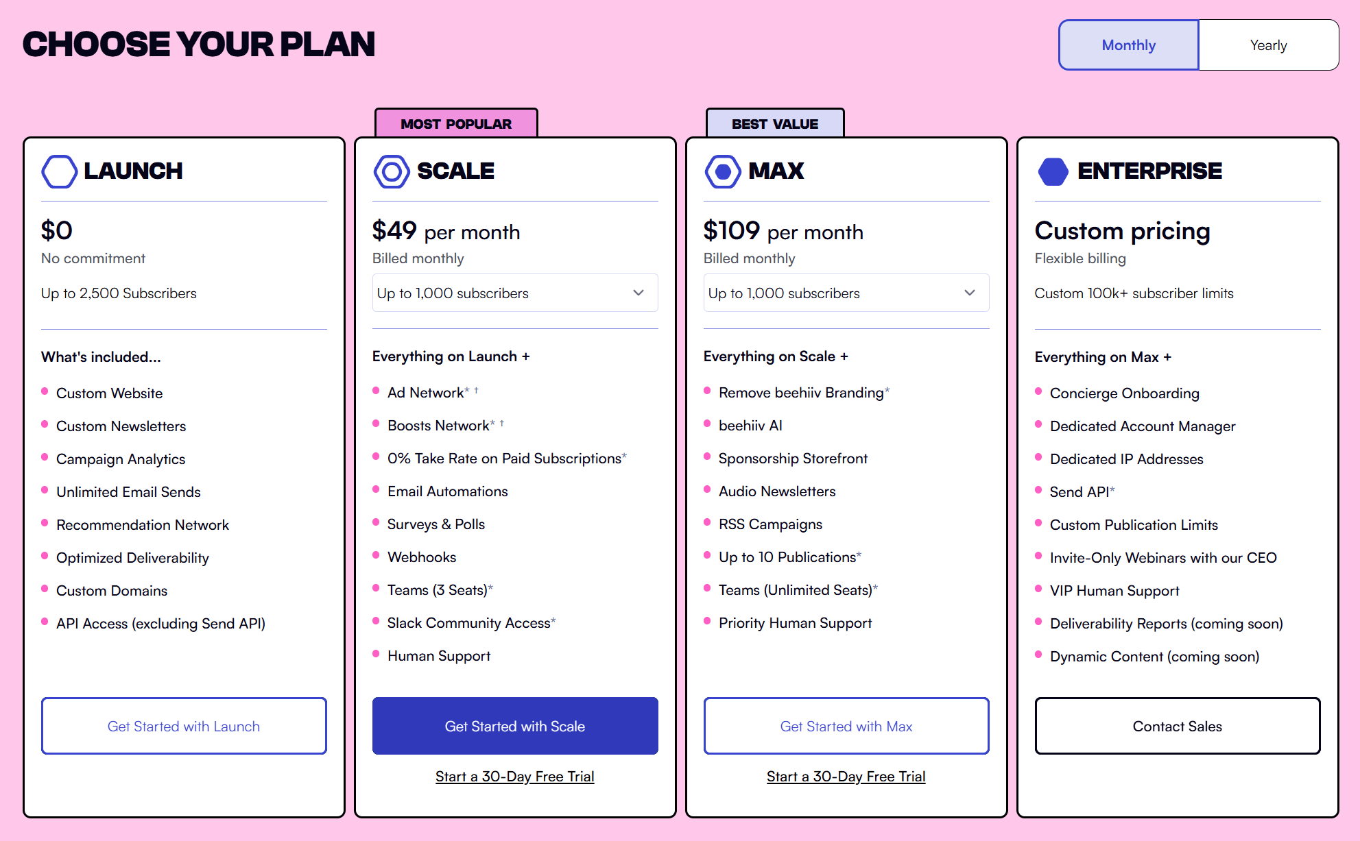
beehiiv’s pricing structure consists of a free plan and three paid options. Starting from the free tier, it’s undoubtedly generous, letting you have up to 2,500 subscribers. You can send unlimited emails and access handy features like the Recommendation Network and audience segmentation.
For more advanced features, you need a paid plan. Prices start at $49/month for 1,000 subscribers and scale with your growth. Generally, beehiiv becomes more budget-friendly the more your email list grows.
Also, beehiiv’s MAX plan is significantly more affordable than the respective Mailchimp plan (Premium), which starts at $350/month.
Mailchimp:
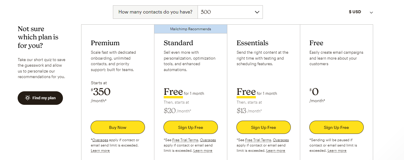
Like beehiiv, Mailchimp offers a free plan, though it’s less generous. Specifically, you can send up to 1,000 monthly emails and have up to 500 contacts.
There are three paid plans available, starting at $13/month (Essentials), but to compare Mailchimp with beehiiv better, we need to look at the Standard plan ($20/month). This option offers a wide range of powerful features suitable for both creators and marketers, while its starting price is lower than beehiiv. For more than 5,000 contacts, however, beehiiv becomes the more affordable option.
Another thing to note here is that Mailchimp has monthly email sending limits, while beehiiv allows unlimited email sends.
Winner: We believe beehiiv’s pricing is more competitive, supporting your growth.
Top beehiiv and Mailchimp Alternatives
If you’re unsure about beehiiv and Mailchimp or you want to explore more alternative options, here are the top solutions to consider.
1. Moosend

Pricing: Paid plans start at $9/month, 30-day free trial (Sign up here)
Best Feature: Advanced automation with real-time behavior triggers
Moosend is one of the most affordable yet powerful email newsletter platforms available today. Its drag-and-drop editor lets you design professional newsletters from scratch or customize one of the available premade templates. Then, the automation builder enables you to create personalized customer journeys using real-time behavior triggers such as link clicks, purchases, or website visits.
Unlike Mailchimp, Moosend offers unlimited email sends and only counts unique subscribers, which means you can create as many lists as you want without double-paying. You also get in-depth analytics and a wide range of integrations with other marketing tools. Finally, the responsive customer support team is a valuable benefit if you need assistance with newsletter creation or troubleshooting.
2. Kit
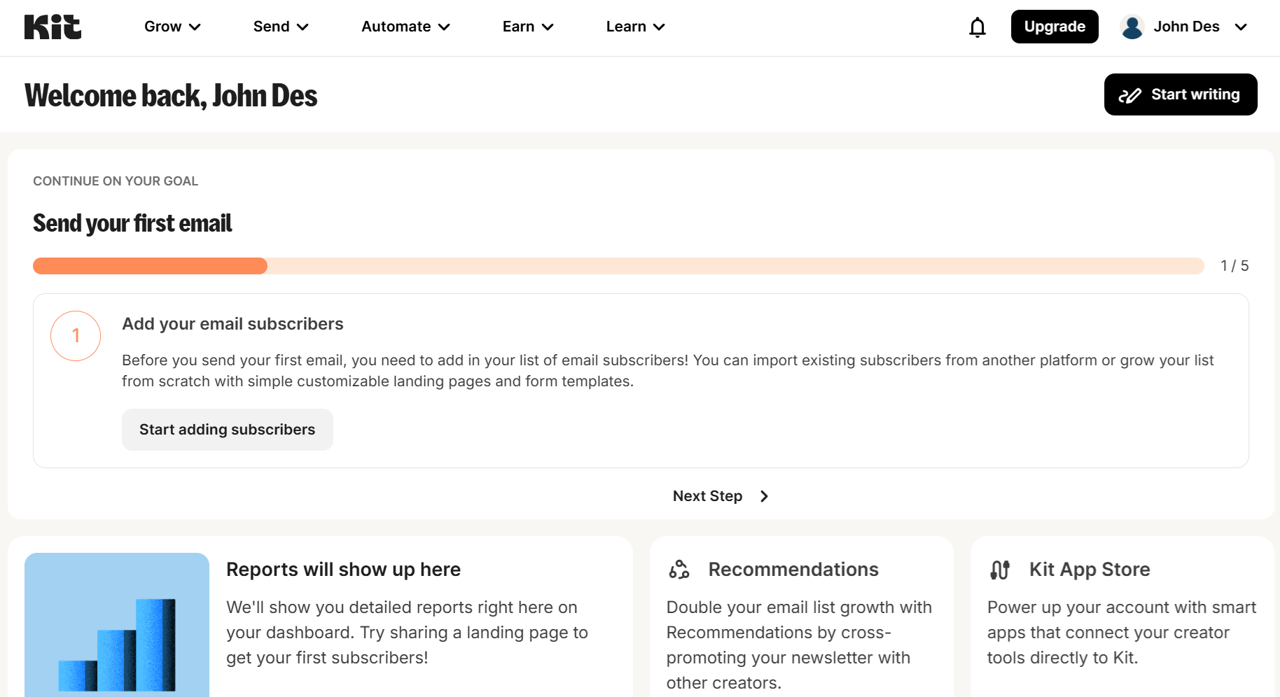
Pricing: Paid plans start at $39/month, free plan
Best Feature: AI-powered writing assistant
Kit is a newsletter platform designed for creators who want a mix of simplicity and monetization. It combines an intuitive editor with AI-assisted writing tools that help you craft engaging subject lines and email content faster. Kit incorporates detailed analytics and a monetization dashboard that lets you sell paid subscriptions, run sponsorships, or accept tips directly within the platform.
Compared to beehiiv, Kit offers a slightly more flexible layout editor while keeping the process straightforward. It’s ideal for independent writers and creators who want to grow and monetize their readership without relying on external tools or coding.
3. MailerLite
Pricing: Paid plans start at $10/month, free plan
Best Feature: Intuitive design editor and integrated website builder
MailerLite is a modern email marketing platform with a smooth email builder, enabling you to create visually appealing newsletters with drag-and-drop blocks and reusable templates. What stands out most, though, is MailerLite’s website and landing page builder, which lets you expand your newsletter into a complete online presence.
With MailerLite, you can automate email sequences and manage subscribers with advanced segmentation filters, something beehiiv still lacks. For creators and small businesses that want both beautiful newsletters and lead generation tools under one roof, MailerLite offers one of the best all-around solutions at a competitive price.
Additional Resources to Check
Here are a few resources to expand your reading:
beehiiv vs Mailchimp: The Verdict
Both Mailchimp and beehiiv offer solid tools for email marketing, but they serve distinct audiences.
beehiiv focuses on simplicity and creator-driven growth, giving writers and publishers everything they need to build, engage, and monetize their newsletters through built-in subscriptions, referrals, and ad placements.
Mailchimp, on the other hand, is designed for businesses that need more advanced marketing features such as complex automations, detailed analytics, and multi-channel integrations.
Overall, if your priority is creating and scaling a newsletter brand, beehiiv provides a streamlined, all-in-one experience tailored to that goal. But if you’re running broader marketing campaigns or need to manage customer journeys across multiple platforms, Mailchimp remains the more comprehensive choice.
Frequently Asked Questions (FAQs)
Here are some common questions and their answers.
1. Is beehiiv better than Mailchimp for newsletters?
If your main goal is to create, grow, and monetize a newsletter, beehiiv is a better fit. It offers built-in tools for paid subscriptions, referrals, and audience engagement, whereas Mailchimp focuses more on marketing automation and ecommerce campaigns.
2. Can I use Mailchimp for newsletters?
Absolutely. Mailchimp supports newsletter creation with its drag-and-drop editor, templates, and scheduling tools. However, it’s more suited to businesses and marketers running multi-channel campaigns, not independent writers or publishers.
3. Does beehiiv have a free plan?
Yes. beehiiv offers a free plan with core publishing and analytics features. Paid plans unlock advanced features, including monetization, custom domains, and automation tools, starting at $49/month.
Some people can hold a full conversation in emoji, but when it comes to inboxes, does 🔥 mean “open me” or “send me to spam?”
To find out, we analyzed more than 69,000 subject lines from our email database. What we discovered might surprise you. Emojis can lift open rates, but careless use can hurt deliverability or make your brand look spammy.
The good news is that, when used intentionally, the right emoji can help a subject line stand out.
In this post, we’ll show you when emojis in subject lines work best, reveal the most frequently used ones, and share tips to make your emails eye-catching without the risk of the spam folder.
Key Findings
Out of 69,315 subject lines, 19,211 included emojis. That’s roughly 28% of all subject lines analyzed.
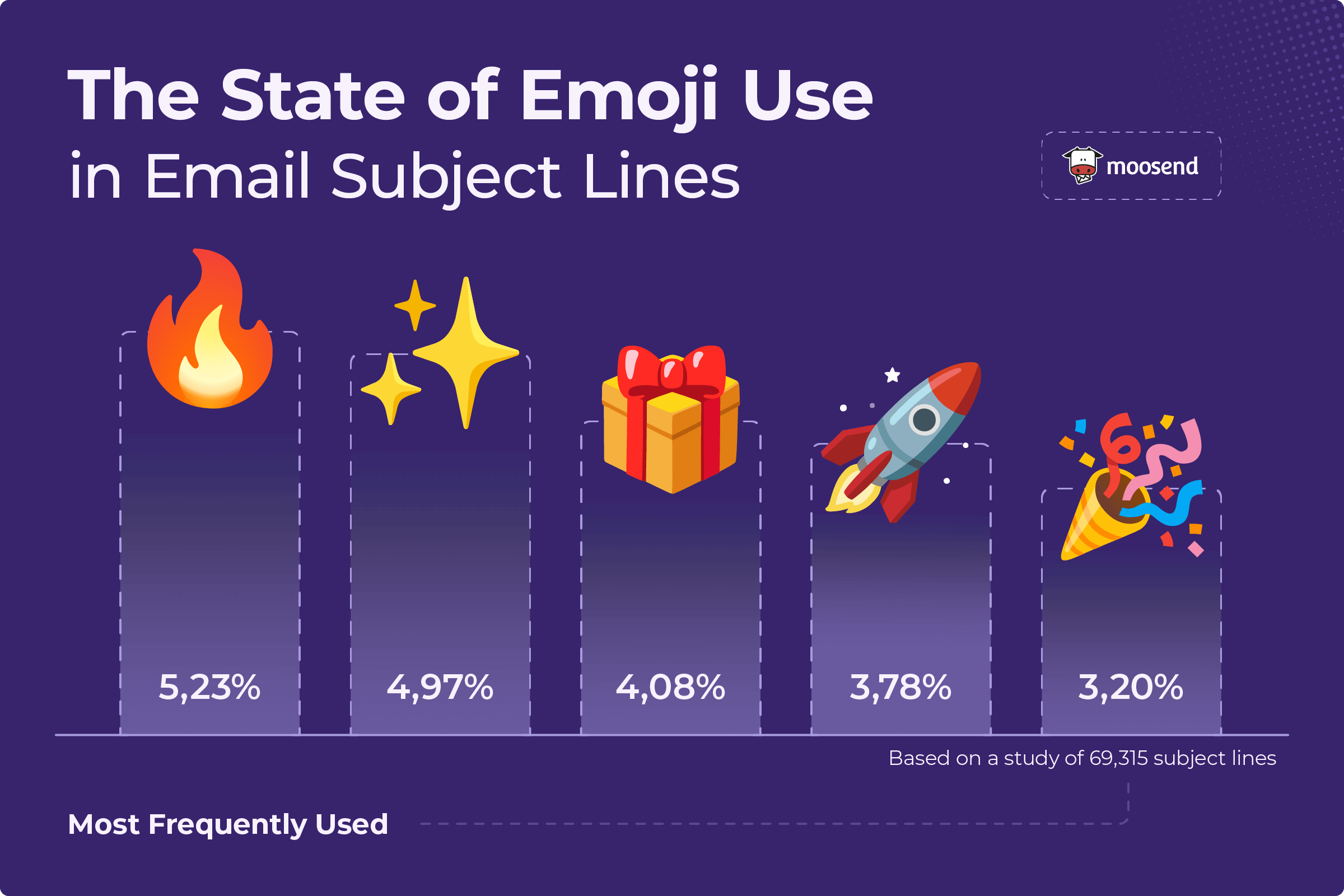
Here are the most frequently used ones found in our dataset:
Other notable findings:
- Seasonal and event campaigns rely heavily on emojis. Common picks include: ✨ (4.97%), 🎁 (4.08%), ☀️ (2.26%), 🌸 (1.93%), and 🌴 (0.64%)
- Emojis that signal trust or confirmation appear frequently: ✔ (2.89%) and ✅ (1.13%) are commonly used in promotions, receipts, and updates to indicate that something is approved or completed.
- Dog emojis dominate the inbox. Together, 🐕, 🦮, 🐶, and 🐾 appear around 817 times (4.25%), while cat emojis 🐈, 🐱, and 😻 show up only about 148 times (0.70%).
- Money emojis are also common despite the risk of appearing spammy: 🤑 (1.05%), 💰 (1.01%), and 💸 (0.72%).
Do You Really Need Emojis in Your Subject Lines?
Marketers often assume that adding an emoji will automatically increase open rates. The truth is a little more complicated. Emojis don’t guarantee better performance, but they can boost visibility in a crowded inbox.
Take a look at the image of the inbox below.

The siren (🚨) and lightning bolt (⚡) emojis immediately catch the eye. They break the monotony of text-only subject lines, giving certain emails a visual edge.
To see how marketers actually use them, we looked at more than 69,000 subject lines. Certain emojis appeared repeatedly, such as 🔥 for urgency and 🎉 for celebrations. Unsurprisingly, others, such as 🥫 (soup can) or 🏐 (volleyball), showed up only once.
The takeaway is that marketers stick with recognizable emojis to attract attention. So, do you need them in your subject lines, too? Not always, but they do come with some clear benefits:
- Help break through inbox clutter.
- Give readers a quick visual cue about the email’s theme.
- Add a touch of personality or tone that plain text can’t.
- Signal urgency, promotions, or seasonal events at a glance.
That said, not every emoji adds value. Some fit the message naturally, like a lightning bolt for a flash sale, while others feel like clutter and can even harm your email deliverability.
The Good: When Emojis Can Boost Engagement
When used strategically, emojis can make your subject lines pop and add just the right touch of personality.
Here are some use cases where they work exceptionally well.
Welcoming new subscribers
Welcome emails are one of the first touchpoints a subscriber has with your brand, and the right emoji can instantly make the interaction feel warmer and more personal.
Partake Foods, for instance, used the following subject line for their welcome message: “Welcome to Partake 🍪.”
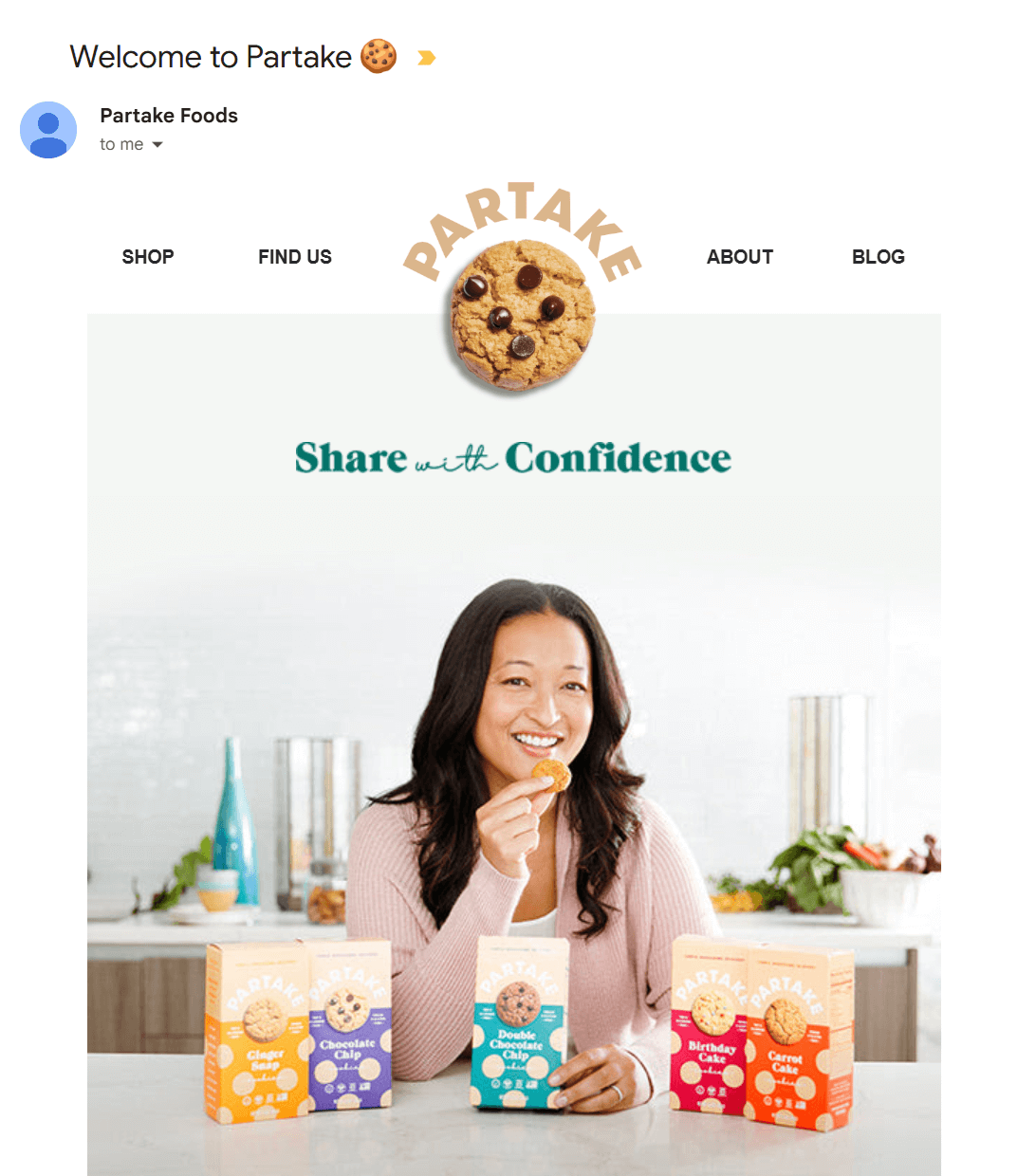
Their subject line fits their product, with the cookie emoji highlighting what the brand sells.
Visual cues like this give subscribers a hint of what to expect, which works well for brands that want their welcome to feel a little more playful and on-brand.
Here are some examples of other companies using the same tactic:
- Welcome to Maev 🥩
- 👛 Welcome to FASHIONPHILE
- Welcome to the Pack 🐾 (Finn)
- Welcome to Kylie Cosmetics rewards 💋
- Welcome to America’s Coffee 🦅
- Welcome to the GIR Family 🧑🍳
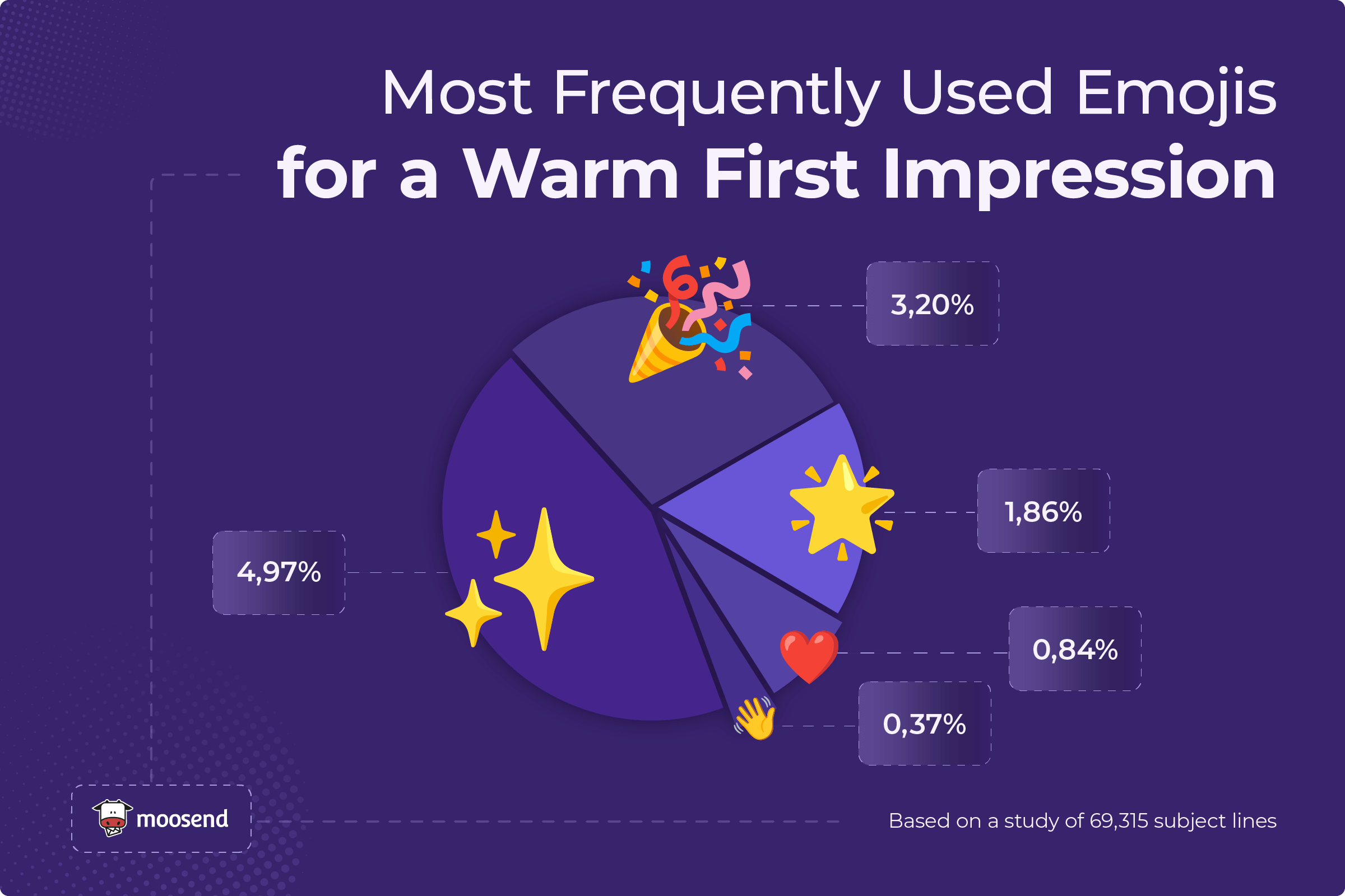
While these emojis aren’t pulled directly from welcome emails, they can make excellent choices for a warm first impression:
Adding a seasonal touch
Emojis tied to holidays or seasons feel natural and expected. A pumpkin in October, for instance, or a tree in December instantly signals relevance.
Ecommerce brands like NotebookTherapy used the ghost emoji to highlight Halloween promotions. It feels timely and adds a festive touch without distracting from the offer.

However, it’s not only retail or lifestyle brands that see results from emojis. B2B companies and agencies can use them effectively as well.
If you take a second look at the above example, you’ll see how, at Moosend, we used a jack-o-lantern emoji in our own Halloween email subject line to grab attention.
Emojis work across industries because they aren’t tied to any one market. The key is alignment. When your choice aligns with the season, the offer, or your brand’s voice, emojis can enhance engagement and make your emails feel more approachable, especially with younger audiences.
According to our findings, here are some of the most popular seasonal emojis:
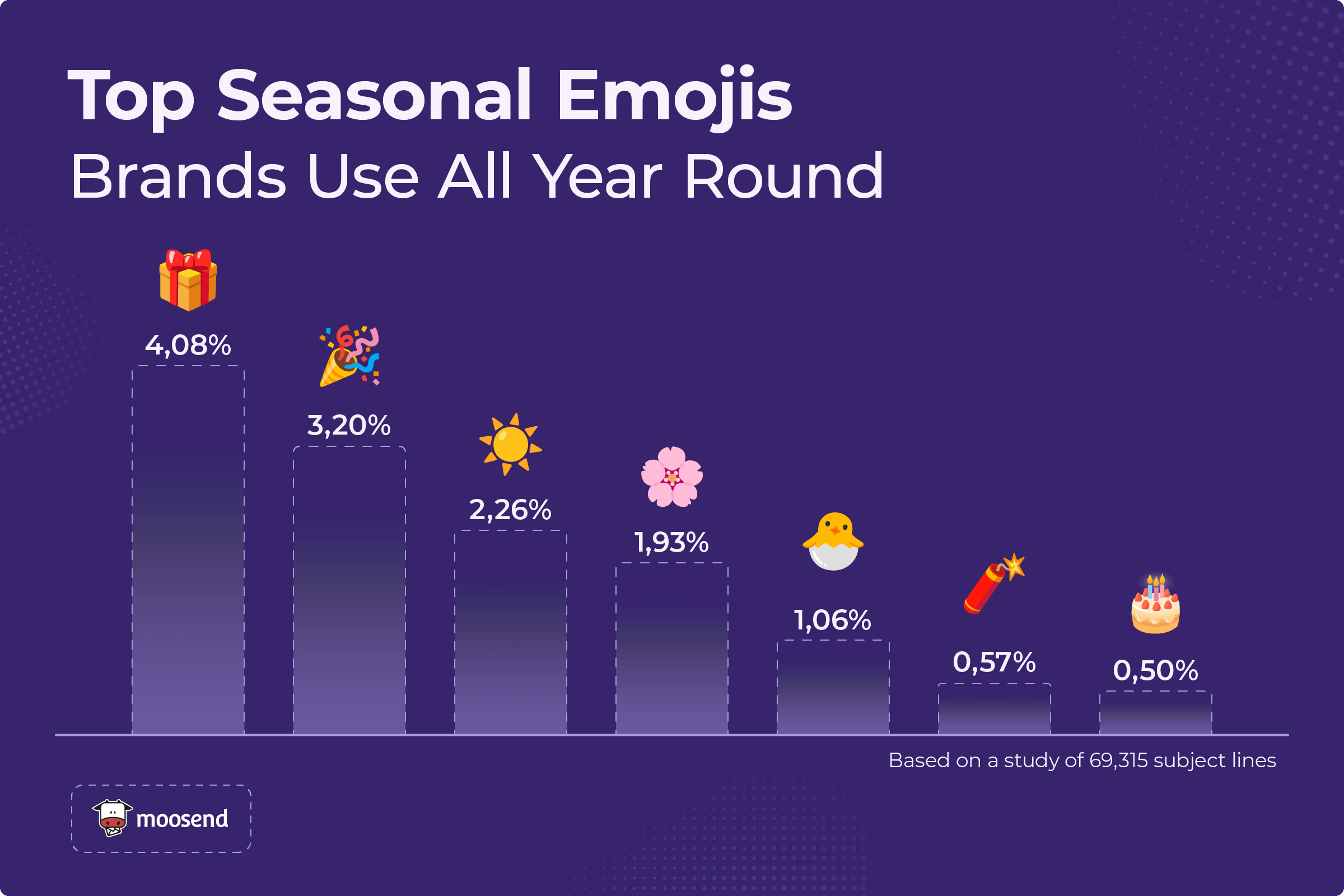
And while our dataset didn’t include every seasonal event, some emojis are consistently present around major holidays. For example:
- Christmas: 🎄, 🎅, ❄️
- Halloween: 🎃, 👻, 🕸️
- Thanksgiving: 🦃, 🥧, 🍂
- Valentine’s Day: ❤️, 💘, 💌
Promoting urgency
Emojis are especially effective for highlighting urgency or time-sensitive offers, creating a sense of FOMO.
The fire emoji is one of the most common for this purpose, signaling hot deals or limited stock. Timers (⏰🕒) and sirens (🚨) also work well to stress deadlines and last-chance reminders.

Seattle Coffee Gear and Timberland used emojis such as 😱, 🥊, and 🔥 to make their promotions feel more urgent. These choices stand out against plain-text subject lines, immediately signaling to readers that these are deals worth acting on fast.
Brands seem to favor emojis for limited-time promotions. According to our findings, here are the most popular urgency-driven emojis:
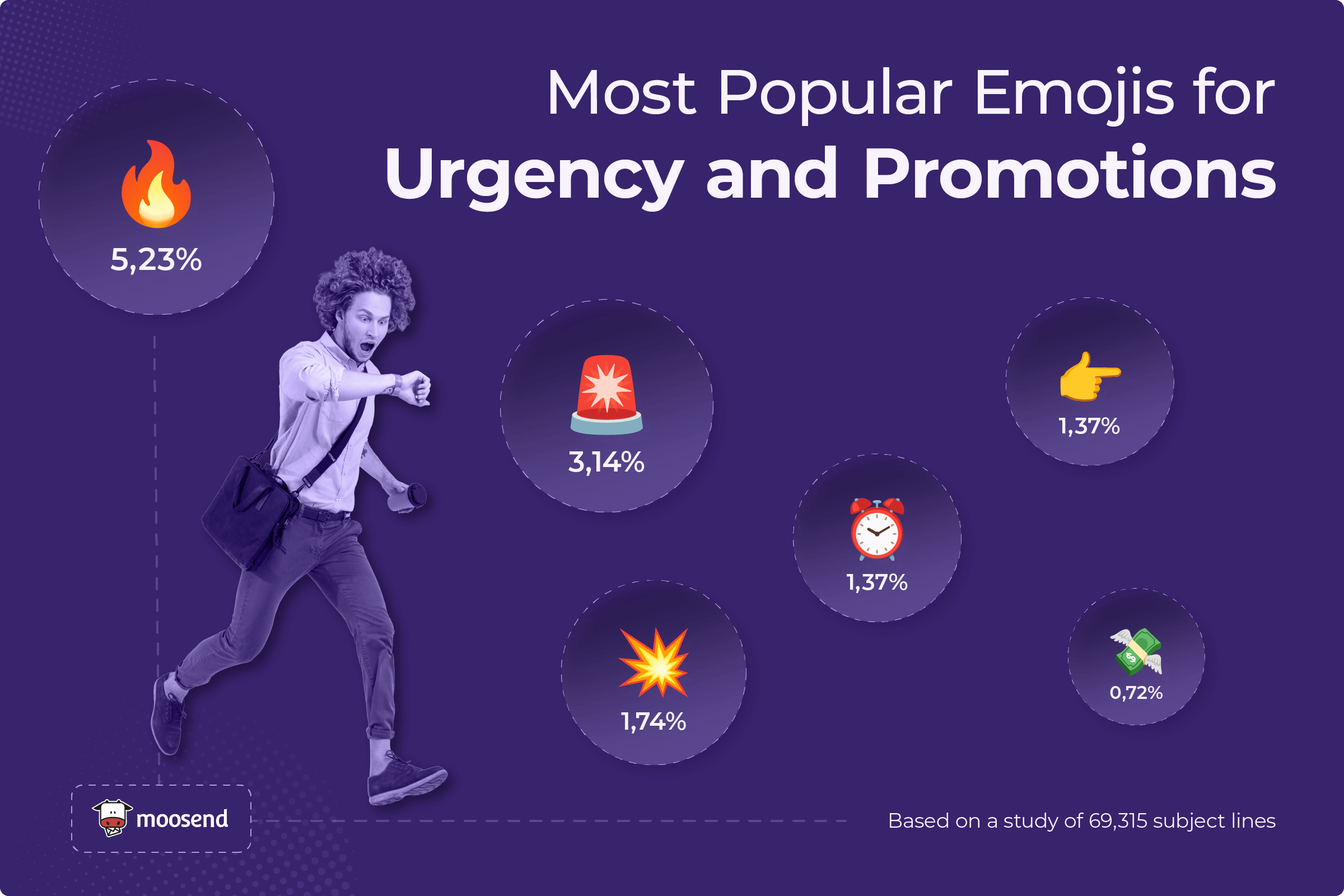
Highlighting product categories or themes
Sometimes the best emoji choice is the most obvious one, and in our case, it’s the one that reflects what you sell. Using emojis tied to a product or theme gives subscribers instant recognition and helps your subject line stand out for the right reasons.
For example, a travel company can use a plane for flights or a palm tree for vacation getaways. The emoji sets the context before the subscriber even finishes reading. Similarly, a beauty brand might use 💄 or 💋 to highlight a new lipstick launch, or 👀 to tease an eyeshadow collection.
Here’s how Bésame Cosmetics used it:
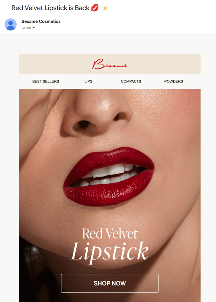
This small addition connects the subject line with the offer, making the message easier to process at a glance.
Our findings show that product- and theme-based emojis are also widely used:

The Bad: When Emojis Backfire
Emojis are indeed great. However, if you use them the wrong way, they can make your subject line look spammy, confusing, or even untrustworthy.
Here’s how a badly-placed emoji can turn into the villain of your email campaign.
Cluttering your subject lines
Stuffing a subject line with emojis doesn’t make it more eye-catching. On the contrary, it’s harder to read and often triggers the same reaction as spam. Instead of focusing attention, multiple emojis compete with one another, burying the actual message.
Here’s an example from our findings: “🎁📘 Blogs 📽️ Videos 👕 Merch 💻 Sites 📚 Courses Done-For-YOU!🔥”
At first glance, it’s loud, and not in a good way. With every word accompanied by a different emoji, the offer itself gets lost. Readers often struggle to find what they’re looking for, and spam filters are more likely to flag this type of formatting.
A simpler version, such as “🔥 New Courses and Merch Inside,” would be easier to process, while still using a single emoji to catch the eye.
Inboxes are already noisy, so when you overuse emojis, readers don’t know what to focus on. As a result, they will delete your email, unsubscribe from your email list (if you keep spamming them), or even report you.
Harming your deliverability
Speaking of reporting, did you know that certain emojis can impact your email deliverability?
Overused or aggressive icons, such as the bomb (💣) or the exclamation mark emoji (❗), can raise red flags with spam filters.
ISPs scan for these patterns, and if they see your subject line containing high-risk symbols, your email could land in the spam folder. Even if it does reach the inbox, readers may associate those emojis with low-quality or scammy messages and ignore your offer.

Here’s a common example: “UP TO 90% OFF SAMPLE SALE ❗❗❗” from Rue La La. Instead of making the offer sound exciting, the repeated exclamation marks feel pushy and spam-like. Readers are more likely to ignore it, and filters may block it before they even get the chance.
And it’s not just one brand. In the same image, four more brands, including CaratLane, MeUndies, PANTONE, and Tommie Copper, all used the red exclamation mark emoji.
Apart from looking spammy, when everyone uses the same trick, the effect wears off fast, making inboxes look noisy and repetitive rather than compelling.
Being misleading
Emojis can help your subject line stand out, but they should never be used to exaggerate or mislead. If your subject line promises something the email doesn’t deliver, readers will lose trust in your brand.
Take a subject line like “🎁 Get Your Free Gift!” when the email actually contains no gift, not even a discount code.
The gift emoji suggests something tangible, and when that expectation isn’t met, subscribers feel tricked. Over time, this damages credibility and reduces engagement, as readers will be more cautious about opening your future campaigns.
Using irrelevant emojis
Dropping in random emojis that don’t match the content can confuse readers and discourage them from opening your email.
For instance, adding a monkey (🐒) to promote a fashion collection makes no sense unless the products actually tie back to that theme. Irrelevant emojis feel like filler, and over time, they can make your subject lines look unprofessional or, as mentioned above, misleading.
Common vs. Unexpected Emojis
Some emojis are everywhere in subject lines, and they work because they’re instantly recognizable and easy to interpret. But that popularity also makes them less likely to stand out.
From our data, the most used emojis were 🔥 (5.23%), ✨ (4.97%), 🎁 (4.08%), 🚀 (3.78%), and 🎉 (3.20%). These are “safe bets,” but they can quickly start to blend in. Even worse, subscribers may think they’ve already opened your email if the subject line resembles others using the same emojis.
That’s where unexpected emojis come in. Surprising choices can catch the eye and differentiate your email, but they need to be used carefully to avoid confusion.
Take e.l.f.’s subject line, for instance: “Today only: FREE Pout Clout Lip Plumping Pen! 💋🖊️”
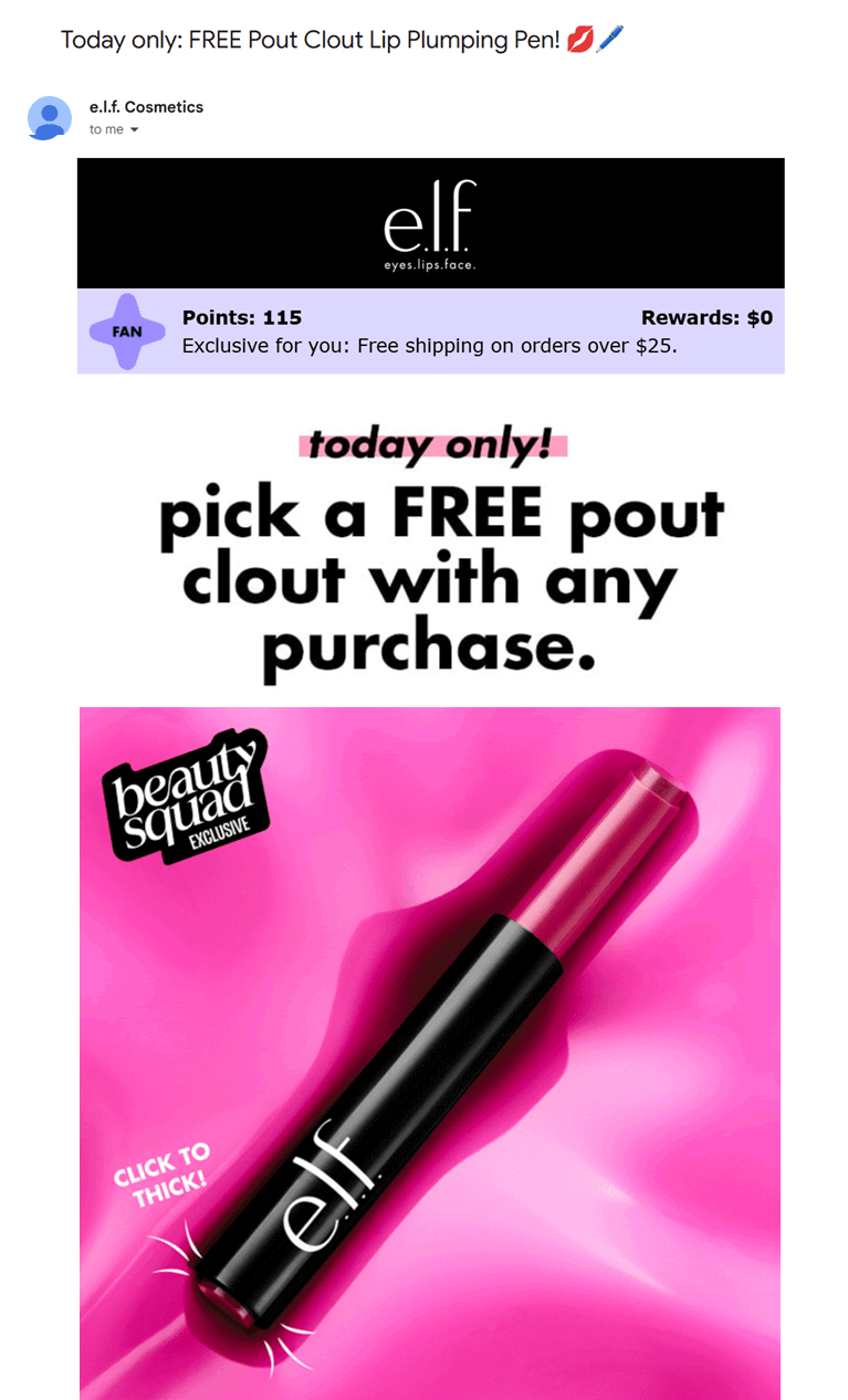
On the surface, the pen emoji may seem irrelevant to makeup, but when paired with the lip emoji, it seamlessly connects to the product’s concept.
This combination makes the line playful and memorable rather than confusing.
Made In took it a step further, using pointing up and down emojis (👆👇) to frame their offer.

This subject line is definitely different, and that’s why it stands out. The arrows guide the reader’s eye, create a break in the text, and make the subject line feel more playful than a standard sale announcement.
This subtle twist is enough to capture attention and pique the subscriber’s interest. Of course, for it to work, Made In’s deal must actually deliver. In this case, it beats John’s Crazy Socks’ offer (20% off) and matches Bruno Magli’s discount.
Emojis in Subject Lines: Best Practices
Now, let’s see some simple tips you can use to make emojis work for your subject lines without hurting deliverability or subscriber trust.
1. Use sparingly
Emojis should support your words. Limit yourself to one or two per subject line, because adding more risks making your message look spammy or hard to scan. Readers typically skim their inbox, so cluttered subject lines get skipped or deleted.
For example, instead of “🎁📚🔥 Huge Sale 🎉💻👕”, try “🔥 Huge Sale on New Arrivals.” A single emoji makes the subject line stand out, keeps the focus on the offer, and helps avoid triggering spam filters that flag excessive symbols.
Tip: Check your own inbox to see what other brands are doing. If you notice the same emoji (like 🔥) popping up everywhere, try choosing one that’s more unique or tied to your brand to stand out.
2. Choose the right placement
Did you know that the placement of your emoji has different effects?
At the start, it can set the tone right away, while at the end, it serves as a “visual full stop” that leaves the reader with a clear takeaway.
What you should avoid is dropping emojis in the middle of sentences, where they interrupt the flow and make the subject line harder to read.
Here’s why placement matters:
- Shop Our Biggest 🎉Sale Today: the emoji splits the phrase and distracts from the offer.
- 🎉 Shop Our Biggest Sale Today: at the start, it sets the celebratory tone right away.
- Shop Our Biggest Sale Today 🎉: at the end, it leaves subscribers feeling excited.
Also, keep in mind how subject lines appear on mobile devices. Emojis at the very start may sometimes get cut off (mobile truncation), so always preview across devices to ensure the whole subject line still makes sense.
3. Align with brand and context
The best emojis are those that feel like a natural extension of your brand’s voice and campaign.
Each industry tends to have its “go-to” emojis that customers instantly recognize (the coffee emoji for coffee brands, the lipstick emoji for beauty, etc.). However, don’t be afraid to experiment and establish your own.
For instance, we sometimes use the cow (🐮) emoji in our messaging.

Although we’re an email marketing platform, the cow fits our brand mascot, Moo, and holds meaning for our audience. Used sparingly, it adds personality and reminds our subscribers of our brand identity.
So, lean on emojis that fit your industry, but also look for unique options that tie back to your brand story.
Tip: Don’t forget your email preview text. You can also add emojis there, just like in the examples above with 🐮 or 👻.
4. Avoid clickbait emojis
Don’t promise what you can’t deliver. As mentioned above, if you use 🎁, make sure there’s an actual gift or coupon. Misleading emojis can quickly break trust, and once subscribers stop believing your subject lines, they will stop opening them.
Also, keep in mind that spammy emojis are a thing, just like spam words. Icons like 💰, 💸, or 🤑 may feel tempting for savings and sales emails, but they’re often flagged by spam filters or ignored by readers who associate them with scams.
5. Create urgency without clutter
Emojis like 🔥, ⏰, or 🚨 are perfect for time-sensitive deals (and the data supports this), but overusing them can make your subject line feel pushy.
One red exclamation mark (while a little risky) can emphasize urgency, but three in a row (❗❗❗) looks spammy and may even trigger filters. Use urgency emojis to highlight deadlines, not to shout at your readers.
If you want to stand out, try less obvious options that still signal urgency or movement. For example:
- 💨 or 🌬️to suggest “going, going, gone”
- ⏳ for a “time is running out” vibe
- 🏃 for a “last chance to grab it” feel
Again, always choose urgency emojis that align with your brand’s voice. A sporty brand could get away with 🏃, while a lifestyle brand might use ⏳ to keep things sleek. Testing alternatives helps you avoid the inbox clutter of the same emojis everyone else is using.
6. Test your emojis
So, how do you find the emojis that work best? By testing them with your own audience.
Run A/B tests by sending the same campaign with three variations: one with no emoji, one with a familiar emoji, and one with an unexpected option. Compare open rates, clicks, and conversions to see which resonate with your target audience.
Tools like Moosend make this easy by allowing you to set up subject line A/B tests and track performance side by side.
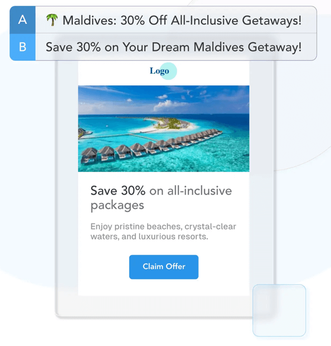
Lastly, consider who you’re sending to. Gen Z audiences are fluent in emoji culture and may respond better to playful or unconventional choices, whereas older segments may prefer more minimal or classic symbols.
Segmentation lets you match the right subject line to the right person, rather than taking a one-size-fits-all approach.
7. Optimize your subject lines
A/B testing will help you see how emojis perform, but optimization doesn’t stop there. Once you have data on what works, use it to refine your subject lines.
You can also use dedicated tools to accelerate the process. Here are some to streamline the process:
- AI assistant: Generates or refines subject line ideas, providing multiple variations for testing. This helps you find phrasing that resonates with your audience by providing the right context.
- Subject line tester: Checks your subject lines before sending and flags issues like clutter, spam triggers, or weak hooks. This lets you optimize for performance and deliverability. For instance, you can use Refine to check how they’ll perform and get valuable suggestions on how to improve your creations.
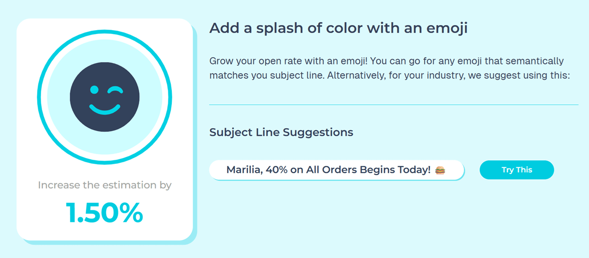
You can combine the above tools with your A/B testing strategy to get better results. For example, use the AI Writer to draft variations, then run them through your subject line tester, and let a tool like e-mojo add a fitting emoji.
8. Don’t stop at the subject line
Emojis can help open the conversation, but they can’t carry your campaign on their own. What happens after the click is what matters most. If your email content doesn’t deliver on the promise of your subject line, subscribers will click on the unsubscribe button, and no clever emoji will fix that.
Ensure that your subject line, preview text, and email body copy work together effectively. The emoji draws attention, the preview builds anticipation, and the content provides the value. That full experience is what turns opens into clicks and clicks into conversions.
Emojis in Subject Lines Are the Cherry on Top
Emojis can give your subject lines the extra spark they need to stand out in crowded inboxes. Used well, they highlight urgency, add personality, or tie your message to a season or product. Used poorly, they clutter, confuse, or even send your emails straight to spam.
The key is to choose emojis that align with your brand and audience. Trends come and go, but relevance never fails.
And remember, at the end of the day, a clever subject line with a fun emoji might earn the click, but it’s the content of your email that keeps subscribers interested.
FAQs
Here are some common questions regarding emojis in subject lines
1. Do emojis in subject lines increase open rates?
They can, but only when used thoughtfully. Emojis draw attention in a crowded inbox, but their impact depends on your audience, industry, and context. Our data shows popular picks like 🎉, ✨, and 🔥 are widely used, but testing is the only way to know what works best for your subscribers.
2. How many emojis should I use in a subject line?
Stick to one or two; using too many can make your subject line look cluttered or spammy, and may even hurt deliverability. Place them strategically, either at the start to set the tone or at the end to reinforce the message. Also, avoid dropping them in the middle of a sentence, as it breaks your message.
3. Which emojis should I avoid in subject lines?
Avoid misleading or “spammy” emojis, like 💰💸🤑 when you’re not literally offering cash. Aggressive icons such as ❗ or 💣 can also trigger spam filters. When in doubt, avoid emojis and focus on providing value in your subject line copy.
Having a newsletter isn’t enough. No matter how great your content is, you need a reliable system to turn your target audience into devoted subscribers. A key part of that process, which you can’t leave to sheer luck, is your newsletter landing page.
In this guide, you’ll learn the exact strategies to optimize your landing page, attract more visitors, and boost conversion rates.
Even better, you’ll get to explore real-world examples from popular, high-converting newsletters to make your own page successful.
Grow your list with the right assets
Craft converting landing pages with Moosend’s editor.
Start freePractices for Compelling Newsletter Landing Pages
A great landing page works when all its elements come together to help people on your email list understand what your newsletter is about and, most importantly, why it’s worth their time to sign up.
Here are some pro tips to make your newsletter landing page stand out.
Prioritize a clear layout
People rarely have time to read long blocks of online content. They spend a few seconds skimming, and if something grabs their attention, they’re eager to spend a few more. Therefore, a clear, scannable landing page design is essential.
Each section should pop out, including a heading and plenty of white space. Keep important information at the top to capture your visitors’ attention. Your newsletter name, target audience, call-to-action (CTA), and sign-up form should be visible without scrolling to increase signups.
Supporting copy should also be presented in a clear format. Use bullet points or infographics to improve readability. Find the right balance between copy and visuals to deliver a great experience for readers.
The good news? Most landing page builders offer pre-made, professionally designed templates to save you time. You can browse different landing page templates, find the one that serves your needs, and customize it with built-in editors.
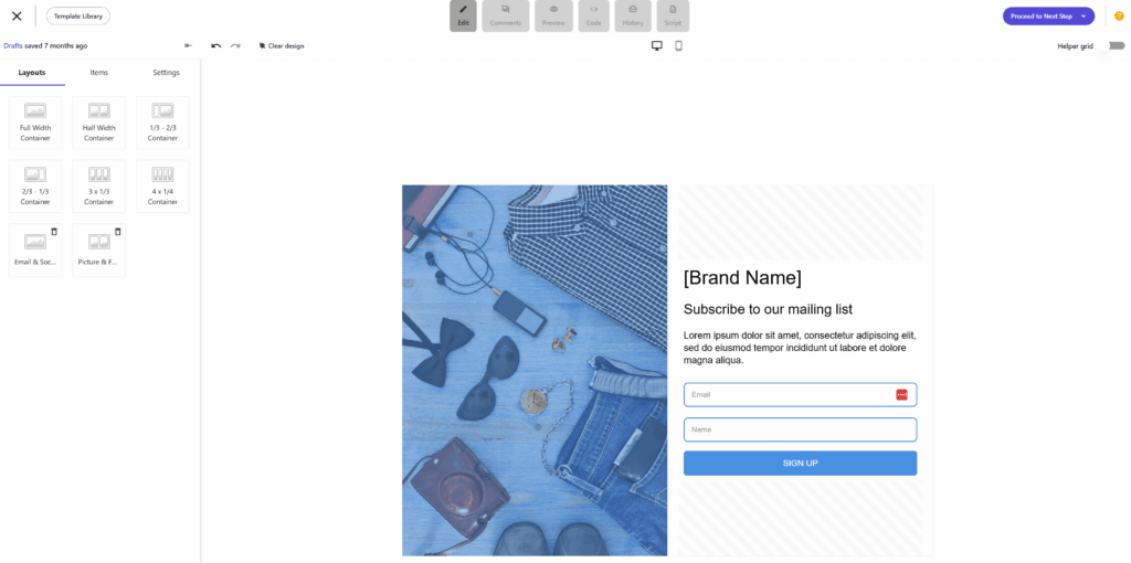
Finally, your landing page should be optimized for all devices, including mobile and tablets. Otherwise, you risk losing people due to poor user experience.
Focus on your value proposition
To deliver converting landing page copy, you first need to step into your potential subscriber’s shoes. Imagine what prospects want to learn, and ensure your newsletter is a valuable resource for them. Here are some questions that can help you format your content:
- What industries do you target with your content?
- What kind of pain points do your prospective readers face?
- What does your audience find interesting?
- What are the main benefits of signing up for your newsletter?
- How do you differentiate from competitive newsletters?
When the answers to these questions are clear to you, decide how you’ll present that information to attract the right people. For example, a benefit-oriented headline, written in actionable language, can make a great first impression. Mention the key topics you cover and how these resources can help prospects grow.
Do you also offer a membership option? Mention the key differences to the free version, from exclusive content to freebies to grow your revenue.
Earn trust via social proof
Want to give your visitors another reason to subscribe? Social proof holds the key to their hearts, as people are often motivated by FOMO (Fear of Missing Out) and a need for belonging.
Show them they’re missing something their peers enjoy, and you’ll get them on board. From sharing reader testimonials to logos of brands that have trusted your newsletters, find the right form of social proof to engage your page visitors more.
A common newsletter landing page best practice is to include the number of your current subscribers to make signing up more appealing. Another highly effective strategy is featuring “As Seen In” banners with logos of popular media outlets that have mentioned or featured your content. This signals instant authority and credibility to first-time visitors.
Simplify the sign-up process
People are rarely fond of long and complex sign-up forms. To streamline your email marketing growth on your landing page, eliminate any friction at that stage.
Let’s start with placement. Add your signup form at the top, followed by a CTA button inviting readers to sign up. Obtain only essential information from them, such as their email address. Depending on the scope of your newsletter, you can also request their business information or content preferences.
Many newsletter landing pages also give prospects the option to set their frequency preferences. Make them feel in charge of their interaction with your newsletter to get extra trust points.
If you need to acquire more information from new subscribers, consider designing a two-step newsletter form to avoid overstimulating them. You can also send them an email once they sign up to collect any extra information or invite them to set up their email preferences.
Display recent newsletter content
If you want to show potential subscribers the value of subscribing to your newsletter, share a few of your latest emails or highlight your favorite past issues. This allows visitors to sample your content and determine its value for themselves.
Moreover, you can expand your reach by sharing some of your most popular resources from other channels, like social media or your podcast. The key is to ensure the displayed content is perfectly aligned with the audience you’re targeting; otherwise, you risk confusing them. As a bonus, this practice will help you drive traffic across multiple channels.
Use AI and data-driven techniques
Suppose you’re unsure about certain elements of your landing page, such as the placement of the newsletter sign-up form or your headline copy. In that case, you can always resort to A/B testing for actionable insights. This data-driven process will help you find the landing page version that performs best for your target audience and effectively boost conversion rates.
As for brainstorming and initial concept generation, use an AI platform you trust. Type the right prompts, including comprehensive information about your target audience and your newsletter niche, to get more accurate output.
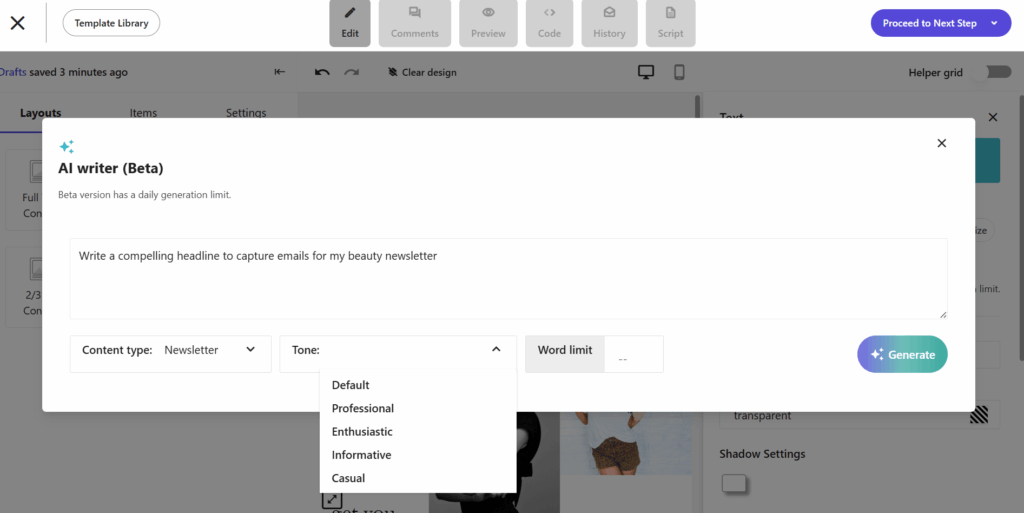
A quick reminder: Use AI not as a replacement for your marketing strategy, but as a powerful tool to generate strong starting points for your tests.
Ensure brand consistency across assets
Visitors can end up on a newsletter landing page through multiple channels, such as a search engine query or through your homepage. It’s essential to match your landing page to the source to deliver a unified experience that will make sense to your readers.
Use the same colors, fonts, tone of voice, and visual assets as the referring source and your overall brand. For example, if a visitor clicks a purple pop-up on your website but lands on a green page with a different messaging tone, that disconnect might confuse them.
Maintaining this seamless transition reinforces your credibility and, ultimately, the decision to subscribe.
Top Newsletter Landing Page Examples & Why They Work
Let’s explore some high-converting landing pages for popular newsletters and why they’re unique.
1. Stacked Marketer
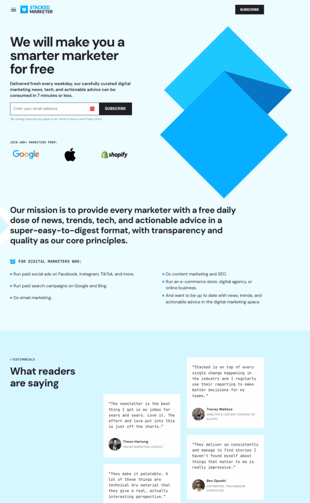
Stacked Marketer is a popular newsletter for digital marketers with a great landing page that leaves nothing to second-guessing.
Why it works:
- The headline is a promising invitation to marketers, followed by copy that sets clear expectations about the newsletter frequency and content.
- They organically included three types of social proof: the number of subscribers, logos from top brands that read the newsletter, and a few testimonials to build trust.
- They included a section defining their target audience to help readers decide if the content is suitable for them.
- The CTA buttons are easy to spot at the top to increase conversion rates.
2. The 3-2-1 Newsletter
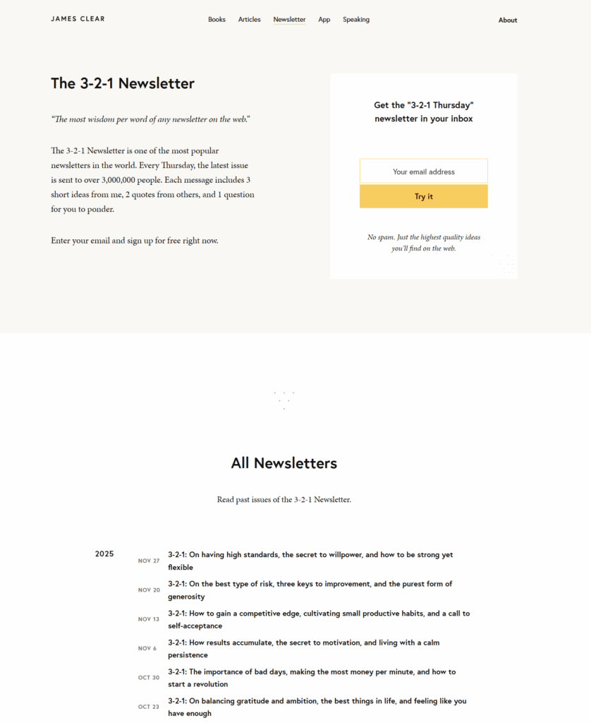
Best-selling author James Clear followed a minimalistic approach to grow The 3-2-1 Newsletter’s list, and did a great job.
Why it works:
- The landing page introduction explains that it is a weekly newsletter, offering three personal ideas, two quotes from others, and one reflective question for the reader.
- Their sign-up form is simple, with a footnote that clarifies that they won’t receive any spam from him.
- The newsletter’s past issues help readers quickly understand what it’s about, so they can decide whether it belongs in their inbox.
3. The Daily Good
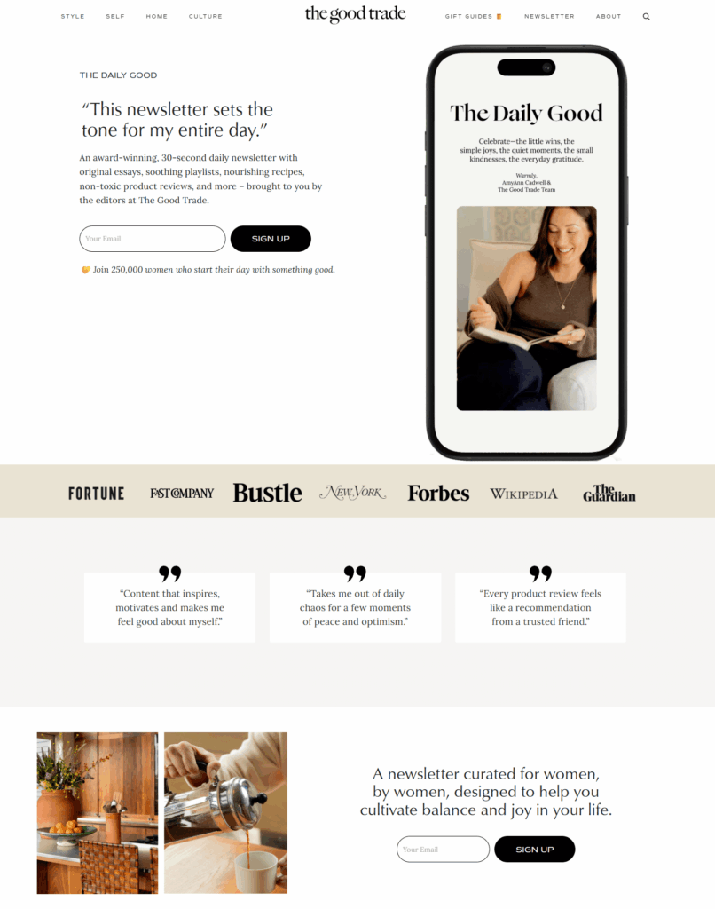
The Daily Good’s landing page captures this email newsletter’s mission through its copy, colors, and visuals.
Why it works:
- The headline is a testimonial that perfectly summarizes the newsletter’s goal and impact.
- The target audience of this newsletter, women, is easy to recognize in a few seconds, delivering an experience they can resonate with.
- The brief copy under the sign-up form makes the reader feel that by subscribing, they’ll become part of an empowered community.
4. The Gist
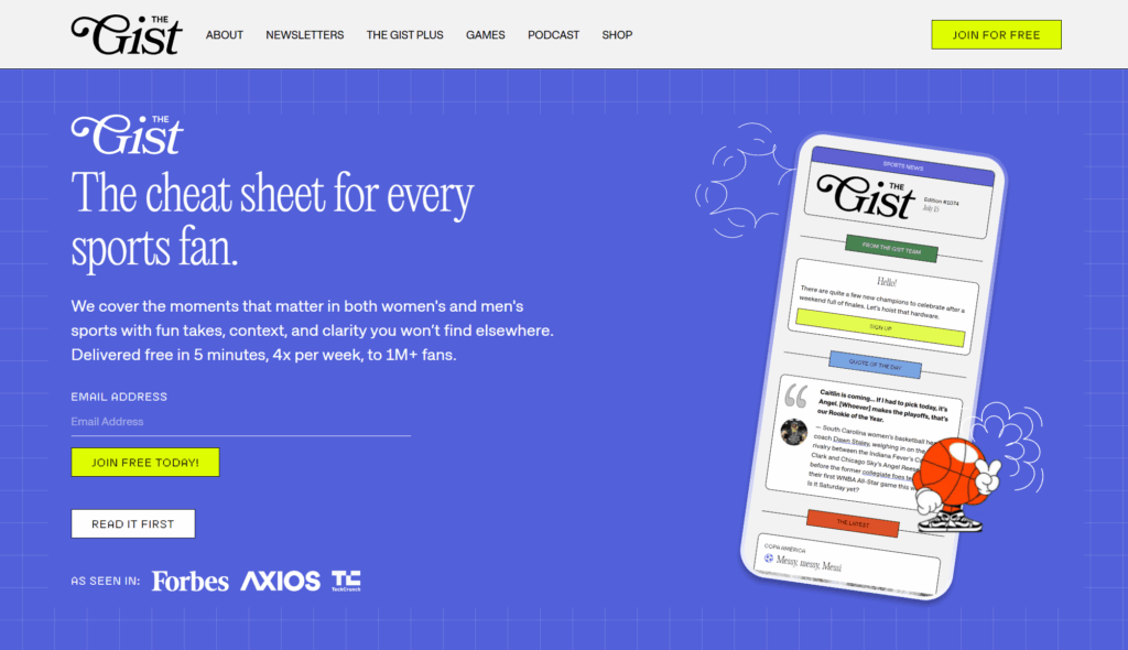
The Gist, one of the most popular newsletters for sports fans, has designed a brief but engaging landing page.
Why it works:
- The landing page header shares the “gist” of the newsletter content to attract interested visitors and yield more conversions.
- The word “Free” on the CTA button reassures readers that they won’t be charged for subscribing.
- The animated visual on the right helps the readers picture how this newsletter will look, adding a fun note.
5. The Weekly Scroll
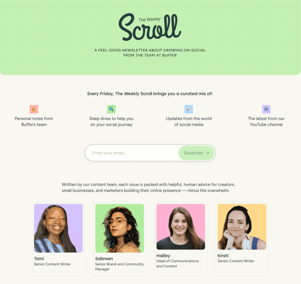
Buffer’s newsletter, The Weekly Scroll, shares social media tips weekly and has built a beautiful landing page to attract more subscribers.
Why it works:
- The simple and colorful design makes each section stand out, enhancing readability.
- The icons and accompanying copy highlight the newsletter’s main topics to attract like-minded readers.
- The headshots of the content team members add credibility, boosting conversion rates.
6. The Daily Skimm
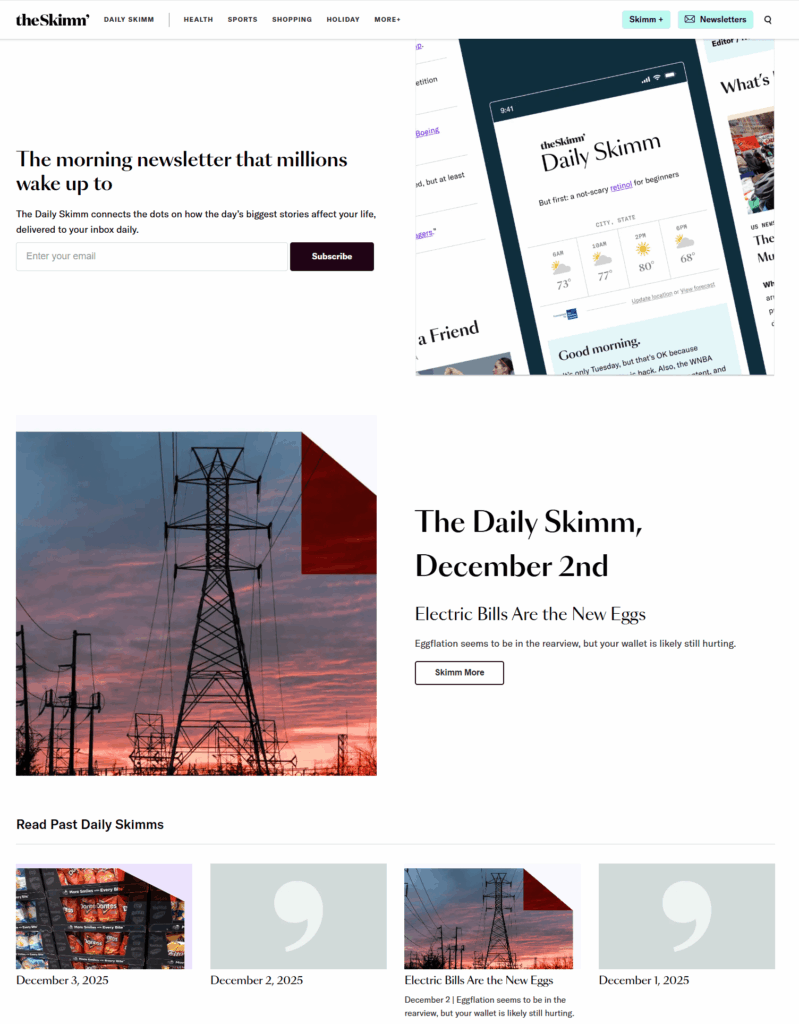
The Daily Skimm delivers daily news and info to subscribers and has created a simple yet powerful landing page to promote it.
Why it works:
- The catchy headline creates FOMO for visitors, enticing them to subscribe to the newsletter “millions wake up to.”
- The recent issues give visitors a glimpse of the newsletters they will receive upon subscribing.
- The sign-up form is placed at the top of the landing page to yield more subscriptions.
7. Nature Briefing Daily
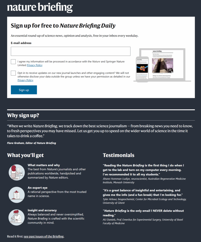
Nature Briefing Daily, a popular scientific newsletter, introduced various information on its landing page.
Why it works:
- The privacy policies on the newsletter sign-up form make visitors feel more secure about how their data is used.
- The editor’s note on the “Why sign up” section adds a personal touch and is written in actionable language to entice readers to subscribe.
- Testimonials from top scientists add credibility and help convince hesitant readers.
8. Jonathan’s Daily List

This newsletter landing page from Jonathan’s Daily List follows a person-centered, minimalistic approach.
Why it works:
- Beyond the headline, visitors can find the newsletter’s target audience and purpose.
- The link to the archive lets readers browse previous newsletters without taking up extra space.
- The testimonials in the form of messages to the writer help earn trust points faster.
Grow Your Newsletter With High-Converting Landing Pages
If you thought that creating a landing page to increase your newsletter sign-ups would be redundant, you’ve probably changed your mind. Find the elements that will convince your target audience to hop on board and ensure your email content leaves them speechless.
The more information readers can get about your newsletter, the better. So share your mission, add social proof, and a sample of your writing to remove all hesitance.
FAQs
Let’s explore some frequently asked questions regarding newsletter landing pages:
1. What is a newsletter landing page?
Newsletter landing pages are standalone web pages designed to motivate visitors to subscribe to a newsletter.
2. What should you include on a newsletter landing page?
A newsletter landing page should include an attractive headline, a call-to-action, a sign-up form, compelling copy, engaging visuals, and social proof, such as testimonials.
3. Why should you create a landing page for your newsletter?
Landing pages attract visitors’ attention by limiting online distractions and focusing on a single call to action, increasing newsletter subscriptions.
4. How do you drive traffic to your newsletter landing page?
You can drive traffic by optimizing your landing page for SEO, sharing it on your website and social media, and running paid ads, among other digital marketing tactics.
Your landing page is the medium that turns curiosity into leads and conversions. And conversions need to be tracked so you can fine-tune your overall marketing strategy.
That’s why you need to track your landing page metrics, the data points that reveal how effectively your page attracts, engages, and converts visitors. From bounce rate to conversion rate and time on page, these metrics can show you how to turn your landing page from a digital brochure into a growth engine.
In this guide, we’ll explore the most important metrics for measuring landing page success, why they matter, and how to improve each one to drive better performance.
Optimize your landing pages smarter
Track your results and turn your insights into real conversions with Moosend.
Start for freeWhat Are Landing Page Metrics?
Landing page metrics are the performance indicators that help you understand how effectively your page turns visitors into leads or customers. Metrics like conversion rate, bounce rate, or cost per conversion show which types of landing pages perform better, but also which elements of your landing pages attract attention, drive engagement, and prompt people to take action.
These performance metrics cover every stage of the user journey, from how visitors arrive on your page to what they do once they get there. Therefore, tracking them gives you a complete picture of your page’s strengths and weaknesses, allowing you to make data-driven improvements.
Metrics vs. KPIs: What’s the Difference?
While the terms are often used interchangeably, metrics and KPIs (Key Performance Indicators) serve slightly different purposes:
- Metrics are individual data points that measure specific aspects of your landing page’s performance.
- KPIs are strategic goals tied to broader business outcomes, such as lead generation or revenue growth.
This means that your metrics can shape your KPIs. You might track dozens of metrics, but only a few directly indicate whether you’re achieving your goals. For example, a high click-through rate may be a positive metric, but your KPI might be the overall conversion rate or customer acquisition cost.
Are vanity metrics reliable?
Not all numbers tell the full story. Vanity metrics like total page views or impressions might look impressive, but they show visibility, not impact, and can’t help you with landing page optimization.
You could have thousands of visitors landing on your page, but if they don’t engage or convert, the page isn’t doing its job. So instead of focusing on how many people show up, focus on how they interact. That’s where real visitor engagement and performance insights live.
Tracking actionable data like conversion and bounce rates, and average session duration gives you clarity on how users behave, what holds their attention, and what drives them to take the next step.
Why You Need to Track Landing Page Metrics
Landing page metrics can help you stop guessing and start improving. Now, let’s see how metrics reveal campaign effectiveness, the real benefits they unlock, and the common mistakes teams make when they ignore the data.
Metrics reveal campaign effectiveness
Metrics let you connect outcomes to causes. In other words, they can get you from saying “this page didn’t work,” to understanding why it didn’t work.
To do it correctly, map metrics to the various stages of the funnel. Some metrics point to issues with customer acquisition (e.g., low CTR), while others pinpoint interest or engagement issues (e.g., short average time on page), or conversion frictions (e.g., high form abandonment).
After that, try to distinguish traffic quality from page quality. If your conversion rate is low but CTR and time on page are high, you might be attracting non-qualified leads. Another example is having strong traffic but high bounce rates. This suggests issues with the anatomy of your landing page, like page messaging or poor UX.
You can also break metrics down by source, device, geography, or campaign. For example, if your desktop audience converts well but your mobile audience doesn’t, your mobile UX or load speed is likely the issue.
Measuring properly boosts your efforts
Tracking landing page metrics translates directly into smarter, faster growth. Here’s what that means:
- Improved conversions: When you know which elements are underperforming, you can test targeted fixes and reliably increase conversion rate.
- Audience insights: Metrics reveal who responds to what, which headlines pull certain segments, which offers resonate, and which messaging needs localization. That feeds product messaging and campaign targeting.
- Better resource allocation & ROI tracking: With accurate cost-per-conversion and funnel metrics, you can decide which channels deserve more budget and which experiments to pause. That turns marketing from a cost center into a measurable revenue driver.
- Risk reduction: Data prevents costly mistakes, such as scaling a campaign with high impressions but near-zero conversions.
Of course, tracking landing page metrics is not a one-off chore, but an ongoing operational task that can save you resources. Measure the right things, segment them, and use the results to prioritize tests that generate more leads and, eventually, revenue.
The Most Important Landing Page Metrics
Now that we’ve seen that not every number in your analytics deserves your attention, let’s see which metrics really tell the truth about your landing page performance.
1. Conversion rate
Your conversion rate measures the percentage of visitors who complete a desired action on your landing page. Whether that’s signing up for a newsletter, downloading a resource, or making a purchase, this metric reflects how effectively your page guides visitors to take the next step.
Across industries, the median landing page conversion rate is 6.6%, according to Unbounce’s report. Of course, this number depends on industry, targeting, offer type, and traffic quality. A free-trial SaaS landing page, for example, can achieve higher conversion rates than an eCommerce product page, mainly because it requires less commitment.
Improving your conversion rate starts with optimizing every element that influences user decisions.
To understand what works for your audience, run A/B tests to compare headlines, visuals, and CTAs and identify what drives more actions. To write landing page copy that aligns with visitor intent through clear, benefit-driven messaging, you can use a targeted AI writer for brainstorming and copy-check sessions.
Reduce friction by simplifying your forms and asking only for the necessary details. After users convert, you can request additional information as you go. Fewer fields can lead to higher conversion rates.
Finally, align your offer with traffic sources so expectations match what users see after the click. For example, a subscriber will already know your brand, so make sure to show them content that matches your relationship.
2. Bounce rate
Bounce rate measures the percentage of visitors who land on your page and leave without taking any further action. In essence, it shows how well your landing page captures immediate interest and motivates engagement.
A high bounce rate doesn’t always mean failure, but it often signals a disconnect between a visitor’s intent and your landing page’s offer. It tells you that users found your content irrelevant, confusing, or slow to load, and that they left.
But what are the most common causes for bounce rates?
- Slow page load times: Even a two-second delay can dramatically increase abandonment rates.
- Weak message match: If your source promise doesn’t align with your landing page content, users bounce almost instantly.
- Cluttered or unfocused design: Overwhelming visuals, pop-ups, poor hierarchy, or simply using the wrong landing page template can cause visitors to lose focus or, even worse, trust.
- Lack of above-the-fold clarity: When the core offer or CTA isn’t visible right away, users fail to see the value proposition.
- Low-quality or mistargeted traffic: Irrelevant audiences driven from broad campaigns rarely engage deeply.
The ideal bounce rate varies depending on traffic source and offer type. However, the average bounce rate for a landing page spans between 60-90%, as Custom Media Lab’s study, referenced by Backlinko, suggests:
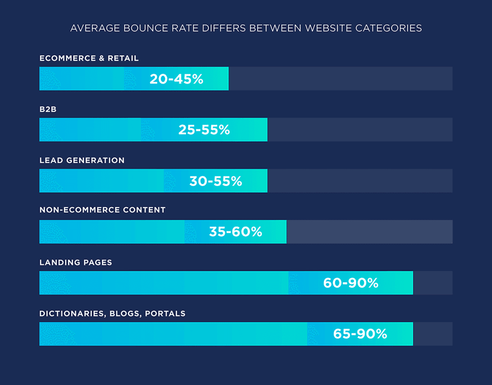
More than half of your prospects won’t make it to your CTA. The key to understanding your bounce rate is context. A high bounce rate combined with strong conversions from the remaining visitors can indicate high-quality traffic. Always pair this metric with others, such as average session duration and conversion rate, for an accurate assessment.
To fix a bad bounce rate, the first step is to improve load times. Compress images, minimize scripts, and use a landing page builder that’s preferably no-code. Every second counts.
Secondly, tighten medium-to-page alignment. Ensure your landing page headline, visuals, and offer mirror your original message down to a tee.
Next, you need to strengthen above-the-fold content. Make your value proposition and CTA instantly visible and benefit-focused. Lastly, add interactive or visual cues. Videos, short animations, or directional design elements can subtly encourage scrolling and exploration.
The steps above can fix common landing page mistakes that lead to failure. But they’re not the only steps to take. Make sure to refine audience targeting by using analytics and filters to focus on visitors with the right intent and demographics.
A well-optimized landing page doesn’t just lower bounce rate. It also increases engagement depth and conversion efficiency across the entire funnel.
3. Average time on page
Average time on page reveals how long visitors stay before leaving. More importantly, it shows how engaged they are with your content. While bounce rate shows whether users stay or go, time on page indicates the quality of their attention once they’ve decided to stay.
A higher average time suggests your messaging resonates, your structure flows logically, and your content keeps users curious enough to read or explore further. On the other hand, users leaving your page quickly can mean your value proposition isn’t clear, your page feels overwhelming, or your design doesn’t guide the eye effectively.
This metric is essential for story-driven or information-heavy pages, where engagement equals persuasion. If users spend enough time reading, they’re far more likely to convert.
As we saw above, benchmarks vary widely depending on your landing page type, purpose, and industry. To make better sense of your landing page’s metrics, you can track your time on page data with various tools like Google Analytics or Hotjar that help you visualize with heatmaps. This will give you a full picture of where users focus and where they drop off.
After measuring the average time on page, it’s time to correct any errors. Here’s how to achieve better results:
- Use narrative flow: Treat your landing page like a mini story with a problem-value-proof-action structure. A clear emotional arc increases reading time naturally.
- Balance visuals and copy: Break text with images, icons, or short explainer videos that reinforce your message. Visual pacing reduces fatigue and improves comprehension.
- Guide readers with design: Contrast, spacing, and elements like arrows that point towards the CTA subtly keep attention moving downward.
Average time on page measures how persuasive and enticing your message is. When users linger, it means your page doesn’t just inform them, it also convinces them.
4. Click-through rate (CTR)
Click-through rate (CTR) measures the percentage of visitors who click your primary CTA button, whether that’s a form submission, a download, or a button that leads to the next step in your funnel. It’s the clearest indicator of how compelling and trustworthy your offer feels when prospects stumble upon it.
A healthy CTR means your value proposition, design, and CTA placement work together seamlessly. A low CTR, on the other hand, usually indicates unclear messaging, a weak visual hierarchy, or friction between the promise and the next action.
You can think of it as a health check. If it’s low, users aren’t yet sold on your offer. However, if the conversion rate is low but the CTR is substantial, your form or follow-up process might be what’s harming your marketing plan.
To boost your CTR, you can go through the following steps:
- Craft stronger CTAs: Use active, benefit-oriented language (“Get my free demo,” “Start building now”) instead of generic verbs (“Submit”).
- Clarify the offer instantly: Visitors should understand what they gain and what happens next before clicking.
- Test CTA placement and frequency: Secondary CTAs above the fold and a primary one at the conclusion often maximize visibility.
- Build trust near the CTA: Add micro-proof like testimonials, security badges, or reassurance copy, like “No credit card required”
When optimized correctly, CTR bridges curiosity and commitment. It’s the moment your landing page stops talking to the user and starts moving with them toward conversion.
5. Form abandonment rate
Form abandonment rate tracks the percentage of visitors who begin filling out a form but leave before submitting it. It’s one of the clearest indicators of friction in your landing page experience, showing where interest turns into hesitation.
This metric points to the most important issues in user experience, trust, or timing. If people click your CTA but don’t complete the form, the offer itself isn’t necessarily the problem. The issue could lie in what happens between intent and action.
High abandonment rates usually signal that users hit resistance. Common causes could include:
- Lengthy or intrusive forms: Every unnecessary field increases cognitive effort, decreases trust, and leads to drop-offs.
- Lack of clarity on data use: When users don’t trust where their information goes, they hesitate to share it.
- Poor mobile optimization: Tiny input boxes or awkward layouts on smaller screens quickly deter completion.
- No immediate value: If the form doesn’t clearly promise a benefit—like a free trial, demo, or exclusive content—users lose motivation halfway through.
- Technical glitches or validation errors: Hidden bugs, broken autofill, or vague error messages lead users to quit.
Understanding where people drop off helps pinpoint the exact moment friction occurs. And, of course, understand how to deal with it.
One step towards reducing that friction could be to ask only for essential information, as each extra field adds friction. If more data is needed, you can collect it progressively. If, for example, you’re creating a SaaS landing page for a demo booking, you can’t use just a name and email address field:

This is Userpilot’s landing page for demo bookings. And since it’s meant to inform and convince, sales will need more data, such as the company’s name or size. That info will help them promote the best solution for their prospect.
On the other hand, if your landing page promotes a specific piece of information, like a pricing page, you can have zero fields. Like this:
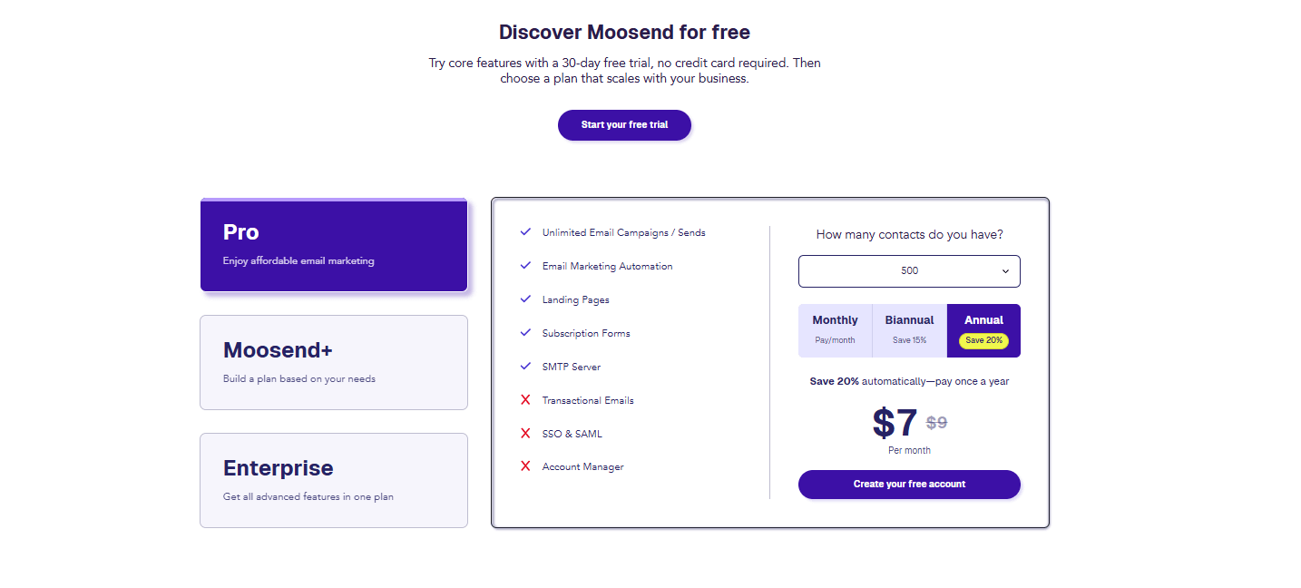
Moosend’s pricing page has no forms because there is no need for them on this type of page.
The second step towards minimizing form abandonment is to enable autofill and smart defaults. This will reduce user effort by leveraging browser data and predictive text. And less effort means less friction, and a smoother experience overall.
Another trick you could implement would be to build instant trust with privacy reassurances (“We’ll never share your info”) and trust badges or security icons near the form. And don’t forget the huge part social proof plays as well.
6. Page load time
Page load time measures how quickly your landing page fully renders and becomes interactive. It’s one of the most important metrics of conversion potential. The best copy, design, and offer can collapse under the weight of slow performance. In other words, if your page doesn’t load quickly, nobody will see it.
Studies consistently show that every additional second of delay can lower conversions:

This study from Portent shows that a page that loads in 1 second has a conversion rate 3 times higher than a site that loads in 5 seconds and 5 times higher than a site that loads in 10 seconds. This places the ideal benchmark at around 3 seconds or less, and ideally between 1.5 and 2.5 seconds.
To monitor speed and vitals, you can use tools like Google PageSpeed Insights, which provide actionable insights on bottlenecks and rendering delays.
But how can you optimize page loading times and ensure nothing goes amiss? Here are some ways to ensure your landing page doesn’t literally fail the test of time:
- Compress and correctly size images and keep all necessary information above the fold.
- Serve static assets from geographically closer servers to cut load times for global visitors.
- Reduce the weight of code you need to use or opt for a no-code landing page builder.
- Limit third-party widgets, popups, and analytics tags that often bloat performance.
- Avoid heavy templates and opt for simple, plug-and-play ones. Simplicity loads faster and converts better.
When it comes to your landing page, loading speed is not to be taken lightly. The faster your landing page loads, the sooner interest piques and action begins.
7. Cost per conversion (CPC)
Cost per conversion (also known as cost per acquisition, or CPA) measures how much you spend to get one user to complete a desired action, such as filling out a lead form, taking a free trial, or making a purchase. It’s one of the clearest indicators of efficiency in your marketing funnel, showing how well your landing page turns marketing budget spend into measurable results.
When paired with metrics like conversion rate and ROI, cost per conversion helps marketers understand not just how well their campaigns perform, but how cost-effectively they do it.
Lastly, measuring CPC reveals opportunities to cut spend from underperforming actions and reallocate budget to better-performing campaigns.
To optimize this metric, instead of comparing absolute values, focus on trend direction. If your CPC drops over time without reducing lead quality, your efficiency is improving.
Here’s how to optimize it over time:
- A/B test landing pages and CTAs: Identify which versions deliver higher conversions for the same spend.
- Refine audience targeting: Exclude unqualified segments and optimize your efforts for high-intent visitors.
- Align ad messaging with landing page content: Consistency reduces confusion and improves click-to-conversion rates.
- Track performance by channel: Compare CPC across platforms to invest more where ROI is highest.
- Reduce friction in the conversion process: Simplify forms and speed up page load times to improve completion rates.
A healthy CPC can help you spend smarter. The goal is to generate conversions at a sustainable, profitable rate while maintaining user quality.
8. Return on investment (ROI)
ROI is the holy grail of your marketing efforts. From email marketing ROI to ad campaign ROI, this metric measures the profitability of your marketing actions and how much revenue they generate compared to what you spent. Unlike CPC, which looks at efficiency, ROI focuses on financial performance and long-term value.
ROI shows whether your landing page is driving actual business growth, not just activity. It connects landing page performance directly to business outcomes and justifies scaling campaigns or increasing budgets based on proven profitability. Lastly, it helps prioritize high-value customer segments that deliver the greatest long-term returns.
Now, how can you optimize ROI for your landing pages and turn them into profitable lead generation and conversion engines?
- Calculate ROI by channel: Track which traffic sources yield the most profitable conversions, not just the most conversions.
- Improve conversion quality: Focus on qualified leads rather than volume.
- Enhance post-click experience: Personalized content, email marketing follow-ups, fast load times, and seamless forms improve both conversions and customer satisfaction.
- Consider lifetime value: Measure ROI over the full customer journey to identify channels that contribute long-term profit.
ROI is the ultimate validation of marketing success. A landing page that converts well is good, but one that delivers measurable financial growth is what can truly help you scale your business.
Now that you know which metrics define landing page success, it’s time to see how to measure them.
How to Track Your Landing Page Metrics (+Tools)
Besides implementing various landing page trends to ensure quality, you can use tools to track your landing page metrics and explore a wide variety of methodologies.
The first tool in your toolbox should be Google Analytics (GA4), which remains the backbone of web analytics and offers a comprehensive overview of your landing page performance. It tracks data such as page views, bounce rate, average engagement time, and sessions by source, giving you clarity on who’s visiting, how they arrived, and what actions they take.
To get the most out of GA:
- Set up conversion events for button clicks, form submissions, or downloads.
- Use UTM parameters to track the performance of campaigns leading to your landing page.
- Segment visitors by source/medium to identify your most valuable traffic channels.
You can combine GA with your email platform to see the full customer journey, from email opens to landing page engagement and conversions.
For example, let’s see what happens when setting up a landing page in Moosend’s platform. You can track it by toggling the “Track with Google Analytics” button on the “Track your conversions” section of the creation process:
![]()
In addition to the Analytics option, you can also use Facebook Pixel if you share your landing page on social media.
Another tool that can help you track and analyze how your email campaigns send recipients to your landing page is Moosend’s built-in Analytics Dashboard.
Moosend’s analytics suite provides marketers with a unified view of performance across both landing pages and campaigns. You can access key landing page metrics like visitors, views, conversions, and conversion percentage. You can also sort and tag landing pages with status and labels. Here’s an example:

This landing page was visited by 146 people. It had 205 views and 89 conversions, for a 61% conversion rate. Its status is published, indicating it’s still up and running. If we press the “+” button, here’s the pop-up that will appear:
This allows users to add labels and categorize their landing pages by audience, action, location, etc. Down the line, this allows users to categorize their landing pages and filter and sort through them effortlessly.
Now, while analytics give you the “what,” behavioral tools reveal the “why.” Tools like Microsoft’s Clarity let you visualize user interactions through heatmaps, scroll tracking, and session recordings. These insights highlight how visitors move through your landing page, which buttons they click, how far they scroll, and where they lose interest.
Lastly, tools like Unbounce allow you to run experiments on page elements. Integrating these results with Moosend’s analytics helps you refine both ends of your conversion funnel.
Of course, apart from the tools, there is the methodology of setting up metric tracking. Here’s what to keep in mind:
- Add tracking codes (GA4, Moosend tag, or Clarity script) to capture performance data.
- Define goals for each page, such as signups, downloads, or purchases.
- Distinguish between one-off campaign pages (like waitlist landing pages or promotional offer landing pages) and ongoing website pages (such as pricing pages) to get more accurate insights.
How to Improve Your Landing Page Performance
Tracking your landing page metrics is only half the equation. The real magic happens when you turn insights into action. Once your data reveals what’s working (and what isn’t), it’s time to test, refine, and optimize.
Identify friction points
Start by isolating the metrics that signal friction. A high bounce rate may indicate poor first impressions or irrelevant targeting. A low CTR could mean your CTA isn’t visible, precise, or persuasive enough.
A short average time on page might point to weak storytelling or a disjointed offer. Use your analytics to pinpoint where users drop off, what they interact with, and how they move through the page.
Optimize copy, layout, and CTA
Once you identify weak spots, experiment with targeted changes, starting with your copy. Adjust headlines or value propositions for clarity and urgency. Simplify your phrasing, lose complex words, and make it short and value-driven.

As evident by Unbounce’s conversion benchmark report, copy can make or break your landing page’s conversions.
The same can happen to your layout. Simplify the visual hierarchy and ensure your design flows naturally from your landing page’s heading to your CTA. Also, never forget about mobile responsiveness:
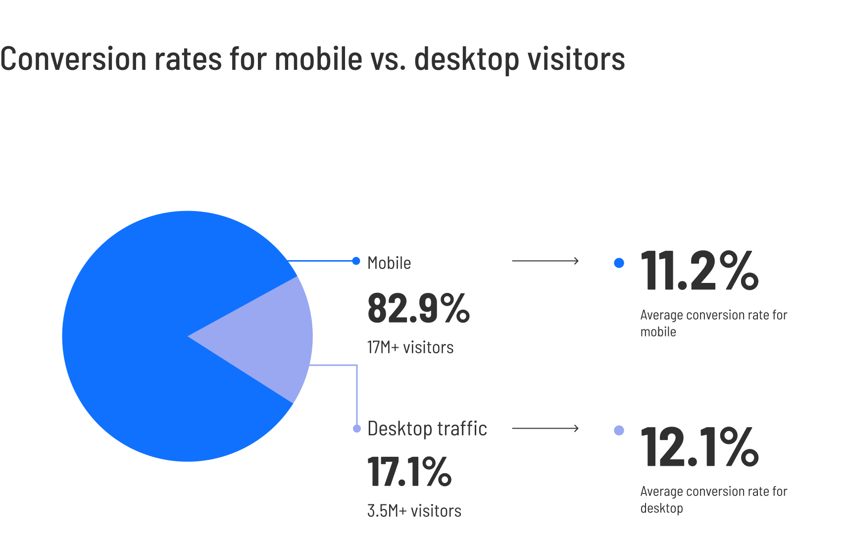
The same study reveals that desktop converts better, but mobile drives more traffic. Take into account that the difference is less than 1%, and you’ll understand how a non-responsive landing page can break your conversions.
Another thing to keep in mind is CTA placement. Move your main CTA button above the fold or duplicate it across sections for better visibility.
Experiment and retarget
Since a landing page can be a place to experiment with creative or unconventional ideas to grab attention, especially if your product or audience responds well to bold moves.
For example, try adding unexpected microcopy, interactive visuals, or time-limited offers inspired by guerrilla marketing tactics. These strategies can reignite engagement when your page feels “stuck” in familiar patterns.
Also, don’t forget to test different CTAs and subject lines in your email campaigns and apply those learnings to your landing page. This will help you maintain consistency across the user journey.
Keep testing
Optimization isn’t a one-time process. After every test, measure results against your benchmarks. Did the bounce rate drop? Did conversions rise? Feed those findings back into your workflow and continue testing. Even minor adjustments (such as a headline change or reduced-form fields) can yield compounding improvements over time.
Focus on one or two metrics at a time. Trying to improve everything at once muddies your data. Target a single issue (e.g., low conversions) and isolate the variables that most affect it.
Always A/B test one variable. To ensure clean results, change one variable at a time in each experiment. For example, the CTA wording, not the CTA and the form simultaneously.
Use automation to win back non-converters. For example, if your landing page aimed to promote your new webinar, you can retarget attendees by setting up a workflow that sends follow-up emails, offers a freebie like the webinar’s recording, and personalized incentives based on the data they provided upon signup. This will nurture attendees and create a more personal relationship between you and your brand.
You can also segment audiences by engagement level for smarter remarketing. For example, if someone visited your pricing page but didn’t sign up, create a workflow that triggers an automated email with a “Need help choosing a plan?” message or a limited-time discount. This can turn a missed conversion into a second chance.
Common Landing Page Metric Mistakes To Avoid
Tracking landing page performance is essential. But interpreting the numbers correctly is where real optimization happens. Here are some common pitfalls to avoid to keep your data meaningful and actionable:
- Chasing vanity metrics: High impressions, long scroll depth, or big traffic spikes might feel encouraging, but they don’t guarantee engagement that makes a difference or the conversion rate you want. Prioritize metrics tied to actual outcomes rather than noise.
- Treating industry benchmarks as universal truths: Benchmarks provide direction, not rules. Your audience, offer, and channel mix are unique. Therefore, a “below average” conversion rate might still be healthy for your niche. Use benchmarks as context, not commandments.
- Skipping context behind the numbers: A dip in conversions may have nothing to do with the landing page itself. Seasonality, changes in traffic sources, or an audience mismatch can all impact results. Always pair your metrics with situational context to avoid misdiagnosing the problem.
- Running A/B tests without hypotheses: Making random changes (e.g., a new headline, a different button color, or a shorter form) without a clear hypothesis leads to scattered results. Let data guide what you test and document why you’re making a change, not just what you’re changing.
- Customizing templates but forgetting your branding: Templates are great starting points, but failing to infuse them with your brand’s visuals, tone, and messaging can make your page feel generic. Weak branding confuses users and erodes trust, ultimately affecting conversions.
- Treating all landing pages the same: A page designed for lead generation doesn’t work the same way as one meant for webinar registrations, product trials, or content downloads. Each page type has a unique user intent. Adapt your structure, messaging, and success metrics accordingly.
By avoiding these common traps, you keep your analysis grounded, your optimizations intentional, and your landing pages aligned with what your audience actually needs.
Turning Metrics into Actions
Rome wasn’t built in a day, and the best-performing landing pages aren’t built overnight. They’re built through observation, iteration, and intent. Every data point tells a story about your audience: what attracts them, what confuses them, and what ultimately convinces them to take action.
When you connect those stories, you’re optimizing your landing pages. Each minor adjustment moves you closer to a landing page that truly works for your business and your audience. Data is the map. Insight is the compass. And with the right tools, you’re always one step ahead.
FAQs
Here are some frequently asked questions about landing page metrics and how to track them.
1. What are the most important landing page metrics to track?
The key metrics include bounce rate, conversion rate, average time on page, click-through rate (CTR), form abandonment rate, and page load time. These collectively show how engaging and effective your landing page is at converting visitors.
2. How do I know if my landing page metrics are “good?”
Benchmarks vary by industry. Therefore, you shouldn’t rely on benchmarks alone, but see what performs for your niche and your audience, both in terms of absolute numbers and quality of leads. Always compare results within your niche, not against universal averages.
3. Why is my landing page bounce rate so high?
A high bounce rate often signals slow load time, unclear messaging, or irrelevant traffic sources. Optimize your above-the-fold content, improve page speed, and ensure your ad or email targeting matches the page’s intent.
4. How do I connect my landing page performance with ROI?
Track how many conversions come from each campaign. After that, divide total spend by conversions to find your cost per conversion, then compare revenue against cost to calculate ROI.
5. What’s the difference between CTR and conversion rate?
CTR measures how many users click your CTA button, while conversion rate measures how many complete the intended action. High CTR but low conversion often means your CTA is appealing, but the post-click experience needs work.
What makes a holiday campaign truly stand out? This question troubles many marketers during the busy holiday seasons. Inboxes get so crowded with special offers and season’s greetings that grabbing your subscribers’ attention feels like solving a riddle.
In this guide, we’ll share compelling holiday email examples from notable brands that have found a great formula to boost their holiday email performance. Learn why they’re unique and find professionally-designed, pre-made templates to craft your own email marketing campaigns.
Why You Should Include Holiday Emails In Your Strategy
People spend more during holidays. According to the NRF, per-person holiday season spending in 2025 is expected to reach $890. Considering that email has a significant ROI, with a return of $36 for every dollar spent, leaving this channel out of your strategy would be a heavy loss.
Let’s explore the main benefits of holiday email campaigns:
- Boost brand awareness: The popularity of these emails lets you show your contacts what your brand is made of, by sharing everything from relevant gift recommendations to warm wishes.
- Increase customer loyalty: Sending meaningful and relevant emails to customers can strengthen your relationships during periods when people are most likely to connect with their favorite brands.
- Grow seasonal sales: Product recommendations, holiday gift guides, and unique deals, especially when they’re personalized, can increase your sales during high shopping seasons.
- Drive traffic to your website: Holiday email content that leads users to your website and product pages boosts your sales and familiarizes them with your brand and products.
Ready to load your email marketing calendar with holiday emails to reap these benefits?
Top Holiday Email Examples and Why They Stand Out
Dive into these email examples from popular holidays throughout the year to optimize your holiday email marketing strategy. Learn why they work and replicate some of these ideas:
1. New Year’s Day emails
New Year’s emails show customers and contacts that you wish to interact with them on this meaningful date. Sending “Happy New Year” wishes, sharing resolutions, or promoting your best products can help you connect more deeply with your customers and set the stage for a great year ahead.
Here’s a great email example from OLIPOP showcasing some of their last year’s milestones:
Subject line: Our LAST Email EVER*

Why it works:
- The attention-grabbing New Year subject line stands out from similar campaigns, boosting open rates.
- They expressed their appreciation for their customers’ support and listed three impressive milestones they hit last year.
- Even though it’s not a salesy email, they added a call-to-action leading to their website in case someone wanted to stock up for next year.
Ready to craft your own New Year’s email? This festive template is all you need to send your subscribers your warmest wishes:
Pro tip: Focus on reflection rather than aggressive sales. Express your sincere gratitude and use a soft call-to-action to encourage engagement, not instant sales.
2. Valentine’s Day newsletters
We all know the importance of February 14, both for consumers and marketers. To join this love quest, give customers gift ideas for their loved ones or promote relevant Valentine’s Day marketing initiatives (e.g., BOGO offers, self-care recommendations).
It’s best to send those campaigns at the end of January or the beginning of February to ensure gifts can be ordered and delivered on time, especially for eCommerce. Or send last-minute emails with gift cards to subscribers who haven’t purchased yet.
This is an amazing V-Day email example from Clinique:
Subject line: Our top Valentine’s Gifts 💝 Share the love

Why it works:
- The best-selling products at the top, combined with a captivating image, grab subscribers’ attention at a glance.
- The customer testimonials next to the product recommendations build credibility and trust.
- The “picked these for you” section adds a personal touch to this campaign.
Celebrate the season of love with this lovable yet straightforward design that can clearly demonstrate your products:

Relevant resources:
- Top Valentine’s Statistics & Facts For Marketers
- Valentine’s Day Email Subject Lines Customers Love
- Unconventional Valentine’s Email Campaigns
- February Email Planner
3. International Women’s Day campaigns
On March 8, we celebrate International Women’s Day. Many brands seize the opportunity to honor their female customers by sharing limited-time sales, motivational messages, or product recommendations. You should join them, especially if your products or services are made for them.
Check out this amazing Women’s Day example from Everlane:
Subject line: It’s International Women’s Day

Why it works:
- They showcased and honored powerful women from their team to celebrate this special day.
- They found a clever way to promote their clothes without sounding salesy by placing “Shop her look” CTA buttons.
- The shared quotes are inspiring, covering various facets of female strengths and opinions.
Similarly, you can use this pre-made eCommerce newsletter to delight women on this special day:
4. Easter email newsletters
The average Easter spending was expected to reach $23.6B in 2025. Leverage this trend by targeting your audience with holiday-themed emails. This is especially relevant for eCommerce, retailers, and food and beverage businesses offering Easter products or services.
Here’s an amazing Easter email campaign from Little Sleepies based on this holiday theme:
Subject line: JUST HATCHED: The Cutest Easter Jammies 🐰💜

Why it works:
- The Easter-themed subject line uses clever wordplay to instantly grab readers’ attention.
- The product images at the top spread the holiday cheer and are likely to bring customers to checkout.
- User-generated content serves as social proof, inviting users to join the community.
Combine this template with an Easter-themed subject line to boost your holiday sales:

Pro tip: Leverage the playful nature of Easter by incorporating pastel colors, bunny imagery, and engaging seasonal humor into your designs to capture attention.
5. Pride Month emails
June is the official Pride Month. Many brands support the LGBTQIA+ community by sending dedicated email campaigns with ally messages or showcasing products perfect for the community.
Before sending this campaign, ensure your initiative is proactive and not performative. Stand up for this cause throughout the year, not just in June. If you cross that line, your initiative will backfire.
Here’s how Happy Socks delivered their own Pride marketing message:
Subject line: Don’t Miss Pride Month!

Why it works:
- The subject line instills urgency and FOMO to boost open rates.
- The colorful design elements and product images immediately highlight the Pride theme.
- The discount block at the bottom rewards engaged users with an offer.
Here’s a colorful Pride Month template to design your own campaign:

6. Labor Day emails
The first Monday of September marks Labor Day, as celebrated in the US and Canada. It’s the perfect opportunity for your brand to honor the dedication and hard work of the labor force. Connect with your audience in these regions, and share specific deals.
For example, Freaks of Nature delivered a Labor Day email to prepare their contacts for their holiday getaway:
Subject line: Labor Day Plans? Don’t Forget This

Why it works:
- The subject line reflects the email’s purpose and induces FOMO.
- The call-to-action button and copy are very effective.
- Social proof, in the form of testimonials and best-selling info, boosts sales.
Red and blue are a popular color combination for this holiday, making this template a great fit:

Pro tip: Use Labor Day to promote quick getaways, end-of-season clearance, or final outdoor gear deals focusing entirely on autumn/winter products.
7. Halloween emails
Halloween kicks off the popular year-end holiday shopping season. In 2025, the average spend per person is expected to reach $114.45, so if you offer related products, don’t miss this opportunity. Plus, this holiday leaves plenty of room for creativity for all brands interested in engaging their audience in a unique, spooky way.
Here’s a great Halloween email example from NOOCI:
Subject line: 🎃 30% OFF: Sustained energy > sugar rush

Why it works:
- The Halloween-themed design and wordplay entice readers to keep reading.
- The social proof leverages the importance of trust to boost seasonal sales.
- The emoji and discount code in the subject line are perfectly delivered to increase open rates.
Customize this creepy-looking template to spook your audience during Halloween. You can also use your own images to create a simpler version:
Relevant resources:
8. International Men’s Day email campaigns
After celebrating women earlier in the year, let’s not forget about the great men in our lives. On November 19, we honor their positive value by showing them our love and appreciation.
This email campaign from Funky Buddha is the perfect example:
Subject line: 🎉Happy International Men’s Day with a gift for you!
Why it works:
- The subject line gets readers straight to the topic, making it easy to open.
- The flash sale and countdown timer create a sense of urgency for subscribers.
- The special offer information is clearly stated to avoid confusing readers.
Customize this template and deliver a great campaign for Men’s Day, perfect for eCommerce:

Pro tip: Ensure your email messaging is sensitive and aligns with the appreciative spirit of each international day.
9. Thanksgiving emails
Thanksgiving occurs on the fourth Thursday of November. It’s the perfect opportunity to express your gratitude to your customers for their trust and support. Send heartfelt messages and consider combining them with special offers or gifts for their loved ones.
Athletic Brewing stayed loyal to the holiday theme by using orange for the design.
Subject line: Brew Up Some Thanksgiving Cheer – Shop Now!🍻🍗

Why it works:
- The subject line is holiday-relevant, with a turkey emoji and a “Shop now” invitation to hint at the email content.
- The copy informs readers what they can offer for Thanksgiving Day and directs them to their website.
- They offered extra incentives for exclusive members and displayed them as icons to invite more people to their loyal community.
This template is perfect for this holiday. Write your own gratitude message to warm readers’ hearts:
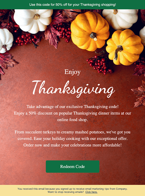
Relevant resources:
- Best Thanksgiving Email Examples With Tips
- Best Thanksgiving Email Subject Lines To Convert
- Free Thanksgiving Newsletter Templates
10. Black Friday campaigns
And now off to one of the biggest holiday players of the year, Black Friday. Black Friday emails cannot be missing from your holiday email calendar, according to the attention they demand. Considering how hectic inboxes are around this holiday, it’s wise to follow common email marketing tactics, such as A/B testing, to increase performance.
Here’s a special Black Friday email from Brooklinen. They chose to stick to their brand design and focus on displaying some of the discounted products:
Subject line: It’s Go Time. Black Friday Starts Now!

Why it works:
- They gave their contacts more time to grab their deals and increase their seasonal sales.
- The “Shop the deals” CTA button stands out from the rest of the text to boost click-through rates.
- The referral program is cleverly embedded in this email campaign to benefit from the traffic it’ll generate.
This elegant, minimalist Black Friday template is the perfect design to display your offers. Combine it with a countdown timer to drive more sales.
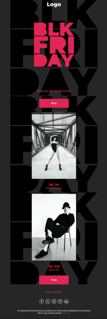
Relevant resources:
- Essential Black Friday Statistics You Need To Know
- Post-Black Friday Email Campaigns: Examples & Tips
- Black Friday Email Subject Lines & Tips
11. Cyber Monday emails
Cyber Monday immediately follows Black Friday, letting online businesses extend their discounts and further boost their earnings.
Check out this amazing Cyber Monday email from Cometeer, which introduced a clever concept: Cyber Mugday.
Subject line: It’s Cyber MUGDAY! Free mugs with every box 🚀

Why it works:
- They shared how much customers will save by buying this deal.
- The option to choose a gift based on the purchased product makes this offer more engaging.
- The mug descriptions help prospects determine which product is suitable for them.
Want to build a vibrant Cyber Monday email campaign? This template’s just for you:

Relevant resources:
12. Christmas emails
Christmas is one of the most popular shopping seasons worldwide. It’s the best time to deliver festive emails to your contacts with gift recommendations, unique offers, and holiday greetings. Red and gold with Christmas-themed elements prevail, but you can keep these emails in a minimalist tone if a festive style doesn’t fit your brand naturally.
To make your message more targeted and resonant with your audience, use personalization tactics, such as custom fields and segmentation. For instance, add subscriber details (name, location, or interests) through custom fields, and group your audience by behaviors (e.g., past purchases, engagement level, or browsing activity) so each email feels more relevant.
This Christmas email example from Momofuku is ideal:
Subject line: Find the Perfect Gift for Your Favorite Food Lover

Why it works:
- They blended Christmas design elements with their own brand tone organically to delight readers while maintaining a consistent experience.
- The product recommendations and descriptions help prospects find the perfect gift for their loved ones, as noted in the subject line.
- They combined the call-to-action with the rest of the copy to make it more engaging.
‘Tis the season! Tailor this lovely email template with your brand assets to spread the holiday cheer:
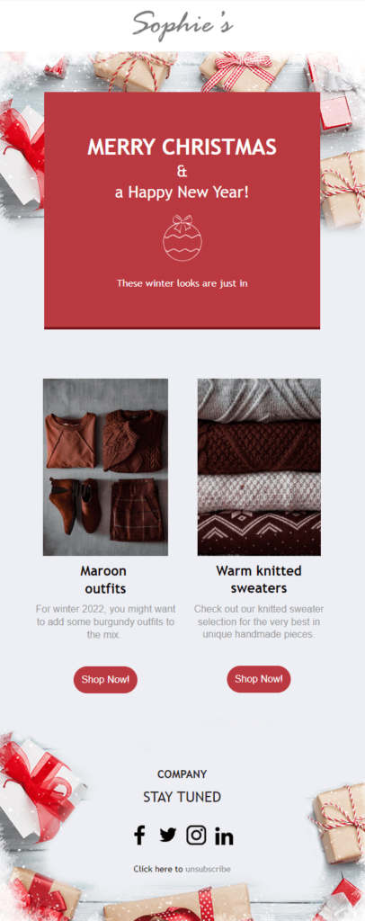
Relevant resources:
- Christmas Marketing Ideas To Revive The Holiday Spirit
- Christmas Email Subject Lines To Use
- Christmas Marketing Stats To Know
Holiday Email Campaigns: Dos’ and Don’ts
Ready to create holiday emails your audience will find hard to skip? Learn some best practices and what to avoid to meet your holiday marketing goals:
The dos
- Craft attractive subject lines: Experiment with personalization, festive emojis, and a focus on exclusivity or urgency to find the best combo for your audience. You can use an AI writer to help you out.
- Personalize your emails: Segment your list by factors like location or engagement level, and use dynamic content for product suggestions.
- Showcase your unique selling point: Share the value prospects will get by purchasing your products, including free shipping, easy returns, and more.
- Use real urgency and scarcity: Highlight sales deadlines, shipping cutoffs, and limited stock notifications. Consider using a countdown timer for flash sales and last calls.
- Set up automation workflows: Set holiday email sequences in advance, from teasers to last-call emails, using email automation software like Moosend or Constant Contact.
- Track important metrics: Beyond sales, monitor your open and click-through rates, bounce rates, and spam complaints to improve your future strategy.
The don’ts
- Don’t spam your subscribers: If you plan to increase your email frequency during holidays, ensure your email volume doesn’t hurt your deliverability and sender’s reputation.
- Don’t use misleading subject lines: Fake scarcity and exclusivity, or false information, will confuse or, worse, repel subscribers.
- Don’t contain large images: Large files can be blocked from spam filters or fail to load. Always add a plain-text version to secure a good user experience.
- Don’t ignore unsubscribes: Add an unsubscribe link and share your preference center to respect readers who want to opt out.
- Don’t send bulk emails: Irrelevant holiday offers and content can lead to lower engagement and conversions.
- Don’t be over-salesy: Mix holiday wishes with sales emails to show gratitude to subscribers regardless of items in their carts.
Build Your Next Holiday Email
Hopefully, you now have all the inspiration needed to deliver compelling holiday emails. Start planning your calendar early on to avoid last-minute crises. And remember, teamwork makes the dream work. This also applies to the software you onboard in the process, including your CRM and email marketing service.
We wish you and your customers a happy holiday season, all year long!
FAQs
Here are some frequently asked questions regarding holiday emails:
1. When should I start sending holiday emails?
For the year-end holiday season, start sending in late October/early November to cater to consumers who prefer to purchase holiday gifts early.
2. What makes a great holiday email?
A great holiday email includes festive content, relevant product recommendations for each holiday, and a compelling subject line that drives high open rates.
3. How do I segment my email list for the holiday season?
First, analyze past performance to spot important distinct criteria, such as engagement or product preferences. Then, create targeted holiday content for each segment.
If email marketing were a movie, email spam filters would be the villain. At least, that’s what many guides suggest. But are spam filters really the bad guys? Or helpful tools that show you how to become a better email marketer?
We’re standing for the second case. Spam filters are there for a reason: to protect users from low-quality, suspicious, or unsolicited messages.
From a marketer’s perspective, they set boundaries that help you create relevant, trustworthy, and authentic content for your audience.
So, this isn’t a post on how marketers (or potential spammers) can outsmart these systems. Instead, we’ll look at how they work.
We’ll also focus on how real senders can comply with best email practices and anti-spam requirements by investing in clarity, relevancy, and transparency.
Win your subscribers’ hearts
Ensure inbox placement with Moosend’s deliverability features
Start freeHow Email Spam Filters Work
In short, spam filters analyze each message that tries to reach the inbox. The legitimate ones get through, whereas unwanted emails like phishing attempts end up in spam or are rejected.
Email service providers, such as Gmail, Outlook, and Yahoo, use spam-filtering technology to keep malicious emails out of recipients’ inboxes. They rely on multiple signals to decide whether to deliver or block a message.
Here are the most common types of spam filters for email:
- Content filtering: These filters analyze everything within the email to determine whether it’s legitimate. These include spelling errors, spam trigger words, text-to-image ratio, links, and layout.
- Rule-based filtering: Inbox providers or users set predefined rules, like blocking certain keywords, senders, or attachments, to allow email delivery. If an email matches any of these, spam filters don’t let it through.
- Blocklist filtering: Before delivering a message, providers check the sender’s reputation against a known blacklist. If the sender has been flagged as spam in the past, email clients will block any messages from them.
- Engagement signals: ESPs track how subscribers interact with a brand’s emails, including both positive and negative signals. For example, a negative action may be an unsubscribe or spam complaint. On the contrary, a subscriber opening or moving an email from spam to the inbox is an indicator of trust and interest.
- Authentication protocols: Authentication filters check whether the sender’s domain is verified using authentication systems like SPF, DKIM, and DMARC. If these protocols aren’t properly configured, the campaign will likely land in spam.
- Language and country filtering: When subscribers receive an email written in a foreign language (and this doesn’t match their preferences), these filters may move it to spam. The same goes if recipients want to filter messages from certain countries.
Keep in mind that inbox providers won’t rely on just one method. Instead, they combine several filtering systems to detect and block threats.
Also, there’s no way of knowing the specifics of each spam filter. Because if we did, it would allow spammers to adjust and bypass their rules in no time.
So, the key isn’t to trick spam filters for email. Rather than that, you must focus on creating emails that align with your subscribers’ preferences and ISPs’ standards.
Spam Filter Best Practices to Get Emails into Inboxes
Sometimes, email spam filters will send even trustworthy emails to spam folders. But it’s also true that the more your subscribers engage with your campaigns, the more servers trust you as a sender.
Therefore, instead of working against or around spam filtering, you should learn from their rules and avoid any tactic that triggers them or annoys your audience.
1. Invest in a trustworthy email platform
Everything starts with your sending infrastructure. A reliable solution comes first because it directly affects your email deliverability and sender reputation. That’s why you need to review the features of any email software before committing.
This is what to look for:
- High deliverability: Read user reviews and visit tool testing platforms to check how each solution scores in terms of deliverability. Also, check if there are deliverability experts who may guide you if needed.
- IP and domain management: Email platforms should provide a pool of trustworthy IP addresses that you can use to send emails. Make sure they have options for dedicated IPs when required, for example, for time-sensitive campaigns.
- Email authentication protocols: Look for a tool that helps you configure SPF, DKIM, and DMARC authentication, offering records, built-in setup, and helpful resources.
- List building and hygiene: Ensure GDPR-compliance when adding subscribers to your list with processes like double opt-in and easy unsubscribe. The software should also handle spam complaints and bounces so your list stays clean.
- Performance reporting: It’s important to have access to detailed email analytics to keep track of inbox placement and engagement. These give you a clear picture of your campaign performance, helping you identify bottlenecks and optimize.
- Compliance and certifications: To ensure inbox placement, use an email tool that complies with regulations like GDPR and the CAN-SPAM Act. Also, certifications such as CSA and M3AAWG verify that senders meet technical standards for inbox placement.
- Spam testing: Some platforms allow you to run spam checks before sending. Spam testing warns you if your email content is likely to trigger spam filters, catching errors before they become deliverability issues.
2. Authenticate your domain
Security checkpoints in airports verify who you are and that you’re there just to travel. Similarly, email clients use authentication protocols to confirm that an email comes from a legitimate sender.
With email authentication, you prevent cybercriminals from using your domain and reaching users. That way, you keep your sender reputation intact, subscribers are protected against scams, and your emails fulfill their purpose.
Let’s take a look at the main email authentication protocols:
- Sender Policy Framework (SPF): SPF tells filtering systems which IPs are authorized to send emails from your domain. Adding an SPF record to your domain’s DNS helps mail servers confirm that your brand owns that domain and can deliver emails from it.
- DomainKeys Identified Mail (DKIM): This method adds a digital signature to the email header, associating the message with a specific sender. Email providers check the signature before delivering emails to verify the sender and protect users from spam.
- Domain-based Message Authentication, Reporting, and Conformance (DMARC): DMARC adds an extra layer of security by setting policies for handling emails that fail SPF and DKIM checks, allowing servers to block fraudulent messages.
Each platform has a unique process for email authentication. For instance, Moosend users can set up these records directly through their account settings:
As mentioned, though, your email solution shouldn’t just require authentication, but also offer help. So, make sure to browse their Help Center documentation to ensure proper configuration.
No matter which software you use, you can use free tools to check your DMARC authentication records in a few seconds.
3. Send to people who’ve given you consent
What’s a surefire way to trigger a spam complaint? Emailing people who haven’t given you consent. Buying contacts might sound like a quick growth hack, but it only brings distrust and a damaged sender reputation.
Your brand could even end up on a blocklist, as most of them flag IPs involved in unsolicited messaging. Besides that, purchased lists often contain spam traps, which, once hit, may get your domain blacklisted.
Instead, invest in growing your list organically. Organic lists are more engaged because people who give you permission to contact them want to see what you offer. So, they’ll be eager to open, read, and act on your emails.
Plus, organic lists offer clearer performance insights. When all you have are contacts you bought, you can’t know if your content is the reason for low engagement.
But if opt-in subscribers don’t open your emails, your safest bet is to improve your subject lines, not question the list quality.
Now, how can you grow your list organically? Here are some effective strategies:
- Include visible yet not intrusive newsletter signup forms on your website.
- Ask for people’s email addresses in return for giveaway and contest entries.
- Incorporate “Sign Up” buttons into your social media pages.
- Capture email addresses through a webinar registration form.
- Collect email addresses offline, e.g., at industry conferences or your physical stores.
- Offer downloadable resources that people get for free by sharing their email address.
In this event registration form, LearnWorlds keeps things simple by asking for the essentials: the visitor’s full name and email address. The copy is clear and short focusing on the event’s takeaways and the outcomes expected when using their latest features.
4. Make your opt-in confirmation email count
Let’s start by stating the obvious: a double opt-in process is a must-have for clean, high-quality lists. With it, people confirm their registration by clicking on a link in a dedicated email.
Passing through this step shows genuine interest on their part. So, if your emails meet audience expectations and needs, you’ll get interactions and show mailbox providers that your emails are relevant.
You might think it’s a typical email, but it doesn’t have to be plain. Minimalistic and straightforward is the way to go with signup confirmation emails.
Also, they can serve more purposes than this one, such as increasing brand awareness or amplifying your reach.
Let’s see some examples of what you can do with them:
- Remind people of the perks of being a subscriber
- Let them know what’s coming next
- Inform them about the email frequency
- Include a short mission statement to help them understand what your brand stands for
- Share contact information or links to customer support and FAQs so they can reach out in case of questions or issues
- Add links to recent and popular blog posts
- Invite subscribers to join your social media channels
Whatever you choose, make sure it doesn’t distract them from the main campaign objective, which is to confirm their email address. Keep any additional information or action subtle, ensuring it’s the supporting actor, not the email protagonist.
Nomadic Matt’s subscription confirmation email centers on a clear, prominent CTA. A few short phrases are enough to set expectations and open the door to a two-way conversation without overwhelming the reader.
Subject line: Please confirm your email!
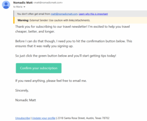
5. Segment your audience to send personalized emails
Opens, clicks, forwards, and conversions tell email clients that your audience cares about your campaigns.
To get this kind of engagement, you need to deliver relevant and valuable content that resonates with each subscriber’s interests and behavior.
The thing is that one out of four SMBs struggle with sending the right messages to their customers. That’s because not every subscriber has the same needs or preferences, so one-size-fits all emails rarely resonate.
List segmentation is the missing piece of the puzzle, helping marketers match each message to the right recipient.
With it, you build small audience groups using different rules, like demographics, likes, psychographics, patterns, etc. There’s no limit to the data points you can combine to create hyper-personalized email campaigns.
Let’s explore Asana’s website, where users can download a free social media calendar template after filling in their role, job function, and intended use.
If the visitor selects individual contributor, project management, and content calendar, how can the brand use that data to create segmented campaigns?
They could follow up with targeted emails featuring step-by-step content calendar guides, premade project tracking templates, and collaboration tips.
This approach helps Asana start the relationship on the right foot, adding value and solving pain points with tailored, practical resources. The result? Increased satisfaction. And satisfied subscribers don’t hit “unsubscribe” or “mark as spam.”
6. Keep your email list healthy
We talked about how to grow your subscriber base the right way. It doesn’t end there, though. A high-quality list is like a tree in need of regular pruning to stay healthy. By taking away what no longer serves the tree, you leave room for the healthy parts to flourish.
Just like unproductive branches weigh down a tree, disengaged subscribers who ignore or delete your emails may damage your sender reputation and affect your relationship with active subscribers.
And as this builds up, email clients start filtering your campaigns out of those inboxes. Here’s where email list cleaning works like pruning, preventing the decay from spreading to healthy branches.
Let’s see what you should do to keep your list clean and growing:
- Use email verification tools to ensure all email addresses on your list are valid.
- Set a list-cleaning schedule (like quarterly or biannually) and stick to it.
- Decide on what counts as an inactive subscriber and create a dedicated segment.
- Monitor email analytics regularly to identify disengaged recipients.
- Leverage email automation to send a re-engagement email campaign after a certain period of inactivity.
- Add a compelling incentive to win dormant subscribers back using insights like their browsing or buying history.
- Ask inactive contacts if they prefer to unsubscribe or update their email preferences.
- Make it easy for them to unsubscribe and respect their choice.
- Remove inactive recipients from your database in case they take no action.
7. Write informative and clear subject lines
A great subject line offers context, so recipients know what your email is about. But it’s not just about email open rates. Vague, deceptive, or salesy subject lines are a threat to your overall email strategy.
Under email laws such as the CAN-SPAM Act, marketers aren’t allowed to use subject lines that don’t reflect the email content. Those who don’t comply may face consequences, including penalties.
On top of that, mailbox services filter your email’s subject, looking for spam trigger words, phrases, or tactics. If it seems suspicious, they’ll send your campaign to spam, and so will your subscribers if something feels off.
Wondering what a spammy or deceptive subject line looks like? Let’s find out:
- Writing in all caps or adding excessive punctuation, especially exclamation marks
- Using spammy phrasing, such as “cheap,” “buy now,” “no fees,” etc.
- Misleading subscribers with false promises or anything irrelevant to the campaign goal
- Making your subject line more than 50 characters long
- Neglecting personalization, for example, not including the recipient’s name or an action they took
- Sounding pushy without conveying value
- Using jargon and confusing language that your recipients can’t relate to
- Not performing A/B tests to see which tactics drive engagement
Still unsure whether your subject line will make it past spam filters? No worries, just pick a subject line tester and check how your subject lines perform.
Some of these tools compare them across industry averages or offer optimization suggestions, too. The best part? You can use most of them without creating an account.
Chewy’s browse abandonment email uses the recipient’s history to target them with a relevant promotion.
The subject line communicates the email objective, reminding subscribers of their action and prompting them to order. Simple, short, personalized, and informative, just like the email itself.
Subject line: Your browsed items are order-ready
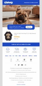
Other Common Pitfalls to Avoid
Besides following these email tactics, you also need to avoid certain mistakes that may damage your relationship with ESPs and your audience. Let’s see the checklist:
- Warm up your IP: When you have a new IP address, you can’t just send bulk emails from day one, since email clients will treat it as a red flag. Instead, start small and gradually increase the email volume over time, giving ESPs the time to trust you.
- Keep a consistent sending schedule: Regular, consistent email sends help you maintain a positive sender reputation. On the flip side, delivering emails too often or too rarely, or changing your email frequency too frequently, may affect your deliverability.
- Consider text-to-image ratio: Adding too many images to an email or sending all-image emails are tactics associated with spammers and may raise red flags with spam filters. So, keep a balance between text and images, aiming for a 60:40 ratio.
- Sound confident: Remove words or phrases that sound pushy or desperate. Opt for clear and persuasive language that explains what’s in it for your audience instead of tricking them into acting, just like a spammer would do.
- Keep formatting clean: Structure your email content for readability, using white space, short paragraphs, clear headings, and scannable sections.
- Use links wisely: Links are usually essential to direct subscribers to your website or a dedicated landing page. Having too many of them, though, looks spammy. Stick to a few URLs that align with your email purpose. Also, always check for broken links since they hurt the email experience.
- Send from a reply-to address: With a reply-to email address, you offer people a way to respond to your emails. Subscribers don’t send back to spammers, so mailbox providers can instantly tell you’re a legitimate sender that they want to hear from.
- Avoid attachments: Spammers use them to send malware, so email filters are likely to reject emails with attachments. If you want to share helpful tips with subscribers, include links leading to the resource or incorporate the advice in the email copy.
- Test and preview your content: Before hitting send, use your email platform’s spam testing and preview tools to ensure your campaigns don’t trigger filters and render correctly across devices and email clients.
Turning the Enemy into an Ally That Wins You the Inbox
Email spam filtering isn’t the enemy. Spammers are. What spam filters do is set rules so that subscribers and businesses can engage in transparent, meaningful conversations.
Therefore, you’d be better off adjusting your strategy to comply with spam filtering restrictions rather than trying to bypass them. Some of the actions might sound time-consuming or technical.
However, you’re halfway there by investing in a reliable email solution with high deliverability and all the tools you need to send trusted messages.
Ultimately, it’s not more complicated than adhering to email best practices, as you probably already do. And what’s behind every email practice in the book? The subscribers. As long as your audience is satisfied with your messages, so are email providers.
So, make subscriber experience your top priority, stick to delivering value, and your email campaigns will keep finding their way into the inbox and into your audience’s hearts.
FAQs
Now it’s time to answer some common questions on spam filters for email:
1. What are email spam filters?
Email spam filters are systems that identify emails containing unsolicited or potentially dangerous content. They protect users from malware, scams, and deceptive messages by using a variety of factors to classify emails based on the filter type or server used.
2. Why are spam filters important?
Spam filters act as gatekeepers, helping inbox providers sort incoming emails. They allow legitimate emails from trusted senders to reach their destination while keeping harmful ones out. Passing spam tests is the first step in getting your emails in front of recipients; therefore, it is a prerequisite for positive results.
3. Is using shared email addresses a potential spam risk?
Several parties use shared email addresses. So, if any of the senders abused them, they might come with a poor reputation. But when you partner with trustworthy email marketing software, it’s highly unlikely to face that since they take proactive measures to ensure shared addresses aren’t associated with spammy practices.
We all experience Monday blues from time to time. But there’s a specific Monday that can make that feeling go through the roof, leaving us feeling melancholic.
Blue Monday is often seen as the epitome of the January blues, prompting us to seek relief and lift our mood. Consequently, many brands have begun connecting with their target audience on this day to brighten their spirits through various initiatives.
In this guide, you’ll learn why adding a Blue Monday email to your marketing calendar is a great idea, and get tips to engage your audience through these messages. You’ll also find examples from notable brands and pre-made templates to craft your own Blue Monday campaigns.
What is Blue Monday?
Blue Monday typically falls on the third Monday of January and is referred to as the most depressing day of the year. In 2026, it will occur on January 19 and in 2027 on January 18. Even though there’s no scientific evidence to back this up, it has, over the years, become a cultural phenomenon.
Blue Monday was created by psychologist Cliff Arnall in 2004. Sky Travel asked him to find a formula for the bleakest day of the year. The goal was to encourage people to book their summer holidays on that day and boost sales.
Even though it started as a marketing gimmick, Blue Monday was widely accepted because there’s some truth in it. Poor weather, seasonal depression, post-holiday debt, or failed New Year’s resolutions make this myth feel like reality. It’s like a self-fulfilling prophecy.
Why Blue Monday is an Opportunity for Brands
Many people who believe in this narrative use this day to focus on their well-being and mental health. As a result, many brands choose to support them, offering encouragement, positive messages, or even special campaigns.
Here are some of the top reasons to craft Blue Monday emails:
- Build trust with your subscribers: Supporting your audience on a tough day and genuinely caring for their wellness can boost their engagement with your brand. Plus, this campaign can increase your credibility when crafted wholeheartedly.
- Boost brand awareness: Special promotions and valuable content can bring more people to your brand, driven by an intent to connect with someone authentically and a need to feel seen.
- Differentiate from your competitors: Creating and sharing kind messages that show you care for your subscribers makes you stand out from competitors, especially if the tone isn’t salesy.
- Drive sales: If you run an eCommerce store, you can leverage the Blue Monday theme by sharing discounts or special promotions to cheer up subscribers. This way, your promotions become more meaningful.
But to reap all these benefits, there’s an important prerequisite. Your emails should come across as proactive and purpose-driven, rather than performance- or sales-oriented.
Best Practices for Impactful Blue Monday Emails
Ready to find your own perfect formula to create an effective Blue Monday email marketing strategy? Follow the steps below.
1. Choose an email angle
Let’s start with your campaign goal. What do you want to achieve through Blue Monday emails? Are you looking to drive more sales or share a warm email with your audience to boost brand awareness? Your goal should be clear so that you can communicate it effectively.
Once you’ve decided whether your email is promotional or nurturing, choose an angle that resonates with your audience to grab their attention. Understand their needs to choose a perspective that matters to them.
Here are some themes to brainstorm with:
- One-day promotions to boost their dopamine
- Positivity quotes to reverse their melancholy
- Initiatives to connect with the community, such as volunteering
- Humorous email storytelling to tackle the blues
- Self-care tips to connect with their inner selves
Find your favorite concept and sit down with your team or an AI assistant to determine the best way to bring it to life through a gentle yet impactful email campaign.
2. Offer valuable content and promotions
Some brands add “Blue Monday” to the email subject line to boost their seasonal promotions without putting in extra effort. While this is a viable option, you miss a valuable chance to genuinely connect with your audience.
Instead, ensure that your email message and content reflect the day’s theme. Promote products that can truly impact someone’s well-being or mood, or package them in a way that inspires action. No matter your angle, make sure your tone is authentic.
Keep in mind that it’s not all about what you offer, but how you offer it. Ensure your caring intent is visible throughout your content, even at a glance.
For example, BIKO announced their Blue Monday free shipping offer using phrases like “To make you a little less blue” and “lift your winter spirits,” adding a gentle tone to a promotional email:
Subject line: Treat Yourself This Blue Monday
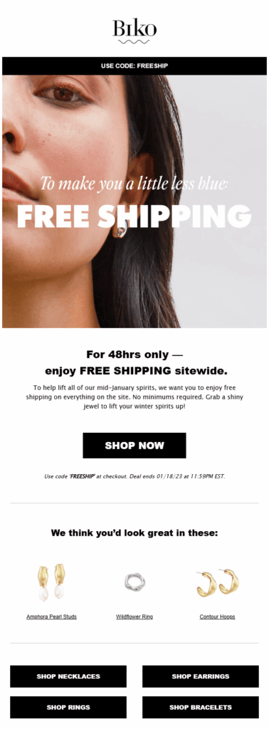
3. Personalize your email campaigns
To create more targeted emails that will delight your readers, personalization should be your go-to tactic. You can start simply by adding the recipients’ names in key placements, such as the subject line or email introduction.
You can also use behavioral or personal data to make more informed decisions. For example, you can add product blocks to send more personalized promotions to your audience based on products they’ve recently browsed. Who wouldn’t love to receive a special offer for something they really want to light up a gloomy day?
Finally, segmentation lets you send different emails to subscribers based on shared characteristics, such as location or funnel stage. For example, send VIPs special offers to boost their brand loyalty, and provide self-care content to new customers who’ve recently converted, showing your values and earning their trust.
To streamline these processes, you can use email marketing services like Moosend or Constant Contact. They come with valuable personalization features, such as dynamic content, audience filters, and automated workflows based on user behavior.

4. Set up an automation workflow
Sometimes an email isn’t enough, especially if you want to promote specific products to increase your sales. Through email automation, you can create email sequences and nudge your contacts at meaningful times.
For example, you can announce a flash sale on Blue Monday and schedule a gentle reminder for people who haven’t purchased to boost conversions. Automating emails can also save you time to prepare for upcoming campaigns, such as Valentine’s emails, without compromising quality.
Another great content-oriented idea is sending a pre-Blue Monday email with weekend self-care tips to help people start their Monday on a positive note. Then, send another email on Blue Monday, highlighting the importance of staying present and practicing self-kindness on tough days.
Finally, keep in mind that many email automation platforms offer pre-made recipes, which help users craft those sequences easily by following the if/then logic.
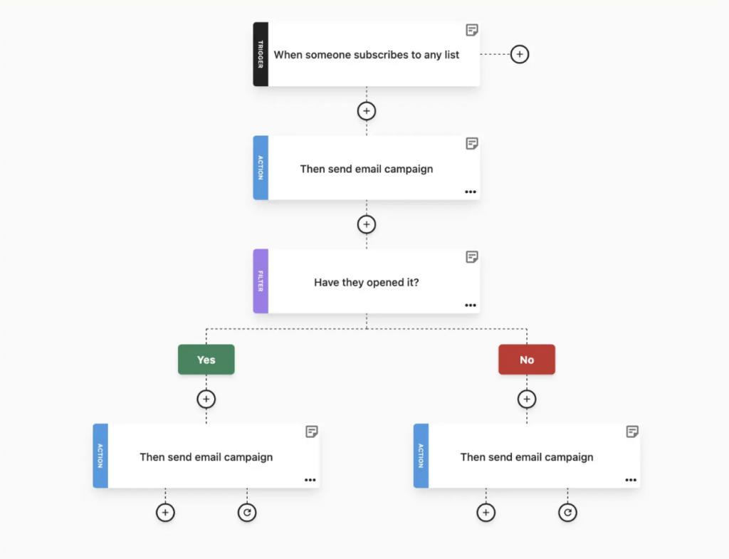
5. Adopt an empathetic tone
Your Blue Monday copy is unlike any other. It should signal to subscribers that you deeply care about them and that you’re there to support them when melancholy hits.
Put yourself in their shoes and consider their perspective:
- What do they need to feel better?
- How can you offer it to them?
- Is a flash sale enough, or should you also invest in content?
Make sure that the visual assets you use also align with the theme. For example, replace happy smiles with graceful or reflective facial expressions that they can resonate with. Otherwise, you risk sending mixed signals that will confuse readers about the purpose of your campaign.
Overall, empathy in emails is not just a good-to-have element. It can help your reader trust your content and feel safer.
6. Remove salesy language
Since Blue Monday campaigns aim at making subscribers feel better, avoid adding salesy elements, even when launching flash sales or offers. While countdown timers and urgent calls-to-action usually increase conversions, they may put readers in the exact state of mind they try to avoid on Blue Monday.
Instead of inducing urgency and FOMO, adopt a gentler tone when mentioning the expiration dates of your promotional offers. Plus, replace clock and hourglass emojis with zen or heart symbols to set a calm mood right from the subject line.
Interested in experimenting with different copywriting tones? Use an AI writer and find the best version that will make sense to your audience on this special day.
Email Examples to Inspire Your Blue Monday Campaigns
Explore these email campaigns from great brands to get inspired before crafting your Blue Monday emails.
Displate
Subject line: 💙 Blue looks best on metal!
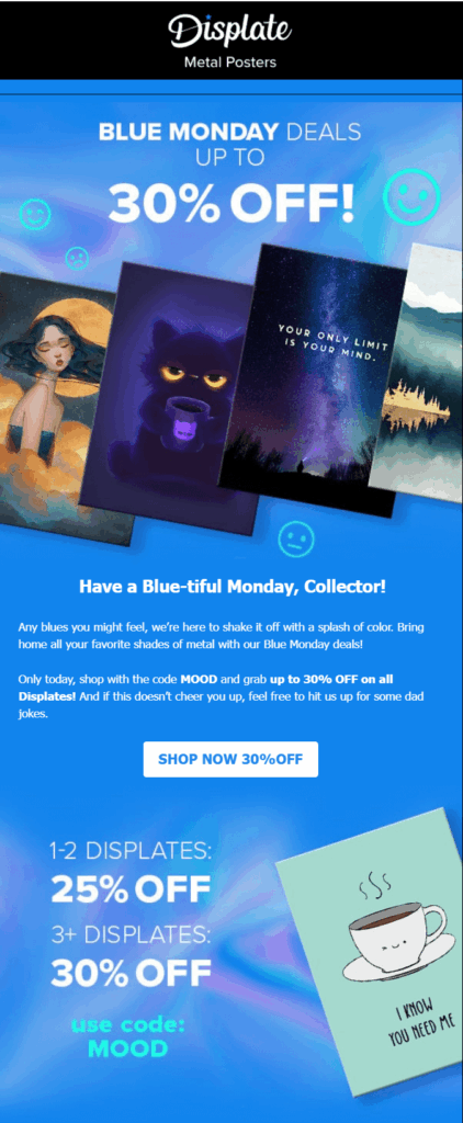
The poster brand Displate sent a special offer to their email contacts to cheer up their day.
Why it works:
- The subject line directs readers straight to the email topic, capturing the attention of highly interested subscribers.
- The special discount (up to 30%) is placed at the top to maximize visibility. It’s also repeated in the CTA button to drive more clicks.
- The email body highlights the deal’s intent to shake off the blues with a splash of color.
- Important information about the offer, including the end date and redemption code, was highlighted to offer potential customers peace of mind.
Body Shop
Subject line: 20% off weekend treats 💙

Check out this beautiful pre-Blue Monday email from The Body Shop and create a similar campaign to deliver positive vibes to your subscribers’ inboxes:
Why it works:
- The subject line informs recipients of the email’s main incentive (20% off) to encourage them to open it.
- They included the discount information, a redemption code, and a link to their best sellers to drive more clicks.
- The diverse product recommendations cater to various preferences and needs, ensuring there’s something for everyone.
- Each recommendation has a brief product description and a beautiful image for a richer experience.
Wonderbly
Subject line: Exclusive 20% off for 48 hours

Wonderbly, a brand that sells personalized kids’ books, shared a discount with an exclusive member list around Blue Monday.
Why it works:
- The word exclusive makes readers feel special and more likely to interact with the email.
- The email body emphasizes the importance of finding small pleasures to help you persevere on gloomy days.
- Below the primary CTA, recipients can find added product recommendations for different tastes, followed by “Customize me” buttons to boost conversions.
Van Gogh Museum
Subject line: Hopeful

Looking for an inspiring post-Blue Monday email example? This email campaign from the Van Gogh Museum is the one.
Why it works:
- The collection of Van Gogh quotes brings hope and inspiration to readers during a “tough month.”
- They added a beautiful Van Gogh painting and chose an orange-and-yellow color palette to make this campaign feel more hopeful and appealing.
- They mentioned three reasons why Van Gogh is the perfect Blue Monday antidote, each linked to inspiring words, colorful paintings, and recognition.
GUESS
Subject line: Blue Monday | Smile for an Extra 20% off

If you’re a fan of simpler promotional emails, check out how GUESS chose a different angle for their Blue Monday campaign.
Why it works:
- With the catchy headline “Turn the blue to cool,” they immediately introduced their unique angle.
- The listed product recommendations in blue relate to the day’s theme in a unique way.
- The extra incentive at the existing sale is mentioned in the subject line and above the footer to grab readers’ attention.
Extra reading: January offers more opportunities to connect with your audience. Have a look at our January email planner to find out more.
Pre-made Email Templates for Blue Monday Emails
Looking for pre-made email designs to craft your next Blue Monday email? Check out these pre-made templates and easily customize them with a drag-and-drop editor.
Just sign up for a Moosend account or request a 30-day free trial to explore the platform.
Mental health resources template
Grab this mental health template and tailor the copy, visuals, and brand colors. The blue shades make subscribers resonate more quickly with the theme.

Extra reading: Get inspired by these Mental Health Day email examples to deliver a campaign that can truly move your audience.
Product recommendations email template
Promote your product recommendations, and Blue Monday offers using this beautiful email template, focusing on product images and descriptions to help subscribers decide what’s best for them.
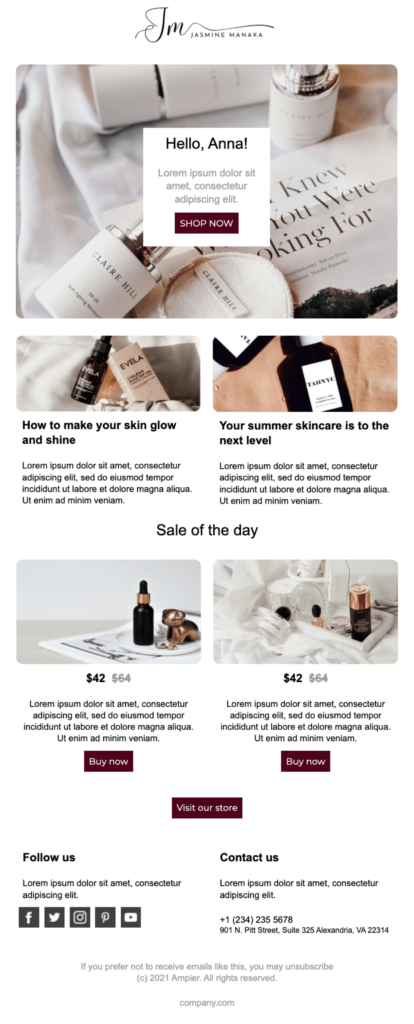
Blue Monday message newsletter template
Even a kind message sent from the heart can make a true difference on gloomy days. Grab this template and tailor it based on your brand’s tone:

Paint Blue Monday with All Colors
If you decide to send Blue Monday email campaigns, make sure to stick to the day’s special themes and deliver them in an empathetic tone. Add hope and optimism to your subscribers’ tough days to get into their hearts.
Also, feel free to think outside the box and choose a unique angle to make a bigger impact. These seasonal days leave plenty of room for imagination. Just make sure that human connection is always your compass.
FAQs
Here are some frequently asked questions regarding Blue Monday emails:
1. Can I use urgency in Blue Monday emails?
Blue Monday emails are made to reduce stress and make readers feel lighter. Aggressive sales language and countdown timers can undermine your intent or empathetic tone. Instead, mention the offer’s expiration date to inform them.
2. When is the best time to send Blue Monday newsletters?
Start on Friday and the weekend before the actual date with a teaser and self-care tips to survive the day. On Blue Monday, send the promotional offer or kind message, and consider sending a post-Blue Monday follow-up campaign to extend your offer.
3. How can I make my Blue Friday email feel authentic?
Align the offer with the theme of the day by sharing products or services related to self-care and wellbeing. Use gentle colors and reflective visuals, and write copy that focuses on human experience rather than sales.
If you run a small business, you’ve probably been there: posting on social media, boosting a few ads, and hoping something sticks.
Maybe you’ve watched likes and reach drop, and engagement fade even though you’re doing everything “right.” The good news is, it’s not you. The problem lies in the algorithm and the flood of AI-generated content, which makes standing out even more challenging.
That’s the reality for many small business owners. You put your heart into your work, but feel invisible online. What you really need isn’t another platform but a way to reach people who already care about what you do. That’s where email comes in, and today, we’ll see how it can help your business grow.
Just ask Mrs. Maria, my mother’s best friend, who learned that lesson the hard way after opening her first candle shop.
Your email marketing era starts now
Create your first email campaign with Moosend and turn readers into regulars.
Start nowThe Perspective of a New Small Businessperson
When Mrs. Maria opened her first shop, she wasn’t new to hard work, but she was definitely new to marketing.
At first, she did what everyone told her to do. She took photos of her candles, created a Facebook account, and started posting her pictures. For a while, it was exciting. Friends liked and shared her posts, strangers left heart emojis, and Mrs. Maria thought, “So this is how you build a following.”
But then the posts stopped reaching people, sales dropped, and every new post felt like screaming into the void. Mrs. Maria didn’t understand why her photos got fewer and fewer views.
“Maybe I’m too old for this,” she said once, half-joking. After all, she was in her mid-fifties when she decided to follow her dream of running her own business. Still, she continued trying by printing flyers, creating a loyalty card, and even hosting a giveaway on Instagram. Sadly, nothing stuck.
It wasn’t until a customer asked, “Can you email me when you restock the cinnamon candles?” that something clicked. Mrs. Maria started collecting addresses in a small notebook by the register. A few months later, she sent her first message with the subject line: “Our New Scents for Winter Are Here!”
That single email started bringing back her regulars and a few new faces who’d forwarded it to friends. It wasn’t instant success, but it was the first time Mrs. Maria felt in control.
Email allowed her to communicate directly with her customers, without algorithms or ads getting in the way. But how do you get there yourself if you have limited knowledge or resources?
The Reality of Promoting Your Small Business
Mrs. Maria’s story isn’t unique. Most small business owners start just like her, running everything alone without a big agency, hoping social media will do the heavy lifting.
When that doesn’t work, they often turn to email, but only for the basics, such as order receipts, shipping updates, maybe a “thank you for your purchase.”
I’ve seen this happening quite often. A small brand I recently ordered from sends me only email receipts. There are no updates, tips, or new arrivals to remind me why I loved their store in the first place.
It’s easy to think email is just for confirming a sale, but that’s only half the story. When used effectively, email helps you stay connected after the initial purchase, just as Mrs. Maria did with her simple “new scents for winter” message.
However, it takes time to get there. For most small business owners, email marketing isn’t the first thing that comes to mind when they start their business.
Here’s what their marketing journey usually looks like:
- Word of mouth: Start by telling friends, neighbors, and anyone who walks into your shop.
- Social media: Open an Instagram or Facebook page, post photos, and wait for engagement.
- Paid ads: Boost posts or run a small ad campaign. This brings clicks, but few loyal customers.
- An online store: Create an e-shop to make things easier, and that’s when email quietly enters the picture as order confirmations and receipts.
- Finally, email marketing: You realize you can use those same inboxes to share updates, promote new products, and keep people coming back.
While it may seem logical, this journey isn’t ideal. Many realize too late that email marketing could’ve supported their growth much earlier, helping them build a loyal audience from day one.
Still, it’s a common path, and by the time most business owners get there, they’ve learned that visibility fades, but connection lasts. And that’s exactly what email marketing offers.
What are Marketing Emails?
By now, you might realize you’re already using email in your business without thinking about it. Every order receipt, shipping update, or booking confirmation you send is what we call a transactional email, a message that keeps things running smoothly and gives customers peace of mind.
But there’s another side to email that’s just as powerful: marketing emails. These are the friendly messages you send to connect, share news, or bring customers back. That’s precisely what Mrs. Maria discovered with her “New scents for winter” email.
Here’s another example from Royalty Soaps, a small business using the same approach to promote new products in a fun, personal way:
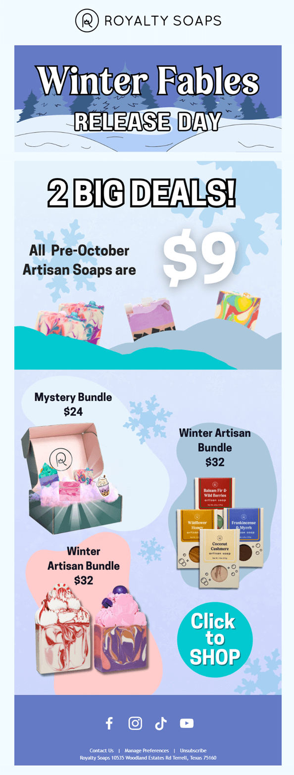
Now, you might wonder, “Can’t I just send marketing emails from my personal account?”
You can, and it’s a good way to start, but sending from a personal email address has limits: you can reach only a small number of contacts, and your messages can easily end up in spam since you don’t have the proper settings in place.
On the other hand, a dedicated email marketing tool for small businesses will help you do more. For instance, add your logo, schedule messages, personalize offers, and even see who opened or clicked. It’s how you turn a simple message into a profitable marketing channel that grows with your business.
We’ll see more about the tools of the trade later on. Now, let’s focus on why email can be an ally to small businesses and how it compares to other channels.
Email Marketing vs Other Popular Channels
As mentioned above, by the time most small business owners discover email marketing, they’ve already tried almost everything, maybe even a few ads if their budget allows.
Each of these channels has its place, but they don’t deliver the consistency or control a growing business needs.
Here’s how email compares to the ones most small businesses start with:
| Benefits | Drawbacks | How email compares | |
| Word of Mouth | Builds trust through personal recommendations. | Works at first, but growth is slow and unpredictable. | Email helps you scale that trust by reaching everyone who already knows and loves your business. |
| Social Media | Quick visibility and creative freedom. | Algorithms decide who sees your posts, while reach can drop overnight. | With email, you own your audience. Every subscriber chose to hear from you. |
| Paid Ads | Can drive instant traffic and sales. | Results depend on your budget. Stop paying, and visibility disappears. | Email remains effective after the initial click via reminders, updates, and repeat sales. |
| SMS | Marketing
Fast delivery and high open rates. |
Limited space. Too many texts can feel intrusive. | Email gives you more room for storytelling, visuals, and links, making it ideal for building long-term engagement. |
| Email Marketing | Direct, personal, and cost-effective communication. | Requires consistency, but grows stronger over time. | N/A |
How Email Marketing Benefits Small Businesses
Unlike social or ads, email doesn’t rely on trends or budgets. While it may not be as impactful as a viral social media post, it gives you something far more powerful: email list ownership.
Instead of shouting in crowded feeds, you’re showing up in someone’s inbox after they opted in to receive your messages.
Beyond that, email gives small businesses a few more benefits:
- Consistency: You don’t need to chase the next viral post or guess what time the algorithm will “like” you. A simple weekly email with your new products, seasonal menu, or store updates keeps your name in front of customers without the pressure of daily posting.
- Low-cost growth: Some platforms start at just $9 a month, so you don’t need a big budget to get started. That’s less than a single boosted post.
- Personalization: Just as you know a regular customer who always buys the same candle scent, email lets you do the same digitally. You can suggest products they’ll actually like, from recommending relevant items to giving loyal shoppers early access or a thank-you offer.
- Automation: When you’re busy packing orders or managing your store, automation handles follow-up tasks for you, like nurturing new subscribers, reminding customers about restocks, or sharing care tips for their last purchase.
- Customer loyalty: You can’t possibly remember every customer’s birthday or milestone, but email can. A quick “thank you for supporting us this year” or an automated birthday discount makes people feel appreciated and more likely to shop again.
- Insight and control: With email, you can tell which products get the most clicks, what time people read your emails, and what drives them back to your shop. This way, you can not only improve your marketing strategy but also your customer experience and your entire business operations.
- Scalability: Whether you’re writing to 20 customers from your small studio or 2,000 from your online store, the effort stays almost the same.
In other words, email grows with your business and meets you where you are, even if that’s just a notebook by the register, like Mrs. Maria.
Of course, it can’t replace the warmth of an in-store chat, but it’s the next best thing, letting you maintain that personal connection even when customers aren’t standing in front of you.
How to Approach Email Marketing as a Small Business Owner (with or without Experience)
The first step in getting started with email marketing isn’t mastering design or automation, but rather getting comfortable with the basics. Start small and focus on establishing habits that align with your business’s needs.
Choose a small business-friendly email tool
If you’ve never used an email marketing platform before, don’t worry. This is the fun part. You can try different tools for free before you commit to anything. Most small businesses do exactly that until they become familiar with email creation. It’s a zero-cost practice, and every test helps you understand what you like.
Start with a free plan or trial and see how it works for you. Once you’re comfortable and ready to grow, you can explore paid options, and even then, the cost stays low. Considering that email brings an average return of $36 for every $1 spent, you’ll soon see it pay off.
Now, when testing tools, look for something simple and intuitive, especially if you’re doing everything yourself. The best platform for you isn’t the one with hundreds of features or the one your experienced business friend recommended. Your brand has specific needs that you only know and understand, so initially, aim for:
- A drag-and-drop editor to design emails easily.
- The option to connect your online store or website.
- Sign up forms to start building your list.
- Segmentation features to organize your customers.
Some platforms, like ActiveCampaign, may be powerful but can feel overwhelming when you’re just starting. Others, like Constant Contact or Moosend, are designed for small businesses, prioritizing simplicity, a clean editor, affordability, and scalability as you grow.
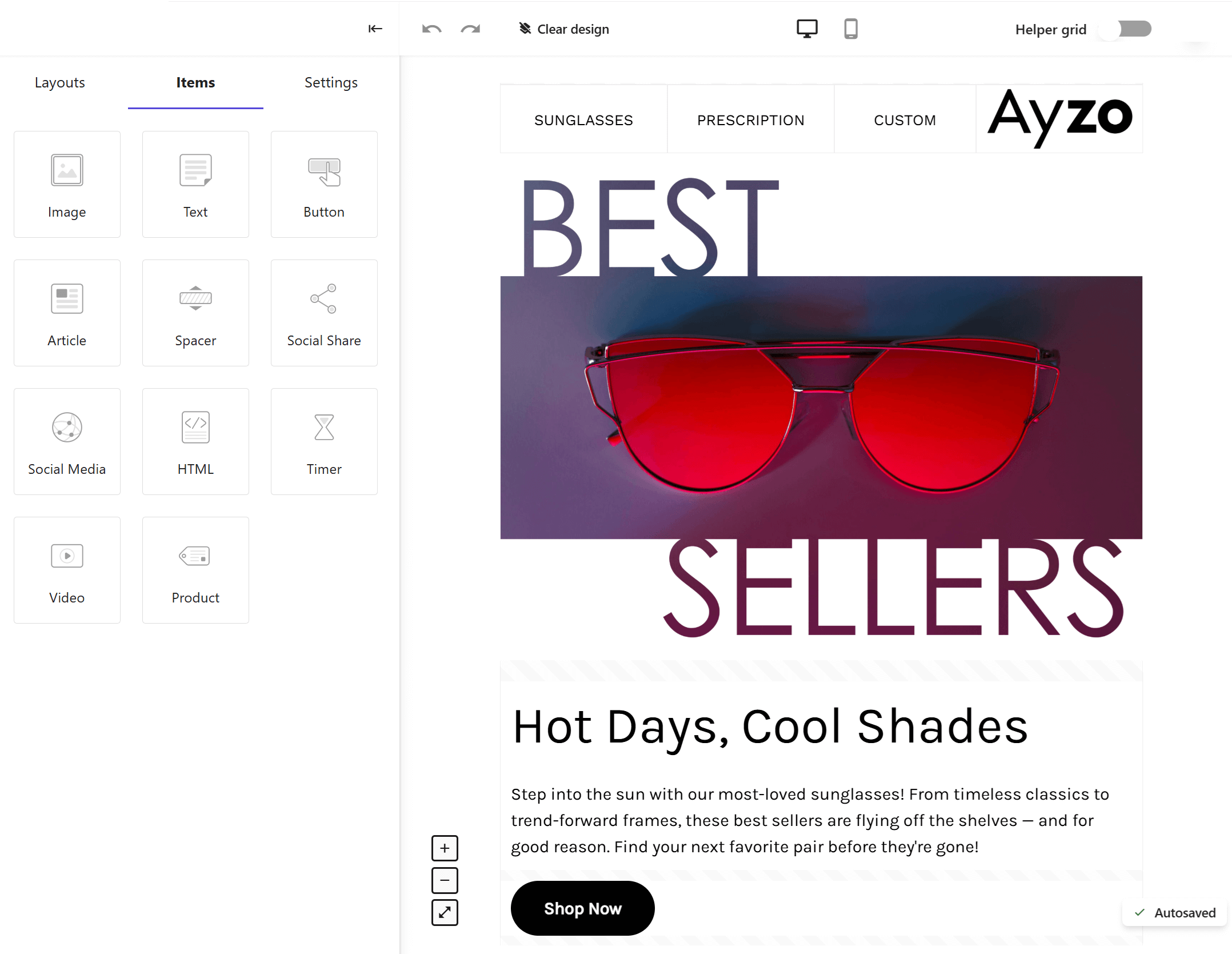
So, try a few small business-oriented platforms, send a test email, and see which one feels right. The goal isn’t perfection, but finding a tool that lets you focus on your message, not on figuring out how to use it.
Question: “Can I do email marketing completely free forever?”
Technically, yes, but free plans come with limits. For instance, MailerLite’s free plan allows you to reach up to 500 subscribers, which is ideal for the start. But as your list grows, those limits can hold you back. Eventually, you’ll want a tool that grows with your business, not one that stops you when things start going well.
Further reading: You can explore your options in our dedicated email tools for small businesses post. Also, we regularly review email tools, so make sure to check them out on our marketing blog.
Use your existing audience first
Like Mrs. Maria, you can’t rely on a notebook forever to keep track of your customers, and that’s where email marketing truly helps. Before thinking about growing your list, focus on the people who already know and love your business.
These are your regular customers, online shoppers, and those who ask, “Do you have a newsletter?” They’re your most valuable audience because they already trust you. Reaching out to them first builds momentum and gives you a chance to learn what works before expanding to new subscribers.
Add their emails to your list (with permission) and start small. Send simple updates about new products, tutorials, or short stories about your business. These early emails will help you practice, gather feedback, and find the tone that feels most natural for your brand. And once you’ve found what works, expanding your audience will feel easier and more purposeful.
For example, ASK Italian created a simple “Friendsday Wednesday” email for their regular diners, offering free dough bites midweek. It’s friendly, familiar, and clearly made for people who already enjoy their restaurant.
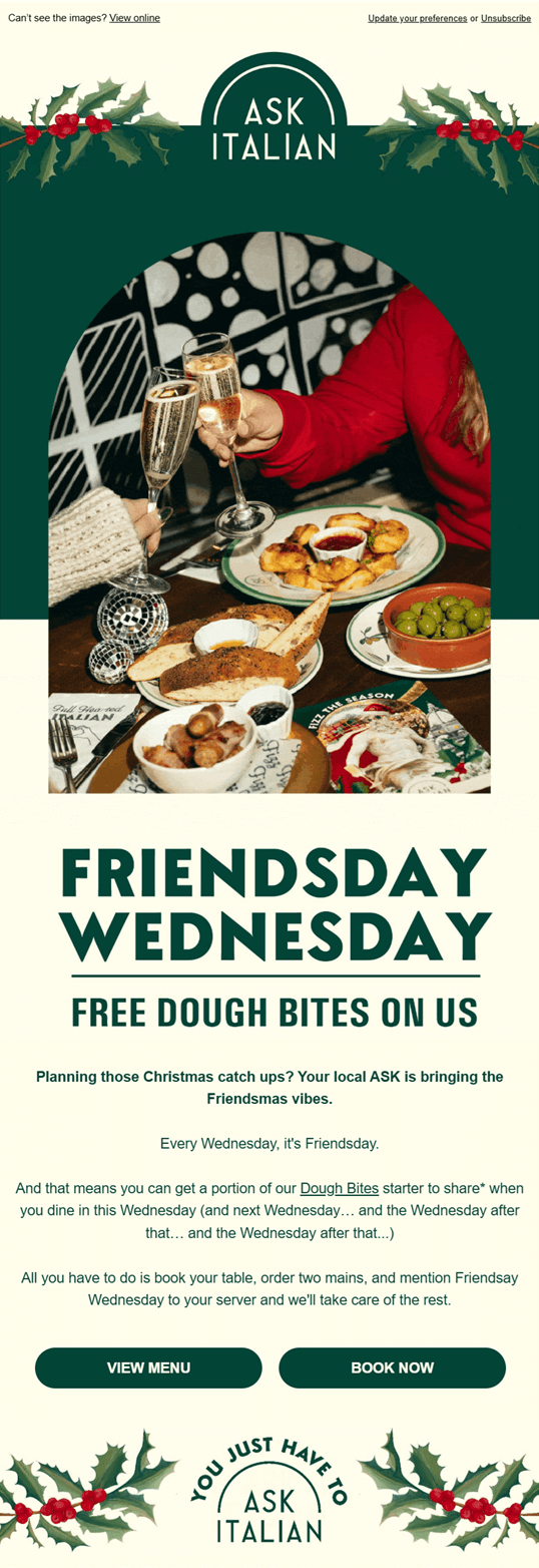
You can take a similar approach to reward loyalty, stay connected, and keep your audience excited to return.
Question: “Okay, but how do I grow my list once I’ve emailed my existing customers?”
Don’t worry, it’s easier than it sounds. The simplest and most effective tactic is to add a pop-up form for new visitors on your website. For example, BIKO, a jewelry brand, uses friendly pop-ups inviting people to “Join the Insider List” and get 10% off their first order.
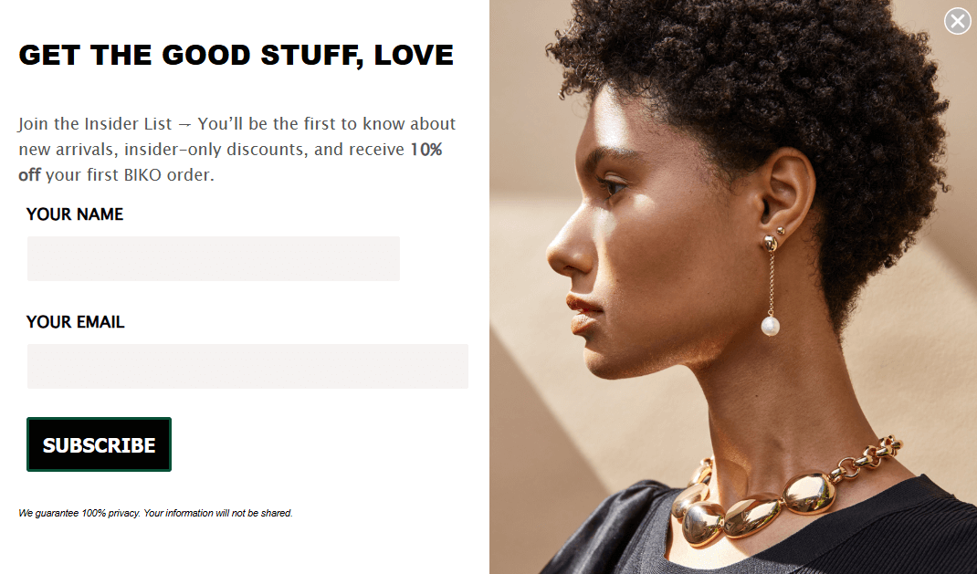
You can also include a signup option at checkout, place a form in your site footer, or even collect emails through a QR code at your counter. Small steps like these add up fast.
Further reading: Here’s a quick guide that shows you exactly how to build an email list from scratch.
Favor authenticity
We live in a visual era, and presentation matters. However, that doesn’t mean your emails need to resemble those from a big retail chain. What customers care about most is authenticity.
Take this Black Friday email from Sassy Spud, a small independent brand. It’s colorful, playful, and perfectly in tune with their personality.
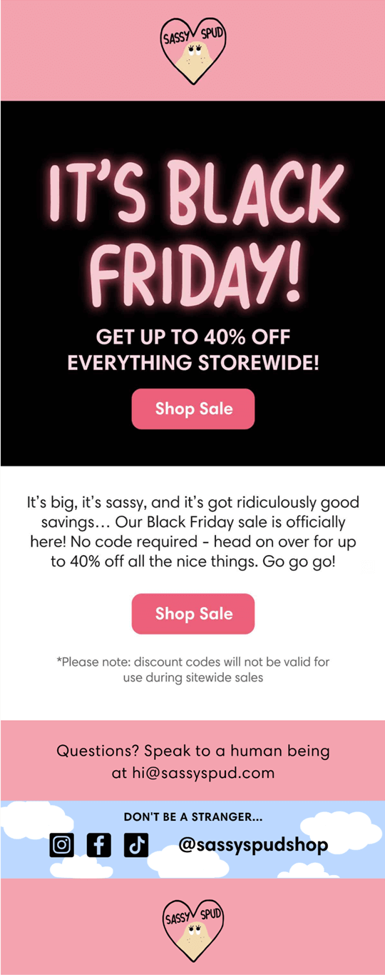
The email design is simple, featuring a bold headline, a clear call-to-action, and concise copy that mirrors their tone on social media. It’s proof that you don’t need a large marketing team to make something eye-catching.
You can add a photo of your latest product, a behind-the-scenes shot, or a seasonal banner that accurately represents your brand. Focus on one clear message. For example, “Our new collection is here” or “We’re extending our hours this weekend.” Simple emails are not only easier to make but also easier to read.
And don’t worry if your first few emails don’t look perfect. Each one teaches you what your customers like, helping you refine your tone and style over time.
Question: “Will my emails ever look as professional as those of a big brand?”
Absolutely, but it takes practice (and patience). Start slow, learn as you go, and customize premade templates. While some might look plain at first, think of them as blueprints. They help you understand how each element works, like your header and CTAs.
Experiment with those templates to learn the basics. Then, as you grow more confident, you’ll start tweaking layouts, testing new visuals, and eventually building designs from scratch.
The key is consistency. Once you find a style that fits your brand, you can repeat certain elements like your colors, fonts, and header layout to create a recognizable, professional look. Also, this will help your audience recognize you more easily.
Finally, when your business expands, you can always team up with a designer to refine your look even further. That’s growth, and customers absolutely love a soft rebrand (as long as you keep it uniquely yours).
Automate your emails without overwhelming yourself
When you’re new to email marketing, it’s easy to get carried away, sending every update, offer, and idea that comes to mind. But more isn’t always better. Sending too many emails too frequently can lead to email fatigue, where subscribers start to ignore your messages or even unsubscribe altogether.
As tempting as it may sound to send new offers every single day, it’s not the best approach. Instead, a few well-timed messages can keep your audience engaged and drive sales.
Like email design, email automation takes time to master, but once you set up a few key sequences, they’ll keep working in the background while you run your business.
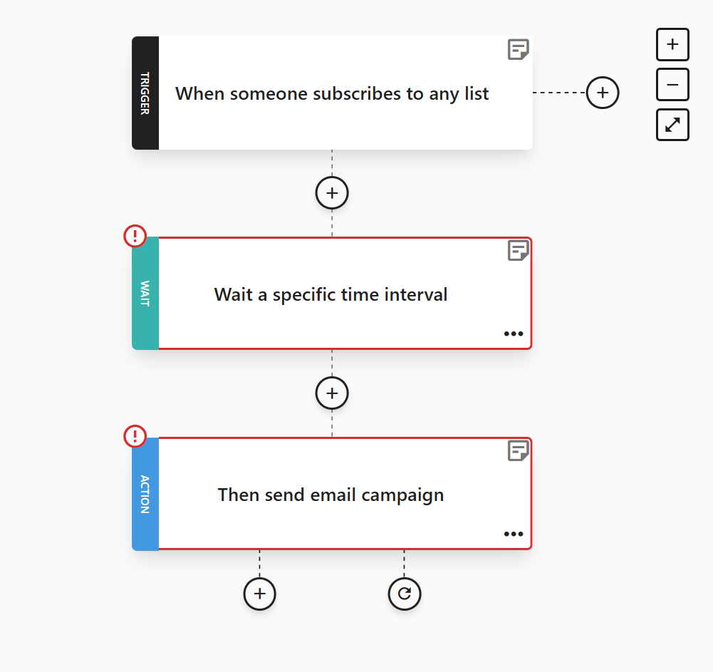
Most platforms include a workflow builder, like the one above, which differs from a regular email editor. Instead of writing a single message, you’re setting up a sequence of triggers (like “when someone subscribes” or “after a purchase”) and actions (like “send welcome email” or “wait two days, then send a follow-up”).
Once it’s live, the system handles the rest automatically, providing your customers with a timely, personal experience without requiring any extra effort from you.
For your small business, we recommend starting with a few basic automations:
- Welcome sequence: Sent when someone joins your list. Say hello, share your story, and consider offering a small incentive for first-time buyers (like Biko).
- Abandoned cart series: Reminds customers about items left in their cart with a friendly nudge.
- Thank-you email: Sent after a purchase to show appreciation and confirm their order details.
- Restock or new product alert: A short note to past customers letting them know when something they liked is back.
- Feedback or review request: Sent a few days after delivery to gather reviews or comments. You can use these later as social proof (star ratings, testimonials, etc.) for your products.
- Birthday or anniversary email: Ideal for building loyalty and showing your customers that you recognize and appreciate important milestones.
Once you become more comfortable, you can add advanced automations, such as an upsell or cross-sell flow to suggest complementary products based on what someone has already purchased.
Even if automation feels intimidating at first, take it one sequence at a time. Before long, you’ll have a system that keeps your customers engaged while freeing up more of your time.
Question: “How many emails are too many?”
For most small businesses, sending one to four emails per month is a great starting point, as it’s enough to stay connected without overwhelming your audience.
If you’re just getting started, try sending your campaigns on Thursday mornings between 8:00 and 9:00 a.m. That’s often when engagement is highest. As you grow and learn more about your audience, you can fine-tune your timing based on your own data. Your reports will show when subscribers open and click the most, helping you adjust your schedule for even better results.
Additional resources:
- Email Marketing Frequency: How Often Is Too Often?
- Welcome Email Examples [+Tips & Templates]
- What Is Cart Abandonment? Tips To Recover Lost Sales
- Real-Life Cross-Sell Email Examples
Common Email Marketing Mistakes & How to Avoid Them
Every small business owner makes a few missteps when starting with email marketing. But that’s completely normal. The key is knowing what to watch out for so you can catch and fix issues early.
Below, we compiled the most common mistakes and how to prevent them.
Mistake #1: Relying on just one marketing channel
Email builds relationships, drives repeat sales, and keeps your business visible when social reach fades. But even the best emails can’t do everything on their own.
Many small business owners make the opposite mistake once they discover how effective email marketing is. They stop posting, pause ads, and focus only on their inbox audience. While email helps you nurture long-term connections, you still need other channels to attract new customers in the first place.
Each platform plays a different role:
- Social media is perfect for quick engagement, discovery, and showing your brand’s personality.
- Paid ads can help you reach fresh audiences during busy seasons or product launches.
- Email turns those visitors into loyal, returning customers.
How to avoid it: Think of your email marketing strategy as a cycle where your other channels bring people in, and email keeps them coming back. If you rely on just one, you limit your growth. The best approach is to use each channel for what it does best, and let them work together.
Mistake #2: Ignoring deliverability
Don’t panic if this is the first time you hear about email deliverability. It simply means how many of your emails actually reach your customers’ inboxes instead of getting lost in spam.
Many small business owners are unaware that this can be a significant issue. If you purchase an email list or add people who haven’t given you permission, your messages are more likely to be flagged as spam. Over time, this can damage your sender’s reputation and make it harder for all your emails to be delivered.
The solution is simple: Email only people who want to hear from you. Grow your list naturally, ask for permission, comply with regulations (because GDPR won’t be as forgiving), and clean it regularly to maintain strong deliverability.
If you are new to the concept of deliverability, you can take a look at our dedicated email deliverability guide (written by our own deliverability expert).
Additional resources:
- The Invisible Deliverability Killers Marketers Ignore
- Email Deliverability: Avoiding The Spam Folder
- Outlook vs Office 365 Deliverability: How Microsoft Filters Your Emails
Mistake #3: Neglecting responsive design
According to Forbes, 41% of people check their emails on mobile while commuting, waiting in line, or scrolling before bed.
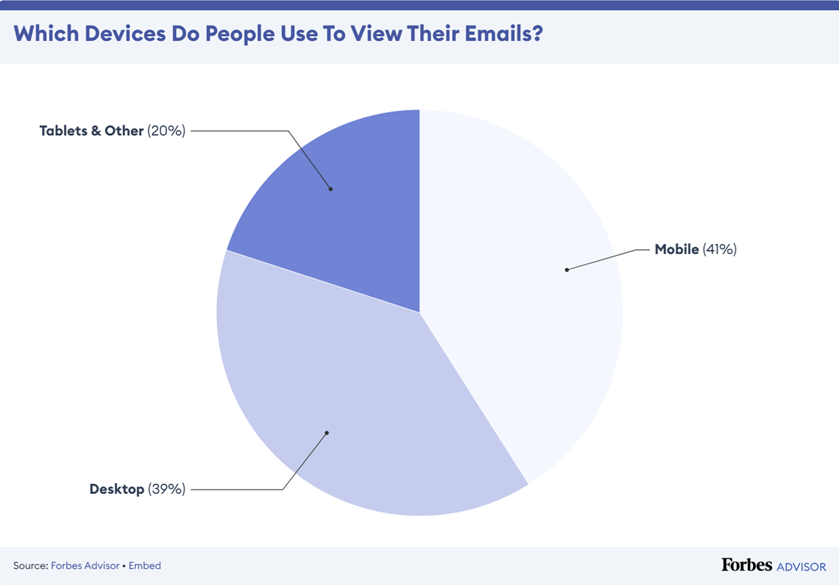
So, if your email looks perfect on a desktop but breaks on mobile, you’ve already lost half your audience.
Heavy images, long layouts, or small fonts can make it impossible to read or click through. And if a customer can’t view your offer properly, they’ll likely close it and move on.
Here’s an easy fix: Always preview your email on a phone before hitting “send.” Use clean layouts, short paragraphs, and images that load quickly. Most email tools like Moosend offer a mobile preview feature to help you spot issues early.
Mistake #4: Forgetting transactional touchpoints
Small businesses often view transactional emails as purely functional. But these messages are golden opportunities to build trust and keep customers coming back.
These are the emails people actually open and read because they contain important information. So, instead of sending a plain “Your order has been received,” you can make it memorable. Add a short thank-you note, a photo of you packing the order, or a quick tip on how to use the product.
This way, you’ll differentiate your small business from other brands and maintain that personal touch that small businesses are known for.
For example, if you sell handmade candles like Mrs. Maria, your confirmation email could say, “Thanks for your order, Marilia! Here’s a tip: let your candle burn for at least two hours the first time for an even scent.”
The solution is simple: Treat transactional emails as part of your brand experience. Personalize them, keep your tone friendly, and show customers there’s a real person behind every order.
Mistake #5: Skipping reporting
If you’ve ever tried to make sense of Google Analytics, you know how confusing numbers can be. Many small business owners skip this part altogether, as managing orders, stock, and customers can already feel like one more thing to worry about.
But reviewing your performance doesn’t have to be complicated. Your email platform already tracks key metrics for you, like open rates, clicks, and sales. These insights reveal what your audience enjoys, allowing you to identify what works and gain a deeper understanding of what to focus on.

Most tools also include A/B testing, which lets you test two variations of the same campaign to see which performs better. For example, you can send half of your subscribers “New Scents for Winter” and the other half “Warm Up With Our Winter Candles” to determine which one drives more clicks.
Here’s what to do: Take a few minutes after each campaign to check your reports, even if it’s just the basics. The more you learn from your numbers, the better your next email will perform.
Mistake #6: Ignoring your sender name and subject line
When someone gets your email, the first thing they notice isn’t your beautiful design but who it’s from and what it says. If your sender name looks unfamiliar or your subject line feels unclear (or spammy), chances are they’ll delete it before opening.
Your “from” name should look familiar. Ideally, your business name or, if customers know you personally, your own name. Consistency helps people recognize and trust your emails.
Here’s a simple example from ettitude:
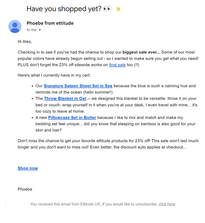
As for the subject line, keep it as honest and direct as possible. Avoid clickbait or misleading phrases like “Your order is waiting” or “You’ve won a prize!” if it’s not true. Not only can this frustrate subscribers, but it can also hurt your email deliverability, pushing your messages into spam over time.
A good rule of thumb: Write subject lines that sound human and match the content inside. For example, instead of “Don’t Miss Out on This Deal,” try “10% Off Our New Fall Collection Just for You.” Also, you can use a subject line tester for tips and suggestions. Such tools are perfect (and free) for increasing your open rates with easy fixes.
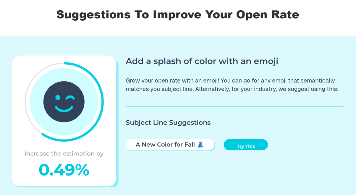
Additional resources:
- Original Ecommerce Email Subject Lines
- Free Subject Line Testers
- Why You Should Avoid Using “RE:” In Email Subject Lines
Mistake #7: Not segmenting your audience
When you’re just starting, it’s tempting to send the same email to everyone on your list. However, not all customers are at the same stage, and treating them all the same can negatively impact your results.
Segmentation means dividing your subscribers into smaller groups so your emails feel more personal. Even a basic split, such as new versus returning customers, can make a significant difference.
For example, new customers might appreciate an email highlighting your story and bestsellers, while loyal customers would prefer early access to new products or an exclusive discount. The message is the same brand, but the tone and timing should fit the relationship.
How to tackle it: Tag customers automatically based on their behavior (what they buy, how often they open, or how long they’ve been with you, etc.) and send them emails that actually matter to them. Be careful not to hyper-segment them, though, because you’ll end up with very small groups, which means extra work to send different campaigns to each segment.
In short, personalization and segmentation go hand in hand. The more relevant your emails appear, the more likely your customers are to open, click, and return. If this sounds all Greek to you, we have a few more guides you can check out to get the hang of it:
- Customer Segmentation Examples Your Business Needs
- What Is Email Personalization? Definition, Benefits, And Tactics
Mistake #8: Giving up too early
It’s easy to feel discouraged when your first emails don’t look like Nike’s or L’Oréal’s. Big brands have full design teams, while you probably have a laptop, a free plan, and a few spare hours. And that’s okay. Every small business starts there.
The truth is, your early emails are about progress, not perfection. You’ll learn how to write clearer subject lines, choose better images, and understand what your customers respond to. Each send brings you one step closer to mastering it.
And it’s not just about design. Engagement takes time, too. Your first emails might not have sky-high open rates, but that’s normal. Keep sending useful content (and maybe an eye-catching discount now and then), test different approaches, and stay patient. Over time, your audience will grow more loyal with every campaign.
How to avoid: Don’t compare your beginning to someone else’s polished result. Keep experimenting, stay consistent, and remember that even the best campaigns started as someone’s first attempt.
Email Can Make Your Small Business Thrive
Remember Mrs. Maria and her candle shop? These days, her inbox is full of customers asking about new scents, sharing photos of their homes, and forwarding her emails to friends. What started as a simple “new scents for winter” message became the foundation of a loyal customer base.
That’s the real power of email. It keeps your business connected, visible, and human. You don’t need a big budget or a whole marketing team to make it work, just commitment, consistency, patience, and a little curiosity to keep learning as you go.
FAQs
Here are a few more common questions about email marketing for small businesses.
1. How much does email marketing cost for small businesses?
Most email marketing platforms are affordable, even for beginners. For example, Moosend starts at around $9/month for unlimited sends and up to 500 subscribers, while Constant Contact begins at about $12/month. Many also offer free plans or trials so you can test the platform first. As your list grows, you’ll only pay for the contacts you actually have, making email one of the most budget-friendly marketing tools for small businesses.
2. Do I need a website to start email marketing?
No. You can begin with a hosted signup form from your email tool. Share it on social media, add a QR code to your counter, and include it in receipts. A simple landing page helps later, but it’s not required to start collecting emails and sending campaigns.
3. Should I use single or double opt-in?
Single opt-in adds a subscriber right away, while double opt-in sends a confirmation email first. If you want faster growth, use single. If you want cleaner lists and fewer spam signups, use double. Many small businesses start with double for quality, then switch to single once they trust their forms and filters.
4. What basic rules do I need to follow (GDPR / CAN-SPAM)?
Get explicit permission, don’t buy lists, always include an unsubscribe link, along with your business address. Also, honor opt-outs promptly, collect only what is necessary, and maintain accurate records of consent. If you sell to EU residents, include a brief consent note and a link to your privacy policy. This keeps you compliant and protects deliverability.
5. How do I measure my small business email marketing success?
You can track your email performance directly from your platform’s dashboard. Focus on key metrics like:
- Open rate: People who opened your email
- Click rate: Number of clicks on your links or buttons
- Conversions: Actions taken (made a purchase, booked an appointment, etc.)
- Unsubscribes: Subscribers who opted out after a campaign
These numbers help you understand what’s working. For example, if your open rates are low, test a new subject line. If clicks are down, consider simplifying your design or revising your call-to-action copy. Over time, these minor adjustments help you send smarter, more effective emails.
