10 Landing Page Mistakes You Should Avoid in 2026
Landing pages aren’t just a “nice-to-have” in your marketing strategy, but a necessity. This standalone page aims to persuade visitors to take a specific action, serving as a lead generation tool.
But with only a few seconds to make an impression, every element needs to work in your favor. So, what drives visitors away?
Messy copy, cluttered design, confusing flows, and slow loading times are among the most common landing page mistakes. And they can cost you a significant amount of revenue, or, even worse, send potential leads to a competitor with a clearer, better-structured page.
In this guide, we’ll break down the most common pitfalls, explain why they hurt your conversions, and show you how to turn things around.
Design the perfect landing page
Generate more leads with a no-code editor and professionally-made templates.
Try MoosendThe Importance of Fixing Landing Page Mistakes
Let’s begin with a statistic from Unbounce’s Conversion Benchmark Report. The median conversion rate for a landing page is 6.6%:
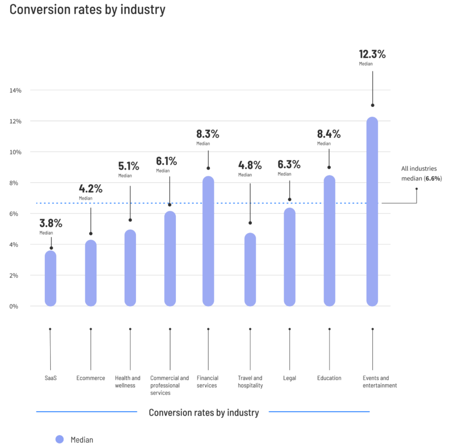
This means that if your landing page attracted 1,000 visitors, more than 60 visitors turned into leads. If each visitor spends $100 on your product, you automatically get a little more than $6,000 in revenue from a single landing page.
And since this is the median number, improving landing page performance will lead to better results.
Think of your landing page as a pipeline: even minor leaks like a confusing headline, a hidden CTA, or slow load times can reduce the flow of leads and sales. That’s money slipping through the cracks.
What’s more, every click that lands visitors on your page costs something. It can be a part of your ad budget, content efforts, CTR, or referral traffic. If your page doesn’t convert, you’re not just missing out on conversion. You’re also wasting resources.
A poorly optimized landing page also creates friction and a bad user experience. Visitors could get confused or distracted, and eventually bounce before acting because of the following:
- Messaging that doesn’t go from point A to point B and lead up to the CTA
- A heavy page with too many elements that cause slow loading times
- Too many distractions, like a navigation menu or too many external links
All the above lead to fewer signups, fewer sales, and a negative impact on your ROI.
On the other hand, small, targeted fixes, like polishing your value proposition, optimizing CTAs, or simplifying forms, can improve your page’s performance. Plus, they don’t require a lot of work to implement.
As a result, they can have a great impact on conversions, whether it’s lead generation or an overall increase in your ROI. These micro-wins can compound over time, turning a “leaky” pipeline into a high-performing conversion engine where steady traffic can lead to great results.
Most Common Landing Page Mistakes (with Fixes)
Landing pages don’t usually fail because of one huge mistake. Instead, it’s the little things that quietly sabotage conversion.
So, let’s break down the most common landing page mistakes and their fixes, so you can correct the errors and start creating high-converting landing pages.
Lack of clarity in the value proposition
When someone lands on your page, they need to understand three things right off the bat:
- What your offer is
- Why it matters for their business
- What’s in it for them
If your value proposition is a vague statement, such as “Get more for less,” hidden below the fold or buried in jargon, visitors will simply opt out before they even scroll further. And while a clever pun or a headline is appreciated often, a landing page isn’t the place for it.
To fix this mistake, you need to lead with clarity. Your headline should spell out your core benefit using plain language. Craft a headline that won’t be too long and will showcase your offer clearly, like “5 steps to the perfect landing page headline.”
Ensure that you add a bit more clarity to your subheading. This is the place to provide more context or details, but avoid overdoing it. Keep it short, specific, and aligned with the medium—ad, email, or blog post—that brought users there.
For example, if your email was about something visitors should anticipate from you, and the CTA was “See all the details,” the headline of your coming soon landing page should reflect the sentiment of your email campaign:
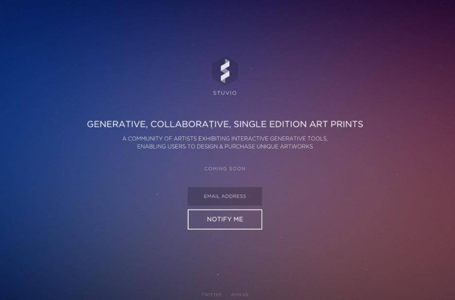
The opposite can result in a negative user experience and visitors hitting the “back” button.
Weak (or missing) CTA
When was the last time you took an action on a website without knowing what the action was? If the answer is “never,” then you’re right. A visitor who doesn’t know what action to take will not take any. And this can harm your conversions on your landing pages.
A landing page without a clear CTA is like a salesperson who chats and is pleasant but forgets to close the sale. People will walk away, regardless of their interest in your offer.
On the other hand, multiple competing CTAs can be just as bad, leaving users confused or distracted, instead of keeping them moving from one action to the next.
Make your CTA impossible to miss and unambiguous. Use a single, action-oriented button with clear messaging that stems from your existing copy (we’ll explore this further as we proceed).
Here’s an example from Moosend’s landing page:
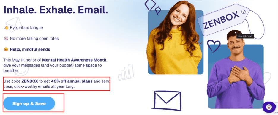
This CTA naturally follows the main action (“Use”), and the colors make it stand out.
Which brings us to the second point. Using contrasting colors can work wonders for your CTA button. After all, this is what most people will look for after reading your headline. Of course, this doesn’t mean you need to use popping reds or blacks to get users to click. The colors, after all, should match your brand and the action itself.
Apart from making your CTA button stand out, they can also make your landing page more accessible for users with vision impairments.
Lack of a dedicated landing page builder
Trying to create a landing page using your website’s CMS or a tool here and a different one there can be a common mistake. Without a landing page builder, you will need to juggle design, layout, forms, and copy manually, causing you to lose time, slow down launches, and, potentially, add friction.
A dedicated landing page builder, like Moosend’s, can streamline the process for you, giving you everything you need in one place.
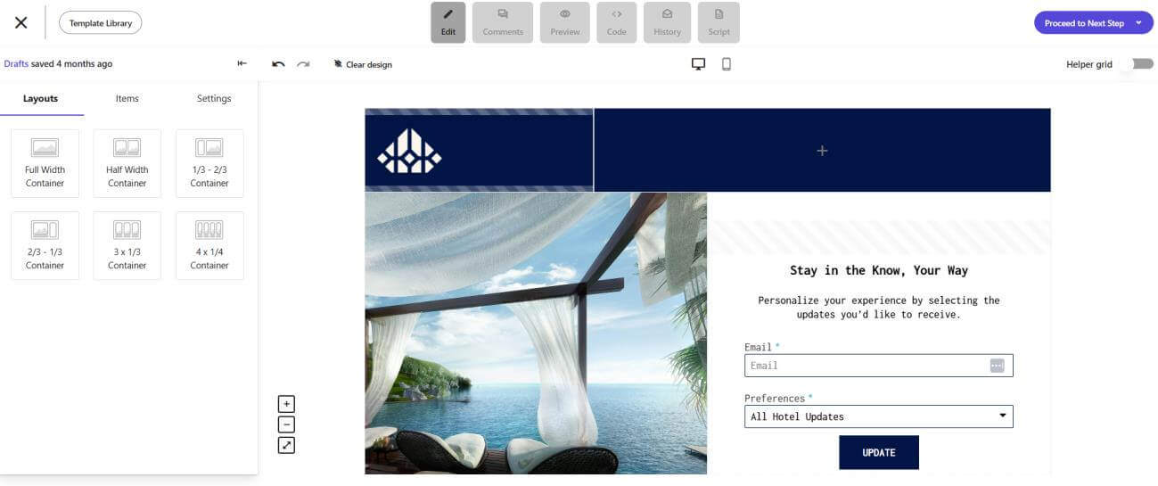
Just make sure it has the following elements:
- A drag-and-drop builder that can eliminate the use of code. You can move elements exactly where you want them and create clear, comprehensive designs for your landing page.
- Conversion-focused landing page templates that are plug-and-play and optimized for mobile. This will help you catch two birds with one stone and save you hours of trial and error. All you will need to do is customize them according to your offer.
- AI-assisted copy suggestions through an expert AI writer that can be your brainstorming buddy. This won’t replace your creativity, but it’ll help you save time with actionable suggestions for headlines, subheadings, and CTAs that align with your campaign’s goals, or copy checks that will eliminate the chance of copy blunders.
- Built-in forms and a native integration with your email campaigns to keep you from switching tabs and investing in unnecessary tools.
From the above, it’s easy to infer that a dedicated builder can make your life easier. It helps boost conversion rates with great design and copy, speeds up campaign launches—as crafting a landing page requires minimal effort—and ensures your pages look polished and professional due to the professionally designed, ready-made templates.
Too many distractions and slow loading speed
Patience online is thinner than ever. According to Forbes Advisor’s research, “40% of users will leave a site if it takes more than three seconds to load,” while a staggering 47% won’t wait longer than two seconds.
Too many elements can harm your loading speed and cause distractions to users. Your landing page should act like a one-way street, guiding visitors directly towards the desired action. When you pack that page with navigation menus, external links, or a cluttered design, users will feel uneasy.
This feeling can be caused by either the information being too dense or the page not loading properly, or not loading at all. In any case, all those will cause visitors to flee before they even see your offer. A lack of clarity and speed leads to a decrease in conversions.
To remedy that, keep your landing page lightweight. Make sure to strip your page down to the essentials:
- Remove the main navigation bar
- Limit outbound links
- Keep the design clean
Every word, image, and button should drive the user toward your CTA. A minimalist, conversion-focused design works and looks better.
Finally, don’t forget to compress images and use tools like Google PageSpeed Insights to spot bottlenecks. In this scenario, every second counts, so ensure that you optimize your design and loading speed to reduce bounce rates and increase conversions.
Weak landing page copy
When it comes to convincing visitors to act, landing page copy does all the heavy lifting. Language that’s vague, jargon-heavy, or doesn’t match the promise that brought visitors here will make your prospects flee.
Weak copy fails to inform, describe, and answer the golden question every visitor has: “Why do I need this?”
To fix this problem, write with clarity and intent. Focus on benefits over features and keep your sentences concise and punchy.
Ensure consistency by mirroring the language used in the ad, email campaign, blog post, or any other source that triggered the click. Use active voice and actionable language, such as “You can achieve X goal” rather than “X goal will be achieved.” Be sure to highlight the outcome as well.
The real challenge here is to achieve this in under 1,000 words while crafting scannable content. Remember, your landing page is not here to educate, but to attract and sell.
Use short paragraphs, bullet points, and bold statements to help users quickly grasp the message. Lastly, ensure that you elevate your landing page copy with a built-in AI tool that provides suggestions, performs copy checks, and keeps your messaging aligned.
Ignoring mobile optimization
According to Statista, over 60% of traffic originates from mobile devices. Therefore, building a landing page with desktop-first logic can negatively impact the overall visitor experience. Buttons too small to tap, layouts that break on smaller screens, and forms that are impossible to fill out will make users drop off instantly.
Adopting a mobile-first approach is no longer a luxury. Make sure your design is fully responsive, your CTAs are thumb-friendly, and your forms are short and easy to complete on smaller screens.
Your landing page editor will help you test your landing page design on both smaller screens and desktops. But to have a clearer view, you can craft a test page and see how it appears across multiple devices and browsers as well:
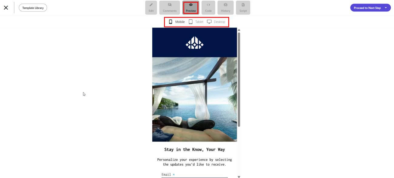
Make your design as seamless as possible. That way, you can ensure your landing page’s design won’t drive visitors away.
Generic, uninspiring visuals
Stock photos of office desks and happy customers will definitely fill the space. But do they build trust or spark interest? The answer would be no, as generic visuals often feel inauthentic and fail to support your offer.
Online exposure has made visitors able to sniff out “fake” imagery and start questioning your credibility.
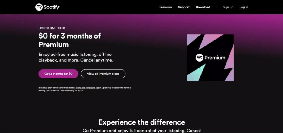
Try to be as versatile as possible and adjust your visuals according to your landing page type. For example, a sales-oriented landing page can have a more energetic look, featuring bold letters and vibrant colors. Like this one from Spotify:
On the other hand, a pricing landing page should have a clean design, simple and comprehensive language, and, ideally, a customer testimonial or two:
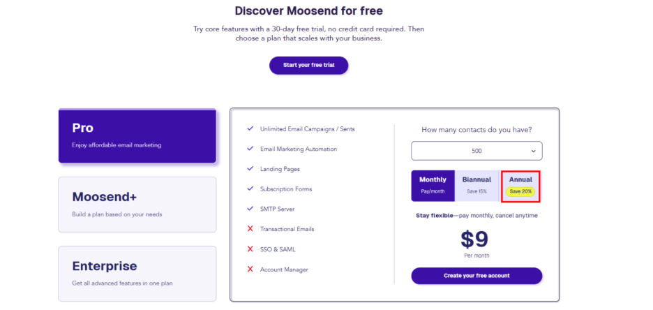
Notice the pop of color on the annual plan’s savings? On a page like that, simplicity is the true north. Therefore, any “extravagant” design choice should be reserved for things you really want to put emphasis on.
All in all, visuals that are unique and support your message, such as product screenshots, demo videos, or real customer testimonials, show your visitors what they can expect from your business.
Keep visuals high-quality, but ensure, as mentioned above, to compress them for faster loading times. Also, ensure that every element works toward your end goal, rather than just filling white space.
Overly long forms
How much information do you need to get to know your leads? Nothing kills momentum like an ill-placed form that feels like an interrogation.
If you’re asking for unnecessary details before offering real value, most visitors will abandon the process. Long or irrelevant forms create friction and make prospects feel like the trade-off is too lengthy and the brand is too intrusive.
Before creating your landing page, ensure you have all the necessary information in place. For example, if you’re building a whitepaper or webinar landing page, you don’t need more than a first and last name and an email address. Depending on the nature of the whitepaper or content upgrade, you might need a company name and the number of employees for better segmentation:
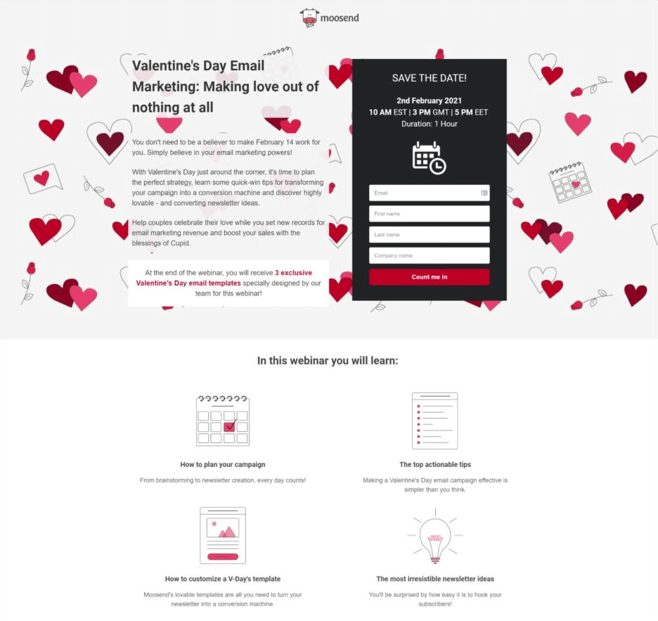
Keep your forms short and relevant, and only ask for the essentials. There will always be time to ask for more information.
Also, make sure the form is mobile-friendly. Large input fields and minimal typing will result in a frictionless form, leading to higher completion rates and, ultimately, better conversions.
The message intent and the medium not matching
As a user, if you click on an ad that promises a free trial and land on a page that pushes a paid subscription, you are bound to opt out (and probably never bother with this brand again). This messaging mismatch erodes trust.
A landing page that doesn’t align with the medium (email, social post, ad, etc.) that brought the prospect there can be considered misleading, and rightfully so. This will lead users to bounce, and your conversion rates will drop.
The solution is to maintain consistent messaging throughout. Mirror the headline or offer in your landing page headline, so that visitors know they’re in the right place. Ensure that your visuals, tone, CTA, and design logic all reflect the promise that got them to click in the first place.
This alignment reassures users, builds credibility, and keeps the conversion path seamless.
No social proof or trust signals
No visitor likes taking the leap of faith with any brand, including yours. And no landing page will convert if visitors don’t trust you. Without proof that your product or service delivers, why would they? The absence of testimonials, case studies, logos, or security badges from your landing page creates doubt. And doubt kills conversions.
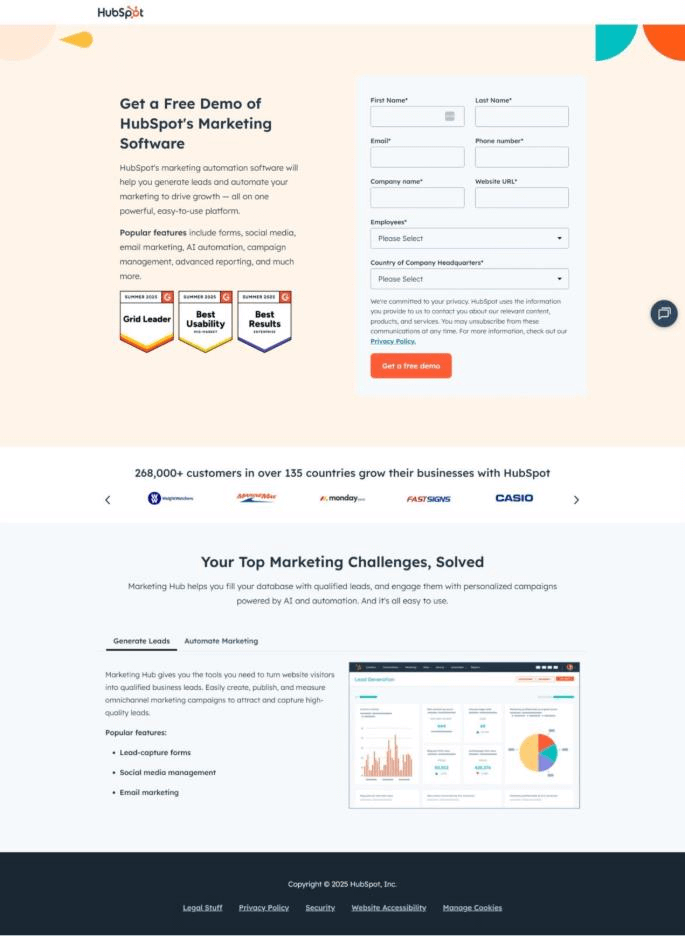
HubSpot’s demo landing page is a prime example of a SaaS landing page with social proof. In this case, they display recognizable client logos to build credibility. The landing page is then completed by the main pain points the tool addresses.
Trust signals like social proof or trusted badges when it comes to landing pages for sensitive actions like payments, reassure visitors that their data is safe. And a little proof goes a long way in removing hesitation.
Emerging Mistakes to Avoid in 2025
Landing page mistakes move as fast as technological advancements in marketing. And since what worked last year might already be outdated, several emerging mistakes can quickly erode trust and engagement if left unchecked.
Here are the three mistakes to watch for and avoid.
AI copy that feels robotic
AI might be a powerful tool that can generate content in large volumes, but if you lean on it too much, your landing pages might start sounding flat, repetitive, or lacking real personality. Visitors can easily pick up on generic phrasing and canned lines. And when they do, trust can take a real blow.
Instead of using AI as a landing page copy generator, use it as a trusted assistant. You can write your landing page’s copy and then use tools like Moosend’s AI writer to brainstorm different ideas. The goal isn’t to fill the page with attractive words, but to showcase your brand’s personality with audience-specific language and branded content.
Non-accessible landing pages
Lack of accessibility is, first and foremost, a compliance issue for landing pages. Laws like the Americans with Disabilities Act (ADA) and regulations like the European Accessibility Act (EAA) have made digital accessibility mandatory, particularly in terms of content. Accessibility standards are outlined in the Web Content Accessibility Guidelines (WCAG), and failure to implement them can result in penalties and damage to brand reputation.
Beyond the legal side, maintaining inclusivity demonstrates your care for every visitor’s experience. Ensuring proper color contrasts, adding descriptive alt text to images, and making your page easy to navigate don’t just expand your audience. They improve usability for all visitors.
Additional Resources
Landing pages are a core lead generation tool. Having the whole picture behind their creation, design, and content is essential before you create one that converts. Here are some extra resources to help you out:
- Landing Page Design Examples To Inspire Your Layout
- Best Landing Page Builders For Affiliate Marketing
- The Anatomy Of A Landing Page: Key Elements & Examples
Eliminate Mistakes for the Perfect Landing Page
Landing page mistakes might seem small. However, they’re easy to accumulate and drive away conversions, frustrate users, and waste your marketing budget.
From unclear value propositions to weak CTAs and cluttered design, each pitfall has a simple fix. You only need to identify these pitfalls and address them early on, and you’ll dramatically boost your results.
FAQs
Let’s look at some of the most common questions and solutions to landing page mistakes.
1. Should my landing page have a navigation menu?
Since a landing page is designed to lead users to a specific action and serves as a standalone page for this action, a navigation menu provides visitors with too many options. It’s a good rule not to have one on your landing page, as it will distract them from their main goal, leading to lower conversion rates.
2. How long should my landing page be?
The length of your page depends on the complexity of the action you want visitors to take. A good rule of thumb is for your landing page to be shorter for simpler actions (like a newsletter signup). Longer actions (like a high-cost B2B service) can be longer, as they will require more detailed information, some social proof, and, potentially, FAQs that address the most common objections.
3. Can I have more than one CTA on my landing page?
Since a landing page has one primary goal, offering multiple CTAs can confuse the visitor. The result will be them clicking the “Back” button due to choice paralysis, resulting in lower conversions.
4. Why do I need social proof on my landing pages?
Testimonials, case studies, client logos, and star ratings—all forms of social proof—build trust and credibility. Prospects often encounter scammy or unsafe websites. Social proof elements show that other people have used your product. Not only that, but they have found real benefits, which can be a powerful motivator for a visitor to convert.
5. What landing page element should I fix first?
There is no one-size-fits-all approach to this question. However, be sure to pay attention to your headline and value proposition. If visitors don’t immediately understand what you’re offering and why they need it, they will leave.


 Published by
 Published by
