
Best Email Fonts in 2026 [Examples & Best Practices]
Your email copy does the talking, but your font sets the tone. Choose the wrong one, and your message might feel outdated, hard to read, or just plain off.
Choose the right one, and boom! Your emails become clearer, more engaging, and even more persuasive.
But with so many fonts out there, how do you pick the perfect one?
Don’t worry! Today, we’ve rounded up the best email fonts, real examples, and tips to make sure your campaigns look as good as they read.
Sans-ational email design starts here
Create eye-catching emails with a drag-n-drop builder.
Try MoosendTop Email Fonts to Use
Below are some of the best fonts to use in your email marketing campaigns:
- Times New Roman
- Arial
- Helvetica
- Verdana
- Georgia
- Courier New
- Tahoma
- Trebuchet MS
- Garamond
- Open Sans
- Roboto
Why Choosing the Right Email Font Matters
Selecting the right email font matters mostly because it ensures readability.
A clear, legible font keeps your audience engaged and encourages clicks. Poor font choices can lead to abandoned emails, resulting in poor click-throughs (CTR) and conversions.
Readability, though, isn’t the only reason why selecting the right fonts matters. Studies reveal that fonts also affect trust and perception.
According to the New York Times, using Baskerville, a classic serif font, boosted reader agreement by 1.5% compared to other fonts. The takeaway: clear, readable fonts can actually enhance credibility.
Another experiment by researcher Kevin Larson revealed that poor font choices negatively impact brand perception, causing frustration and decreased engagement. Visually appealing, readable fonts help users form positive, memorable associations with your brand.
In a nutshell, selecting the right email fonts for your campaign:
- Improves readability and engagement
- Boosts credibility and trust
- Strengthens brand identity
- Creates a positive user experience across devices
Common Font Styles
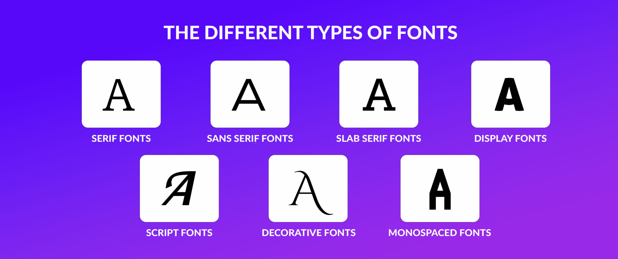
We typically group fonts into distinct “styles ” based on their visual characteristics and readability.
Let’s examine the two most common types below.
Serif fonts
A serif is a line or stroke used at the end of a letter. Fonts that have this line are called serif typefaces.
The biggest advantage of “serified” fonts is that they are more elegant and legible since the little strokes attached to the letter guide a reader’s eye.
For this reason, serif fonts are commonly used for large chunks of text.

Popular examples include Times New Roman, Palatino, Garamond, and Georgia.
Sans serif fonts
This font family is characterized by a lack of serifs (sans serif actually means without a line or stroke). The most common sans serif typeface is Arial, Gmail’s default font.
Sans serifs are ideal for screens as they are simple and have a modern and minimal structure.
![]()
Other commonly-used sans serif fonts include Verdana, Geneva, Comic Sans, and Calibri.
Popular Font Families
Beyond serif and sans serif, other fonts can bring creativity, personality, or unique functionality to your design.
Let’s explore them below.
Script fonts (cursive)
These typefaces mimic human handwriting to achieve a more natural result.
Cursive fonts usually look fancy, and, as mentioned above, they are ideal for invitations and diplomas to make them look aesthetically pleasing.

Lucida Handwriting and Edwardian Script are examples of cursive fonts.
Monospace fonts
A monospace font has letters that are the same width (fixed-pitch). It was used by typewriters and early computers.
Since monospace typefaces are harder to read and take more space than non-monospaced typefaces, we use them for typesetting code.
![]()
Courier New is one of the most popular monospace fonts.
Display typefaces (decorative/fantasy)
Display is another font family that includes more “magical typefaces.”
These decorative fonts are ideal for books, games, presentations, etc., as they’ll turn any block of text into a playful experience.

Famous fantasy fonts include Papyrus, Herculanum, and Harrington.
System UI fonts
Lastly, we have the system UI typeface, a new addition to web typography.
These fonts were meant to simplify web design since they don’t require a web font delivery service.
System UI typefaces allow web designers to create websites that will feel modern and user-friendly, reducing loading times.
![]()
Popular system UI fonts include Roboto, Google’s default font, San Francisco, used by Apple, and Mozilla’s Fira Sans. Of course, let’s not forget Trebuchet MS, which was created for Microsoft devices and OS.
Now that you know the font families, how do you choose the right one for your next email design? Before you get to font selection, it’s essential to know a little about the so-called web fonts and web-safe fonts.
Web Fonts Vs. Web-Safe Fonts
First of all, web fonts shouldn’t be confused with web-safe fonts. The reason is simple.
Web-safe fonts are typefaces found on every operating system, meaning they are browser-adaptable. This allows them to display on every device even if you uninstall them from a device.
Web fonts, on the other hand, may not be found on every computer or OS. So, if you use them and your recipient doesn’t have them installed, your text may not render properly for them.
This difference makes it clear that if you want to choose the best email fonts, you need them to be web-safe, or more precisely, email-safe:
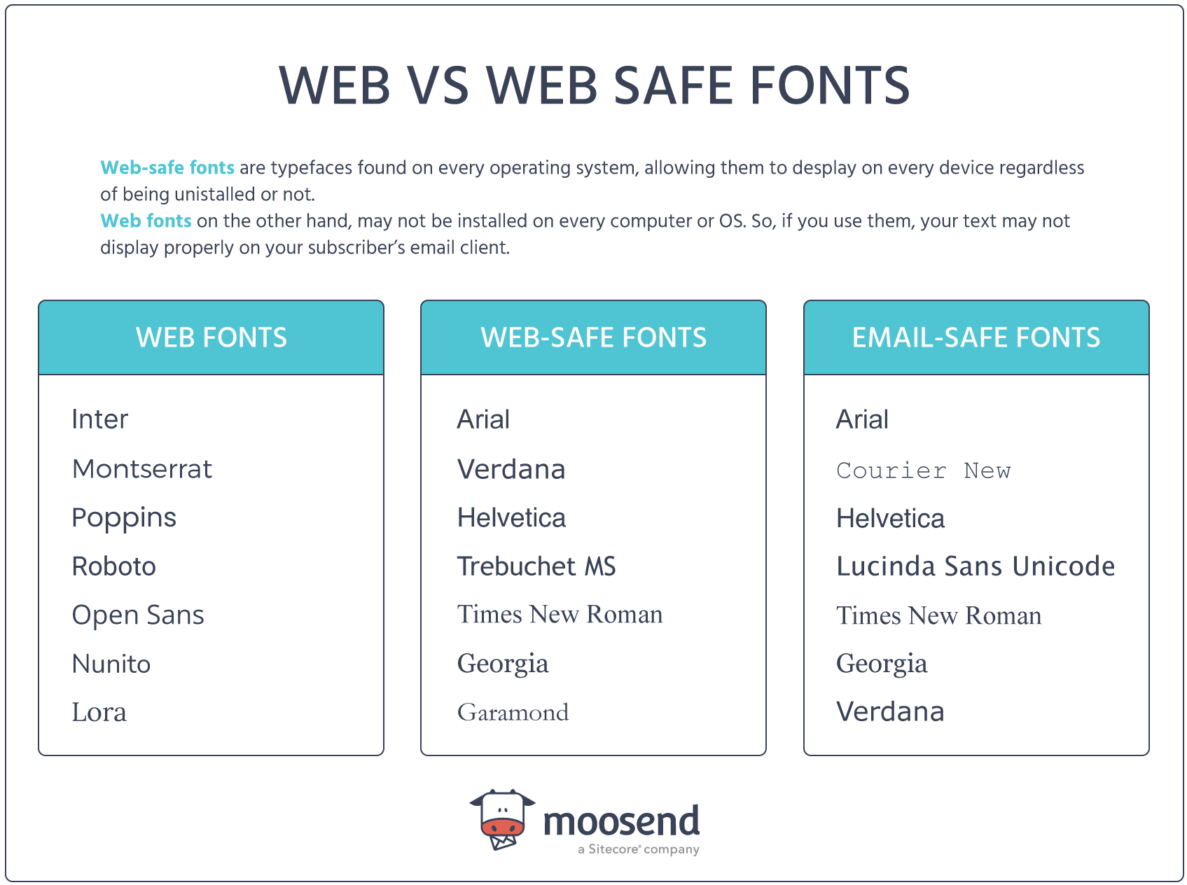
As you can see, marketers now have a greater variety of web-safe CSS and HTML fonts, allowing them to create a unique brand identity for their business.
However, what happens when you really need to use a web font like Poppins or Inter? In this case, you need to know the email clients that support them.
Which email clients support web fonts?
Choosing the right font for your newsletter is essential to delivering a unique user experience.
For example, Cox & Cox uses the sans serif Gill Sans font for their email marketing campaign:
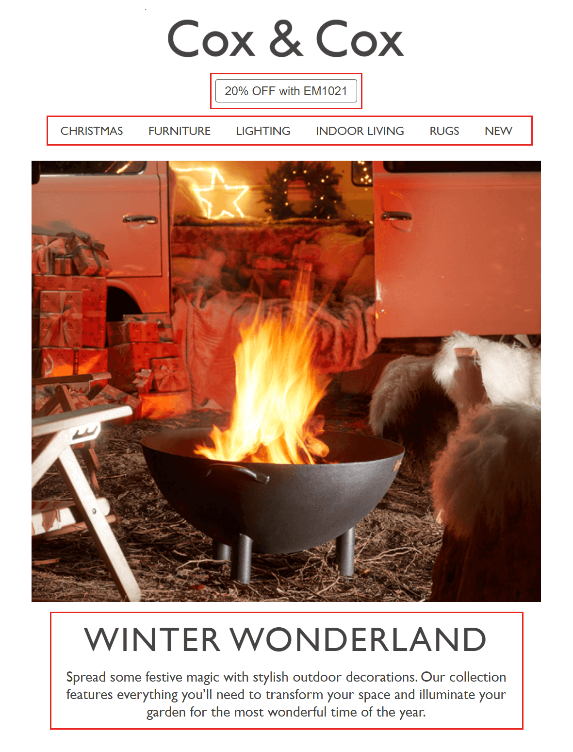
Using web fonts may not sound ideal, but you can definitely employ them if you consider a few things first.
The most important one is to find out what email clients work well with them:
- Apple Mail & iOS Mail
- Outlook 2000 & Outlook.com app
- Samsung Mail
- Android mail client
Moreover, a recent survey showed that three out of five top email clients support web fonts, so using them might not be bad.
Next, you need to consider where to get them and how to embed them in your newsletters. You can get web fonts for your email from various sources, either free or paid.
The most popular free font choice is Google Fonts, whereas licensed fonts can be obtained from Adobe Fonts or Typotheque.
Choosing fallback fonts
Another important thing to remember when using web fonts for email marketing is to implement fallback typefaces.
In short, a fallback font is used when your first font can’t be displayed. So, if your recipient’s email provider can’t render your web font, it’ll use the fallback font instead. To make them work, your fallback fonts should be similar to the original fonts you used in terms of weight, width, and height.
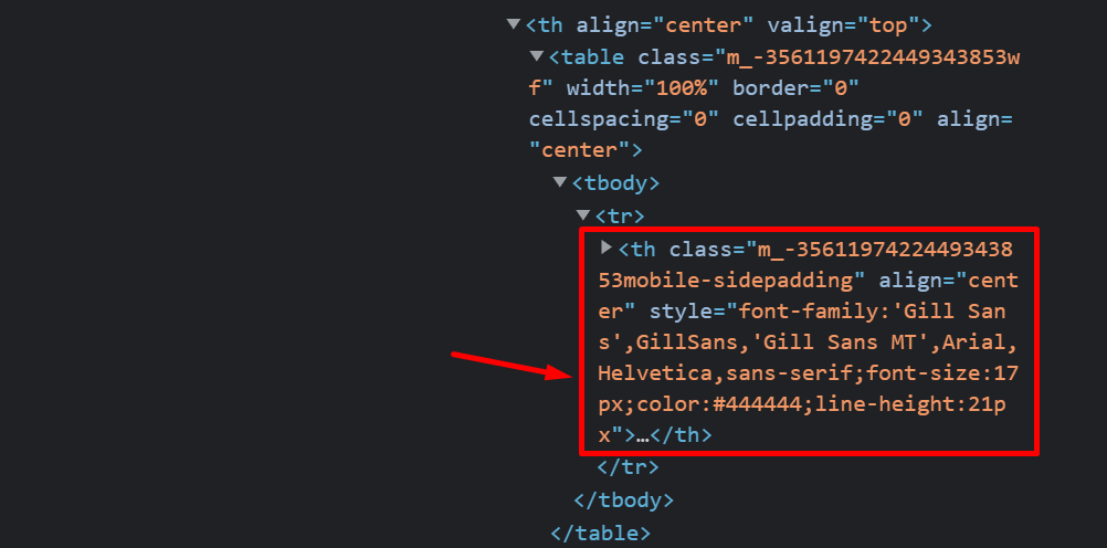
If we go back to Cox & Cox’s email campaign, we can check the fallback fonts for the Gill Sans web font by clicking on the Inspect option.
As you can see, Arial and Helvetica will be used in case the email client is unable to display Gill Sans.
While following the above will help you deliver newsletters that render correctly, the best way to improve your subscribers’ reading experience is to make a font selection based on data.
Finding out the app most subscribers use to open your campaigns will allow you to select the most suitable email-friendly fonts.
You can easily do that through your email marketing platform. For instance, Moosend’s reporting and analytics features will show you the email client your contacts use the most:
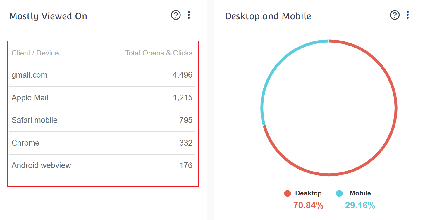
If you want to harness the power of data, sign up for a Moosend account and start sending optimized newsletters.
Best Email Fonts for Your Campaigns
Now let’s check the top web-safe fonts and a few web typefaces you can use.
1. Times New Roman – Email-Safe Font
Times New Roman is one of the most popular serif fonts. It is classified as a mixed, old-style transitional font mainly used for printed materials like books.
Pros
- Highly readable, ideal for long body text.
- Professional and traditional appearance suitable for formal emails.
- Universally recognized and supported across all email clients.
Cons
- May feel outdated or overly formal for modern brands.
- Can appear generic as it’s extensively used.
2. Arial – Email-Safe Typeface
Arial (or Arial MT) is another great option since it is the default font stack sans serif typeface for most websites and browsers.
Pros
- It has a clean, modern look suitable for headlines and short text.
- Excellent readability at smaller sizes.
- Optimized for display across devices, especially for Gmail users.
Cons
- Less distinctive, as it’s used extensively online.
- Can appear generic, reducing brand uniqueness.
- Not optimal for lengthy body texts due to slightly lower readability over extended passages.
3. Helvetica – Web-Safe Font
Helvetica (or Neue Haas Grotesk) is another neo-grotesque sans serif font. This typeface has the same advantages as its cousin, Arial. It is a good choice for your newsletter header since it has a bold, modern look that will make your text stand out.
The font is also a great choice for business emails since it will give them a more professional vibe.
Cons
- Letter spacing is tight, which can make dense text harder to read.
- Can feel too corporate or sterile.
- Larger file size when used as a web font, potentially slowing email load times.
Apple Mail also uses Helvetica as its default font, so if your readers are Mac users, keep that in mind.
4. Verdana – Web-Safe Typeface
Verdana is another sans serif typeface whose unique characteristic is its additional space between letters to increase legibility.
Pros
- Optimized for screens of any size.
- Works well for both headings and body text, unlike Helvetica or Arial.
- Web-safe and supported across most email clients, reducing display issues.
Cons
- Takes up more space due to its wider letters, which may impact email layout.
- Can look slightly less refined compared to modern sans serif fonts.
- Not as visually unique, making it harder to establish a unique brand identity.
5. Georgia – Web-Safe Typeface
Georgia is a serif typeface that will add elegance to your headings and email copy.
Since it is similar to Times New Roman, you’ll get all the perks of the popular serif font and benefit from Georgia’s rounder and bolder font style.
Pros
- Web-safe and widely supported, reducing display inconsistencies.
- Gives a refined, authoritative feel, making it great for professional emails.
Cons
- Can appear too formal or traditional for playful brands.
- Takes up slightly more space than sans serif fonts, impacting layout flexibility.
6. Courier New – Email-Safe Font
This monospaced serif font was developed for IBM typewriters, so using it will instantly give your body text an old-fashioned vibe.
Courier is perfect for creating branded email templates with a more “old-fashioned” or “rustic” feel.
Pros
- Enhances readability for code snippets or technical email content.
- Web-safe and supported across most email clients.
- Stands out in designs dominated by sans serif and proportional serif fonts.
Cons
- Harder to read in large paragraphs due to fixed-width spacing.
- Takes up more space than proportional fonts, making layout management tricky.
Best for: Vintage-styled emails, creative brands, coding-related newsletters, or brands aiming for a typewriter-like aesthetic.
7. Tahoma – Web-Safe Typeface
Tahoma is another great sans-serif email font option and a fan-favorite for Windows Operating Systems.
The typeface supports various Unicode characters, meaning you can easily create newsletters in multiple languages.
Pros
- Highly readable at small sizes, making it great for body text.
- Supports multiple languages, including Hebrew and Greek, ensuring accessibility.
- Compact letter spacing allows for efficient use of space in email layouts.
Cons
- Appears too basic or generic, lacking personality.
- Less commonly used in modern design compared to Arial or Helvetica.
- May look slightly compressed on some screens.
8. Trebuchet MS – Web-Safe Font
Trebuchet MS is the default font used by Microsoft operating systems, making it a no-brainer for newsletters.
In 2010, Microsoft released the Trebuchet Pro version of the typeface for commercial use, which included extra font styles and features.
Pros
- Modern and slightly decorative, giving emails a more stylish look than Arial or Tahoma.
- Highly readable due to wider spacing and well-balanced letterforms.
- Web-safe, making it a reliable choice for email readability across devices.
Cons
- Slightly wider letterforms may take up more space, impacting email layout.
- Not as neutral as Helvetica or Arial, making it less versatile for all branding styles.
9. Garamond – Web Font
Garamond is a classic serif typeface known for its smooth, elegant lines, and high readability.
It’s a strong choice for body text and is widely used in publishing and personal communications, offering a refined and timeless feel.
Pros
- Highly readable in long-form text, making it ideal for body copy.
- Lightweight font, meaning it loads faster compared to some modern serif fonts.
- Gives emails a classic, refined aesthetic that stands out from default fonts.
Cons
- Not universally supported across all email clients, so fallback fonts may be needed.
- Can appear too formal or old-fashioned for modern, tech-oriented brands.
- Not the best for small text sizes, as the fine details may be harder to read on screens.
10. Open Sans – Web Font
Based on the Droid Sans design, which was developed for mobile devices, Open Sans is a great sans-serif font that is easy on the eye.
This font works well with Gmail, ensuring your messages display correctly without fallbacks.
Pros
- Highly readable due to its clean, open letterforms.
- Optimized for desktop and mobile devices.
- Perfect for brands favoring minimalist, clean aesthetics.
Cons
- Not a default system font, so it may require embedding, potentially increasing load times.
- Less distinctive than Helvetica or other premium sans-serif typefaces.
11. Roboto – Web Font
The Roboto typeface is similar to the Open Sans font. Google initially created this neo-grotesque sans-serif email font for the Android OS.
Its geometric style makes it look modern. Since it was developed with mobile in mind, it is very screen- and user-friendly.
Pros
- Flexible for both body text and headlines, with multiple weights and styles available.
- Modern, sleek, and professional, it’s suitable for brands favoring a clean, minimal look.
Cons
- Lacks uniqueness as it is widely used across various apps and platforms.
- Can feel robotic or overly technical, making it less ideal for brands seeking personality.
Best Email Font & Color Combinations
Now that we have examined some of the best email fonts for your campaigns, let’s look at real examples featuring effective font combinations.
We also added color palettes to help you craft well-designed, engaging emails that stay true to your brand identity.
e.l.f: Verdana & Futura
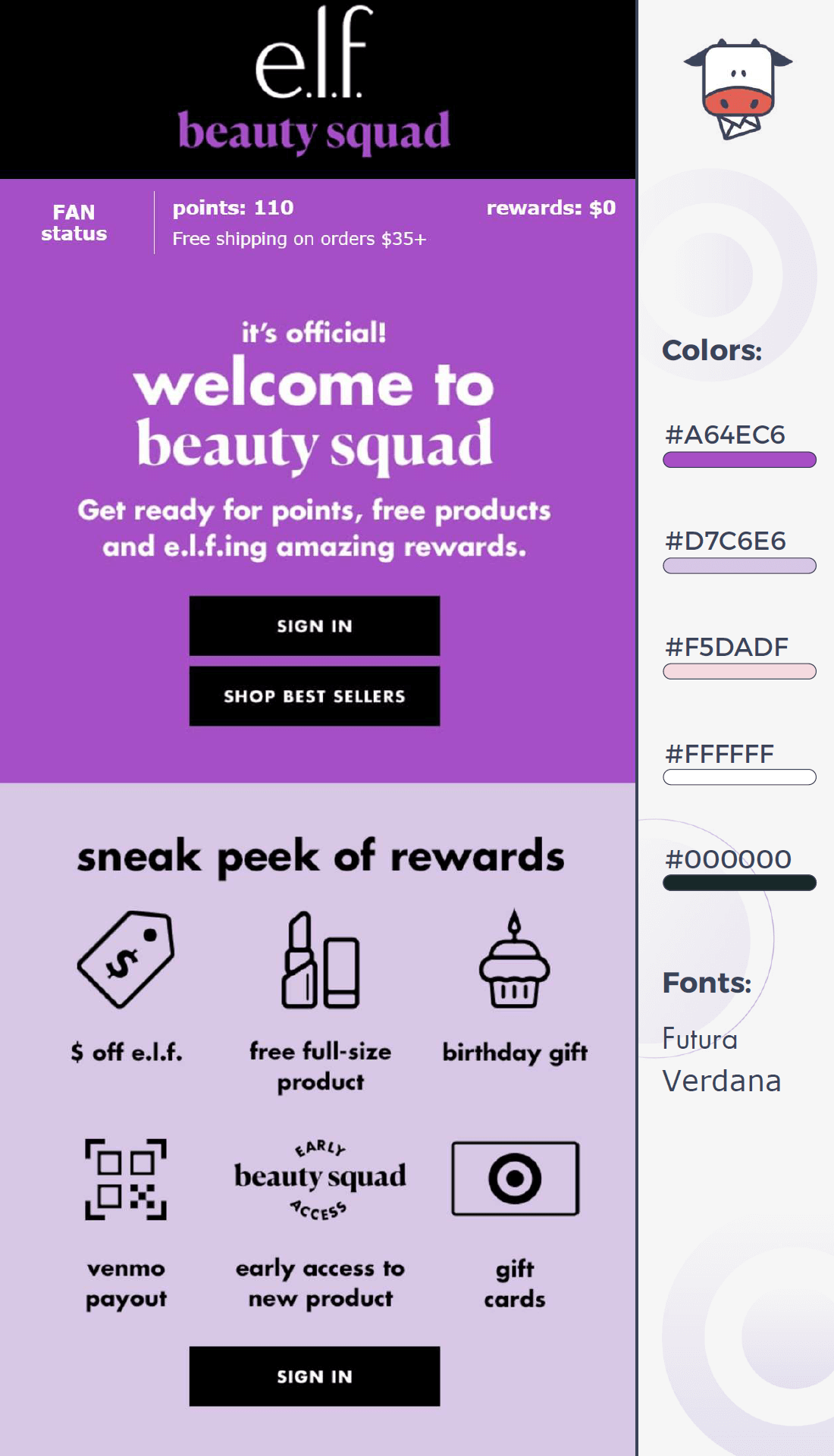
This email example by e.l.f. uses Futura and Verdana to create a modern and easy-to-read result.
Fonts
- Futura is used for headings and branding, such as “beauty squad.” It gives the email a trendy, stylish feel.
- Verdana is used for body text and buttons to make the content easy to read on any screen.
Colors palette
The colors help make the design stand out. The bold purple (#A64EC6) grabs attention, while the soft pastels (#D7C6E6, #F5DADF) create a friendly and inviting feel. The black text and buttons (#000000) add contrast, making key actions like signing in easy to spot.
The Body Shop: Helvetica & Arial Black
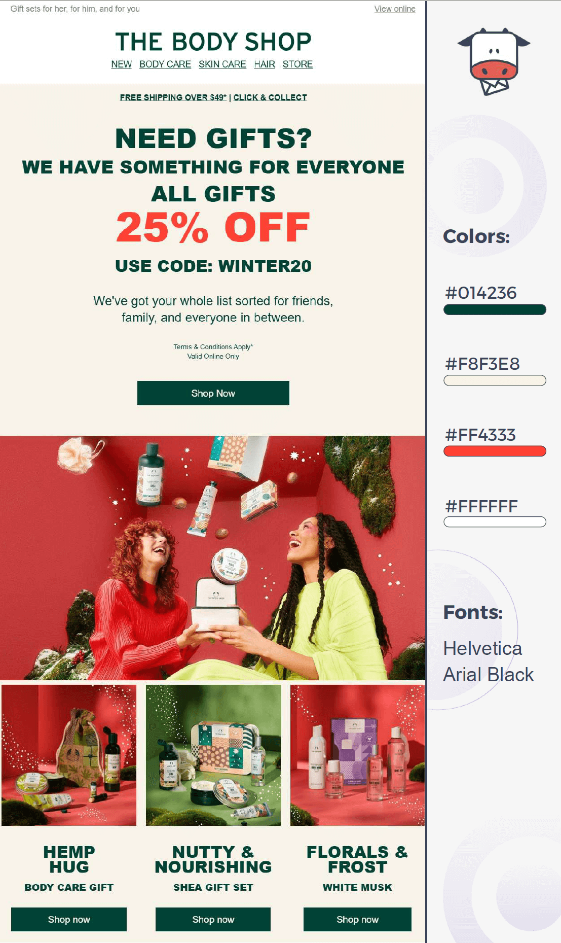
The Body Shop’s holiday email campaign uses Helvetica and Arial Black to match their colorful design.
Fonts
- Helvetica, a widely used sans-serif font, gives the email a modern and professional look while ensuring readability even on design-heavy campaigns.
- Arial Black, a heavier and more attention-grabbing font, is used for headings and discount offers (like “25% OFF”), making key messages stand out instantly.
Color palette
The color palette gives the email a festive feel. Deep green (#014236) adds a classic holiday touch, while bold red (#FF4333) creates urgency around the sale. The soft beige background (#F8F3E8) keeps the design warm, inviting, and easy to read.
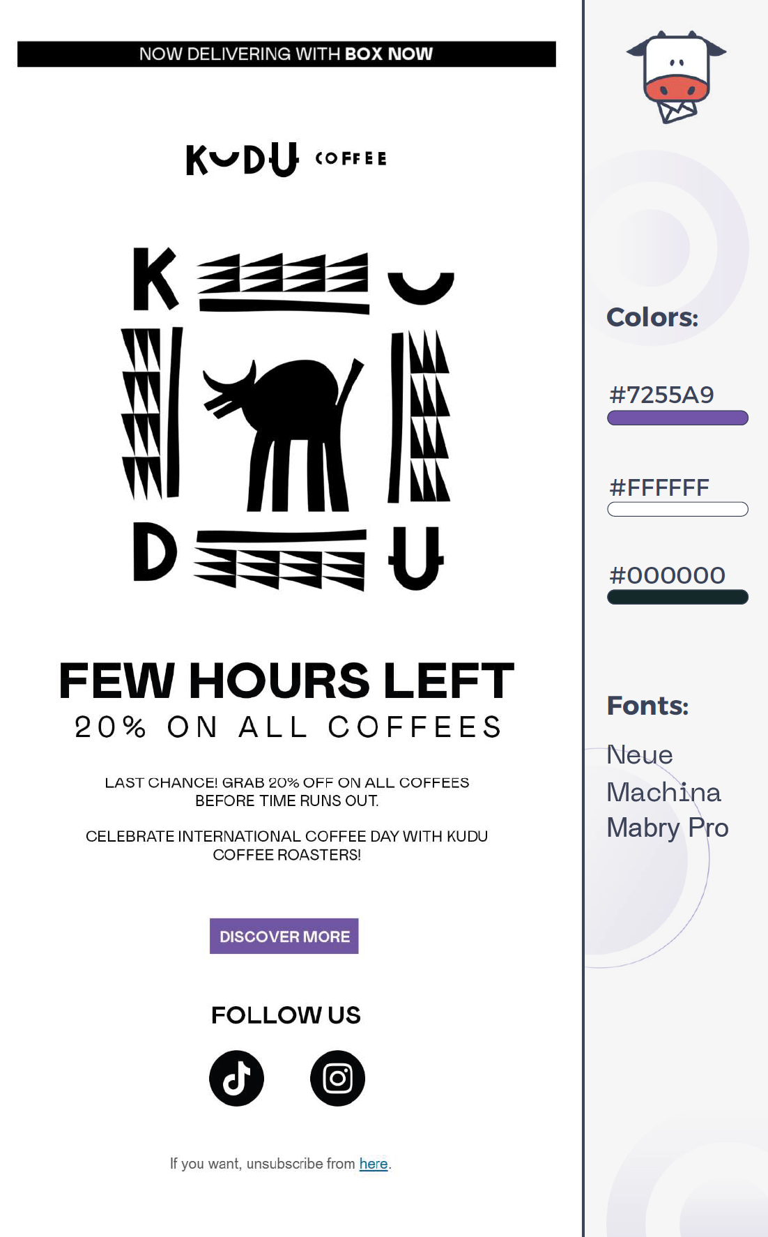
KUDU Coffee: Neue Machina & Mabry Pro
KUDU Coffee uses Neue Machina and Mabry Pro for a modern, structured look that maintains readability through white space.
Fonts
- Neue Machina’s sharp, industrial-style lettering gives it a strong, futuristic feel, making urgency-driven messages like “FEW HOURS LEFT” stand out.
- Mabry Pro offers a clean, contemporary feel that balances Neue Machina’s boldness, keeping the email easy to read.
Color palette
The black and white palette keeps the design minimal and sophisticated, while the deep purple (#7255A9) CTA button adds a splash of color, drawing attention without overpowering the design.
Terre Bleu: Futura & ITC Avant Garde Gothic
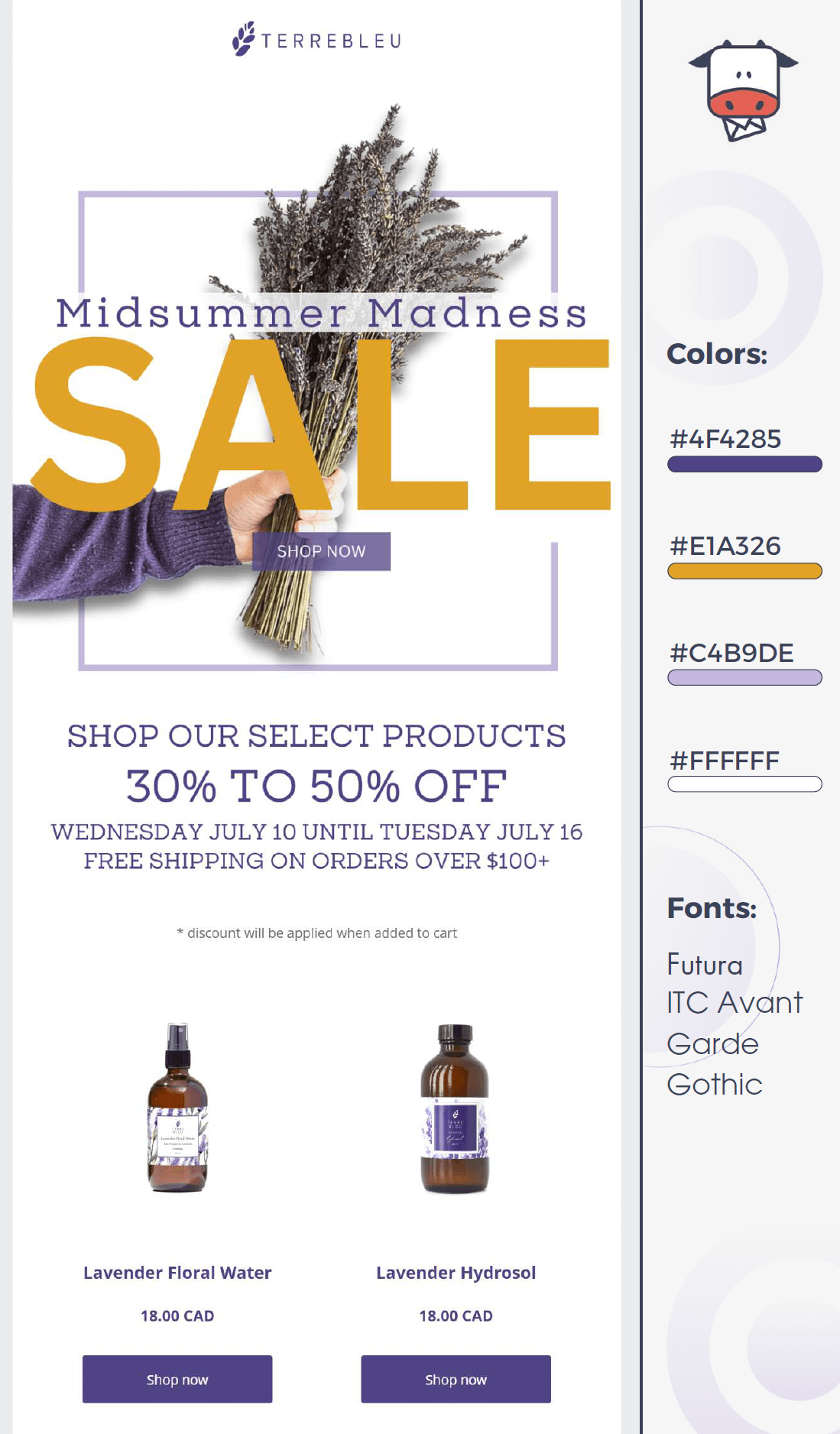
Terre Bleu’s email design employs Futura and ITC Avant Garde Gothic to promote a clean, modern aesthetic that aligns with the brand’s premium and natural image.
- Futura adds a sleek and structured feel, making the text easy to read while maintaining a contemporary look.
- ITC Avant Garde Gothic, known for its bold and elegant letterforms, emphasizes key areas, such as the sale announcement.
Color palette
The color palette is similar to KUDU’s, featuring deep purple (#4F4285) and soft lavender (#C4B9DE) for a luxurious and calming feel. However, the addition of yellow (#E1A326) in “SALE” makes the offer stand out instantly.
The white background (#FFFFFF) keeps the design light and easy to read, ensuring legible typography and messaging.
HelloFresh: Agrandir & Source Sans Pro
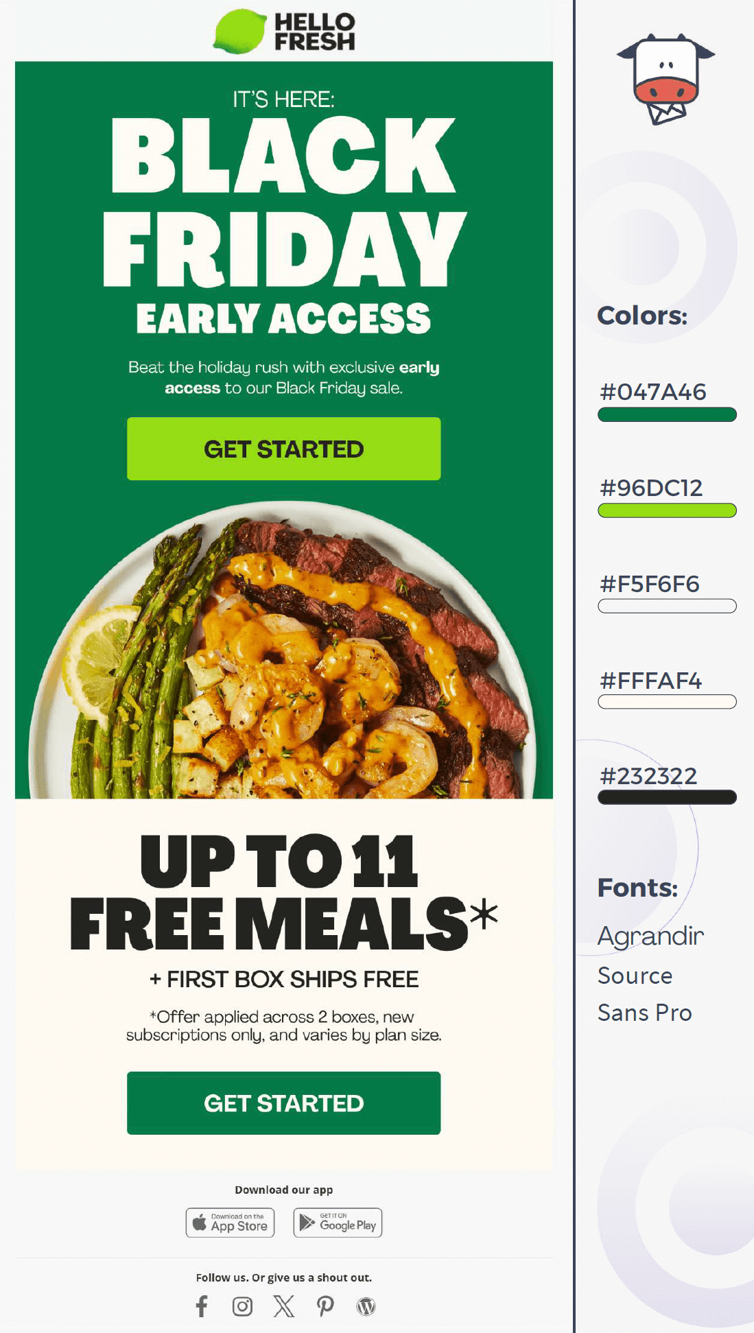
HelloFresh’s Black Friday email campaign takes advantage of bold fonts to make an impression and ensure readability.
Fonts
- Agrandir is a chunky sans-serif that dominates the headings, making key messages like “BLACK FRIDAY EARLY ACCESS” stand out. This adds urgency and excitement to the offer.
- Source Sans Pro keeps the body text clear and easy to read, balancing Agrandir’s bold headlines for a smooth, readable design.
Color palette
The green-heavy palette (#047A46, #96DC12) perfectly matches HelloFresh’s natural branding while creating a strong Black Friday contrast. The bright green CTA button grabs attention, encouraging immediate action.
Meanwhile, neutral whites and soft beige (#FFFAF4, #F5F6F6) balance the boldness, keeping the design clean and approachable.
Best Practices to Nail Your Email Fonts
Choosing a cool font is great, but choosing the right font will help you distinguish your brand from the rest.
1. Use the right fonts for different text elements
To nail your font selection, you need to consider each text element separately.
For instance, headlines and body copy require specific fonts to be efficient. To give you an idea, here are the most common text elements and what’s best to choose:
- Headlines: Use fonts that are easy to read and have great bold options. Verdana is a good sans-serif choice that will make your headings clear. Helvetica is also a nice alternative as it is clean, elegant, and works well for larger sizes.
- Body copy: Your email copy should favor a very legible typeface to avoid tiring your readers. Serif fonts, such as Baskerville, Garamond, and Georgia, are an excellent option. Sans-serif fonts also work, but make sure that they have a wide spacing.
- CTAs: Your CTA buttons must be bold to make a statement. Opt for fonts that will stand out and look great in bold. To make them work, choose serif or sans-serif typefaces to create legible buttons.
- Email signature: Use standard and professional fonts (Arial, Helvetica, Verdana, San Fransisco, etc.) to make your email signature easy to read. Keep the size between 10 and 12px and avoid decorative styles.
2. Choose the best font combinations
You can combine different typefaces to create a beautiful email design when selecting fonts. Nevertheless, when the time comes to “marry” your fonts, you need to make sure they match.
The easiest way is to choose typefaces from the same family, like Arial/Verdana or Times New Roman/Georgia. Nevertheless, don’t forget that opposites sometimes attract.
So, using a good serif and sans-serif font might be just what you need. To inspire you, here are a few nice font combinations to consider:
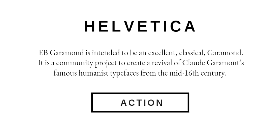
Helvetica & EB Garamond
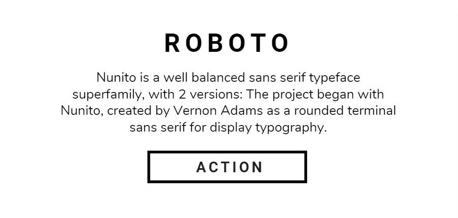
Roboto & Nunito
3. Add custom fonts
What if you want to give your audience a font to remember your brand? You can add custom fonts to make your email newsletters more memorable for your target audience.
To use custom fonts, you need an email campaign editor that allows you to insert your favorite typefaces.
Many email newsletter software tools, such as Moosend and Mailchimp, allow you to use custom fonts, such as Nunito, Noto Sans, Crimson Pro, and so on.
Before selecting a custom typeface, note that not all email clients will support your custom font choices. The ones who will include:
- Apple Mail
- iOS Mail
- Outlook for Mac OS
- Samsung Mail (Android 8.0)
Of course, some brands will take this to the next level by developing their own fonts as part of their brand-building efforts to power up the customer experience. Here are some businesses that have adopted this practice:
- Michael Kors: Kors Sans Book
- Samsung: SamsungOne
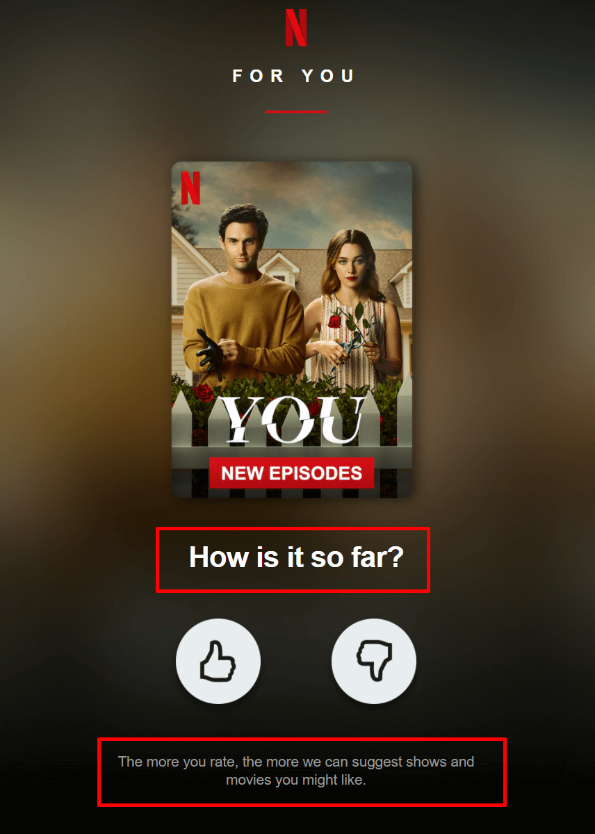
- Netflix: Netflix Sans
Below, you can see Netflix’s Netflix Sans in action:
4. Style your typefaces wisely
Apart from choosing a font, you also need to decide whether you’ll use different style elements to make your text pop out:
- Bold: Make your fonts bold to increase the weight of your words. Use this element for headings or short chunks of text to emphasize your message.
- Italics: Use italics to emphasize important information in your text. You can leverage it for quotes, subheadings, names, etc.
- Font color: Adding a splash of color to your fonts will make your body text more playful and increase your branding (if you choose your brand colors!).
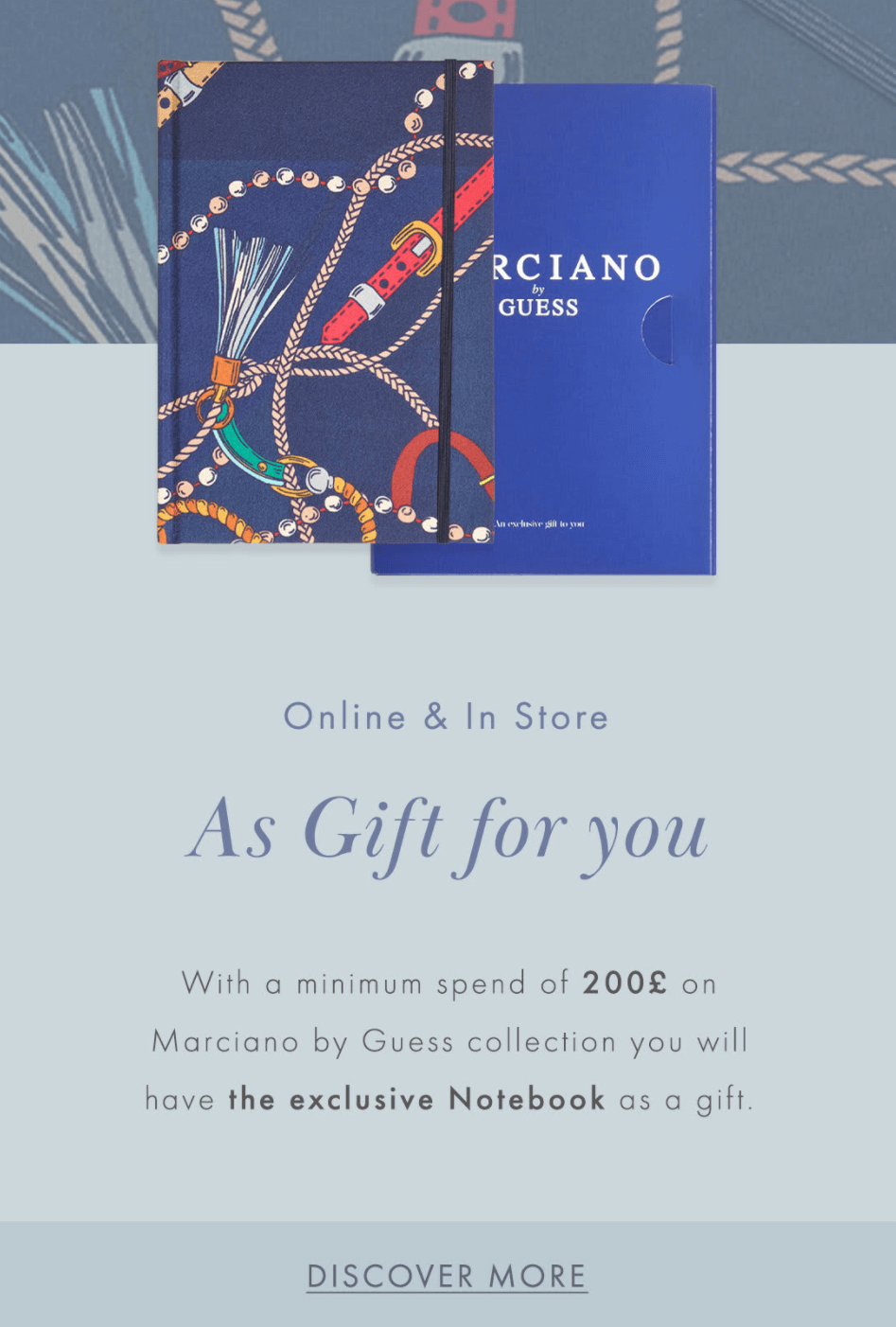
Below, you can see how GUESS uses different fonts and style elements to create an eye-pleasing message:
5. Be consistent with your fonts
If you have a regular mailing schedule, your audience will expect emails with common elements, such as your logo, color palette, brand tone, and so on.
The same applies to your fonts. Don’t use different typefaces for every campaign you send, as this will prevent your reader from establishing a sense of continuity with your brand.
Find the ideal combo and use it for your weekly newsletter. Of course, you can keep special font combinations for rare occasions like a Black Friday sale or Christmas email marketing promotion to make a difference.
Best Email Fonts for Stunning Campaigns
Choosing the right fonts for your newsletters might seem like a lot of work, and it may be if you want to find the best typeface combination for your brand!
To nail your font selection, you can experiment with your campaign typefaces until you find the ones that suit you and your readers best. Of course, some A/B Testing may be necessary, but creating converting campaigns already requires you to try different elements and optimize your emails.
So, in a nutshell, choose fonts that favor legibility, are email-safe, and align with your campaign’s goals. If you want an advanced tool to help you smooth out the process, you can try Moosend. Just ensure you register for an account and are ready to roll.
Frequently Asked Questions (FAQs)
Short answers to important questions about email fonts.
1. Should I use more than one font?
Multiple fonts will help you create unique messages that look sophisticated and are fun to interact with. As a rule of thumb, use up to three different fonts to avoid confusion and inconsistencies. You can have various font combos like serif/serif, sans-serif/serif, sans-serif/sans-serif, and so on.
2. What is the best email font size?
It depends on the text element. You can go up to 36 pixels for headlines, but keep your overall newsletter design and email element sizes in mind. A font size between 10 and 14px is great for your body copy, while your footer text can be between 10 and 12px.
3. What is the ideal font spacing for emails?
Letter spacing depends on your chosen font, as font families have various character widths. Try not to choose typefaces that don’t have a big positive or negative spacing value to maintain good legibility.
4. What is the ideal line spacing?
The ideal line spacing (leading) depends on the font and content type, but a good rule of thumb is 120% to 145% of the font size.
- For body text, a 1.4x to 1.6x line-height (or 140%-160%) improves readability.
- For headings, slightly tighter spacing (1.2x or 120%) keeps the design compact and bold.
Proper line spacing prevents clutter and ensures text is easy to scan, especially on mobile.
5. Can I use style elements with my fonts?
Using styling elements such as bold, italics, and font colors depends on your email newsletter design and whether you need to emphasize specific chunks of text. For headlines, you can use the bold version of your selected typeface set.
6. What are the best email fonts?
Based on their legibility and email client compatibility, the best fonts for email newsletters are the web-safe (email-safe) typefaces, including Arial, Verdana, Georgia, Helvetica, and Times New Roman. Nevertheless, you can utilize web fonts like Open Sans and Roboto, but don’t forget to set a fallback font.
6. What are the default fonts for desktop email clients?
Each email client has different default fonts to display your text. Gmail uses Arial, Apple Mail has Helvetica, and Microsoft Outlook utilizes Calibri.
7. Why should I use standard fonts?
Standard fonts are perfect for emails, web pages, and documents because they ensure consistent display and easy readability across different devices and platforms. Some of the most popular fonts include Times New Roman, Georgia, Arial, Helvetica, Verdana, Tahoma, Courier New, Roboto, San Francisco, and Segoe UI.



 Published by

