


10 Best Webinar Landing Page Examples & Templates in 2026
Published By Alexandra Marinaki
April 14, 2025

14/04/25
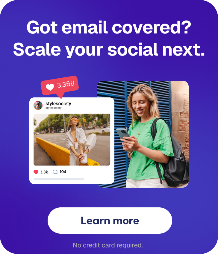
You’re about to start promoting your next webinar and look for ways to increase your registration rates. But how? There’s one marketing asset that can secure the results you’re longing for—webinar landing pages.
According to the 2025 Webinar Benchmarks Report, well-designed webinar landing pages can increase registration rates by up to 30%, making them an essential tool in your event marketing strategy.
In this guide, you’ll learn best practices to craft high-converting landing pages to promote your webinars. Explore their core elements and see how big brands have built successful webinar landing pages to boost their lead generation. Finally, find premade landing pages to build your own.
What Is a Webinar Landing Page?
A webinar landing page is a webpage aiming to promote an upcoming webinar and increase signups. It can also work as a lead magnet, as it can bring new high-quality leads to the business.
Webinar landing pages include valuable information about the event, such as date, time, covered topics, and speaker names. They invite prospects to sign up, emphasizing the benefits attendees will reap.
Most businesses use landing page builders with premade templates to craft them. You can resort to dedicated tools such as Leadpages or more enhanced marketing platforms like Moosend with built-in tools and user-friendly features.

Why You Should Create High-Quality Webinar Landing Pages
The two main challenges marketers face when promoting a webinar are low signup and attendance rates. Thankfully, a well-designed landing page can help overcome them.
Here are some of the key benefits of introducing webinar landing pages to your promotional strategies:
- Increase registrations: They help attract the attention of people interested in the webinar topic.
- Boost engagement: They provide participants with important information about the webinar to convince them to join.
- Generate new leads: You can target high-quality leads and gradually move them down the funnel with nurturing techniques to convert them into customers.
- Boost brand awareness: A beautiful landing page can display your brand’s identity and make an impression on new visitors.
- Collect important data: You can use the data collected during the signup process to send highly targeted campaigns to leads and customers.
The better news? Reaping those benefits is relatively easy if you follow some practical tips.
Essential Elements of High-Converting Webinar Landing Pages
What is the anatomy of a successful landing page? Here are the essential components and tips to master them:
Clear headline
One of the first elements visitors will spot on your landing page is the title. A compelling headline should align with the purpose of the event and reflect the webinar content to increase conversions.
Most marketers add the webinar title followed by a description or a subtitle to help readers grasp what this event is about at first glance. Keep it short and concise and use action-oriented words to increase conversions. Plus, place the event date and time close to the headtitle for maximum visibility.
Here’s a landing page example for an on-demand webinar by HubSpot and Lake One targeting marketing and sales teams from a specific industry:

Webinar description
Readers who feel intrigued by the title seek more information about the webinar to decide if it’s a good fit for them. Start with a brief description like the example above, adding keywords related to pain points and benefits they’ll reap if they join.
To structure information more efficiently, use subheadings and bullet points. Apart from takeaways, you can also add an FAQ section to respond to questions that often come up, such as how to log in to the webinar platform and payment options.
Value proposition (USP)
Your target audience will need enough evidence before signing up about the benefits of joining your webinar. Include your value proposition through clever copywriting, hinting at the pain points they’ll overcome.
HubSpot and Lake One added a “What you’ll learn” section explaining what they can gain during the webinar, from expert industry insights to Q&As:

Speaker information
Potential attendees will be more motivated to join when they know the experts who will present the webinar. Mention their names and a short bio to reassure participants they’re in good hands. Plus, add their headshots to make it more formal.
HubSpot and Lake One chose this presentation style, directing readers to the experts’ LinkedIn profiles:

Visuals/videos
Adding visuals or videos to your landing page can make it more engaging and boost conversion rates. They can improve user experience and navigation and bring new valuable information to the table.
For instance, HubSpot added an infographic showing how manufacturing companies have improved 12 months after using the platform, along other visuals complementing the landing page copy:

Signup form
Now off to the signup form; place it at a prominent place on the landing page to help potential attendees spot it and sign up faster. Create a short registration form, as assets with many fields may undermine visitor experience and prevent readers from completing them.
Here’s what HubSpot wanted to know about new leads to categorize them effectively:

Call-to-action
Landing page copy invites readers to take a specific action—register or download. Create eye-catching CTA buttons and place them on the landing page to yield more conversions. The buttons should stand out from the rest of the text, written in actionable language.
HubSpot and Lake One included two CTA buttons, one at the top and the second above the footer. The copy lines “Watch on-demand” and “Get Access” leave no room for second-guessing.
Social proof
Finally, to elevate this promotional marketing strategy, consider adding social proof. Include customer testimonials, ratings from review sites, or even comments from social media users to earn the trust of potential customers faster.
How could HubSpot and Lake One make this most of this tactic? They could include testimonials or logos from popular manufacturing companies that’ve used the platform to build credibility faster.
How to Craft the Ultimate Webinar Landing Page
Can you make a great recipe by simply assembling the right ingredients? No, so learn how to blend these components harmoniously to create stellar webinar landing pages, including conversion optimization tips for beginners and pros:
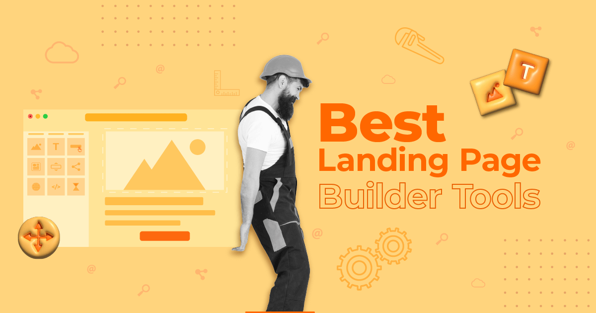
1. Create a clear design
While many designers are well equipped to create landing pages using popular tools such as Figma or Adobe, a premade webinar landing page template can save them valuable time and worries. The placeholder titles, texts, and images help visualize the output faster.
So, find an attention-grabbing template that suits your needs from platforms such as Moosend or Unbounce and customize it in simple steps. Tweak the fonts, images, and colors to match your brand style and create a consistent visitor’s experience across channels. Divide each section with headings and add spacing for easier navigation.
Here’s a landing page frame to structure information better:

2. Write customer-centric copy
To grab—and hold—a visitor’s attention, you need to give them the leading role. When crafting your head titles and body copy think of what the visitor would like to read to feel that your event addresses their needs fully.
Step into your ideal participant’s shoes; what would they want to see to feel this webinar is for them? What needs and pain points would they want to be tackled and what verbs would motivate them to act? Instead of sticking to what you can provide them with, focus on what they’ll earn and can expect. Action-oriented verbs and personal language can work magic.
Imagine that you’re promoting a skill development webinar. Which title would be more efficient? “Skill development for designers: Beginner level” or “Master your design skills from zero to hero?” Over to you.
3. Simplify the signup process
One of the main goals marketers set when crafting the webinar landing page design is making the signup form readily visible. Completing it is the primary–and usually single–call to action for visitors.
Long signup forms often prevent visitors from signing up due to time restrictions or concerns about how their data will be treated. To tackle those concerns, create short forms with limited fields and link to terms and conditions.
Before setting up the fields, think of what data you’d like to collect from new leads. For example, location, industry, and company size could help send more targeted marketing campaigns to new prospects to nurture them successfully and move them faster down funnel. What criteria would you introduce based on your business goals?
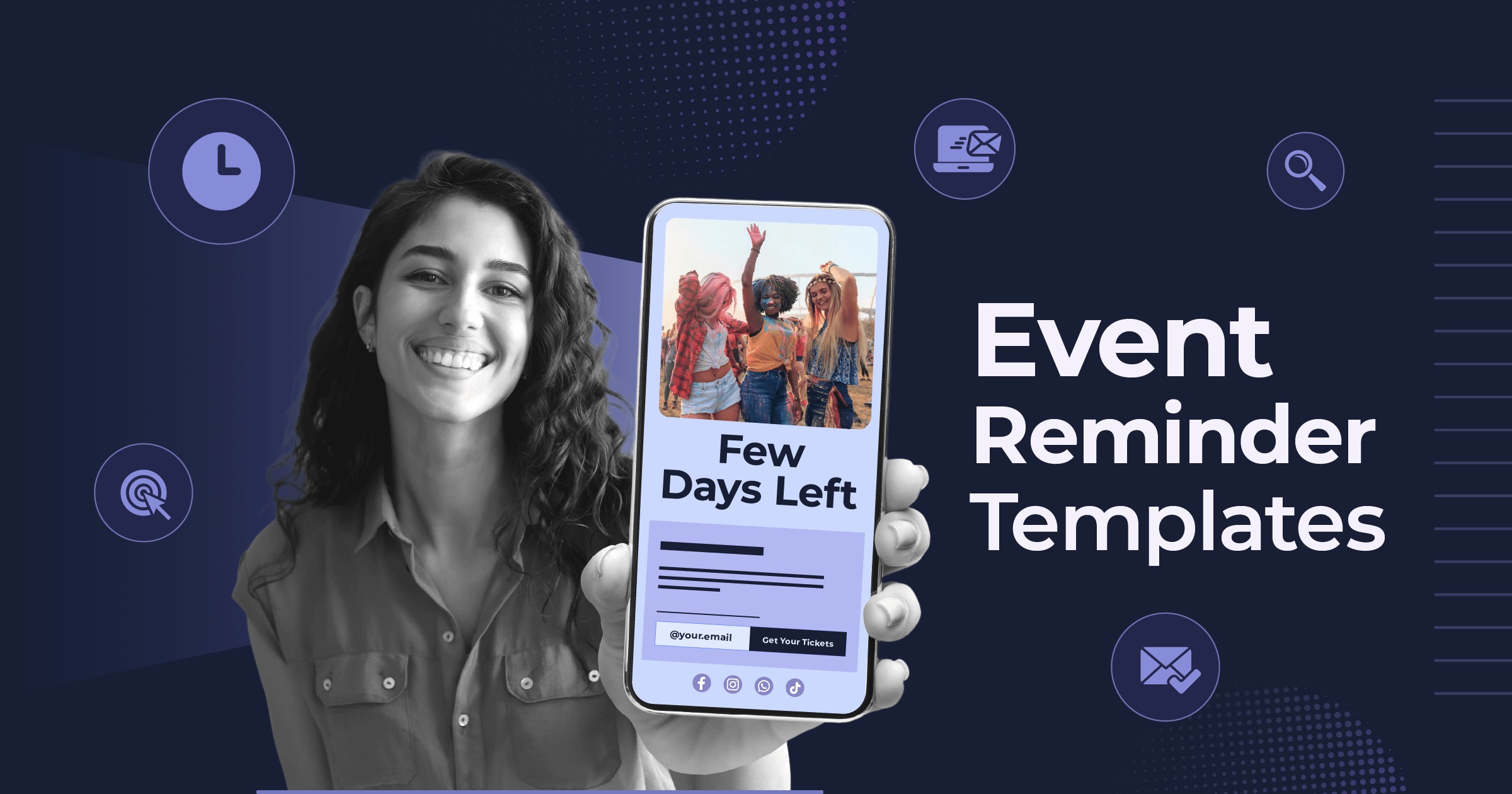
4. Add a sense of urgency
To encourage visitors to sign up before the time runs out, use time-sensitive phrases and words. For example, a “Register now” call-to-action button or a “limited spots” addition can motivate readers to register asap. However, avoid overusing these words as they could make your landing content look spammy.
Adding visual cues, such as countdown timers can also double the urgency effect, especially for upcoming events with limited registration time or waitlist landing pages. Place it at the top of your webinar registration page for better results.
Finally, offering limited-time incentives, such as early access or early bird tickets can maximize your registration rate.
5. Use data-driven techniques
If you’re unsure about certain parts of your webinar landing page and how they’ll perform, use A/B testing. This data-informed tactic helps marketers and designers find what landing page versions resonate the most with their target audience.
But what can you experiment with? You can test different images, content formats, CTA, or form variations. Combine that information with data you’ve collected from previous landing pages to build highly converting campaigns.
Overall, implementing data-driven tactics will teach you more about your target audience and what appeals to them to make better decisions down the line.
6. Ensure mobile responsiveness
Many visitors will find your webinar landing page while browsing on their mobile devices and tablets. Making responsive landing pages is a non-negotiable to secure an optimal visitor experience for all visitors.
But how can you ensure that your landing page remains stellar without having to dive deep into the nuts and bolts of UX and responsive design? Use a premade template with that functionality or look for an integration to your existing tool to run rendering tests and check how your landing page looks on different screens and devices.
As a rule of thumb, choose a simple and decluttered layout with fast loading images.
7. Optimize for SEO
If you want to make your landing page accessible to your target audience, apply SEO optimization tactics. This way, visitors interested in your webinar will reach it when typing similar queries on search engines.
Your first step is finding the right keywords to target and sprinkle them strategically throughout your content, especially headings. Add keywords in the meta data, such as SEO title and alt text for images. However, keep them in moderation otherwise the content may look spammy to crawlers.
Overall, implementing an SEO strategy won’t just benefit your webinar promotion, but can also boost brand awareness and contribute to lead generation, as your page will “land” in front of the right people.
8. Promote in various channels
While organic traffic can lead to signups, focusing on your existing channels and audience can drive faster results. People who’re already familiar with your brand will have less resistance to show trust in you. Plus, they’re probably already interested in what you’re offering.
First, add the webinar on your website to attract visitors. Include popups or banners to certain highly visible pages or related to the webinar topic. Plus, add related posts to your social media linking to your landing page to inform your audience and gain a wider reach through likes and shares.
Finally, you can create email marketing campaigns to nudge your subscribers. This method lets you send more targeted messages to potential attendees based on certain criteria, such as engagement level, previous behavior, or industry through segmentation. Check out this amazing example by Teachable:

You can also use email automation software to set up triggered email series in advance. For example, you can create an early access email with a “coming soon” landing page, a campaign with a general invitation, and a last call email to maximize your registrations.
9. Create a follow-up plan
While a well-crafted landing page can lead to a high registration rate, your promotional tactics shouldn’t stop there. Considering how busy registrants’ lives are, going “no contact” until the webinar date can undermine your attendance rate.
Once new registrants start flowing, nurture them through a series of emails, starting with a confirmation email with a thank-you note. Plus, send them a reminder a few days before the event to mark their calendars.
To save time, Moosend, apart from a built-in landing page builder, offers all the features needed to set up automated emails using premade templates and automation workflows, following the if/then logic.

Webinar Landing Page Examples & Why We Chose Them
Need more than theory and practical tips? Check out how popular businesses hosting webinars regularly design their landing pages to boost registrations and leads.
1. Sitecore
As a digital experience platform, Sitecore created a webinar to help customers and prospects choose the perfect CMS:

Why it works:
- They included a compelling headtitle addressing a common pain point of people searching for a CMS.
- They bolded important keywords hinting at the webinar content and a “Key takeaways” section to make readers spot them faster.
- They added the names, headshots, and job titles of the presenters for maximum credibility.
2. Salesforce
Salesforce is also a webinar force, holding frequent educational sessions to educate customers and move prospects down the funnel:

Why it works:
- It’s simple and easy to navigate, including all essential information needed to decide if it’s a good fit for potential attendees.
- It includes learning outcomes in bullet points, written in action-oriented language to convince prospects with similar interests to join.
- The signup form is easy to find, including links to the privacy statement and terms and conditions.
3. Sprout Social
Sprout Social, a well-known social media management platform, created a comprehensive webinar landing with a strong focus on copy:

Why it works:
- They placed the signup form at the top to boost registrations, adding the words free and the CTA button “Watch now” to boost signups.
- They included brief descriptions of the presenters focusing on their credentials.
- They added a statistic related to the topic in the body copy to add more credibility and indulge more people to join.
4. Shopify
Shopify needs no introduction in the eCommerce world. Here’s how they presented a data-oriented webinar for retailers:

Why it works:
- They created a minimalistic design that suits their brand style, with enough spacing to make each section distinct.
- Instead of a form, they added a CTA button written in actionable language at a prominent place.
- They presented the key takeaways in style, focusing on benefits and pain points to attract more registrants.
5. Calm
The popular meditation app Calm created a webinar targeting educators. Here’s the landing page design:

Why it works:
- They added a short signup form, requesting only the email address to generate more leads.
- They added a statistic from a notable source to emphasize the impact of workplace stress and the importance of taking active measures to alleviate it.
- They included short bios of the speakers to earn potential attendees’ trust.
6. Zoom
Here’s another example by Zoom targeting a specific niche—healthcare—with the latest trends to boost brand awareness and loyalty:

- They added an engaging visual healthcare professionals can quickly identify with to grab their attention.
- They divided valuable information into two sections under the headings “What to Expect” and “Why Attend” to set the right expectations.
- They added an additional information section in the signup form to prepare for the Q&A section.
7. Slack
Slack created an on-demand webinar landing page to help business leaders and admins maximize the value they gain from the platform:

Why it works:
- The headtitle and short description get the reader straight to the point of the webinar.
- The body copy emphasized pain points and benefits attendees will reap for their organizations.
- They added a brief survey at the footer to collect feedback and improve similar events in the future.
8. Hootsuite
Hootsuite built a webinar to introduce new features and how they can help customers and prospects upgrade their work in 2025:

Why it works:
- They introduced the webinar topics and benefits in action-oriented language, addressing readers directly.
- They placed social media share buttons to motivate attendees who enjoyed this webinar to post it online and gain more traction.
- The signup form stands out in dark green color next to a red visual, inviting visitors to “Download now.”
9. LearnWorlds
LearnWorlds offers daily live webinars with mini product tours, showing new customers and prospects how to build a course like pros:

Why it works:
- The webinar description is well-structured with bullet points, communicating clearly what attendees will learn.
- They let potential attendees choose from different dates on the signup form to find what suits their needs.
- It’s easy to grasp that this is a short, free webinar for LearnWorlds’ users.
10. Gartner
Finally, let’s have a look at a simple, corporate-looking landing page by Gartner, a popular tech consulting firm:

Why it works:
- They created a simple signup form, requesting only a work email address.
- They added contact information in case someone has questions about the webinar to improve user experience.
- The landing page copy included all the information needed to persuade security technicians to attend, from pain points to benefits.
Premade Webinar Landing Page Templates to Boost Registrations
Ready to build a compelling landing page to boost your signups and conversion rates? There’s no need to start from scratch, wasting valuable design resources. Instead, sign up for a Moosend account and get one month for free or log in to your existing account and set up a landing page with user-friendly features.
Here are four templates you can easily customize based on your brand’s needs:
Webinar announcement landing page
This template puts the hosts at the center of attention. It includes a simple signup form to capture leads, easy to customize. Tweak the date and icons in the topic section to make it more relevant:

Lead generation landing page
This webinar landing page has a social proof section to build credibility and increase conversions. You can easily customize the webinar topic and presenter sections:

Minimal webinar landing page
Use this simple webinar landing page to attract more signups and present the speakers more effectively. You can also add the logos of popular customers at the bottom for social proof:

Video-enhanced webinar landing page
Finally, use this template and add a visual or video at the center to boost engagement. Next to the form, you can add presenters’ quotes or bios or brief customer testimonials:

Turn Webinar Landing Pages into Lead Generation Machines
No matter how great a landing page design and copy is, remember that people signed up for an enlightening webinar. Create an engaging and inspiring presentation and ensure that speakers are prepared to deliver amazing results.
After all, this is the only way to turn new leads into customers and existing customers into loyal brand ambassadors.
Similar Posts
 Published by

Create, send and optimize your email marketing campaigns