
11 Best Practices for Landing Page Copy With Examples
You’ve been tasked to promote your next business webinar. You sit down with the design team to decide on the essential assets and a landing page cannot be missing from the list. They hand over the design blueprint to you, and now it’s time to start writing. But where do you even begin?
Whether you’re a copywriting newbie or a seasoned storyteller, the struggle to craft landing page copy is usually real. Especially when presented with a tight deadline or high conversion rate expectations.
Before turning to your AI assistant in a panic for quick copy suggestions or fixes, here’s a step-by-step guide to soothe your concerns and deliver copy that delights—and converts—your audience. Learn how to master landing page copywriting and get prepared for any similar project that comes your way.
Craft compelling landing pages easily
Use Moosend’s premade templates and AI writer to boost conversions.
Try freeThe Anatomy of a High-Converting Landing Page
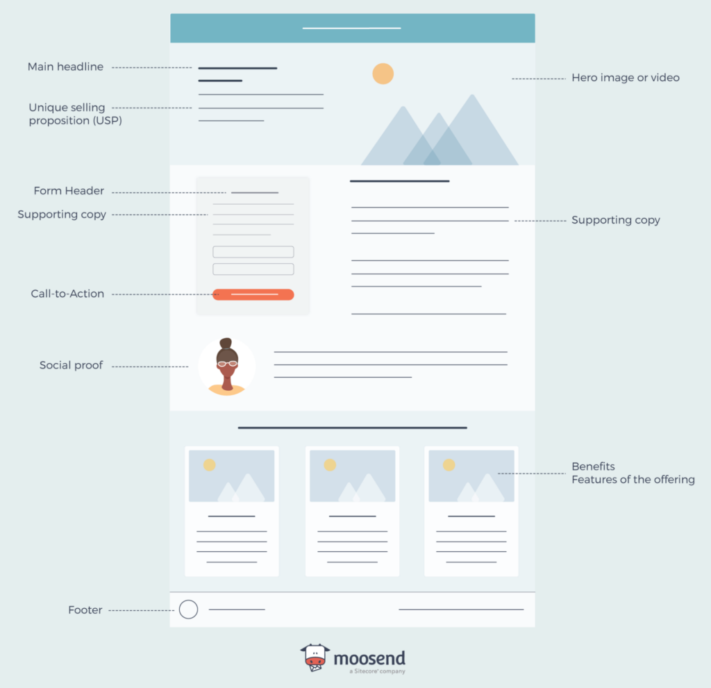
Let’s explore the key elements of a landing page to understand where your copy will fit. The landing page design and the placement of certain sections can differ based on the campaign goal.
- Main headline
- Signup form
- Call-to-action
- Image/video
- Supporting copy
- Benefits/features
- Footer
- Social proof (optional)
Check out this infographic to get a better grasp:
To save time and resources, most businesses resort to landing page builders with premade templates and use them as blueprints. This is even more helpful for junior copywriters to ensure that valuable information is covered. Check out this landing page template by Moosend to get a better grasp:
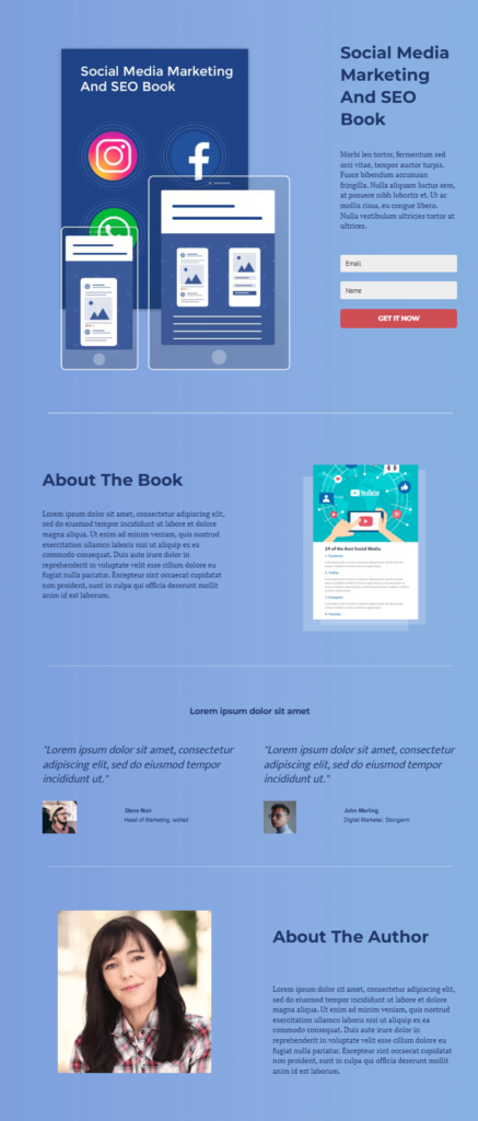
Overall, a landing page template with placeholder text and images will help you start visualizing your own page. You can start thinking about extra elements you’d like to include and how to present them more efficiently.
But to create a successful landing page, you need to find the right words that will resonate with your target audience.
How To Master Your Landing Page Copywriting
Imagine that writing landing page copy is like making a cake from scratch. Before serving your delicious treat to your guests, you need to go through three phases: Preparation, execution, and refinement. And each round comes with subtasks. Let’s see:
Preparation Phase
To write copy that will make potential customers trust and sail with you, you need to do some homework first.
1. Set a clear landing page goal
Setting a clear goal for your landing page is your key to success. Think about what you want to achieve—whether it’s generating leads, boosting sales, or increasing event registrations.
Once you’ve nailed down your goal, ensure that every element on your landing page supports it. This means your headline, body copy, images, and call-to-action (CTA) should all work together. For example, if you’re aiming to collect email addresses, your CTA should clearly invite visitors to sign up for your newsletter or download a free resource.
Keeping your messaging and design consistent creates a smooth user experience, making it more likely you’ll hit your goal. When everything flows together in sync, visitors are more likely to take the action you want them to.
2. Understand your target audience
To deliver converting copy, step into your customers’ shoes. What are their daily pain points and what converting will mean for them? Remember, your landing should not focus on what your brand does. Instead, put the reader in the leading role, explaining how your products or services can benefit your target audience and why.
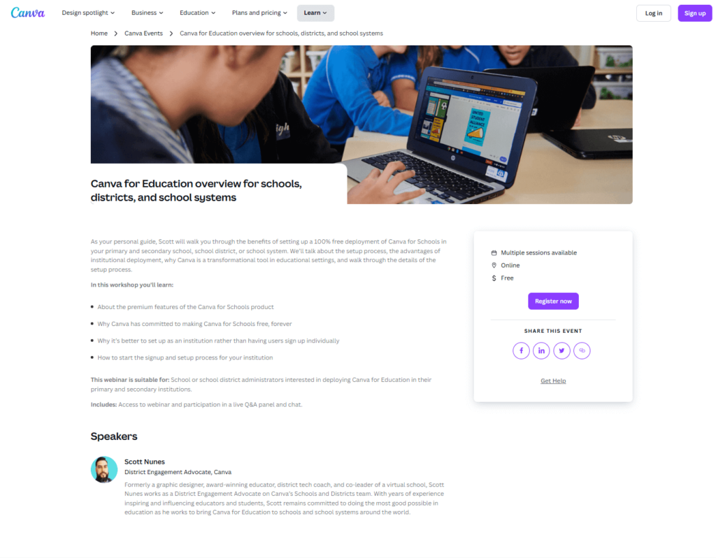
Let’s explore this webinar invitation by Canva. You can tell at first glance who this webinar is for, setting clear expectations for attendees. Visitors can check out the agenda of the event in bullet points to decide if it’s suitable for them. The pain points they address are readily visible.
Plus, they’ve included information about the speaker to add a more personal touch. His bio acts as a form of social proof. Teachers and school administrators would love to learn from a peer who has experienced similar challenges with them, including how they resolved them.
3. Determine your USP
Finding your unique selling proposition is like finding a secret ingredient that will elevate your recipe. Start by asking yourself: What makes your product or service unique? Maybe it’s a special feature, exceptional customer service, or a unique approach to solving a problem.
Whatever it is, your USP should be evident in your landing page copy. From headlines to benefits and features, share what differentiates you from competitors. For example, if your USP is that your product is eco-friendly, make sure to highlight how it benefits the environment and why that’s important.
Keep in mind that visitors will need evidence to trust you. To write effective landing page copy, complement your value proposition with stats or customer testimonials that prove your points.
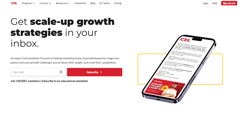
Check out this example by CXL. The value proposition is right there, with a description of what this newsletter is about and how many people already trust it.
Execution Phase
And now that the basic ingredients and cookware are in place, let the writing begin:
4. Match with the traffic source
People can “land” on those pages through multiple sources, such as a pop-up form on your homepage or a Google search. Create a consistent experience by using similar messaging that will reflect the visitors’ goals to avoid confusing your readers, or worse, sending them away.
Think of the intent a visitor has before arriving at the landing page and the stage they’re in throughout the customer journey. For example, people who’ve found your event landing page via an email marketing campaign are probably already familiar with your brand and closer to conversion.
But what happens to people who land on it after visiting your website for the first time? They’re probably at the awareness stage, so you’ll need to share more information with them down the road to convert them.
5. Write clear and compelling headlines
Do all people who come across a landing page intend to read it carefully? Considering today’s hectic paces, probably not. That’s why your headline should convey your value proposition straightaway.
What should a landing page headline include to be attention-grabbing? Addressing the customers’ pain points in one single sentence, combined with the benefits of your product, can work miracles.
To discover your customers’ bigger concerns and wishes, you need to walk their walk, and most importantly, talk their talk. Sourcing data from customer surveys, interviews, social media conversations and customer support data can help you out.
For example, here’s the headline of one of Unmind’s services with a powerful impact:
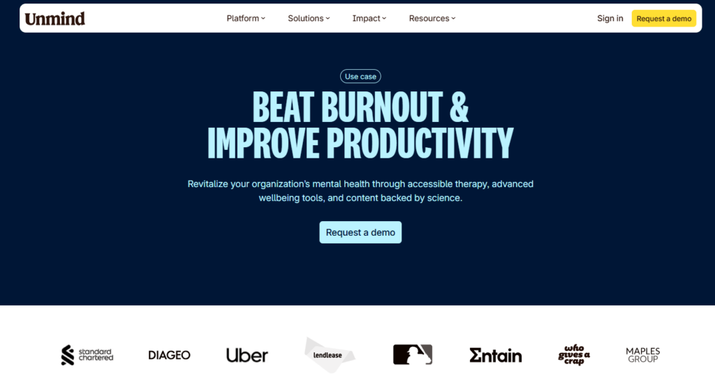
As for the subheadings, they should be straightforward and reflective of the content they serve. For example, if you include customer reviews, you can add the title “Why our customers like us” to attract readers’ attention.
Overall, think of your headlines as the skeleton of your page. They help readers navigate the page fast and find what interests them the most. And when promoting a time-sensitive action, such as a webinar or even a flash sale, adding a sense of urgency with words such as “limited-time” or “early access” to yield better results.
6. Use persuasive, supporting copy
While the headline is destined to steal the show, your landing page body will give readers the context they’ll need to complete the desired action. Enhance each section with clear and persuasive copy to provide more information about your product or service.
Instead of focusing on your brand’s assets and features, focus on the benefits customers will reap to boost your conversion rates. Use action-oriented and personalized language to motivate them. For example, adding “you” or “your” helps readers connect with you more instantly.
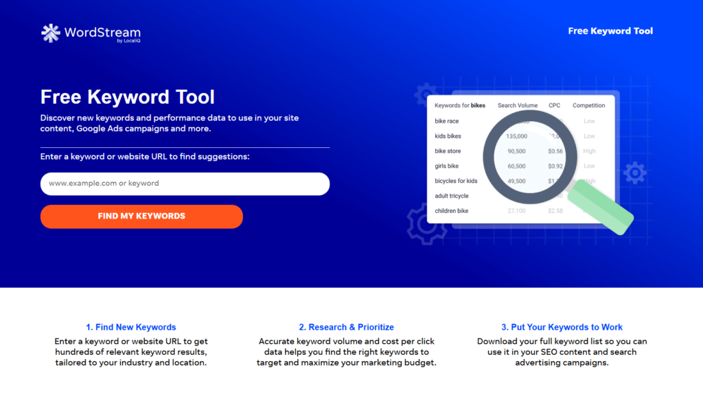
Check out this example by WordStream. The copy is complementary to each section, focusing on actions clients can take with the tool to refine their digital marketing efforts:
If you’re unsure about the efficiency of your copywriting, you can also work along with an AI tool. To save time, Moosend comes with a built-in landing page AI tool, helping users produce high-quality content to satisfy potential customers based on the landing page goal.
7. Craft a compelling CTA
The goal you’ve set for this page will ultimately translate to a call-to-action. At the example below, SurveyMonkey invites readers to sign up for free.
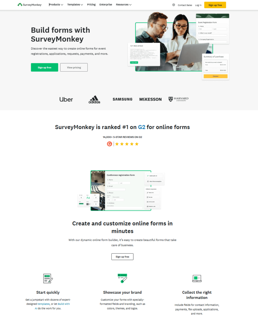
The placement of the CTA button plays a vital role. The higher it is, the better. Plus, use a color from your brand palette that stands out from the rest of the text to get more clicks.
The CTA copy should be brief, usually 3-4 words, and written in actionable language. Verbs followed by “free” or “now” are usually highly attractive. Here are some landing page suggestions based on the type of your offer:
- Download now
- Get started
- Start free trial
- Get full access
- Join now
To create converting landing pages, it’s best to stick to a single CTA. If you add secondary buttons, place them lower on the email footer or design them with a less distinct color, like SurveyMonkey.
8. Add social proof
It’s not always easy to build trust with your audience when providing little to no evidence of how useful a resource, product or service will be for them. But kind words from existing customers will bridge that gap.
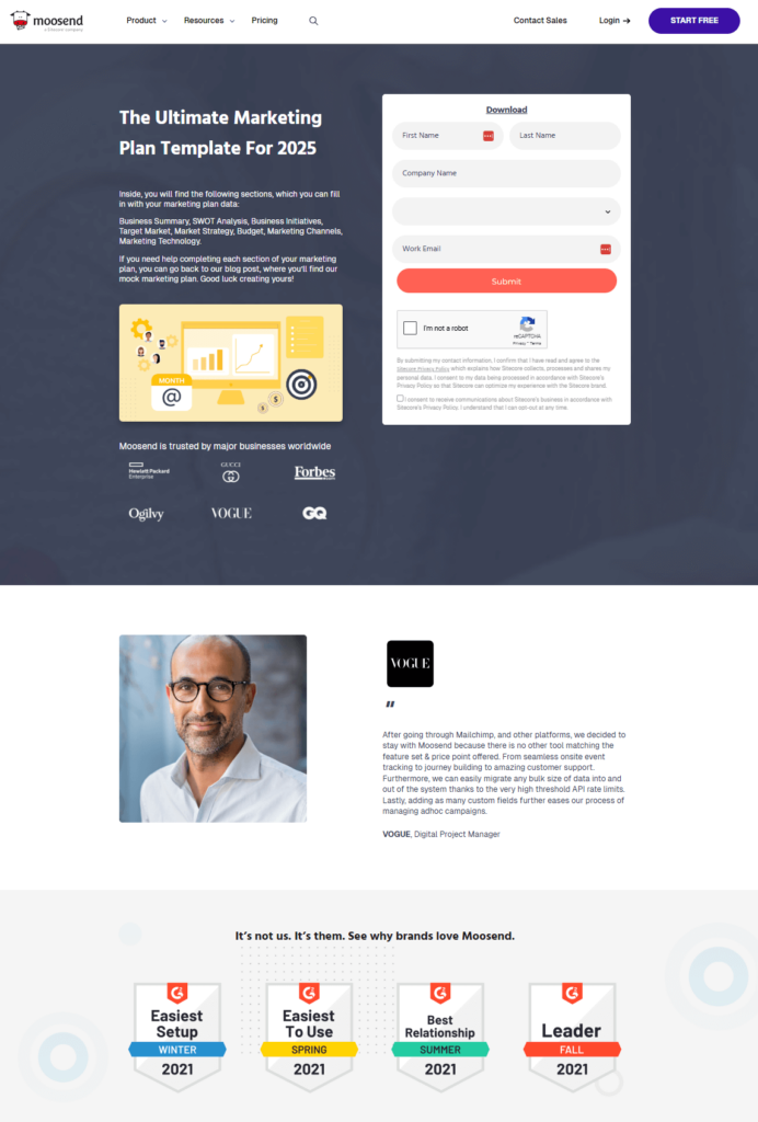
Social proof can take many forms. For example, you can attach customer testimonials or logos from top brands who’ve trusted you. Many SaaS businesses attach badges from review sites, such as Capterra or G2.
You can also try a combo to go the extra mile as we recently did. The review we chose included some of the best product features and a brief comparison of one of our competitors to win more potential customers closer to the consideration stage.
Refinement Phase
The landing page is finally baked. Before serving it to your audience, follow these steps to make this experience Michelin worthy–or simply high-converting.
9. Optimize for SEO
If you want to make the landing page reachable through search engines to increase your website traffic as well, apply SEO guidelines. Conduct keyword research and spread related terms and words to increase rankings. Infuse them into your metadata and consider adding an FAQ section with related questions people often search.
Overall, a natural and comprehensive writing flow is key. Write clear head titles, structure your landing page with bullet points and add spacing to make each section stand out and enhance readability.
Finally, avoid overusing keywords as this might signal to crawlers that your content is non-authentic and spammy.
10. Conduct A/B testing
Overly stressed about certain parts of your landing page? Collecting data about your readers’ preferences can bring some relief. Specifically, A/B testing lets you test two different landing page elements and roll with the one most readers prefer.
For instance, you can experiment with landing page design and copy elements, such as visuals or headtitles. The result can also open a new door regarding your visitors’ preferences. Backed up with more information from your analytics tools, you’ll get more equipped to build great landing pages moving forward.
11. Ensure mobile optimization
Not all users will find your landing page on their desktop. Optimize your landing page for mobile devices and tablets, as well, to create a seamless experience for all visitors. Otherwise, you may end up with fewer conversions and a poor brand reputation for the wrong reasons. Plus, a mobile-optimized landing page can boost your SEO rankings.
While writing shorter and crispy copy is a quick solution, a sneak peek of the output is more than welcome. You can run rendering tests to see the results for different screen sizes and devices. Most platforms with premade templates, such as Unbounce and Moosend, offer mobile-optimized templates to remove that blocker.
5 Landing Page Copy Examples That Meet Customer Expectations
Let’s explore a few more landing page examples with winning copy from top eCommerce and SaaS businesses to get you inspired:
1. ClickUp
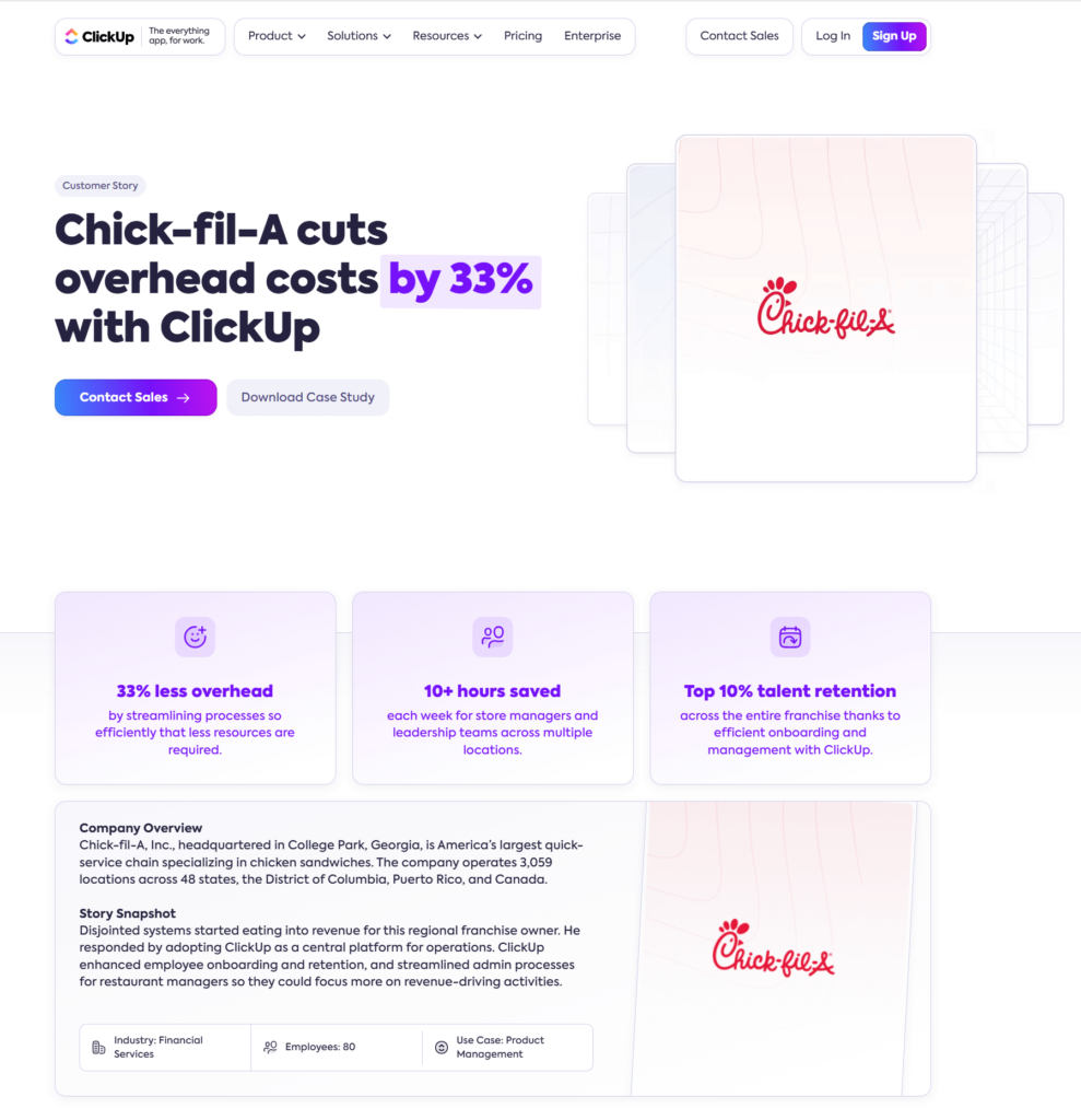
ClickUp created a landing page to promote a case study by Chick-fil-A to attract business with similar KPIs.
Why it works:
- They provided data that proves the benefits the company reaped from collaboration with ClickUp.
- The headline is powerful and hard to skip, especially for businesses who want related results.
- They added two CTA buttons, with the primary leading to a sales agent to move leads faster down the funnel.
2. Calm
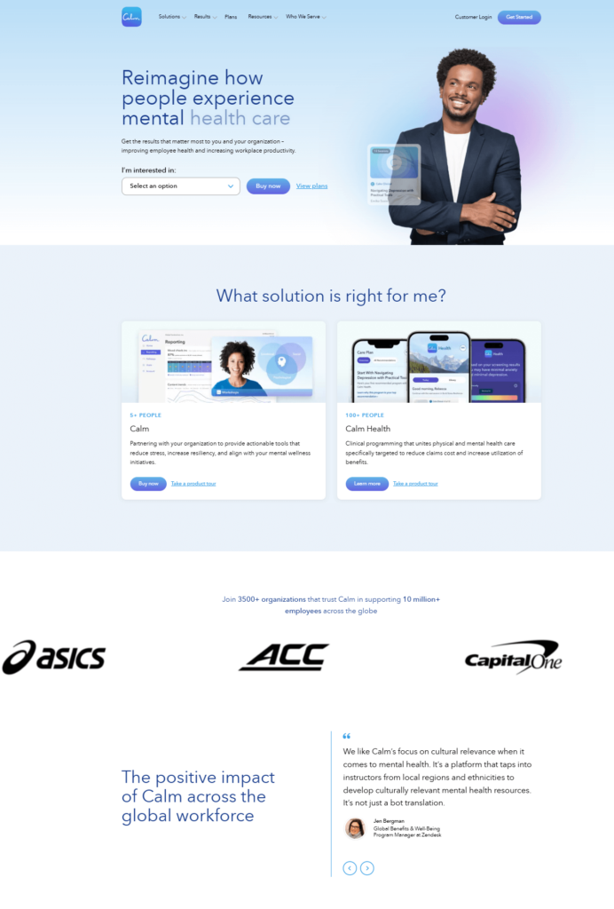
Want to promote one of your services to attract the right people? Check out how Calm demonstrated their product to organizational leaders to gain their trust.
Why it works:
- They included a dropdown with different tools and the subheading “What solution is right for me?” to make the copy more personal.
- The “Buy now” CTA buttons add a sense of urgency.
- They included different social proof types, including numbers of how many businesses trust them and customer testimonials.
3. LinkedIn
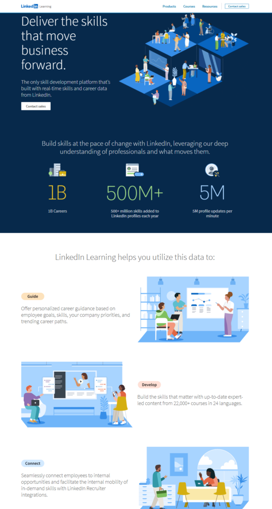
LinkedIn promoted their skill development service for career progression targeting business leaders.
Why it works:
- The header and subheading describe perfectly what this service is about, adding an exclusive tone (“the only skill development platform”).
- They presented important achievements from the users of the service to build trust.
- They displayed some of the main capabilities of this service in action-oriented language.
4. HelloFresh
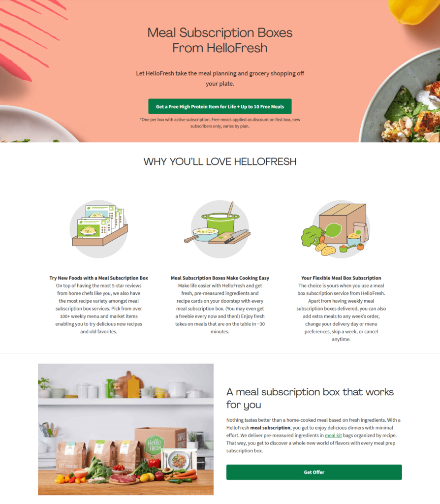
If you find it hard to sum up your services and benefits in short copy, explore how HelloFresh found a winning formula for their meal subscription boxes.
Why it works:
- The wordplay at the subheading grabbed our attention and boosted our curiosity to learn more.
- They created a long CTA version with all the goods subscribers will earn.
- They described all the benefits subscribers will reap with longer but still meaningful sentences.
5. GetYourGuide
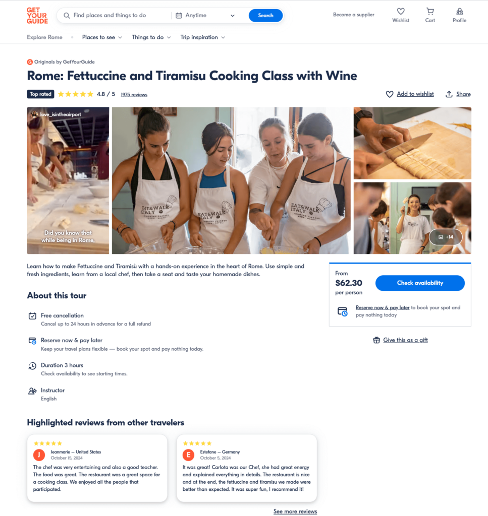
GetYourGuide–a memory-making business–displayed one of their next events in Italy to attract travelers.
Why it works:
- The copy is simple, yet convincing, including everything a traveler needs to decide if this event is for them.
- They added high ratings and five-star reviews from other travelers to make it more appealing.
- The CTA button pops out from the rest of the text, followed by a gift option for fellow travelers.
Make Your Landing Page Copy Flow
Even though the best practices above are easy to implement, writer’s block is always creeping around the corner. Thankfully, following the above steps, a little assistance from an AI tool, and quick online research of other landing pages you admire can unstuck you.
And if you want a rule that rules them all, that would be stepping in your customers’ shoes. It’s the only way to ensure that your landing page copy will eventually do its magic.

 Published by


I love your tips & tricks! Thanks
Hey Sophie,
Nice Tips!!! The design of the landing page plays an important role in generation of leads. Even I will follow the tricks like looking over the size of landing page, Content should be engaging and try to add CTA effectively at Branding Marketing Agency page.