


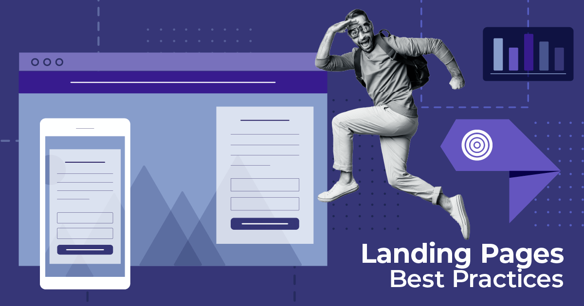
21 Landing Page Design Examples To Inspire Your Layout
Published By Marilia Dimitriou
February 12, 2021

12/02/21
Having trouble finding the most converting landing page design for your business? Not anymore!
To create a landing page that performs, you don’t need to have a magic hat! Instead, all you need is the right elements and a landing page builder.
From the right copy to the visuals and value propositions, every little element can make or break your lead generation.
Try Moosend Today
The easiest and most affordable email marketing and newsletter software!
To help out, today we’ll take a look at some successful landing page examples and what they did right.
Without further ado, it’s time for some real landing page magic!
But first…
What Is A Landing Page?
Haven’t you heard about the legend of the mythical landing page like a thousand times already? No?
Well, a landing page is designed to boost your conversion rates, in other words, to win you more customers or registrants.

Compared to your homepage or any other web page, landing pages have designs that focus on converting visitors or nurturing leads through various offers (free demo, e-book download, and so on).
Now, let’s see how to create one!
How To Create A Landing Page
Landing page creation isn’t rocket science! However, if you want to create an effective page from scratch, then here’s what you need:
- an advanced drag-and-drop landing page builder
- a compelling headline to intrigue your visitors
- high-quality visuals to attract attention
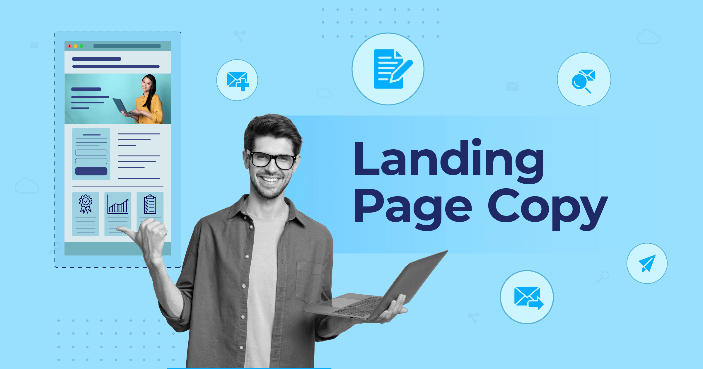
- landing page copy that amplifies your value proposition
- online forms to capture your visitor’s information
- social proof to boost your credibility
If you’re busy, though, you can always pick a ready-made landing page template to save valuable time and effort.

Adding the right ingredients into the mix will give you high-converting landing pages to capture your visitors.
Of course, sometimes landing pages doesn’t need to be all fancy and colorful. Leveraging white space and bigger fonts will help you create focused messages and lead your target audience to action!
Top Landing Page Designs To Inspire Your Next Creation
Landing pages are a versatile marketing and advertising tool to boost lead generation, lead nurturing and power up brand loyalty/user engagement.
Mediocre designs aren’t going to win your audience over. So, with this in mind, let’s see some great landing page examples and why you need them:
Best ECommerce Landing Page Designs
Landing pages are very popular among eCommerce store businesses. Which is mainly due to their lead generation and lead nurturing capabilities.
Below, you’ll find some good lead gen page examples from successful online stores.
Let’s see!
1. Hemster – Simple and Elegant Structure

Headline and Copy: Hemster’s landing page has a simple design that reflects the brand’s elegant spirit. While the headline doesn’t show the benefit of converting, the supporting copy comes to the rescue! Moreover, if you look closely, you’ll notice that the brand uses copy when it’s necessary to highlight the benefits and avoid getting the visitor tired.
Design: Hemster adds space between the important elements to improve user experience and make the copy easier to digest. What’s more, the colors perfectly match the images, giving the visitor an eye-pleasing result.
CTAs: The CTA is conveniently placed on top of the page to ensure that the visitor will know what to do. To increase the chances of converting, the brand also adds a second CTA after the benefits to catch more leads.
Social Proof: This is a great way to build trust with your audience, especially when your business is new. For starters, they can use a logo maker to ensure a professional and cohesive visual identity. Also, the “Our Story” section is perfect for making the brand more personal and relatable. This is a great way to build trust with your audience, especially when your business is new. Also, the “Our Story” section is perfect for making the brand more personal and relatable.
While this is a beautiful design, the existence of clickable links might distract the visitor and lead them away from taking action.
2. Quip – Post-Click Landing Page Example

Headline and Copy: Quip’s headline is very short, focusing on the benefit of getting the product. The landing page copy is also on-point, using specific language like “simple,” “affordable,” and “enjoyable” to excite potential customers about the purchase.
Design: The design is straightforward and minimalist, yet it makes sure that the potential buyer receives all the necessary information to take action. Using pictures of the product instead of stock photos/screenshots improves the page’s overall quality, making it more attractive and converting.
CTAs: As you can see, the CTA button is the only bright element on the page (apart from the logo). Using bright colors on a white background is a winning tactic to make your CTAs hard to miss!
Social proof: The brand leverages social proof to show visitors that it has a legitimate product acknowledged by big companies like TIME and GQ.
While all these elements work in the brand’s favor, the navigation bar on top is unnecessary as clickable buttons will lead users away. Also, the brand could use a more intriguing headline to keep visitors engaged.
3. Dollar Shave Club – Video-Infused Landing Page

Headline and Copy: Dollar Shave Club has created a unique page that, according to our case study, resulted in 12.000 orders within 48 hours. The page makes sure to attract attention through the headline, highlighting the benefit of subscribing to the service.
Design: What stands out here is the unique content the Dollar Shave Club created. As you can see, the video is strategically placed next to the CTA button to make it easier for leads to convert. The different colors also create an eye-pleasing effect, while the three sections underneath give the visitor more reasons to get the brand’s blades.
CTAs: The orange-colored CTA attracts attention, capturing the leads turning them into customers. Also, the CTA copy is very actionable despite being a simple “Do it.”
Social proof: Of course, social proof is also part of the design, featuring some big brand names (and enlightened customer #164) to convince the target audience that the service is worth their time and money!
Again, leaving the navigation bar on top can lead visitors away from the page. The same applies to the social follow button underneath the video.
4. Indochino – Landing Page With Social Feed

Headline and Copy: Indochino’s landing page design is one of my favorites as it has a great headline that stands out and beautiful colors. Copy-wise, the brand uses straightforwardness to communicate the message and adds urgency by incentivizing users to book an appointment for a chance to win an amazing prize!
Design: The colors perfectly match the visual of the man in the suit. Which, I have to say, is a beautiful and on-brand addition to the landing page. Another plus is that the brand has dropped the infamous navigation bar, making the design more focused and converting.
CTAs: When it comes to the CTAs, the first button stands out, using action verbs to make website visitors click on it. And if we move a little further down, we can see that the brand has another section that leads visitors to a second and a third CTA to increase the chances of converting them.
Social proof: Finally, the brand uses the #INDOCHINO hashtag to show real examples of their products, perfectly combining their page with social media marketing. This way, the brand avoids using generic stock photos and invites curious visitors to check its social media profiles. Indochino also adds a quote from Forbes to build trust with the audience before dropping the last CTA.
Clever, right?
5. AXIS – Minimalist Design

Headline and Copy: When you look at AXIS’s landing page, you can see how the headline communicates the benefit using a capitalized font. The copy underneath could have been bigger. Nevertheless, it provides additional info to convince the potential customer.
Design: Additionally, potential leads who need to find out more can click on the “Watch how it works” button, which opens a window on the landing page instead of leading the visitor away to a new page. Apart from showing how it works, the brand also includes some extra sections to show the benefits. As a result, potential customers will have everything they need to click on the CTA button.
CTAs: AXIS’s secret weapon is the bright red color of its CTA button, amplified by the white and grey color scheme. The CTA copy is also straightforward, and the use of “now” adds a bit of urgency.
Social proof: The brand leverages famous company logos like CBS, Fox News, and TechCrunch to boost its credibility and convince new customers that it’s not a rip-off.
One of the things that might annoy visitors is that they will have to keep scrolling down as the page is rather lengthy.
SaaS Landing Page Design Inspiration
For SaaS businesses, landing pages are a real lead gen Swiss army knife.
Planning a webinar? Make a landing page! Expanding your email list? Make a landing page!
Below, we have collected some amazing designs that SaaS companies have used in their marketing strategy for lead generation and more!
Let’s take a look!
6. Moosend – Webinar Landing Page

Headline and Copy: This landing page by Moosend served as the registration point for users wanting to attend its Valentine’s Day webinar. The headline perfectly summarizes the topic of the online event, keeping the V-day feel. Also, the benefit of joining is highlighted at the end of the message using a red font. This way, the visitor sees what they will get in exchange for registering.
Design: The design takes advantage of white space and high-quality visuals to keep visitors engaged. Moreover, the lack of a navigation bar and other clickable buttons minimize distractions, keeping the visitor focused.
CTAs: Moosend’s online form includes only the necessary fields, skipping unnecessary fields to encourage visitors to register. Along with that, the bright red CTA works perfectly with the form, attracting attention and incentivizing attendees to register.
Social Proof: To promote attendance, the company used testimonials from existing customers. Not only that, but to further boost its credibility, Moosend also added some of its G2 badges to build trust with new visitors and promote the quality of the event.
If you want to mimic Moosend’s example, you can register for a free account and check out the landing page builder.
7. Hotjar – Lead Generation Page Example

Headline and Copy: Hotjar has created a specific landing page for its paid ad campaign. If you look at the headline, you can see how Hotjar uses a question to intrigue visitors to keep reading. Then, it uses checkpoints to highlight the benefit of choosing the tool. This way, Hotjar helps its potential clients see why the software is right for the job.
Design: When it comes to visuals and white space, the company favors a clean design to maximize the visibility of its CTA button and benefits. Furthermore, the visual on the right side works equally well, giving potential customers a glimpse of the heatmap software.
CTAs: Hotjar uses a bright pink CTA button that stands out on the landing page. However, this isn’t the only thing that makes it convert. The CTA copy is also actionable, using the “free forever” addition to make the company’s offer more valuable!
Social Proof: Lastly, it’s worth mentioning that Hotjar uses its G2 badge and company logos as social proof to establish trust and improve conversions.
While the design is beautifully crafted, the clickable logo on the top left corner of the page isn’t necessary.
8. Optimizely – Watch Demo Landing Page

Headline and Copy: Optimizely’s landing page is balanced and informative at the same time. The headline of the page is clear and direct, letting visitors know what they need to do. When it comes to the rest of the copy, Optimizely gets straight to the point using action verbs and bullet points to encourage users to take action and improve user experience.
Design: While the page doesn’t have any fancy visuals to attract attention, the structure is engaging. To make it convert, Optimizely has paid attention to its form length by using only the necessary fields. The use of white space also adds balance to the design, while the use of grey in the footer makes the page appear fuller.
CTAs: The main CTA button could have been a brighter color to stand out more on the page. Nevertheless, the CTA copy compensates for it by adding a touch of urgency, implying that the number of seats is limited.
Social Proof: Social proof is present in the form of popular, trusted brands to convince potential leads to watch the demo.
9. Shopify – A/B Tested Landing Page Design

Headline and Copy: Shopify’s landing page just hits all the right design notes and more! The headline has no fluff, getting straight to the point. Moreover, the company uses extra copy to explain why Shopify is the best tool for them.
Design: The page is very easy to navigate and has the right length to avoid leading the visitor away. Moreover, the choice of color matches the brand colors, even though it’s not the brand’s traditional green. And to top it off, Shopify has a visual of a laptop and mobile device to promote the idea that you can manage everything whenever you are!
CTAs: No clickable links (the logo isn’t clickable!), multiple CTAs, and the excellent use of white space are what make it unique and converting. The CTA copy also highlights that trying the service is “free,” which is a great way to convince indecisive leads to give your trial a chance.
Social proof: Shopify’s secret weapon is its number of trusted businesses, which the brand uses after the headline to build trust with new users. However, to make it even more credible, the company also adds an existing customer testimonial to show its value.
This design is one of Shopify’s favorite landing pages. As you can see, the company has previously used a purple version of it:

A/B Testing is crucial to improve your landing page conversion rate optimization. So, like Shopify, don’t forget to A/B test your designs to optimize your landing pages for better results! From your color scheme to your copy, every little change can make a difference!
10. Unbounce – E-book Promotion Landing Page Example

Headline and Copy: Unbounce’s headline starts with a bold statement and carries on with a promise: learn how to optimize your pages! The large font attracts attention, and the “like Talia Wolf” shows potential leads that this will be an expert piece of content rather than a generic guide. The supporting copy is very straightforward, explaining what the free guide entails. Nevertheless, a slightly bigger font could have been better.
Design: Unbounce’s design is a great example of combining white space with photography and online forms! By looking at the landing page, visitors instantly understand what it is about. Stock photos and screenshots are also absent from the design, which increases the conversion rate of the page.
CTAs: The number of fields is ideal for capturing the target audience while the blue CTA stands out, having a direct and actionable CTA copy. However, while the dark blue button works for the page, the company could have used a bright pink or red to match the colors of the image.
Social Proof: To increase credibility, Unbounce’s page uses a testimonial to highlight Talia’s expertise. This way, potential leads get a taste of what to expect by reading the guide.

Real Estate Landing Page Design Inspiration
Recently, real estate agencies have given us some amazing landing page examples. Which shows how these pages can help realtors generate leads through beautifully designed pages with clever value propositions and CTAs.
If you’re a real estate agent, you can learn all about real estate landing pages in our dedicated post, or explore email marketing software for real estate! Now, let’s see some great real estate designs to get you inspired!
11. Scout. – Mobile Responsive Design

Headline and Copy: Scout’s landing page follows the rules of an effective landing page. It has an intriguing headline using a question and a supporting copy highlighting the “fast, free, and accurate” results visitors will get. The use of short copy and icons also makes the benefits easier to read!
Design: Scout’s design is simple, using an image of a property to make the page more relevant. However, while the photo is appropriate, using a different picture with people might have been a lot friendlier and relatable. White space is also used to the page’s benefit, helping the Scout display the benefits of converting in an organized manner.
CTAs: When it comes to the CTA, the choice of color is perfect to make this single focus design more converting. On top of that, the use of “my” makes the result look more personalized.
Responsiveness: While this landing page has a great design, its secret weapon is its mobile responsiveness. As you know, creating mobile-friendly landing pages is a must to convert your mobile-first users and provide a better user experience.

If you want to create responsive landing pages, you can use Moosend’s landing page tool to ensure that everything is in place. You can use the builder and the full array of additional features by signing up for a free account (no credit card required).
12. Sundae – CTA-Focused Landing Page

Headline and Copy: Sundae’s landing page header is exactly what homeowners want to see when they land on the page. The use of action verbs (“sell”) and words like “today” also add urgency, calling the visitor to act now. The rest of the page copy focuses on presenting the benefits of getting an offer in a short and sweet way. On top of that, the realtor’s “promise” is the highlight of the page, triggering an emotional response.
Design: At first glance, Sundae’s landing page is white with minimalist visuals and black fonts. However, white space is power here! Especially since Sundae uses the entire design to power up its bright CTA. While the page is a bit lengthy, the structure helps the visitor identify the main points and move one step closer to conversion.
CTAs: Speaking of CTAs, did you notice that the only splash of color is either the CTA button or the phone number that the realtor provides? This way, the entire page leads the visitor’s eyes to the only colored element, inviting them to click.
Social proof: In the last section, the agency cleverly adds some testimonials, increasing credibility and making this one of the most effective lead generation designs out there!

All in all, Sundae’s design is a great example of how a simple page and a bright CTA can become the ultimate conversion weapon!
13. Flyhomes – Elegant Landing Page Design

Headline and Copy: Flyhomes uses a very specific landing page headline to convert leads in Seattle. The use of “beat” is meant to intrigue homeowners and show them that they can get the best offers by clicking on the CTA. Moving further down, you can also see how the real estate agency boosts its value proposition by offering leads three ways to become better homeowners.
Design: Flyhomes’ design uses a blue color palette to create an elegant result that matches the company logo. The hero image is simple, yet it reflects the brand, making the page more unique. Also, white space makes the page easier to navigate, keeping the design and image balanced.
CTAs: Here, the primary CTA is strategically placed after the headline and supporting copy to maximize conversions. The color of the button, though, is the same as the font, making it stand out less. Regarding the CTA copy, “Start now” is a simple way to incentivize action by adding a touch of urgency.
Social proof: On top of that, we can also see that the realtor uses company logos and testimonials to build trust and statistics to convince visitors that they can give them tangible results. Credibility plays a major role in converting people who have never heard of your company before. So, using it as part of your design will work in your favor!
14. Trulia – Single-Focus Page Example

Headline and Copy: Compared to the rest, Trulia has a very different landing page design. Here, you see a single-focus landing page that prioritizes capturing the lead instead of showing the benefits. To get more information, visitors will need to move to the next step. However, Trulia makes sure to excite them first by turning their headline into a question: “How much is your home worth?”
Design: Examining Trulia’s structure, we can see that the company places its form at the center of the page, turning the CTA into the center of the design. Moreover, the realtor uses five fields to encourage homeowners to complete them as fast as possible. The background image is an excellent addition to the design. However, using a picture of a person looking directly at the lead would have been better.
CTAs: Since your leads are busy people, giving them an instant solution to a pain point is actually the best way to win them over. For Trulia, using a question, a simple form, and an orange CTA looks like the winning combination. Also, the CTA copy ensures that the reply the lead will get will be tailored to their property, not something generic.
Overall, Trulia’s design is perfect for capturing leads who need an instant and personalized solution. So, don’t forget that sometimes less works better than more!
Agency Landing Pages
Whether it is for lead generation or advertising, landing pages are among the most cost-efficient tools to promote an agency!
Below, you can see how agencies use creative and beautiful designs to boost their lead generation.
Let’s see ’em!
15. Klientboost – Fun Landing Page Copy

Headline and Copy: Getting a marketing plan with more meat than a quadruple Big Mac? That’s something I haven’t seen anywhere else! The fun and unique headline is an instant attention-grabber that intrigues the potential client. The copy underneath also makes a big statement, giving the lead the promise of getting the best service out there.
Design: Klientboost’s design is more playful than the rest due to its cartoonish visuals. Apart from the visuals and copy, this landing page is interactive, allowing visitors to select what they need help with and then click on the CTA. This is quite unusual for an agency since agency landing pages tend to have more”serious” designs.
CTAs: Speaking of CTAs, Klientboost has chosen a red color to make its button stand out on the page. Combined with the green visuals and white space, the agency has created a beautiful contrast that pulls visitors towards the “Start my free marketing plan.”
Social proof: Lastly, the agency leverages testimonials from existing customers (names and job positions included) to make the offer more attractive and credible.

While the design of this landing page is unique, it could do without the navigation bar and the clickable links at the bottom to prevent users from leaving the page.
16. Yodle – Traditional Landing Page Example

Headline and Copy: Yodle (now Enspire) uses a four-word headline to show its audience what they will get when they join the agency. However, using something more intriguing could have made a better first impression. When the visitor looks at the copy, they can immediately identify the benefits. Moreover, checkpoints are ideal for helping potential customers make a decision and request the demo.
Design: Compared to Klientboost’s example, this landing page favors more traditional elements. As you can see, the design is more “serious,” using darker colors and a grey background image. Moving to the form, we can see a simple form design, asking only for the necessary information. This is ideal as potential customers asking for a demo don’t want to spend too much time on endless fields.
CTAs: While the CTA copy could have been something more attractive and actionable, the orange color makes up for it. This is a smart way to get visitors to notice your CTA button when they land on your page. Regarding the CTA copy, the agency could have used something more actionable instead of the “Request Demo.”
Social proof: The first thing visitors notice is the 55,000 small businesses underneath the header. However, this statement is rather vague and doesn’t show how the agency has helped them find a better way. Fortunately, the agency uses a testimonial from an existing client, which is more believable and specific.
17. Bloom – Balanced Page Design

Headline and Copy: Bloom’s page aims at getting leads to contact them. To convince visitors, the agency underlines the benefits of becoming a client using bullet points.
Design: The design is simple, using a soft color scheme and background image to create an eye-pleasing result. Bloom has also placed its form next to the benefits to increase the chances of converting the visitor. According to the landing page best practices, always use fewer form fields, especially when your goal is to get in touch with leads. Keep in mind that longer forms should only come into play when it’s necessary!
CTAs: When it comes to the CTA, the orange color attracts attention, making it hard to miss. The copy is also simple and direct, highlighting the action the visitor needs to take.
Social proof: Of course, social proof is part of the design, using a testimonial from an existing client, a graph, and various company logos to boost credibility.

If there’s something that this design could improve is the excessive copy next to the graph. The small font also makes it a little hard to read. Instead, the agency could have used bullet points to describe the additional benefits and use a different font and color to help the copy stand out more.
Blogging Landing Page Examples
Blogging and landing pages are a great match! As a lead gen tool, you can easily create pages for your blog to expand your mailing list and get more engaged readers!
To give you a helping hand, here are some good landing page designs to get you inspired!
18. ProBlogger – CTA That Stands Out

Headline and Copy: The main goal of ProBlogger‘s page is to boost newsletter signups by capturing visitor’s first name and email address. The header manages to stand out due to its color and intriguing offer. Using the word “exclusive” is a great way to show your new subscribers that this isn’t just another signup but a unique opportunity to receive exclusive content. The copy underneath gives new subscribers something to get excited about as it promises to deliver 180 blog post ideas when they hand over their email.
Design: The two form fields are ideal for minimizing frustration and incentivizing the audience to complete the form.
CTAs: What strikes out on the design is the choice of CTA color. Yellow is a rather powerful color, so adding it to the page instantly catches the potential lead’s attention.
One thing, though, that the landing page could have done better is to use a different color/bolder font to make the copy stand out more. As it is now, potential leads might not read the whole sentence and completely miss the benefit of joining the list.
19. BloggingWizard – Vibrant Design Example

Headline and Copy: Regarding the landing page copy, this page opts for a compelling headline that highlights the benefit of joining the mailing list. The header attracts instant attention by showcasing the benefits and the material new subscribers will receive.
Design: This design by the BloggingWizard shows you how to create a converting design using bright colors. The blog has also removed the logo link to minimize distractions. However, at the bottom of the page, there’s a homepage link that can lead visitors away before converting them.
CTAs: The first CTA is strategically placed underneath the headline to attract the user’s attention, while the green color matches the visual of the “dragon wizard” on the right. This is an excellent addition to make the page a little more interesting and fun!
Social proof: BloggignWizard cleverly leverages social proof in the form of featured company logos to increase credibility and build trust with new visitors.
And to make sure that the page will convert, BloggingWizard adds an extra testimonial section before dropping its second CTA button with an equally compelling copy!

Online Course Landing Page Examples
If you have an online course that needs promotion, then a great landing page can do the trick!
Calling your audience to register for your online class through brightly-colored CTAs and amazing value propositions will help you boost your attendance and build a loyal following.
Below, let’s see how online course instructors have used their landing page design for better results!
20. Danielle Leslie – Online Course Promotion

Headline and Copy: Visitors will land on Danielle Leslie’s online course landing page after clicking on her Facebook CTA. There, the headline is hard to miss, while the promise of launching your own course in 60 days is something that increases the visitor’s desire to take action. To boost conversions, the instructor also includes the benefits of taking the course, highlighted in a checklist format for an easier read.
Design: Danielle’s social media followers come across a design that leverages contrasting colors and white space. Moreover, Danielle features another section with a picture of herself to make the page friendlier and introduce herself to new visitors. Nevertheless, the copy here is quite long, and visitors might not spend time reading the entire thing.
CTAs: What really stands out here is the bright red CTA button that Danielle uses to increase registrations. More specifically, she uses it three times on her design to make sure that the potential students will see and interact with it.
Social Proof: Danielle adds a testimony from a satisfied student to boost her conversions. The quote is strategically placed under the CTA to capture indecisive leads who didn’t click on it.

One thing that Danielle could improve is to choose different photos of herself since pictures of people looking at the visitor have a greater impact on them.
21. Skillshare – Super Targeted Design

Headline and Copy: Designing converting landing pages is both an art and a science. On this page by Skillshare, you can actually see both. Starting with the header, the message is very straightforward, emphasizing the “free” and “Premium” service the users will get. Moving further down, you can see how Skillshare uses copy and design to present the benefits in a beautiful and organized way.
Design: The online learning platform takes advantage of the Z pattern to amplify its value proposition. The use of white space also helps the design stay clean, incentivizing visitors to interact with it.
CTAs: The bright green CTA button is ready to catch visitors’ attention and make them click! But, you might ask, what about the multiple CTAs? If you check the CTA copy, you might think it has different buttons leading to separate pages. However, while some differ (“learn more”), they all lead to the same signup page. This is a great way to make your landing page more effective and avoid repetitions.
Social Proof: While testimonies aren’t present in this design, Skillshare uses pictures of instructors and the number of creators to make the offer more appealing and credible.
Designing Better Landing Pages
As I said before, creating high-converting landing pages is both an art and a science!
Put all the right elements together, and you’ll have the conversions of your dreams! Add something out of place, and your audience will go away!
Looking at some of the best designs will inspire you to create designs that will get your target audience one step closer to conversion.
And while a good landing page design is all about the elements you put together, don’t forget that a smart builder is what will enable you to materialize your pages!
If you are searching for a builder (or an alternative), you can sign up for a free Moosend account and try out the landing page builder to your heart’s content!
So, invest in great tools and designs, and soon, my friends, you’ll get from landing page creation to lead domination!
Similar Posts
 Published by
 Published by
 Published by

Create, send and optimize your email marketing campaigns