You’ve probably seen landing pages that look right, read well, and follow every “best practice” out there. However, for some strange reason, they don’t convert.
Knowing what makes a good landing page on paper isn’t the same as understanding why people actually take action. While most pages focus on layouts, copy, or even animations, they often overlook what matters the moment someone lands there: context, hesitation, and the need to make a quick decision without overthinking.
In this post, we’ll explore what makes a landing page work, using clear tips and examples you can apply right away.
Launch landing pages that convert
Choose a template, customize it in minutes, and start capturing leads.
TRY MOOSENDWhat Is Considered a Good Landing Page?
High-converting landing pages don’t try to educate like a homepage or support SEO like a long-form blog post. They exist to fuel marketing campaigns, drive conversions, and turn potential customers into signups or leads.
A successful landing page:
- Speaks to a specific target audience
- Communicates a clear value proposition within seconds
- Focuses on a single goal instead of multiple outcomes
- Builds trust fast through social proof or testimonials
- Removes friction instead of adding more information
In a nutshell, if users understand the message, trust the offer, and know exactly what to do next, you’re looking at a great landing page.
How to Create a Good Landing Page for Your Business
Below, we’ll cover the core aspects that influence landing page performance and conversion.
1. Make a strong first impression
When it comes to landing page creation, first impressions matter more than you think. This is the halo effect in action. Users form an opinion in seconds and let it color everything that follows.
So, does that mean the more visually stunning your page is, the better it performs? Well, no. Visitors aren’t judging your design skills; they’re asking whether the page is for them. If the answer isn’t clear right away, they leave, no matter how polished the page looks.
For example, imagine an eCommerce ad that promises “Free next-day delivery on running shoes.” The user clicks and lands on a page that opens with “Premium footwear for every lifestyle,” high-quality images and animations, followed by a generic CTA like “Shop our collection.”
The message shifts from a clear benefit to a vague brand statement. There’s no immediate value or relevance, so users either scroll without intent or leave. This isn’t a design issue, but a mismatch between the promise that brought them in and the message they see first.
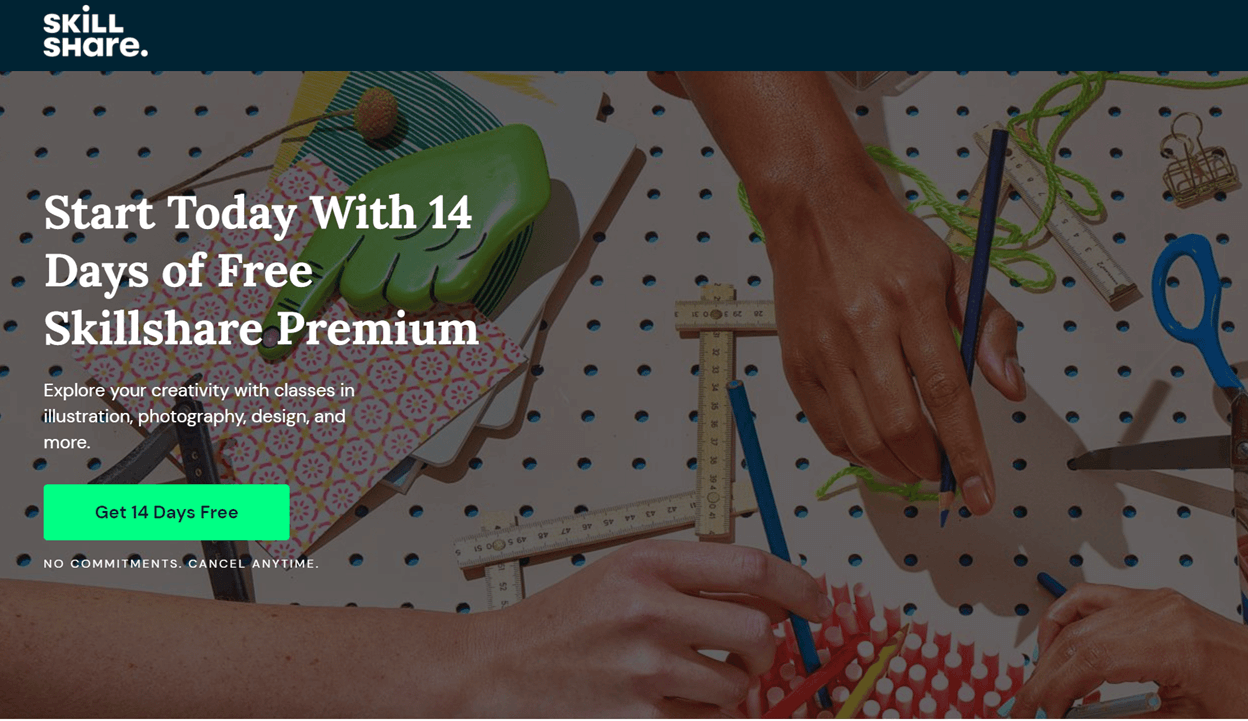
Here’s a good landing page example from Skillshare that makes a strong first impression. Every element above the fold supports the same goal and reinforces the user’s expectations.
What works:
- A clear header states the offer and sets expectations right away
- The subheading explains what users get during the free trial
- The CTA reinforces the same promise and makes the next step obvious
- Reassuring microcopy removes friction by highlighting that cancellation is possible anytime
- The visuals support the message rather than overpowering it
2. Ensure your copy matches intent
At this point, you probably already have copy on your landing page, or you’re in the middle of writing it. Either way, the real task here isn’t adding more words, but stepping back and checking whether the message still matches why people are landing there in the first place.
Benefits-only messaging often assumes users are still comparing options. In reality, though, many are already ready to act. They just need a gentle push to click your CTA.
A practical way to check intent match is to read your headline, subheading, and CTA (preferably out loud) and see if:
- The copy reflects the promise that brought the user here
- It explains what happens next in plain language
- Pushes people back into “learn more” mode or not
You don’t need endless revisions or clever wordplay to get it right. Focus on intent. When your page confirms it and makes the next step feel obvious, conversion gets easier without sounding salesy.
Here’s a good newsletter landing page example from GrowthWaves:
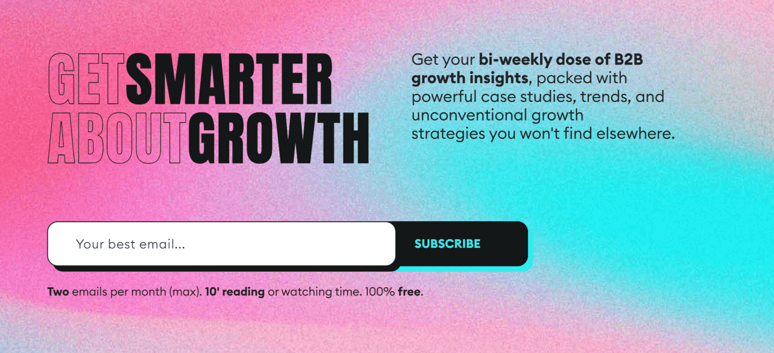
What works:
- A clear, benefit-led headline that focuses on outcome (“Get Smarter About Growth”)
- The subheading explains who this newsletter is for and what’s in store for them
- Low-friction CTA and input make the next step obvious
- The microcopy removes hesitation by addressing time, frequency, and cost upfront
3. Include one clear call-to-action
A landing page works best when it asks the user to do one thing. Adding a “pick your path” option with multiple calls-to-action leads to the opposite results, even when your second CTA is just a link to your homepage.
Extra CTAs are one of the most common silent conversion killers. A “Buy now” button next to “View pricing,” “Learn more,” and “Compare plans” usually makes them hesitate. Every additional action competes for attention, reducing the chance that any single one gets clicked.
As a result, conversion rates drop even when traffic stays the same. If you feel the need to add a second CTA, don’t introduce a new action. Repeat the same primary CTA or add a simple navigation link that points users toward it. This way, visitors who are ready to convert can act immediately without needing to read the rest of the page.
Here’s another great landing page example from Unbounce:
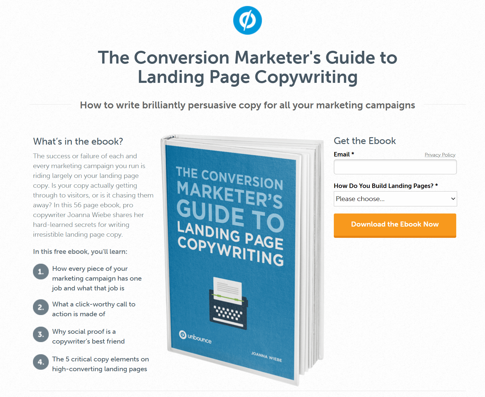
What works:
- The CTA copy is explicit about the outcome. “Download the Ebook Now” leaves no room for interpretation
- The action matches the intent. Users came for the ebook, and the CTA delivers exactly that
- Strong visual contrast makes the button easy to spot and hard to ignore
- Friction is kept low with minimal required fields before the click
4. Add social proof that actually convinces users
You’ve probably come across a landing page with a testimonial section copied across the site. It usually includes the same quotes, logos, photos, and vague praise. That kind of social proof looks reassuring, but it rarely helps a landing page convert.
Generic trust signals just fill space. For example, a quote like “It works great” or “Amazing product” doesn’t address any real concern a potential customer has at that moment. On a high-converting landing page, trust signals need to align with where the user is in the decision-making process.
With this in mind, you can approach social proof based on your audience’s stage in the customer journey:
- Awareness stage: Lightweight social proof works best here. A short testimonial that signals relevance is often enough. This can be a one-line quote, a usage stat, or a few recognizable logos that quietly build credibility.
- Consideration stage: Visitors need proof that your solution actually works. This is where longer testimonials, short case studies, or highlighted results belong.
- Decision stage: Aim for proof that removes any final doubt. Specific results, before-and-after snapshots, or satisfied-customer quotes are very effective, especially when placed near the CTA.
Here’s an example from Sundae’s landing page, using quotes from existing customers:
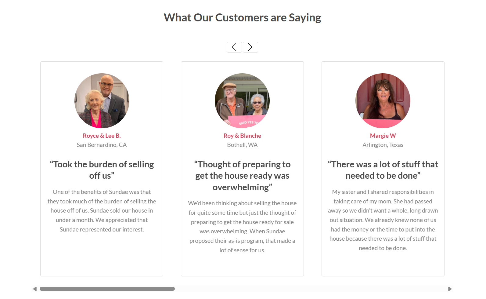
If you don’t have the right testimonials yet, collect them intentionally through email surveys after onboarding, asking for reviews after a clear win, or following up with customers who reached a meaningful milestone.
Tip: Trust signals work best when they appear near moments of hesitation, like next to a CTA or pricing section. Piling them all at the bottom of the page won’t help. So, add them where your visitor is more likely to see them.
5. Revise your page layout to reduce friction
Your landing page layout should make it easy to read, scan, and act. When design decisions add friction, users pause. That’s why a good landing page needs to favor white space, structure, and visual hierarchy.
Spacing gives the value proposition, CTA, and key benefits breathing room, helping users understand what matters at a glance. On the other hand, cramped pages force users to work harder to identify the next step, slowing momentum and hurting conversion.
What’s more, most users scan before reading your message. That’s why structure matters for improving the user experience, especially when you have a lot going on.
Here’s how to improve your page structure:
- Use bullet points to highlight benefits, conditions, or steps that need to be understood quickly.
- Add context or reassurance through short paragraphs.
- Avoid long text blocks that bury important information and push CTAs further down the page.
Lastly, fonts, color choices, and heading sizes should clearly separate what’s primary from what’s supporting. If headings, subheadings, and body copy blend together, users lose orientation and are more likely to leave.
Here’s an example from Moosend’s landing page:
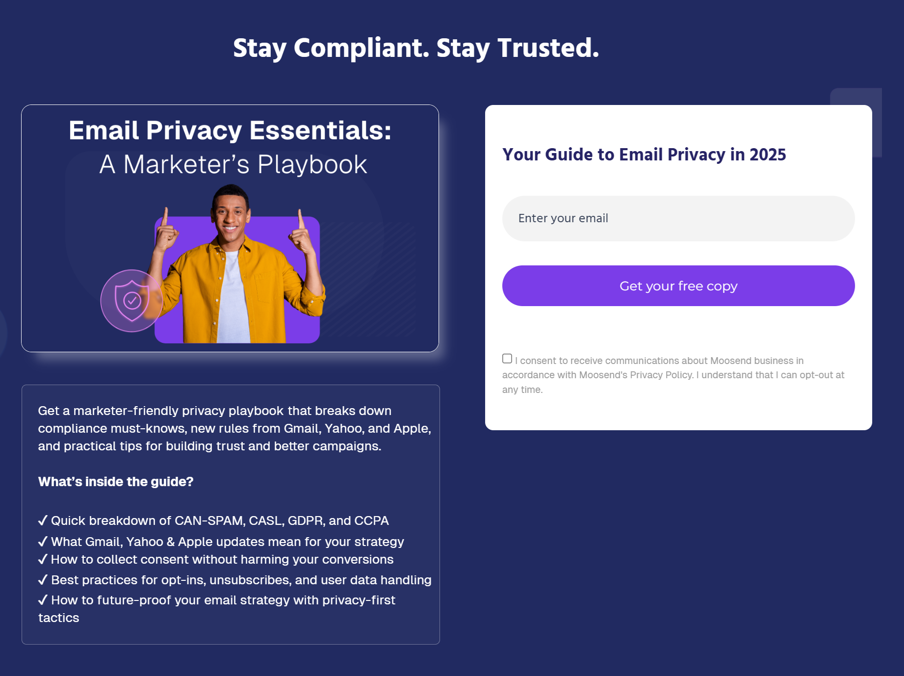
What works:
- The left side explains the value and builds context, while the right side focuses only on the form and CTA, reducing cognitive load
- Spacing, hierarchy, and contrast guide the eye naturally from the headline to the benefits to the action
- The CTA remains visible and easy to reach across screen sizes, especially on mobile
6. Maintain consistency across your funnel
Most users arrive at your page from an email, a PPC ad, or a social post.
When the landing page feels disconnected from the initial source, trust drops fast. This is especially obvious in email marketing.
Take this email campaign, sent to promote Moosend’s email privacy guide:
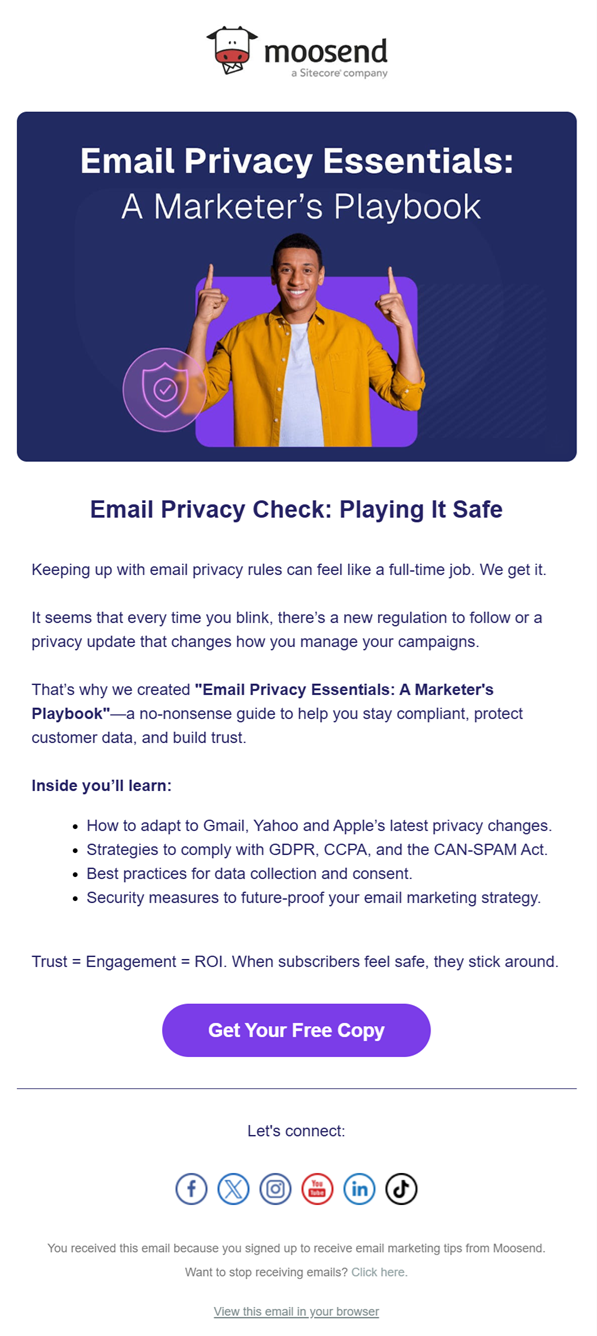
The headline, tone, and overall promise are fully aligned with the landing page we reviewed earlier, right down to the color palette, visuals, and CTA messaging.
Now, if that email linked to a landing page with a different headline, visuals, or a broader product pitch, the user experience would break.
Of course, consistency doesn’t mean copying the email word for word. You can keep the same core message, tone, and visual language. The user should feel like they’re continuing the same conversation, not starting a new one.
7. Use inclusive visuals
Images on a landing page send a quick signal about who the page is for. When visuals only show one type of person, many users subconsciously feel excluded and disengaged.
Inclusive visuals help more people see themselves in the offer. Showing diversity in age, gender, body type, ability, and background makes the page feel more welcoming and relevant to a broader audience.
This matters across use cases:
- Ecommerce: Diverse models help shoppers more accurately assess fit, comfort, and real-world use.
- SaaS and digital tools: Showing different roles and age groups helps prevent signaling that the product is only for a narrow user type.
- Lead generation: Inclusive imagery makes the offer feel applicable to more potential customers.
Inclusion also goes beyond who appears in photos. Good contrast, readable text, and clear images help users with visual impairment interact with the page more easily.
Here’s an eCommerce landing page example from Zara:

8. Rethink mobile responsiveness
When it comes to mobile devices, users often arrive mid-context from social media, ads, or messages while multitasking, commuting, or scrolling casually. That means their attention can be interrupted fast.
A good mobile landing page should be built with that in mind. Instead of asking users to explore, help them make quick decisions.
Here’s how to create more responsive pages for mobile-first users:
- Make the core offer clear without forcing people to scroll more than once.
- Write for skimming by using short lines, clear hierarchy, and plain language.
- Ensure the primary CTA is immediately visible and easy to tap without zooming or extra effort.
- Remove pop-ups and any other elements that will clutter the experience.
Here’s a great responsive landing page example:
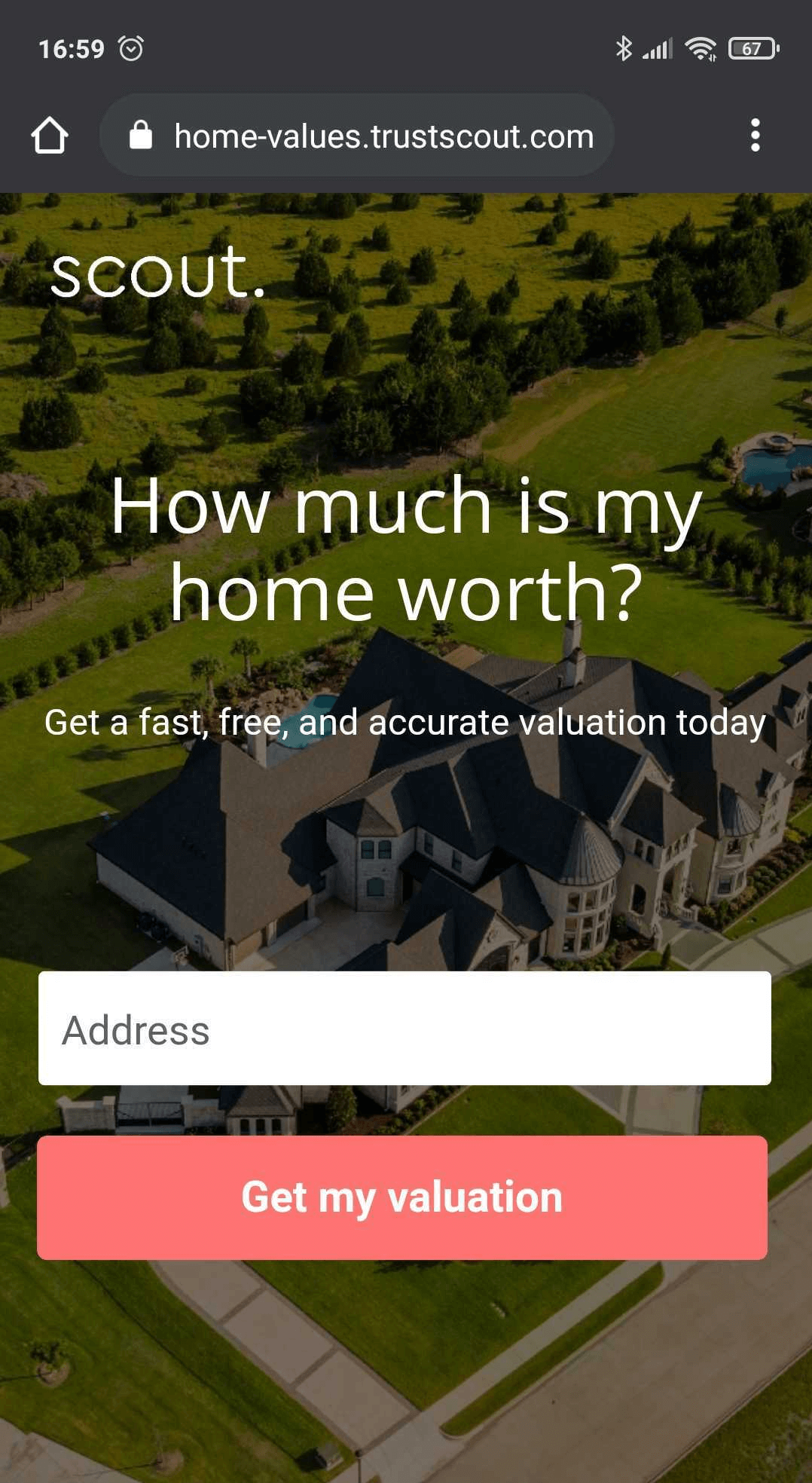
What works:
- The design is as clean as possible to minimize distractions
- There’s a single CTA to prompt immediate action
- The number of fields is limited to one to reduce friction
- The copy is direct and actionable
9. Detect page speed issues
By the time someone lands on your page, intent is already there. Now, page speed decides whether that intent survives.
Slow load times don’t just affect SEO or search engine ranking. They interrupt the flow created by your marketing efforts. If a page takes “ages” to load, users abandon it before they even see the message. At that point, no amount of good copy or design can recover the moment.
A simple way to check speed is to load the page yourself under real conditions. Open it on your phone using mobile data, not Wi-Fi. If the headline and primary CTA don’t appear almost immediately, the page is too slow.
Then validate that feeling with tools like Google’s PageSpeed Insights. Focus on the report and look at a few key signals:
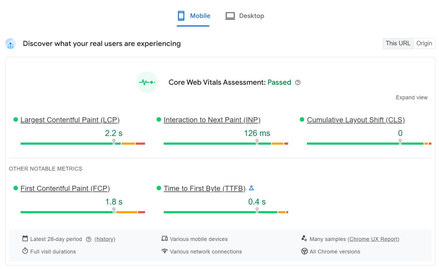
- Largest Contentful Paint (LCP) tells you how fast the main message becomes visible. If this creeps past ~2.5 seconds, users are waiting to even understand the offer.
- First Contentful Paint (FCP) shows when something appears. A fast FCP reassures users that the page is loading, even before the full message is ready.
- Interaction to Next Paint (INP) reflects how responsive the page feels once users try to click or type. High INP means buttons and forms feel laggy.
- Cumulative Layout Shift (CLS) shows whether elements jump around. Any movement near the CTA can cause misclicks or frustration.
If these metrics look healthy, but the bounce rate is still high, speed likely isn’t the problem. If they’re weak, fix speed and load behavior before changing copy or layout. Speed issues erase intent faster than any wording mistake.
10. Optimize your landing page based on user behavior
Many marketers approach optimization as a short checklist: tweak the headline, test the CTA color, move the button, etc. Those tests can help, but they rarely lead to meaningful gains on their own.
Landing page A/B testing should focus on behavior. Instead of asking “Which version looks better?” ask “Where do users hesitate?”
Good split test ideas usually surface where users hesitate or abandon your web page. Common areas worth testing include:
- Rearranging above-the-fold content, such as placing the main benefit before social proof or vice versa
- Adjusting the timing of trust signals by introducing testimonials earlier or closer to the CTA
- Clarifying the next step through more explicit CTA copy, replacing generic labels with outcome-driven actions
- Experimenting with forms, including the number and order of fields, to reduce friction
This is also where metrics matter. A raw conversion rate tells you what happened, but not why. Supporting metrics like scroll depth, time on page, form abandonment, and bounce rate help you understand how users interact with the page.
Use that behavior data to guide what you optimize next. If users scroll but don’t click, the issue is likely clarity or a mismatch in intent. If they click but don’t convert, friction often lies in the next step.
Landing page optimization works best as a feedback loop. So, observe behavior, test one meaningful change, and repeat. Over time, that’s how you increase conversion in a way that actually lasts.
Should You Use Landing Page Templates?
Landing page templates are useful when you need a solid starting point. Among others, they help you move faster by giving you a proven page layout, sensible spacing, and a clear structure to work on.
For SaaS campaigns, pricing pages, or lead generation, for instance, templates can help you build landing pages that follow conversion-friendly patterns from day one.
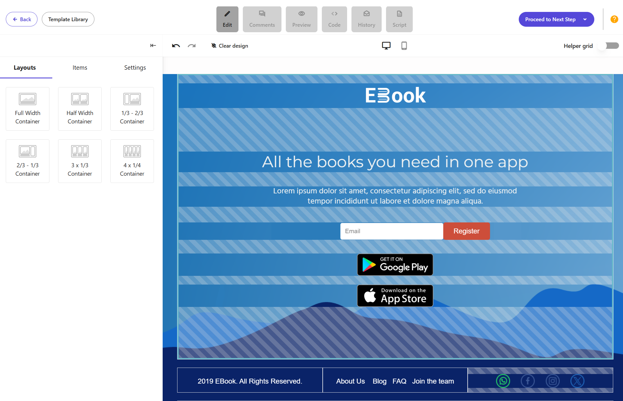
Discover Moosend’s landing pages
Where templates fall short is differentiation. Reusing the same layout, color scheme, and animations without customization can make pages feel generic, especially in competitive markets. Users recognize these patterns quickly, which makes it harder to stand out or build trust.
The key is to treat landing page templates as guides:
- Adjust the messaging to match your marketing strategy and traffic source.
- Customize the color scheme to align with your brand.
- Keep animations only when they help direct attention to the CTA, not when they slow the page down or distract from the goal.
- Add valuable copy, which you can write yourself or use the AI Writer inside your landing page tool to speed up the process.
Templates can surely save time. However, good landing page design comes from how you shape them. So, use them wisely to create an effective landing page for your needs.
Quick Checklist Before Launching Your Landing Page
Before you publish or promote your landing page, run through this checklist once. It takes a few minutes and catches most conversion issues early.
- First impression: The first screen clearly confirms the promise that brought users here, without requiring scrolling.
- Intent alignment: The headline, subheading, and CTA point to the same goal and reinforce each other.
- Single action: There is one primary action on the page, and all supporting elements guide users toward it.
- Trust and credibility: Testimonials or social proof appear near points of hesitation, such as pricing or the CTA.
- Mobile responsiveness: On mobile devices, the message is clear, and the CTA button is visible without extra effort.
- Page speed: The main content loads fast enough for users to understand the offer immediately.
- Funnel continuity: The page feels like a natural continuation of the ad, email, or post that leads to it.
Additional Resources
Take a look at our dedicated landing page guides for more tips and inspiration:
- Best Landing Page Trends To Get Your Inspo Running
- How to Create a Landing Page Without a Website
- Waitlist Landing Page: Examples & Best Practices
Creating High-Quality Landing Pages for Your Funnel
A good landing page is built by removing doubt at the exact moment someone is deciding whether to act.
To work, your pages need to respect user intent, guide attention rather than compete for it, and reduce friction across devices, channels, and load conditions. Also, don’t forget that the real work happens after the page is live. Watching behavior, spotting hesitation, and making small, intentional changes over time is what turns an average page into one that converts reliably.
If you focus less on how your landing page looks on paper and more on how it feels to the person landing there, you’ll naturally start building pages that work, not just pages that follow the rules.
FAQs
Here are some common questions around landing pages.
1. What is a landing page?
A landing page is a standalone web page designed to get visitors to take a specific action, such as signing up, requesting a demo, or making a purchase. Unlike other pages on a website, a landing page focuses on a single goal and removes distractions that could draw users away from that action.
2. What’s the difference between a landing page and a web page?
A regular web page, such as a homepage or blog post, is designed to inform, explore, or navigate. A landing page is built to convert. It usually has a single message, a strong call-to-action, and no competing links, making it more effective for marketing campaigns.
3. When should you use a landing page instead of a homepage?
You should use a landing page whenever you’re running targeted marketing efforts, such as PPC ads, email campaigns, or social media promotions. Sending traffic to a homepage often leads to higher bounce rates because users have too many choices and no clear next step.
4. What makes a landing page high-converting?
A high-converting landing page matches user intent, communicates a clear value proposition quickly, builds trust through relevant social proof, and guides users toward one desired action. Speed, mobile experience, and consistency across the funnel also play a major role.
5. Do landing pages help with SEO?
Landing pages can support SEO, but they’re not designed like long-form content pages. Their main purpose is conversion, not ranking. That said, fast load times, good user experience, and clear messaging still help landing pages perform better in search engines when used strategically.
Sometimes, a single emoji says more than an entire paragraph. These tiny icons have evolved into a universal language, turning even the dullest messages into something truly engaging. Beyond just expressing emotions, they capture complex concepts, actions, and everyday situations in a single symbol.
The impact of emojis is so powerful that we’ve dedicated an entire day to honoring them: July 17th. Also, fun fact, this date was chosen specifically because it’s the date shown on the classic calendar emoji.
If you’re hunting for a creative way to start a conversation with your audience this summer, this holiday is the perfect opportunity. Explore these clever World Emoji Day email ideas to surprise your subscribers and boost engagement.
Craft emoji-based email stories that stick
Use Moosend’s AI Writer to strengthen your holiday campaigns.
TRY MOOSENDWho Can Leverage the Emoji Day Theme in Emails
If you’re wondering if this date deserves a place in your email marketing calendar, here are some use cases that prove this unique holiday fits almost any industry:
- Retail and eCommerce: It works perfectly with summer sale emails. Use emojis to label your product categories or run an emoji-based quiz to help subscribers “decode” which items are on sale.
- Content creators and bloggers: Whether it’s through an emoji challenge or an interactive poll, give your audience a reason to click and participate.
- SaaS and B2B: Leverage this day to humanize your brand. Use emojis to simplify complex data, introduce a new product or case study, or engage younger audiences by adopting a more relatable communication style.
- Travel and hospitality: Use emojis to share the “vibes” of a guest’s next destination or experience, whether it’s by the beach 🏖️ or in the mountains 🏔️, to trigger an instant emotional response and boost bookings.
- Nonprofits: Choose specific emojis to highlight your mission and create an instant emotional connection that might otherwise be missed in a standard block of text.
In short, there’s always a way to make emojis work for you. Ultimately, the spirit of this unofficial holiday is to get rid of formalities and communicate with our audiences in a more genuine, friendly tone.
Further reading: Explore our July email planner to find similar mid-summer holidays, including World Chocolate and Selfcare Days.
Email Marketing Content Ideas to Celebrate World Emoji Day
Here are some inspirational World Emoji Day campaign ideas that can be easily tweaked for different industries.
1. Craft emoji-based storytelling
By enhancing your email storytelling with emojis, you can offer a unique experience that cuts through a customer’s crowded inbox and instantly grabs their attention. Instead of creating entirely new campaigns dedicated to this day, which is, of course, an option, you can simply tweak existing ones with these icons to make them more vivid.
For example, if you run a skincare brand and want to share a quick guide on where your products fit into a daily routine, you could portray it like this:
- Step 1: 🚿 (Cleanse)
- Step 2: ✨ (Serum)
- Step 3: 🧴 (Moisturize)
- Step 4: ☀️ (SPF/Ready for the day!)
You can apply this same logic to other nurturing emails, such as customer testimonials, “day in the life” sequences, or product demonstrations. By finding emojis that represent specific experiences, you provide your subscribers with a much more interesting and visual reading experience.
Check out this email campaign from Code Camp, which uses emoji scales to highlight customer feedback.
Subject line: We asked Isabella what they thought about Code Camp at Chatswood Public!

2. Share exclusive discounts via emojis
Since it falls right in the middle of July, World Emoji Day is the perfect occasion for a mid-summer flash sale or an early back-to-school discount. By strategically placing emojis from your subject line to your CTA, you can transform a standard promotional email into a creative experience.
To take it a step further, try gamifying your offer. For example:
- Announce your discount code using a string of emojis and challenge your subscribers to decode it to unlock their savings.
- Tease a new product or a discounted bundle by using emojis as clues for what’s hidden inside the gift box 🎁.
Keep in mind that while it’s tempting to use “money” emojis like 💵 or 🤑 to highlight a sale, it’s best to avoid them. Using these icons, especially in subject lines, can occasionally trigger spam filters or make your email look like “junk” to some email providers.
Instead, use emojis to describe the concepts, products, or the fun process of the sale itself. Let your copy handle the price drop while your emojis handle the “vibe.”
3. Create an emoji quiz
If you want to create something more interactive, try crafting a poll or quiz using emojis. These are excellent tools for collecting quick customer feedback or providing personalized product recommendations to your subscribers.
For example, as shown earlier, you can use an emoji scale to gauge customer satisfaction, asking them to rate their latest experience with your brand: 🙁, 😐, 🙂, or 😄. Not only is this visually appealing, but it also lowers the friction for the user, as clicking an emoji is much easier than typing a review. You could also ask them to “predict” their upcoming needs by choosing an emoji that represents their mood or product needs for the next season.
When it comes to product recommendations, let your imagination run free. For instance, if you run an online bookstore, ask your subscribers to pick their favorite genre via emojis and send them a targeted follow-up with relevant recommendations:
- 🔍 (Mystery)
- 🐉 (Fantasy)
- 💖 (Romance)
- 🚀 (Sci-Fi)
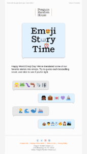
You can follow the example of Penguin Random House and ask subscribers to guess the book based on the emojis. It’s an excellent way to boost brand awareness and engagement on this special day:
Subject line: Guess the Book Titles Based on Emojis!
4. Send personalized emoji emails
Regarding personalization, you can leverage segmentation to send targeted emails enhanced with emojis. For instance, you can craft “half-year reviews” or style profiles based on your customers’ specific shopping habits.
If you run a beverage eCommerce shop, you can easily segment ☕ (Coffee Lovers) from 🍵 (Tea Enthusiasts) and send a tailored discount for their next order. Similarly, if you’re in fashion, you can send a “Vibe Check” campaign based on a customer’s style aesthetic, distinguishing “Party Enthusiasts” 👗 from “Sports Fans” 👟 to offer them the most relevant cross-selling options.
Even your automated workflows, such as abandoned cart, VIP, and anniversary messages, can join the World Emoji Day celebration. These icons will make triggered emails more vibrant and allow recipients to instantly recognize the purpose of the message before they even read the first line.
Overall, by matching the emoji to the segment or user behavior, you aren’t just sending an email; you’re showing the customer that you actually “get” them, providing a highly resonant and humane experience.
5. Run an emoji giveaway contest
If you want to maximize engagement, you can run a giveaway on World Emoji Day, inviting subscribers to join a quest to enter a draw for a special prize. To take it even further, consider bringing social media into the game to boost user-generated content and gain more visibility across platforms.
You can start simple by asking subscribers to reply to your email with a specific emoji. Try asking questions like, “Which emoji best describes your brand experience?” or challenge them to solve a quick emoji puzzle. To add urgency, you could offer a prize specifically to the first ten people who respond with the correct answer.
For a truly cross-channel experience, you can create an Emoji Scavenger Hunt. Ask your audience to collect hidden emojis shared across your social profiles, like Instagram or TikTok, and submit them via email to enter the prize draw.
6. Enhance your email design with emojis
When used wisely, emojis can enhance your email content by contributing to a clearer layout or making important elements, such as your subject line or CTA, pop.
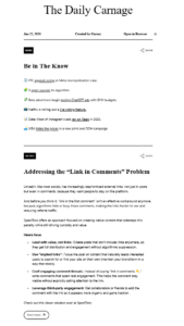
The Daily Carnage, for example, successfully uses emojis instead of bullet points in their newsletters to create a smooth, scannable reading experience.
Subject line: Link in Comments 👇
Here are a few quick ways to level up your design the emoji way:
- Replace bullet points: Swap standard dots for themed emojis that match your message.
- Brighten subject lines: Use a splash of color with an icon to boost open rates in a crowded inbox.
- Strengthen your CTA: Add an emoji next to your button or link to make the call-to-action more visually prominent.
- Create section dividers: Use a string of emojis, such as ✨✨✨ or ☀️☀️☀️, to separate topics if they blend well with your overall aesthetic.
Once you’ve applied these ideas, the next step is bringing them to life in your email. Most email marketing tools, like Moosend or Constant Contact, offer pre-made email templates you can easily enhance with these elements. To truly honor the day, you can even replace existing stock images with “emojified” visuals.
Quick Email Marketing Tips for World Emoji Day
Here are some quick best practices to optimize your World Emoji Day email campaigns and win subscribers’ hearts.
Align with your brand tone
Before planning your World Emoji Day email campaign, remember that adhering to your brand voice and style is paramount. Always keep your target audience in mind when shaping your design and messaging.
Avoid confusing your customers with a campaign they wouldn’t expect from you, especially older audiences who may not resonate with this type of marketing. The goal is for your approach to feel fun and friendly rather than desperate or alienating.
If you maintain a more formal brand tone, look for neutral, sophisticated ways to celebrate this day. For example, use more utility-based emojis, such as calendars and clocks. You can also remove it from your calendar if it doesn’t make sense for your brand in any format.
Add emojis to subject lines
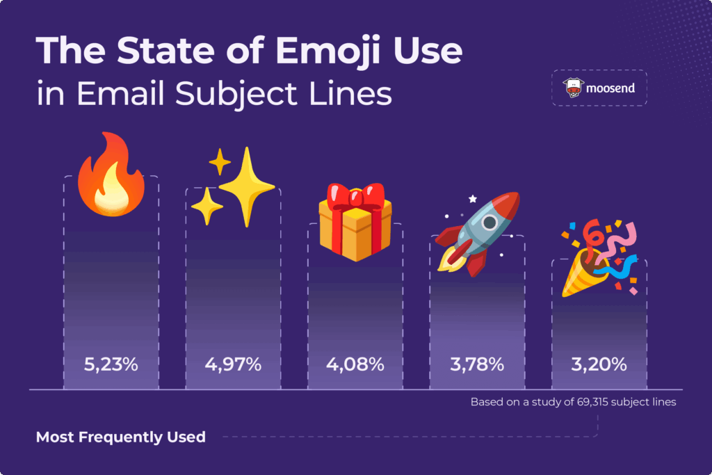
Based on a recent Moosend survey, we found that 28% of the emails analyzed included emojis in their subject lines, and for good reason. They help break through inbox clutter, provide visual cues for email content, showcase a brand’s personality, and highlight important information like sales or urgency.
World Emoji Day is the perfect opportunity to include an emoji in your subject line. Find one that aligns with your content and consider personalizing it to increase relevance. For example, if you are a pet store owner, you might distinguish cat lovers from dog lovers by using a 🐱 or 🐶 emoji to boost your engagement metrics.
If you can’t find the best emoji for your email, you can use AB testing to experiment with different versions, or check out Moosend’s AI writer to craft a high-converting subject line.
Ensure responsiveness and accessibility
Before hitting “Send,” ensure that the emojis you’ve added to your campaign read well on every device. Test them across iOS, Android, and Windows platforms and consider replacing them if anything feels off, while always making sure to stick to your main theme.
Also, keep in mind that screen readers read the alt text of every emoji, which can significantly change how a subscriber hears your message. To avoid confusing visually impaired subscribers, avoid replacing critical words in a sentence with emojis. For instance, instead of writing “Check out our 🆕 arrivals,” it’s much better to write “Check out our new arrivals 🆕.”
Finally, when using emojis in your design, ensure that there’s enough color contrast with the background to maintain a good user experience for people with low vision. A blue emoji on a green background, for example, may be difficult to spot.
Avoid spammy emojis
Certain money-related emojis, such as 🤑 or 💵, are usually not favored by spam filters. These icons can signal that your content is phishing, which may move your World Emoji Day campaign directly to the “junk” folder, especially if they’re placed in the subject line.
To prevent this, you should opt for safer ways to showcase your discounts to your customers. It’s better to clearly state your offers in the copy while avoiding common spam words such as “free” or “urgent.”
If you want to grab attention, focusing on urgency-based emojis like 🚨 or ⌛ can positively impact your open and click-through rates without triggering the same red flags.
Skip emoji-only messaging
Finally, remember to use emojis in moderation. Even on this special day, subscribers may get frustrated when an email overloaded with emojis appears in their inbox. Make sure the icons you choose genuinely enhance storytelling and design, and aren’t included just to grab attention.
To be safe, share your draft with your teammates before scheduling the email. Take their feedback seriously to determine if the balance of visuals and text is right. You want this email to feel festive, not annoying or over-cluttered.
Celebrate Our Most Common Universal Language
World Emoji Day isn’t just a fun addition to your calendar. It’s the perfect date to connect with your audience in a language almost everyone understands. Make sure to find a campaign idea that resonates with your audience to hit your marketing goals.
And if you’re looking for an email marketing solution to manage everything in one place, from email design to scheduling to automating follow-ups, Moosend has everything you need. You can sign up for a 30-day free trial to give it a spin.
FAQs
Read these frequently asked questions regarding World Emoji Day email ideas:
1. Is it professional to add emojis to emails?
Yes. When used strategically, emojis can humanize your brand and improve the readability of your message. However, the icons you choose should align with your brand voice and be used in moderation; otherwise, you risk confusing your subscribers.
2. Where is the best place to put an emoji: start or end of the subject line?
The safest choice in terms of readability is at the end of the subject line, as the reader’s focus goes straight to your main message without any visual blockers. However, many choose to place emojis at the beginning of the sentence because it helps the email stand out in the inbox.
3. Do emojis affect accessibility for visually impaired users?
Yes. Screen readers read the alt text for those icons aloud. To create an inclusive experience, place them at the end of sentences and avoid replacing words with emojis. Moreover, avoid stuffing your copy with too many of those icons, as it might lead to chaotic output for people with low vision.
When you’re building a company from the ground up, time and budgets are limited. There’s little room for lengthy onboarding processes, steep learning curves, or software that demands a dedicated specialist to run everything.
Startups need tools that are quick to set up and powerful enough to automate essential marketing tasks without draining resources.
But not all marketing automation software is built for startups. Some platforms are overpriced, while others are overloaded with features you’ll never use.
Below, you’ll find the best marketing automation tools for startups, balancing affordability, ease of use, and scalability, so you can grow efficiently from day one.
Why Startups Need Marketing Automation Tools
Early-stage companies operate in survival mode. Every lead matters, while missed follow-ups can mean lost revenue. Marketing automation helps startups create structure without adding headcount. Many email marketing tools designed for startups now include automation features that make this possible even for small teams.
Instead of manually sending onboarding emails, promotional offers, or re-engagement campaigns, automation lets you build workflows once and run them in the background. This ensures timely communication with prospects and customers, even when your team is focused on product development, fundraising, or customer support.
Marketing automation tools also improve consistency. Startups can nurture leads with personalized email sequences, segment audiences by behavior, and trigger messages in response to real-time actions. This means better engagement without extra manual effort.
Equally important, automation provides measurable insights. With access to campaign performance data, startups can identify what works, optimize more quickly, and make informed decisions rather than guess.
Marketing Automation Tools for Startups: Overview
Now, let’s see a quick overview of the top tools you can consider for your startup.
| Pricing | Free Plan | Best Feature | |
| Moosend | $9/month | 30-day trial | Easy-to-implement automation with a wide range of triggers |
| HubSpot | $20/month | ✔️ | Powerful free CRM |
| ActiveCampaign | $19/month | 14-day trial | Vast library of automation templates |
| Zoho CRM | $20/month | 15-day trial | Customizable sales workflows |
| Brevo | $9/month | ✔️ | SMS & WhatsApp campaigns |
| Zapier | $19.99/month | ✔️ | No-code automation across 5,000+ apps |
| Hootsuite | $249/month | 30-day trial | Multi-platform social scheduling |
| Mailchimp | $13/month | ✔️ | Intuitive customer journey builder |
1. Moosend
Moosend is an email marketing and marketing automation platform designed to give startups access to advanced functionality without the high costs or complexity typically associated with such platforms.
Its interface is clean and intuitive, allowing teams to create campaigns, set up automations, and manage lists without a steep learning curve. For early-stage companies, this ease of use can significantly reduce onboarding time and execution delays.
From an automation standpoint, Moosend offers a visual workflow builder that supports behavior-based triggers, conditional logic, and advanced segmentation. Startups can automate onboarding sequences, cart abandonment emails, re-engagement campaigns, and lead-nurturing flows with minimal setup.
The platform also includes transactional emails, landing pages, signup forms, and real-time reporting, enabling businesses to centralize multiple marketing functions in a single tool. This makes it suitable for startups looking to build structured, scalable campaigns without investing in multiple separate solutions.
Regarding pricing, Moosend remains competitive with many automation-first platforms, making it accessible for startups operating with limited budgets. Its feature set supports both B2C and SaaS use cases, particularly for teams that need strong segmentation and automated lifecycle marketing from the start.
Pros
- Advanced automation workflows at a competitive entry price
- Strong segmentation capabilities for personalized campaigns
- Includes transactional emails and landing pages in one platform
Cons
- Smaller native integration ecosystem (compared to larger competitors)
- Fewer built-in CRM features than other tools in the list
Pricing: Starts at $9/month. There is also a 30-day trial you can sign up for free.
2. HubSpot
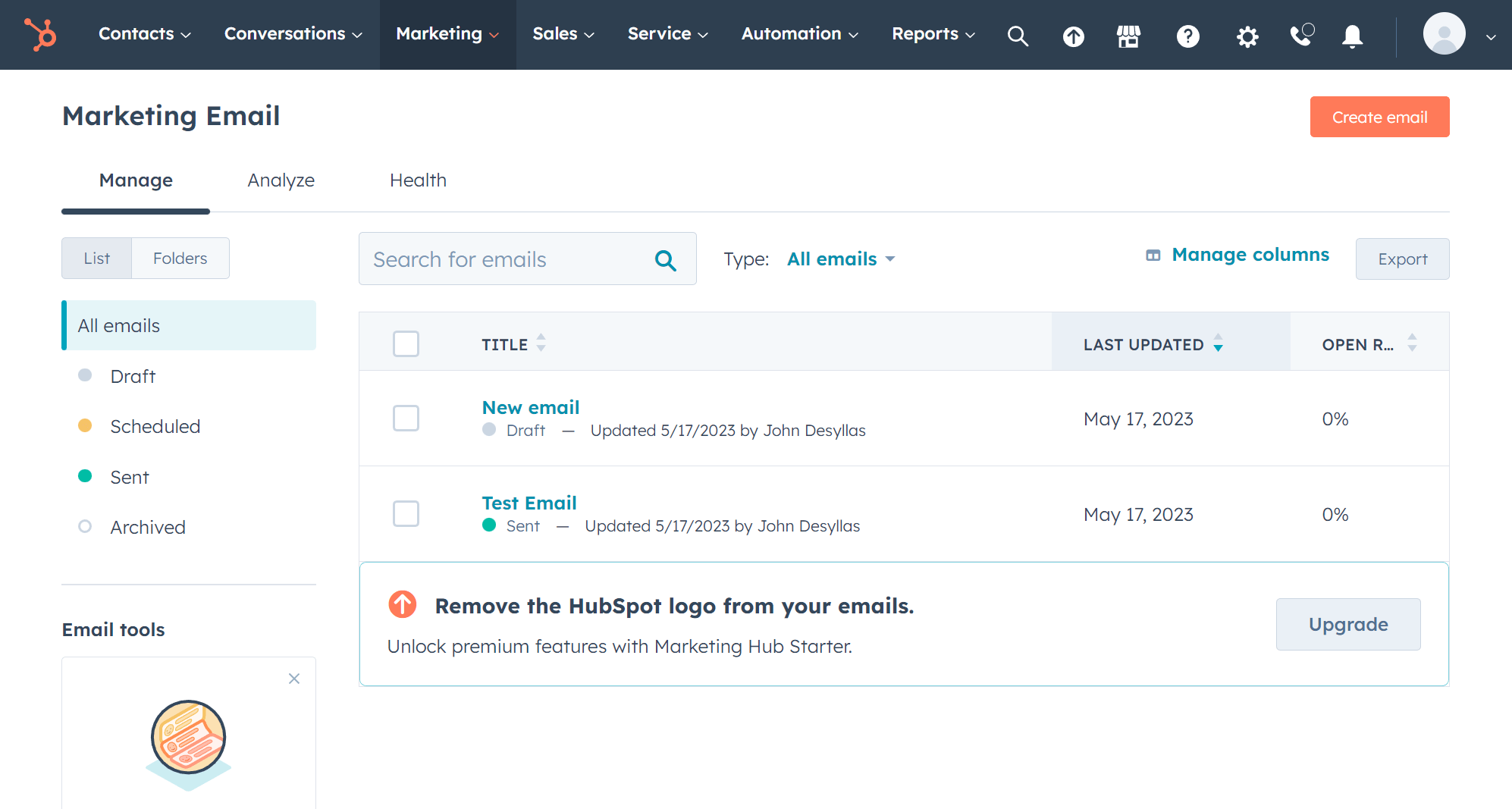
HubSpot is a well-known marketing automation platform that combines email marketing, automation, and CRM functionality in a single ecosystem.
If you want to align marketing and sales from day one, HubSpot’s built-in CRM is one of its strongest advantages. It allows teams to track contacts, manage pipelines, monitor deal stages, and view customer interactions in one centralized dashboard without a separate CRM tool.
This solution comes with a visual workflow builder that supports lead nurturing, internal notifications, scoring, and lifecycle-based campaigns. Startups can automate onboarding emails, content follow-ups, demo reminders, and sales handoffs.
The platform also includes landing pages, forms, live chat, reporting dashboards, and lead-tracking tools, making it a comprehensive solution for companies that want structured growth processes early on. Its analytics can help founders and marketers understand which campaigns drive conversions and revenue, not just opens and clicks.
All in all, for early-stage teams that prioritize CRM alignment and long-term expansion, HubSpot can serve as a growth platform, provided the budget supports it.
Pros
- Powerful built-in CRM with sales pipeline tracking
- Strong marketing–sales alignment and lifecycle automation
- Extensive reporting and contact tracking capabilities
Cons
- Price increases significantly with advanced automation features
- Automation functionality is limited on lower-tier plans
- Can feel complex for very small teams with simple needs
Pricing: Starts at $20/month. Free plan available with foundational tools.
3. ActiveCampaign
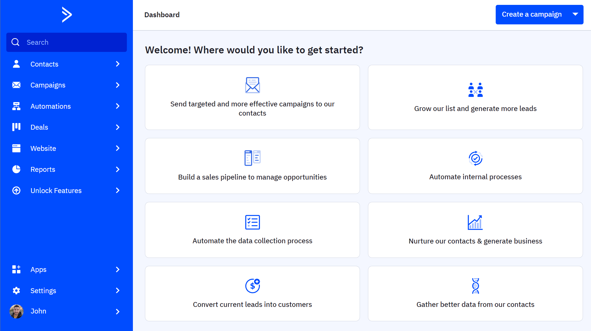
ActiveCampaign is a marketing automation platform built around advanced automation and customer experience workflows.
For startups that want more than basic email sequences, it offers a powerful visual automation builder with conditional logic, behavioral triggers, lead scoring, and dynamic content. The platform also includes a large library of pre-built automation journeys to help startups automate their strategy quickly.
Beyond email marketing, ActiveCampaign includes a built-in CRM (available on higher-tier plans), sales automation, SMS marketing, and site tracking.
Startups can automate onboarding flows, trial-to-paid conversion sequences, abandoned cart reminders, and post-purchase follow-ups. Its tagging and segmentation system allows for highly targeted campaigns based on user actions, engagement, or purchase behavior. For SaaS and eCommerce startups, especially, this level of behavioral automation can help increase conversions without increasing team workload.
While the platform is flexible, setting up advanced automations may require time and experimentation. Pricing also scales based on contacts and features, so startups need to assess whether they’ll fully use its more sophisticated capabilities.
Pros
- Highly advanced automation builder with conditional logic
- SMS marketing
Cons
- Steeper learning curve compared to simpler tools
- Some advanced features are locked behind higher-tier plans
Pricing: Starts at $19/month. There is also a 14-day free trial.
4. Zoho CRM
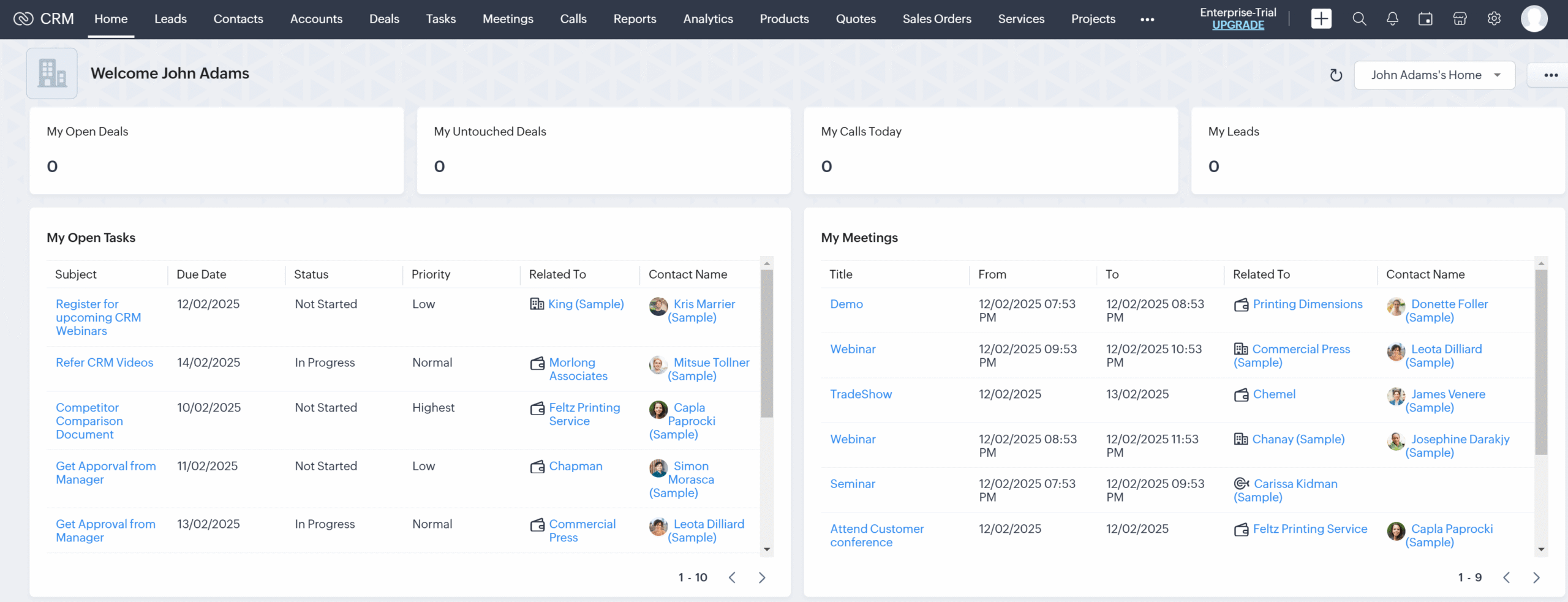
Zoho CRM is a sales-focused platform that includes marketing automation capabilities as part of the broader Zoho ecosystem. For startups that want to structure their sales process early and centralize customer data, it offers a practical alternative to using separate CRM and automation tools. Instead of focusing solely on email campaigns, Zoho CRM helps teams manage leads, track deals, automate follow-ups, and monitor pipeline performance in one system.
Startups can also capture new leads through web forms, automatically assign them to team members, score them based on predefined rules, and trigger email workflows directly within the CRM.
Workflow automation streamlines repetitive tasks such as status updates, notifications, and task creation. Built-in reporting dashboards and forecasting tools provide visibility into sales performance, helping founders make data-driven decisions without exporting data across platforms.
Zoho CRM becomes more powerful when used alongside other Zoho products like Zoho Campaigns, Zoho Desk, and Zoho Books. This integration can reduce software fragmentation for startups already operating within the Zoho environment.
Pros
- Strong lead management and pipeline tracking
- Affordable pricing compared to many CRM alternatives
- Integrates seamlessly within the broader Zoho ecosystem
Cons
- The interface can feel complicated for beginners
- Advanced automation and customization require higher-tier plans
Pricing: Starts at $20/month. There is a 15-day trial of the paid plans and a free edition with essential features.
5. Brevo
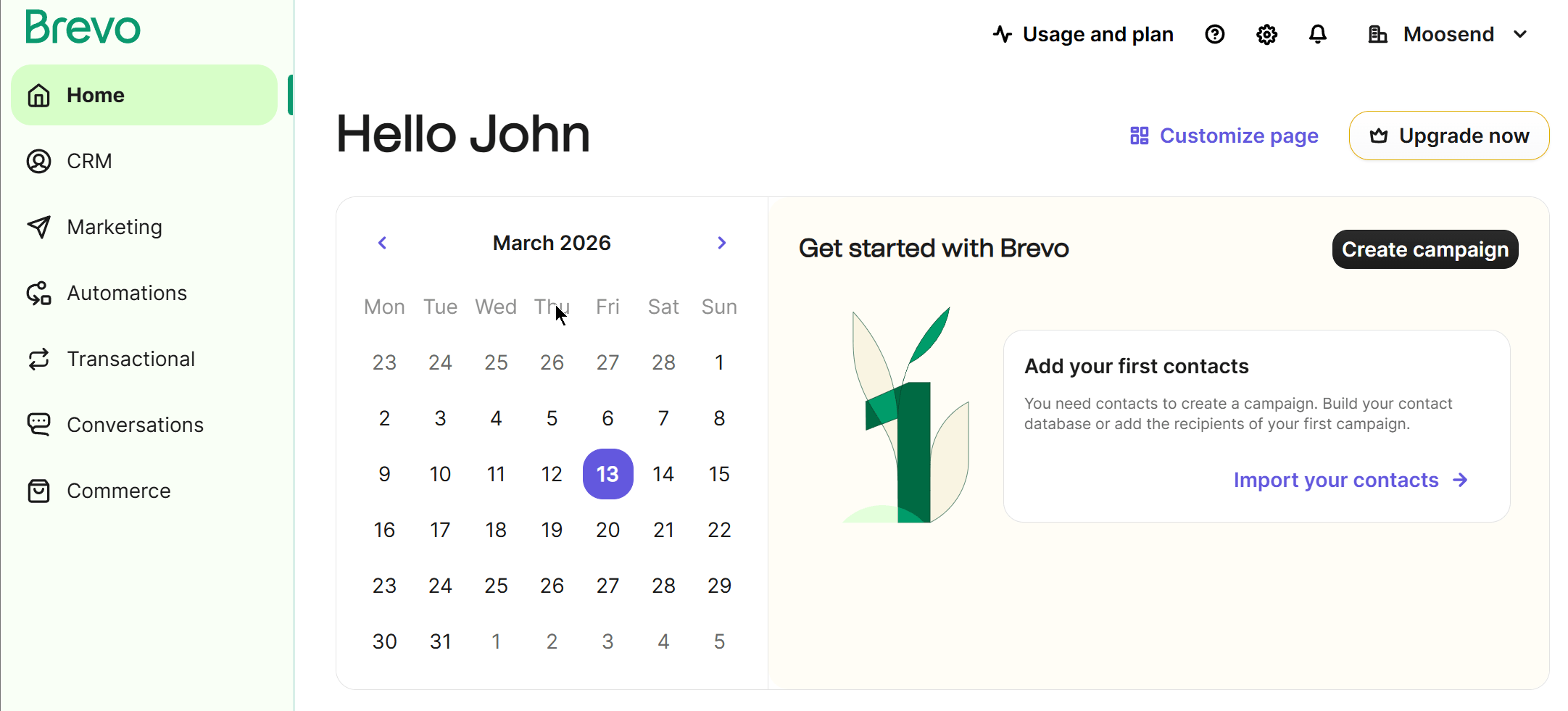
Brevo is another popular marketing automation platform that offers email marketing, SMS, WhatsApp, and web push notifications. It has a modern interface that makes navigation of the platform effortless.
You get a great workflow builder that lets you create behavior-based workflows triggered by email activity, website visits, or custom events. What’s more, Brevo can handle transactional emails through its infrastructure, making it useful for SaaS and eCommerce startups that need order confirmations, account notifications, and system emails alongside promotional campaigns.
The platform also provides lead-generation tools, such as landing pages and signup forms. It goes without saying that you get a bunch of beautiful templates to get started fast. Last but not least, Brevo’s CRM functionality will help startups centralize customer data and campaign execution.
Pros
- Supports email, SMS, and transactional messaging
- Email volume-based pricing
- Multi-channel automation capabilities
Cons
- Reporting depth can feel limited for data-heavy teams
- Advanced sales automation costs extra ($31/month)
Pricing: Starts at $9/month. A limited free plan is also available.
6. Zapier
Zapier isn’t a traditional marketing automation platform. Instead, it acts as a connector between apps, allowing startups to automate workflows across thousands of tools without writing code. For lean teams using multiple SaaS products (CRM, email platform, forms, payment tools, project management software), Zapier helps eliminate manual data transfers and repetitive admin tasks.
Startups can create “Zaps” that automatically trigger actions, such as adding new form submissions to an email list, notifying a Slack channel when a lead signs up, or updating a CRM when a purchase occurs. This makes it especially useful for companies that don’t want to commit to an all-in-one suite but still need operational efficiency.
Pros
- Connects 5,000+ apps without coding
- Reduces manual data entry and tool switching
- Flexible automation across multiple systems
Cons
- Not a full marketing automation platform
- Costs increase with task volume
- Complex workflows may require paid tiers
Pricing: Starts at $19.99/month. Free plan available with limited tasks.
7. Hootsuite
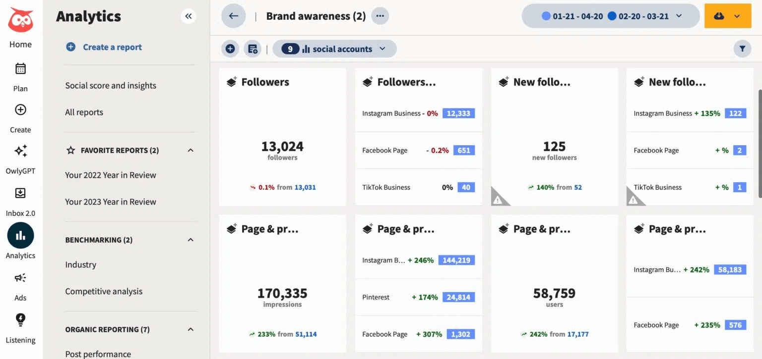
Hootsuite is a social media management platform that helps startups plan, schedule, and monitor content across multiple social networks. While it’s not a traditional email marketing automation tool, it supports marketing automation through social scheduling, content workflows, and performance tracking. For startups building brand awareness early, automating social media activity can free up valuable time.
The platform allows teams to schedule posts in advance, monitor mentions and conversations, and manage multiple social accounts without switching platforms. Built-in analytics help startups understand engagement trends, top-performing content, and audience behavior. Hootsuite also includes collaboration features, making it easier for small teams to assign tasks, approve content, and maintain a consistent publishing schedule.
For startups relying heavily on social channels for growth, Hootsuite can streamline execution and reduce manual posting. However, it focuses on social automation rather than full-funnel marketing automation, so it works best alongside email or CRM tools.
Pros
- Centralized management of multiple social media accounts
- Advanced scheduling and content calendar tools
- Social analytics and monitoring features
Cons
- Advanced analytics available on higher plans
- Cost may be too high for some startups
Pricing: Starts at $249/month (billed monthly). There is also a 30-day free trial.
8. Mailchimp
Mailchimp is another marketing automation tool for startups worth checking out. This popular email marketing platform can help you set up a complete automated marketing strategy with its pre-made customer journeys and intuitive workflow builder.
Despite its ample functionality, the platform is easy to explore and understand its key features. You also get extensive documentation and guided onboarding. Among others, Mailchimp includes A/B testing, signup forms, and rich analytics to understand whether your campaigns perform as expected. Additionally, the platform comes with social posting and ad integrations, making it more than just an email tool.
However, while Mailchimp is easy to start with, costs can increase as contact lists grow. Specifically, the platform charges you for duplicate contacts, and more advanced automation features may require higher-tier plans. Nevertheless, for startups that need intuitive automation and brand recognition, this tool can be a practical starting point.
Pros
- Beginner-friendly interface and large template library
- Guided onboarding
- It can also handle transactional emails (at an extra cost)
Cons
- Advanced automation and segmentation are unlocked on higher tiers
- The free plan is very limited
Pricing: Starts at $13/month. There is also a limited free plan.
Finding the Right Marketing Automation Tool for Your Startup
Choosing the right marketing automation tool depends on your startup’s stage, budget, and growth goals. Some teams need simple email workflows to save time, while others require CRM integration, multi-channel communication, or advanced segmentation from day one.
The key is to select a solution that meets your current needs without adding unnecessary complexity. Start lean, prioritize ease of use, and choose a platform that can scale as your startup grows.
FAQs
Here are some frequently asked questions and their answers.
1. What is the best marketing automation tool for early-stage startups?
The best marketing automation tool for early-stage startups depends on your immediate priorities. If your goal is simple email automation and affordability, lightweight platforms like Moosend and Brevo are ideal. If you need sales tracking and pipeline visibility, a CRM-based solution may be more suitable, such as HubSpot and ActiveCampaign. Startups should generally prioritize ease of setup, transparent pricing, and scalability over complex features they may never use.
2. How much should a startup spend on marketing automation software?
Most startups can expect to spend anywhere from $0 to $50 per month at the early stage, depending on list size and required features. Many tools offer free plans or trials that let startups test functionality before committing. As your contact list grows and automation needs become more advanced, pricing typically scales based on the number of subscribers, users, or tasks.
3. Can marketing automation replace a marketing team in a startup?
Marketing automation cannot replace strategy, creativity, or decision-making, but it can significantly reduce manual workload. Automation handles repetitive tasks such as welcome emails, follow-ups, segmentation, and reporting. This allows small teams to focus on growth initiatives, partnerships, and campaign optimization instead of routine execution.
Most nonprofit organizations find it hard to turn website visitors into active donors or volunteers. The right information is usually there, but supporters often fail to find what they need, lost in cluttered websites.
Landing pages solve this challenge. By removing the extra digital noise, they guide users toward a single call-to-action (CTA). For instance, rather than asking a visitor to “Explore Our Mission,” a landing page directs them to a specific outcome, such as “Sponsor a Classroom.”
In this post, we’ll share impactful nonprofit landing page examples across various categories, along with practical tips to help you better connect with your community.
Engage your community with powerful tools
Access landing pages and similar growth assets at a low cost.
TRY MOOSENDWhy Create Landing Pages for Your Nonprofit Organization
Before we dive into the ins and outs, here is why landing pages are so effective at boosting the performance of your marketing campaigns and outreach:
- Limit distractions: By removing elements that typically draw attention, such as menus or secondary links, you keep supporters focused on your CTA. This way, the landing page responds to the specific reason they clicked in the first place.
- Optimize the user experience: Landing pages offer a simpler path than a standard website, making it much easier for someone to sign up or donate in just a few clicks. Instead of making a donor navigate from “Home” to “About” to “Donate,” a landing page puts the donation form right in front of them.
- Boost conversion rates: This narrowed focus helps users support your cause faster. Reducing the “time to give” often leads to higher fundraising results and a better chance of securing recurring donations.
- Provide better insights: It’s much easier to track the performance of a dedicated page. You can see exactly how many people arrived from a specific source and how many contributed, giving you a clear picture of what truly resonates with your community.
In a nutshell, creating dedicated pages for specific goals is well worth the effort. Better yet, it’s simpler than it sounds, especially when you have the right tools and a few best practices.
What Should a High-Converting Nonprofit Landing Page Include
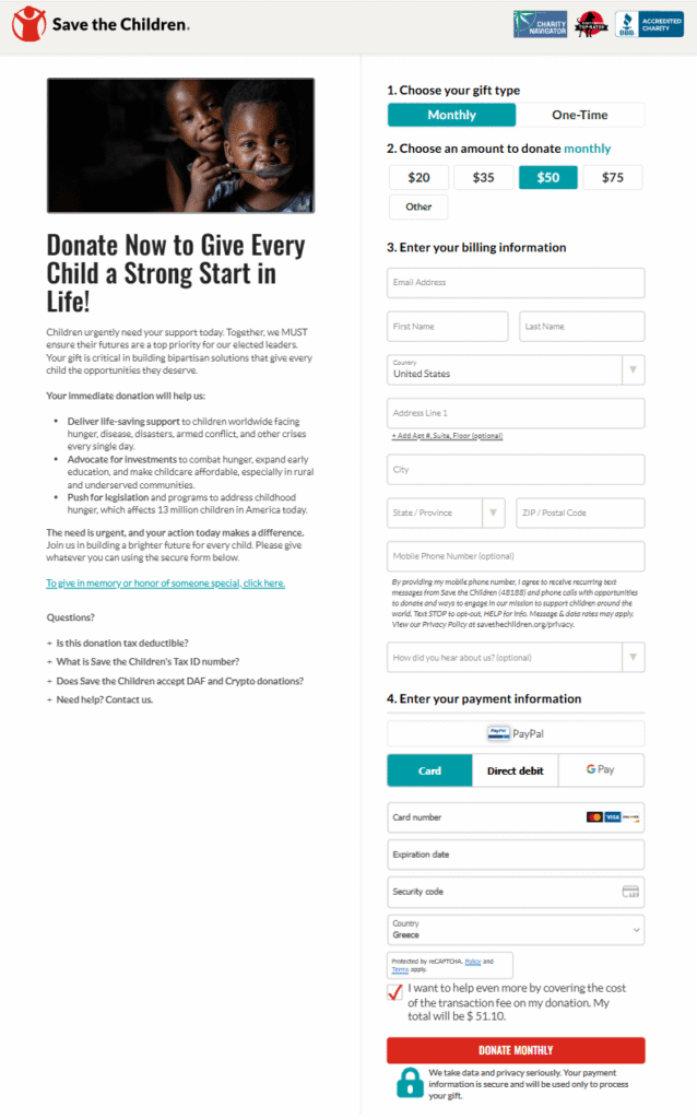
Let’s explore the elements that can make your landing page stand out by focusing on this example from Save the Children.
Compelling headline
Make an impactful first impression by placing your call-to-action directly or subtly in your headline. Rather than simply stating what the visitor should do, emphasize why they should do it.
In this example, Save the Children combines urgency (“Donate Now…”) with mission-driven language to immediately engage the audience. A headline like “Give Every Child a Strong Start in Life” is difficult to dismiss. Since the visitor has already clicked through to this page, they likely have a high intent to help, and the headline encourages them to act.
Visuals
Following the Save the Children example, placing a powerful, high-quality image at the top of your page instantly bridges the gap between the supporter and the cause.
You can also use supporting visuals to clarify your mission without overwhelming the reader. For instance, instead of a complex spreadsheet, a simple “impact thermometer” that shows how close you are to a $5,000 goal can give donors a sense of real-time progress. Always keep your layout clean so that these graphics complement your text rather than burying it.
Finally, while stock photos are convenient, authenticity should remain your greatest asset. Using real photos of the people, animals, or environments you serve is far more impactful and ethical than a staged image.
Landing page copy
Your landing page copy should act as a spotlight for your mission statement, driving action without sounding salesy. Shift the focus from your organization’s needs to the real-world impact a supporter will create. For example, instead of describing your logistics, explain that a $50 gift provides an emergency medical kit for a family in a war zone.
To maintain engagement, your page should be structured into clear sections with subheadings that guide the reader’s eye. This creates a logical flow that prevents “information overload.”
You can see this reflected in the Save the Children example, where they use the “Questions?” dropdown. This FAQ section addresses common supporter concerns without cluttering the page. Moreover, by answering these questions in advance, you remove potential barriers to a donation while keeping the layout clean and professional.
Signup form
The signup form is one of the most important elements of your page. This is the moment where visitors take the time to subscribe or donate by sharing their personal information. The rule here is simple: the fewer the clicks, the higher the conversion potential.
Donation forms should include essential information without overdoing it. You don’t want supporters to question their privacy or safety, especially when making larger donations. For example, including a small “Secure Checkout” padlock icon near the payment field can reassure a donor instantly.
While Save the Children’s form may seem long at first glance, it makes the donation process feel secure and straightforward. It gives supporters a clear choice between one-off and recurring donations and allows them to select from various payment methods, such as PayPal or credit cards, to cater to different preferences.
Call-to-action
The CTA button represents the exact moment a supporter joins your mission. To be effective, this button should visually pop against the page background. Many high-performing organizations also place a secondary CTA at the very top of the page, such as a “Donate” button in the navigation bar to maximize visibility.
You can do the same by using a sense of urgency as Save the Children did with “Donate Now.” Keep your language actionable by writing copy that focuses on the mission. For instance, using “Give Water” or “Save a Life” instead of a generic “Submit” makes the impact feel more personal and feasible.
Finally, your landing page call-to-action should be unique. If you offer too many competing choices, such as asking for a donation while also promoting a newsletter, the primary goal of the page can easily get lost.
Social proof
To build trust quickly, many organizations add credible forms of social proof to their landing pages. Case studies, testimonials from beneficiaries, or charity ratings, such as a “4-star” badge from Charity Navigator, can significantly influence a donor’s decision to join your cause. These trust signals reassure supporters that their money is being handled responsibly.
Alternatively, you can share an infographic with impact stats to visualize the progress a charity has made. For example, a simple graphic stating “5,000 Trees Planted This Year” helps a donor see exactly how their contribution comes to life, making the mission feel achievable.
Effective Nonprofit Landing Page Examples & Why They Stand Out
Need inspiration before crafting your next nonprofit landing page? In this section, we’ve collected examples from well-known NPOs to help you get started.
Doctors Without Borders
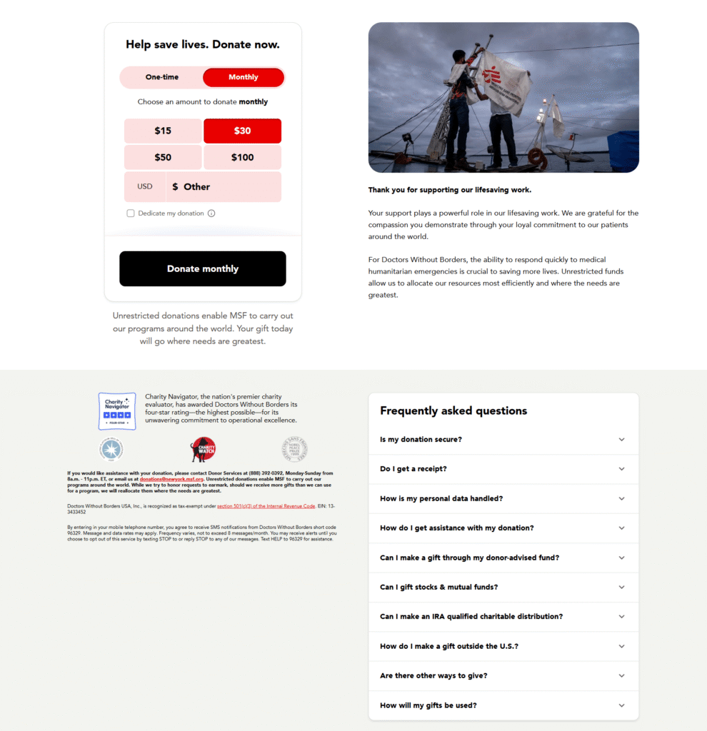
Doctors Without Borders is a leading medical humanitarian aid organization providing care globally. They crafted a donation landing page specifically designed to increase fundraising.
Why it works:
- The signup form is positioned at the top of the page, letting users choose between monthly and one-time donations.
- A powerful hero image is followed by a direct thank-you note to donors, explaining exactly why their contribution matters.
- The badges placed directly below the form, like that from the Charity Watch, act as social proof and help earn trust faster.
- The FAQ section resolves common concerns that might otherwise cause a donor to hesitate at the final step.
Room to Read
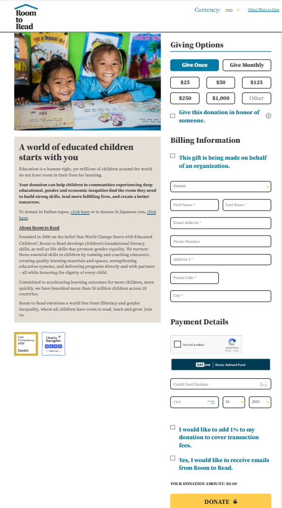
Room to Read envisions a “world free of illiteracy and gender inequality” and invites supporters to join their mission through a dedicated fundraising landing page.
Why it works:
- The heartwarming image of the girls sets a positive tone for the entire page, reflecting the cause’s successful impact.
- The headline informs readers that their contribution can make a significant difference, positioning the donor as the story’s hero.
- The landing page copy stays focused on specific fundraising goals to help the reader visualize their impact.
- They offer an option to donate in honor of someone else, such as a birthday or memorial gift, while maintaining a simple signup process.
Amnesty International
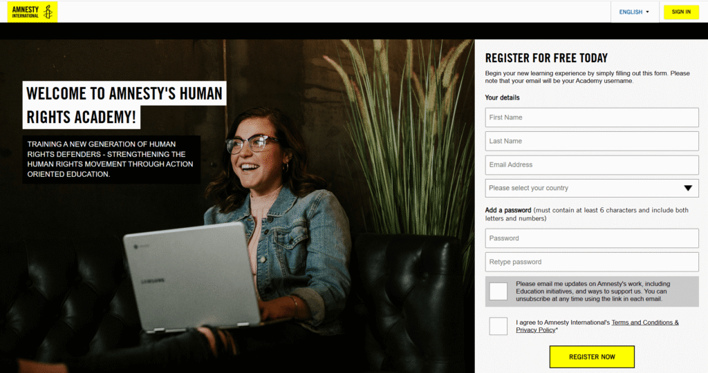
Amnesty International protects the human rights of millions of people globally and offers online courses to educate the public on these critical topics. Here is a look at their Academy landing page:
Why it works:
- The landing page copy welcomes readers and briefly informs them of the workshop’s primary goals.
- The signup form is incredibly simple to fill in, reassuring visitors that they are subscribing for free. This reduces reluctance and keeps the focus on education.
- The yellow CTA button stands out against the page while remaining perfectly on-brand. Using actionable text like “Register Now” alongside this bold color encourages immediate signups.
Heller Keller Intl
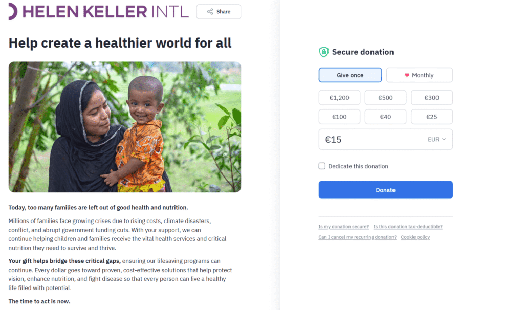
Helen Keller International aims to provide better health and nutrition to families worldwide facing crises caused by rising costs, climate disasters, and conflict. This is their donation landing page.
Why it works:
- The hero image helps potential donors visualize the direct effect of their contribution.
- The simple form allows supporters to complete their donation quickly and securely.
- The copy clearly outlines the organization’s mission, using bolded sentences to grab attention quickly.
- Below the form, visitors can find links to FAQs and the cookie policy to address concerns regarding data privacy.
Clean Air Task Force
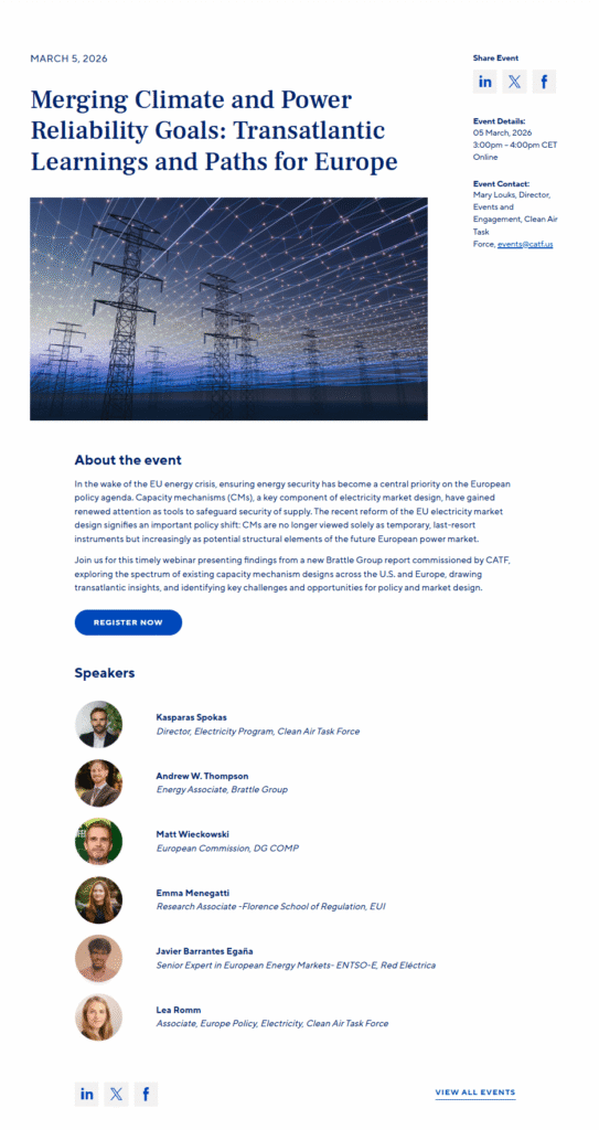
This nonprofit aims to create a zero-emissions future by promoting technological and policy advances to manage climate change. As part of their agenda, Clean Air Task Force hosts niche industry events, and here is the landing page for one of them.
Why it works:
- The event details and agenda are placed at the top, letting readers instantly spot important information, such as the date, time, and location.
- The gallery of event speakers adds credibility and authority to the page due to their high expertise.
- The social media buttons invite visitors to share the event with their professional networks.
- The “Register Now” button is the central focus of the page.
Internet Archive
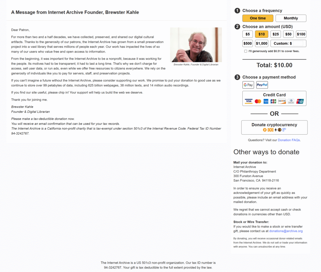
The Internet Archive is a non-profit digital library that provides free access to millions of books, web pages, and audio files. Their donation page is simple, with a consistent look and feel with their website design.
Why it works:
- The mission statement comes directly from the founder, adding a personal tone and a sense of accountability.
- The signup form is quick to complete and offers a wide range of payment options, including cryptocurrency.
- They include a clear link to their FAQs, which addresses common technical or tax-related concerns without cluttering the main page layout.
Cancer Research Institute
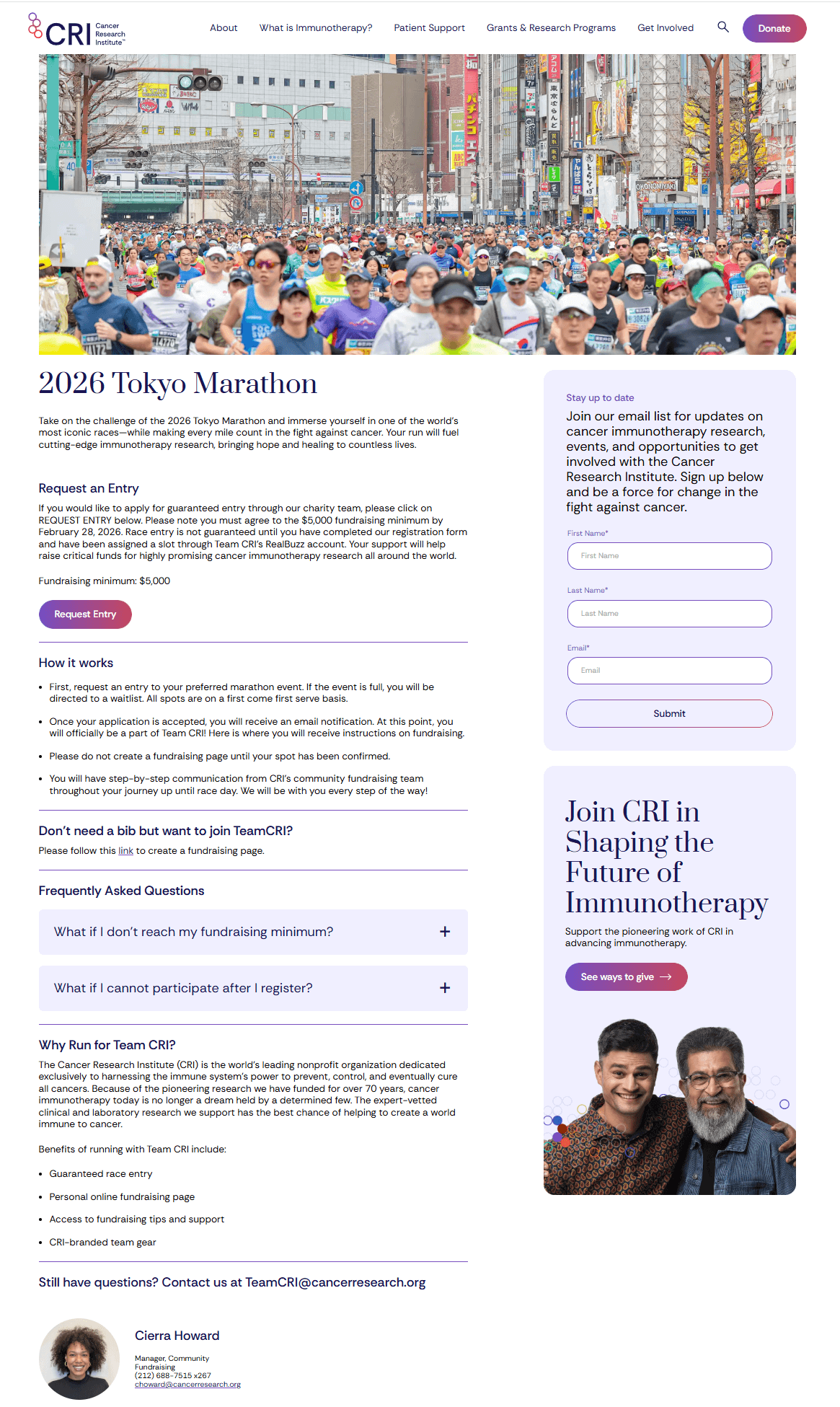
The Cancer Research Institute is a pioneer in healthcare, contributing to the discovery and development of immunotherapies for cancer treatment. Here’s the landing page for their dedicated fundraising marathon.
Why it works:
- The landing page copy informs readers how they can get involved in detail.
- They include both an FAQ and a “Why Join” section to address common questions and help convert hesitant visitors by highlighting the specific impact of the race.
- While the primary focus is on the “Request Entry” CTA, they also include a secondary newsletter signup to boost lead generation, which can be risky for conversions.
Charity: Water
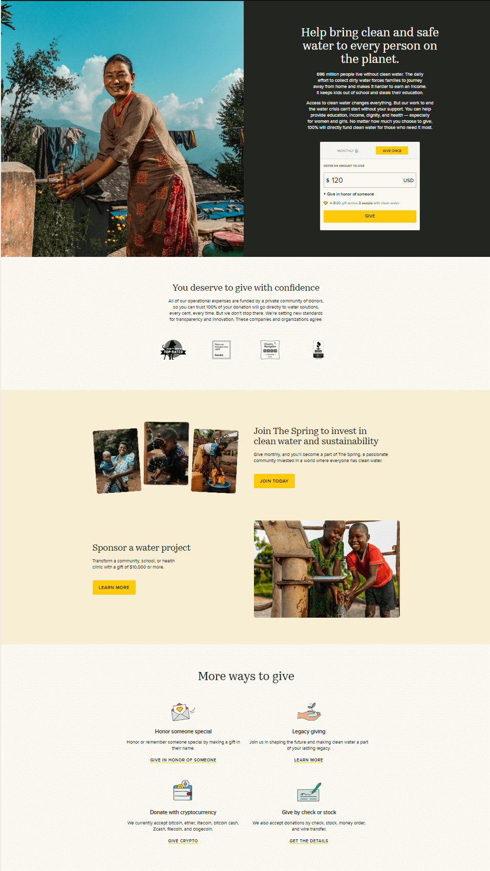
Charity: Water provides clean and safe water to people in developing nations. Their landing page is a masterclass in transparency and visual storytelling.
Why it works:
- The hero image perfectly reflects the donation results, followed by real images in other sections that trigger emotions.
- Above the donation button, they added a note explaining how many people can receive clear water with a specific donation.
- They added social proof to be transparent and help people feel safer with their donations.
OutCare
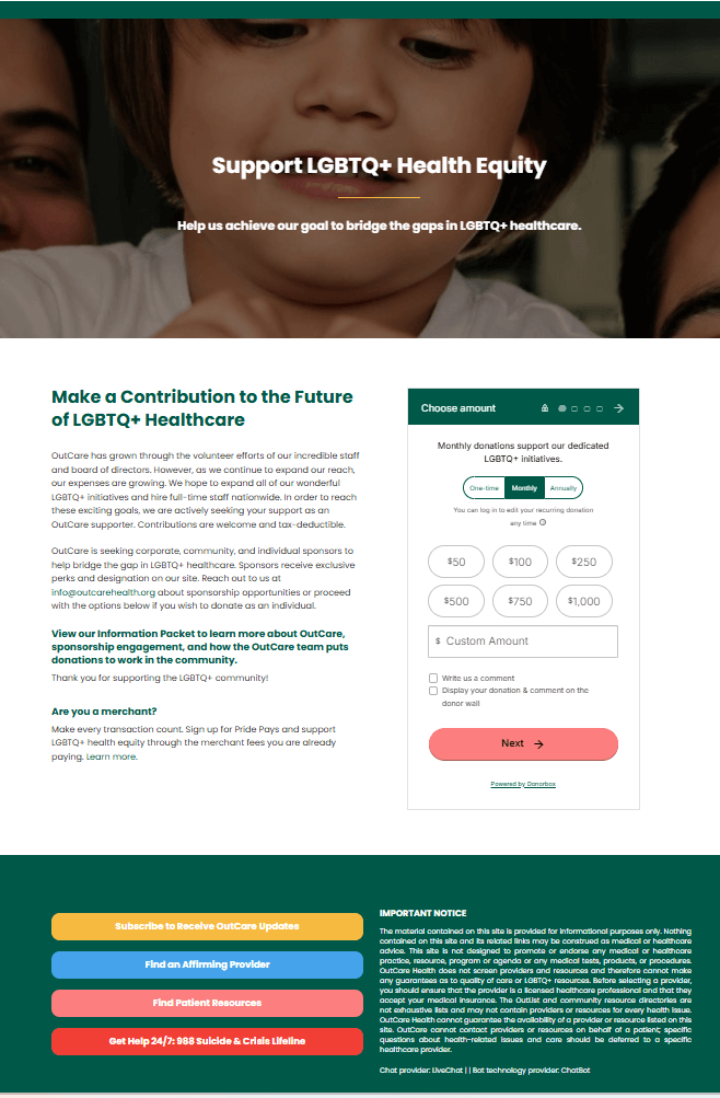
OutCare supports LGBTQ+ health equity and has created a user-friendly landing page designed to increase donations and community support.
Why it works:
- The hero image and title clearly depict the organization’s mission, providing an immediate summary of their work.
- The landing page copy informs readers exactly what the organization hopes to achieve, making donors feel they are part of a larger strategy.
- The multi-step signup form is brief and offers various “donation packages” for every budget.
- They include important notices and additional sections in rainbow colors to honor their mission.
How to Create a Landing Page for Your Nonprofit Organization
Ready to attract new supporters, donors, or charity event attendees? Learn how to create a landing page from scratch to meet your goals.
1. Create a plan for your landing page
First, determine the primary goal of your landing page to ensure every element serves that purpose. Whether you’re seeking one-time donations, volunteer recruitment, or charity event signups, the more concrete your objective, the more effective your page will be.
Next, develop a marketing plan based on the supporter journey to determine how your target audience arrives on the page. You might guide them there through:
- A targeted email campaign sent to recent newsletter subscribers.
- A timely social media post announcing a specific fundraising goal.
- A pop-up on your homepage for visitors who spend more than 30 seconds on your website.
This strategic plan also allows you to track metrics and refine your approach over time. By analyzing your data, you can make informed improvements to your storytelling style, signup form placement, or your promotional channels, among other factors. For example, if you notice high traffic from Instagram but low conversions, you might realize your mobile checkout process needs to be faster.
2. Understand your target audience
Before you begin building your page, identify exactly who you’re targeting. Understanding the psychology of prospective donors and volunteers allows you to spot the specific motivations that drive them to support your cause.
Developing these personas will help you shape the messaging and design in a way that truly moves your audience. Regarding financial support, it’s best to provide several options to cater to supporters from different backgrounds.
For instance, a college student might prefer a $5 “micro-donation” or a volunteer shift, while a corporate donor might opt for a $500 sponsorship. By offering varied donation packages, diverse payment methods, or even the choice to contribute time through charity work, you ensure there is a meaningful way for everyone to get involved.
3. Build your landing page
You don’t need design or coding skills to create a high-converting landing page. All you need is a landing page builder with pre-made templates that ensure user-friendly functionality. You can resort to dedicated platforms like Leadpages or more comprehensive marketing tools like Moosend.
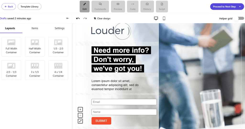
Find a landing page builder that matches your needs and customize your favorite template with your fonts, colors, and design assets. This creates a consistent experience across all your marketing channels. Ensure your design prioritizes readability by using white space, bullet points, and subheadings. Your CTA button should also be placed prominently to ensure it stands out.
Moreover, feel free to tailor the pre-set blocks of text or drag and drop new sections as needed. For instance, if your chosen template doesn’t have a section for social proof, you can easily add one yourself.
Finally, keep in mind that you can build landing pages without a website, a perfect solution if your NPO is newly established or still in the founding process.
4. Optimize your page for SEO
To make your landing page discoverable through search engines, which is essential for driving donations, you should follow a few core SEO best practices. One of the most effective strategies is to incorporate specific long-tail keywords into your content, particularly within your headers. This helps your page rank higher for niche search queries.
Adding metadata, such as a compelling SEO title and an actionable meta description, is also vital for increasing click-through rates. Finally, ensure your images load quickly to improve the user experience and keep your URL structure clean and descriptive.
5. Ensure mobile-responsiveness
With so many people browsing on their phones, providing a good mobile experience is essential. Mobile-friendliness is also an important ranking factor for search engines. If your page isn’t optimized for smaller screens, your visibility will be constrained.
Fortunately, most landing page builders provide mobile-responsive templates. However, you should still manually test your page on different devices. Ensure that all key information is easy to read and that your call-to-action button is large enough to be tapped easily.
6. Lean into data-driven tactics
You can adopt a data-driven strategy even if you’ve never launched a page before. A/B testing allows you to compare different versions of your landing page to see which one resonates best with visitors and drives the most conversions. For example, try experimenting with different headlines, signup form placements, and CTA button colors.
For those with existing data, tools like Google Analytics can reveal how previous assets performed and which traffic sources were most effective. You can also use heatmaps to visualize where visitors focus their attention. By seeing exactly where users click or scroll, you can strategically place key elements to boost engagement and click-through rates.
Bring More Supporters Through Landing Pages
Creating dedicated landing pages is one of the most effective ways to boost your fundraising and charity initiatives. To see the best results, stick to one clear call-to-action per page and communicate it directly to your target audience, while always keeping the focus on your organization’s mission.
Finally, remember that adding social proof, such as trust badges or real stories from beneficiaries, makes a powerful difference. Sharing these stories proves to visitors that your NPO is transparent, trustworthy, and, most importantly, delivering on its promises.
FAQs
Here are some frequently asked questions regarding nonprofit landing pages.
1. What is a nonprofit landing page?
A nonprofit landing page is a standalone marketing asset designed to promote an initiative, such as recruiting volunteers, registering event attendees, or securing donations. Unlike a full website, it focuses on a single desired action to prevent distractions and increase conversion rates.
2. What is the difference between a nonprofit website and a landing page?
A nonprofit website includes various types of information and a navigation menu for browsing. In contrast, a landing page removes navigation to focus on a single call-to-action, guiding the visitor toward a specific goal.
3. How many CTAs should a nonprofit landing page include?
To be most effective, a landing page should focus on a single goal. However, if your page is long, you can place multiple CTA buttons in different sections (such as the top, middle, and bottom) to make it easy for visitors to convert wherever they are on the page.
4. How important is mobile-responsiveness for landing pages?
A large percentage of your supporters will discover your page via mobile devices. Ensuring an optimal mobile experience is essential for both user trust and search engine rankings.
You sent your latest campaign. Everything looked good, from the subject line to the design. Still, open rates, clicks, and conversions were disappointing.
So you send another campaign, but the results are the same. Why?
Inbox competition is high. Subscribers ignore emails that don’t feel relevant, and mailbox providers rely on engagement signals to decide where campaigns land.
Also, when the same message goes to everyone, relevance drops and engagement follows. Segmenting your audience helps fix that.
In this post, we’ll look at why segmentation is important in email marketing and how it can improve your strategy.
Turn segmentation into results
Create smarter segments, personalize campaigns, and send the right message at the right time.
TRY MOOSENDWhat Is Email Segmentation?
Email list segmentation is the practice of dividing your subscriber base into targeted groups based on shared attributes or behaviors so you can send more relevant messages to each group.
Those attributes can account for demographic segmentation (location, role), behavioral segmentation (opens, clicks, purchases, product usage), or lifecycle-based segmentation (new lead, active customer, inactive user).
The goal goes beyond organization. It’s aligning message, timing, and offer with intent to improve engagement, conversions, and ROI.
However, segmentation is often misunderstood or misused. Here’s what it isn’t:
- Random list splitting. Creating arbitrary sub-lists without a clear performance objective doesn’t improve results. Every segment should answer: “What outcome are we optimizing for?”
- Over-engineering your data model. You don’t need dozens of different segments to see impact. In most cases, 2–3 strategically defined behavior-based segments will outperform a complex but unused structure.
- A replacement for strategy. Segmentation doesn’t fix weak messaging or unclear positioning. It ensures the right message reaches the right audience.
The Importance of Segmentation in Email Marketing
Segmentation changes what you optimize. Instead of one message for everyone, you align messages to groups defined by intent and behavior.
This is what turns email into a performance channel with higher engagement, better list health, stronger inbox placement, and more measurable ROI.
All in all, email segmentation works when the email matches the subscriber’s current intent. When that alignment improves, metrics follow.
1. Improves metrics through relevance
Segmentation drives clicks and conversions because relevance changes how people pay attention.
They respond to timing, intent, purchase stage, past behavior, and how closely the message matches what they currently care about. When those elements align, the email feels useful instead of intrusive.
That shift affects the metrics marketers most closely monitor. Relevant emails earn more opens when the subject line reflects a recognizable need, more clicks when the content supports an existing interest, and more conversions when the offer fits the subscriber’s level of readiness.
People are less likely to ignore, delete, or unsubscribe from emails that feel selected for them. This is why segmentation is directly tied to better metrics.
2. Leads to personalization at scale
Personalization doesn’t start with a “Hi {FirstName}.” That’s surface-level.
Real email personalization begins when different members of your email list receive different messages based on their lifecycle stage. If everyone gets the same campaign with minor field swaps, it’s still generic. And generic messaging produces average engagement.
Segmentation enables personalization that actually moves metrics because it’s built around intent groups:
- New subscribers need onboarding and expectation-setting.
- High-intent users (pricing page, product view, cart) need a push to convert.
- First-time buyers need reassurance and cross-sell logic.
- Loyal customers need expansion or VIP treatment.
- Inactive users need re-engagement.
The email marketing payoff is simple: more revenue with less manual effort.
Once segments are defined, automation does the heavy lifting. You stop building one-off campaigns and start automatically responding to signals.
3. Protects email list health
Email list hygiene is about how your list behaves over time.
Unsubscribes and spam complaints increase when subscribers receive emails with no relevant content. Bulk sends accelerate that pattern by ignoring the user’s intent and engagement level, two variables that directly impact list health.
When you send the same campaign at the same cadence to your entire list, three things happen:
- Low-intent subscribers disengage first (your metrics will likely show low open and click-through rates).
- Repeated disengagement increases frustration.
- Frustration turns into unsubscribes or spam complaints.
Segmentation interrupts this cycle by aligning content and frequency with engagement level. Creating customer segments based on email engagement limits exposure to subscribers most likely to unsubscribe and reduces the risk of spam complaints from fatigued users.
4. Improves deliverability through engagement signals
Deliverability isn’t just “did the email send?” It’s where the email lands. And mailbox providers heavily weigh engagement behavior to decide that.
The chain is brutally practical. When sending the right message at the right time, you get higher engagement and a better sender reputation. This contributes to better inbox placement.
Segmentation helps here because it reduces the negative signals that quietly wreck inboxing:
- Spam complaints from people who shouldn’t have received the message.
- “Delete without reading” behavior from low-intent recipients.
- Ongoing disengagement that tells inbox algorithms your mail isn’t wanted.
Here’s the data behind this:
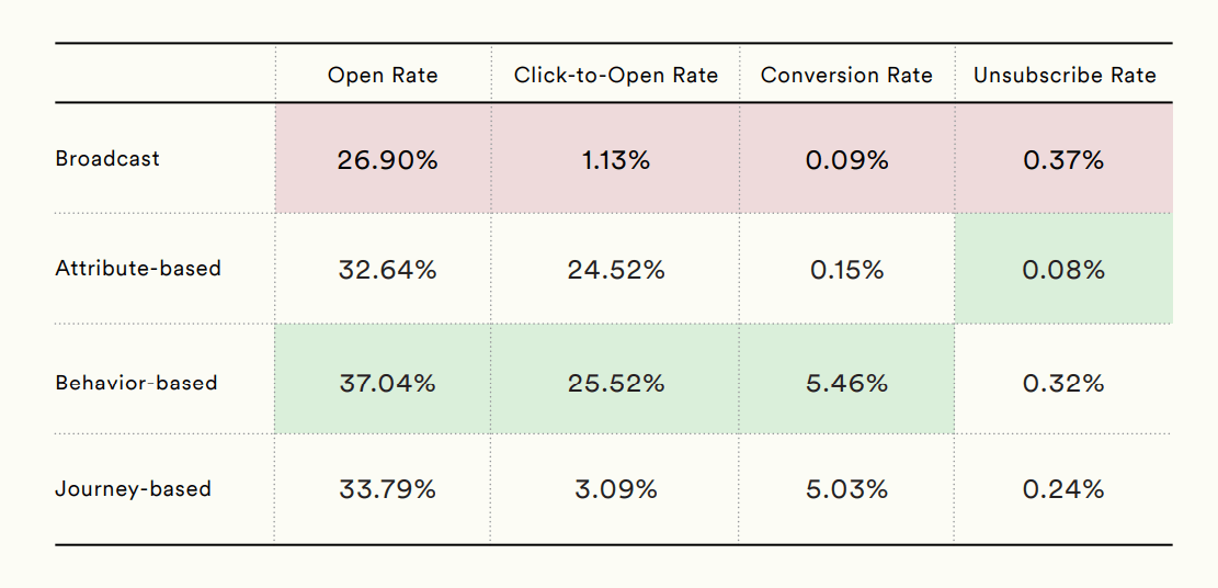
According to Moengage’s Email Benchmark Report, eCommerce campaigns that were segmented generated significantly higher engagement signals than simple broadcasts.
This makes list segmentation essential, since email deliverability best practices alone don’t create the engagement signals inbox providers rely on.
5. Increases email marketing ROI
ROI improves when you stop sending emails to the wrong audience. Non-segmented messages cause marketers to “pay”—because of higher pricing, list fatigue, deliverability risks, and opportunity cost—more for their email marketing platforms to message people who aren’t ready.
Email marketing segmentation makes performance measurable by audience. Instead of “this campaign worked or failed,” you get:
- Which segment clicked
- Which segment converted
- Which segment unsubscribed
That’s clearer attribution and leads to faster optimization because you know where the leverage is. Of course, it goes beyond that.
Segmentation brings your content in front of the people most likely to act. High-intent segments (recent product views, cart starts, pricing visits, repeat customers) get the conversion push. Everyone else gets discovery, education, or a lighter ask. Same list size, personalized content, and targeted action.
This is why targeted emails are consistently tied to better email marketing ROI in industry reports.
How to Start Segmenting Your Audience
Segmentation gets messy when it’s treated like a database project with too many rules and lists, and no clear payoff.
The clean way to do it is to build a small segmentation system tied to a single business outcome, then expand only when the numbers justify it. Your goal is to make better decisions by understanding who gets which message, when, and why.
The fastest path is a five-step loop. It’s designed to be implemented quickly, reused across campaigns, and measured without guesswork.
Step 1: Choose one outcome
Start with a single metric-related outcome like “increase revenue per recipient,” “reduce unsubscribe rate,” “lift winback conversions,” etc.
Segmentation works best when it is tied to a measurable business result. This matters because the segment you build should reflect the behavior most closely connected to that result. If the objective is retention, you may segment by inactivity or purchase recency. If the objective is to upsell revenue, product interest, or past order history may matter more.
A clear metric turns segmentation into a decision-making system with a measurable purpose.
Step 2: Pick one segmentation signal
Once the outcome is clear, choose one signal that gives you the strongest clue about subscriber intent. This is where many marketers overcomplicate things by combining too many data points too early.
Instead, look for the signal that most directly explains what someone is likely to want next. Behavioral data is often the strongest starting point because clicks, browsing activity, purchase recency, and campaign engagement reveal active interest more reliably than static traits alone.
Demographic or geographic segmentation can still be useful, but usually only when it affects relevance directly, such as language, seasonality, or shipping availability. The goal is not to collect more data. It is to identify the signal that most clearly improves message-to-audience fit.
Step 3: Build a small set of segments
Create simple segments as your starting point. Most segmentation strategies fail in execution because their structures become too complex to maintain.
Begin with two or three segments that are significantly different from one another and likely to respond to different messaging. For example, you might separate highly engaged subscribers, recent customers, and inactive contacts. That is already enough to change subject lines, offers, content emphasis, or send frequency in a measurable way.
One practical way to start is to define a few reusable intent segments based on recent behavior:
- New (joined in the last 14 days)
- Engaged (opened or clicked in the last 30–60 days)
- High intent (viewed product or pricing pages, or added to cart in the last 3–7 days)
These segments reflect different levels of readiness, which means they shouldn’t receive the same message.
Once they exist, go beyond personalizing the greeting and right into personalizing the content itself. That can include:
- Changing the CTA based on intent
- Offering incentives only to high-intent users
- Modifying content blocks based on interest or behavior
After that, automate a few high-impact triggers to keep the system running continuously. Common examples include:
- Browse or cart abandonment
- Pricing page follow-ups
- Post-purchase cross-sell sequences
- Winback flows for inactive subscribers
Finally, measure performance per segment as well as overall email metrics. Track click-through rates, conversion rates, revenue per recipient, and unsubscribes to understand how each audience group responds.
Step 4: Launch one segmented campaign before scaling
Avoid redesigning your entire email program at once. Use your chosen segments to build one campaign or one automation where relevance is likely to make a visible difference.
A category-specific campaign sent to subscribers who previously clicked related products, a re-engagement flow for inactive users, or a post-purchase sequence tailored to first-time buyers.
Starting with a single execution path helps you isolate the impact of segmentation without introducing too many variables at once. It also forces the strategy to prove itself in practice. Segmentation only creates value when it changes the message, the timing, or the offer in a way the subscriber can actually feel.
Step 5: Refine the model based on performance
After launch, evaluate performance at the segment level and use the results to improve the system. This is the step that turns segmentation from a one-time setup into an ongoing optimization loop.
Review the metrics that connect to your marketing plan, such as conversions, revenue per recipient, click-through rate, unsubscribe rate, or complaint rate. Then compare how each segment responded and identify where relevance held up or broke down.
Maybe the segment was right, but the offer was weak. Maybe the content matched intent, but the cadence was too aggressive. Treat segmentation like any other testable marketing lever: adjust one variable at a time, measure the outcome, and scale only what proves its value.
Real-World Segmentation Examples
Segmentation gets easier when you fuse personas, marketing tools, and your CRM with your next actions. Each example uses a single, simple split, a clear goal per segment, and messaging that aligns with the intent.
Please keep in mind to focus more on the customer segmentation logic than on the industry. The pattern is the same everywhere: segment by what people are doing (or where they are in the customer journey), then create relevant emails for each segment.
Trial users vs paying customers
A trial user and a paying customer are solving different problems. So, a one-size-fits-all approach to your communications with them won’t work.
As trial users are still evaluating, they need clarity and momentum. Your email should focus on reaching the first-value moment as quickly as possible. Here’s what to showcase:
- A short walkthrough
- One strong use case
- One testimonial that reduces doubt
The CTA should reflect this. Go for phrases like “Create your first [X]” or “Finish setup.”
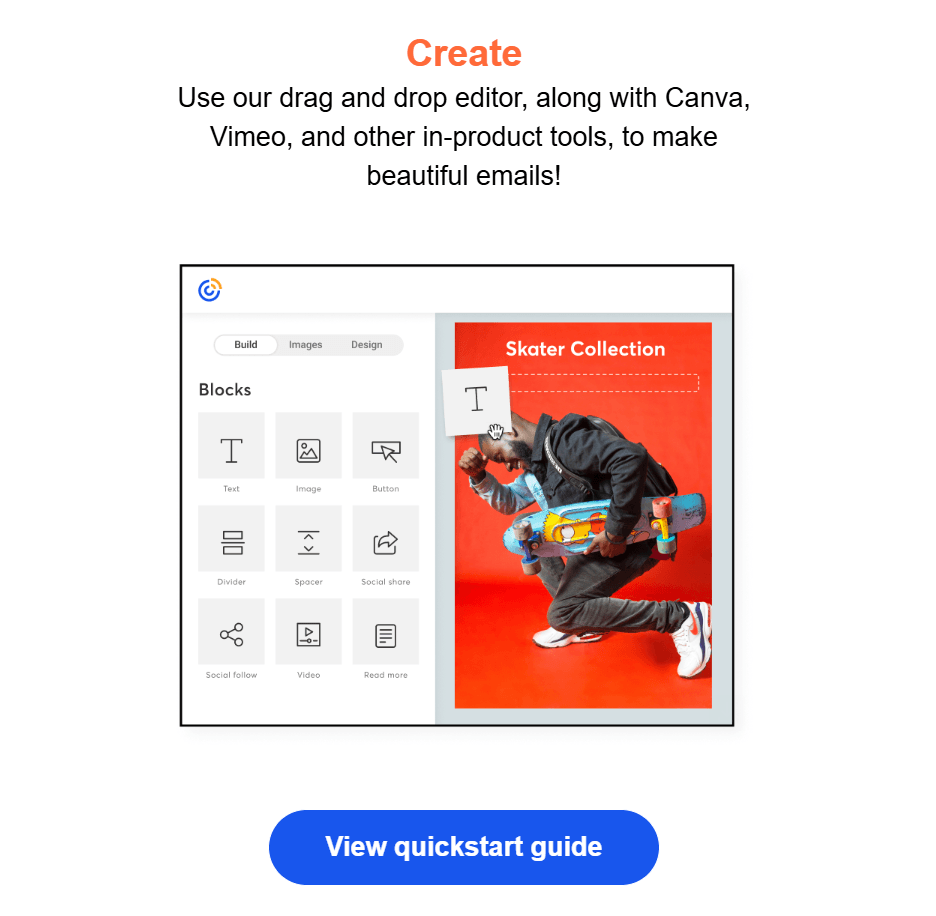
This is Constant Contact’s first onboarding email. The CTA gets straight to the first quick win.
Paying customers are the opposite, as they need depth. The message shifts toward feature adoption, workflow efficiency, or expansion. Show them something that increases ROI or saves time. The CTA becomes “Enable advanced reporting” or “Invite your team.”
What metrics to measure:
- CTR per segment
- Activation rate (trial)
- Feature adoption or expansion revenue (customer)
- Unsubscribes and complaints
Browsed vs purchased category
If someone browses a category but doesn’t buy, they’re undecided, not unaware. The email should acknowledge that context. Show the products again, add reviews, and remind your audience of the benefits.
Add urgency or a limited incentive, if needed. Remember, the tone is “Still thinking?” not “Here’s our brand story.”
Now, if someone has already purchased, pushing the same items again can come across as lazy and is clearly ineffective. Instead, engage your eCommerce audience with post-purchase emails. Show how to use or care for the item and suggest complementary products that make logical sense, not generic bestsellers.
That builds trust and increases average order value (AOV). Here’s an example of this segmented email marketing campaign method:
Subject line: We saved these and got you 20% off

Instead of sending a generic promotion to the entire list, Forever21 followed up with subscribers who had previously viewed specific products. The subject line, “We saved these and got you 20% off,” immediately shows that the email relates to something the subscriber already explored.
The body of the email reinforces that context by resurfacing the products the subscriber viewed and pairing them with a discount incentive.
In other words, the email doesn’t try to introduce the brand or re-explain the catalog. It simply removes hesitation by reminding the shopper what caught their attention and adding a reason to return.
What metrics to measure:
- Conversion rate (browsed segment)
- Repeat purchase rate (purchased segment)
- Revenue per recipient
- Unsubscribe rate
Engagement and topic interest segments
More often than not, clicks (or lack thereof) reveal intent. Therefore, email engagement reveals the type of content they love receiving.
If a reader consistently clicks on AI-related articles, stop sending them broad newsletters that give equal weight to SEO, branding, and paid ads. Give them more AI.
Create versions of your email with dynamic content blocks. That way, AI-focused readers get deeper tactical breakdowns and tools, while SEO-focused readers get ranking frameworks and case examples.
Using dynamic content blocks doesn’t change your content calendar. You’re merely creating one version of your email with content that’s targeted, personalized, and adapted to each segment.
Let’s see an example of topic interest segmentation:
Subject line: We miss you!
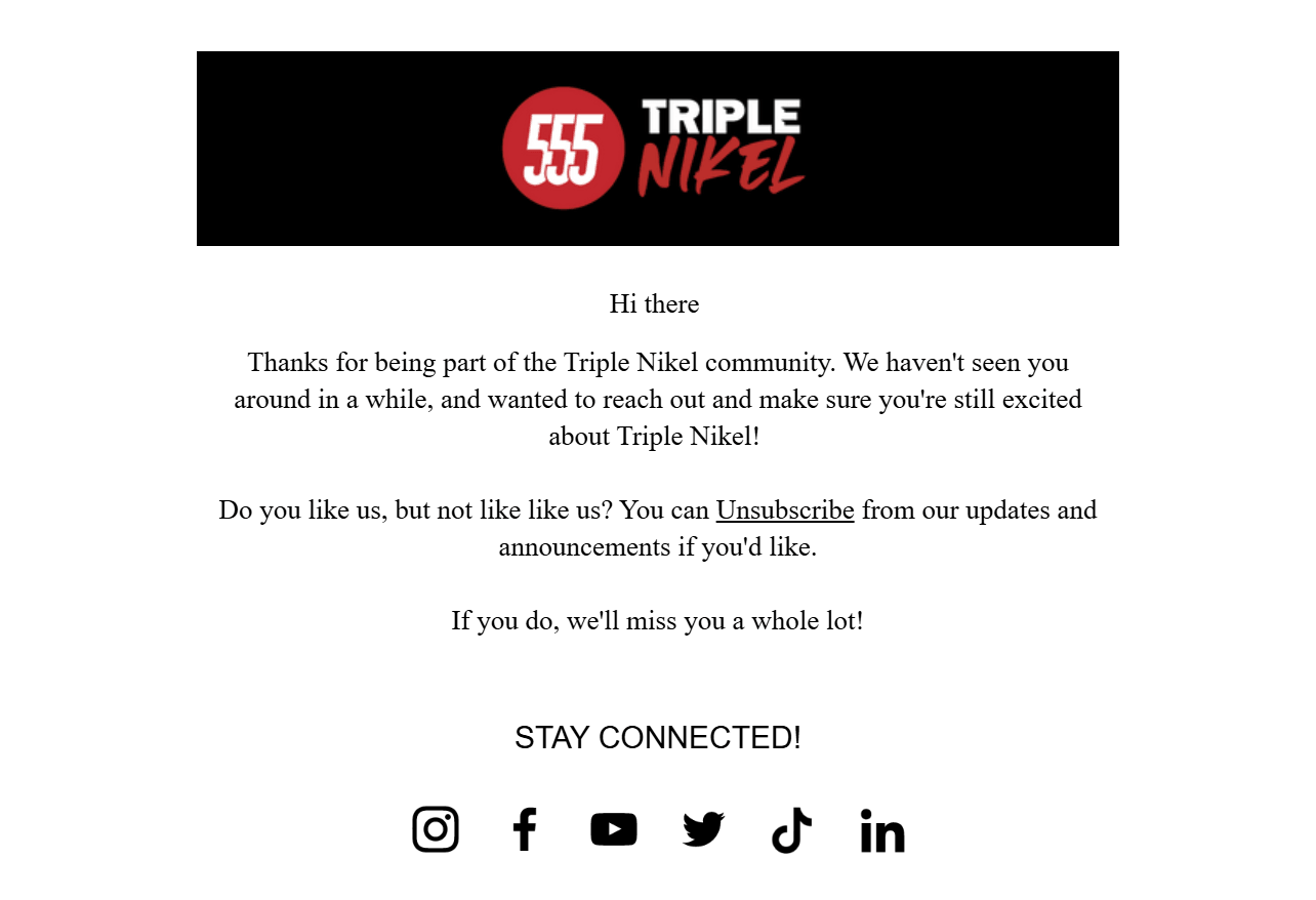
Here, Triple Nikel isolated a segment that hadn’t opened or clicked emails in a meaningful period of time.
The subject line, “We miss you!” acknowledges that disengagement directly. The tone of the email is playful and emotional, which fits the context of reconnecting with an audience that has drifted away. Just as importantly, the message includes a clear opt-out path.
Emails like the example above lower unsubscribe rates, as the audience segment that isn’t interested will organically unsubscribe. That way, they also lower complaint rates and contribute to a cleaner list with more active subscribers. Both outcomes help protect engagement rates and sender reputation.
What metrics to measure:
- CTR by interest segment
- On-site conversions (demo, signup, lead magnet)
- Revenue per recipient (if monetized)
- Unsubscribe and complaint rates
Common Segmentation Mistakes and Quick Fixes
The benefits of email segmentation can evaporate when segmentation rules create conflicting messages, wasted sends, or unmeasurable results.
Use the list below like a QA pass. If any item is true in your account today, you’ll either be losing revenue (wrong target audience, misread personas) or harming your reputation (unwanted sends). Fixing these usually improves performance without changing your email templates or body copy.
Over- or under-segmenting
Most email marketing teams tend to swing between two extremes. They either create too many micro-segments (20+ tiny groups, low volume, no meaningful insights), or they barely segment at all, keep sending to “All subscribers,” and maybe go for simple behavioral segmentation and somewhat targeted content.
Both approaches fail because they don’t influence the recipient.
What over-segmentation looks like:
- You have dozens of segments, but still default to broad sends.
- Segment sizes are too small to measure performance reliably.
- You can’t explain what business decision each segment supports.
What under-segmentation looks like:
- One campaign goes to everyone.
- The only variation is a subject line test.
- High-intent and low-intent users receive the same CTA.
To fix these, go for an intent-based structure. Start with two or three backbone segments (i.e., new subscriber, repeating customer, non-opener) and one active intent layer (e.g., high intent vs everyone else),
That’s enough to meaningfully change your messaging. The high-intent recipients are ready for direct conversion content with a powerful email CTA like Endy’s:
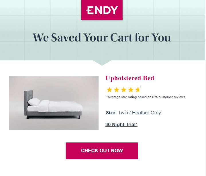
For the “everyone else” intent layer, create a CTA that aims to help recipients explore or educate them, as Guess did:
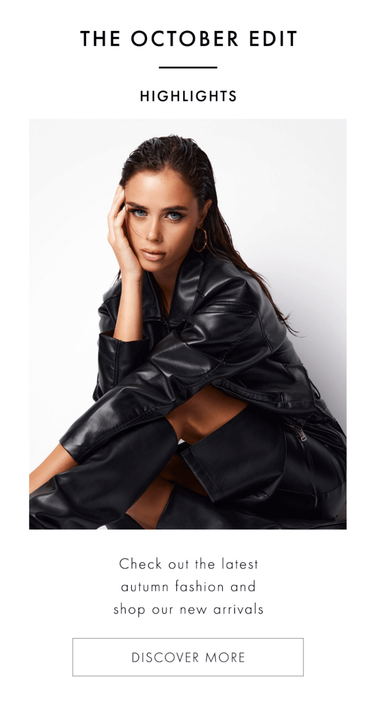
Only create a new segment if it answers a recurring decision you’ll make every month. If a segment doesn’t change the message, timing, or offer, it doesn’t need to exist.
Missing exclusions
Incorrect segmentation can actually lower your ROI. While this might not look dramatic in reporting, it accumulates over time, resulting in lost revenue.
What it looks like:
- You send a discount to someone who purchased yesterday.
- Push an upgrade to someone still in onboarding.
- Upsell while a customer has an open support issue.
- Include active trials in generic promos instead of lifecycle messaging.
To fix this mistake, create default suppression layers that apply to every campaign:
- Exclude from promos if customers purchased in the last X days.
- Exclude from heavy sales pushes if still in onboarding or trial stage.
- Exclude from upsells and aggressive CTAs if there is an open support ticket or a refund requested.
These customer segments should sit at the account level, not be recreated manually per send. So, save them once and reuse them whenever you send an email. As a rule of thumb, before launching any campaign, ask: “Who should absolutely not receive this?”
That question protects margin, experience, and long-term engagement.
Having overlapping segments
Imagine receiving a “We miss you” email and a “VIP early access” email in the same week. Or being in a nurture flow and still getting a promotional blast. Someone visits your pricing page but receives a discovery newsletter instead of a conversion push.
In cases like these, the problem isn’t segmentation. It’s the lack of a clear hierarchy.
When segments compete, the loudest campaign wins. This is why you should define priority rules in your email segmentation strategy.
Use a simple hierarchy:
- Customer lifecycle stage
- Intent behavior
- Interest affinity
Lifecycle always overrides intent, and that overrides interest.
After that, enforce one operational rule: send one email aligned with the highest-priority objective. Then let your email templates and dynamic content blocks in that message do the job for you, using content tailored to lower-priority signals. That way, you’ll minimize the number of separate sends.
If you don’t control priority, your segments will conflict. And confused messaging rarely converts.
Forgetting to update your segments
Outdated segments can lead to the wrong messaging. Imagine someone clicking “Category A” once a year ago and still getting “Category A” promos. Or a past buyer who is treated as high-intent long after their interest has cooled.
Intent doesn’t last forever. And if your segments don’t account for that, you’re personalizing based on history, not reality.
The fix here is simple. Add time windows to every behavioral rule. Time-bound segments keep your email marketing strategy sharp, your messaging aligned with current behavior, engagement stable, and reporting honest.
Make Your Next Send Smarter
Most email problems come from poor targeting, not poor creativity.
If the same message goes to everyone, performance will always plateau, no matter how strong the copy is. Segmentation changes the foundation. Instead of optimizing one message for an average audience, you align different messages to defined intent groups.
Segmentation is about sending fewer, better-timed messages that make the next action obvious. And when the next action feels obvious, results stop feeling unpredictable.
FAQs
Now, let’s answer some of the most common questions on why segmentation is important in email marketing.
1. What’s the main benefit of email segmentation?
Segmentation increases relevance, which directly improves clicks, conversions, and revenue per recipient. Instead of sending a generic message, align content and the CTA with subscriber intent. That alignment is what drives measurable results.
2. Does segmentation improve deliverability?
Yes. Higher relevance leads to stronger engagement signals (opens, clicks) and fewer negative ones (unsubscribes, complaints). Over time, that strengthens the sender’s reputation and improves inbox placement.
3. What’s the best way to segment an email list?
Start with engagement recency, purchase or usage activity, and high-intent actions (e.g., viewed product/pricing, added to cart). Add interest-based segments only after you can measure impact. Behavior first, demographics second.
4. How many segments should I start with?
For most teams, two to three segments are more than enough to start. These include new recipients, engaged, and unengaged users. If you want it simpler, split it into recent high-intent vs. everyone else and tailor the CTA accordingly.
5. What metrics prove segmentation is working?
Segmentation is working when each audience group performs better than your overall average. To confirm this, measure results per segment, not just campaign totals. Track metrics like CTR, conversion rate, revenue per recipient, unsubscribe rate, and spam complaints. If segmentation is effective, high-intent segments will convert more, while lower-intent segments will generate fewer unsubscribes and complaints.
If you’re planning to cancel your Klaviyo subscription, it’s important to understand your options first.
In this guide, we’ll walk you through exactly how to cancel your Klaviyo subscription step by step, so you can avoid unexpected charges or data loss. We’ll also cover your cancellation options, what happens to your data, how reactivation works, and important things to check before you make the final decision.
Not sure if canceling is the right move yet? We’ll also help you evaluate whether switching software makes sense for your goals and what to do next if you decide to migrate to another email marketing platform.
What Are Klaviyo’s Cancellation Options?
Before you start cancelling your Klaviyo subscription plan or account, it’s important to understand that there are different options available. Each one affects your account differently in terms of data retention and feature access.
Consequently, selecting the right course of action depends on your specific business needs and future marketing plans.
Downgrading to a free plan
Downgrading to Klaviyo’s Free plan can be a temporary solution if you’re not ready to fully cancel.
When you downgrade:
- All future payments stop (unless you exceed the free plan limits)
- You retain access to your account and campaign history
- Your contacts remain stored
- Advanced features (such as higher email send limits, SMS credits, and certain automation capabilities) may be restricted
This option is useful if you want to pause paid activity but keep your lists, templates, flows, and reporting data intact. However, sending limits are significantly reduced, and SMS features may be disabled.
Cancelling a plan
Canceling a paid Klaviyo plan stops future charges for that specific plan, but it doesn’t delete your account.
Your account stays active, and any other paid features continue running as usual. For example, if you cancel your SMS plan, your email marketing plan will remain active and unaffected.
After cancelling:
- You’ll retain access until the end of your current billing cycle
- Your data remains stored in your account
- Campaigns and flows will stop sending once your paid subscription expires
- You won’t be charged again unless you reactivate
This option is ideal if you want to stop paying for a certain plan but keep using Klaviyo’s platform
Keep in mind:
- Klaviyo doesn’t typically offer prorated refunds
- SMS billing requires separate cancellation steps
Cancelling your account
Another option is to cancel your account. Choosing this option keeps your data intact, but all features are turned off immediately. Your campaigns will pause, your flow will stop sending, and integrations will be disabled.
You’ll still be able to log in to export data, review reports, or prepare for migration.
This option works well if you need to temporarily suspend your marketing operations or start transitioning to another email marketing service.
Closing your account
If you choose to close your account, then it will be permanently deleted. Once you choose this option, all data in the account will be deleted, and this process can’t be reversed.
Make sure you export any data you want to keep, because once the process is complete, you’ll be immediately logged out of your account, and it’ll be deleted.
This option is suitable for businesses that want to move away from Klaviyo with no intention of returning. The process also requires owner-level permissions and ensures customer data privacy and compliance with data protection regulations.
Pre-Cancellation Preparation Steps
To avoid unexpected complications and ensure a smooth cancellation process, there are a few steps you can take.
Review your current billing
Before making changes to your account, it’s important to understand your billing situation. This will also help you determine the best time to make changes to your subscription.
Check whether your account is on manual billing or has a contract that extends beyond one month. To check if you’re manually billed, head to your Account Overview in Klaviyo. If you want to cancel your subscription when billed manually, you’ll need to contact Klaviyo’s support team.
Check account permissions and access
User roles determine what changes you can make to your Klaviyo account/plan.
Specifically, to cancel an account or downgrade to the free plan, you must be an account Owner or Admin. Closing an account is only available to Owners.
It’s advisable to review which team members have access to the account and notify them about upcoming changes. This way, you can avoid confusion and better prepare for upcoming changes.
Export essential marketing data
Backing up your data is crucial before making changes to your account.
Make sure to export valuable marketing assets, including performance analytics, customer profiles, segments, and campaign templates.
While Klaviyo lets you export your data before closing your account, being prepared beforehand reduces the risk during the process.
How to Cancel Your Klaviyo Plan/Account
First, log in to your Klaviyo account using your credentials. Then, navigate to the account menu in the bottom-left corner and click on it. In the menu that pops up, click Billing.
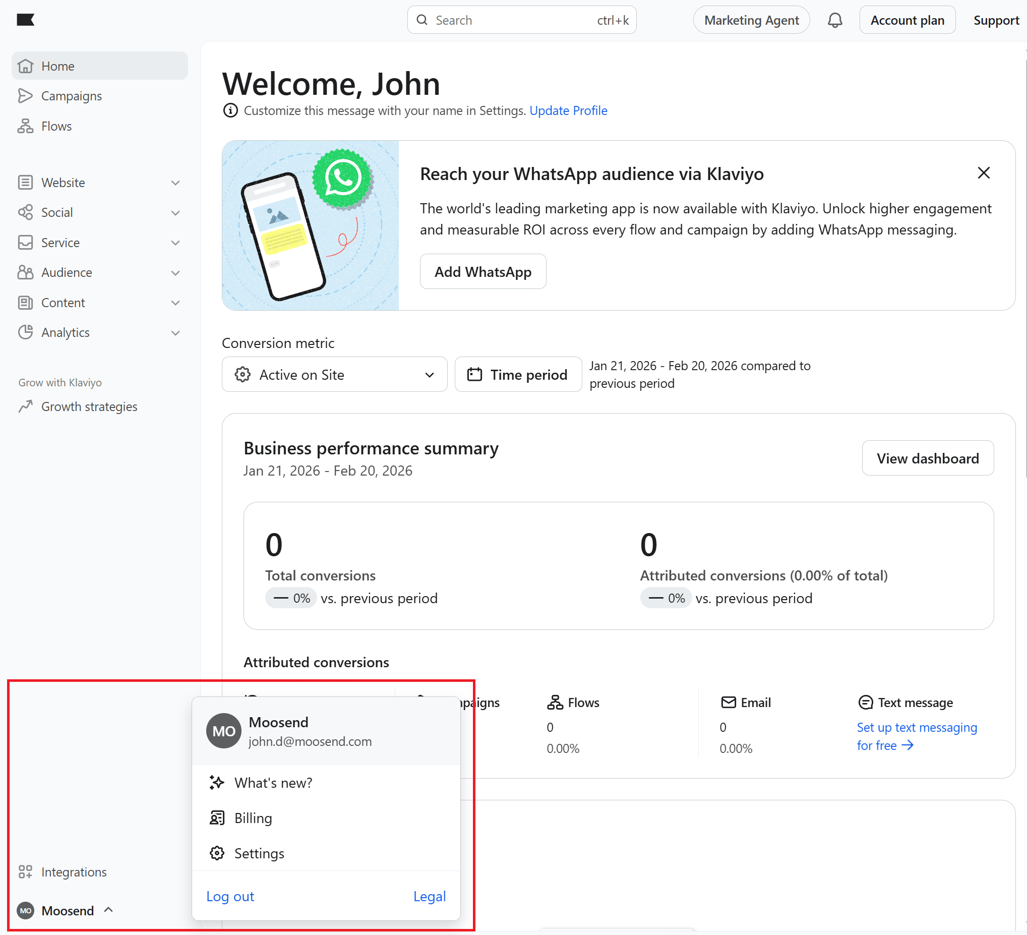
In the Billing section, click Cancel Plan.
Now, Klaviyo will ask you to select the plan(s) you want to cancel. If you want to cancel your account, select Cancel all plans. Then click Continue.
Important note: If you cancel your SMS plan, any flows that contain SMS messages will be completely disabled. This means that none of the messages within those flows, including emails, will be sent.
Now, you’ll need to select the reason(s) you want to cancel; then click Continue.
You’ll see that the platform gives you two options regarding when you want your plan to end:
- at the end of the billing cycle (recommended).
- immediately
If you select the first option, your campaigns and flows will continue working until the last day of the billing cycle. The same applies to your integrations. After that, future payments will be disabled. Selecting the second option terminates your plan immediately (no refunds).
Next, enter the account name to confirm and click Cancel Plan. Then click Exit, and you’re done.
How to Downgrade to Free Plan
If you want to use a free Klaviyo plan, you first need to cancel your paid subscription.
For users with two or more paid plans, canceling one automatically sets it to the free plan.
If you want every plan in your account to be on the free version, cancel your account (see above) and then reactivate it as free. Let’s see how.
Navigate to Billing, then open the Preferences tab.
Scroll down the page to the Reactivate your account section. Click Reactivate to free.

Note: Upon reactivating as a free account, you’ll still have access to your data from any former paid account. You will need to manually turn flows back to live, reschedule your campaigns, or enable third-party integrations you may want.
How to Close Your Account
To permanently close and delete your account, navigate to Billing and follow the steps mentioned above for cancelling a paid plan/account. Also, tick the option Close and delete account.
Select the reason(s) you want to cancel and click Continue.
In the next step, the platform lets you export any data you want to keep, such as campaign analytics, flow analytics, profiles, and templates.
If you haven’t already exported your data, this is your last chance to do so. After that, your account will be closed, and the data will be deleted.
In the next step, you’ll be asked to confirm your account name.
Click Close account, and you’ll be immediately logged out of your account.
Why Klaviyo Might Not Be the Best Fit for You
Klaviyo is a powerful platform, especially for eCommerce brands. However, that strength can also make it less suitable for certain businesses.
Here are a few common reasons why users consider switching or select an alternative:
- Pricing based on active profiles: Klaviyo’s pricing scales with the number of active profiles in your account, not just the emails you send. As your list grows, costs can increase quickly, even if a portion of your contacts are inactive. For businesses with large databases or seasonal campaigns, this model can become expensive over time.
- Advanced features may add complexity: Klaviyo offers advanced segmentation, predictive analytics, and multi-channel automation (email + SMS). While powerful, smaller teams may prefer a more streamlined interface that focuses on essential automation without a steep learning curve.
- SMS and add-on costs: SMS credits and certain advanced capabilities are billed separately. Depending on your usage, total costs may exceed your initial expectations.
- Strong focus on eCommerce: Klaviyo integrates deeply with platforms like Shopify and WooCommerce and offers advanced revenue attribution and customer lifecycle tracking. While this is valuable for online stores, non-eCommerce businesses (B2B, creators, service providers, local businesses) may find many features unnecessary or overly complex.
If your priorities include predictable pricing, simplicity, or a tool that works equally well beyond eCommerce, it may be worth evaluating alternative platforms before renewing your subscription.
How to Transfer Your Data to Another Email Marketing Service
If you’re moving away from Klaviyo, switching to a new email marketing platform can feel intimidating.
Here’s how to approach the migration:
1. Choose your new platform wisely
First, identify the features you need and evaluate new email software.
Do you want advanced automation, an intuitive interface, better deliverability, or lower costs? Moosend, for example, is a great choice for businesses looking for powerful automation, a wide range of triggers, user-friendly email design, and affordable pricing.
Other great Klaviyo alternatives include Constant Contact, ActiveCampaign, and Omnisend, depending on your needs.
2. Export your data from Klaviyo
Access your Klaviyo account and export any valuable data you’ll need, such as your email campaigns, templates, reports, and custom automations.
3. Import your data into the new platform
Most email marketing tools, including Moosend, offer a straightforward import process. For example, you can upload your contact list as a CSV file and map the fields to ensure all data (like names, tags, and segments) is transferred correctly.
If your contacts gave explicit opt-ins, it’s a good idea to maintain that status and ensure compliance with any anti-spam regulations in your region.
4. Recreate email templates and automations
Most likely, you’ll need to rebuild your automation workflows and design your email templates from scratch. This is unless your new platform offers a migration tool or a template import option.
It may also be a good time to clean up old templates you no longer use and modernize your designs.
5. Test everything before going live
Before fully committing, send a few test emails to yourself and your team to ensure everything looks and works as expected. Double-check your automation triggers, confirm your sender authentication (SPF/DKIM), and verify that your unsubscribe links and contact info are correct.
6. Cancel your Klaviyo account
Once your new email platform is fully functional, it’s time to cancel your Klaviyo account permanently.
Don’t get to this step unless you’re sure everything’s running smoothly. Otherwise, you risk disruptions in your email marketing.
Ready to Move From Klaviyo?
Knowing your options when canceling your Klaviyo subscription will make the whole process a piece of cake. Whether you’re taking a break or switching to a more affordable platform, this guide will help ensure a smooth transition.
Don’t forget to back up your data and explore in detail the alternatives that match your needs before making any final decisions.
We’ve all seen those emails with countdown timers, “LAST CALL” subject lines, and cues that trigger the fear of missing out. Sometimes we bite, but mostly we scroll past, especially when it isn’t a major event like Black Friday, where discounts actually live up to our expectations.
Urgency in emails doesn’t always lead to higher conversion rates. In fact, if you lean on it too hard, your audience just develops “urgency fatigue” and stops believing the timer.
Moreover, during economic downturns, people aren’t just hunting for the lowest price; they’re looking for the biggest emotional reward. We tend to replace big-ticket luxuries, like vacation or a new car, with smaller, “affordable” indulgences that offer an immediate mood boost.
Economists call that the “lipstick effect.”
Turn limited-time deals into affordable treats
Create rewarding email experiences from $9/month.
TRY MOOSENDWhat the Lipstick Effect Really Is
The lipstick effect is a psychological and economic theory suggesting that during uncertain economic times, people resort to more affordable luxury items, like high-end beauty products or premium coffee, instead of major luxury goods.
The concept was first pinpointed by Leonard Lauder, Chairman of Estée Lauder, who noticed a huge spike in lipstick sales during the early 2000s economic recession. But the trend wasn’t new. It had been documented as far back as the Great Depression and was explored in Juliet Schor’s book, The Overspent American.
So, what does the “Lipstick Index” actually tell us? It suggests that when times are tough, we don’t stop treating ourselves; we just change how we do it. Why? Because small luxuries provide a sense of control and comfort in a world that feels chaotic.
Understanding this economic indicator should shift how we handle promotions, especially on personal, one-on-one channels like email. Subscribers didn’t just sign up for “cheap.” They need an emotional reason to choose your brand that goes beyond a discount.
Promotions vs. Pleasure: Two Different Motives
Now, I’m not saying your discount and flash sale emails are bad. There’s a time and a place for them. It’s more about knowing which motive will actually build trust and turn a subscriber into a happy, long-term customer.
Think of it as a choice between two different biological responses:
- The stress response (urgency & scarcity): These tactics are designed to trigger the sympathetic nervous system, our “fight or flight” mode. While this can drive a quick sale if someone is already looking to buy, constant stress is paralyzing. If you’re always shouting “LAST CHANCE,” your audience starts to see you as a source of “inbox fatigue” or a “bargain brand.” Eventually, they don’t just stop buying, but hit unsubscribe or move you to spam.
- The reward response (pleasure & indulgence): This is driven by the emotional high of a self-reward. Unlike the instant effect of a flash sale, the excitement of a small indulgence creates a positive, long-lasting connection to your brand. When a product delivers on that “treat yourself” promise, it reinforces the habit of coming back to your brand for an uplift.
So, the lipstick effect is what glues customers to your brand, the bridge between value and true desire. When you switch your narrative from “Buy now before it’s gone” to “You deserve this!” you’re honoring your customer’s intelligence and their emotional state. And in the end, you’ll win customers who are loyal to your brand, not just your latest coupon code.
Why Email Is the Perfect Channel for “Affordable Indulgence”
Unlike social media, paid ads, or search, email is a private, curated space. It’s where people receive messages from brands they’ve actually opted into. This level of familiarity gives you a great advantage: your audience has already dropped its guard, making it much more emotionally receptive to your story.
From the subject line to the email footer, you have the room to move beyond “hurry up” and embrace storytelling. Modern email marketing software, like Moosend or Constant Contact make it easier than ever to prioritize the sense of reward:
- Smart automation: Following “if/then” logic, you can use timing to your benefit. Imagine a weather-based trigger that suggests a “cozy night in” bundle when it’s raining; zero urgency, just pure comfort.
- Milestone moments: Sending a birthday or anniversary email with a free sample of a premium product or early access to a new collection makes the customer feel seen, not just sold to.
- Creative AI & templates: These features let you test different “moods” and wordplays through A/B testing to see exactly which emotional rewards resonate most with your list.
Whatever you decide, make sure your copy emphasizes well-being, self-care, or the “treat yourself” factor.
Take the cookware brand Le Creuset, for example. Instead of shouting about a 10% discount, their seasonal campaigns use soft, brief copy and imagery that sells an experience. Now that’s not a sales pitch, but an invitation to a better morning.
Subject line: Pour Some Love Into Your Mornings
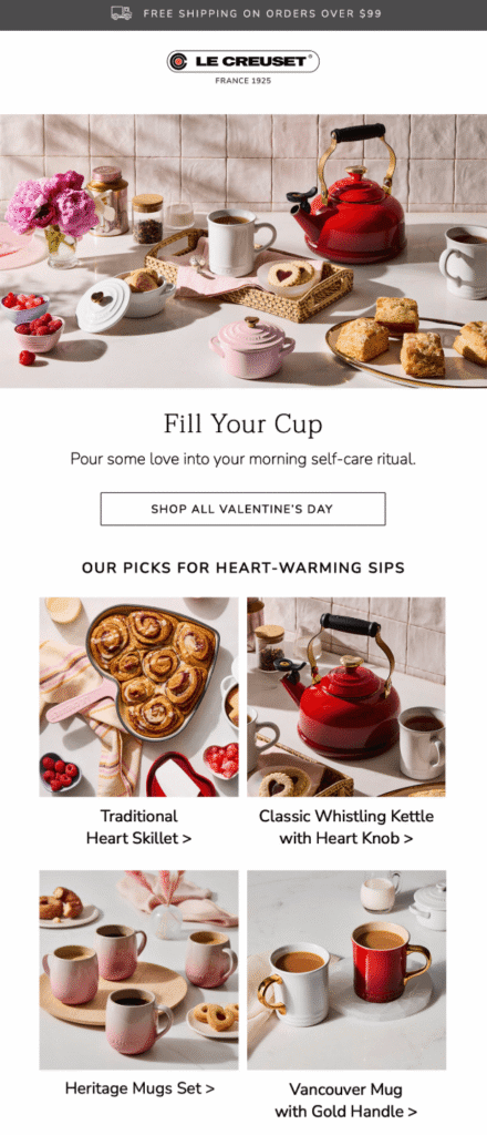
How the Lipstick Effect Should Shape Your Email Offers
The lipstick effect isn’t just for beauty brands, but a mindset that applies to various types of products. The goal is to identify how your offering provides that “affordable luxury” feeling and ensure your email reflects it.
Start by reframing your offers. Instead of common phrases like “Save 20%,” try something like “You’ve earned this.” This simple affirmation can be the secret to higher open rates and conversions, provided the offer actually feels like a reward.
Instead of focusing on the price tag, focus on the emotional value. Position your products as “small wins,” “stress relievers,” “productivity boosters,” or “confidence gains.” When you frame a purchase as a tool for well-being rather than just another expense, the “need” for a discount starts to disappear.
This strategy works just as well for digital services as it does for physical goods. If you’re in SaaS, don’t just sell “tools.” Promote your premium features as a way to reclaim time and reduce daily friction. If you’re a blogger, share early access to your new ebook as an exclusive treat. It’s all about finding the right perspective and communicating it with a focus on the user’s emotional state.
A perfect example of this comes from the learning platform MasterClass. Here, the subject line focuses on well-being and comfort. It’s inviting with a promising reward, and it offers the subscriber something precious.
Subject line: Outsmart stress—try habits that reset your mind

How to Apply the Lipstick Effect on Your Email Campaigns
Let’s take a look at some easy tactical steps you can follow to reframe your campaigns, starting with the most important email elements.
Email subject lines
Great first impressions happen the moment you hit the inbox, and with the right email subject line, you can trigger the “lipstick effect” before the email is even opened.
If urgency has always been an important part of your strategy, try pivoting to see how your audience responds. Instead of price-hooked subject lines, choose variations driven by emotion. Curiosity, comfort, and self-reward are powerful cues that, when delivered in balance, feel like a breath of fresh air compared to a countdown timer.
Take a look at how these notable brands use the “lipstick effect” to spark interest:
- Do your lunches need an upgrade?
- How hot do you like it?
- A little love for your skin 🤍✨
- Love the way you rest
- Sunday self-care club 🛁🫧
- Your lips need winter relief ❄️
- A home refresh would heal us, tbh
If you aren’t sure this tactic fits your brand, use A/B testing to compare an “emotional” subject line with a traditional “urgent” one. This tactic identifies the high-performing variant using a small segment of your list, then automatically sends it to the rest of your subscribers.
You can also use an AI writer to help you experiment with different tones and wordplay to find that perfect balance of comfort and curiosity.
Email copy
The same mindset should continue through to your copywriting, by opting for language that puts emotions first. Emphasize the experience someone will have when they indulge in your offering and the outcome of that experience.
For example, if you’re promoting a premium lipstick, don’t just talk about the price. Highlight its unique ingredients or how long-lasting the finish is. Then, back it up with social proof. Customer testimonials confirming the product feels as good as it looks can make a massive difference in converting a reluctant subscriber.
Check out this brilliant example from Bésame Cosmetics. They invite customers to choose a lipstick that best describes their own identity, placing reviews right next to each product to validate the results.
Subject line: Which Story Will You Wear Today? 💄

Overall, by removing the pressure to “move fast,” you replace anxiety with subtle reassurance. This motivates the customer to choose your brand because they want to, not because they’re afraid they’ll miss a deal.
Call-to-action
“Buy Now” CTA buttons are everywhere, so if you want to stand out, you need to offer a different pathway. An aggressive invitation rarely convinces a hesitant shopper. Instead, you need to give them a rewarding reason to move forward.
Think back to the Bésame Cosmetics example. Instead of the standard “Shop Now,” they invite the reader to “Explore Your Identity.” The first feels like a transaction, and the second feels like a journey of self-discovery. Depending on your goals, you might try phrases that emphasize growth and ease, such as “Unlock your potential,” “Simplify your workflow,” or “See how it works for you.”
This philosophy even applies to your design choices, specifically your button colors. Unless it’s a core part of your brand palette, try to avoid red. It’s the color of “stop” and “warning,” which can trigger the stress response we’re trying to avoid.
Instead, opt for a softer alternative that stands out against your background while staying on-brand. By making the button feel like an inviting “entry” rather than a “demand,” you prompt them to click.
Email design
To visually trigger the lipstick effect, replace clutter with vibrance. High-pressure emails often use bold colors, large fonts, and countdown timers to grab attention. But if you want to offer an emotional reward, you should opt for inspirational aesthetics instead.
Here are a few design tweaks that will make your emails look like a treat:
- Swap products shot against dull backgrounds for lifestyle images that resemble moments of peace and joy.
- Add enough white space to give your content room to breathe and establish a sense of calm authority in a crowded inbox.
- Try incorporating premium-looking colors like deep forest greens, soft creams, or muted metallics.
- Use elegant, readable fonts that feel editorial to make your email look like a page from a high-end magazine.
By following these tips, the concept applies across the entire email experience, not just the “words.” Just like in this example from Truly:
Subject line: “It’s just that iconic” 🤩

When Promotions Still Matter (And How to Blend Both)
Of course, the lipstick effect doesn’t define every consumer spending habit. There are times, like major holidays or seasonal events, when urgency remains a powerful tool to boost your sales. But you don’t have to choose between being a “premium brand” and a “profitable” one. You can combine both tactics to maximize interest rates without hurting your brand.
For instance, instead of labeling your promotion as a “deal” or a “discount,” try using the word “treat.” It’s a subtle shift, but it has a much larger emotional impact. It allows you to offer a price break without “cheapening” your products or coming across as a bargain brand.
You can also plan limited-time offers that feel curated rather than desperate. Instead of year-round discounting, save your sales for peak holiday seasons or important milestones in the customer journey. By diving into your data, you can identify which sales periods actually convert and stick to those, without hurting your bottom line.
Imagine a boutique fragrance brand that avoids discounting to protect its high-end image. Instead of a generic “Winter Clearance” with 30% off banners, they launch a “Winter Glow Treat.” They use their data to identify the exact 48-hour window when their audience is most active and offer an exclusive bundle in a limited-edition gift box.
Stop Choosing, Start Balancing
Long story short: it’s not about choosing between promotions and pleasure, but knowing when to lead with each, and when to blend them. Prioritizing both ensures you aren’t just hitting monthly targets, but actually securing your company’s future in a competitive landscape.
So remember, especially in tough times, emails that feel human will always outperform those that feel transactional. Sometimes, the best way to grow your business is simply to lead with emotion.
Email subject lines are your first impression. They reveal to subscribers what’s in it for them, either sparking interest in your email content or leading to an instant skip.
A “bad” subject line doesn’t always cause annoyance. More often, it just triggers a neutral reaction. In a crowded inbox, though, the result is the same: the email is ignored. Between overflowing folders and busy schedules, readers rarely give a second chance to a subject line that feels dull.
Whether you’ve already mastered the basics or you’re looking to stand out from day one, this post moves beyond standard subject line best practices. We’ve gathered advanced tips and fresh perspectives to help you write truly compelling email subject lines.
Upgrade your subject lines in minutes
Use Moosend’s AI Writer and A/B testing to steal the show.
Start free1. Personalize Beyond Just the First Name
While adding a recipient’s name to a subject line is a good way to grab their attention, it only gets you halfway there. If a name appears next to a sentence that is irrelevant to their interests, you risk confusing or even annoying them.
If you use custom fields, ensure the rest of the subject line copy is highly tailored to the recipient. This example from e.l.f. Cosmetics perfectly executes this strategy by making the product recommendations feel bespoke:
Subject line: No bc… these picks are SO Marilia 😮💨

Another effective tactic is segmenting your email lists by purchase history or customer journey stage. Providing distinct groups with specific copy significantly increases engagement. For instance, during a flash sale, you should target lapsed and existing customers with different messaging that reflects their relationship with your brand.
Similarly, when crafting cold emails, hyper-personal details are powerful icebreakers. A line like, “Loved your point about [Specific Detail] at [Event Name],” shows genuine effort.
However, when handling personal data, always double-check that you’re following privacy regulations to avoid unsettling your audience, or worse, raising compliance concerns.
2. Provide Context through Brackets
Want to improve the readability of your subject line? Using brackets as a visual anchor is a great way to help readers quickly identify your email and determine if it’s relevant to them.
Here are some bracket ideas to explore depending on your content:
- [Action Required] Your feedback on the slide deck
- [Event Invitation] Registrations for [Event Name] are open!
- [Collab Request] Our businesses are made for each other
This is also a clever tactic for transactional emails, such as shipping notifications or password recovery. The easier the information is to spot, the more reassured your customers will feel knowing their request is being handled.
The Blonde Abroad used this approach to correct a mistake in a previous email, ensuring subscribers immediately noticed the fix:
Subject line: Oops [UPDATED LINKS] 🙈
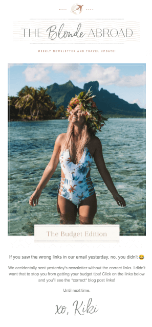
Important note: Avoid adding [Urgent] to your subject line, even when you truly mean it. This often triggers spam filters, sending your email straight to the junk folder and hurting your deliverability. Softer alternatives like [Last Call] or [Final Reminder] are safer and often more effective at driving action.
3. Prompt Curiosity or Mystery
They say curiosity killed the cat, but for marketers, it’s the secret to driving the open. A little mystery in the subject line, provided it resonates with your audience, motivates subscribers to open your email and uncover the rest of the story.
To trigger this response, share a benefit (the “what”) without explaining the “how.” This creates a “curiosity gap” that compels readers to read to close the loop. For example, you can:
- Highlight missed opportunities: “Here’s what you missed from our bestsellers.”
- Tease a new launch: “Your new obsession is live!”
- Lead with the benefit: “5 ways to tackle AI burnout.”
Here’s a compelling subject line from Under Armour that uses this marketing strategy perfectly. Readers want to instantly learn what this “superpower” is and, more importantly, how they can claim it:
Subject line: It’s like a superpower 🦸
Plus, creating question-based subject lines can have the same impact, especially if the answer feels personal to the reader. Under Armour, for example, has used “Thinking about new shoes?” in a separate campaign to grab the attention of subscribers who were already considering a purchase.
4. Balance FOMO and Urgency
Creating a sense of urgency and triggering the well-known Fear Of Missing Out (FOMO) are often seen as the hallmarks of a great subject line. While there’s some truth in it, you need to use these time-sensitive tactics in moderation.
Think about it: How would you react if a subject line shouting “Act now” appeared in your inbox? While it’s certainly urgent, it’s also pushy and can lead users to move this email straight to the spam folder or hit the unsubscribe button.
To avoid these consequences, simply indicate that a time window is closing or a specific benefit is expiring. The more personalized that benefit feels, the more likely a subscriber is to rush to claim it.
This effective subject line from Urban Outfitters reminds informed email subscribers that an offer “ends tonight.” The urgency is clear, but the tone remains helpful rather than demanding. You can also replace it with “Last call,” “A few hours left,” or “One more chance” to have a similar effect:
Subject line: Ends Tonight! Extra 40% Off Sale
5. Lean into Lowercase
Another trick many brands use to add a personal touch in their email marketing campaigns is writing their subject line in all lowercase. This seems to add a more human element to your message, as if it was written by a friend or colleague.
The brand NotebookTherapy consistently uses this tactic, helping their subscribers immediately recognize their signature style in a crowded inbox:
Subject line: free february printables!
On the flip side, subject lines written in all caps come across as aggressive, the digital equivalent of shouting. Not to mention that using all caps for words like “FREE” or “URGENT” can trigger spam filters. So, grabbing attention for the wrong reasons ultimately hurts your brand reputation and your deliverability.
6. Use Emojis Sparingly
Adding emojis to subject lines is a popular tactic for a good reason. This splash of color can indeed make your email subject line stand out in the inbox.

However, certain icons require caution. For example, money-related emojis such as 🤑 or 💰 or more aggressive ones like 💣can be spammy. Instead, opt for “softer” alternatives to hint at promotions or urgency, such as ⌛ or 🎉.
Moreover, there are two technical considerations to keep in mind. First, not every Email Service Provider (ESP) or device displays emojis the same way. Always test your emails to ensure they don’t turn into a broken “blank box” icon.
Plus, screen readers used by people with visual impairments read the literal description of an emoji. To ensure an inclusive experience, place emojis at the end of the subject line rather than using them to replace actual words.
Finally, avoid cluttering your subject line with many emojis. Too many icons look unprofessional and can confuse the reader. Usually, one or two is all it takes to do the trick, as seen in this campaign by Sigma Beauty:
Subject line: Save 20% on a True Multitasker Brush 🙌
7. Create One-Word Subject Lines
Sometimes, going against the flow and creating something brief and simple can lead to a more eye-catching subject line. In fact, just a single word can say it all.
Words like “Update,” “Monday,” or “Question” feel personal and urgent, making them an excellent choice for follow-up emails.
However, use this tactic cautiously. For example, if you’re running a promotional or nurturing campaign, this approach might sabotage your metrics if the reader doesn’t have enough context to click. Moreover, be mindful of your brand voice before stripping everything away.
Bottega Veneta, though, was brave enough to try it out. They simply typed “Astaire,” the name of one of their shoe models, to pique the interest of brand enthusiasts and announce a new style:
Subject line: Astaire
8. Lead with Numbers or Stats
Numbers and statistics naturally stand out in the inbox. They provide immediate value and can significantly increase email open rates, especially when combined with a specific benefit or a relatable pain point.
For example, if you’re sending a case study or survey results to move subscribers down the funnel, share your data points right at the start, ensuring they align with the email’s content.
Check out these examples:
- 25% increase in [Metric]. How we did it
- 3 reasons your [System] might be lagging
- The $5k mistake I see in [Industry]
Even if you aren’t sharing a “stat,” using a numbered list sets a clear expectation for the reader. Weruva used this effectively to share tips for improving pet health:
Subject line: 5 Easy Ways to Upgrade Mealtime 🐾
Never mislead readers with “vanity stats” that aren’t actually in the email, and avoid exaggerating claims about your brand. While a fake number might get an open, it will almost certainly hurt your click-through rates and damage subscriber trust.
9. Back Up Your Subject Lines with Data
Before crafting your next campaign, look at how your previous subject lines performed. Identifying the patterns your audience responds to can have a measurable impact on your future success.
Factors such as seasonality and email type influence which format will be most effective. For instance, your subscribers might prefer short, punchy subject lines for weekly newsletters but respond better to longer, detailed ones for educational content.
Similarly, a tactic that works during the Black Friday rush might fall flat in a quiet month like August. If you’re ever unsure about your direction, A/B testing and AI writing tools can help you refine your approach. Most email marketing software, such as Moosend, comes equipped with these tools to help you compare different versions and see what truly resonates.
Create Subject Lines that Drive Easy Opens
Which one of the tips above will you try first? Whichever you choose, ensure you craft a subject line that accurately reflects the content of your email. Aim for 20–40 characters to ensure your message is optimized for all devices.
Test often, stay true to your brand voice, and soon enough, your subscribers won’t just open your emails because of a clever hook. They’ll open them because they trust that what’s inside is worth their time.
FAQS
Check out these frequently asked questions regarding subject line best practices:
1. Does “Re:” or “Fwd:” work in subject lines?
It’s best to avoid them. While they can technically drive higher open rates through trickery, if there is no actual previous conversation, it destroys your brand credibility. Worse, it may flag your message as deceptive, landing it in the spam folder.
2. What triggers spam filters in subject lines?
Salesy and clickbait elements, such as money-related emojis and symbols, and the use of all caps, are red flags. Certain spam words, such as “Free,” “Guaranteed,” “Urgent,” and “Act now,” might lead your emails straight to spam or promotions.
3. How long should a subject line be?
Keep your email subject lines under 40 characters so that they’re optimized for most mobile devices. It’s best to add the “hook” of your copy at the beginning so that everyone reads it.
4. Are emojis in subject lines professional?
In most cases, yes. If your brand tone is more corporate or official, prefer utility-based emojis such as 📅 or ✔️ to keep your copy neutral yet more colorful.
Email retargeting is that gentle nudge you wish you could give every visitor who almost took an action on your website.
Usually, people browse, check a product, maybe even add it to their cart, and then life happens. Instead of losing that sale for good, retargeting lets you follow up with a message that feels timely, relevant, and genuinely useful.
In this post, we’ll show how email retargeting works, its benefits, and how to create a successful strategy. Also, we’ll see real examples to recover sales, re-engage subscribers, and get more value from every visit.
Visitors leave, opportunities shouldn’t.
Retarget your audience with emails that arrive just when they need them.
Try MoosendWhat is Retargeting in Email Marketing?
Email retargeting is a smart marketing tactic that helps you reconnect with people who showed interest in your online store but didn’t take the final step.
Instead of starting from zero, you follow up with website visitors, email subscribers, or existing customers based on what they actually did, like browsing products, abandoning their shopping cart, or skipping checkout. The result is more conversions, higher retention, and fewer lost sales.
How Does Email Retargeting Work?
Retargeting works by responding to user behavior rather than sending the same email to everyone. This approach is based on behavioral marketing, where real actions guide your messaging.
When someone visits your online store, actions such as product views, shopping cart activity, or checkout drop-offs are tracked using browser cookies, pixels, or site events. These signals are then passed to your email marketing platform through a remarketing pixel or tracking script installed on your website.
Once this behavior is recorded, it’s combined with data from your email list, such as past purchases or engagement history. This allows you to create highly targeted email campaigns that reflect what each subscriber actually did, rather than assuming what they might want.
From there, marketing automation takes over. Triggered emails are sent automatically based on predefined rules and timing, ensuring each message arrives while intent is still high.
Popular flows include:
- Cart abandonment emails after someone leaves checkout
- Follow-up messages after viewing a product multiple times
- Re-engagement (win-back) campaigns for inactive subscribers
If you set everything up correctly, a visitor will receive something like this:
Here, Cheekbone Beauty follows up with a targeted email that highlights the exact product the shopper viewed, adds urgency with a limited-time offer, and includes a clear call-to-action (CTA) to return to checkout.
Related product recommendations are also added to encourage cross-sell, all in one focused message sent at the right moment.
Email retargeting and email privacy
Before you get started with email retargeting, it’s worth noting that it depends on data availability. This means that privacy updates, cookie restrictions, and GDPR rules can limit what you track, especially for anonymous visitors.
That’s why effective email retargeting needs to rely on:
- First-party data from your email list
- Clear consent through sign-up forms, pop-ups, and checkout opt-ins
- Triggering emails based on confirmed actions, not assumptions
While remarketing pixels help capture behavior, they work best when combined with strong email list growth and permission-based tracking.
To retarget your audience effectively, stay informed about email privacy regulations and ensure every email marketing campaign is built on clear consent, transparent data use, and compliant tracking practices.
Retargeting Ads Vs. Email Retargeting
You’ve probably heard (or even used) retargeting ads. They’re the ones that seem to follow you on social media or across the web after you visit an online store.
Ads like this one from Shopify can work well, but they’re never free.
On platforms like Facebook, advertisers pay for every interaction, with click-per-cost (CPC) typically ranging from $0.26 to $0.50 and an average click-per-thousand (CPM) between $1.01 and $3.00.
Per month, ad costs can range from $101-$500 for SMBs to up to $5,000 for enterprises. And as competition grows, those costs add up fast.
With email retargeting, once someone joins your email list, follow-ups don’t come with a per-click or per-impression cost. That’s what makes it a more predictable and cost-efficient way to re-engage interested users and recover lost sales.
Here’s a quick comparison between email marketing retargeting and retargeting ads:
| Email retargeting | Retargeting ads | |
| Cost | Fixed monthly cost (e.g., $9/month for 500 subscribers and unlimited emails) | Pay per click or impression ($101–$500 per month) |
| Cost growth | No added cost per send or click | Costs increase as traffic and competition grow |
| Audience | Email subscribers and existing customers | Website visitors and ad audiences |
| Personalization | High, based on behavior and purchases | Limited by ad formats |
| Automation | Advanced workflows and triggered emails | Basic rule-based setups |
| Visibility | Depends on subject lines and open rate | Immediate and highly visible |
| Long-term value | Supports retention and repeat sales | Stops once ad spend stops |
Why Ecommerce Brands Use Email Retargeting
Not every visitor converts on the first visit, and that’s normal. Some will take their sweet time, especially with higher-value purchases.
Email retargeting helps eCommerce brands stay top of mind during the decision process and bring shoppers back when they’re ready.
Here’s why it’s such an effective strategy that numerous online stores use:
- Recovers lost sales without increasing ad spend: It brings back shoppers who have already shown intent, helping reduce shopping cart abandonment without paying for clicks or impressions again.
- Turns existing traffic into higher conversions: By following up based on real behavior, brands improve conversion rates, opens, and click-through rates (CTR) with messages that feel timely and relevant.
- Builds long-term retention: Retargeting increases repeat orders and overall customer lifetime value by reminding potential shoppers of your products or services. Targeted upselling, cross-selling, and product recommendations also boost average order value without aggressive promotions.
- Creates a more efficient marketing strategy: It complements ads, SMS, and other channels, giving online stores a scalable way to engage customers with owned data rather than rented attention.
How to Create a Successful Email Retargeting Strategy Step-by-Step
If you want email retargeting to work, you need a plan. The steps below will help you set up a simple strategy you can automate, measure, and improve over time.
1. Define the retargeting goal
The first step is to decide exactly what you want the email to achieve. Email retargeting works best when each campaign has a clear, single outcome.
For example, your goal might be to:
- Get someone to complete checkout
- Bring a shopper back to their shopping cart
- Encourage another look at a product
- Re-engage inactive subscribers
- Upsell or cross-sell to an existing customer
Avoid mixing goals in the same email. A cart abandonment message should focus on finishing the purchase, not browsing more products or joining a loyalty program.
If a customer, for instance, adds a skincare product to their cart but leaves before checkout, your goal is to get them back to complete the purchase. That determines how the email looks, what it says, and when it’s sent.
Defining the goal upfront keeps your messaging focused and your workflows simple.
2. Segment your target audience
Whether you already have segments in place or you’re doing this for the first time, segmentation is essential, not only for retargeting but also for email marketing in general.
At a minimum, you should separate:
- Existing customers from potential customers
- First-time visitors from returning buyers
- High-intent users based on browsing history or cart activity
- Inactive subscribers on your email list
This ensures each email matches the recipient’s level of intent and familiarity with your brand. Better targeting leads to higher conversion rates, stronger engagement, and fewer irrelevant sends.
If you already use segmentation, this is also a good moment to clean your email list. Remove hard bounces, suppress long-term inactive subscribers, and revisit outdated segments. Clean data improves deliverability and ensures your email retargeting campaigns reach people who are actually likely to engage.
Solid segmentation sets the foundation for everything that follows.
3. Connect your website and install tracking
Now, to trigger emails based on actual visitor behavior, your eCommerce website needs to be connected to your email marketing platform.
This usually happens through website tracking, either via a plugin or a tracking code snippet added to your site. Once connected, your platform can start collecting behavioral data, such as product views, cart activity, and purchases.
The setup typically follows three simple steps:
- Select the website you want to track
- Install tracking using a plugin or code snippet
- Start turning behavioral data into actions
These steps vary based on your ESP, so make sure you check how to connect the two before moving on.
Here’s an example from Moosend’s platform:
To enable website tracking, go to More > Websites, add your domain, and submit. Once the website is added, Moosend automatically generates a website ID, which you use to install tracking via a plugin or code snippet.
You can then install website tracking using one of the following methods:
- Plugin installation, using one of Moosend’s supported plugins for popular eCommerce platforms
- JavaScript tracking, by inserting a code snippet into your website’s head section
- PHP tracking, for custom setups that require server-side tracking
All methods collect the same behavioral data and can be used to trigger automated retargeting workflows.
4. Set a trigger and build your workflow
With website tracking in place, you can start defining when your retargeting emails should be sent.
This begins with selecting a trigger event, meaning the specific action that activates the automation. Common triggers include website abandonment, product page visits, email inactivity, or purchase completion.
From there, you build the automation workflow. For example, a shopper adds one or more products to their shopping cart but leaves the site without completing checkout:
The automation then:
- Waits for a short delay, such as 30 or 45 minutes
- Checks whether a purchase has been completed
- Sends a cart abandonment email only if no order is detected
If the customer completes the purchase during the waiting period, the workflow is automatically stopped, and no further emails are sent (unless specified).
This trigger-and-condition structure ensures your retargeting emails arrive only when they’re relevant. Instead of manual follow-ups or one-size-fits-all campaigns, automation handles the timing and decision-making in the background.
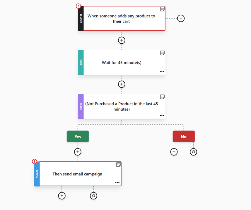
5. Choose or design the email template
This is where your retargeting email finally starts to take shape visually. Most email platforms, including Moosend, offer pre-made templates you can use as a starting point.
For example, an abandoned cart template like the one shown below already includes the essential structure: a clear headline, product blocks with images and prices, and a prominent checkout CTA.
Using pre-made templates like the one above can save you a lot of setup time and help you launch faster.
That said, these designs are blueprints, not finished emails, and you should always customize them to match your brand:
- Update colors, fonts, and spacing to align with your branding
- Replace generic copy with product-specific messaging
- Adjust CTAs to match your tone and conversion goal
Keep the layout simple, make important elements like product images and prices easy to scan, and ensure the main CTA is visible without scrolling. A well-designed template connects copy, visuals, and structure into a clear path back to taking the desired action.
6. Write the subject line, copy, and CTAs
Speaking of copy, the goal of your email remarketing campaign is to deliver instant value. The recipient already showed interest, so your job now is to remove friction and make the next step obvious.
Start with the subject line. It should clearly reflect the action or intent, whether that’s returning to checkout, finishing a purchase, or revisiting a product.
Here are a few tips to help you write effective email subject lines:
- Use action-based language like “Finish your order”
- Keep it under 45–50 characters so it’s readable on mobile
- Avoid jokes, puns, or vague phrases that don’t signal the next step
- Match the subject line to the rest of the copy to avoid confusion
- Add urgency only when it’s real, like low stock or expiring carts
When it comes to the email copy, keep it short and focused on benefits. Remind the reader why they were interested in the first place, without being aggressive. This works across use cases, from abandoned carts to re-engagement or product reminders.
Lastly, your CTA should always match the behavior you’re responding to. That said, avoid over-selling or adding too many buttons at once. Retargeting emails are meant to guide visitors to take a single action. So, one clear message and a single action are enough.
If you want to speed up this process, Moosend’s AI writer can help you generate subject lines and copy based on your campaign goal, saving time while keeping messaging consistent.
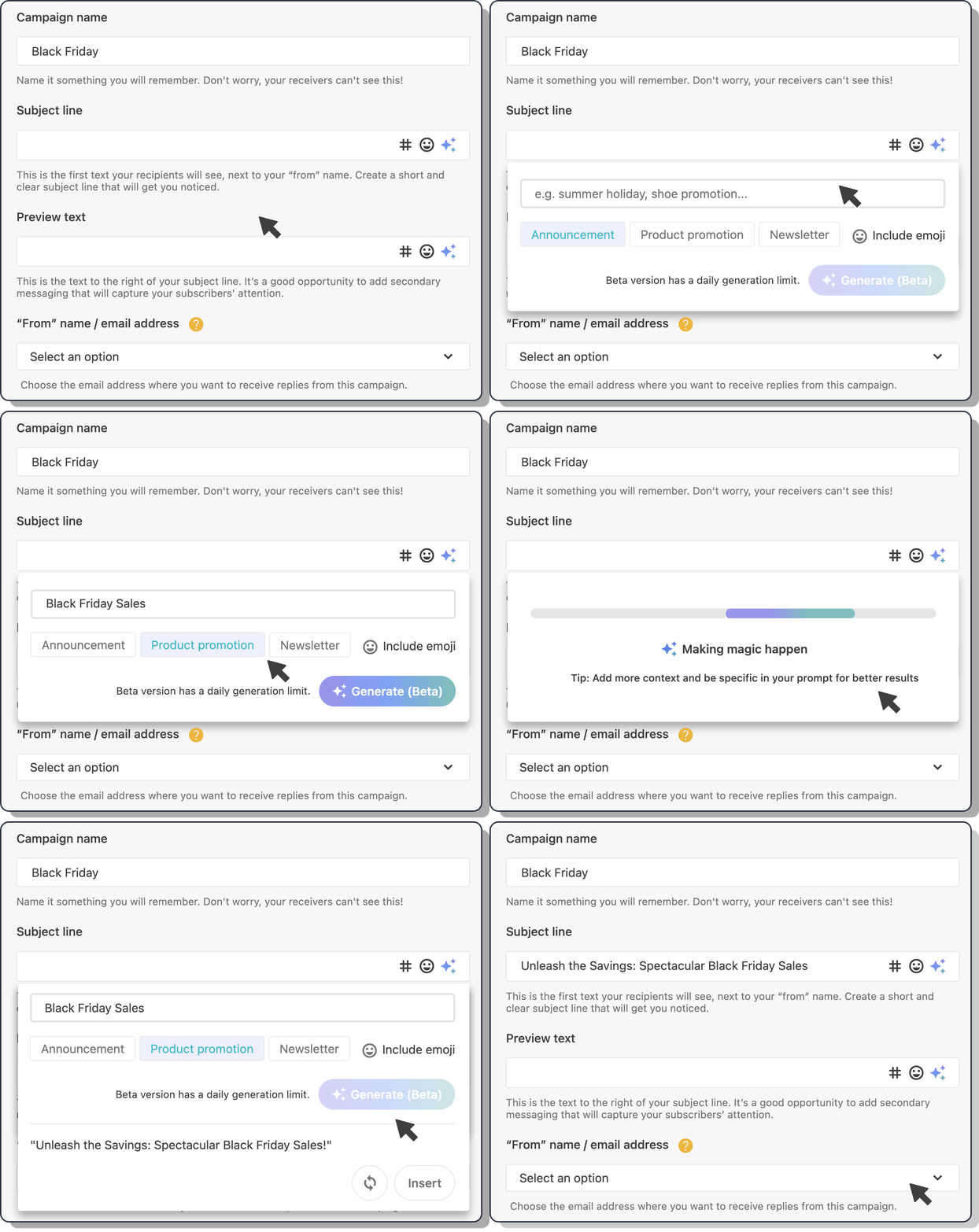
Don’t worry about getting every detail perfect at this stage. In the next section, we’ll walk through real retargeting email examples to help you refine your copy and get inspired.
7. Personalize the email content
Once you’ve defined the value of the message, personalization helps deliver it to the right person in the right context.
Now, you may think that email personalization is about adding someone’s name everywhere, but it’s so much more. Using data and segmentation, you can make the message feel relevant based on what the user has already done.
For example, you can add dynamic elements in your email remarketing campaigns, such as:
- The exact items left in the shopping cart or recently viewed
- Product recommendations related to browsing or purchase behavior
- Personalized email content blocks that change based on segment, action, or even weather conditions
- Basic details like first name or location only when they add clarity
Before you launch your retargeting emails, keep one thing in mind: over-personalized messages can feel intrusive. That’s when users get the “my device is listening to me” feeling. It’s usually just tracking, but not everyone knows that or feels comfortable with it.
Stick to data users recognize, avoid surprises, and use personalization to support the message’s value. As a rule of thumb, show them exactly what they need to return, nothing more.
8. Track your performance
For retargeting to work effectively, tracking needs to be in place. This allows you to see what’s working and where users drop off.
Your email platform will let you track:
- Opens and clicks to see how many users engage with your message
- Conversions and orders to measure completed actions after the click
- Revenue recovered from users who returned to finish a purchase
You can also connect campaigns with Google Analytics to track post-click behavior on your website and see how retargeting emails support the full customer journey.
![]()
9. Test, launch, and optimize your retargeting emails
Finally, before linking your email to your retargeting workflow, run a final round of checks.
Most ESPs let you preview your email across desktop, tablet, and mobile, so you can confirm the layout works on every screen. You can also send test emails to check links, images, subject lines, and CTAs in real inboxes.
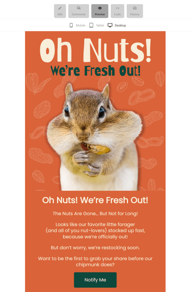
Many platforms also include spam and deliverability testing tools, helping you spot issues that could affect inbox placement before you go live.
Once everything checks out, connect the email to your automation and launch.
After that, optimization doesn’t stop. Review key metrics regularly, test timing, copy, and CTAs, and adjust your workflow rules based on performance.
Email retargeting works best when it’s treated as an ongoing process rather than a one-off send.
Best Examples of Email Retargeting
Here are some of the most effective email retargeting examples, each triggered by real user behavior and designed to bring visitors back at the right moment.
Abandoned cart emails
When a shopper adds a product to their cart but leaves before checkout, this email steps in to gently bring them back.
Here, Beauty of Joseon’s goal isn’t to rush the sale, but to remind them of what they were already interested in and make returning feel easy. Plus, they throw a little freebie to encourage abandoners to complete the purchase.
Subject line: Oops! You left something behind 🎁
Why it works:
- Uses a friendly, low-pressure email subject line with an emoji
- Brings the exact product back into view, so users don’t have to search again
- Keeps the message simple and product-led instead of salesy
- Matches the brand’s calm, minimal tone, which builds trust
- Makes returning to checkout feel quick and low-effort
If you need more inspo, check out our best abandoned cart email examples and templates.
Website abandonment
When a visitor spends time browsing a product but leaves without adding it to their cart, this email brings them back into the experience. In this case, Solo Stove focuses on rekindling interest rather than pushing for an immediate sale.
Unlike cart abandonment emails, there’s no “you forgot something” message or urgency cue. Instead, the email highlights the product again, promoting the brand’s lifestyle appeal, and invites the user to continue shopping at their own pace.
Subject line: Did you see something you like?
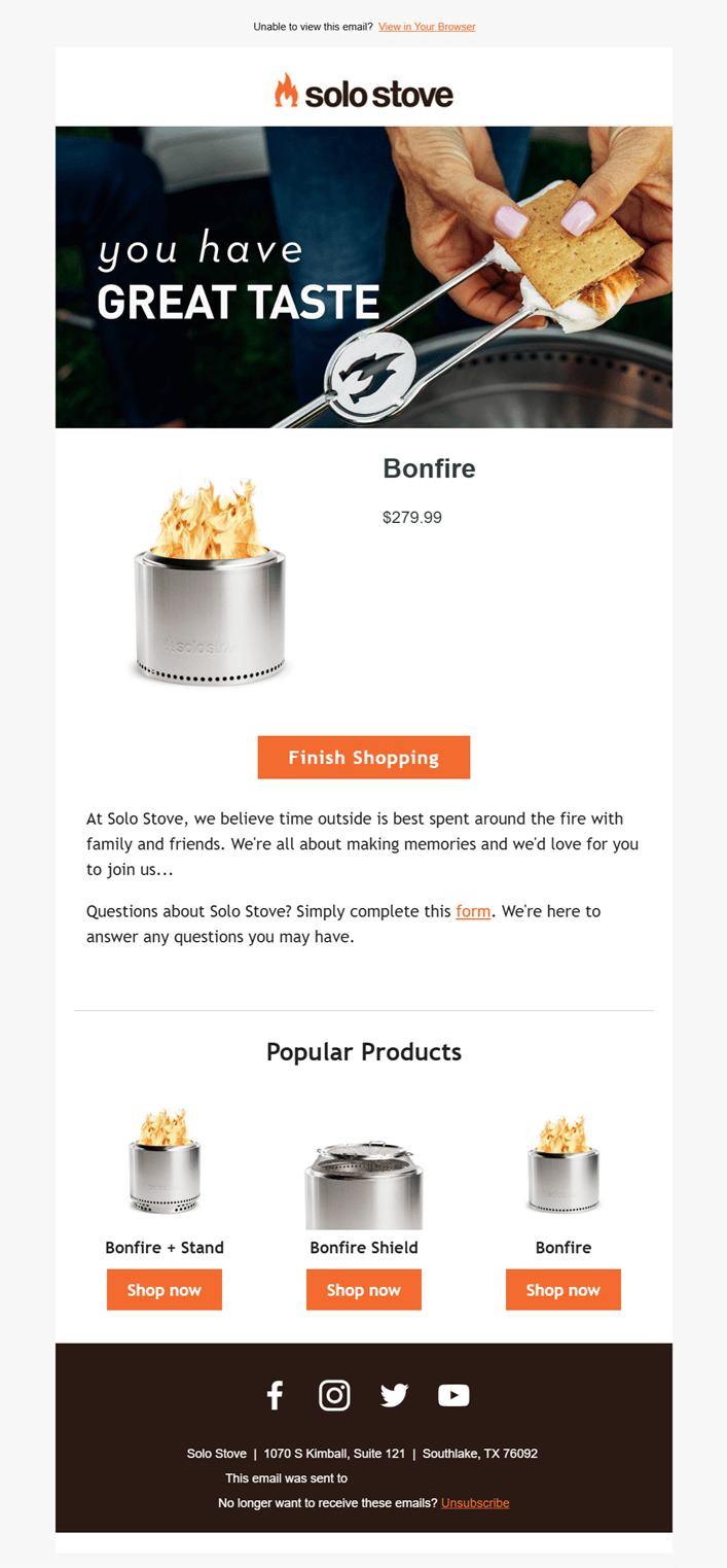
Why it works:
- Leads with lifestyle imagery instead of urgency, reminding users why they were interested, not just what they viewed
- Reintroduces the exact product with price, keeping the decision context clear without pushing checkout
- Uses a soft, continuation-based CTA that fits a browsing mindset
- Reinforces brand values through storytelling elements
- Adds popular products at the bottom to prompt further exploration
Back-in-stock alerts
Back-in-stock emails usually go to shoppers who have opted in to receive notifications. They also work as retargeting when someone checked a product, didn’t complete the purchase, and then left while it was unavailable.
That’s the approach La Colombe takes here. The email reconnects with users who have already shown intent and brings them back as soon as the product is available again to finish what they started.
Subject line: Back in Stock: Our Bestselling Cold Brew 🙌

Why it works:
- Calls out “Back in stock” immediately, aligning perfectly with the subscriber’s earlier interest
- Keeps the focus on the specific product lineup that went out-of-stock
- Uses strong visuals to guide clicks toward key products
- Expands beyond a single item with related options, increasing the chance of conversion
Price drop email example
Similar to the above example, this email targets users who viewed a specific item, left without purchasing, and then received it after the price dropped.
Instead of pushing a generic sale, Uniqlo reframes the discount as a personal “savings edit,” turning a price change into a timely reason to return and complete the purchase.
Subject line: Price drop on something you liked
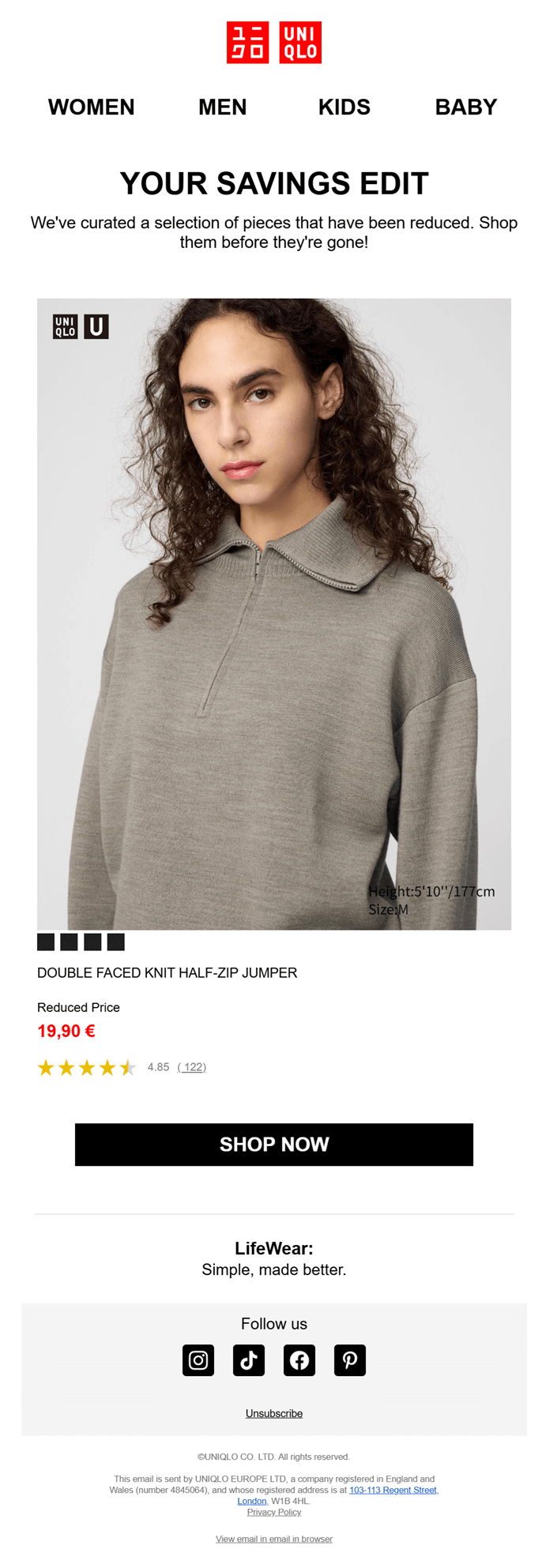
Why it works
- Connects the price drop directly to an item the user already checked
- Makes the discount feel curated with ample white space and only the necessary details
- Keeps the focus on one product, reducing decision fatigue
- Uses social proof and clear pricing to remove last-minute hesitation
Replenishment reminders
Based on past purchases, replenishment messages reach customers right as everyday essentials are likely to run low, making it a strong form of behavior-based email retargeting.
Chewy doesn’t wait for customers to realize they need to reorder. It anticipates the need, surfaces familiar products, and removes friction from the repeat purchase.
Subject line: Running Low?

Why it works:
- Uses purchase history to predict needs instead of pushing a generic promo
- Brings previously bought items back into view, reducing effort and decision time
- Boosts convenience with quick CTAs and autoship incentives
- Fits naturally into routine-based categories like pet food, skincare, and household staples
Pet supply brands can benefit greatly from this email retargeting strategy and should incorporate it into their pet care marketing efforts to increase revenue.
Win-back emails
After a subscription ends and a user goes inactive, this type of email retargeting steps in to help warm the relationship back up. In this case, Audible reaches former subscribers with a clear incentive to return.
Instead of reintroducing the service, the email assumes prior use. It focuses on what the user already knows, pairs it with a limited-time offer, and removes friction from rejoining.
Subject line: Welcome back with 50% off for 3 months
Why it works
- Acknowledges inactivity directly with a “we miss you” message that feels personal
- Uses a time-bound discount to create a clear reason to return now
- Highlights recognizable content to tap into past listening habits
- Makes reactivation simple with a single, focused CTA
Cross-sell newsletter campaigns
This retargeting example builds on an existing customer relationship to introduce relevant add-ons or upgrades. After a user installs or actively uses a product, cross-sell emails expand value by suggesting tools that naturally fit their needs.
MacPaw follows up after CleanMyMac X usage with a thank-you message, then smoothly promotes related products at a discount.
Why it works:
- Ties the offer to recent product usage
- Leads with appreciation and feedback before introducing additional products
- Cross-sells tools that clearly complement the original purchase
- Uses a discount as added value for existing users
Post-purchase follow-ups
Post-purchase emails are a smart form of email retargeting because they reconnect with customers after delivery. The goal isn’t to sell right away, but to keep the conversation going and turn a completed purchase into long-term value.
Here, Jotoys follows up shortly after the order arrives to ask for a quick review. It’s a low-effort ask that benefits both sides: customers share their opinion, and the brand collects feedback and social proof it can reuse across product pages and future campaigns.
Subject line: ⭐️ Maria, what did you think about ukio Letters to nowhere Series Figures Blind Box
Why it works:
- Arrives right after delivery (14 days after the purchase), when customers are most likely to respond
- Keeps the action simple with a one-click star rating
- Includes the subscriber’s name in the subject line and copy to make it look more personalized
- Sets the stage for future retargeting with reviews, recommendations, and loyalty follow-ups
Feature or usage-based nudges
Feature- or usage-based retargeting is triggered when activity slows, features go unused, or key actions are missed, guiding users back into the product with a clear and timely next step.
In this example, Grammarly notices a drop in writing activity and steps in with a weekly progress update. The email gently reminds users what they’re missing, shows what they could unlock next, and pairs the nudge with a limited-time upgrade offer.
Subject line: 🏆 Weekly progress + 55% off Pro!

Why it works:
- Uses real usage data to make the message feel relevant
- Reframes inactivity as an opportunity to improve, not a failure
- Highlights specific features users haven’t fully activated yet
- Adds a time-bound incentive that aligns with renewed engagement
Retargeting Customers at the Right Time
While email retargeting doesn’t deliver instant spikes the way ads sometimes do, over time, it can bring back lost sales, strengthen retention, and make every visit more valuable without constantly asking for more budget.
For brands that think beyond the next click, email retargeting becomes a long-term advantage. And if you want a simple way to get started, Moosend gives you the tools to track behavior, automate follow-ups, and turn intent into results without overcomplicating the process.
FAQs
Here are some common questions regarding email retargeting:
1. How long should I wait before sending a retargeting email?
It depends on the trigger. For high-intent actions like cart abandonment, 30 minutes to a few hours works best. For product views or re-engagement, waiting 1–3 days often feels more natural. The key is to send while the intent is still fresh, not after it’s gone cold.
2. Can email retargeting work without discounts?
Many of the strongest examples rely on reminders, availability updates, convenience, or reassurance rather than price cuts. Discounts are useful, but relevance, timing, and clarity usually drive better long-term results.
3. What’s the biggest mistake brands make with email retargeting?
The biggest mistake is treating it like a one-off campaign. Email retargeting works best as a system. That means clear goals, proper segmentation, testing, and ongoing optimization. Brands that “set it and forget it” miss out on most of the value.
