


Web Form Design: From Acquaintances to BFFs in a Few Clicks
Published By Tea Liarokapi
January 22, 2020

22/01/20
Form design… The mere word “form” is bound to bring back some unpleasant feelings.
I bet all of you remember those long, long online forms that were excruciating to fill out. The issue was that in the old days (i.e., like five years ago), a good form was hard to come by, and subscription forms were an issue.
Now, there’s the option of auto-fill, of in-field labels, of… Oh, I won’t tell you more now, I’ll just show you everything, complete with web form best practices and all that jazz!
But the point is that forms used to appeal to the exact opposite of impulse action; they required so many fields and the process was so tedious, that nobody wanted to do it.
However, all marketers know that a good form, much like a good landing page can boost conversion and increase sign-ups.
What are web forms?
In all fairness, web forms are a necessity. I dare you to come up with a website that doesn’t have a web form. For real, I double-triple dare you. You can’t.
Companies need online forms for a gazillion reasons. Hence why all websites have online forms, to begin with.
An online form can help with a purchase, the sign-up process, payments, the works!
This is what makes companies at least try and make some really good forms, through great web form design.
The main aim would always be friction reduction and to provide the users with something that will get them to sign up without tiring them out or bullying them into it.
Therefore, great form design will create a great user experience. You can’t do anything without it.
Why are web forms necessary?
An online form is one of the best lead generation tools, provided it’s used correctly, and it’s cost-effective enough to entice SMEs and big brands alike. Here’s what I mean:

Online forms are one of the most common tools marketers use for lead generation and, according to the stats, the highest converting one as well -hence why you’ll need to know everything about the best online form builder tools. But that’s a totally different discussion.
And there really is no reason to bash web forms, seeing as they are fun, playful and lead to a hell lot of conversion, leading site visitors to become subscribers.
And then, subscribers can become buyers and buyers can become brand ambassadors….You know the drill!
The whole point is that an online form is a great tool that can capture a prospect and, combined with other methods like email marketing and landing pages and some great web form design, you can engage and entice.
The whole point and the reason you need a web form is the following: While your website is the tool that will inform, you also need a tool for the tool, that will convert, otherwise the time you spent on your web form design has no real value.
Your visitors contact you through your online forms
(Source)
Information that goes through that web form of yours, a question, a subscription, anything at all, will get straight to the company’s email list-the vault if you will.
Your form can include text boxes, drop-downs, file uploads, the works. Just as long as you want to include it. As long as it’s appropriate, of course.
A web form design that definitely will not work, would be one that is long, too long compared to what it can actually offer.
For example, if I want to sign up for a newsletter or a discount code, I will need to see one field: The one that requires my email address. I could even understand the field asking for my first name.
But that’s about it.
You’ll need to study your data and see what performs well and what doesn’t, what constitutes friction in your case and what would make your prospects go like

So, web forms are pretty useful, provided they’re designed and used wisely. But what does that even mean, in the end?
Stellar web form design is what you need!
You don’t need simply “good forms”. You need to have a “flippin’ fantastic web form design” if you want to convert visitors into something more… Special.
Your online forms’ design is what will make or break your user experience, both on the form and through the entire website.
You know what they say… People remember their bad experiences forever, whereas they’re very quick to forget the good ones. Something about evolution and all that…
Anyway, to put it simply, a well-designed form gives the impression of a brand that knows its tools, thinks of the user and is more than a little tech-savvy.
Not to mention that a good form that won’t bother the user is one thing less to worry about.
But let’s see what happens when you’ve got a web form design that is downright wrong.
- Prospects will abandon your page
- No prospects mean no conversion
- No conversion means no sales
- Clicking the back button tells Google that your website is not useful
Do you really want these things to happen? No? I wouldn’t either.
Web Form Design: Best Practices 101
Web form design has its own rules and there are plenty of things that could be branded as “web form design best practices”.
Much like landing page best practices or website optimization, there are some things to be done.
Web form best practices: #1 – Lose TMI

(Source)
Asking for too much information translates to asking for lost conversion.
And unless this is some marketing tactic from the depths of the Amazon (the rainforest, where all the best stuff is!) that I haven’t heard about, you don’t really want that.
The issue with TMI on an online form is not exactly the length or the friction-those can be tackled, easily too. There is another problem though.
Too much information means that you’re being nosy. And that’s the main issue with that specific design practice.
Just think: What kind of information do you need, for starters? If there’s an undeniable need for a company email, go ahead and ask for it, instead of a generic email account.
The same goes for a first and a last name. If there’s some specific need for those, use the form to ask.
All in all, before creating your form, you should see what is aligned with the user’s desire and with what you’re offering.
If it’s a freebie that entices the user to subscribe, ask for as much information as your freebie allows.
If it’s a “Subscribe for a 10% discount”, you need no more than the prospect’s email-if they buy, you’ll get the rest of the information as well.
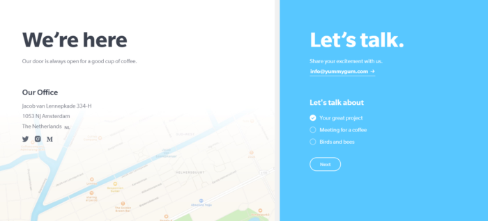
Web form best practices: #2 – Go easy on them
Let’s assume you need to ask for more than just an email on that specific form you want to design. It’s okay, you probably have your reasons-no judgment!
So, maybe you need to make a form that will have a phone number field, or perhaps a budget field. It’s all good, so long as it’s not right there at the top.
You see, you already need to be careful with a longer form just because it’s longer, you can’t afford to ask the difficult questions first.
So here’s what you should do, in an image:
(Source)
Ease your prospects into signing up by asking for their email and name first. That way, you can build trust and will have your prospects quickly run through the easy stuff.
Since their interest is peaked now, they’ll fill in the rest of the blanks just as quickly.
And another thing you need to do to go easy on your prospects: Don’t stop them from continuing with their subscription or application if they’ve got a field wrong.
Rather, tackle the problem right at the beginning by using some help text that will be giving clear, concise instructions on how each field can be completed correctly.
Web form best practices: #3 – Go mobile
Because honestly, your online forms need to work on mobile. End of. So, here’s what your form should look like:
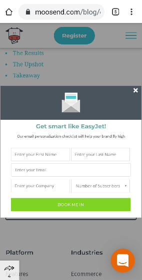
Mind you, it’s the exact same one used in the above example (oh and no judgment on how many tabs I’ve open on my Chrome app, please. You should see my desktop).
Optimizing an online form for mobile or tablet is something that you just have to do, in order to capture as many prospects as possible.
As with landing pages, there are not many people that would go onto your website and see an unresponsive and broken web form and would instantly think “Oh, let me bookmark this page, I’ll subscribe when I’m on desktop”.
You need some mobile-friendly and responsive web form design-oh, and when I say responsive, I mean both in terms of visuals and in terms of copy.
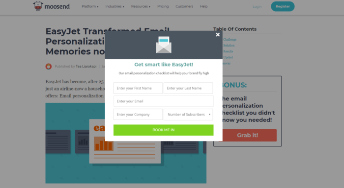
Web form best practices: #4 – Include labels
Field labels, to be exact. Name the fields according to what kind of information you need on each field, to be even more exact.
Kiiiinda like…

The web form (or rather, our web form) above, reads “Enter your email” for a reason: Prospects love to run through the fields of your online forms and enter information hastily.
By labeling the fields, you keep the prospect’s attention right where it needs to be, without having to constantly have to poke them on the shoulder and go “Hey, you there? You listening?”
Not to mention that, by using in-field labels (my fave thing!), you actually save space and time, as the prospect doesn’t need to see a field and check above or below-the eye can take in the whole picture right there and then.
You see, prospects just go there, see the form, type their data in and then click the CTA button (more on that, later). They do things automatically, you ask, they answer. It’s pretty easy to get distracted that way.
Field labels are a way for your prospects to remember what they’ve read and what was entered into each respective field. That way, they’ll just type faster and click the CTA button before deciding that they just don’t want to go through with it.
Fiendishly clever, isn’t it?
Web form best practices: #5 – Lose CAPTCHAs
Completing the form doesn’t really matter, when I’ve got to solve the riddle of the Sphinx just to hit the “Subscribe” button.
When I say “the riddle of the Sphinx”, I, of course, mean something like that:

(Source)
This image is hard to read, end of. And why would I want to hit a “Subscribe” (in the above case, it’s a download button, but the point still stands) when I can subscribe to billions of other newsletters?
I understand that you’re trying to keep your list clean that way and eliminate the chance of spam and bots and yes, your prospecting game will be super strong with steps like that one, but on the other hand, do you really really need to make it that hard?
You can just use reCAPTCHA:
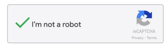
(Source)
It looks like reCAPTCHA is a lot easier than just simple CAPTCHA, right? Well, it may be safer as well.
Also, it causes zero friction on your form, seeing as it’s just another checkbox.
Web form best practices: #6 – On CTAs
CTAs are the buttons that tell people what to do and when to do it. Without those, your prospects are lost on what kind of action you’d like them to do next.
This pretty much means that you need clear, actionable verbs and a design that will help your CTA button stand out, both in terms of color and in terms of typography.
Don’t use pale colors on pale colors and small letters in a big space (ie button). Just try to make it so there will be some whitespace, just to keep the eyes focused and all.
CTAs are there to guide users through action. Like this:
(Source)
If the letters are too small or too large, the typography is too complicated, the colors are too meh or your design is just plain, your CTA button will go to waste, your prospects won’t really know what to do with your online form and your form design game… Weak.
And don’t forget that the CTA button should be placed somewhere that makes sense.
Next or right below the final field of your online form? At the right of your online form? Anywhere that suits you, so long as it’s intuitive.
If I have to look for it, I probably don’t want it anymore.
Web form best practices: #7 – Be honest, but creative
You can’t tell your prospects what you’ll give them in the long run, right upfront.
But you can’t keep secrets from them in terms of what signing-up will give them, either. So… Maybe you’re caught between a rock and a hard place here?
Not really, no. You don’t have to be, anyway.
You just need your copy to be clever and creative at the same time and you need to show your prospects what you can do for them.

(Source)
Buzzfeed is one of the masters of online forms, both when it comes to design-simple, contrasting colors, powerful in its own right-and when it comes to copy… “Customized marketing messages” and the fact that you can select your own newsletter categories is where the game is won.
The subscribers (née visitors) know exactly what they’re in for that way, without you just taking all the fun of exploration right out of their hands at that stage.
Chapter recap anyone?
I bet you need it, after all that info you got thrown right at you.
So…
- You need to ask only for as much data as you absolutely need.
- If you do need something more than an email or a name and an email, ease your prospects into giving their data and place the fields in a smart manner: Info that’s easy to give, goes first. Leave the hard stuff for later.
- Mobile-responsive online forms are good forms. End of.
- In-field labels are where it’s at. Because all of us lose concentration at some point and because I wouldn’t want to go all back-and-forth just to fill out an online form.
- CAPTCHAs are very complicated, they’re an outdated practice when it comes to web form design and, frankly, they need to go. Use reCAPTCHAs instead.
- CTAs need to be actionable, clear-as-day and you need to place the button on the form in an intuitive manner. Ie, if you’re talking to an international crowd, don’t place it at the left-hand side of your web form, since English is read from left to right. Oh, and your CTA button needs to stand out, no matter what you do.
- Use a cryptic message but don’t be dishonest and leave zero room for misunderstandings.
Just one super-pro tip: Include a countdown timer, please! Especially if your online form has anything to do with an offer or something a prospect can use in a short and/or specific time-frame, say, a discount code.
And now, let’s move on to…
A little don’ts action
Knowing what to do doesn’t mean that you know what to avoid, when it comes to online forms. And a good form could be good just on paper but have that little something that will throw prospects off their game.
So, let’s see if you went wrong anywhere.
You didn’t test a new design thingy
I bet you created an online form you’re all too proud of. And I bet you just issued it because “hey, what can go wrong?”.
The answer is “A lot of things”. So, whenever you’re hands-on including something new in your web form design that you haven’t used before, always test it.
Perhaps it won’t work like you would’ve liked it to, or perhaps it will show properly but won’t exactly be of help down the line.
You’ll need to know those two things before issuing and only testing can show you where your possible blunder is.
You weren’t clear on your fields
There is a very specific reason why I was talking about in-field labels before.
If you’re asking for data that you’re not sure your field can accept, then you’re in for a nasty surprise. But how are you going to know whether or not this is the case your online form doesn’t convert as much as you want to?
Just check which field has the most errors and you’ll instantly know what to fix!
Your form was just too darn long
Most common blunder in the book.
You not only want your form to be short, you also need it to look short as well, otherwise you’re definitely going to scare your prospects away.
As mentioned before, make sure that you’re asking for the details you actually need. But there is a web form design trap to avoid here: Fields and letters that are too small, on a form that is just too large.
This is bound to scare people away, even if the required pieces of information are easy as pie to be filled out.
I bet you’ve got it now, right? So, moving on to…
Pretty web form design examples
They’ll give you some much-needed inspiration, especially if you’ve no idea what works or what to do when it comes to web form design.
Oh, and if you don’t understand why those specific online forms are, in fact, good forms and what makes a form design stand out, don’t worry. I’ll include some thorough explanations, to keep you from getting confused.
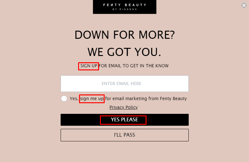
Good form #1: The New Yorker
(Source)
So, this little online form popped up (literally) as I was reading an article about… I don’t really remember, but I remember it was something pretty interesting and I had spent a good chunk of my time reading it.
Actually, come to think of it, I had spent a good chunk of my time reading The New Yorker Magazine articles in general.
So, when this fellow popped up, I just stood and raised a brow in fear. Like…
Jesus Christ, I need to get things going, what’s going on, what am I gonna do with the article?
But apart from that… There’s a whole lot of whitespace that keeps the eyes rested, there is some custom illustration that is actually pretty clever, neat and different and the CTA button pops, as this shade of blue is nowhere to be found on that web form.
Good form #2: The Daily Egg

(Source)
Discreet and up there where one can definitely see it, this online form is there to just remind you that subscribing is an option.
Actually, it’s there to remind you that subscribing is the better option-the other one being… You know, not subscribing.
It may not be a form that’s so in-your-face, but on the other hand, its color contrasts, compared to the color of the page itself, it’s right above the blog’s name/link to homepage and it’s ready to let you know exactly what you should expect.
Weekly newsletters, that is.
Good form #3: The NeuBible App
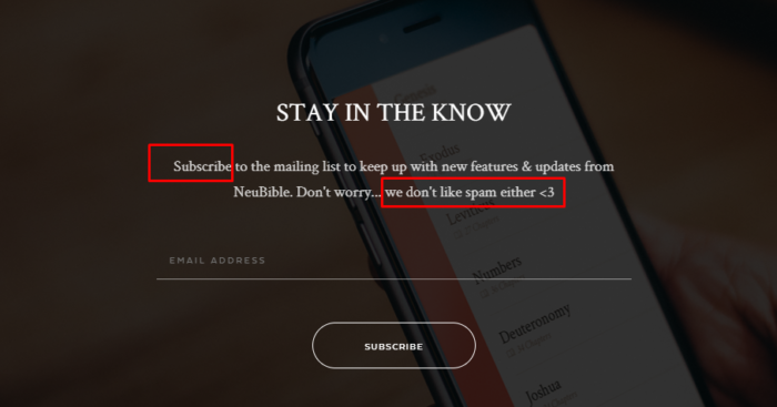
(Source)
This is an online form that belongs to a Bible app. Which means that it should naturally feel pious and respectful, while showcasing value. And that’s exactly what it does.
This online form uses copy hacks that are brilliant, with actionable verbs and answering the “Why”s that come with.
“Subscribe” “Why?” “To keep up with everything new”
And what about that little “Don’t worry” input with the heart… Too cute!
Reassuring prospects that you won’t sell their data and you won’t fill their inboxes with spammy emails can make all the difference. Oh and did I mention that the value and objective is pretty clear?
No? Well, my bad. It is.
Good form #4: Shinesty
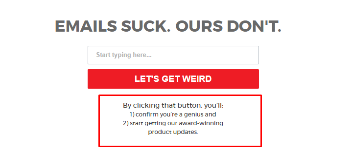
(Source)
Talk about consistency in a brand’s tone!
Shinesty is one of my favorite brands out there, in terms of tone, that is. This brand is supposed to be selling “Outrageous clothing for theme parties, costume parties, and general ridiculousness”. And this translates to their overall brand tone.
From copy (“Emails Suck”) to colors (red-on-white) and design (simple, they cause no more fuss than their costumes do), this brand is here for the simple web form design and allows copy to do all the work.
Are there contrasting colors? Yes.
Is there simplicity in the message and value? Yes.
Is there a clear (albeit humorous) explanation of what the subscriber should expect? Yes.
Good form #5: Instapage
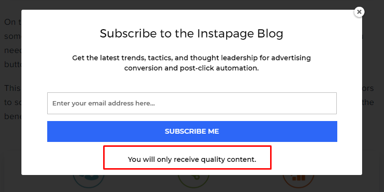
(Source)
Simple, no-fuss, minimal friction, what more could you possibly ask from your web form?
It’s all there. Everything you need. It answers the prospect’s “Why”s, there are actionable verbs that push the subscriber to the right direction, it even has a reassuring message of quality content only.
What is more, it’s got a minimalist type of design, large typography and a blue-on-white CTA button that pops. Oh, and the in-field label as well.
What’s not to like?
All in all…
Web form design is something that can be as simple as our brand new feature makes it out to be (which is true, go ahead and try it out) or as complicated as those haters claim it is.
But really, brilliant web form design-and online forms in general-is something all businesses need, and yours is no exception.
Use them correctly and you’ll get more subscribers and, eventually, more conversion that will make your revenue reach the sky!
Similar Posts

 Published by

 Published by

Create, send and optimize your email marketing campaigns