Email Opt-In: Definition, Types & How To Use It [2026]
What is an opt-in? Which sign-up method do I need to use?
In a world where email is one of the greatest engagement channels, building an effective email list is the best way to make your business thrive. However, to get from zero to hero, you need to have a list of verified contacts. This way, you will:
- promote your email delivery
- maintain a high sender score
- avoid getting flagged as spam
Today, we’ll take a look at the two most popular sign-up methods to find out which is best for your business!
The easiest and most affordable email marketing and newsletter software!
What Is An Opt-In?
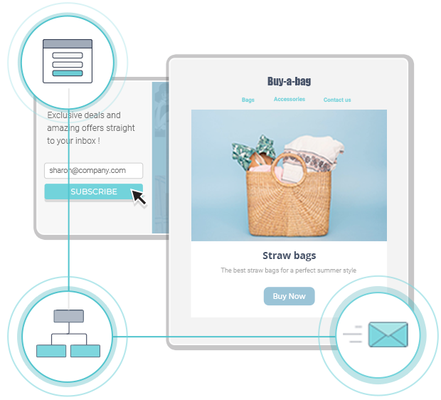
First off, when we talk about opt-in or email opt-in, we refer to the registration method that marketers use when someone signups for their email newsletter. This process can be either single or double.
In the first case, subscribers will be immediately added to a list after clicking on the “subscribe” button. In the second, recipients will need to verify their email address through a confirmation email sent to them minutes after registering.
Single Opt-In Vs. Double Opt-In
So which is best for you? Single or double opt-in?
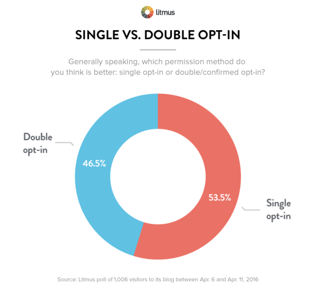
According to a poll, 53.5% of website visitors favor the single verification method, while 46.5% prefer the double process.
To understand this trend, let’s take a more thorough look at the two methods and their advantages and disadvantages.
Single opt-in email
As the name suggests, this process requires only a single action to turn a visitor into a new subscriber. This sign-up method is popular with eCommerce sites that want to collect numerous visitors’ email addresses to get them to make a purchase.
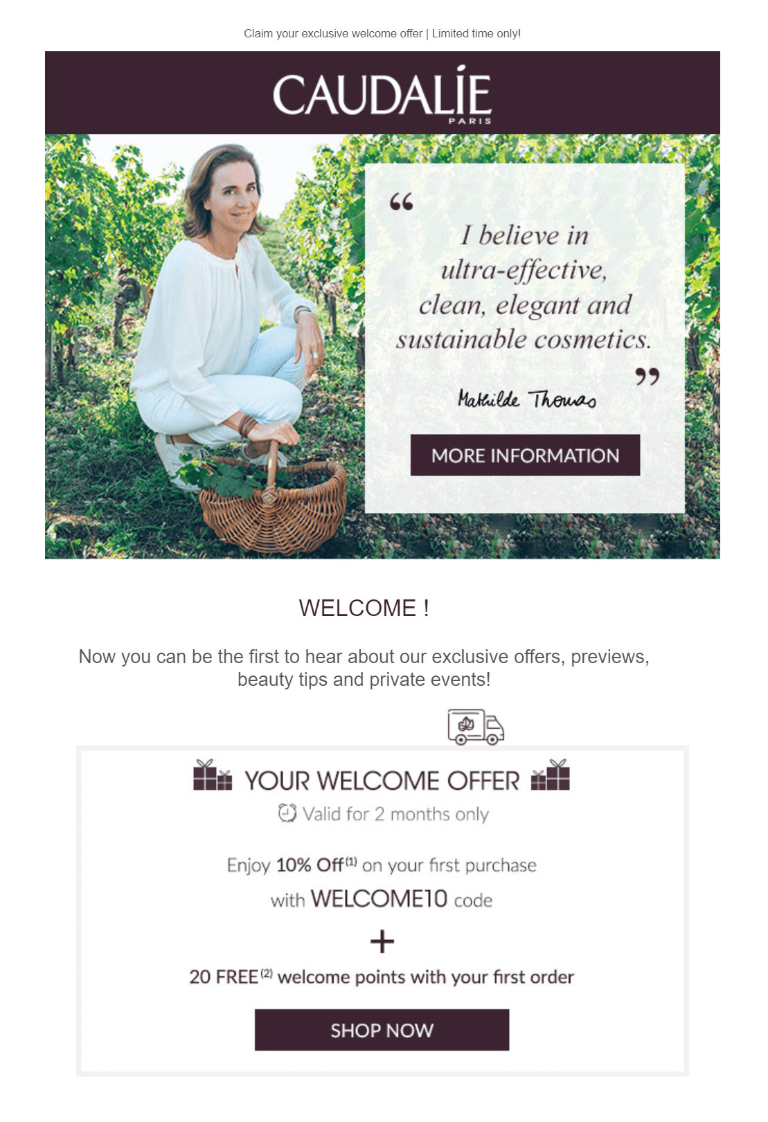
For instance, when you sign up for Caudalie’s emails, the brand will instantly start sending you marketing emails like this welcome campaign:
To understand why the majority of online stores choose this method, let’s take a look at the benefits and drawbacks of single opt-in:
Pros
- Grow your subscriber list fast.
- Minimize visitor frustration due to the lack of extra steps.
- Immediate access to the promised value (discounts, offers, etc.).
Cons
- Poor email list hygiene.
- Your sender score might be affected by spam complaints.
- Legal compliance issues in specific countries.
Double opt-in email
Choosing the double sign-up method entails adding an extra step to verify your visitors’ email addresses. One of the most crucial benefits of choosing this method is its ability to combat fraudulent acts and create a healthy email list. This process is popular with many businesses, including SaaS companies, agencies, and online stores.
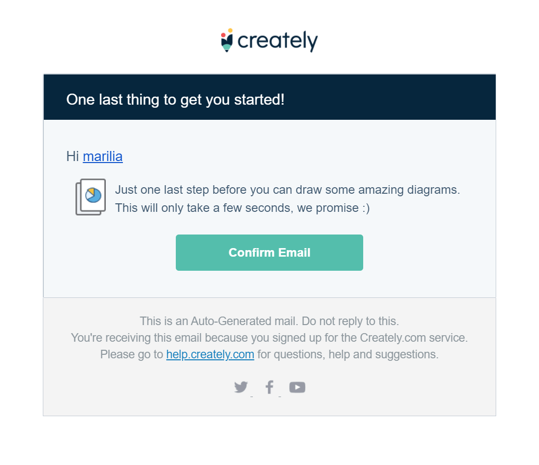
Instead of receiving a marketing message, recipients will get a transactional campaign in the form of a confirmation email. Here’s an example by Creately:
Now, let’s see the ups and downs of setting up a double opt-in process:
Pros
- Maintain email list hygiene.
- Have a good email deliverability score.
- Collect quality contacts.
Cons
- Longer registration process.
- Subscribers might feel annoyed by the additional step.
- Without confirming their email address, they won’t receive any messages.
So which opt-in process is the best?
As you can see, both methods have their strong and weak points. If you want to grow your list fast, you can choose the single opt-in approach, but you should be ready to deal with unverified recipients and spammers.
On the other hand, setting up a double process will give you better engagement rates and conversions, but the additional verification step might annoy visitors and hinder your growth. At the end of the day, it’s up to you and what you want to achieve!
Want to learn more about the two processes? Check out our single vs. double opt-in guide to find the best method for your business.
Types of Email Opt-Ins
Did you know that opt-ins come in different shapes and sizes? Before we see how to set up your sign-up process, let’s check the most popular types out there:
Pop-ups
Pop-ups are a fan favorite for many marketers. To create one, you’ll need an online form builder like Moosend or Typeform.
Successful online forms will allow you to increase your lead generation and expand your mailing list. To make them work, you need to:
- Add a compelling heading.
- Create an irresistible value proposition.
- Have a clear CTA button.
- Add the necessary form fields.
- Include your privacy policy.
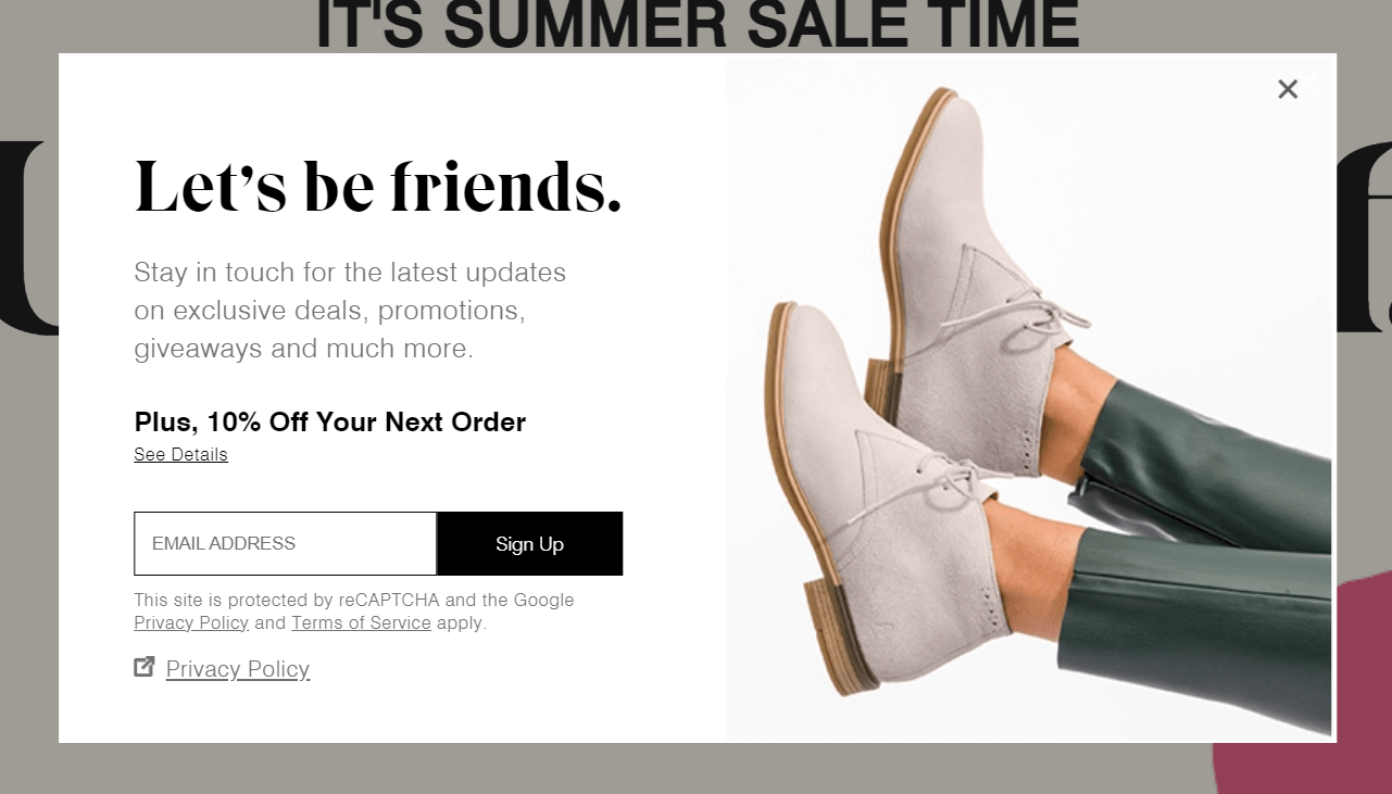
Here’s a great example by Hush Puppies to show you how it’s done:
Furthermore, to power up your newsletter signup rate, make sure to place your forms above the fold to collect as many email addresses as possible. Apart from the classic pop-up, you can use many other form types to capture your audience:
- Inline forms: popups embedded on your webpage along with your content.
- Floating bars: slim forms placed at the top or bottom of your page.
- Floating boxes: sticky forms that stay with you as you scroll up and down.
- Full page forms: sign-up forms that cover your visitors’ entire screen.
Want to create your next form? Sign up for a Moosend account, hop into the form builder, and start capturing your leads!
Landing pages
Landing pages are the best way to increase your lead generation by offering your visitors a value proposition they can’t resist.
To create a converting landing page, you need to follow some common design practices. In short, here’s all you need to consider before designing yours:
- Start with an intriguing headline.
- Use valuable landing page copy.
- Choose the right CTA button colors.
- Add high-quality images and graphic elements.
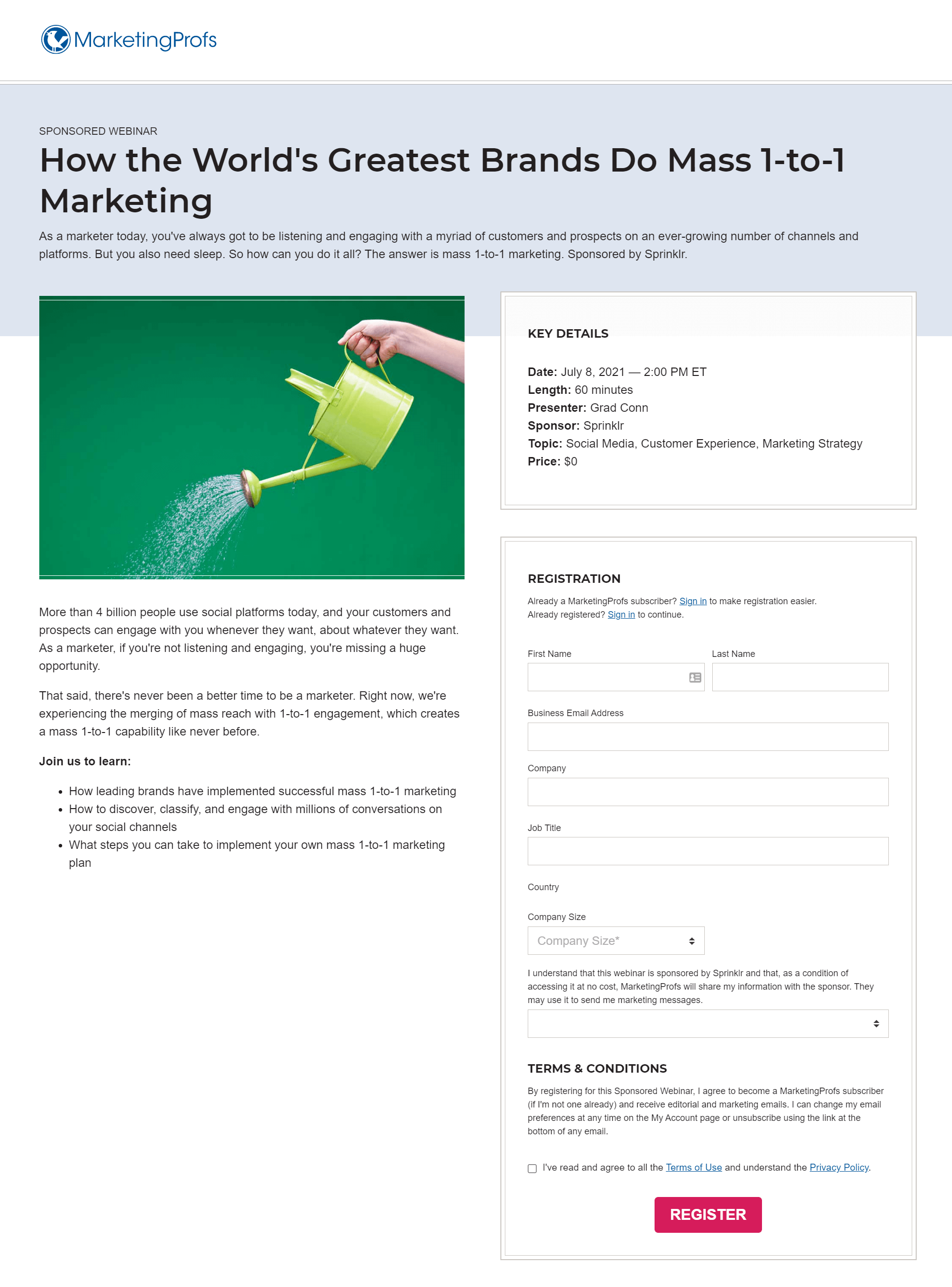
Here’s a great lead gen landing page example by MarketingProfs:
Now that you know how to capture your visitors’ email addresses, let’s see how to configure an opt-in form in simple steps.
How to Create an Opt-In Form
In this section, we’ll take a more thorough look at the steps you need to design a successful email opt-in form for your business. Let’s go!
1. Pick the right form design
The first step is to hop into your online form builder and choose your design. You can either craft an online form from scratch or choose a template to save time and effort.
For instance, Moosend’s form editor gives you the option to choose from 11 pre-made templates:
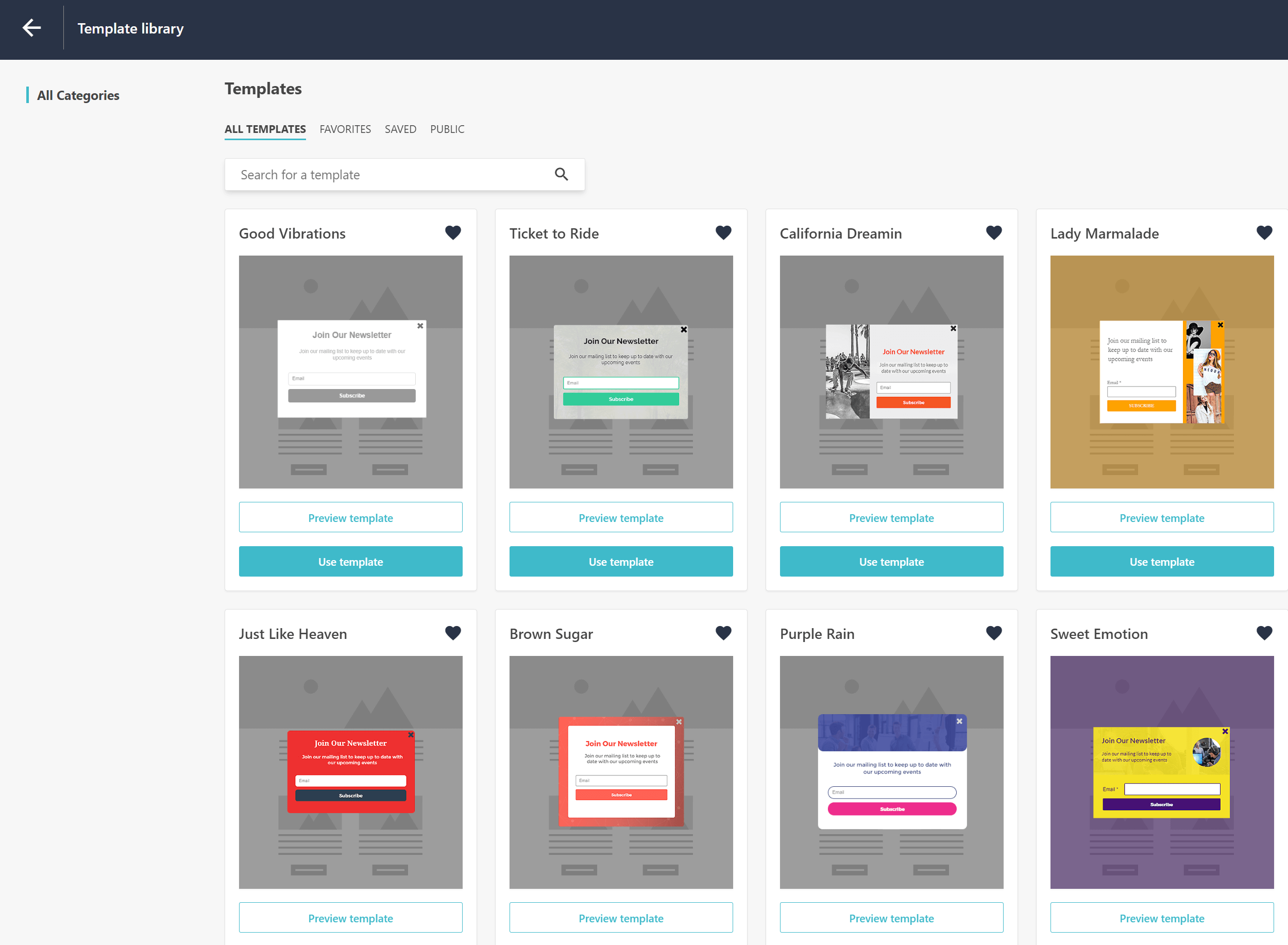
To increase conversions, you should make your forms as simple and appealing as possible.
From the colors to the images, make sure to bring everything together nicely to avoid frustrating your visitors. And if you want to match your form with your first newsletter, you can easily pick one of Moosend’s email newsletter templates to provide your audience with a seamless experience!
Need more tips to nail your opt-ins? Check out our form design guide to create pop-ups that will skyrocket your lead generation and conversion rates!
2. Highlight the value with compelling copy
If you want to get those addresses, you need to show your future subscribers why they should give you their contact details.
Here I need you to keep the principle of reciprocity in mind, a positive action-reaction approach that will help you convince your prospects to sign up for your newsletter in exchange for their email address.
Of course, to make it happen, you need a clever value proposition, usually in the form of a lead magnet, to make the deal a little sweeter. Here are some things you can use to land more clicks:
- Give your audience a free ebook, gift, guide, checklist, etc.
- Use social proof to show them the credibility of your business.
- Make sure to use short copy to avoid any frustration.
Now, how do you know that your form will perform? Well, let’s take a look at two examples.
Sign-up form examples
First off, here’s an opt-in by Crazy Egg:
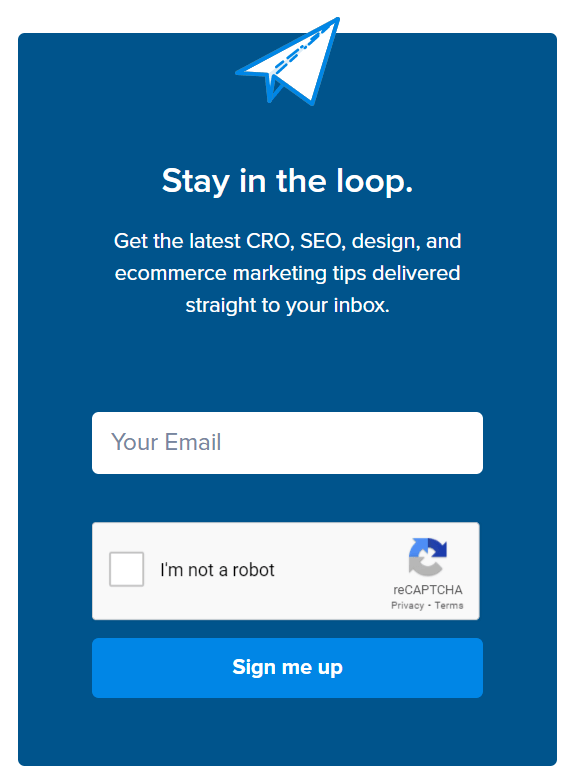
As you can see, the above example is straightforward, having a short copy and a single form field. Nevertheless, new visitors don’t see the real value of joining apart from receiving some tips in their inbox.
For some, this will work. However, if you want to go far, you need to incorporate additional elements like Optinmonster:
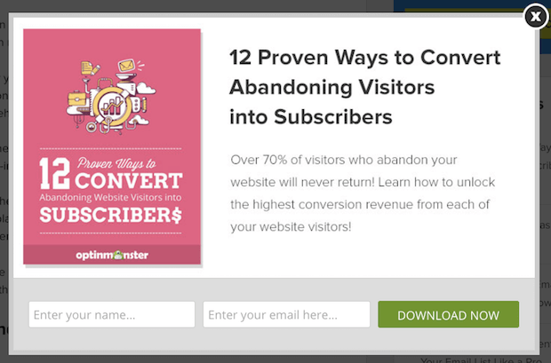
Here, the business uses targeted language to intrigue visitors and statistics to make the value proposition more credible. On the plus side, the two form fields are perfect for minimizing form abandonment, while the CTA manages to stand out!
Pro tip: Use actionable language and phrasal verbs to make your messages more casual, friendly, and natural!
3. Add a bright CTA
Speaking of calls to action, if you want to convert your visitors, you need to make sure that they won’t miss them!
The best way to nail them is to pick bright colors like red, green, orange, etc. Of course, don’t forget to consider your overall color scheme before you choose the best option for your buttons.
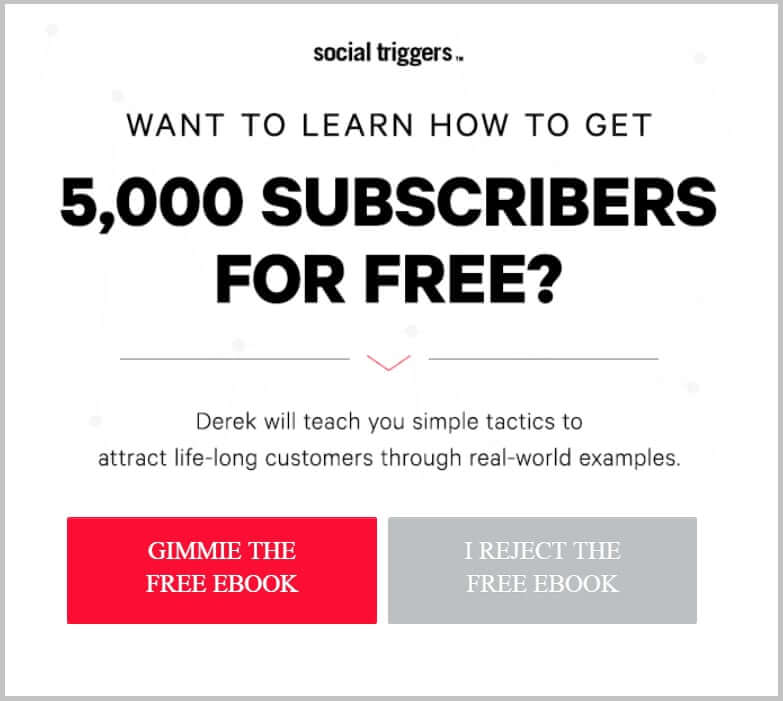
For instance, using complementary colors like red/green or purple/yellow will give your CTA the boost it needs to stand out. Otherwise, you can take advantage of white to ace your form conversion rate like Social Triggers:
4. Optimize for SEO
Optimizing web forms for SEO is essential, as improves the discoverability and visibility of your website’s content on search engines. Search engines crawl and index form fields and content, so optimizing these elements can enhance your site’s relevance and ranking.
A well-optimized form can also enhance user experience by providing clear guidance and reducing friction, ultimately leading to higher conversion rates. Not to mention the appeal this strategy can have to the impulsive nature of an action, as your content will mention all the right things at the right time.
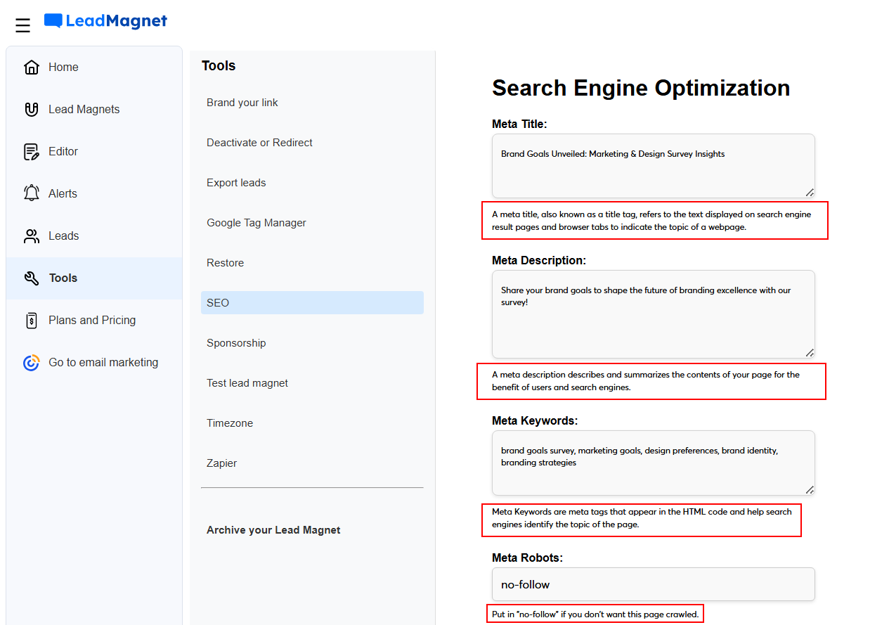
To nail this tactic, choose a tool like Constant Contact’s Lead Magnet with an intuitive, built-in SEO feature. And if you’re an SEO novice, it gives you additional information in each step, to help you familiarize yourself with the process.
5. Choose your opt-in process
After you pick your design, colors, and CTAs, you need to decide the opt-in method you’ll use.
To make it easier, ask yourself two things:
- Do I need to expand my list fast?
- Or do I need to acquire more quality prospects?
There are no right or wrong answers here. Just choose what will serve you best! Now let’s see what’s the next step for each process:
For single opt-in: Send your first campaign
As we mentioned above, If you choose this method, you will immediately let your visitors become new subscribers.
So after they hand you their email address, you have to send them your first campaign to start nurturing them.
Your welcome email is the best way to make a lasting impression. You can easily craft it by using your email marketing tool.
Add the right elements (CTAs, social media buttons, countdown timers) to lead your audience back to your website. For eCommerce stores, give them a nice discount to incentivize them to make their first purchase!
Here’s a beautiful welcome email by Bobbi Brown:
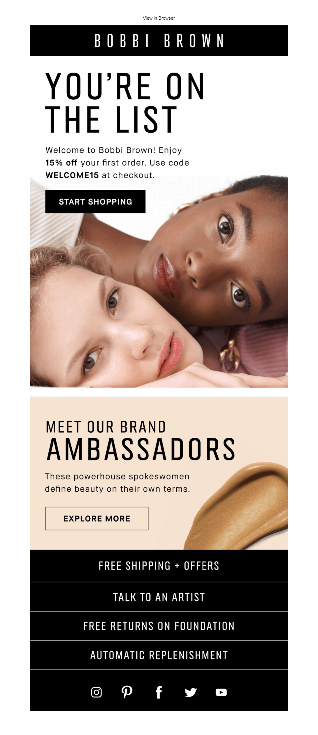
An eye-catching message will lead your audience back to your website and promote your conversion rates!
If you need a bit of help, make sure to check our welcome email templates to create a winning message for your new subscribers.
Furthermore, don’t neglect your open rates! Craft compelling subject lines and preview texts to stand out in your recipients’ inboxes. And, no matter what you do, don’t forget to add an unsubscribe link to avoid getting flagged as spam.
For double opt-in: Send a confirmation email
If you go for the extra step, you have to design a confirmation email for your visitors. These transactional emails will let them verify their emails and give you some peace of mind regarding spam accounts and email list hygiene.
Your confirmation campaigns need to be as straightforward as possible, and the same applies to your subject lines. The goal is one, to get your recipient to click and join your list!
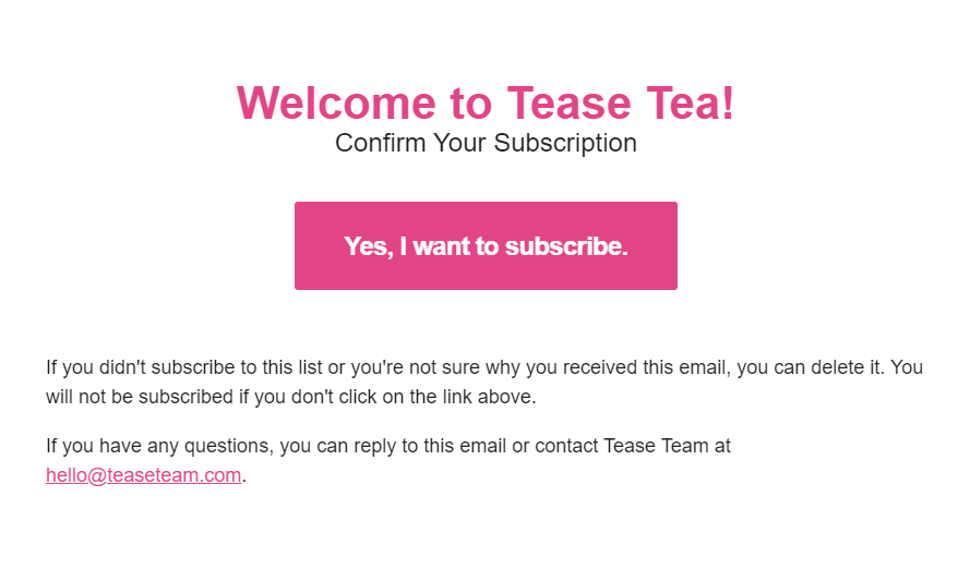
Here’s a winning example by Tease Tea:
Subject line: Confirm your subscription
Since confirmation emails are transactional messages, you need to get your hands on an SMTP Server to deliver them.
Moosend’s solution is perfect for small and large eCommerce businesses who want to take advantage of an email marketing automation platform with advanced capabilities at an affordable price. Just make sure to create an account and get started!
6. A/B test your opt-in forms
Now let’s talk optimization for a moment! Everything in marketing is a process of trial and error since your audience consists of various individuals with different needs and tastes.
To win them over, you have to discover what they like best. The easiest way to do it is through A/B Testing, a process that will allow you to test different form elements for better conversions.
Here are the most important things you need to test:
- Online form copy.
- CTA button color.
- Opt-in form placement.
- The number of fields.
Even a little tweak might give you better results! So if you notice that your opt-ins don’t give you the signups you desire, you have to perform some A/B tests to find out what’s wrong! Here’s a real-life example:
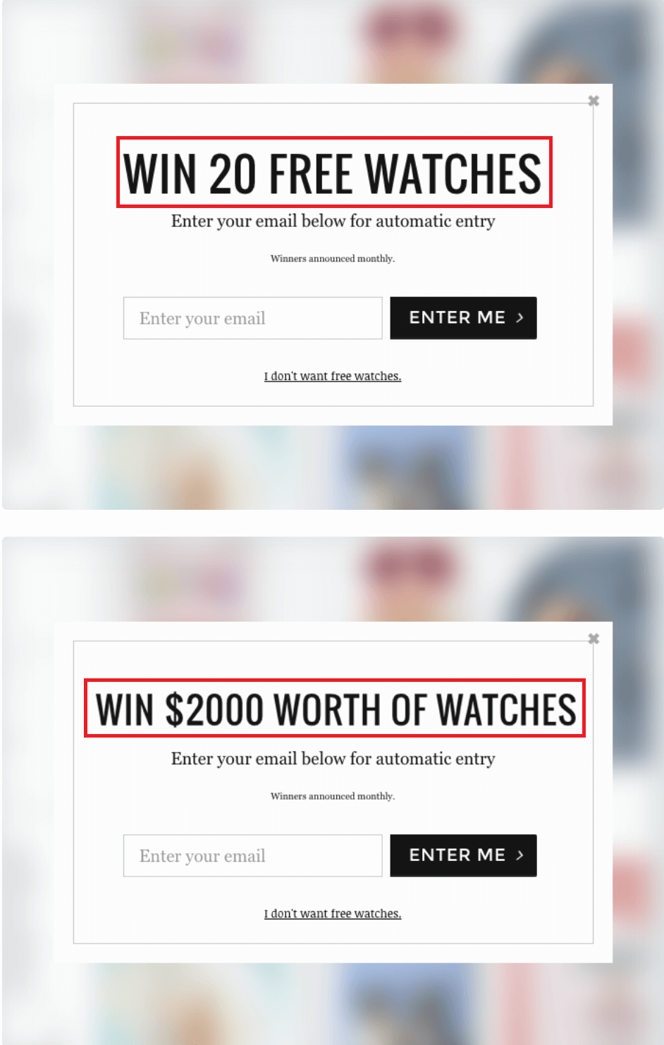
According to The Daily Egg’s study, changing the headline from “20” to “$2000” gave the company a 2x subscription rate:
- Win $2000 Worth Of Watches – 13.40%
- Win 20 Free Watches – 6.70%
So that’s why you should always embrace the power of A/B Testing!
FAQs
Short answers to important questions! Let’s see them:
Q1. What Is An Opt-in Page?
An opt-in page aims to convert a visitor into a subscriber through an irresistible offer. This can be a lead magnet (ebook, checklist, discount) or any other means that will get an individual to share their contact information with you.
Q2. Is Double Opt-in Mandatory?
GDPR doesn’t require businesses to have a double opt-in verification method in place. However, according to the CAN-SPAM Act of 2013, organizations are required to give visitors the ability to opt out of getting emails at any given time.
Q3. What Countries Require Double Opt-in by Law?
While it’s not mandatory to use double opt-in, certain European countries like Germany and Switzerland require email marketers to use the extra verification step. You can find out more about specific country policies here.
Q4. Should I Choose Single or Double Opt-in?
It depends. Based on your needs, you can either choose to add an extra security step or not. As a general rule, double opt-in will give you more quality leads and help you maintain a good sender score.
Q5. Is Deliverability Affected by Single Opt-in?
Since anyone can join your email list without verifying their address, a single opt-in might hinder your deliverability score. To avoid it, use a single opt-in when it’s necessary.
Supercharge Your Lead Generation
Creating forms is the best way to build and expand your email list. Before you do, make sure to choose the right tools and pick the opt-in process you want to follow.
Both single and double opt-in have their pros and cons, so it’s up to you to decide what you want to achieve.
After reading this article, you are now ready to create your forms or landing pages and convert your visitors into engaged subscribers of your business!
And if you need a quick and easy-to-use tool to get started, why not sign up for a Moosend account to set your list building in motion?
It’s time to create the best opt-in forms! Go!
