75+ Free Email Newsletter Templates [2026]
Looking for eye-catching and responsive email newsletter templates to kickstart your email marketing strategy? You’ve come to the right place!
But why do you need newsletters? Well, apart from the fact that email marketing is one of the most cost-efficient channels, it’s effective for organic content distribution, too. Nevertheless, designing everything from scratch often gets time-consuming.
And there’s always a chance you’ll run out of inspiration at some point. Having the right email newsletter templates in place saves the day, regardless of the occasion.
So, are you ready to create impactful email campaigns without a major investment in time and effort?
Here you will find 77 wonderful email templates for eCommerce, SaaS, publishers, product promotions, hotels, events, and real estate. Plus, seasonal and milestone newsletter templates to engage your audience all-year-round and throughout their journey.
How to Get Moosend’s Free Email Newsletter Templates
To gain instant access to the templates, follow these simple steps:
- Sign up for a free Moosend account.
- Click on the “Campaigns” tab and select the type of campaign you need to create. These are the options: Regular, RSS & Repeatable, and Transactional.
- Tap on the “New” button at the top right corner, and then pick the campaign type. Let’s say you go with the Regular one.
- Define the basic settings like the campaign name, subject line, and preview text.
- In the “Design” step, click the “Start designing” button. You’ll be directed to the template library of the editor where you can preview and use any of the professional email newsletter templates.
- Select the newsletter template you like and customize it using the drag-and-drop editor.
You can also use the email template builder to create your own newsletter templates from scratch, save them in your library, and reuse them whenever you like.
Now let’s meet the family, shall we?
1. eCommerce Newsletter Templates
Newsletters are the backbone of eCommerce email marketing. To help you out, we’ve collected a variety of designs to nurture and convert your target audience with beautiful layouts.
Now let’s see some responsive email newsletter templates for cart recovery, promotions, sales, offers, and more.
Minimal Cart Abandonment Email Template
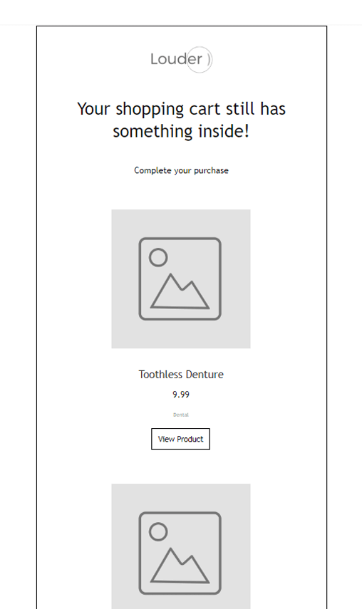
Starting with something simple, this cart abandonment template is perfect for restoring your lost revenue. Due to the lack of extravagant elements, this design will look great on multiple email clients like Outlook, Gmail, and Yahoo.
Design tip: Since this template favors white space, you can easily tailor it using your brand colors and product images. Also, make sure to use a bright color for your CTA to catch your recipients’ attention.
Why you need it: Super easy to customize (no coding skills required) and mobile-friendly layout. With a compelling subject line and actionable copy, you’ll bring users where you need them: back to their shopping cart.
Black & White Cart Abandonment Newsletter Template
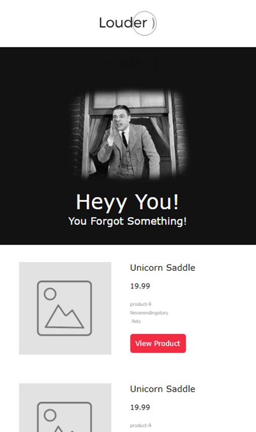
If you want something more design-wise, then this template is just what you need. The above example is full of elegance, using the classic combination of black and white. The best part, though, is the red CTA that stands out no matter what.
Design tip: Add a beautiful visual on the top to make your campaign more appealing. While you can include different colors, keeping the black-and-white scheme will boost the visibility of your call-to-action. Just make sure to pick a contrasting color to make it pop.
Why you need it: Due to its simplicity, you can combine it with other email newsletter templates and add it to your abandoned cart series through Moosend’s marketing automation workflow builder.
Indigo Cart Abandonment Design Example
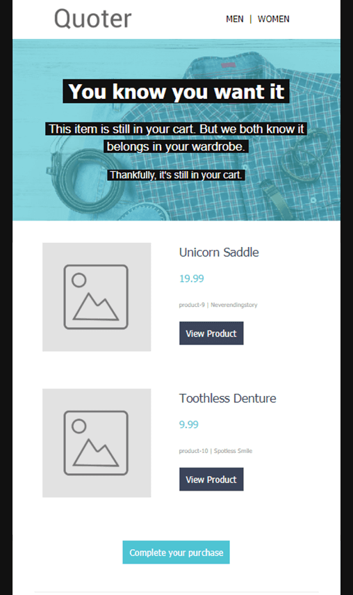
Love color? Us too! Here’s a cart abandonment template with a lovely color scheme. If you pick it, you can add your own visuals, play around with different palettes, and insert your product blocks. Besides that, this newsletter template already has a “Need some help?” section to allow your customers to reach you if they have questions.
Design tip: This template gives you all the freedom you need to incorporate extra elements. To increase urgency, consider equipping the design with a countdown timer, which is a key strategy to prompt immediate action.
Why you need it: The layout is great for large and small businesses that want to quickly set up an effective abandoned cart email for their customers.
Stylish Shopping Cart Recovery Email Template
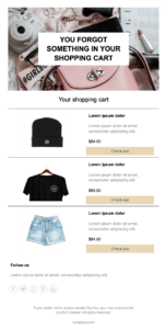
Nail your cart recovery efforts with this modern cart abandonment design. A template with clean layout but stylish is exactly what you need to highlight the abandoned products. No fluff, no distractions!
Design tip: Using a strong header works wonders, grabbing attention from the start. Combine it with a structured listing with high-quality product images to help subscribers focus on their items. You may use the “Follow us” section to increase visibility on key social media channels.
Why you need it: Far from being a plain cart abandonment template, it helps you create a digital storefront with a familiar look and feel. Plus, the well-structured layout leading from one element to another offers an intuitive reading experience-especially for mobile users.
Pop Abandoned Cart Newsletter Template
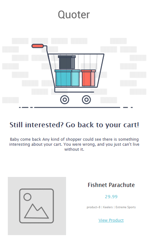
What makes this template pop is the shopping cart GIF on the top. Adding high-quality visuals is a must-have email marketing practice to entice your recipients. Here, you can insert a relevant image or an eye-catching GIF. Also, you have the option to ask customer reviews to increase the credibility of your online store.
Design tip: Use visuals and GIFs that match your newsletter design and overall branding. White space and clear calls-to-action will also keep your copy tidy and focused on the action your recipient needs to take.
Why you need it: The customer review section is, undoubtedly, the best part of this template. Also, using social media buttons will help you drive engagement on more touch points.
Ocean Blue Cart Recovery Email Template
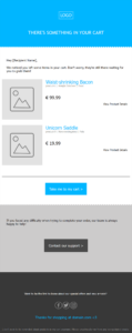
Throwing in a splash of color is key to grabbing attention. With this template, you place the abandoned products at the heart of your campaign so the reader knows what to do as soon as they open it.
Design tip: While blue is a soothing color, you can choose something more vibrant to get your customers to take action. For a more pleasing and coherent result, you can also match your header with your CTAs. The addition of an option to contact the support team is a clever way to build trust.
Why you need it: Whether you have some good email newsletter design skills or not, you can tweak colors and other elements with the super-friendly email builder. The result? An effective cart abandonment campaign that you can reuse as many times as you need.
Sunny Cart Recovery Email Newsletter Template
Our last cart abandonment template favors yellow and grey to catch the shopper’s attention. Here, the design allows you to place your main CTA above the fold. And you should since it ill give you greater chances of converting your audience.
Design tips: Yellow is a peculiar color that stands out by itself. If you want to change the color scheme, pick colors that complement it, such as grey, pale pink, or navy blue. All that’s left to turn the focus on your products is use compelling newsletter images that remind readers of the items they left.
Why you need it: This free email newsletter template is easy to customize, saving you time and letting you focus on other, more demanding tasks.
Out of Stock Alert Newsletter Template
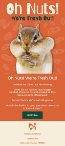
Who says an out of stock email has to be plain? This fun and straightforward newsletter template uses bright colors and clear clear copy to guide the reader towards the focus point. This is a great example of how to communicate that a product is out of stock while reassuring your audience that it will be available soon.
Design tip: This template is easy to scan with separate sections, each serving a different purpose: the visual punch, the message, and the call-to-action. If it matches your brand personality, you could use playful color schemes, light-hearted visuals, and relatable copy to keep things fun.
Why you need it: The clean and straightforward design makes detecting key points easier. Moreover, adding your logo, unsubscribe option, and contact details prominently in the footer leads to a polished design that boosts trust.
eCommerce Weekly Offer Template Example
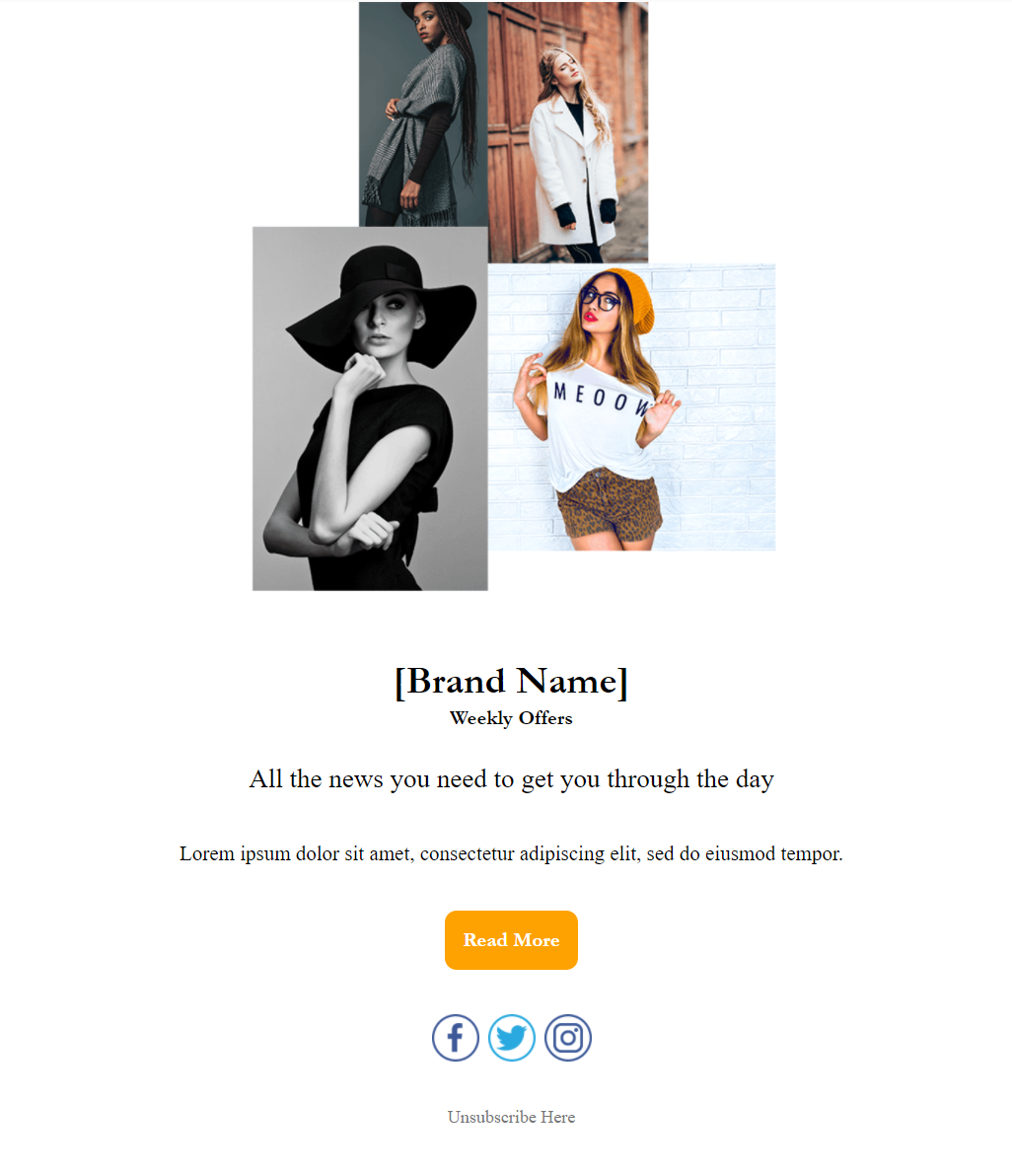
Simplicity is the ultimate sophistication. Embrace it! As people have a very short attention span, you need to create email campaigns that are easy to digest in a few seconds. The above template is perfect for that. You can use it to promote new products or give your audience updates and weekly offers.
Design tip: Use high-quality product images and matching graphic elements to intrigue your subscribers. If you are good with design marketing tools like Adobe Photoshop, create relevant PSDs, export them as PNG or JPEG files, and then upload them through the editor.
Why you need it: This newsletter template gives you all the creative freedom you need. You can use it as a starting point to design an eye-catching and mobile-friendly campaign in a few minutes.
Special Offers Email Newsletter Template
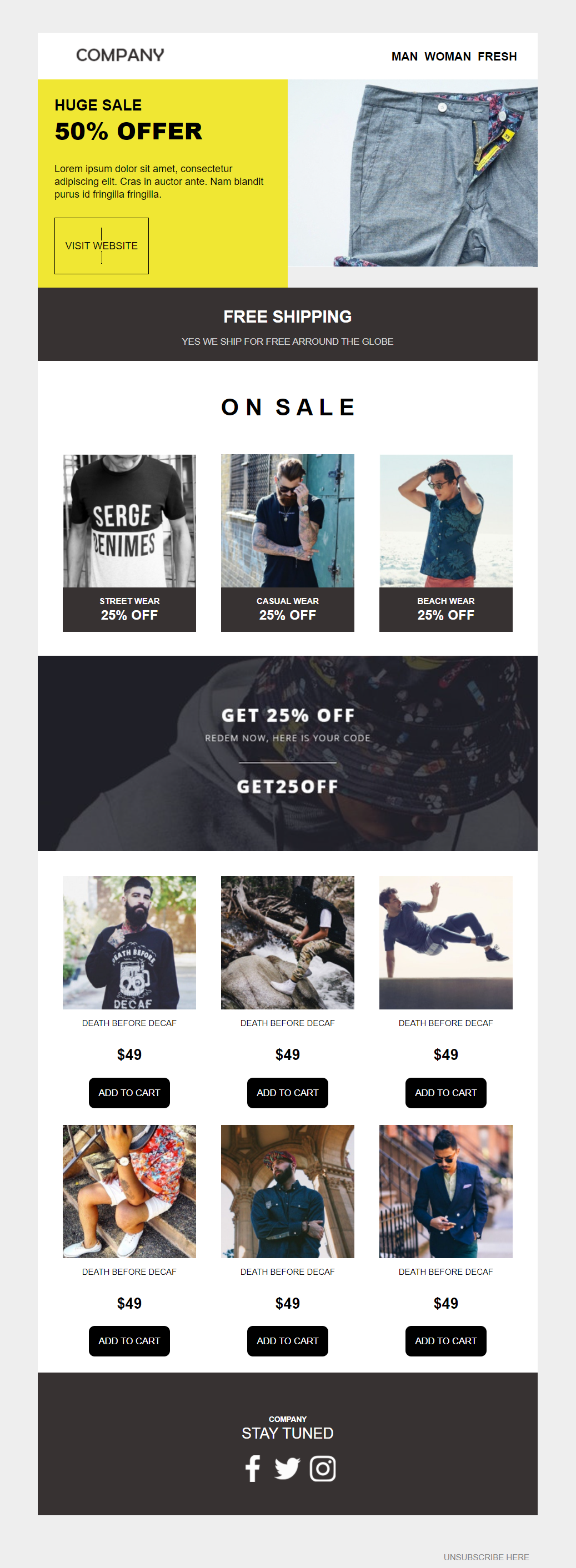
Planning a sale and need a quick email design to make it happen? This template has all the elements you need to create a sales campaign for your audience. You can customize it to your liking and add as many product blocks as you like.
Design tip: Sales are wonderful but don’t forget to make your campaign urgent to convert your deal-hunting customers! A countdown timer is perfect for making it happen. An effective way to boost conversions is to include a similar “Free shipping” section, removing a common pain point for consumers.
Why you need it: This newsletter example has a great layout that allows you to showcase special offers and products. You may choose to include a few key categories to ensure recipients don’t feel overwhelmed with too many options.
Monthly Offers Email Template Example
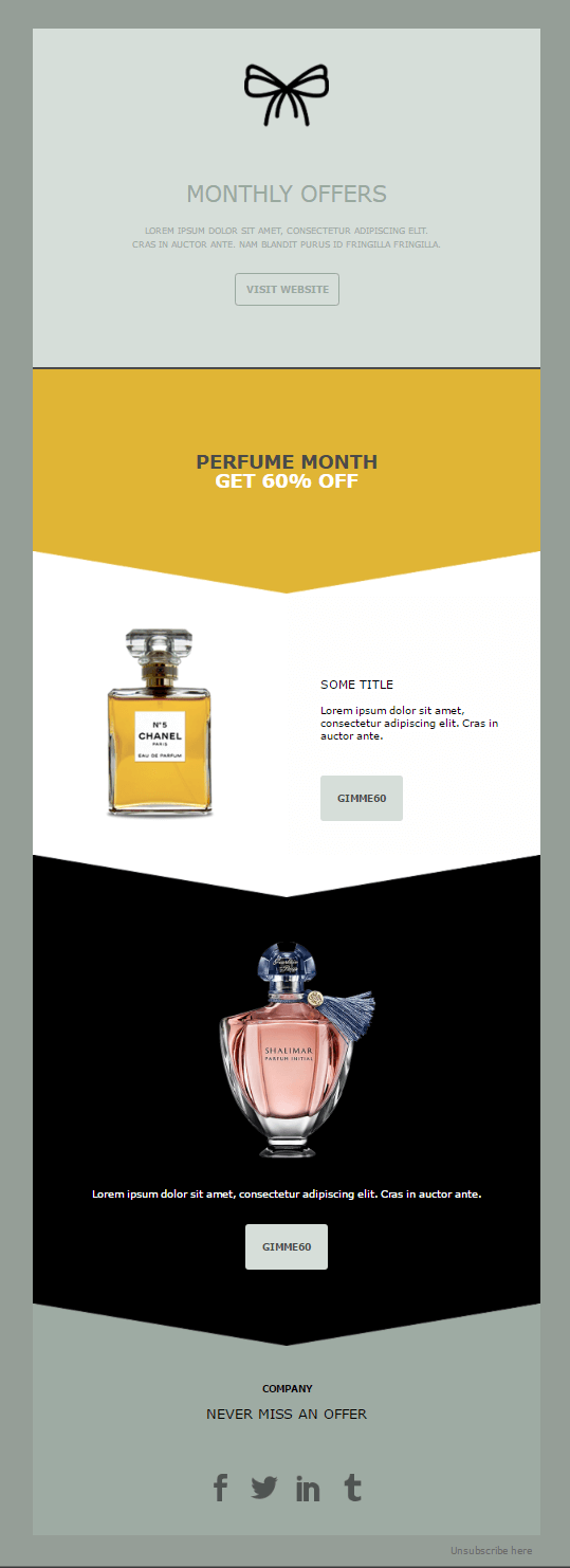
Targeting your audience with valuable messages is the best way to lead them a step further down your sales funnel. You can customize the above template for your eCommerce store to inspire your subscribers and increase your sales.
Design tip: Having too many elements in your email design could make or break your campaigns. In case you go for just a few elements, first of all nice move. The next step is to make everything perfect and clean. So, add high-quality product images and enough color contrast to make your most important elements stand out.
Why you need it: Overall, this is an exquisite template to promote multiple products without overwhelming subscribers.
Newspaper Style Email Newsletter Example
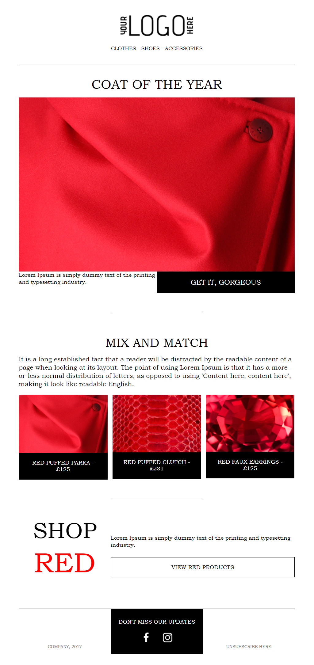
Sometimes it’s not about promoting products or announcing sales but sharing tips and tricks with your audience. When this time comes, make sure to use the above design. This template will allow you to create a unique newsletter to intrigue your subscribers.
Design tip: White space is your friend. Always! Here, you can add colorful visuals to promote your products, and the result will simply be stunning. Also, you can easily personalize your unsubscribe link using CSS (Cascading Style Sheets). Find out more about how to do it here.
Why you need it: The layout keeps things simple, which makes it perfect for informing your readers and leading them to action.
2. Product Email Templates
Product marketing emails lay at the heart of your email marketing strategy. The key is to create a clear message and showcasing the value of your promotion.
Instead of wondering what you should and shouldn’t include, start with product newsletter templates designed to convert. Whether it’s to announce new features or promoting new arrivals, here are some professional product newsletter examples to inspire you.
Modern eCommerce Product Placement Template

Modernity and minimalist design can really work wonders. So, use the above layout to send your subscribers a beautiful email campaign featuring your products in a simple and structured way.
Design tip: Use sharp images without backgrounds to amplify your campaign and give your subscribers something to remember. Also, including helpful blog content (if you have a blog) is a nice touch to further engage them.
Why you need it: This is a very modern and refreshing email newsletter template to step up your product marketing strategy.
Single Product Promotion Newsletter Design
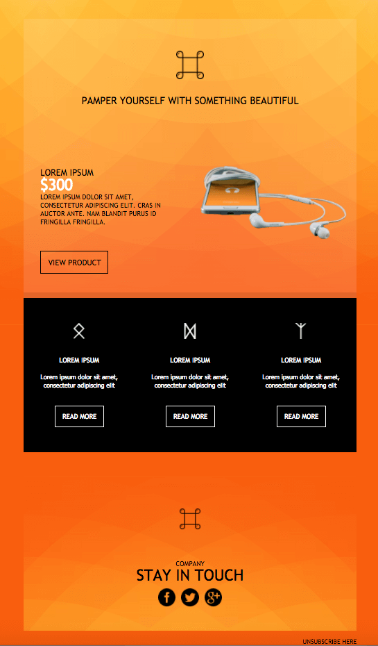
Now it’s time for the colorful newsletter examples. With the right combination of vibrant colors, you can charm your recipients and persuade them to act on your message more easily.
Design tip: Bold colors are great to catch the reader’s eye. However, make sure to use the right fonts and font colors to make your copy stand out, too. Also, consider adding advanced elements like countdown timers and social media buttons to enhance the effectiveness of the template.
Why you need it: This email example will give your new product the attention it needs to convert potential shoppers at first glance.
Image Gallery Email Newsletter Template
Another clever idea is to combine enticing product images or even videos with concise product descriptions to break up content. Here’s where such an image gallery template could serve you, allowing for a successful combination of the two. Plus, a “Stay in touch” section fosters engagement, giving readers contact options.
Design tip: Invest in clear hierarchy by using different colors or fonts to separate content blocks. Placing your logo prominently at the top ensures brand recognition. Solid email newsletter software lets you add your own logo to every campaign and customize the rest of the design to be aligned with your branding guidelines.
Why you need it: This product image gallery template uses a design that favors the Z-pattern, helping the reader digest the message. Simply put, it’s a great choice if you want to engage your audience during regular or seasonal promotions.
Product Promotion Template
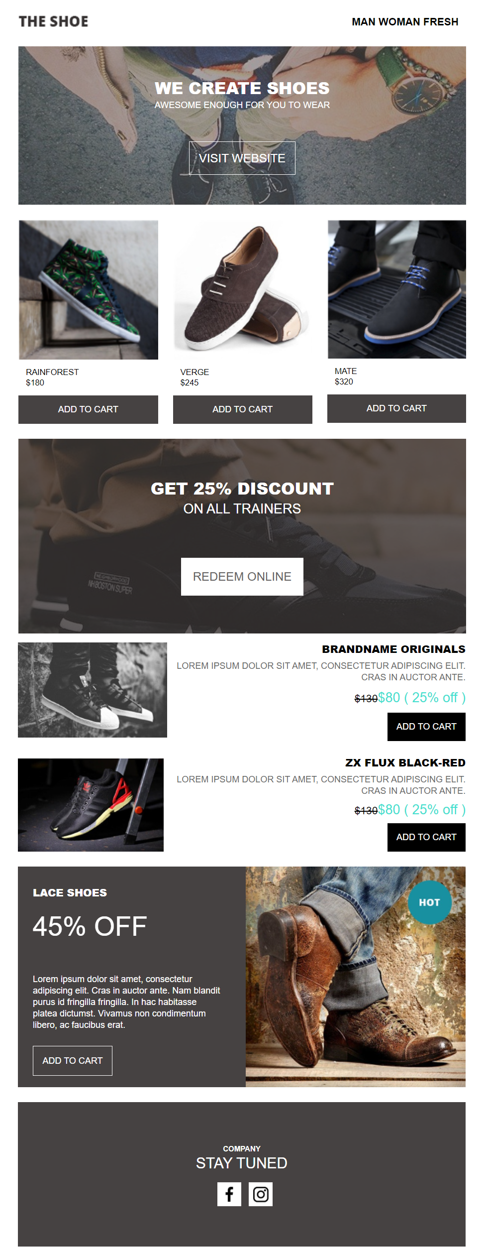
Looking for a great template to promote your products? Here’s the design you need. While this example is created with footwear in mind, you can easily customize it with the email builder to display your products in the most appealing way.
Design tip: You can use the drag-and-drop tools to move the different elements around, change the color scheme, and add branded components. If your CTAs are on top of your visuals, pick bright colors to make them stand out more.
Why you need it: This product-oriented template will help you create converting email marketing campaigns for your online business. Just add your products, powerful copy, and action-oriented CTAs, and wait for conversions.
Natural Palette Product Newsletter Template

This product promotion newsletter template soothes the reader’s eye with its soft pink tones. It’s designed to promote cosmetics, which makes it perfect for creating effective beauty brand emails. However, you can get inspired by its fresh design and use it to showcase your top-rated or brand new products-regardless of the industry.
Design tip: Use plenty of white space and beautiful product images to make the featured items the protagonist of your email. Add short, matching descriptions to help subscribers quickly grasp the benefits of the products. To maximize the chances of conversion, craft CTAs that contrast with the background.
Why you need it: With this product newsletter template, you can create email promotions that are both aesthetically-pleasing and effective. If you have discounts that go along, the dedicated section at the bottom will encourage readers to benefit from them.
Black & Yellow Product Promotion Template
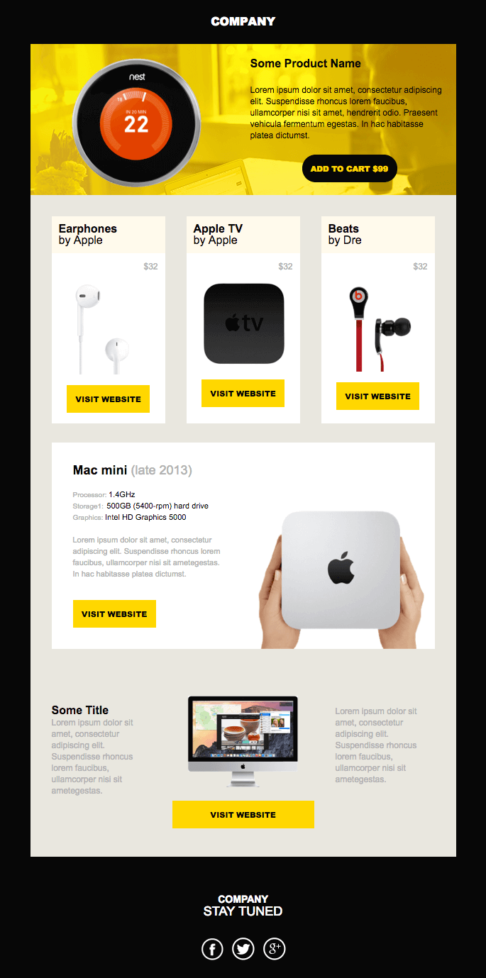
Now let’s take a look at this beautiful black and yellow product promo newsletter.You can use it to charm your recipients with beautiful images and provide relevant product information.
Design tip: This newsletter template has all you need to showcase your products. To make it more attractive, you can add a customer review section or star ratings. Plus, you have the option to feature an FAQ section to give your audience a seamless experience.
Why you need it: The beautiful colors, effective layout, and symmetry of this design will help you create a top-notch email marketing campaign.
3. SaaS Email Newsletter Examples
SaaS email marketing needs thorough planning and professionally designed campaigns. But does this mean that you have to create everything from scratch? Well, no!
Ready-made, carefully crafted SaaS newsletter template will save you valuable time. In this section, we’ll see various designs that you can customize and use on the spot.
Company Introduction Email Template
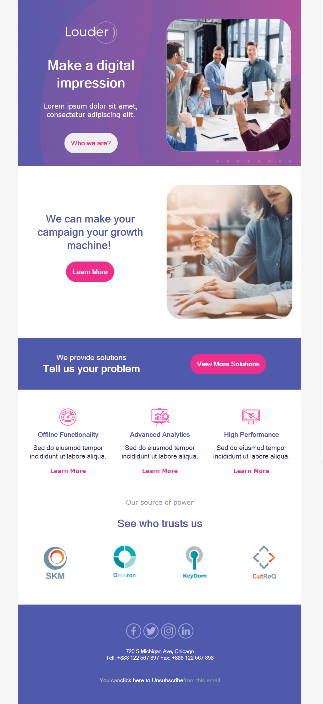
Every company needs a cool email to introduce itself to new clients. And this is exactly what you can do with the above template. From the color scheme and CTAs to the company badges at the end, you have everything you need to create an eye-catching SaaS email campaign.
Design tip: Use the layout to add all the necessary information your customers want to see. Don’t forget to insert high-quality images (or unique stock photos) to make your messages more appealing and relatable. Since it’s important to get off on the right foot, including badges from companies who already partner with your brand serves as a token of trust.
Why you need it: This template has everything you need to introduce your company and actively demonstrate that you are a credible business.
Upcoming Feature Newsletter Template
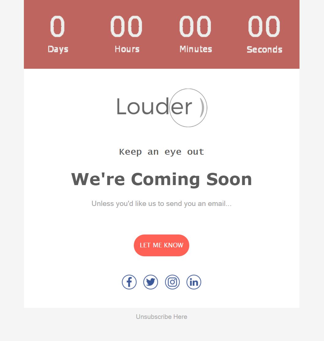
Got new features or an exciting update in the works? Then let your subscribers know with the above email newsletter template. You can create a teaser message to excite them and have them counting days.
Design tip: This is a simple template you can customize at the flick of a switch. Throw in some amazing visuals, add compelling email copy, and make your CTA stand out using bright colors. Also, use different email fonts to prioritize information.
Why you need it: A short and versatile template that you can use for numerous occasions. If you want to intrigue the audience further, the timer at the top is the perfect tool to let the countdown begin.
Feature Announcement Email Template
If you need something more austere, you can always grab the above template and customize it with Moosend’s drag-and-drop builder. The color scheme is ideal for an older audience that prefers more traditional elements.
Design tip: You can make small and big changes to the layout based on what you want to promote. Adding some graphic design elements will also work in your favor but don’t overdo it. On occasions like this one, all you need is to put the feature announcement front and center. And pair it with a clean-cut layout.
Why you need it: The single visual placed prominently at the center in this template lets you draw attention to your copy and call-to-action.
Abstract Newsletter Example
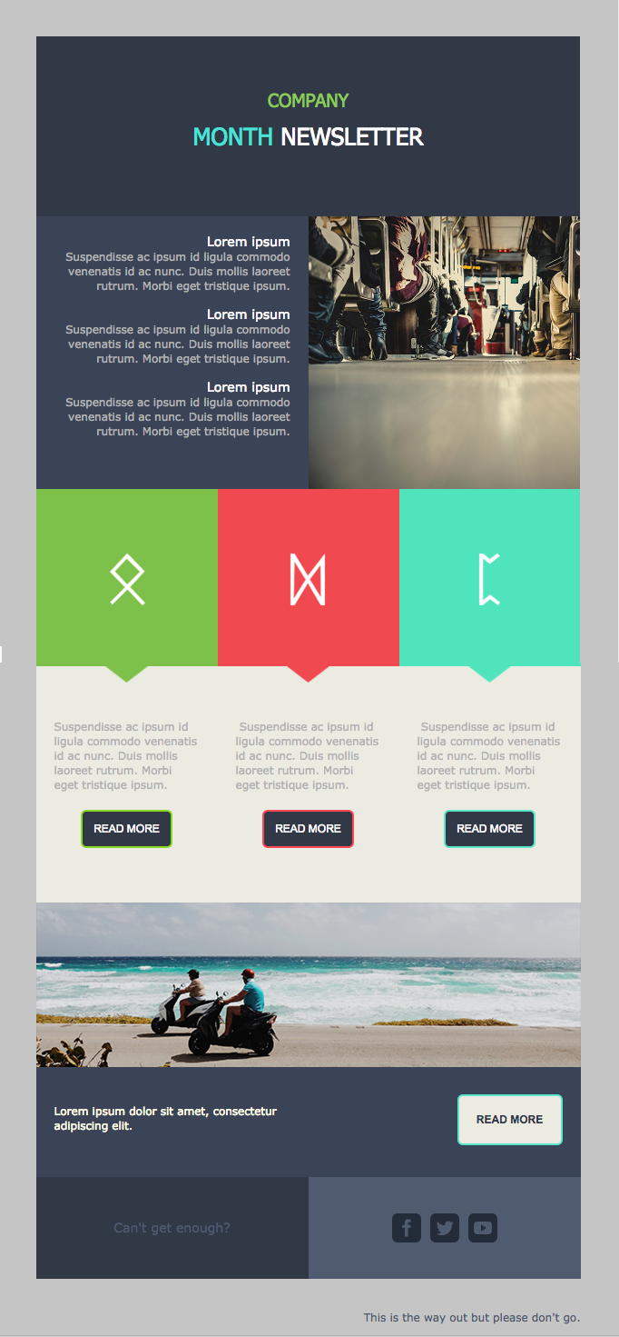
If you want something professional yet less traditional, the above template is what you need. The use of colored blocks adds a modern vibe to the entire template, making it ideal for younger audiences. You can use this example to share updates and lead your audience to dedicated landing pages.
Design tip: Keep the colored blocks if it fits your objective. You can add images, too, to make this newsletter even more stunning. Also, try to keep your copy short to avoid tiring your recipients.
Why you need it: The use of color in CTAs and visuals is a nice touch to create a memorable email campaign.
Lights-Out Company Newsletter
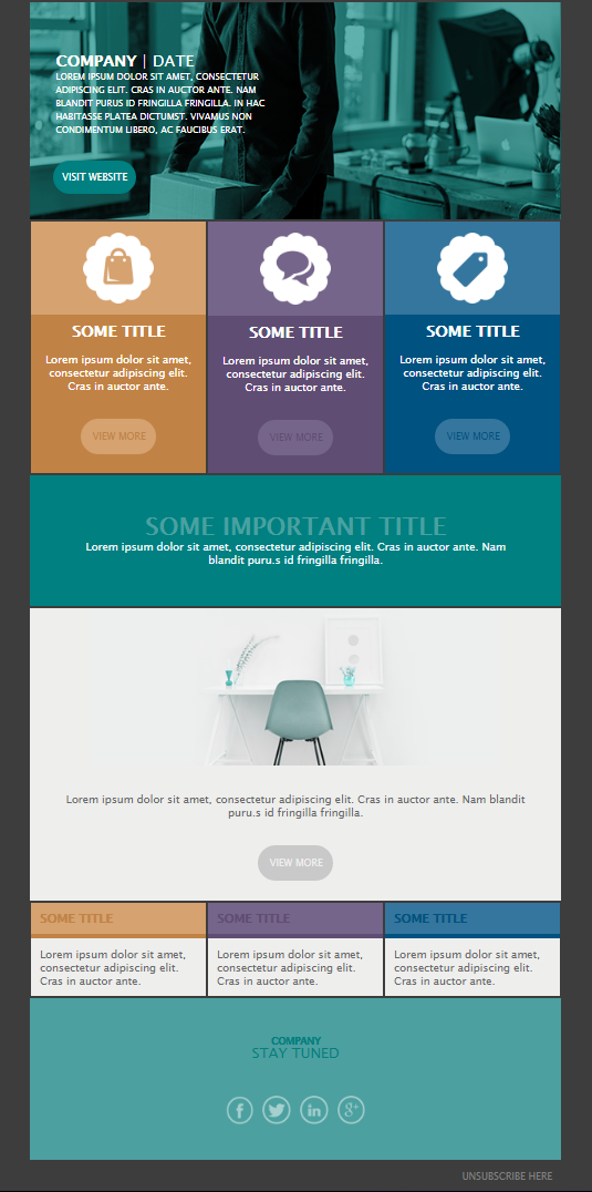
Are you a fan of colors but want something less vibrant? Well, let me introduce you to the lights-out template. You can select and customize it for different goals, ranging from sharing updates to showcasing new features.
Design tip: Consider playing around with different color combinations if it fits your overall branding. Using darker versions of your brand colors will also be interesting for your audience.
Why you need it: This properly structured design is great for informing your audience without frustrating them.
Website Launch Newsletter Template
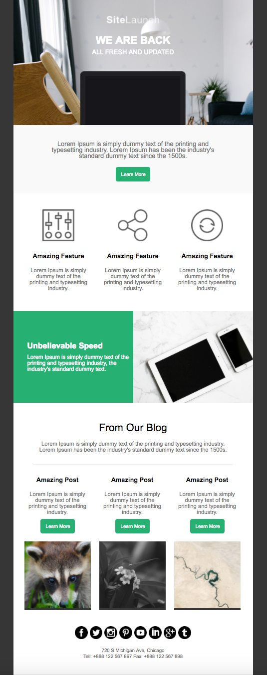
A website launch or relaunch is a big deal for a business. The above example is what you need to present your new website design in a beautiful and informative way.
Design tip: The layout of this newsletter template is perfect for showing your subscribers what’s new. You might use it to showcase top features and direct readers to latest or best posts. Complement the copy with beautiful images to excite them and insert relevant CTAs to increase engagement. For the same reason, don’t forget to add icons so they can follow you on important social media channels.
Why you need it: While this template focuses on a website launch, you can easily customize it to fit other purposes such as a new feature release or any critical announcement.
Heart of Glass Promotional Campaign Design
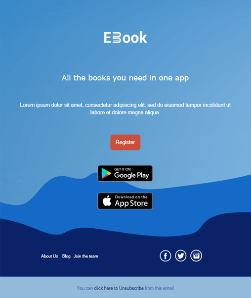
The Heart of Glass template favors a straightforward layout to help you create focused messages. You can use this design if you want to lead your subscribers to a single action.
Design tips: Take advantage of the blue color scheme to amplify your CTA buttons. Also, don’t forget that brighter font colors work better on darker backgrounds. Using simple and concise language will help to keep the focus on the unique action you need subscribers to take.
Why you need it: This template keeps things beautiful and straightforward, giving your CTAs the attention they deserve.
New Service Promotion Template
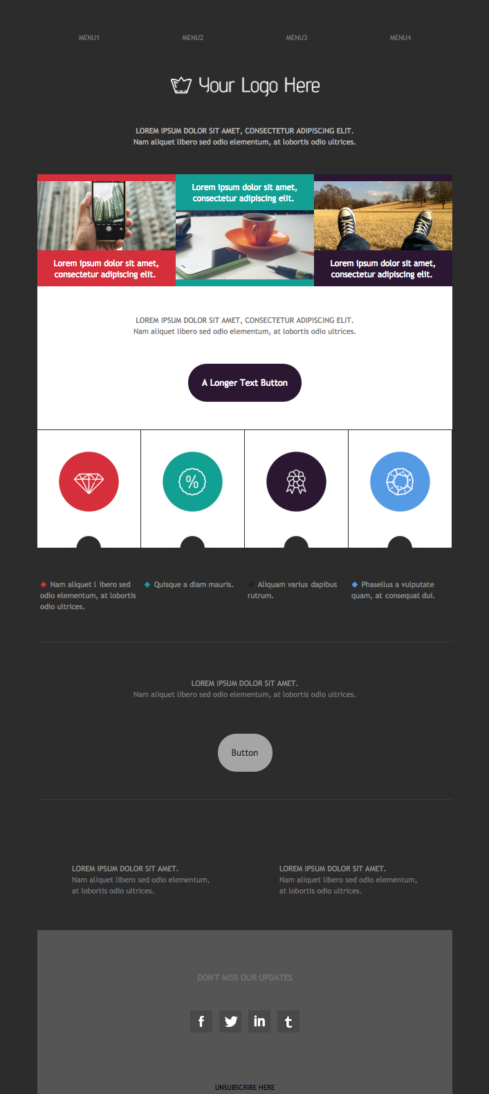
The above design will allow you to promote your new service or features in a jiffy. Structure-wise, the template sports a simple layout with enough white space and clear sections to make your message easy to read.
Design tip: Try not to clutter your campaign with too much copy and visuals. You’ll want to use only the necessary elements to give your audience exactly what they need to know about your new service, feature, etc.
Why you need it: You can customize this template as much as you like by dragging and dropping elements like images, videos, timers, or social media buttons from the “Items” tab in the editor.
New Feature/Product Promo Email Template
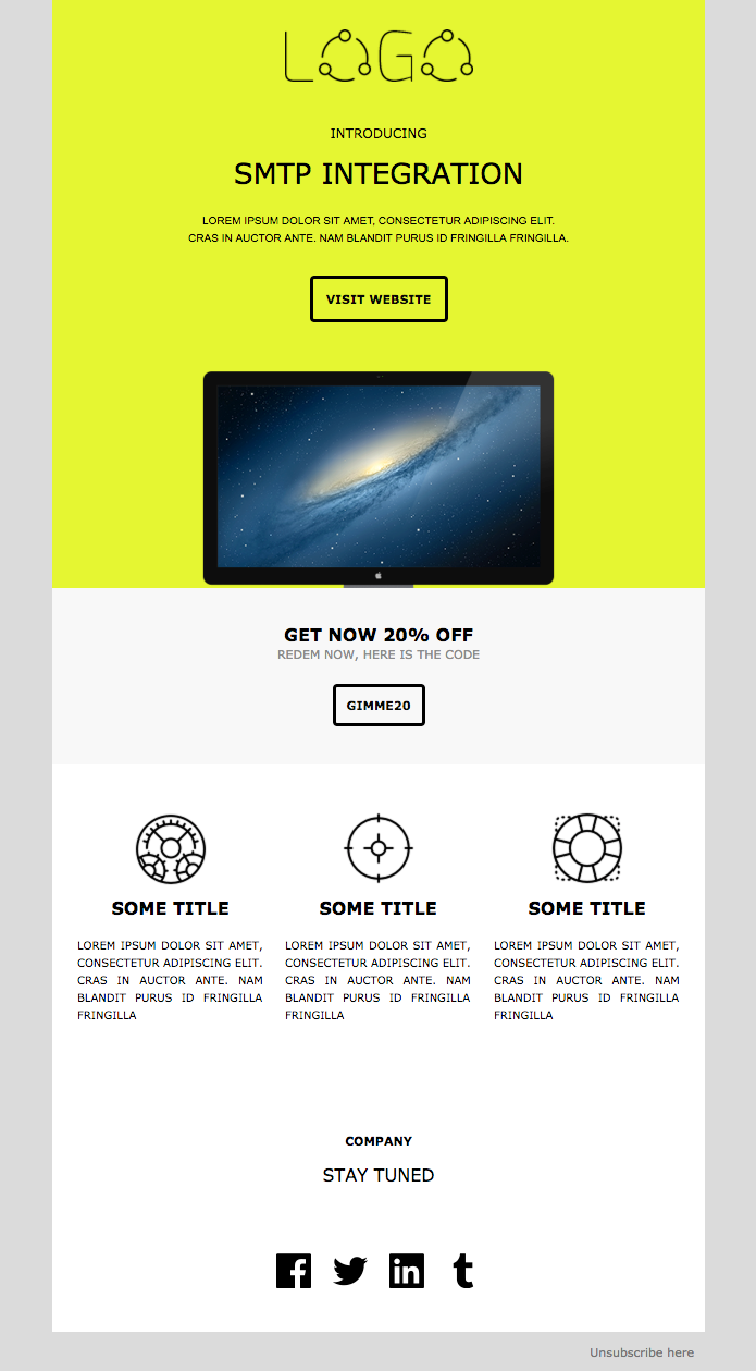
Now, this template has a simple design logic to give your audience all the information they need the minute they open your campaign. You can add your email copy at the top to instantly get your message across while the CTA is perfect for getting subscribers to take immediate action.
Design tip: Use your brand colors so your contacts immediately recognize your emails. And don’t forget to enrich the design with some high-quality graphic design elements to grab their attention. If you want to promote a new feature, a good idea is to include a demo video to show users how to start working with it.
Why you need it: This template works well if you want to put new features or products at the center of your campaign.
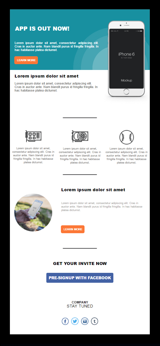
Mobile Application Launch Email Newsletter

A new product launch is a big deal for any business, allowing you to reach a large part of your audience. To make it memorable, you can use our dedicated mobile app launch template to inform your audience while creating a lasting impression.
Design tips: If you like the complementary color scheme, you can easily adapt it to your brand for a seamless and consistent result. Remember to include your new app features in a structured way to inform your audience and achieve mobile app growth.
Why you need it: Using complementary colors, a logical hierarch, and prominent CTAs is a great way to power up your app launch campaign.
Mobile App Promo Newsletter Template
This simple mobile app newsletter will help you create an effective promotional campaign for your email subscribers. The design is simpler compared to the previous template, investing in white space. Nevertheless, what it loses in fanciness, it earns in sophisticated look.
Design tip: The spacing in this template will let you make your mobile app features pop. Also, you might want to use bright colors in your CTAs so they contrast with the background to increase clicks.
Why you need it: The header and the above-the-fold CTA are ideal to engage recipients immediately and power up your click-throughs.
Mobile App Features Template Example
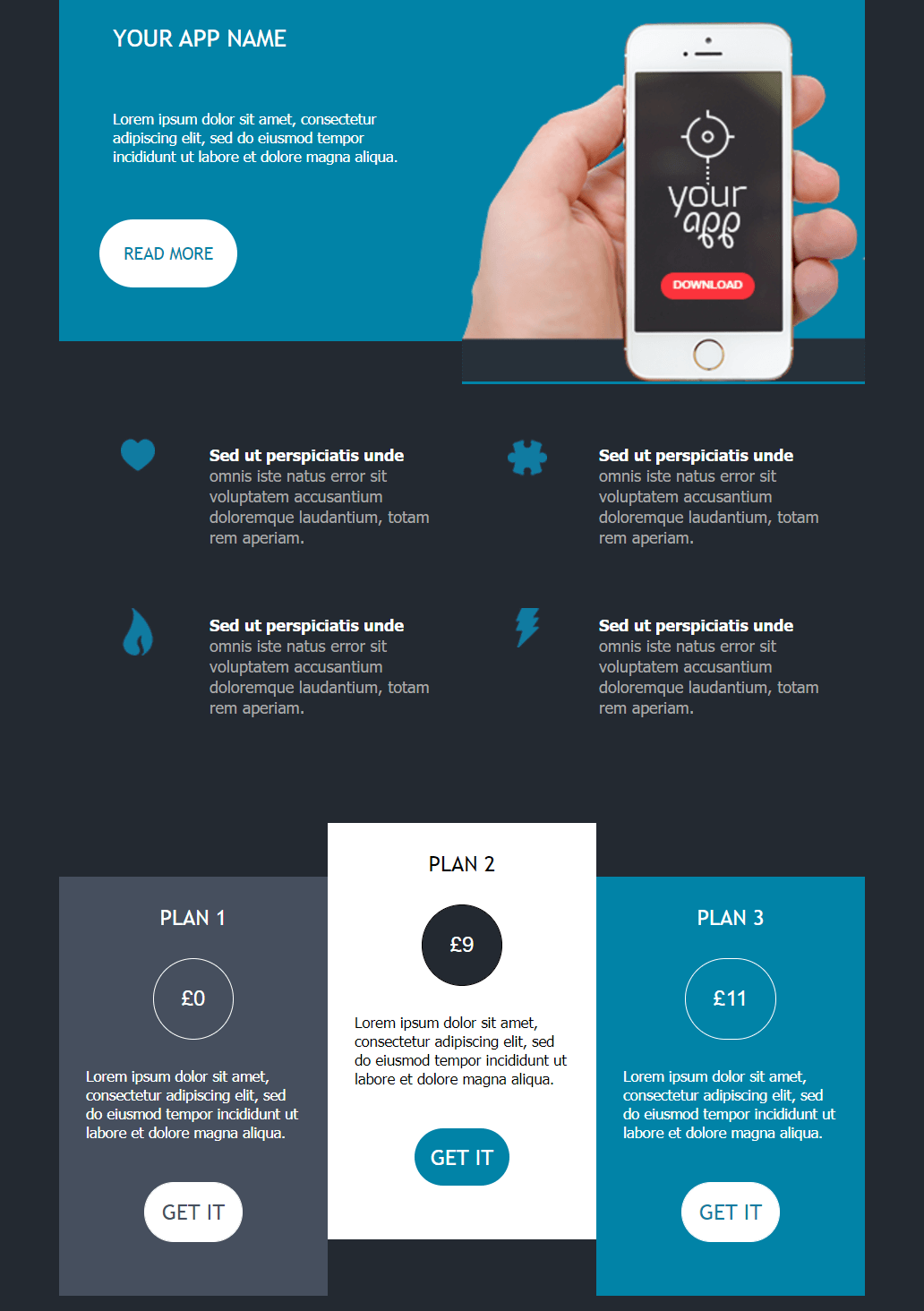
If you are a fan of dark themes with a splash of color, you can choose this template to give your audience a unique presentation of your new mobile app features.
Design tip: Use bright fonts to increase the readability of your copy. Also, vibrant colors and images are a great way to catch the reader’s eye and break up blocks of text.
Why you need it: The layout and color scheme helps brands promote their app in a memorable way.
Ring of Fire Mobile Newsletter Design
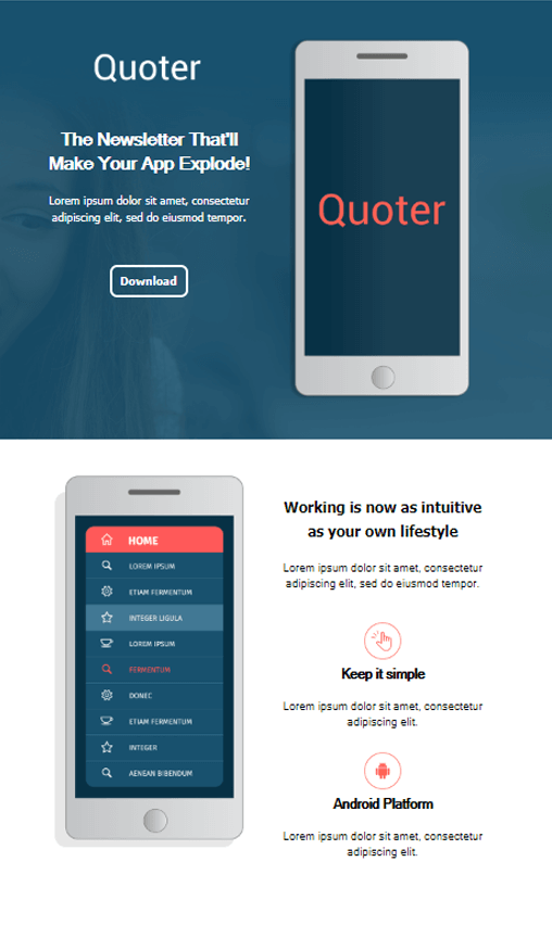
Last but not least, we got the Ring of Fire mobile newsletter template. The design is a mix and match of blue and white, giving you the impression that you’re browsing a webpage.
Design tip: This template is built with simplicity in mind to help you present your new features. You could incorporate high-quality images of your app and other graphic design elements to give your audience enough reasons to download it.
Why you need it: Ring of Fire is an impressive template that combines a clean layout, graphic elements, and strategic CTAs to boost conversions.
4. Seasonal Email Newsletter Templates
While holidays and special occasions are a busy time for most people, they’re also an amazing opportunity for engagement. For email marketers, targeting audiences with relevant seasonal campaigns serves various objectives, from building brand awareness to driving sales.
Below, you’ll find a fine selection of Christmas, Valentine’s Day, Halloween, and Black Friday templates to power up your holiday email marketing. And let’s not forget about summer and spring, so we got them covered, too.
Promotional Christmas Card Newsletter Template
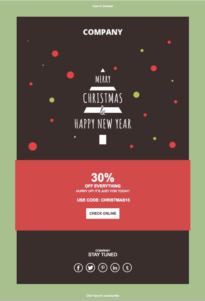
Our first Christmas email template will remind your subscribers of a digital Christmas card. Since the design is pretty minimalist, you can use it as a blueprint to create unique campaigns for your Christmas email marketing strategy. The single and prominently placed CTA is also great to drive conversions.
Design tips: Use your brand colors so your Christmas campaigns represent your identity and give your audience a consistent experience. To take it one step further, upload a cheerful Xmas image and give your audience a holiday offer or discount to incentivize them to act. When it comes to visuals, you can leverage Moosend’s Image Picker to draw images and GIFs from Facebook, Unsplash, or GIPHY.
Why you need it: This Christmas newsletter template gives room to unleash your creativity, adding and customizing components to your branding and goal. Everything’s possible!
Christmas Gifts Newsletter Example

Are you looking for a minimalist layout with less flair and more elegance? The above Christmas email template is exactly what you need to keep things simple yet classy. It offers you the opportunity to display great Christmas gifts, share holiday preparation tips, or announce limited-time sales.
Design tip: You may benefit from the template’s white space and structured layout to make key messages stand out. Do you have a compelling holiday discount coming up? Then, consider introducing it on the top of the email so it’s the first element that catches attention. You could steal the idea from this template and create a custom image highlighting the discount.
Why you need it: Such a clear and straightforward template offers you a range of opportunities to engage your audience. To make them relevant to your audience’s needs and likes, Moosend’s personalization tools will turn the process into a child’s game.
Christmas Sales Promotion Design Example
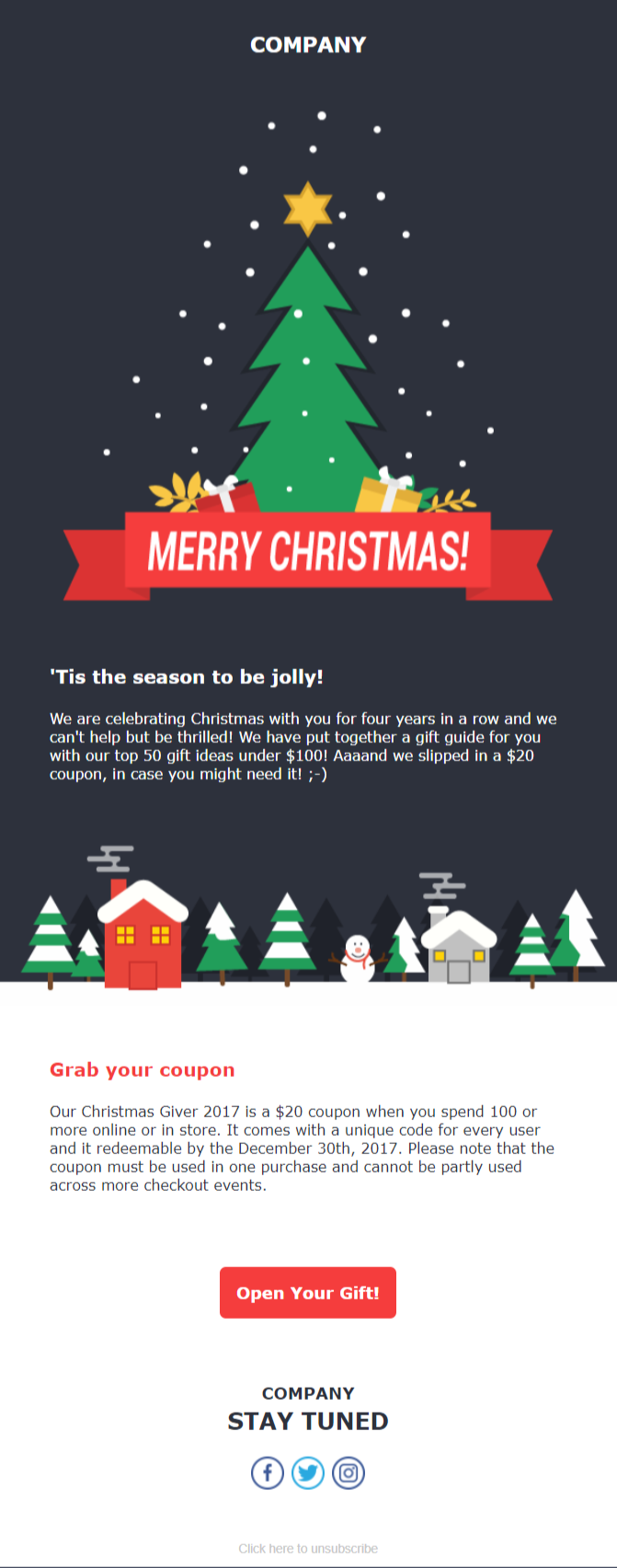
Another beautiful Christmas email newsletter example to excite your customers during the holiday season. This design has a few more visuals to promote the holiday spirit and let you wow your subscribers with a jingle-all-the-way email campaign.
Design tip: Again, you can insert beautiful, holiday-themed images to create an impressive Christmas email. Using the above CTA color is also perfect since red is associated with Xmas. What’s more, you can use a countdown timer to add urgency to your message in case of time-sensitive offers.
Why you need it: This template will give you an eye-catching Christmas campaign to target your audience. Also, you can easily customize it and use it as a New Year campaign. You could even use it for post-holiday email marketing, for example if you want to extend your sales period.
New Year Cheer Email Design Example

Not every holiday email has to be about sales and promotions. Sometimes, a thoughtful holiday campaign that just says “thank you” is an excellent method to put a smile on your recipient’s face and stay top of mind. And what better occasion to do this than New Year’s?
Design tip: Here’s where you can get creative, as long as you keep your message clear and concise. What you want is to thank recipients and make them feel appreciated. It could be through a festive image, short and full of gratitude copy, or perhaps an exclusive discount as a reward. No need for cluttered layouts and fancy graphics here. Just an on-brand, jolly campaign with the right elements to satisfy your audience.
Why you need it: You can use this campaign to thank your customers for their year-round support. Another idea is to share a round-up of your accomplishments or remind recipients of what they achieved using your products or services.
Valentine’s Daydreaming Email Template
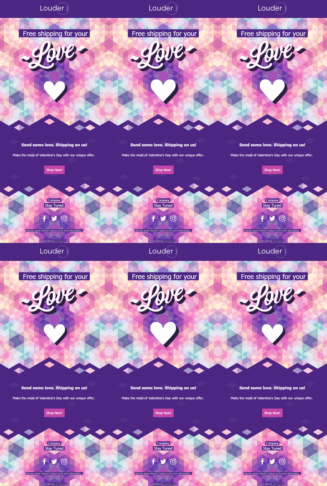
Of course, you shouldn’t forget about Valentine’s Day. The above template will be a beautiful addition to your seasonal email marketing campaigns. From the vivid color palette to the animated elements, you can use the above template to entice your target audience and boost sales.
Design tips: This email newsletter template has everything you need to charm your little lovebirds. I recommend keeping the animated heart to make your campaign more lively and holiday-related. Apart from that, don’t hesitate to insert a good old countdown timer to express urgency. Also, a heart emoji in the email subject line is a nice touch to get more opens.
Why you need it: The Daydreaming template is equally stylish and unique to help you bewitch your readers with your offers.
Eternal Flame Email Newsletter Design Example

If you want something more traditional and Valentine-y, Eternal Flame is just what you need. This example is both elegant and effective, giving you the chance to create an eye-pleasing V-day email campaign without spending too much time on it.
Design tip: Add your brand logo to the header and choose a heart or any other Valentine-specific visual element to get your subscriber in the mood for love the moment they open your email. Don’t forget to create attractive and bold CTAs to match your visuals. Red should be high on your list since it’s both vibrant and represents action.
Why you need it: The existing white space is perfect for making your brightly colored CTAs pop out. Plus, it gives you enough room to improvise and highlight your core message.
Be My Valentine Newsletter Template
Entering the “love is all around” template world, this occasion allows you to get a bit more extravagant. You can make it all about love, hearts, and roses and create a spot-on Valentine’s Day email design to offer suggestions for your audience, such as what gifts to make or where to go.
Design tip: While this is a heart-packed design, you don’t have to promote anything Valentine-specific to use it. Remove or tweak any elements that don’t fit your branding or goal. However, we strongly suggest you keep the red color scheme, and perhaps use a romantic font to match the occasion.
Why you need it: Taking the romantic road usually works on Valentine’s Day, even if your products aren’t relevant to the holiday. Excite your users with this heart-warming layout, and why not add a few creative poems to make them go “awww”.
Halloween Jack-O-Lantern HTML Email Template

Trick or Treat? Halloween is the best time to give your audience a spooky experience and promote your seasonal products. Or leverage the holiday spirit while staying on brand. The above template is perfect for giving readers a holiday discount or a coupon to celebrate.
Design tip: This design relies heavily on the pumpkin image, sporting a single CTA button right in the middle. Also, it uses black and orange, a color combination that is popular in Halloween email marketing. So, you can keep the layout as it is and use your copy to intrigue your audience.
Why you need it: Using the Jack-o-Lantern template allows you to minimize distractions and lead your audience directly to your call-to-action button.
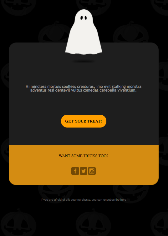
Ghost Themed Email Newsletter Template
Another way to charm your audience is with this spooktacular newsletter template. While simple, you can add any element you like to fit your branding and target your audience better.
Design tips: Add boo-tiful images to share the Halloween spirit with your recipients. Think of ghosts, pumpkins, spiders, and so on. Also, since the template is mainly black, use brightly-colored CTAs to drive more conversions.
Why you need it: Easy-to-customize and straightforward, this template is ideal for every Halloween campaign across industries. Also, don’t forget to come up with a scary subject line to increase your open rate and get readers into the spirit right away.
Wicked Witch Themed Template Example
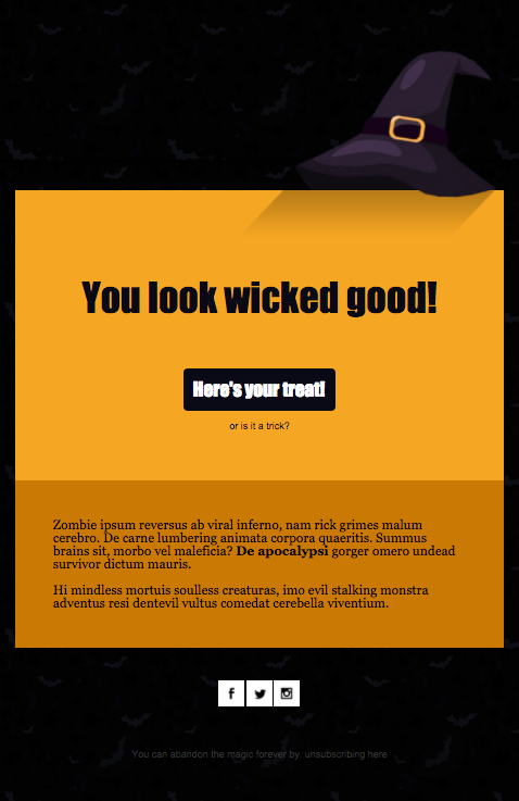
Of course, we couldn’t forget about witches. If you want to provide your audience with extra info, you can pick and customize the above newsletter template for better engagement.
Design tip: Since Halloween is associated with orange, yellow, and black hues, you can keep the color scheme and insert your own wicked visuals and inspiring copy. Again, the template gives you space to add extra elements like GIFs, countdown timers, or product blocks. Also, make sure to link back to your social media profiles to cross-promote between channels.
Why you need it: You can use this template to create a beautiful campaign to stun your audience, from promotions and special offers to Halloween makeup tutorials. No matter the goal, the center-aligned CTA that contrasts with the background prompts users to take action.
Haunted Mansion Newsletter Example

Do you wish to take this all the way? Then, don’t limit yourself to black and orange color schemes and images of Jack-O-Lantern. This template is ideal to give readers a nice scare, from top to bottom.
Design tip: With this unique design, it’s almost certain that recipients will stop and wonder what this is about. Now that you have their attention, all that’s left is to add high-quality product images and prominent CTAs with action-oriented copy to prompt action. Fonts could work as a scary-good tool, too, matching the look and feel while keeping the focus on certain sections in the email.
Why you need it: This email exudes a haunting feeling, which makes it truly authentic. As a result, using this Halloween template as foundation will contribute to your brand staying top of mind even when your Halloween promotion is over.
Black Friday Email Newsletter Template
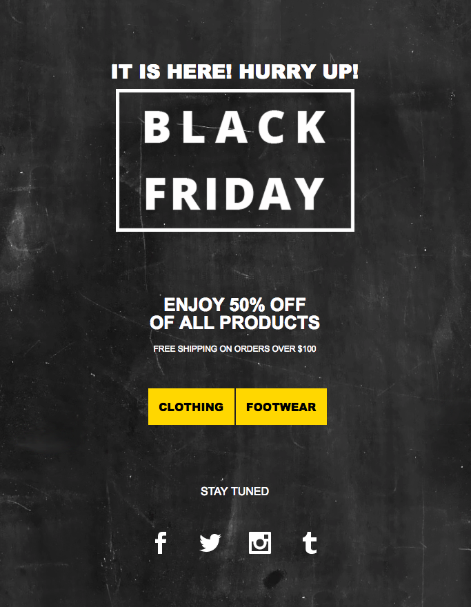
To benefit from customers’ tendency to shop more, you need a brilliant Black Friday email to show them your limited-time offers. With the above template, you can create a simple yet effective email campaign for your retail business or eCommerce store to amp those conversions like a pro.
Design tips: Take advantage of the color scheme to power up the visibility of your CTAs. Black Friday deals are time-sensitive by definition. So, this is the perfect time of the year to instill urgency through countdown timers and actionable copy.
Why you need it: A simple design you can instantly customize to suit your needs. With the perfect Black Friday subject line and the right urgency elements, you’ll increase critical email marketing metrics like opens and clicks.
Black Friday Sale Design Example

You’ll see most Black Friday campaigns using dark colors, particularly black or purple. But there’s always room for a brighter approach, like in this Black Friday email newsletter template. It’s colorful and fun yet simple and professional.
Design tip: With this powerful design, you can draw attention to your holiday promotion just by incorporating compelling product images. Make sure to include the initial and discounted price. Another thing to keep is having a main CTA above the fold and secondary ones under each product or product category.
Why you need it: A clean and straightforward layout is perfect for mobile-users. Or practically any user that scrolls through. And that’s rather common during promotion-saturated periods like Black Friday. In addition to that, the colorful blocks help you separate important sections and elements like your CTAs.
Spring Sales Newsletter Example
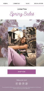
Spring is associated with fresh starts and joy. As people get inspired by the blossoming nature, it’s time for brands to bring these characteristics into their spring emails. This colorful email template screams spring, using pastel colors and flower decorations.
Design tip: This template is as fresh as it gets. Still, it remains clean-cut and beautiful. If it matches your brand tone and the occasion, write light-hearted copy to complement the high-quality product images. And since spring sales don’t last forever, consider incorporating a countdown timer at the top to create a sense of urgency. To that end, use phrases like “Time is running out” or “Hurry up”.
Why you need it: With this warm spring newsletter template, you can create an effective email, whether it’s to promote new arrivals or destock inventory using time-sensitive discounts.
Let The Sunshine In Summer Template

We could never leave out summer. No better way to increase seasonal sales during this time of the year than an impressive campaign like the above summer email. With its retro and relaxed feeling, it fits perfectly to the careless spirit of the season.
Design tip: By using summer-themed visuals, you set a perfect summer tone. Make sure to create equally powerful copy and CTAs to convince readers. The sales banner is an excellent way to draw attention to a limited-time discount or any other piece of content that represents your campaign goal.
Why you need it: Its visually engaging and clear design helps marketers display summer deals or even promote post-summer sales. However, you can always use it to direct readers to relevant posts and other resources at your disposal.
5. Publisher Email Newsletters
Are you a blogger or publisher who wants to deliver your content to your readers’ inbox the moment you hit the publish button? Our email service has got you covered with ready-made email newsletter templates for several objectives.
Below, you’ll find some eye-catching blog, eBook release, and RSS templates to enhance your content marketing strategy.
Typical Blog Newsletter Template

As the name suggests, this is your typical newsletter template for promoting your personal or company blog. You can easily add your own content, pick your favorite colors, and optimize the CTAs to improve your click-through rate.
Design tip: Take advantage of white space to make each section stand out. Also, since white is pretty dominant here, don’t hesitate to add bright colored calls-to-action to make them pop. You can leverage every email section, especially the header, to showcase your best blog content.
Why you need it: A beautiful template to increase engagement through your blogger email marketing and cross-promote between channels using social media icons.
Food Blog Newsletter Template

The above email newsletter template is great for food bloggers who want to give their audience a memorable experience. The color scheme and background remind recipients of a tablecloth, which could help to make their appetite grow.
Design tip: You can make this template more awesome by adding some high-quality and mouthwatering pictures from your blog post. Also, play around with various elements and add new content blocks to offer food lovers the best cooking tips or promote helpful gadgets.
Why you need it: While this template is made with food blogging in mind, you can customize it as you like to suit your niche.
Personal Blog Newsletter Template Example

If you have a personal blog, then I’d recommend using a more friendly design that reflects the tone of your site. To do that, you can use the Personal Blog template to create a stunning and scannable email for your readers.
Design tip: To match your style, use the drag-n-drop editor to change the color scheme. Moreover, you could upload images from your Drive or social media to show recipients what’s new. The “Stay in touch” section at the footer pointing at the social media buttons is a clever addition to lead readers to other channels.
Why you need it: You can take advantage of the versatility of this template to mold it into whatever you want and promote different content categories in a straightforward way.
Blue Corporate Newsletter Template
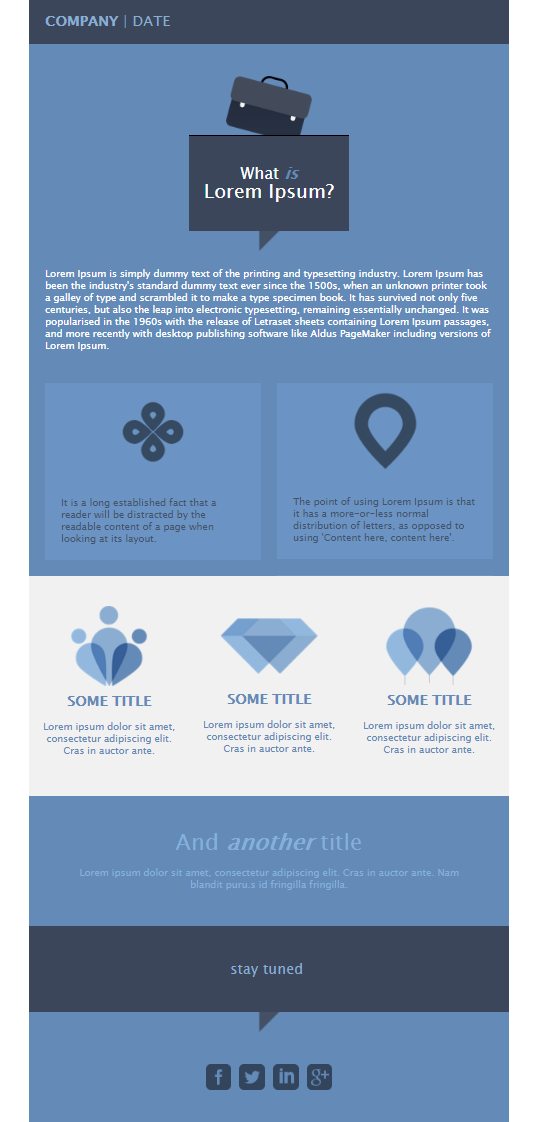
Keeping the more austere and traditional vibe, here’s another professionally-looking design you can use to target your audience. As you can see, this template also favors copy, using simple email design elements to stay elegant and informative.
Design tips: Not a fan of blue? You can change the color scheme to whatever you like. Using your brand palette is a great way to connect the email with your company and provide a consistent experience. Don’t forget to add your company logo at the header to achieve it.
Why you need it: Utilize this template to strike the right balance between copy, visual elements, and structure. Your subscribers will appreciate the beauty of simplicity in this effective email template.
Informational Email Newsletter Example
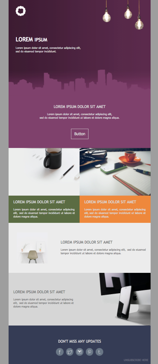
Keeping your audience educated is crucial to increasing engagement rates, building brand awareness, and fostering solid relationships. So, use the above newsletter template to share valuable details in a structured way.
Design tip: To complement your email copy, make sure to add some beautiful images, your company logo, and social media buttons. Also, use the header along with a strong CTA to display your core message.
Why you need it: This is an easy-to-customize template that allows you to place the most important information above the fold while sharing additional resources in the following content blocks.
RSS Blush Free Email Newsletter Template
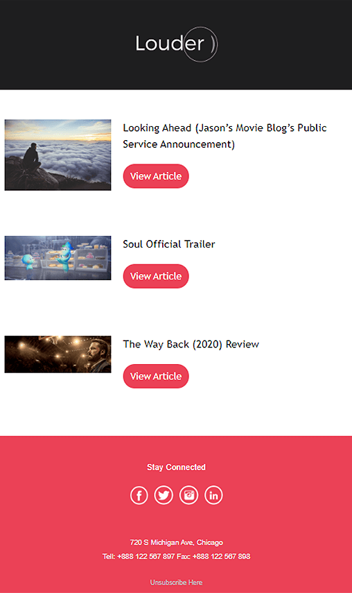
RSS emails are an integral part of a successful blogger marketing strategy. By setting up RSS campaigns, you can connect your email marketing and content marketing efforts. To help you out, we have a straightforward and minimalist email template to make it possible.
Design tip: Since they draw content directly from your blog, RSS emails need to be simple and easy to read to fulfill their purpose. Avoid adding any distractions or too many resources and focus on your CTAs.
Why you need it: A simple yet aesthitically-pleasing template to set up your RSS campaign in a couple of minutes.
RSS Cotton Newsletter Design Template
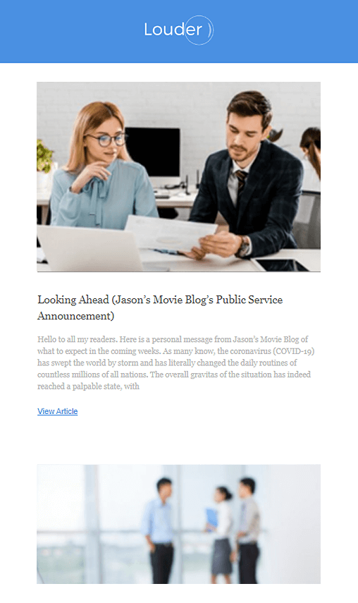
If you aren’t a fan of the RSS Blush, you can use the RSS Cotton to create an equally attractive email. This newsletter template is great for email designers who use beautiful visuals in their content and want to excite their audiences by taking advantage of the “one picture is worth a thousand words” tactic.
Design tip: Make sure to add high-quality images so they stand out in this minimalist layout. Don’t forget to create action-oriented and prominent CTAs to promote your CTR.
Why you need it: This RSS template is simple and powerful, which makes it ideal to quickly inform your readers about new posts.
RSS Powder Newsletter Example
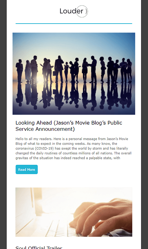
If your audience likes to see a lot of content on your newsletter, you can use RSS Powder to make it happen. Without overwhelming them, though, since this email design invests in a user-friendly structure.
Design tip: Again, add some visuals to enrich your newsletter design and pick the right colors to make it more pleasing to your audience’s eyes. Use high contrast between your CTAs and the email background to draw attention to them.
Why you need it: A great template to showcase your content and intrigue your readers to click on your CTAs for more.
RSS Navy Email Newsletter Template Example
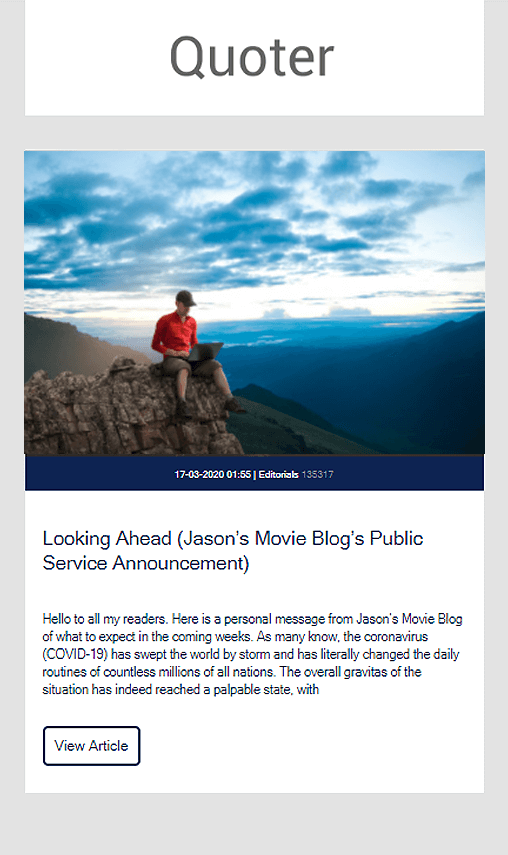
RSS Navy is great for single RSS updates. Like the previous designs, you can instantly pick it and customize it to provide your email subscribers with all the necessary information.
Design tip: Don’t forget to add your company logo and an eye-catching image to capture the reader’s attention.
Why you need it: While similar to the rest, you can keep RSS Navy in your quiver for important updates and announcements due to its focused layout.
RSS Essential Newsletter Email Template
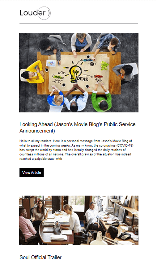
If you are more of a traditional type, this simple, black-and-white RSS Essential newsletter design is the ideal choice to deliver multiple updates at once.
Design tip: This example works great if you want to combine images with brightly colored CTAs. Due to spacing, your visuals won’t clash with your color scheme and will give you a balanced result.
Why you need it: The Essential RSS template is your everyday hero, ready to use in a couple of minutes.
Billie Jean Ebook Promotion HTML Template
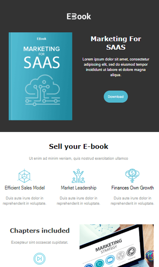
The Billie Jean template isn’t here to cause a scene (rest assured, MJ) but to help you promote your eBook. Ebooks are an important tool to nurture your leads and move them a step down your marketing funnel. The structure is great for guiding you through email creation to design a brilliant lead nurturing campaign.
Design tips: Take advantage of the defined sections to give your audience as much information as possible. Don’t hesitate to introduce yourself and share customer testimonials to increase your credibility.
Why you need it: This template is perfect for creating an eBook promo that will charm and persuade your subscribers.
Just Like Heaven eBook Newsletter Design
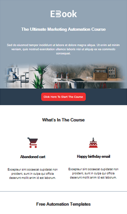
Versatility is key when it comes to picking a template. With the above design, you can either create an eBook campaign for your audience or even promote your online courses and tutorials to nurture them effectively.
Design tips: The template will allow you to add your email copy on the top. Take advantage of this opportunity to show readers why they need your resources and then offer a compelling CTA button to convert them.
Why you need it: The layout gives you the chance to promote additional resources/pages and even add any relevant information to show your expertise.
6. Transactional Email Templates
Transactional email campaigns serve as an important communication tool, delivering valuable and timely updates each time consumers take a specific action.
With these campaigns, you keep your audience informed and up to date, letting them know that everything worked out fine during their transaction. Which, in turn, is a key ingredient of customer trust and satisfaction.
Now let’s see how you can offer your audience a great experience through our selection of transactional email newsletter templates.
Colorful Account Creation Design Template
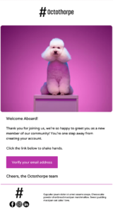
You might think that account doesn’t leave much room for creativity. But who is to say you can’t make the corresponding confirmation email more cheerful? Here’s where you can use this cute and colorful transactional email template to grab your new subscribers’ attention.
Design tip: In such an email, a clean and focused design is gold. So, keep things simple, leveraging white space and a bold-colored CTA to ask recipients to verify their email. Also, don’t forget to add your logo and an attention-grabbing visual that will stick with them.
Why you need it: Use this unique template to welcome new contacts and give them peace of mind.
Minimal Order Confirmation Newsletter Design
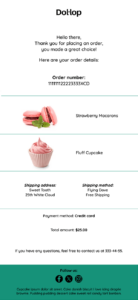
Again in this case, minimalism takes over. With this uncluttered and well-structured layout, you can confirm the subscriber’s order and provide all relevant details to keep them informed and engaged.
Design tip: Featuring compelling images of the items ordered is an excellent method to create that “oh-I-can’t-wait” feeling. Pair the images with the necessary and easy to understand information-let’s not forget that it’s the main objective of this email. Also, saying thank you in the copy adds a human touch that your subscribers will appreciate.
Why you need it: Subscribers expect order confirmation emails to rest assured. Use this easy on the eye template to give them all the info they need without tiring them.
7. Hospitality & Travel Newsletter Template Examples
Newsletters aren’t only effective for eCommerce, SaaS, and publishers but also for hotel owners, travel agencies, restaurants, and so on.
Below, we’ve picked some amazing hospitality and travel email newsletter templates to capture your guests’ and travelers’ attention. Let’s check them out.
Hotel/Resort Promotion Email Template
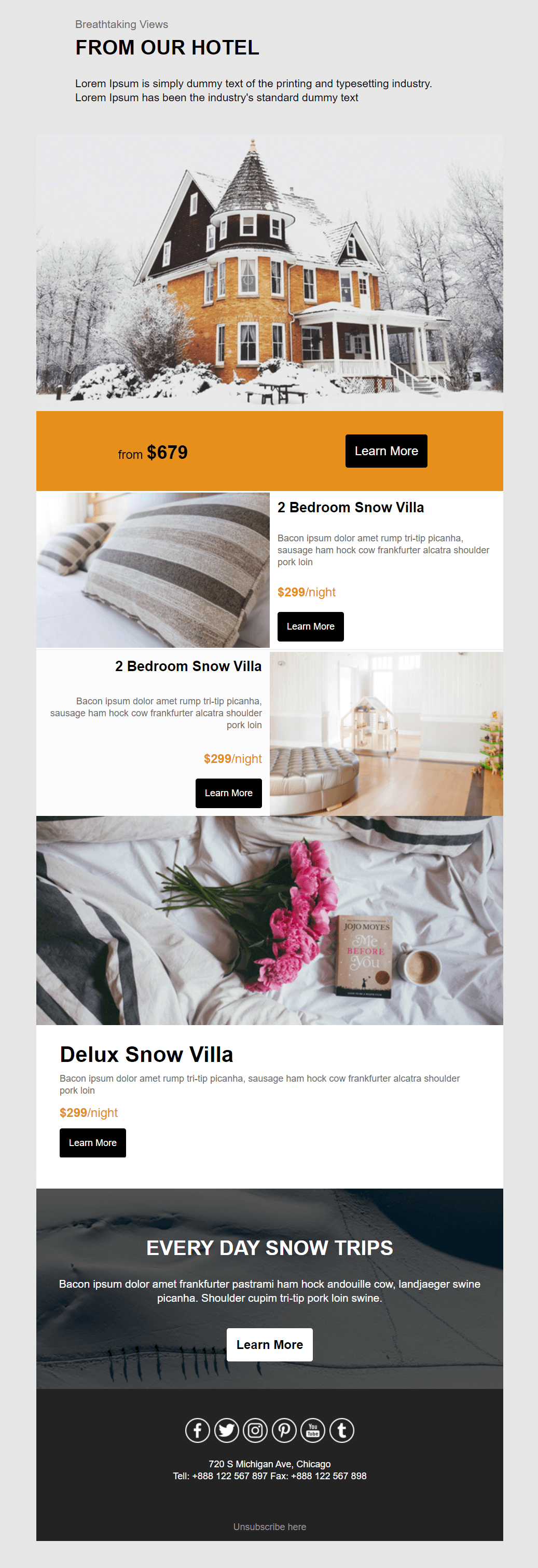
Hotel owners, this is your time to shine! Grab this template and use it to promote your hotel/resort with visuals and compelling copy.
Design tip: Add beautiful images of your business to intrigue potential guests and see your bookings rise. Also, you can customize the color scheme of this template to match the colors of your brand to create a familiar look and feel.
Why you need it: This template has been designed for hotel owners who want to kickstart their hotel email marketing efforts. With it, you get all the sections you need to promote your business, share special deals, and excite your guests.
Hotel Reservation Newsletter Design Example
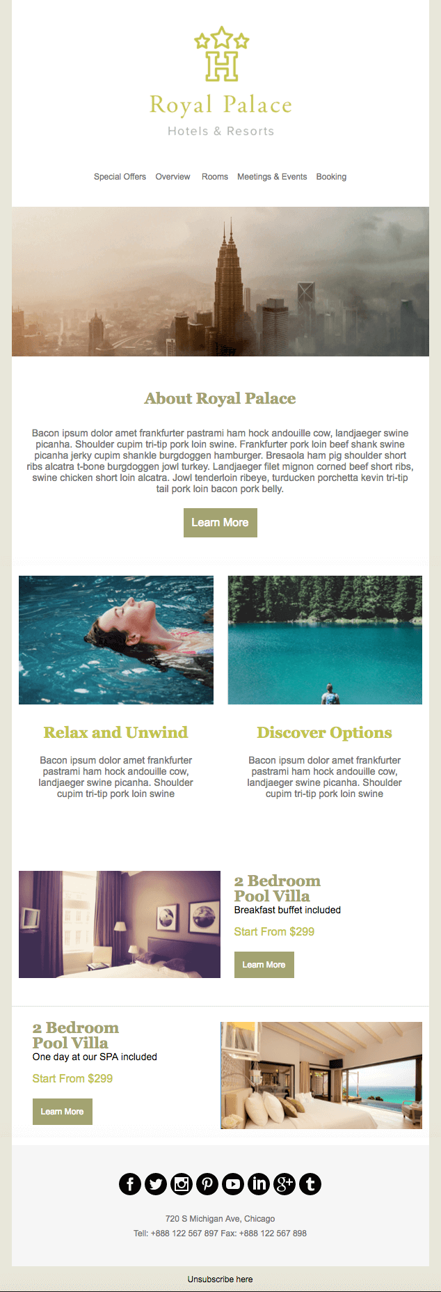
If your motto is “Elegance and Luxury,” you can instantly grab the above newsletter design. With this polished template, you start preparing visitors for a memorable service right from the email communication. And have them long for more.
Design tip: Leverage white space to make your copy more readable and your graphic design elements pop. Also, you can play around with colored fonts to give your email a sense of glamor.
Why you need it: A very chic template to engage potential guests and send them to your booking landing pages without much effort.
Travel Booking Newsletter Template Example
Give your audience more reasons to make a booking at your hotel with an eye-catching marketing campaign. Just pick the Travel Booking newsletter template, add the magic ingredients, and let your guests know you are open for business.
Design tip: Don’t forget to insert your brand colors and logo to create a familiar email for your audience. What’s more, make sure to include compelling CTAs in contrasting colors to increase your booking rate. Why not throw in star ratings next to each option, too? Word-of-mouth marketing never goes out of fashion, especially for service providers.
Why you need it: The Travel Booking template is easy to customize for any accommodation type to power up booking efforts.
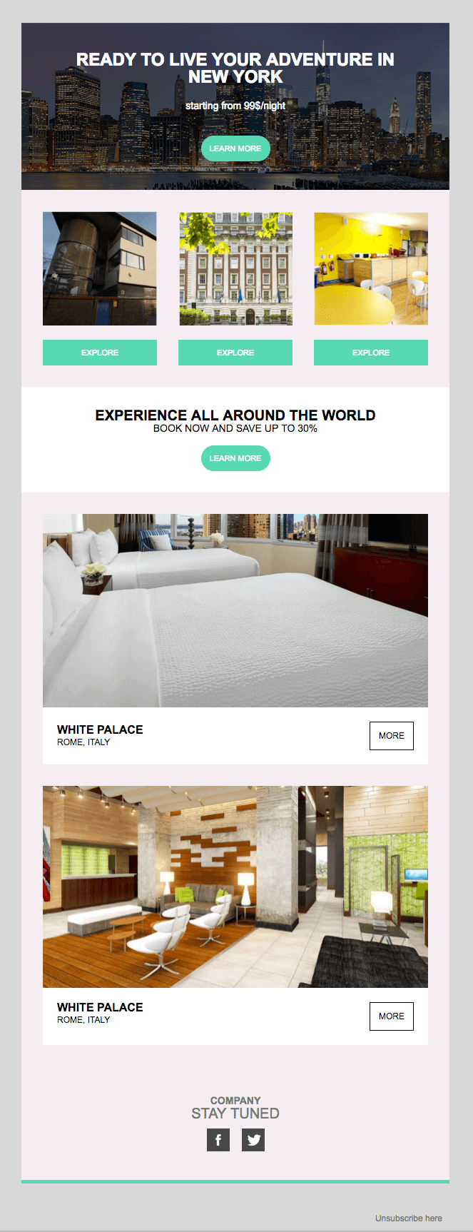
Live Your Myth Email Template Example
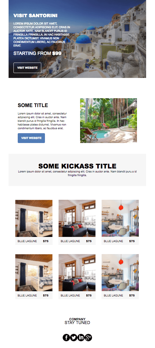
Let your audience live the myth of an exciting destination with the above template. Use this professional design to promote different accommodation options, inspire subscribers, and offer them amazing solutions to satisfy their wanderlust.
Design tip: Give your audience a sneak peek of what they’ll experience and don’t forget to insert additional product blocks to promote multiple rooms/services. Incorporating high-quality visuals of what you offer is also key to incentivize bookings.
Why you need it: Excite your indecisive travelers with this well-crafted layout featuring stunning visuals that will make their hearts flutter.
Food Delivery Newsletter Email Template

Attract your subscribers with an email newsletter that will build up their appetite. Give them amazing deals and even share posts from your blog to inspire their next order.
Design tip: Start with an image of your business or specialty to set the mood. Also, take advantage of the Z-pattern to easily guide your subscriber’s eye towards conversion.
Why you need it: Show your potential customers your special offers and new menu items to increase orders. Alternatively, share fresh posts with tips to help them become better home chefs.
Food Wars Newsletter Template
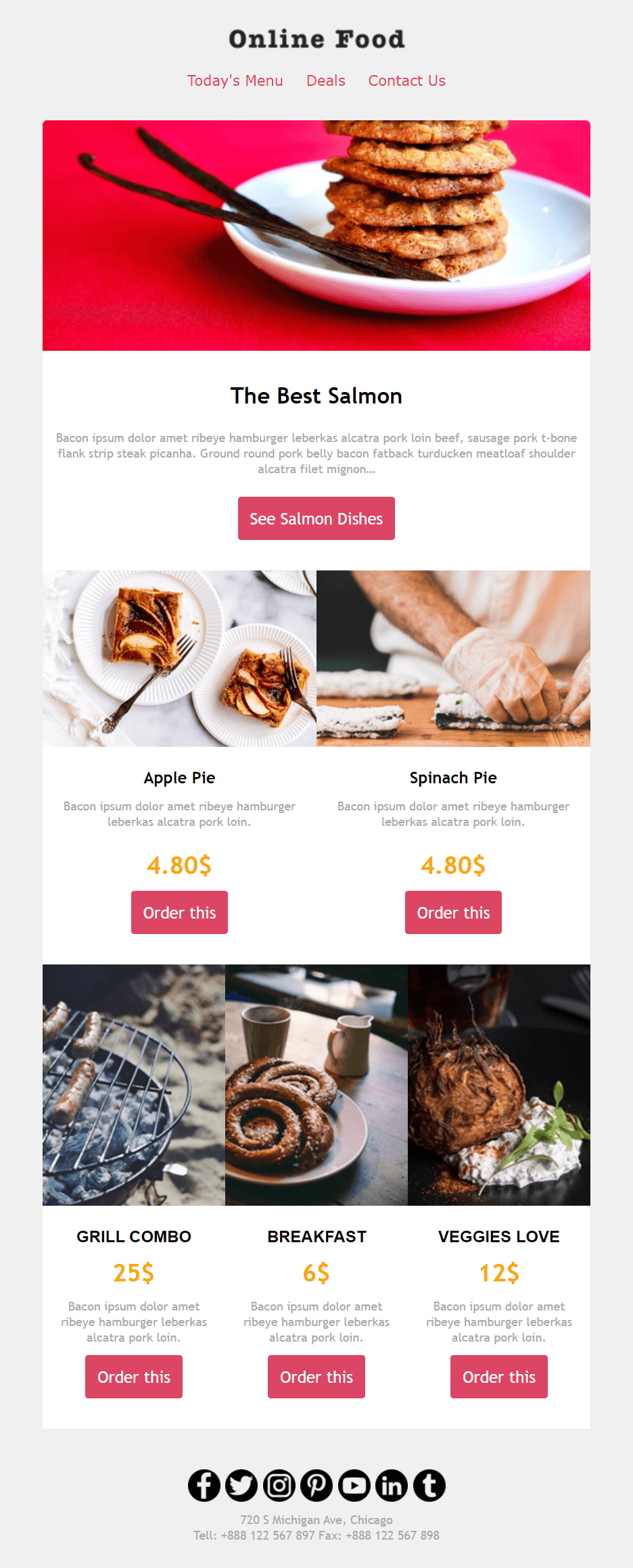
Need something classier? We got your back. Save and customize the above template to show the value of your food service and content like no other.
Design tip: The white space here is just “chef’s kiss!” Take advantage of the layout to present your products beautifully and craft brightly colored CTA buttons to convert your customers. And consider adding links to key web pages in the footer to drive more engagement.
Why you need it: Although this template is designed for restaurant email marketing, any hospitality business could use it for promotions and value-packed content.
New Year’s Treats Newsletter Example
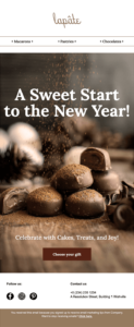
This New Year’s template examples leverages seasonality to create a timely and sweet promotion for pastry items. However, it might serve every business that wants to share timely offers, sell gift bundles, or display season-related products.
Design tip: Grab attention instantly with an irresistible hero image and a straightforward headline that reveals the email’s focus point. You can keep the warm color combination or tweak them to create an on-brand, bold newsletter.
Why you need it: Brands should benefit from this elegant design focusing on the products to urge recipients to make holiday purchases.
8. Event Newsletter Templates
Planning an exciting event? Tell your audience all about it with an eye-pleasing event newsletter. With the right email template, you can both boost registrations and excite your audience until the day comes.
In this section, we’ll see some webinar newsletter templates that every business needs to nurture and educate their customers. Also, we’ll take a look at some more personal templates for those precious moments in life.
Webinar Registration Email Newsletter Template
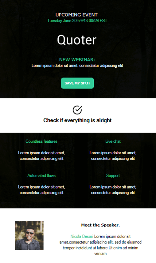
Kickstart your webinar marketing with the right newsletter template. The above design is great for informing your audience about your upcoming event and providing them with all the necessary attendance information.
Design tip: Add your event details at the top of the email to make sure that your subscribers won’t miss it. Right below, you can place a strong and action-driven CTA to convert them instantly. Take advantage of the bottom section to insert some information about the speakers and perhaps use another CTA to increase registrations.
Why you need it: Make sure that your subscribers are aware of your event and let them save a spot easily through your email campaign.
Online Training Design Example
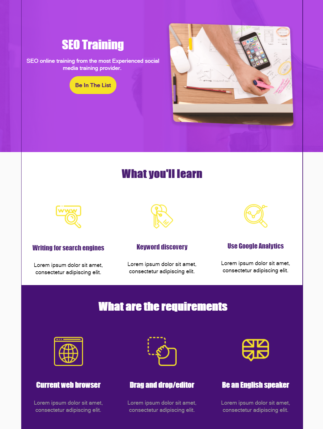
Get your participants interested in your online event with a short and to-the-point email campaign. Use the above template to provide them with event details and convert them with a unique CTA that’s above the fold.
Design tip: Event email marketing should be all about sharing informative and relevant content. Stress the benefits of attending your event with short and crisp copy. To go the extra mile, use the “Requirements” section to guide registrants through the attendance process.
Why you need it: With this event template, you can easily excite your audience with your color choices and show the value they’ll gain with persuasive language.
Event Invitation Newsletter Design Example
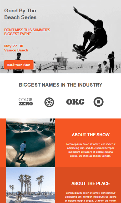
The above template allows you to promote your event (online or not) in a cool fashion. Take advantage of the layout to make your email invitation look like the real thing and power up your registrations.
Design tip: Customize your template using colors that represent your event and brand identity. Don’t forget to include all key details. Plus, a great idea is to insert extra blocks to inform your participants about the location, activities, and more.
Why you need it: To spread the word about your event with a cool and modern invitation, of course!
Wedding Invitation Newsletter Templates

Traditional wedding invitations are great, but what about “e-nvitations?” They are what you need to show your wedding guests your creativity and have them looking forward to it. So, grab this template and customize it to your liking.
Design tip: Wedding invitations can be elegant or extravagant. Add your personal touch, insert images of you and your significant other, or play around with original graphic elements.
Why you need it: No need to worry about mailing those invitations one by one. Also, turning your CTA into an RSVP will save you tons of time and facilitate arrangements.
Informative Wedding Newsletter Email Design

Here’s a more minimalist wedding invitation template to make sure your guests know about your special day. Responsive and customizable, use it to create a beautiful invitation that people will remember.
Design tip: The design looks like an actual invitation so you don’t lose the real-life effect. Make it more special by adding bright colors and, of course, add your RSVP to learn who will attend.
Why you need it: Again, saving time, money, and effort on mailing hundreds of invitations. No more waiting at the post office is a god-sent gift.
Boy Christening Email Newsletter Templates
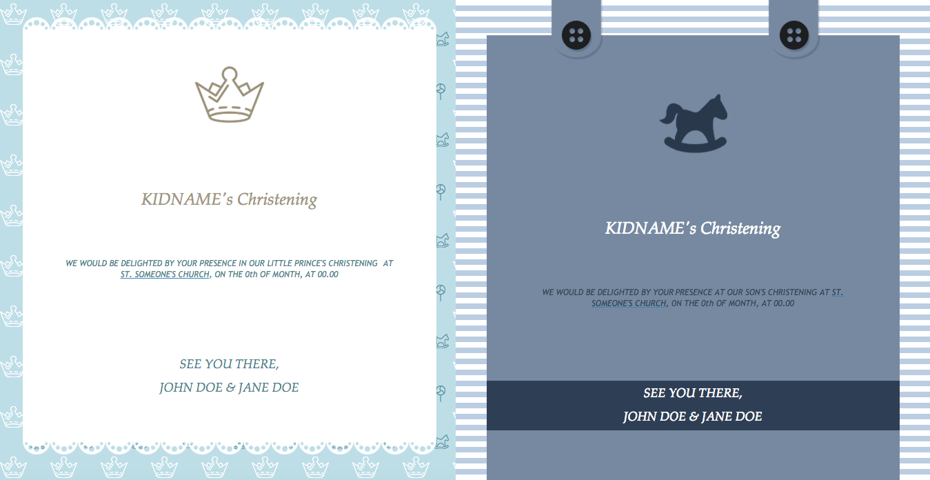
Like with your wedding invitations, you can create stunning e-nvitations for your little bean’s christening.
Design tip: Keep them simple, play around with color, and don’t forget to add your child’s name. Or, if you want to get your guests wondering, make sure to highlight that they’ll learn all about it on the special day.
Why you need it: Organizing events, whether business or personal, involves a lot of hard work. So why not simplify the process to spend more time with your precious little one?
Girl Christening Newsletter Templates
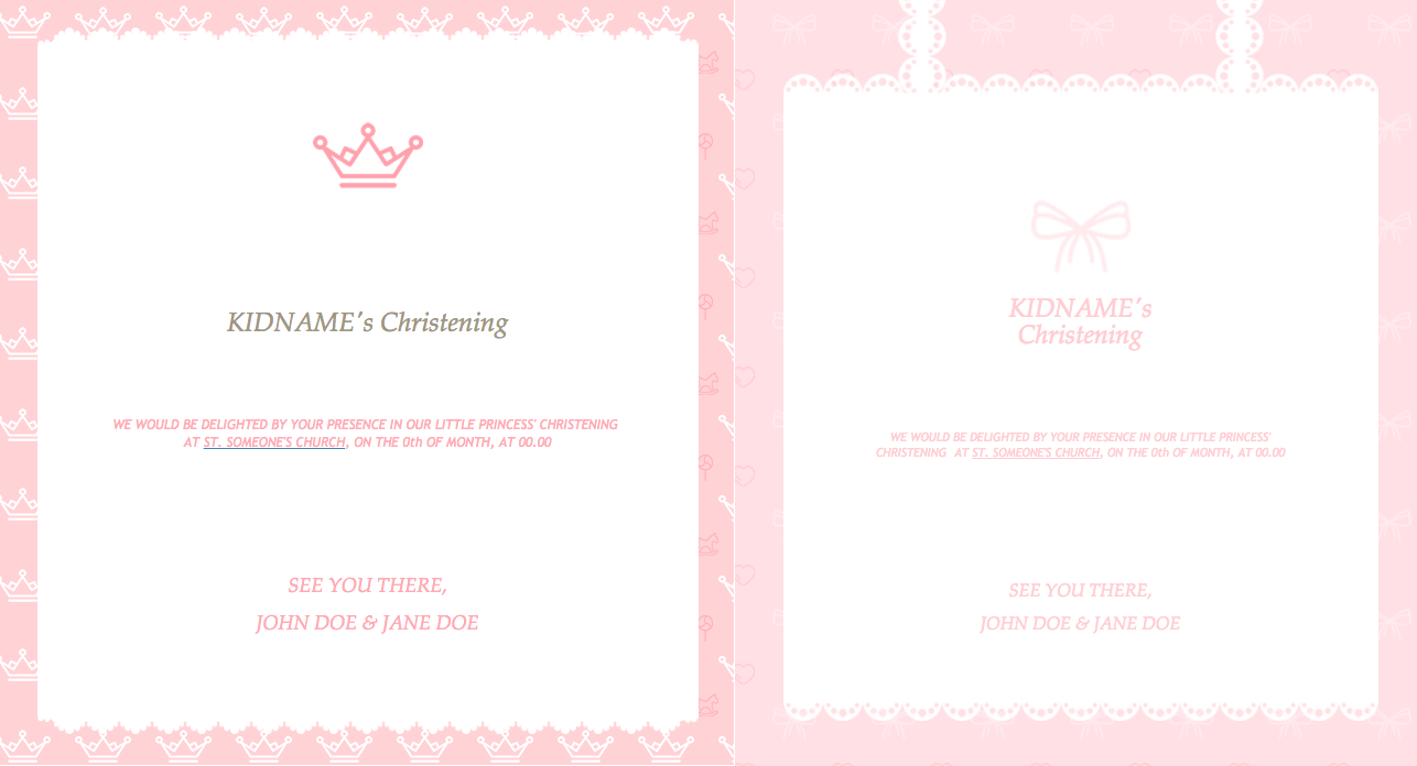
Last but not least, we also have these sweet christening email newsletter templates for girls to invite your loved ones to this unique celebration.
Design tip: Pink is always a great choice. However, don’t hesitate to experiment with various creative color combinations in the invitation for your little girl’s special day. If you feel like it, you could create a loving rhyme or poem to stand out.
Why you need it: Simplify the tedious invitation sending task once and for all with this effective newsletter template.
9. Milestone Email Templates
Speaking of precious moments, celebrating milestones with your audience comes with lots of benefits, including setting the foundations for lasting customer relationships.
Milestone emails aren’t about boosting sales-although sometimes they can do that, too. They’re about gratitude and personal connections. So, here are some great milestone templates for continuous engagement and loyalty.
Birthday Email Newsletter Example
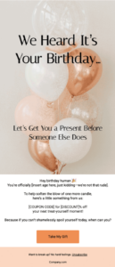
No better way to feel recipients feel special than wishing them happy birthday with this beautiful newsletter template. If your budget allows you to, incentivize them to purchase through a generous birthday discount or gift.
Design tip: Hit your subscriber’s heart with stunning and festive visuals. To add to the experience, write inspiring birthday wishes to warm up their heart. Do you have a birthday gift just for them? Make sure to make it your email’s protagonist using bold and/or large fonts and prominent CTAs to urge them to claim it.
Why you need it: Cherishing your audience’s special day goes a long way, so customize this birthday template to reinforce bonds.
Customer Anniversary Newsletter Example
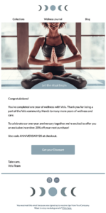
Anniversaries are key moments in every relationship. Customer anniversaries in particular remind your audience of how far they’ve come in their journey with your brand. So, give them a memorable experience with the above simple yet meaningful anniversary newsletter.
Design tip: Anniversary emails should feel heartfelt. So, again focus on personalizing your message by using the recipient’s name and including a sincere thank-you note. Even better if you add an exclusive discount to the mix and center the email design around it so it immediately catches the reader’s eye.
Why you need it: Use this straightforward template to share key customer achievements and reward customer loyalty.
10. Real Estate Email Newsletter Example
For realtors, creating effective real estate campaigns help you increase your listing visibility. To help you out, let’s share a great email template you can grab and customize in a jiffy.
Real Estate Listing Promotion Template

Promote your house listings using a clean email design that will intrigue future homeowners and make them click on your CTA buttons.
Design tip: Take advantage of the layout to display your best properties. Make sure to add relevant information and beautiful images to get your audience interested and lead them to your real estate landing pages.
Why you need it: Reach future homeowners and tenants with targeted home-listing recommendations and see your properties sell out like hotcakes. With the right email marketing software for real estate, you can effortlessly connect with potential clients and drive sales.
Set Your Email Newsletters In Motion
A fruitful email marketing strategy is made possible. You just need to take it one great email newsletter template at a time.
Now that you’ve seen them all, it’s time to hop into the editor and start customizing them as you please. Our advice is to choose templates that you like and add your own touch to make them more familiar with your target audience.
And before you leave, don’t forget to sign up for a free Moosend account. That’s all you need to become the email designer or your dreams.

 Published by
 Published by
