10 Email Newsletter Design Tips for Beginners [& Examples]
Email design trends change fast—some day it’s all about dark mode, and the next it’s interactive elements. But as the well-known Italian designer, Massimo Vignelli, said: “Styles come and go. Good design is a language, not a style.”
Likewise, crafting stunning campaigns isn’t about following email newsletter design tips and trends; it’s about how your brand speaks to subscribers. The layout, the visual components, even the white space bring something to the conversation.
So, the focus should be on creating a visual language that makes subscribers recognize your emails. With the right guidance, your newsletters will become a goldmine that establishes this language.
To master email design, this blog post will provide you with:
- all the essential information on key email components
- the best tips to make your emails stand out
- email newsletter examples and templates to customize and use right away
Before we dive deep into email newsletter design, let’s understand what comprises a good newsletter.
Master email design in minutes
Give your campaigns a “wow” factor with converting email designs.
Get startedWhat Are The Key Components to Include in Your Email Newsletter Design?
Email newsletters consist of different design elements that create a unique visual experience when combined.
As they say, a picture is worth a thousand words, so below you’ll find a visual representation of the main components of an email newsletter:
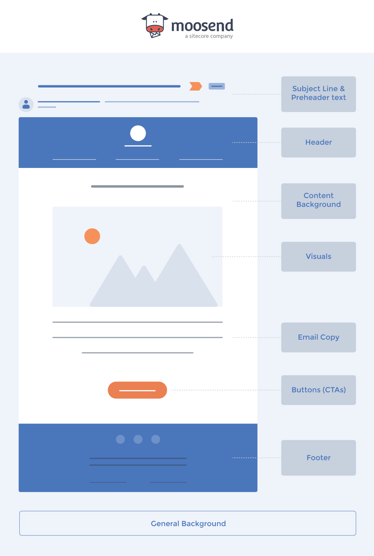
Now let’s take a closer look at what each element involves.
1. Subject Line & Preheader Text
The first component of every email newsletter is the subject line along with the preheader text, i.e., the summary text following the subject line. These two the first thing the user sees in their inbox.
As such, it’s the decisive factor determining whether they will open your campaign. In fact, according to recent research, 33% of email recipients open an email solely based on its subject line.
Besides open rates, subject lines impact other crucial email performance indicators. If your subject line looks “weird” or spammy using words like “earn” or “cash” and tactics like excessive use of special characters, you’ll be getting spam complaints or unsubscribes.
The purpose of subject lines is to draw the reader’s attention and communicate the value of the email so recipients know what they’re about to read—and why they should. So, they should be straightforward and informative.
And don’t forget to include your primary message at the start since subscribers are likely to skim through their inbox quickly. For example, if you want to promote a Buy One Get One (BOGO) deal, highlight it in the first words.
Pretty much the same rules apply to your preview text. It must give additional insight into the message or offer that’s inside the email. In the BOGO deal we mentioned, the subject line could be something like “Today only: Hurry in for our BOGO offer” complemented by the following preview text: “Buy your favorite [Product] and get a second one for free.”
2. Header
The header of the email is the first thing your subscribers see when they open your campaign, preceding the email copy. Traditionally, it has three elements: your company logo, brand name, and menu bar. Since it displays the most critical components of your brand identity, it helps you make your campaign immediately identifiable.
It’s also common for brands to include a ‘view in browser’ link in the header. By doing so, they offer subscribers the option to view the email newsletter the way it was meant to—in case there’s trouble with image downloading, for example. As a result, you improve the user experience.
Occasionally, there are navigational links, providing readers with quick access to key pages on your website. An eye-catching image and a clear headline could also work to urge recipients to read through.
However, make sure you don’t cram the header with too many links or other elements. The most effective headers are simple, straightforward, and uncluttered.
Sometimes, businesses choose to add a few words about an ongoing perk such as a discount or free shipping. Just like Patagonia does in this clear and attention-grabbing header, offering helpful links to their website and details on the free shipping offer.

3. Background
As the name implies, it’s what lies behind your email. It could be anything from a plain color or a custom background image. You may get even more creative, using elements like animated gifs as your email design background.
Some brands prefer to leave the background “blank” (white), while others use beautiful and bold colors or nice custom assets that really make their emails pop. The aim of the background is to surround your email and make it more eye-friendly. It serves as a subtle means to create a unique color balance in your email campaigns, too.
The most critical aspect here is that the background blends nicely with the rest of your email and doesn’t draw attention from the core message. And let’s not forget that proper color contrast between the background and the diverse email elements is a key factor for creating an accessible newsletter design.
4. Email Copy
The next major component is the email copy, which consists of all written parts inside the main body. Above all, it’s the email design component that delivers your campaign message.
It’s important to align every part of your email copy with a specific marketing or sales purpose. For example, if the purpose is to inform subscribers about an upcoming sale. The copy should reflect that intent.
Therefore, the way you express your message to prospective customers must be clear, leaving no room to doubt and answering all the potential questions.
As a rule of thumb, it’s preferable to keep your email copy short yet informative. Subscribers nowadays skim through the email content rather quickly. So, they need just the right information, and they need it instantly.
5. Visuals
Visuals are an essential part of a successful email campaign since they support the copy while making the email more skimmable. That makes them perfect for use in emails where the reader needs to understand the value of the message as soon as possible.
Also, according to the picture-superiority effect, visuals leave a stronger mark on human memory. In simple terms, they stick with us longer than words do.
Keep in mind, though, that striking the right balance between text and visuals is one of the most important newsletter design tips. This means you shouldn’t go too heavy on visuals because their excessive use often comes at a cost. Think of slow loading times, visual overload, and accessibility issues for the visually impaired.
In the following email, Starbucks uses clean and high-quality product images. Keeping them to a bare minimum, they ensure a modern yet balanced design that doesn’t overwhelm the reader.

6. Buttons (CTAs)
What would an email newsletter be with no conversion point? The answer is incomplete. Here’s where an email call-to-action enters the game. Your email CTA is the star of your email, representing your campaign objective.
Depending on your goal, CTAs may lead to various actions such as registering for an event or downloading a piece of content. To perform them, subscribers are directed to your website or landing page.
While it’s not wrong to add multiple CTAs in an email, using too many is likely to have a negative impact and disorient subscribers. On the contrary, a single CTA allows your audience to focus on a key action. If you have one main email CTA, it’s wise to place it above the fold so your readers can detect it right away.
7. Footer
The footer lies at the bottom of the email. This doesn’t mean it’s less important than other, more prominent assets. First of all, it includes your brand’s social buttons. These allow subscribers to Adding social buttons as part of your design can help you grow your email list and boost brand awareness.
Moreover, the email footer displays your contact details, such as your physical address and phone number. This piece of information is crucial for leaving the communication lines open, offering subscribers extra contact points. Besides that, including your physical address in your emails is a legal requirement in many countries.
You’ll usually find the unsubscribe button as part of the footer so readers can easily opt out. You can add a note at the bottom of the footer, too, reminding subscribers why they are receiving your emails.
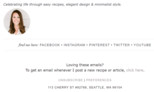
Finally, at the footer, you may find the sender’s email signature along with a photo. This is a common tactic in email marketing for bloggers or other types of content creators.
Just like Julie Blanner does in this email footer, including a head shot and a catchy moto for memorable communication. She also has her social media accounts readily available, as well as links to unsubscribe and change preferences.
10 Email Newsletter Design Best Practices
Now that we’ve seen the main components of an email, let’s dive into ten effective email design strategies to ensure aesthetically pleasing, well-structured, and on-brand emails.
1. Start with the Right Email Template
Designing an email newsletter from scratch can be daunting, especially for beginners. By selecting a pre-made email template, you can use it as your foundation and then focus on customizing it for your needs.
Fortunately, the top email newsletter software available in the market offer an abundance of email newsletter templates for several use cases. From promotional and seasonal templates to company announcements, you can find the one that fits your campaign goal.
You can even save your favorite ones for different purposes, tweaking different elements as you see fit. Basically, email templates save you time while guaranteeing polished and consistent email design across campaigns.
Another benefit of this valuable design tool is that they’re created with the best email practices in mind. For instance, their ideal dimensions remove any concerns about compromising the email design quality. Also, their mobile-friendly designs make them render perfectly on every device. Which is crucial in a world where most emails are displayed on mobile devices.
Lastly, email newsletter templates follow accessibility standards. That way, you deliver the same, impeccable experience to every user, regardless of the circumstances.

Here we have an eCommerce newsletter template that you can easily customize and use for your own business right away. Just add your own logo to the dedicated place above the fold using the drag-and-drop editor and tweak the CTA to match your objective.
The simple and slick email design will make your key point stand out, whether it’s promoting new products or sharing important updates. The clever addition of a customer review section allows you to showcase the value of your products and add credibility to your message.
Need more templates like the above? Don’t miss these 7 Email Newsletter Designs for your business.
2. Have A Clean and Organized Layout
A clean and organized layout helps in reducing distractions for your readers. At the same time, it makes your newsletter easily scannable.
Due to subscribers’ short attention span, you should always prioritize information properly. To achieve information hierarchy, divide your content into organized sections. Then, put the most important things first, preferably at the top of the design. After all, it’s the part of the email readers tend to check out the most.
Don’t neglect investing in other effective practices to highlight your key points. Some of them include:
- Adding headings and bullet lists
- Using color contrast
- Making part of the text bold
- Separating elements with white space
Another point is considering the alignment of all sections to achieve a symmetric presentation. Otherwise, a plurality in alignment choices may create visual noise and lead to subscribers straying away.
But what’s the ideal email layout? While there’s no right and wrong answer, a single-column design allows for easier scrolling on smaller screens, and a smoother reading experience for all users.
Now let’s see how a clean and well-structured email design example and one with visual noise look like:


3. Brand Your Email Campaigns
It’s essential that your customers recognize your emails as soon as they see them in their inbox. This tactic helps you maintain a consistent look and feel, which, in turn, keeps your brand top of mind.
To that end, the first step is to add your brand logo and tagline in your email header. Placing them prominently at the top of the email makes them visible, allowing subscribers to instantly understand where the message comes from.
Another excellent place to display your brand personality is your email footer, including your unsubscribe button, social media links, physical address, privacy policy, and contact information. You could even use a memorable to leave recipients with a lasting message.
Moreover, you need to select a certain font that you’ll be using in your email designs. If you use specific fonts on your website, consider adding them to your email campaigns to achieve a seamless experience.
The same goes for your brand colors, a critical element for a consistent look and feel. Additionally, your graphic elements must follow the same design logic as your website to increase the recipient’s familiarity with your brand. If you’re using a pre-made template, don’t forget to customize the design to fit your branding.
Lastly, if your email CTA directs readers to a landing page, you might want to match its design with that of your email to create a consistent experience from start to finish.
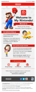
In this welcome email example, Nintendo has placed its branding elements across the whole campaign. Their characteristic logo is used both in the header and footer—where you can also find the brand’s social media buttons. Also, they’ve made their mascot Super Mario the protagonist by using his image in the header, so readers instantly make the connection.
Apart from these elements, the color scheme is consistent throughout the campaign, from header to CTA. They’ve even placed a branded background at the top, a smart addition to make the email stand out.
4. Use Color to Elicit Emotions
Color is a particularly important element in email newsletter design due to its power to evoke emotions and send specific signals to the human brain.
According to research, your color choices attract different types of buyers, too. For instance, red and orange are likely to catch impulse buyers’ attention while navy blue and teal work better for targeting budget-conscious shoppers.
But how will you know which colors to use in different cases? Let us give you a general idea of what cultural conventions in the West dictate regarding the use of colors.
Black is considered powerful and elegant, while it’s often associated with luxury items like expensive cars. Red relates to energy and, typically, brands turn to it to create urgency. This is why it’s often found in CTAs. On the other hand, blue offers a calming effect, evoking serenity. Businesses, especially in the tech industry, use it to create a sense of security and reliability.
However, remember that finding the right colors for your emails depends on your brand, too. Your preferred color scheme is directly linked to your unique identity, helping with brand recognition. So, it’s usually safer to select a color palette that’s complementary to your identity.
Besides, diverse campaign objectives may call for different color schemes. A Christmas email could require red and green to match the holiday spirit while, for a Valentine’s Day campaign red and pink are ideal to associate the message with the warm atmosphere.
In the above email template, combining purple, pink, and white creates a soothing newsletter campaign. The CTAs make a wonderful contrast with the rest of the email.
What’s more, this template is easy on the eye and scannable. With the addition of high-quality images, you can make your campaign eye-catching and relatable.
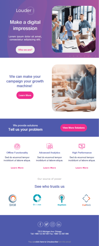
In the above example, the colors purple, pink, and white are combined to create a soothing newsletter campaign. The CTAs make a wonderful contrast with the rest of the email. What’s more, this template is easy on the eye and scannable.
This layout offers everything you’d want your customers to see, from solutions to their problems to badges serving as social proof. With the addition of high-quality images and actionable language, you can make your campaign relatable.
5. Add Stunning Visuals
Visuals play a major role in designing engaging newsletters. If you’re looking for reasons to incorporate them in your emails, here are just a few:
- They get the value of the message across quickly
- They turn complex ideas into digestible format
- They make readers relate in a more direct way compared to text
- They create a pleasant reading experience
- They reinforce your brand identity—if used properly
An excellent strategy, especially for product promotions, is to put the product at the center and a stunning image at the background. If you want to promote different products, incorporate high-quality images and accompany them with compelling descriptions. Ideally, you’d want to match the newsletter visuals to those of your landing page.
Visuals aren’t limited to images, though. You could embed GIFs, infographics, or videos in your email if it fits a certain purpose. For example, customer testimonials might be more persuasive in video format and video tutorials could convey your key points more clearly.
Whatever you choose, remember to place visual components strategically, making them your focus point. What would work better: placing a relevant image before the CTA, reinforcing the value of the required action, or after it?
And don’t neglect adding a suitable alternative text to every image. This helps you avoid subscriber frustration if the email client doesn’t display images by default. Plus, it’s a crucial accessibility standard to enhance a seamless experience for all users.
Before sending your emails, make sure you test visual components and use the preview option of your email marketing platform to ensure everything works great on all devices and internet service providers.
6. Use Web-Safe Fonts
Best email newsletter design strategies could not but include typography. Believe it or not, the font you choose for your newsletters influences the way your audience perceives your emails. It’s an essential readability factor, too. With the right typography, your messages come across as more clean and easy to understand.
For this reason, avoid decorative and fancy styles since they might hurt the user experience, especially for people with cognitive impairments like dyslexia.
Keep in mind that different email clients and web browsers display newsletters in different ways, too. To ensure your emails look good on all of them, it’s advisable to use legible and web-safe fonts. Don’t go overboard and use too many different fonts in your newsletter design. Stick to one or two email fonts instead. You can check out a list with the most popular web-safe fonts here.
Generally, it’s a good idea to use a similar or the same font as the one you’re using on your website. This way, user experience remains consistent across touch points.
If you want, you can use different type face for your headlines and email body. Are you looking for more contrast but are unsure about font sizes? The general rule is to keep your headlines between 20-26 px and your text between 14-16 px.
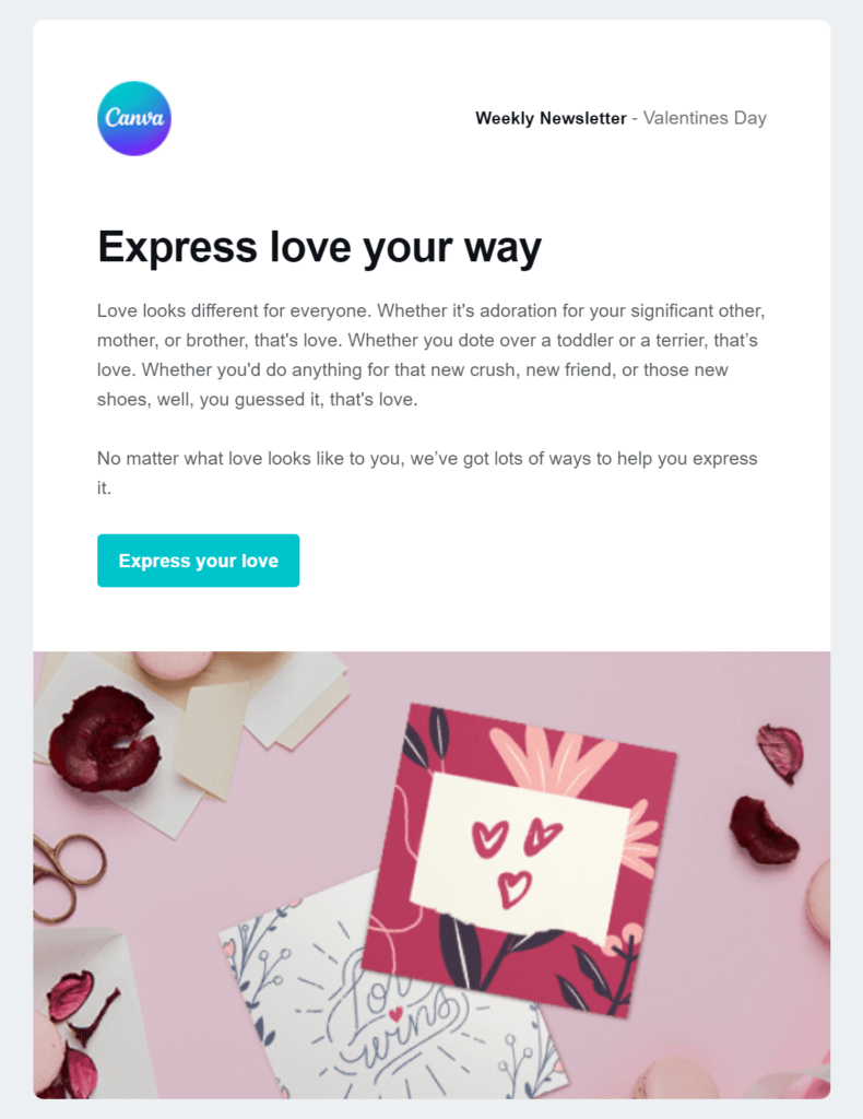
As you can see above, Canva benefits from ample white space to increase readability. The font the brand chooses for their newsletters is Helvetica, which is a sans serif font ideal for email campaigns.
The CTA button is aligned with the brand’s colors and stands out due to the nice color contrast.
7. Keep Your Text Short And Engaging
The aim of a great email newsletter design is to get your target audience from the email to your website or landing page. So, you need to figure out how to deliver value easily and quickly.
The way to do so is by keeping your email copy short and engaging. Avoid long walls of text that discourage readers. In case you have to send a longer newsletter, break up large blocks into smaller and digestible chunks to minimize the mental load. Think of adding white space, relevant visuals, or bullet lists to optimize the experience.
Humans usually read from left to right. Therefore, left aligning your copy works better in email design since it improves the reading experience for all users.
To give readers the main point of your email, a good design strategy is to craft a strong and informative headline. Moving to the copy, make it concise and useful, staying away from sounding too promotional. An effective way to make the message feel more relatable is going for the second person in your copy.
Also, put the key information front and center for readers to spot immediately. If you want to promote your new products, add compelling images and engaging descriptions at the beginning of the email. In case you’re promoting blog content, it might be a good idea to include snippets that tease the content, leading to a “read more” CTA that takes subscribers to your blog.
Don’t forget about your brand tone. When users have gotten used to formal language from a brand, coming across a newsletter full of puns, GIFs, or playful language will strike them as odd. However, you’re allowed to a few creative changes if the occasion call for it, i.e., spicing up a Christmas campaign.

Warby Parker has created an email newsletter that manages to pique the readers’ interest in just a few lines of copy at the top of the email. Then, the bold and actionable CTA gets straight to the point, inviting readers to explore the collection.
But the best part is the fun graphics taking over next. They suggest alternative ways to wear the brand’s sunglasses, giving the email a playful twist. And they do so while maintaining a simple and sleek design.
8. Design Mobile-Friendly Emails
Mobile responsiveness has turned from nice-to-have to must-have. To design a great email newsletter, you need to anticipate that some people will view it on smaller devices.
This is why a mobile-first approach is of utmost importance in email newsletter design. The first step includes ensuring that your email marketing tool offers templates with responsive designs. Meaning, they render well on all screen sizes. Most of the times, a single-column design is also the best choice as it’s the most mobile-friendlyoption.
You should use optimize image size for mobile, too, so these files don’t increase your email loading times. Opt for vertical orientation and short copy to facilitate scrolling on mobile devices. When it comes to your subject lines and preview texts, keep them brief because part of them could get cut off on small screens. As to your email links and buttons, they should be large enough for mobile users to easily see and tap on them.
With a newsletter tool like Moosend, tailoring your email design becomes effortless since you can edit both your desktop and mobile version through the same page on the Editor. Specifically, you can hide elements that won’t look good on mobile. This way, you achieve an optimized user experience without compromising the design you envisioned for the desktop version.What’s more, you can preview how your campaigns look on all devices and A/B test different variations to determine which elements work better for mobile users.
Let’s see what creating different email versions for desktop and mobile means in action below.
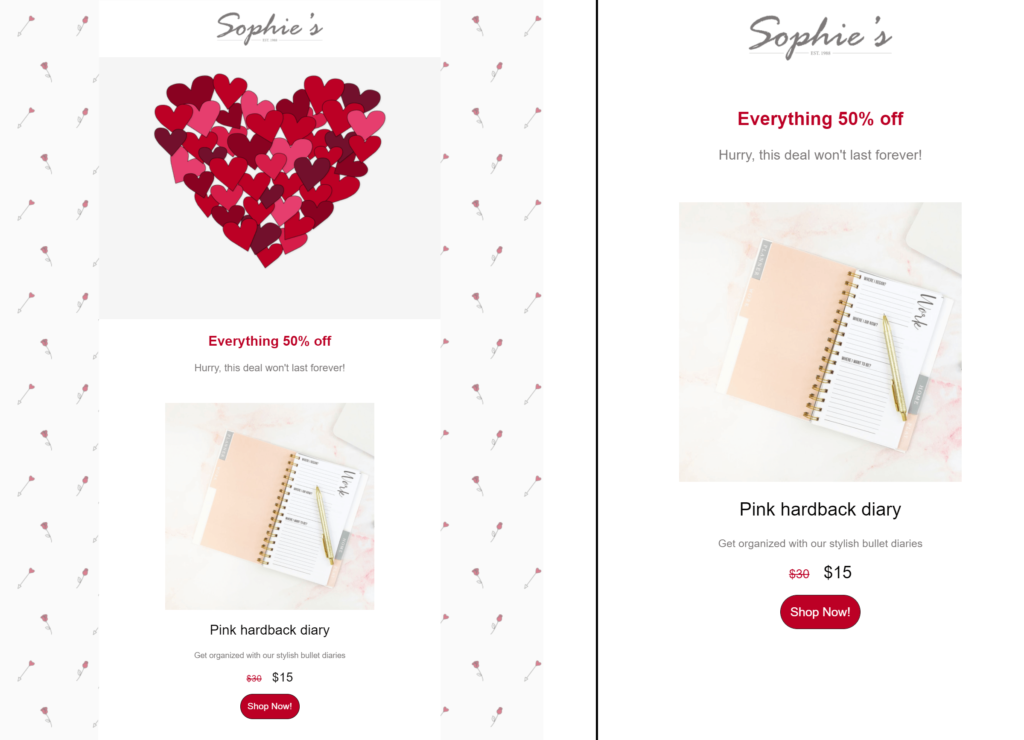
On the left side, we have the desktop version of a Valentine’s Day newsletter template by Moosend, while on the right it’s the mobile one. As you can see, in the mobile version we hid the background image as well as the heart visual to achieve a cleaner design.
You can do the same for any newsletter through our platform, without creating a duplicate campaign.
9. Consider the Design and Placement of Your CTAs
The overall success of an email campaign depends on whether you successfully lead readers towards your call to action and have them click on it.
To help subscribers reach it, invest in the inverted pyramid model, guiding the reader’s eye from the top of the email down to your CTA at the bottom. Use a headline that attracts attention, provide concise copy emphasizing the value of the offer, and use a clean design so your CTA stands out.
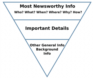
Basically, this scheme eliminates distractions, with every email component urging readers to read through the content and click the email CTA.
Your work doesn’t end with this scheme, though. There are other ways to make your email CTAs visible. Some of them include placing them at a prominent place like the top of the email, using bold colors, or adding enough color contrast between the CTA and its background.
Since they’re the element most responsible for conversions, the copy used in them must be actionable to inspire action. Email CTAs may also come in different forms, such as a button or a link, shapes, and sizes.
When it comes to their ideal dimensions, make sure that they’re large enough to optimize the mobile experience. As a rule of thumb, the average size is 47.9 px while Apple suggests 44 px for mobile devices.
You could repeat your CTA throughout the email content, too. If you choose to have more than one CTAs, invest in the right structure and color choice to distinguish between them and make your primary one the email hero. For example, put your main CTA above the fold so no reader misses it or make it bigger than the secondary ones.
10. Create Plain Text-Emails
Plain text emails are often treated like the underdog of email newsletter design. But while HTML emails have their charm, sometimes they can be too distracting. There are occasions when a plain email might be better suited for the job. That’s because they have a simple format and usually include only key information. Plus, they serve accessibility purposes and are easily read on mobile.
But their main disadvantage is that they’re less engaging, lacking the power of interactive elements.
Here’s where a “hybrid” email campaign comes into play, an HTML email that looks like a plain text one. Such an email design allows you to be flexible while combining the best of both worlds. Recipients will see the call-to-action straight away since text-based emails have fewer distractions and message delivery is more effective.
An additional benefit of these hybrid emails is that they’re ideal in B2B scenarios. They inspire trust, keep the reader focused, and serve as an excellent way to start a conversation. Finally, due to their nature, people don’t perceive them as a blatant sales pitch.
Let’s see an example of an HTML email that resembles a plain text one.
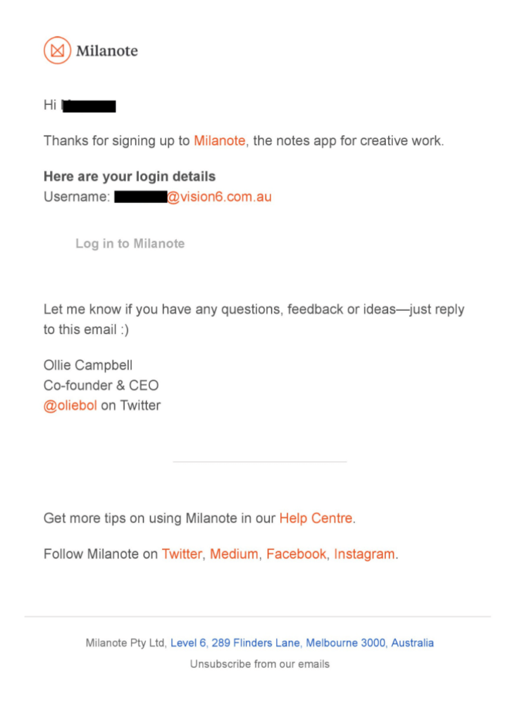
In this automated thank you email, new subscribers are greeted by the CEO of Milanote. While we get that this is an HTML email thanks to the logo, it has the feel of a plain text one. With the addition of personalization (the subscriber’s name), this email creates a sense of intimacy, enhanced by the fact that it comes from the CEO himself.
5 High-Converting Email Design Examples
It’s nice to have a roadmap on what constitutes an effective and eye-pleasing email newsletter design. But how about moving from theory to practice? Below, we’ve gathered some of our favorite email design examples to spark your inspiration.
1. Moosend’s Cart Abandonment Template
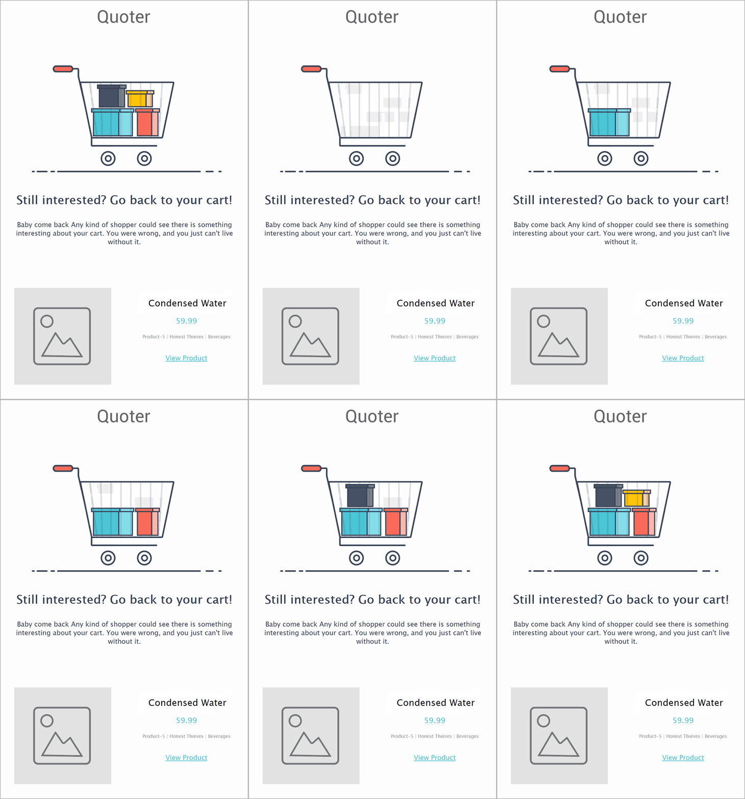
What to steal:
- The minimalistic and clean email design that focuses on the primary message of the campaign, which is to urge the subscriber to complete the checkout
- Moosend uses a straightforward and mobile-friendly structure with clear sections and white space to separate different email assets
- The addition of attention-grabbing visuals are the secret sauce for cart abandonment emails to hit their mark—here, it’s the animated GIF catching the eye
2. Pop In a Box’s Offer Email
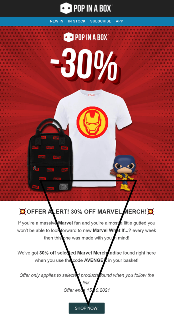
What to steal:
- They include a prominent and high-quality visual highlighting the compelling offer
- The offer is repeated in the headline and throughout the email copy, adding urgency to the mix.
- The inverted pyramid scheme used directs the eye towards the actionable CTA-which has a cool contrast with the white background, too
3. Who Gives a Crap’s Promotional Email

What to steal:
- The email copy is fun and lighthearted, aligning with the playful brand tone
- The ideal balance between visuals and text and the clear hierarchy facilitate the reading experience while guiding the reader’s eye towards the CTA
- They invest in a color palette that’s easy on the eye while making the CTA pop with the green color that’s in contrast with the background
4. Finn’s Love Your Pet Day Email
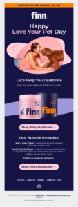
What to steal:
- The combination of pink and blue create a visually-appealing contrast while matching the colors of the product packaging
- Finn places the products at the center of the email design, followed by a strong CTA that includes the name of the product in the copy
- The image of the girl with her dog, placed above the fold, is powerful in evoking emotions and making subscribers relate
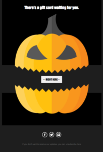
5. Moosend’s Halloween Template
What to steal:
- The bold combination of black and orange is perfectly aligned with the holiday spirit
- The pumpkin at the center, divided by the email CTA, is a clever way to guide the reader’s eye towards your conversion point
- Moosend opts for a straightforward design with just the necessary elements, which is ideal to minimize distractions and help readers focus on your holiday offer
From Design to “Send’
Creating effective email newsletter layouts requires a certain mix of inspiration and functionality. The above email newsletter design tips are easy to follow and you can integrate them right away into your existing email marketing strategy. The email examples, on the other hand, are perfect to draw inspiration from.
As to the functionality part, you should be looking for a user-friendly email newsletter creator with powerful capabilities and ready-made email templates that require no technical experience to customize. So, sign up for a Moosend account and stun your audience with outstanding designs.

 Published by

 Published by
