11 Ecommerce Newsletter Examples To Inspire You [2026]
Digital marketing can be a goldmine for eCommerce businesses, especially when you use SEO and social media. But let’s highlight the real star of the show: eCommerce email marketing.
If you’ve been trying it out but haven’t seen the results you were hoping for, or if you’re just starting to dip your toes in, you might be wondering how to create a successful campaign.
What types of email newsletters should you use? What visuals grab attention? How do you write copy that converts? And is your call-to-action (CTA) placed strategically?
To answer your questions, we’ve compiled some of the best eCommerce newsletter examples along with actionable tips to kickstart your journey.
Most Popular Types of eCommerce Newsletters
Before you create a newsletter, you should clearly define your marketing goals so you can choose the right type of eCommerce newsletter.
Otherwise, sending random newsletters to your new subscribers will likely be perceived as spammy and can cause them to unsubscribe.
Here are some of the most popular eCommerce email marketing types that online stores use to target their customers:
- Welcome emails
- New product launch newsletters
- Product recommendation newsletters
- Promotional newsletters (e.g., limited-time sales, special offers, and discounts)
- Cart abandonment emails
- Transactional emails
- Customer review newsletters
- Educational newsletters
Regardless of which one you choose; you should stay creative and offer fresh content to keep your subscribers engaged. Getting the right email service is also crucial to getting the job done.
Ecommerce-oriented software like Moosend will offer you tools and features to make your campaigns more effective, including powerful automated workflows, eCommerce AI capabilities, and advanced segmentation.
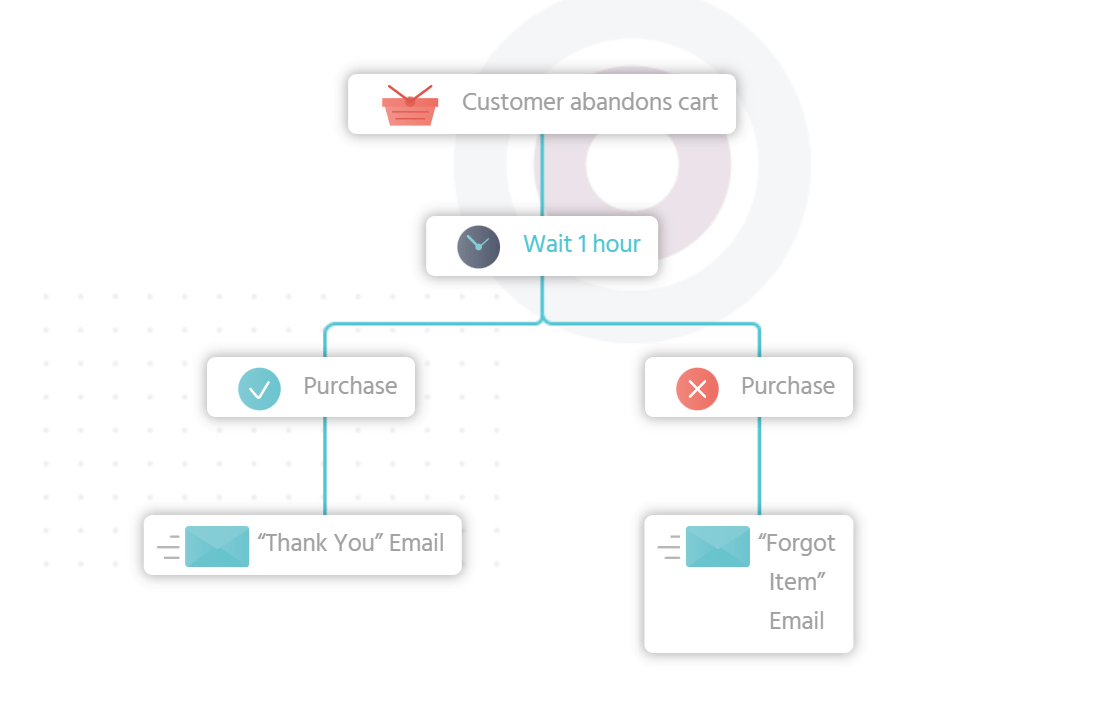
With a user-friendly workflow builder, you can set up abandoned cart sequences to recover your lost sales or thank customers for their purchases.
Now, let’s examine the following eCommerce newsletter ideas.
Top 11 Ecommerce Newsletter Examples
Everything matters when it comes to email newsletter creation, from the subject line to the layout to the visuals.
An eCommerce email newsletter template is a great starting point for designing your campaign. However, it’s essential not to rely solely on them.
To make your campaign truly stand out, you should personalize and customize your templates. Add your unique touch by tailoring specific elements to better fit your branding and resonate with your audience.
1. Frank and Oak’s welcome email
Subject line: Welcome to Frank and Oak. Here’s your 15% discount
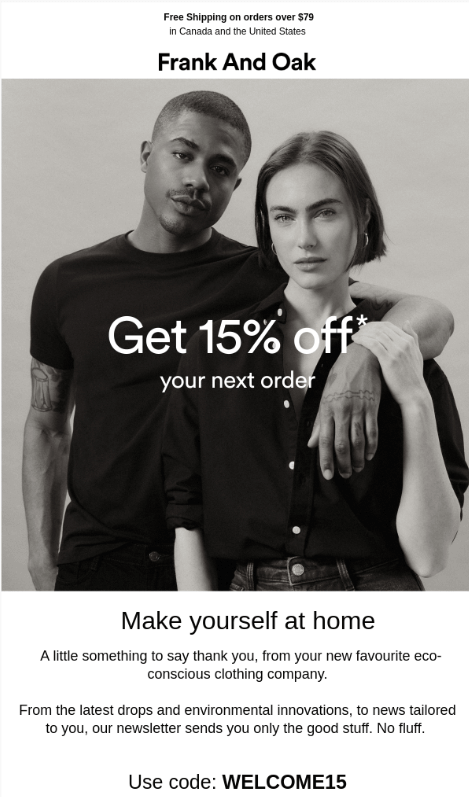
Welcome emails help increase open rates, make a good first impression, and possibly even convert them into new customers.
From the beginning, Frank and Oak use a straightforward newsletter introduction to thank users for signing up. This is a very simple yet effective strategy that makes people feel valued.
What makes this a great welcome email is using large fonts to highlight the discount percentage and the code they offer as a thank you for subscribing.
What to use:
- Friendly email copy to welcome and thank users for joining you.
- A welcome gift in the form of a discount or a coupon.
- Bold email-safe fonts that attract the reader’s attention to the discounts
- High-quality visuals reflecting your brand to introduce customers to your products.
Additional resources:
Welcome emails are some of the most important types of emails you need as they act as an introduction to your brand. If you need an extra hand, here are a few resources to help you nail them:
2. Flings’ new product launch
Subject line: Introducing the new & improved Flings! 🔥
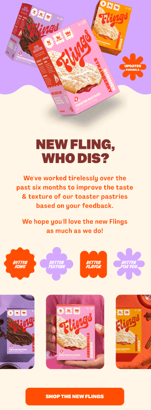
New product launch newsletters are perfect for generating interest and excitement. Not only do they show your audience something new, but they can boost your open rates, click-throughs, and conversions.
The colorful design chosen by Flings aligns with their brand image and is eye-catching for the readers.
Moreover, the visuals clearly present the new products making them easily recognizable and memorable.
What to use:
- Eye-catching email design that aligns with the brand image.
- High-quality visuals to show the new product.
- Email copy that triggers an emotional response (excitement) and informs about the benefits of the new item.
- Bold CTAs strategically placed under the visuals.
3. One Kings Lane product recommendation
Subject line: Selected just for you – take your pick!
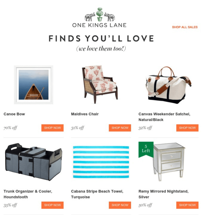
These types of newsletters add a personal touch to your customer relationship, which helps increase click-through rates and conversions.
In this eCommerce newsletter example, users see a well-crafted subject line, which makes them curious and eager to open the email.
Moreover, once they open it, One Kings Lane reassures them that the products were specifically selected for them, using clear language in large bold type that is eye-catching.
Using personalization is a great way to increase your metrics, delivering content tailored offers to your customers instead of generic recommendations.
What to use:
- A personalized email subject line and introduction.
- Beautiful visuals of the recommended products.
- A clean email layout to increase readability.
- Brightly colored CTAs with actionable copy.
Personalization is a force to be reckoned with, so when you plan your promotions, opt for targeted messages instead of email blasts.
If you want to improve conversions, use an email service that lets you personalize not only your subject lines but also your content. Moosend’s improved conditional blocks, for instance, will let you display the right type of content based on specific criteria, like age or location.
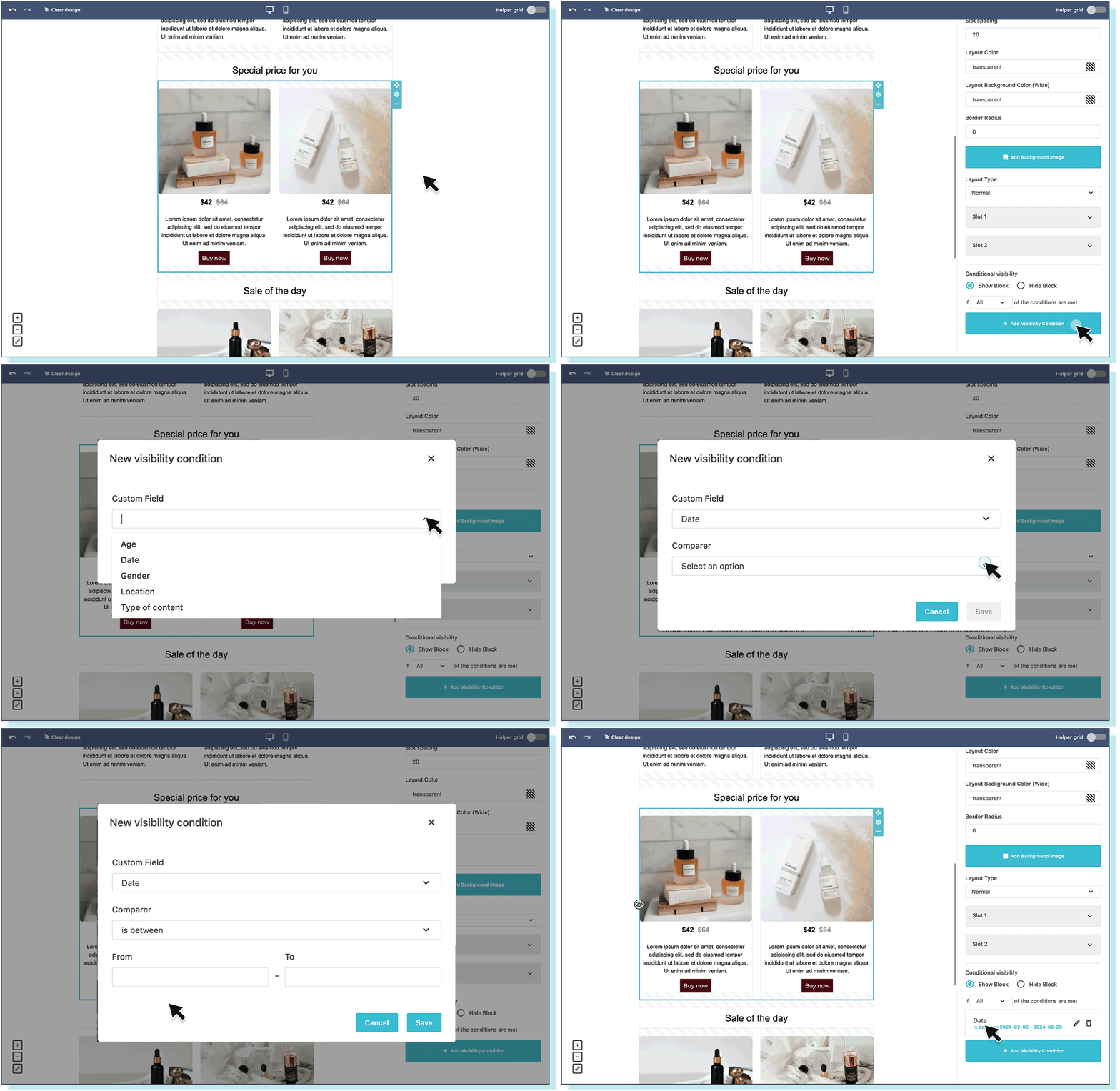
This way, you can create one campaign for your audience, set up the conditional visibility of your blocks and deliver tailored product offers to your recipients.
4. Buoy’s time-sensitive promotional newsletter
Subject line: Surprise! FREE Daily Wellness Bundle w/ Hydration Drops! 💘
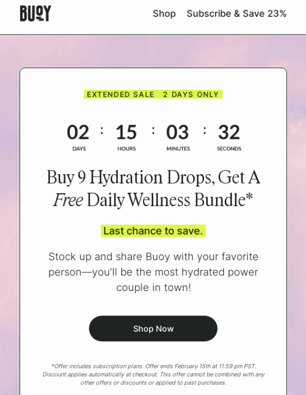
Limited-time deals are very effective marketing strategies for eCommerce businesses as they instill a sense of urgency that boosts conversion rates and sales.
Here, Buoy manages to attract the reader’s attention to the time-sensitivity element of the offer through the countdown timer and highlighted sections.
They also kept the message short, followed by a CTA, making it easy for the subscribers to understand what’s expected of them and act quickly.
What to use:
- Countdown timers to instill a sense of urgency.
- Short content followed by a clear CTA button.
- Colors and any other design elements that will increase the sense of urgency and lead customer to the call-to-action.
5. Fatty 15’s mystery sales email
Here’s another good example of a limited-time sale that you should consider.
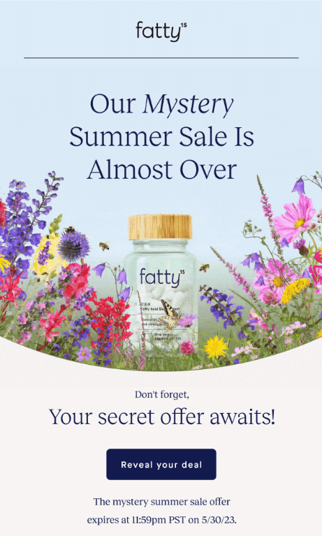
What makes this newsletter by Fatty 15 unique is the intriguing email copy. By using phrases like “mystery summer sale” and “secret offer”, they pique the subscriber’s interest, making it impossible for them not to click the CTA.
They also use a simple design with the product placed in the heart of the email, surrounded by beautiful visuals of flowers.
Moreover, to instill a sense of urgency, they use the phrase “almost over” while also providing a sale expiration time and date.
What to use:
- Compelling email copy that intrigues the recipients
- Simple email newsletter design with a nice visual of the product. Simplicity sometimes is the ultimate sophistication.
- A clear sale expiration time and date to give the campaign a sense of scarcity.
6. Athletic Brewing’s seasonal promotion
Subject line: Order for Thanksgiving Delivery 🍺 🍗
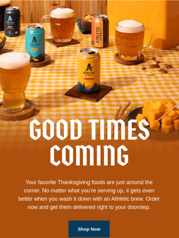
This type of seasonal promotional newsletter is perfect for driving click-through rates, conversion rates, and sales.
Athletic Brewing uses enticing phrasing like “good times coming” to convince subscribers to purchase before Thanksgiving.
Moreover, their Thanksgiving email newsletter takes advantage of the holiday theme, using the color orange and a beautiful visual of a dining table to amplify the holiday vibe.
What to use:
- Target major holidays like Christmas, Valentine’s Day, Easter, etc. with dedicated email marketing campaigns.
- Use holiday associated colors to give a more festive vibe to your email, such as red and green for Xmas, or orange and black for Halloween.
- Add eye-catching visuals of your products in holiday settings.
Seasonal marketing is great to give your sales a boost. Remember to start planning your campaigns as early as possible to target each busy season effectively.
Seasonal resources:
Below, we added some of our favorite seasonal email marketing guides with more eCommerce newsletter examples to help you:
- Halloween Email Marketing Guide With Examples
- Black Friday Email Marketing: Strategy & Tips
- Christmas Email Marketing Examples
- Valentine’s Day Email Marketing: Tips, Ideas & Examples
- Mother’s Day Email Marketing Guide
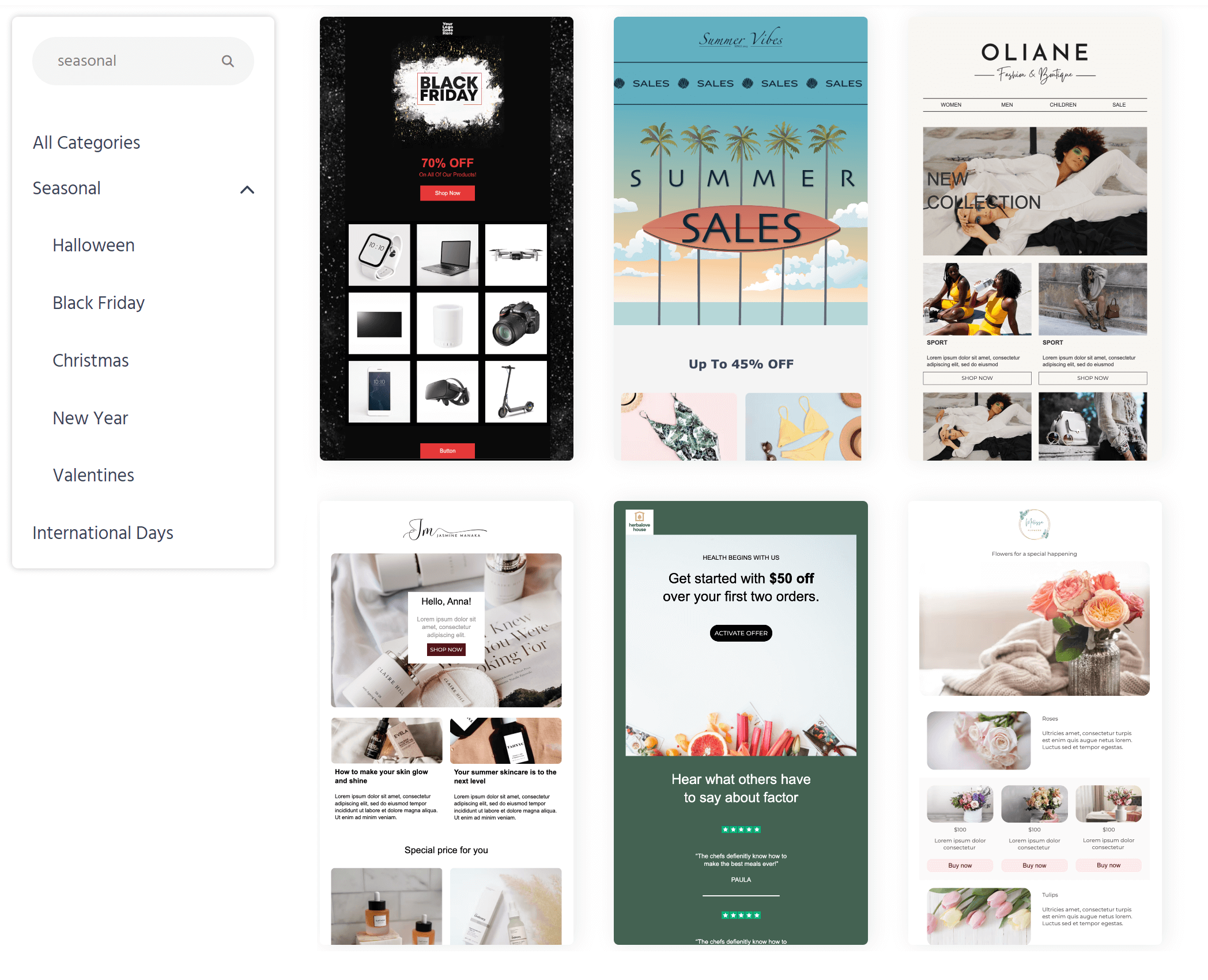
And to save time, you can pick and customize a pre-made holiday template from Moosend’s library. There, you’ll find all the seasonal designs you need to create your promotional offers and newsletters ahead of time.
7. Oobli’s discount promotional newsletter
Subject line: We’re Selling Out!!
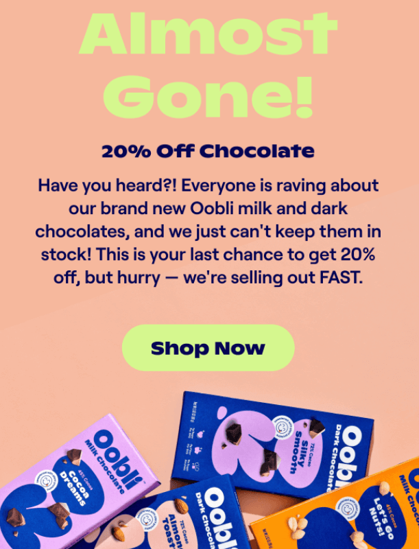
Discount newsletters are perfect for converting users into new customers and driving sales because everyone loves a good bargain.
Oobli manages to create a sense of urgency right from the subject line. That, in turn, will inevitably increase their open rates.
And to make things even better, the brand uses a large, vibrant font to inform the recipients that the items are “Almost gone!” which adds to the urgency.
Here, the 20% discount doesn’t seem as important as the fact that the products will run out of stock. Oobli achieves this by using phrases like “your last chance” and “selling out fast.”
What to use:
- Create compelling subject lines to entice your customers.
- Use the right font size to present the most important information.
- Play with different colors to make the most important information stand out, such as the discount or the coupon code.
- Choose words that will create a sense of urgency and encourage the recipient to click on the CTA.
8. Kizik’s cart abandonment email
Subject line: Your Kiziks Are Lonely 😢
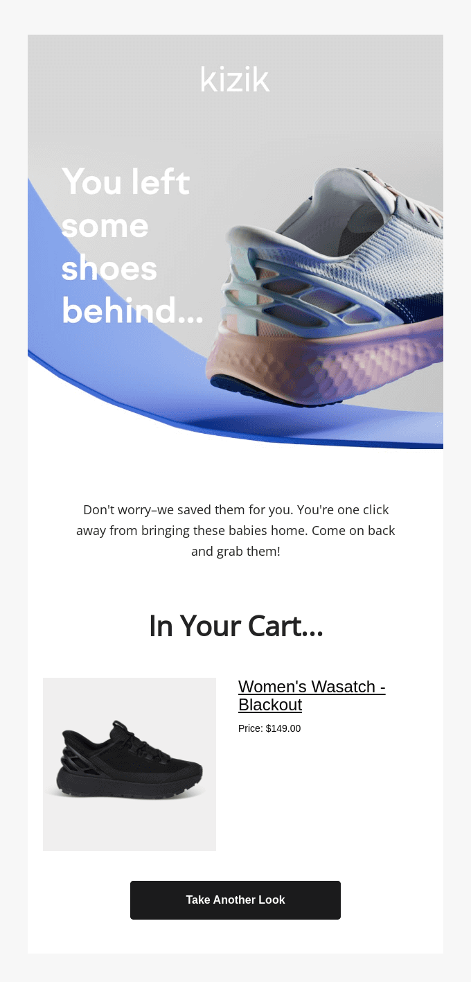
According to statistics, 69% of online carts are abandoned on average. An abandoned-cart email, though, like Kizik’s will help you draw users back to your eCommerce website and encourage them to buy.
The subject line of this email plays a bit with the user’s emotions by saying that “Your Kiziks Are Lonely.” This is a great solution for drawing people in.
Then, after opening the email, Kizik reminds you that you left some shoes in the cart using a large, bold font and a visual of shoes.
The email also contains a clear visual of the exact pair of shoes you meant to buy, together with the pricing and a call to action inviting you to take another look.
What to use:
- Add emojis if your branding allows them to stand out in the inbox.
- Include nice visuals of the product, the pricing, and a clear CTA to remind users about the product they forgot.
- Provide additional information, such as links to customer support to help customers in case they have questions.
- Throw a discount to sweeten the deal and finally purchase.
Additional resources:
Creating the perfect abandoned cart email requires a synergy of multiple elements: a compelling subject line, a clean design, and a great CTA. Below, you’ll find some helpful resources to make it a little easier:
- 120+ Smart Abandoned Cart Subject Lines
- Abandoned Cart Email Templates
- Best Abandoned Cart Email Examples
Abandoned cart emails are necessary for any eCommerce email marketing strategy. After you create your design, you can set up a workflow to target your cart abandoners.
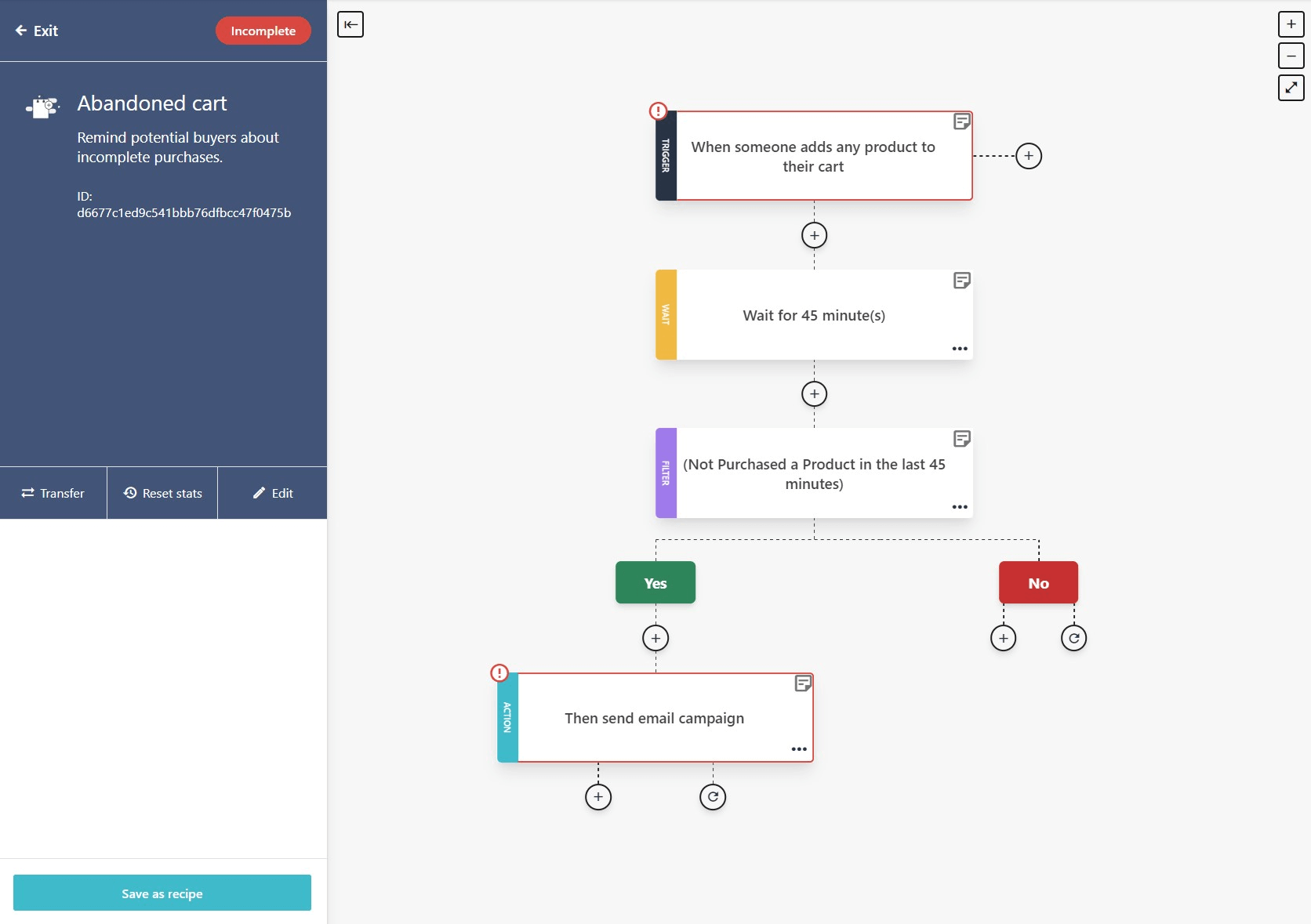
Moosend’s editor is both advanced and user-friendly, letting you build effective recovery sequences. You can start from scratch or choose one of the pre-made eCommerce recipes to save time by signing up for a free account.
9. Allbirds’ transactional email
Subject line: Your Feet Say Thank You
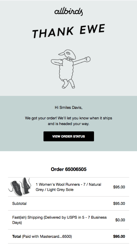
In this example, Allbirds uses the order confirmation email to thank the customer for making the purchase, through a large bold font.
The brand has also added a personal touch to this transactional email by including the customer’s name in the introduction.
The rest of the email simply informs the recipient of the shipping terms and confirms their credit card payment, which is useful and reassures the customer that their order is progressing smoothly.
What to use:
- Always include a thank you message regardless of the type of transactional email.
- Add all the necessary information regarding the customer’s order and let them know you if there are any issues.
- Add a personal touch by using the customer’s name.
- Insert helpful links
Transactional emails are a great way to help you improve the new customer’s experience and build trust in your eCommerce business. Some other common types include:
- Account creation emails
- Password resets
- Shipping notifications
- Payment invoices
- Purchase receipts
10. Paro’s customer review email
Subject line: 5 ⭐️ reviews: “So simple and quick to assemble…”
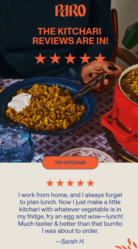
To establish yourself as a trustworthy and credible brand, you can leverage customer reviews and testimonials. Then, turn them into a customer review email to show your recipients what others think about your products.
In the above eCommerce newsletter example, Paro uses social proof to increase its engagement and conversions. The 5-star design element in bright orange shows subscribers their top ratings even before reading the rest of the content.
They also use an attention-grabbing visual illustrating a plate full of their delicious kitchari, which makes the reader want to have a taste. The visual is followed by a CTA button asking the user to try the product.
Finally, Paro includes a real customer review to further convince potential shoppers to try their product.
What to use:
- Design elements in bright colors and attention-grabbing visuals
- Great customer reviews that highlight the reasons why they chose the brand/product.
- Give credit to the original source to maintain transparency and increase credibility (name of the reviewer, the website they left it on, etc.)
11. Ritual’s educational newsletter
Subject line: We saved you a spot
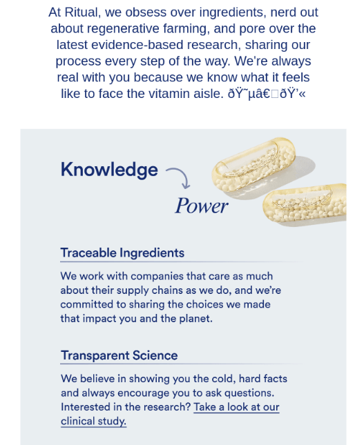
The best part about educational newsletters is that they increase brand awareness and customer trust. These emails can include everything from blog content, industry news, and case studies to invitations and webinars.
Here, Ritual educates readers about the brand’s values and product using a minimalist design to keep the reader focused on the message.
In addition, they chose their words carefully to show subscribers their commitment to being transparent regarding the ingredients and science they use. Using phrases like “obsessed over,” “we’re always real,” and “we’re committed to” can help increase customer trust.
What to use:
- A minimalist design that keeps the focus on the message.
- Visuals of your actual products and the ingredients/parts used to make them.
- Email copy that uses simple language and educates users on the product making process. Also, highlight what differentiates your product from other eCommerce brands.
Best Practices for Designing an eCommerce Newsletter
After checking some of the best eCommerce newsletter examples, it’s time to learn some best practices you should follow.
Create an attention-grabbing subject line
Before you can even think about boosting sales, you should first ensure the subscribers open your email newsletters.
To do that, you need attention-grabbing subject lines that entice users to open your emails.
Here’s how to ace them every single time:
- Be clear and concise to avoid confusing the recipient.
- Use actionable verbs to encourage users to act (e.g., join, sign up for).
- Add a sense of urgency to get subscribers to open your email as soon as possible (e.g. Don’t miss out on this limited offer!).
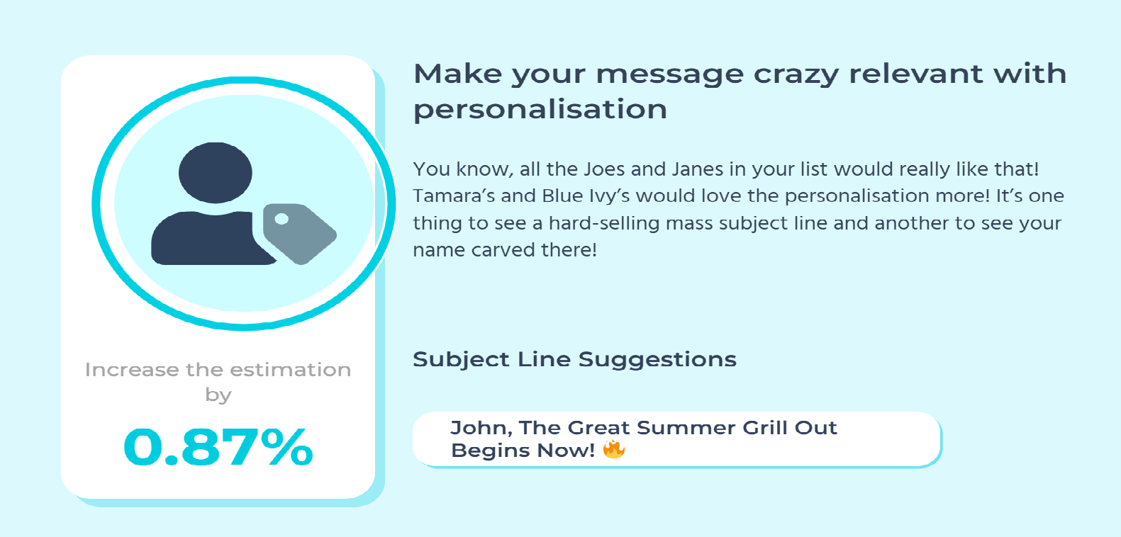
- Add a personal touch by including the user’s name (e.g., Emily, here’s a special offer just for you!).
If subject line creation isn’t your strongest suit, you can use a free subject line tester like Refine. The tool will give you actionable insights to improve your creations and increase your open rates.
Personalize email content
Email personalization is one of the most important elements of email marketing. Why? Because it makes it unlikely for subscribers to perceive your emails as spam.
At the same time, it boosts click-through rates and conversions.
To leverage its power, use segmentation to send only relevant emails to pre-selected recipients. For example, you can segment your audience based on demographics or past purchase history.
Moreover, provide personalized recommendations to drive conversions and sales. For instance, you can use their past purchase history to send them recommendations for similar or related products.
Lastly, use your email marketing and automation software to create dynamic emails that personalize their content automatically based on customer data and subscriber preferences.
Here’s a great example by Seafolly that offers a reward on the customer’s special day. It’s unique, thoughtful, and gives them more reasons to make a purchase.
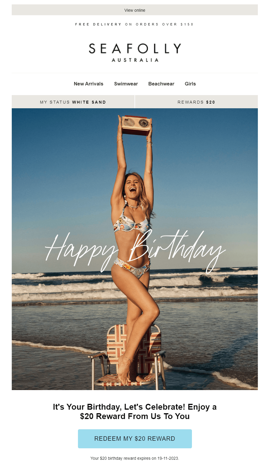
Everyone loves birthday emails, especially when they give an extra discount to celebrate. You can easily set up these emails through Moosend’s platform.
And if you need help, you can find the birthday email recipe in the workflow library. Just make sure you add the right ingredients and you’re ready to go.
Establish a clear primary CTA
Without a clear and prominent call-to-action, subscribers might not take any action.
However, a well-designed and well-positioned CTA button will boost click-through rates and conversions.
Here’s what you should do:
- Use actionable language. Here are some examples: “Buy now,” “Try it now” or “Get the offer.”
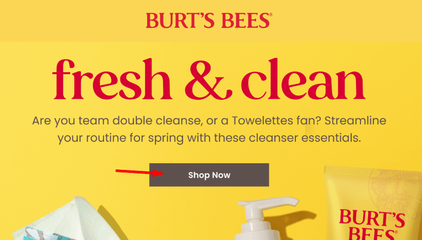
- Make it very visible. You can use a bold color and large font to make the CTA button stand out.
- Position it wisely. If users don’t see the button immediately, they will probably not waste time looking for it. So, make sure you position it towards the top of the newsletter.
Here’s an example by Burt’s Bees:
Optimize for deliverability
Unfortunately, you can’t have a successful email marketing campaign if your emails don’t reach the subscriber’s inbox.
Therefore, optimizing for email deliverability is essential. So, here are some tips:
- Improve your opt-in process to ensure you send emails only to interested users.
- Regularly clean your email list by deleting inactive contacts and bounces. As a result, you can focus on the most engaged subscribers.
- Give users the option to easily unsubscribe if they are no longer interested in your eCommerce business. Otherwise, they can easily get frustrated and mark your emails as spam, hurting your brand’s reputation.
Moosend’s excellent delivery score will let you land your campaigns in your recipient’s inbox every single time.
Moreover, the audience management features will help you track and centralize the number of active and unsubscribed users and monitor your bounces. Based on this data, you can then focus on the optimization of your deliverability.
Take accessibility into account
Given that nowadays people use their smartphones more than other devices, you should always consider mobile accessibility.
So, here’s how you can optimize your email marketing templates for mobile devices:
- Make CTA buttons visible and touch friendly. Otherwise, your click-through rates and conversions will suffer.
- Make images smaller and text larger. This will improve legibility and load times on mobile devices.
- Use A/B testing. Even if an email design seems mobile-responsive to you, without A/B testing, you can’t be sure. Plus, this can help you identify other issues you’re unaware of and optimize accordingly.
If you’re looking for more ways to design winning eCommerce newsletters, check out some more email marketing best practices for great results and conversions.
Create the Best Email Newsletters for Your Ecommerce Brand
After looking at some of the best eCommerce newsletter examples, you can now use the above examples as inspiration to create fresh and engaging content for your email campaigns.
Still, remember that newsletters are not standalone marketing strategies. Therefore, you should always pair them with other winning strategies, like early access to new products or discounts.
Moreover, if you want to improve your strategy, use workflow automation to streamline the process. An eCommerce-friendly email marketing software, such as Moosend, will give you all the tools you need to step up your strategy.
Not sure if this is the right solution for you? Then, try Moosend for free and decide for yourself.
Frequently Asked Questions
Take a look at the top FAQs about eCommerce newsletters.
Q1. How often should you send eCommerce newsletters?
While there’s no general rule, weekly newsletters or monthly updates are more popular than daily ones. This is because sending emails too often annoys your recipients and makes them mark your messages as spam.
Q2. How long should an email newsletter be?
Email newsletters should be short and clear because users usually scan them only for a few seconds. So, you have to grab their attention in just a few words.
Q3. How do you measure the performance of an email newsletter?
You can measure the performance of an email newsletter by tracking specific metrics such as the open rate, the click-through rate, and the conversion rate.

 Published by
