


If you run a website or own a business, you know how much CTAs(Call to Action) play a part in your conversion strategy.
Your call-to-action is what can make or break your business growth, either helping you reach your goals or leaving you stranded behind everyone else.
It’s essential to optimize your CTA so your website gains as many conversions as possible.
It’s a tool that helps move users down the conversion funnel and helps them move along their buyer’s journey with ease.
The easier it is for users to navigate through your content and see the benefit behind handing over their information, the likelier they’ll convert.
Try Moosend Today
The easiest and most affordable email marketing and newsletter software!
What is a Call to Action (CTA)?
A call-to-action is exactly what it sounds like: it’s a call to your audience, encouraging them to take some sort of action on your website.
This could be many different things, including signing up for an email list, clicking through to a product page, or generating leads.
It helps to carry along your conversion strategy by leading users in the right direction and telling them what to do next.
What makes a successful CTA?
To create a successful CTA that brings your business conversions, you must first decide what your goals are, such as:
- Email sign-ups
- More leads on a certain webpage
- Contest entries
- Build your social media following
When you have a solid list of objectives to fulfill, it’s easier to achieve them because they’re specified, allowing you to create a strategy that matches what you need.
An effective CTA uses actionable language to convince users to take action.
When done correctly, its language is convincing enough to make users believe they need to follow the action you’ve put in front of them.
Using verbs is essential when creating calls-to-action because the whole point is that you want users to do what you tell them.
It’s important that the language you use in your CTAs doesn’t come off as bossy, annoying, or forceful.
It’s more about the customer than you, and you have to prove to them that there’s a benefit to them clicking on that button. Using the right language, in this case, is essential.
Your CTA should also express a sense of urgency to your audience. The point of CTAs is to convince users they need to take action immediately or else they might miss out on a spectacular deal or content that may not be available for long.
If it’s easy to miss, then there’s no point. Your CTA should stand out and be the star of the show on your landing page, blog post, and wherever else it’s placed.
If you aren’t A/B testing different components of your CTA, then it’s impossible to know if they’re able to convert more visitors. You should always test one element at a time and pay special attention to button color and copy when split testing.
The Buyer’s Journey
Your call to action should also move your visitors seamlessly through their buyer’s journey.
If it isn’t pushing them down the sales funnel, then something is amiss. It should bring your audience one step closer to becoming loyal, paying customers. If users need to fill out a form, your CTA should be right there next to it, easy to navigate and interact with.
If you need to have two CTAs on your webpage, then it’s essential that you lead visitors to the main one you want to be clicked on first.
To do this, it needs to be more visually striking than the CTA next to it and lead users to the primary action you want them to take.
What different types of CTAs can you use?
When you think of CTAs, there’s probably only one or two types that you envision in your mind as certain calls-to-action are more popular than others.
However, it’s important to know that you have options and can reach out to your audience in many different ways.
Each type of CTA has its own purpose, so depending on what your main objective is, you might find that one works better than another.
Let’s go over the different kinds of opt-ins for CTAs you can use to skyrocket your leads.
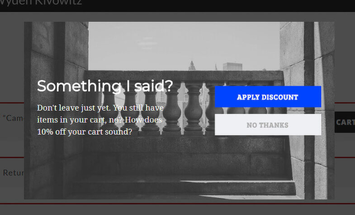
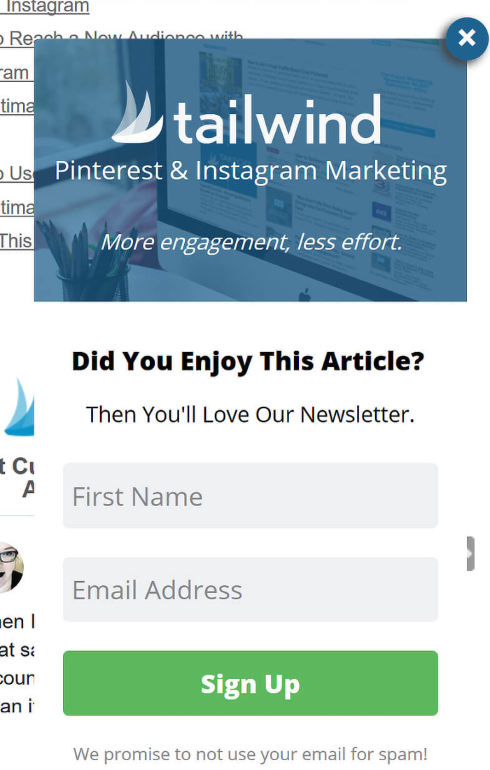
Exit-intent
This type of CTA is perfect for those instances when users are about to click out of your website and go somewhere else.
With exit-intent technology, the pop-up gets triggered anytime it senses someone is about to exit your site.
It then presents them with some type of offer and reasoning for why they shouldn’t leave and should hand over their information instead.
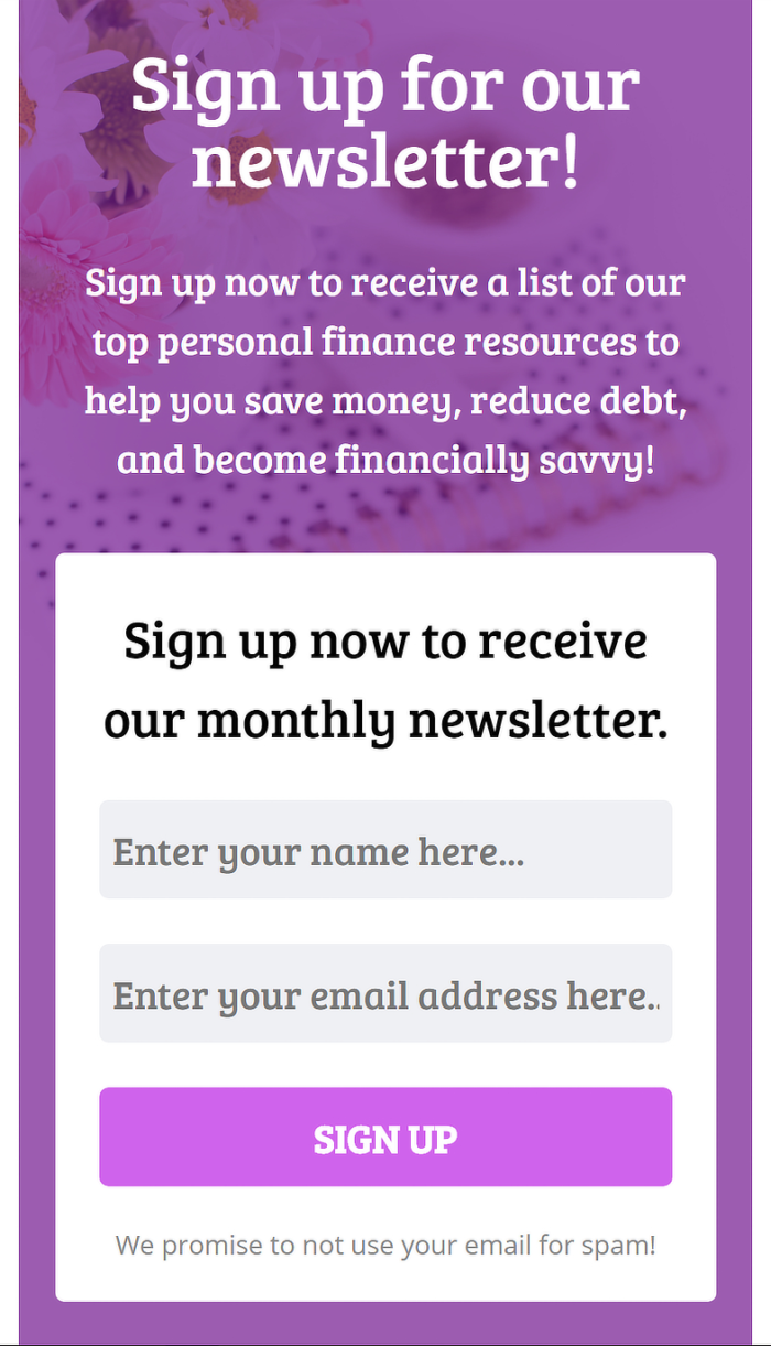
Inline/after-post
An inline or after-post popup appears at the end of a post.
If users have already made it through an entire page of your content, the chances of them opting into your offer or email list are likely.
That’s why this type of Call to Action is more effective if you already have a loyal audience.
These popups are less annoying to users because they don’t interrupt their viewing experience yet still manage to get their attention.
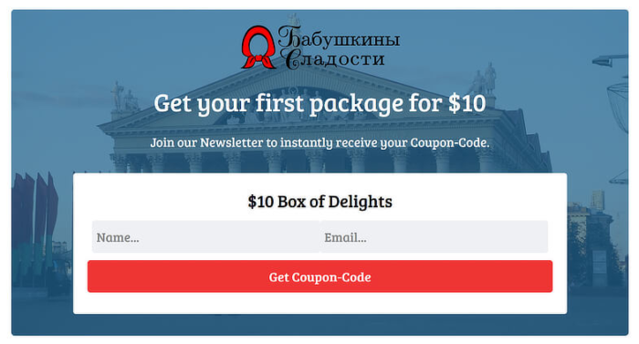
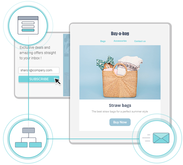
Floating bar
Also called a ribbon or a header or footer bar, a floating bar popup floats at the top or bottom of your webpage.
It floats above or below content so that the user experience isn’t interrupted but still remains visible as users scroll through content.
One problem is that sometimes these types of CTAs are so subtle that users may not pay them too much attention or even realize they’re there.
![]()
Slide-in
Slide-in popups appear at the bottom left or right corners of your webpage.
They’re good for convincing users to further engage with your brand by suggesting related pieces of content.
Many brands use these types of CTAs to showcase their lead magnet, although you can lead users to anything you want.
They’re a great way to catch someone’s attention if they’re just about to leave your site.
Sidebar
As the name suggests, this popup appears right in the sidebar for easy access. Users can put this in the sidebar widget of your WordPress website.
The good thing about entrusting your Call to Action in this kind of popup is that it’s non-threatening to users and doesn’t interrupt their viewing experience.
However, sometimes it’s so subtle that users don’t even realize it’s there.
Why should you use CTAs?
Calls-to-action are key to convincing visitors to take action that will benefit both you and them.
They are direct, specific, and lead your audience down the conversion funnel so that your business achieves its goals and users get the content they want.
10 Call to Action Examples to Increase Conversions
1. Double Call to Action
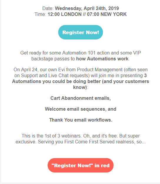
Nothing entices users like free content, which is why our own approach is so effective, resulting in an 18.57% click-through rate.
It’s difficult to convince users to hand over their email address, let alone click on your CTA button/s.
However, urging them by telling them to register for a free Webinar will allow you to increase your CTR. In this case, we clearly state the date and time of the Webinar followed by a subtle and simple “Register now” button colored in blue.
While at the end of our email, we have the same button with the same CTA text in red color, followed by the words “in red” to captivate the reader’s attention.
2. View our work
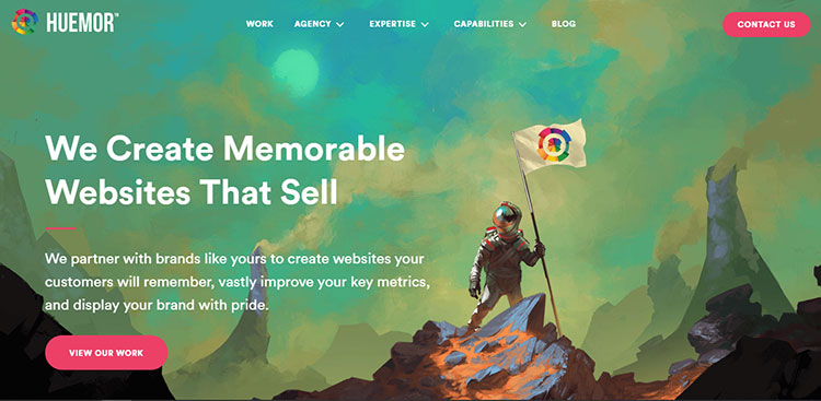
Huemor’s homepage CTA, which is placed above the fold, showcases a bright pink color guaranteed to grab visitors’ attention right away against the slightly darker backdrop.
It also describes, in smaller text, what it does and how it can help users who are trying to create and develop visually appealing, memorable websites.
Since it is a website development business, it goes without saying that its design has to be impeccable in order to live up to its standards and convince people they are worth investing in.
This adds to the effectiveness of the CTA because, instead of telling users to book an appointment or see a pricing plan, it urges them to view their work examples.
This shows that they want their audience to have a solid idea of the type of work they do so they attract the right customers.
3. Launch (do not press)
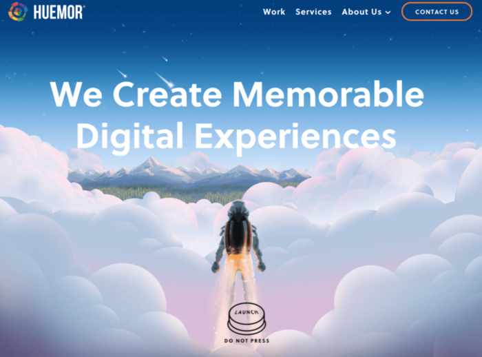
When someone tells you not to eat the last piece of candy sitting in front of you, it’s hard to oblige. Being told not to do something, for some reason, usually entices people to do the exact opposite.
Perhaps that’s why this reverse psychology CTA by Huemor works so well. On one hand, there’s a button with the word “launch” that tells you something is going to happen by clicking on it.
Right underneath in smaller letters, however, it then tells you not to press. This definitely catches users’ attention and makes them wonder what will happen if they do press it.
It’s a unique CTA that works for this brand that specializes in web development and convinces its audience to do the thing they’re told not to.
4. Discover a cocktail catered to your taste
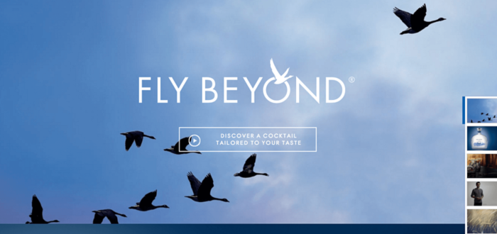
It’s normal that a CTA will lead to a product page or another landing page, but this one by Grey Goose lures visitors in using personalization.
Who wouldn’t want to find out what kind of cocktail they can create using their own personal taste? It’s clever because it doesn’t have a typical “salesy” feel to it and makes users feel like they’ll benefit by clicking through.
It truly feels like a CTA built to please customers instead of the other way around, and that’s what makes it work so well, especially for Grey Goose’s target audience.
5. Enter giveaway
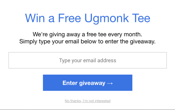
A great way to boost your email sign-ups is by enticing your audience with a giveaway. Who doesn’t like receiving free products?
There’s a rush that comes with entering a contest and waiting to see if you win the prize or not, and this tactic didn’t run away from Ugmonk.
Its design is simple and clean and appears as an exit-intent popup when you’re about to leave the website.
This easily grabs the attention of their audience and convinces them not only to stay on the site but to leave their email address so they can possibly win a free t-shirt.
6. Give me the free PDF
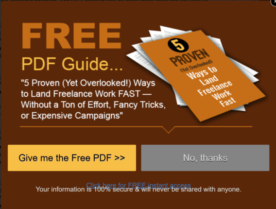
A tactic that certainly helps you convert visitors is using a first-person point of view in the CTA copy.
This makes users feel more involved in the action of receiving their goods and makes them feel like they’re getting away with a steal.
Changing the wording from the third person to the first-person perspective has the ability to increase your click-through rate by 90 percent!
Words have a huge impact on how our brains process information, so when the action involves users directly, it compels them to click through and convert.
7. Follow the magic
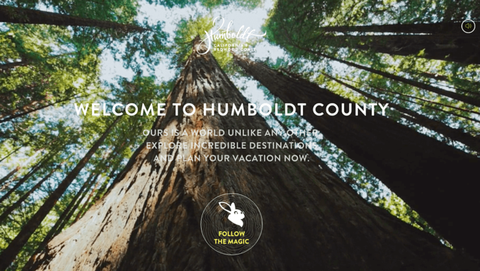
Depending on your brand, you might have some leeway in how you present your CTAs and how creative you can be with them.
Humboldt County is a destination area in California, so the beautiful nature imagery goes perfectly with their overall theme.
To top it off, their CTA is none other than a rabbit character with the words “follow the magic” underneath.
This matches the foresty background and stays in tune with the website’s branding.
Although many brands out there might not be able to pull off this kind of CTA, it’s a perfect example of how businesses can get creative in their approach to increase their sales funnel conversion rate if they know how to stay consistent with their brand image.
8. I wish to end whaling
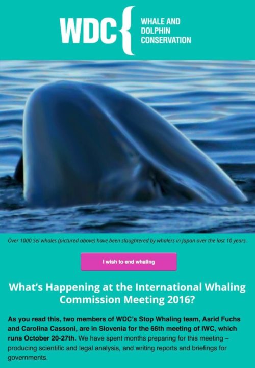
This brand, which specializes in the conservation of dolphins and whales, uses emotion in its CTA to nudge people in the right direction.
Users who are already on this website obviously care about conserving wildlife, so it’s clever to use that emotion to tug on their heartstrings.
The CTA copy “I wish to end whaling” is enough for most people to click through to the next step because they care about what happens to these animals.
It also helps that the button is a bright pink color in contrast to the teal background, so it stands out and grabs your attention, just like any good CTA should.
9. Choose your BarkBox or give a gift
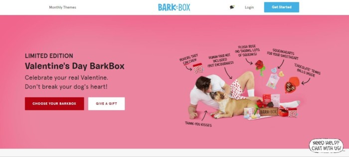
Some landing pages will have more than one CTA, which can either make or break your conversions.
On one hand, you don’t want to annoy users by giving them too many decisions to make, but on the other, you want to be able to give them different options.
When executed correctly, having two CTAs can actually help your audience feel empowered to make the choice that’s right for them by clicking on the option that best suits their needs.
BarkBox has both their CTA colors mirroring each other, but the bold red one is the one that stands out the most because it’s the first option they want users to see.
10. Show me my heatmap
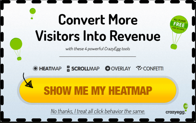
This particular CTA stands out because it’s in the first person, which makes users feel like they’re in control of the decisions they’re making.
It also directly points out the benefit of clicking the CTA and does so in a direct, clear way.
The best CTAs are clear, concise, and to the point, and this one by CrazyEgg has all of those qualities.
It also uses bold lettering at the top to show users that clicking the bright yellow CTA will help them convert visitors into revenue. Who wouldn’t be intrigued by that?
Wrapping up
If you know how to craft a CTA specific to your business and its objectives, you’re already on the way to better conversion rates.
An optimized CTA will have gone through A/B testing and will provide users with content they want to consume.
It should be easy to spot on a landing page and be personalized to the user so they feel more in control of their decision to take action.
On top of that, using the first-person point of view is proven to boost click-through rates because it personalizes the experience and makes visitors feel like they’re more than just another number.
There are several ways to create a call to action that will skyrocket your leads, but it’s important to stay true to your branding and not stray from your main objectives.
Similar Posts

 Published by

 Published by

 Published by


Create, send and optimize your email marketing campaigns