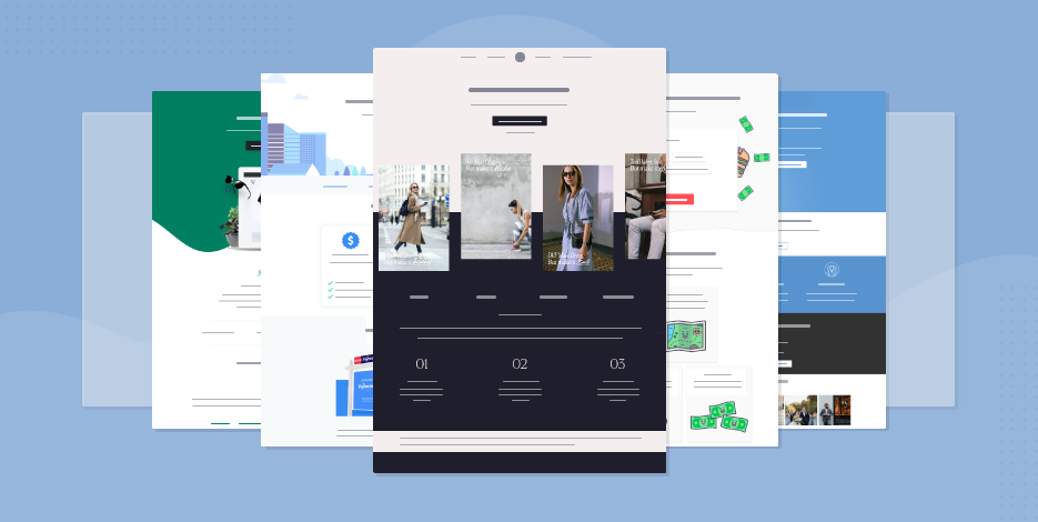
38 Landing Page Templates To Steal In 2026
Landing page templates are coming your way… Oh, wait! They’re already here!
Whether you have a single product offering or an event promotion, creating a focused page with minimal distractions will help you convert your audience effortlessly.
To give you a hand, today, we’ll see 38 landing page designs to help you craft converting layouts for your business.
More specifically, in this post, we’ll see templates for:
- Lead generation
- New features and mobile apps
- eCommerce and content promotions
- Online events and webinars
- Hospitality
Without further ado, let’s see them! But first…
How To Get Moosend’s Landing Pages
Landing pages are one of Moosend’s lead generation tools, along with subscription forms. To try them, you simply need to sign up for a Moosend account.
Then, hop into the landing page builder and start creating your new designs, either from scratch or by choosing a beautiful template. You can publish your pages on Moosend or other external platforms like WordPress through the existing plugin.
Now let’s see those pre-made designs.
Lead Generation Landing Page Designs
Increasing your lead generation is one of the most important processes you need to keep in mind. To do it the right way, you can create a high converting landing page to give your visitors a value proposition they won’t be able to resist.
Here are the means to do it:
1. Important Updates Landing Page Template
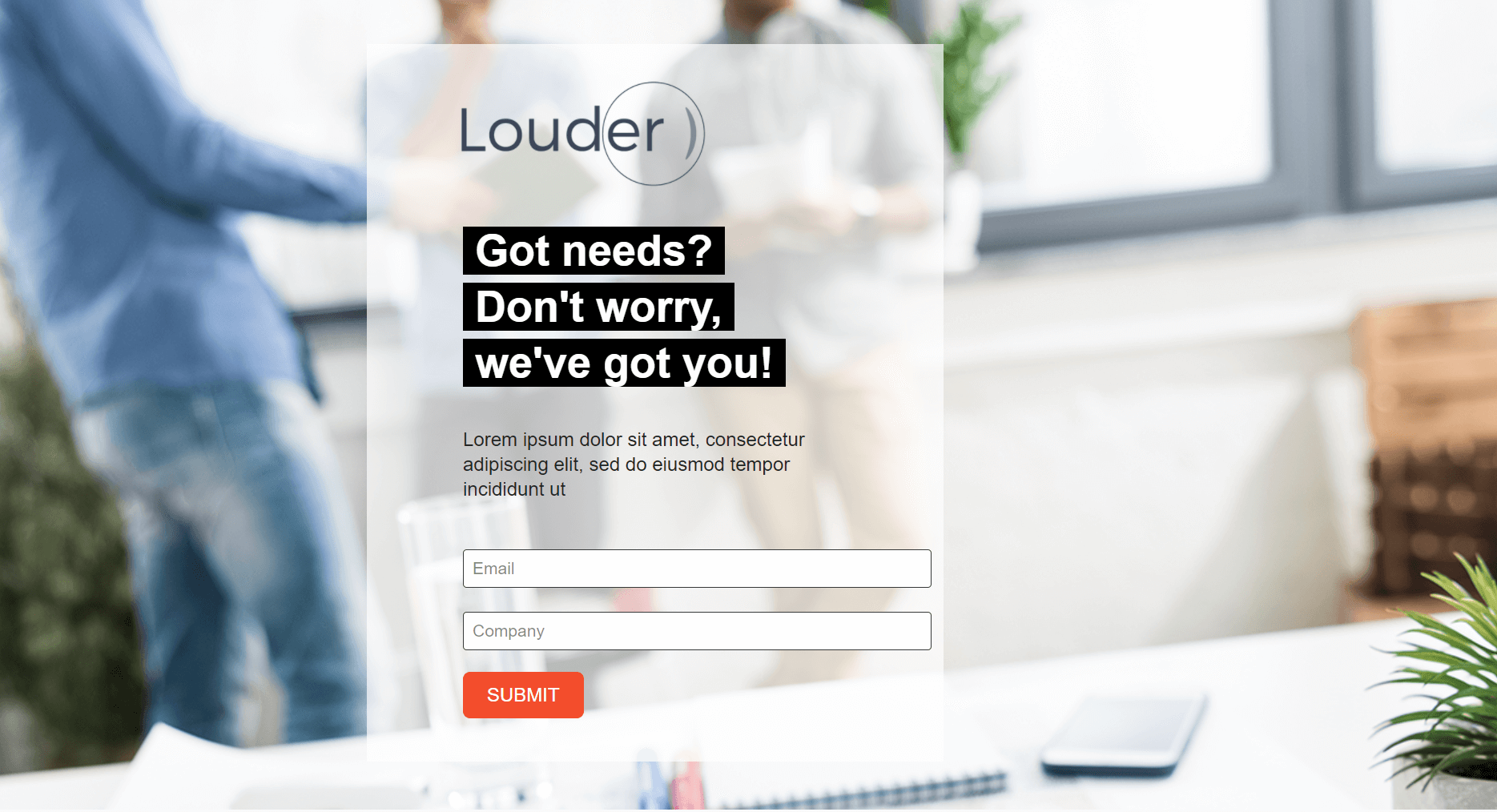
A simple single-page layout you can instantly grab and customize to fit your branding.
Why you need it:
You can add high-quality background images to make it more appealing and tweak the opt-in form based on the information you want to collect. When it comes to your offer, this example is ideal for adding your copy above the fold to increase your conversion rate.
Lastly, don’t forget to add a bright call-to-action (CTA) to ensure that your visitor won’t miss your button.
2. Company Info Page Layout
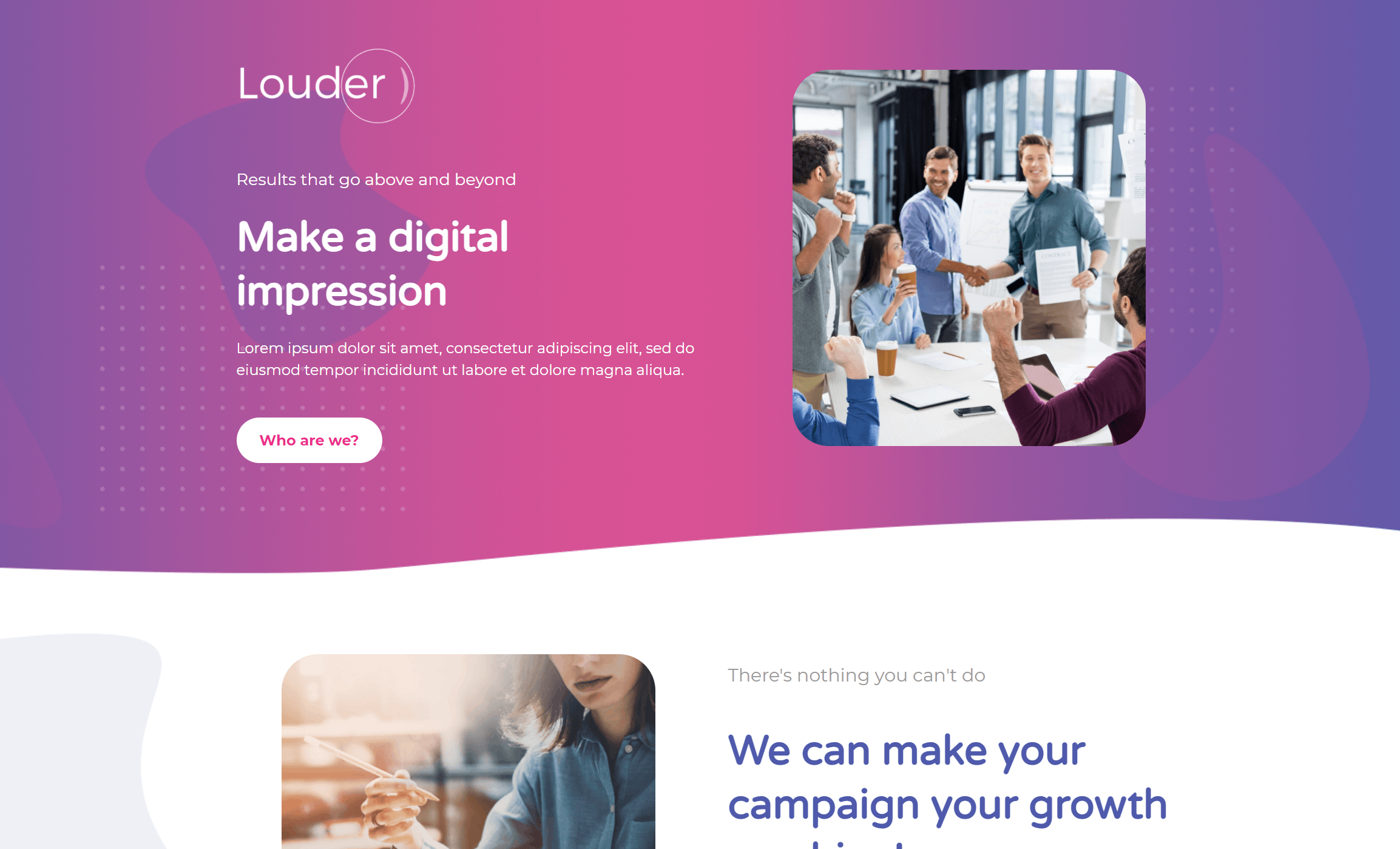
Want to give your visitors a more targeted experience with your company? Then, this layout is what you need!
Why you need it:
Take advantage of this design to minimize distractions and provide your visitors with all the necessary information they need to click and convert.
Also, since this is a responsive landing page template, you can be sure that your message will display well on multiple screens and mobile devices. And the best part is that you can easily use this example for your online business, SaaS company, real estate agency, or startup to boost your newsletter signup rate!
3. Newsletter Signup Webpage Example
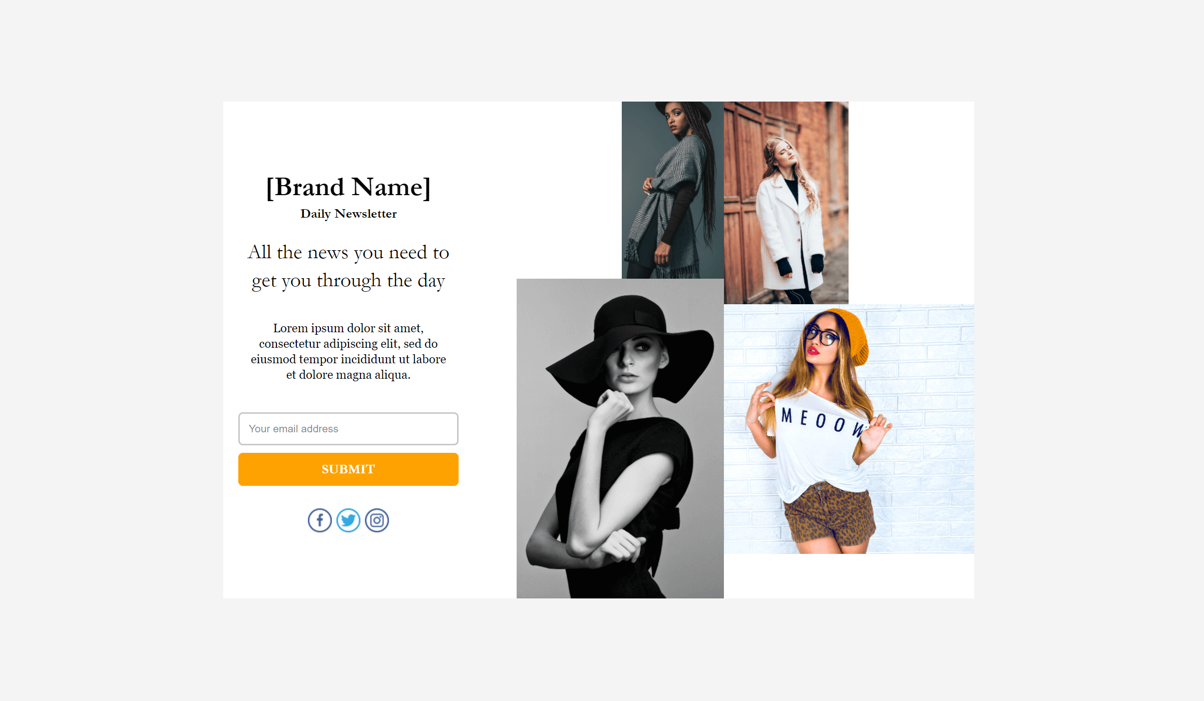
If you want to increase your lead gen, make sure to employ the power of simple landing pages to get more people on board!
Why you need it:
This landing page template will give your visitors all they need to sign up for your daily or monthly newsletter. Just make sure to highlight the value of joining you with compelling landing page copy!
What’s more, if you want to cross-promote between channels, you can easily link your social media profiles through social buttons. Nevertheless, don’t forget that a landing page isn’t a homepage. This means that it needs to have as few distractions as possible, so think wisely before adding extra links and buttons!
4. Email Subscription Landing Page Template
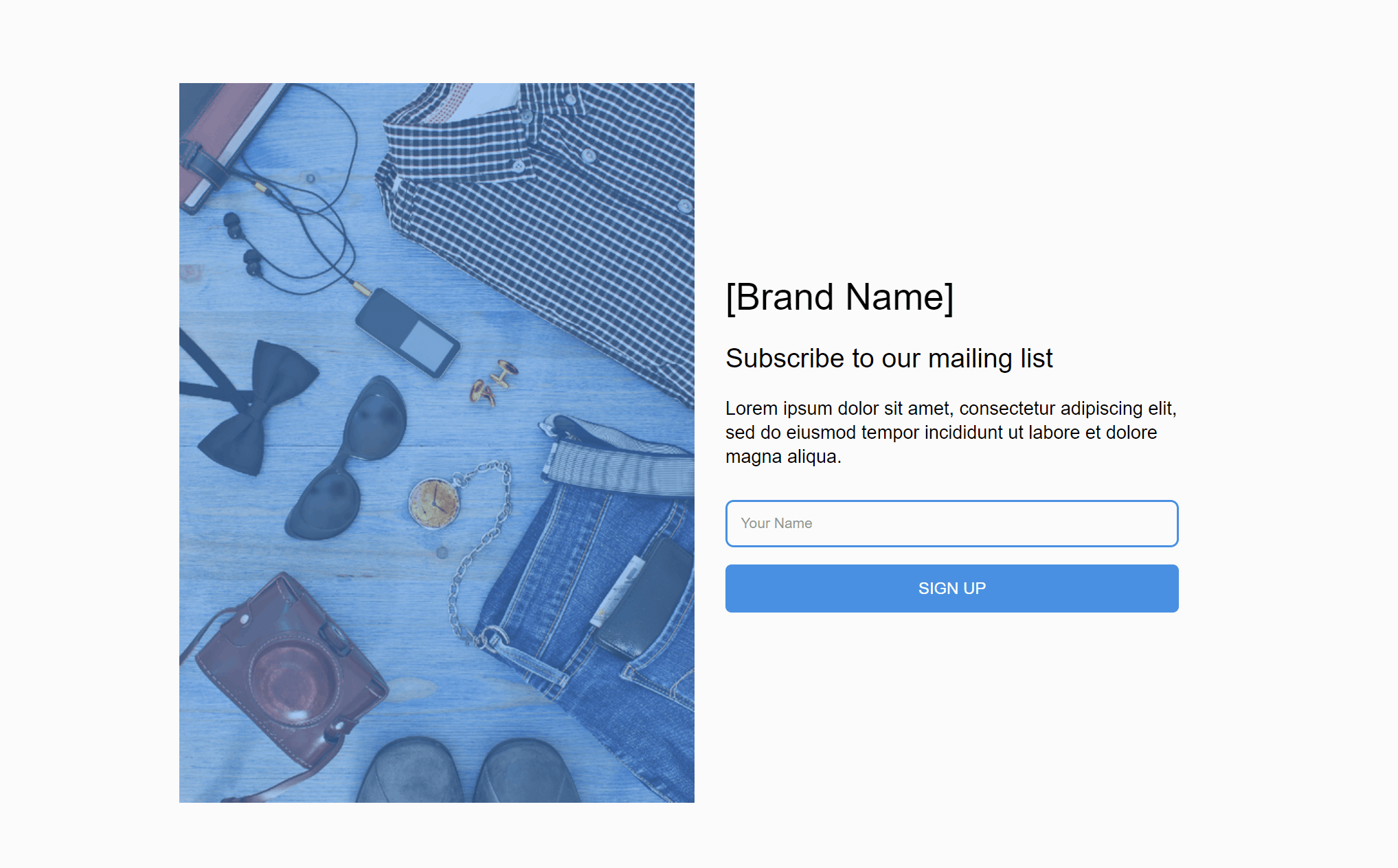
Another cool landing page example to capture your visitors’ email addresses and start sending them your amazing email marketing campaigns.
Why you need it:
Use an eye-pleasing image to create a converting page for your audience. Also, don’t forget to craft a valuable heading to intrigue and lead them to action! Finally, pay attention to your contact form to increase your lead generation rate and expand your mailing list effortlessly.
Coming Soon Landing Page Templates
Is something new coming out soon? Then use a high converting “coming soon” landing page to show it to your target audience. The following designs are perfect for promoting your new additions, such as features, products, or services. Let’s see them:
5. Multipurpose Landing Page Example

The above landing page layout will help you promote your new feature in a jiffy.
Why you need it:
Take advantage of white space to increase your readability and add beautiful colors to make your page more eye-catching. Apart from inserting the usual landing page elements, you can utilize Moosend’s advanced landing page editor to add countdown timers! This way, you can create a brilliant landing page example with the right amount of urgency!
Interested in this design? Make sure to register for a Moosend account to try them out and then get a paid plan to make them forever yours!
6. Simple Announcement Landing Page Design
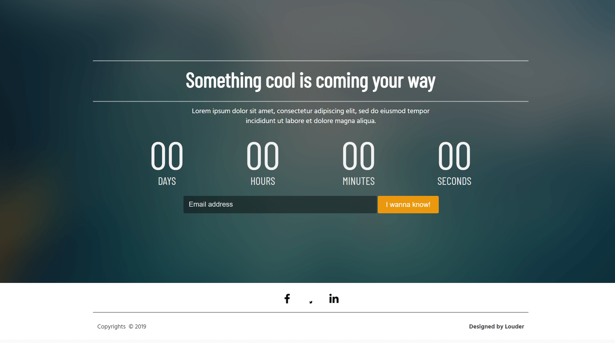
Another great layout to give your visitors and customers a sneak peek of your new feature or product.
Why you need it:
Leverage this responsive landing page template to capture your potential customer’s attention and call them to action. Also, like before, keep the countdown timer to let your audience know when your new feature rolls out! Apart from that, don’t forget to upload a beautiful background image to make your landing page stand out.
7. New Surprise Responsive Template
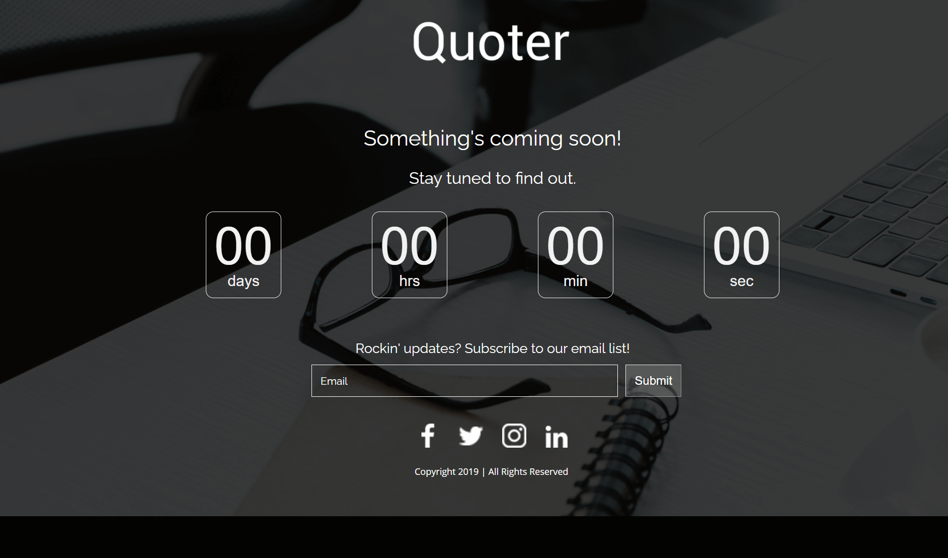
A simple and elegant design that numerous businesses can use to increase conversions.
Why you need it:
Use this austere layout and dark color palette to entice your audience. For better results, you can use a bright CTA color like red to make sure your audience clicks on it. Moreover, you can use design tools like Photoshop or Canva to create your own visuals, export them, and import them to your template through Moosend’s editor.
8. New Feature HTML Landing Page Template
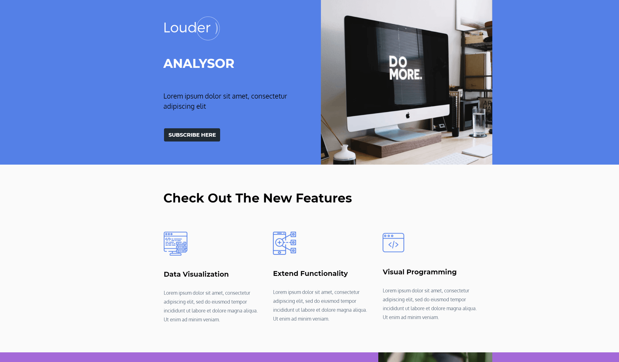
Compared to the previous layout, here’s a design that favors white space and vibrant colors.
Why you need it:
You can instantly grab the template to create a fun and informative page for your visitors. Play around with different color combinations to highlight the most important parts of your page and use spacing to make your value proposition easier to digest. Also, you can use the existing content blocks to provide extra info about your new feature and convince your visitors to take action.
9. Website Launch Landing Page Example
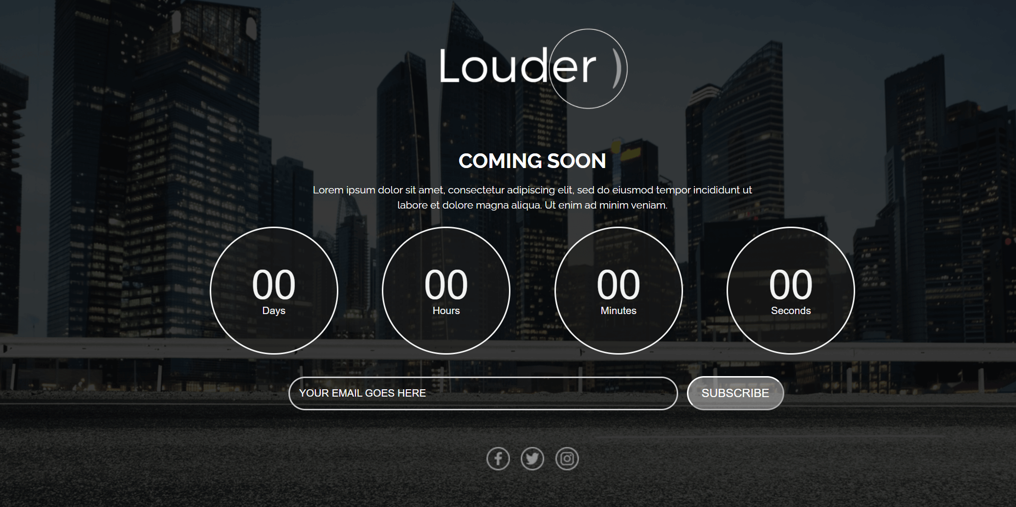
Revamping your new website? Give your subscribers something to look forward to with the above landing page template.
Why you need it:
Make sure to keep the countdown timer to let them know when your new website is ready. Also, you can add a beautiful background image to boost your landing page performance, and don’t forget about your CTA color! A bright button can really make a difference, and it’s one of the most important conversion tricks you need to keep in mind.
Mobile App Landing Page Layouts
A new mobile app can be a big deal for your company! Make sure to promote your new release with a high converting landing page that will intrigue your visitors and turn them into app users.
Let’s see how:
10. Upcoming App Landing Page Template
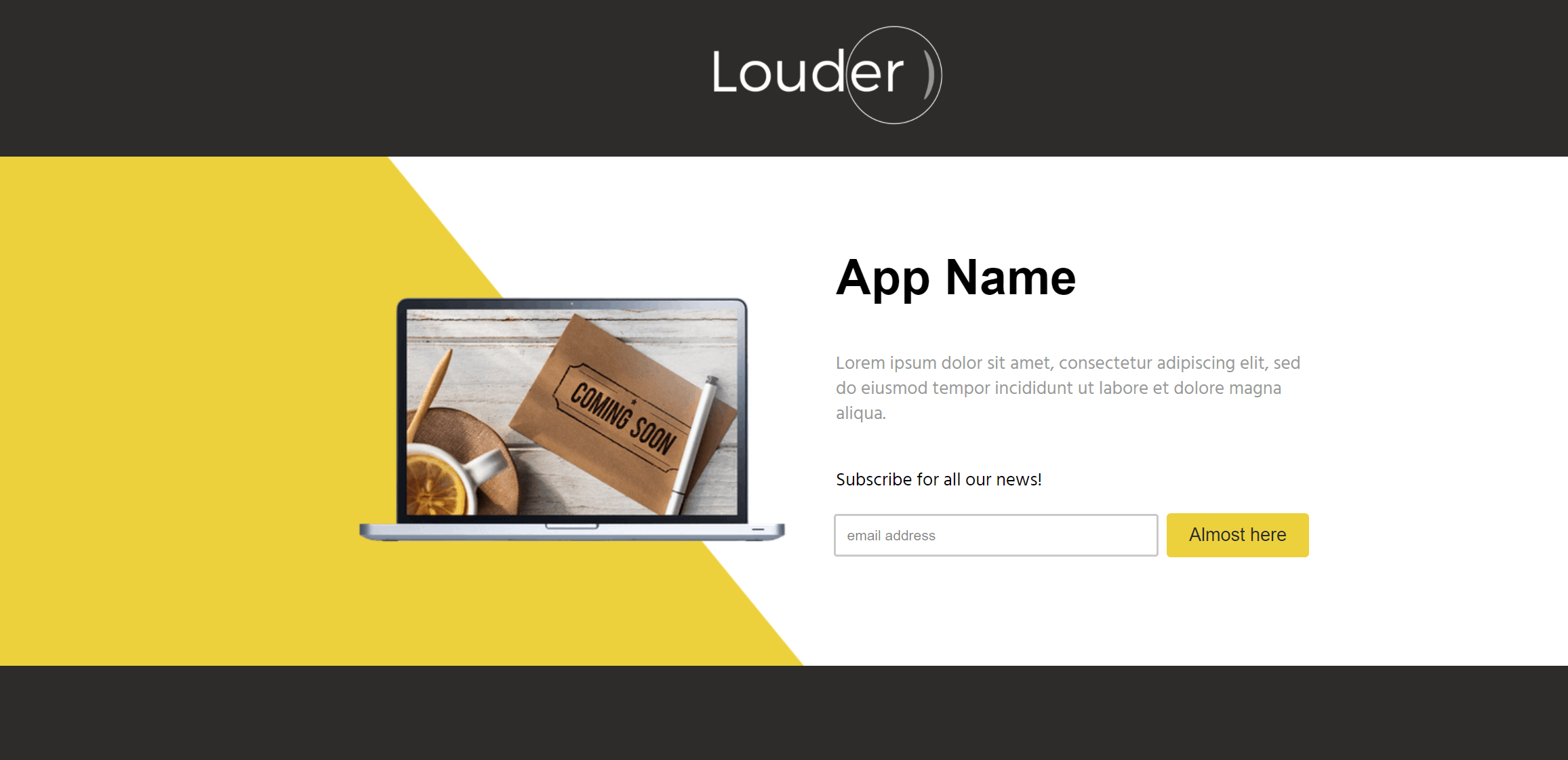
Promote your upcoming mobile application with a simple landing page design that will steal their hearts.
Why you need it:
The above layout will allow you to add your copy and use the embedded form to capture your visitors’ contact information. You can keep the existing color scheme to make your page more lively, give your potential users more reasons to click on your CTA, and find out more about your app through your email marketing endeavors.
Need a beautiful email design to share your mobile app updates? Hop into Moosend’s email builder, grab one of the pre-made newsletter templates, and get started today!
11. Blue Side Landing Page Example
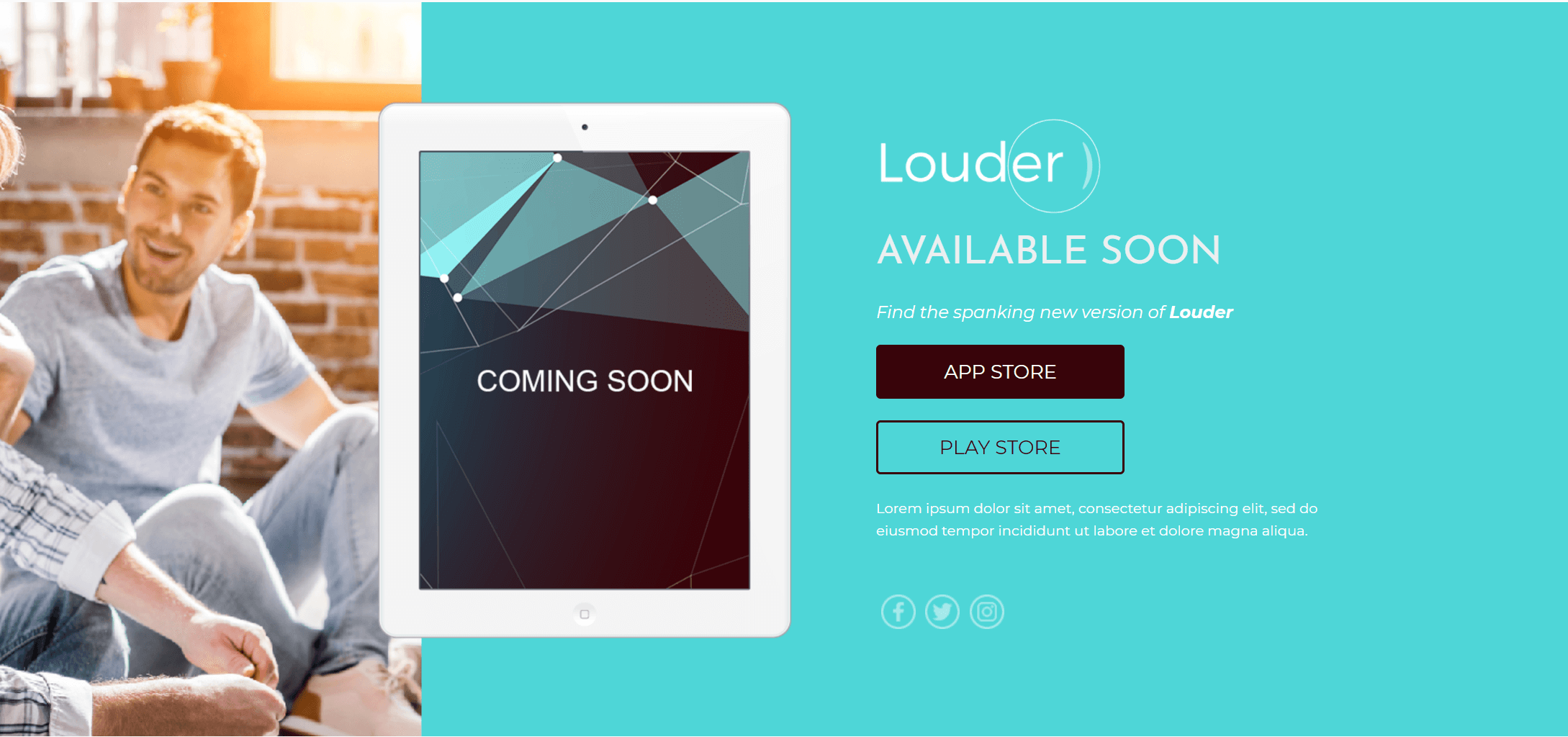
If you like color, you can easily use this vibrant landing page template to stun your audience.
Why you need it:
The format is straightforward, making your landing page copy easier to digest. The existing colors are also perfect for creating a unique marketing campaign to promote your app. On top of that, if you pick this design, you can add an eye-catching background image to turn it into a true conversion weapon! It’s simple as that.
12. Elegant Page Design For Applications
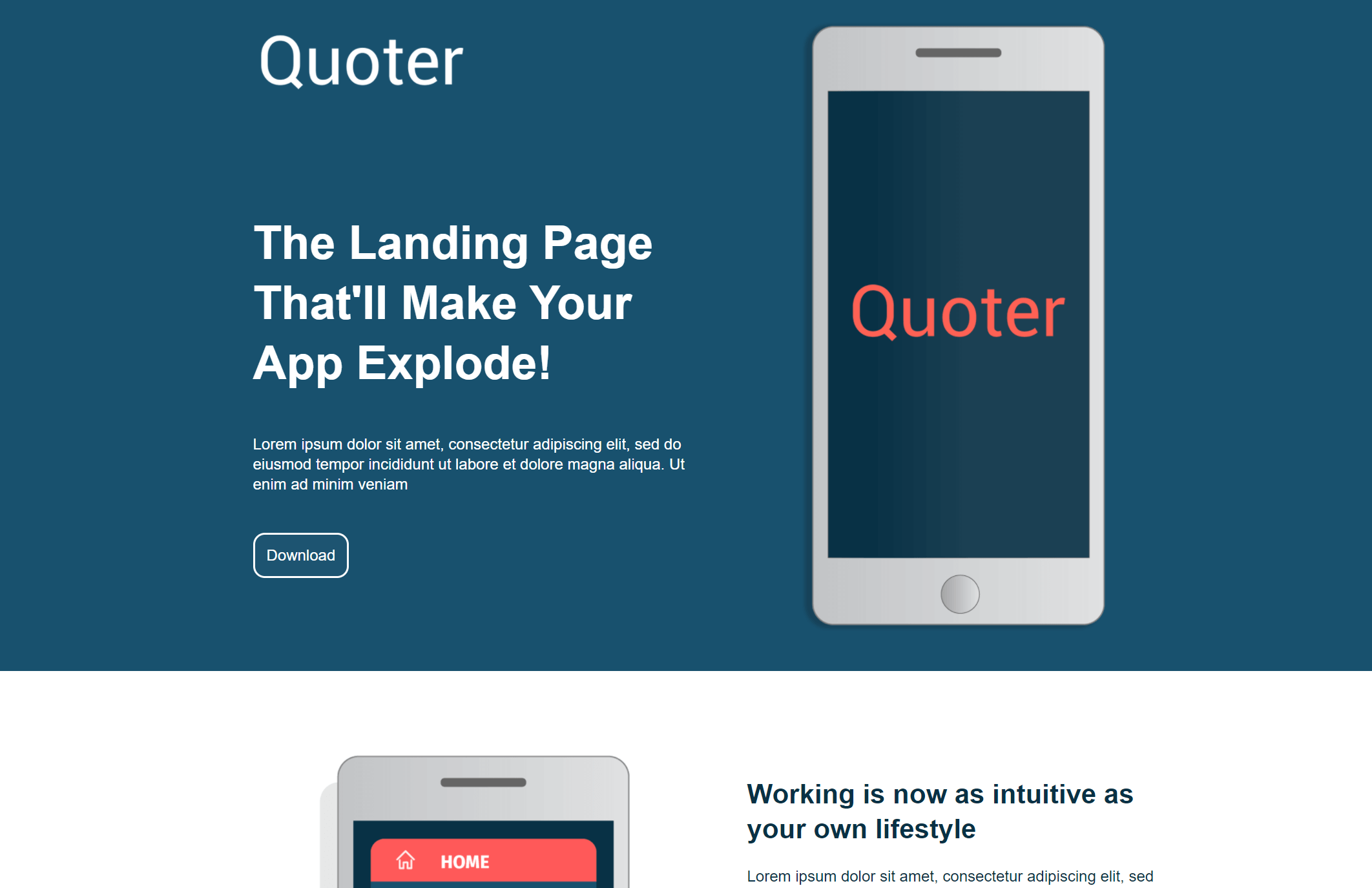
Another great design you can use to give your mobile app the promotional boost it needs!
Why you need it:
Pick this template and start your customization efforts on the spot. Add your copy above the fold to intrigue potential users and use the pre-made sections to provide your audience with all the necessary information they need.
Apart from that, you can insert extra elements through your landing page builder! For instance, Moosend’s editor will allow you to embed a video presentation or use testimonials to increase your page conversions effortlessly!
13. App Release Landing Page Website Template
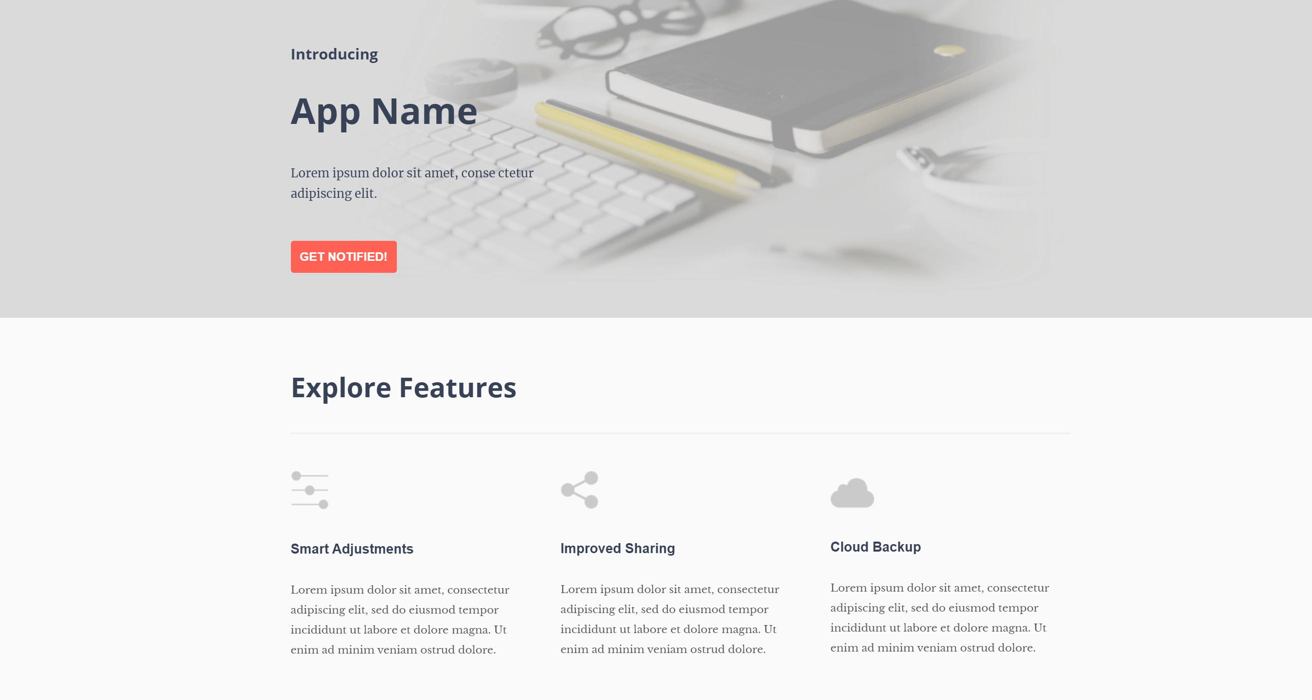
If you want something more toned down, you can use this simple app release example.
Why you need it:
The above responsive landing page design is perfect for showcasing your new features and calling your audience to action using actionable CTAs. And speaking of them, make sure to pick bright colors to make your buttons stand out on your page. Lastly, don’t forget to insert high-quality images to create a beautiful and high converting page that will charm your audience!
14. Dark Landing Page Design Example
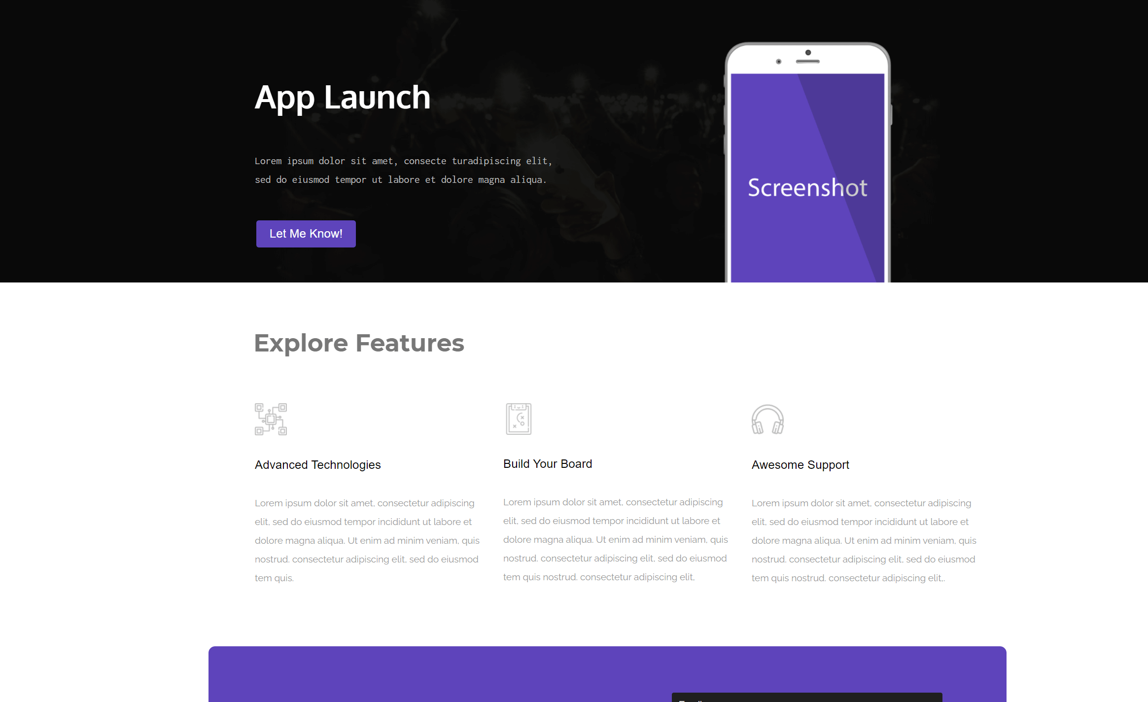
Take advantage of this darker template to create an eye-catching page.
Why you need it:
You can use the black header image and bright colors to make your value proposition pop. Also, take advantage of white space to make your copy more readable, allow your audience to digest every single bit, and boost your conversion rate.
Of course, don’t forget to add the necessary form fields to capture your visitor’s contact information and then start nurturing them with your amazing email content!
15. Mikrokosmos HTML Page Layout
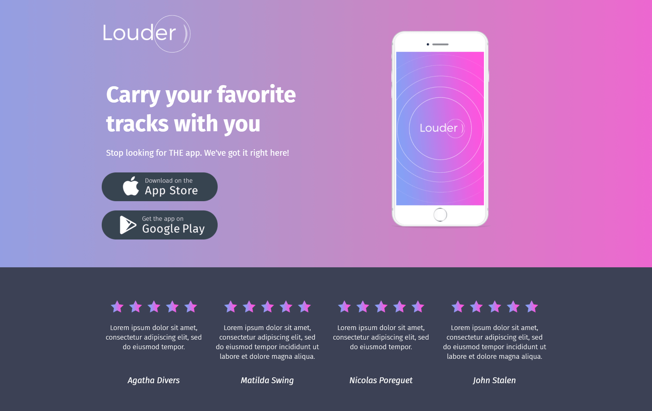
The above template employs pink and purple hues along with a testimonial section to capture and convert your page viewers.
Why you need it:
Take advantage of the layout and add a compelling headline to intrigue your potential users. Moreover, you can keep the customer review section to increase your brand’s credibility through social proof. If you want to nail your design, make sure to follow the current landing page trends to satisfy your audience!
Want to check this design? Register for a Moosend account and try out the landing page builder today!
Ecommerce Sales Landing Page Examples
Online businesses can equally leverage the power of landing pages to redirect their audience to focused sales pages that will convince and convert them. Be it an offer or a product showcase, every eCommerce site can craft effective landing pages to give their lead generation and conversion rate a great boost.
Let’s see:
16. Red Lady Landing Page Template
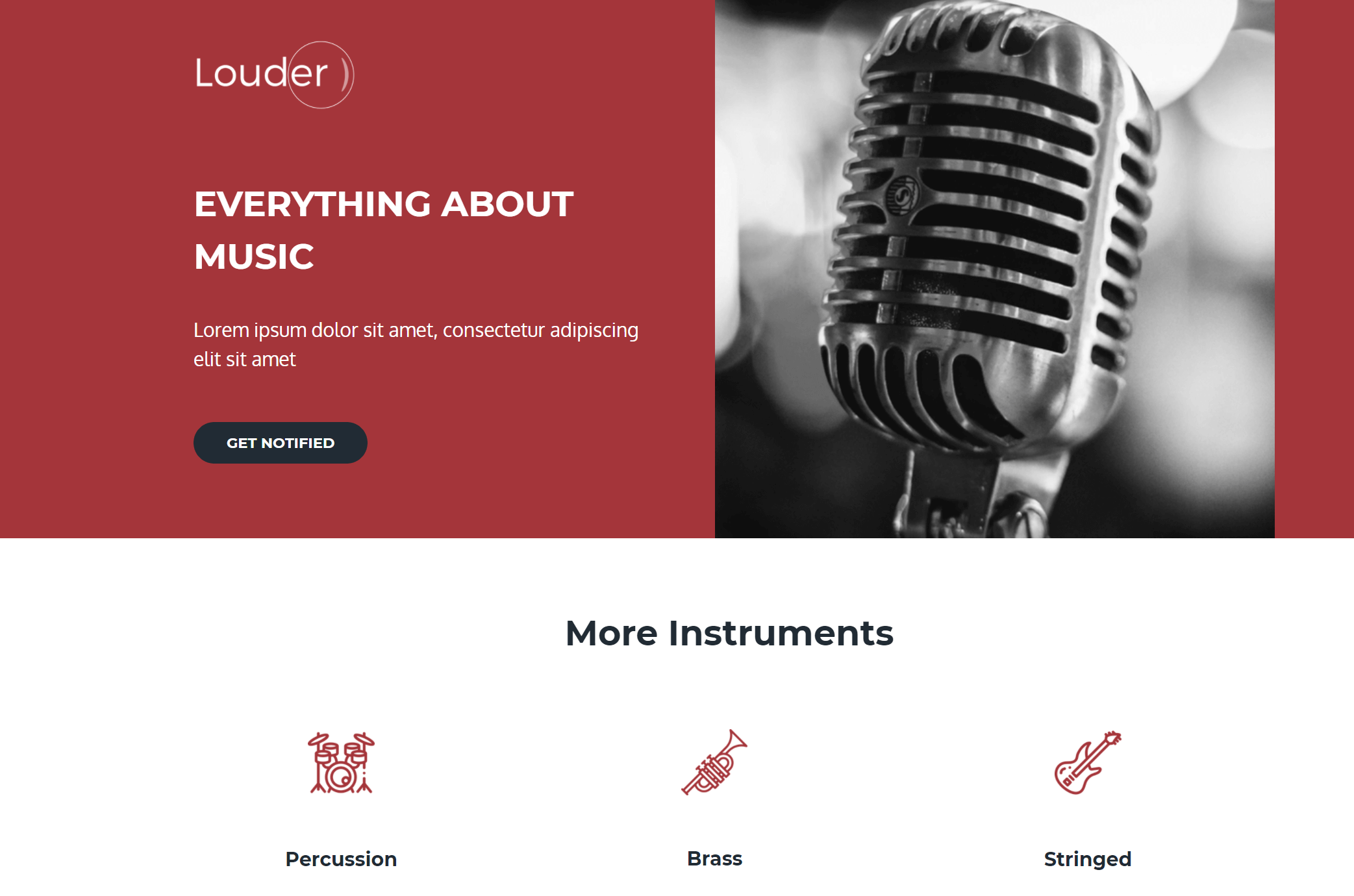
An effective single-page layout you can customize to promote your online store products and save valuable time.
Why you need it:
Due to its versatility, you can use this template for numerous products and purposes. Just add relevant background images and descriptions, and you are ready to roll! Also, don’t forget to use the right colors and add a CTA button that will stand out to minimize landing page abandonment. On top of that, since this is a responsive design, you don’t have to worry about your mobile users’ experience!
17. Monochrome Landing Page Example
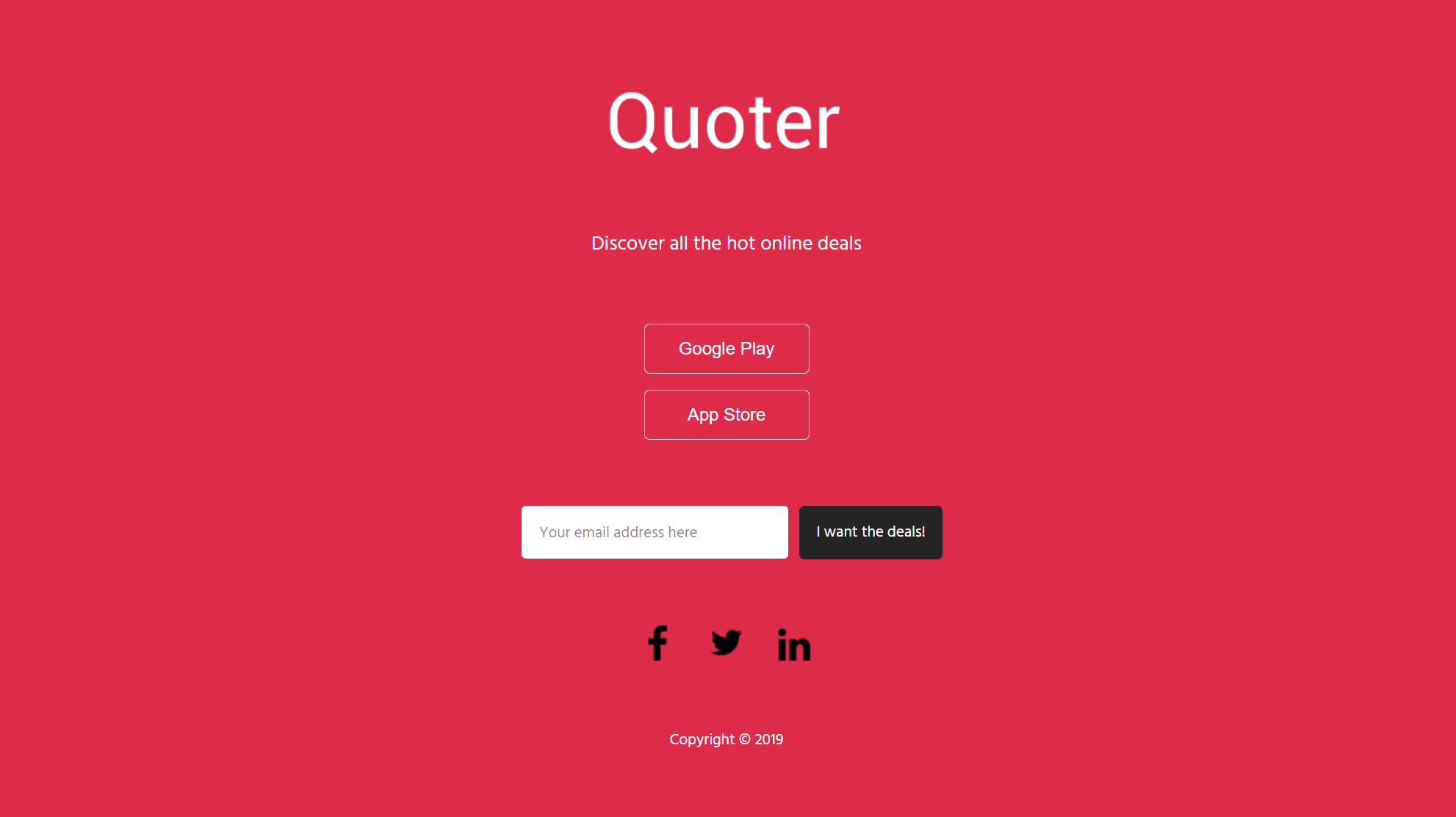
Another design you can practically customize for every occasion.
Why you need it:
Moosend’s landing page editor will let you pick your favorite colors to turn this example into an instant attention grabber. If you want to add a background image instead, you can upload your favorite images or get some from stock photo sites like Unsplash or Pexels. And as always, don’t forget to give your CTA some love!
Content Promotion Landing Page Templates
Promoting your new features and products is great! But what about your content? Well, if you aim at increasing your lead gen through content marketing, and more specifically, through ebooks, guides, and more, you can craft a brilliant landing page to highlight the value of your resources and collect your visitors’ precious email addresses!
Let’s see how:
18. Waves Ebook Landing Page Layout
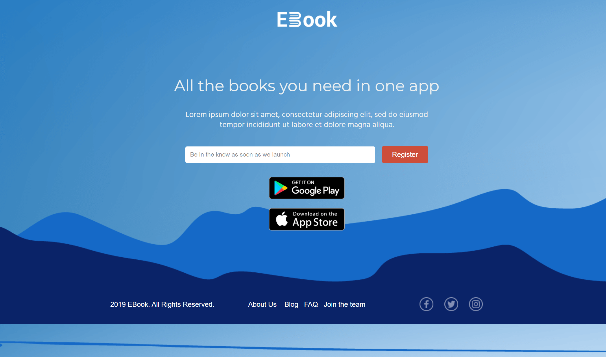
Increase your ebook downloads with a beautiful landing page design that stands out.
Why you need it:
This layout is great for creating a simple page to promote your resources. With the right CTA copy and color, your page will instantly grab your visitor’s attention and capture their contact information. What’s more, if you have the technical skills, you can easily access the HTML, CSS, and Javascript code of every template to add your own widgets! Cool, right?
19. Light Blue Webpage For Ebooks
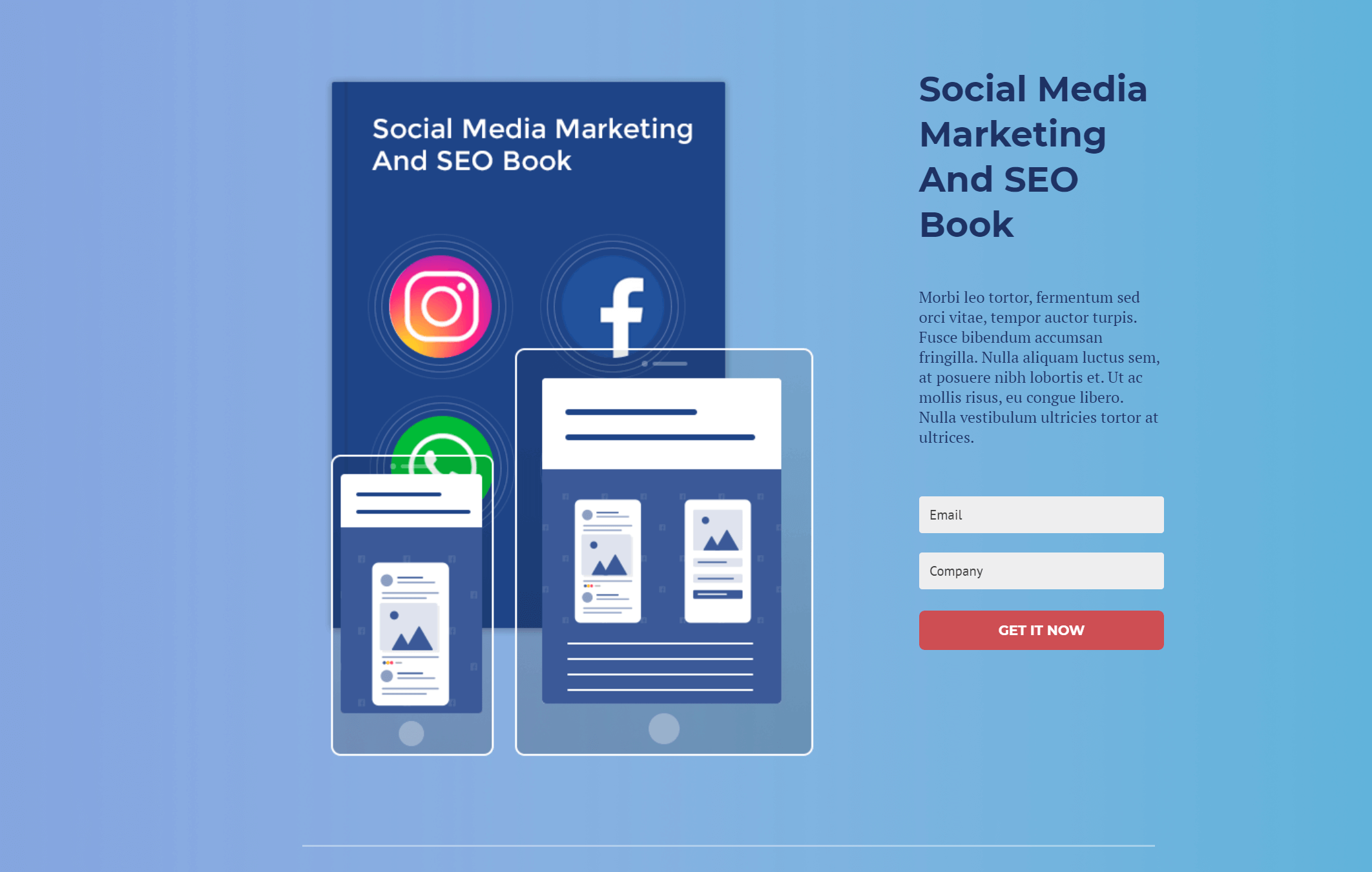
The above template will allow you to show your page viewers your new resource and give them extra information about its contents.
Why you need it:
The single-page layout is ideal for presenting your value proposition in a simple and structured manner. To boost your lead gen, add as many form fields as you need to collect your leads’ details. This way, you will manage to personalize your marketing campaigns and give your audience unique experiences with your business!
20. Forest Landing Page Example
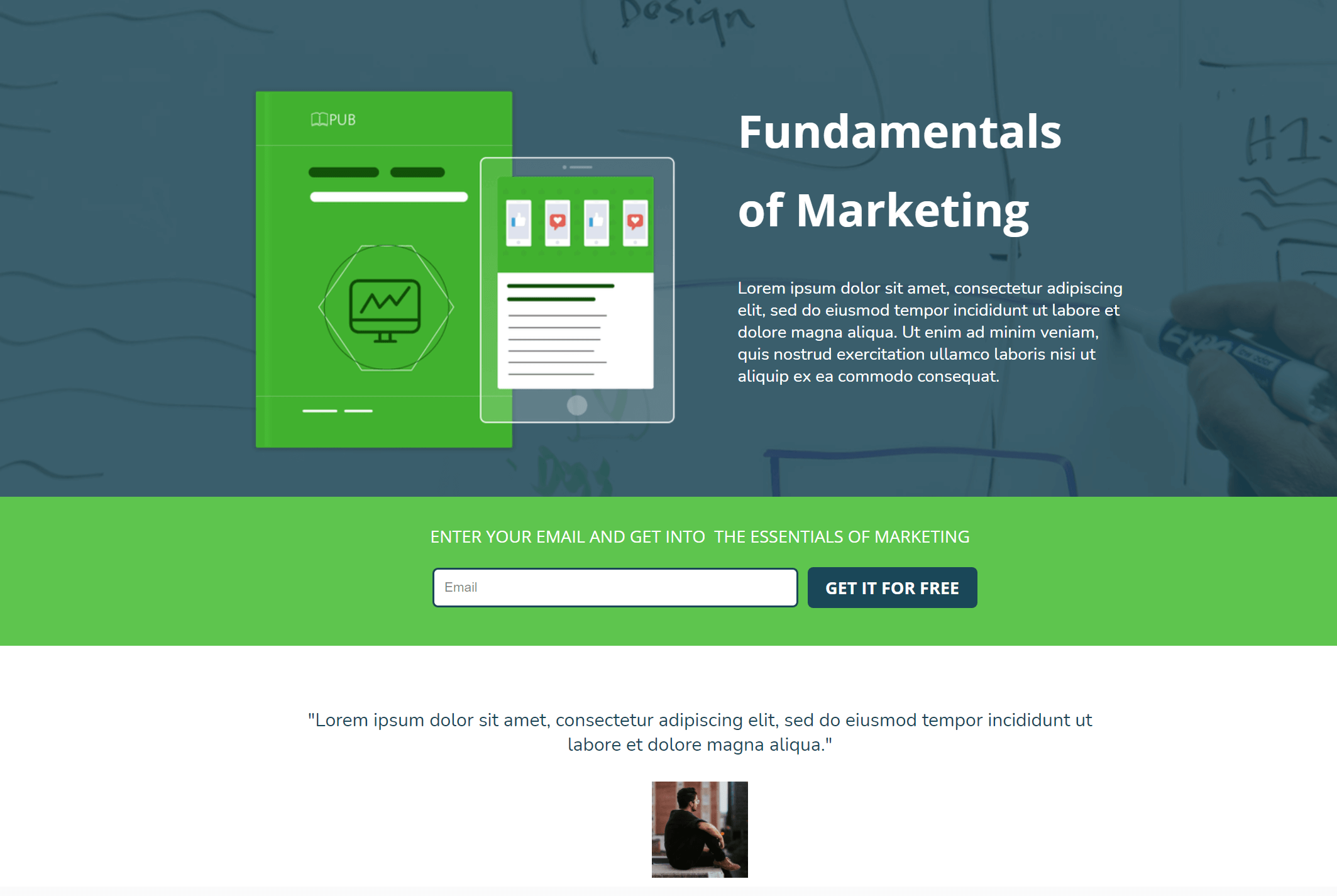
Another colorful and responsive design to increase your lead generation through content promotion.
Why you need it:
Make the necessary customizations to create a page that fits your branding. Then, don’t forget to add your landing page copy to show your audience why they should download your resource. Moreover, you can leverage the middle content block to introduce yourself. For instance, you can make a short section about your company or add a testimonial to make a great first impression.
21. Elegant Resource Page Example For Ebooks
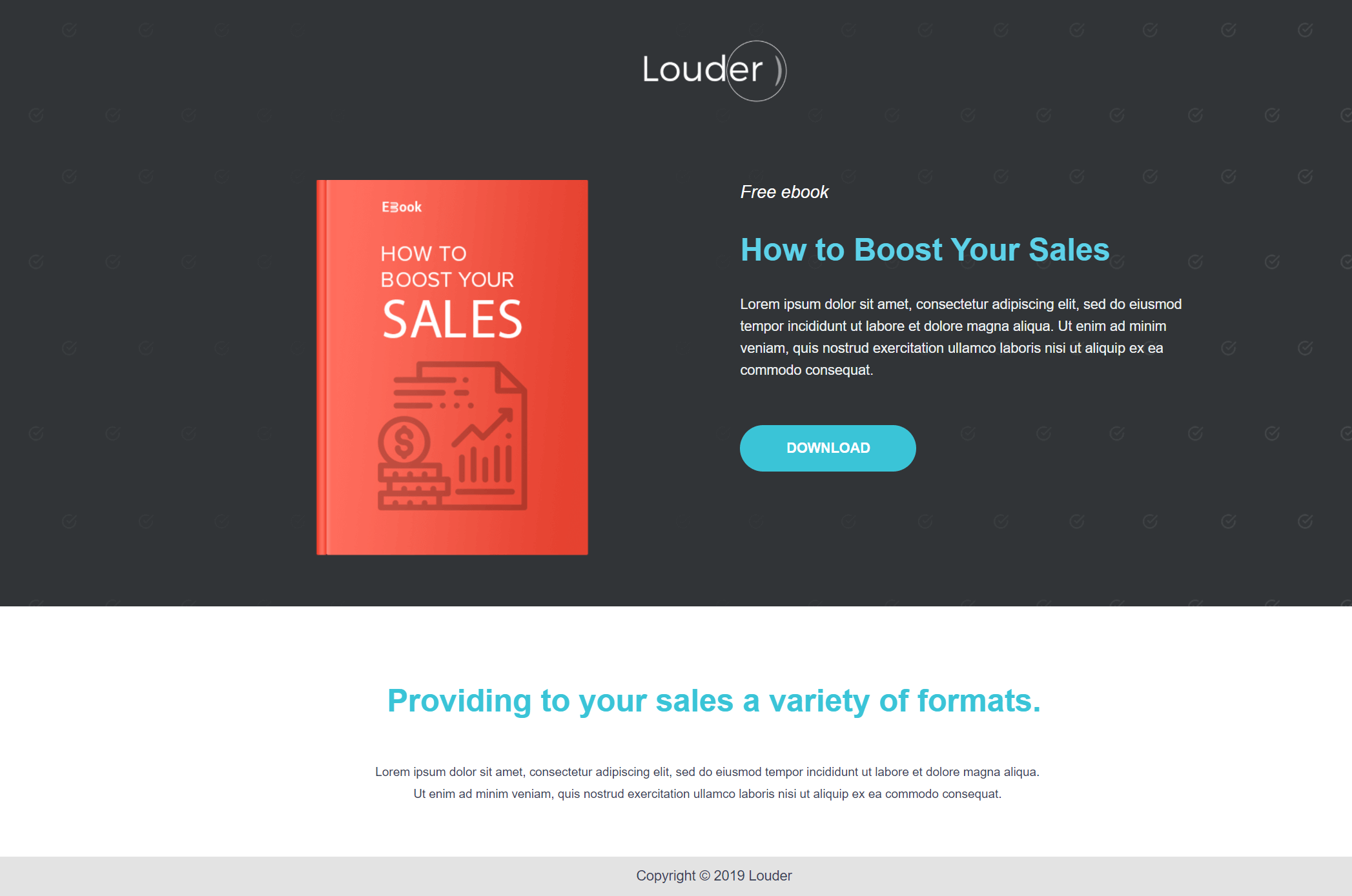
If you are a dark color lover, you can use this elegant landing page design to capture your visitor’s attention.
Why you need it:
First off, the lack of navigation elements is ideal for minimizing distractions and increasing your landing page performance. Make sure to add a compelling headline and copy above the fold to capture your potential leads and then deliver a CTA to make them click.
If you are interested in the above design, you can instantly try it by signing up for an account! Moosend will give you all the landing page templates you need to nail your lead gen!
22. Gradient Landing Page Template
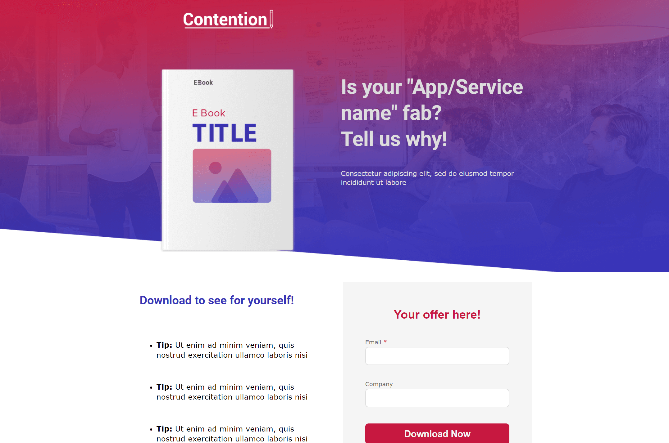
Do you love gradient overlays on top of background images? Then this example is for you!
Why do you need it:
You can use the above layout to give your target audience a beautiful experience without distracting or confusing them. The structure is perfect for creating an informative page with a simple opt-in form that will incentivize users to add their personal info and hit the call to action button without overthinking it.
23. Elegant II Landing Page Design
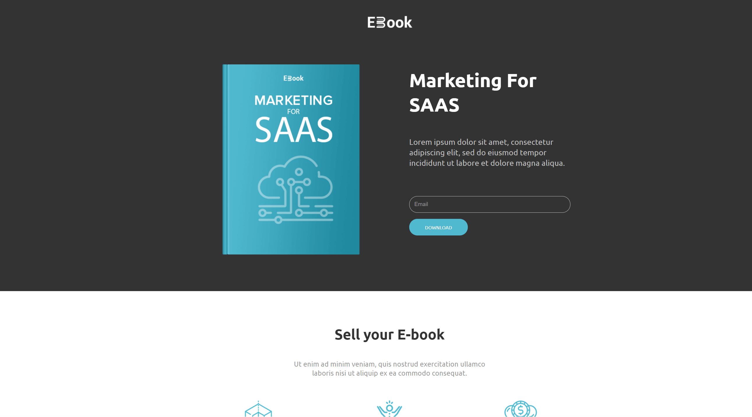
A different version of the Elegant page template to help you create numerous landing pages for your ebook promotion.
Why you need it:
Grab this layout to give your audience details about your ebook, guide, or checklist. Don’t forget to use high-quality visuals and graphic design elements to make your resource more appealing and generate more conversions.
24. Ultimate Guide Promo Landing Page
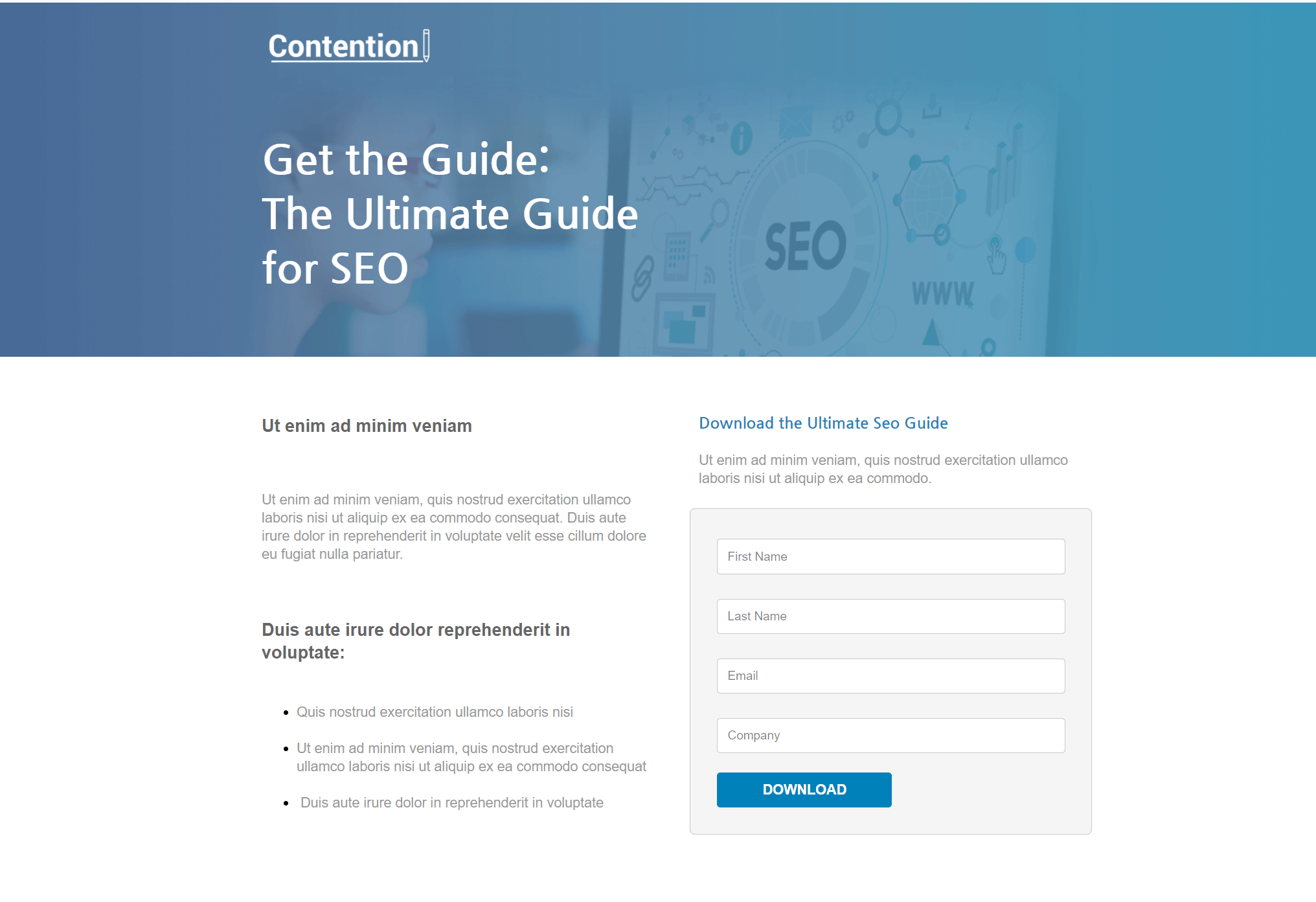
Promote your content like a pro with a clean design that doesn’t distract your page viewers.
Why you need it:
This example will let you craft a high converting and focused page for your marketing or SEO guides, checklists, and so on. Make sure to craft an intriguing headline and use the left content block to let your audience know why they need to grab your resource. On the right side, take advantage of the web form to capture their information and, as always, add a vibrant CTA to expand your mailing list.
Online Event Landing Page Layouts
Landing pages are an excellent way to promote your resources, but what about your online events? Well, using such a page will let you create a beautiful registration process for every occasion! What you need is a great design, converting copy, and a CTA to increase your attendance rate like a pro.
Here’s what you can use:
25. Online Course Landing Page Layout
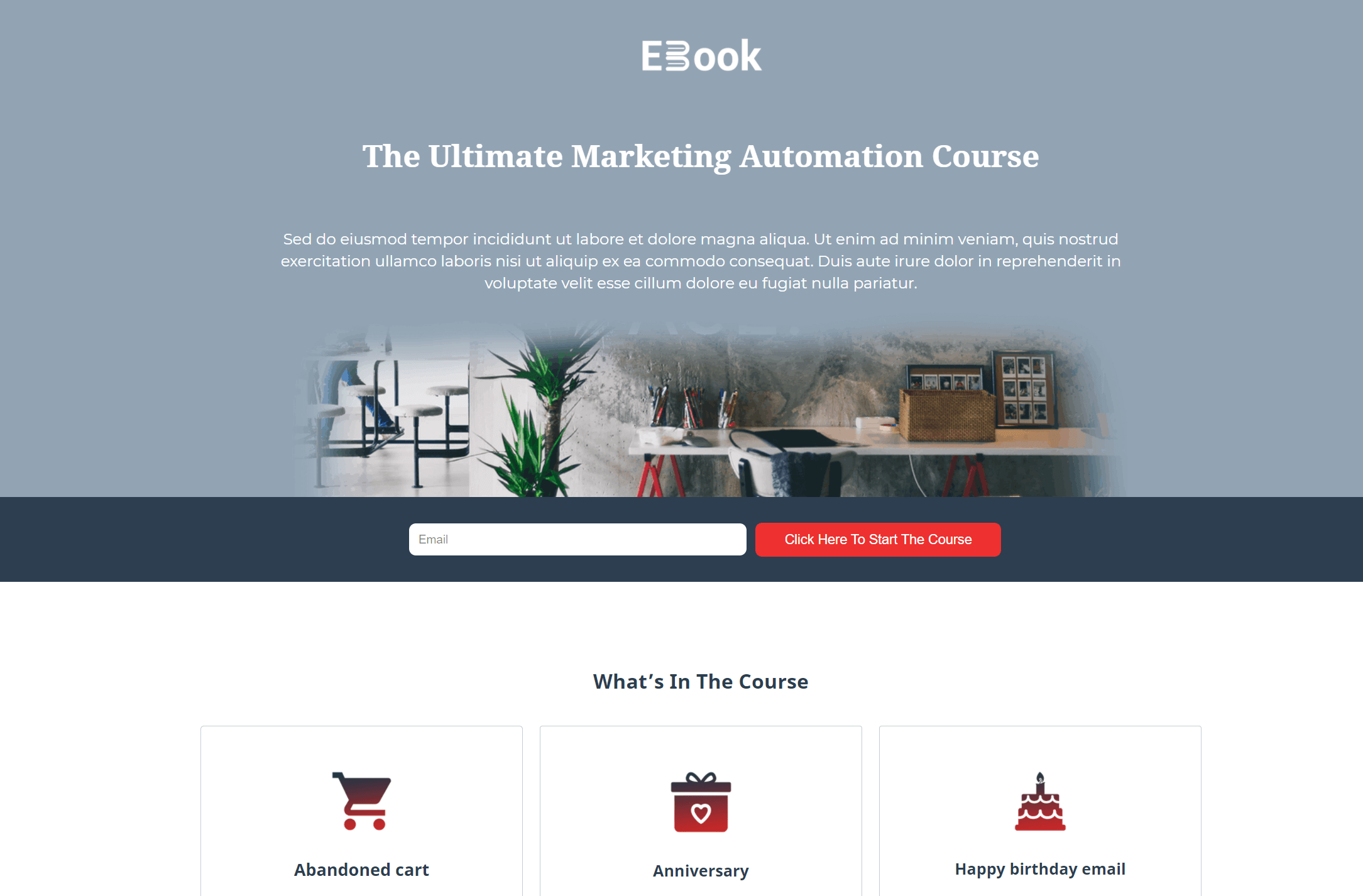
If you’re planning an online event, make sure to give your attendees an easy way to participate.
Why you need it:
You can benefit from this landing page template by placing your headline, copy, and background image above the fold. Just make sure to pick photos that won’t make your text hard to read and use bright font colors to increase your readability. Moreover, you can use the middle section to present your course using beautiful graphic design elements to make it more eye-catching!
Like what you see? Sign up for a Moosend account and customize the above template to your heart’s content!
26. Lights Out Event Registration Page
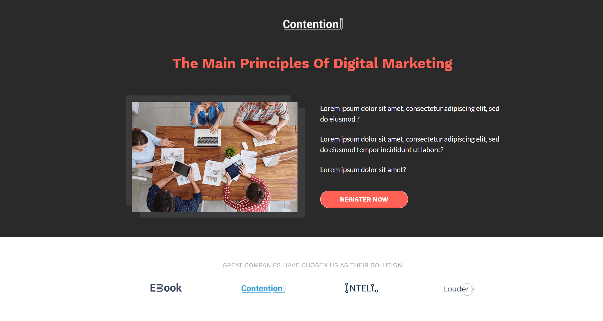
If you want a more professional page, you can always use the Lights Out event landing page!
Why you need it:
The design is great for promoting a variety of events, courses, webinars, and more. As mentioned above, you can use Moosend’s editor to insert advanced elements for your audience. So if you have created a YouTube video, you can easily use it to increase the performance of your landing page!
27. Complementary Landing Page Example

A great color combo can really make a difference!
Why do you need it:
Here, we have a template that uses complementary colors to make every individual element pop out. Of course, you can pick your own combinations to make this page fit your branding. Moreover, the structure will allow you to add your copy in a straightforward manner to power up your online course registration rate! As a rule of thumb, keep your color combos balanced to avoid any sort of “color overload.”
28. Multipurpose Event Page Template
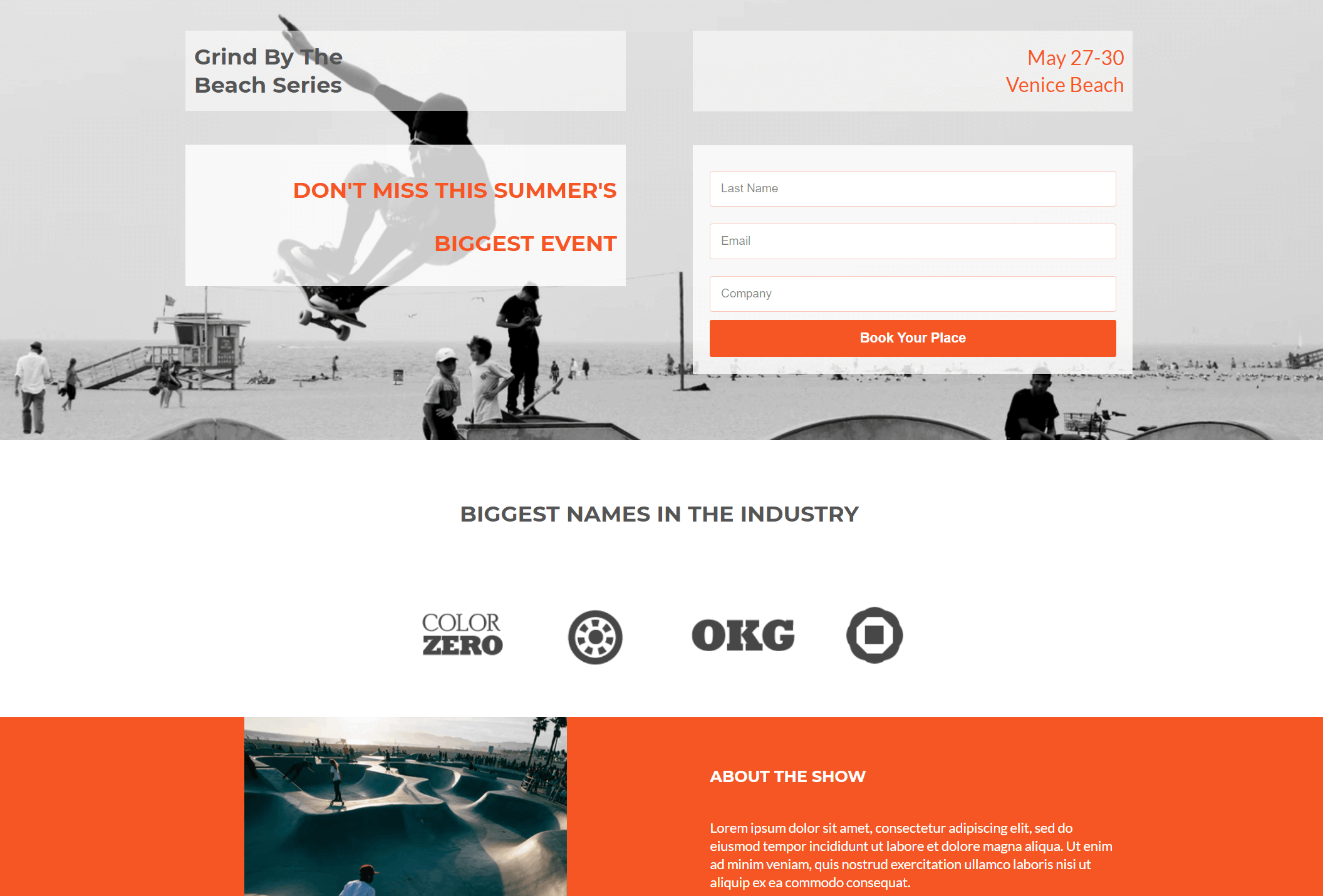
Last but not least, we have this vibrant event template to rock your events.
Why you need it:
You can easily customize the design to promote your upcoming events, give your participants an overview of your activities, and let them save their spots or buy tickets. You can equip your page with testimonials to increase your credibility or use brand logos to show your partnerships and entice your audience. The choice is yours!
Webinar Landing Page Layouts
Webinar marketing is an important asset for B2B companies that want to educate their leads and turn them into loyal customers. To promote these events, most businesses create converting landing pages and link them to their newsletters or online ads.
Below, let’s see some webinar-focused designs you can grab to nurture your audience and supercharge your attendance rate:
29. Essential Webinar Landing Page
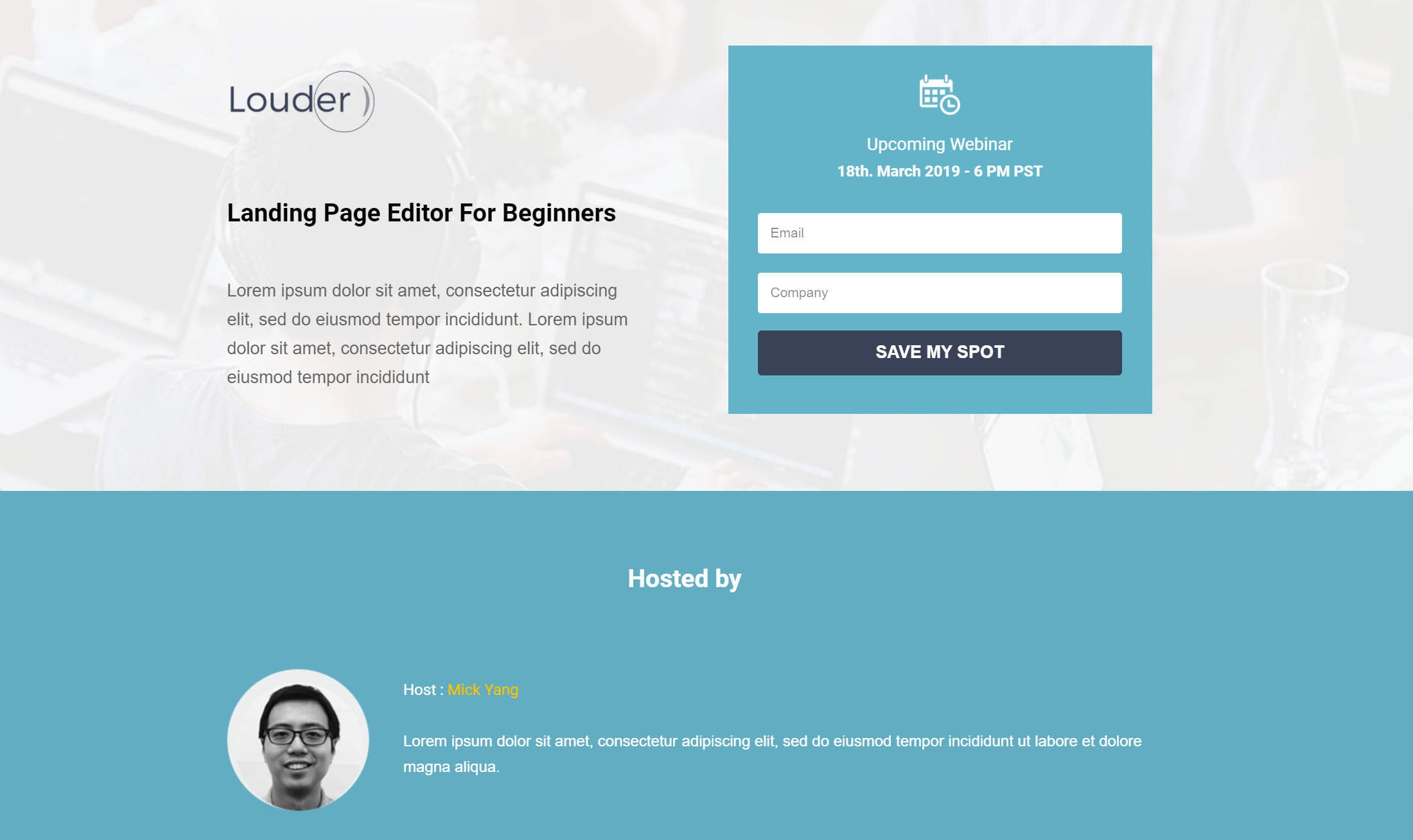
Your webinar pages don’t need to be complicated, just smart!
Why you need it:
Take advantage of this simple landing page template to promote your upcoming online event and provide your audience with additional information. The contact form is conveniently placed above the fold to increase your conversion chances, while the middle section will allow you to add more details about your hosts to intrigue your registrants.
30. Webinar Announcement Page Layout
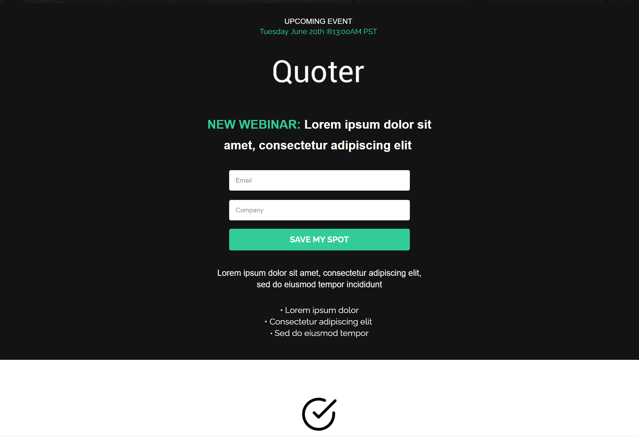 Placing your registration form at the heart of your landing page will emphasize the action your visitors need to take.
Why you need it:
Since this example is mainly black, you can take advantage of the background colors to make your CTA stand out. Of course, you can utilize white space to highlight your value proposition and insert additional sections to convince your visitors to register.
31. Minimalist Webinar Page Example
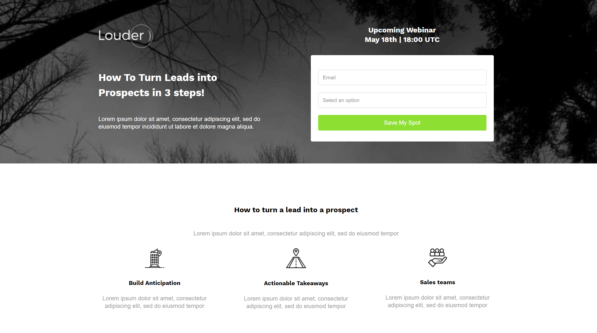
Minimalist design is a major plus for numerous users.
Why you need it:
Add various elements like icons and images of your hosts to make this landing page template visually appealing and friendly. The structure and white space are ideal for presenting your copy in a structured and straightforward way that will make your visitor’s life a little easier.
If this layout is your cup of tea, make sure to get a Moosend account and try out the landing page builder. It’s easy as pie!
32. Video-Focused Landing Page Template
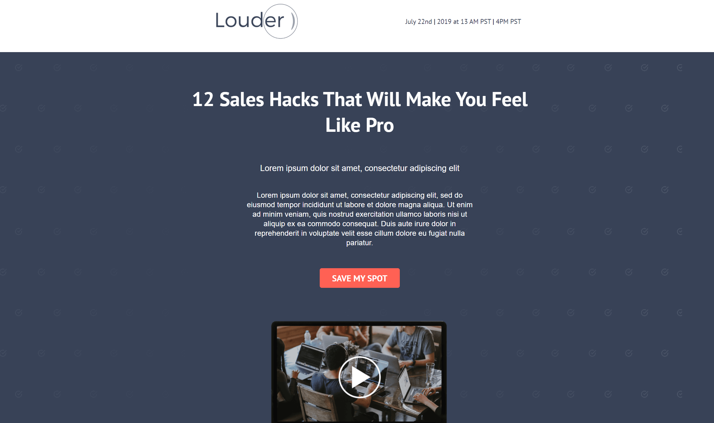
Videos and GIFs are perfect for making your marketing campaigns stand out.
Why you need it:
Leverage the advanced elements of this layout to stun your visitors at first sight. Moreover, you can use the color scheme of this design to power up your CTA. Just make sure to pick the right color and copy combo to make it more interesting and appealing to your audience’s eyes.
33. Registration Landing Page Design

If you want to boost your attendance rate, you can pick and customize the above template in a matter of minutes.
Why you need it:
The online form on the left side is great for collecting your visitors’ contact information effortlessly. Change the colors to make it stand out more, or use a background image of your choice. Also, you can provide your registrants with additional information by inserting details about the presenters or any other details you like.
34. Alternative Contact Form Webinar Page
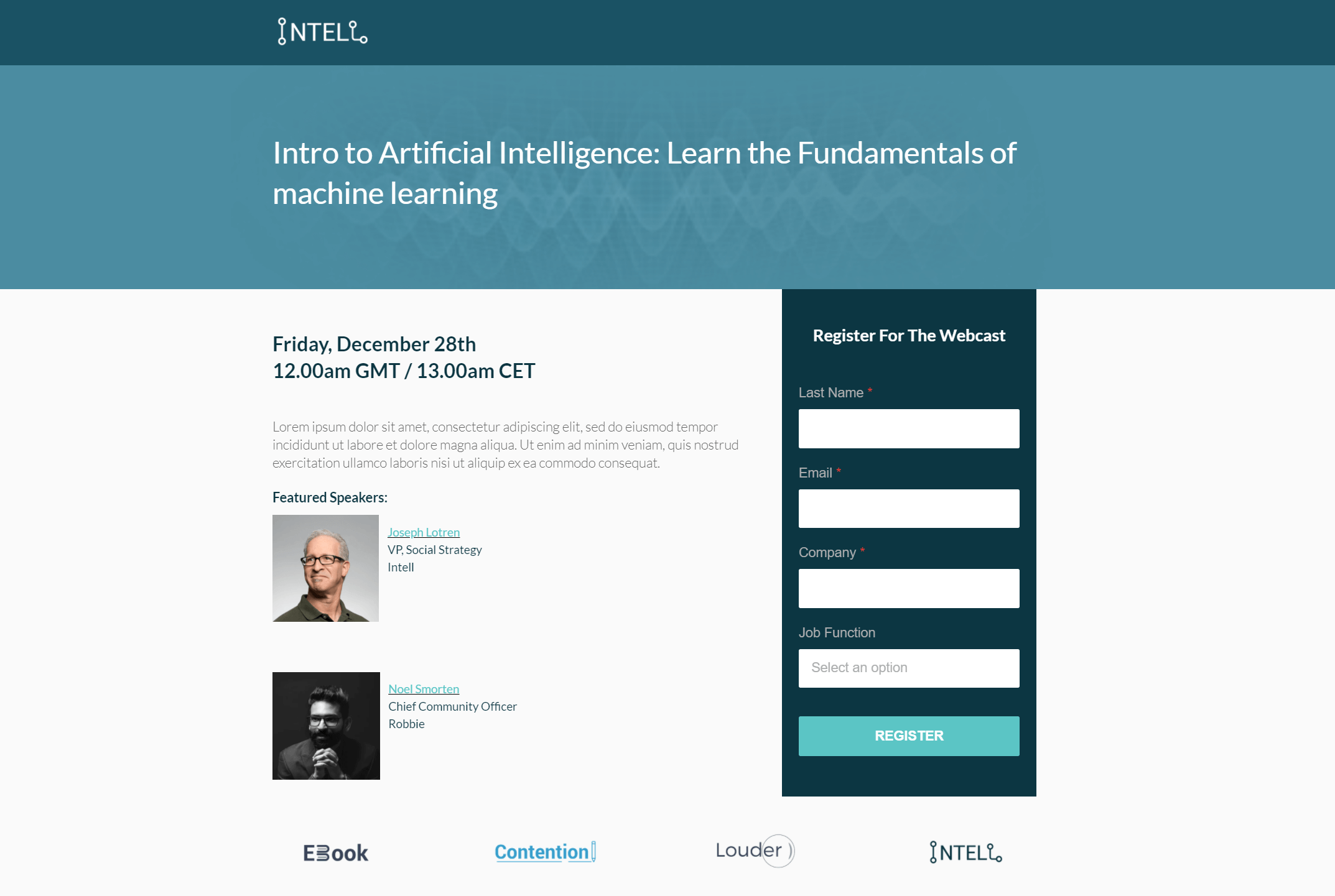
Liked the previous template but want something more? We got you!
Why you need it:
The above example favors colors and white space to let your value proposition stand out and make your form hard to miss. For better results, you can include testimonials and trusted brand logos to increase your credibility and engagement. Lastly, take advantage of the “Featured Speakers” section to make your page more converting and informative.
35. Marketer’s Favorite Page Template
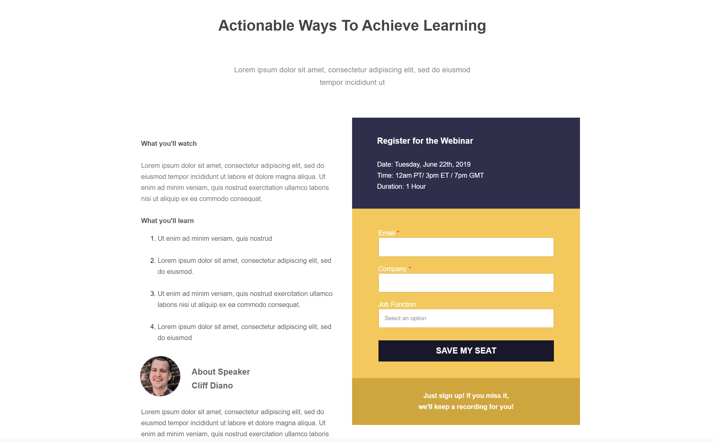
Another beautiful layout to rock your webinars, online courses, events, and more.
Why you need it:
The use of white space is pretty dominant here. This will allow you to increase the readability of your message and place focus on your contact form. To nail it, make sure to insert valuable copy using the right keywords to create SEO-optimized landing pages for your business.
Make this design yours by registering for a Moosend account! Then all you need is your imagination!
Hospitality Landing Page Layouts
Need to increase your booking rate but don’t know how? We have just the right thing for you! Create an awesome landing page with your accommodation offers, add a clever CTA, and let your value proposition do the work for you.
Here are the magic tools you’ll need:
36. Booking Promo Page for Hotels
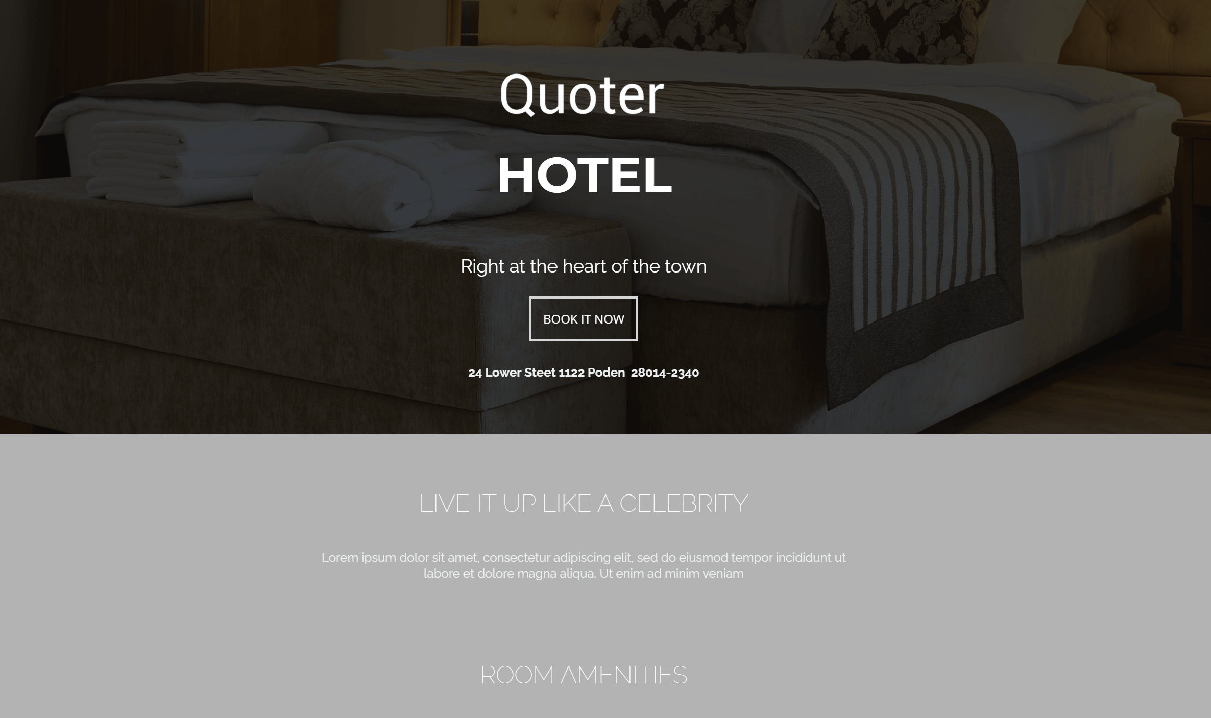
The best way to increase your booking rate is to craft a beautiful newsletter that’ll lead to your landing page!
Why you need it:
Here, you have a simple layout you can customize for your h0tel business. Add an intriguing background image and your value proposition to make your guests click on your offer the moment they land on your page.
And if you want help with your emails, make sure to grab one of Moosend’s hospitality newsletter templates to make the job easier!
37. Exotic Escape Landing Page
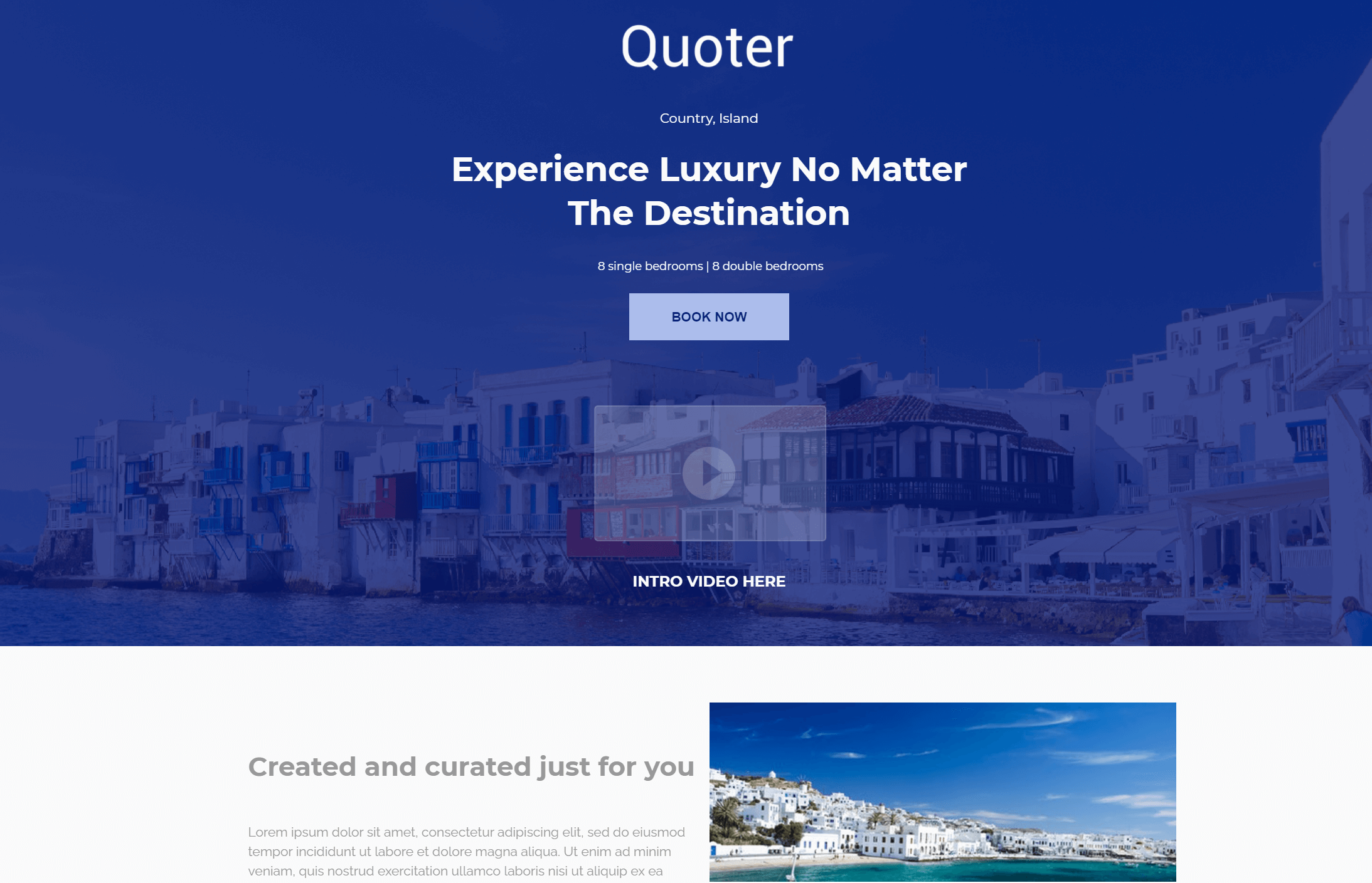
The perfect landing page doesn’t exist… Or does it?
Why you need it:
Use the above template to excite your potential guests with beautiful images of exotic destinations and high converting copy. Take advantage of the color scheme to draw positive connections and see your booking rates fly to the moon!
38. Food Service Webpage Example
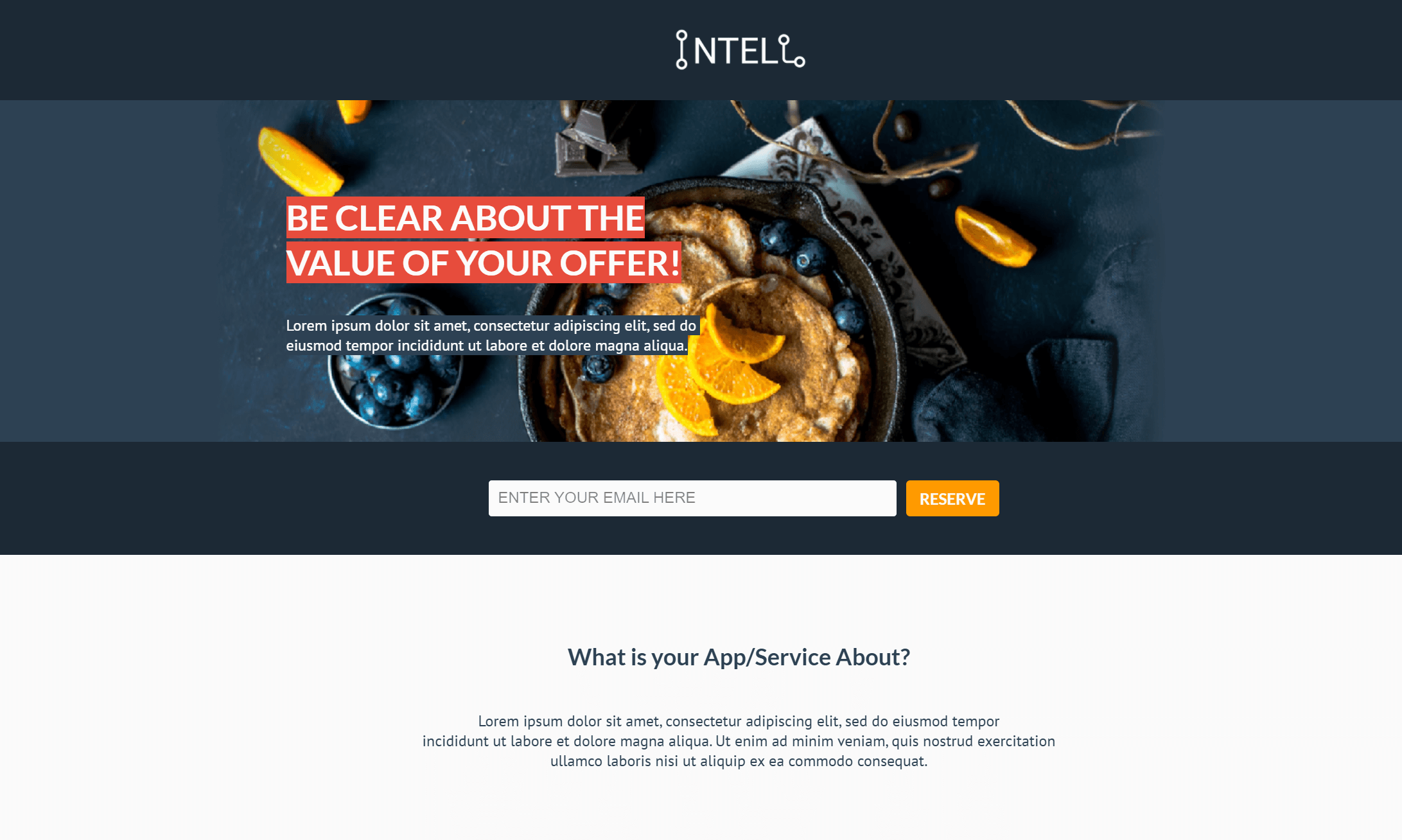
Promote your food service with a landing page template that will increase your visitor’s appetite and lead them to action!
Why you need it:
Grab the chance to add some “delicious” visuals and interesting copy to show your audience what you got! Also, you can benefit from the existing spacing to make your message easier to read, give your audience a great experience, and satisfy their needs!
Master The Art Of Landing Pages…
One beautiful landing page template at a time!
Landing page design doesn’t need to be a hassle anymore. If you want to make things easier and save valuable time, grab a pre-made design, customize it according to your needs, publish it, and see your lead generation skyrocket.
For a quick yet effective solution, make sure to register for a Moosend account and use the drag-n-drop landing page editor to craft amazing pages for your business.
Now it’s time to land your conversions to the moon!

 Published by
