Landing Page Trends To Get Your Inspo Running In 2026
Hello hello everyone and welcome to another episode of our landing page series, hint it’s about: landing pages trends!
So far we’ve shown you how to create a landing page, what landing page optimization for lead generation can do, we even created a list to help you pick the landing page builder that better suits your needs.
But there is something missing… You need some landing page inspiration and you know it as much as we do…
So may I present to you…. the landing page trends you need to know!
If you feel that you only need some don’ts, grab them by clicking on the box on your right.
Let Me Remind You
What a landing page is, for starters: A landing page, unlike the home page, is a page that has been designed for a prospect to land on.
This means that a prospect can press on a CTA button in an email, an ad, anything at all, and end up on the landing page.
Now, a landing page’s goal is to convert, whether it means that you want it to generate more leads or sell something effectively.
So, what is the very first, very basic thing you’re gonna want to remember?
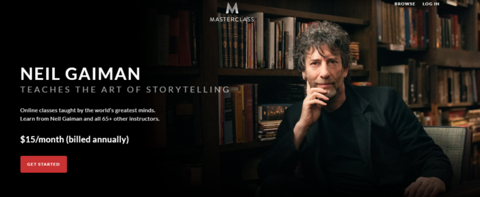
That a landing page doesn’t need more information than what it’s supposed to have. If you want it to convert, you can’t use more than “Hey, here’s us, here’s our product, here’s what you need to do to get it, now CTA!”
In other words, you don’t need all the information or a link here and a link there.
You only need to provide your prospects with a way out to make sure they won’t feel trapped and all the info they need, in order for them to take the action you want them to take. Nothing more, nothing less.
Like so:
(Source)
So, are we good? Are we clear on what a landing page is and what it needs to look like, on the most basic perspective?
Alright, let’s see what you need to do to design a successful, ultra-pretty landing page, complete with landing page examples to get you going!
Before You Begin
Design and trends are fine and well but are they enough to bring more conversion all on their own?
As much as I hate to admit it, the answer is no. Mainly because you can’t put all your hopes and dreams into trendy designs when it comes to creating the best landing page.
You’ll have to do some things before that. And here they are:
1. Study your audience
You’ve got all the data. You’ve got all the information. You can really dive deep and find out what your audience loves and what they love to hate. And then, you can make your buyer personas.
And if you use AI like we can get you to do, then you’re in for a treat: You’ll be able to create personas that will be so real and so accurate, nobody will know how to beat you.
If you’re selling mattresses, for example, you can’t appeal to small children. Here:

(Source)
And you can’t appeal to people that don’t like comfort or don’t need a good night’s sleep, either.
2. Study your goals
You can’t go anywhere without actionable goals. In fact, your goals are a crucial point and will help you design your landing page down the line.
What is it that you need? More sign-ups? Make your form small and simple with no evident friction.
More buyers? Make your form enticing enough but make it showcase real actual value.
This will help you determine your CTA, your form’s look, feel, even its length and the information you’re going to ask from your prospects.
3. Match the ad to the page
In fact, match anything that made them land on your landing page, to the page itself.
You’ll need to show that you’re sending them somewhere useful, somewhere that meets their expectations.
That’s why you’ll need your landing page to be aligned-content-wise, copy-wise and otherwise-with whatever comes before that, as this is what will spike interest.
Look at that one:

I found this one on Facebook and it is a pretty good landing page copy. Also, I loved the video, so I clicked on it and got redirected here:

(Source)
The copy matches, the colors do so as well and if you’ve watched the video, the visuals do the same thing.
The point here is that this landing page not only shows what its ad has promised but also shows me why I need to buy the product.
4. Optimize your landing pages for mobile
By making your landing pages mobile-responsive, you’ve got a whole new world of conversion opening up in front of your eyes.
The reality is pretty simple here: We all browse social media and we all open emails through our phones and tablets.
So, if a prospect bumps into an ad, it will be a real shame to offer them something that just won’t respond when it comes to mobile. And believe me, they won’t remember the name of your brand and won’t look it up when they find themselves in front of a desktop computer later on.
For example, this one is one of the best landing pages for real estate software I could find:
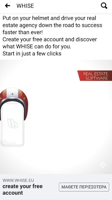
This was the ad I clicked on.
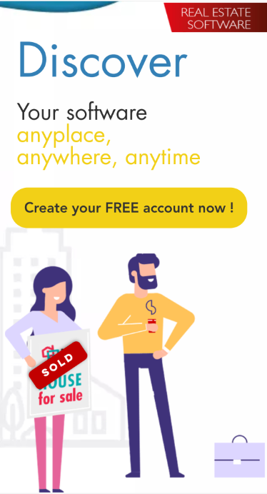
(Source)
And this was the fabulous landing page. All from mobile, all responsive, and if I were interested in real estate software, I would’ve created a free account. For sure.
Off to the landing page trends
Okay, okay, I could’ve gone on and on about what needs to be done before, but you already know that a CTA button needs to pop, that there needs to be some white space to keep the eyes calm and focused, and so on and so forth.
You won’t escape me babbling about those, you’ll see later on!
But these are not landing page designs or landing page trends. Much like the above tips, these are some staples. So, without further ado…
Landing page trends: #1 – Minimal design
Overbearing is so so out right now! So, keep everything under the logic “less is more.”
A landing page doesn’t need too many things on it to draw attention. It just needs one simple, geometric and clean design that will be able to convey your message:
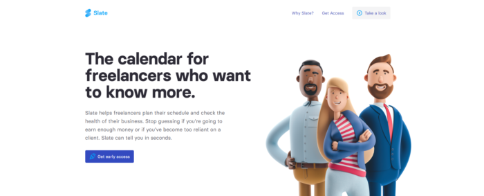
(Source)
Design is not the only reason behind this, of course.
While the minimal design is not confusing at all and it’s easy on the eyes, it’s got yet another very clear benefit: Your page will load faster.
So, minimal design has everything to do with landing page optimization as well as style, as you’ve only got a couple of seconds to make an impression and you need all the help you can get.
In other words: A page that loads fast, converts faster. A page that loads slowly, won’t really convert. At all.
And another simple tip: A minimal web page makes your message digestible, pretty easily too.
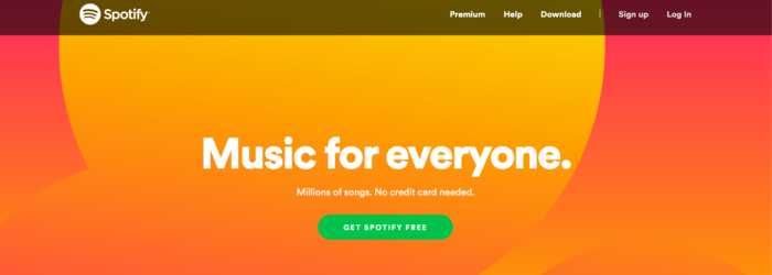
(Source)
I don’t think that, by seeing this landing page, I get confused as to what it can do and this makes it one of the best landing pages, in terms of design.
Its key selling point is that it just shows a big, bold headline with what it can do and then the CTA button in contrasting colors. Easy and simple and I can understand what’s going on just by looking at the copy.
Landing page trends: #2 – Interactive landing page design
This one’s straight from the future, as there are not too many brands that use it. Yet. So you heard it here first, remember that.
So, let’s see why you need your landing page to look a little like this one:
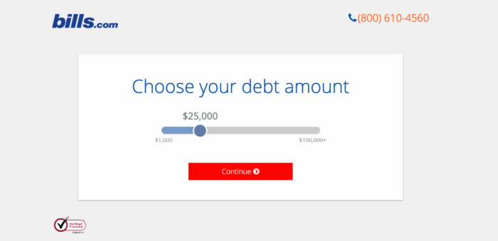
(Source)
This is a classic example of an interactive landing page, and here’s the rest of it:
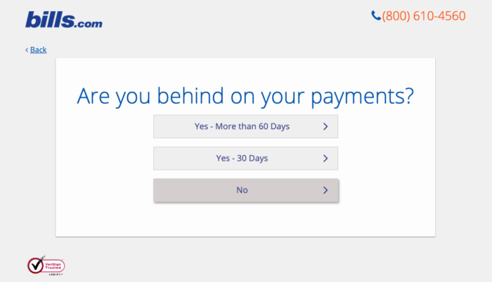
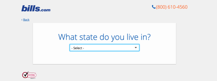
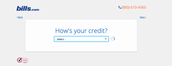
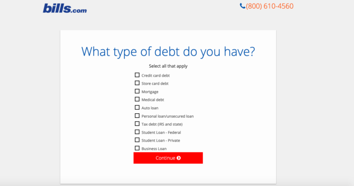
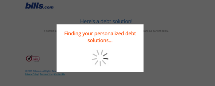
I spent quite some time on this landing page, pressing buttons around, even though I really had no reason to be there. Imagine if I’d landed on there on purpose.
So, what does this mean about landing page trends? Why should interactivity be landing page inspiration?
Remember what I mentioned before: Conversion is the goal of every single landing page and the trends follow the goals of each function and era.
Real-life example: Grunge would’ve never existed if the 80s hadn’t been so colorful.
So, how will conversion happen if your prospect only finds a static landing page, one of the many that frequent the internet nowadays?
And how will a prospect remain enticed if your landing page is too… Well, desktop-y? Especially in an era where the use of mobile devices is reaching desktop use?
The answer is: By adding interactivity to your landing page, of course!
This kind of landing page design is nothing short of genius, as it’s so much more than you clicking your heart away and scrolling through information.
If you take a look at the example above, it’s not like the landing page has something colorful or catchy. It’s plain, simple and true to its point. And it wouldn’t have caught my eye, had it not been interactive.
I stayed on this landing page for longer than I intended to, I actually had a back-and-forth with the pieces of information the brand needed me to focus on, and the biggest benefit of all:
The amount of time I spent on that landing page will make search engines think that it’s got all the right information that can help the audience grow and thrive.
This, in turn, means that you’ll be one step ahead when it comes to landing page SEO, as dwell time is a very important component.
Interactivity, all in all, will help your landing page get viral, score you extra engagement points and help your conversion go like this
Landing page trends: #3 – Heavy contrast and custom illustration
Heavy contrast is one of the best landing page trends, as it’s eye-catching, fun and helps the viewer really see what’s front and center on a landing page.
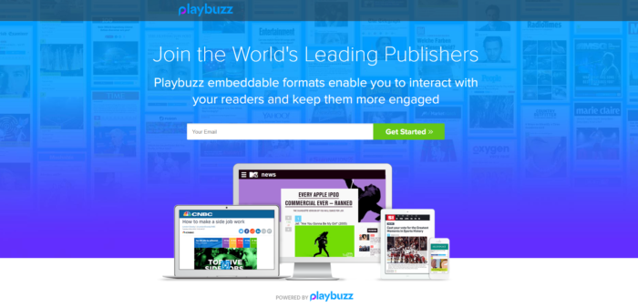
What is more, most pages use gradient colors for their background, keeping things simple but interesting at the same time:
(Source)
Blue and white contrast beautifully, there is quite a lot of white for me to figure out that this central bit there is where I need to enter my email to sign up, the CTA button contrasts…
What more could I possibly need?
Oh, I know. A lot of whitespace. A lot of white is what makes headlines and landing page copy pop and explains why the user is there. But this is not the only thing you can utilize to make your landing page design memorable.
You also need something custom, something memorable that will be able to showcase all your brand’s about. Like Coca-Cola’s font, for example, which you can’t see used by another brand and not blame that brand for unoriginality.
And instead of using a boring and tacky stock photo, use custom illustrations to convey those ideas that would look too plain with a simple, single picture, showing how the thought process can bring people together.
Landing page trends: #4 – Navigation bars? Nah-huh. Social proof? Ya-huh
A very common design mistake on landing pages of all kinds is the mere existence of the navigation bar.
And yes, of course, you need to give them a way out. But a way out to your website would be way better.
The more links you add on your landing page, the more ways out you’re offering. And this landing page design won’t benefit you at all, because it only takes one click to get your prospects to opt out and just leave.
You need zero navigation links on your landing page.
Because too many of them will kill your conversion rate, seeing as you’re distracting your prospect from the actual reason this page exists, with each little link. They’ll just click on an “About” link to see everything they can about your company and then… Boom. They’re gone.
Just check what the statistic below has to say about conversion rate optimization on a landing page:
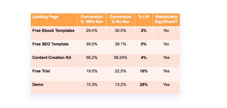
(Source)
In other words, you’re trying to create a special, one-of-a-kind page that will do one thing and one thing alone: Convert.
Navigation links are what Ernie sings about in “Sesame Street”: One of the things that’s not like the others.
And it just shouldn’t be there in the first place.
Navigation links aren’t made to convert. CTAs are. So, these belong on a landing page.
Hint: Just link your homepage somewhere on your landing page and you’ll be fine. I wouldn’t want to not know how to leave, had I landed on there:

(Source)
So, if the lack of navigation makes your landing page convert more, what is it that makes your landing page trustworthy enough to get your brand noticed?
You need kind of a lot of social badges on your landing page.
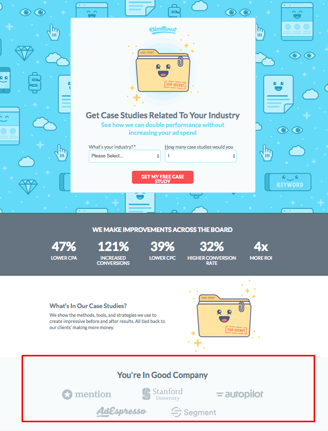
Social badges serve as social proof. And social proof is important. Just as important as clearly showcasing your offer, if I’m honest.
(Source)
By the way, this is one of the best landing pages on the interwebs.
But let’s move on. Social proof is, first and foremost and according to my dear friend Wikipedia: “a psychological phenomenon where people assume the actions of others in an attempt to reflect correct behavior for a given situation.”
Let me simplify this for you. Let’s say that you, as a kid, admired Mel C of the Spice Girls. She was the “Sporty Spice”, the athletic one, the one that always dressed in sweats-or “tracksuits” as the Brits call them.
I can bet good money that you began loving sweatpants and sports. For as long as you loved the Spice Girls, at least. This is what social proof is. “If the one that I admire loves X product or behavior, then I should love it”.
In the example above: Stanford University gets stats from KlientBoost. Stanford University is a credible source. Therefore, KlientBoost is credible as well.
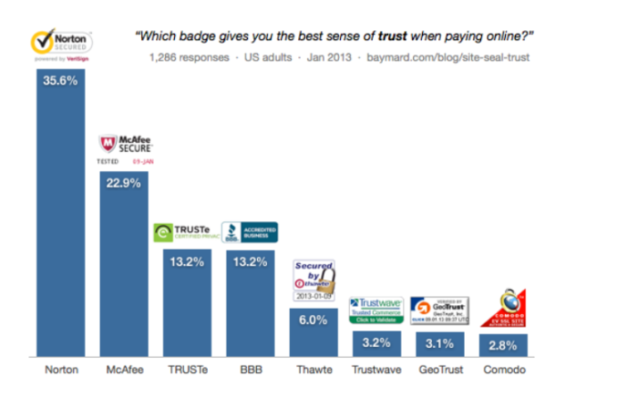
Don’t lose the social proof badges like you’ll lose navigation links. They’re much too important for your conversion:
(Source)
*Psst, check this out if you’re into eCommerce!*
But I saved the best for last…
Landing page trends: #5 – Video
This is my favorite landing page trend, by far. The best landing page that has ever been created -up to this point- surely has a video on it.
Okay, okay I am biased, I know, but hear me out.
Video landing pages are those landing pages designed to have a video as a centerpiece. The video will do all the work, allowing you and your team to go easy on copy and image.

(Source)
You can see what video can do for you and how good it is at raising your conversion up to the heavens with a lot more ease, seeing as there are some things you just need to do when using video in your marketing efforts.
What are these things exactly?
- You already know that your video can’t be too long (Damn you, loading time!), so you’ll keep it short and sweet. This leads us to our second point.
- By keeping video content short and sweet, marketers know how to answer the key questions of their audience. Which means that their content is useful and straight to the point. This leads us to the third fact.
- Videos are SEO optimized straight from the beginning. And look at the results of that practice:
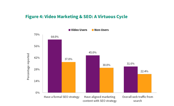
(Source)
That way, more prospects will bump into your landing page and more people will see it. Make search engines find more value in your content. Make your content go viral.
You get the gist, all the cool kids want to do it like that.
There’s also another thing, one that goes beyond statistics and technicalities and straight to the content: Videos can be as diverse as your audience.
Do you work for a brand that’s kind of like Chandler’s job and nobody can fully and clearly understand what it can do for prospects? Use explainer videos.
Do you work for a brand that sells something expensive or refined or even something that people will need but won’t be sure if it’s going to be of benefit? Use customer testimonials.
Do you work for a brand that is neither and just wants to leverage the sheer power of video marketing and get prospects to spend 88% more time on your landing page? Replace your hero shot with a video background.
Got it? Great? No? Okay, let me recap:
The top 4 landing page trends
- Interactive landing page design
- Heavy contrast and custom illustration
- No navigation bars but plenty of social proof
- Video 💓
And now I wanna move on and give you one fine example for each and every landing page trend I mentioned above.
Best Landing Page Design Awards
Or almost. No, these pages don’t win anything other than my love, admiration, and appreciation. Let me show you the winners first and explain why I loved them so much and why they fit into the categories perfectly, to spark your landing page inspiration and make your next campaign fly!
For the interactive landing page trend
(Source)
Check this fine specimen out!
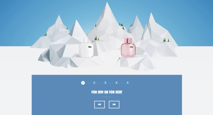
Lacoste’s aim was to help those late buyers find the perfect gift easily and without too much friction. So what did the brand’s marketers do? Well, they created an interactive landing page with one of the cleverest minimal landing page designs.
They used a quiz and some gamification as well, and they saw their conversion skyrocket just by entertaining their visitors!
For the heavy contrast and custom illustration landing page trend
(Source)
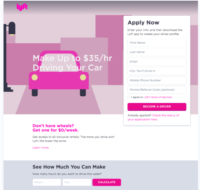
Magenta on white, on black, on custom illustration, on clear and concise copy with a calculator at the bottom…
There is no menu navigation, but there is a strong headline that shows clear benefit, in numbers no less. And an FAQ section. Love it!
Could Lyft have used stock photos? Yes.
Would that look tacky?
Yep.
For the no navigation bars but plenty of social proof landing page trend
(Source)
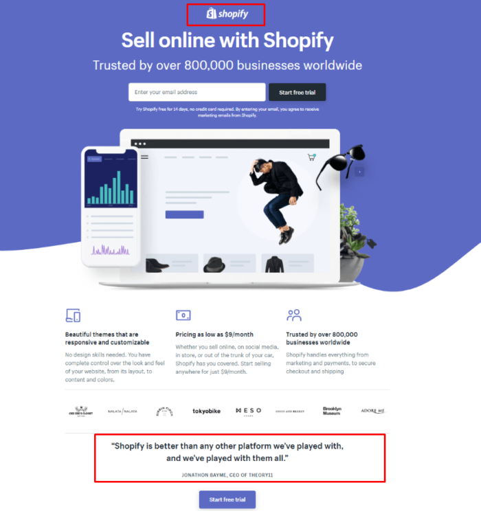
Well hello there! I managed to find a landing page that combines both elements. Which is harder than I thought it would be, as the “no navigation” tip is not actually common knowledge.
Anywhoo, here’s Shopify’s pretty landing page that has no navigation bar-ie no option for the visitor to get distracted and opt out-and includes social proof, what with the names of the companies that use it and a customer testimonial to boot!
For the video landing page trend
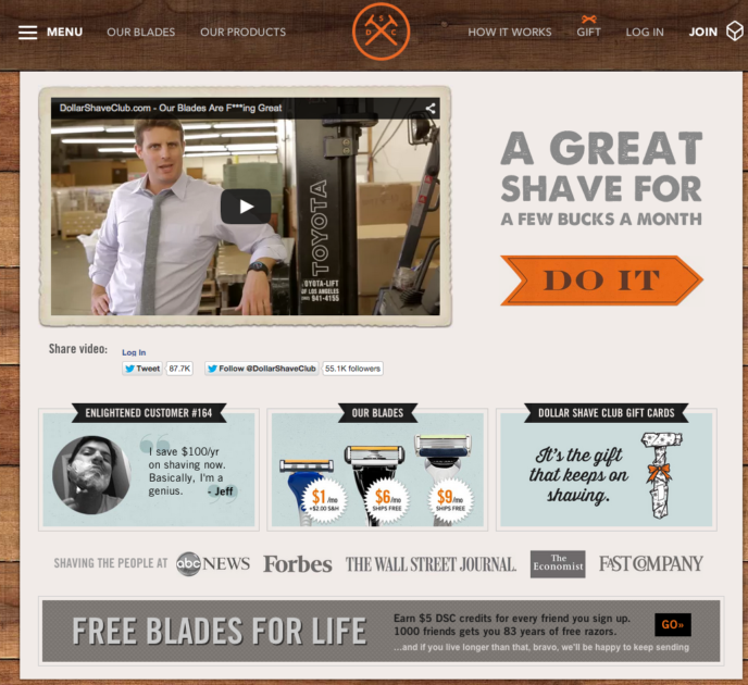
(Source)
I honestly couldn’t stop laughing the billionth time I watched that video. Technically, it’s an explainer video, as its main purpose is to make sure consumers understand why they need to invest an amount of money in a company that sells razors.
Long story short, the razors sold themselves. The company was happy. Oh, I won’t keep talking about it, just read our case study.
Final Tips Before You Go-Go
This is not the section to find more landing page trends. Or the place to check the landing page design, even. This is where I’ll make sure that you got the landing page basics in mind because fantastic design is not a be-all-end-all.
Your CTA action
Make it as short and as sweet as the whole entire landing page. Oh, and make it clear and simple as well.
Nobody likes a landing page that doesn’t tell them what to do in a clear way. You don’t want prospects to wonder, you want prospects to convert.
Your CTA must make your users react quickly, therefore you need verbs and actionable ones at that.

(Source)
See there? Sign up-Use-Create. A fantastic trifecta that makes users subconsciously think that they need to take action.
And boy oh boy, will they? Yeah. The answer is they will!
Showcase value
“Now, for only $10 a month you can…” No. Nu-uh, not like that.
You’ll need to show the value of your product. The real value, not just the numbers. Make it simple, make it so that a toddler will say “Hey Mommy, hey Daddy, I want to go on a business trip!”. Like Airbnb did!
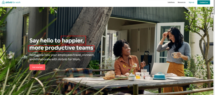
What is the value here? Not Airbnb’s low prices, nor the fact that it offers a flexible and contemporary way of traveling and experiencing places.
The value is the happier, more productive team.
In other words, the value of anything is not found in the price, but in what the prospect can become, after making a purchase or being somehow involved with your company.
Use a Thank You page
It’s only polite to say thank you after someone has engaged with your brand in some way.
And if this doesn’t do it for you, consider that politeness is the only way to nurture your leads and make them travel further and further down your sales funnel or otherwise.
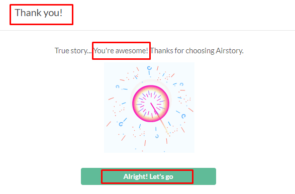
(Source)
I was very happy to see a thank you page appear when I signed up for a free account on Airstory. Oh, and that exploding firecracker thingy? It’s a GIF, so you better up your game!
This thank you page is beautiful, short and appealing, as it not only uses great copy that can pump up the lead, it uses actionable verbs on the CTA as well and that makes the user want to start using the service immediately.
Which means that they won’t forget they signed up in the first place. *Wink*
Use clever colors
You’ll need colors that contrast, as I mentioned before. You can’t have people opt out because your CTA button’s letters are white on a baby blue button. Just do it like that:
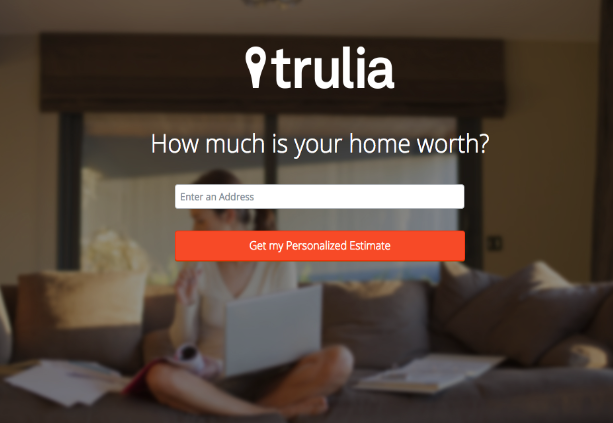
(Source)
The colors contrast beautifully, but there’s more to it than contrast.
Trulia is a real estate website. You check out homes in there. What does that mean?
That you need a homely feeling with calming colors and contrast that won’t pop aggressively.
Nobody would like a real estate agency that would make them anxious about the house they’d like to check out, they’d opt out before you even knew it.
That’s all mah peeps!
Oh, wait, I didn’t mention using long-tail keywords, the option of zooming in on products, the need for only one CTA, and some other landing page best practices, but I think you got the final gist and you know exactly what to do now!
Just tell me what you loved and what you didn’t love and the kind of landing page design you think makes your landing pages fall right into the trend, in the comment section below.
And as per my request, always share the knowledge with your favorite marketer!


 Published by
 Published by
 Published by
