15 Cyber Monday Email Examples & Tips For 2025
Since one of the biggest shopping holidays of the year is around the corner, it’s time to get inspired by looking at some of the best Cyber Monday email examples.
In this post, we will see some exciting email marketing campaigns from brands like Lenovo, LG, and Fila to find out what makes them work. Both eCommerce stores and retailers can use them to get inspired, so make sure to keep notes.
Without further ado, let’s check them out.
Craft the perfect Cyber Monday email with Moosend
Get advanced email features starting $9/month.
Start freeWho Can Target Cyber Monday
While you may think that Cyber Monday is limited to electronics and tech deals, it’s a huge opportunity for any brand with an online presence. From fashion retailers to beauty, home goods, and beyond, businesses in all industries can benefit from this major shopping event.
While Cyber Monday was initially created for online stores, it has expanded to include traditional retailers with digital offerings as well. Small businesses, independent sellers, and large corporations alike can all take advantage of this event.
Even service-based businesses and SaaS companies can join by offering exclusive online shopping deals, free trials, or discounted subscriptions.
So, whether you sell physical products or services, Cyber Monday will let you tap into the holiday shopping frenzy, drive traffic, and increase online sales.
Additional Resources
- Retail Email Marketing Guide
- Ecommerce Email Marketing: Beginner’s Guide
- How To Do Email Marketing For Small Businesses
- The Complete B2B Email Marketing Guide
- How To Create A B2C Email Marketing Strategy
Best Cyber Monday Email Examples
Now, let’s take a look at numerous examples from B2C and B2B brands.
1. Moosend
Subject line: Welcome to Cyber Monday 🎉
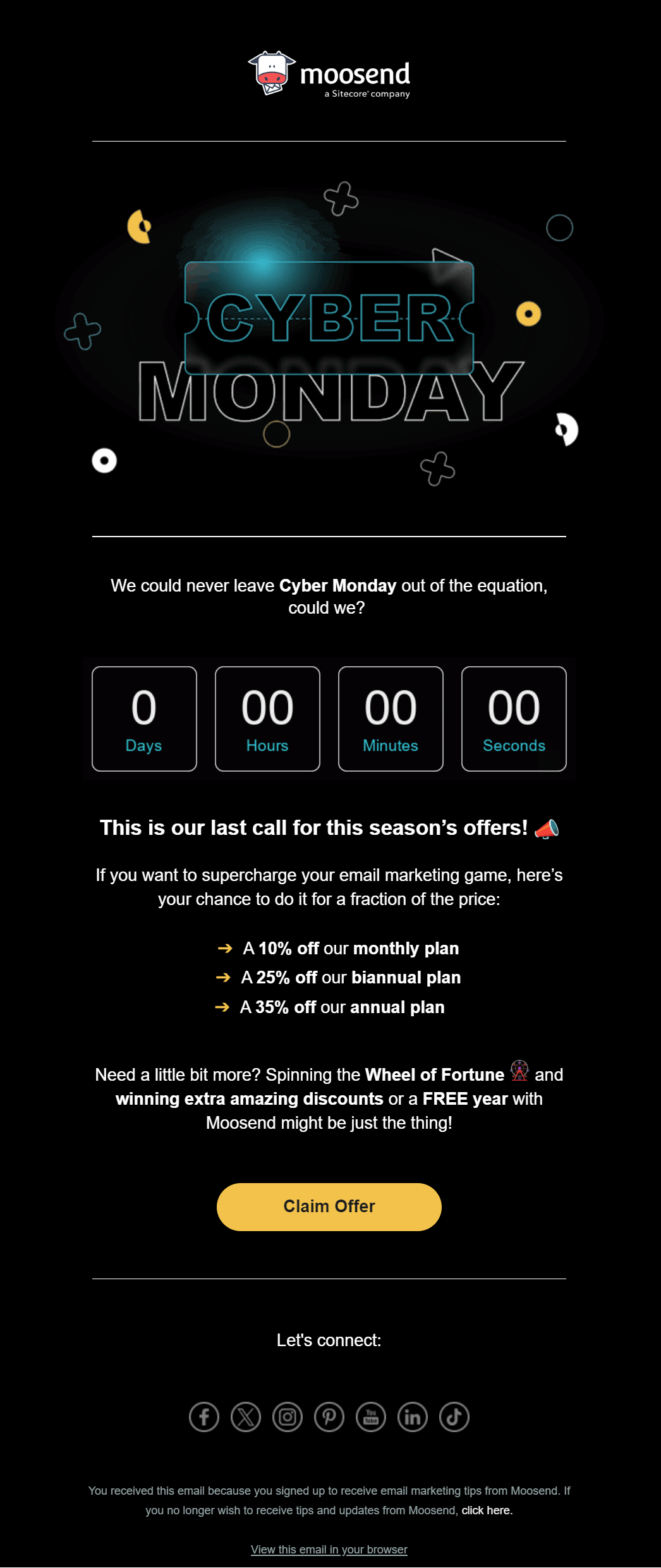
This Cyber Monday email by Moosend offers an engaging, professional approach to driving action for B2B and SaaS businesses.
Why it works:
- The sleek layout with cyber-themed graphics makes it visually appealing and relevant for a tech-savvy audience.
- Creates a sense of urgency with a countdown timer, encouraging recipients to act before the deal expires.
- The yellow call-to-action button contrasts well against the dark background, drawing attention and boosting click-through rates.
- The email copy is clear and well-organized, using bullets to highlight the different pricing tiers and Cyber Monday offers, making it easy for the reader to digest.
- The email maintains a polished and professional tone, making it ideal for B2B and SaaS businesses.
You can easily replicate this design with the Moosend email editor to create your high-converting campaign. All you have to do is sign up for a free Moosend account and see what you can create.
2. Uber
Subject line: Need a hand after Black Friday & Cyber Monday? 🛍️
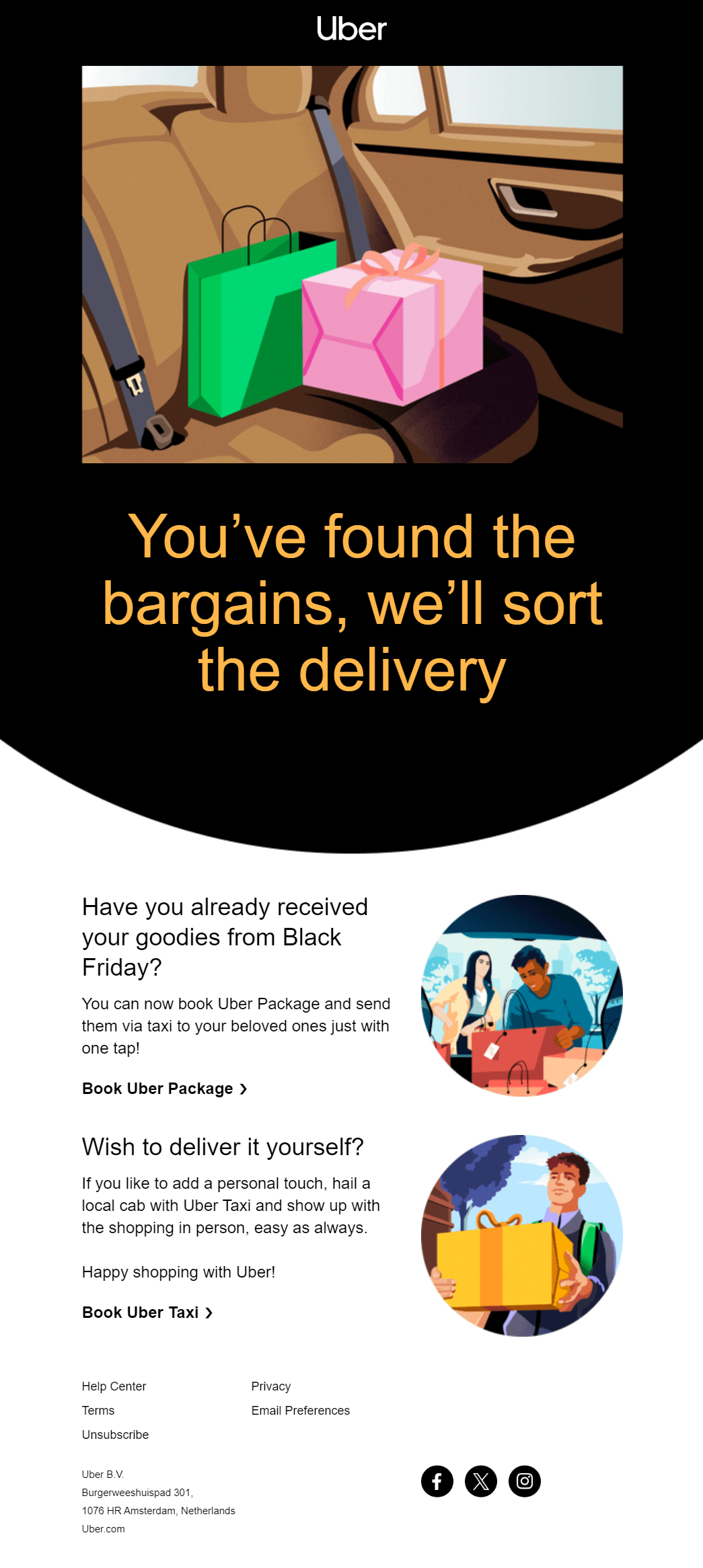
Uber’s Cyber Monday email campaign is an excellent example of how non-retail businesses can leverage the holiday season to increase their revenue.
Why it works:
- It cleverly ties in both Cyber Monday and Black Friday by offering customers a unique service.
- The copy addresses a common issue for holiday shoppers—how to get their items delivered quickly or personally—providing a simple solution through Uber’s services.
- The visuals remain consistent with their brand identity, keeping the message both professional and engaging.
- The email includes well-placed CTA buttons (“Book Uber Package” and “Book Uber Taxi”), making it easy for recipients to take the next step and use Uber’s service.
- The white space keeps the email clean, making it easy to read and ensuring the key information stands out without overwhelming the recipient.
3. Truly Beauty
Subject line: Only a few moments left! 20% OFF sitewide!
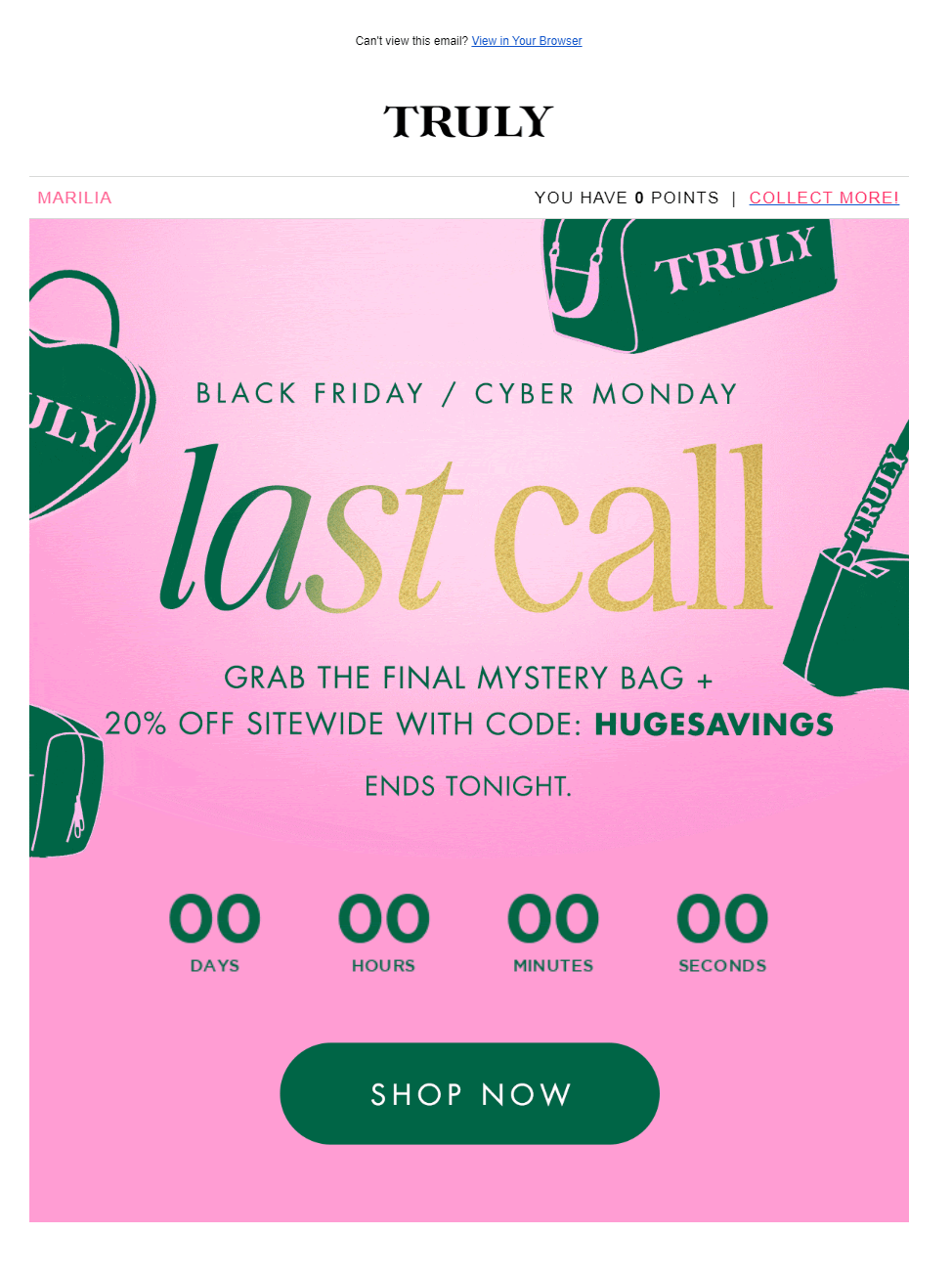
Truly Beauty’s Cyber Monday email campaign stands out with its unique color palette and clever personalization.
Why it works:
- Instead of the typical dark colors often used for Cyber Monday, the brand uses a pink and green color scheme. This fresh approach immediately grabs attention, setting it apart from other emails in a crowded inbox.
- The email keeps the visuals minimal yet effective, using graphics of bags to tie into the shopping theme without overwhelming the design.
- The countdown timer at the bottom creates a sense of urgency, pushing recipients to act quickly before the deal ends.
- Adding the subscriber’s name at the top left makes the email feel personalized as if the offer is tailored just for them, which boosts engagement.
4. Jeni’s Ice Creams
Subject line: LAST CALL! Your free pint is waiting
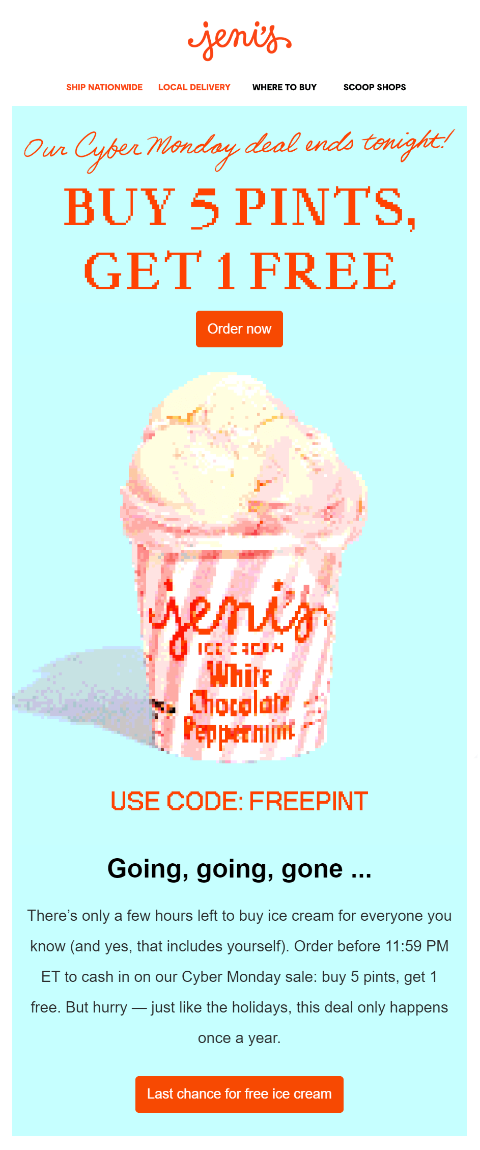
Jeni’s Ice Creams has crafted a playful and creative Cyber Monday email campaign that perfectly aligns with the holiday while highlighting its unique brand.
Why it works:
- The email uses a bright blue and orange color scheme, which, like Truly’s campaign, helps it stand out with a playful, eye-catching design.
- The orange CTA button is prominent and stands out against the lighter background, drawing the reader’s attention and encouraging immediate clicks.
- The use of phrases like “Going, going, gone” and the countdown timer adds pressure, pushing subscribers to take advantage of the deal before it ends.
- To fit the Cyber Monday theme, Jeni’s creatively uses pixelated images of a pint of ice cream and fonts, blending the modern tech holiday with their traditional product offering.
- The subject line employs the fear of missing out (FOMO) to encourage potential shoppers to click on the CTA.
5. Terre Bleu
Subject line: Today Is The Final Day To Save! 💻😮
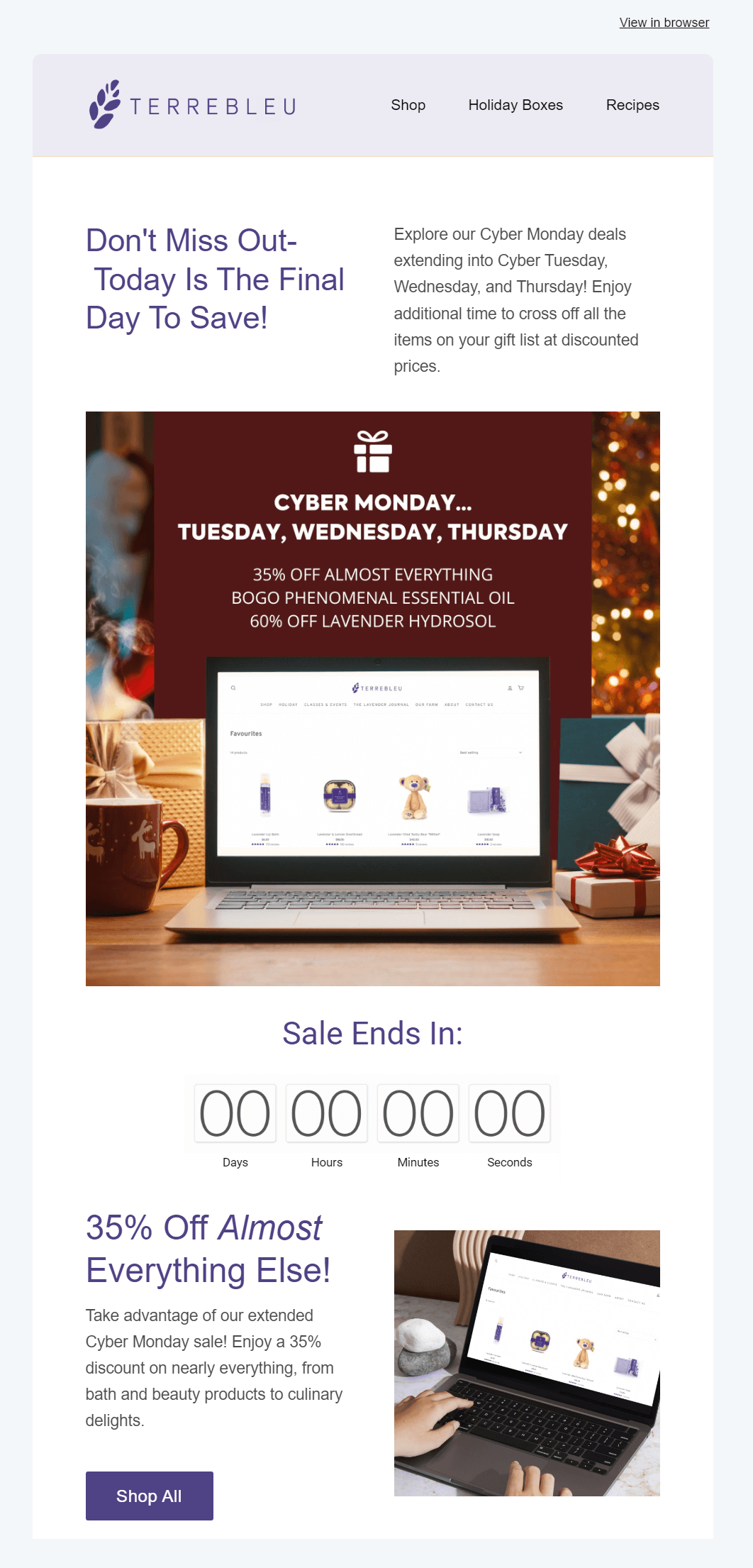
This Cyber Monday email example from Terre Bleu stands out for its decision to maintain its regular email design rather than adopting a more common Cyber Monday aesthetic. The simplicity works in their favor, keeping the focus on their products and offers, rather than an overly stylized design.
Why it works:
- The brand sticks to its regular, minimalistic design, ensuring continuity in branding and familiarity for customers.
- The copy provides all the information shoppers need to make a purchase, including the extended sale for Cyber Monday, Tuesday, and Wednesday. Although the copy above the fold could have been omitted for brevity, the rest of the message is clear and informative.
- The countdown timer adds urgency, encouraging immediate action before the sale ends.
- The inclusion of a product block featuring various items gives shoppers a preview of what’s available and drives them to explore further.
6. Death Wish Coffee
Subject line: Marilia Cyber Monday Is Dyin’

Death Wish Coffee’s email is bold and attention-grabbing, making use of its brand color to create a stunning result.
Why it works:
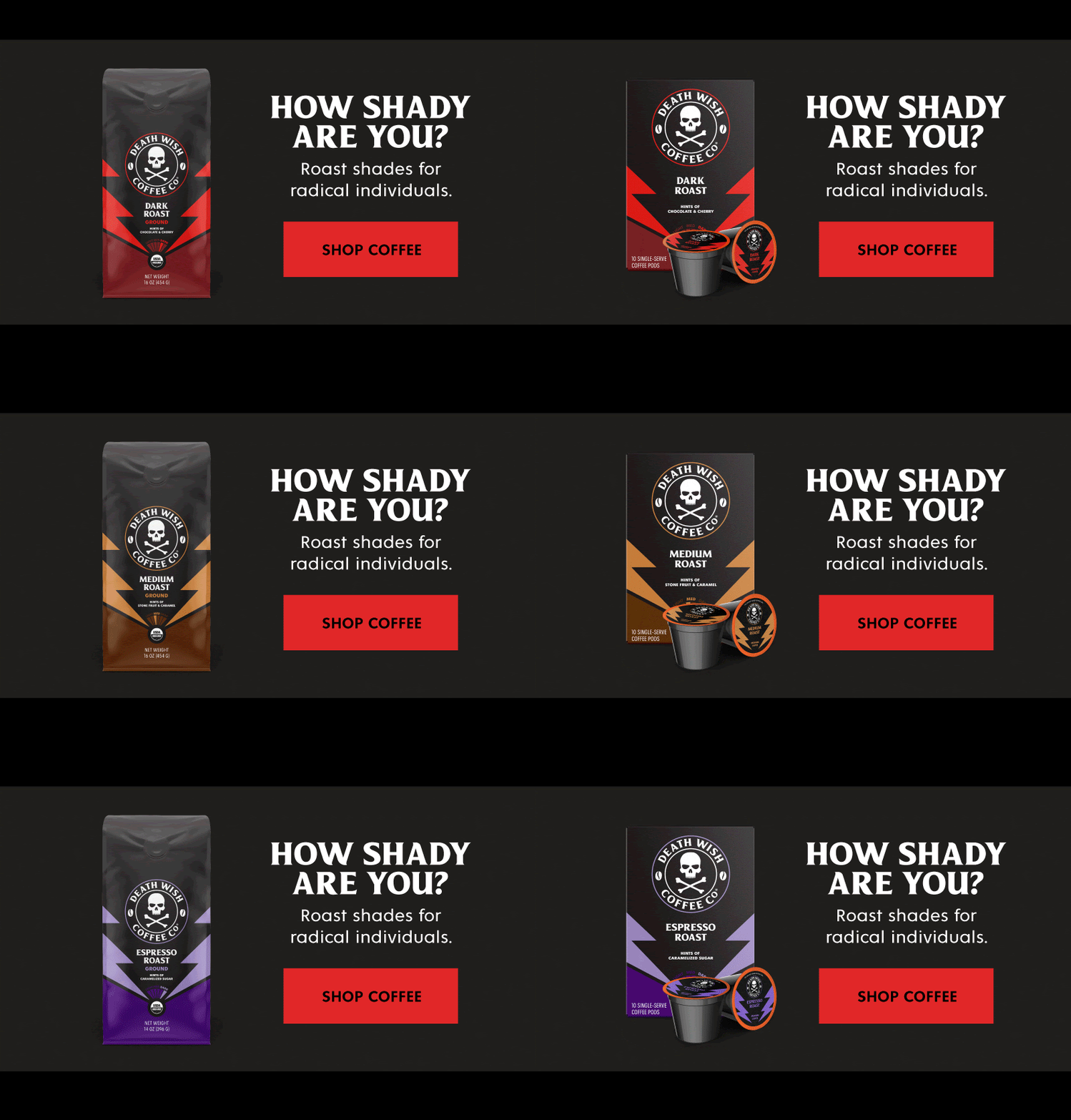
- The black background with red CTA buttons creates high contrast, ensuring that the key actions, like “Shop” and “Shop Coffee,” are hard to miss.
- Highlights both their coffee products and branded merchandise, keeping the content engaging and relevant for their target audience.
- To enhance engagement, the email also uses a personalized subject line, making recipients feel like the offer is tailored just for them.
What also draws attention is that the discounts (Save 15%, 20%, 25%) are displayed through GIFs, creating a dynamic and interactive feel. This tactic is also used in the product blocks, showcasing multiple products and increasing engagement:
7. Lenovo
Subject line: Cyber Monday Starts Early!

Lenovo has created an effective Cyber Monday email marketing campaign, skillfully combining enticing deals with engaging visuals. By using countdown timers and clear messaging, the brand encourages urgency and drives immediate action.
Why it works:
- The countdown timers create a sense of urgency, pushing recipients to act quickly before the offer ends. This technique increases the likelihood of conversions.
- Lenovo emphasizes the “Save up to 77%” benefit, clearly showing the value customers will gain. This direct messaging draws attention and leads to a higher click-through rate.
- By including a “Tomorrow’s Hot Doorbusters” section, the brand keeps its audience engaged beyond the immediate email, motivating them to return for more deals.
- Offering 2x rewards for loyal customers not only drives additional purchases but also makes subscribers feel valued, enhancing customer loyalty.
You can easily mimic Lenovo’s email example by signing up for a Moosend account. Just hop into the editor and get started on the spot.
8. Fila
Subject line: 30% OFF EVERYTHING + $25 Off Orders $100 or More: Our Cyber Sale Finale.

This Cyber Monday email campaign from Fila is a great example of how to connect with subscribers and encourage purchases.
Why it works:
- Instead of standard product shots, Fila uses images of models wearing their products, making the campaign more relatable and helping subscribers visualize the items in real life.
- The brand places the Cyber Monday deal front and center, ensuring the main offer grabs attention and keeps the focus on the discount, making it easy for subscribers to understand.
- To further encourage conversions, Fila sweetens the deal with an extra $25 off, providing subscribers with even more reason to take advantage of the offer.
- The Cyber Monday subject line teases the email’s content, giving recipients a clear reason to open the message and engage with the deal inside.
If you have difficulty coming up with compelling email subject lines, you can use a subject line tester like Refine to help you.
9. LG Electronics
Subject line: Cyber Monday deals are extended!
LG Electronics’ Cyber Monday email campaign is an excellent example of how to extend deals and drive more purchases.
Why it works:
- The email uses a strong headline to announce the extension of Cyber Monday deals, immediately catching the recipient’s attention and making it clear that special prices are still available.
- A prominent CTA button directs shoppers back to the website, while specific product categories are featured to help customers find exactly what they’re looking for, streamlining the shopping experience.
- By promoting Klarna’s pay later option, LG reassures customers that they can complete their purchases without immediate payment, reducing potential hesitation.
- Emphasizing free shipping encourages buyers to complete their purchases, minimizing cart abandonment and adding extra incentive to act.
10. EM Cosmetics
Subject line: CYBER MONDAY STARTS NOW

EM Cosmetics has a very effective and visually appealing Cyber Monday email example to drive purchases.
Why it works:
- The email kicks off with a free shipping disclaimer in the header, instantly offering a benefit before revealing the main value proposition, and encouraging further engagement.
- The campaign uses visuals to present the Cyber Monday discount code in a clear, eye-catching way.
- A well-placed CTA button directly below the code ensures higher click-through rates, leading shoppers to act quickly.
- The free gift offer gives customers an extra reason to place an order.
- The email wraps up with a great email footer, providing important details like shipping information, returns, and customer support, making the overall shopping experience smoother and more informed.
11. Bobbi Brown Cosmetics
Subject line: 30% off + free Extra Lip Tint
Bobbi Brown’s promotional email for Cyber Monday checks all the right boxes, with a simple design and a high-quality product image.
Why it works:
- The email delivers a short, direct message that highlights the key benefits of the VIP offer. Also, the copy is placed above the fold to grab attention right away.
- The black CTA button pops against the gold background, making it easy to spot and click, enhancing the overall visual appeal.
- The subject line complements the email content, reinforcing the value of the offer and enticing recipients to open the email.
- It includes important details in the email footer, such as an alternative payment method, the return policy, and social media buttons, all of which improve the overall customer experience and encourage engagement.
12. Red Bull
Subject line: Last call to save up to 70%
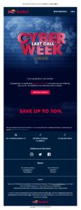
This eCommerce campaign by Red Bull is another great Cyber Monday email example, drawing inspiration from successful Black Friday email campaigns.
Why it works:
- Uses advanced elements to capture the recipient’s attention, adding a beautiful GIF in the header to make it more exciting.
- Leverages its signature blue and red colors, creating a strong visual contrast that highlights key elements like the offer and CTA, making them stand out.
- The email footer includes additional important details, such as EU-free shipping and a 30-day refund policy. These elements address customer concerns and can significantly influence the decision to make a purchase.
Want to craft a holiday email marketing campaign like Red Bull? Sign up for a Moosend account and use the advanced drag-and-drop email editor to make it happen!
13. Burrow
Subject line: We love the cyber: take up to $1,000 off everything

If you want to increase your Cyber Monday sales, you can craft a limited-time campaign to maximize your profit like Burrow.
Why it works:
- The email uses bright, eye-catching colors and concise, valuable copy to effectively communicate the offer.
- The CTA is conveniently positioned below the offer, driving higher click-through rates by making it easy to find.
- Burrow includes a section showcasing their popular products, inspiring customers by showing what others are buying.
- A second yellow CTA button is strategically placed further down, matching the email design and capturing any shoppers who may have missed the first one.
14. RayBan
Subject line: It’s Cyber Monday // Last day to get up to 50% OFF
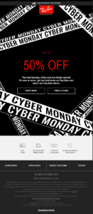
This simple yet powerful email design by Rayban can be used as inspiration for both Black Friday and Cyber Monday email campaigns.
Why it works:
- This email emphasizes the main promo deal, with 50% off for some of the top products.
- The color scheme is simple, using a red email font to highlight the 50% OFF discount.
- The subject line informs readers that it’s the last chance to claim this offer, adding urgency.
- The email footer includes all the essential information consumers need to know to claim the deal.
To make your email more vivid, you can insert a relevant GIF into the design to increase their engagement. Sign up for a free Moosend account and see how you can add images and GIFs easily through the drag-and-drop builder.
15. Grammarly
Subject line: 🔮 Manifest miraculous writing with Grammarly Premium
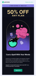
A simple Cyber Monday email example from Grammarly that’s perfect for service-based businesses who want to increase their seasonal sales.
Why it works:
- Offers a 50% discount to those who want to upgrade their plan to boost conversions.
- Has a vibrant green CTA that matches Grammarly’s brand colors. It also stands out on the black background.
- The visuals and copy in this email blend seamlessly: a playful “discount potion” graphic is paired with the creative “Cast a Spell with Your Words” copy, making the message both engaging and thematic.
This email could benefit from a more descriptive subject line with more details about the deal to increase open rates. If you’re unsure about it, use a free subject line tester like Refine or an AI writer to find a converting subject line for your seasonal email.
How to Craft the Perfect Cyber Monday Campaign
Creating the perfect sales email for your target audience is essential to get more clicks and conversions. To do it right, here are some simple yet effective tips you need to follow.
- Start with a template: Since this is a very busy time, you can use a pre-made sales template or Cyber Monday design to save time and effort.
- Add an intriguing subject line: Make your campaigns stand out with the right subject lines. Use emojis and urgency to stand out in the inbox and boost your open rates.
- Create irresistible copy: Ensure that your copy shows the benefit of shopping from your store. Make a value proposition that will be hard to miss.
- Insert a converting CTA: Choose the right copy, color, and placement to catch your subscribers’ attention and convert them into customers.
- Leverage marketing automation: Create Cyber Monday automation workflows to save time and boost conversions.
- Optimize your Cyber Monday promotions: Use data from last year, including open rates, conversions, and bounce rates. This will help you understand your email list better and create messages tailored to their needs.
Following the above tips will help you create an effective email marketing campaign, not just for Cyber Monday, but for your entire Cyber Week. It’s important to offer early access to your deals to keep your audience excited and engaged before the main event begins.
You can even create a sense of exclusivity by offering VIP access to customers who participated in your Black Friday sale. Moreover, combine your Black Friday emails with Cyber Monday for a continuous sales experience.
Further reading: If you need more tricks to ace them, you can check out our email marketing best practices guide.
Cyber Monday Email Marketing Resources
Discover our dedicated resources for Cyber Monday below:
Cyber Monday Email Examples to Get Inspired
Now you’re ready to get started. Review the Cyber Monday email examples above and note the elements that stood out to you. Then, open your email builder and begin crafting your promotional messages.
Whether you’re starting from scratch or customizing a Cyber Monday email template, focus on the key elements that drive conversions—countdown timers, bold fonts, irresistible coupons, eye-catching visuals, and compelling copy.
To streamline the process, you can use Moosend’s email marketing service. It offers everything you need to create the perfect campaign for the biggest sale of the year. Sign up for a free account and start designing your Cyber Monday emails today.
Time to set your Cyber Monday email marketing strategy in motion!
