
12 Free Halloween Newsletter Templates For 2025 [+ Tips]
Need Halloween newsletter templates to kick off your holiday campaigns? You’re in luck.
Let’s be real—holiday seasons are busy, and crafting the perfect email marketing campaign can be a challenge. That’s where templates come in handy. They save you time, keep your design looking sharp, and let you focus on the fun stuff like creating exciting content and offers.
Today, we’re diving into some great Halloween email newsletter designs that’ll help you craft the perfect email campaigns without the hassle.
Ready to get started? Let’s make this Halloween a spooktacular success!
Use the code SPOOKY20 at checkout and get 20% off the plan of your choice!
Moosend’s Halloween Email Templates
Moosend will equip you with various holiday newsletter templates as a treat to target the festive season.
The Halloween-themed newsletter templates are spooky, customizable, and require zero knowledge of HTML, which is more than ideal if you have no coding skills.
To access them, you need to:
- Easily register for a free Moosend account
- Access the drag-and-drop email editor
- Click on the Template Library
- Choose your favorite design and customize it
Now that you know how to get them, let’s see what Halloween email designs you can use for your spooktacular marketing campaigns.
1. Skull-themed newsletter template
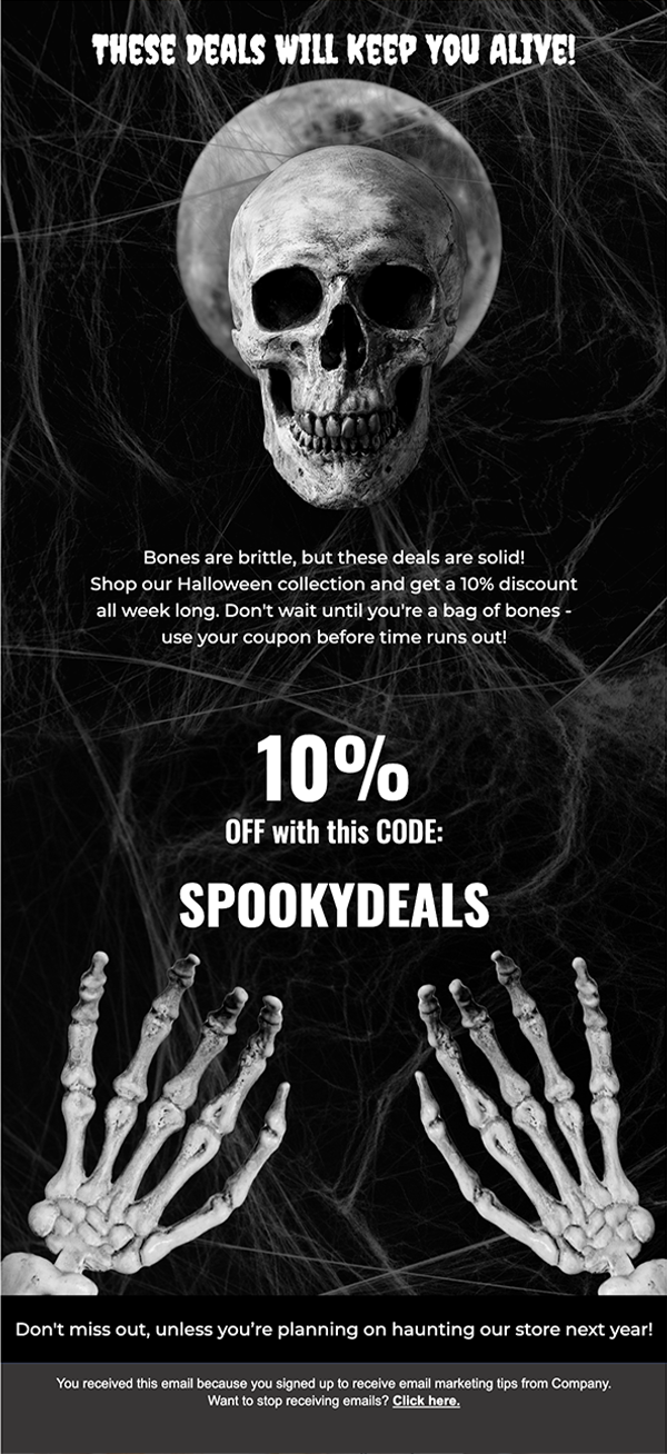
Engaging subscribers with a spooky Halloween email can be as simple as using eerie visuals and themed copy, just like the above example.
Why you need it:
This design perfectly sets a spooky tone with its skull and spiderweb visuals to enhance the Halloween vibe.
The bold headline and offer are placed in the heart of the design to encourage immediate action.
Design tip: Using different Halloween-inspired fonts for your headers or key messages can add to the overall spooky vibe and make the design more engaging for your subscribers.
2. Haunted house email design

Grab your subscribers’ attention with the above Halloween newsletter template for scary good campaigns.
Why you need it:
This design is perfect for creating a haunted atmosphere while promoting products. The “Haunted Mansion” theme is visually striking, while the copy placement will let you engage your audience and lead them toward action.
Each section will also allow you to add clear CTAs to convert potential shoppers.
Design tip: Use a bold primary CTA to focus attention. Be careful not to overwhelm your audience; secondary CTAs should drive additional actions without distracting from the main goal.
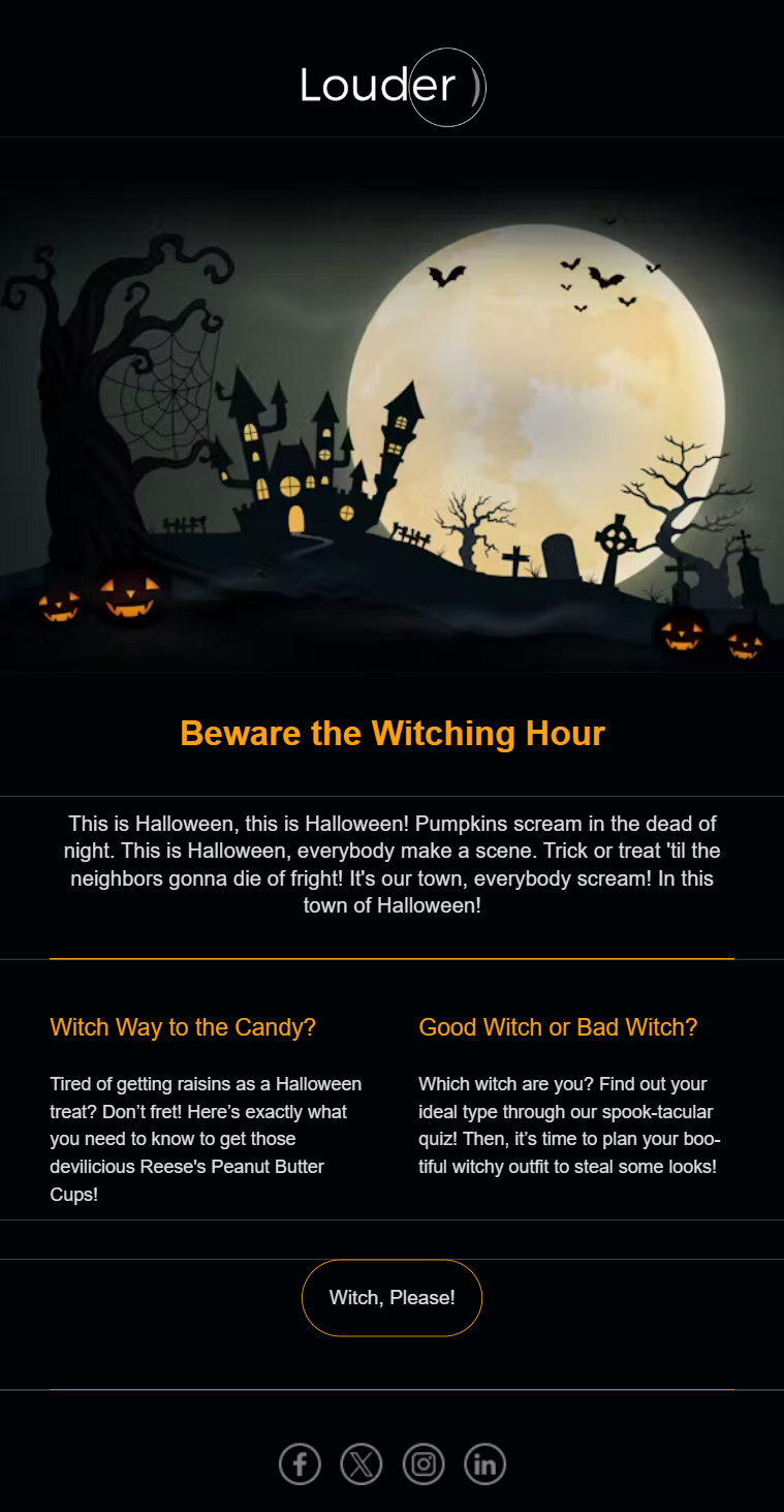
3. Bewitching hours email template
Catch your subscribers’ attention with an email that captures the Halloween theme and a spooky vibe, just like this one.
Why you need it:
This haunted design is perfect for setting the eerie tone of your Halloween promotion.
The header visuals will ensure your message is captivating and perfectly set the tone for your content.
Design tip: For dark-themed designs like this, use a combination of white and orange email fonts to make your copy stand out. The contrast between the dark background and bright text draws the reader’s eye directly to your key messages, ensuring your content is visually appealing and easy to read.
4. Jack-o-lantern newsletter design
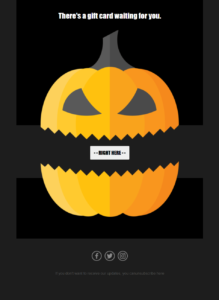
Catch your subscribers’ attention with an email design that promotes the Halloween theme and spooky vibe.
Why you need it:
The jack-o-lantern layout is perfect, popping, and so Halloween-y.
The simplicity of the newsletter design and bright colors are perfect for exciting your Halloween shoppers and leading them back to your website or seasonal landing pages.
Design tip: Since the layout is simple, you can add extra elements like GIFs, social media buttons, video tutorials, or product blocks to increase engagement and conversions.
5. Wicked Witch Halloween email design
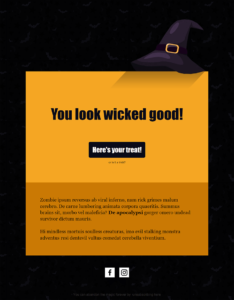
If you want to provide your audience with all the relevant information, pick the above Halloween email layout to keep them up-to-date about your scary good deals, such as coupons, and discount codes!
Why you need it:
Compared to the previous Halloween newsletter template, you can use the Wicked Witch to give your recipients more details about your store and products or even announce something new.
Intrigued? You can customize this template yourself and check Moosend’s advanced builder capabilities.
Design tip: Use your copy wisely to avoid overwhelming your recipients. Remember that promotional email marketing copy communicates the value of buying from you and solving customer pain points!
6. Ghost-themed newsletter layout
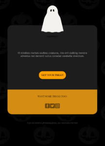
A simple and eye-pleasing newsletter template to get your subscribers back to your haunted house, i.e., your store or website.
Why you need it:
You can use this free Halloween newsletter template as it is simple, to the point, and will make your call-to-action button stand out without trying.
Design tip: Use orange and light blue for a bright, festive campaign. Orange captures the classic Halloween vibe, while light blue adds a modern, refreshing contrast that keeps the design lively and engaging.
Here’s a Halloween email example we created by using Moosend’s responsive newsletter designs:
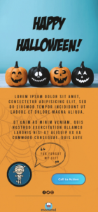
To use the above templates for your holiday email marketing strategy, create your Moosend account and customize them on the spot to achieve the desirable result.
Stripo’s Free Halloween Newsletter Templates
Stripo is one of the popular email template editors you can use to grab a free design for your large or small business; free Halloween email newsletter templates are included.
If you want to access Stripo’s library, just create a free account, pick your favorite design, and start customizing it!
Important: When you’re done, just hit the “Export” button and pick what fits you best, between HTML and exporting your Halloween layout straight to Moosend–or your ESP of preference. From there, the procedure is pretty simple. Copy the API key, paste it, hit export, and you’re all set!
Got more questions? Well, the video above is here to answer them!
7. Happy Halloween email newsletter layout
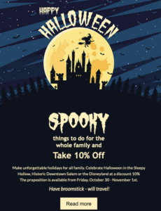
A free Halloween email template to deliver a first-class haunted house experience to your subscribers’ inbox!
Why you need it:
Stripo’s layout is unique and eye-pleasing, favoring Halloween visuals to excite seasonal shoppers. The bottom half of the layout is ideal for making your email copy and CTA button stand out. All you need to do is pick a bright color, and you are ready to roll.
Design tip: Use high-quality images to give your audience the best experience. Along with your Halloween images, you can also insert product blocks to showcase your seasonal goods and increase conversions.
8. Hocus Pocus promo Halloween template
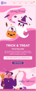
Do you want to mix the Halloween vibe with your existing brand color palette?
Why you need it:
If you love your brand colors but want to spice things up the Halloween way, you can use this template as a compass. It’s suitable for brands that prefer including cute elements rather than changing their whole email design approach to a spookier one.
This is an excellent template to convert more customers with a final-day sale, adding a sense of urgency to your copy.
Design tip: You don’t have to adopt an extreme Halloween style if it doesn’t serve your messaging. Instead, go for simpler yet creative additions your customers will love.
9. Happy Halloween night event template
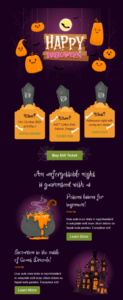
Want to invite your customers and shoppers to your next Halloween-themed event? Then, this template is what you’re looking for!
Why you need it:
Event invitation templates are usually more complex, including various information, such as location, pricing, and date. To make all these details equally visible, you need a template with a clear layout and different sections that pop out.
Plus, this email design has all the essential Halloween elements that marketing campaigns need to stand out, placed in a fancy and clever way.
Design tip: Build a mobile-friendly email layout to ensure that user experience remains top-notch on every device, especially for longer campaigns with multiple visuals and elements.
10. Spooky Halloween HTML email template
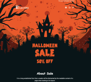
Zombies and a witch’s house. There’s no better Halloween combo than that!
Why you need it:
This eerie Halloween newsletter design reminds us of a cool Halloween flyer! This is great because it will make your recipients think something grand is about to come. You can customize this design to power up your eCommerce email strategy and increase your Halloween sales effortlessly.
Design tip: Ensure you add bright CTAs to grab your recipients’ attention.
11. Trick or treat? Halloween newsletter layout
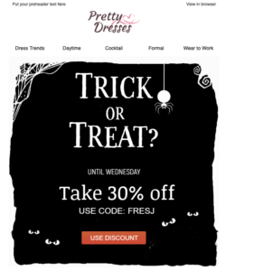
Black and white are always an exceptional combo to create elegant Halloween email marketing campaigns for your strategy!
Why you need it:
As I mentioned, black and white are a great combo to avoid overwhelming your audience with colors that might be too much for them. Also, you can leverage this palette to make your CTAs stand out! This way, your subscribers’ eyes will instantly catch your button!
Design tip: CTA colors matter more than you think, so when you have a layout like this, go for bold colors like red, yellow, or orange to ensure that your recipient will notice yours!
12. Happy Halloween sale newsletter template
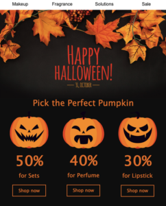
Here’s your classic Happy Halloween email template with scary pumpkins and autumn vibes.
Why you need it:
Orange is for Fall and Halloween, but if you want to do it with a twist, Stripo’s editor allows you to change some editable blocks from its editor or your ESP’s. Also, you can insert links to your website and product pages by taking advantage of the section on top. Nevertheless, try not to overdo it, as it might distract your subscribers!
Design tip: Use autumn colors to reinforce the Halloween spirit and pick images that will spook your audience. Orange and yellow are some of the best options!
Tips for Better Halloween Email Campaigns
When it comes to your Halloween email campaigns, there are a few things that you need to know before you get to newsletter creation:
- Craft spooky email subject lines: Use your best puns and scary emojis to create Halloween subject lines that intrigue your recipient. For scary-good results, use a free subject line tester, like Refine, and implement subject line best practices.
- Add relevant images: Use visuals that reflect the Halloween theme, like jack-o-lanterns, ghosts, haunted houses, etc. Also, include GIFs for an interactive touch.
- Create valuable copy: Show your audience the value of interacting with your campaigns. Don’t hesitate to create clever wordplays to make them more entertaining.
- Pick the right colors: Halloween is a holiday related to orange, yellow, brown, and black. Use them to boost the spooky Halloween theme.
- Add urgency: Your competitors will also target your audience, so use countdown timers to make your potential customers act fast.
- Leverage automation: Schedule pre- and post-Halloween email campaigns to increase conversions.
If you need more tips and tricks, check out our Halloween resources below.
Additional Halloween Resources
Here, you’ll find some helpful guides to help you build your Halloween email marketing strategy:
- Complete Halloween Email Marketing Guide with Examples
- Halloween Email Subject Lines with Tips & Examples
- Halloween Email Newsletter Examples to Get Inspired
- Spooky Ideas for Your Website
Create Spooktacular Halloween Email Campaigns
Holiday email marketing is a powerful way to boost sales and showcase your business.
By using the right newsletter templates, you can craft sales emails that not only excite but also convert your customers.
Don’t wait—sign up for your free Moosend account and use Stripo to get more templates. Then, access Moosend’s editor, select a free Halloween newsletter template, and watch the magic unfold as your campaigns drive results.
It’s time to invite your customers to your spooktacular Halloween party, complete with amazing special offers and deals they won’t want to miss.


 Published by
