18 Genius Newsletter Examples [All Categories Included]
Creating converting campaigns is part of every successful email marketing strategy. Sometimes, though, your inspiration pools may run dry, so here are some beautiful newsletter examples to help you out!
As a tool, your email marketing campaigns are perfect for nurturing your audience into loyal advocates of your brand. To do that, you need a beautiful and converting email newsletter to share product updates, blog content, news, and more with your subscribers.
Without further ado, let’s check some amazing newsletter ideas by popular brands and why they work.
The easiest and most affordable email marketing and newsletter software!
Let’s do this!
Best Email Newsletter Examples Per Category
Searching for a specific email newsletter design example? You can start checking them immediately or select the category that interests you the most:
1. ECommerce
2. Business
3. Product
4. Blog
5. Holiday
6. Banking
7. Non-Profit
8. Restaurant
9. Real Estate
10. Webinar
What Makes a Great Newsletter?
Good email newsletters have a few common characteristics. Let’s check them below before we see the actual email campaign examples:
- Intriguing subject lines: clever subject lines that attract attention will give you the open rates you desire.
- Valuable newsletter content: your email copy needs to offer value to your email subscribers and solve their pain points.
- Eye-catching design: a visually-appealing newsletter design will promote action and mesmerize your recipient.
- Clear CTAs: colorful buttons that stand out in your campaigns will be much easier to spot and be clicked on.
Now that you are aware of the most important newsletter design elements, it’s time to see how the following emails check the above boxes.
1. ECommerce Newsletter Examples
What makes a great newsletter for eCommerce? Making a beautiful campaign doesn’t mean it is a good email. If you want to craft email newsletters that truly speak to your online customers, make them valuable for them.
In a nutshell, an eCommerce email newsletter needs to:
- Establish a line of communication between you and your audience
- Promote various offers or special deals
- Boost sales and keep customers engaged
With these in mind, let’s see some eye-catching newsletters to get you inspired.
Serumize
Serumize has come up with a beautiful weekly newsletter series, usually sent on Thursdays and Fridays for better open rates. Apart from promotions and special offers, the beauty brand also shares tips to educate and help its target audience solve common problems. Let’s take a look at the campaign:
Subject line: Are You Cleansing Correctly?
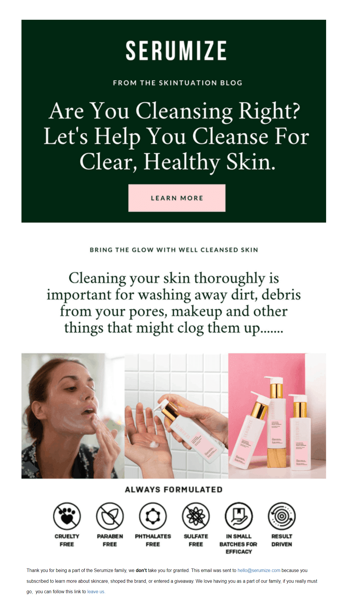
Serumize’s email newsletter example has a beautiful and straightforward design without any unnecessary elements. It takes advantage of white space to increase the readability of the copy and give its email recipients a quick solution.
The copy is also actionable, using a question to make the message more direct and intriguing for the reader. Of course, the supporting visuals also encourage the subscriber to click on the call-to-action and learn more.
And speaking of that, you can see how Serumize uses a pink button to make the CTA stand out. Moreover, adding it above the fold increases the brand’s chances of receiving more clicks! So keep it in mind when you create your newsletters.
If you want a simple and effective email, you can follow Serumize’s example and get a Moosend account! Then, hop into the editor and start crafting an equally great campaign from scratch or use one of the available newsletter templates. The choice is yours!
Sephora
Sephora is a brand that uses email marketing to nurture its audience through promotions, educational content (tips), events, and special deals. Below, you can see a simple yet effective email newsletter used to promote the brand’s limited-time offer.
Subject line: Spend $50 now and get 15% off later!

The beauty brand has a very clean newsletter design that favors color and minimalist elements that resonate with its young target audience.
On top of that, the copy is clear, offering value to the recipient at first glance. Also, Sephora uses its visual elements to make the copy stand out, choosing vivid fonts that match the color palette.
Lastly, the beauty brand’s CTA is located after the value proposition to promote click-throughs. The white button is a great choice as it helps the CTA stand out in the background. Regarding the copy, Sephora uses actionable language to get potential customers back to their product or landing pages.
If you have a cosmetics brand and want to take your first steps into email marketing, make sure to check out our beauty industry email marketing guide! You’ll find everything you need to build your first strategy in easy steps!
SideMen Clothing
Sidemen Clothing has built a consistent fashion email marketing strategy that includes special deals, offers, cart abandonment sequences, and weekly newsletters. Below, you can see a great newsletter that combines email with social media marketing.
Subject line: NO MORE RESTOCKS UNTIL 2022

Starting with the newsletter design, the clothing brand leverages spacing to make each individual element stand out in the inbox. What’s more, it uses a GIF in the header to provide customers with extra info about its shipping policy.
When it comes to the email copy, Sidemen Clothing informs its audience about its restocking policy. The bold choice of font also amplifies the message, making it hard to miss. Moreover, the CTAs are placed underneath the recommended products to lead potential shoppers back to the brand’s product pages.
What’s interesting here is the way the clothing store adds other elements, like a Spotify list and a link back to their YouTube channel. This is an amazing way to cross-promote between email and social media, increasing engagement and building stronger relationships with customers.
Sidemen Clothing’s email was crafted with Moosend’s email builder. If you want to mimic their newsletter example, make sure to sign up for an account and hop into the drag-n-drop editor!
2. Business Newsletter Examples
Compared to eCommerce newsletters, business email marketing campaigns are slightly different. Here, the goal is to offer value to your email list by targeting it with educational email content, case studies, personalized offers, and more. Effective business email newsletters have to:
- Nurture new subscribers and offer them value
- Inform recipients about weekly/monthly updates
- Help business owners keep in touch with their audience
Below, let’s see a few great email examples from companies like Moosend, Zapier, and Workable.
Moosend
The SaaS company uses email newsletters to deliver company news, blog post updates, and help its subscribers become better at email marketing through educational content. Here, you can see an example from the company’s Marketing Lab, a series meant to nurture new customers on a variety of topics around email, social media, and more.
Subject line: Semrush + Neverbounce + Moosend = Growth 🌱
The above newsletter showcases a very distinct style that favors white space, soft colors, and high-quality visuals. It’s worth mentioning that Moosend keeps the same style throughout its email campaigns to boost its brand identity through consistent design.
Regarding the email copy, the company highlights the benefit of following their weekly series (“tips for your digital marketing strategy”). Moreover, since this is a collaboration with other popular businesses, the company makes sure to show it in the subject line and email copy to boost credibility.
Lastly, the newsletter has multiple CTAs to lead the audience to the actual episode (or previous ones). What’s more, it also includes other incentives like joining its social media accounts and promoting an upcoming event to increase engagement and conversions.
If you want to recreate our favorite email campaigns, make sure to create a Moosend account and the rest is history!
Zapier
Zapier’s monthly newsletter aims to provide tips, important updates about integrations, and new apps. The following email roundup is great for businesses and entrepreneurs who need to keep their audiences up-to-date without bombarding them with numerous newsletters per week. Let’s see what works here.
Subject line: New in December: 3 ways Zapier can improve how you work, 6 updates, and 18 new apps

Starting with the design, Zapier also takes advantage of white space to make each content block stand out. Also, the structure is perfect for adding numerous pieces of information.
Copy-wise, the company opts for short chunks of text to increase its reading times. The email design also helps the message stand out, using balanced colors and icons to improve readability.
When it comes to the CTA buttons, the use of blue is ideal for attracting the reader’s attention and encouraging them to click. Apart from the monthly updates, Zapier takes the opportunity to promote its job listings and community to attract new talent, killing two birds with one stone.
Workable
One of the purposes of a business newsletter is to help your email list solve problems and become better. For Workable, creating emails with valuable content is a must to help its audience improve its hiring process. Let’s see how it’s done:
Subject line: Your hiring process is messed up. Just ask Reddit.

The company has a very branded design that uses specific elements to be memorable. One of these elements is the logo found on the top of the email and the vibrant images.
The copy is also very actionable and direct. As you can see, the business uses a heading in the form of a question to attract the reader’s attention. Also, the text is in the second person to be more relatable to the email subscriber.
Lastly, the CTAs manage to stand out in the email design, using Workable’s trademark green color. What’s also interesting is that it uses a personal email address and even adds an image of the sender to make the message more friendly and put a person behind the campaign. This is an excellent way to boost your engagement and build solid relationships with your audience.
3. Product Newsletter Examples
Newsletters are perfect for updates and news but they can also help you promote your new products! Such campaigns need to:
- Highlight the product and its features
- Showcase how it can solve customer pain points
- Use high-quality images of the product
Now it’s time to see some great examples of product-oriented newsletters to get you inspired.
The Body Shop
The Body Shop creates beautiful email marketing campaigns that are meant to excite, nurture, and convert its email subscribers. Below, you can see what makes the following email work and how to replicate it.
Subject line: 👏 Say YES to some self-love

From its welcome email to its weekly newsletter promotions, The Body Shop has a very consistent email design that charms its audience. Some common elements include bold product images, descriptive copy, and eye-catching CTAs.
More specifically, the brand makes its product copy as valuable as possible showcasing the benefits of interacting with the email. For example, the second product block highlights the moisturizing effects of the new ingredient.
Along with the high-quality product images, the brand creates a beautiful experience for its audience. Now what’s left is a converting CTA button to capture it. Here, the brand uses its trademark color and a large email CTA button size to attract the reader’s attention.
To create this beautiful newsletter, the beauty business uses Moosend’s email builder tool. If you want to mimic its example, make sure to register for an account, open the email editor, and start creating yours!
Box
The Box Team makes sure to inform its email list about new product features through its monthly newsletters. The SaaS company has created a very short yet informative campaign to provide its audience with an integration roundup. Let’s take a look.
Subject line: Box Product Newsletter: September 2021
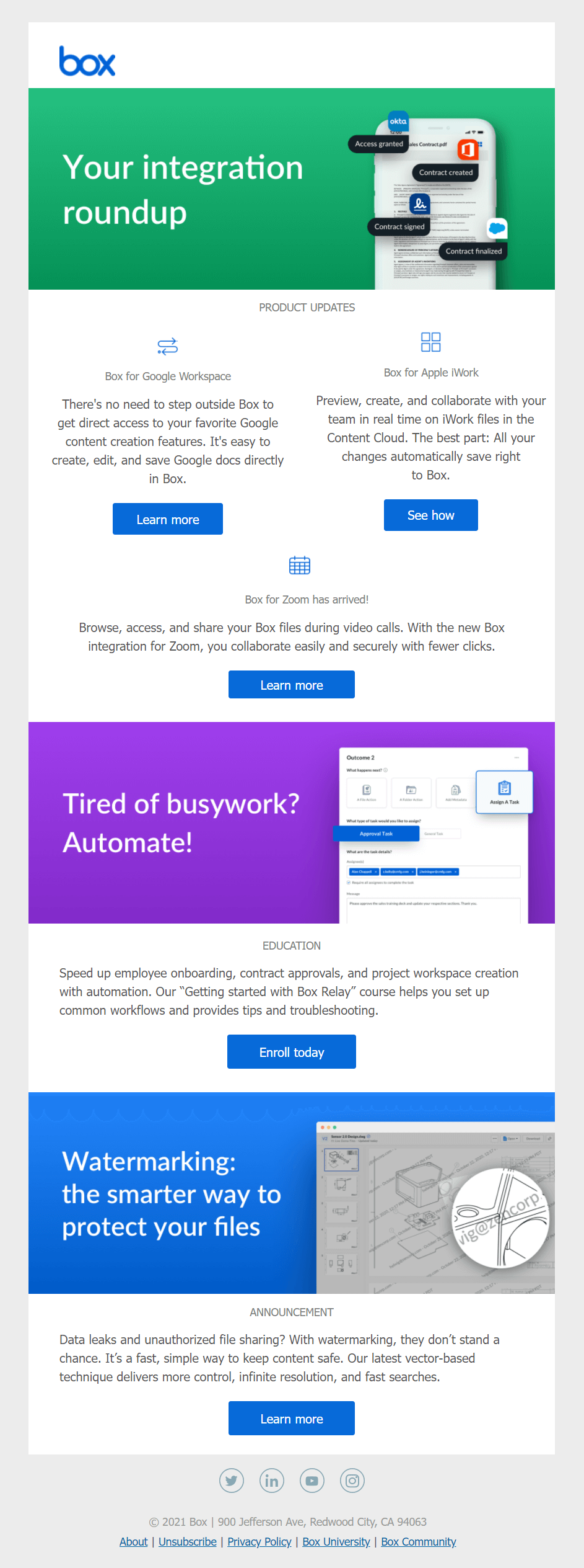
Design-wise, this newsletter example is very simple, using separate content blocks to showcase different updates. To make it more engaging, the product news is placed after the header in a clear manner and with different CTAs.
When it comes to the email copy, the short descriptions work effectively in informing the reader about the features. Moreover, the business uses bold headlines and short chunks of text to provide additional information to the email subscriber.
The CTA buttons have a vibrant blue color (Box’s trademark color) to stand out. The design and the use of white space amplify their effectiveness, while the brand uses actionable copy to increase its click-through rate and conversions.
Function of Beauty
A great newsletter should always resonate with your target audience. Function of Beauty uses this practice to deliver campaigns that charm and intrigue their email subscribers. The secret lies in their copy and beautiful product images. Let’s see!
Subject line: 🥭 Fragrance drop! 🥭
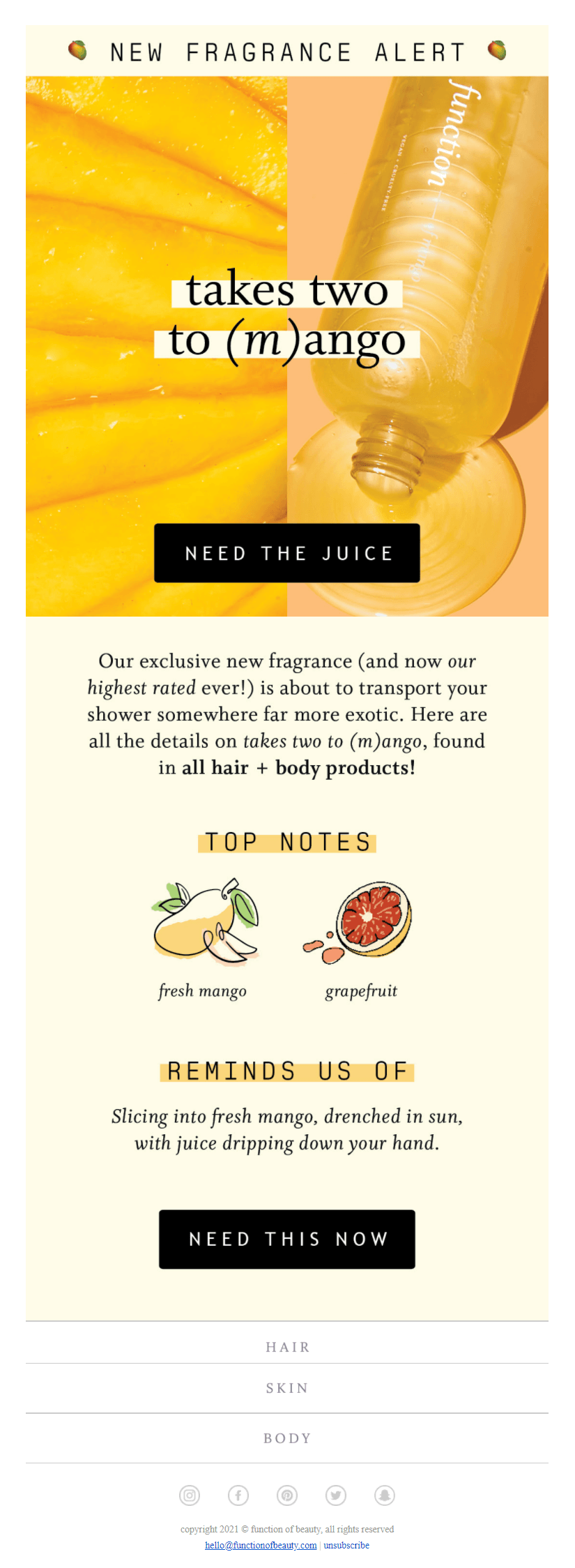
Starting with the newsletter design, Function of Beauty has a very clean email that consists of two parts. In the first half, the beauty brand uses a vibrant product image to excite their reader, while in the second half it provides them with more information about the new addition.
The copy works perfectly with the vibe of the newsletter, creating a beautiful experience for the beauty brand’s audience. The clever wordplay, “take two to (m)ango,” takes the center stage, creating a playful message that will make email subscribers click on the CTA.
And speaking of that, Function of Beauty uses two distinct buttons to convert its audience. The choice of color and copy helps them stand out and increases the likeability of being clicked. Lastly, the use of urgency (“NEED THIS NOW”) is perfect for incentivizing indecisive subscribers to act.
4. Blog Newsletter Examples
Email marketing and blogging are a match made in heaven. By combing the two, you can promote your content marketing and build better relationships with your audience. To make your messages work, you have to:
- Provide regular updates through RSS feeds
- Create dedicated posts for specific pieces of content
- Be conversational and friendly
With these in mind, let’s see a couple of great email examples that check all the right boxes.
Julie Blanner
Email marketing for bloggers is all about promoting your amazing content to your audience. To do so, Julie Blanner creates and sends valuable newsletters to nurture and help her email subscribers. Let’s see how she does it.
Subject line: The Ultimate Guide
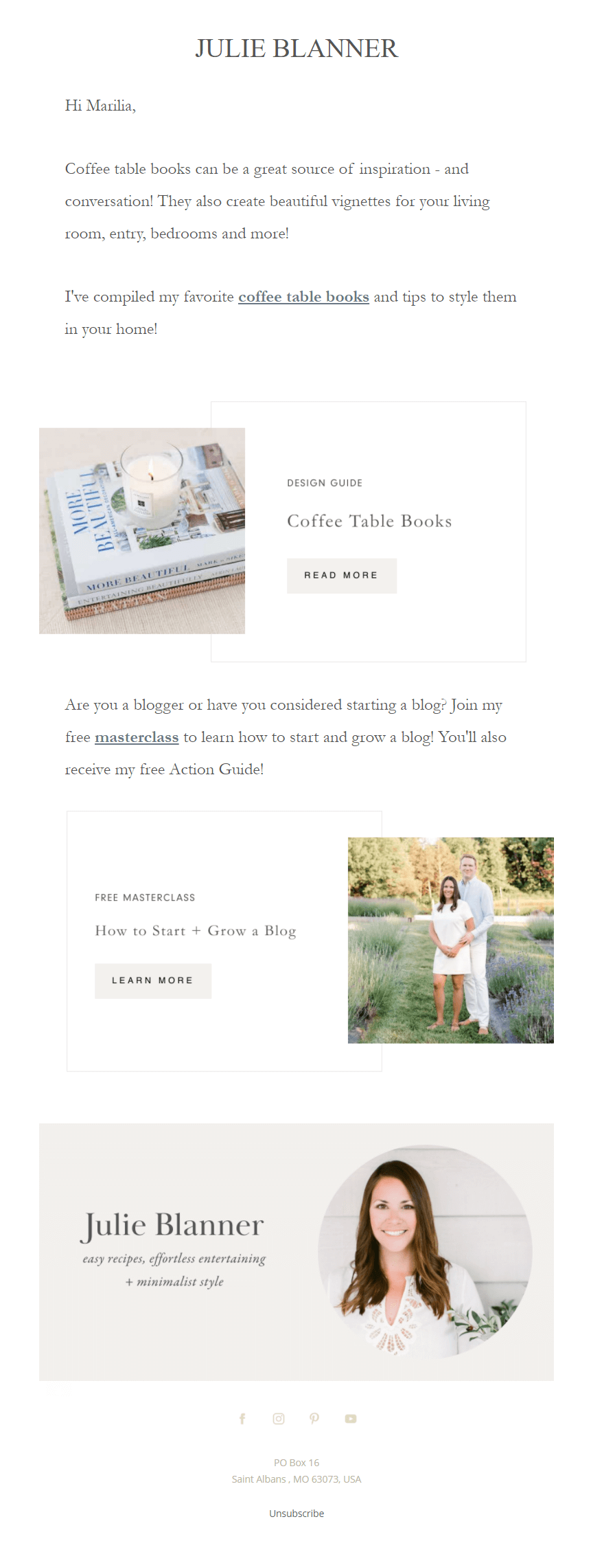
When it comes to the newsletter design, Julie Blanner uses a plain-text-looking email to make her campaigns more personal. As you can see, the blogger uses white space to improve readability, while the use of the Garamond serif font makes the message more aesthetically pleasing.
The copy here maintains a friendly tone, taking advantage of personalization to address the recipient with their first name. This way, the newsletter looks like it has been specifically created for the email subscriber, making it more unique and relatable.
To increase her click-through rates, she has also inserted two content blocks with dedicated CTAs featuring her hyperlinked resources. Apart from that, the blogger also includes a photo of herself to put a face on her brand and has a clear unsubscribe button at the end for those who want a way out of her mailing list.
Torque
Setting RSS feed newsletters is one of the most important email marketing campaigns for bloggers. Not only will you automate your content promotion efforts but you will be able to engage your audience with your content the moment it gets published on your website. Let’s see how Torque does it.
Subject line: Develop safely with these tips.
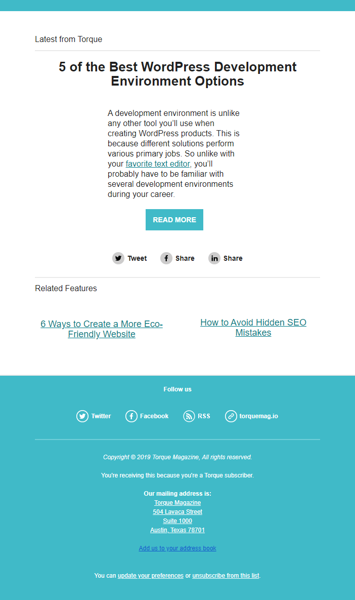
First of all, RSS newsletters are a special type of email you can set up through your email marketing service. These emails need an RSS URL, i.e., the website from where they will draw your content.
Torque has used a single content block email template to promote a specific piece of content. The design is very minimalist, having only the necessary elements.
Copy-wise, Torque’s RSS campaign automatically draws a snippet of its blog content and displays it in the newsletter. Here, the chunk of text is meant to provide more information about the blog post. Last but not least, the brand adds social media buttons to cross-promote between email and social to boost engagement.
5. Holiday Newsletter Examples
The holidays are the best time of the year to engage your audience with exclusive offers, send them wishes, or any other piece of content related to your company. To craft a good holiday campaign you have to:
- Pick a holiday email template or craft one from scratch
- Add a unique incentive that resonates with your audience
- Give additional value to your email subscribers
Great holiday email newsletters will help you nurture and convert your audience during a festive period of time, such as Christmas, Black Friday, Easter, and so on. Let’s see two amazing examples to get you inspired.
Coffee Island
Christmas is indeed the most wonderful time of the year! And for Coffee Island, spreading happiness and positivity to its audience is possible through its beautiful holiday newsletter campaign. Let’s check it out:
Subject line: Christmas is our favorite season!
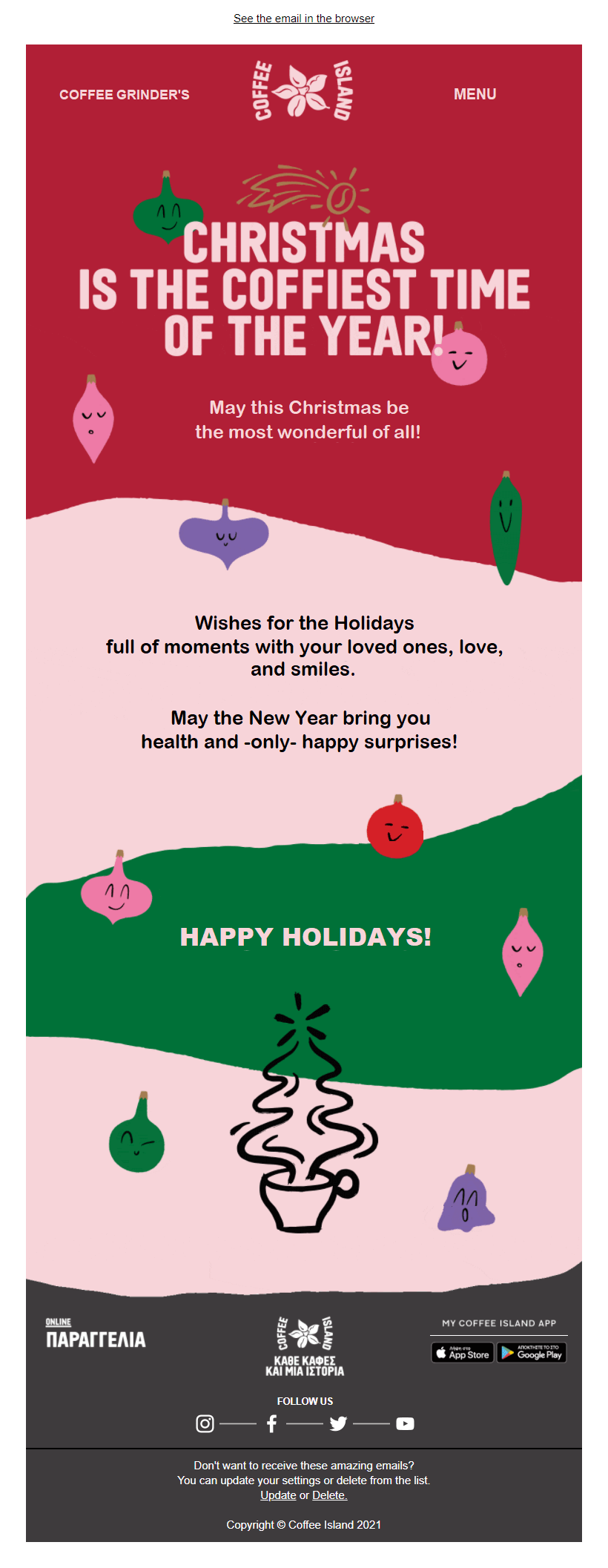
The coffee brand uses a colorful newsletter design to stay truthful to the holiday theme and excite its email subscribers. What’s more, the first part of the email uses a GIF to make the campaign more dynamic and engaging.
Furthermore, Coffee Island uses holiday-themed copy to wish their email subscribers for the holidays and spread the festive spirit.
As you see, there’s no clear CTA button here as the goal of this newsletter is to give warm wishes to the brand’s audience instead of calling them to action. Nevertheless, by clicking on the campaign, recipients will land on the website where they can place an order.
Coffee Island’s beautiful Christmas email newsletter is an example of what you can do with Moosend’s drag-n-drop email builder. If you want to copy it, sign up for an account and get to the builder. Then it’s time to work your magic.
Home Chef
Another popular holiday that a lot of B2C and B2B companies target is Black Friday. Brands like Home Chef take the opportunity to give their audience limited-time offers to increase their seasonal revenue and engage their audience during the busiest time of the year! Here’s how the brand does it.
Subject line: Don’t miss this 👀 Get 12 FREE meals delivered!
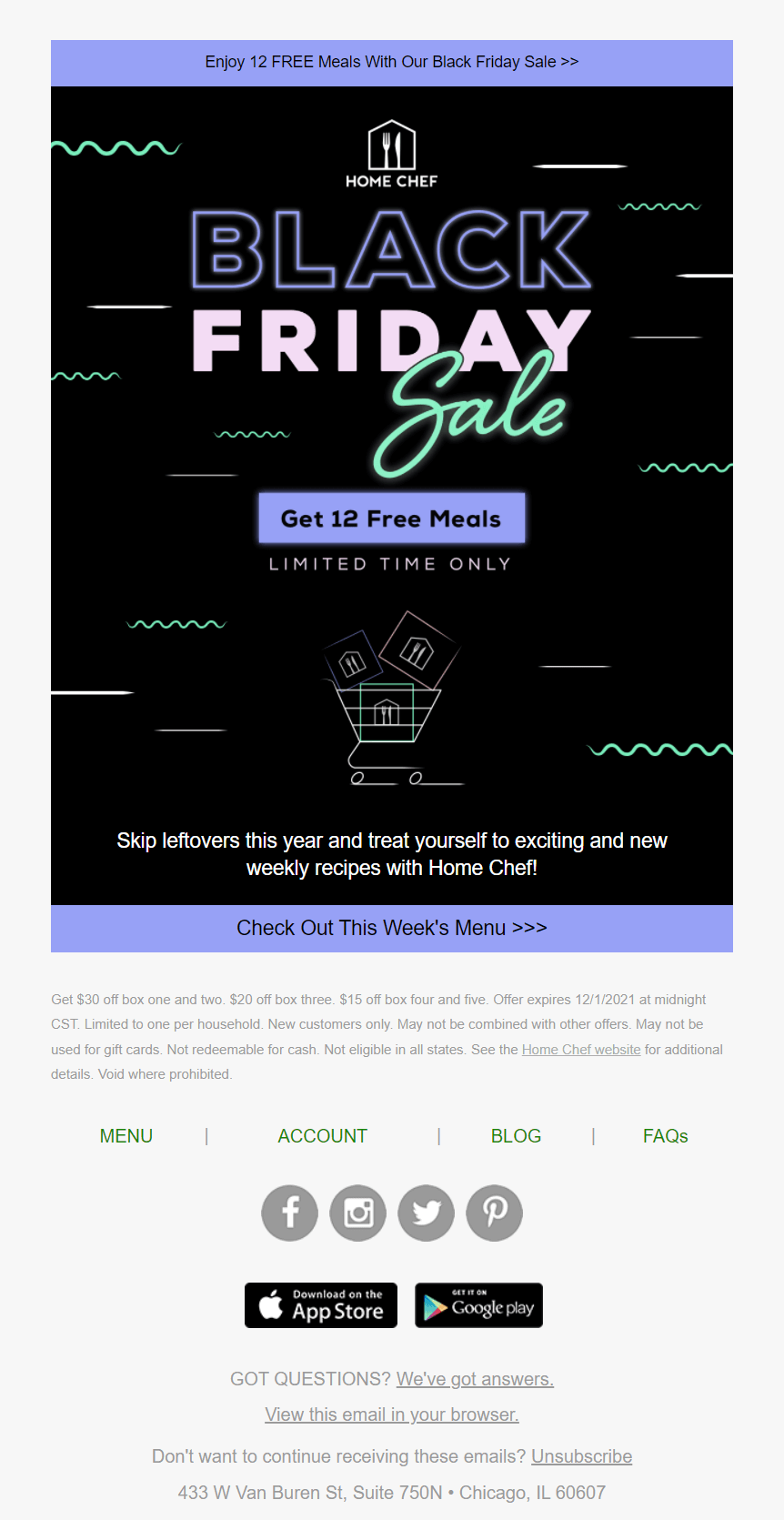
The above campaign is a simple Black Friday email newsletter that has all the right elements to convert Home Chef’s audience. Design-wise, the newsletter is short, using the traditional black color of the holiday and vibrant fonts to attract the reader’s attention.
The copy is also to the point, focusing on showcasing the purpose of the campaign (Black Friday Sale) and the benefit (Get 12 Free Meals). The use of urgency is also a must for Black Friday emails and the brand uses it cleverly underneath the CTA to boost conversions.
And speaking of that, Home Chef uses purple to make its button stand out on the black background, while the CTA highlights the irresistible offer in the best way possible.
6. Non-Profit Email Example
NPOs use a variety of email marketing campaigns to inform their audiences about new actions and provide them with weekly updates and highlights. To rock your newsletters for your non-profit organization, make sure to:
- Use straightforward copy to showcase your cause
- Use high-quality visuals to complement your text
Below, you’ll find a great email example that educates the email subscribers and gets them to take action.
WWF
WWF’s email marketing strategy consists of a series of newsletters that inform its subscribers about a variety of topics and environmental actions. To do that, the NPO sends weekly round-ups to keep its audience up-to-date. Here’s a recent example.
Subject line: Great news for our shared home ❤️🌍
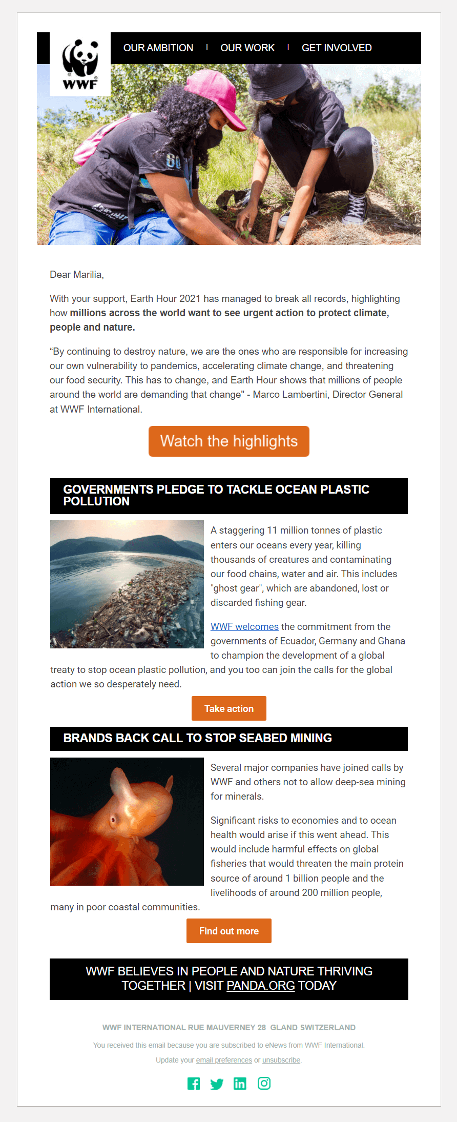
WWF maintains “design consistency” through its newsletters. More specifically, the NPO uses an image-infused header with the logo and a relevant visual to make the message more engaging. In the above example, where the topic was “Earth Hour,” the organization uses an image of two people planting trees to introduce the reader to this week’s topic.
The rest of the design is simple, favoring white space to make each individual element stand out. Moreover, while the email copy is quite extensive, the structure of the newsletter and the choice of fonts make it easy to read.
The first orange call-to-action is deliberately bigger than the second one in an attempt to draw the reader’s attention and improve WWF’s CTR.
7. Banking Newsletter Example
Email marketing isn’t a valuable tool only for eCommerce brands, startups, and small businesses. In the right hands, it can be a weapon of immense power to build better customer connections. In this case, banks can leverage its power to create newsletters that will:
- Provide monthly statements for their customers
- Give them updates about new features
- Promote various incentives for programs, cards, etc.
Now let’s see a real-life banking email newsletter and what makes it work.
Revolut
Creating readable and easy-to-navigate emails is important to improve your engagement. To make it happen, Revolut has adopted a very specific newsletter design that favors white space, crisp visuals, and valuable copy. Here’s the newsletter:
Subject line: More currencies, and make it speedy 🌎
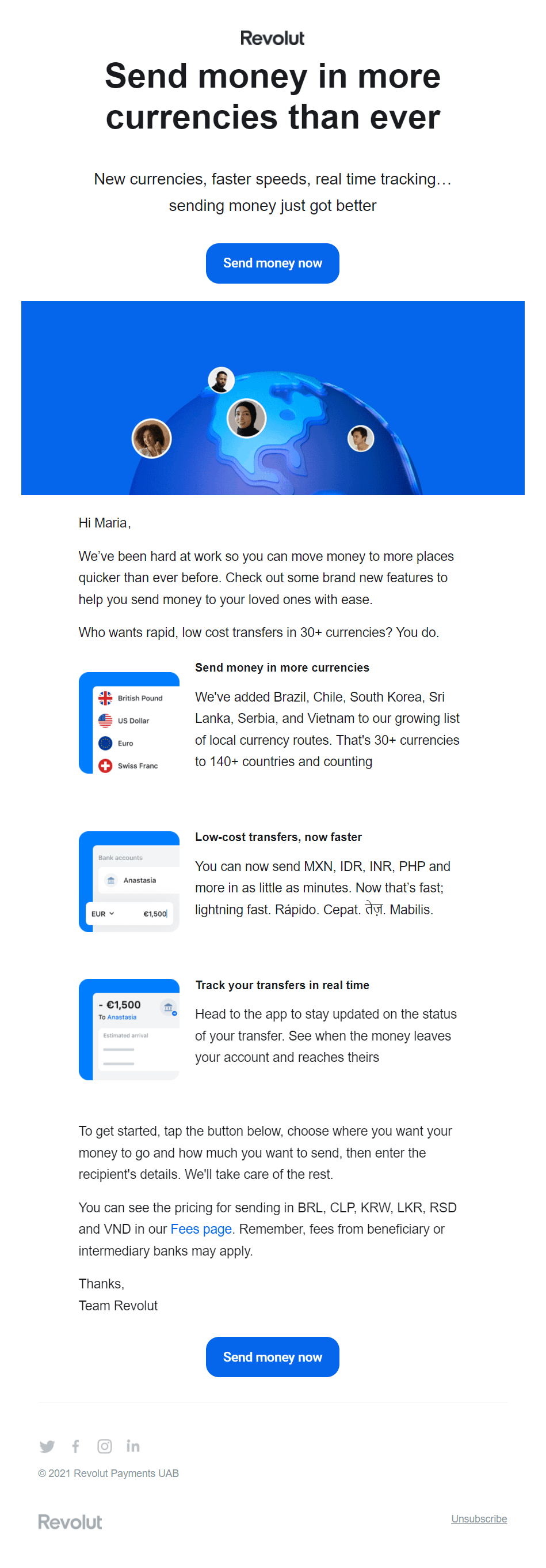
As mentioned above, the bank uses spacing to make the message pleasant to the eye. What’s more, the use of visuals adds structure to the email body, making the message easier to read.
When it comes to the email copy, Revolut takes advantage of the above-the-fold space to add a heading with the benefit the subscriber will get. This way, the recipient will know what the newsletter is about at first glance. Then, the bank uses actionable language to inform its customers about the new features and capabilities.
The CTA is also placed above the fold to increase clicks and conversions. For better results, Revolut adds a duplicate button at the end of the newsletter. Lastly, the blue color is perfect for this example as it makes it hard to miss.
8. Restaurant Email Example
Hospitality businesses have used email marketing to promote their reservations and give special deals to their customers. To craft the best email newsletter for your restaurant make sure to:
- Showcase the value of your email message
- Give them extra incentives to place an order
With these in mind, let’s see one of our favorite email newsletters designs.
Domino’s
To promote its daily/weekly deals, Domino’s creates beautiful newsletter designs to intrigue its customers and lead them back to their website to place an order. The business’ secret is that it gets inspired by events to create beautiful campaigns resonating with its audience. Below, let’s see an example inspired by the Formula 1 Grand Prix.
Subject line: 🍕🏁Do you want a Deal that will send you to pole position? See what came in Domino’s!
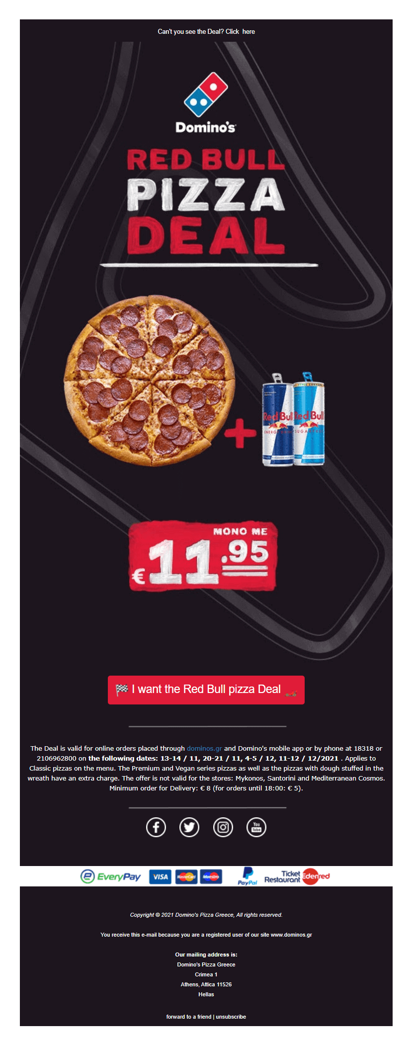
Domino’s newsletters follow a visual-centric logic that places the product in the middle of the design. Since this email is inspired by the Formula 1 races, the brand used darker colors and a race track background to set the mood.
Regarding the copy, it only adds the necessary info to get customers to place an order, i.e., the description of the deal and the price.
The CTA also uses red to attract attention and connect it to the “Red Bull” deal it offers. Moreover, the button uses specific copy to excite its audience and lead them one step closer to conversion.
Domino’s email newsletter is made with Moosend’s email newsletter software. So if you want to create an equally beautiful email campaign, just register for an account and then start creating!
9. Real Estate Newsletter Example
Another industry that has benefited from the use of email is Real Estate. Realtors can promote their properties effortlessly, educate their audience, and keep it up-to-date about new listings. For an effective real estate newsletter you need to:
- Choose the ideal software for real estate email marketing
- Keep it as informative as possible
- Provide solutions to homeowner problems
Below, you can see how a real-life real estate campaign looks like. Let’s go!
Zillow
Zillow’s email newsletters focus on promoting listings and educating homeowners about their future properties. The following campaign is a great example of how the realtor tries to help its target audience solve common pain points. Here’s the newsletter:
Subject line: Quiz: Fix it up or give it up?
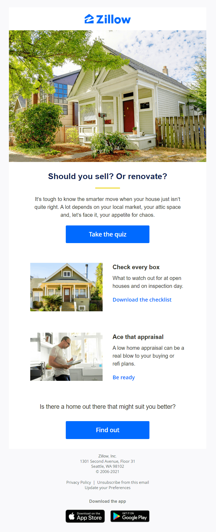
Like Revolut, Zillow uses spacing to make its email more readable and enjoyable to its recipients. The use of high-quality visuals also helps the email become more unique and relatable as it uses a real-life image of a property.
For the copy, the realtor uses a heading in question form to boost engagement with the content. Then, the short text underneath describes a common problem many homeowners face.
The solution comes with the blue CTA, where recipients can take the quiz and find answers to their questions. Moreover, to keep them engaged, Zillow also infuses its newsletter with additional resources to help its email subscribers and adds a second CTA to boost conversions.
10. Webinar Email Example
Webinar marketing is a powerful tool to nurture your target audience, build better relationships, and offer instant solutions to their problems. If you are planning monthly webinars (or weekly podcasts) you can use email to promote your registrations effortlessly. To make them perform, make sure to:
- Add a summary of your event with all relevant information
- Include a CTA or link to your landing page/website
- Boost credibility with speaker images, etc.
Now let’s see an example of a great webinar newsletter.
Fluent
Fluent’s email marketing campaign has all the right elements to inform its email subscribers about its upcoming webinar. Let’s find out what makes this newsletter great.
Subject line: [WEBINAR] Register to kickstart your call marketing strategy with ActiveProspect and Fluent!
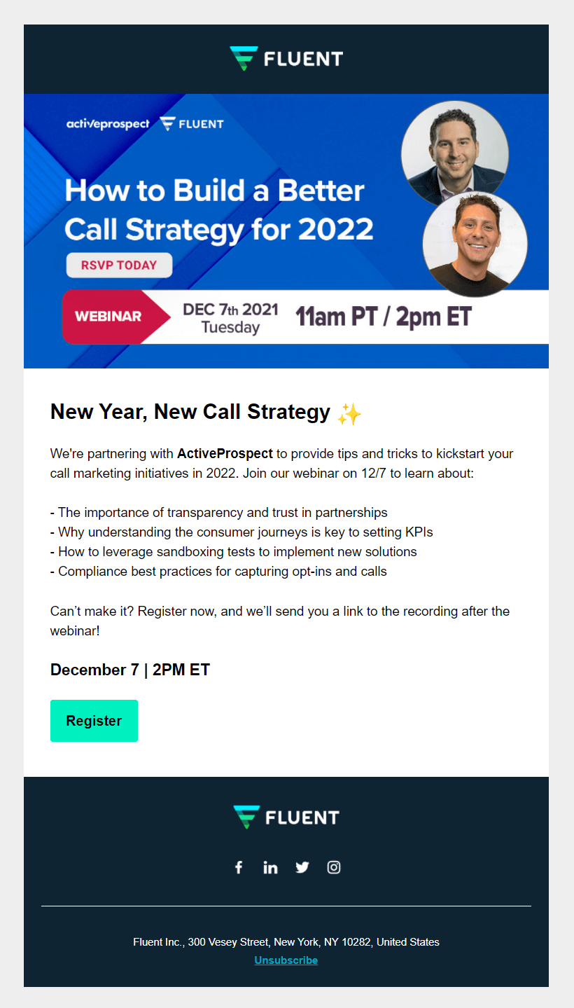
Starting with the design, this example is very short yet has all the necessary elements the potential participants need to see to click on the register button. The brand has added a visual summarizing the event, including the name, day, and time.
The email copy is also very explanatory, using dashes to introduce what the participants will learn in a clear and concise manner.
Lastly, the vibrant CTA button uses one of Fluent’s trademark colors to make the campaign more unique and increase the click-through rate.
Newsletter Examples For Better Campaigns
Creating the perfect newsletter may take time. From choosing the right design and copy to adding your CTAs, a good email needs to be intriguing and valuable enough to give you the conversions you desire.
Hopefully, the above examples managed to get you inspired and show you how you can create a beautiful newsletter for your brand. Apart from your creativity, don’t forget to get your hands on a user-friendly email platform to give you the right tools for the job.
Moosend’s builder is both easy-to-use and advanced to help you bring your newsletter creations to life. If you’re interested, make sure to sign up for an account and get started today.
Now, it’s time to create the next best email newsletter for your audience! Go!


 Published by
 Published by
