Best B2C and B2B Email Marketing Examples for 2026
Tired of looking around google for the best email marketing examples to fill your creative pools?
The wait is finally over!
Coming directly from my email collection (yes, that’s what content writers collect these days!), today we’ll see the best examples to get your inspired. Not only that, but to cover everything, today we’ll examine both B2C and B2B campaigns to have everything you need in one place!
Without further ado, let’s dive right into the best campaigns, dissect them and discover what makes them tick!
But before we do that…
The easiest and most affordable email marketing and newsletter software!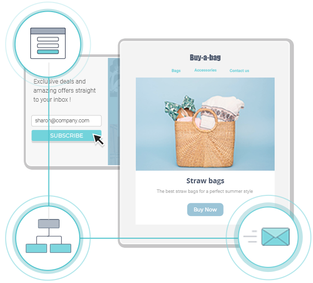
How To Create Amazing Email Marketing Campaigns
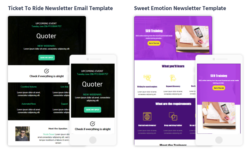
To make your next big email campaign, you also need to choose one of the best email marketing platforms to do the job.
Below, let’s see the essential features your email platform needs to have.
1. Drag-and-Drop Email Builder
A user-friendly drag-and-drop builder to simplify the creation process is the alpha and the omega of email marketing.
With it, you will customize your campaigns, add or remove elements, and preview them on the spot.
For example, Moosend’s email builder is intuitive and easy-to-use without having any technical expertise.
2. Responsive Email Templates
An effective email campaign must look good on multiple devices regardless of screen size.
For that, your platform should equip you with equally beautiful and responsive email newsletter templates.
Don’t forget: a rich template library will save you time and let you focus on more pressing matters!
3. Segmentation and Personalization
Lastly, segmentation and personalization features will allow you to create campaigns tailored to your subscribers’ needs.
Segmenting your audience will help you manage your email lists more effectively, maintain list hygiene, and always nail the deliverability of your emails.
4. Using AI Content Assistants
Another way to create highly optimized email campaigns is to leverage AI email writing tools, companies like Hubspot are creating tools to help with just that. Take a look at their ai email writing assistant here.
Best B2C and B2B Email Marketing Examples for 2025/26
Now, let’s see those email marketing examples I promised!
1. Buzzfeed
Subject line: Confirm your This Week In Cats subscription now!
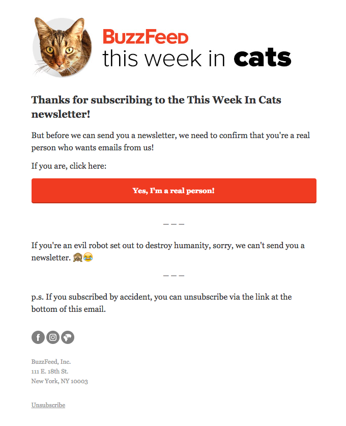
Type: B2C Confirmation email example
Goal: Verify new subscriber’s email address
To capture your visitors’ email addresses, you need a newsletter signup form. Usually, companies will let subscribers into their list without asking for verification. Nevertheless, if you want to keep your list clean, you need to verify their email address.
Buzzfeed’s confirmation email is a prime example of how you can leverage double opt-in to keep your sender reputation and email deliverability intact.
In this email marketing example, Buzzfeed thanks new subscribers for joining the list and calls them to verify that they are real people. The CTA is straightforward and has a bright color to ensure that the new subscriber won’t miss it.
Furthermore, Buzzfeed grabs the opportunity to make this email fun with a hilarious addition. This little fun twist is perfect for engaging new Buzzfeed subscribers who are already familiar with the company’s tone and content.
Buzzfeed’s confirmation email is like no other because:
- it is entertaining and engaging
- the cat image is all their new subscribers joining “this week in cats” want to see
- it gives accidental subscribers a way out through the unsubscribe button
If you liked this example, you can use one of our pre-made email marketing automation recipes and create a similar email marketing campaign in seconds!
2. KonMari
Subject line: Welcome to KonMari
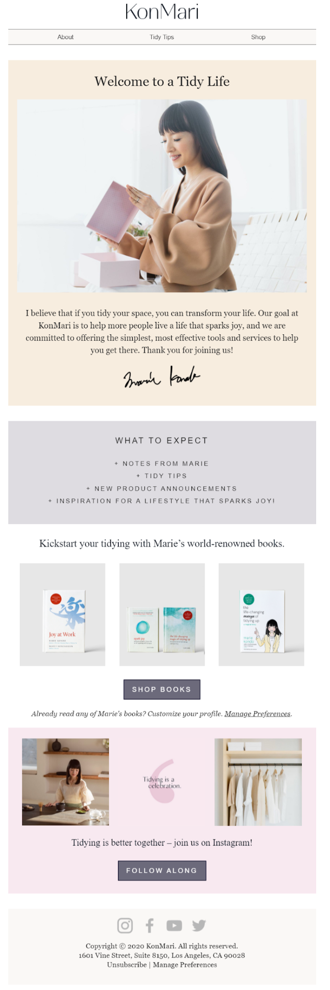
Type: B2C Welcome email example
Goal: Greet new customers after signing up for your newsletter
When you become part of KonMari’s email list, she will send you a beautiful welcome email reflecting her brand. Starting with the copy, this welcome email is both friendly and organized to make a great first impression.
What makes this one of the best email marketing examples in our list is the use of the first person, which makes subscribers feel like Marie is talking to them. Along with the eye-catching visuals, Marie’s email list also gets a taste of what they are about to learn.
When it comes to the CTA, this campaign directs subscribers to kickstart their tidying with Marie Kondo’s world-renowned books and join her Instagram account for a more personal experience. Which translates into more profit and better engagement!
Overall, Marie Kondo’s welcome email:
- is friendly and personal
- Perfectly combines her brand with the copy and visuals
- highlights the benefits of joining
3. EM Cosmetics
Subject line: Hey Marilia, did you forget something?
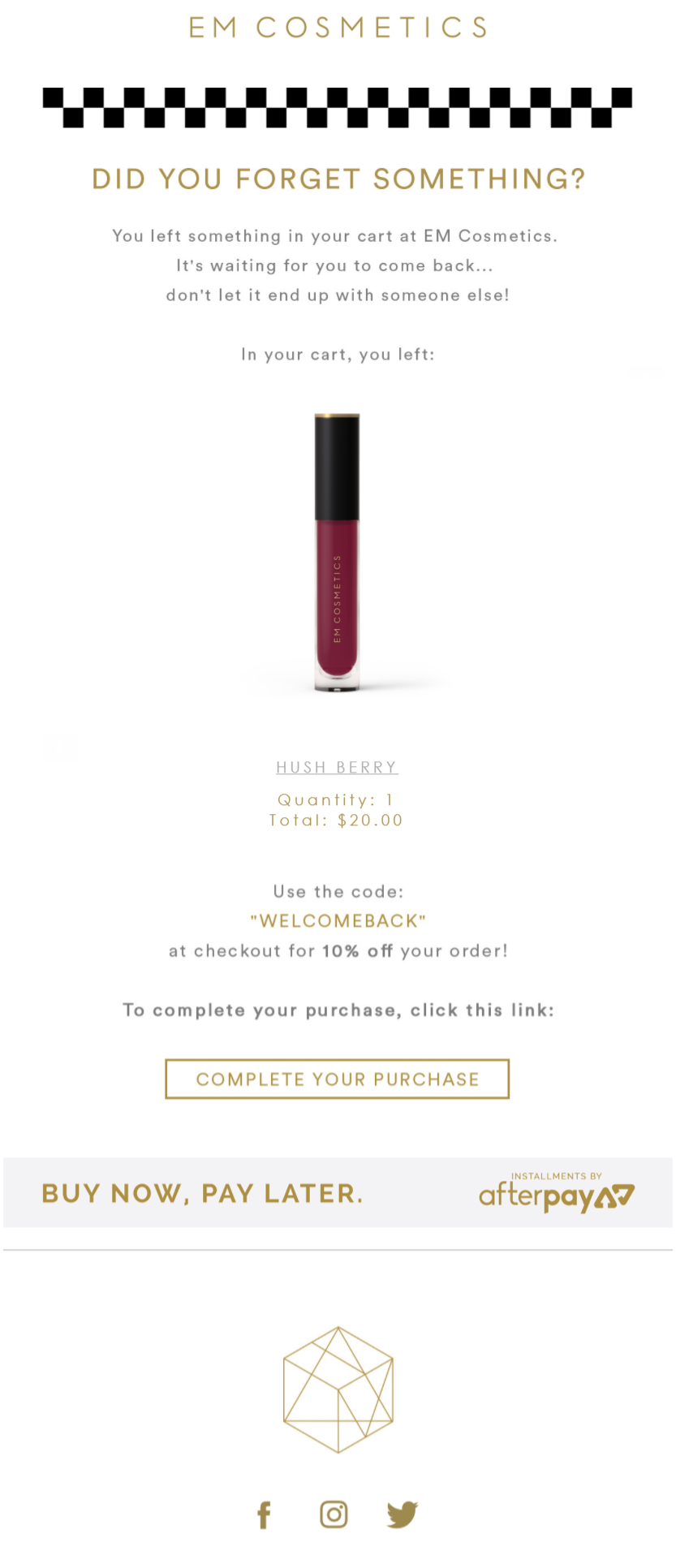
Type: B2C Abandoned cart email example
Goal: Restore lost revenue
Cart abandonment is no small feat. And with 69% of online carts being left behind by shoppers, cart abandonment is a problem that needs immediate attention. In this email marketing example, EM Cosmetics has everything to get abandoners to complete their purchases.
Using one of the most efficient email marketing best practices, the brand uses its subscriber’s name to boost its email open rates. The copy is also sweet and adds a sense of urgency by telling you “not to let it end up with someone else.” By setting the product at the center of the campaign, potential customers can see what they are missing. And to convince them, the brand hands them over 10% off to make the deal a little sweeter.
As you’ll see in numerous cart abandonment email examples, discounts and free shipping are a must to get your potential customers to make a purchase.
All in all, EM Cosmetics’ automated email:
- is personalized and straightforward
- offers a discount code to make shoppers click
- has a clear CTA button that doesn’t confuse
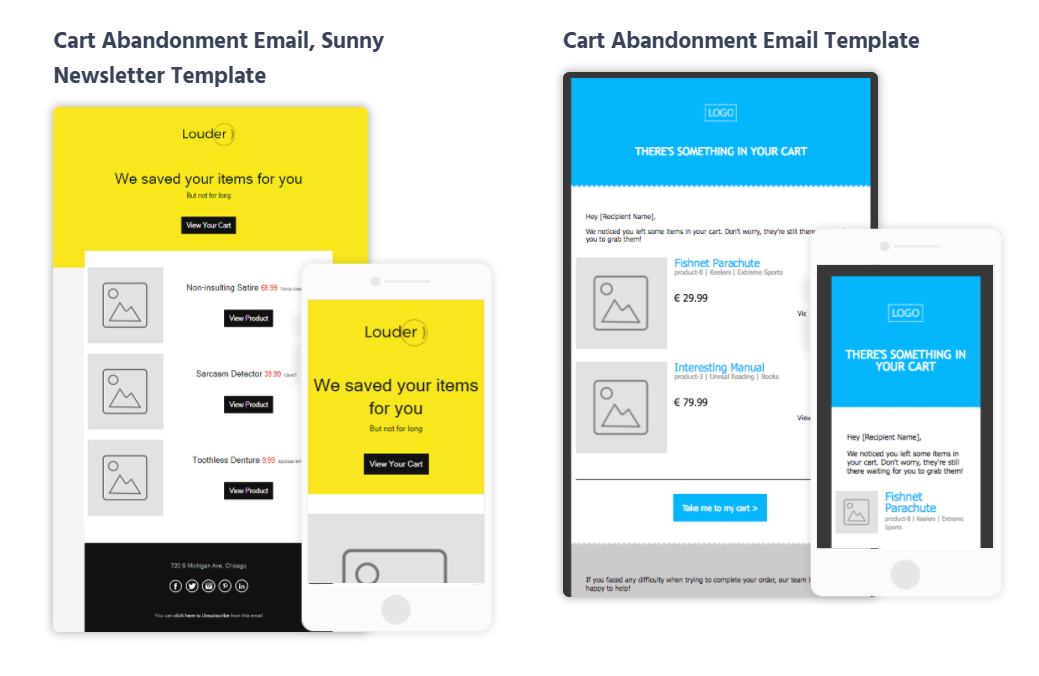
Cart Abandonment Email Templates
If you want to design the perfect cart abandonment email, you also need the right email template to make it work.
Moosend offers various responsive cart abandonment templates you can customize to restore your lost revenue and kiss cart abandonment goodbye.
And don’t forget! All these templates are available on Moosend’s platform for free when you sign up for a free account!
4. Shopify
Subject line: Reminder: Reunite is today!
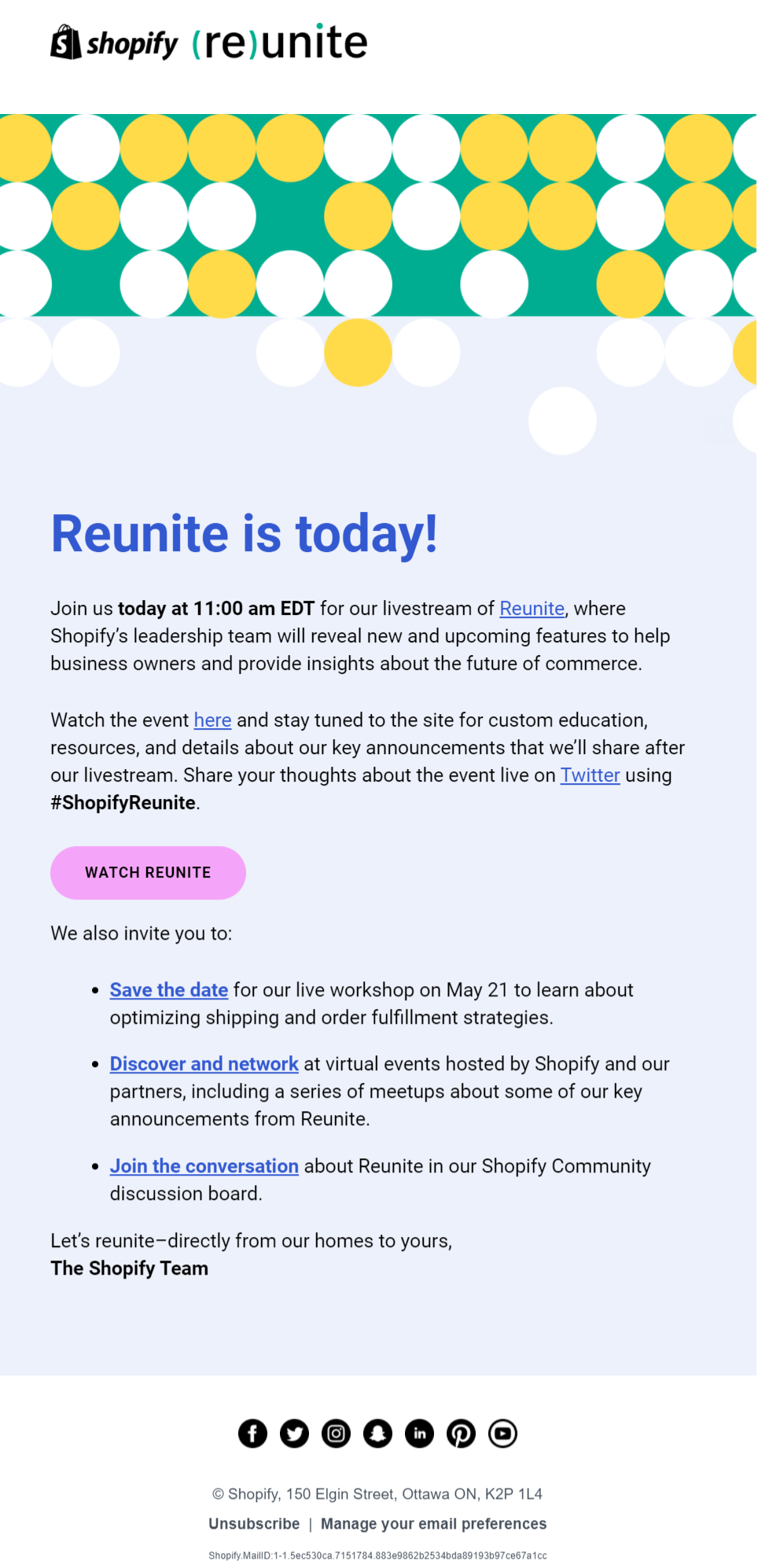
Type: B2B Event Reminder
Goal: Increase attendance for Shopify’s Livestream event
Your subscribers are busy. So, when it comes to attending online events, they might forget all about it. To make sure they won’t, Shopify has designed a great email marketing example to get its audience to attend the Livestream.
When it comes to email copy, Shopify’s example has a more professional tone, addressing pain points rather than evoking emotion. Visuals also exist as part of the email design to make it more vibrant and stylish.
The colors of the email campaign work perfectly to make the CTA stand out. The choice of color also increases visibility, giving Shopify’s click-through rates a boost. Apart from the main CTA, the company asks subscribers to add the event into their calendar, discover the network, and join meaningful conversations.
Overall, Shopify’s reminder email marketing campaign:
- has a straightforward subject line
- incentivizes subscribers to share their thoughts on social media
- guides recipients and shows them what actions they need to take
5. MOO
Subject line: Need a new look? Just add foil
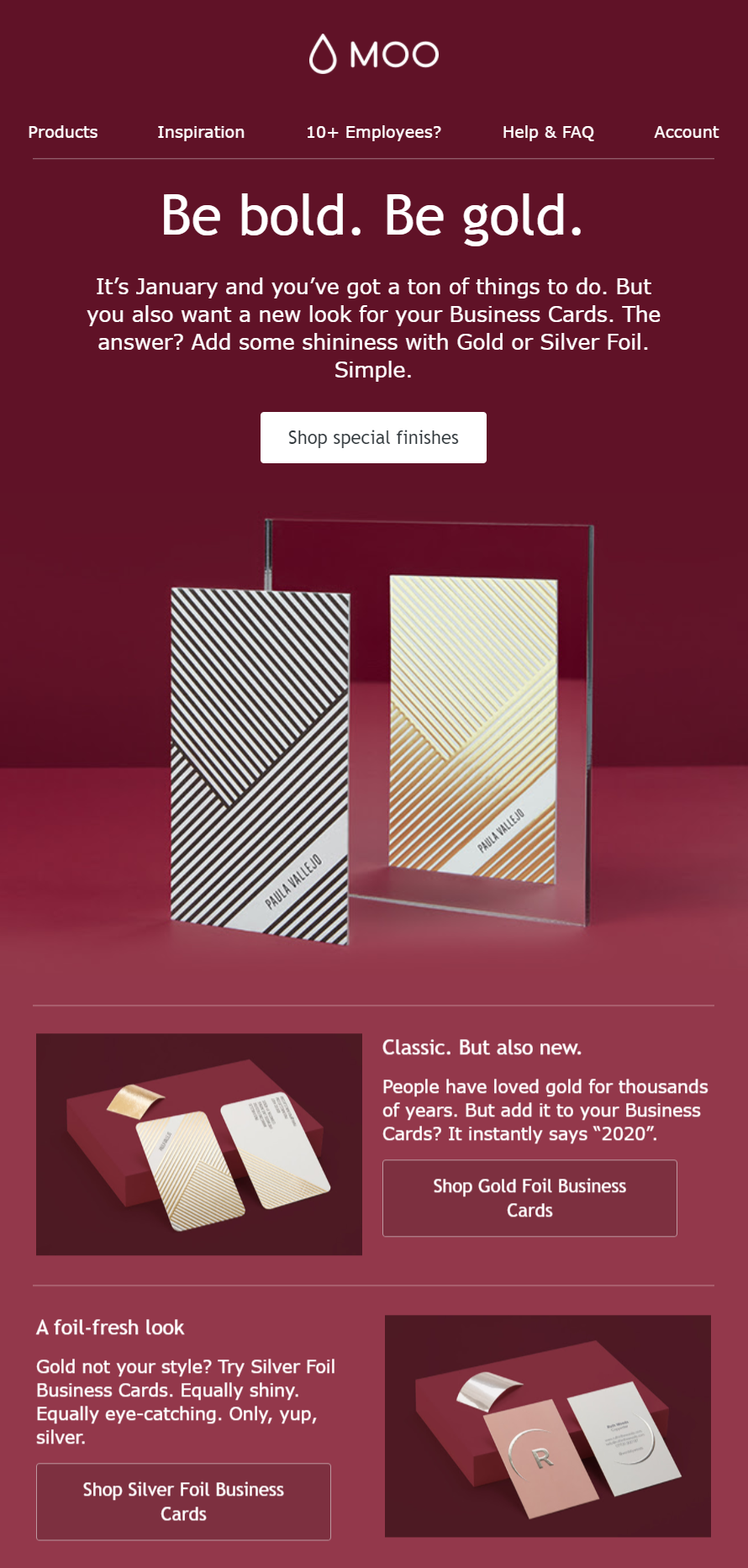
Type: B2C Upsell email campaign
Goal: Promote an upgraded version of a product
MOO, a business card maker, leverages the age-old practice of upselling and turns it into one of the most elegant email marketing examples in our list. The brand not only stuns subscribers with its engaging email copy and the “Be bold. Be gold.” headline but also uses color to make it stand out.
The red color, famous for its conversion powers, matches the upsold product nicely and boosts MOO’s click-through rate. Also, the use of high-quality visuals of the upgraded product makes this campaign a lot more effective. And don’t get me started on the gold/red combo that inspires and makes a bold statement!
This beautiful email example also offers customers a few alternatives to ensure that it will suit everyone’s needs. While the CTAs are straightforward, they could have been a slightly brighter color to make them stand out more.
All in all, MOO’s upsell email marketing campaign:
- nails its email design with bright colors and engaging copy
- effectively promotes the upgraded version of the product
- offers alternatives to satisfy
6. Hootsuite
Subject line: The secret to a more effective social marketing plan?
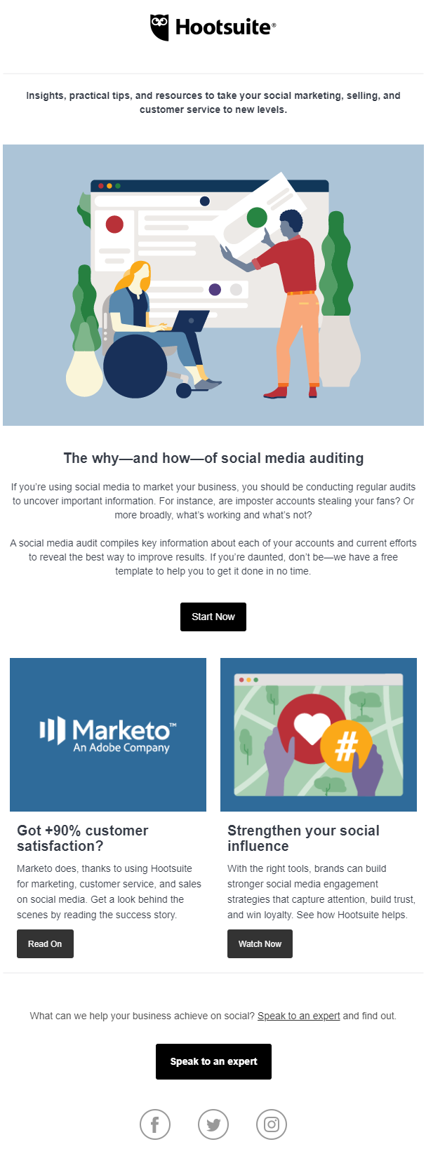
Type: B2B Blog Update Campaign Example
Goal: Increase blog traffic and educate subscribers
When you get started with content marketing, you surely want a great marketing channel to promote your content and increase your reach. In the case of Hootsuite and many other SaaS platforms, this is possible through email marketing and blog post update emails.
More specifically, Hootsuite here goes for a simple structure and a copy that employs direct questions to intrigue its B2B audience and hit the “Start Now” button. What’s more, Hootsuite also uses the same visuals to give its recipient/reader a sense of continuity between the email newsletter and the blog post.
Apart from the main blog post update, the company takes advantage of its email space to promote two more pieces of content. The CTA buttons will lead subscribers to more resources and a webinar, which is a great addition to educating and engaging them.
Overall, Hootsuite’s email marketing example:
- favors simplicity and avoids overwhelming the recipient
- places its main piece of news at the center of the campaign
- has CTA buttons that are clear and actionable
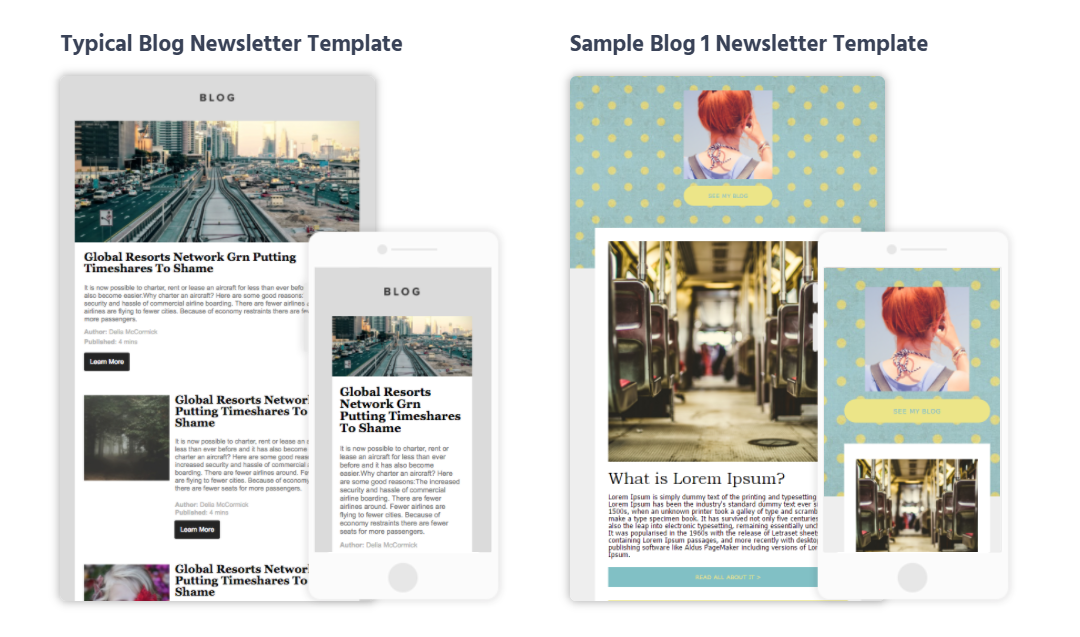
Blog Post Updates Templates
An effective blog post update campaign will help you give you content marketing a boost and affect your SEO rankings positively.
To create the perfect blog update campaign, you can select between simple or RSS blog email templates to promote your content to your audience without worrying about unresponsive designs.
7. Amazon
Subject line: Your Amazon.co.uk order of “POP! Bobble: Star Wars…”

Type: B2C Order confirmation cross-sell
Goal: Show order summary and cross-sell relevant items to customers
Cross-selling is an art that online store owners need to incorporate into their eCommerce email marketing strategy. While this is an example of an order confirmation email from Amazon, if you see past the order total, you’ll notice a different section. This section is used to cross-sell additional items to new customers who’ve just made a purchase.
Amazon’s campaign manages to do that effectively. Since the customer bought a Star Wars collectible, the brand suggests additional items to complete their collection. And to make the cross-sell more efficient, the company names their section “Customers who bought this also bought” to make the campaign resonate better with their audience.
So, what does the customer see? This isn’t what the brand suggests. That’s what other collectors buy together to make their collection “pop!”
Overall, Amazon’s cross-selling email marketing example:
- suggests relevant products to make customers purchase more
- uses a clever copy that resonates better with them
- by clicking on each item, customers can easily buy the additional product
8. Durham University
Subject line: St Cuthbert’s Society Virtual Alumni Day 2020
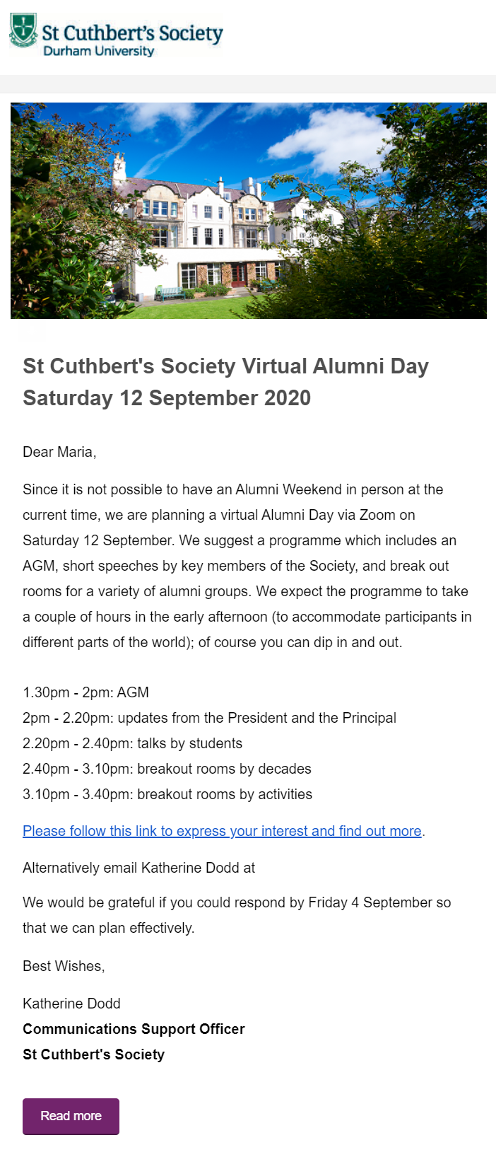
Type: B2C Virtual event for educational institutions
Goal: Invite alumni to express interest in the event and learn more
Of course, universities couldn’t be absent from our best email marketing examples. This campaign by Durham University is meant to promote a virtual Alumni Day on Zoom. To do that, Durham University opts for a straightforward copy that explains the reason for the event, giving additional details to participants.
What’s more, to make participants click on the CTA button, the email copy gives a simple version of the schedule. Alumni can either click on the link to discover more details on a new landing page or contact the person in charge via the email address provided.
And to make sure that subscribers won’t forget to click, Durham University also adds a final CTA button (in the uni’s trademark color) to increase its click-through rates.
All in all, Durham University’s event email campaign:
- is simple and effective without unnecessary visuals
- has a focused and straightforward email copy
- includes multiple CTA buttons to make sure that subscribers will click
9. MarketingProfs
Subject line: [Webinar] Data-Driven Storytelling: Marketing’s Next Chapter
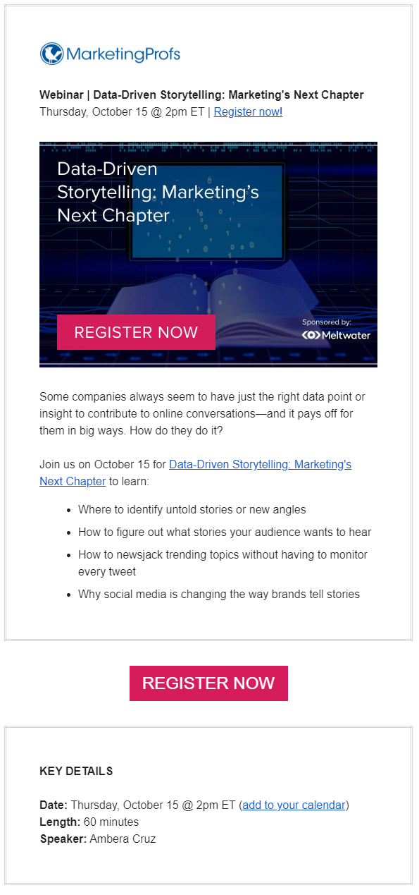
Type: B2B Webinar Announcement
Goal: Let subscribers know about the upcoming webinar and share information
Webinars are more crucial than ever because they’ll not only help you educate your audience but also show your expertise in the field. In this email marketing campaign, you can see how MarketingProfs nails its webinar campaign in three easy steps.
Firstly, the copy informs users about the nature of the webinar, giving valuable information about the date, time, and topic. Secondly, MarketingProfs opts for a high-quality image to make the email more eye-catching. Of course, the “Register Now” CTA is hard to miss. Finally, the company also incorporates another brightly colored CTA to capture the recipients who didn’t click on the first one.
All in all, MarketingProfs has a very professional email example that:
- is very informative and addresses pain points
- has multiple CTAs to increase registrations
- includes a “key details” section to ensure the attendees have all the information
Webinar Email Newsletter Templates
The perfect webinar doesn’t only need a great platform to host it but also a way to promote it to your audience.
With the right webinar newsletter templates, you can create the perfect webinar promotion email to boost your registrations and reach your lead nurturing goals.
10. MVMT
Subject line: IMPT! SITE UPGRADE coming soon
Type: B2C Website revamping campaign example
Goal: Excite subscribers about new website design
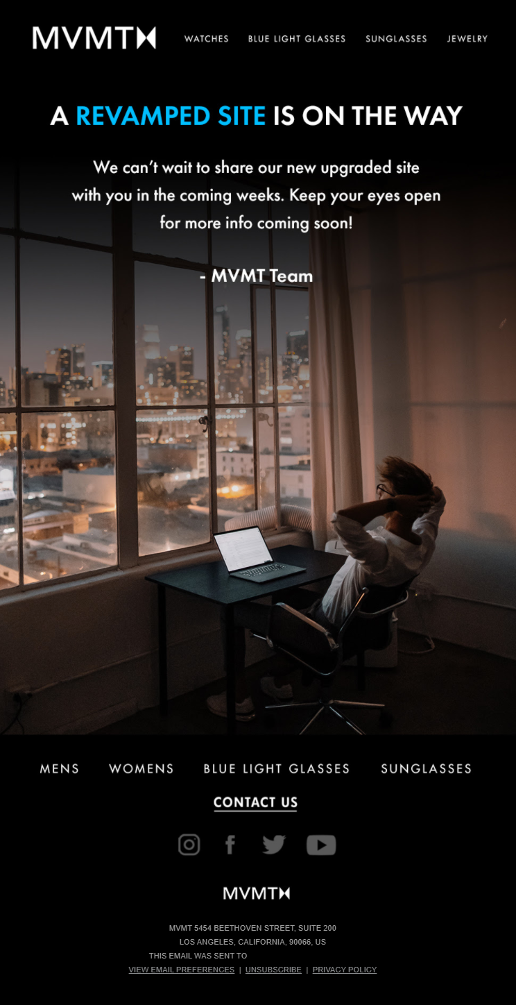
Change is a good thing because it shows how much you’ve grown! So, when it comes to revamping your website, you need to let your customers know what you’re up to. In this email marketing example, MVMT has created an eye-catching email campaign to let subscribers and customers know that something exciting is about to happen soon.
Here, we have a beautiful example of how copy, color, and visuals can help you pass a message in a few seconds. As you can see, the brand has a very soft color palette and a white font. However, when the recipient first opens it, the blue font grabs their attention.
And when they look at the visual, the subscriber receives the following message: we are making your experience better! Just relax, and we’ll let you know when you can visit it!
Finally, subscribers that click on the CTA will be redirected to the product-oriented homepage where they can shop for new watches.
With this campaign, MVMT manages to:
- pique subscriber’s curiosity
- get them excited about the new website
- allow customers to continue their purchases despite the revamping
11. Airtable
Subject line: Need more time?
Type: B2B Trial ending soon campaign example
Goal: Let trial users extend trial and discover the benefit of the service
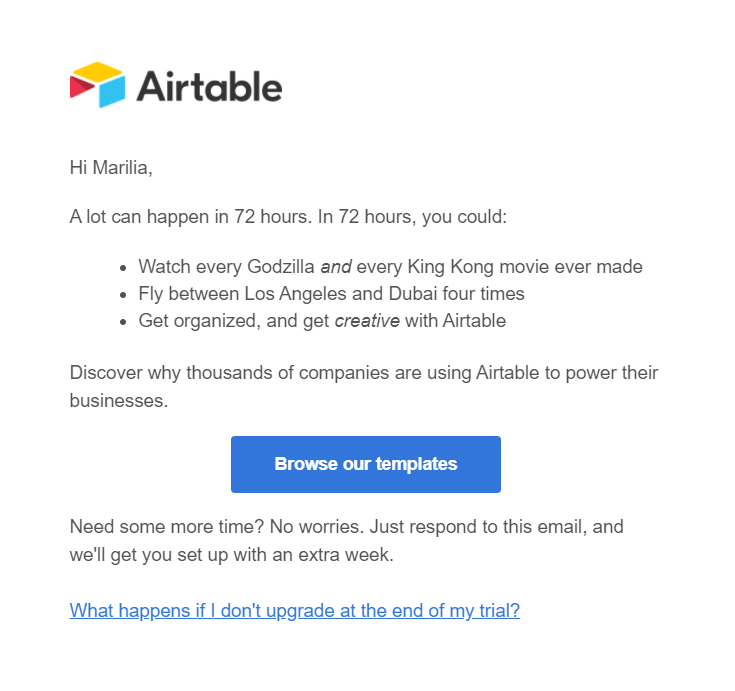
For SaaS businesses, trials are the best way to let customers know you and your product. However, trials are very limited, and Airtable knows it well. To get its users to get the most out of the trial period, the company delivers a fun email campaign to offer them an extension.
Here, the copy is a little different from what we’ve seen from other SaaS companies. Airtable takes the opportunity to give a fun twist to a widespread SaaS campaign. Personalization is also present to increase engagement and boost Airtable’s email opens and click-through rates. The absence of visuals doesn’t make the email less attractive but rather keeps it simple and focused on the action the subscribers need to take.
What’s also interesting is that the CTA button leads users to Airtable’s template library. This clever tactic allows the company to show trial users the full potential of the service.
Overall, Airtable has a good email campaign example that:
- is fresh and fun to engage trial users
- allows subscribers to reply without going through a contact form
- clears any confusion by linking to the company’s FAQ page
12. Wendy’s
Subject line: ⏳ Last chance for free food!
Type: B2C Mobile app engagement
Goal: Get customers to download Wendy’s app via a free food competition
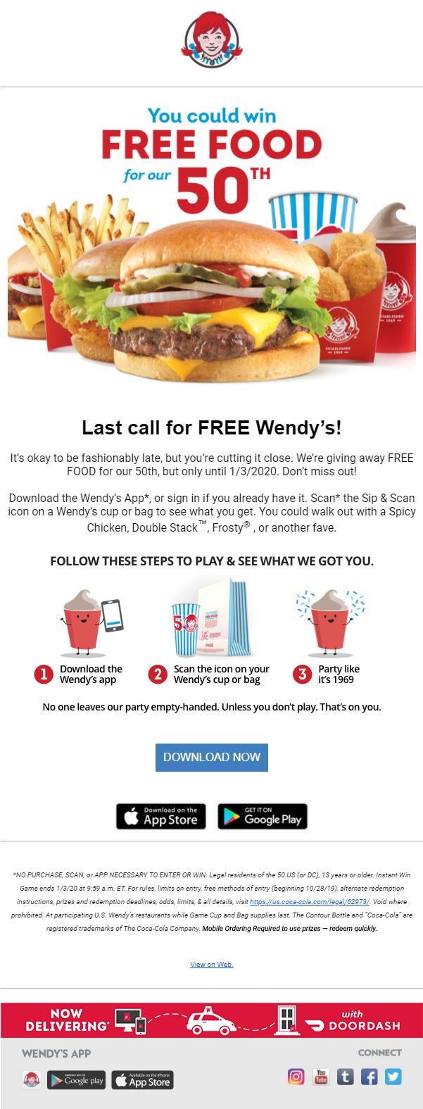
Regardless of industry, email marketing can help you fulfill your goals, reach your target audience, and incentivize them to join you. In this example, Wendy’s perfectly demonstrates how you can use your email list to increase engagement with your mobile app.
To get its audience to download the app, Wendy’s promotes a competition which requires subscribers to download an app and scan the icon on their order. The prize is also irresistible for the brand’s audience, who will hurry to get the app for a chance to win free food from their favorite place!
Wendy’s email design uses a beautiful newsletter image to guide customers through the process. Furthermore, it’s worth mentioning that Wendy’s has a social media presence with a particular tone. For loyal customers, this tone is also evident throughout this email campaign, which offers Wendy’s customers a great experience.
All in all, Wendy’s has achieved to:
- promote its mobile app through a fantastic competition
- use images to guide subscribers to take action
- create a clear CTA button and show users where to find the app
Mobile App and Food Email Templates
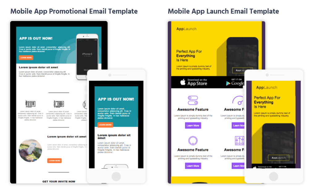
If Wendy’s campaign gave you some great ideas about promoting your mobile app, I’ve got great news for you. Moosend’s library has some great-looking mobile app email templates to promote your business and boost engagement.
And if you are interested in getting more email templates for your restaurant, you can sign up for a free Moosend account and take advantage of the platform’s beautiful food email templates for free!
13. Audible
Subject line: Thanks, your order is complete
Type: B2C Order confirmation
Goal: Summarize recent order and cross-sell relevant items
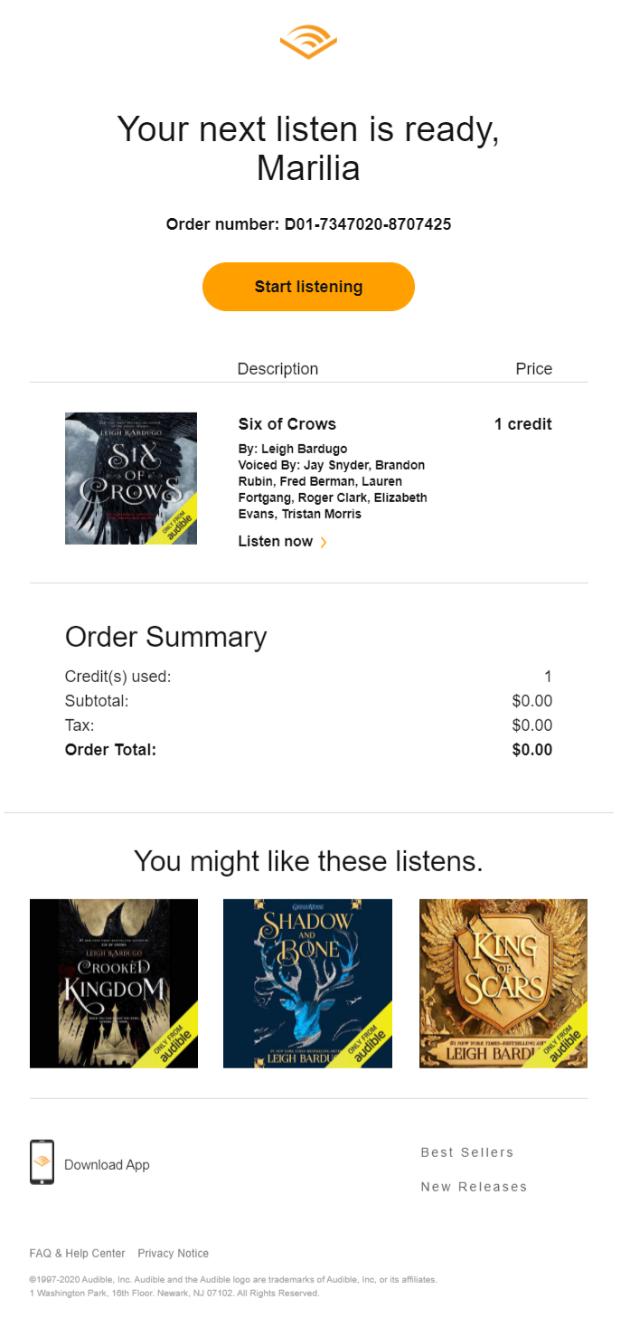
Order confirmation emails are some of the most essential transactional email campaigns that online businesses should send. Here, Audible has a simple yet effective email marketing example to get you inspired.
This type of email doesn’t need to be complicated or too fancy. As you can see, Audible includes only the most critical information, including a summary of the items purchased. While this email doesn’t have eye-catching visuals, the brand uses the image of the product to show customers what they bought.
Along with that, Audible has added a bright yellow CTA button to get customers to take immediate action. Through this email, they can start listening to their new book in a couple of seconds.
Not only that but Audible also adds a little cross-selling section underneath to boost sales. The absence of additional email content after the “You might like these listens.” is a smart tactic to focus the customer’s attention on the products rather than the extra details.
Overall, Audible gives its customers a simple order confirmation that:
- includes all the necessary information
- has a CTA that lets them use the service
- boosts sales through product recommendations
14. Visme
Subject line: Following up on your special offer from Visme
Type: B2B Follow-up email example
Goal: Remind potential leads of the original message
When you are in the SaaS business, you need to engage with your potential leads as much as possible. This means giving them trial extensions, special offers, and more. And to do that, you need, like Visme, follow-up emails to make sure your original messages didn’t go unread.
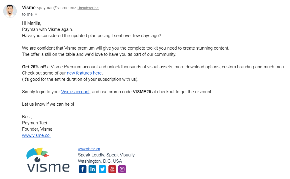
In this email marketing campaign, the company uses numerous elements to keep the recipient interested. First of all, personalization is a must to nail this type of email. It makes the message feel more personal and friendly.
Secondly, Visme sends this email from a business email, giving the subscriber the impression that they received messages from a real person. When it comes to the offer, the company cleverly uses bold letters to attract attention to the offer and the special code they need to get it.
Finally, the first CTA is strategically placed to convince customers that getting the upgraded version of the tool is worth the while. All the subscriber needs to do is log in and use the promo code to grab the fantastic deal.
Visme’s follow-up email hits all the right notes since it:
- has a personal and friendly tone
- acts as a reminder for the upgrade offer
- is sent from a real person, specifically the company’s founder
15. Zendesk
Subject line: Great customer service is expected
Types: B2B E-book promotion email example
Goal: Educate leads and customers through content
B2B companies can nurture their leads through email marketing by promoting blog content. While this is a great way to use email to educate and engage users, one shouldn’t forget that email marketing can help you distribute your e-books, case studies, whitepapers, and more.
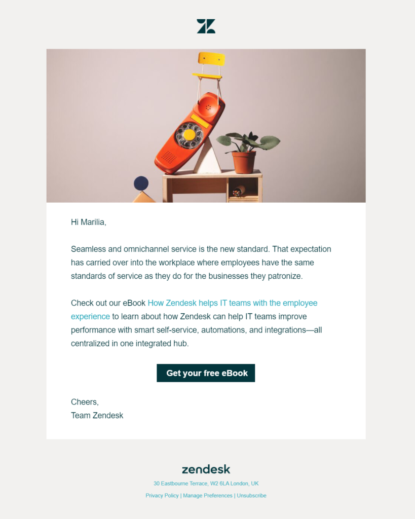
Zendesk, here, has one of the best email marketing examples to promote its e-book and nurture its leads. When it comes to the copy, the company has opted for a two-paragraph email structure. The first one focuses on highlighting a common issue, whereas the second provides the solution.
Zendesk also adds a link to increase its click-through rate and e-book downloads before the subscriber reaches the main CTA. Concerning the visuals, the company used a high-quality image that attracts attention, complementing the email subject line and email content.
All in all, Zendesk’s e-book email works because:
- it is personalized
- it has the perfect balance between copy and visuals
- the CTA couldn’t be more straightforward
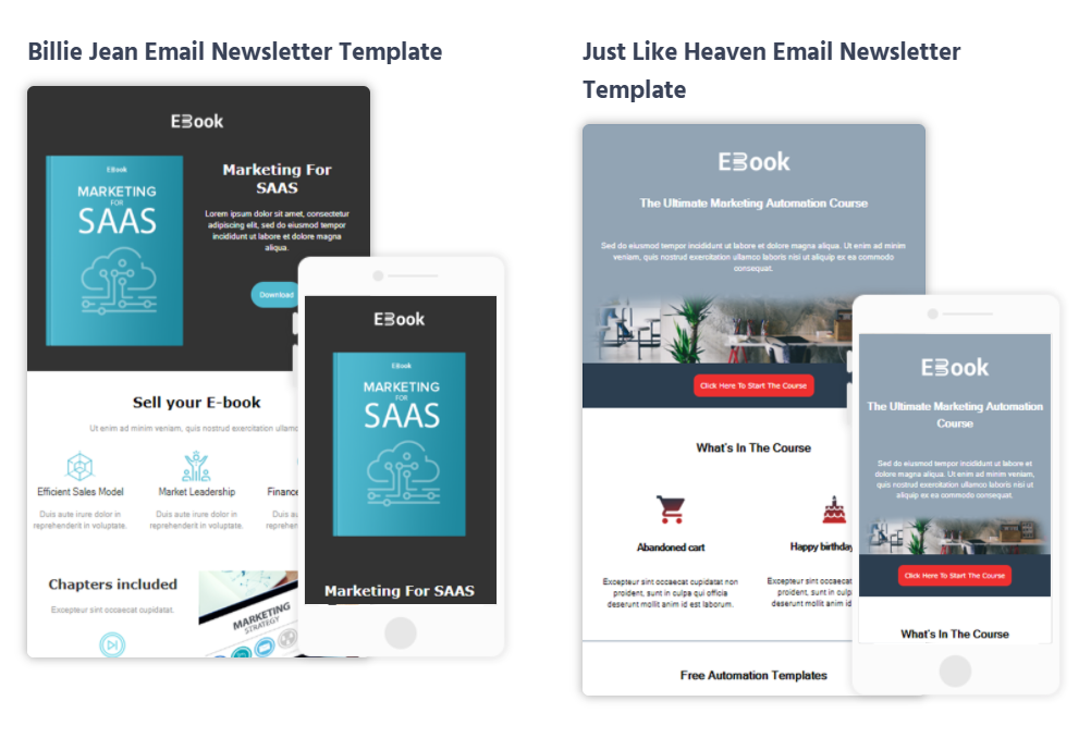
E-book Newsletter Templates
For B2B companies, your e-books can help you educate your audience and let them know how to use your tools better.
With the right e-book email template, you can promote your content and effectively manage to boost your downloads. All it takes is an excellent piece of content and an irresistible email design!
16. Blizzard
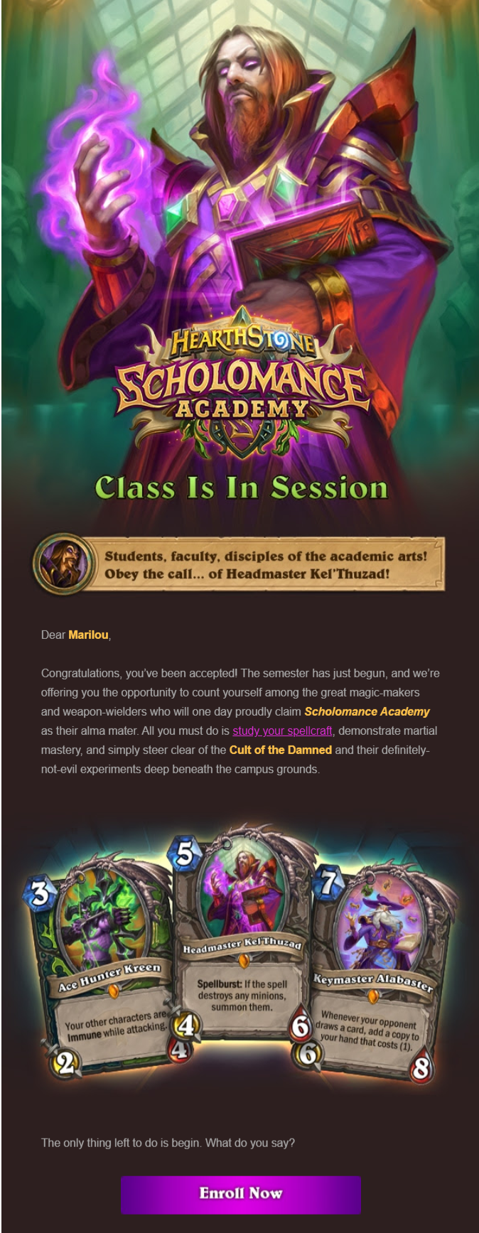
Subject line: Headmaster Kel’thuzad has chosen you as his pupil, Marilou.
Type: B2C Promotional email campaign example
Goal: Promote a product through storytelling
Storytelling has become a force to be reckoned with when it comes to better engagement and conversion rates. As a gaming company, Blizzard knows how to tug at its subscribers’ heartstrings (mine included) with this promo email.
Not only does it incorporate visuals and storytelling in the best way possible, but it is one of the best email marketing examples that fit its target audience like a glove. Both copy and visuals work together to give subscribers an immersive experience. Personalization plays a significant role in the success of this campaign because without the subscriber’s name the story would be generic.
As you can see, this email feels like the subscriber has been personally chosen by Headmaster Kel’thuzad to become his pupil. Nothing is out of place in this personalized email marketing campaign. Even the CTA button has become an integral part of the story.
All in all, Blizzard achieves to:
- create the ultimate promotional email for its gamers
- grab the subscriber’s attention the moment they open the email
- promote a product through a fantastic story where the subscriber is the hero
17. Revolut
Subject line: 🤑 Enjoy 10€ on us whenever you invite a friend
Type: Refer a friend email campaign example
Goal: Get visitors to invite friends through the mobile app or share link
One of the best ways to increase your brand visibility and get more customers on board is through referral marketing. The process is pretty straightforward: you send a campaign to your subscribers and tell them to bring their friends!
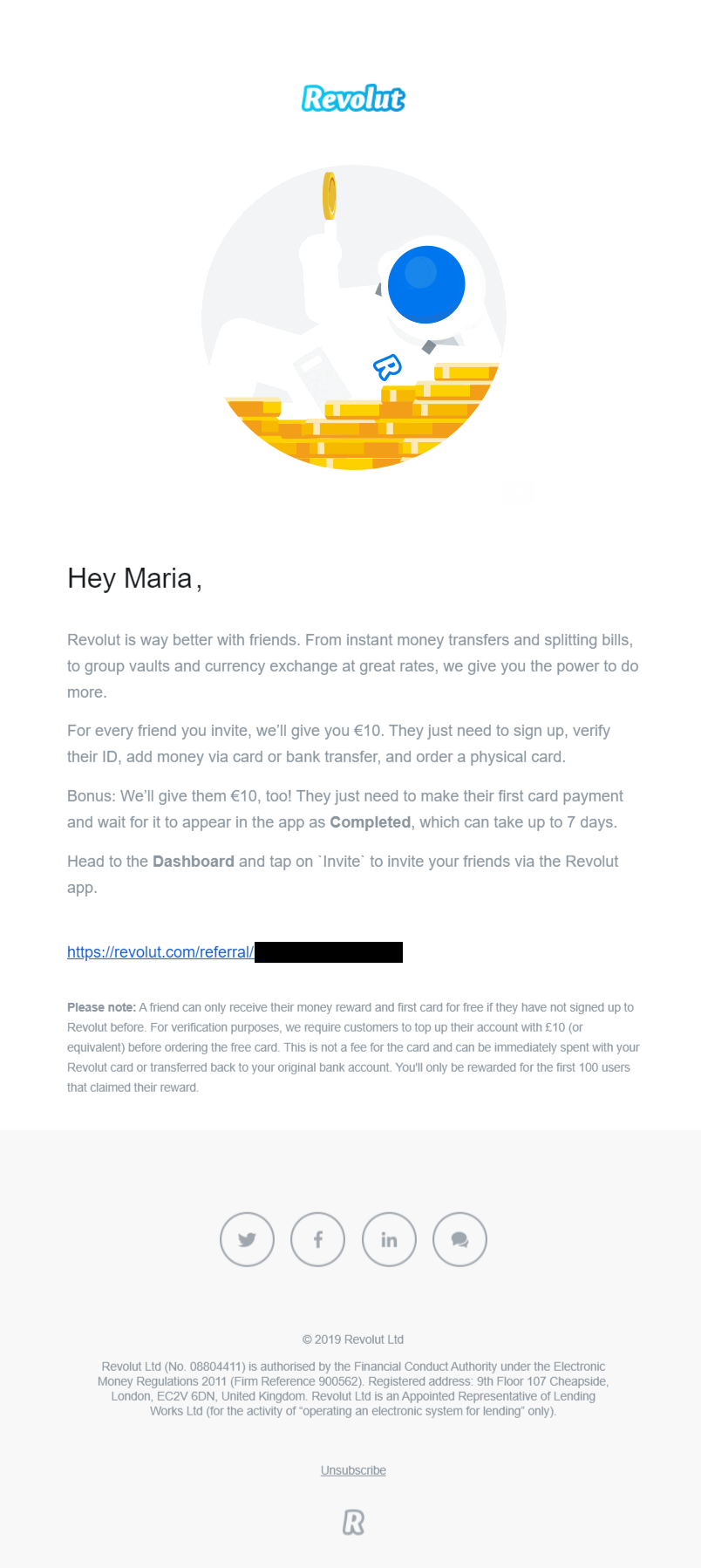
For Revolut, spreading the word about its services through email marketing is a must. While this email marketing example isn’t jaw-dropping, it has a killer landing page that makes conversion easy as pie. But to get there, let’s see a few things first. The subject line is straightforward, highlighting what the message is about at first glance.
When it comes to the email content, Revolut explains how users can benefit from this offer and how they can start inviting their friends. However, to increase the number of referrals, the company also adds a link, which the subscriber can share with their friends.
And here’s where the magic begins:
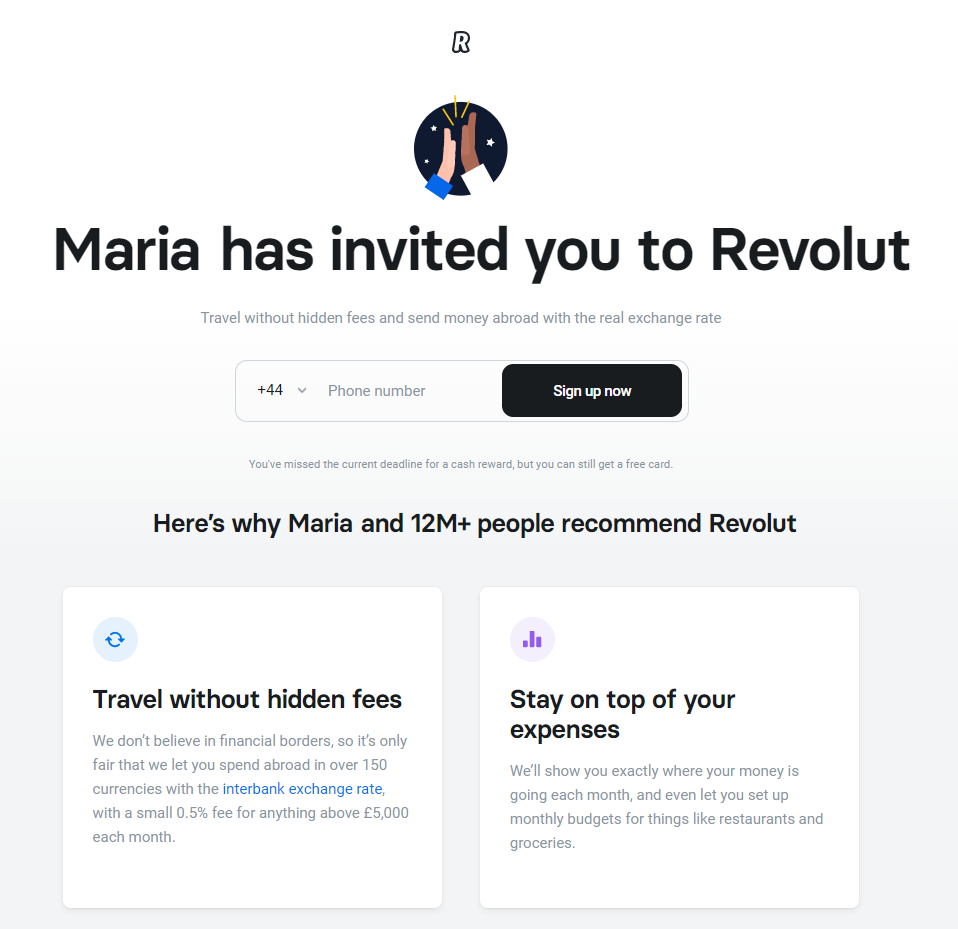
Notice how the landing page includes the subscriber’s name? Here, personalization and social proof can be your secret weapon to increase your legitimacy and boost your conversion rates beyond expectations. And it all started with a simple email campaign!
Overall, Revolut’s email campaign:
- has a subject line that immediately highlights the benefit
- is linked to a killer landing page that converts
- stays true to the company’s branding and website design
18. Four Seasons
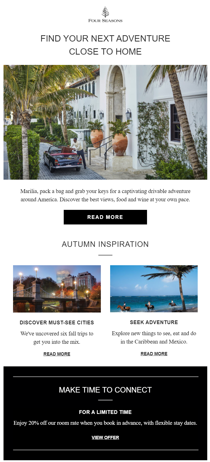
Subject line: Marilia, get inspired by these incredible getaways and enjoy 20% off
Type: B2C Special Offer
Goal: Nurture leads and offer 20% off on their next booking
Special offers are the bread and butter of every successful business that wants to drive more sales. Online stores have mastered this practice, but what about other industries? In this example by Four Seasons, you can see how hotel email marketing can leverage special offers to boost reservations.
First of all, what attracts the subscriber’s attention is the level of personalization the hotel adds both in the subject line and email content. Furthermore, instead of favoring copy, the business opts for a more visually-oriented email newsletter design.
And why not? That’s exactly what travelers want to see to get inspired for their next adventure, right? Not only that, but to make the offer more appealing, Four Seasons guides their subscribers through a process of discovering the destinations. To do that, the hotel has linked back to articles and magazines to excite, nurture, and choose their next dream destination.
Overall, Four Season’s email marketing example:
- nurtures its audience and gets them inspired
- adds a sense of urgency through the limited time offer
- has the right amount of personalization to convince and convert
Hotel and Accommodation Email Templates
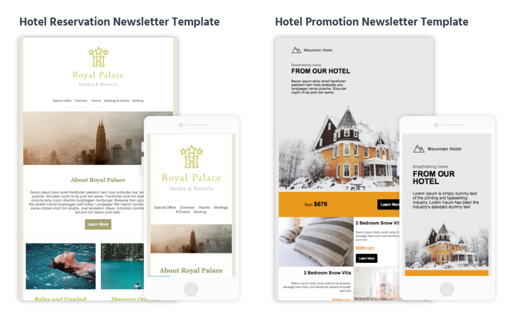
When hotel owners get their hands on email marketing, they can create beautiful campaigns to nurture their subscribers and boost bookings.
Using professionally-looking hotel email templates will save valuable time and effort.
19. Netflix
Subject line: Enjoying Dragon’s Dogma?
Type: B2C Customer feedback
Goal: Collect feedback to personalize the customer experience
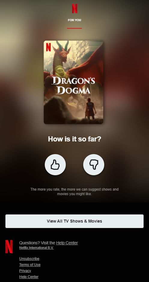
Our best email marketing examples wouldn’t be complete without the king of personalized campaigns. Netflix has a reputation of sending very targeted campaigns with movies and series based on watching history. But to make the experience greater, Netflix will also ask for feedback to ensure that it will keep delivering the best recommendations.
The above email campaign is so simple that the new subscriber just needs to like the show or go thumbs down, Julius Caesar style. Now, when recipients click, Netflix will lead them back to its platform, displaying a message that they successfully rated it.
What’s interesting is that there’s another CTA that also leads recipients to the platform. Here, Netflix has cleverly used three different CTAs that look different but have the same purpose: check the homepage! And that’s when “Popular on Netflix” and the previewed movie appear to attract the subscriber’s attention and keep them occupied for the next couple of hours!
Netflix’s smart email marketing example earns points for:
- its data collection and personalization abilities
- the three CTAs that focus on one goal
- letting the user get involved by rating the shows they like
20. Canva
Subject line: Design tips that get right to the point
Type: B2C & B2B Educational Email Campaign Example
Goal: Share tips and help users learn how to use the tool better
Educating your audience is one of the best practices to nurture them and show them how to use your products/services more effectively.
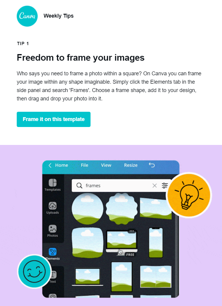
Canva, knowing that not everyone has the same design skills, has come up with a brilliant email marketing example to educate users and help them succeed with its tool.
As you can see, the tips are nicely structured, each having a headline and a CTA that leads users to Canva’s platform.
There, they can play around and put everything they learned from the email into practice. Furthermore, when it comes to visuals, Canva has incorporated three animated gifs showcasing what the tip describes to make the experience better.
Canva manages to create an email marketing campaign that:
- educates the audience without being tiring
- uses the CTAs to show users how to put the tips into action
- is simple and eye-catching to attract subscribers’ attention
21. Hawkers
Subject line: 2for1 🎁 HAWKERS XMAS 🎁
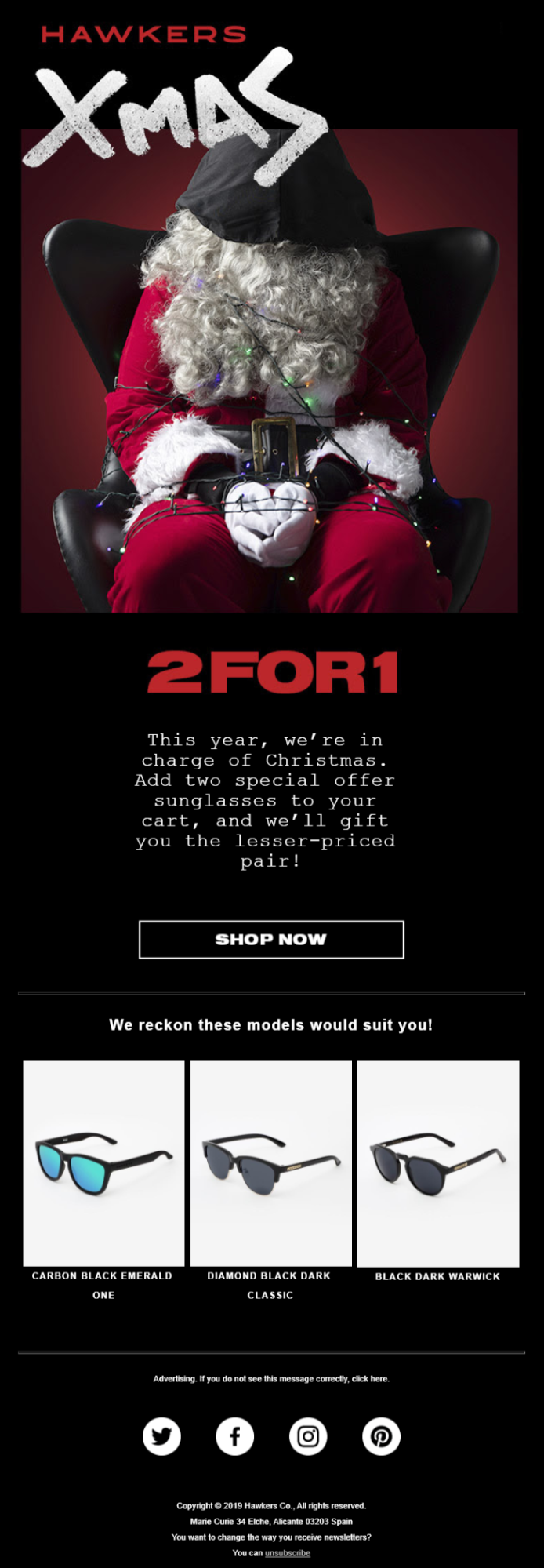
Type: B2C Christmas offer
Goal: Boost sales during a busy time of the year
The holidays! Such an excellent time to target your email list with campaigns that will boost your revenue and engage your audience. Hawkers is among the brands that take the time and effort to create such email campaigns to benefit from Christmas shopping.
However, this isn’t your regular Christmas email. With this unusual image, the brand makes a big statement: Move over Santa, we are here! The copy then explains what this is all about, letting subscribers know about the fantastic 2 for 1 offer.
While not evident in the above example, Hawkers’ CTA button is also animated, flashing a bright red color, which is hard to miss. And to top it off, the brand will throw some recommendations underneath to inspire shoppers and save them the trouble of browsing through numerous products.
Hawkers seasonal email campaign:
- leverages a busy time of the year
- has an unusual visual that attracts attention
- includes recommendations to incentivize subscribers to hit the CTA
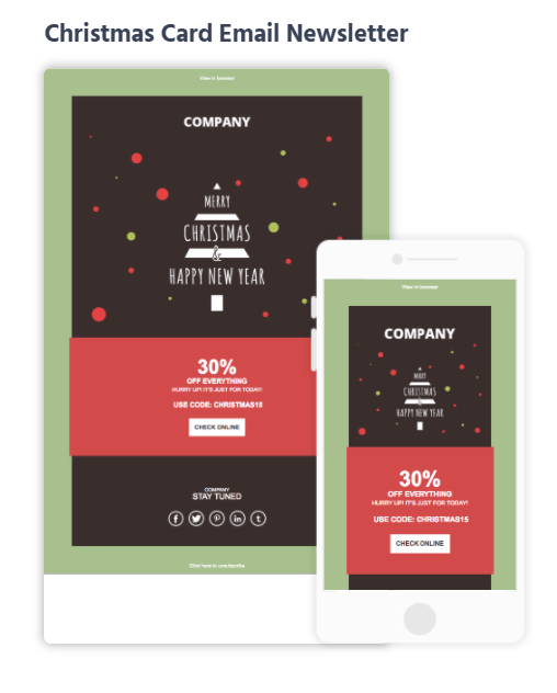
Seasonal Email Campaign Templates
Seasonal campaigns should be part of every B2C and B2B business. Be it to promote a special offer or wish them happy holidays, a beautiful Christmas email template will help you stun your subscribers and increase your revenue.
22. The Venetian Resort
Subject line: 🎁 Celebrate Your Birthday in Style

Type: B2C Birthday email example
Goal: Promote an offer on your subscriber’s special day
This must be one of the greatest email marketing examples from hotels I’ve come across. And no, it’s not because this is an email for my birthday! The Venetian Resort has put a lot of thought into creating this email marketing campaign a month before the subscriber’s birthday.
What could easily place this example in the first place of successful hotel email marketing examples is the stunning visuals, the copywriting, and the value proposition. More specifically, the copy has a festive tone that instantly makes the email subscriber feel appreciated. The 25% off is also hard to miss!
But that’s not why this is an effective email marketing campaign. When subscribers click on the CTA button, they will be redirected to a dedicated landing page:
By creating a landing page, the hotel has at its disposal a powerful weapon to boost its conversion rates. And all these due to the beautiful birthday email the hotel sent!
What the hotel got right in this email marketing example:
- stunning visuals and animated gifs
- an irresistible value proposition
- a landing page to convert email subscribers
23. Starbucks
Subject line: New ways to earn free drinks and food
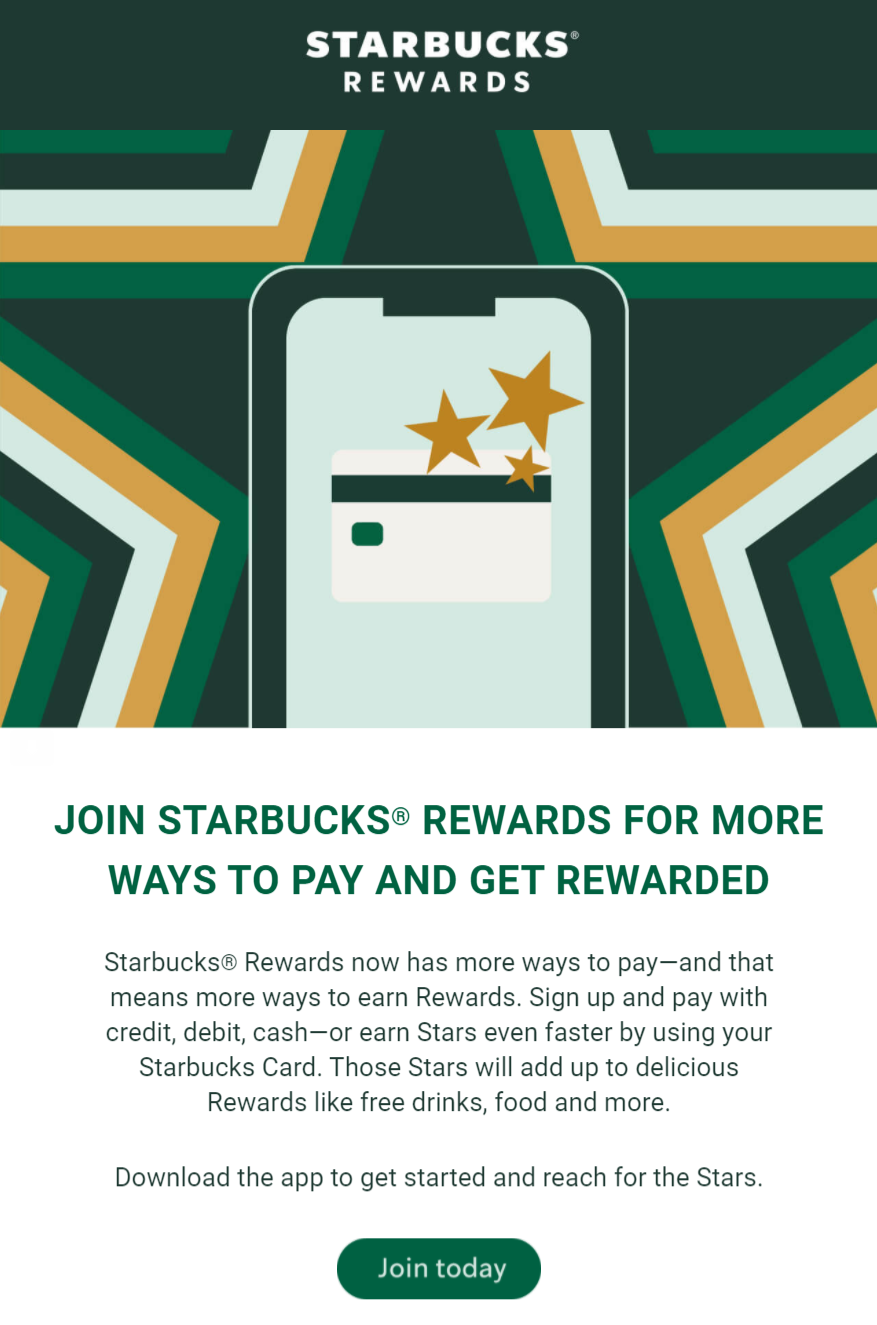
Type: B2C Join a loyalty program
Goal: Highlight loyalty program features to increase conversions
Starbucks is among our best email marketing examples since it sends some of the prettiest emails out there. To get recipients to join the loyalty program, the brand creates a stylish email campaign to increase conversion rates.
First of all, this example has solid branding elements, using Starbucks’ trademark green and various shapes to intrigue users. Despite being short, the email copy gives email subscribers all they need to click and download the app. Additionally, the choice of words isn’t random at all. Using words like “faster” and “deliciously rewarding,” Starbucks makes email subscribers recall the brand’s fast service and delicious beverages.
So, on a subconscious level, email recipients associate the rewards with the in-store experience and, thus, the positive customer experience might lead them closer to taking action. The CTA button is also conveniently placed after the copy, staying true to the inverted pyramid method for better click-through rates.
Starbucks’ campaign is among the best examples because:
- the branding elements are solid
- it is simple, without unnecessary images
- the email copy highlights the benefits of joining
24. Zillow
Subject line: 5 homes we’re drooling over 🤤

Type: B2C Listing Promotion Example
Goal: Show potential homeowners popular properties
Up to now, we saw how eCommerce, SaaS, and hotel businesses have leveraged email marketing to fulfill their goals. However, email marketing software can also be a powerful tool for real estate agencies to promote their listings and engage with new homeowners.
Zillow’s email is one of the simplest email marketing examples you can follow and set as a template to promote your listings. From the emojified subject line to the beautiful images that increase clicks, Zillow’s email is simple yet effective. More specifically, the email content focuses on using a high-quality visual, the name of the property, what they love, and a CTA that complements them all.
The variety of CTAs and the witty copy increases the potential homeowner’s desire to click and check the listing.
Overall, Zillow does a great job with this email campaign since it:
- uses emojis to make it more playful
- focuses on visuals rather than copy
- every CTA has its unique vibe
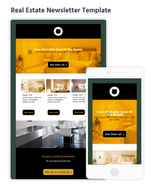
Real Estate Email Newsletter Templates
Realtors can benefit from email marketing as much as other industries. Using beautiful real estate email templates, you can capture your target audience, promote listings, and more.
Make sure to grab these templates and more by signing up for a free Moosend account.
25. Death Wish Coffee
Subject line: You’ve unlocked a reward!
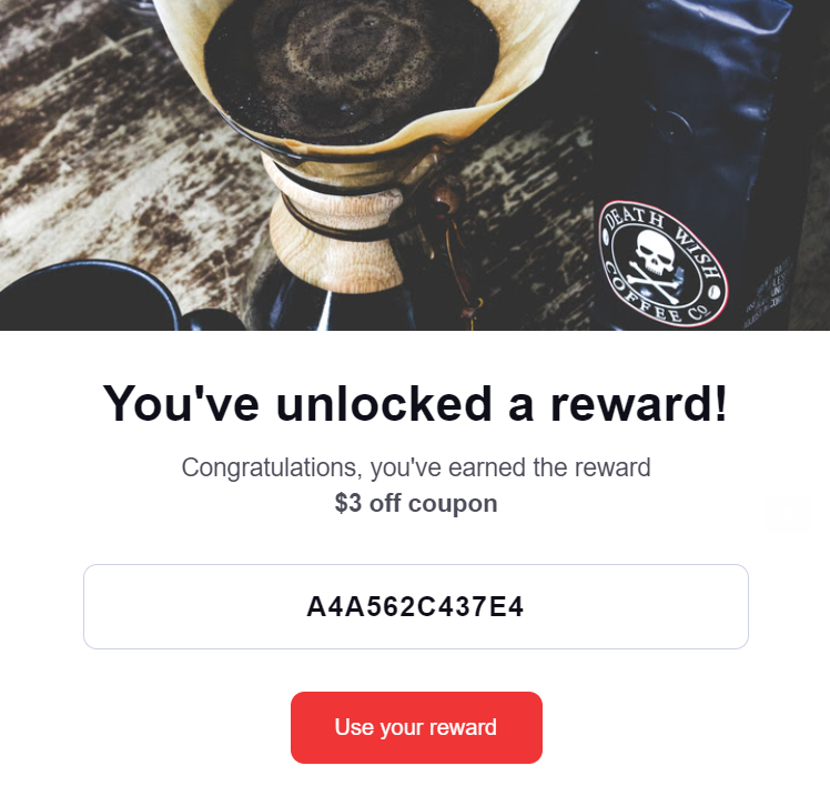
Type: B2C Reward loyalty
Goal: Let subscribers know they’ve unlocked loyalty rewards
Joining a loyalty program will surely give your subscribers more reasons to buy from you. However, to keep them engaged, you need to keep them up-to-date with what they win. For Death Wish Coffee, creating a beautiful and effective campaign is a piece of cake.
While there isn’t much to see here, the email content follows the inverted pyramid model to increase the brand’s click-through rates. Also, the bold letters allow the subscriber’s eyes to detect what truly matters in this email. And to top it off, the brand has chosen a red CTA button to make its offer unmissable.
These emails don’t need too much effort to address your subscribers’ pain points. What they need is to be as clear and actionable as possible!
Overall, Death Wish Coffee manages to:
- reward loyal subscribers without getting them tired
- pick the best CTA color to attract attention
- use specific language to make it sound like a game
26. Grammarly
Subject line: You’ve earned a new badge. Check it out!
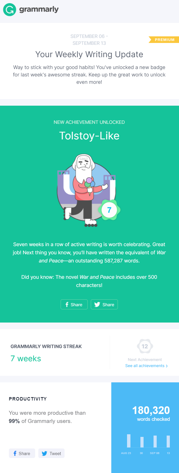
Type: B2C Weekly usage update
Goal: Share writing updates and incentivize users to share it on social media
Social media marketing is on the rise! So, why not marry your email marketing and social media strategies to get better engagement? For Grammarly, this email marketing example allows the company to excite its subscribers and increase engagement through social media.
The recipe is simple. Grammarly sends its subscribers weekly writing updates with some cool statistics. These campaigns almost feel like a game, where Grammarly users unlock achievements based on their writing performance.
The copy and visuals make this email one of the best email marketing examples to nurture customers and motivate them to use your services. When it comes to taking action, Grammarly has added numerous social media share buttons to spread the news.
As a result, its subscribers’ friends and followers can see how the tool helps them achieve their goals.
Overall, Grammarly’s email campaign:
- gives off a gaming vibe that’s fun to interact with
- boosts engagement through social media
- keeps users satisfied and happy by acknowledging their achievements
27. New Darlings
Subject line: Let’s reconnect… 💛

Type: Blog re-engagement email campaign
Goal: Get subscribers to re-engage with content
The engagement struggle is real, especially for bloggers who want their subscribers to read their content. To re-engage them, there’s no better way than sending the famous re-engagement email campaign.
This email by New Darlings is one of the most elegant email marketing examples I’ve seen so far. Not only do they have beautiful visuals showing the newest member of their family, but the bloggers have also included a few of their latest blog posts and tips to excite dis-engaged readers.
The colors of this email newsletter example fit perfectly with the family photo, increasing the reader’s likability of clicking-through and becoming a loyal reader.
Overall, New Darlings have managed to create a beautiful campaign that:
- Attracts and pleases the eye
- Informs readers what has been going on while they were gone
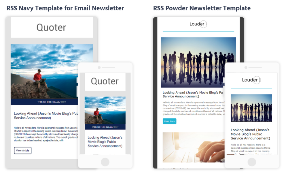
RSS Email Newsletter Template
Re-engagement campaigns are fantastic to get your readers back to your blog. But that’s not the only thing you can do to keep them engaged.
By creating RSS email campaigns, you can show them your new content and boost your blog traffic like a pro. You can create a fantastic campaign by leveraging some of the coolest RSS email templates for better results!
28. Indiegogo
Subject line: Just for You: 15 Innovations to Watch

Type: B2C Personalized product recommendation
Goal: Show subscribers recommendations based on their interests
I know I’ve talked about it countless times, but personalization is and will always be one of the greatest conversion forces out there! Here, Indiegogo has one of the best email marketing examples to increase crowdfunding contributions to its projects.
So, to make sure that they’ll become a contributor, the crowdfunding platform creates an email tailored to their subscribers’ interests. And it’s not one but “15 big ideas” (which it was impossible to fit in this article!) that the recipient can check and choose!
But wait! How does Indiegogo know which campaigns are perfect for each subscriber? Typically, it would take a popup form to collect info about the recipient’s interests and then create a campaign tailored to them through customer segmentation.
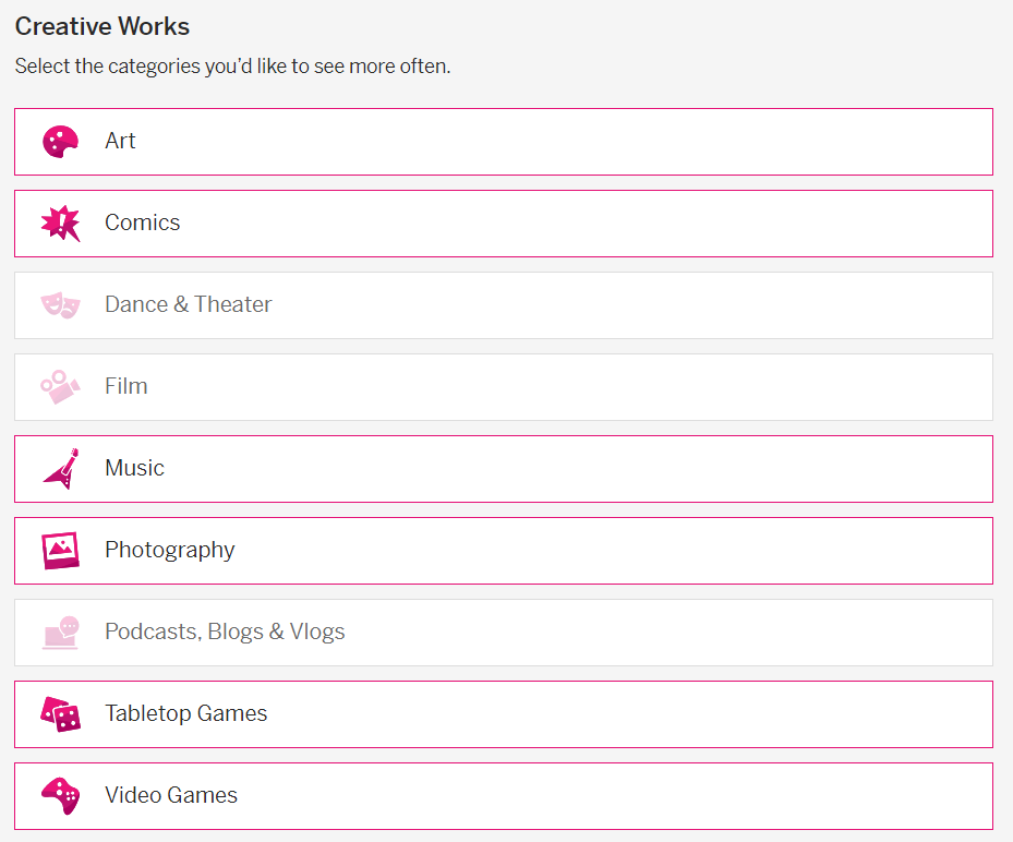
In this case, though, the platform has a dedicated page where users can check what they like for more relevant messages:
All in all, this email marketing example by Indiegogo:
- offers personalized email content to its subscribers
- has brightly colored CTAs to attract customers’ attention
- gives relevant information about each campaign
29. Workable
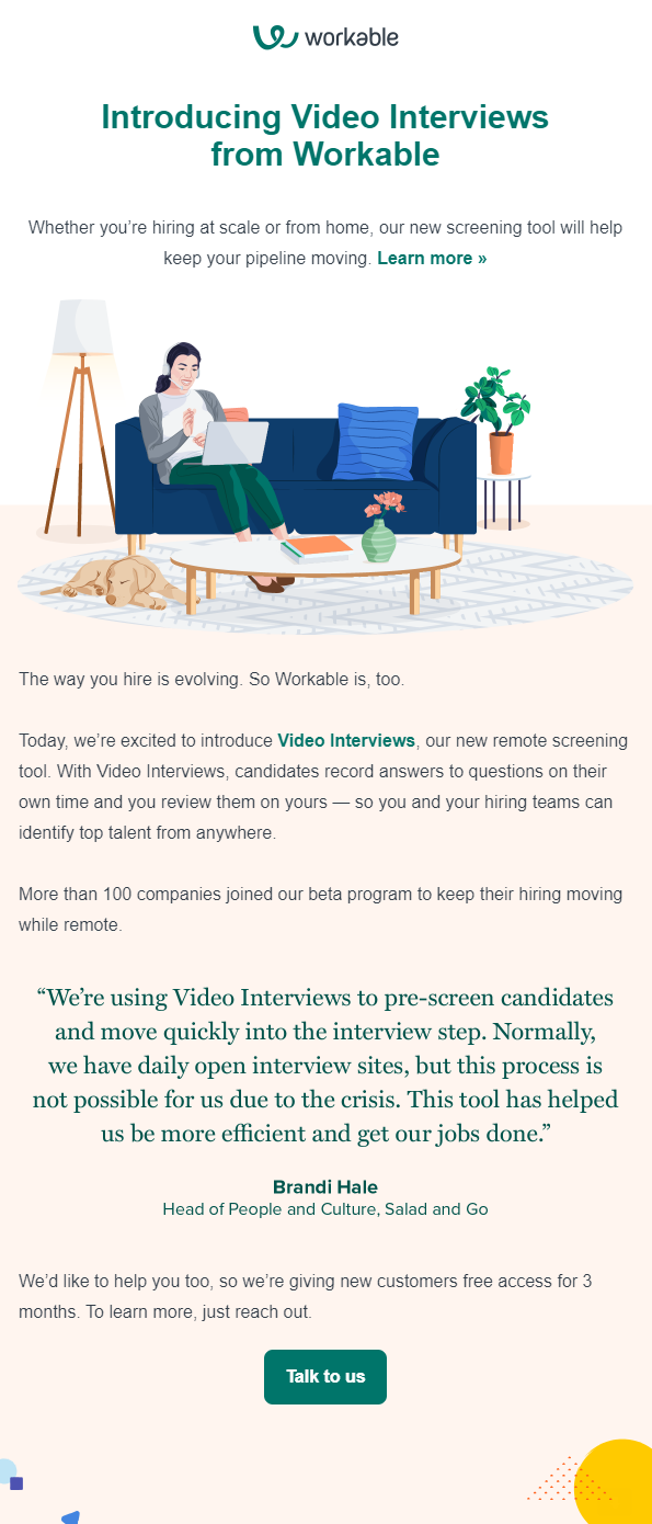
Subject line: Introducing Video Interviews from Workable
Type: B2B New feature announcement
Goal: Let users know about new features and offer trial/demo
When B2B companies release new features, they need to show them to their subscribers. To do that, they need a beautiful email campaign to let recipients check them out or sign up for a demo.
Here, Workable shows us how it’s done. First of all, the copy effectively intrigues the recipients, addressing their pain points. But that’s not all. To make the email more successful, Workable leverages social proof to show them that the cool new feature is useful!
The visuals also contribute to the success of the announcement, making the campaign more stylish. When it comes to the CTAs, Workable has added three CTA buttons that lead to a landing page with a converting online form. There, subscribers can sign up for a demo of the new feature and find out more about it.
All in all, Workable’s feature announcement campaign:
- has a beautiful color, copy and visual combination
- lead subscribers to take action through the landing page
- adds testimonials to boost its click-through rates
30. Apple
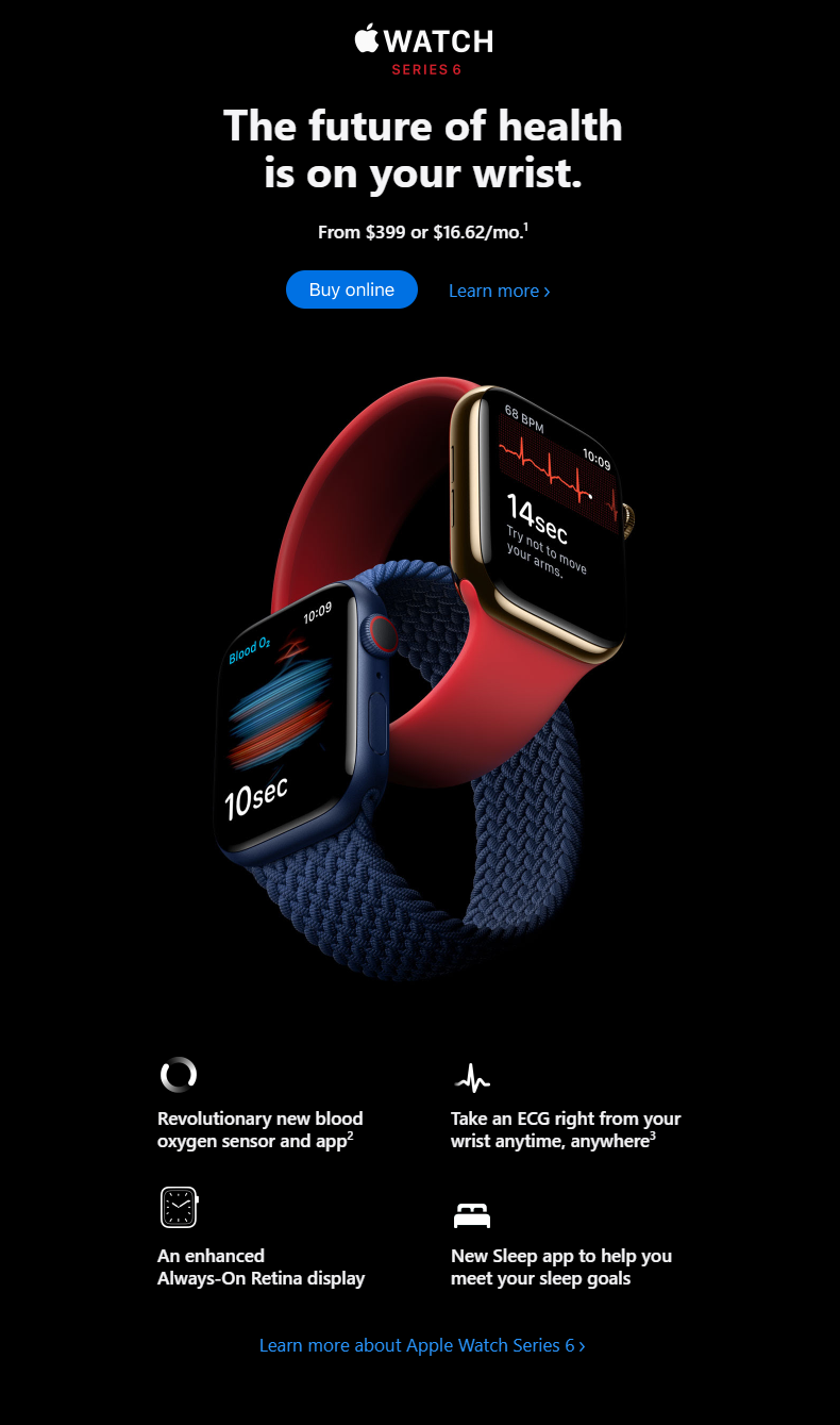
Subject line: Introducing Apple Watch Series 6
Type: B2C New product launch
Goal: Present the new product and share information about its features
Launching a new product and email marketing are a match made in heaven. What you need is a beautiful product launch campaign, and you are ready to roll. For Apple, this email marketing campaign is everything their target audience wants to see. It is elegant. It has a similar design to its website and gives information about the product in a structured manner.
The minimalist design of this campaign also lets Apple’s new watch become the center of attention. Which is what an effective product launch email should be all about. What’s more, the brand has added two different CTAs, a “buy online” and a “learn more” button to nurture its potential customers and let those who have made up their mind purchase it with a click.
Overall, Apple’s product launch campaign includes:
- a copy that’s short and to the point
- a high-quality image of the product to make it more appealing
- two different CTAs to nurture and convert the audience depending on where they are on their customer journey
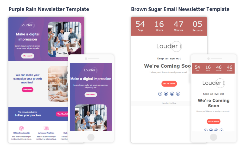
Product Launch Email Templates
To ace your new product launch, you need a beautiful campaign to grab your potential customer’s attention and lead them to conversion.
With the right product launch template, you can create your next big email to supercharge your revenue.
31. BetaList
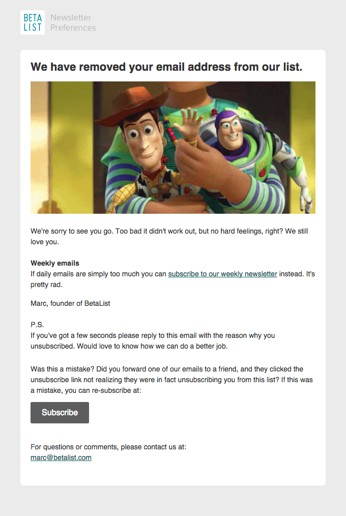
Subject line: I’m sorry it didn’t work out
Type: B2C Unsubscribe from email list email campaign
Goal: Inform subscribers that they were removed from the list
Sometimes, your subscribers will hit the unsubscribe button, and there’s nothing you can do about it. Or is there? When your once engaged subscriber unsubscribes, it’s time to send them the unsubscribe email or, as we call it in the email marketing circles, the break-up campaign.
This email marketing campaign example from BetaList shows you what you can do in the unfortunate event of subscribers hitting unsubscribe. More specifically, the copy has a break-up tone using words like “sorry,” “too bad,” and “didn’t work out” to show the dis-engaged subscriber that the company cared about them.
What makes this email a brilliant example is the CTA and the way BetaList incorporates it in the campaign. In the form of an alternative, the company lets recipients know that if too many emails were the cause of their frustration, then they can join the weekly newsletter.
BetaList’s email example works because:
- it gives dis-engaged subscribers a way to rejoin
- allows recipients to reply and express their concerns
- It has another CTA at the bottom to increase conversations
Feeling Inspired?
Are your creative pools replenished yet? I’m sure they are!
After looking at all these unique B2C and B2B email marketing examples, you are ready to design your beautiful email campaigns.
And don’t forget, to create all these examples, you need to get your hands on a great email marketing tool that will provide you with an easy-to-use builder and responsive email templates.
Moosend’s platform will offer you this and a lot more to make your email marketing dreams come true. Just sign up for a free account and try it yourself.
You have nothing to lose!

 Published by
