


10 Fashion Newsletter Examples to Inspire Your Next Campaign [2026]
Published By Oleksii Kovalenko
June 8, 2026

08/06/26
Fashion brands compete for attention in some of the most crowded inboxes around.
The best emails stand out because they do more than announce a new collection or promote a sale. They reflect the brand’s style, personality, and perspective, giving subscribers a reason to keep opening future campaigns.
That’s a harder brief than it sounds, particularly when most inboxes are full of similar promotional layouts and discount codes.
This roundup collects real fashion newsletter examples from apparel and footwear brands that get it right, covering product launches, buying guides, brand storytelling, and values-led campaigns. Each one includes a breakdown of what specifically makes it work, so you can bring those lessons to your own fashion email templates.
Fashion Email Marketing Design Best Practices
Here are the design principles that consistently show up in fashion emails that actually perform.
These aren’t universal rules, but patterns worth keeping in mind as you build or refresh your approach to fashion email marketing.
Here’s a detailed breakdown:
- Lead with a full-width hero image: Fashion is a visual category. Opening with a strong, editorial-quality lifestyle shot sets the tone before a subscriber reads a single word.
- Keep the copy tight and purposeful: Short sentences, confident tone, no filler. The product images carry the weight; copy just needs to frame the mood.
- Use color and layout to signal positioning: Background color, typography weight, and layout structure all communicate brand identity before a subscriber reads anything. Your email newsletter design should be immediately recognizable.
- Use annotated product images to build credibility: Calling out specific details directly on the image, such as fabric name, construction detail, measurements, signals that the brand knows its product deeply and gives shoppers a reason to look closely.
- Design for the brand world: The strongest fashion emails feel like an extension of the brand’s editorial voice, not a promotional blast. That consistency builds recognition and trust over time.
- Pair CTAs with supporting copy: Fashion brands that perform well don’t drop a CTA button at the end. Instead, they set it up with a line of copy that adds context and earns the click.
- Design for mobile: Single-column layouts, large text blocks, and thumb-friendly email CTAs are standard. Most subscribers will open your email on a phone, so make the experience as friendly as possible.
Best Fashion Newsletter Examples to Get Inspired
Below are real campaigns from fashion brands, each highlighting a different approach you can adapt for your email marketing strategy.
1. Rouje — lookbook email example

Rouje’s summer newsletter fully commits to the lifestyle concept before attempting to sell anything.
The opening hero image drops subscribers into a specific mood and season, and the copy that follows mirrors how the target customer actually talks about getting dressed, with lines like “no plan, no outfits planned.” The product grid that follows feels like a natural continuation of that scene rather than a pivot to the “sell.”
What works:
- Lifestyle-first hero image sets an editorial tone before any product is shown, making the scroll feel like browsing a magazine rather than a catalog.
- Minimal copy mirrors how the target customer thinks about getting dressed, which builds immediate recognition without any marketing language.
- Multiple product entry points in the grid let different subscribers click into whatever appeals to them, rather than funneling everyone toward one item.
- Two CTAs spaced across the email extend engagement without the email ever feeling pushy.
If you want to recreate this style, Moosend’s drag-and-drop email builder makes it easy to blend editorial content with shoppable product sections, without needing custom code.
2. Asphalte — product launch campaign

Asphalte’s preorder email for their Pleated Trousers turns a single product into a full narrative.
The email opens with a bold, magazine-cover-style hero image, then slows down to show a second photo with four numbered callouts pointing to the fabric. The approach treats the subscriber like someone who actually wants to understand how something is made.
What works:
- The annotated product photo with numbered callouts gives the email a level of product depth that most fashion emails skip entirely, and builds the kind of credibility that converts browsers into buyers.
- The copy is confident and restrained, which signals that the brand knows exactly what it made and who it is for, without any persuasive language.
- The preorder mechanic creates genuine anticipation without resorting to countdown timers or artificial scarcity messaging.
- Bold logo typography in the hero makes the email immediately recognizable in the inbox before a subscriber reads a single word.
3. Allbirds — product range newsletter

Allbirds’ “Your Daily MVPs” email presents four shoe styles across two gender categories without the layout ever feeling like a catalog. Handwritten-style annotations on two of the lifestyle photos add a casual, human touch that fits the Allbirds brand tone without softening the commercial intent.
What works:
- Gender-segmented sections with their own CTAs make the email easy to navigate and reduce the decision fatigue, which is the same principle that makes email list segmentation so effective in a broader email strategy.
- Handwritten-style annotations on the lifestyle photography give a casual touch that softens what is otherwise a straightforward product email.
- Product tiles are clean, consistently shot, and laid out in a grid that makes comparisons easy without making the page feel crowded.
- The two CTAs at the very top let subscribers self-select.
Tip: Brands that use dual CTAs often collect those preferences at signup with a popup builder that includes product preference checkboxes. The result is faster and more relevant email personalization from the start.
4. Highway Robery — personality newsletter example

Highway Robery’s “Pass the remote” newsletter is a demonstration of what happens when a brand trusts its voice completely. The product, a black lightning-bolt-print cotton robe, appears after the copy has done all the work of establishing the mood, so it serves as a natural conclusion rather than an interruption.
What works:
- The opening copy is funny, specific, and completely on-brand before a product appears, which means the email earns attention rather than demanding it.
- The minimal design, with a plain background, clean product photos, and no decorative elements, lets the voice carry the entire email.
- The casual, deadpan product descriptions remove all sales pressure, which makes the products feel more desirable rather than less.
- The pop-culture image in the footer adds a splash of fun while clearly indicating what kind of brand this is.
5. Taylor Stitch — single product email

Taylor Stitch’s Piston Jacket email is built around a single hero image, product description, CTA, and a second lifestyle photo to close. The hero shot is a close-up of the jacket’s corduroy texture, worn open in natural light, and the product copy leads with a reference to the 1950s garage staples before getting to fabric specs.
What works:
- The full-bleed hero photo puts the product in context, worn and lived-in rather than staged on a hanger, which communicates the brand’s positioning without any copy
- The product description leads with story and heritage before it gets to fabric and construction details, which is the right order for a brand selling premium basics to people who care about provenance
- The black-and-white second image creates a visual gear shift that keeps scrollers engaged and makes the email feel more like editorial content
- The warm off-white background runs throughout and reinforces the premium, unhurried positioning without requiring any additional design work
6. Amundsen Sports — editorial campaign

Amundsen’s “The Shorts Guide” email reframes a product category email as a decision-making tool.
Rather than simply showing a range of shorts and linking to the collection, the email opens with the premise that the brand will help you find your fit, explaining the measurement system and then introducing three named product styles by use case rather than material.
What works:
- The guide framing makes the email feel like a useful service rather than a promotional push, which is a different kind of value exchange that builds subscriber trust.
- The three product styles are named and described by use case rather than by fabric or silhouette alone.
- The deep burgundy background is consistent with Amundsen’s broader brand aesthetic.
- The closing section on brand philosophy is a confident way to end a commercial email, betting that the brand world is compelling enough.
7. Nomasei — product focus newsletter

Nomasei’s “Zoom on Silencio” email gives the single kitten heel pump a full editorial treatment across multiple photos, styling variations, and a copy block that explains the product’s philosophy as much as its features. This email copy is personal and founder-adjacent, making it read less like a campaign and more like a recommendation.
What works:
- Multiple photos of the same shoe from different angles and on different people build buying confidence, particularly for footwear where fit and silhouette read differently on different feet.
- The copy leads with the feeling the product is meant to evoke before it gets to the practical specs, which is the right order for a brand with a strong aesthetic point of view.
- Practical sizing guidance and strap detail are placed naturally within the flow rather than in a separate spec block at the end. This keeps the email reading as one continuous recommendation.
8. Kirrin Finch — new arrivals and preorders
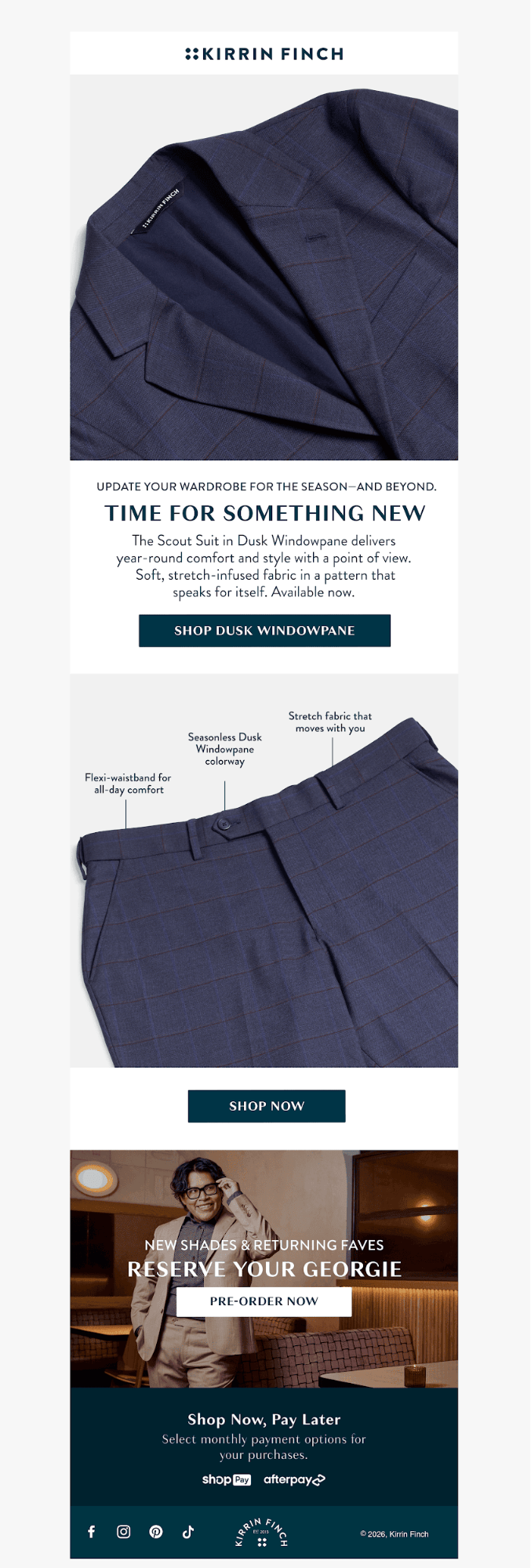
Kirrin Finch’s email structure does the work. Each section gets its own image block, and the visual hierarchy is clear enough that a subscriber can scan and click into whichever part is relevant without reading every word.
Best practices:
- The annotated product image highlights three specific features of the Scout Suit, communicating product depth at a glance without requiring the subscriber to read a description.
- The preorder CTA gets its own full-width image block with a separate headline and CTA button, giving it visual parity with the main campaign rather than burying it beneath the fold.
- The Shop Now, Pay Later section addresses price concerns by highlighting flexible payment options through familiar provider logos.
9. The Frankie Shop — brand moment email

This email from The Frankie Shop promotes an original interview series filmed inside a roaming yellow cab during Paris Fashion Week, in which the host conducts candid conversations with friends of the brand between shows. This fashion email example presents six featured guests in a grid that functions like a magazine table of contents.
What works:
- The interview series concept gives the email a reason to exist beyond selling and signals that the brand has a perspective on culture, not only on clothing.
- The guests are real people rather than models, which lends the campaign an authenticity that straightforward product photography cannot replicate.
- The grid of six featured guests, with names and titles, functions like a magazine table of contents and creates multiple click-through incentives, since subscribers are likely to recognize at least one name and want to know more.
10. Emoi emoi — brand values newsletter

Emoi emoi’s “Are you familiar with this story?” email opens with a large editorial serif headline, then goes directly to a photo of the two founders and a mission statement quote. There’s no product in the first half of this fashion email; instead, the brand walks through its sustainability commitments across three categories, with specific, verifiable actions.
What works:
- The founder photo and direct quote open the email with a human face and a specific mission statement, establishing the brand as something built by real people with a real point of view rather than a faceless ecommerce operation.
- The sustainability commitments are organized into three concrete categories with specific, verifiable actions rather than vague language about caring for the planet, which makes the claims land differently.
- The footer navigation treats the email like a content hub with multiple entry points rather than a single-purpose send, extending its usefulness beyond the campaign itself.
Turn Heads in the Inbox
What these examples have in common is not a single formula.
Each one makes a clear decision about what the email is trying to do, whether that is launching a product, building a world, or telling a story, and then designs everything around that decision. That’s a useful frame to bring to your own campaigns, whether you’re a small brand sending your first newsletter or a larger team trying to make your emails feel less generic.
Ready to put those ideas into practice? Sign up for a free Moosend account and build your next fashion newsletter with customizable templates, an intuitive email builder, and built-in automation.
Similar Posts
 Published by
 Published by


Create, send and optimize your email marketing campaigns