


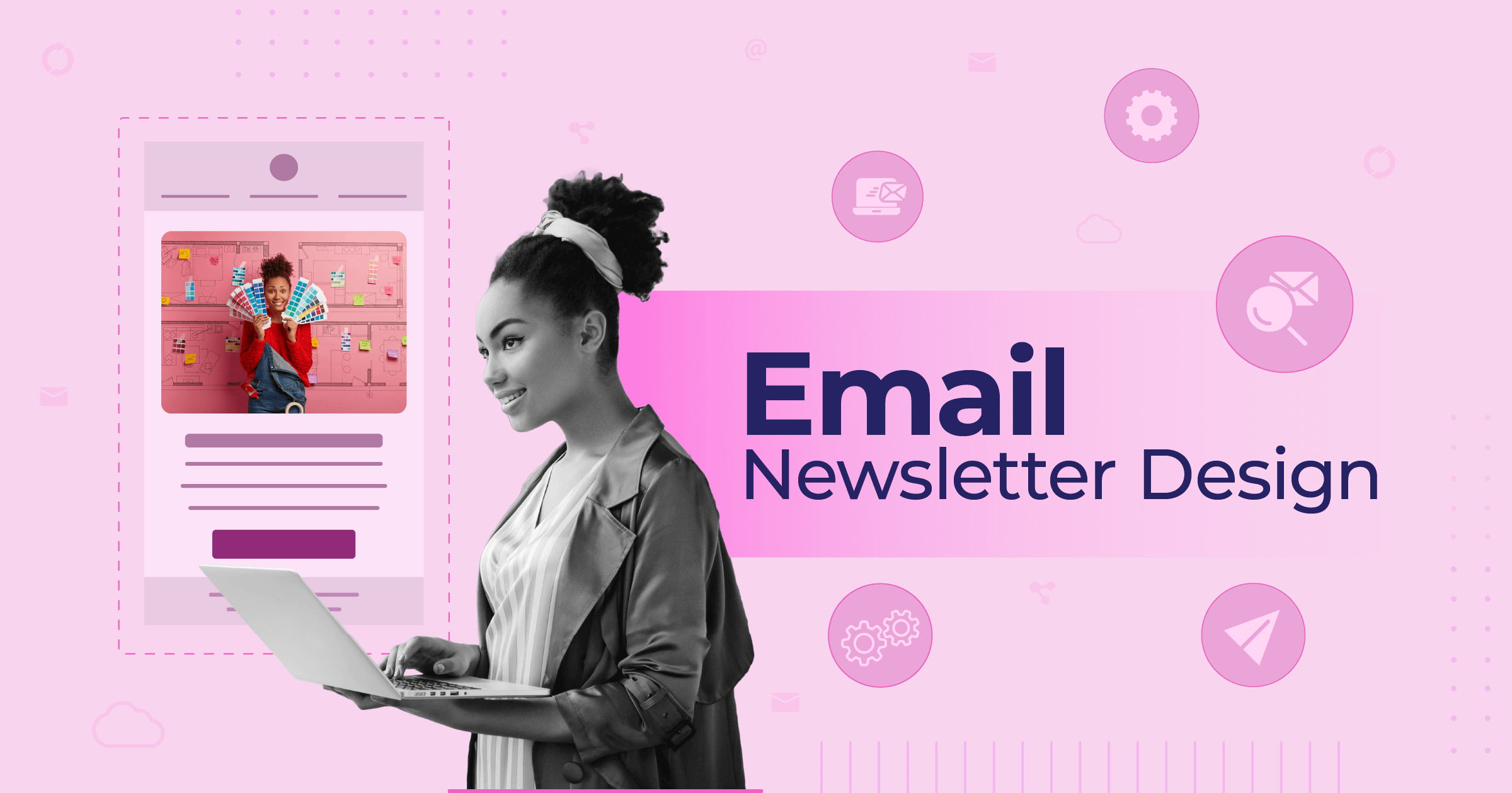
Email Design Best Practices For Higher Engagement [+Checklist]
Published By Alexandra Marinaki
January 27, 2023

27/01/23
Despite the rise of social media, brands still try to bring their audience to owned channels, like email. They create lead magnets or offer discounts in exchange for email addresses, and then invest in nurturing their subscribers. Bu that’s not enough to win them over. People sign up to several lists but are ready to unsubscribe if they don’t find value.
In other words, sending email campaigns doesn’t guarantee success. Following email design best practices is a make or break factor to reach your objectives. Let’s see how you can create flawless designs that convert.
In this guide, you’ll learn all things email design to craft campaigns that stick with the reader while achieving great ROI. In short, we’ll share:
- The benefits of focusing on email design
- Common email types and elements
- Best email design practices
- Email marketing tools with unique design capabilities
- A bonus checklist to ensure you’ve done everything right
- Top email design examples for inspiration
Without further ado, let’s discover the power of email design.
Grab templates that hook your audience
Create on-brand, professional emails with minimum effort.
Try freeWhy Is Email Design Important?
Effective email design ensures visually appealing and engaging campaigns that inspire action. Here’s why a thought-out email design process is so important:
- Contributes to brand awareness. Using branded elements like your logo, color palette, and fonts consistently across emails reinforces your brand identity. And with brand recognition comes customer trust.
- Increases conversions. By investing in email design best practices like information hierarchy, scannable sections, and clear email CTAs, subscribers can understand your value proposition quickly and take the next step.
- Maximizes engagement. A well-structured layout with plenty white space, eye-catching visuals, and captivating copy makes a strong first impression. Plus, it’s legible and easy to navigate, characteristics that facilitate interaction.
- Ensures accessibility. No user has the same restrictions as the other. So, brands should step into their subscribers’ shoes to offer the same optimized experience. For this, they’ll need accessible designs, considering things like proper color contrast, descriptive links, and alt text for images.
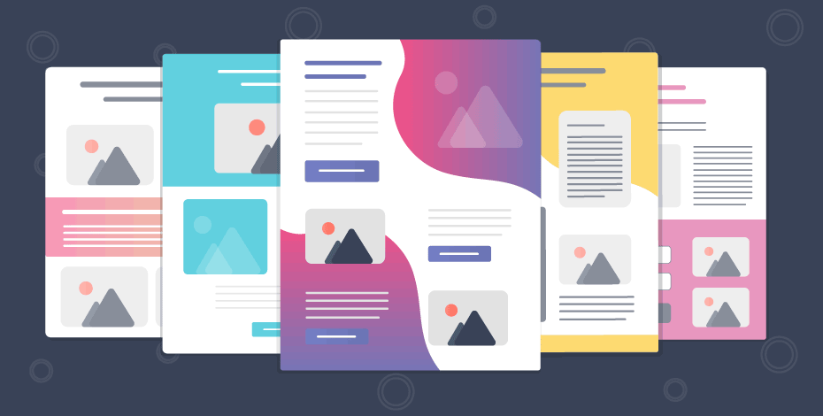
Email Design Types
It’s wise to use different email design types depending on your objectives. While an HTML email with high-quality product images is ideal for personalized recommendations, a plain-text campaign could work better in the case of a password expiration email.
With this in mind, let’s have a look at the most common email design types to build:
Plain-Text
This is the simplest email type that is text-only without visual enhancements or formatting. Plain-text emails are easy to create and user-friendly due to their minimalistic nature.
Even though they usually feel more personal, they lack brand identity and compelling graphics. To put it simply, they may not have that wow factor that will make your campaigns stand out.
The following campaign is a plain-text email from Sweetgreen:

HTML
This email type consists of engaging content such as graphics, buttons, and colors, standing more on the side of fun email design. Marketers create them using HTML or CSS language. But it doesn’t always take coding skills.
For example, platforms like Moosend or Mailchimp provide ready-made email templates with responsive designs that serve as a starting point to craft HTML emails. With the help of drag-and-drop editors, you can customize their look to match your brand image.
Here’s an amazing HTML email example by Chipotle:

Interactive
Finally, interactive emails go one step further. As their name implies, they encourage interaction with specific elements to complete an action such as adding items to a cart, rating a service, or completing a quiz.
Interactivity in email design turns simple messages into inbox experiences. However, brands often skip them as designing them usually requires some coding skills. Also, some email clients don’t support them.
Look at this example from Disney+:

Top Email Design Elements For Compelling Campaigns
Looking for those key email assets that will capture your subscribers’ attention? Below, we present you with the elements you should take extra care of to increase click-through rates:
1. Layout
What comes first in email design? An organized and solid layout. Cluttered emails are against most email design best practices. Whereas a well-structured campaign enhances the user experience, helping recipients notice and comprehend different points quickly.
One of the most critical parts of a proper layout is leaving enough white space between elements. By doing so, you reduce eye strain and improve readability. This email tactic gives your email a clean look, separating email sections visually and helping recipients scan through your content.
Most emails must start with a header that includes the company name and logo. Email design best practices suggest placing a link to display the browser version, create a headline to tease the email content, and add a navigation menu to direct users to key web pages.
Next is the email body, which is where brands display their main content. You should use it to convey your value proposition and achieve your campaign goal, whether it’s through text, visuals, or a combination of the two.
Last comes your email footer, a.k.a. the last impression of your email. Including information like your contact details, privacy policy information, and unsubscribe options, it’s a key element to building customer trust.
Let’s look how a clean-cut and focused email design looks like in the following example by Dollar Shave Club:

2. Copy
A a marketer, you should never underestimate the power of words. People still want to read the messages their favorite brands send. So, ensure you craft email copy that complements your email style.
The general rule of thumb is to keep your text short and straightforward. Besides that, follow these tips to create engaging email copy that subscribers will read through:
- Be concise and mention the objective of your email upfront instead of adding fluff that will tire users.
- Break large walls of text into smaller and more digestible chunks that people can easily scan.
- Add white space, bullet points, and short paragraphs to give breathing room to your content.
- Emphasize important information with bold or italics; don’t overdo it, though, as readers might have trouble concentrating.
- Use headings wisely to create an optimal reading experience.
In addition, if you use links inside your copy, ensure that the color of the hyperlinked text aligns with the rest of the design and that it’s easily recognizable by readers.
This email promotion by Loftie uses short and crisp copy, visuals, headings, and bullet points to create a smooth email experience:

3. CTA
One of the most important elements of your email design is the call-to-action button . It’s the magic pathway to the desired action you want visitors to take. That’s why it remains a significant email design best practice to drive conversions.
Even though you can place more than one CTAs in a single campaign, it’s best to keep the primary one closer to the top, designed in a way that stands out. Pick a unique color from your palette that contrasts with the background.
To increase click-through rates, combine it with actionable copy. If you wish, include your main CTA more than once to increase the chances of subscribers acting on it.
As for secondary CTA buttons, you can demonstrate them in lighter options of your color scheme or make them smaller. Overall, it’s best to stick to a particular action; otherwise, you may confuse or overwhelm your readers.
Here’s how Everlane approached this case:

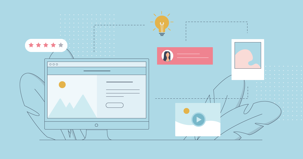
4. Visuals
Let’s move to the asset that spices up your email marketing campaigns-the visuals. Images, illustrations, even emojis: these elements do the trick, supporting the message delivered by your text with a creative twist. Apart from images, you can embed animated GIFs or videos.
Generally, opt for PNG or JPEG formats for images and GIFs or APNGs for animations. Moreover, it’s best to decompress the size files using tools like TinyPNG to reduce loading time and ensure optimal user experience for all ESPs.
Don’t throw in visual elements just for the sake of it, though. Make sure they’re high-quality and relevant so they really bring something to the table.
Also, remember that you need balanced and simple design, too. So, aim for a text-to-image ratio of 60:40, ensuring that images take up a maximum of 40% of your email content. With this email design tip, you create a harmonious result and a seamless user experience.
Finally, ensure that your images perfectly suit your brand’s colors so readers can instantly link your campaigns to your company. A clever idea is to create your own custom images to showcase your unique personality.
See how HOKA uses visuals in their email design:

Using Moosend, you can include images, videos, and GIFs to any email template, whether your own or our platform’s ready-made. If you go for the second option, the drag-and-drop builder allows you to add, remove, and tailor visuals based on your needs.
5. Typography
To many people, email design is mostly about the layout, the colors, and the graphics. But the thing is that your fonts are part of your visual identity, too. And did we mention the user experience? Yes, typography affects both the legibility and visual appeal of your emails.
There are many web-safe and email-friendly fonts to include in your design:

You’ve probably heard that colors convey emotions. Likewise, different fonts have unique connotations.
The psychology of fonts suggests that Serif fonts are associated with stability and tradition, making your emails look more formal. Whereas you should pick Sans Serif fonts for a casual look since they are considered more modern and friendly.
You must also know that Serif fonts are generally more legible. So, they’re the best option for long blocks of texts. Sans Serif fonts, on the other hand, are easier to read in large sizes or short texts. This attribute makes them ideal for headings where you want to grab attention immediately.
Try not to include too many fonts in your emails as it will frustrate readers and mess with your branding efforts. You need your email fonts to remind users of the marketing material they’ve seen on other channels like your site.
6. Colors
The color scheme used in email campaigns contributes to how subscribers perceive your campaigns. There’s so much you can do when selecting the right colors for your campaigns: represent your image, prioritize important content, and enhance the readability of your content.
So, you’ll want to consider colors that match your branding. That left aside, you’ll want to be mindful of the emotions each color evokes. Let’s see a few examples of the emotional responses to colors:
- Blue brings out calmness and stability.
- Yellow is associated with joy and spontaneity.
- Green has a refreshing effect, reminding people of nature.
- Red is the color of action and energy while also indicating danger.
- Purple elicits mystery and wealth.
- Orange makes us feel energetic and enthusiastic.
- Pink has a sensitive and romantic vibe.
How you combine colors also plays a vital role in conveying your message and creating a pleasant user experience. For example, the quite common combination of white, black and gray gives your emails a professional and classic look. Plus, how you use colors together and the contrast created is a key factor for email accessibility.
Email Design Best Practices
Now that you know what good email design consists of, it’s time to who want to create unique campaigns that steal the show:
1. Showcase Your Brand
Just as we like putting a face to a name, we like to match a brand with a unique image. Creating on-brand emails allows recipients to identify your emails in their crowded inboxes. That’s why you should think of every email you send as a brand asset, and customize it to the max.
Starting from your logo, put it at the email header so it’s the first thing the recipient sees once they open your email. There, consider adding a menu, too, linking to key pages on your site to serve additional objectives.
Then come other branding components like fonts, colors, imagery, and social media buttons at the email footer. Each and every one of them turns your email design into a trustworthy tool that increases brand awareness.
But branding work doesn’t end with the elements that comprise the visual identity. The tone of voice you use in emails must match your style and communicate your mission and values.
Maintaining a unique tone across marketing resources, such as landing pages and social media posts contributes to a consistent user experience. In addition, if your CTA buttons lead to landing pages, keeping the branding consistent is vital, as readers may get confused and bounce back before completing the desired action.
So when you craft your next campaign, think about Starbucks. The brand logo, colors, fonts, and tone of voice are instantly recognizable:

2. Invest In Visual Hierarchy
When structuring your email layout, you have to think how to make crucial information pop. Visual hierarchy in email design helps marketers direct the reader’s eye where they want, for example their call-to-action.
Here are a few steps to consider so your subscribers check core messages first:
- Lead with what matters the most. Prioritize essential elements by placing them at the top of the email to capture attention right off the bat.
- Add bold headlines, using different font sizes to make critical content prominent.
- Create a natural flow with strategically placed graphics and CTAs to urge recipients to skim through your entire email content.
- Invest in color contrast, white space, and bold text to design skimmable campaigns.
Another valuable way to achieve a structured hierarchy is through your layout choice. There are a few email layouts to choose from based on the email content you’d like to share. Here are some examples from Moosend’s email templates for each scenario:
Inverted pyramid: It enables you to eliminate distractions, get readers to click-through, and guide their eye down to the call to action faster.

Zig-zag: This layout helps you show readers a lot of information in simple and skimmable sections by adding images and colors without wasting space.

F-shaped: The F-shaped pattern helps brands draw attention to specific content blocks. For instance, such a layout is ideal for well-designed cart abandonment emails to display the items left behind.

Overall, you can save time by picking a customizable template that lets you stay on-brand while adopting email design best practices effortlessly.
To explore our library of built-in email templates, sign up for a free Moosend account to find the perfect design for your campaign goal.
3. Ensure Mobile Responsiveness
According to Statcounter, here’s a comparison of desktop vs mobile global market share during 2024:

It’s a fact that people use mobile devices to search for brands, products, and services online. However, not every campaign is optimized for mobile devices, which usually leads to a poor user experience.
Therefore, it’s imperative to create responsive emails that subscribers can effortlessly navigate on all devices. Let’s explore some quick tips to apply:
- Shorten your subject line: To optimize your email subject lines for Android and iPhone users, stick to 30-40 characters.
- Write clear preview text: Keep your preheader texts short and place all essential details are at the beginning.
- Have a plain text version: Create a plain text format for devices and email clients that don’t read images to avoid compromising the email quality.
- Create concise copy: People find it hard to read long text forms on smaller screen sizes as they’re usually in a hurry.
- Mind your clickable elements: Make links and buttons at least 44×44 pixels so mobile users can easily tap on them with a thumb.
- Choose large font sizes: Think of at least 16 px for the email body and 22 px for headlines to facilitate reading on small screens.
- Go single-column: A single-column design is easier to click through on mobile devices.
- Test for different devices: Always test and preview how your emails render on different devices and email clients.
- Invest in premade email templates: Find an email marketing tool that offers templates with responsive designs that adapt accordingly.
For example, when browsing Moosend’s email templates, you can check the mobile version to see how it looks. You may also use the preview option when creating your campaign to ensure maximum results.

4. Personalize Your Campaigns
Personalized marketing is at the core of customer communications, as consumers prefer brands that consider their specific preferences and needs. That’s where email segmentation and automation step in, helping marketers send more targeted messages to subscribers.
You can start by using the subscriber’s name in the subject line or email copy to establish a connection. To take it one step further, you could use their browsing and buying history to send a product recommendation email or upsell items.
Mentioning their behavior in your emails increases the relevance of your content while showing subscribers you understand their journey. A personalized and timely email message lets subscribers know why you send the email and what you expect. Which, in turn, increases the likelihood of them taking action.
By using dynamic content, you get to personalize the design elements of your campaign to make it more attractive to different users.
For example, you send different emails based on demographics, such as the subscriber’s gender or age group. An alternative is to tweak the product or service recommendations based on your reader’s location or the weather conditions in it.
Check the example below to see how Northern Trail suggests different products based on gender:

With the rise of AI, email personalization is made simpler and more accurate. Take Moosend’s Audience Discovery tool as an example, helping you understand and predict customer interest in specific products.
Using this feature, dynamic segments are created based on each user’s interests and buying intent so you can send laser-focused promotions.
5. Make Emails Accessible
Although email design best practices prioritize accessibility as a major component of any effective marketing strategy, 99.7% of emails were reported to contain accessibility issues.
Giving every reader the chance to access your email content comes with a double benefit: you get to reach a larger part of your audience and all users enjoy a great email experience.
And don’t think creating accessible emails is just about catering to people with disabilities; it actually covers several audience groups like individuals with a bad internet connection or on commute.
Here’s how you should optimize your email design for accessibility:
- Choose simple fonts: Avoid the excessive use of italics, underlining, and capitalization, which could hinder readability.
- Opt for contrasting colors: Aim for sufficient color contrast (a ratio higher than 4.51:1 will do) to help visually impaired subscribers.
- Add alt text to images: Provide comprehensive descriptions of images and GIFs for disabled users with access to text-to-speech software or screen readers.
- Use headings and subheadings: This tactic helps you organize your email content, making it more digestible and legible.
- Left align your email copy: Left-aligned text is considered the most accessible option as it capitalizes on the natural flow of reading.
- Keep your hyperlinks descriptive: All users should clearly understand where your email links take them, even out of context.
- Invest in inclusive language: Write your copy in simple gender-neutral language and avoid jargon or sophisticated words.

6. Use Interactivity
Interactive experiences have conquered the digital world. After all, who doesn’t love a fun game? In email design, interactivity comes with a number of benefits: grabbing readers’ attention, increasing click-through rate and conversions, improving engagement, to name a few.
Consider adding interactive elements like short polls and exciting quizzes to encourage readers to click through your email content. For instance, urge subscribers to complete an embedded quiz where they will share their preferences.
With this email design practice, they will stay longer within your content and take the action you need them without leaving the email. Which translates into a better use experience. On the other hand, you get to collect valuable customer feedback and refine audience segmentation and personalization down the line.
Interactive email elements don’t end with quizzes and polls. There are several types to choose from:
- Spin the wheel features to unlock discounts and gifts.
- Image carousels to display product recommendations.
- Videos to showcase products and services, share testimonials, or onboard users.
- Hover effects to make critical email components like CTAs stand out.
As with everything, there’s a catch with this email design best practice. The purpose of interactivity should be to reinforce your message instead of overshadowing it.
So, use it wisely and in a complementary way. Keep things simple to provide a frictionless experience, and don’t forget to check that your interactive emails work properly across devices and email providers.
Here’s how Skillshare gives subscribers the opportunity to choose between the classes offered based on their mood:

7. Try A/B Testing
Both your subscribers and you deserve emails that work as you were hoping to. Investing some time and effort in A/B testing before sending your emails will help you ensure everything is in place.
A/B testing allows brands to test different email design elements to see which resonates best with their target audience. In other words, it’s an email design practice that takes some of the guesswork out, helping you optimize resource allocation.
With this method, you compare two different email versions, preferably focusing on one element at a time. For example, you can test CTA buttons, images, or subject lines.
Once you identify the combination that yields the best results, you can send the winning variant to most of your email subscribers. Plus, the findings will allow you to optimize future emails based on each group’s interactions.
Popular Email Design Tools
Are you looking for intuitive tools to elevate your email marketing design? Check out these platforms:
1. Moosend

Moosend is an all-in-one email marketing platform with excellent design capabilities. You can pick one of its 100+ HTML templates for every occasion and customize them the drag-and-drop way.
Moosend’s templates are mobile-friendly, with slick layouts to enhance readability and conversions. You can upload your own files and brand assets, and customize them to the fullest. Finally, you can save your templates for future use if needed.

Overall, this is an excellent and scalable option to streamline all your email marketing efforts at a low price, starting at $9/monthly. All things email marketing are included – from segmentation and automation to signup forms and landing pages.
2. Stripo

Stripo is an HTML email builder you can easily integrate with your ESP to deliver beautiful campaigns to your audience. It offers a drag-and-drop editor and over 1150 templates suitable for different industries.
You can start with a free account with limited capabilities and switch to the Basic plan for $20/month for two users, 50 exports, and 50 daily tests.
3. Mailchimp

Mailchimp doesn’t need an introduction to the email marketing world. Ιt’s an inclusive email automation platform that enables readers to design beautiful campaigns in simple steps.
This email service also has a drag-and-drop builder and provides users with 100+ premade templates that are easily customizable. In the free version, though, the user only has access to the tool’s basic templates. Even though Mailchimp is an effective solution, it’s expensive compared to similar options.
4. Unlayer

As a final option, we present Unlayer, another email editing tool with several HTML email templates for different industries. You can design the templates and add them to your application. Apart from ready-made templates and a drag-and-drop builder, it has dynamic content features and custom file storage.
Their free plan has minimal capabilities. Paid plans are rather costly, starting at $250/month.
Email Design Checklist
Now that you have all the tools to create professional and beautiful emails, we’ll share a bonus checklist so you can quickly tell you’ve taken all the right steps before hitting “send:”
- Use an organized and structured layout with clear and scannable sections.
- Leave ample white space to separate different elements and enhance legibility.
- Keep your text skimmable and concise, using bullet points and short paragraphs.
- Place your primary CTA near the top of the email and use color contrast to make it stand out.
- Add relevant and high-quality visuals and optimize them for fast loading times.
- Stick to email friendly-fonts and limit the use of multiple fonts for consistency.
- Invest in color contrast to enhance readability and draw attention to key email elements.
- Prioritize mobile-friendly and accessible email design to cater to every user’s needs.
- Use dynamic content to tailor emails based on each subscriber’s demographics and preferences.
5 Popular Email Design Examples From Top Brands
Let’s explore five amazing campaigns with responsive design that check all the boxes:
1. Canva Welcome Email Design Example
Subject Line: Welcome to Canva

The design platform Canva knows how to attract their reader’s attention at first glance. They start with a short message followed by a clear and prominent CTA that directs users to the platform to get to work.
In this email newsletter, they include two attractive images; the one on top emphasizes the creative process, and the second is a snapshot of the platform. There’s also a checklist of the tool’s biggest assets and a second call-to-action with the same goal.
Finally, readers can find the company’s main details on the email footer, the unsubscribe link, and social media icons for deeper nurturing.
2. Moschino’s Cart Abandonment Email Design Example
Subject Line: You left something behind

Cart abandonment newsletters receive high open and click-through rates, that’s why email marketers should pay extra attention when creating them. This great example by MOSCHINO shows it all.
The newsletter starts with a captivating fashion image followed by a CTA leading consumers to checkout. It continues with the products they left behind and a few benefits to motivate customers to act.
They include two CTA buttons in different colors and placements to increase click-through rates. We should also note that the second one uses the first person in the copy to make readers relate.
3. Atoms’ Special Sale Email Design Example
Subject line: Ending tonight: 15% off for Back 2 School

You don’t always have to go the extra mile to deliver a spotless and converting campaign. Atoms designs a short, straightforward email newsletter to get the readers to the point – the discount code.
For that purpose, they decide to portray a shiny pair of shoes at the center surrounded by cute design elements emphasizing the back-to-school email theme. Instead of a CTA button, they add the special code at a profound place so that no one misses it and provide information on how to claim it.
4. MeUndies Confirmation Email Design Example
Subject line: Your Order Has Shipped 📪

Who said that order confirmation emails should be plain and dull? Even though the copy is the key to transactional emails, you can also cleverly demonstrate your brand as MeUndies did.
They add the brand’s main colors and a section dedicated to their referral program with a simple product image below the shipping information. Finally, they use creative design elements and copy lines on the email footer to nurture customers even more.
5. Lyft Feedback Collection Email Example
Subject Line: Enter to win a gift card for feedback

For last, we saved another simple campaign by Lyft that does the trick. The yellow background helps the rest of the design elements pop out, including the action-oriented CTA button.
In the headline, they make sure to highlight the free entry in a draw for a compelling prize once they fill out the survey. A surefire way to drive conversions.
So if you want to create a similar campaign, choose a more straightforward format to help the important parts stand out and avoid noisy layouts.
The Takeaways
Long story short, adopting email design best practices is key to transforming each campaign into a conversion tool. All you need to do is pick the right tools, go through our email design checklist, and unveil your creativity to build campaigns that hit every recipient’s soft spot for valuable communications.
If you’re looking for an all-in-one email marketing platform with exceptional design features and ready-made templates for all tastes, sign up for a Moosend account today to get started.
Email Design FAQs
Let’s see a quick round of frequently asked questions about email design:
1. How do you design an email?
You need to create a clear and structured layout with a distinct header, main body, and email footer and place your design elements and copy strategically to stand out.
2. What makes a great email design?
A successful email campaign consists of branded visual elements and a straightforward layout with visual hierarchy to focus on your main message and reduce unnecessary noise.
3. How do I customize my email design?
Add your logo, brand colors, visuals, and fonts and use the email footer to display information about your company, such as your website, contact information, etc.
4. How many CTAs should you use in your campaigns?
While you can use multiple CTAs for distinct objectives, the ideal is to have a single email CTA to avoid distracting readers with too many actions.
Similar Posts
 Published by
 Published by

Create, send and optimize your email marketing campaigns