10 Common Subscription Form Mistakes & How to Avoid Them
A subscription form is your brand’s front door. If it feels uninviting or awkward, people won’t step inside. Since it’s often the very first interaction a prospect has with you, getting it right is key to growing your list and making a good first impression.
But why do marketers often fall for subscription form mistakes? The challenge is that they’re deceptively simple. It’s easy to think that you can’t mess up a headline here, a field there, and then the CTA button. But, as it turns out, even the smallest missteps can significantly impact your conversion rates.
In this guide, we’ll help you see your forms through the eyes of your visitors. By the end, you’ll know what the most common errors are, why they quietly hurt your signups, and how to fix them.
Say goodbye to form fails
Create pop-ups that convert with Moosend’s subscription form builder.
Start FreeMost Common Subscription Forms Mistakes & How to Fix Them
The length of a subscription form, poor page placement, or lack of mobile optimization aren’t always obvious at first glance. However, the devil is in the details. If you’re not cautious, you’ll find yourself wondering why there are fewer signups than expected.
Let’s look at the most common culprits that hold your forms back.
1. Asking for too much information
Requesting too many details right off the bat might be tempting. After all, having a location, job title, and industry, in addition to the name and email of a lead, can help you segment and personalize better, right?
But here’s the catch: extra fields feel like extra effort. And at worst, they can feel a little intrusive, or raise negative questions like “Why do they need my location?” or “What does my job title have to do with the newsletters I want to receive?”
When completing a form, prospects think of the benefit first. If the effort seems bigger than the benefit, most people won’t complete their efforts.
Too many form fields add unnecessary friction or even raise privacy concerns. The fix? Start with the bare minimum.
An email address is often the only thing you need, like Moosend’s subscription form template suggests:
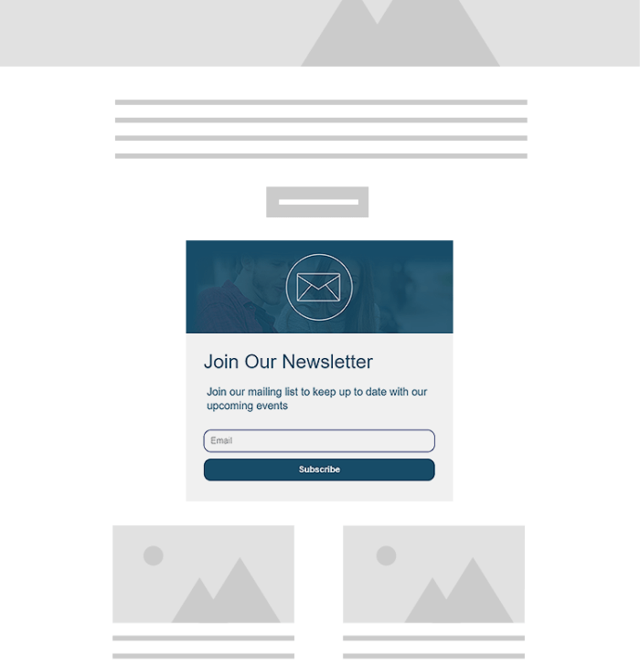
Perhaps you’ll need a first and last name as well, if you want an extra personalization layer. However, you don’t need to ask for this information right away. It can come later, once trust is built.
So, instead of demanding full profiles upfront, launch a single-field subscription form and, after the user has clicked, opened, and engaged, gather any additional information gradually.
This approach will not only minimize friction but also give prospects the feeling they’re in control of the data they share, which enhances the feeling of trust.
2. Using weak or boring copy
One of the simplest phrases you can use when creating a subscription form is “Sign up for our newsletter.” And while simple doesn’t necessarily mean weak or boring, it can harm your conversions because it carries no real promise.
Inboxes are crammed with promotions, updates, and “exclusive” newsletters, making most people skim past this wording without a second thought.
No real benefit means no real desire to subscribe. Prospects will opt in to solutions, time-savers, insider knowledge, exclusive deals, anything that gives them tangible benefits. If the form copy doesn’t show that benefit, they’ll assume it’s not worth the effort.
To fix this mistake, make the copy benefit-driven. All you need is a one-liner that highlights the positive outcome:
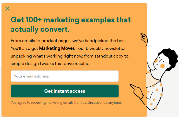
This signup form from Sleeknote promises its examples “actually convert,” making it easy for prospects to understand why they should sign up. In this case, the task shifts from filling a form to driving more conversions.
Of course, swapping “simple” copy for one that showcases real benefits is easier said than done. This is why it would help to choose an online form builder tool with a built-in AI writer, like Moosend’s.
AI writing tools can help you brainstorm dozens of variations faster. They can also perform accurate copy checks and give you a range of headline options, from playful to urgent to numbers-driven, with just a prompt and a click.
All in all, words make the promise, and the form is just the medium that delivers it. Bland copy won’t lead to conversions, whereas reward-oriented copy will make it a lead generation engine.
3. Giving unclear or generic CTAs
Your CTA button is the final step between hesitation and conversion. And while generic CTAs like “Submit” might be effective in some cases, such a simple phrasing could also feel transactional.
Simple words tell users what to do, but not what they’ll get. There’s no sense of reward. When the CTA button copy doesn’t promise a benefit, the click becomes a low-value effort, which rarely turns into action.
Generic buttons also “blend” into the page. Visitors’ attention will skip over it, because it doesn’t register as a reward or a logical next step that’s worth the effort.
How can you remedy this subscription form mistake? With CTAs that use actionable verbs with a strong message, such as “Send me updates” or “Count me in.”
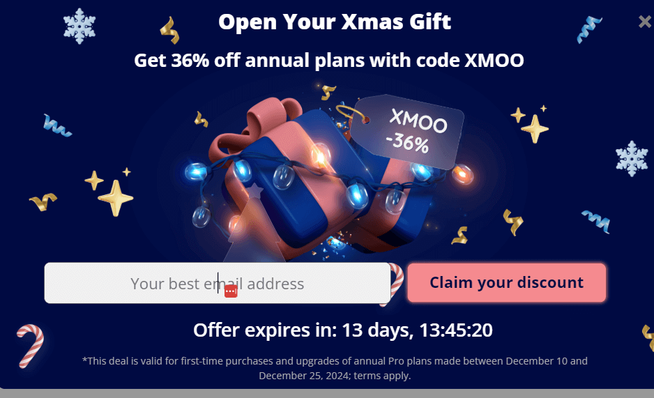
This is a signup form example from Moosend’s 2024 Christmas campaign. The CTA complements the headline’s message, and the subtle shift in language (“Claim” instead of “Submit”) is a benefit-led initiative that changes the perceived value of the CTA by answering the most common question: “What’s in it for me?”
This CTA highlights what the user receives, not what they’re giving up. People click when something feels personally relevant (“your”), immediate (“claim”), or useful (“discount”).
4. Overloading with design clutter
Subscription forms are a part of your overall brand presence. After all, they’re parts of your page’s layout, be it a landing page, a homepage, or a blog post. And that’s what many brands fail to consider.
Filling this small space with images, long paragraphs, and multiple CTAs causes your subscription form’s elements to compete for attention. This results in cognitive overload. Visitors usually skim a page or an offer. When there are too many elements, the brain struggles to decide what matters most, making visitors take the path of least resistance. Instead of choosing what to engage with, they leave.
If you want your form design to perform as intended, strip away the unnecessary elements. A strong subscription form only needs four elements:
- A clear headline that shows the value of your proposition.
- Short supporting copy that explains why users need to go through the proposed action.
- A CTA button with actionable verbs and popping colors so users know where to redirect their attention.
- Whitespace that provides some room for the eye to “breathe” and process information so that prospects can focus on what you need them to.
Let’s see an example of a form that implements all the above:
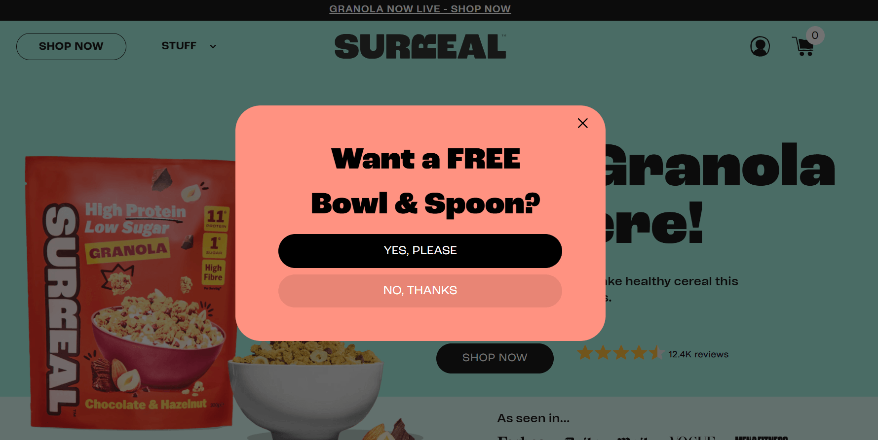
This pop-up from Surreal Cereal is minimal in design and clear in messaging. It pairs a direct headline with two CTAs: one for prospects who want to subscribe and another for those who wish to opt out. Now, let’s see what happens when you press the “Yes, please” button:
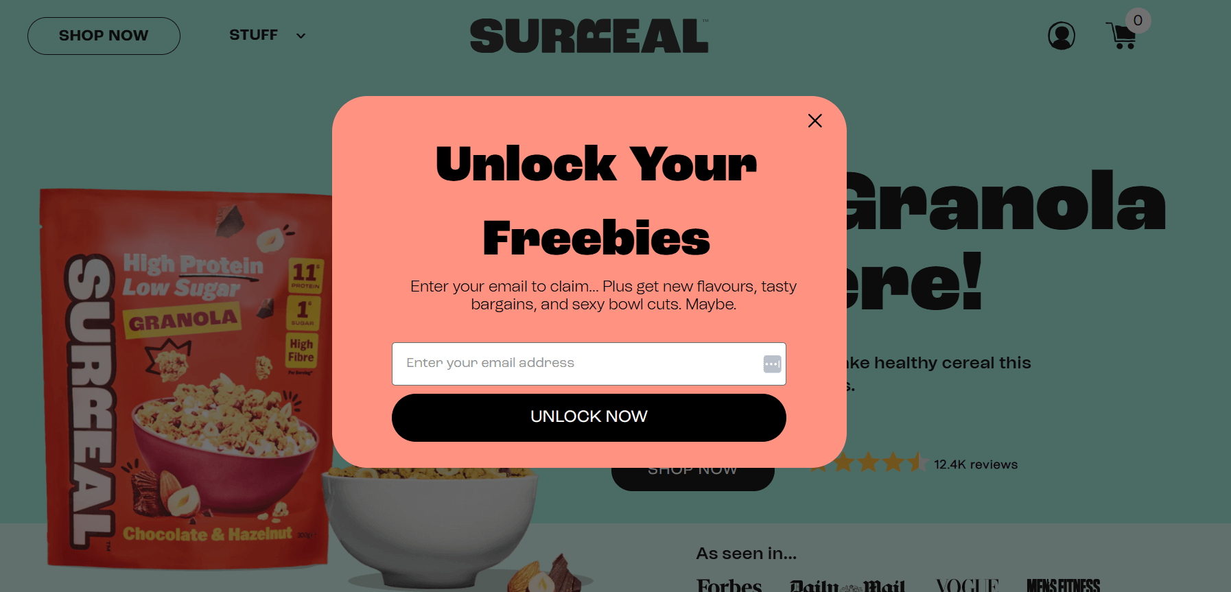
This subscription form is a great example that follows form design best practices. There are no competing visuals, no extras, just the offer, a supporting subheading, and a strong CTA button with contrasting colors that pop. This simplicity makes the form feel effortless, guiding prospects from point A (the offer) to point B (the CTA button).
Clarity converts. If prospects have to fight through a cluttered design to understand your offer, they won’t bother. Let your form stand on its own, and it will do the job for you.
5. Hiding the form on your page
Even the best-designed subscription form won’t convert if you place it where nobody sees it. A common mistake is burying it at the bottom of a page or tucking it away above or right below a menu tab.
The problem here is visibility. While scrolling habits have changed, and visitors will scroll below the fold if you pique their curiosity, their attention is bound to drop after some time.
If your subscription form is hidden below that, you might see your conversions fall. The form might be there, but it’s functionally invisible.
To remedy that, you can bring your forms into view earlier. Use different types of subscription forms or multiple touchpoints that feel natural, or both.
You can grab attention with a promotional pop-up like this one:
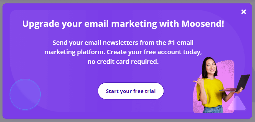
But also have a floating bar above the fold, or another touchpoint like an inline form or a floating box that’s naturally incorporated into your page’s design:

This layered approach makes the form easier to find without overwhelming the user. Additionally, you won’t create extra friction by having users scroll through your page looking for your subscription form.
A small, non-intrusive opt-in touchpoint provides immediate visibility, while a well-timed pop-up appeals to the visitor’s impulsive nature. This variety ensures that wherever the user is on their journey, they’re given a straightforward and convenient way to subscribe. That way, your form won’t be out of sight, out of mind.
6. Offering weak incentives
When asking someone to hand over their email address, it’s like asking for access to their inbox, a very personal channel that they have complete control over. It’s no wonder that people protect it, like they do with all personal information.
When a form simply says “Enter your email to subscribe” without offering anything in return, there is no reason for the prospect to follow through with the action proposed on your CTA.
The mistake is assuming your brand’s image and content alone are enough to earn the sign-up. As we mentioned before, users want a clear trade-off to give up sensitive information. And if the value isn’t tangible, such as saving time or money, or gaining access to exclusive information, they won’t bother.
You can overcome this subscription form mistake by offering a strong, relevant incentive. It doesn’t have to be flashy or expensive. It just has to matter to your audience:
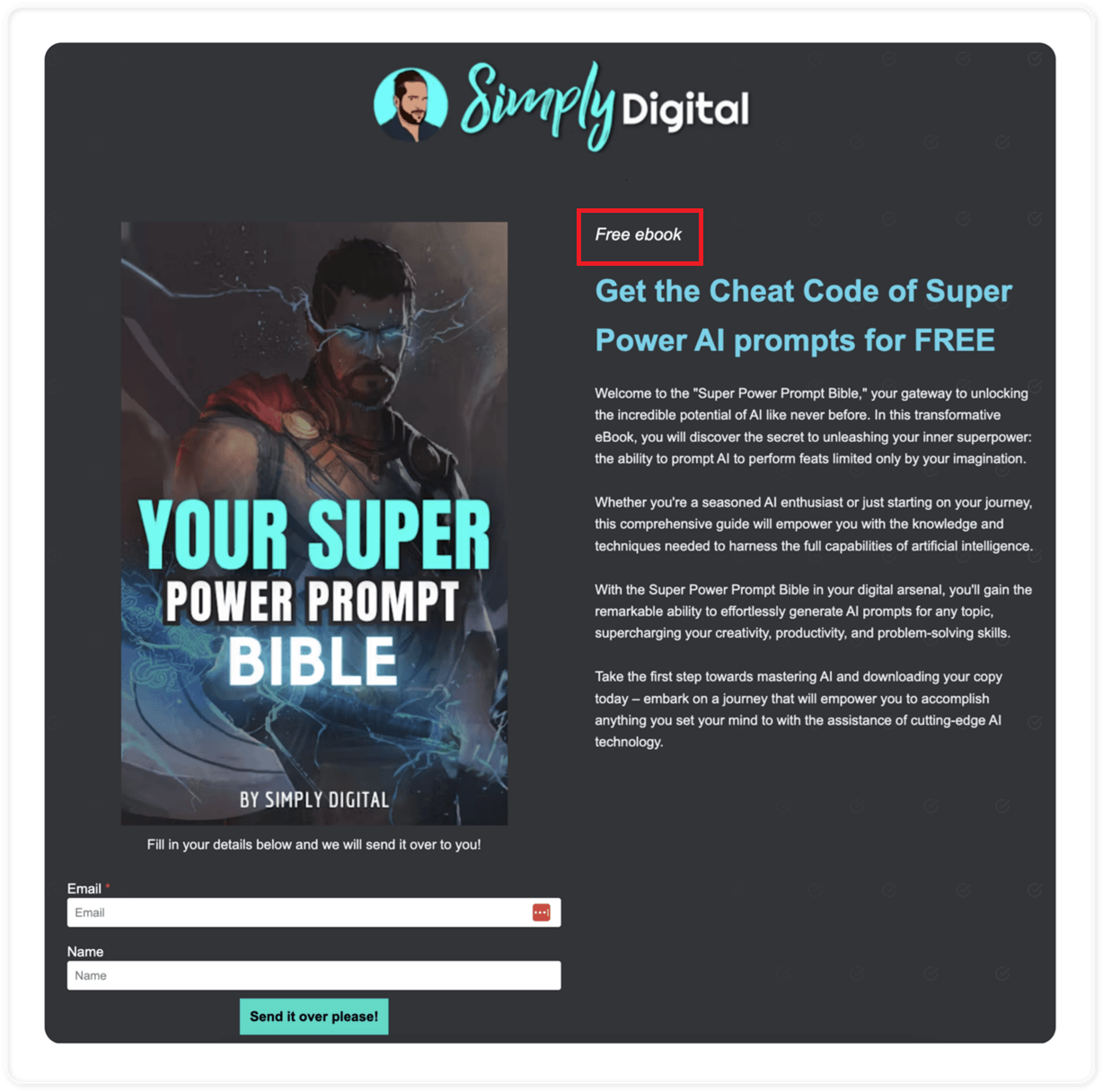
This is a subscription form created by SimplyDigital’s Konstantinos Synodinos with Moosend. And as he reveals in a recent case study, this form, with the free AI prompt e-book, generated 15,000 emails in a 4-month period.
This incentive isn’t something that can blow up a marketing budget, but it’s exclusive to SimplyDigital’s audience, and it works because it gives visitors immediate value. According to Synodinos, their strategy was to provide free resources that people would find interesting.
So, the key is to speak directly to your audience and include an offer they can’t refuse in your subscription form’s copy. It needs to be something practical, highly relevant to your audience, and instantly usable.
That simple exchange is enough to turn passive visitors into subscribers. Give people a reason to trade their email, and signups stop feeling like a favor and start feeling like a win-win situation.
7. Ignoring mobile optimization
Subscription forms are a marketing element that most people might think of as a “desktop” element rather than something that needs to be optimized for mobile as well.
Sometimes the solution is to shrink the form down to fit a mobile display, rather than designing it with mobile in mind. The result is buttons that are too small to tap, fields that could overlap or not show correctly, text that’s unreadable, or forms that won’t load at all.
According to Statista, a staggering 61.85% of all traffic comes from mobile devices. This means that more than half of your traffic will see a broken signup form if you don’t take action. A visitor who’s trying to zoom onto the screen or fill out their information on a broken form won’t think twice about abandoning it.
You can fix this mistake by investing in a platform that can help you customize responsive subscription form templates to your liking:
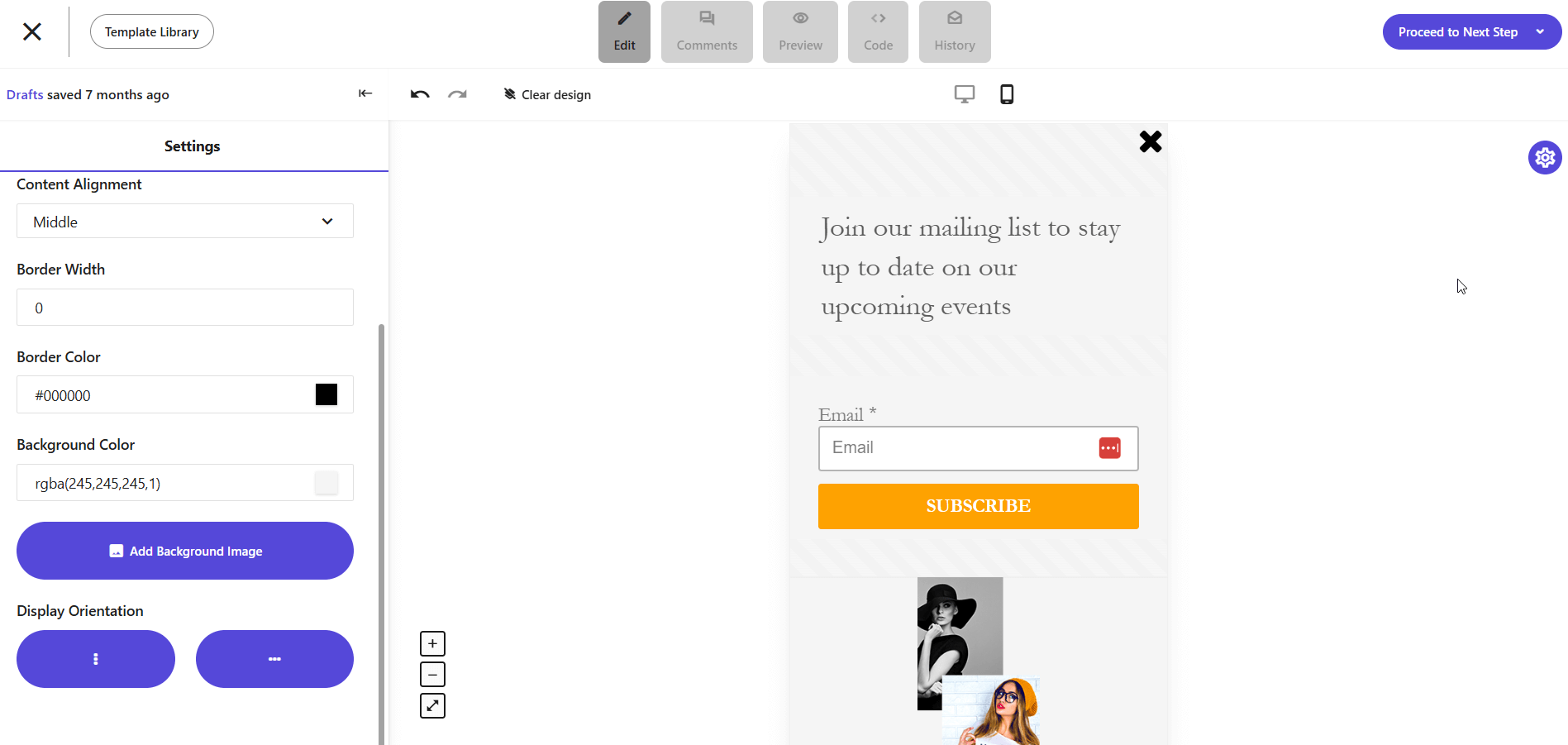
Moosend’s platform allows you to create a subscription form with a mobile-first approach or adapt your design if needed. The field is short and doesn’t require a lot of typing, while the CTA is large enough to tap with as little margin for error as possible.
And if you’re unsure about the way your form will look on a mobile device, you can preview your design right through the subscription form editor:
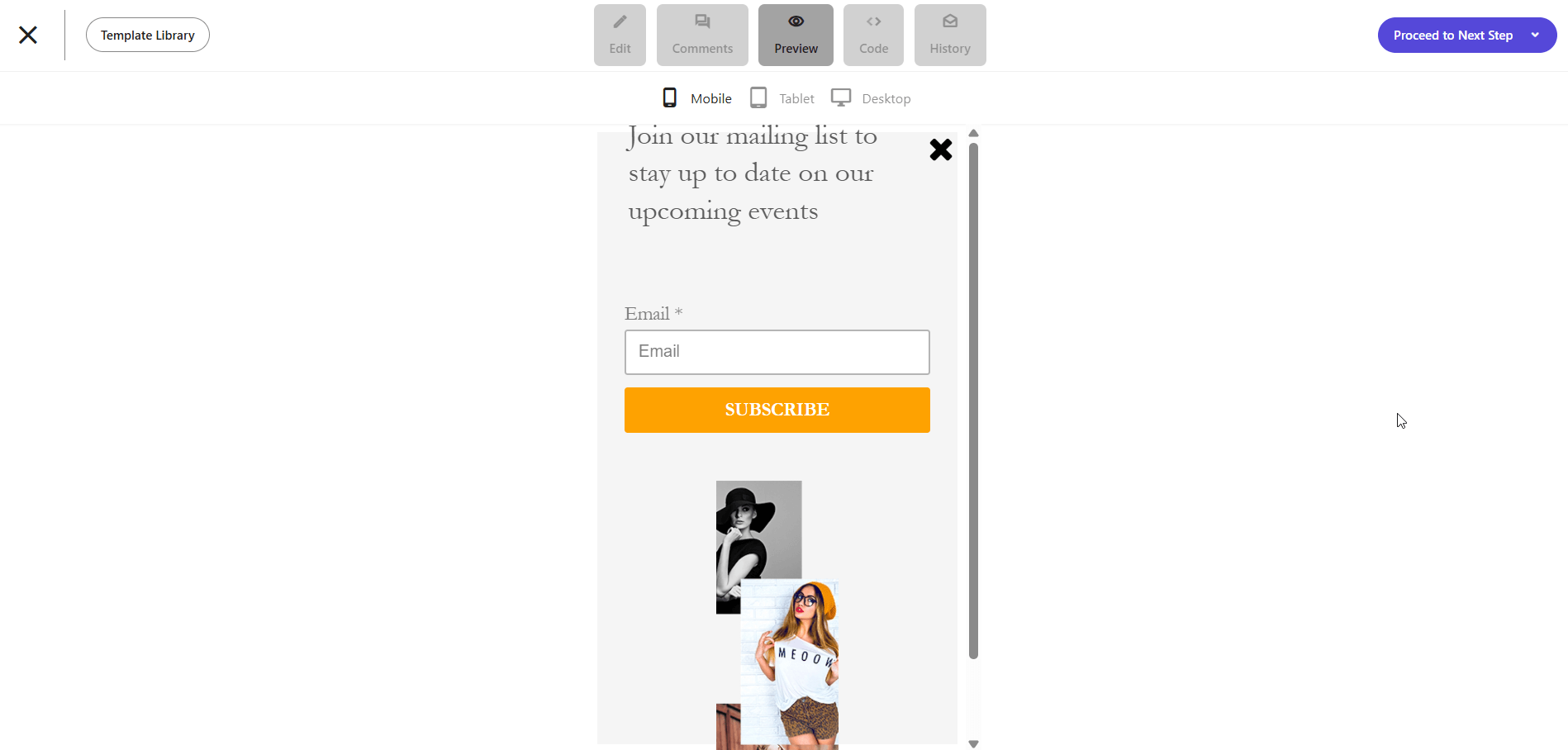
To make your form mobile-friendly, use generous whitespace and big tap targets to ensure the form feels natural on a smaller screen. Also, ensure your “close” button is large and visible enough. A visitor may not be ready to convert immediately after visiting your website, but that doesn’t mean they need to opt out altogether.
Designing with mobile optimization in mind makes subscribing feel as effortless on a mobile device as it does on a desktop or laptop. And since there’s no squinting or zooming in, interested visitors can take a quick path to conversion.
8. Not including social proof or trust signals
When you’re asking for information as sensitive as a visitor’s email, you’re asking them to trust you: “Give us your email and we’ll make it worth your while.” But when a form is bare or sits on a page with no credibility markers, many visitors hesitate.
The issue is simple. Users have no reason to believe their data will be safe with you. No trust signals mean uncertainty, and uncertainty often outweighs whatever reward you’re offering for joining your email list.
Luckily, there is an easy fix to this common subscription form mistake: Use social proof or other trust signals.

This is a floating box from Teachable that uses social proof in the form of user count. Your social proof could also be testimonials from happy subscribers or small logos of well-known companies that follow you or use your product.
Of course, most marketers think of social proof as an email or landing page component, and the first thing that comes to mind when talking about it is customer testimonials. However, a user count or a logo will work just as beautifully in the limited space a subscription form provides.
Each trust signal reduces friction by demonstrating that others have trusted you with their information and had a great experience. So, instead of a lonely subscription form, try something like “Trusted by marketers at XYZ company.” This transforms the decision-making process from a risk into an opportunity to be a part of a helpful community.
9. Overusing intrusive types of subscription forms
Subscription forms come in various types. Some are more discreet, while others are more intrusive. And using intrusive types of subscription forms (like pop-ups or full-page forms) can be a double-edged sword.
They’re powerful and ideal for situations where you need to grab attention. But when they’re overdone, they can backfire dramatically.
Think of this scenario: A visitor lands on your website, and, within seconds, a full-page form blocks the entire screen. Imagine they close that one, but you have an exit intent pop-up appear when they try to exit the page.
Some marketers would argue that this is the “multiple touchpoints” we talked about earlier. The difference is that touchpoints guide the visitor, while an overuse of intrusive forms creates an obstacle course by disrupting the browsing flow.
To avoid this mistake without losing out on conversions, treat the more intrusive types of subscription forms like seasoning: sparingly and strategically only where they feel helpful instead of disruptive:
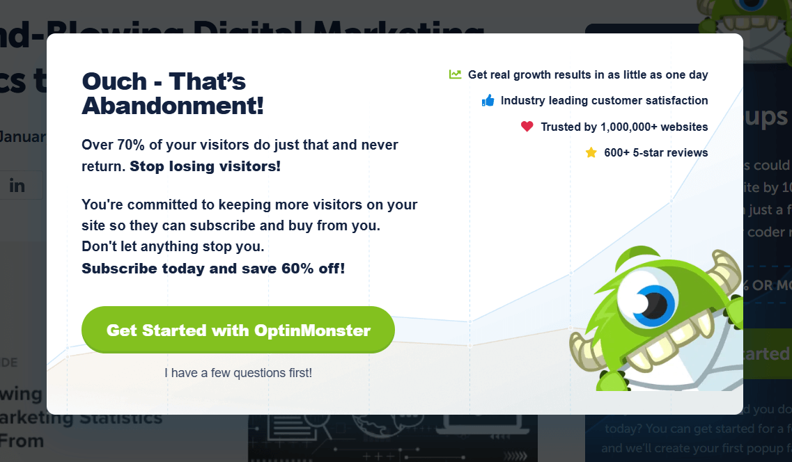
This is an exit-intent pop-up from OptinMonster that appears when visitors are going towards that “Close” button. But it’s not the only touchpoint:
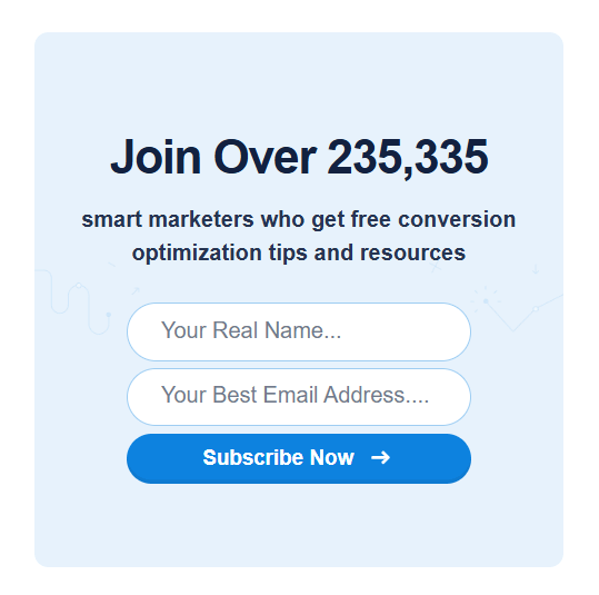
There is also a subscription box to the side of the blog post. And since the visitor doesn’t convert with one, the brand figures they’re going to convert with the other.
Of course, the two touchpoints lead users down different paths. One gets them to a newsletter subscription, while the other gets them to a platform subscription. And at first glance, it might seem they’re not quite connected, but it’s a smart move on the brand’s part.
The pop-up drives users toward a higher-commitment action right when they’re about to leave by using emotional language and addressing a real pain point, perhaps one that the “free conversion optimization resources” cannot fix.
On the other hand, the static box form captures users who are open to lighter engagement by capturing a different visitor mindset: that which is earlier in the journey.
This distinction turns what could feel like clutter into a choice. Whichever path the visitor is ready for, there’s a natural, well-placed option waiting for them.
10. Showing the form at the wrong moment
You used a dedicated form builder, followed design best practices, and provided valuable copy with benefits, yet your form still didn’t convert?
Maybe it was ill-timed. Even the best subscription forms fail if they show up at the wrong moment.
Timing is everything when it comes to optimizing your opt-in process or asking a user to subscribe. Ask before the visitor has seen any real value, and you’ll come across as pushy. Wait too long, and you’ve missed your opportunity.
Subscription forms are lead generation machines because they exchange value between your brand and the visitor. If the visitor hasn’t yet experienced your brand, the request feels premature.
On the other hand, if the form doesn’t appear until they’re ready to leave, it could be too late. The sweet spot lies in matching your “ask” to the visitor’s engagement level.
Delivering your forms contextually would be the best way to fix this problem. For example, showing a pop-up form with an exciting benefit mid-scroll is effective because it appears exactly when the reader is engaged and hungry for more.
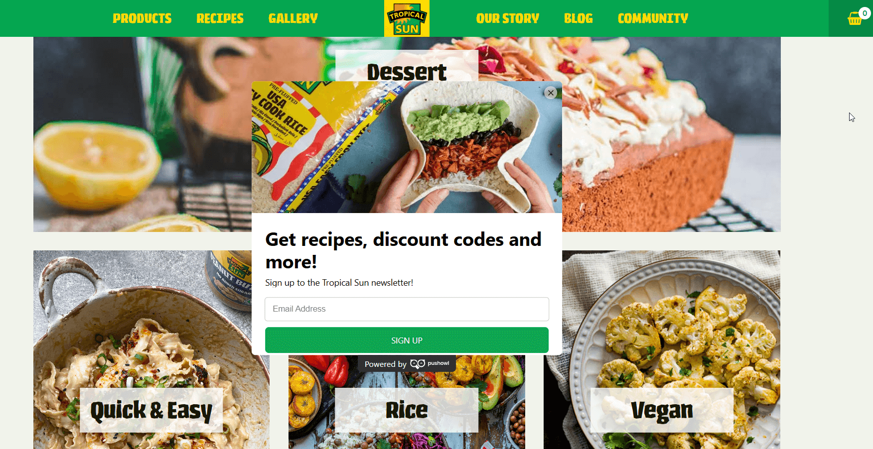
Tropical Sun Foods effectively uses this methodology by incorporating a subscription form on their homepage, which is triggered after a couple of scrolls. And since the form is on their homepage (and the brand is related to food and cooking), providing benefits through recipes and discount codes is contextually appropriate.
This form is well-timed and doesn’t interrupt the visitor’s journey. On the contrary, it extends it to a more private channel. Their inbox.
Turning Subscription Form Mistakes into Momentum
Subscription forms succeed when friction is low, design is clean, and value is upfront. The difference between an uninteresting form and one that attracts attention and conversions comes down to surprisingly small details.
A powerful word on your CTA, removing an unnecessary field, or placing a well-placed form can make a huge difference.
Tweaks matter because forms are a means of asking visitors for a space in their inbox. They’re not just capturing emails. They’re there to make visitors’ “Yes” effortless and rewarding.
Of course, real growth doesn’t come from a single change. Avoiding subscription form mistakes is a process. It takes testing, measuring, and iteration to steadily move from mistakes that repel subscribers to touchpoints that convert them.
FAQs
Let’s look at some common questions on subscription forms and mistakes to avoid.
1. How many fields should a subscription form have?
There is no one-size-fits-all approach to this. However, a good idea would be to keep it simple. Usually, the prospect’s name and email are enough. To ensure your fields are sufficient for your business, analyze your audience and goals, and align your data with the type of form you’re using and its purpose.
2. What’s the best placement for a subscription form?
This also depends on the form and industry. However, high-converting placements include above the fold, or mid-page, especially if the form is on a blog post and offers a content upgrade. The best approach would be to use multiple touchpoints in a way that doesn’t overwhelm the visitor, ensuring visibility without clutter.
3. Should I use a pop-up or an inline form?
Both can work, but they serve different purposes. Popups grab attention and are best when triggered by engagement (like exit intent or scroll depth). Inline forms feel more natural in content and appeal to readers already engaged. Ideally, use both, but with different goals.
4. How do I make my CTA stand out?
Don’t overuse generic verbs like “Submit.” Instead, use benefit-driven language that tells the user exactly what they’re getting, like “Send me weekly tips” or “Get my free guide.” Also, use colors that pop. They don’t need to be very eye-catching; you need them to contrast well with the rest of your form.
5. How do I avoid annoying visitors with my subscription forms?
The key is balance. Forms should invite, not interrupt. Avoid using multiple pop-ups or asking for sign-ups before showing value. Instead, time your forms strategically (like after a reader scrolls or when they’re about to exit) and keep them easy to close. Respecting user experience makes them far more likely to subscribe.



 Published by

 Published by
