How to Create a Newsletter: Checklist, Examples & Templates
If you came here wondering how to create a newsletter, you are in luck.
While designing an engaging newsletter is no rocket science, without solid steps to follow, it may turn out to be a difficult process.
Whether you have a small but active audience or a bigger following that you want to re-activate, this guide will cater to your needs.
So, in this guide you can expect to learn:
- how to design a newsletter
- solutions to create and send your newsletter
- useful examples and templates you can use
The easiest and most affordable email marketing and newsletter software!
What Is An Email Newsletter?
An email newsletter is a marketing email sent to a list of subscribers on a regular basis (weekly, monthly) aiming to provide them with updates on new products and services, share company news, or educate them in general.
Email marketing is a proven channel to drive business growth and sales, offering a staggering ROI of $42 for each $1 spent and email newsletters are the pillars around it.
Let’s see why that is and what their actual purpose is.
What Is the Purpose of a Newsletter?
The purpose of an email newsletter is to give subscribers on your email list updates regarding your business, products, and services.
Moreover, it’s an opportunity to engage and connect with your audience in a fun and interesting way, while at the same time encouraging them to take action (purchase, join a loyalty program, etc.)
So, they are important for successful email marketing.
Why Are Newsletters Important?
The importance of newsletters is paramount since they allow regular contact with your customers. With regular contact comes more trust. Loyal and active customers are the life force of a successful business.
The importance of newsletters doesn’t stop there. They can help:
- build brand awareness
- generate more leads
- track prospects and measure their level of interest
- educate subscribers on their pain points
Are Newsletters Effective?
In fact, email newsletters are the most effective digital marketing tool at the hands of modern marketers.
With proper segmentation of the customer base and personalization in email campaigns, marketers deliver unique and targeted messages, able to achieve high click-through rates that translate into better conversions.
I’m sure that by now you’ve understood the importance and effectiveness of newsletters, so without further ado, let’s see how you can create your own newsletter for your business!
How To Create A Newsletter: A Beginner’s Checklist
To create your email newsletter campaigns, you need an email service provider (ESP). While you could technically use email clients like Gmail and Outlook, this is not ideal for sending bulk emails due to deliverability issues.
It is advisable to use an email marketing platform like Moosend or Mailchimp that allows sending newsletters to a large group of people without trouble, and most importantly, lets you measure important stats like open rates and clickthroughs.
Below you’ll find 8 easy steps that you can follow to create a professional newsletter for your business.
Checkpoint #1: Log into Your Email Marketing Software
The first thing you need to do to make a newsletter is to log into your email client. Then, you need to access the email editor in order to start creating your newsletter.
When you do that, you’ll have two different options: either build an email newsletter from scratch or choose one of the available email templates.
In our case, we’ll choose a pre-made template since it will both save you time and allow you to focus on making the perfect newsletter design.
If you want to check out Moosend’s intuitive drag-and-drop editor, you can do this by signing up for a free account.
Checkpoint #2: Choose an Email Newsletter Template
Once you choose the email marketing service that you’ll use to make your first newsletter, you need to find the email template that best suits your needs. Also, have a rough idea in your mind of how you would want your newsletter to look.
Fortunately, the majority of email service solutions out there offer a variety of different newsletter templates that you can utilize as a starting point. Even if you’re a beginner with no design skills, those templates will save the day. Browse through the available templates and make your choice.
Be sure that your choice is based on the needs you and your audience have. Don’t go straight for the flashiest one.
Finally, make sure that the template you choose is also mobile-friendly so that your email subscribers can properly read and click on its elements.
With Moosend, you don’t have to worry about this at all, since all email newsletter templates are optimized for mobile devices too.
Now it’s time to start customizing your template.
Checkpoint #3: Customize Your Newsletter Template (Branding, Copy, CTA)
It’s time to get creative! If the platform you’ve chosen features a drag-and-drop tool, then the process is straightforward since you simply drag and drop the elements you want into position.
First, to make your email identifiable, add your brand name and logo at the top. Your email newsletter has to be aligned with your brand identity. Also, your email subscribers will immediately know the email is from you. Change any colors from the template to match your own brand colors.
The next step is to add the newsletter content to the template. The most important message should come first, namely the design elements and copy that will entice the reader and grab his attention.
A general rule of thumb is to keep the copy short, fun, and engaging to encourage clickthroughs. Avoid any weird typos, since mistakes can’t be fixed once the email is sent. Then, find eye-catching images to accompany your email copy.
Now craft your call-to-action (CTA). This is a critical step, as it’s practically your conversion point. Choose a color that stands out and use action words that prompt readers to perform a specific action. Next, make sure your CTA is above the fold so your subscribers don’t need to scroll to see it.
Finally, make it easy for people to unsubscribe by providing an unsubscribe button at the end. In this way, not only will you be compliant with CAN-SPAM and GDPR rules, but you will also have a healthier email list.
Checkpoint #4: Personalize Your Newsletter
Personalization is no longer an optional marketing strategy, but an absolute must for both small businesses and big enterprises. Customers need to feel that the email was crafted for them personally to address their needs.
So, you have to add some personalization tags. Start with the recipient’s name which is pretty basic and easy to do. Just find the ‘Recipient Name’ personalization tag and add it. You can even tweak the “fallback” value to avoid sending a simple hi.
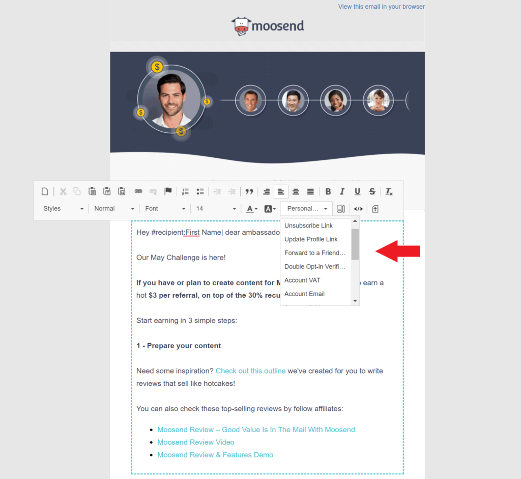
It’s also a good idea to experiment with conditional visibility or simply dynamic content. Dynamic content is the content that appears based on the parameters (custom fields) you’ve set.
How do you set up dynamic content? Well, almost effortlessly, with an email marketing tool like Moosend. Let’s say you want to create a specific offer for subscribers living in Canada; you need to go to Conditional visibility and adjust the Custom field “country” into “Canada.”
This works especially well the more data you’ve collected about your subscribers from your newsletter signup forms. In case your newsletter software of choice is Moosend, then you can create an opt-in form for your website for free, without even leaving the platform.
Checkpoint #5: Add Alt Text and Plain Text in Your Newsletter Content
If this is your first time going through the steps of creating a newsletter, you may have missed this. Alt text is the short written description that appears when a picture isn’t loaded.
It’s vital to include the alt text so your subscribers understand what they’re looking at since some email providers don’t always load images properly. Imagine a scenario in which your CTA is an image; your conversion rates will probably plummet without an alt text to save the day!
Moreover, there is a chance that email clients won’t display HTML as intended. Therefore, your emails have to look good in plain text. Your links have to be easy to click and it needs to be clear what the email is about without the presence of photos.
Checkpoint #6: Craft Your Subject Line and Preview Text
This is an equally important step in the process of creating a newsletter. First, you need to craft an attention-grabbing email subject line. Generally, try to be brief and state your value proposition immediately.
While nailing your subject lines can be tricky, there are some tools like Refine that can be particularly insightful. With this subject line optimizer, you can get a step closer to perfection through its suggestions.
Next, support your subject line with additional information in the preview text. The preview text is the short text appearing right after the subject line. To nail it, either explain the benefits of clicking on your email or try to induce a fear of missing out (FOMO) to the potential reader. In any case, be concise because mobile devices may not display your text in full.
Ideally, always conduct A/B testing to ensure you have the best possible opens and clickthroughs with your subject lines.
Finally, fill in the sender address. It’s advisable to use a sender name that’s recognizable, so your subscribers aren’t confused. If you use a real person’s name, know that it could have a positive impact on email opens.
Checkpoint #7: Launch Your Newsletter Campaign
Your newsletter campaign is almost ready to go. Before you hit send, though, it would be useful to conduct a spam and delivery test.
The spam test checks how your email rates against the popular spam filters, so your efforts don’t go to waste. The delivery test allows you to check how your campaign displays before it reaches your recipients’ inbox.
Since not all email providers read email code the same way, this test will show how your email renders. Finally, check how your newsletter loads in the most popular browsers.
How can you do these tests? You can use Moosend’s award-winning campaign editor and go to the “Spam and Delivery Test” tab. Now launch your newsletter!
Checkpoint #8: Monitor Results and Optimize Your Performance
In a few days’ time, you’ll have enough data about the performance of your marketing campaign.
Check if you achieved your goals first, and then see how the individual parts of your campaign performed. Which subject line got the most clicks, what content had more clickthroughs?
This data will be your guide in your next newsletter campaign. Optimizing your campaign requires a lot of time and effort, but it becomes easier the more data you collect about your audience and the more experience you gain.
And now’s the time to get inspired! Let’s go ahead and check out some hand-picked newsletter examples.
5 Email Newsletter Examples to Inspire You (Categorized by Industry)
I’m sure that by now you’re confident enough to develop a newsletter yourself. But having a little inspiration doesn’t hurt.
Here you’ll find 5 top-notch email newsletter examples categorized by industry, specifically picked to show you how to tick all the boxes.
Example #1: MVMT’s Ecommerce Newsletter
Subject line: SALE: 20% off Blue Light Glasses
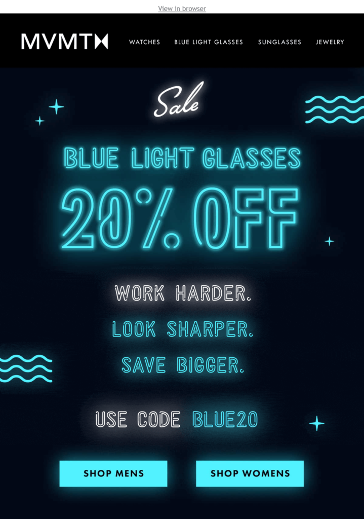
In this email, MVMT aims to promote their blue light glasses with an eye-catching email campaign. Here’s what works:
Copy: The brand uses a clear and straightforward headline that emphasizes why the user needs to pay attention to this email. The email copy is on-point and gives the viewer exactly what they need to know.
Design: MVMT uses neon blue as the main color to make a connection between the product and the email copy. The important element of the headline is emphasized with a bigger font size (“20% OFF”). Moreover, while you cannot see it here, the brand has employed a GIF to make the email more playful.
CTA: The CTAs of the email stand out right away with the use of a black background. As for their placement, it’s ideal as they’re slightly below the fold, so with a minimal scroll, you can see them. The copy is simple providing options to what the customer wants to see next.
Example #2: Moosend SaaS Newsletter Idea
Subject line: Assorted posts for delicious reads over your morning coffee
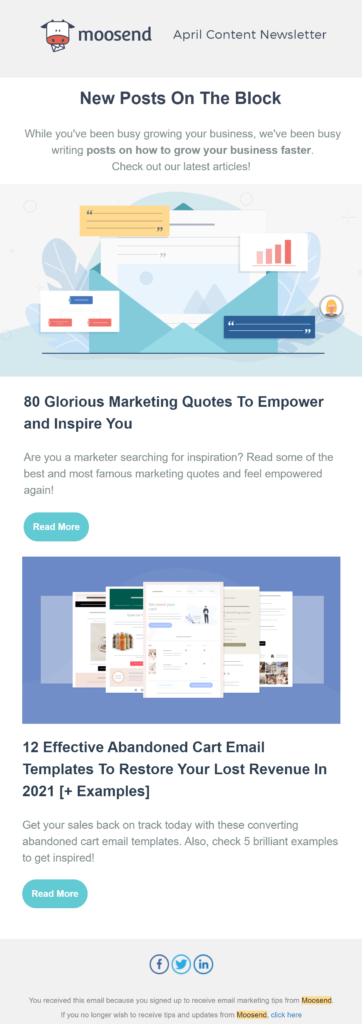
Here we have a monthly company newsletter from Moosend featuring their latest content. The aim behind this newsletter is to nurture their subscribers and educate them on topics that will help them grow their business.
Copy: As you can see, the copy at the top contains only the essential information that’s going to draw the reader in and explain what is going to follow. The company uses active wording to encourage readers to take action, i.e., read the article on the company blog. As for the subject line, its playful character attracts people’s attention.
Design: We have a simple and elegant design, focusing on clarity. There is adequate spacing between the elements, which makes the email easy to read and digest. The brand logo at the top makes the email immediately recognizable.
CTA: The CTAs use the brand’s colors, which also happen to stand out in this email format. They are simple yet effective and they don’t obstruct the user.
Example #3: New Darlings Blogger Newsletter
Subject Line: EARLY ACCESS: Shop the Canyon Collection!🏜
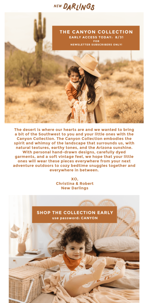
Here we have a highly visual email newsletter from New Darlings giving subscribers the unique chance for early access to the new collection. Let’s delve deeper, shall we?
Copy: The headline of the email immediately informs readers that they get early access to a new collection of clothes. The main body of the email copy is warm and personal, trying to make an emotional connection with subscribers. While it’s not short, it plays a crucial role in showing why users have to check out this new collection.
Design: The email newsletter design is simple with an emphasis on the visual side. The bloggers use their own images to make it even more intimate. Also, the color of the font is aligned with the setting of the visuals (i.e desert) to create a beautiful balance.
CTA: The CTA may not be unique or original, yet the message is clear and simple (i.e., shop early). The addition of a password to “unlock” the early access adds to the exclusivity of the products. You need to act fast to have them before the rest of the world.
Example #4: The New York Times Publisher Newsletter
Subject Line: Limited time offer: €0.50 a week.
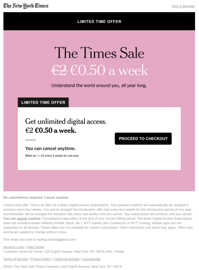
Here we have a publisher newsletter example from the well-known New York Times featuring a limited-time offer. Let’s see what works.
Copy: The email newsletter has a minimal copy that serves the purpose of highlighting the benefits the reader will receive. Subscribers are given the “solution” to their need of getting informed on a regular basis. ‘Limited time offer’ appears 2 times to add urgency to the message.
Design: This is a prime example of unique color formatting. All three colors blend beautifully and create a nice contrast. Moreover, the main message is in white background, which makes it easier to read. Finally, the reader immediately understands what this is about since after the header we have a nice ‘limited time offer’ block. Overall, this is an easy and effective way to make newsletters.
CTA: The CTA button is big and obvious, so it serves its purpose well. The contrast with the background is excellent and the wording of the CTA is in agreement with the message of the email (i.e., proceed to checkout since this is a great value proposition you shouldn’t miss).
Example #5: Zillow Real Estate Email Newsletter
Subject Line: Excited? ✔️ Overwhelmed? ✔️ Worth it? ✔️✔️
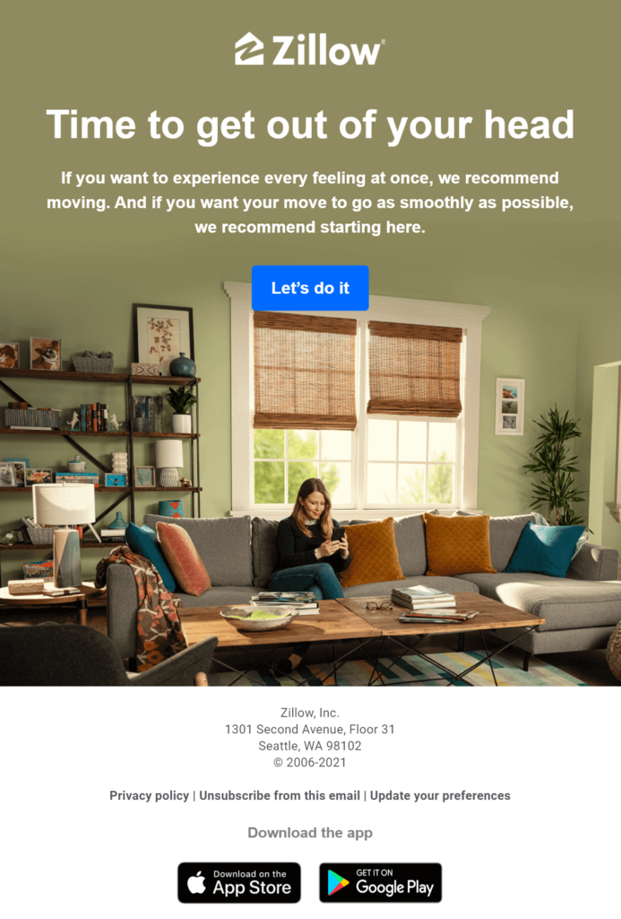
Here we have a real estate email newsletter by Zillow, aiming to familiarize subscribers with the brand and get them to try their services.
Copy: The brand employs short and engaging copy to lead readers towards the CTA. Through the well-crafted copy, the company aims to take the stress off the readers’ shoulders and encourage them to take action. That’s something that they achieve from the spot-on headline.
Design: This email follows the inverted pyramid model, with the email building up to the CTA. The branding element is clear and the visuals used are aligned with the purpose of the email.
CTA: As you can see, the CTA button is in a different color in order to stand out. Moreover, the company uses encouraging language to persuade users to take action. You could even say that the CTA is the logical answer to the subject line (which poses a few deliberate questions).
3 Free Newsletter Templates to Use Right Away
In the previous section, we saw a few successful email newsletter examples to inspire you and get you started.
Now we are providing you with three exciting newsletter templates that you can use for free in Moosend’s newsletter creator. Of course, you can access our full arsenal of email newsletter templates by signing up for a free Moosend account.
If you’re as eager as I am right now, read on!
Template #1: The Promotional Newsletter Template

Being able to send an engaging promotional newsletter, either for your website launch or for your product/services, is an essential part of every successful email marketing strategy. To do that, you need a marketing ace, which in this case is a well-crafted template customizable to suit most newsletter needs.
At the top of the template, put a catchy headline that draws the readers in and creates the need to find out more. Below add a supporting email copy that encourages and leads the reader towards the CTA. As you can see, the email follows the inverted pyramid model that attracts attention without tiring the reader.
This template is ideal for most kinds of newsletters because of its simple format and adequate spacing between different elements. It also gives you the opportunity to feature resources from your company blog, thus bringing traffic to your website and helping you nurture your leads. Finally, the color palette employed makes the important parts of the email, such as the CTAs, stand out.
At the bottom, be sure to add links to the social media icons, so that your audience can follow and engage with your brand’s content available there. This could also help you create social media groups where your customers can hang out and share their knowledge and opinions about your product/service.
The one-click unsubscribe button at the bottom ensures that you maintain a healthy email list and people don’t flag your emails as spam.
Template #2: The Online Event Promotion Template
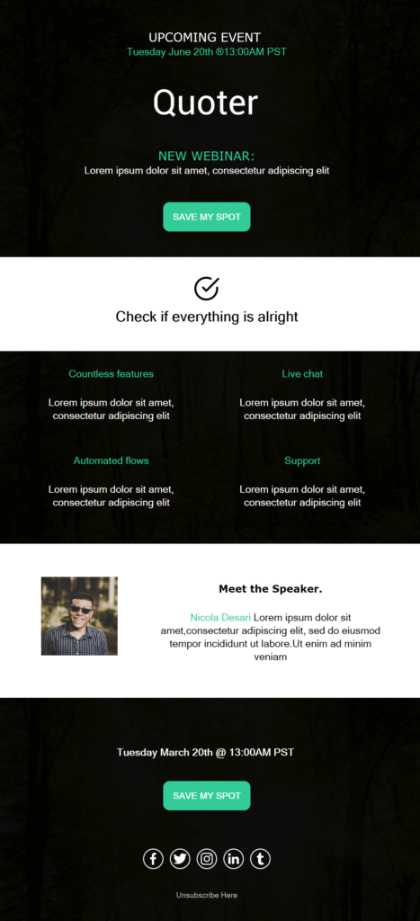
Promoting your business through online events, webinars, and conferences is very important to grow your business. This template saves you the time and effort of having to design it from scratch.
The overall design is based on the contrast of black and white, with CTA buttons that immediately catch the reader’s attention.
Craft a catchy headline and emphasize the value of attending in your main email copy. Then, customize your CTA according to the type of event you’re having.
It shouldn’t be a hassle to add the necessary details to this pre-made template, and the result you’ll end up with will definitely be worth it!
Pro tip: You can easily integrate a countdown timer in this template and add urgency to your campaign. Just drag and drop a “Timer” Element and set the date you want it to expire.
Overall, the simplicity of the design makes this template digestible and fun to engage with, something which is necessary to achieve high click-through rates.
You can test out its effectiveness yourself by signing up for a free Moosend account.
Template #3: The SaaS Email Newsletter Idea
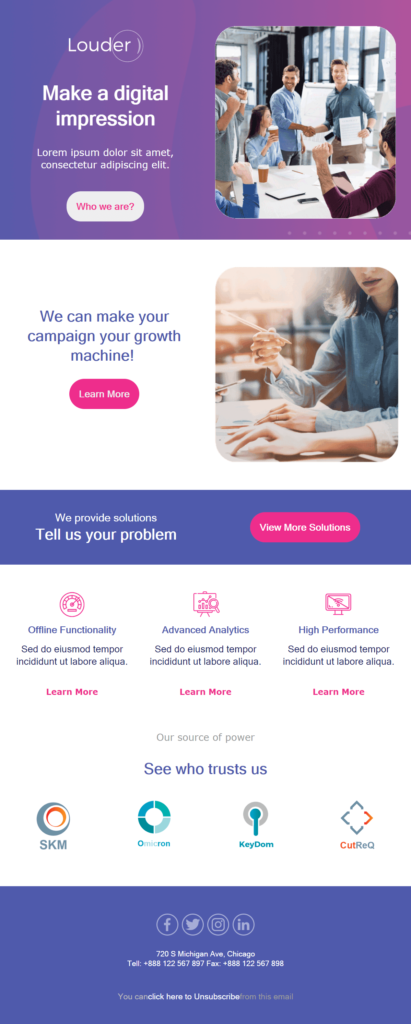
If you want to increase brand awareness or showcase how your product/service solves your subscribers’ pain points, use this template to create your newsletter.
It employs a friendly and relaxed style, utilizing nice colors and bright CTAs. It also offers you the opportunity to add social proof (“see who trusts us”) in order to build trust with your audience.
You can follow the template and add a real-life image of your offices, thus humanizing your brand. The CTA encourages people to “see” the people behind the company.
Be sure to showcase your company’s strong points or intrigue people to check how your service is better than your competitors and how it applies to their pain points.
The overall style of this template sets the tone for interesting content to follow on your landing pages.
Looking For A Newsletter Maker?
You’ve got your checklist, successful examples to get inspired on how to create a newsletter, and a ton of ideas about how to apply what you’ve learned to design a professional-looking newsletter for your business.
As they say, strike while the iron is hot! So go ahead, pick the tool that suits your needs, and design away!
If you want a tool that you can start using right away without much hassle while delivering amazing and responsive newsletters, check out Moosend by signing up for a free account. No strings attached!
Frequently Asked Questions (FAQs)
Here you are going to find the most frequently asked questions we’ve been getting regarding how to create a newsletter.
Q1. How to Design an Email Newsletter?
First, decide which email provider you’ll use. Then, select one of the available email templates and customize it to suit your needs. Craft an engaging subject line, write your copy, pick relevant visuals, add your brand logo and colors, and finally design your CTA.
Q2. How to Name a Newsletter?
Crafting a unique newsletter name is essential for brand awareness and connection with your audience. The name of your newsletter has to be short and simple to make it memorable. Think of words relevant to your content or make a pun/wordplay. The name could also include the frequency of newsletters (e.g., The Weekly Dispatch).
Q3. When Is the Best Time to Send a Newsletter?
The best time to send an email newsletter according to data is between 9 and 11 am. An alternative time slot that works well is 1-2 pm, as numerous consumers have their lunch breaks.
Q4. What Is the Best Day to Send a Newsletter?
The best day to send an email is Thursday. Moreover, Tuesday seems to be a close second. On a more general note, data suggests that sending email newsletters during the middle of the week yields the highest open rates.
Q5. Are Newsletters Still Relevant?
Yes, email newsletters are still relevant. Now more than ever, consumers expect personalized experiences that are tailored to their needs to be delivered to them when they need them. Newsletters are a direct digital marketing channel to achieve this.
Q6. What’s the Best Newsletter Maker?
There are several great newsletter creators out there, but Moosend stands out from the rest due to its intuitive drag-and-drop editor, variety of ready-made templates, and freedom to test out and use. For a detailed rundown of the best email newsletter tools, check this list.

 Published by

 Published by
