How To Create Effective Email Footers [Tips & Examples]
First impressions matter in email marketing, but so do last. Learn everything you need to know about email footers and how to design them efficiently.
In this guide, you’ll find:
- The email footer definition, benefits, and differences to a signature
- Essential and optional email footer elements
- Email footer tips with examples
Let’s start with the basics for beginners!
The easiest and most affordable email marketing and newsletter software!
What Is An Email Footer?
An email footer is the last block of content in a newsletter with important information about the company. It also includes links that allow subscribers to take several actions, such as unsubscribing or managing their preferences.
Here is a simple email footer example by Moosend:

Footers are valuable in all types of newsletters, from promotional to transactional email messages. You can create them in plain text or write them in HTML to make them more interactive.
If you’re ready to design a branded footer and send email marketing campaigns that convert, sign up for a Moosend account and connect with your customers today!
Why Email Footers Are Valuable To Businesses
If you’re wondering why you should always end your email campaigns with a dedicated footer, here are the primary reasons:
- They help you build consumer trust and brand awareness
- They enable you to share valuable information about your business
- They boost your lead generation efforts if treated wisely
- They can include calls to action and maximize conversions
- They let subscribers manage their email preferences or unsubscribe
All these amazing benefits make email footers a must for your email marketing strategy. But before we move to the key elements of email footers, let’s clear the air around a common misconception about them!
Email Footer Vs. Email Signature: What Is Their Difference?
Many confuse email footers with professional email signatures or sign-offs. Even though some of their parts overlap, they don’t usually serve the same purpose.
Email signatures add a more personal tone to the email, with details about the sender and their role. They often include marketing links and information about the company, but that’s not always the case.
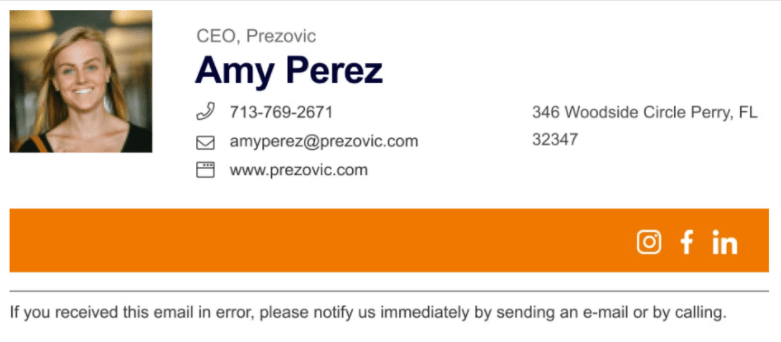
On the other hand, email footers usually share more brand-oriented information. Apart from the company logo or website links, they can also include legal regulations or information about products/services.
You can usually create email signatures and footers following the same process. For example, you can make both through the email signature section in the Gmail or Microsoft Outlook email clients. Or, you can use free email signature generators, like Newoldstamp or WiseStamp.
What To Include In Your Email Footer To Make It Work
Let’s find out the key email footer elements to make it successful – including your company name and logo, and of course:
1. Unsubscribe link
We understand that it’s hard to see people from your email list go. But to maintain GDPR compliance, giving them the option to unsubscribe if they wish is essential. Look at this email footer by Wonder Valley:
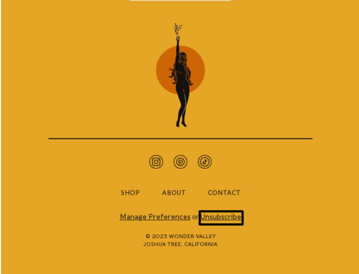
Moreover, this way, you secure your credibility as a sender. People who don’t want to receive emails from your company will be annoyed if they don’t get the opportunity to leave. However, with the appropriate copy, you may prevent them from proceeding further. Here is an unsubscribe button example:
“We don’t like to see you go, but if you want to leave, you can Unsubscribe Here.”
You can also add a brief questionnaire to understand why they unsubscribed and use that info to improve your email marketing process going forward.
2. Preference center
Apart from the option to leave your email list temporarily or even forever, you can also enable readers to manage their preferences regarding the email newsletters they receive from your brand – see the example above to get a grasp.
So add a “Manage Preferences” button to avoid getting unsubscribes and putting your sender reputation at stake. For instance, let them select the frequency of the emails they get from you or the exact types.
3. Contact information
What if the subscribers who have received your emails want to contact you? Even though they can reply to you via your business email, they may also like to know additional contact details, such as your phone number or your company’s address.
Look how TripAdvisor approaches that:
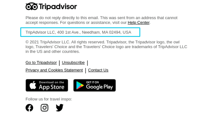
This is even more important when you have a physical store instead of an eCommerce to help them spot your location more easily. Finally, you don’t have to add your email address if it’s the same as the sender’s.
4. Social media buttons
Want to stay in touch with your subscribers through additional channels and promote an omnichannel marketing experience? Then add links to your social media accounts and keep nurturing readers in various ways.
Look how Brooks Running displayed their social media icons in an eye-catching style:
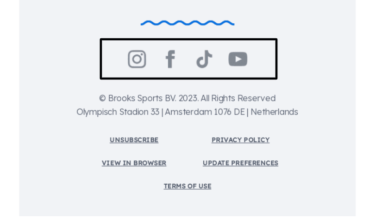
So add buttons to the social media channels you use the most and update them with fresh content when possible.
5. Legal information
Finally, it’s best to include important legal information such as copyright, anti-spam and privacy policy, and terms of use in your email footer. Of course, it’s vital to follow all the necessary legislation, like the CAN-SPAM Act and GDPR rules, before you send those campaigns to your customers.
This way, you reduce the likelihood of negatively impacting your sender and brand reputation going forward and keep your email marketing strategy as efficient as possible.
Optional Email Footer Additions
Apart from the essential components above, there are some extra optional ones to consider:
7. Brand values & mission
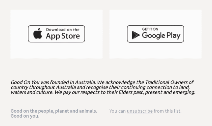
To inform your readers about your brand mission and vision, include your statements in your email footer organically and show them what you’re made of. Follow your email copy style to avoid confusing you readers.
Here is a footer example by Good On You. They’ve also shared their slogan:
8. Calls to action
You can also use your email footer to promote some of your latest work to boost conversions and increase your sales, especially in marketing emails.
Why not share one of your latest product launches or a new blog post? Or the webinar you’re preparing? Decide what is best to add each time based on your business goals and create CTAs that stand out from the rest of text.
9. A “Green Statement”
Want to show your readers your sustainable and environmental attitude? Then you can add a “green note” at the end of your email.
For example, you can prompt them to remember their ecological responsibility before printing your email to contribute to more sustainable living.
10. FAQs or Help Center
Finally, you can put an FAQ section with some of the most common questions consumers have about your brand or your product/services. It can also be in the form of a Help Center, as Captions did in their footer:
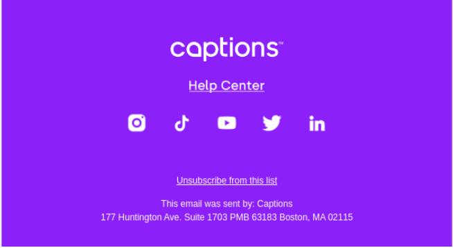
Moreover, you can share customer support contact details. It’s up to you to decide what you want to display for maximum results.
11. Social proof or referrals
If you want to gain new customers, the email footer can also make a difference in this process. For example, you can include customer testimonials to show new subscribers why your existing customers value your brand.
Finally, you can also add a “Refer a friend” button, offering incentives to people who bring new customers to you through word-of-mouth marketing practices
6 Best Email Footer Tips And Examples
If you need more email footer inspiration, we’re here for you. Here, we’ll present some email footer best practices to consider before you start the design process, with examples from other brands.
And now, off to our email footer design inspiration session!
1. Add spacing to let different sections stand out
If you want to include as much information as possible in your email footer, you can do it like Blurb. It’s all there, from social media links to referral incentives and valuable information.
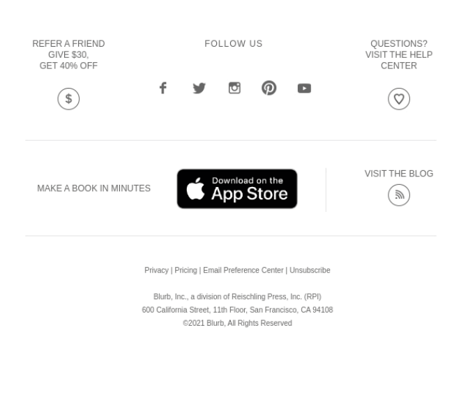
To make the difference between each part distinct, they made great use of spacing. Plus, the “Download” button helps increase sign-ups and conversions through a simple addition.
2. Include drop-down menus to add more links
Here’s another way to display lots of information in your email. Zwift added three drop-down menus to help readers find all the info they need in zero time. And there are additional elements, as well, like social media buttons and Privacy Policy.
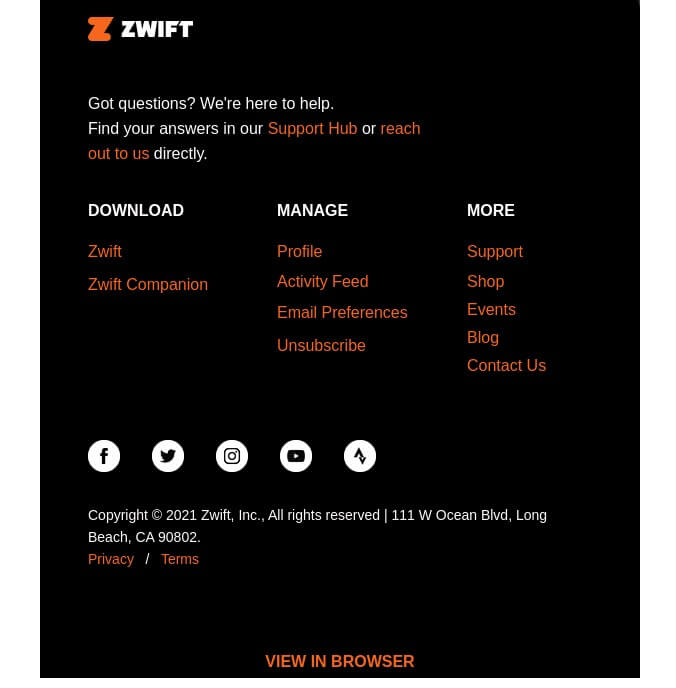
Plus, the design works pretty well here as orange pops out in black and captures the subscribers’ attention. If you’re passionate about minimal yet fancy campaign styling, you can try something similar.
3. Mind your email footer copywriting style
To make your email footer an organic part of your newsletter, it’s important to keep the same writing style and tweak it from time to time if needed.
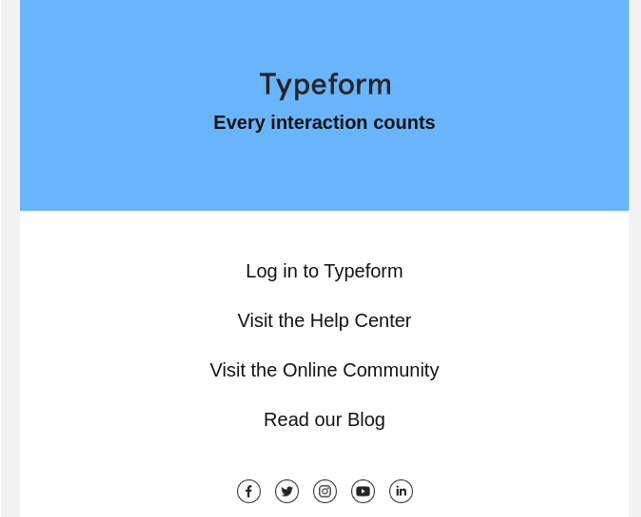
Many businesses like Typeform, also include their business slogan, as it sticks faster to the readers’ minds and gets easier to recognize it in the future.
4. Mention your customer email address
Modern Mammals chose to add the customer support email address for those who need help and a few more assets that don’t quite steal the show. This way, they show customers that they can reach out to them any time they need.
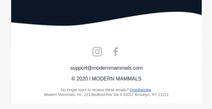
Overall, many brands choose simpler email footer design as they want to put more emphasis on the email content shared earlier, so it’s best to check out what works well for your brand, too.
5. Add product categories to make shopping easier
E-commerce marketers want to make shopping a piece of cake for subscribers. By adding links to the website and contact details, they prompt readers to reach out to them by all means and move fast to the checkout page.
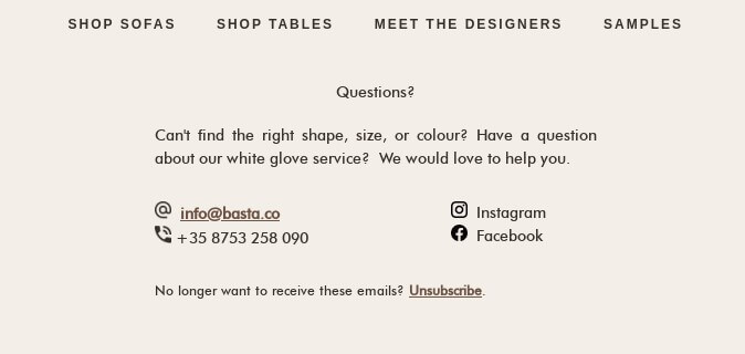
The above email footer example by BASTA shows one way to succeed in it. It’s easy to read, with a very clear font and sections that stand out.
6. Make it responsible for mobile devices
Finally, keep in mind that many of your subscribers will open your email on their smartphones and tablets, so you need to ensure that they’ll be flawless there, too.
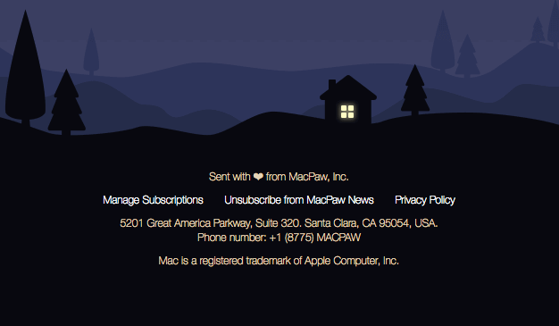
For example, MacPaw has met all the technical requirements. They created a concise email footer with all necessary information placed in the middle. Finally, top email marketing services like Moosend offer responsive email templates to help you overcome this barrier.
How To Craft An Email Footer With Moosend
Are you wondering how to design campaigns and email footers that will convert by all means? Say no more! At Moosend, we have everything you’ll need to streamline your email marketing efforts from A to Z.
Sign up for a Moosend account and start playing around with our unique features. Once you’re ready to create your new email, go to “New campaign” and fill in the essential information. Then you can move on to the “Design” section.
With our drag-and-drop editor, you can design your email footer as you wish, choosing the exact elements you want from the dedicated section.
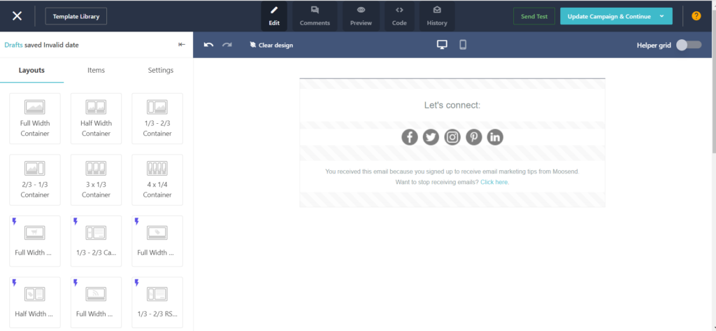
When it’s done, you can save it and use it for future campaigns or tweak it when needed. Simple as that. Now you’re ready to schedule your new campaign and see how it performs.
Email Footers Are Icing On The Cake
As you can understand, email footers can enhance your marketing communications and newsletter performance. Consider what’s best to add based on the goal of each email and your business at a particular moment.
Then jump in your email marketing tool, insert those elements in an elegant and clear way, and get ready to shine.
Not a Moosend member yet? This is your chance! Get a Moosend account today and design emails that convert with our intuitive drag-and-drop editor. Or pick one of our ready-made templates to save time. Good luck!
Email Footer FAQs
Here, we’ve gathered the most common questions regarding email footers:
1. Why should I add an email footer to my newsletter?
It enables you to share valuable legal information, such as disclaimers and policies, and additional assets, such as social and contact information, to boost brand awareness.
2. How do you insert a footer in an email?
You can follow the instructions of your email client or choose a premade template from your email marketing service with a dedication section.
3. How do I insert a footer in Outlook?
You can only add it as an email signature: Go to “Settings,” choose “Compose and reply” and type it at the dedicated email signature section.
4. How can I create an email footer in Gmail?
It works similarly to Outlook – Go to “All Settings,” find the “Signature” section and follow the guidelines before you save it.



 Published by
 Published by
