10 Great Unsubscribe Page Examples To Inspire You [2026]
Did you know that accidental unsubscribes are a thing? Or that you can prevent contacts from leaving your email list with a very simple trick?
That’s where unsubscribe pages come in, ready to help you prevent accidental opt-outs and give those determined to go a chance to rethink their decision.
In this guide, we’ll see some of the most inspiring unsubscribe page examples, with insights and practical tips to create your own.
Unsubscribe Page Examples To Inspire You
Below we’ve highlighted some unsubscribe pages that excel not only in functionality but also in their ability to positively engage departing subscribers.
From the straightforward unsubscribe button to the thoughtful email content, each unsubscribe page offers unique insights.
Now let’s see a collection of unsubscribe messages, emails, and pages.
1. Hulu’s unsubscribe message
Hulu’s unsubscribe page effectively streamlines the email unsubscribe process with its clear and personalized approach.
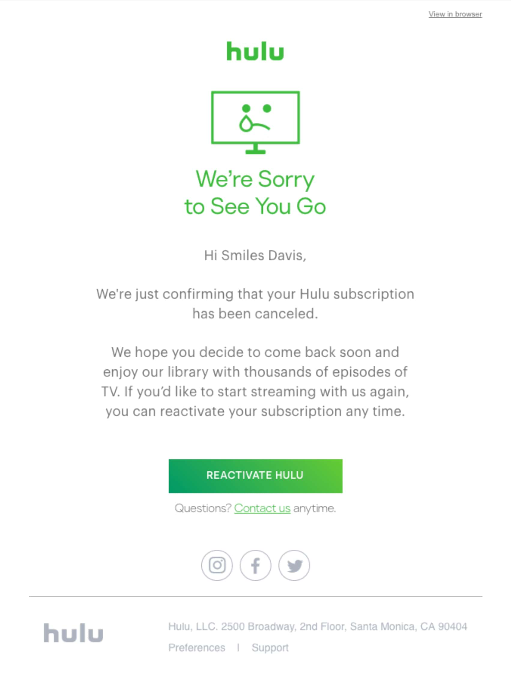
It leads with a heartfelt headline “We’re Sorry to See You Go,” capturing the regret of parting and immediately acknowledging the user’s decision.
The page speaks directly to the subscriber by name, adding a touch of personalization that makes the interaction feel less generic and more thoughtful.
The rest of the message reaffirms the user’s action while leaving the door open for a return without being overbearing. And for those flickers of second thoughts, the “Reactivate Hulu” CTA offers a straightforward path for re-engagement.
What we like best: Adding a contact link in this email unsubscribe page to resolve any issues is a smart move, as it can potentially reduce your unsubscribe rate.
2. Beta List’s subscriber removal
Beta List’s page is a good example of how to part ways with a subscriber on a high note.
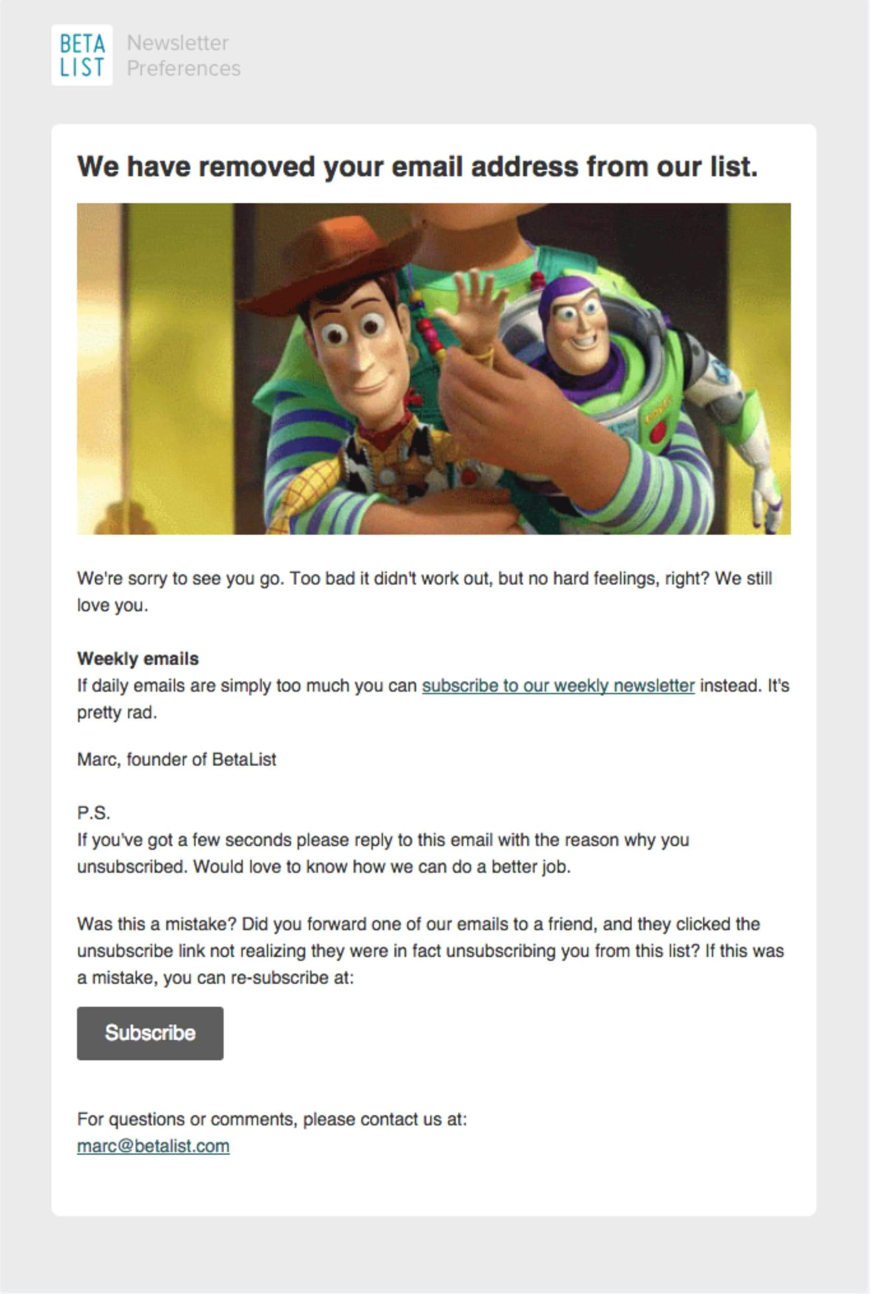
It uses a friendly, conversational tone that softens the blow of separation, opening with an understanding “We’re sorry to see you go.”
Additionally, the page cleverly offers an alternative subscription option—a weekly, less frequent newsletter which could retain subscribers who are overwhelmed by daily emails.
The invitation to provide feedback shows a genuine commitment to improvement. Overall, the option to re-subscribe is effortless—indicating that while the user is leaving, the door remains open for their return.
What we like best: The animated image from the well-loved film franchise ‘Toy Story’ adds a touch of warmth, easing the disappointment.
3. BestMade’s unsubscribe page example
BestMade’s example showcases minimalism and efficiency.
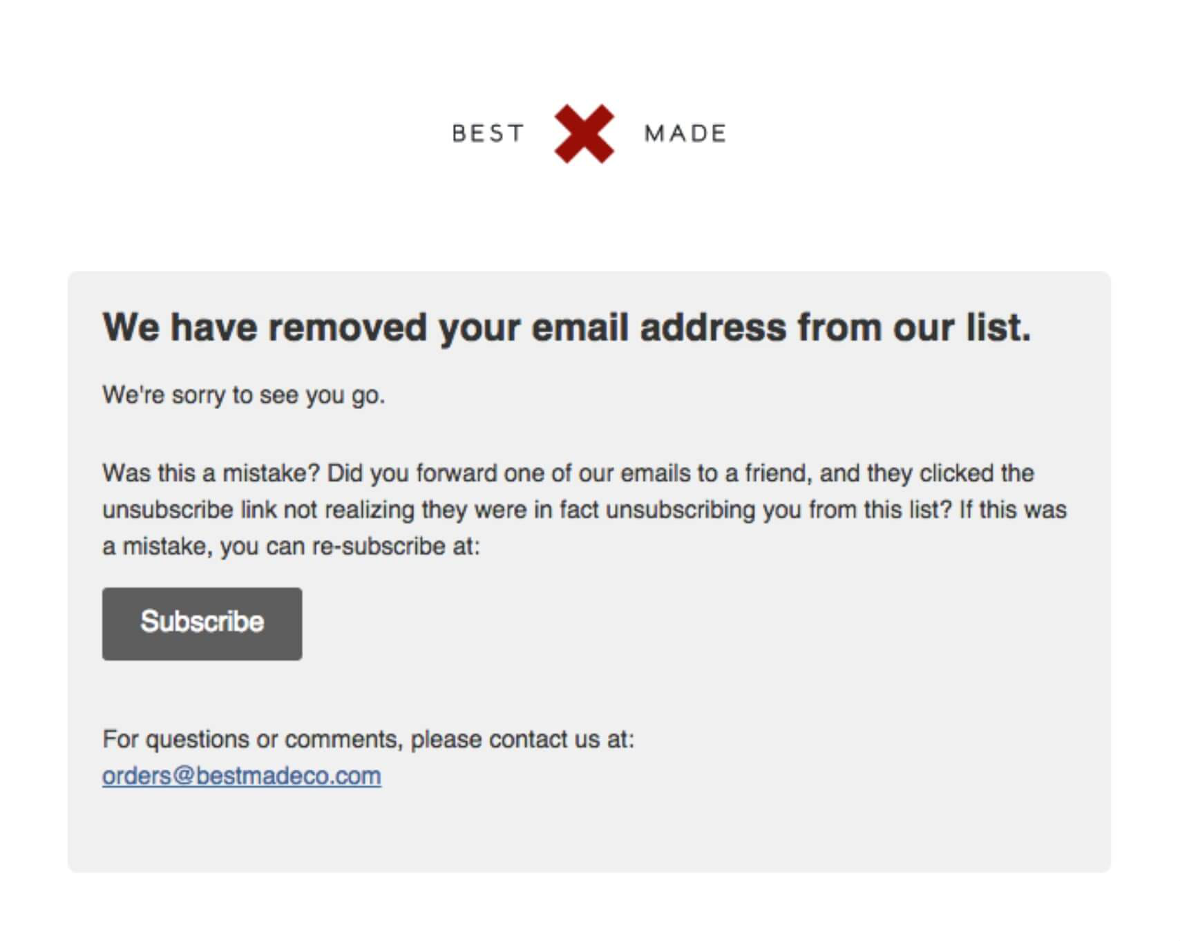
The layout is straightforward and free of distractions, focusing the user’s attention on the message—which is a brief but warm farewell.
The tone is polite and considerate, acknowledging the unsubscribe action while offering a simple path to re-subscribe.
BestMade’s approach is similar to what you might find in the simplicity of non-profit unsubscribe pages, focusing on clear messaging and respect for the user.
What we like best: The simple message around re-subscribing reduces friction for those who may have unsubscribed unintentionally and helps them resubscribe easily.
4. Atlas Obscura’s re-subscription attempt
Atlas Obscura has a delightful example that highlights on-brand messaging.
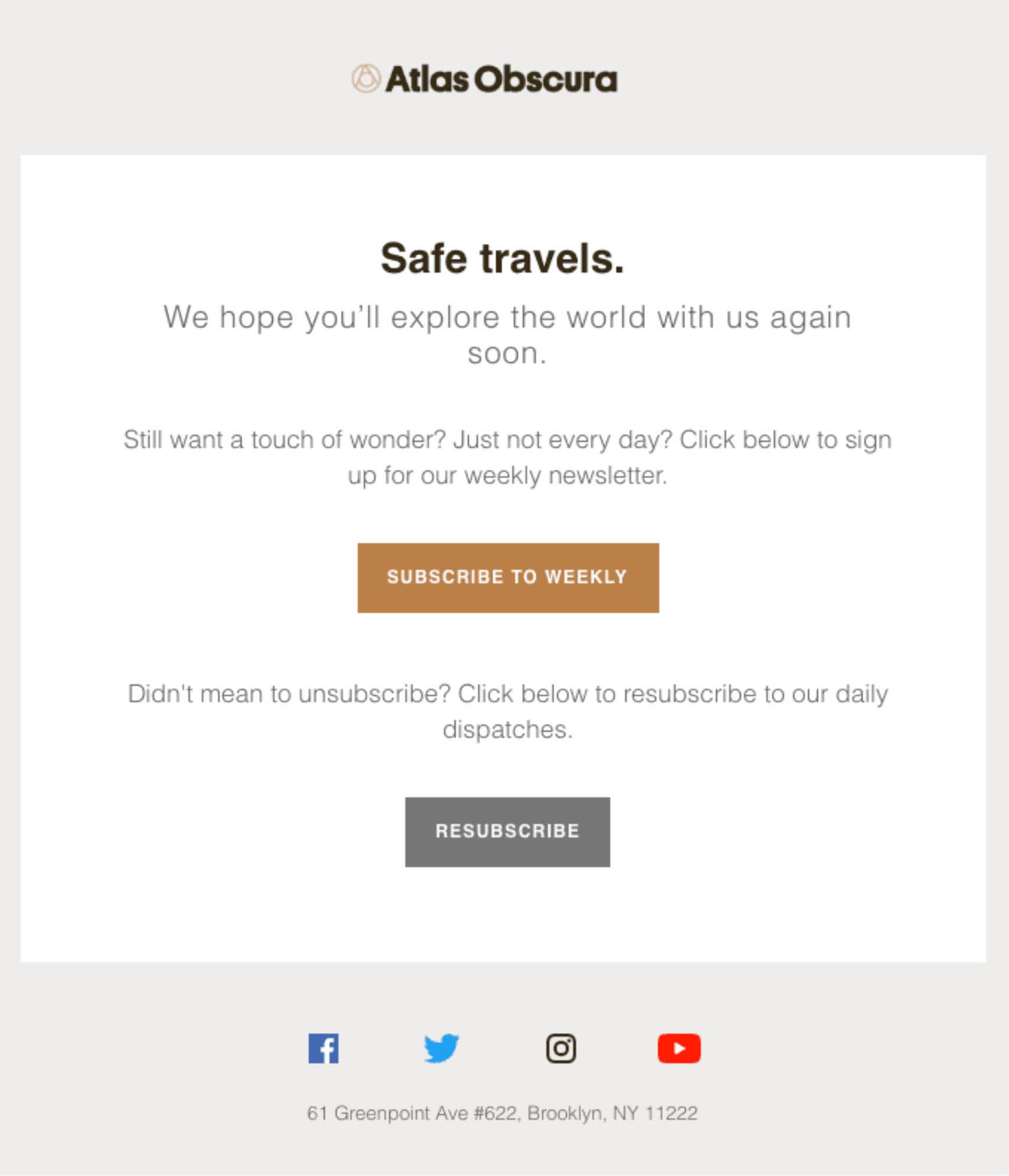
The headline “Safe travels” immediately resonates with the adventurous spirit of their audience. The page then thoughtfully offers an alternative to unsubscribing completely by inviting users to a less frequent weekly newsletter—recognizing different preferences for content consumption.
The option to re-subscribe is also clear and accessible, addressing those who may have unsubscribed by mistake.
Overall, the tone is warm and encouraging, leaving the door open for future engagement in a way that’s consistent with the brand’s focus on curiosity and wonder.
What we like best: The page’s messaging conveys a sense of goodwill and maintains the theme of journeying, aligning with the brand.
5. Charity: Water’s subscribe re-engagement
Charity: Water’s unsubscribe page example stands out for its humor and clever engagement strategy.
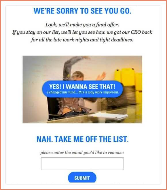
They make a playful “final offer” to reveal how they handle work challenges, cleverly enticing the subscriber to reconsider their decision.
The options “YES! I WANNA SEE THAT!” and “NAH. TAKE ME OFF THE LIST.” are presented in a conversational tone, making the process feel interactive rather than transactional.
What we like best: Adding a humorous image further lightens the mood. This creative approach humanizes the brand and may effectively prompt second thoughts about unsubscribing.
6. Sidekick Content’s unsubscribe twist
Sidekick Content’s page is a refreshing take on email list hygiene with a holiday twist.
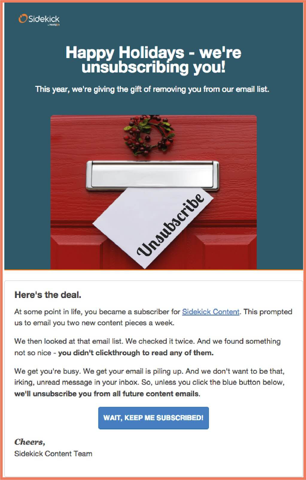
The page stands out with a festive greeting, “Happy Holidays – we’re unsubscribing you!” which immediately grabs attention. Sidekick’s unsubscribe message is crafted in a friendly and relatable tone, acknowledging that life gets busy and emails can pile up.
Moreover, it addresses the reader directly, explaining that they are proactively cleaning their email list as a gift to the user, reducing inbox clutter.
With a clear, humorous call to action, “WAIT, KEEP ME SUBSCRIBED!”, Sidekick also offers a simple opt-in option for those who want to stay on the list.
What we like best: Sidekick’s preemptive approach shows they respect the subscriber’s time and engagement level.
7. Cuisinart’s respectful message
Cuisinart offers a more customer-centric unsubscribe page example.
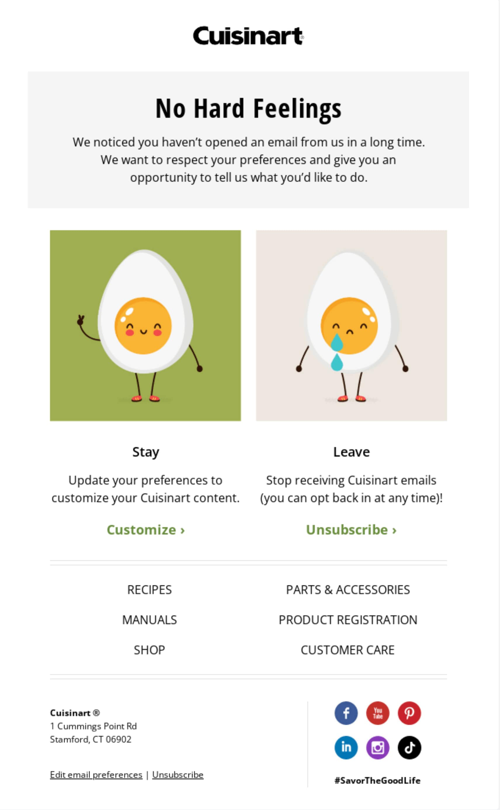
The “No Hard Feelings” headline immediately sets a considerate tone, acknowledging that the customer’s engagement has dropped without placing any blame.
Users are presented with a clear choice to either “Stay” and customize their content experience or “Leave” and unsubscribe, emphasizing user empowerment.
This approach respects the customer’s inbox and choices, fostering goodwill.
What we like best: The page’s unsubscribe message is paired with cheerful graphics of animated eggs, softening the conversation about email preferences.
8. Wincher’s feedback request
Wincher’s unsubscribe page is straightforward and user-friendly.
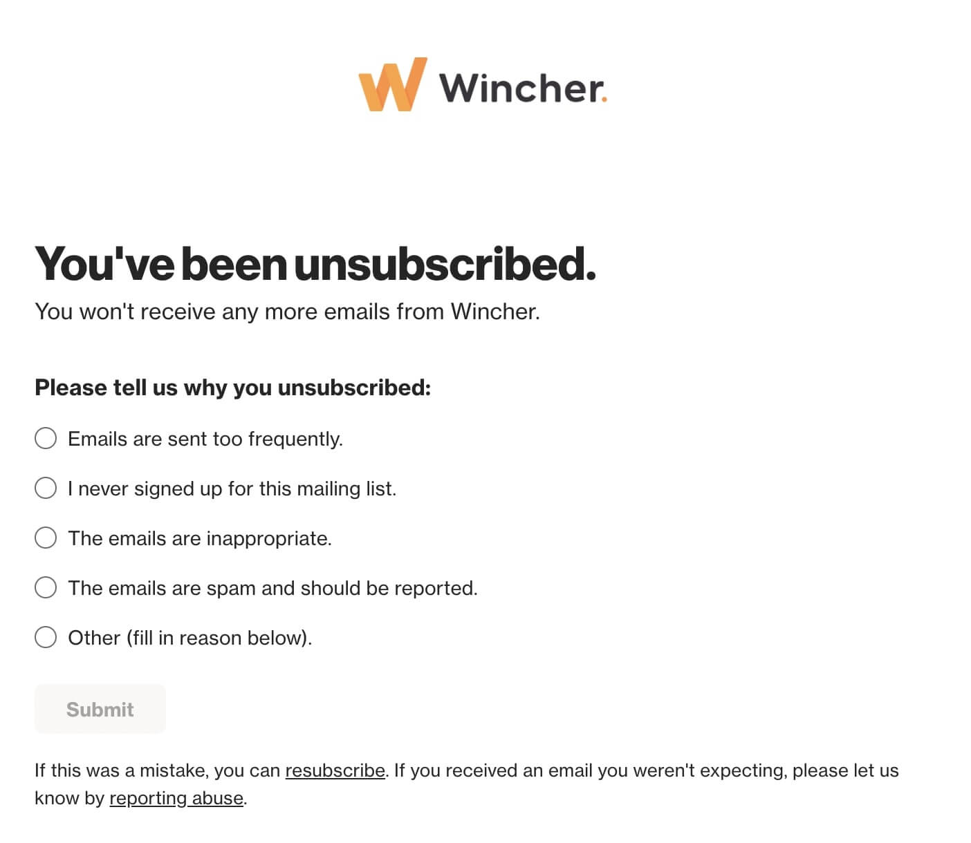
The page has a clear “You’ve been unsubscribed,” headline followed by a note that ensures no further emails will be sent. This direct approach shows they respect the user’s decision without delay.
Additionally, the page encourages feedback by presenting common reasons for unsubscribing.
Including a re-subscribe link also helps those who may have unsubscribed unintentionally. The abuse report option for addressing concerns of misuse also helps to reinforce trust and security for the user.
What we like best: Leaving room for user feedback not only helps Wincher improve its service but also makes the user feel heard.
9. ClickMinded’s humorous approach
In this unsubscribe page example, ClickMinded uses a unique blend of empathy and humor.
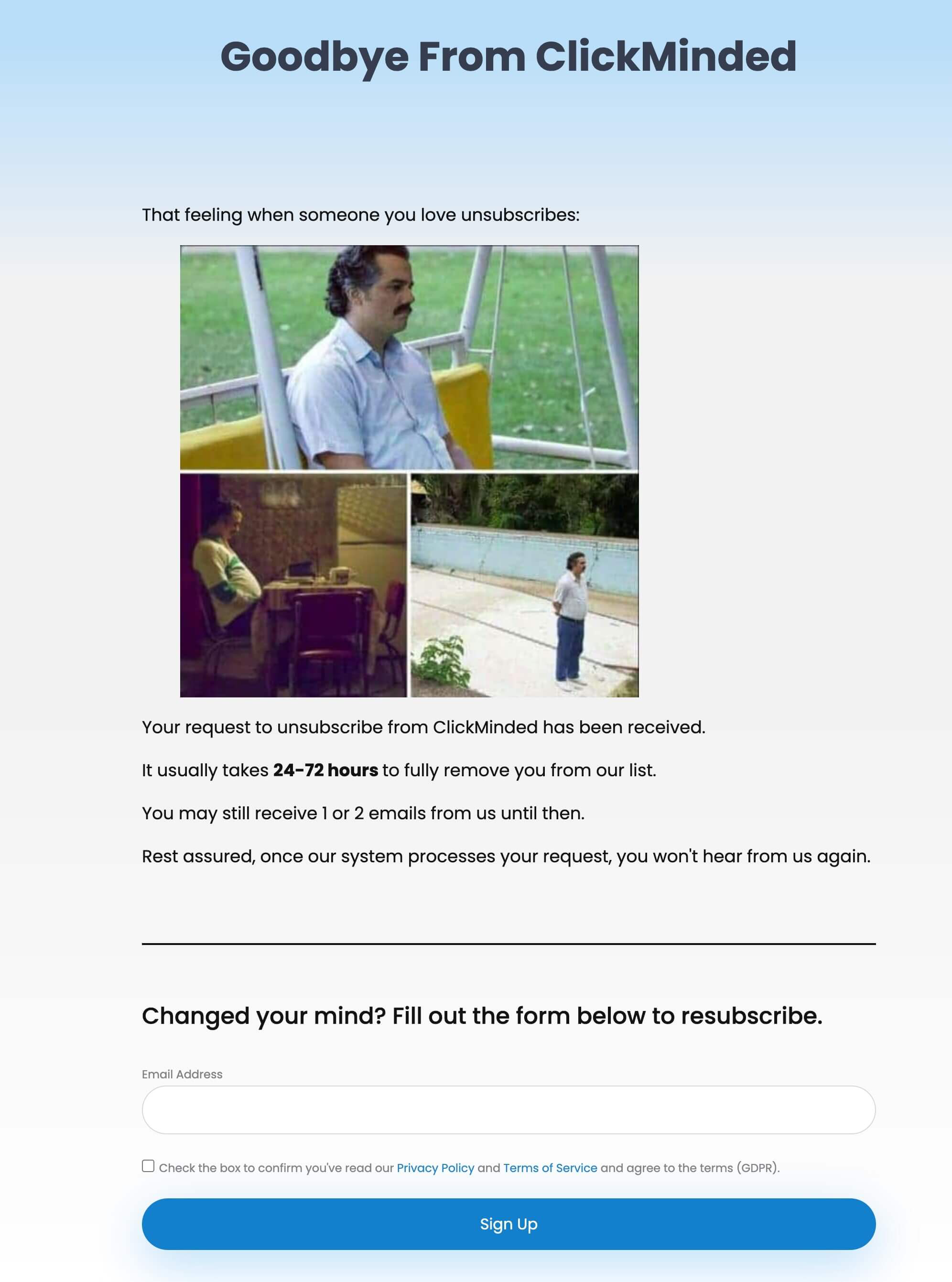
The headline “Goodbye from ClickMinded” is straightforward and respects the user’s decision to leave.
Yet, the accompanying note “That feeling when someone you love unsubscribes” and memes humanize the brand and lighten the mood. The page also sets realistic expectations by stating the time it might take to be fully removed from their list.
The final section, offering a chance to re-subscribe, is a smart retention strategy, allowing for an easy change of heart.
What we like best: The page’s transparency about potential continued contact is considerate and helps prevent any confusion.
10. Bolt’s more personal approach
Lastly, Bolt’s unsubscribe page uses a personal touch to make users rethink their choice.
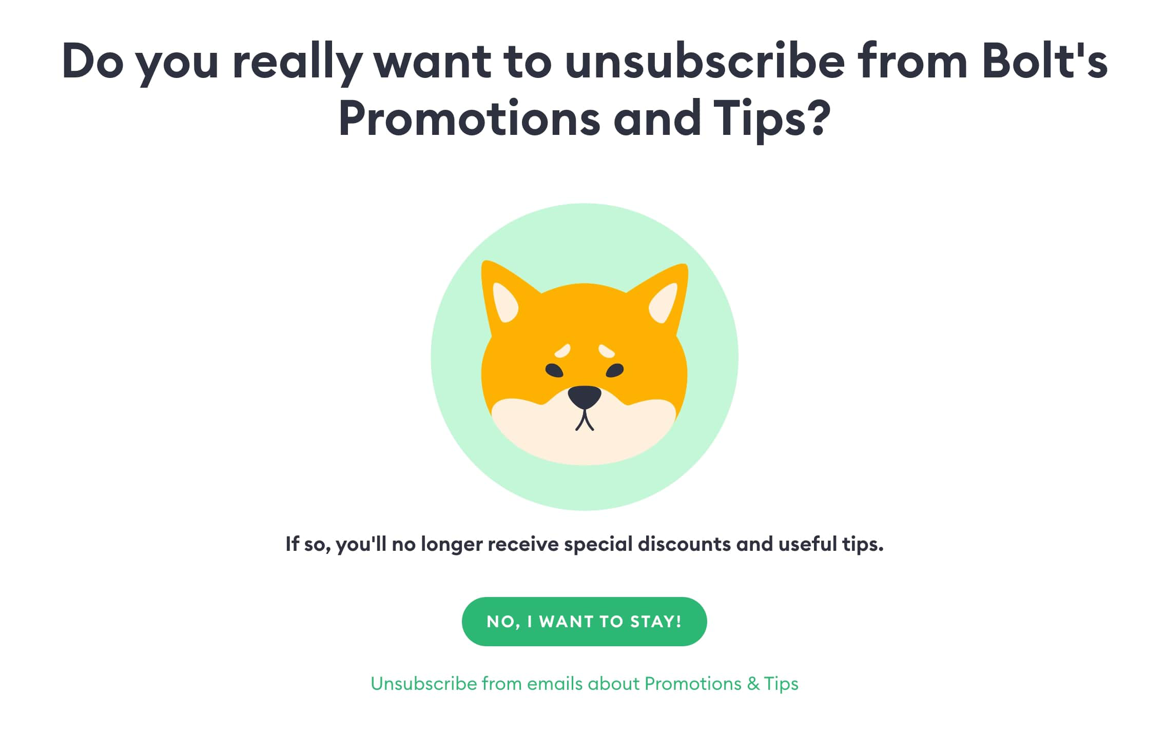
The page’s headline poses a direct question, engaging the user to consider the consequences of their action while highlighting the benefits they will miss out on.
The contrast between the inviting “NO, I WANT TO STAY!” CTA and the smaller “Unsubscribe” option cleverly nudge users towards reconsidering their decision.
What we like best: The sad cartoon fox image adds an emotional appeal, suggesting that even Bolt feels the loss of a subscriber.
Now, let’s consider what should be included on an unsubscribe page for a positive user experience.
Unsubscribe Page: Dos & Dont’s
Before we see what elements you need to add to your page, let’s take a look at some dos and don’ts to help you out.
Dos
- Make the unsubscribe button and link easy to find to reduce frustration.
- Send a confirmation message after unsubscribing to inform users that they have successfully left your email list.
- Allow subscribers to update their email preferences (frequency, interests, etc.).
- Keep the unsubscribe process straightforward and user-friendly.
- Comply with data privacy regulations.
Don’ts
- Don’t hide the unsubscribe link to prevent users from leaving as it will harm your brand reputation.
- Avoid asking them to log in or provide additional information to unsubscribe.
- Refrain from using negative language on your page and confirmation messages.
- Don’t dismiss user feedback.
Now let’s see how to create an effective unsubscribe page for your audience.
How To Make A Successful Unsubscribe Page
A well-designed unsubscribe page can indirectly aid in improving your email campaign’s conversion rates.
Here are a few things to consider, whether you have an eCommerce store or a SaaS business:
Get feedback
Your unsubscribe page can serve as a valuable feedback tool. By including a short, optional survey with open-ended questions, you can gain insights to refine your email strategy.
For best results, encourage honesty, assure them their feedback is for improvement, and respect their choice.
Give alternative options
Offer subscribers a choice in the types of emails they receive, whether they’re promotional or informational.
You can do this by providing options either to adjust email frequency or content type.
However, keep the unsubscribe process straightforward and respectful. You can also use A/B testing to find the best solutions that match your audience’s preferences.
Tip: Regularly review important metrics such as unsubscribe rates to continually refine your email marketing approach
Add humor
Consider injecting humor into your unsubscribe page to soften the mood and maybe even sway or influence the subscriber’s decision to leave.
The thing is, a light-hearted message can leave a positive lasting impression, even in departure.
For instance, brands like BarkBox have successfully used humor in their email content, including unsubscribe pages, to create a memorable brand experience.
Make the subscriber reconsider
Design your unsubscribe page to account for various user scenarios. You can offer a compelling reason to stay or a last-minute irresistible offer.
Plus, a warm message expressing regret can make subscribers pause and possibly reconsider.
Tip: Consider placing a re-subscribe button on your unsubscribe page for easy return of subscribers who change their minds.
Offer other ways to stay in touch
For those moving away from email, showcase your alternative channels.
So, include social media links or community forums on your page to invite them to engage with your brand in other ways they might prefer.
For non-profit organizations, this can be especially crucial as it helps them maintain a connection with their audience in various ways.
That said, let’s dive into setting up an unsubscribe page.
How Do You Set Up An Unsubscribe Page?
After taking a look at the above unsubscribe page examples and emails, it’s time to create yours.
Email marketing providers like Moosend can simplify the unsubscribe page setup.
Here’s how to set up an unsubscribe page:
Create your unsubscribe page
Creating an engaging unsubscribe page that captures essential feedback and retains your audience is an important aspect of email marketing.
Similar to platforms like HubSpot, Moosend allows for easy creation and customization of unsubscribe pages.
With its drag-and-drop editor, you can design unsubscribe messages or use the landing page builder to create redirection pages with feedback forms, and alternative subscription options.
You can also align Moosend’s pre-designed email templates to your brand’s style, ensuring the page looks great on any device.
Remember, the unsubscribe confirmation page is just as important as the email unsubscribe process itself.
Tip: Ensure your unsubscribe page aligns with opt-in practices, as this is crucial for GDPR compliance and maintaining a healthy email list.
Set up a redirection after unsubscription
After creating your unsubscribe landing page, the next step is to establish a smooth redirection for users who click the unsubscribe link.
With Moosend, you can customize your settings to remove a subscriber from a specific list or your entire account.
Additionally, the platform offers the flexibility to select between single opt-out or double unsubscribe options, allowing you to control how subscribers confirm their unsubscriptions.
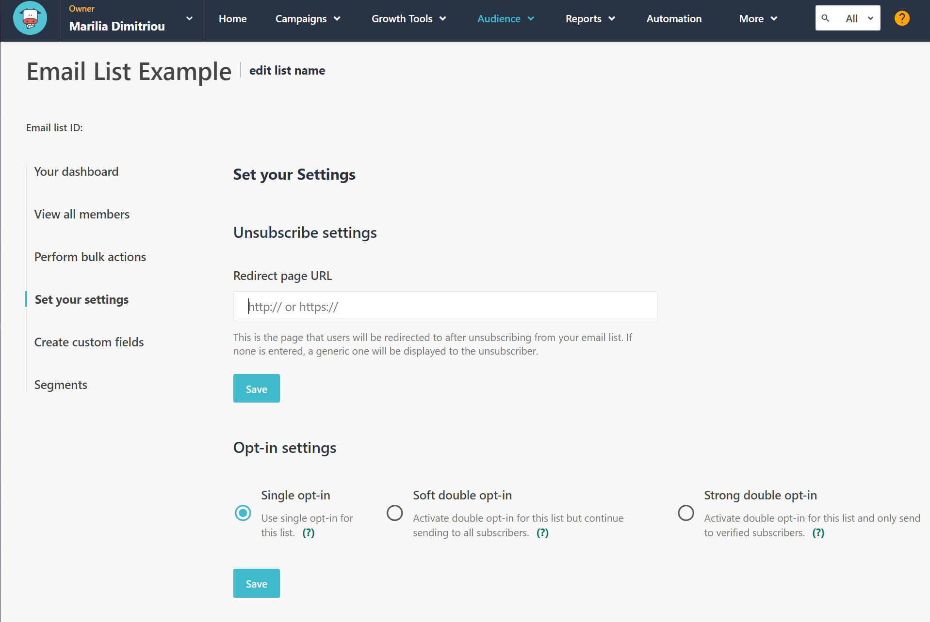
This customization ensures a user-friendly experience while maintaining the integrity of your email list.
For insights on creating effective newsletter signup forms that complement your unsubscribe page, explore Moosend’s detailed guide.
Tip: Consider a pop-up message on your unsubscribe page to present a final ‘stay with us’ offer or important information.
Now that you have the blueprint to craft an effective unsubscribe page, it’s time to put it to work for your brand.
Now It’s Your Turn
With the insights and tools provided, you’re well-equipped to design an unsubscribe page that reflects your brand’s values and respects your audience’s choices.
Remember, the harmony between your email subject lines and email content is key, as it can significantly influence the unsubscribe rate.
Plus, managing your unsubscribe process effectively can improve email deliverability, while ensuring your messages reach genuinely interested subscribers.
With Moosend, you can create unsubscribe messages that align perfectly with your brand’s messaging.
Sign up for a free Moosend account today and transform your unsubscribe page into a strategic asset.
Frequently Asked Questions (FAQs)
Here are answers to some of the most commonly asked questions about unsubscribe pages:
1. What is an unsubscribe page?
An unsubscribe page is where users land to confirm their wish to stop receiving emails—giving them a chance to adjust their preferences or opt out completely.
2. What are the benefits of an unsubscribe page?
Here are some benefits of an unsubscribe page:
- Ensures compliance with regulations like the CAN-SPAM Act, which governs email communication
- Fosters subscriber trust
- Gathers insights for improvement
- Provides an opportunity for users to reconsider their decision to unsubscribe
- Contributes to your inbound marketing strategy by helping you maintain a positive brand image
3. What is a good unsubscribe message?
A good unsubscribe message should be like a gentle breakup—clear, respectful, and straightforward. It should also offer a one-click option for leaving while reminding subscribers of their initial interest, possibly prompting them to stay.


 Published by

 Published by
