


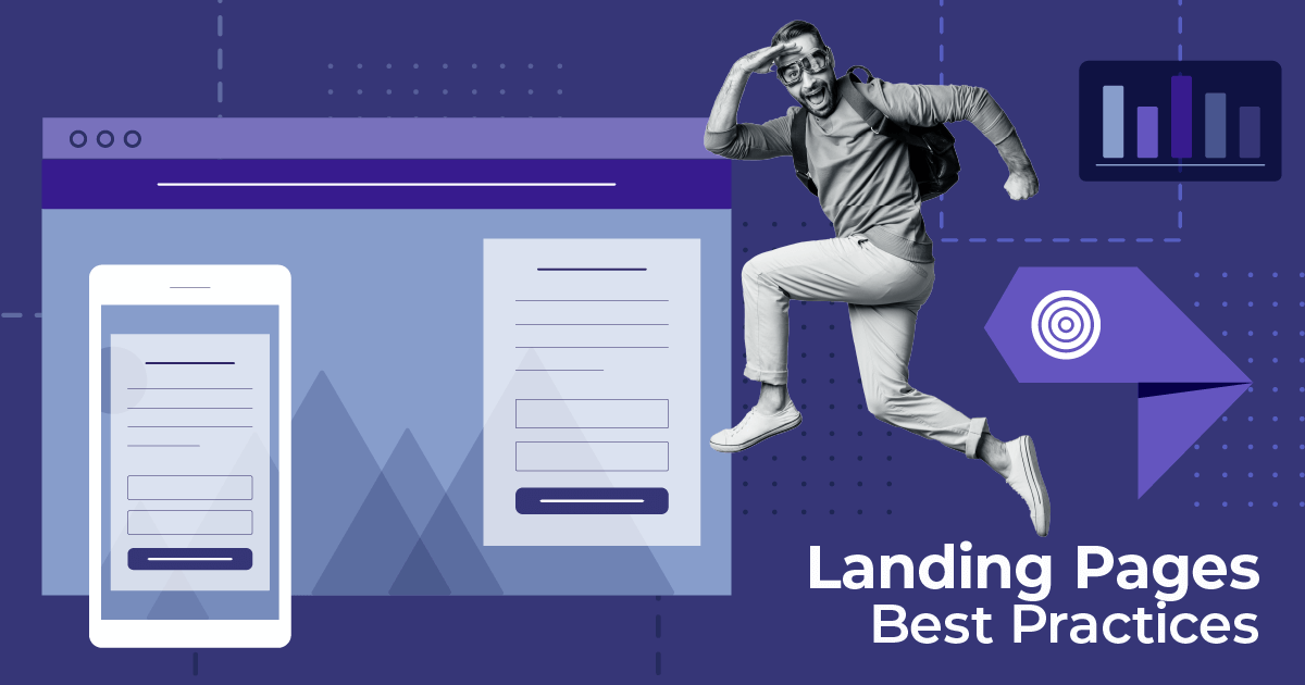
12 SaaS Landing Page Examples to Get Inspired
Published By John Desyllas
July 14, 2025

14/07/25
Whether you’re launching a product, promoting a webinar, or showcasing your latest ebook, a well-designed landing page can make all the difference in your conversions. But let’s face it, starting from scratch is tough. That’s why a little inspiration can go a long way.
In this post, we’re diving into some great SaaS landing page examples that get it right, with clean design, sharp copy, and clear value propositions. But before we jump into the examples, let’s quickly look at what makes a SaaS landing page effective and why these pages matter.
Want to create SaaS landing pages that drive conversions?
Get stunning templates to start collecting leads the easy way.
Try MoosendWhat is a SaaS Landing Page?
A SaaS landing page is a conversion-oriented page built to promote your software. It’s where potential users learn what your tool does, how it solves their problem, and why they should try it, usually with a clear call to action like “Start Free Trial” or “Book a Demo.”
Unlike eCommerce or content landing pages, SaaS landing pages often highlight product features, show off the UI with screenshots or animations, and build trust through testimonials, logos, or case studies. The goal? To turn curious visitors into signups or leads by clearly communicating the value of your software.
These pages typically sit in the middle or bottom of the funnel, making them ideal for users who already know what they need and are comparing solutions like yours.
Key Elements of a SaaS Landing Page
Every SaaS product is different, and so is every SaaS landing page. Still, high-converting landing pages tend to share a few key ingredients. Here’s what you’ll usually find:
- Clear value proposition: Right up top, you need to clearly state what your software does and why it matters. What makes it stand out from the competition? Keep your copy sharp, simple, and benefit-driven.
- Strong call to action (CTA): Whether it’s “Start Free Trial” or “Get a Demo,” your CTA should be prominent and repeated throughout the page.
- Product visuals or demo: Use UI screenshots, short videos, or GIFs to make the product feel real and accessible. Demos are especially useful for more complex products.
- Feature highlights: Add a quick breakdown of your core features, ideally tied to specific user benefits or pain points.
- Social proof: Testimonials, customer logos, case studies, or review site badges help build trust and credibility.
- Lead capture form: Whether it’s for a trial, demo, or waitlist, make it easy for visitors to take the next step.
- Responsive design: Your landing page should look great across desktop, tablet, and mobile.
Now, the time has come to see the examples we’ve gathered.
12 SaaS Landing Page Examples Analyzed
In this section, we’ll look at a few SaaS landing page examples from well-known brands. We’ll break down what makes them effective so you can apply the same principles to your own landing pages.
1. ClickUp’s Comparison Page

Industry: Project management
This is a comparison landing page from the popular project management tool ClickUp. The page uses a side-by-side feature breakdown to show how ClickUp stacks up against its direct competitor, Trello. The goal? To convince visitors that ClickUp is a better choice. These kinds of landing pages can also be used to
What’s smart about this SaaS landing page is that it doesn’t just say ClickUp is better; it shows it using clear visuals that are hard to dismiss. You can also use such a landing page to persuade visitors to switch from competitors.
Why it works:
- Bold, authoritative headline (“See why teams choose ClickUp over Trello).
- Side-by-side comparison table highlighting dozens of features that ClickUp offers for free.
- Color-coded columns that reinforce the contrast.
- Clean, uncluttered landing page design.
- Recognizable company logos to build credibility and social proof.
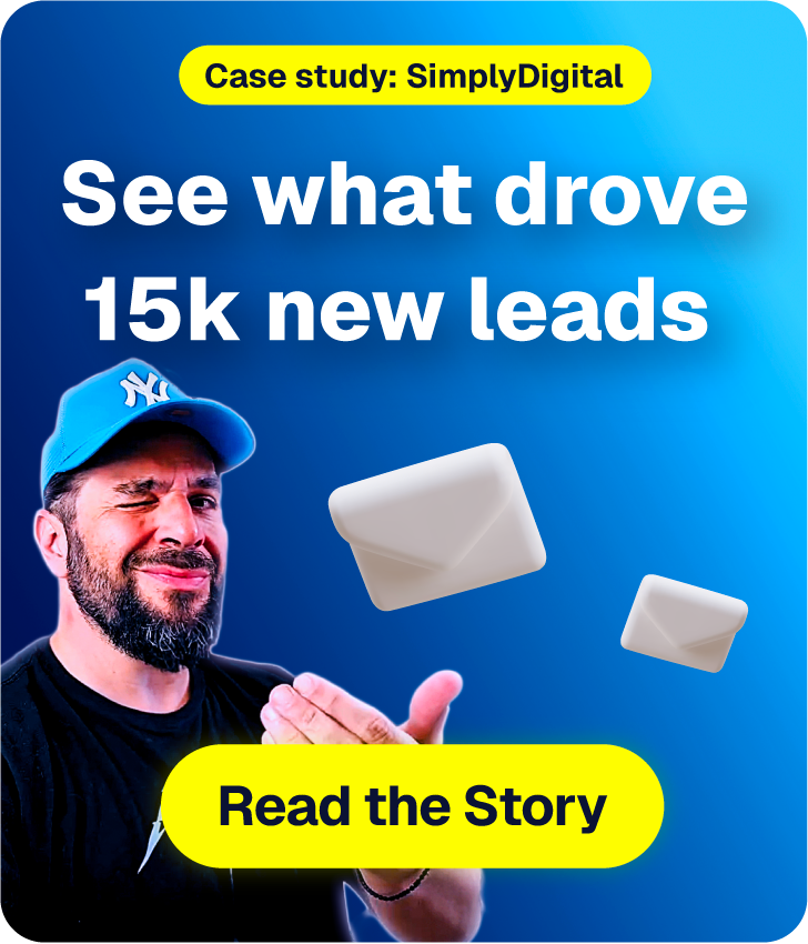
2. Moosend’s Seasonal Webinar Page

Industry: Marketing
This is a webinar landing page example from the email marketing service Moosend. It served as the main registration point for users interested in attending the Valentine’s Day webinar. The brand uses seasonal visuals and colors that perfectly match the event’s theme.
You can easily create a similar landing page for free by signing up for a Moosend account and using the intuitive landing page builder.
Why it works:
- High-quality visuals that keep visitors engaged.
- The online form is simple, including only the necessary fields.
- Bright red CTA that grabs attention.
- Clear takeaways from the webinar.
3. Shopify’s Free Trial Page

Industry: eCommerce
Shopify’s free trial landing page is a prime example of top-of-funnel SaaS marketing done right. It targets first-time visitors who may not know the product in-depth but are ready to explore. With minimal design and straightforward copy, this landing page encourages users to jump in and start building their store.
This page is all about simplicity and trust. Its goal is to remove potential barriers for people looking to get their business online, while highlighting how easy it is to get started with Shopify.
Why it works:
- Bold headline and subheading that build trust with the visitor.
- Only one sign-up field (email) to reduce friction.
- No credit card required, making the offer feel low-risk.
- Visual walkthrough of the 3-step process to start selling.
- Testimonial from a CEO that adds authority and human validation.
- CTA appears twice on this short page to encourage action.
- No distracting links (even the logo isn’t clickable).
4. Userpilot’s Demo Booking Page

Industry: Business/Productivity
Userpilot’s SaaS landing page is the epitome of simplicity. With a tight layout and direct messaging, it guides visitors toward one clear goal: booking a demo.
Why it works:
- Conversion-centered design with a clean two-column layout
- Dark background creates a strong contrast with the white form, making it pop.
- Short and no-fluff copy keeps the focus on results.
- Social proof through logos is placed strategically below the value proposition, building credibility before asking users to convert.
- Selective use of pink draws attention without overwhelming.
5. Unbounce’s Lead Generation Page

Industry: Marketing
This Unbounce landing page is a great example of lead generation through educational content. Instead of pushing a product directly, it offers an expert’s guide to marketers looking to improve performance and learn from industry leaders.
Why it works:
- The headline is direct and memorable, while also sparking curiosity.
- Featuring Talia Wolf adds immediate credibility and puts a face to the knowledge being offered.
- The brand uses white space to keep users focused on the core offer.
- The landing page copy is both casual and encouraging to keep things approachable yet professional.
6. Semrush’s Product Feature Page

Industry: Marketing
This SaaS landing page from Semrush is a product feature page. It walks visitors through multiple use cases, each tied to a specific product benefit. From audits and competitor research to link building, the page highlights the platform’s capabilities while nudging users toward trial activation.
Why it works:
- The headline focuses on what users can achieve, not what the tool does.
- The CTA is bright orange for maximum contrast and appears multiple times to reduce potential signup hesitation.
- The hero section has a great GIF that shows how the platform works at a glance.
- With excellent visual storytelling and product images, abstract SEO features become more tangible.
- The modular design encourages scrolling, allowing users to engage based on their needs. Also, each use case has its own CTA.
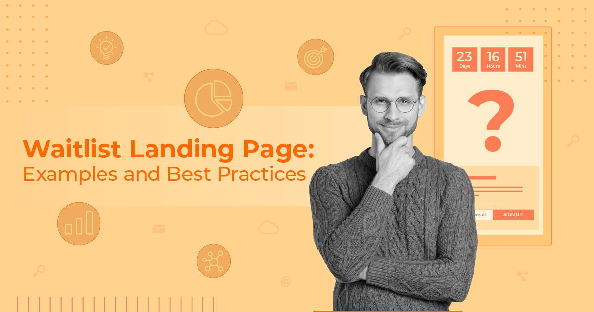
7. GetResponse’s Waitlist Page

Industry: Marketing
Here we have a waitlist landing page example from GetResponse. The page teases the upcoming content monetization platform using clever messaging and strategic headline colors.
Why it works:
- Clear, engaging headlines that emphasize the value of early access.
- A short video in the hero section that visually showcases the platform.
- Copy that targets key pain points such as monetization, automation, and ease of use.
8. Wolt’s Product Feature Page

Industry: Online food delivery
This landing page example from Wolt balances brand storytelling and benefit-driven messaging, all wrapped in a light, visually engaging design. The page engages and pushes visitors toward conversion, whether they’re hearing about Wolt Ads for the first time or already considering their options.
Why it works:
- Bold hero section with immediate value, explaining what Wolt Ads does and why it matters.
- Digestible feature highlights, presented in a visual and easy-to-scan way.
- Built-in FAQ section that addresses common objections and reduces friction.
- Subtle urgency (“Don’t wait, they’re already shopping”) before the final CTA to promote action without feeling pushy.
9. ActiveCampaign’s Demo Booking Page

Industry: Marketing
This SaaS landing page example from ActiveCampaign is designed to guide users toward booking a personalized product walkthrough. The layout is simple, helping users reach the desired goal without overwhelming them with too much information.
Why it works:
- Strong, benefit-led headline (“Get 1-on-1 time with an expert to ask anything you want”) that directly addresses user concerns and curiosity.
- Visual product snapshot of a flow diagram, giving users a quick glimpse of the UI.
- Simple form with optional segmentation through checkboxes and open text fields, letting users tailor their experience.
- Multiple G2 badges serve as social proof, establishing trust, authority, and a strong reputation across industries and business sizes.
10. Intercom’s Product Feature Page

Industry: Tech/Customer service
Intercom’s landing page offers a product-led experience that guides users through their Product Tours feature. It’s clean and interactive, suitable not only for enterprise buyers but also for product and growth teams exploring onboarding tools.
Why it works:
- Soft colors and whitespace make the design feel modern and easy to scan.
- Sections organized around specific use cases (onboarding, showcasing features, reducing support load).
- Animated examples and UI demos to explain features (ideal for SaaS users who want to see them before they sign up).
- Short sentences without unnecessary jargon.
- Specific, quantified benefits backed by customer quotes.
11. Klaviyo’s Webinar Landing Page

Industry: Marketing
This landing page from Klaviyo is crafted to promote an upcoming live webinar. It uses a blend of compelling storytelling, structured event info, and social proof.
Why it works:
- Visually striking hero section with a vibrant gradient background and centered headline that grabs attention.
- Countdown timer that adds urgency and boosts registrations.
- Checkmarks to help break down key takeaways.
- Inclusion of the event’s agenda for transparency and reassurance of visitors that the session will be well-structured and valuable.
12. Kajabi’s Comparison Landing Page

Industry: Online courses
Kajabi’s landing page stands out due to its sharp design, bold messaging, and competitive positioning. It establishes the platform as the go-to tool for monetizing knowledge, backed by comparisons, testimonials, and real-world proof to convert visitors into signups.
Why it works:
- High-contrast palette (black, white, red, purple) paired with clean font hierarchies and scroll-triggered visuals that increase engagement.
- Oversized headlines that create a feeling of confidence.
- Emphasis on social proof and testimonials providing credibility from the creators themselves rather than the company.
Stick The Landing
Great SaaS landing pages come in many forms, but the best ones all have one thing in common: a clear purpose.
Use these pages as inspiration, but don’t stop there. Start building your own, test different layouts, messages, and CTAs, and see what works best for your audience. A/B testing is your best friend here. The smallest tweaks can lead to big wins.
Frequently Asked Questions (FAQs)
Here are some frequently asked questions and their answers.
1. What is the difference between a webpage and a landing page?
A webpage is any general page on a website, like a homepage or pricing page. Typically, it includes multiple links and navigation options. A landing page, on the other hand, is a standalone page focused on one goal, such as driving signups or downloads. The key difference: webpages inform, while landing pages are built to convert.
2. Should I remove navigation from my landing page?
In most cases, yes. Removing navigation reduces distractions and can significantly improve conversion rates. That said, the best course of action is to run an A/B test to see what works best for your audience.
3. Do I need different landing pages for mobile?
No, you don’t need separate pages, but they must be fully responsive. This means your pages must be optimized for smaller screens with easy-to-tap buttons and quick load times.
Similar Posts
 Published by
Create, send and optimize your email marketing campaigns!