
Email Sizes: The Ideal Dimensions For Your Templates [2026]
Ever wondered what the ideal email sizes for your newsletter templates are? Do you need to choose a specific width and height for them?
Well, the short answer is yes. The long answer is a bit more complex. Worry not, though, because we’ll explore everything you need to know about the ideal dimensions and how many pixels (px) they have to be to render correctly.
To give you an idea, today we’ll look at the essential sizes, including:
- Template width and height
- Campaign file size
- Email header
- Content blocks and footer
Without further ado, let’s see them!
The easiest and most affordable email marketing and newsletter software!
Email Template Dimensions: Overview
If you’re in a hurry to find out the best sizes for your newsletters, you can check the table below:
| Ideal Size | Maximum Size | |
| Template Width | 600 px | 700 px |
| Template Height | 1500 px | 3000 px |
| Email File Size | 75 KB | 102 KB |
| Header (Height) | 70 px | 200 px |
| Content Blocks (Total Height) | 800 px | 1200 px |
| Footer Size (Height) | 100 px | 300 px |
| Email Banner | 600×730 px | 700×1730 px |
| CTA Button | Depends on Campaign | Depends on Campaign |
| Image | 600×650 px (depends) | Depends on Campaign |
Now, let’s take a more thorough look at them!
Email Size – Element Anatomy
Here’s an email newsletter example and the elements we’ll examine:

This campaign has a width of 664 px and a height of 2549 px. The email design displays well both in the Gmail and Outlook inboxes and renders correctly on mobile devices. When it comes to file size, it is 57.8 KB, which is within the ideal size limits.
Before we move on, keep in mind that your design might show differently depending on your subscribers’ screen resolution and size. So now that we know what we’ll examine, let’s start exploring these “ideal” sizes one by one!
Best Email Sizes: Width, Height & Weight
Starting with the crucial HTML email template dimensions, let’s find out the best width, height, and “weight” needed to avoid problems with popular email clients like Gmail, Outlook.com, Yahoo Mail, and more.
Email Width
Most marketing tips highlight that the ideal width should be 600 px. So what does this mean? Do all your templates need to be no more than that to be efficient?
Well, no. While 600 px is the standard email template width, you can have wider templates. The reason for this is that the email clients of today are far more advanced than in the past. So displaying wider templates isn’t that much of a problem anymore.
Nevertheless, while you can experiment with width, you should know that Gmail might not display background colors for designs that are more than 640 px. This can be a bummer for your campaigns, so the easiest way to avoid it is to use layouts with a maximum width of 640 px.
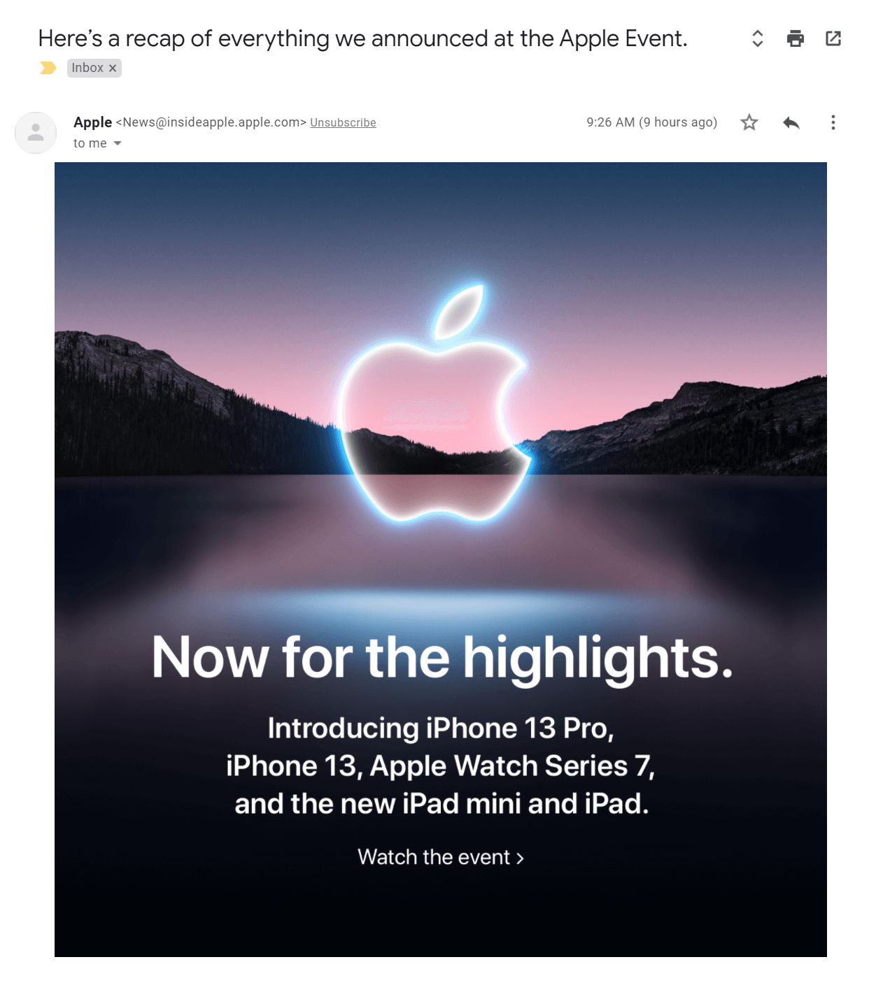
Below, you can see an email message by Apple with a width of 736 px:
If you want to use wider templates, make sure to leverage various email preview tools to ensure that your chosen width won’t cause any problems.
Also, it’s good to know that most email template builders like Moosend and Mailchimp offer designs that are by default 600 px wide, so you don’t have to worry about email template sizes.
Email Height
Now let’s talk about email template height. Here, you can go for as high as 1500 px or more depending on the content you want to present.
You can go “wild” with this email size but remember that your subscriber should be able to digest the message without scrolling to infinity to get to the point!
Ideally, your template should be between 1500 and 3000 px. If you think that 3000 px is not much, let’s see a real-life example by The Citizenry:

The above example has a height of 2230 px, which subscribers can check in a few scrolls.
Of course, a lot of email marketers will choose bigger heights for their campaigns. While showing your audience everything you have to offer, don’t forget that our attention span is very short, having decreased significantly within the last 15 years!
So, a height of 2000-25000 px is better than having your recipient scroll through an endless template to get to your CTA!
Email Weight
Well, now that you know about the width and height of your campaign, let’s take a moment to talk about the best file size for your template.
Generally, you want to create messages that will land into your subscribers’ inbox without any issue. A spammy subject line is usually the cause of triggering spam filters. But did you know that your email file size can also be the cause of poor email deliverability?
To avoid that, you should keep your email “weight” pretty light. This means that you need to have email campaigns with a body that will be between 20 and 102 KB.
Here are three quick ways to avoid rending issues:
- Aim for a maximum 102 KB email file size
- Use visual elements (GIFs, images) wisely
- Leave out large attachments
Inbox clipping
But what happens when your email is more than 102 KB? Well, if you send it to a Gmail address, then the email client will clip your message.
Email clipping occurs when campaigns go over the maximum file size limit. As a result, Gmail will hide or “clip” your campaign, and subscribers will need to select the “View entire message” option to check it out.
While Gmail will ultimately show them your message, having your campaigns clipped isn’t ideal for user experience. Adding an extra step to the process might frustrate your contacts and result in lower click-through and engagement rates.
The solution is simple: keep your emails under 102 KB (75 KB is just perfect)!
Email Campaign Element Dimensions
Now that we covered the vital email sizes you need to know, let’s find out the right dimensions for your email components, starting with your email preheader.
Email Preheader
First of all, your email preheader is the extra line of copy following your subject lines. You can quickly check it by looking at your inbox. Usually, they look like this:

However, your preheader text is also visible as a short message on top of your email newsletter. These lines of copy can provide your readers with valuable information and even let them view your emails on their browser.
Here’s an example by Sigma Beauty:
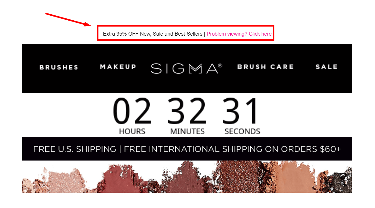
So, how big should your email preheader be?
When it comes to width, your preheader will be as wide as the rest of your campaign. Height-wise, though, it should be somewhere between 20 px and 60 px.
Email Header
Moving on to one of the most important elements of your campaigns, the email header! As you may have noticed, campaigns can have different email header sizes. Let’s see a few examples.
Here’s one by Wendell August Forge:

(600×98 px)
And one by The Blonde Abroad:
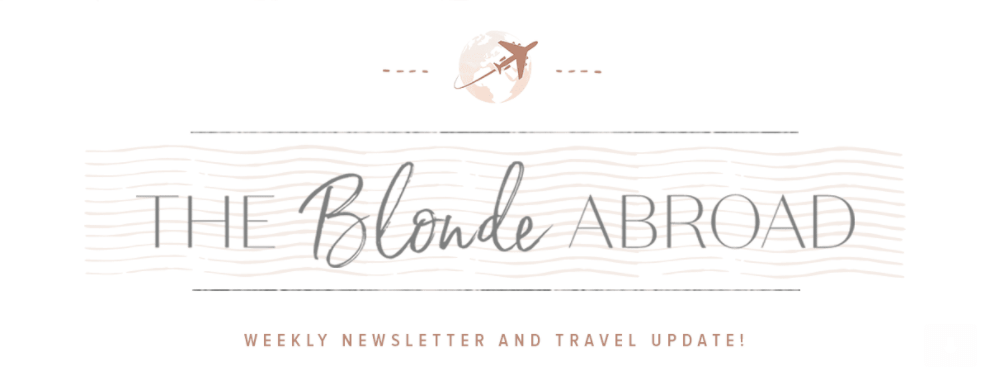
(600×255 px)
Both headers have the same width of 600 px. However, when it comes to height, the second one is 255 pixels high.
While a smaller header like Wendell August Forge’s is ideal both for desktop and mobile devices, having a slightly higher header isn’t going to be a problem (as long as you test it first!). As a rule, your email campaign header should be about 60-70 px high. However, if your logo contains additional elements or a menu, it can be as high as 200 px.
Again, don’t forget to check the Gmail or Outlook preview pane or preview mode of your email marketing software tool! Moosend, for instance, has a desktop and mobile feature that allows you to check how your campaign looks before sending it to your email list. You can easily sign up for an account and give it a try for free!
Email Content Blocks
Now let’s take a look at the email sizes of your content blocks. These blocks might have anything, from email copy and images to GIFs, videos, and CTAs!
Regarding width, your content blocks should follow the email template size you chose. However, height-wise, there are a few things you need to keep in mind.
First of all, to give your audience the best experience, you need to make your content blocks valuable and short. Long content blocks will result in email abandonment, and low email read times! And you don’t need any of that.
Below, you will find an email marketing campaign by Julie Blanner with three content blocks:
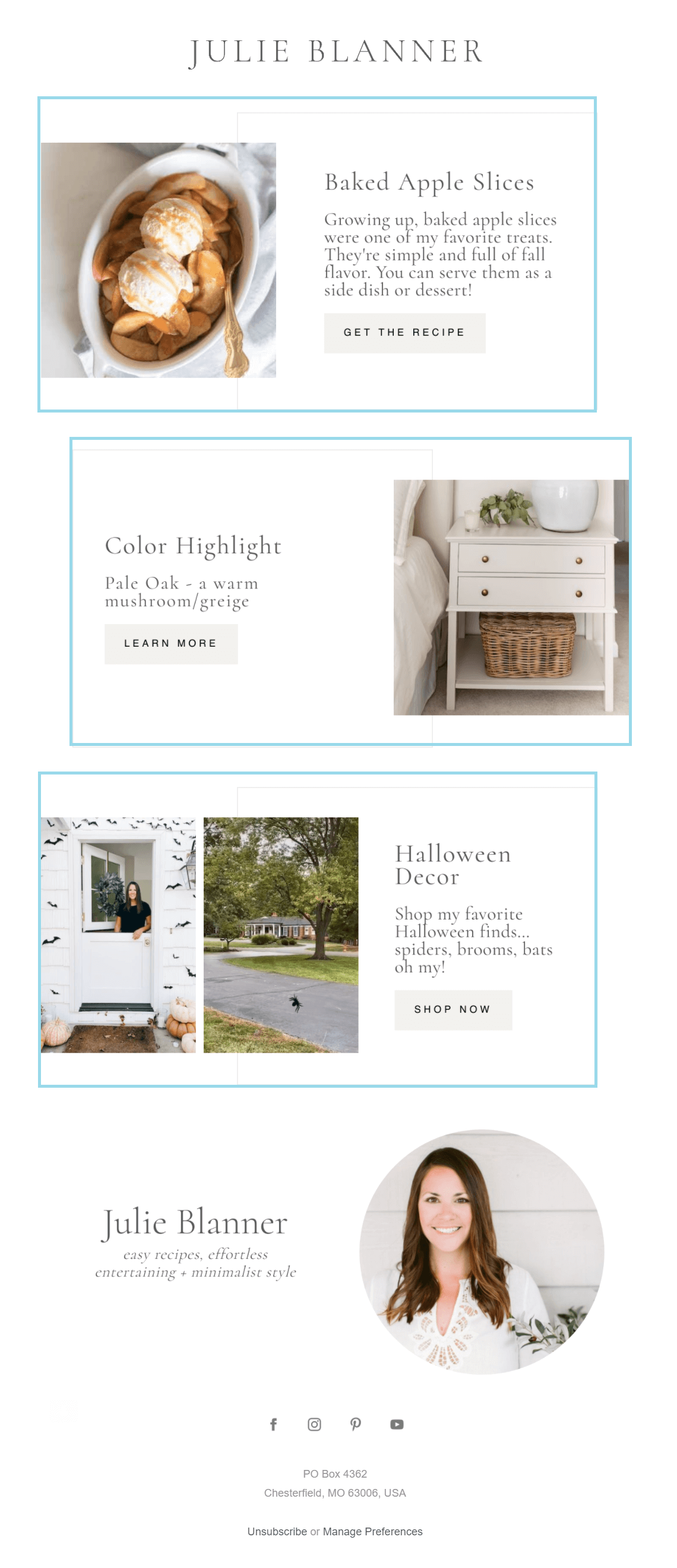
Each block is 344 px high and includes an image, copy, and a straightforward call-to-action. Visually, each continent block is easy to read and engage with. The minimalist email design also helps the blogger’s purpose.
In total, Julie Blanner’s email content is 1032 px high, excluding the blogger’s signature block. If we consider all of the above, it’s safe to say that your content blocks need to be short enough for your subscribers to check them out in a few scrolls.
So, we can now conclude that:
- Each content block should be about 200-300 px high.
- The total height of your content blocks should be 800-1200 px.
Email Footer Size
Last but not least, we have your email campaign footers, where you can find social media and unsubscribe buttons, website links, and more.
As with your headers, footers can vary in length depending on your goals. For example, Modcloth’s footer size is 600 px wide and 361 px high:
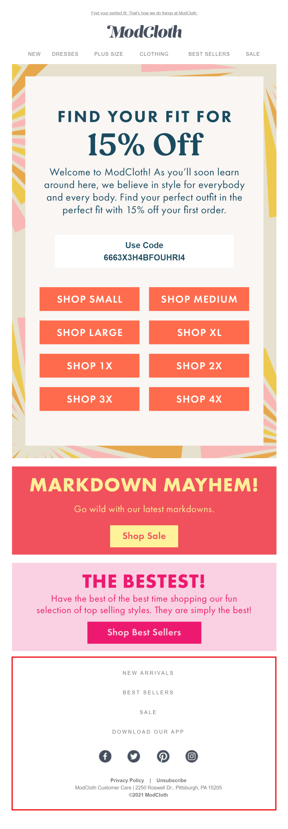
The above footer works well with the email design as it provides subscribers with all the necessary information they need to see before they close the email. In terms of height, it might be lengthy, considering that email footers need to be a smart last resort to capture your subscriber’s attention without annoying them.
With this in mind, the ideal email size for your footer should be around 100 px. If you need to include more elements like website links, ensure that the total length isn’t over 300 px.
Additional Email Component Sizes
Apart from your preheader, header, content blocks, and footer, you should consider your banners, CTA buttons, and image sizes. Let’s see!
Email Banner
Let’s talk banners for a minute. First off, an email banner is usually a copy-infused image found on top of your email marketing campaign. A great email banner design can excite your audience and give them more reasons to engage with your message.
For instance, here’s a banner example by Velasca:
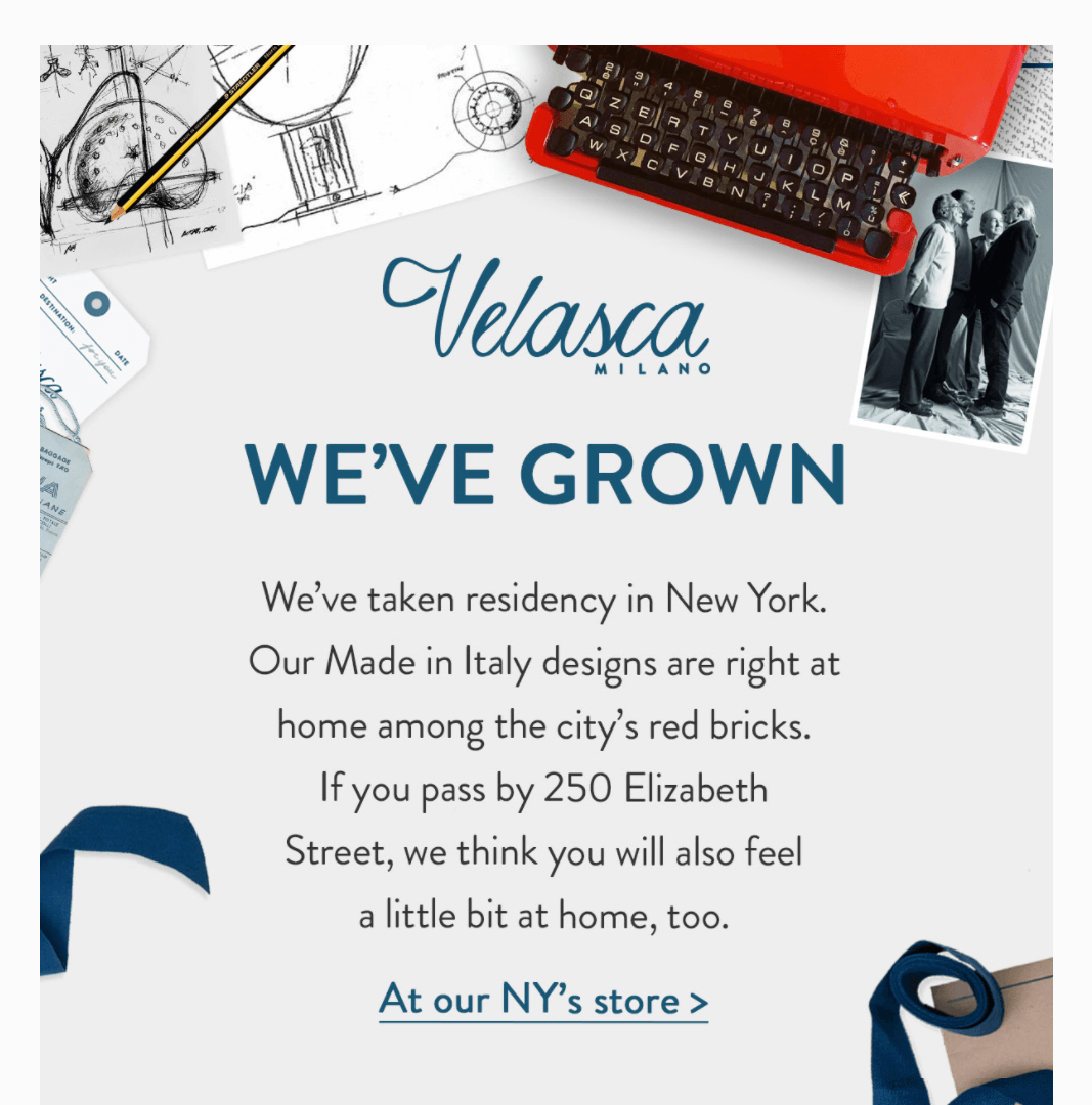
The brand’s banner includes all the necessary info to attract the subscriber’s attention. It has its logo, clear copy, graphics, and a CTA button. Also, in terms of size, the above example is 600 px wide and 612 px high, which is quite ideal based on the following data.
More specifically, according to Swift Digital, the recommended banner size should be:
- 600-700 px wide (320-385 px for mobile devices)
- 1730 px high
CTA Buttons
Ecommerce email marketers usually add colorful CTA buttons to incentivize potential customers to take action. B2B marketers, on the other hand, might add a hyperlink to lead their subscribers to their website or landing pages.
To make sure that your buttons align with your email design, let’s take a look at some interesting CTA button email size data:
- The average CTA height is 47.9 px
- Apple suggests a 44 px height
- The average CTA has 14 characters
As you can see, email button height is significant for creating an efficient CTA. But what about width? Well, email marketers go for different email button sizes based on their goals. Consider the following examples.
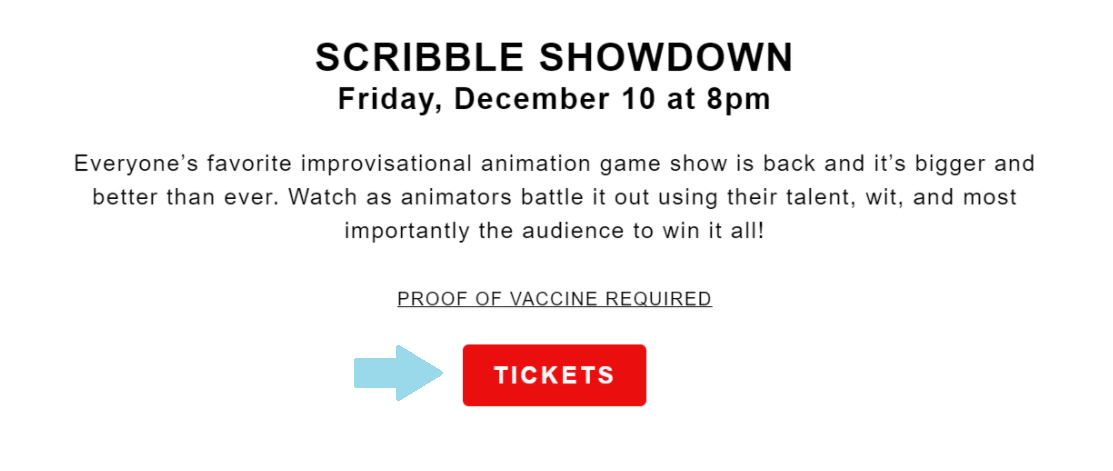
Kings Theatre has a very simple button that measures 122.4 x 41.51 px:
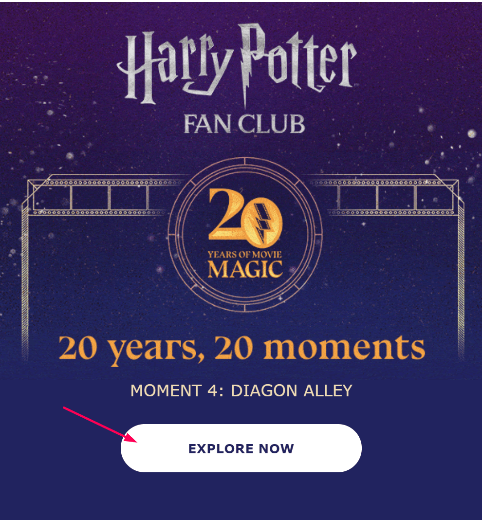
On the other hand, the Wizarding World opts for a more prominent CTA that’s 300 px wide and 60 px high:
Ideally, your CTAs should be in harmony with your visuals and email design to make sure they stand out without being excessive.
And while there isn’t a standard width and height for them, you can use the above CTA button findings as a guide to creating yours more effectively!
Email Image Size
First of all, the most popular image file format read by email browsers include your good old JPG (or JPEG), PNG, and GIF. But what about dimensions? Well, width-wise, your images will follow your set template size. So, if you have a set 640 px width, your image will follow suit.
Length-wise, though, you should first consider the purpose of your image. If used as banners, then they should be between 800-1730 px. Similarly, if you use them as newsletter images, you should go as high as 1200 px. Nevertheless, there are no standard email image sizes you need to follow.
When it comes to quality, you should use a resolution of 72 dpi to increase the overall performance of your visuals! And don’t forget to optimize your images for retina displays (iPhones, iPads, etc.)!
Email editors like Moosend’s will give you suitable options to ensure that your Apple users will have the best experience, image quality-wise.
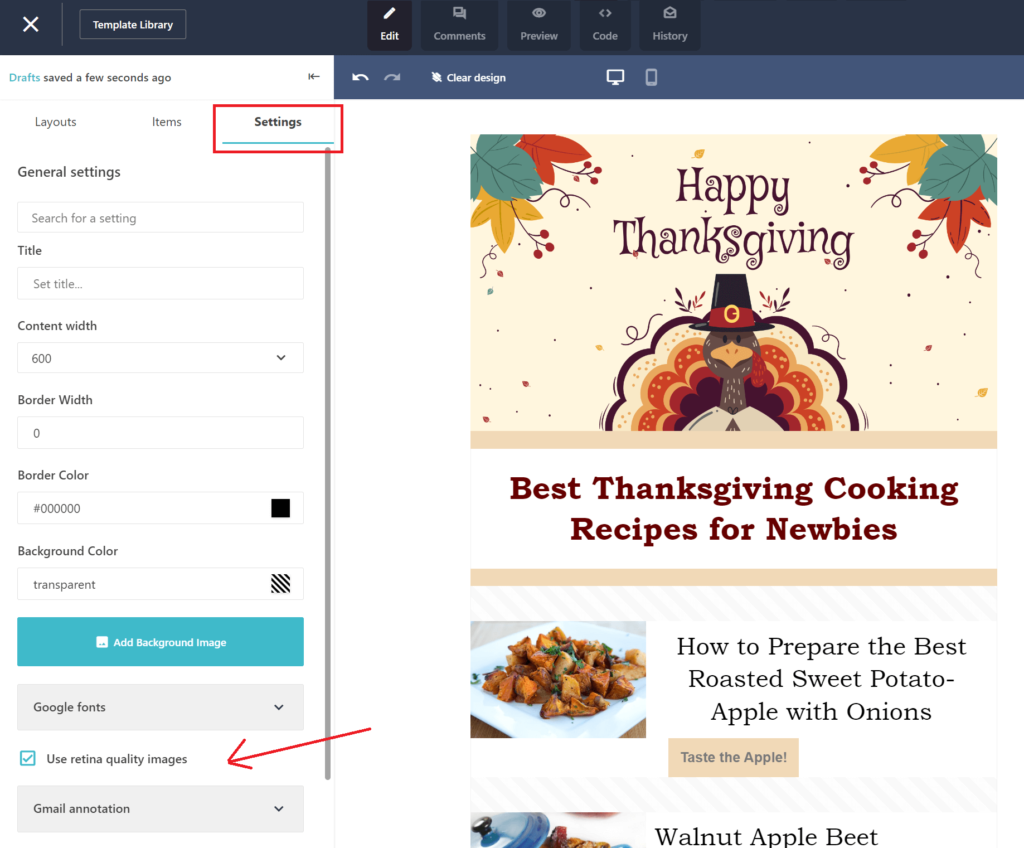
Apart from the correct dimensions, make sure that your images aren’t too large. You can avoid clipping by using tools like TinyJPG or Imagesmaller to compress them. If possible, try to stick to PNG formatting as it’s more than ideal for email campaigns.
Last but not least, keep in mind that most email clients will not utilize the full-width option. So be careful when you create the desktop versions of your messages as your preview, and what your subscribers see might be different!
Best Email Sizes To Nail Your Templates
Now that you know the best email template sizes, you can create campaigns that will display correctly every single time.
While you can use the above dimensions as references, don’t hesitate to experiment with them using an array of testing tools. Also, pay attention to your mobile-first users and the need for more responsive emails!
With that in mind, it’s time to create the best-sized email marketing newsletters for your business!
And if you want an advanced tool to help you out, make sure to try Moosend for free to create responsive emails that will stun your audience!




 Published by
 Published by
