13 Best Ecommerce Sites: Tactical and Design Tips To Thrive
Wondering how to transfer your brick-and-mortar store in the eCommerce world? Want to get inspired by some of the best eCommerce sites to build your own? If yes, we’ll be happy to show you around.
To put it simply, an eCommerce website is an online platform where you can sell your products or services. Your website visitors and customers can browse through your site, choose their desired items, and proceed to a financial transaction, all in one place.
If you’re new to eCommerce, you probably have lots of questions to ask:
- How can you build an online store from zero?
- What makes an eCommerce website attractive to visitors?
- What features do the best eCommerce sites include?
Here, we’ll try to tackle those concerns to help you get your online store up and running.
The easiest and most affordable email marketing and newsletter software!
How To Build An eCommerce Website
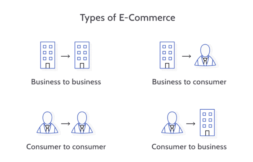
First off, let’s have a look at these four common eCommerce types:
(Source)
B2B (Business-To-Business) covers transactions of services and/or products (e.g., SaaS) from a business to another
B2C (Business-To-Consumer) includes transactions from businesses to individual consumers for a wide range of products
C2B (Consumer-To-Business) is the value a consumer can create for a company, for example, by providing a blog review
C2C (Consumer-To-Consumer) describes deals between consumers that usually take place in a third-party platform, such as eBay
Your business type, along with the products or services you offer, will have a huge impact on your site’s layout and your go-to-market strategy.
Here are some aspects to consider before you kick off this project:
- What is your target audience and market?
- Who are your main competitors, and what are your differences?
- And overall, what is your mission and vision as a business?
All this information will gradually set the tone for the next step: Choosing the best eCommerce platform to meet your goals.
Leading eCommerce Platforms
Τhere are many eCommerce platforms – also known as eCommerce website builders – that can host your online store, catering to various needs and desires. Whether they operate in a start-up or large-scale business, business owners and marketers should conduct thorough research to find their perfect match.
Here are the top eCommerce platforms: Shopify, Wix, Shift4Shop and BigCommerce.
Other eCommerce site builders you could try are Squarespace, Volusion, WooCommerce, Magento, and Weebly.
There are a lot of available choices, even more than we’ve mentioned above. To find the best platform for your business, read our next points and run “a quick functionality check.” You could also seek related eCommerce reviews from credible sources to help you out.
Key Functions Of Ecommerce Platforms
Let’s take a quick dive in:
Open-Source vs. SaaS
There are two main distinctions in platforms you can use: Open-Source vs. Saas eCommerce.
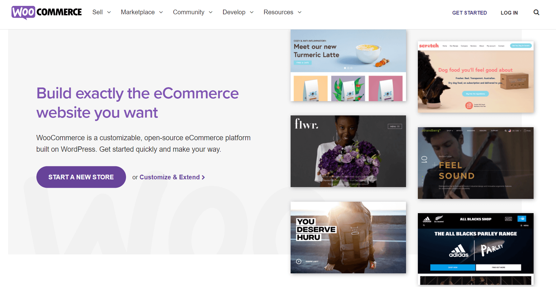
Open-source software, such as WooCommerce, which is a WordPress extension, is open to anyone. Users can easily tweak the source code, pick a domain name, and begin with a free version. However, to create a high-quality eCommerce store, you usually need to purchase add-ons and plug-ins down the road to ensure an efficient user experience.
SaaS eCommerce software, for example, Shopify, requires a subscription fee to get started and hosts your whole platform. Even though you have less ownership compared to an open-source alternative, operational costs can be lower.
Remember, there are no good and bad choices here; it’s all up to your needs and future intentions.
Pricing
You know your budget and business priorities better than we do. To close the best deal possible, read what each platform offers in terms of pricing and how that fits your current planning.
Most eCommerce platform providers share their tiered pricing offers on their sites, so go through them carefully. Plus, check extra costs for integrations and add-ons that may be required before you make your final decision.
Ecommerce Features & Integrations
Do you know what each eCommerce platform’s main features and capabilities are? To gain a high-level understanding of them, search what their top integrations and features are to determine if they tick all your boxes.
For example, what are their primary payment options? Will your customers be able to use PayPal or Apple Pay at the checkout process?
And, of course, your site builder should cater to other business goals, as well. For example, if you have a strong email marketing game in mind, learn if their system integrates with platforms such as Moosend before completing your purchase.
Customer Support
If you decide to partner with a certain provider, you’ll want them to be right at your side in your darkest times, that’s why you should make sure that they offer a high-class customer support service.
Yes, it’s not a piece of cake to find that out if you haven’t experienced it first-hand. But you can have a look at their website pages and social media. Companies that are proud of their customer support always spread the word.
Security
Security is another box you should tick in this exploration round. Learn what measures each provider takes to protect your data and safeguard your customers’ privacy.
You can double-check that information through their website, for example, by searching for ISO certifications and GDPR compliance standards, for starters.
Customer Reviews
And, of course, there isn’t a more valuable resource than current customer reviews and preferences. For example, check which eCommerce platforms are famous in your market segment and why.
Let’s say that you operate in dropshipping. Which platforms do similar dropshipping businesses use, and what is their exact functionality? Don’t miss out on video or blog reviews, including real-life examples and case studies.
Top eCommerce Website Design Features
We’ll begin with some tricky news: Do you know how much time a visitor needs to form an impression about your website? Well, it’s 0.05 seconds. We understand that this may add some pressure to your shoulders, but don’t worry. There’s a lot you can do to make these milliseconds count!
There are many tangible ways to create one of the best eCommerce sites. So think about it: What should a customer run into when first entering your online store to stick with you and make the desired purchase?
Here are some eCommerce design qualities that matter:
- Font: Make it easy to read
- Spacing: Limit unnecessary “noise”
- Copy: Express your brand voice
- Visuals: Make your products shine
- Navigation: Create a hospitable interface
All these traits should interconnect in a meaningful way to entice them. Kind reminder: You probably won’t have a perfect e-commerce store from day one, but you’ll manage to balance things out sooner or later and find your silver lining.
Let’s move to the eCommerce features that ensure an optimal user experience: 1) Homepage, 2) Product categories, 3) Product landing pages, 4) Shopping cart (take a look at some shopping cart software here), 5) Checkout page, 6) Login/Subscription form, 7) Search bar, 8) Contact details, 9) FAQs and 10) Social media.
Also, brand awareness plays an important role in customer attraction. An “About Us” page that describes your company vision or a blogging section can make your customers trust you more.
Now that you know the essential parts of a top-performing online store, it’s time to learn a few more key functionalities that will secure a high-class UX.
Customization Options
If you want to experiment with your website’s design to bring the best results possible, pick an e-commerce platform that gives you access to various customization options that satisfy your needs and aesthetics.
Ready-to-use templates, a drag-and-drop editor, and various color themes and fonts will help you play around until you find the perfect format.
Keep in mind that with certain platforms, such as Shopify, among others, you can easily set up one of the best eCommerce sites without seeking professional web design support.
Dreamy Navigation
To ensure a pitch-perfect user experience, think of your online shop as a physical one. The homepage, for example, is the storefront, where customers or bystanders can see your brand name and all your bestseller products.
When they enter, they can find your products organized on different selves based on categories (aka the product pages). Instead of a salesperson coming on their way, a popup button appears, prompting them to chat.
You can spot the cashier at the top corner of the store or another distinct place waiting for you to checkout. And now the tour is over. Visualizing the process in real-time will help you achieve better navigation and UX.
Mobile and Tablet-Friendly
The percentage of users that complete a purchase through their smartphone has increased over the last few years. More specifically, in the US, 79% of smartphone users have completed a purchase using their mobile devices, according to 2021 data.
You don’t want to offer a clunky experience to mobile users, which could negatively affect your ROI down the road. Navigation should be equally user-friendly for all kinds of screens, including tablets.
SEO Capabilities
For those who aren’t already familiar with it, SEO, which stands for search engine optimization, is an extra useful tool in any marketer’s hands.
With the right keywords and magical SEO practices, you can find yourself in the first results of Google and rule out your biggest competitors. Tempting, right?
To reap those benefits, choose an SEO-friendly platform, such as BigCommerce, to gain maximum visibility. Plus, content marketing actions, such as blogging, will increase your website traffic and, by that, your online sales.
Refined Purchase Process
The end goal of your eCommerce business is to see your visitors convert. To achieve this, you should design a well-defined purchase process on your site. The “Cart” button should be easy to find, and the whole buying procedure easy to complete.
Your customers should also have access to related information they may need, such as return policies, shipping rates, or transaction fees. You can include these resources on the website footer. Don’t forget to mention the payment methods they can choose from, for example, PayPal, Apple pay, or any credit cards you accept.
Finally, make sure to structure your retail processes as well, such as supply chain and inventory management, so that you never run out of stock.
12 Best Ecommerce Site Design Examples
It’s show-and-tell time!
We’ve gathered some beautifully designed eCommerce stores that fulfill the criteria above to inspire you. Enjoy!
1. Soylent
The magic starts with the copy! As they say on their “About” page, Soylent’s mission is “to make complete, sustainable nutrition accessible, appealing and affordable to all.” Delicious, nutritious, and at an affordable price? OK then, count us in!
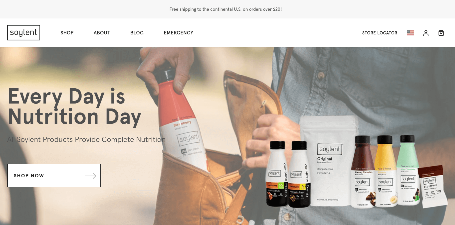
Through clever design and clear navigation, Soylent manages to convince you that their products are the healthier you could find.
Plus, they encourage customers to tag them on Instagram to get featured on the website. Through social media and user-generated content, they aim to attract more visitors and potentially convert them into loyal customers.
2. Ettitude
Ettitude offers organic bamboo bedding, bath, and sleep goods and has excellent navigation on their website. The product categories are readily visible – including gift cards for your loved ones!

Apart from the shipping rates, they share product reviews and information about materials to help the customer make the right choice at the top of the site. When scrolling through their website, you can also find their eco-friendliness certifications.
Last but not least: A 30-day sleep trial. The company offers you bedding for 30 days without a cost. What does that show us? That the business puts our comfort and happiness first. And that’s precious!
3. Warby Parker
Warby Parker is another site with great navigation and UX that enables the visitor to find all the products in the wink of an eye!
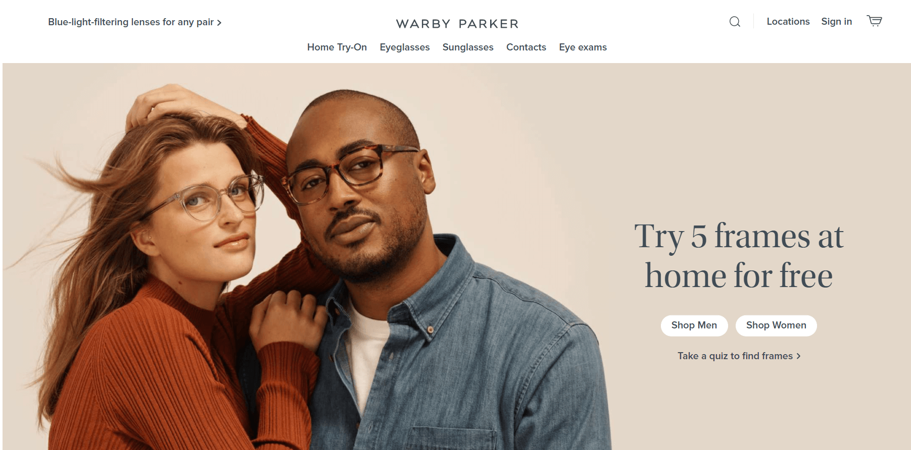
When entering the homepage, apart from information about eyeglasses and frames, the visitor gets notified about other key services they offer, including eye exams. Plus, they’re invited to complete a fun quiz to find their unique style or try eye frames for free.
You can find anything you could ask about eyewear and Warby Parker’s services and policies at the footer. What caught our attention is Warby Parker’s “Buy a Pair, Give a Pair” initiative, which showcases the brand’s vision and social impact.
4. Langly
Ready to embark on a new traveling adventure? Then Langly is there for you with the best traveling equipment.
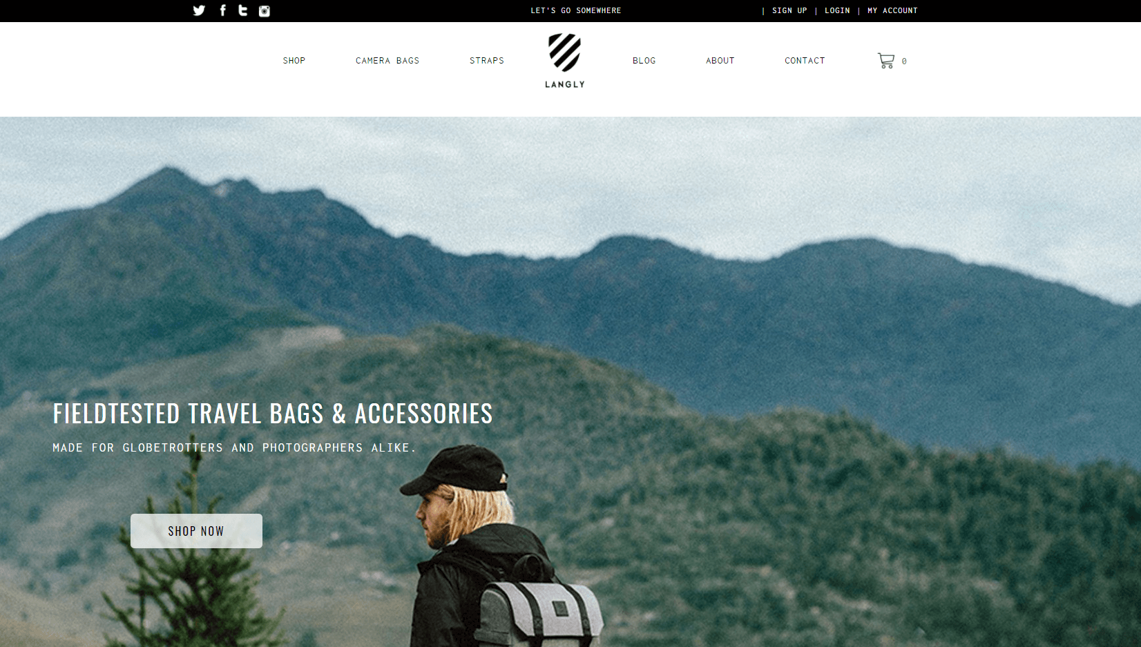
In this eCommerce site, the product navigation runs smoothly, and the customer can easily find what they’re searching for.
Langly also has a strong social media presence on its website. With the hashtag #letsgosomewhere, they bring all customers together and create the vibes of a shared experience.
Finally, this breathtaking video on the “About page” is an absolute delight to watch. The consistent brand voice and style throughout the pages are literally a lesson for marketers:
5. The New York Times Store
Welcome to the New York Times eCommerce website! Apart from credible news and articles, the brand has created an online store with various items, some fixed, some personalized, from T-Shirts to NYT exclusive prints.
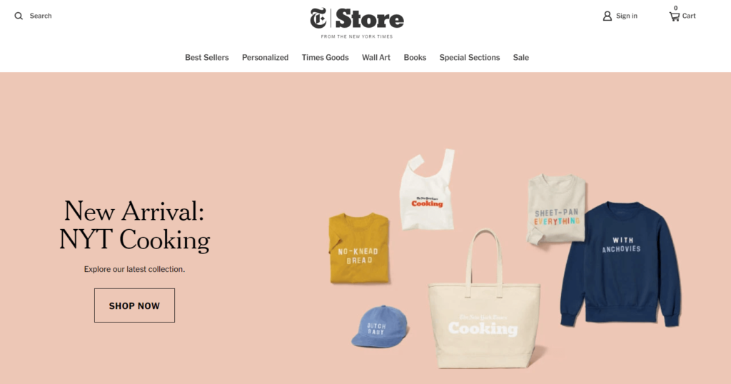
The best part is that the distinct product categories and whole “navigation package” allow the visitor to find quickly what they’re looking for, despite the wide variety.
Bonus points: the bestseller list and the 10% discount off the first order for those who sign up. Those initiatives always get the right attention!
6. Packwire
And now off to the colorful and bright side of eCommerce life, powered by Packwire. Through clever copy and minimal yet cheerful design, Packwire invites you to “Create your custom boxes.”
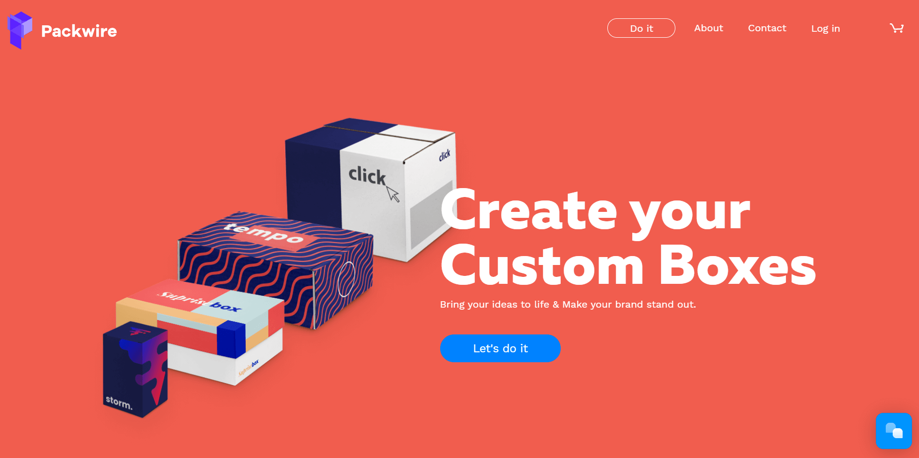
While you scroll down, the different boxes move side by side, and you learn about their specs and customization options.
On the homepage, the visitor also gets a quick but detailed product tour which is super handy. And finally, at the very top, the “Do it” button leaves no room for second thoughts.
The aftermath: If I wanted to create a customized box, I would try Packwire. Mission accomplished!
7. Pure Cycles
When you visit this eCommerce website by Pure Cycles, you quickly realize that if you make a purchase, you don’t only become a bike owner but a member of a community with a greater goal; a lifestyle switch.
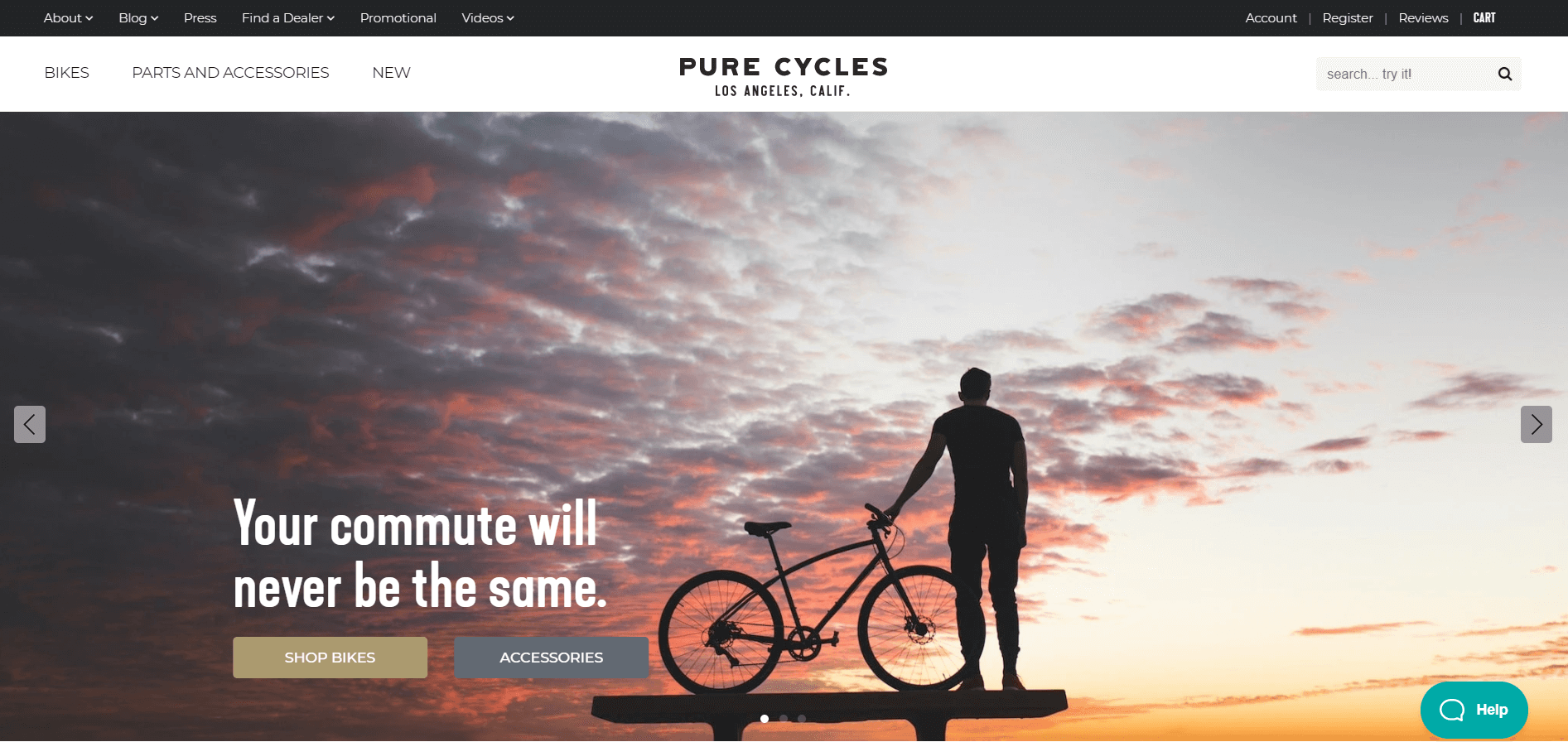
But how does that happen? Their amazing content – pictures, visuals, blog posts, and videos – shows the visitors everything they will gain once they join the tribe.
Plus, product categories and descriptions are top-notch, and it makes sense. It’s not a piece of cake to buy a bike online. The more you learn about each product, the easier it becomes to visualize it and get to the checkout process.
8. Susanne Kauffmann
Susanne Kaufmann is a beauty and spa brand dedicated to sustainability, and you can tell that from the homepage copy and image at first glance.
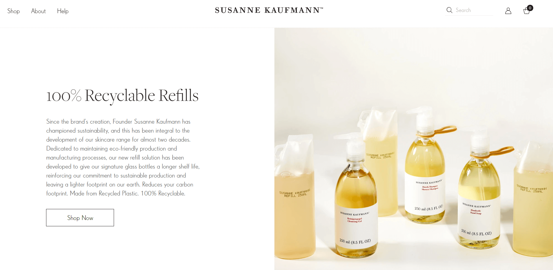
Minimal and eco-friendly packaging shows prospects and customers that they become a part of a higher mission to create a more sustainable lifestyle by buying those skincare products.
When clicking the “Shop” button, you get a clear breakdown of all product categories to find everything you’re looking for, minus the endless scrolling. On the “About” page, you can learn more about the company’s philosophy, origins, and product ingredients or read beauty and wellbeing tips.
Bonus point: The Instagram widget at the bottom of the pages, showing amazing product images that make you want to buy everything at once.
9. Bite Toothpaste Bits
After a quick look at the homepage of Bite Toothpaste Bits, you know that you signed up for something truly innovative through these two words: “Toothpaste, reinvented.” And then, the demonstrated product images shield that impression once and for all.
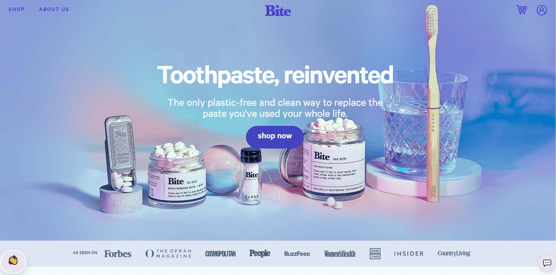
You also find out that huge editorial names, like Forbes and Cosmopolitan, have got their back and approval. And if you press the wavy hand on the left and sign up in the email, you can end up with a free four-month supply. Wow!
Overall, this Ecommerce site created by Shopify has everything a prospect needs to convert. The sparkly images, five-star reviews, quick product tours, and how-to-use guidelines “force” visitors to choose the brand.
10. Julémont Watches
If you’re looking for a sophisticated and unique watch and bump into this eCommerce site, you’ll find it hard to move back. The homepage video shows the manufacturing process of Julémont watches and puts you in the right atmosphere straight away.

Apart from the watches, the visitor has access to the retailer map to view which location suits them best, and through the “Concept” button, they land on a beautiful page where they can learn more about the brand and the story behind it. Besides, the copy is clean, straightforward, and enticing. We loved it!
11. Mahabis
Mahabis have brought slipper-footwear innovation to a new level. Here’s how they introduce themselves on their website:
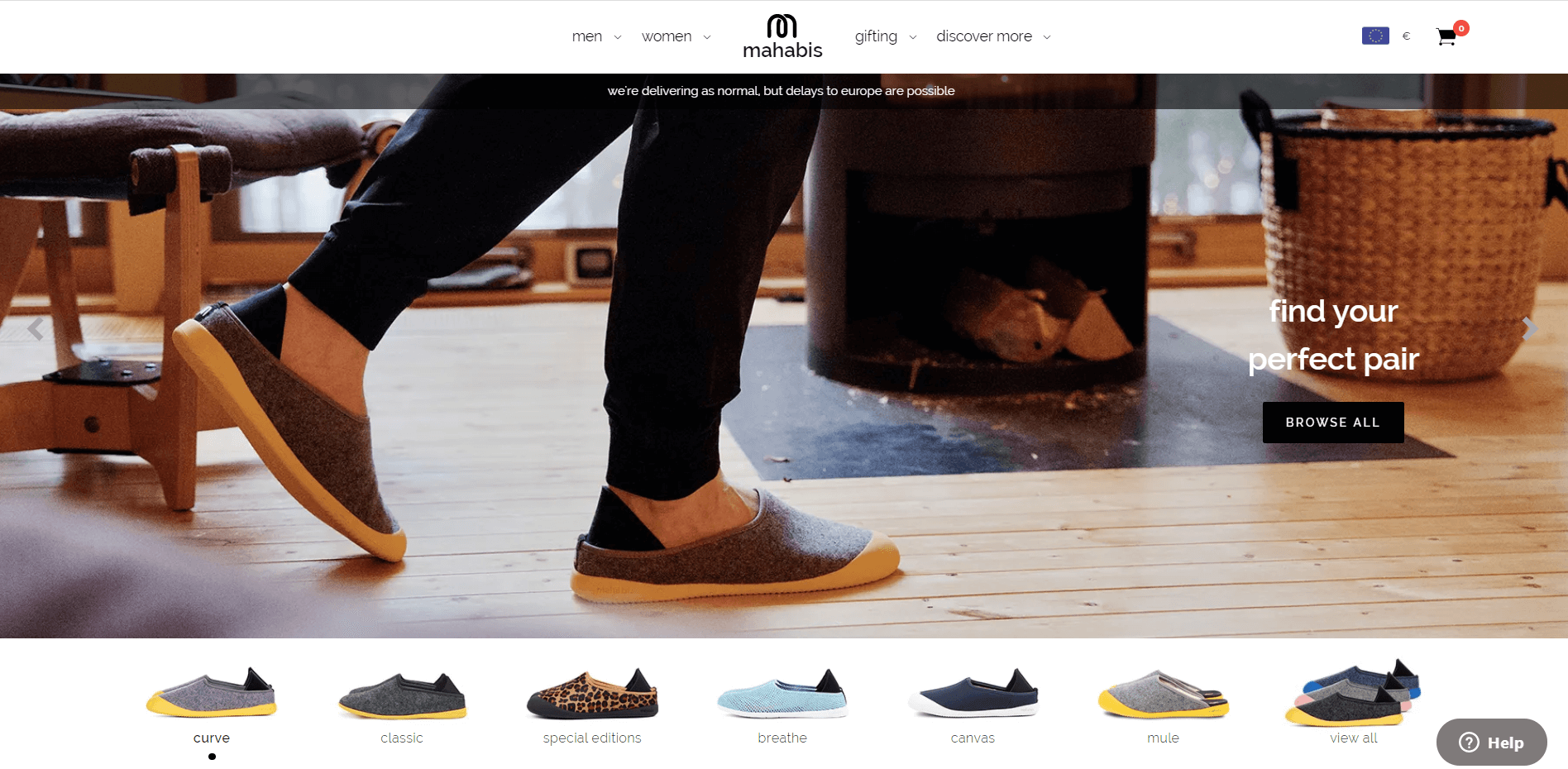
“We’ve taken the world’s most comfortable shoe – the slipper – and ripped up the rulebook to create something functional. Something beautiful. Something to help the world spend its time well, no matter the weather.”
And we believe they did, by observing all the different materials they’ve used to create the footwear. The biggest highlight of this online store is the high-quality product and header images. You can observe the texture and materials and experience comfort from a distance.
12. Native Union
Native Union sells design and quality products catering to modern life – mainly the tech side of it. The website has minimalistic design elements and steals your heart with its simplicity.
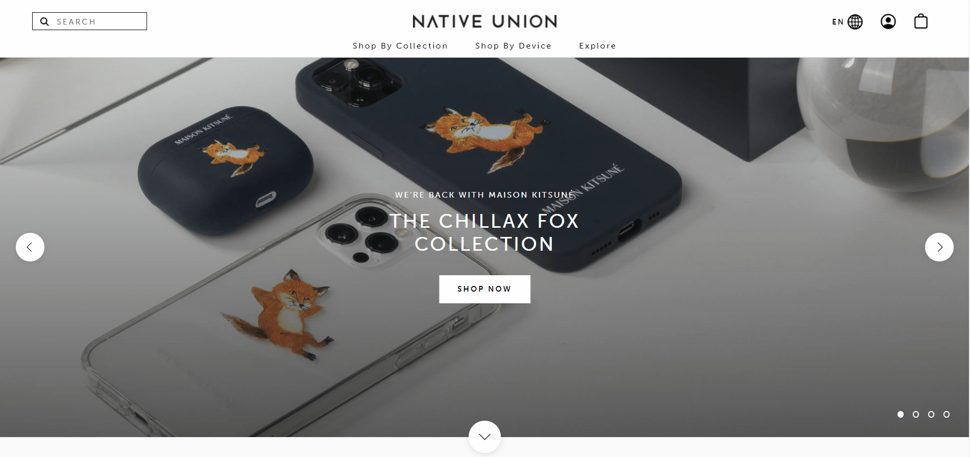
Its best parts are the great product presentation and navigation. What also stands out is “The journal,” a blog where you can find design tips, interviews, and news. You believe that for them, lifestyle is indeed the biggest deal.

13. Burga
BURGA is a great example of a lifestyle and fashion accessory brand done right.
While browsing the catalog you’ll notice that a great deal of attention went into presenting their unique designs.
Furthermore, since 80% of BURGA’s traffic comes from mobile, their responsive browsing experience feels genuinely polished.
Oh, and next time you visit the shop on your smartphone, notice a small but crucial detail – the system detects its model to present you with a personalized experience.
Best eCommerce Sites: Tips For Amazing Online Stores
Yes, the resources above are useful, but we bet a few final practices on how to set up one of the best eCommerce sites can wrap up things perfectly. So here you go!
Choose Simplicity Over Complexity
As you understand from the examples above, the simpler your website format is, the easier it gets for customers to find what they need. If you offer a huge variety of products and services for different purposes, then the outline and navigation should be even less complex.
Imagine stepping into a store with poor customer service and no labels or signs to guide you through it. You find it super hard to find what you’re looking for, and you end up losing valuable time. Would you go back?
Avoid letting your visitor get lost in an ocean of unlimited products if you wish to convert and retain them. Show them where to head off with proper categorization, clever copywriting, and product labeling. Keep in mind that interactive content, such as videos and visuals, is also precious and can boost UX.
Define Your Buyer Personas
How well do you know your target audience? Are you aware of their demographics and needs? Try to grasp how they feel, what their biggest worries and delights are, and you’ll be one step closer to winning their heart.
Identifying buyer personas is key to sustaining your outreach and retaining a healthy ROI. To craft an Ideal Customer Profile, find your top customers and analyze their traits and behavior. Don’t hesitate to reach out to them for information to understand what they like about your website and what needs to be improved. Their input can be game-changing!
One thing you should consider when you target businesses instead of individuals is that the bigger the target company is in headcount, the more complicated the purchase decision can become.
Apart from the end-user, in most cases, you also have to convince high-level decision-makers and shareholders that your product or service is worth their money. To take them by your side, make your website and customer support services equally accessible to them.
For example, share customer reviews, write blog posts about your new features, and create a tiered pricing plan. All info that is frequently asked by prospects should be readily accessible and comprehensive.
Analyze Behavior and Adapt
Once your eCommerce store is ready, keep an eye on key metrics, such as conversion rates and click maps, to analyze the visitors’ and customers’ behavior. Here are some questions that will help you manage this process:
- What are your best-selling items, and what remains unsold?
- What are the most clicked pages?
- Where do visitors spend more time when they land on your site?
- What is the most common question your customer support receives?
All these answers, combined with the buyers’ personas profiles, will allow you to adjust your website if needed and improve UX. And again, keep your spirits up – you’ll probably need a trial and error phase until you find the magic recipe to create the best eCommerce site for your business.
Invest in Email and Social Media Marketing
No matter how cool and fancy your website looks, without the right marketing efforts, you’ll find it hard to convert your leads down the line. First off, a structured email marketing process will help you nurture your relationship with new visitors and customers.
Here are some typical email examples you can include:
- Welcome email
- Abandoned cart recovery
- Product recommendations
With a tool like Moosend, you can create an automated eCommerce marketing process with easy-to-use templates and never miss a chance to connect with your customers and prospects.
If you want to get started with email asap, you can try Moosend’s platform to set your eCommerce email marketing strategy in motion, the easy way.
Social media marketing will also increase your brand visibility and bring new customers to you. Take Langly as an example: They encourage customers to share pictures with a certain hashtag to feature them and create a cheerleaders community!
Share Your Mission and Social Impact
Your brand values and processes don’t only define your business but your customers, too. That’s why 66% of respondents, according to research, value transparency as one of the key factors that attract them to a brand. If you scroll through the design examples in the previous section, you’ll find various value and mission statements for inspiration.
Same works with social impact. Consumers increasingly turn to brands that raise their voices for social issues and injustices and adopt more eco-friendly solutions and procedures. Always share the purpose that drives you, and invite your site visitors, customers, and followers to become your community members.
That was it, everyone. Now that you know how to build the best eCommerce site, roll up your sleeves, and hit the road! You got this!


 Published by
