


15 Newsletter Signup Examples With Best Practices [2026 Update]
Published By Alexandra Marinaki
July 29, 2022

29/07/22
Are you struggling to draw new subscribers in? Growing an email list is a common challenge for businesses. Newsletter signup forms are your go-to tool, encouraging new audiences to opt-in so they can receive your exciting news straight to their inboxes.
In this post, you’ll find the top newsletter signup practices to create memorable forms. We’ll also take a sneak peek at our favorite newsletter signup examples from successful brands to get you inspired.
Make them sign up with all their heart
Use Moosend’s form and landing page tools to grow your audience.
Start freeWhat Is a Newsletter Signup Form?
Email marketing is an effective marketing technique that offers personalization and automation capabilities along with high ROI potential. To reap its benefits, you first need to get the customer’s email opt-in to comply with GDPR guidelines.
An email newsletter signup form is used to capture a visitor’s email address. When the customer subscribes, you can add them to your email list and start sending them relevant newsletters.
Newsletter signup forms come in different shapes and sizes. Whether they are sticky, popup, or full-page forms, their end goal is always the same: to turn website visitors into subscribers.
Thankfully, many email marketing platforms help you create those assets in just a few simple steps. For example, with Moosend, you can access premade landing page, online form, and email templates and customize them based on your needs.
Email Newsletter Signup Form Best Practices
How do you get visitors to join your email list? Let’s explore how to design high-converting signup forms to boost your signup rates:
1. Choose the right signup type
Which are the perfect form types for your lead generation efforts? It depends on parameters like your business goals and the audience group you’re targeting.
Here are the most common types that form builders offer:
- The classic popup form, which can also be exit-intent
- The inline subscription form appearing within a page’s content
- The floating bar form located at the top or bottom of your page
- The sticky form that sticks with the visitor no matter how far down they scroll
- The sidebar that appears on the right or left side of the website
- The full-page form covering a visitor’s entire page
- The footer signup form, capturing highly engaged visitors
For example, a food blog looking to capture casual visitors in search of recipe inspiration could pick an inline form embedded into the footer. It doesn’t disrupt the reading experience and remains visible as readers scroll through.
On the other hand, a SaaS business could create an exit-intent popup form to boost signups and start nurturing potential customers.
2. Offer an incentive
It’s only natural for people to want something in return for giving up their contact information. That’s why one of the most popular newsletter signup tips is to provide solid incentives for email signups based on customer intent.
Depending on your industry, there are different newsletter signup incentives to meet your goals. For instance, eCommerce forms usually offer discounts or coupon codes on the first purchase to make subscriptions more appealing.
At the same time, in B2B, lead magnets are more popular choices. For example, free resources or exclusive content like eBooks, infographics, and templates can drive more signups. In any case, make sure that your incentive is strong, valuable, or exclusive so you can get more users to join.
3. Explain the signup benefits
Whether you offer incentives or not, it’s wise to include the benefits subscribers will reap by signing up for your newsletter. Your value proposition defines you as a brand and should be included in all your marketing assets with the right messaging.
Start with the email content that will land in their inboxes after subscribing. It could be product or service updates, insider news, exclusive deals, or early access to new products or services.
Apart from the type of email content you send, another key signup form practice is to let people know how often you will send email campaigns. With spam emails piling up in their inboxes, it’s only logical that they want to learn about the email frequency beforehand.
As a result, they’ll be more eager to click on a call-to-action to join a monthly newsletter with valuable tips and updates compared to a vague message urging them to subscribe.
4. Make your forms simple
People aren’t willing to spend much time filling out forms from brands that they probably aren’t familiar with yet. Plus, they often get more suspicious towards businesses asking for excessive personal data.
Effective newsletter signup examples are straightforward, guiding users through a quick process. This translates into adding a few custom fields to make your forms simple, with one or two steps required to complete.
When crafting long forms, consider breaking it up into more steps. By doing so, you remove the frustration of filling out too many form fields at once. Consider engaging visitors with a compelling incentive or a qualifying question. Then, they can move to the second step where you ask for their contact information.
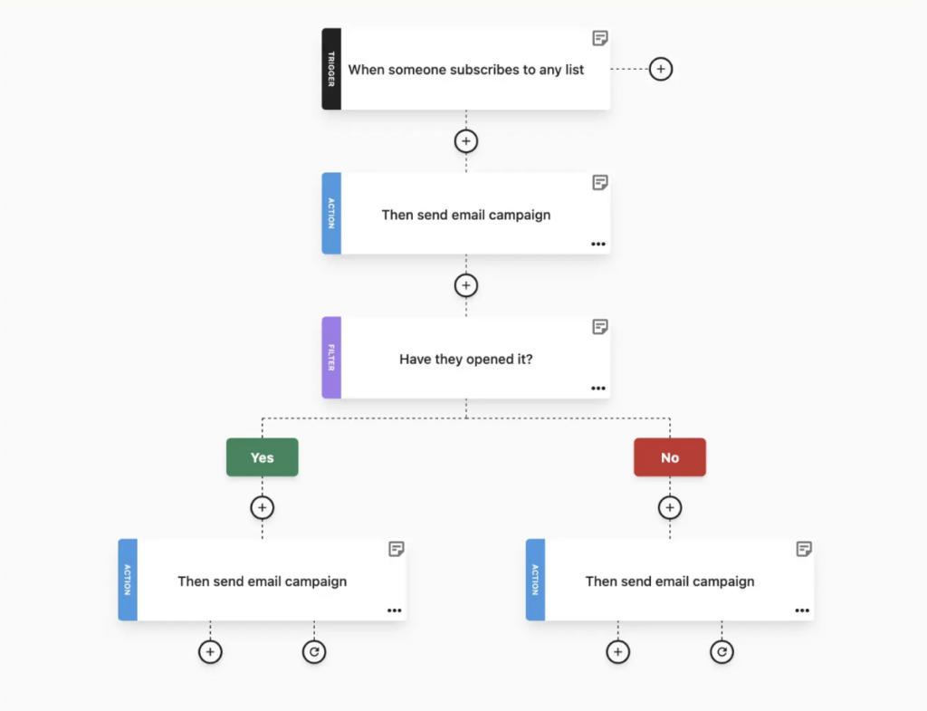
Let’s discuss how such a multi-step form works:

Moving to Surreal’s multi-step signup form, we can see how it can be as effective as a single-step form. Turning form completion into a short quiz, they first ask whether the user wants a 25% discount.

In the second step, the brand invites its audience to unlock the discount by filling in their email address. They also mention additional benefits of becoming a Surreal subscriber, such as getting tasty bargains.
5. Optimize your form design
The first step to attractive newsletter subscription forms is designing them with simplicity in mind. But simple doesn’t mean boring. You need visually engaging forms that catch and keep your audience’s attention.
Choose the design elements of your signup form carefully to keep things minimal yet appealing. Follow your brand guidelines and adopt the look and feel of your website. Think of assets like colors, fonts, and visuals. All of them play a pivotal role in building a seamless user experience.
Newsletter signup form components aren’t limited to fonts or images. White space is also crucial, creating breathing room and helping potential subscribers grasp the main message by improving readability.
But not all businesses have the resources or time to design responsive and eye-catching signup forms from scratch. Thankfully, most online form builder apps like Typeform, Jotform, or even marketing platforms with form-building features like Moosend offer premade subscription form templates. These tools free your hands while offering you compelling designs that you can also tailor to your branding using intuitive drag-and-drop editors.

6. Write clever copy
Flawless copywriting is mandatory for every successful asset in your digital marketing strategy. To get the right messages across, write catchy copy lines that help you convert your audience.
So, what exactly do you need? An attractive headline, value-driven main body, and a CTA button. All these elements must get to the point and emphasize the benefit of subscribing. You can also add a sense of urgency by including the word now or other time-sensitive words on the copy to boost email subscriptions.
Plus, make sure you deliver on any promise you make in your signup form. Misleading users with benefits they won’t receive is a big no-no. Also, if you communicate a specific email frequency, you must stick to it. Imagine a user’s frustration if they signed up for weekly updates and only receive an email campaign every now and then.
Lastly, your newsletter signup form copy should match your tone of voice. A brand that’s popular for its friendly and humorous tone wouldn’t go for formal messaging in their form copy. The golden rule is to maintain your unique tone of voice throughout your communications.
7. Add an outstanding CTA
Calls-to-action (CTAs) are the most critical elements to convert your visitors into newsletter subscribers.
A well-crafted CTA button doesn’t always have to be full of visuals and colors to work. Choosing the right copy is key to nailing your CTA buttons but can be a little tricky. For instance, if you make it too long, you might get your visitors bored. Similarly, if you make it too short, they might not even notice it.
Highlighting the value of joining your mailing list is of paramount importance. Choose the right wordplay to attract visitors and try to make your CTAs highly visible, like this one from the Morning Brew, found at the top of the website:

8. Choose the right timing
While you might think that your popup display time is trivial, timing is one of the most crucial elements you need to optimize before publishing your forms. For example, if you display a popup the moment a visitor enters your website, it will likely annoy them. Instead, displaying it when visitors show exit intent can work miracles.
Delivering a great user experience with timed popups will increase your visitors’ likelihood of clicking on your CTAs. So, if you want to skyrocket your newsletter subscription rate, you have to wait for those crucial seconds to pass and then schedule an irresistible popup to capture their email addresses.
That’s why Swarovski made sure to wait for a few seconds while browsing their homepage before showing off the pop-up form:

The first thing you need to master in your popup display is identifying your visitor’s average time spent on your page. Then, based on your products or services, you can decide how much time your visitors need to digest your content.
You can use a tool like Google Analytics to track everything down. And remember, the right popup display time may require a trial-and-error phase, so don’t be afraid to test things until you get the best results.
9. Use social proof
According to the definition, social proof is a psychological and social phenomenon that describes how people imitate the actions of others to determine the right way to act in a given situation.
Here are some social proof types to choose from:
- Number of satisfied customers/subscribers
- Expert endorsements
- Testimonials
- Visual social proof
Social proof is a tool that holds tremendous power when you use it the right way. Whether it is a testimonial or your subscriber count, social proof can reduce uncertainty and increase your form efficiency.
10. Conduct A/B testing
A/B testing can help you supercharge the effectiveness of your newsletter signup form when you feel unsure. In brief, it’s a method that lets you compare two versions of the same variable and find what resonates most with your target audience.
For example, you can test different versions of your copy to see what works best. Or find the best newsletter signup placement on your website. While the classic popup can do the trick, sticking to only one type won’t help you find the perfect page placement for your form.
Finally, your headlines are your most significant impression triggers, influencing the performance of your newsletter signup. Try coming up with exciting captions that will get your visitors to click on your CTA and run an A/B test to find your winning version.
11. Send a welcome email
Welcome emails have the highest open rates, reaching 91.43%. So once your audience signs up for your mailing list, send them a welcome email campaign to start communication via this channel while interest is still warmed up.
If you offer an incentive to new subscribers, mention how they can claim their reward. You can also share what they can expect from you going forward to bring more suspense. And if you want to get their double opt-in, you can ask them to confirm their subscription.
Looking for a successful welcome email example? Look at his amazing campaign from Patagonia, including valuable information about the brand:
Subject Line: Welcome to Patagonia emails

Always remember to add an unsubscribe button and give your customers the option to say bye if they wish. If not, spam complaints will start rising and email deliverability will decline over time. You can also add a preference center to hyper personalize future emails.
You can easily set up a welcome email workflow using email automation software like Moosend or Mailchimp. To save time, Moosend offers premade recipes to help you build your welcome sequence easily following if/then logic.
15 Best Email Signup Examples & Why They Work
Now that we’ve analyzed what makes an effective form, it’s time to check real-world signup form examples to get inspired:
1. Nominal

Why it works:
- Nominal’s popup form headline stands out due to its original copy, showing appreciation and a giving attitude.
- The 20% discount is introduced straightaway, which makes it hard to miss.
- They built a simple and elegant form design with a clean signup section and a compelling GIF with alternating images of people wearing the brand’s jewelry.
- They set expectations on what users should expect from the newsletter.
2. Allbirds

Why it works:
- Allbirds used original copy to outline what potential subscribers should expect from their emails.
- They nailed the conversational style in the headline by using slang language and a question to target exclusivity fans.
- The “new limited-edition products” can increase conversion rates as many consumers appreciate early access incentives.
- The note stating that they can opt out whenever they wish is a thoughtful addition from a trustworthy business.
3. Moosend

Why it works:
- Last Christmas, we at Moosend used a popup signup form to promote our seasonal sale with a headline that created urgency and added a personal touch.
- We invested in colorful design with a gift image and the coupon code and Christmas elements to match the holiday spirit.
- The countdown timer informed visitors about the time left to claim the discount.
- We added a quick note of the terms and conditions to avoid any confusion.
4. Nerd Fitness

Why it works:
- Nerd Fitness used motivational phrases to encourage visitors to subscribe.
- The headline and matching visuals highlight access to free resources, such as guides and tools.
- They indicated that the resources sent in their newsletter already provide value to 100,000+ people, to build trust through social proof.
- The CTA button stands out, including clever, actionable copy.
5. Revelry

Why it works:
- Revelry created a two-step sign up form to offer visitors the opportunity to win a $200 gift card.
- The user can also select if they’re the bride, bridesmaid, or have another role, to power up their email segmentation efforts.
- They included powerful images displaying some of their beautiful products to attract more subscribers.
6. Topo Designs

Why it works:
- Topo Designs used a bold and actionable headline to prompt immediate action.
- The red color of the CTA button is attention-grabbing, while the white space surrounding it enhances readability.
- The form copy is clear: To claim the 10% discount on their first order, readers only need to enter their email address.
- They added a link to the privacy policy, which is a smart move for GDPR compliance.
7. Frank Body

Why it works:
- Frank Body used its unique, cheeky brand voice in the copy with phrases like “Go on, babe” and the brand’s pastel colors to showcase its identity.
- They highlighted the 10% first-time discount, and the different types of email content their subscribers will receive in future email campaigns.
- They shared a link to a skincare quiz to offer personalized recommendations, which is an excellent way to engage visitors from the first touchpoint.
8. Frances Valentine

Why it works:
- Frances Valentine invested in a minimalistic form layout including a single signup field.
- They used a clear message in bold red and plenty of white space to make it pop.
- The colors matched the tone of the website, ensuring a strong and consistent brand identity.
- They added an image of a woman wearing one of the brand’s colorful dresses, so that users instantly visualize the experience.
9. Graza

Why it works:
- Graza shared a dual incentive—a $9 dollar discount and free shipping to increase conversions.
- The brand colors and fonts used in this newsletter signup example makes the form blend naturally on the website.
- They included the brand name in the CTA and the product images to boost brand recognition.
10. Solo Stove

Why it works:
- Solo Stove’s is the perfect newsletter signup form example that checks the simplicity and clarity boxes.
- They placed the signup form at the homepage footer to attract visitors who scrolled down until the end of the content.
- The warm, pun intended headline, the powerful incentive, and the action-oriented copy are effective tools to drive conversions.
11. Poketo

Why it works:
- Poketo chose a floating bar that fits perfectly with the rest of the website design.
- They used short and concise copy with actionable verbs and a CTA following the same logic.
- They added a 15% discount as an incentive, highlighting it in bold.
12. The Hoxton

Why it works:
- The Hoxton invested in a clean and minimalistic design in this signup form example, focusing on the key information.
- The catchy headline highlighted the exclusive nature of the email content.
- They let readers know that they’ll be the first to hear about their exciting updates, making them feel special.
13. AriZona

Why it works:
- Arizona’s newsletter signup form followed the brand’s overall style, with funky colors and elements.
- Their copywriting is straightforward and got their messages across with clarity.
- The call-to-action is attractive enough to motivate visitors to claim a generous 10% discount off their first order.
- The CTA button pops out with great color, and the visitors can quickly tell what they must do to get their prize.
14. Rogue + Wolf

Why it works:
- Rogue + Wolf’s popup form is a prime example of how to match your forms with your website design.
- While the CTA could have been a different color, the white font and exceptional copy make up for it.
- They added an incentive that’s hard to ignore to turn visitors into customers straightaway.
15. Copyhackers

- From Copyhacker’s signup form headline, the reader can quickly understand what this form is all about.
- The information that follows uses the power of social proof to convince visitors to sign up, reassuring them that they can unsubscribe anytime they want.
- Even though this newsletter signup flows organically with the rest of the website content, it’s hard to miss in the footer.
How to Design a Newsletter Signup Form with Moosend
Creating attractive newsletter signup forms might sound like a lot to take on. Moosend’s signup form builder allows you to design beautiful and functional forms within minutes—even if with no experience or tech skills.

How will you know which elements to put together? No problem, just pick one of the built-in signup form templates that align with your lead generation efforts. They come with professional, fully customizable designs, including all the necessary components.
With the user-friendly form builder, you can remove, move around, and tweak content blocks as you see fit. Adding your own brand assets like fonts, colors, or images, and tailoring the copy is just a matter of a few clicks.
To take some of the workload off, use Moosend’s AI writer to improve your copy, adjust the tone, or fix spelling and grammar.

Note that you can also set up your form visibility settings, choosing when it’s displayed and whether recurring visitors see it. Additionally, the conditional rules allow you to show or hide the form, depending on the audience group, and decide where it appears on your website.
You have the option to publish the form directly on your website or on external platforms. Once everything is set up, you’re ready to review your settings and hit “Publish” to start bringing valuable subscribers into your list.
Newsletter Signup Forms That Click No Matter What
Are you inspired by the fantastic newsletter signup examples above? Find the ones that suit your brand style, choose the best incentive, and demonstrate it as effectively as possible.
To build a seamless signup process that will boost your lead generation, schedule a welcome email using automation to show your appreciation to new subscribers. In addition, if you offer an incentive like a coupon or discount, explain how to claim it. Happy list growth!
Similar Posts

 Published by
 Published by


Create, send and optimize your email marketing campaigns