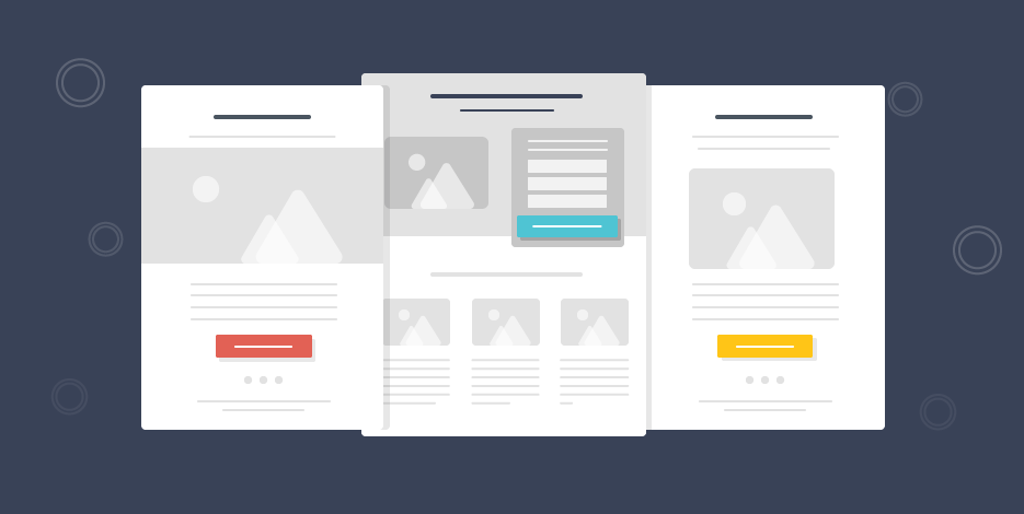
Newsletter Images: 13 First-Class Ways to Boost Clicks
When it comes to marketing your products, images take the prize for helping success reach you.
So, imagine combining the unbeatable force of imagery with the strongest marketing channel, email marketing.
Yep, that’s an effective combo alright!
Let me show you around my inbox’s fabulous treasures and the various ways companies out there use newsletter images to skyrocket their clicks and conversions.
But first, let me give you the numbers tour.
Why do I need newsletter images?
Not sure your next newsletter should include at least one powerful image?
Then these facts might help you make up your mind.
- When people hear information, they usually remember only 10% of it after three days. However, if the information is paired with a relevant image, people remember 65% of the information three days later.
- Visuals increase a person’s willingness to read a newsletter by 80%.
- 65% of users prefer emails to contain mostly images.
How to use images in your newsletters
Creating a newsletter is no rocket science. But you must know a thing or two to make it amazing and effective.
It’s clear that vision trumps all other senses. And pictures beat text as well. Reading takes time while absorbing the information an image gives us is much faster. So, here are 13 ways to use newsletter images and boost conversions before you know it.
1. Illustrate your products
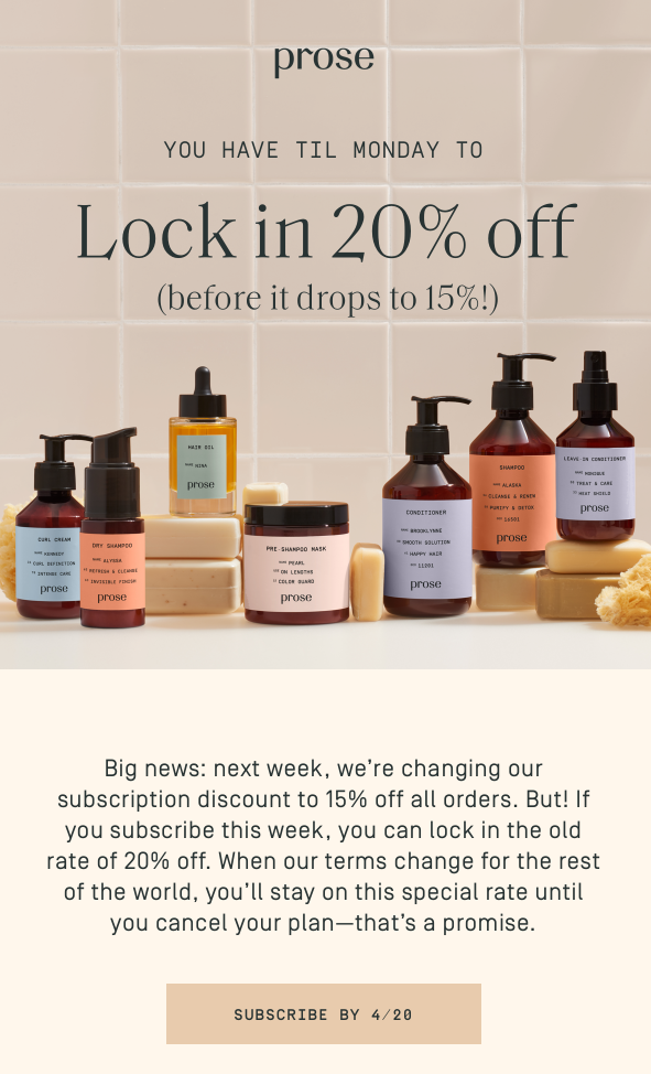
Sometimes words are not enough. Especially when you can boast such beautiful packaging. Prose uses a “family photo” to present its products and let subscribers know exactly what they’re getting.
2. Set the mood
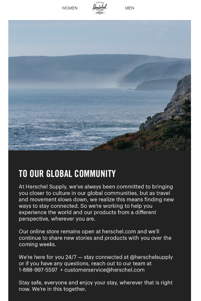
You might be selling products, but you’re much more than that. You are a brand with character, that represents certain values and builds certain impressions towards your customers.
And as a brand, there are times when you need to carry across a message different than the one your readers are accustomed to receiving. When this time comes, make sure you pick the right image!
3. Be seasonal
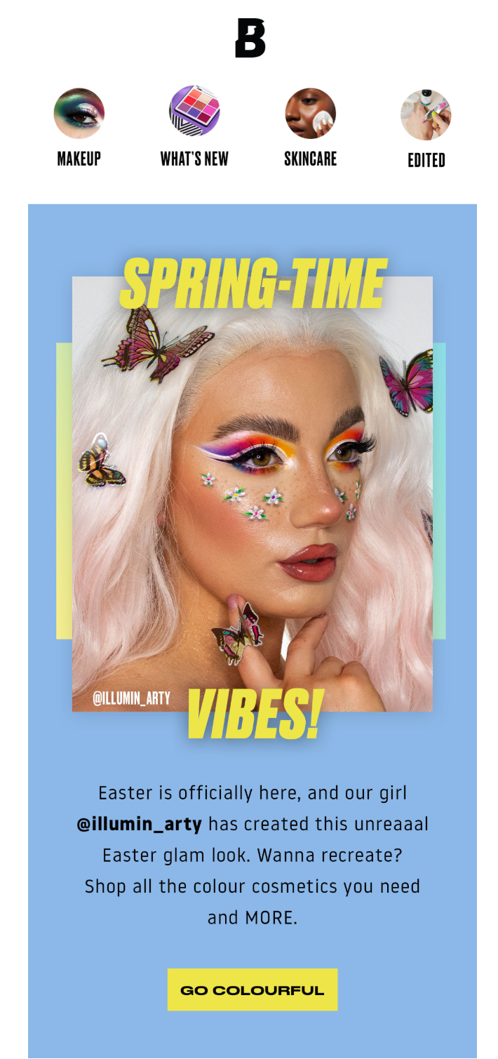
Sometimes you’re so absorbed with work and all that you forget that Spring has come. Thankfully, email newsletters save the day by arriving at your inbox at the right time, reminding you that it’s that time of the season again!
Be it Spring, Christmas, or Earth Day, special occasions are always a good reason to send a newsletter, and images are here to support your efforts!
4. Appeal to their senses

Just when I thought that one shower was enough for the day, this newsletter came in. I mean, don’t you just want to head straight to the shower and take a long bath treating your body hair like you should? All you need now is some Lush products to make it perfect. And you know where to get them!
Pictures are more powerful than you may think. And they can draw your readers attention’ faster than you know!
5. Make your newsletter fun
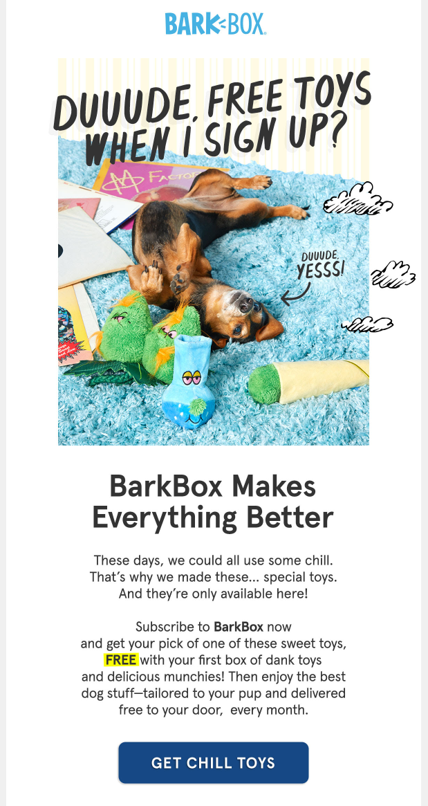
Don’t be a bore! If it suits your brand, inject a little fan in your designs and you’ll see it can go a long way to catching your subscribers’ attention. Look how cute these little hand-drawn clouds are and how they stand out from the newsletter.
Sometimes, visually appealing illustrations can be captivating, and lead to pleasantly surprising your readers and alluring them to take an action.
6. Use them as an attractive background
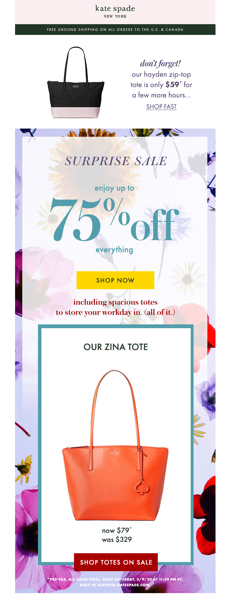
One image is great. Two images? Awesome! Just look at how this Kate Spade newsletter makes its star product stand out by using a colorful background image.
This is a smart way to keep your newsletter clean and minimal while adding just the little something that will make the difference.
7. Liven up your newsletter design
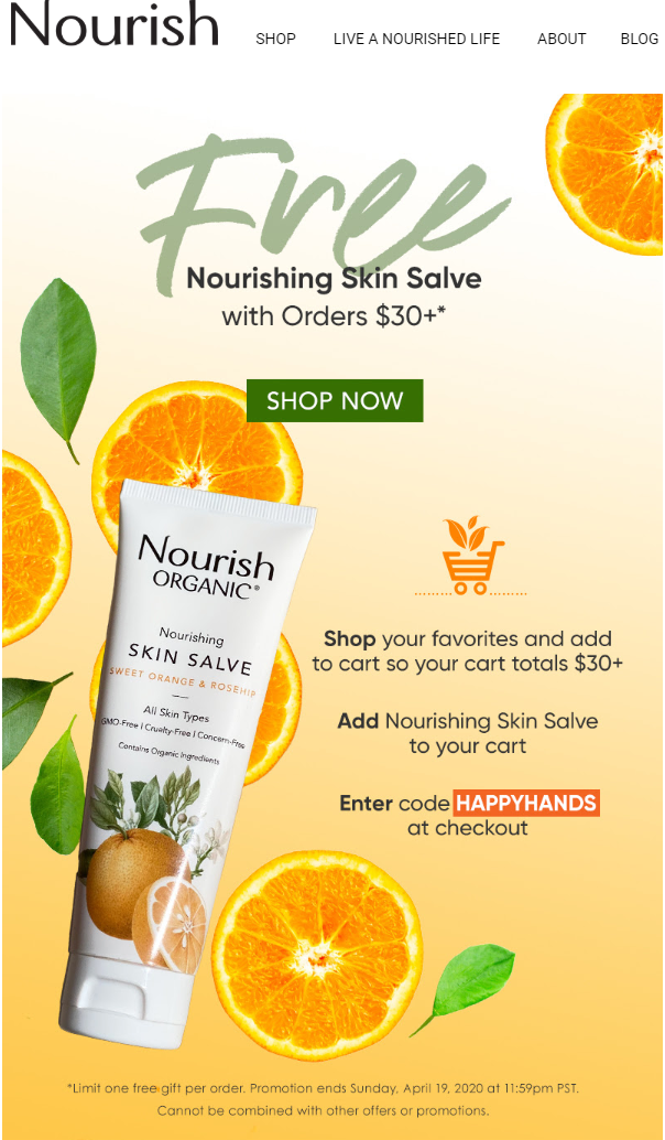
This is an orange skin salve. And you love oranges. So you’d also probably love this skin salve. But what if you received this newsletter and didn’t the product’s description?
Well, thankfully, a few pieces of orange slices here and there make it hard to miss. In many cases, images can be much more captivating than some typed text!
8. Make it personal with an image in your newsletter
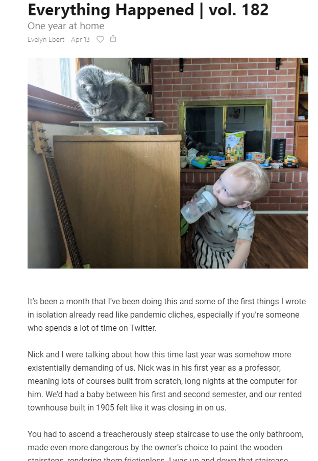
Especially for blogs, creating a friendly vibe that will help your subscribers engage with your newsletters fast is a top priority. So what better way to achieve this than enriching your content with personal, real-life photos?
Try creating your next newsletter with Moosend and find out has easy it is to add images from your desktop to your design with our Image Picker!
9. Make a stronger point for your product
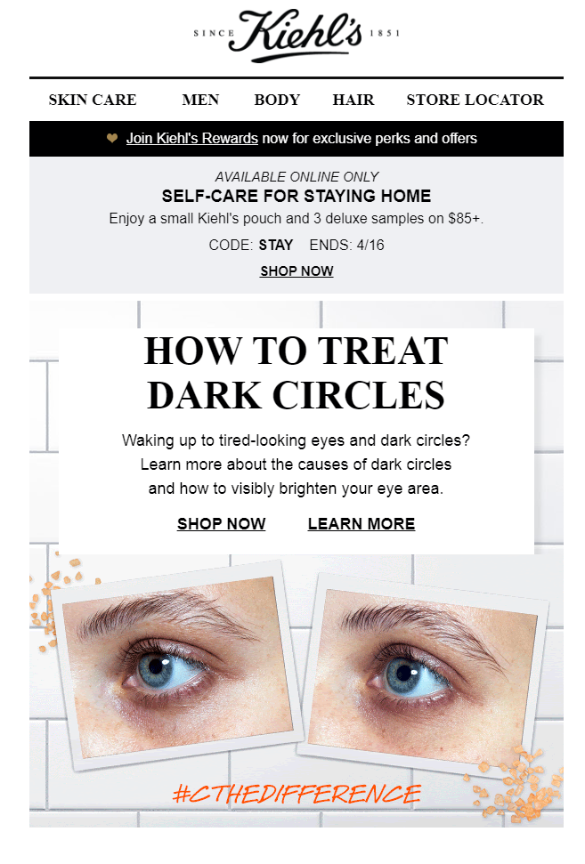
We all know how terrifying dark circles can be. But just in case you forgot, this picture helps you refresh your memory and click this “Shop Now” button faster than ever!
10. Show off your followers with images in your newsletter

If engagement is your goal, then you should know that using faces is the ace up your sleeve. People love faces. And your Instagram followers are the best faces to use!
Strategically show off your fans and draw even more fans by adding images of your followers showing love to your brand. This will add value to your newsletter and wake up your subscribers’ shopping instincts for sure.
11. Use images as your canvas
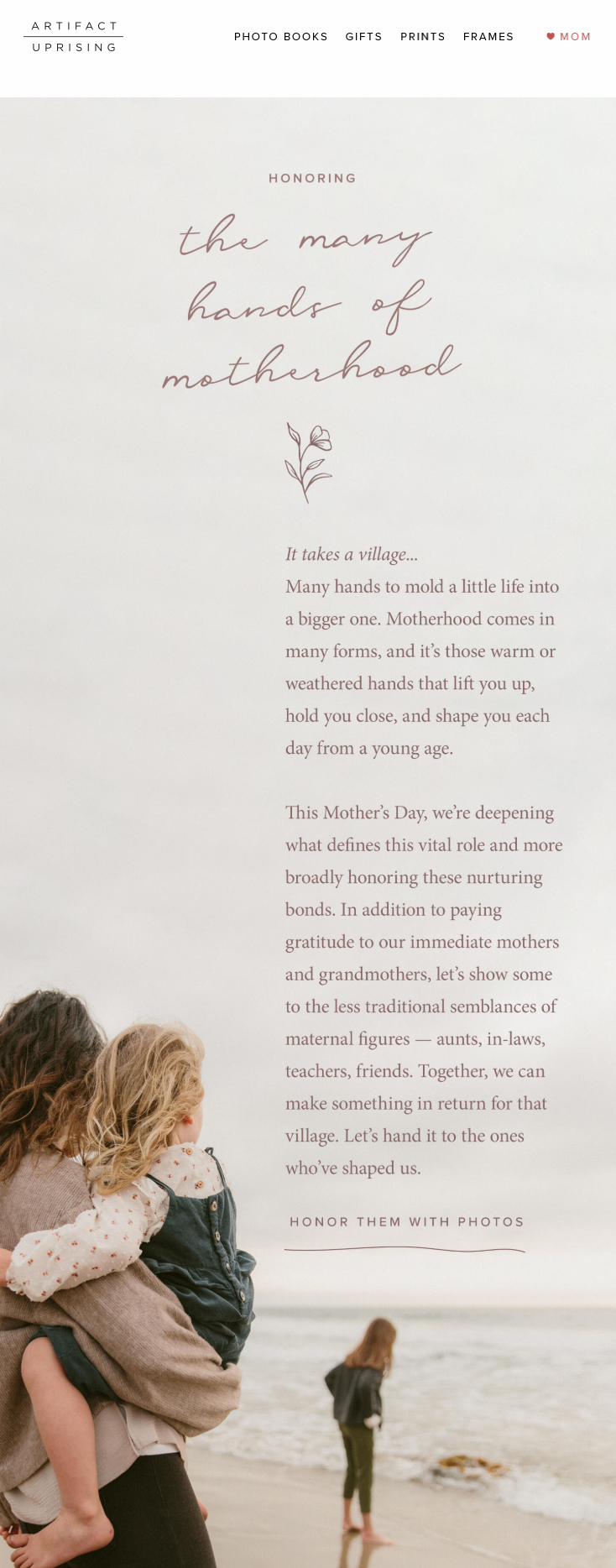
You can create a newsletter with some great copy, and add a beautiful image to make it shine. Or, you can add your great copy on a beautiful image, and BAM!
You got yourself a unique newsletter design that will bring out your copy and draw attention to your message.
You can easily create a design like this by using stock photos from various websites. Or you can just use our Image Picker straight from the Moosend designer to instantly search and add the photo of your choice through Unsplash photos.
12. Show your other side
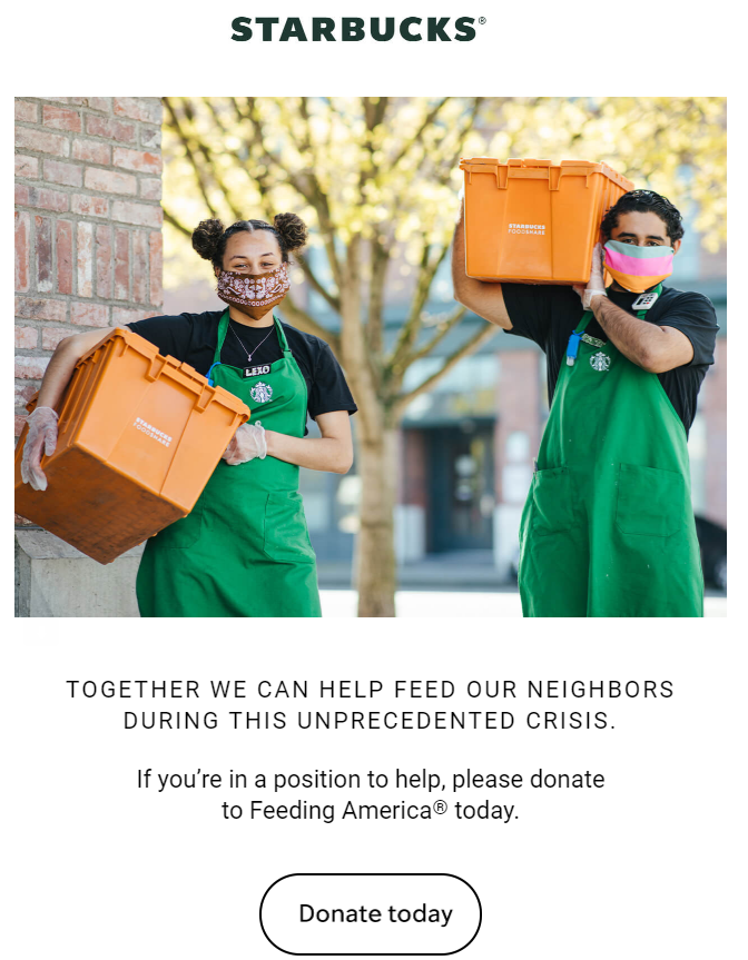
A business has many faces. And they are all part of what makes your brand unique. You can successfully communicate this to your subscribers with a powerful image showing you or your staff in action.
Be it an event you organized, a donation, a party, anything you’re proud of, and want your readers to know about, say it with an image.
This is a powerful storytelling method that helps your audience feel engaged with your brand, and it’s more likely to be shared and discussed.
13. All the spicy details
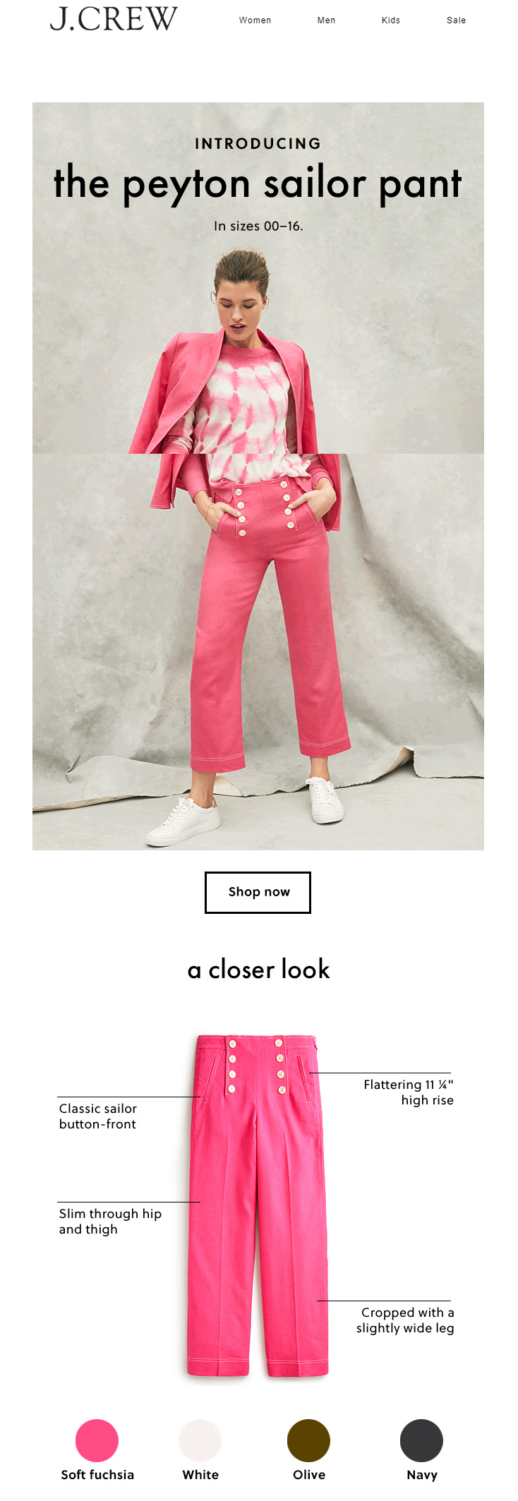
Now that’s a great idea! Use an image of your product to bring it to life and make your subscribers feel like they are at the fitting room trying it on. Newsletters can get so much creative. And J.Crew nailed this one!
Top Tips for Using Images in Your Newsletter
While all these ways to leverage the power of images in your next newsletter sound, and are, amazing, they do come with some rules. If you want to make your campaigns successful, that is.
1. Stay in line with your brand
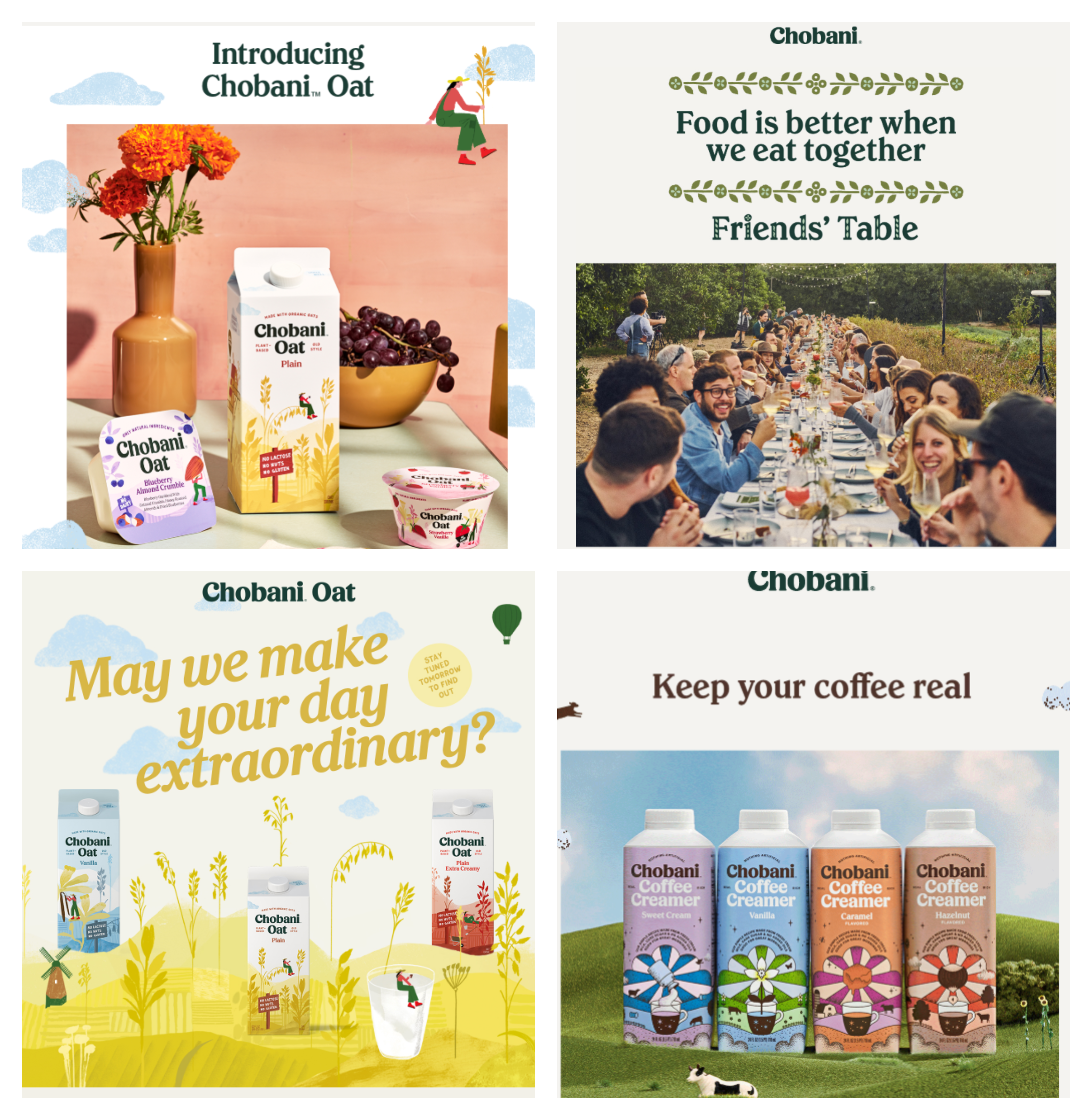
Images play a huge role in building and maintaining your brand. This means that whatever image you use, it should contain the same or coherent fonts, colors, and design elements as anywhere else.
This way subscribers will find it easier to identify you and build loyalty.
2. Size and format
When adding images in newsletters, remember that their size impacts how long it takes for an image to shop up in an inbox. If it takes too long, and by that, I mean only a few seconds, then you can kiss your readers goodbye.
Given that the most popular screen resolution worldwide is 360×640, then the best image size for emails is a 600px width.
Size-wise, the best option is 1MB or less, while the best formats are .jpg, .png and .gif.
3. Professional is the only way
Whether you are in the beauty, restaurant, real estate, or any other industry, professional images are the only images you should use in your newsletters.
First impressions are important, and photos help potential customers to visualize what they’re getting and build an image of your brand in their heads.
While it might need quite an expense for your business, it’s one that you should never skip.
4. Alt-text is important
You know how images are sometimes blocked by default in email clients. And it really is a disaster. Thankfully, Alt text (alternative text) saves the day by playing the role of your backup plan.
An alt text is coded text that is visible to the user when an image cannot be displayed.
Also, alt text is a great option for those on your mailing list who may have a visual impairment and aren’t able to see images on-screen. If they’re using screen reader software, this will pick up alt text and read it to them.
5. Don’t overdo it
Yes, images are powerful. But this doesn’t mean that you should add them in your newsletters carelessly. Remember, images can be worth a thousand words, but only if they are the right images.
Pick yours carefully, and make sure they add value to your newsletter, not overcrowd it.
6. Use heatmaps
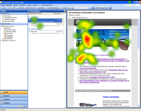
Heat maps are visual representations of data and they show you what users do with their mouse when viewing your newsletter or web page.
So, for example, if you link your image with your e-store, you want to know if the image you chose received enough attention.
Heat maps visualize the places where your reader clicked on, hence they are an essential tool to see if the job was done or if you should think of changing your strategy next time.
Wrap Up
Email marketing is the most effective channel for building your brand, boosting conversions, and creating strong relationships with your audience. And since your subscribers receive dozens of promo emails in their inbox daily, images are your superweapon for making the difference and standing out in the crowd.
Release your imagination (these newsletter ideas might help), follow our tips, and get ready for a whole new level of newsletter awesomeness. In fact, you can start upgrading your content right now by creating a newsletter with Moosend. Our Image Picker will become your best buddy and if you find it hard to design your newsletter from scratch you can also use one of our email newsletter templates 😉

 Published by
