
Your Comprehensive Guide to Landing Page Split Testing [2026]
You’ve built your landing page, launched a few campaigns, and seen some results. But have you really found the formula for lasting success?
The truth is, what works today might not work a few months from now. Consumer behavior changes, trends evolve, and so should your campaigns. That’s where landing page split testing comes in to help you discover what resonates with your audience and improve your landing page performance over time.
In this guide, we’ll cover the key landing page elements to test, how to run effective split tests, the do’s and don’ts to follow, and how to analyze your results to make smarter, data-driven decisions.
Bring your landing page idea to life
Use pre-made layouts, add your copy, and launch a page that feels truly yours.
Try MoosendWhat Is Landing Page A/B Testing?
Landing page A/B testing, also called split testing, is the process of comparing two versions of a landing page to see which one performs better.

You can change elements like the headline or call-to-action and split your traffic evenly between the two versions. The one that gets more conversions, clicks, or signups is your winner.
You can also test multiple variations against your original page to explore different ideas at once (multivariate testing).
Why You Should A/B Test Your Landing Pages
The obvious reason is to boost conversions, but that’s just one of the benefits of A/B testing.
Here’s what it can do for you:
- Understand what drives action: A/B testing helps you discover which design, message, or offer resonates most with your audience, i.e., whether it’s strong visuals, clear value, or a sense of urgency. Once you know what works, you can apply those insights to improve future landing pages and campaigns.
- Make data-driven decisions: By analyzing how visitors interact with your landing pages, you can focus your time and budget on strategies that deliver measurable results rather than following generic tips.
- Get more from your existing traffic: A small improvement in conversion rate can turn the same number of visitors into significantly more leads or customers.
- Build a habit of optimization: Continuous testing lets you spot new opportunities, adapt to changing user behavior, and keep improving your results rather than settling for easy wins.
Which Elements to Test on a Landing Page
Not every part of your landing page needs testing. However, some can make or break your results.
Start with the areas that directly affect how visitors read, click, and convert. Also, keep in mind that the tests you run may depend on your landing page type. For instance, a sales page might focus on product features or offer placement, a lead generation page on form fields or lead magnet visuals, and a webinar page on headlines, host details, or registration CTAs.
Before we learn how to run an A/B test, let’s see what elements you can test.
1. Headlines and subheadlines
Your headline is the first thing visitors notice, and it shapes whether they stay or leave. You can test different headline styles. For instance, you can experiment with a benefit-driven, emotional, or question-based one to see which captures attention best.
The same applies to your subheadlines, where you can further clarify or boost your main value proposition. Here, even small wording changes can dramatically impact engagement.
Let’s say you’re promoting a webinar through a landing page:
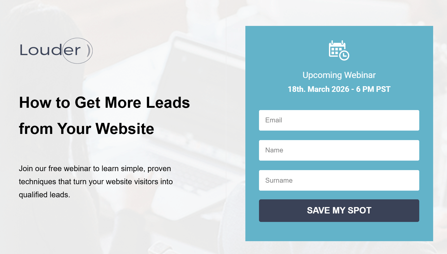
Your original version (control) is simple and clearly states what the webinar is about. This version may appeal to readers who want practical, actionable tips.
Now, let’s see a variation that uses curiosity and promises a specific result.
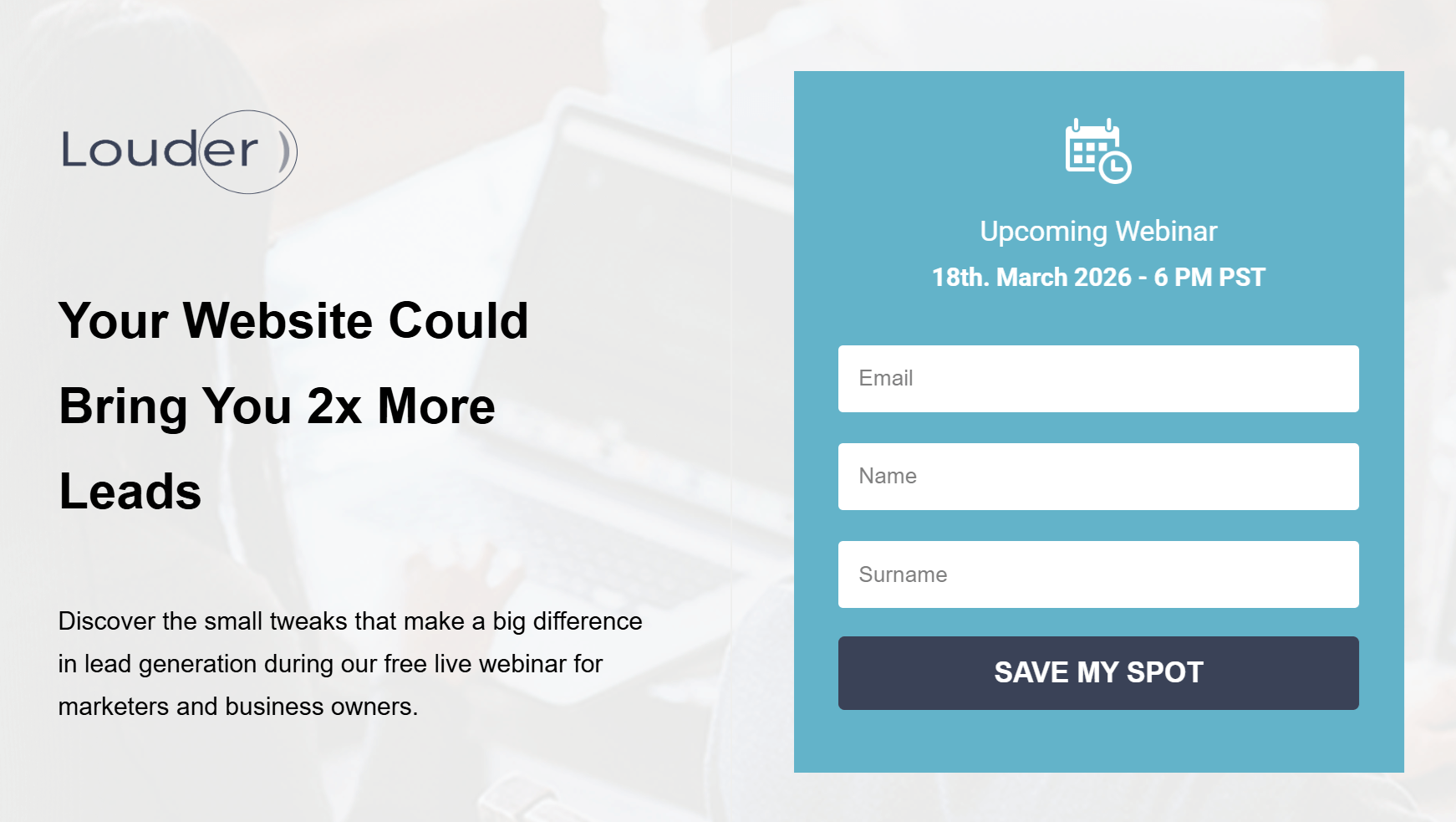
Here, the “2x more leads” claim adds a measurable benefit, while the subheadline provides context and credibility by explaining what the webinar covers and who it’s for.
2. Hero images or videos
Your hero section needs to communicate value instantly. Whether you use a static image or a short video, this area should support your message and harmonize with the rest of your page.
When A/B testing, you can experiment with:
- Image type: Try a product image versus a photo of someone using the product to see which creates a stronger connection.
- Video vs. image: Test a short explainer video that adds motion and context against a static image to measure engagement. Keep in mind that videos can affect page load speed.
- Tone and color: Compare bold visuals that grab attention with more minimal designs to see what keeps your audience engaged.
For example, your variant page could feature a short video of a marketer sharing how your product or your tips helped them achieve a goal.

This kind of authentic, experience-based visual can make your event feel more credible and relatable, especially for new visitors deciding whether to register.
Overall, testing visual elements on your pages will help you discover which format tells your story best and leads visitors to click through.
3. Landing page forms
Your form is where visitors decide whether to take the next step, so finding the right combination of elements is key to getting them to click.
You can test the number of fields, their order, or where the form appears on the page. For example, a shorter form above the fold might attract quick signups, while a slightly longer one placed lower could bring in more qualified leads.
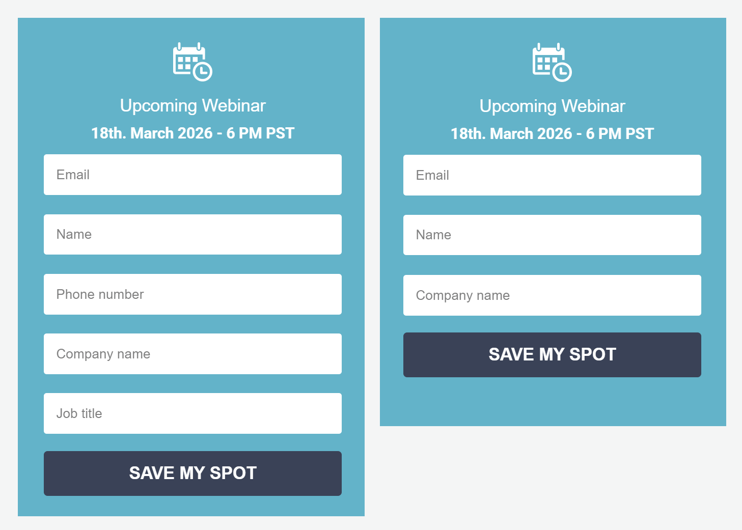
Once you’ve optimized your form fields, the next step is your CTA button.
4. CTA buttons
Without a strong call-to-action, your form won’t capture new leads. To get the best results, you can test variations in color, wording, and placement to see what draws attention and encourages clicks.
In this example, imagine testing two versions of the same landing page:
- Version A: A dark blue “Save My Spot” button that blends naturally with the design.
- Version B: A brighter, pink button with the exact text.
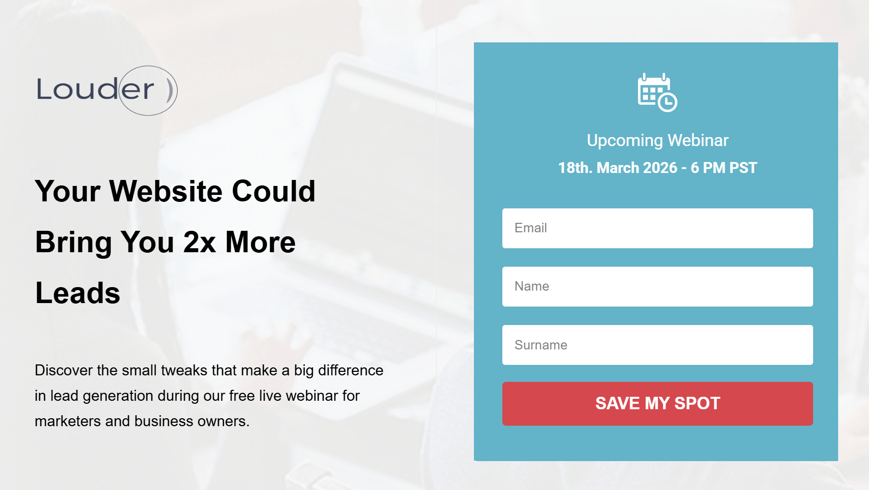
While both are functional, Version B might outperform simply because it stands out more, guiding the visitor’s eye and creating a sense of urgency. The key is to ensure your button contrasts enough to be noticed but still fits your brand’s look and feel.
Tip: Once you’ve nailed the color, experiment with button copy like “Join Free,” “Reserve My Seat,” or “Get Instant Access” to see what language motivates your audience most.
5. Landing page copy
Testing your landing page copy helps you identify the tone, structure, and value proposition that resonates most with your audience.
Even small wording changes, like switching from “Start your free trial” to “Try it free for 30 days,” can shift how users perceive value, urgency, and credibility. Focus on highlighting what makes your offer unique and why it matters to your audience.
Here are some aspects to consider:
- Tone: Conversational vs professional.
- Focus: Benefit-driven copy vs feature-heavy descriptions.
- Length: Short, punchy text vs longer, explanatory copy.
- Value proposition: Emphasizing savings vs results.
For example, your Version A might use straightforward copy that explains what attendees will learn in a sort of “bullet” format.
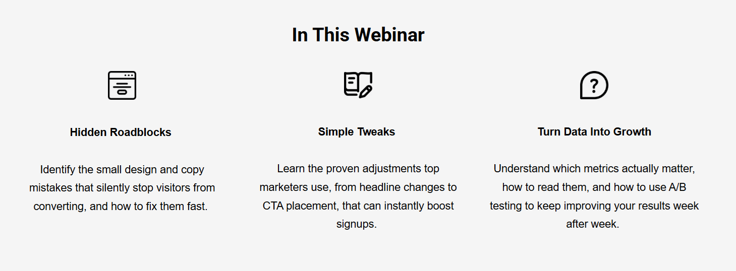
Your Version B, on the other hand, can focus on transformation and results. For example, “Get the proven framework to turn your website into a 24/7 lead-generating machine,” etc.
6. Countdown timers
Countdown timers can add a sense of urgency to your landing page, especially for webinars, product launches, or limited-time offers. When used correctly, they encourage visitors to act before time runs out.
Below, the countdown shows how much time is left until the webinar starts.
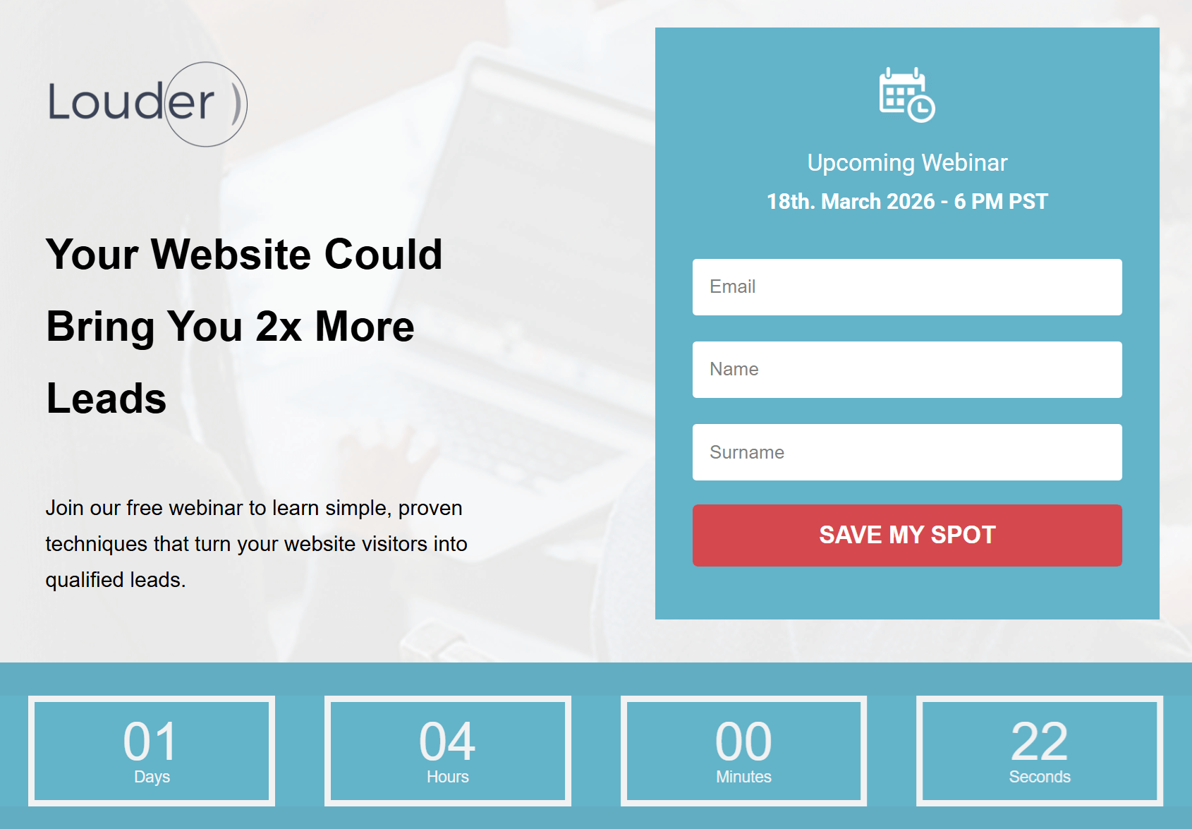
During your A/B test, you could create:
- Version A without a timer. Instead, the page focuses only on the form and event details.
- Version B with a visible timer right below the headline.
The one with the timer might lead to more signups because it highlights scarcity and motivates quicker decisions.
Tip: If you’re using countdowns for recurring events, set them to reset automatically to avoid fake urgency.
7. Social proof
Visitors are more likely to trust your offer when they see what others have already gained from you. Adding social proof, such as testimonials, reviews, or logos of past clients, can strengthen your value proposition and reduce hesitation.
For instance, you could test two versions of your landing page: one focused solely on the webinar details and form, and another with short testimonials from past attendees.
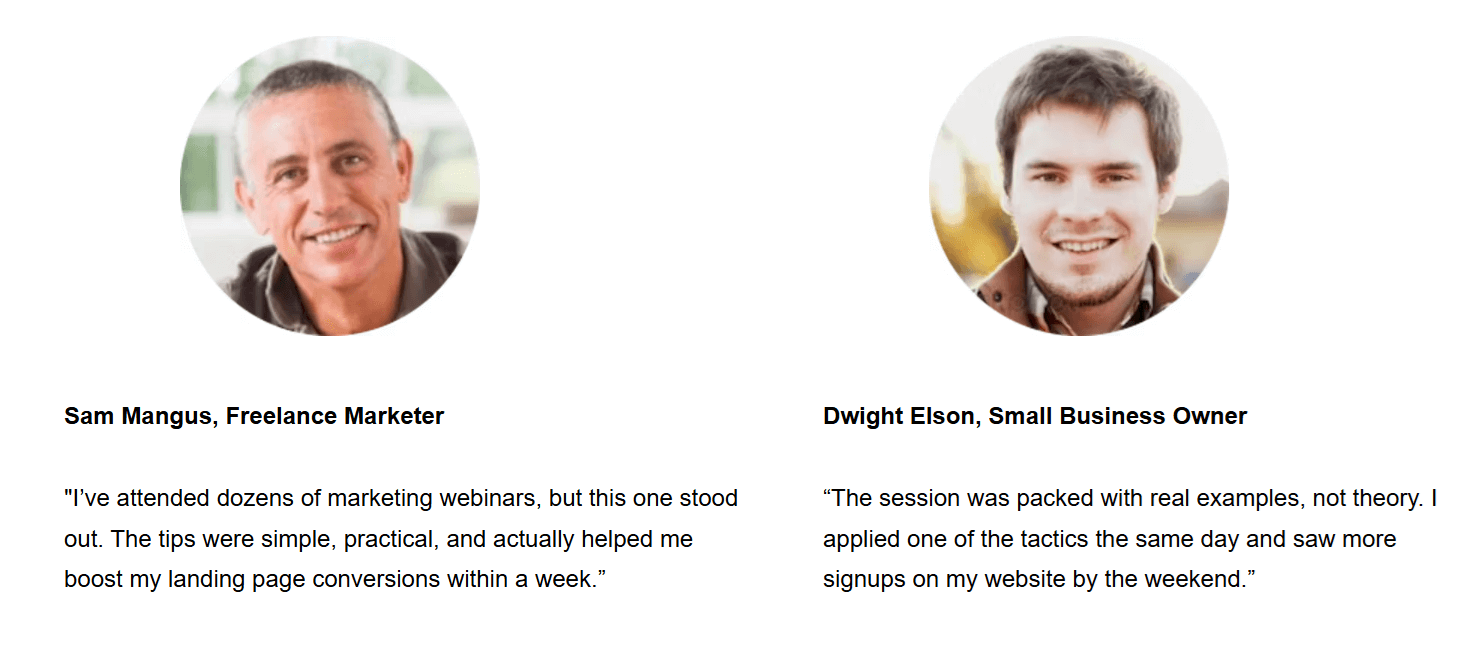
The second version may perform better because it builds credibility and makes the outcome attainable.
8. Layout and navigation
Your layout guides visitors through your page and shapes how easily they find key information. A clear, focused design keeps attention on your offer and CTA.
Here, you can test:
- Page length: A short, minimal page vs a longer one with detailed sections and testimonials.
- Section order: Placing the form above the fold vs after the benefits section.
- Visual hierarchy: Headline-first layouts vs image-led designs.
- Navigation: Single-scroll landing pages vs those with anchor links or sticky menus.
For example, a more extended version of your webinar page might build trust with added speaker bios and FAQs, while a shorter one could boost signups by reducing distractions.
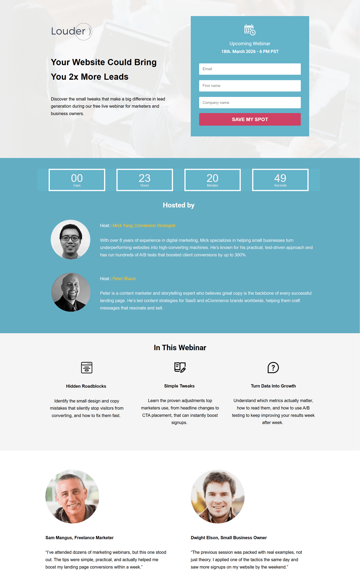
Testing both reveals which structure best fits your audience’s decision-making style. And remember, every audience is different. What works for another brand might not work for yours.
How to Run a Landing Page A/B Test Step-by-Step
Consistently improving your conversion rate depends on following a clear, structured strategy for your A/B tests. While each platform has its own process, the core steps remain the same:
Step#1: Set a clear goal
Start by defining exactly what you want this test to achieve. Your goal should be specific and measurable so you can easily compare the performance of Version A and Version B. This could be increasing webinar signups, getting more demo requests, boosting purchases, or encouraging visitors to download a lead magnet.
Pick one primary goal and make sure the element you plan to test directly supports it. This will help you stay focused and avoid running tests that don’t move the metric that matters most.
Step#2: Make your A/B test hypothesis
Before launching your test, create a clear hypothesis. This brief statement explains the change you’re making and the outcome you expect. A good hypothesis connects your goal to a specific element on your page.
For example, you might say: “Changing the CTA button color from blue to pink will increase webinar signups by at least 10%.”
This keeps your test focused and gives you a measurable target to evaluate after the experiment. We’ll use statistical significance later to confirm whether your hypothesis was correct. For now, the goal is simply to define what you expect and why.
Step#3: Choose what element to test
Now that you’ve defined your hypothesis, it’s time to choose the specific element you’ll change to test it. Since you already know what you want to improve (clicks, conversions, etc.), start by selecting the element that directly supports your hypothesis.
For example, if your goal is clarity, test your headline. If you want to boost engagement, focus on your CTA button. And if you’re trying to reduce friction, start with your form.
As a rule of thumb, test one element at a time. However, you can test two closely related elements together when they function as a single unit. Here are some combinations to consider:
- Headline & subheadline: Ideal for testing new angles or supporting your value proposition.
- CTA button color & CTA copy: Works well if you’re experimenting with a stronger action prompt.
- Form fields & form title: Useful when improving the signup flow.
- Hero image & headline placement: Helpful when testing how layout affects attention.
Just make sure these combinations stay tightly connected to your hypothesis so your results remain clear and meaningful.
Step#4: Create your variations and split your traffic evenly
With your element selected, you can now use your landing page builder to create your landing page variations.
- Version A (control): Your current landing page.
- Version B (variation): The same page with the single change you’re testing.
Keep everything else identical—layout, copy, visuals, and timing—so the results reflect the impact of that one change.
Once your versions are ready, split your traffic evenly between them. Most A/B testing tools handle this automatically, routing 50% of visitors to each version. If you’re testing manually, make sure both versions are shared with audiences of similar size and behavior so the comparison stays fair.
Even traffic distribution ensures both pages compete under the same conditions, giving you trustworthy results. If one version receives more or higher-quality visitors, your test will skew, and the winner won’t be reliable.
Step#5: Determine the ideal test duration
How long your A/B test should run depends on factors like traffic volume, conversion rate, and how quickly you can collect reliable data.
As a general benchmark, AB Tasty suggests that most tests need around two weeks to gather enough activity for meaningful results. This gives both versions enough exposure and helps capture natural fluctuations in user behavior across different days.
Another approach, recommended by Invesp, is to calculate your minimum sample size based on your expected improvement and daily traffic. Once you know the sample size, you can estimate how long your test needs to run using this formula:
Expected experiment duration = sample size ÷ people visiting the tested page (daily)
Even if you reach your sample size sooner than expected, avoid stopping early. Running your test for at least two weeks and no more than four ensures your results are representative and not influenced by short-term spikes, seasonal effects, or campaign-specific traffic.
This balanced timeframe helps you gather stable data and gives both page versions a fair chance to perform under real conditions.
Step#6: Analyze and interpret your test results
After your test has run for the appropriate time and collected sufficient data, you can start evaluating how each version performed. Begin with the core metrics that show how visitors interacted with your landing page:
- Conversion rate: The percentage of visitors who completed your goal (e.g., signed up for a webinar or your newsletter, or made a purchase).
- Click-through rate (CTR): How many users clicked your CTA or key link.
- Bounce rate: The percentage of users who left without taking action.
- Time on page: How long visitors stayed before converting or leaving.
These metrics tell you which variation performed better on the surface. To confirm whether the difference is meaningful, check for statistical significance, which shows whether your results are real or just random, using your p-value:
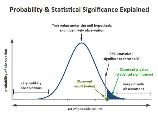
Most marketers consider a test significant when the p-value (probability) is 0.05 or lower, meaning there’s a 95% chance the winning variation truly performs better.
- If p ≤ 0.05: The difference is statistically significant, meaning your winning version likely performs better in reality.
- If p > 0.05: The result isn’t strong enough to declare a true winner and may be due to chance.
For example, if your variation improved webinar signups from 12% to 15% and the p-value is below 0.05, you can be confident this uplift is meaningful and not just a one-off spike. If the p-value is higher, the increase might look promising, but it isn’t reliable enough to roll out yet.
Most platforms and A/B testing tools, such as VWO and Optimizely, automatically find the value. If you’re curious about how it works, though, here’s the basic logic behind the p-value:
- Set your null hypothesis (H₀): No difference between Version A and Version B.
- Set your alternative hypothesis (H₁): One version performs better.
- Collect your data: Visitors and conversions for both versions.
- Run a z-test or use an A/B testing calculator to generate your p-value.
Again, before finalizing your decision, make sure your test has run for at least two weeks and reached its minimum sample size. Even if the results are inconclusive, your data can still reveal patterns, highlight friction points, and inspire your next round of testing.
Do’s and Don’ts of Landing Page Split Testing
To get reliable results from your A/B tests, you need a structured approach. Following a few best practices can help you avoid common pitfalls that’ll waste valuable time, data, and resources.
Do’s
- Test one element at a time: Focus on a single change like your headline, CTA, or form length so you can clearly identify what caused the performance difference.
- Define clear hypotheses: Start every test with a statement you can measure, such as “Adding testimonials will increase signups by 10%.” This keeps your experiment focused and purposeful.
- Use reliable data and proper tools: Leverage platforms that provide accurate traffic distribution, significance tracking, and device segmentation. Reliable data is key to making confident decisions.
- Let tests run long enough: Stop only after reaching your target sample size and statistical significance (usually p ≤ 0.05). Running tests for at least one to two weeks ensures you capture different visitor behaviors across days.
- Prioritize mobile experience: Since a large portion of users browse on mobile, always test and review your variations across devices to avoid misleading desktop-only results.
Don’ts
- Rely on small data sets: Drawing conclusions from too little traffic leads to false positives. Wait until your test collects enough conversions per variation before declaring a winner.
- Assume correlation equals causation: Just because conversions increased doesn’t mean your change caused it. Always confirm significance with statistical testing and contextual analysis.
- Forget to test user segments: Different audiences behave differently. A variation that wins with new visitors may not perform as well with returning users or mobile traffic.
- End a test too early: A sudden spike doesn’t mean you’ve found your winner. Stopping early can lead to unreliable or misleading outcomes.
Setting up a Landing Page with Moosend
Even though Moosend’s landing page builder doesn’t currently include built-in A/B testing functionality, you can still create, customize, and optimize pages directly from your account using the intuitive drag-and-drop editor.
If you’re a beginner, you can use the tool to familiarize yourself with landing page creation. All you need to do is sign up for a Moosend account and then:
- Click on Growth Tools and select Landing Pages
- Create a new landing page from the New button on the top right side
- Set the basic settings and design your page through the drag-and-drop builder
- Choose how to track your conversions and enable cookie consent
- Select the “Publishing method” and finally “Publish” your landing page
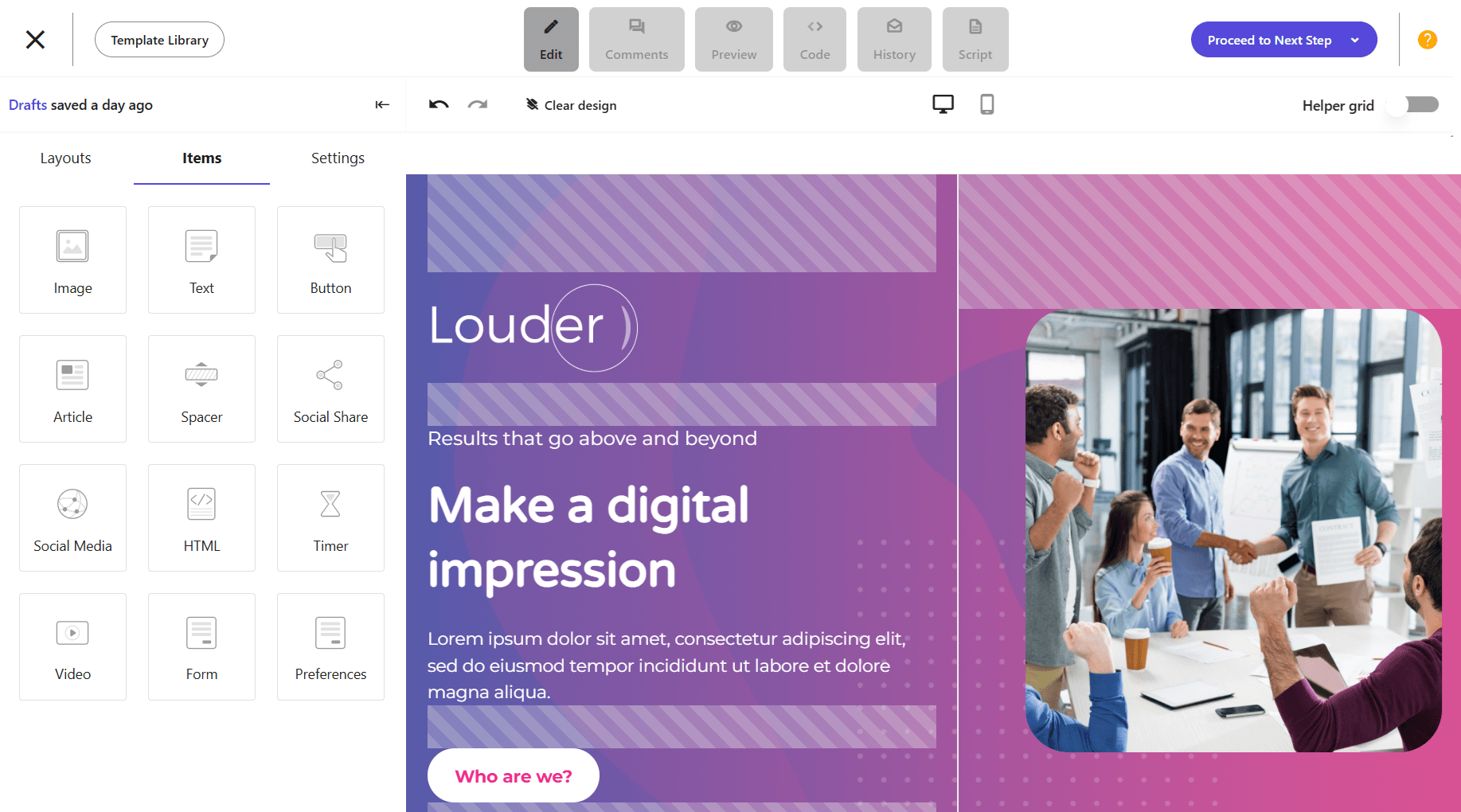
Even without dedicated tools, you can simulate A/B testing by creating two variations of the same landing page. Then, share them with different audience segments, and use Moosend’s reporting tools to see which one drives more conversions.
This is the simplest way to perform a pseudo-test with the tools you already have.
A/B Testing One Landing Page at a Time
A/B testing is a continuous process that takes time to set up, run, and analyze, but it’s worth it. Audiences change, trends shift, and what worked last quarter might not perform as well today. Testing regularly helps you stay proactive, allowing you to improve your landing pages before performance drops.
Each test brings you closer to understanding your audience’s behavior and preferences. And remember, the goal isn’t to find a single “perfect” version, but to keep learning more about your audience and implementing what you learn to keep your business thriving.
FAQs
Below, let’s see some common questions regarding landing page split testing.
1. What is an A/B test hypothesis?
An A/B test hypothesis is a clear statement that predicts how a specific change will impact user behavior or conversions. For example, if you change your headline from “Join Our Free Webinar” to “Learn How to Double Your Leads in 30 Minutes,” your hypothesis could be that the new, benefit-driven headline will increase signups by 15%.
2. What is statistical significance?
Statistical significance shows whether your A/B test results are reliable or happened by chance. A test is usually considered statistically significant when the p-value is 0.05 or lower, meaning there’s a 95% chance your variation actually performs better.
3. What affects your A/B test p-value?
Several factors influence your p-value, including sample size, differences in conversion rates, and traffic quality. Running your test long enough and gathering enough data helps ensure your p-value reflects a true difference, not random variation.
4. What is an A/A test?
An A/A test compares two identical versions of a page to check that your testing setup works correctly. Since both versions are the same, the results should be nearly identical. If they aren’t, it’s a sign something’s off with your tracking, traffic split, or analytics setup before you move on to real A/B testing.




 Published by

 Published by
