How To Create an Effective Landing Page In 2026
You’ve recently launched a campaign to generate new leads during a highly spending season. How can you remove white noise and distractions to convince your visitors and customers to complete the desired action fast? You know the drill–you need a perfectly designed landing page, easy to navigate and made to convert.
In this guide, you’ll learn everything you need to know about landing pages and why they can make a huge impact on your revenue. Moreover, we’ll show you what elements it needs to be successful and how to create one in simple steps with zero technical or design skills.
Transform visitors into happy customers
Create beautiful landing pages in minutes and engage your audience.
Get started with MoosendWhat Is a Landing Page?
A landing page is a standalone web page created for visitors to “land on” after clicking a link in an email or an ad from Google, Facebook, YouTube, etc. A landing page is created with a single goal in mind, leading visitors to the call-to-action (CTA).
What are landing pages used for? In brief, these assets are built for marketing as well as advertising purposes. They can encourage viewers to make a purchase, invite people to an event, or offer important information, such as the benefits of a product or service.
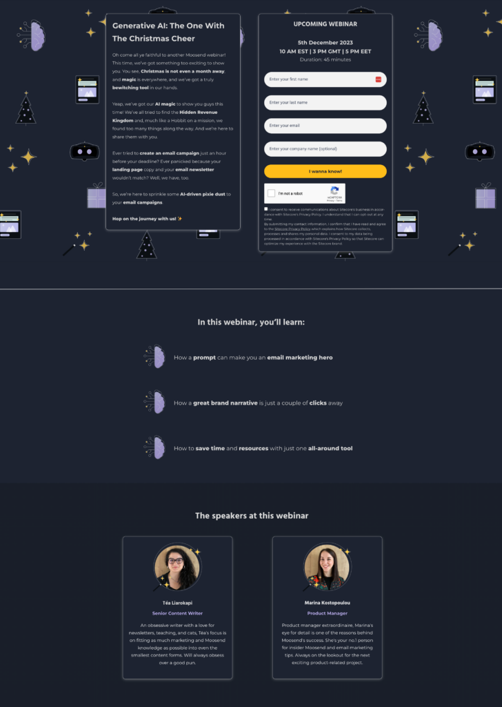
For example, the above landing page was created to capture users’ contact information when they sign up for the Christmas webinar. It has a clean layout, festive background, and a straightforward value proposition.
Popular landing page types
There are various types of landing pages marketers can use to for specific actions, such as:
- Lead generation (e.g., squeeze page and lead capture)
- Conversion-driven (e.g., sales and “get started”)
- Engagement (e.g., “coming soon” and social proof)
- User experience (e.g., unsubscribe and “404 error”)
- Customer feedback (e.g., survey and review request)
What’s the Difference Between a Landing Page and a Website?
The main difference between a landing page and a website is their focus. While websites are designed to provide multiple information about a business, landing pages exist with the sole purpose of driving a certain action.
| Landing Page | Website |
| Specific, with clear goal | General |
| Designed for conversions | Designed for exploration |
| Only one option (CTA) | Multiple options |
| Traffic comes from campaigns | Traffic comes from multiple sources |
| Minimal distractions | Potential distractions |
In general, landing pages are focused on one specific goal (e.g., to generate signups) and they are used as part of a campaign (e.g., PPC, paid social, email marketing).
Here are the key differences between landing pages and websites:
Now, some may wonder, do we need a website for a landing page? Not necessarily, but having one is recommended, as it helps to show your potential customers that your brand is established. And since online shoppers purchase things based on the trust they have for the brand or product, having a website is a plus.
What are the Key Components of a Landing Page?
What makes a good landing page? Firstly, you need clear copy that communicates the value proposition while maintaining messaging consistency. Other equally important success factors include:
- Minimalist design
- Strong call-to-action
- Testimonials
- Messaging consistency
- Clear copy
- Authenticity
Visitors arriving on a landing page need to see what they expect. So, the content of the landing page must match the one from the source.
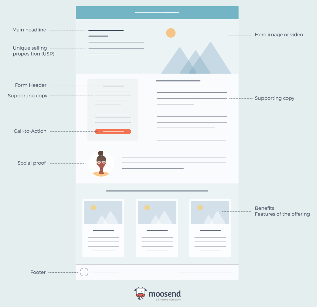
Moving to the anatomy of a landing page, these are the key components: The main headline and supporting copy, a unique selling proposition (USP), a hero image or video, the benefits/features of your offering, some form of social proof, and finally a conversion point (i.e., a CTA).
Below, you’ll see an illustration of those seven key elements that a great landing page must have.
How To Create a Landing Page from Scratch
It’s now time to see how you can create a high-converting landing page fast, without any prior knowledge. Follow these steps and build landing pages that convert.
If you’re in a hurry, we have a landing page design checklist with subtasks to help you out. Click here to access it and create a copy.
- Define your campaign goal
- Select a landing page builder
- Design your landing page
- Write amazing copy
- Create an irresistible call-to-action
- Use visual content
- Include social proof
- Add tracking
- Set SEO settings
- A/B test your landing page
- Preview and publish
Step 1: Define your campaign goal
A great landing page needs to have a clear and measurable goal. This will help you decide how to write your copy, what elements to include on the page, and what template you should use.
So, your call to action may lead visitors to:
- Fill out a form or survey
- Sign up for a free trial
- Download a free ebook
- Order a product
- Register for a webinar
- Provide their contact information
- Download a coupon
- Subscribe to a newsletter
Sticking to a singular goal is important. It minimizes the amount of choice you give to your visitors, and it makes it much easier to convert.
Step 2: Select a landing page builder
There are many landing page builders to choose from, ranging from design platforms like Canva and Carrd to more sophisticated marketing software, such as Moosend and HubSpot.
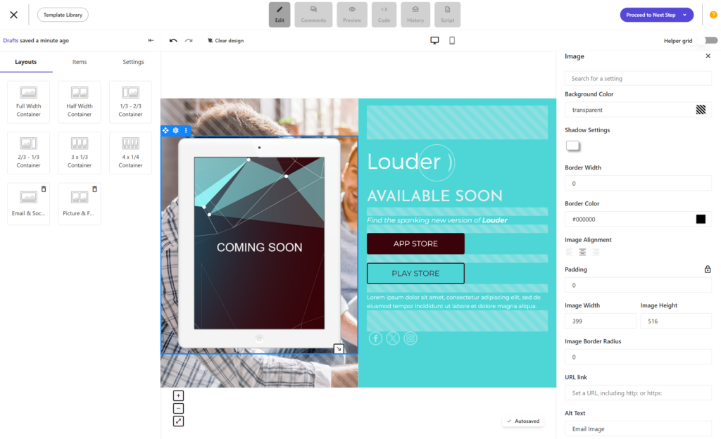
For example, Moosend is an email marketing service that checks that box with lead generation features, eCommerce capabilities, and multiple integrations. You can design a landing page completely from scratch using a drag-and drop editor or select one of the professionally made templates and customize it based on your needs.
All your landing pages will be mobile-responsive, so you can capitalize on the traffic you get from tablets or mobile devices. You can also enrich your landing pages with advanced elements like countdown timers to boost your sales and revenue.
Step 3: Design your landing page
The next step is selecting the appropriate landing page template. Overall, choosing a premade design is more convenient than starting from scratch, as you can use its layout and build upon it. But if you have adequate design skills and creativity, you can create something new and save it in your library for future use.
Most landing page builders offer a wide range of templates to save time and increase efficiency. The templates are usually categorized to make the selection process effortless. Browse through the available templates and select the one that suits your needs.
Finally, add your business logo and make sure that the landing page colors match your brand. Also, check whether you need to make the necessary adjustments to your text color and fonts to create a seamless and consistent experience for your potential customers.
Step 4: Write amazing copy
The first element you’ll need to work on to catch your visitor’s attention fast is the headline. Ideally, it should match the message of the email or ad that brought visitors to your landing page. Check out the head title on the landing page below that’s hard to ignore:
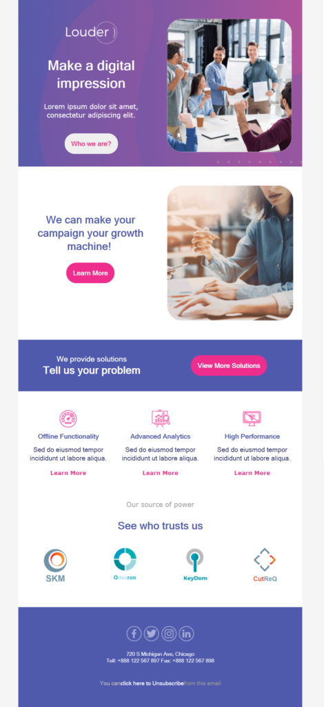
As for the rest of the landing page copy, it is important for conversion rates. To nail your copy, emphasize how your offer will solve users’ problems and how your product will make their lives easier. In essence, you need to focus on the benefits and always have your reader’s pain points in mind.
A general tip you can follow to ensure you create a high-converting landing page is to keep your sentences short and valuable. Cut out any unnecessary details and avoid confusing business jargon.
Step 5: Create an irresistible call-to-action
After you’ve crafted your headline and supporting copy, it’s time to convert your target audience through a great CTA button, one of the most important elements of your campaign.
First, ensure your call-to-action is specific and descriptive to yield better results. Visitors need to know what to expect when they hit your CTA button. Here is an example from Lemon Squeezy.
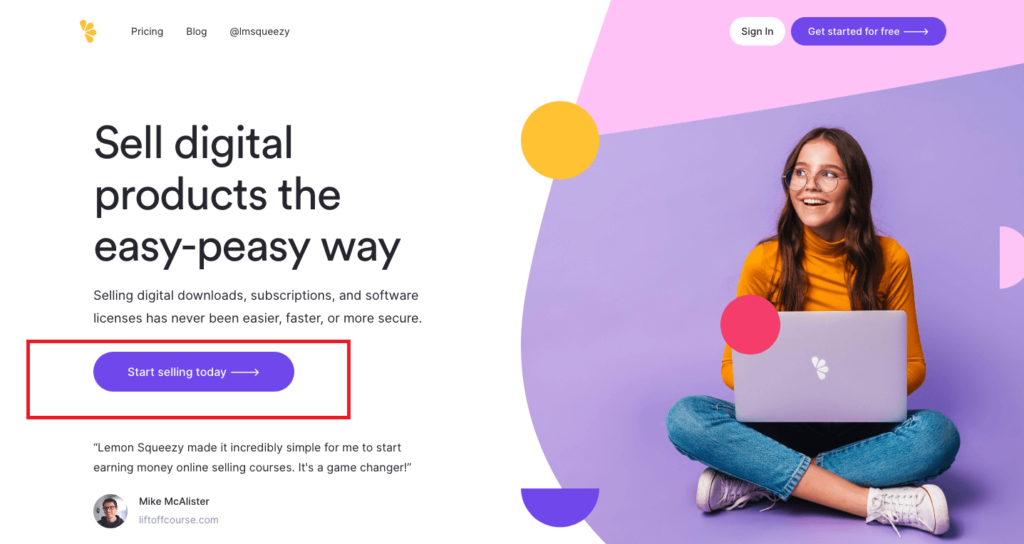
For SaaS businesses, CTAs like “See Pricing” or “Start Your Free Trial” work well. If your landing page contains a form, try to make it as simple as possible. The most converting forms are those with just one field–the email address.
Finally, eliminate distractions that could take your visitors away from your CTA. Ideally, avoid having navigation links to other pages, headers, or footers unless you need to. Looking back at the previous example, that top navigation bar could be omitted to ensure the desired user experience.
Step 6: Add visual content
You’ve finished crafting your copy, and it’s time to work on your landing page visuals. First, you’ll need to decide what images you want to feature. These can vary from product images and stock photos to custom illustrations.
Visual aids are faster and easier to comprehend, strengthening your message and influencing your visitors’ navigation. They can help convey your message in just a few seconds.
As you’ll see in the example below, Fig.1 uses high-quality product images on its landing page to make a visual connection with the copy. The product images blend nicely with the background colors, creating a memorable landing page.
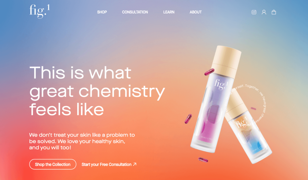
By using the right visual content you direct your visitor exactly where you want them to look to take action. Plus, they can also cleverly replace text.
Here are some tips to help you select the best visuals:
- Select your hero image: Start with a big, mesmerizing visual that shows visitors what your offer is all about. It needs to be professionally designed to catch the viewers’ attention.
- Use real photographs: Include images of people using the product or service to help visitors connect with your offer on a personal and emotional level.
- Add visuals to emphasize the benefits: Take for granted that visitors are busy. Help them convert by providing “a visual story” through your images.
- Back up your progress: Producing visual aids can be a lot of work. So, back up all the assets you’ve made, so you don’t have to worry about whatever might happen.
Step 7: Include social proof
In online marketing, it’s difficult to get people to trust you as a brand. If a consumer is unfamiliar with you, reviews and testimonials from other people like them will add to your credibility.
In fact, a recent consumer survey by Bright Local revealed that “91% of consumers trust online reviews as much as personal recommendations.” This demonstrates how social proof can influence a buyer.
There are many different types of social proof you can use, such as:
- Testimonials
- Case studies
- Customer ratings & reviews
- Influencer endorsements
- Certifications
- Brand/Client logos
- Subscriber counts
- Social share counts
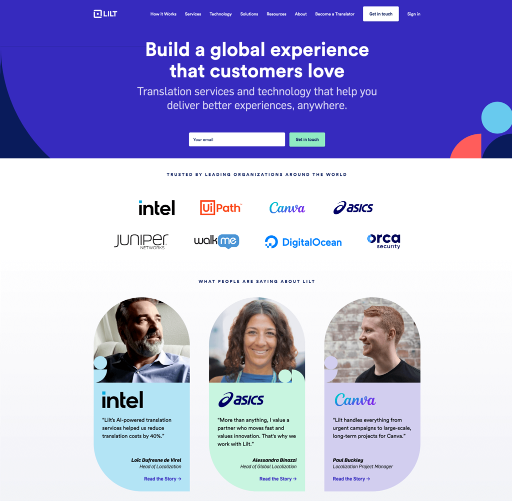
One of the best landing page design tips is to place your social proof near the CTA button to boost the strength of your messaging. Finally, to have a professional-looking landing page, add a thumbnail and name to the testimonial. This will help increase conversions.
In the landing page example below, LILT leverages two types of social proof–client logos, and testimonials. As you can see, social proof occupies a large part of the landing page to increase trust.
Step 8: Add tracking
You’ve done all the hard work and created your very own landing page. But wait, how do you know if it’s actually performing well? Well, you don’t. Not before you add tracking to your campaign.
![]()
As you can see in this example from Moosend’s platform, you can enable tracking with Google Analytics. Simply insert your Google Analytics ID to measure the performance of your landing page. You can also enable tracking with Facebook Pixel to measure your Facebook Ads results.
Keeping track of who’s visiting your landing page and what actions they’re taking is essential to optimize your marketing campaigns.
Step 9: Set SEO fields
Last but not least, SEO-optimized landing pages are bound to drive more traffic. It’s easier for search engines to understand the purpose of your page and put it higher in rankings, making it more visible.
When optimizing your landing page, you should pay attention to the following:
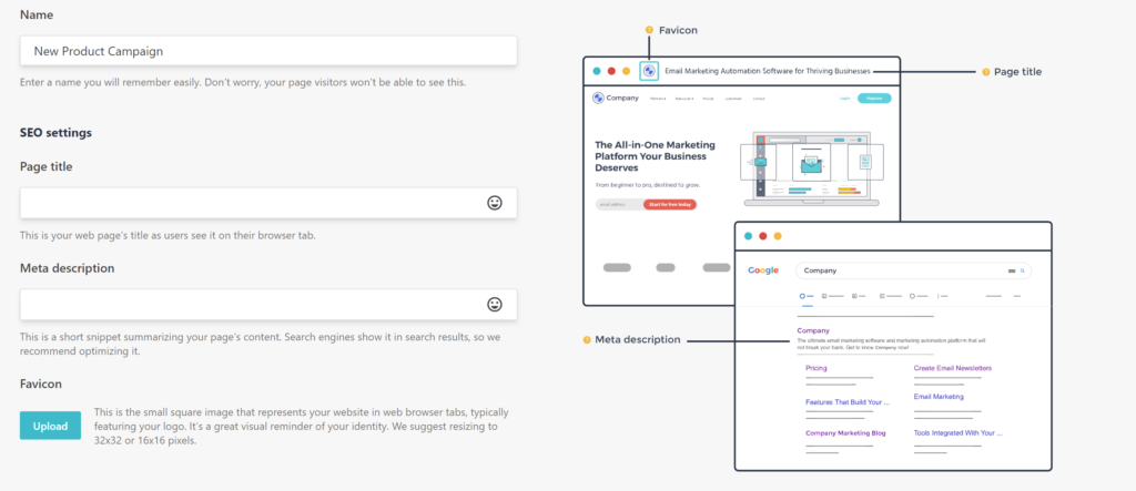
- Title Tag: Think of it as the first impression your visitors have of your website. While there is no exact character limit, an ideal title tag contains around 60 characters.
- Meta Description: Meta descriptions basically summarize the page content. They are your No.1 chance to grab the reader’s attention.
Here’s an example of how SEO settings will look on your landing page builder tool.
After you’re done with these, you’ll need to choose your publishing method. Your landing page builder will give you some options regarding where you’d like to publish your landing page (e.g., your existing WordPress site, etc.).
Step 10: A/B Test your landing page
Landing page creation is practically over at this step. However, you can test and optimize it to maximize its performance. The best way to do that is through A/B testing.
Some key elements that you should test include:
- Headline: Try out different versions to find the best for your target audience.
- Visuals: Experiment with hero images and stick with the top-performing ones.
- CTA: Design an alternative CTA button with a twist in the copy.
By conducting those tests, you’ll be sure that you get the most out of your landing pages, whether your goal is to grow your email list, sell more products, etc.
Step 11: Preview and publish
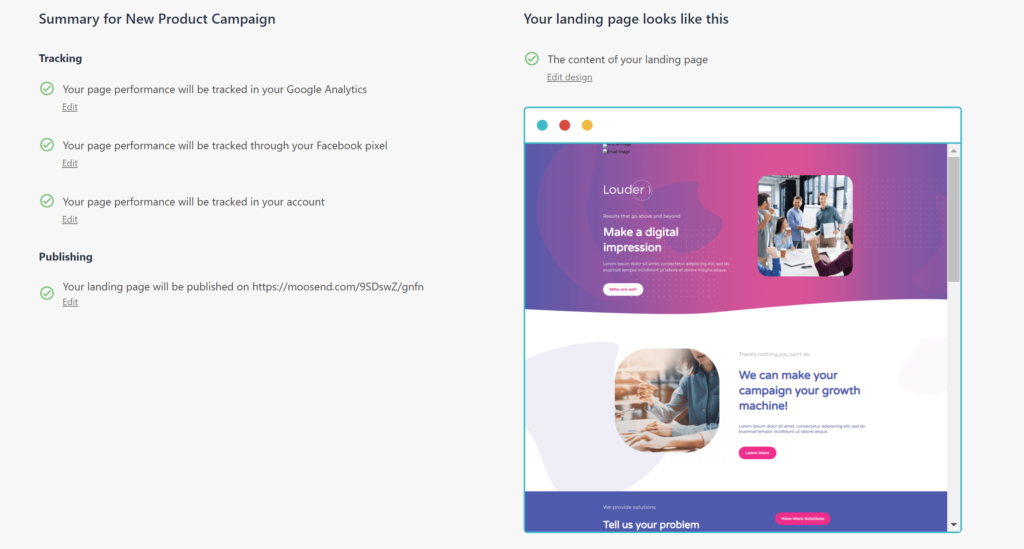
You don’t just publish your landing page and forget it. First, do a quick check on the copy. Make sure there are no typos or grammar mistakes that would compromise your campaign and make a bad first impression.
Then, take a look at your design and find out if everything is the way it’s supposed to be. That’s it! You’re ready to publish your landing page.
Looking for a Landing Page Builder?
Landing pages are undoubtedly an essential part of your digital marketing strategy. With the above tips, you’ll be able to kickstart your way into becoming a landing page master in no time.
If you’re looking for a beginner-friendly landing page builder with powerful capabilities, sign up for Moosend account today and start building high-converting landing pages.
Frequently Asked Questions (FAQs)
Here are some of the most common questions we’ve been getting about landing pages:
Q1. Do I need a domain for a landing page?
No, you do not need a domain name to publish your landing page. Your landing page builder tool will give you options to publish your page without having a custom domain.
Q2. Can a landing page replace a website?
No, landing pages are built with a specific marketing goal, while websites are meant for exploring a brand. Ideally, landing pages work complementary to your website.
Q3. Do landing pages rank on Google?
While landing pages don’t rank on search engines by themselves, Google considers them essential for a good sales funnel. For a landing page to rank on Google it must be optimized for keyword targeting, have additional content that adds value to the reader, include more than one CTA, and have a fast-loading time.
Q4. How long does it take to build a landing page?
To build a landing page, you’d need from 1 hour up to a week since in most cases they act as selling pages for a particular service/product. However, depending on the tools you use and the complexity of the landing page, they can be developed much more quickly.
Q5. How do I drive traffic to my landing page?
Some of the best ways to drive traffic to your landing pages are email newsletters, paid search and social media ads, retargeting ads, and newsletter sponsorships. Other effective ways include guest blogging, creating Twitter threads with your pages included, and finally partnering with influencers.
Q6. Are landing pages effective?
Landing pages are highly effective in increasing conversions compared to a homepage or blog post because they have one singular goal. Moreover, landing pages are a great way to build your brand and grow your email list, while they also work perfectly as part of PPC campaigns.
Q7. Is a landing page bad for SEO?
No, a landing page is not bad for SEO. On the contrary, landing pages are an excellent way to funnel the traffic that you bring through your SEO efforts.
Q8. What URL should my landing page have?
Your landing page URL should ideally “tell” your audience where the link is taking them after they click on it. Customize using words that indicate what your landing page promotes and make it up to 60 characters in total.
Q9. What size is a landing page?
The recommended landing page size is 940–960 pixels, which works for most screen sizes. Moreover, any landing page content within the 720-pixel height should display properly on the screen upon page load.
Q10. What is the best landing page builder?
There are various good landing page builders out there, such as Unbounce, Wix, and Mailchimp, but Moosend is the better option among them because it offers a user-friendly interface with advanced functionalities to power up your landing pages at a fraction of the cost of the other services.
Q11. Do I need a favicon for my landing page?
Yes, you can use the one you already have for your website or create a new one that is part of your promotional landing page campaign to catch people’s attention. To create one you can use Hubspot’s Free Favicon Generator.



 Published by
 Published by
