What Is An Email Preheader? Definition, Best Practices & More
The average inbox is overflowing, and the email open rates are typically abysmal.
So how can you stand out and ensure that all the work you put into your email marketing campaign pays off? One way is to take advantage of email preheader text.
These little gray snippets next to the subject line will encourage the recipients to interact with the email and increase your open rates.
In this ultimate guide, we’ll give you all the info you need to power up your digital marketing and become an email preheader text pro—what it is, why it’s essential, and how to use it.
So, let’s get started.
What Is An Email Preheader?
An email preheader is a text which appears after the email subject line in an email inbox. Preheaders give a short preview of the email text, and companies can use them to entice or intrigue the receiver into opening the entire email.
Most email clients display this text as a grayed-out snippet to the right side of the subject line, but the exact way it’s displayed depends on the app and whether it’s on a desktop or a mobile device.
Email preheader examples
Here’s what the preheader text looks like in Gmail:

Notice that the text is grayed out and less prominent than the subject line.
Nevertheless, the text offers a valuable glimpse for the recipient that can help them decide whether or not to engage with the email.
Some authors use the terms preheader text and preview text interchangeably, but this needs to be corrected. We’ll see why up ahead.
Email Preheader vs. Preview Text
The email preheader is the visible line of text on the top of the email body (above the header), and the preview text is in the inbox next to the subject line.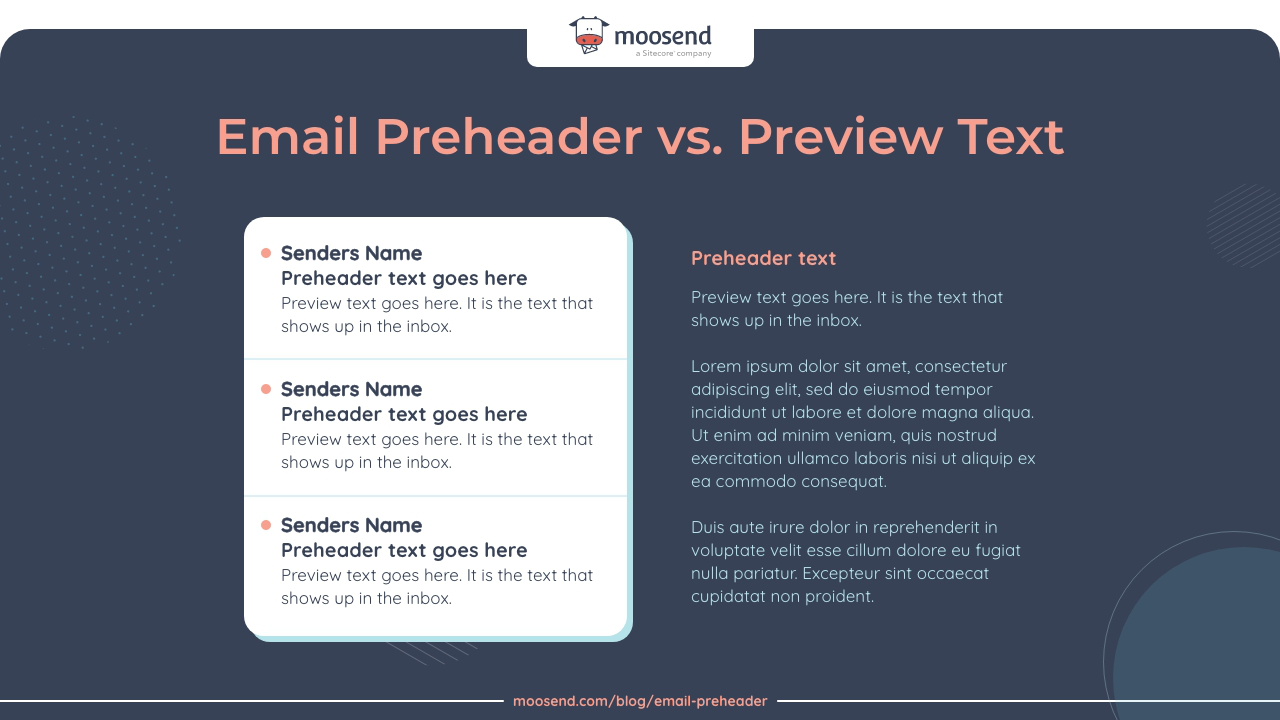
So where does the confusion come from, and why are more and more email marketing professionals using the terms interchangeably?
In the past, hiding any part of your email body was a bad practice that could land your email in the spam folder.
Moreover, if you didn’t specify the preview text, the email client would pull out the preheader and show it next to the subject line in the inbox.
However, the rule about hiding parts of email content has now been relaxed, resulting in many companies using the preview text instead of the “classic” preheader.
Over time, these terms—preheader and preview—started meaning the same thing.
How Long Should An Email Preheader Be?
An email preheader should be between 40 and 130 characters. Different email clients (Outlook, Yahoo, Gmail, etc.) on various platforms display different amounts of text next to the subject line.
If you’re dealing with a mobile-first audience (and who isn’t these days?), consider keeping your preheader text between 30 and 55 characters. Mobile clients typically show less text than desktop ones. And if they are iOS users, the text displayed is even less!
Sticking to this character limit gives the best odds that an email app will display your preheader correctly.
You’re probably wondering by now—what are the advantages of using an email preheader? We explain this in the next part of our guide.
What Are The Advantages of Using A Preheader?
You’ve crafted the perfect promotional email or newsletter. The text is engaging and fun; the graphics are on point and beautiful.
The average open rate for emails across industries is 21.33%, which can be as low as 17% in some niches.
Boosting your email open rates is precisely what preheaders are best at. Writing your preheader well will entice readers to open the email and see the campaign.
Also, effective email preheaders can boost engagement for your campaign. That’s because they add further context to the subject line making it easier for readers to figure out what your email is about.
This is especially true on mobile. These days, mobile devices account for 41.6% of all email opens. Increasing the open rate and engagement for your email marketing campaign also aids in achieving higher click-through rates and conversions.
Because of all this, email preheader has become a best practice in email marketing.
Speaking of best practices, let’s see the best tactics to create the most effective email preheaders.
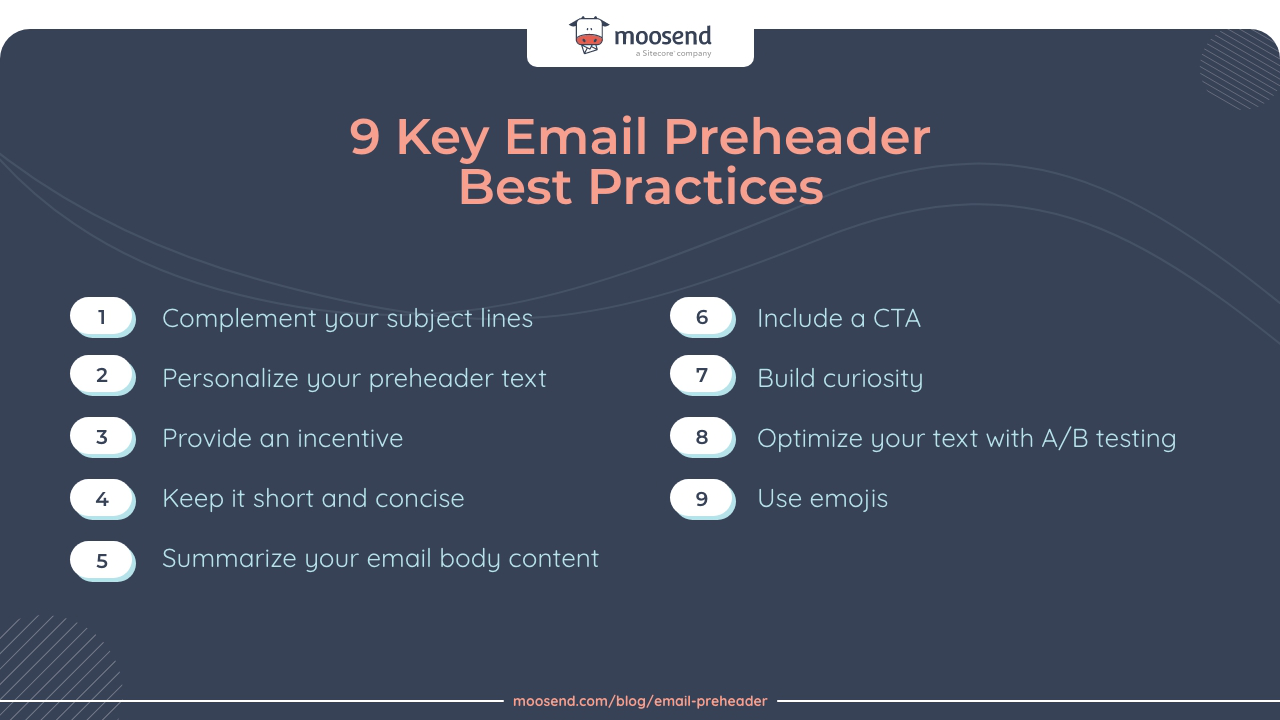
9 Key Email Preheader Best Practices
If you want to create excellent preheaders that’ll get you higher open rates and engage your readers, there are some best practices you can follow.
Here’s what they are at a glance:
Now, let’s dive deeper into each one and see how they’ll help you delight your email list and keep them from hitting that unsubscribe button.
1. Complement your subject line
A good email preheader needs to complement the subject line because some email clients won’t display the preheader.
To avoid that, the subject line and the preheader should be connected.
For instance, you can build off the subject line to add more intrigue, pose a question, or pique curiosity in some way.
If your subject line is “Flash sale up to 60% this weekend,” your email preheader can build on this and add, “Can you afford to miss out?”
2. Personalize your preheader text
You’ve probably heard this email marketing tip before—personalize your content!
There’s a reason why every marketing expert will tell you to do so. Since we all get so many emails, many of which are entirely generic, personalizing your messages is an effective way to stand out in a crowded inbox. If you send out generic emails, the readers won’t notice them.
You might think personalization is just for the subject line, but you can also use it in the email preheader by adding your recipient’s name.
Marketing automation software (another thing Moosend does) lets you easily personalize content. So, why hold back? Think of exciting ways to add a personal touch to your preheaders to get your subscribers’ attention.
3. Provide an Incentive
When you send someone an email, you ask them to set aside time from their busy schedule to read it.
One way to get someone to open your email is to incentivize them. For instance, don’t wait until the end of the email to say there’s a discount code. Share that information in the preheader.
The point here is to let the reader know what they’ll get if they open your email, whether that’s a discount code or a set of valuable tips to increase the conversion rate in their industry.
4. Keep it short and concise
The correct preheader length communicates valuable information to the reader without losing its impact by being too long.
Also, remember that different email apps impose character limits. As mentioned, you’ll want to keep this between 40 and 130 characters.
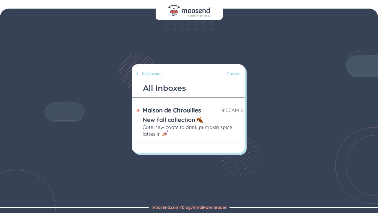
This means you have limited real estate to capture the reader’s attention. So, you generally want your text length to be short, punchy, and engaging.
5. Summarize the email body content
Think of a short preheader as your email content synopsis.
Since people get a lot of different emails these days, they’re less likely to open ones where they can’t figure out the content from the subject line and the preheader.
Using a CTA or an incentive makes sense, but sometimes, it doesn’t. In these cases, a short summary may be your best bet.
If you’re sending out newsletters regularly to keep in touch with customers, something as simple as putting the words “Monthly Newsletter” in the preheader text lets readers know what to expect.
That way, they won’t confuse your newsletter with a sales message and will instantly identify the content of the email.
6. Include a CTA
Most people think of CTAs (calls to action) as something to put at the end of a marketing email or a blog post.
But this is far from the truth, and it’s hurting the success of your email campaigns. You can include a CTA in your preheader text that lets people know why you’re sending them an email.
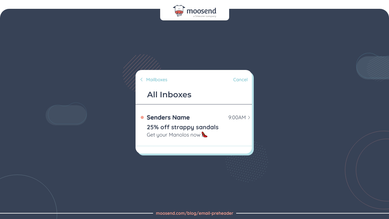
For instance, your eCommerce site could offer 25% off women’s shoes for the next 48 hours, or you could have just added some hot new features to your product that people can try.
Whatever it is, a call to action will immediately let readers know what you’re offering and encourage them to open the email to find out more.
7. Build curiosity
Human beings are curious by nature, and piquing this curiosity is an excellent way to get your emails read.
Think of this tip as the opposite of summarizing your content, where you tease your audience instead of providing extra information.
Since the preheader is the first line of text after the subject line, it’s a great place to create a sense of urgency or stoke a bit of FOMO (fear of missing out).
Some good ways to do this include:
- Asking a curious question
- Starting a story but not finishing it
- Defying expectations
- Suggesting you have knowledge the reader doesn’t
- Saying the reader knew something they forgot
However, try not to use too many simultaneously since it can come off as clickbait.
8. Optimize your text with A/B testing
One of the best ways to enhance your email preheaders is to conduct A/B testing. This will let you see what resonates with your audience best.
To increase the effectiveness of your optimizations, you can track the campaign metrics and see what preheader texts drive the best outcomes.
Many email marketing tools like Moosend and Mailchimp let you A/B test various elements of your emails, from subject lines to preheaders and videos, so take advantage of this.
9. Use emojis 😎
Emojis are a tricky thing. For some brands, they won’t work. So, if you’re in the funeral service business, you’ll want to skip this one.
For most brands, however, peppering the text with a few emojis is an excellent way to add personality in an eye-catching way.
Emojis also reduce the number of characters in the preheader and can be an excellent way to separate information since you can’t use bullet points.
Up next, we’ll get technical. How do you add an email preheader?
How to Add An Email Preheader
Preheaders are beneficial for email marketing campaigns; writing a good one won’t be difficult if you follow the best practices.
So how do you add one to your emails? Two main ways are using HTML and CSS or adding it without code through an email marketing tool.
Let’s see them below.
How to add a preheader with code (HTML & CSS)
The classic way to insert a preheader is to use HTML and CSS code. The advantage here is that this method works regardless of your email service provider. It works as long as the ESP supports adding HTML and CSS to email text.
There are two main things to look out for:
- Make sure to place the preheader before any other text that appears in the body of your template
- Hide the preheader from being displayed by web email clients so that it doesn’t disrupt the email design
To do this, here’s the code you can use:
<div style=”font-size:0px;line-height:1px;mso-line-height-rule:exactly;display:none;max-width:0px;max-height:0px;opacity:0;overflow:hidden;mso-hide:all;”>
<!– Add 85-100 Characters of Preheader Text Here –>
</div>
This way, the hidden preheader text won’t be shown when the reader opens the email but will be picked up by the email app and shown next to the subject line.
How to add a preheader without code
Using code to add email preheader text is a bit complicated and time-consuming.
There’s a better option, and it’s to use an email marketing automation platform like Moosend.
To add your preheader, there are only a few steps to follow:
- Create a New Campaign
- Once you do, you’ll be redirected to Set Basic Settings
- Right after adding the subject line, you’ll see the email Preview Text field below
- Add your preheader text in this field (don’t forget to follow our best practices!)
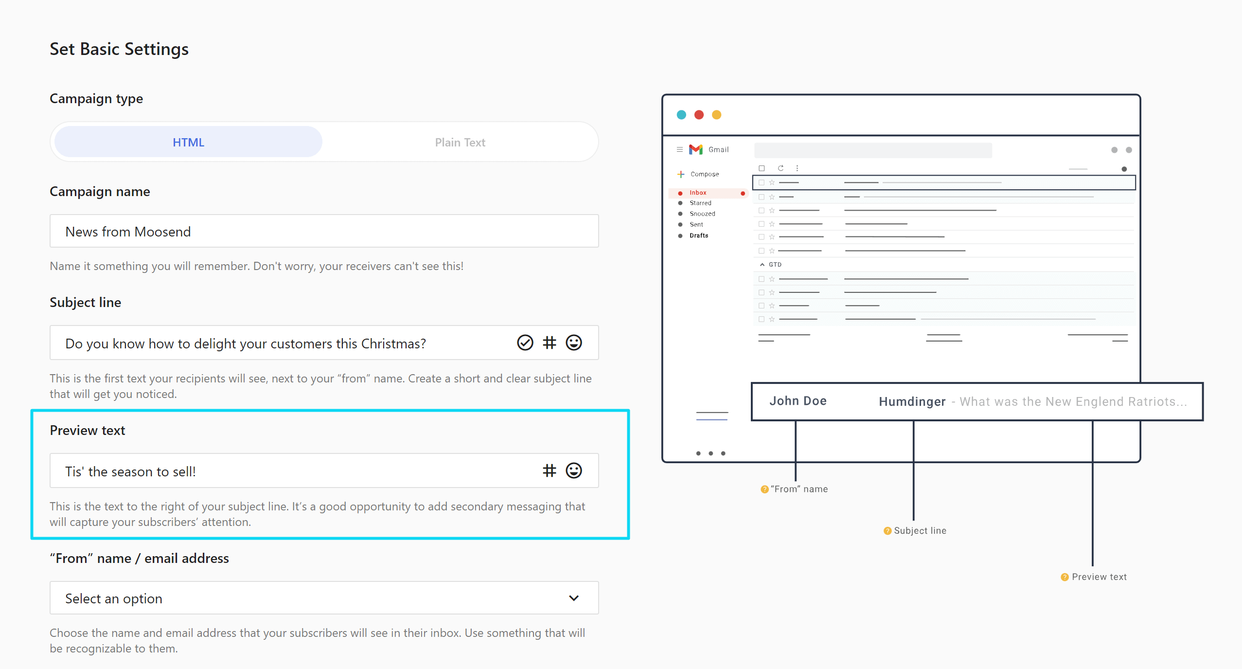
And you’re all set! It’s that simple.
Now Over to You
Email preheaders are a great way to entice the reader to open your email. And in the process, you can increase your open rates and boost conversions.
Adding one doesn’t have to be difficult, especially when using a tool like Moosend.
Do you want to step up your email marketing game? Discover how Moosend can help you do it by creating a free account today!


 Published by
 Published by
