
12 Coming Soon Landing Pages For 2026 Success
Over the years, Coming Soon landing pages have evolved from mere placeholders to powerful marketing tools.
They are a great way of letting your target audience know you have something great in store for them.
Still, some business owners, freelancers, or marketing professionals fear they don’t have the right technical skills, budget, or tools to design attention-grabbing Coming Soon landing pages and drive results.
They can rest easy now. This comprehensive guide offers actionable strategies, practical tips, examples, and relevant tools to create compelling pre-launch landing pages.
Do You Even Need a ‘Coming Soon’ Landing Page?
Coming Soon landing pages let prospective customers know you’re preparing something good for them.
They act as placeholders for something bigger like:
- A new website
- A new product launch
- A brand redesign
- A new line of products
Coming Soon landing pages have the potential to raise awareness, generate leads, build hype, or boost pre-purchase numbers.
Long story short – a good landing page sets the stage for a successful launch for whatever you have planning. Frankly, anything is better than the dreaded 404 “Page not found” error.
These make you look sloppy and unprofessional. And if you’re not a brand people can recognize, these errors will push some people to think you’re a scam.
The fact is, over 73% of people who reach a 404 error page will leave your website never to return.
However, a well-designed Coming Soon webpage has many benefits instead of drawbacks.
It can:
- Boost your email marketing campaign by turning visitors into subscribers and growing your email list.
- Promote your social media pages to potential customers.
- Create excitement and build hype before launch.
- With the right keywords in place, you can even increase your SEO rankings.
- Give you insights into your target audience’s needs and expectations.
- Raise brand awareness.
- By offering early access discounts and preorders on these pages, you can even generate early sales.
- Give you extra time to identify and fix website or product issues before launch.
Simply put, well-designed Coming Soon pages can give you a competitive edge by making a good first impression with the target audience.
So, what should these pages contain to be effective?
Essential Elements of a ‘Coming Soon’ Landing Page
Coming Soon landing pages come in various shapes and sizes. They also serve different purposes, whether it’s an e-commerce site launch, brand redesign, product launch, etc.
You may even want to get different things out of them, like presales, higher conversion rates, or more email subscribers.
The point is there’s no one-size-fits-all to landing page design and optimization.
There are, however, key elements that find their way into most Coming Soon landing pages.
These are:
- Appealing headline: Make your landing page copy short, engaging, and able to capture people’s attention.
- Strong CTA: The call-to-action (CTA) tells visitors what to do next. Whether it’s to subscribe, preorder, contact, follow your social profiles, or join a waiting list, the CTA button directs the target audience where you want them to go.
- Brief description: This should include a clear value proposition and a concise list of the main benefits visitors can expect from your offering.
- Engaging visuals: A good background image and other visuals can go a long way in driving your message home. Make sure they’re on theme, though, and preferably have your brand fonts and colors.
- Contact information: You want your audience to get in touch with every chance you get. So, include your phone number, email, or a contact form.
- Social media account links: These serve multiple purposes. For one, you can grow your social media following. Second, they encourage visitors to get notifications about upcoming launches. Thirdly, interested parties get an easy way to share your event with others.
- Email signup form: Email subscribers get notifications about the launch and other relevant news. You also get to grow your email list.
Optional landing page elements
Depending on the circumstances and the type of Coming Soon landing page, you may also find some of these optional elements useful:
- Hero shot: This is an image of your product in action. It helps the viewer see themselves using it.
- FAQs: A short list of frequently asked questions about the upcoming event, product, or website launch day.
- Countdown clock: You sometimes need to tell your audience when they should return. A countdown timer or a progress bar lets them know the launch date. It can also increase anticipation and interest by creating a sense of urgency.
- Progressive disclosure: You can also use the “Learn more” buttons or various expandable sections. These let visitors learn more about your offering as they explore the page.
- Social proof: If you have anything relevant, things like endorsements, testimonials, or reviews can build credibility or hype about the event.
- Rewards: If appropriate, you can also offer visitors some sort of incentive to subscribe or take some other action. Exclusive content, discounts, and beta testing access generally work well.
- Language option: Provide a multi-language option if you’re reaching an international audience.
- Exit Intent Popup: This functionality helps you capture emails from those who are about to leave the landing page.
With all the theoretical information out of the way, let’s now go over some of the best Coming Soon page template ideas.
12 ‘Coming Soon’ Landing Page Examples
If you’re a beginner to landing page design and best practices, nothing speaks louder than several good examples to follow… or even steal. 🤫
We’ve handpicked a dozen Coming Soon landing page examples that best highlight proper design and optimization.
Hopefully, these Coming Soon page examples will give you a good idea and a head start.
1. StartupScene
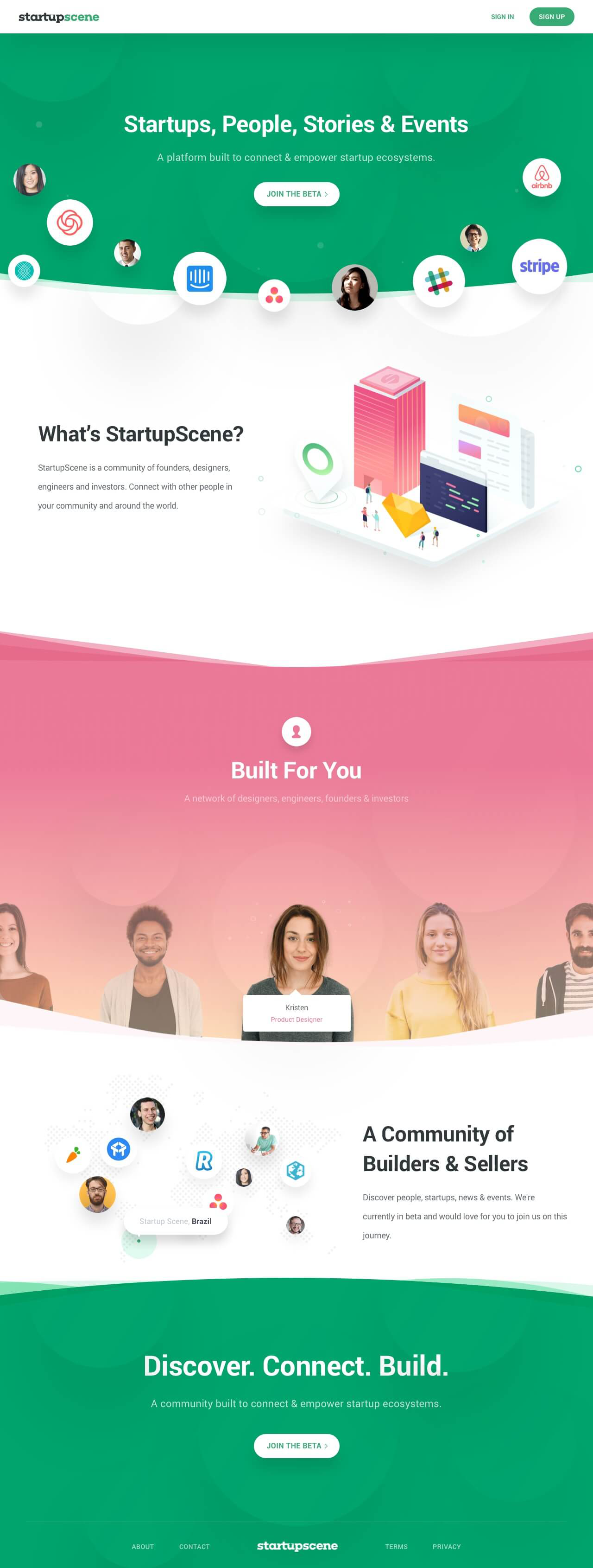
StartupScene’s Coming Soon landing page is a good example of what such a page should include.
Source: Lapa.ninja
This page is simple yet includes most of what visitors need to know. It has a short and catchy headline, “Startups, People, Stories, and Events.” It tells pretty much everything in just a few words.
It then goes into a bit more detail about what the platform provides – a community for designers, founders, engineers, and investors to connect.
At the bottom of the page, we have the CTA button prompting people to join the platform’s beta version. It also includes a Contact information section.
What you should take away from this example:
- A strong and simple headline.
- Simple yet powerful background design.
- Visible and strong CTA.
2. Roastdesign
This landing page by Roastdesign for its Figma plugin has an attention-grabbing headline that immediately conveys the message.

Source: Lapa.ninja
It’s quickly followed by a brief description of what the plugin can do and a CTA button. The CTA directs visitors to get the early access version.
Further down the page, there are more details about the tool, including some of its features and functionalities.
But at the top right-hand corner of the landing page, there’s a button for feedback and one for visitors to share the page on Twitter.
What you should take away from this example:
- Minimalist design in theme with the product.
- Strong CTA button.
- Social media share button.
3. Sol
Sol has created a Coming Soon landing page for their innovative reading glasses – the Sol Reader.

Source: Lapa.ninja
The landing page features numerous elements that highlight the qualities of their product and brand.
They keep a background color reminiscent of that of the sun (sol). It includes product highlights and several hero images. The page includes a Learn More button and several interactive elements. These let people find out more about the glasses.
Lastly, it has a button to join the waitlist and one for a presale option.
What you should take away from this example:
- Thematic background.
- Hero shots.
- Waitlist and presale options.
4. Veiled Fate
Veiled Fate is a fantasy board game looking to get financing off of Kickstarter.

Source: Lapa.ninja
Right off the bat, the Coming Soon landing page includes a date. This lets people know when they can go on Kickstarter and finance it.
It also includes highly engaging visuals. These include artful depictions of the game’s characters and actual pieces and cards from the board game.
More importantly, however, the page includes a couple of testimonials from professional playtesters to give the game credibility.
What you should take away from this example:
- Engaging visuals.
- Testimonials as social proof.
- Countdown clock – in this case, a date.
5. Moon
The New York-based same-day cake delivery service, Moon, had a truly innovative idea with its Coming Soon page.

Source: Lapa.ninja
They decided to play a little game with their visitors. People get to vote on three cakes and will get a token reward for doing so.
This technique gets people to spend more time on the page and interact with it. It builds anticipation and helps visitors envision themselves with those cakes.
The page also has an email signup to get notified when the service launches.
What you should take away from this example:
- Very clear headline.
- Simple game with a small reward.
- Email signup CTA button.
6. Signals
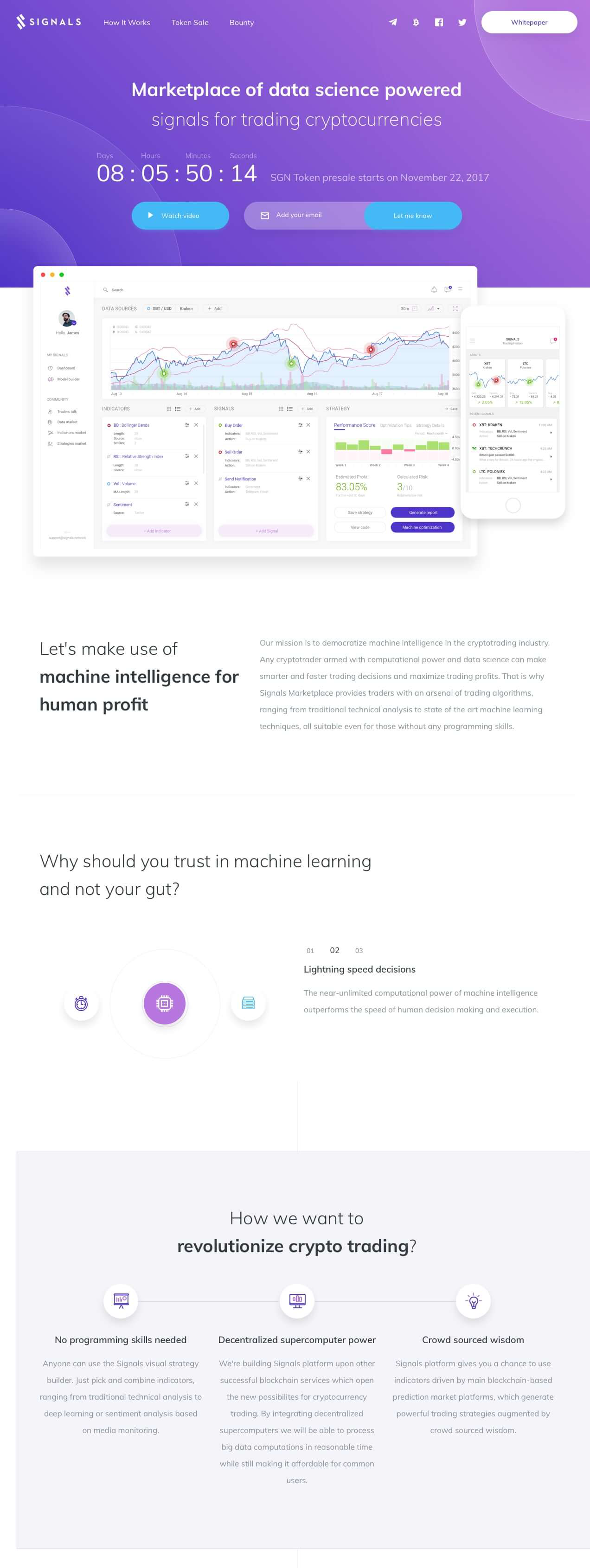
Signals is a cryptocurrency marketplace with a pretty detailed Coming Soon landing page. The page is very clean and well-organized.
Source: Lapa.ninja
The first thing that grabs our attention is its countdown timer. It lets people know how much time until their token presale starts.
They also included a “watch video” and an email signup button at the top. You’ll also find a “whitepaper” button and social media redirects at the top right corner.
They immediately go into the value proposition and a bullet point list of all relevant features and benefits.
Keep in mind that this is a finance platform, and people need to entrust them with their hard-earned money. That’s why there’s a “team” section to show the real people behind the organization.
What you should take away from this example:
- Countdown timer front and center.
- Email signup section.
- Our team section to humanize the brand.
7. Superthread
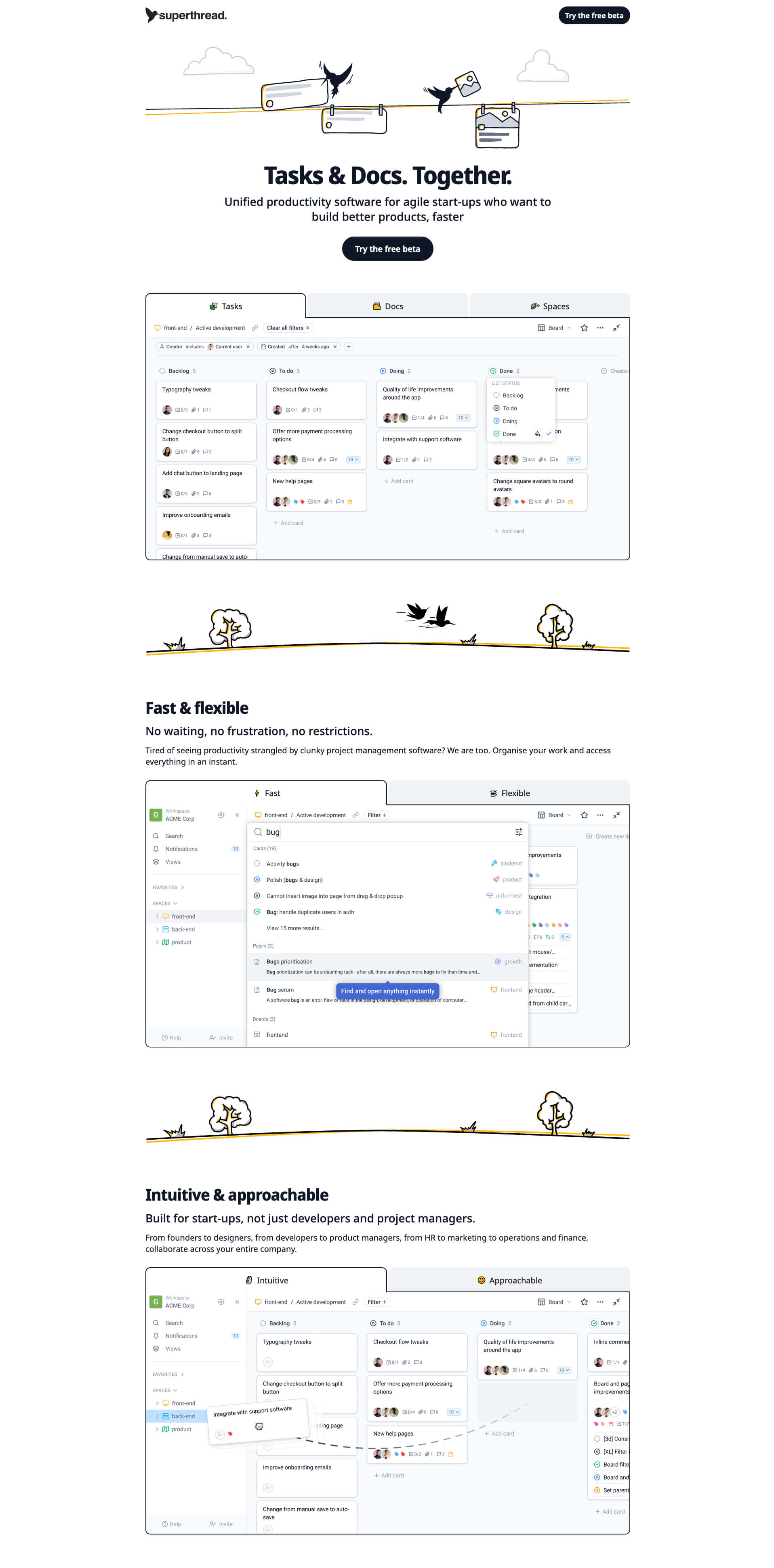
Superthread’s Coming Soon landing page has a clean, white, minimal design. It works great with what they’re trying to say.
Namely, their productivity tool cuts through all the clutter and gets the job done. You’re not paying for bells and whistles. You’re getting a unified tool for start-ups.
Source: Lapa.ninja
Its brilliance lies in its simplicity. It’s got snapshots, benefits, and a clear value proposition.
Even the headline shows this in just three words. Enough said!
Visitors also get to try the free beta version. A great way of getting people on board pre-launch.
What you should take away from this example:
- Minimal design in line with the value proposition.
- Free beta button for early birds.
8. Campsite
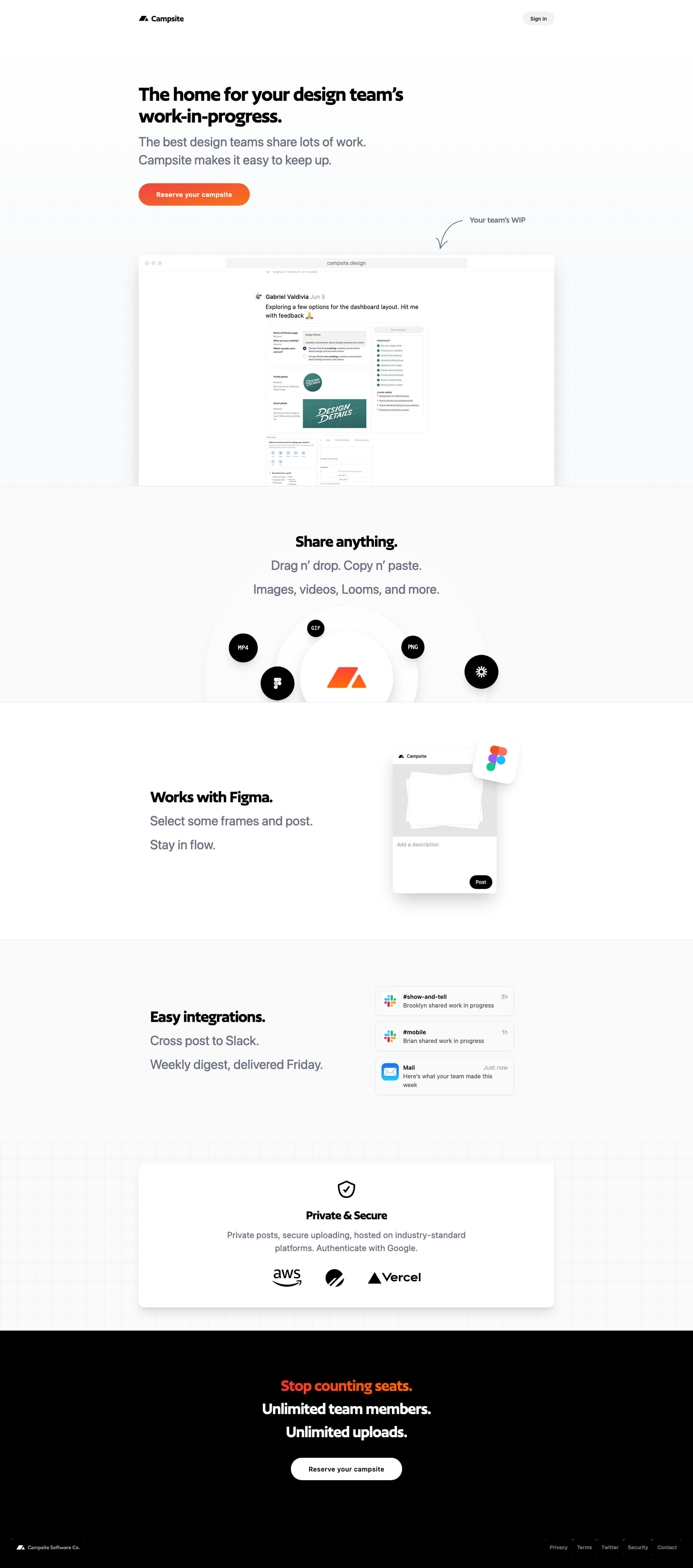
Campsite’s landing page is another example of simplicity. Similar to Superthread, Campsite went for a minimal black-on-white layout with very little clutter.
Source: Lapa.ninja
The headline says exactly what the platform’s about, with the value proposition immediately after.
The only real thing that seems to break the monochrome mold is the CTA.
The “Reserve your campsite” call-to-action is in bright orange making it easy to find, and the text is a cute pun on the brand name.
What you should take away from this example:
- Minimalist design.
- Clear headline.
- Strong and easy-to-find CTA button.
9. Anna Jóna
Anna Jóna is an Icelandic bar, cafe, and cozy cinema — all in one. The Coming Soon landing page keeps a minimal design while giving it a somewhat retro look.
It almost has a Wes Anderson look and feel.

Source: Lapa.ninja
It’s different from the other examples on this list mainly because it’s more personal.
Instead of an obvious headline, there’s the logo. There’s also a very personal greeting that includes a scheduled launch date so visitors know when to come back.
The CTA is for hiring staff, which is a great way of finding like-minded employees who vibe with the landing page.
You also get social media links to follow the process and know when you can share in the experience.
What you should take away from this example:
- Cozy and personal visuals and color scheme.
- Personal greeting with the launch date.
- Social media links to build a following.
10. Steam Deck
Gamers all around the world rejoiced when the Steam Deck came out – a handheld gaming PC connected to the user’s Steam account.
Product Coming Soon landing pages like these need to include several key elements, and this one does.

Source: Lapa.ninja
- Catchy headline and pricing information – check!
- Detailed tech specs – check!
- Hero shots – check!
- Add to wishlist CTA – check!
All-in-all, the landing page gives all the necessary information an avid gamer might want.
What you should take away from this example:
- Hero shots.
- Grabbing visuals.
- Add to wishlist CTA.
11. Felt
Who would have guessed people were still making maps nowadays? Well, with Felt, people are making all sorts of maps for all sorts of situations.

Source: Lapa.ninja
Right off the bat, Felt’s Coming Soon landing page gives that outdoors feel. That’s thanks to the camo green color.
The value proposition is there, and so is the catchy headline. The orange early access CTA button stands out on the green background. It’s also a great way to get people to use the map editor before the official launch.
It also includes social media links but other than that – simplicity is key here.
What you should take away from this example:
- Simple design.
- The CTA button stands out from the background.
- Twitter and LinkedIn social media links.
12. Cricut
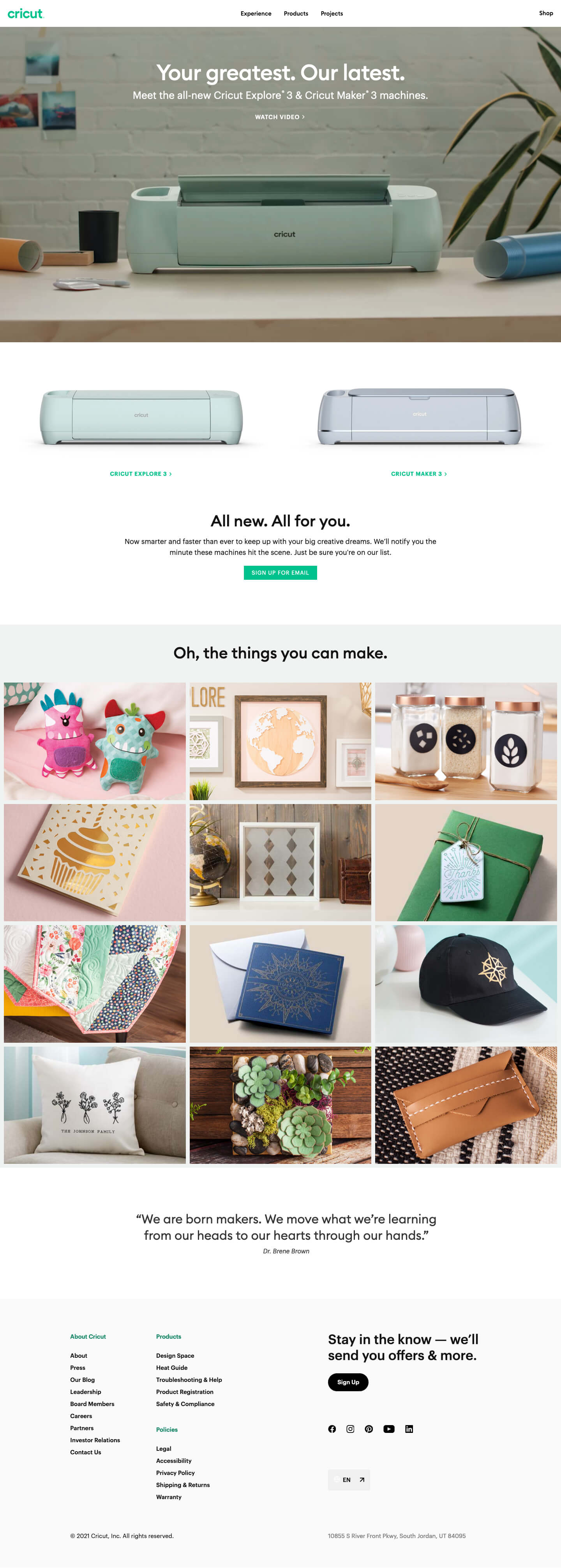
Last but certainly not least is Cricut’s Coming Soon landing page.
Source: Lapa.ninja
What’s most effective about this landing page, in our opinion, is the examples section.
It shows the many diverse do-it-yourself uses their tools can help people with. It helps visitors envision themselves truly becoming creative.
The page also has a quote from Dr. Brené Brown. Although it’s not about their product, per se, this quote helps drive the creativity point forward.
The page also includes an email signup CTA and social media links for people to follow and share.
And since Circut is aiming for an international audience, they also included a language option.
What you should take away from this example:
- Diverse of the product being used.
- Multi-language option.
- Many social media link options.
Best Tools and Platforms for Creating ‘Coming Soon’ Pages
If you want to create Coming Soon landing pages like the cool examples above, you need to use one of the best landing page builders on the market.
Many of these have an intuitive design, numerous customization options, and often need no coding skills on your part. They can also include nice templates to help you get started and make the process as seamless as possible.
Here’s a short rundown of some of the best and easiest-to-use landing page tools and platforms to get you started.
- Moosend is a budget-friendly all-in-one email marketing automation tool with a powerful landing page builder. It has a user-friendly UI and easy drag-and-drop functionality. Coupled with its Coming Soon template library, Moosend makes it a breeze for beginners to create stylish and mobile-responsive landing pages able to convert.
It also comes with a WordPress plugin so you can upload your pages to your site in seconds. - Hubspot Marketing Hub is a suite of inbound marketing tools with a free customer relationship management (CRM) system. You can customize its landing page templates and include media content.
The tool also has A/B testing for up to five versions at a time. You can include smart rules that show landing pages based on visitor location, device, source, or other variables. - ClickFunnels lets you create landing pages for upselling and cross-selling. It includes mainly pre-made landing page funnels and sales-focused features like opt-in pages or lead generation functionality.
- Leadpages provides great mobile-friendly landing page templates. It also lets you include your images, as well as videos, a countdown clock, and other features to make your landing page more appealing.
Let’s now take a quick look at a few techniques and strategies to get visitors to leave their emails on your landing pages.
How to Encourage Visitors to Leave Their Email on a ‘Coming Soon’ Landing Page
It doesn’t matter how cool your Coming Soon landing pages look if they fail to convert.
To encourage visitors to leave their emails, consider the following landing page strategies and best practices.
- Give them an incentive: This can include anything from early access, and sneak peeks, to discounts. These all help entice people to sign up.
- Optimize your CTA: Use visually appealing colors for the CTA button that contrasts with the background.
- Maintain data usage transparency: You must show visitors exactly how you’ll use their data and put their minds at ease. People are generally squeamish about sharing their information if there’s a risk it will end up in the wrong hands. Highlight the fact that you comply with all data privacy laws.
- Use social proof: Leverage testimonials or partner logos whenever possible to increase trust and build confidence.
- Use a countdown timer: These can build urgency and trigger the fear of missing out (FOMO).
Building your email list with Coming Soon landing pages is a great way to get access to people you know are interested in what you have to offer.
Gear Up and Launch: Start Putting Together a ‘Coming Soon’ Page Now
For some, Coming Soon landing pages may seem like an afterthought – something nice to have but not necessary.
We beg to differ. For the amount of time and effort you put in, the benefits are well worth it.
You get to build hype, increase your social media presence, grow your email list, and even make pre-sales if that’s your goal.
Use this guide’s examples and best practices, and get started today!
Register with Moosend for free and create. We’re already looking forward to what you’ve got cooking.


 Published by
 Published by
