
7 Brilliant Abandoned Cart Email Templates For 2026
Unfortunately, cart abandonment is a reality for many eCommerce businesses. According to statistics, 69% of online shoppers leave without completing an order, while 60% of cart abandonment occurs due to poor shipping.
The good news, though, is that 45% of cart recovery campaigns are opened, 21% of them are clicked on, and 50% of the abandoners engaging with them convert. So, with almost 7 out of 10 buyers leaving their shopping carts behind, you need to craft the perfect email to win them over.
We’re going to make this process easier by giving you abandoned cart emails templates easy to customize to restore your revenue. You’ll also find quick tips to nail this marketing strategy and stellar email examples from notable brands.
Explore Moosend’s Abandoned Cart Email Templates
Moosend’s cart recovery templates are perfect for creating quick and impactful emails for your audience. We’ve crafted simple designs to meet the requirements of most businesses and streamlined an easy customization process to help you make them on-brand.
To check them out, sign up for a Moosend account, hop into the drag-and-drop editor and select what you like from the template library. You don’t have to be a coding expert to customize them. This is a major plus for someone who wants a smart email marketing service to scale their business.
Pro tip: Make sure that your email tool integrates with popular eCommerce platforms like Shopify and WooCommerce to streamline your abandoned cart email strategy like a pro.
Now let’s see 7 simple email templates you can pick to recover your lost revenue.
1. The In-Style Cart Abandonment Template
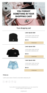
If you have a fashion or beauty brand, you’re probably looking for a simple layout without compromising the creative aspect. This template will help you check all the boxes.
Why you need it:
This design has everything you need to attract your reader’s attention. The header copy and the image at the top put the reader straight to the point. You can keep the placeholder image if it matches your brand tone or upload a tailormade visual.
The cart abandoners can check out all items they left behind, including their prices. The clear CTAs (calls-to-action) move them straight to the checkout page to complete their purchase.
You can also use this template to build automated product recommendation emails. Both strategies lead to personalized emails that capitalize on customers’ preferences to boost your ROI.
2. The Copy-Oriented Abandoned Cart Email Template
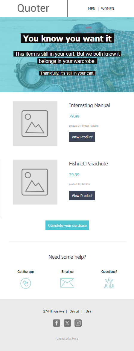
Colors, images, and multiple CTAs are amazing, but sometimes, customers need more. If your audience favors stories, you can include additional copy lines to make your offer more appealing to them.
Why you need it:
This template will allow you to add your copy on top of the email along with a beautiful image. The pre-added “Need Help” section is also perfect for providing answers to common customer questions related to their abandoned items. Forward them to the customer support team or place an FAQ section to help them.
This template is great because you can combine it with the rest to deliver a converting email sequence with multiple drip campaigns.
3. The Sunny Cart Abandonment Template
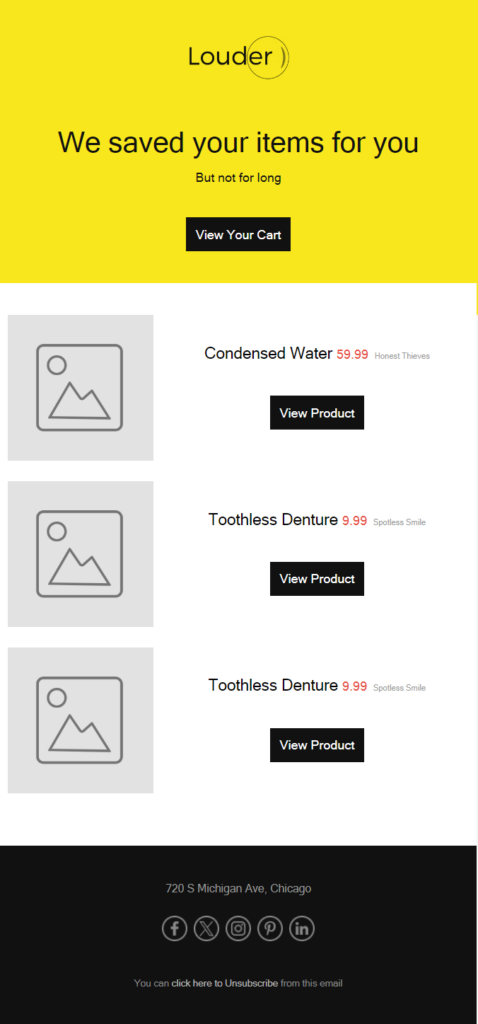
Since it only takes a second for customers to close your email, finding ways to keep them engaged, even for a few extra seconds, will make a difference. This abandoned cart email will help you out.
Why you need it:
According to color psychology, adding a splash of color can positively affect your consumers and motivate them to take action. Moosend’s Sunny template can be a bright addition to your automated email sequence. Its simplicity and clean structure are perfect for online store owners and online retailers who want an effective recovery email.
The two CTAs are great to get your indecisive customers to click through and revisit their online shopping carts.
4. The Visual Cart Recovery Template
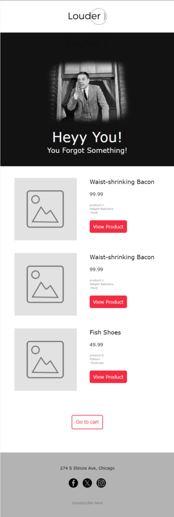
Want to make your email campaigns more appealing? Then combine your introduction with a beautiful visual to amplify your message.
Why you need it:
Email marketing benchmarks have shown that emails with images have higher open and click-through rates than plain-text campaigns. This template also shows a sense of humor, but if it doesn’t suit your brand tone of voice, it’s best to find an alternative.
Plus, you can add an urgent message to lead your shoppers to the call-to-action along with your visual. Stick to a vibrant button color as it will make your CTA pop out.
5. The Blue-Black Cart Recovery Template
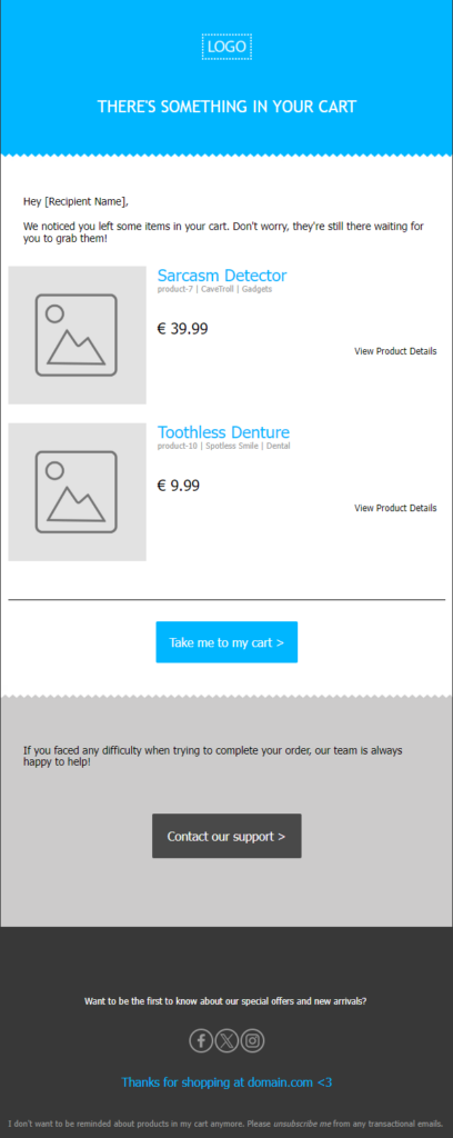
If you want to create a minimal cart abandonment campaign but still need a splash of color, you can choose this template.
Why you need it:
This template is perfect for eCommerce stores that favor simpler designs, such as tech and gadgets. You can alter the copy and use personalization tags to add the subscriber’s name and make it more personal. At the email footer, they added a thank-you note and an unsubscribe link to avoid potential spam complaints.
If you schedule drip campaigns, you can also consider sharing incentives, such as discount codes, for costlier products to motivate VIP customers to purchase faster.
6. The Converting Cart Reminder Email Template

All the above templates are great, but to convert your difficult customers, you need a true cart recovery converter.
Why you need it:
Apart from its clean email design, this template has a GIF to make your marketing campaign more dynamic and playful. Moreover, the customer testimonial section is perfect for showing your abandoners that your product is worth their time and money.
Overall, you can use this template as a blueprint to create a simple yet effective recovery sequence for your online store. To maximize your conversions, it’s best to choose a marketing automation software tool and create an abandoned cart email sequence to nudge non-openers.
7. The Minimal Cart Reminder Template

Your shopping cart recovery campaign doesn’t need to be fancy with multiple CTAs and visuals. The perfect message needs to be clear and informative. Thus, Moosend’s minimal abandoned cart email template came to be.
Why you need it:
The above template will help you minimize distractions by placing your product images at the heart of your campaign. Also, this design allows you to add the email copy at the beginning to entice your shoppers.
Moreover, since it favors white space, you can change the color of the CTA button to make it stand out. Overall, this is a great choice for online stores that need a quick email campaign to get customers back to their abandoned shopping carts.
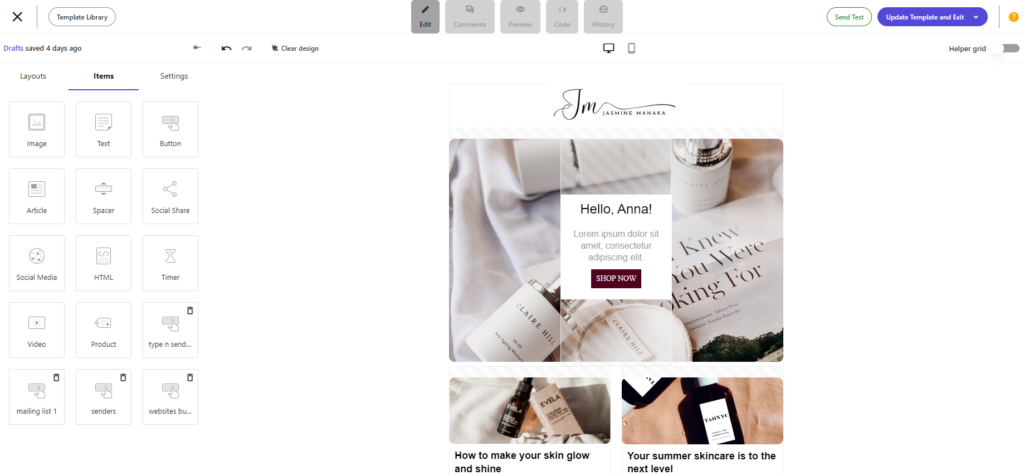
If you want to create your own email template from scratch, you can use a user-friendly email editor. For example, Moosend has a drag-and-drop email builder that lets you enhance your email with the right assets to win over your target audience.
How to Create Compelling Abandoned Cart Emails
What makes an abandoned cart email successful? Here are some tips to follow to put your mind at rest and conversions down the funnel:
Create an attractive subject line
To increase your abandoned cart conversions, you first need to secure a high open rate. So, what will make your subject line stand out from the rest of the openings in your subscriber’s mailbox?
One of the most important parts is making it reflective of the email content to form the right expectations. Plus, it should be within 30-50 characters to be responsive on all devices.
Here are some abandoned cart subject line examples from famous brands:
- Can’t Stop Thinking About Me?
- Oops… You left something in your cart!
- Your shopping cart is about to expire!
- We have something you want! 🧡
- Do you know what suits these products? Good discount.
- Tick-Tock! Your Cart Is on Standby
You can also use a free subject line tester like Refine to optimize your subject lines based on the size of your list and your industry.
Write intriguing copy
If you want to make abandoners claim your products, you need to convince them first. Many marketers rely on the fear of missing out (FOMO) to motivate prospects to buy fast, so it’s wise to remind your subscribers of all the benefits they’ll reap by purchasing your products.
Add a sense of urgency by using statements such as “limited time” and “now” to push things faster. Ensure that your copy is not spammy, as it might cause adverse results.
Finally, remember that clever copy should always resonate with the audience to open doors. Use a nice wordplay based on your tone of voice to capture their attention, and make sure that your copywriting complements your design perfectly.
Add beautiful product visuals
Cart abandoners have probably left products to other carts, too. That’s why it’s important to display your products again as a refresher. Use high-quality and attractive visuals to do the work.
It’s also wise to write a brief description of the products and the price to help them decide on the spot, without having to navigate your website again. A clear layout will help you display them beautifully.
Here’s an amazing example by Nike. They also included product recommendations to increase the conversion potential:

Include clear call-to-actions
To motivate subscribers to go to the checkout page faster, you should include smart call-to-action buttons that stand out from the rest of the text. Place them in prominent places inside your copy based on the layout and choose a color that stands out from your palette.
Moreover, write actionable copy to convert them faster. Copy lines like “Shop Now” usually do the trick. Finally, it’s important to simplify the checkout process to avoid losing people all over again due to unnecessary friction.
Share incentives
If you want to lower your cart abandonment rate no matter what, consider sharing incentives with potential customers while their interest is still fired up. You can schedule a follow-up email for those who didn’t open or skipped the first abandoned cart email to increase your conversion chances.
For example, you can send a coupon code or offer free shipping costs to indulge them. It’s up to you to decide if this strategy is suitable for your business and when to use it.
Add social proof
Do you want to give more reasons to hesitant cart abandoners to choose the products they left behind? Then add customer reviews and testimonials to build more trust and benefit from word-of-mouth.
The best way is to add quotes including the benefits and assets of your products to make them more attractive. Check out this amazing example by Church California:

5 Best Abandoned Cart Email Examples to Get You Inspired
To give you an idea of what an abandoned cart template should look like, let’s look at some incredible examples with clever email designs, irresistible offers, and urgency.
1. Fenty Beauty’s Cart Recovery Example
Subject line: P.S. Your shopping bag is waiting…

Fenty Beauty has a simple cart abandonment campaign with pleasing colors to remind shoppers to complete their purchase.
What works:
- Straightforward subject line
- Use of the second person
- Clear abandoned product image
- Focused CTA (which could have been a brighter color)
- A section that answers FAQs (e.g., payment methods, return policy)
- Social media buttons to promote engagement
Want to mimic this cart recovery example? Sign up for a Moosend account, grab your favorite cart email template, and set your revenue restoration efforts in motion.
2. Endy’s Social Proof-ed Abandoned Cart Email
Subject line: It looks like you left something behind…
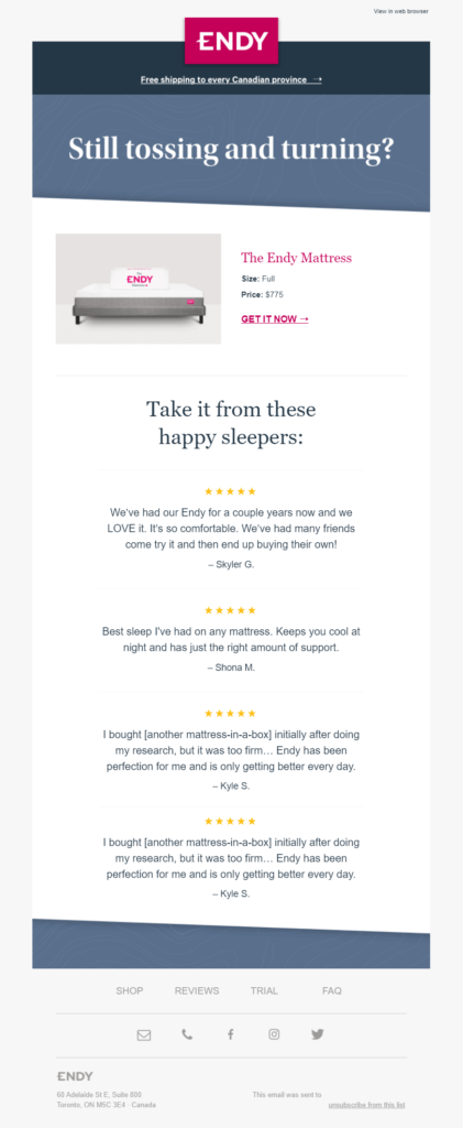
Endy’s campaign might look simple at first glance. However, its true power lies in the beautiful use of email copy and customer testimonials.
What works:
- Straightforward email subject line
- Bold introduction that uses a question
- Summary of the abandoned product
- Use of customer reviews and star ratings to increase conversion rates
- Social media buttons to increase engagement
3. John’s Crazy Socks Cart Abandonment Email
Subject line: Ready to buy? Get Happiness Now
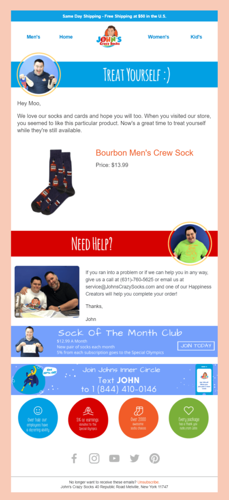
John’s Crazy Socks are phenomenal. And their cart recovery emails share the feeling. Let’s see why.
What works:
- Intriguing subject line to increase the open rate (use of emoji)
- Personalized and friendly greeting
- Email copy to motivate abandoners to click through
- Summary of the abandoned item
- Additional support through a phone number and email
- Reasons why customers should buy from the store
4. Nutriseed’s Free Shipping Cart Recovery Example
Subject line: Your Order Information
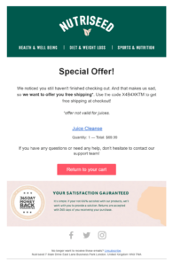
Nutriseed uses a short email campaign to get customers back to their shopping carts. While the subject line needs optimization to improve its open rate, this example is great to lead your audience back to their cart.
What works:
- Free shipping to make the abandoned item more appealing
- Playful email copy that uses emotional language
- Brightly-colored CTA button that stands out
- 365-day money-back guarantee to encourage shoppers to buy
5. Sunday Somewhere’s Social Feed Example
Subject line: Lost luggage

Sunday Somewhere opts for a short shopping cart abandonment email, using white space and high-quality visuals.
What works:
- Unique email subject line
- Clever copy with storytelling elements
- Multiple CTAs (the button could be a different color to increase clicks)
- Abandoned product image at the center of the campaign
- Reasons for making a purchase
- Social media feed to show the product in real situations
Kiss Cart Abandonment Goodbye
Abandoned carts are and will continue to be a problem for eCommerce businesses. However, with the right marketing campaign, you can minimize its effects and restore your lost revenue. A nice offer, free shipping, and friendly messaging will help you motivate your abandoners to revisit their shopping bags and complete their purchase.
So next time you’re planning your cart recovery emails, make sure to choose a beautiful, abandoned cart email template to save time and effort.
And remember to use your amazing email tool to add advanced elements that will power them up. Moosend’s countdown timers can really work miracles, so don’t forget to sign up for an account and try them out.


 Published by
 Published by

