
8 Real Fitness Landing Page Examples to Get Inspired [2026]
Trying to get new clients feels like a constant battle for many fitness businesses. The market is highly competitive, and you can’t afford to waste time or money on strategies that can hurt your bottom line. What’s more, customer acquisition isn’t just about traffic and volume. It’s about focus.
A landing page is built on that very distinction. It’s designed to attract the right prospects and convert them into clients by guiding them toward a single, desired action.
In this guide, you’ll learn how to craft these unique, high-performing pages with best practices and fitness landing page examples. You’ll find easy ways to grow your business though real examples, whether you’re a personal trainer, a weight loss coach, or a fitness instructor.
Grow your business with powerful assets
Get Moosend’s drag-and-drop landing page builder and ready-to-use templates from $9/month.
Start freeWhat is a Fitness Landing Page?
A landing page is a standalone web page designed for marketing or advertising purposes. They inform visitors about specific services, products, or programs, inviting them to complete a desired action, like subscribing for a gym membership.
Unlike a full fitness website, which often has multiple pages and more navigation, a landing page offers targeted messaging and serves a single goal.
For example, if you’re promoting online training programs, you could create a dedicated landing page specifically to entice prospects with a free trial. Invite them to sign up in exchange for their contact information and start nurturing those prospects with relevant content to convert them into clients.
Why You Should Create Fitness Landing Pages
Here are some of their top benefits of a fitness landing page:
- Generate high-quality prospects: Visitors arrive on these pages because they’ve already shown interest through an ad or a search. They’re not just random traffic; they’re high-quality prospects who are more likely to become clients.
- Boost conversion rates: Landing pages have a clear focus and easy navigation, guiding users on what to do next, such as signing up for a fitness course, through outstanding call-to-action buttons.
- Showcase expertise: These pages help you build trust by speaking directly to your audience’s pain points and needs. By sharing valuable information about your initiatives, you position yourself as a leader in your industry.
- Track important data: Landing page data provides valuable insights about user behavior to optimize future performance and improve key metrics, such as click-through and conversion rates.
The aftermath? If you want to boost specific initiatives and stand out in the competitive wellness and fitness industry, a landing page is a must-have tool for your promotional kit.
How to Craft High-Converting Landing Pages for Fitness
A landing page is a powerful tool, but its potential isn’t automatic. To truly give your fitness programs and products the attention they deserve, you need to master the nuts and bolts of high-performing fitness landing page design.
1. Define your landing page goal
Just as every great fitness journey begins with a clear goal, so does a successful landing page. Before creating it, define exactly what you want to achieve.
This clarity is the foundation for communicating with your audience effectively. For example, your goal could be launching a new, premium product from your fitness e-commerce store, boosting free trial signups to your SaaS platform, or filling a masterclass with a limited-time offer.
Once you have a single, clear goal, you can then build your page around it. The more specific your goal, the better you can design your page to achieve it. This specificity ensures your page is a highly focused tool, not a generic one.
2. Create a clear email structure
Let’s move to the anatomy of an effective landing page and the elements you should include to grab attention for good:
- Main headline: This is your first chance to hook a visitor; it should be clear and compelling.
- Unique value proposition (USP): What makes you different? Use this section to tell your story.
- Hero image/video: A powerful visual is key. It should immediately show the benefits of your offer.
- Signup form: Keep it simple. Only ask for the information you absolutely need, like a name and email.
- Call-to-action button: This is the most important button on the page. It tells the visitor exactly what to do next.
- Supporting copy: The body of your landing page should reinforce your main headline and USP by highlighting the benefits of your offer, addressing pain points, and convincing visitors to take action.
- Footer: This isn’t the main part of the page, but it’s important for building trust. Include your copyright information, a link to your privacy policy, and any legal disclaimers.
Once you have the core elements, you can make your landing page more engaging with social proof and compelling visuals. Add testimonials and success stories to build trust, and sprinkle high-quality images, videos, or even GIFs to help prospects visualize their transformation and feel a connection with your brand.
But how can you bring most of these together harmoniously? If you’re new to landing page design, use a landing page builder to save time or get inspired. Tools like Moosend come with built-in editors and pre-made templates that can help you get started quickly.
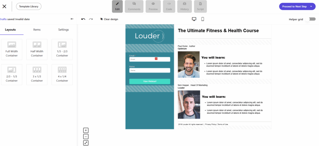
3. Optimize your landing page content
A great outline is only half the battle. Now it’s time to focus on the most crucial element, the landing page copy, starting with your main headline. It introduces readers to the core theme of this asset and can seal their attention or lose it for good.
An effective headline communicates the core idea with engaging, action-oriented wordplay. Use motivational language to show readers that their fitness goals are in safe hands, encouraging them to read on.
Just like your headline, your subheadings guide visitors through your content. They should be hard to ignore and surrounded by plenty of white space to stand out.
The rest of your body copy should stick to short, actionable sentences that focus on your audience’s pain points and how your offer solves them. Ensure your unique value proposition is instantly clear so readers can quickly grasp why they should convert.
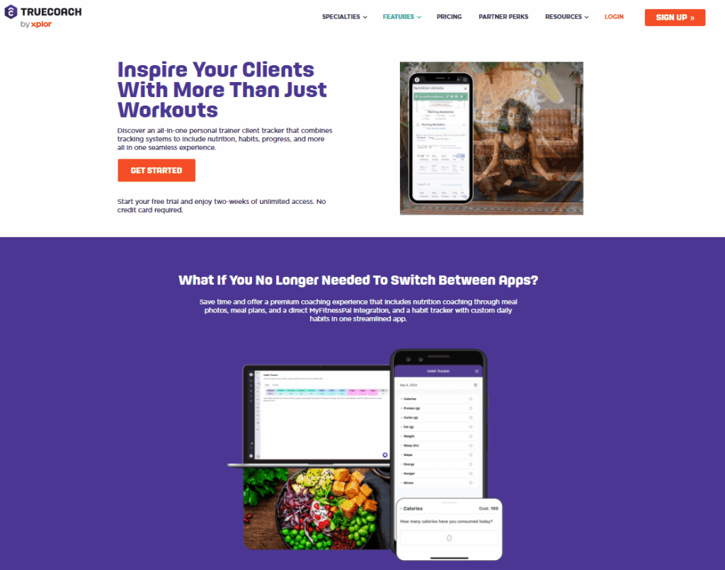
Check out this example by TrueCoach. The main title focuses on customer inspiration and benefits, and the first subheading includes an engaging question. Notice how the rest of the copy provides deeper insights, helping users get a better grasp of the services before they commit:
4. Create a clear call to action
The main conversion point of any landing page is the call-to-action (CTA). To increase conversions, your CTA button needs to be easy to spot and preferably placed above the fold, where visitors don’t have to scroll to see it.
From a design perspective, your CTA should stand out with a distinct, contrasting color. The copy is just as important. Use actionable, urgent language like ‘Sign Up Now’ or ‘Get Your Free Trial Today’ to give your button the punch it needs to drive action.
To avoid confusing your readers, stick to a single, clear CTA per page. If your page is long, you can repeat that same button in different sections to give users multiple chances to convert without introducing a new, competing action.
5. Simplify the signup process
A perfectly placed CTA button is a great start, but it’s not enough on its own. To capture your prospect’s information, you need a signup form, and it should be placed in a visible spot, preferably above the fold.
While you might want to learn as much as possible about your new prospects, avoid using complex forms with too many fields. Asking for too much information can scare potential customers away and even raise privacy concerns.
In case you can’t skip certain information, you can build two-step signup forms and even add a quiz element to make it more fun and engaging.
You can also include a preference center to give your new subscribers control over the communications they receive. For example, if you offer both wellness and fitness coaching, you can let them choose which content they’re most interested in.
6. Use social proof to build trust
First-time visitors often need more evidence to trust a fitness business. Since not everyone will take the time to search for reviews, you need to bring the proof directly to them by adding social proof to your landing page.
For example, share client testimonials and success stories to motivate others to join. You can also include Google ratings, reviews from influencers, or for premium services, media reviews and the logos of businesses that have trusted you.
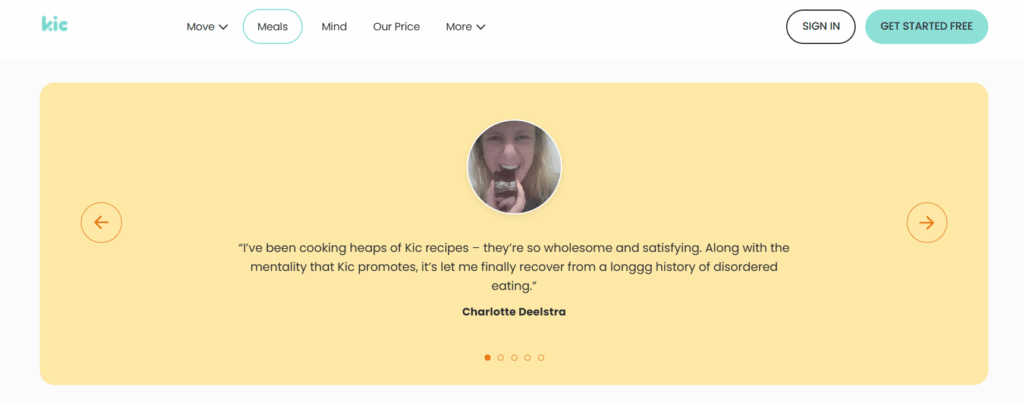
Here’s how Kic showcased some client reviews just above their landing page footer to quickly build trust with new visitors:
7. Include an FAQ section
It’s natural for potential customers to have questions before they commit. By including a proactive FAQ section, you can remove any last-minute doubts and give them the information they need. Use this section to address common questions about free trials, pricing models, or how to contact you.
To make your FAQ section truly effective, step into your prospects’ shoes. What are their biggest pain points or hesitations? By thinking like them, you can address their core needs and concerns with your answers. Back this up with some research to get more tangible data.
Where can you find this information? Scroll through your social media comments, ask your customer service team about the most common questions they receive, or even check out your competitors’ websites to see what they address in their FAQs.
8. Track your landing page performance
Your landing page is live and the first results are flowing in. But to truly measure its success, you need to track key metrics like click-through and conversion rates. This is how you’ll know if your page is actually working.
You can track basic performance using your landing page tool’s built-in analytics, or dive deeper with platforms like Google Analytics. You can also use heatmaps to see exactly how visitors are interacting with your page, uncovering key behavioral patterns.
Want more data before you even launch? Use A/B testing to experiment with different content variations. You can test everything from different hero images to various CTA buttons to see what grabs more attention. The data from these tests will give you the confidence to launch a high-performing page every time.
Best Fitness Landing Page Examples
Now that you know the key elements of a high-converting landing page, let’s look at some real-world examples from notable brands:
1. Peloton
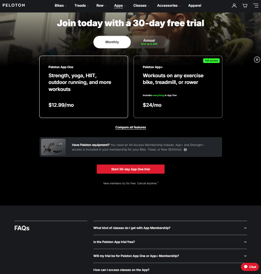
Peloton is a well-known business offering a holistic fitness experience, from gym equipment to online classes. This is the landing page they built for their app’s free trial:
Why it works:
- The page is well-organized, with each section standing out for easier navigation.
- The user can choose between two subscription options based on their needs and request a monthly or annual plan.
- The red CTA button stands out, using actionable language to drive clicks.
- The FAQ section directly addresses user concerns, creating a smoother user experience.
2. Equinox
This gym landing page by Equinox is the perfect example of how to grab visitors’ attention with minimal yet powerful design:
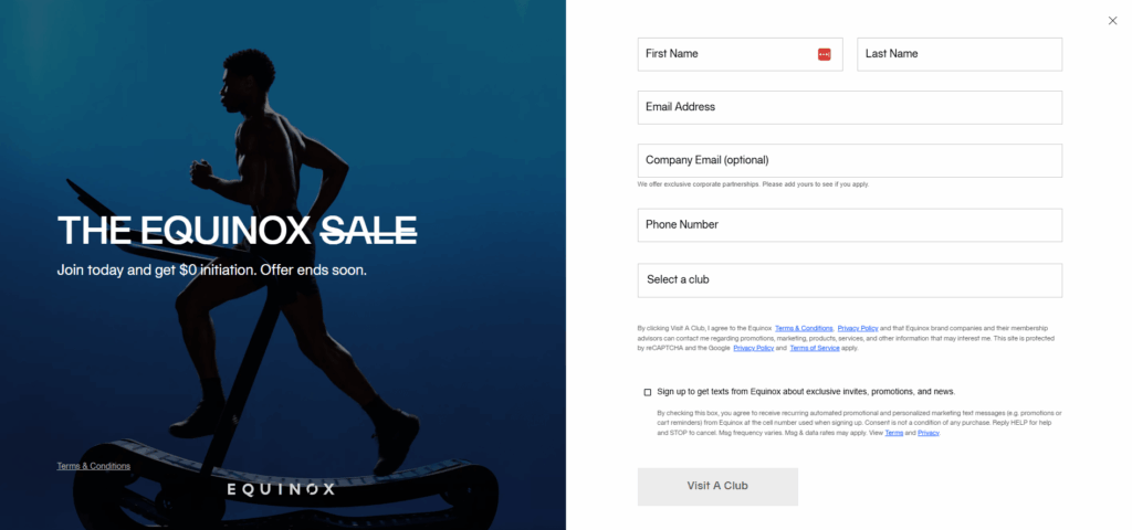
Why it works:
- The page immediately grabs attention with a limited-time, high-value offer ($0 initiation) to boost conversions.
- The powerful image of a man running acts as a strong visual attractor, inspiring prospects to envision themselves using the service.
- The landing page is consistent with the website design, which reinforces brand trust and awareness.
- The signup form is easy to fill, while the footer includes crucial trust signals like terms and conditions
3. Kickoff
Kickoff, an online personal training platform, created a landing page to promote their gift subscription:
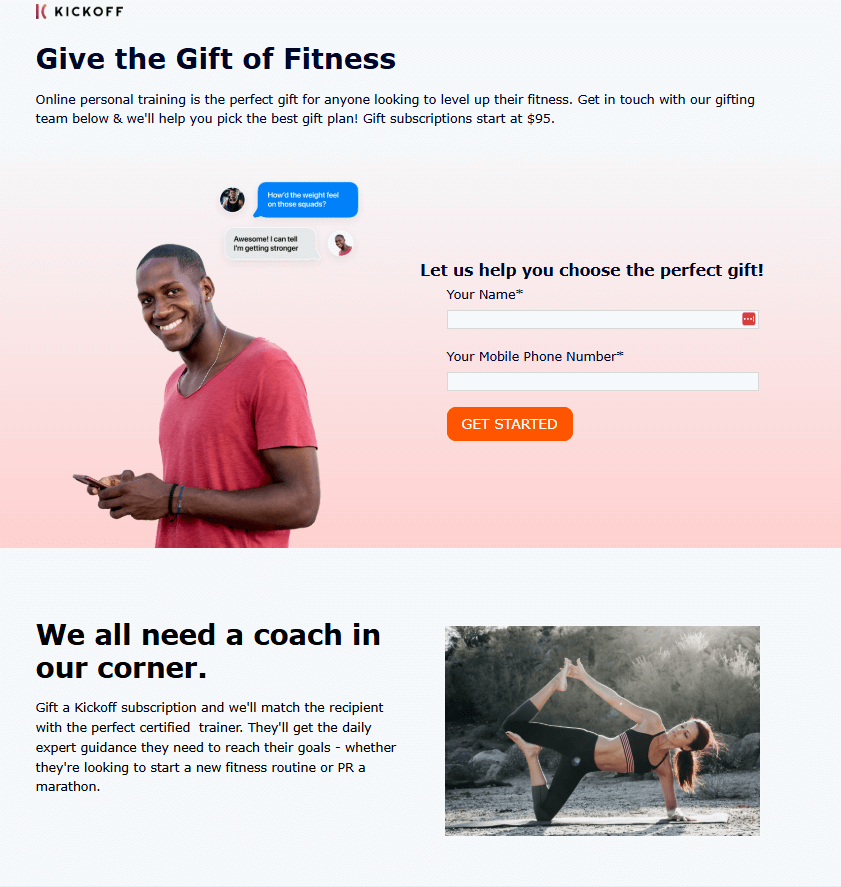
Why it works:
- The landing page titles are straightforward, written in motivational language to intrigue readers.
- The signup form and call-to-action are placed above the fold, making it easy for readers to convert without scrolling.
- The page clearly explains the pricing and main benefits of the gift subscription, so prospects know exactly what they’re getting.
- The images of happy, fulfilled people help visitors visualize the positive impact of the gift, compelling them to make a purchase.
4. Fitness Business Podcast
The Fitness Business Podcast is a well-known resource for gym owners. Here’s how they use an event landing page to promote their online sessions:
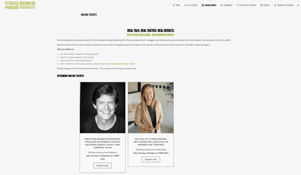
Why it works:
- The landing page copy clearly sets expectations for the content and quality of the online sessions to attract the right attendees.
- They feature upcoming events with speaker headshots and a brief agenda, followed by clear CTA buttons to drive sign-ups.
- They mention the gains of their online events in bullet points to enhance readability.
5. On
On made the most of word-of-mouth marketing by creating a dedicated referral landing page to encourage brand enthusiasts to bring their friends on board:
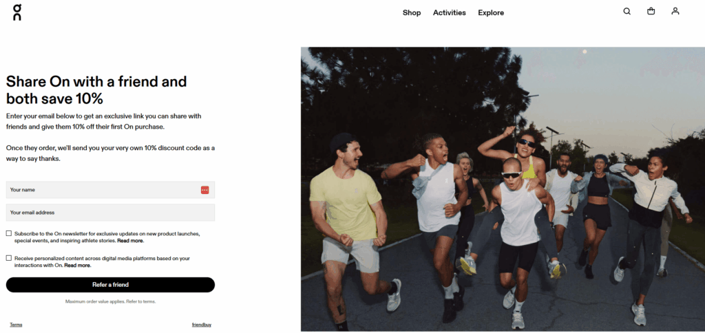
Why it works:
- The title immediately highlights the referral incentive offered to both parties, which drives conversions.
- The image of a cheerful group in athletic gear cultivates a sense of fun and belonging, which motivates referrals.
- The signup form is short and only requests essential details, followed by a straightforward CTA button.
6. Ballet Body Sculpture
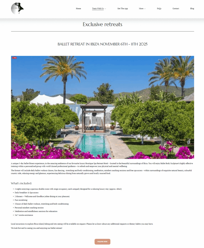
Ballet Body Sculpture created a dedicated landing page to promote their retreats, a perfect way to attract people looking for a unique fitness and wellness experience:
Why it works:
- The retreat description and images at the top set the tone for an aspirational wellness experience.
- The “what’s included” section uses bullet points to make the information easy to scan and understand.
- The CTA button at the bottom stands out in a distinct color, making it easy to find and click.
7. Hussle
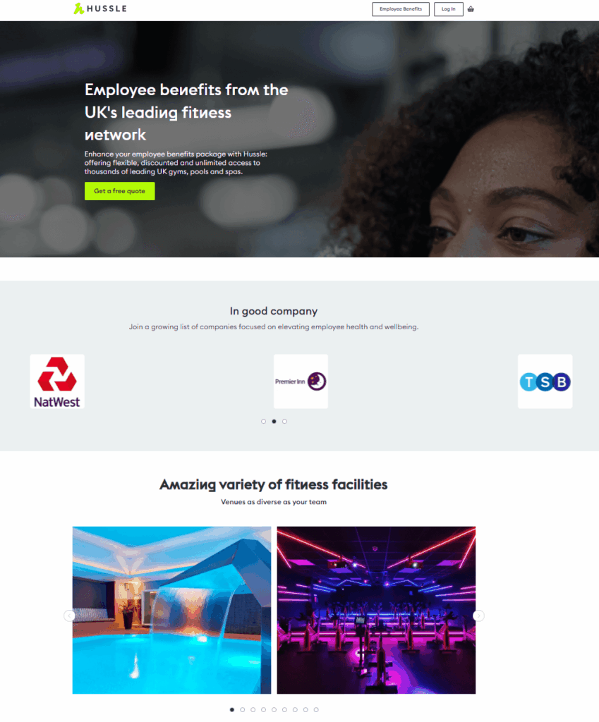
Hussle’s landing page promotes their unique fitness initiatives for employers looking to improve their employee benefits.
Why it works:
- The headline and subheading highlight the popularity and breadth of their fitness network, which immediately attracts their target audience.
- The company logos build trust with new prospects and create a sense of FOMO (fear of missing out), encouraging them to learn more.
- The impressive high-quality images of the venues and facilities are hard to skip, compelling visitors to learn more about the offer.
8. Myfitnesspal
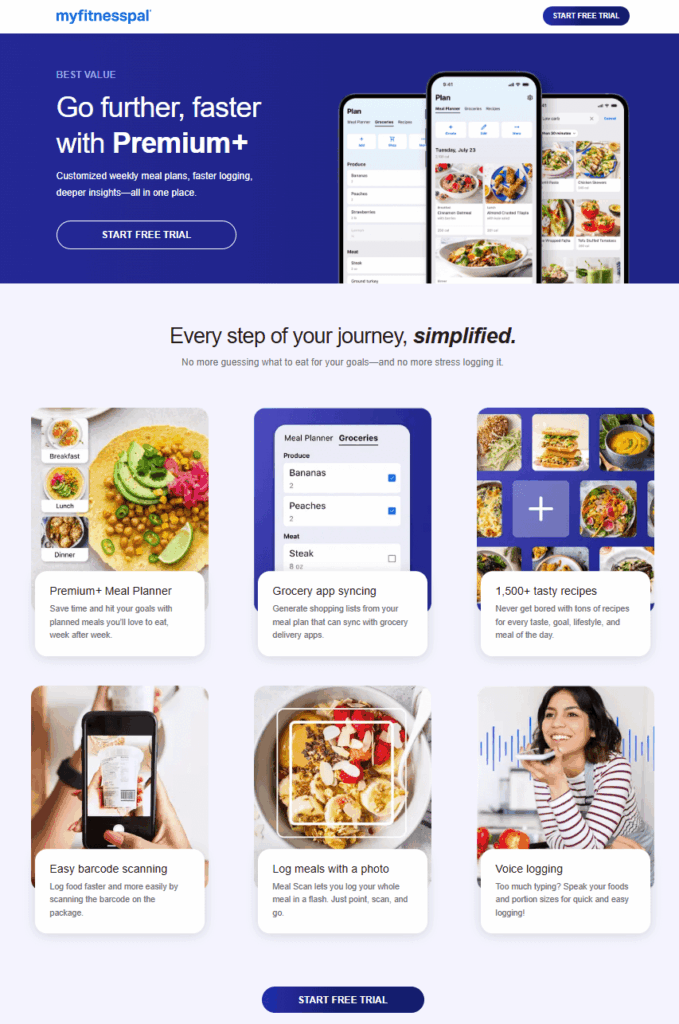
The app Myfitnesspal showcases their premium features on a dedicated landing page, providing valuable information to people who want to upgrade.
Why it works:
- The headline promises prospects that the premium version will help them achieve their goals faster, which is a powerful motivator.
- The feature descriptions use actionable language that focuses on the specific benefits users unlock when they upgrade.
- The page uses two CTA buttons with the same copy but different colors, which is a classic A/B testing strategy to find the best-performing button.
Top Landing Page Tools to Save Time
Ready to build your first landing page, but short on time? You can save yourself a lot of work with a dedicated landing page builder. These tools offer pre-made templates and user-friendly editors for beginners.
Moosend
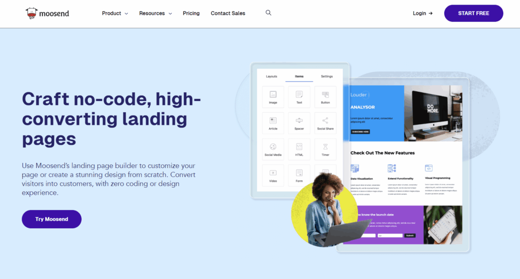
While Moosend is mainly known for its email marketing capabilities, it provides users with an excellent landing page builder. You can choose from a pre-made template library with customizable designs or create one from scratch.
Moreover, Moosend offers ready-made signup forms, popups or static, to attract more clients through your website. So, if you need a tool that combines email marketing with other growth features, Moosend is a perfect fit. Sign up for a 30-day free trial and test it out.
Leadpages
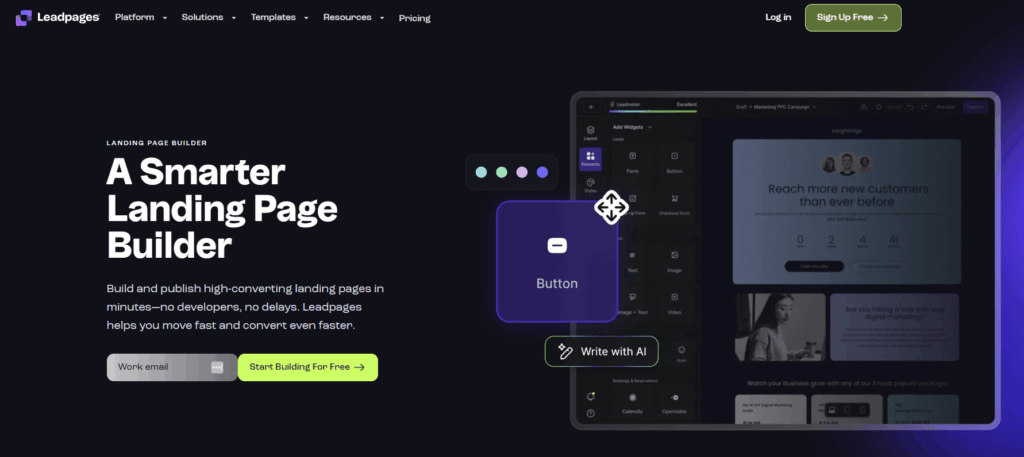
Leadpages comes at a higher price point than some other tools. However, its wide range of growth features, from powerful analytics to a variety of templates, can be a worthwhile investment if you’re serious about scaling your business.
Pricing plans start at $49/month, offering 5 landing page templates. But if you want to use more of its growth capabilities, it’s worth a try.
Unbounce
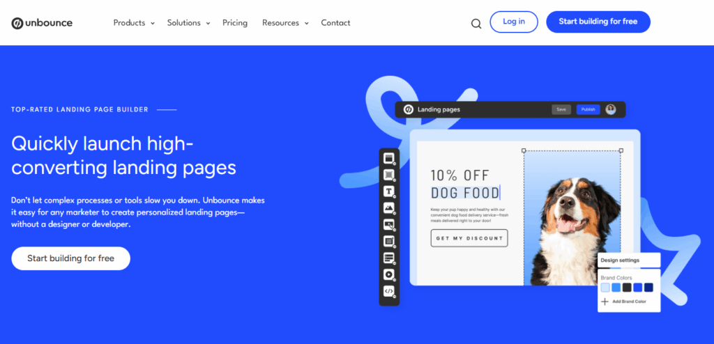
Unbounce is another popular choice, known for its flexible editor and AI-powered features. It’s an ideal tool for A/B testing and optimizing your pages to meet your conversion goals.
Just keep in mind that it’s a premium tool, with plans starting at $99/month, so it’s a good idea to start with a free trial to see if it’s the right fit for your business.
Create Fitting Landing Pages That Convert
When you’re ready to promote your next service or product, apply the same focus you put on your business to your landing page and marketing campaigns. Define your goal and then optimize your page for search engines and social media to drive traffic and boost conversions.
And remember, practice makes perfect. Your first landing page might not be your best, but each one you create will pave the way for a more successful one in the future. Now go and create landing pages that convert.


 Published by
 Published by

