Ecommerce Website Design: 15 Best Practices to Ecommerce Homepage Design
Selling online can be difficult without the best eCommerce website design to excite your audience.
In the age of superior graphic design, you can no longer present your customers with something less than perfect. If you’re looking to start a new online store, there’s no better time than now.
So how do you make it work? Well, your website must inspire trust in your potential shoppers at first sight. As statistics show, 48% of online users base a business’s credibility on its design.
So there’s no other way around it: Website design is more important than ever!
Before we discover how to nail your eCommerce homepage design, let’s take a look at the basics.
What is a Homepage?
A homepage is the main page of a website.
What makes it so important is that it’s often the first point of contact that visitors have with a business.
Since it’s the first thing they see, a homepage also receives more traffic than other pages.
As Jakob Nielsen from Nielsen Norman Group puts it:
“A homepage’s impact on a company’s bottom line is far greater than simple measures of e-commerce revenues: The homepage is your company’s face to the world. Increasingly, potential customers will look at your company’s online presence before doing business with you — regardless of whether they plan to close the actual sale online.”
Your eCommerce homepage design needs to make a strong first impression. To do that, you have to focus on two things.
Firstly, deliver a homepage design that will be more attractive than your competitors.
And secondly, find a way to deal with consumers’ low attention span. The thing is that it takes 50 milliseconds for online users to develop an initial impression of a website.
So how do you convert them?
With a professional website design!
Website layouts, colors, spacing, and fonts are among the things that shape a visitor’s opinion. So, if a website is aesthetically unpleasing, then your website abandonment rate will multiply.
To understand how vital website design is, let’s see some examples.
Good vs. bad eCommerce homepage design
Imagine you’re shopping for gadgets and you come across this site:
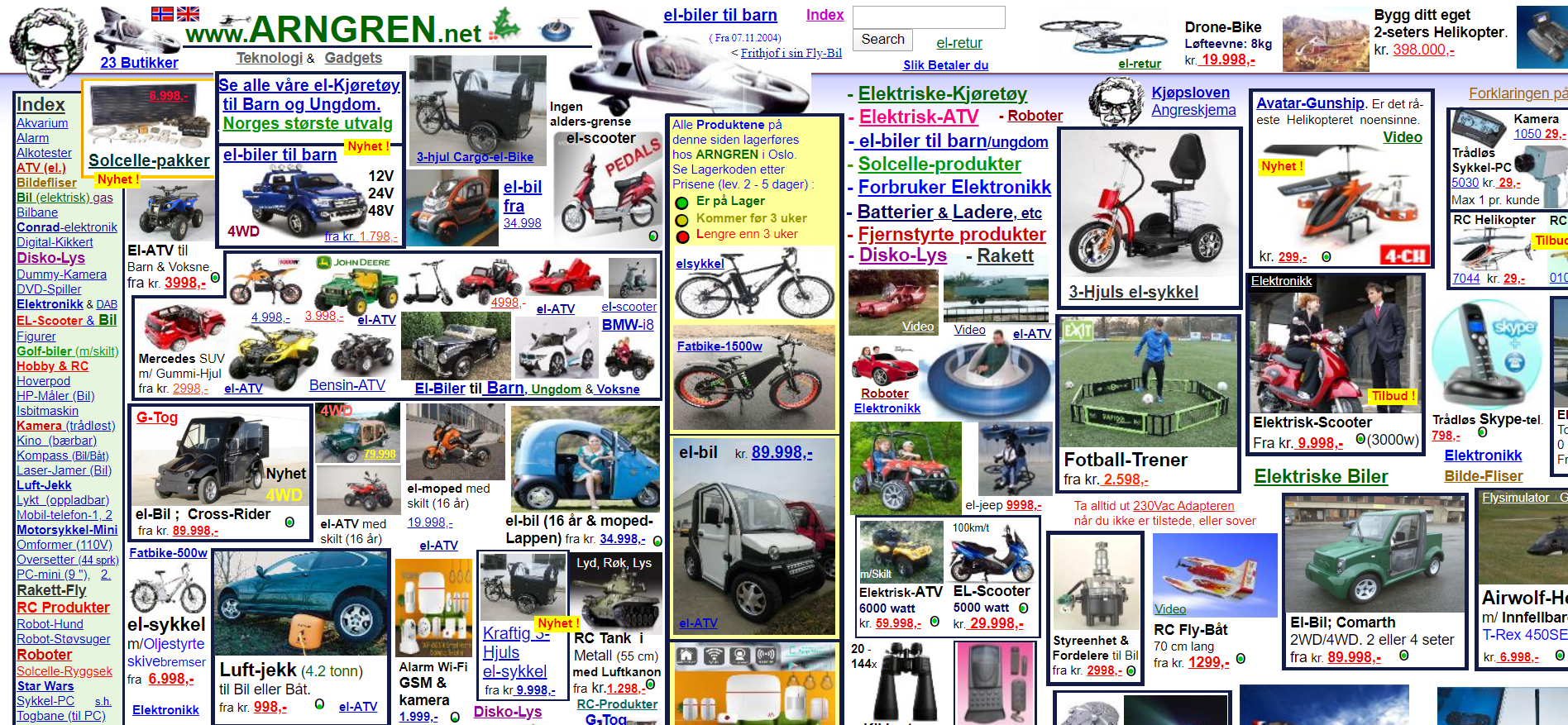
What are your first impressions? Most importantly, would YOU buy from this site? If not, then there’s a reason for that!
First of all, there isn’t a clear layout, and the amount of text and images on the page is overwhelming.
Furthermore, this website design is too cluttered, making it difficult for visitors to find what they’re looking for. Now, let’s turn our attention to another example. Ensuring your website follows UX/UI best practices can significantly improve user engagement, which is why partnering with the best web design company can make a difference.
Imagine that you’re looking for grooming essentials and you come across this website below:
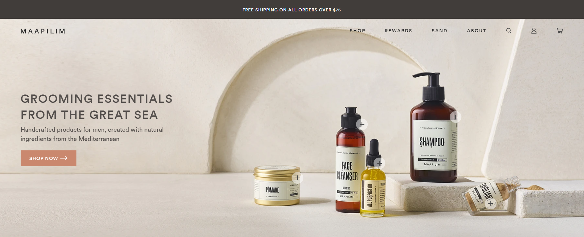
The difference is immediately apparent.
The clean layout is pleasing, while the use of whitespace makes it easier to navigate. Visitors can also scroll down the page to learn more about the product. Everything is clear and easy to find.
Compared to the first website example, this page is more likely to have a higher engagement and conversion rate.
If we look at these two examples again, we can see that an effective website design needs to have some standard elements. What are these elements?
Let’s find out!
Essential Elements of a Homepage Design
Designing an eCommerce website isn’t rocket science. However, without the right elements, it can turn into a rocket-assembling task.
While different industries can have very different designs, some standard features need to be present every single time.
If you want to increase conversions, then these are the must-essentials your homepage should have no matter what.
1. Relevant theme
The homepages for Amazon and New York Times are vastly different. One showcases the latest best sellers in various product categories, while the other highlights breaking news around the world.
If you’re on Amazon, you’re not there to catch up on the news. You’re there to shop. Similarly, if you’re on the New York Times site, you’re not exactly looking for deals.
Your website theme must make it clear to visitors what kind of business you are at first glance.
Harry’s, for instance, has a relevant website design that’s easy to understand what it sells.
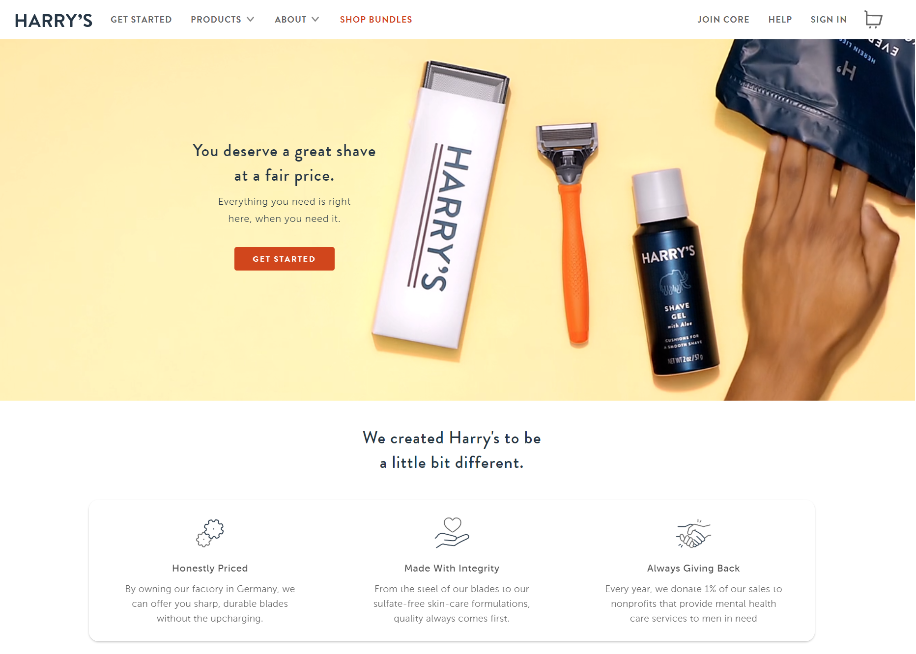
Choosing the wrong theme will confuse your visitors. You don’t need that!
If you are new to the whole website building thing, then you should know that the majority of eCommerce website builders have labeled their themes per industry.
So, when you start your eCommerce website, you can easily select the theme that suits you and customize it accordingly.
If you’re looking for inspiration, check out Astra. It’s the most popular theme in the world and can be customized to be anything you need.
2. Strong branding elements
What’s your first thought when you hear the words “Golden Arches?”
Probably McDonald’s, right? That’s no accident. Some of the largest companies in the world spend billions of dollars a year to market their brands and make them more memorable.
While you may not have the marketing budget of a Fortune 500 company, you can still take steps to make your homepage more recognizable.
The first step to achieve it is to invest in a professionally designed logo that reflects your brand identity.
For instance, choosing the right color palette is critical to boost your identity and distinguish yourself from similar brands. However, creating a logo and placing it on your homepage is only the beginning.
When you come up with a great design, you should use it across all your marketing materials to maintain consistency.
3. Clearly defined goals
An effective eCommerce homepage design should be directly related to your business goals.
What exactly do you want your visitors to do when they land on your homepage? Subscribe to a newsletter? Fill out a lead form?
Defining your goals is crucial to converting your visitors into loyal customers.
For instance, here’s how Shopify utilizes a goal-driven design on its homepage to capture more leads:
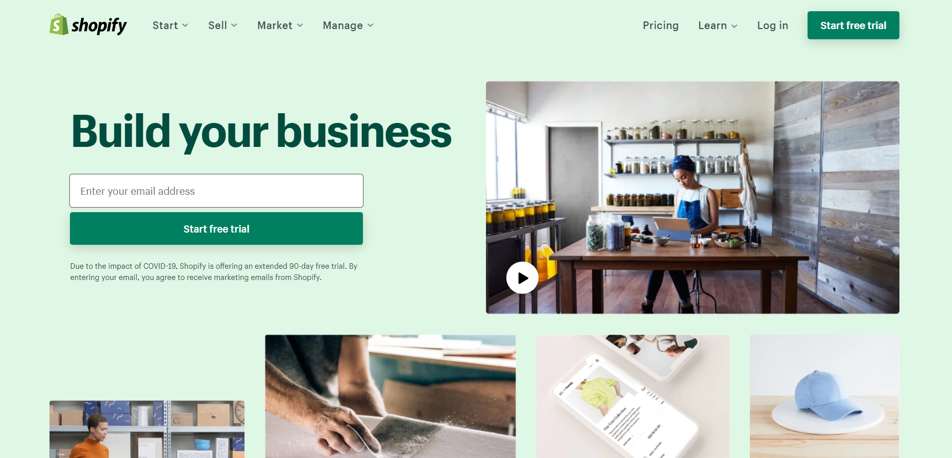
The homepage makes it easy (almost too easy!) for visitors to start a free trial. The CTA stands out, the colors create a pleasing effect, and the images inspire visitors to take action.
If you want your eCommerce website design to convert more, think about your goals and how you can implement a design that facilitates them.
4. Contact information
Visitors want to know they’re dealing with a trustworthy business.
One way to erase any uncertainty is to include a contact information form on the page. Displaying your phone number, email address, and business address is the best way to show them that they can reach you.
Giving your audience a line of communication will show them that your business is legitimate. Furthermore, making your communication form stand out will help them contact you easier in case a problem arises.
Zappos, for instance, displays a customer support number right at the top of its homepage that’s also visible on all pages:

Customers can feel confident knowing that a person is just a phone call away.
Of course, to be effective, you should stay faithful to your promises and be available during the times you specified.
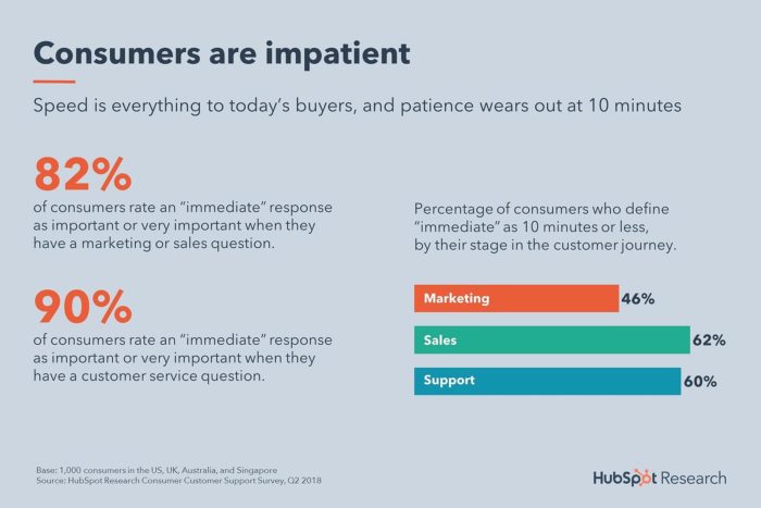
Since nearly two-thirds of buyers expect a response within 10 minutes to sales inquiries, try to answer as soon as possible.
Lousy customer service can be the bane of your eCommerce store. So, come up with a feasible solution, don’t overpromise, and try to expand your customer support as soon as possible.
5. Links to social media networks
With an estimated 3.72 billion active users, social media is a marketing channel you can’t afford to ignore.
That’s almost half the population! Your potential shoppers have at least one social media channel to communicate with their peers and follow their favorite brands.
If you think about it, users also spend an average of 74 minutes on social media sites like Facebook and Instagram.
These minutes can be crucial for your brand since you can create meaningful relationships and increase customer loyalty.
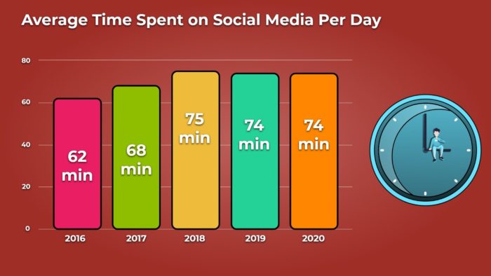
Consequently, social media offers you a way to build a following for your business and engage with your audience in a more personal way.
Adding links to your social profiles will make it easier for visitors to follow you.
On the plus side, you can excite them with fantastic content and even offer more personalized customer support through direct messaging.
A great way to promote your social media profiles is to add them to your website header or sidebar.
If you have them, don’t forget to show them to your new visitors!
6. Navigation elements
Your homepage is often the main starting point for many visitors.
If you think about it, it’s like a corridor with many doors leading to different places.
However, if these doors aren’t labeled, your visitor won’t know where they lead. Consequently, they might get confused and abandon your website.
Navigation elements like header links are a must to help your visitors take a look around your site. Adding them will let them access, browse other pages, and visualize their location.
Here’s an example of how Wayfair makes it easy for their shoppers to find their way around the site:

As you can see, your homepage can contribute to the success of your website in general.
Your eCommerce website, though, needs more than a navigation bar and a contact form to convert your visitors.
For that, you need the best homepage design practices to nail your site every single time.
Making these changes to your homepage is essential as they’ll help you increase conversions.
Furthermore, professional website design will open the door for customer retention and help you minimize acquisition costs.
To give you a helping hand, let’s see how to design the best eCommerce homepage.
15 Steps to Design the Best Homepage for Ecommerce
Now that we saw the essential elements your homepage needs, it’s time to get back to your eCommerce website builder and improve your design.
Below, you’ll find 15 simple yet effective ways to increase the efficiency of your homepage design and make a great first impression.
Ready to sweep your visitors off their digital feet?
1. Avoid clutter with a simple homepage design
A page layout that’s cluttered can be distracting and overwhelming.
While it may be tempting to cram as many things into your page as possible, it might frustrate your customers.
Instead, aim at keeping your design simple and easy to navigate.
For that, remove any unnecessary elements that will cause distractions and make ample use of whitespace.
Here’s an excellent example of a focused homepage design from FRONKS:

Whitespace can work miracles when you use it the right way. Not only will it be easy on your visitors’ eyes, but it will also allow your images and copy to stand out more.
Your homepage design must be easy-to-digest in a couple of seconds. So, if you have any doubts, try to test your website design by asking for feedback.
Keeping everything well-organized won’t disappoint you or your visitors!
2. Display a unique value proposition on your homepage
As we said before, online users won’t stay on a page for long. To increase your engagement and conversion rate, you need to give them all the right reasons to stay.
To make them stay, you need a clear value proposition to capture visitors’ attention.
A unique value proposition (UVP) is a clear statement that describes the benefits of your product and how it addresses a need.
Successful value propositions don’t need to be fancy to get the message across. SomniFix, for example, makes their UVP prominent on their homepage.

To create your UVP, think about what separates your business from the competition.
Then, write your copy based on the elements that will highlight the benefits of using your products.
Furthermore, a UVP doesn’t need to be lengthy since this will increase the chances of going unread. Instead, try to be as concise as possible, highlighting the value in a couple of words.
3. Simplify your homepage menus
Good navigation improves the overall user experience and makes it easy for visitors to find what they’re looking for.
Steve Krug, author of Don’t Make Me Think, says that “nothing important should ever be more than two clicks away.” And he is right.
Multiple steps will add up to your visitors’ frustration and lead them away from your website.
Here’s an example of a simple and intuitive menu from Camelbak:
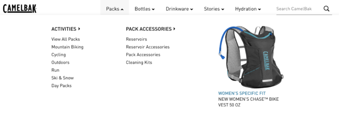
Less is more when it comes to a high-performing eCommerce website design. So, don’t make your visitors click on multiple things to reach their destination.
Instead, simplify your menus and make your main product pages accessible with one or two clicks.
As a result, you’ll increase engagement with your product pages, boost customer experience, and get more conversions.
4. Demonstrate site security on your website
Website and cart abandonment can happen at any time. According to Baymard, 25% of online shoppers abandon their online carts due to a lack of trust.
Excessive cart abandonment will lead to fewer sales and affect your revenue in the long run.
One way to reduce cart abandonment is to use social proof to increase the reliability of your page.
A great testimonial is perfect to convince your potential shopper that your eCommerce business isn’t fake. However, testimonials can’t guarantee that your visitors’ information is always secure.
Adding trust seals, in this case, is crucial for a high-performing website design.
For example, you can use data security seals, business badges, or privacy seals to boost your page security for a price.
Despite the cost, a trust badge will give your new visitors a sense of security and trust that will drive more sales.
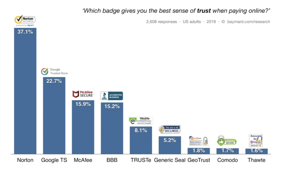
Being safe online has been one of the biggest concerns for modern consumers. So, showing them that your business is legitimate will help you achieve growth faster.
Scan Computers, for instance, displays these seals on the bottom of their homepage to increase trust:
![]()
With these seals, the business increases the trustworthiness of its eCommerce website design and boosts customer confidence.
Now that their information is safe, your customers won’t hesitate to make more than one purchase.
5. Add a search bar on your homepage design
Navigation menus are super important. However, when your visitor lands on your website with a specific product in mind, you need to give them the means to search for it.
Displaying a prominent search bar on your homepage will make it easy for shoppers to find what they need in a few seconds.
As a result, you’ll improve their experience, save them the trouble of searching for a product manually, and boost your conversions.
Here’s an example of how Swagbucks implements a search bar: 
Visitors can enter what they’re looking for into the box, and Swagbucks will return relevant results.
As an essential part of every successful website design, your search bar should also be easy to find at first glance.
Hiding the bar or putting it in the wrong place will defy the purpose of using one. Instead, place your search bar on top of your page, and it will work miracles.
After all, the majority of eCommerce websites display theirs on the top right corner of the page. So, your visitors will already know where to look for it.
6. Insert product images to your website categories
Categories present an overview of the products that your store offers in an organized manner.
But what if you could take the effectiveness of your categories a step further?
As visual creatures, we tend to favor visual elements more than anything else. This means only one thing!
A relevant image will allow your busy visitors to locate what they need faster, offering a more exceptional user experience.
Here’s an example of how Moleskine adds images to their category pages:
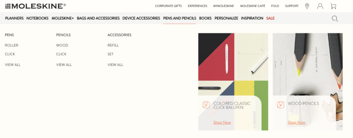
This tactic is easy to implement and will increase your visitors’ engagement with your categories and product pages in a breeze.
Just make sure that your images are always high-quality and relevant to your category.
7. Buy a premium web hosting service for your website
A fast-loading site is of paramount importance to yield more conversions.
Online users today expect a fast browsing experience. If your website takes too long to load, then your visitors won’t hesitate to leave.
Consumers know that there are hundreds of eCommerce sites with similar products out there. So, they’ll choose those if they load faster than yours.
While there are numerous reasons your website loads slowly, sometimes it’s your web hosting service that might be causing slow loading pages.
Need help finding fast premium web hosting? Here are some services that you can consider:
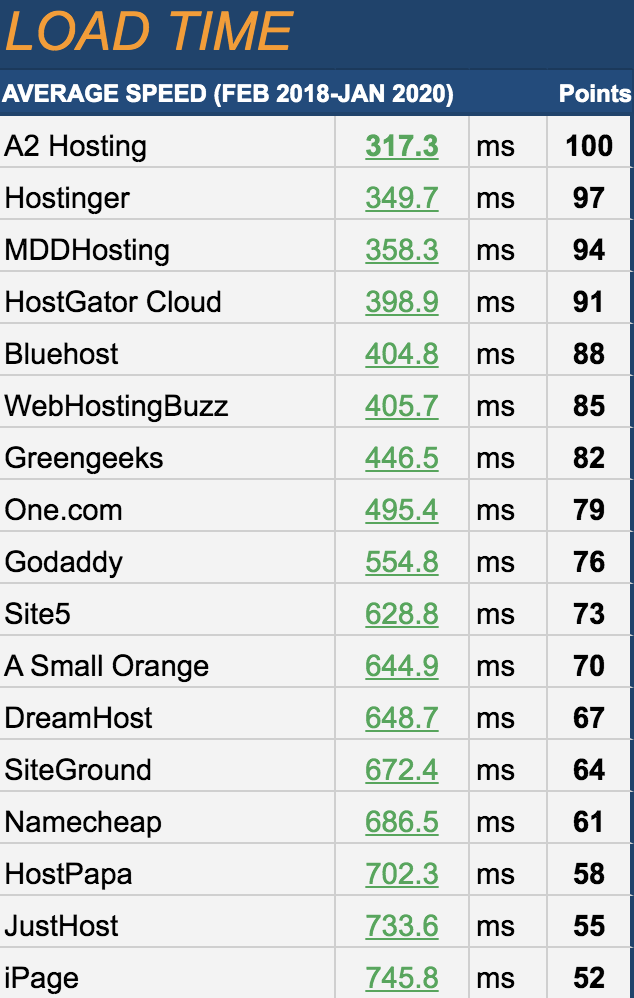
While budget web hosting may save you in the short term, it won’t benefit you in the long run.
Leverage budget web hosting when your website is relevantly new, and you need to balance your expenses.
Then, as your business grows, choose a premium web hosting service to keep up with your traffic and get more customers.
8. Prioritize SEO
SEO remains as relevant as ever., especially since 46% of consumers turn to search engines like Google for product research.
Ranking higher in search engine results can ultimately drive more targeted traffic to your site.
To enjoy the benefits of SEO, you need to optimize your eCommerce website design accordingly.
Titles and product descriptions are the first things you need to improve by including your target keyword on every page.
Famous Footwear, for instance, adds relevant text and internal links to its category page to improve its on-page SEO:
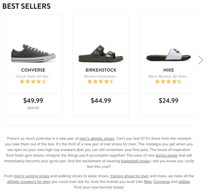
Don’t overlook product category pages like these as they can become high authority pages that will drive more traffic.
Moreover, you can optimize your website by leveraging the power of eCommerce consumer reviews.
Displaying customer reviews on your product pages will help you rank for long-tail keywords and narrow down search results.

Including reviews with long-tail keywords will help your visitors discover your brand and find the products that match their queries better.
9. Get rid of your homepage ads
Incorporating ads into your eCommerce website will give you additional revenue. But you should refrain from doing so at all costs.
Advertisements not only increase clutter, but they can frustrate and send your visitors to your competition.
There are some exceptions, of course.
If you want to use ads as part of your website design, you need to place them strategically.
Adding them naturally will minimize any potential frustration and help you increase your sales.
Amazon, for instance, utilizes ads on certain products to promote their services:

Ads might be cool, but you have more arrows in your eCommerce quiver to boost your sales.
Using lead magnets to capture emails will be a lot more useful than bombarding your audience with ads.
An example might include offering invoice templates or in-depth guides to get visitors to enter their email addresses:
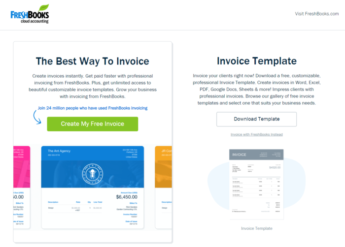
This tactic will help you drive more conversions and give value to your potential customers.
And don’t forget about the email addresses your lead magnet just brought you!
You can use the data to create targeted email campaigns to reach those subscribers and incentivize them to make a purchase.
10. Include key information on your website
There are specific details that visitors want to know right away before they decide to shop from your store.
These include contact details, shipping costs, and return policies. Without this valuable information, your eCommerce website will be incomplete and not helpful at all.
As you can see from other eCommerce homepage designs, displaying them at the end of your page is the best location to add them.
Here’s how Best Buy displays vital information on its homepage:
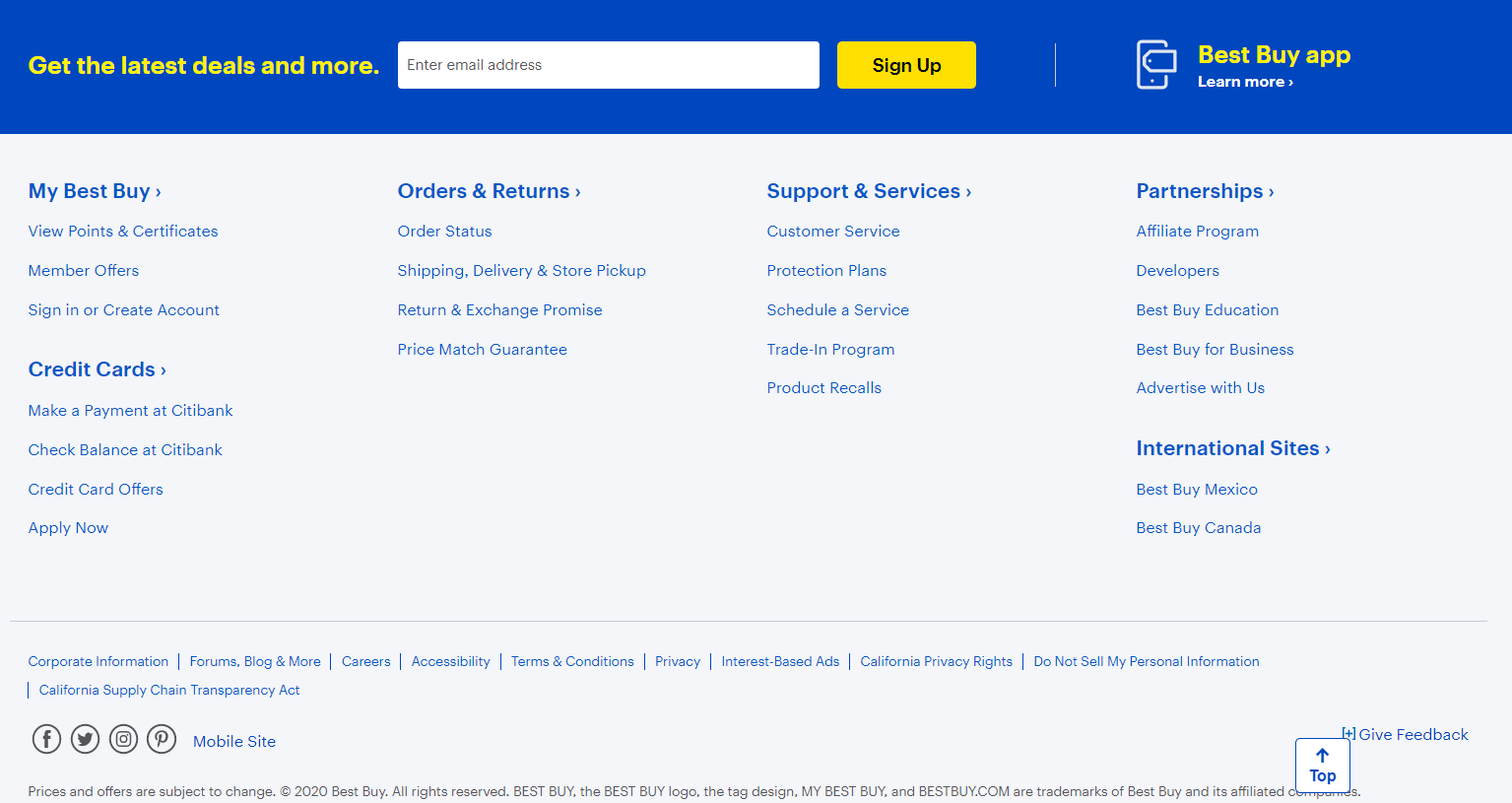
Of course, adding your information randomly isn’t going to help you. Instead, try to display the essential information in separate columns and with a relevant title.
By doing so, you’ll not only improve user experience but also increase your store legitimacy.
11. Feature your best products on your homepage
Your homepage is essentially a virtual storefront.
If online shoppers like what they see, it’s more likely that they’ll stay and browse the rest of your site.
To entice your visitors, then all you need is to feature some of your best products.
As shoppers can’t physically hold your products, make sure to use high-quality images, and include customer reviews that highlight their performance.
Here are some of the products that Spruce showcases on its homepage:
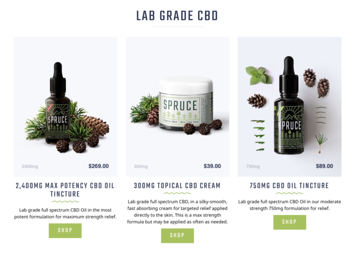
Notice how each product has a unique picture, professionally taken?
From the position of each item to the surrounding elements, these images reflect the products, making them very appealing to new customers.
Keeping your best products away from your audience’s eyes is like keeping your best horse in the stable.
So, if you have a best-selling item with fantastic reviews, show it to them!
12. Provide easy access to customer service
Not all transactions will go smoothly, but that’s perfectly okay.
Some customers may decide to refund their purchase, while others may experience problems with the product they recently bought.
Whatever the case, you need to make it easy for customers to reach out to you and get the help they need.
Luckily for you, you can take advantage of your eCommerce website design to offer solutions. How? Through customer support channels, of course!
Here’s an example of how Newegg provides easy access to customer service:
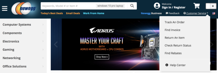
Especially when it comes to bad customer experiences, you need to offer a solution with a single click.
You can also prominently display your phone number, have chatbots, and provide a live customer support tab. This way, customers can pick a channel and quickly get in touch.
Moreover, ensure that your customer support representatives are knowledgeable enough to provide your customers with solutions.
A fast and knowledgeable staff will minimize bad customer support reviews and help you recover any lost revenue.
13. Run tests and analyze results
The only way to know whether the changes you make to your eCommerce homepage design have a positive impact is to run tests and analyze the results.
With A/B testing, you can create variants of an existing eCommerce website design and put it to the test.
For example, you can make layout or image changes and compare the results to your original design (or control).
To understand this form of testing, here’s an example of how split testing works:

A/B testing allows you to maximize homepage conversions and discover the best design for your eCommerce website.
While it may seem tedious to come up with new layouts, finding what your audience likes best will help you come up with the right elements and messages.
So, don’t hesitate to run as many A/B tests as you can, and you won’t be disappointed.
14. Design your homepage for mobile-first users
With the rise of mobile devices, an increasing number of users are now shopping from their mobile phones or tablets.
Shopping on the go, though, calls for more responsive eCommerce website designs that will perform regardless of screen size.
Here’s how ASOS implements a responsive mobile design to ensure a positive browsing experience for its shoppers:

To nail your mobile website design, make sure that you display your elements in a way that won’t seem cluttered.
Opting for simplicity will allow your mobile-first users to navigate your website and maximize your conversions.
By utilizing responsive design, you’ll make your eCommerce website accessible across all devices and boost accessibility.
15. Personalize the design of your homepage
Ecommerce personalization is a proven way to increase your conversions.
As statistics show, 80% of shoppers are more likely to buy from companies that offer personalized experiences.
Perhaps the best example comes from Amazon, which displays recommended products on its homepage based on purchase history.

The power of personalization will allow you to show your audience more targeted content that suits their needs.
So, if you create personalized recommendations on your eCommerce homepage design, you’ll generate more sales and increase customer loyalty.
Personalized product recommendations on your homepage are possible through CRM software.
Just make sure that your eCommerce website can have CRM integrations to enable customer personalization.
Then, you can leverage your customers’ data to show them products related to their search or purchase history.
Best ECommerce Homepage Design Examples
Now that you saw the best eCommerce website design practices, let’s take a look at some fantastic examples to inspire you.
1. Power On Power Off
Power On Power Off has an incredible website design that’s both responsive and interactive.
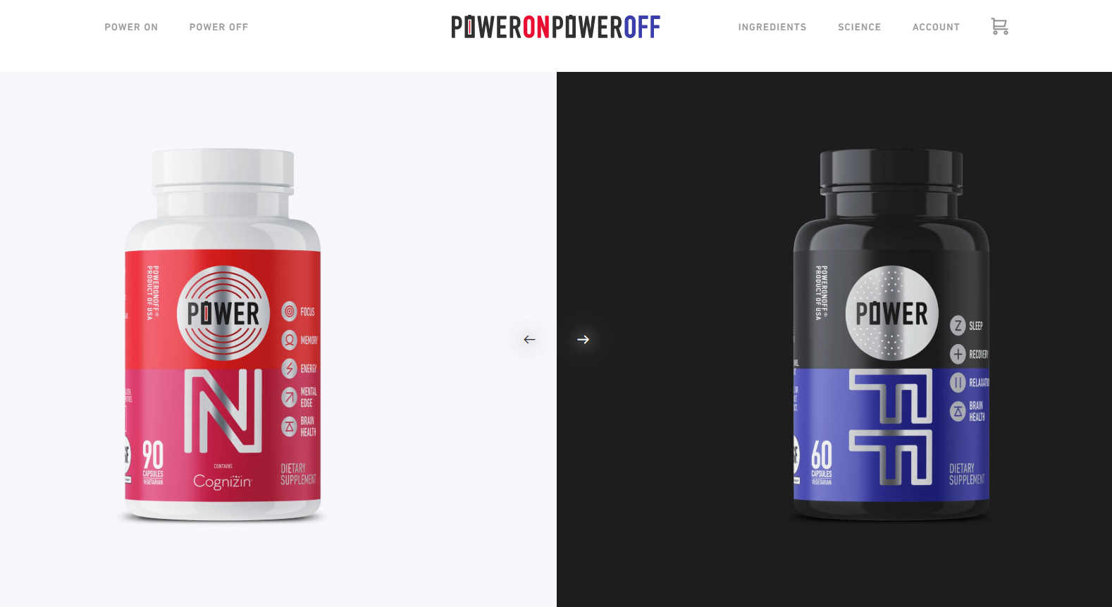
By hovering over each image, the page offers extra information about the products without leaving the page.
The use of whitespace and the black and white antithesis creates a balanced result.
However, that’s not the best part. The brand has masterfully incorporated its logo design into its products to boost its brand identity.
Organized, simple, and beautiful, this eCommerce homepage has everything new visitors need to interact with it and take action.
2. Kate Spade
Kate Spade’s homepage design has a pastel color combination that’s elegant and chic.
Apart from color, though, the website has a clean navigation bar that’s easy to use and a search icon that stands out. 
What makes Kate Spade’s website design successful is the limited time offer it displays to boost sales.
Without being intrusive and with a personalized copy and CTA, visitors can click and grab the deal in a few seconds.
3. Aesop
Aesop is the king of minimalist design. The colors blend nicely, whereas the copy powers up the effectiveness of the homepage.
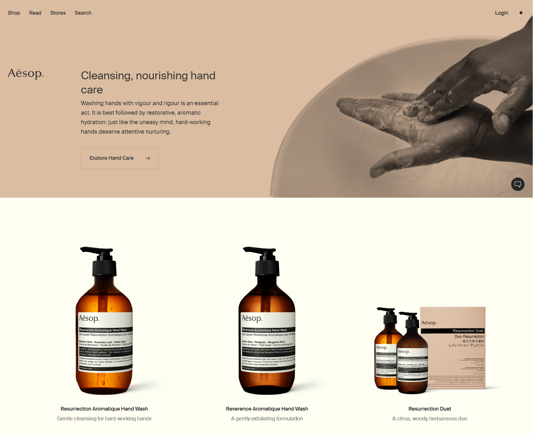
The business also uses some of its best products to attract their audience’s attention and increase engagement.
Aesop’s eCommerce website design carries a nostalgic feel that perfectly matches their products.
The result? It offers a unique customer experience that inspires visitors to take action.
4. Simply Chocolate
Simply Chocolate’s eCommerce homepage design is magical.
Not only can you scroll down and see the products, but you can also interact with them by clicking on the image.
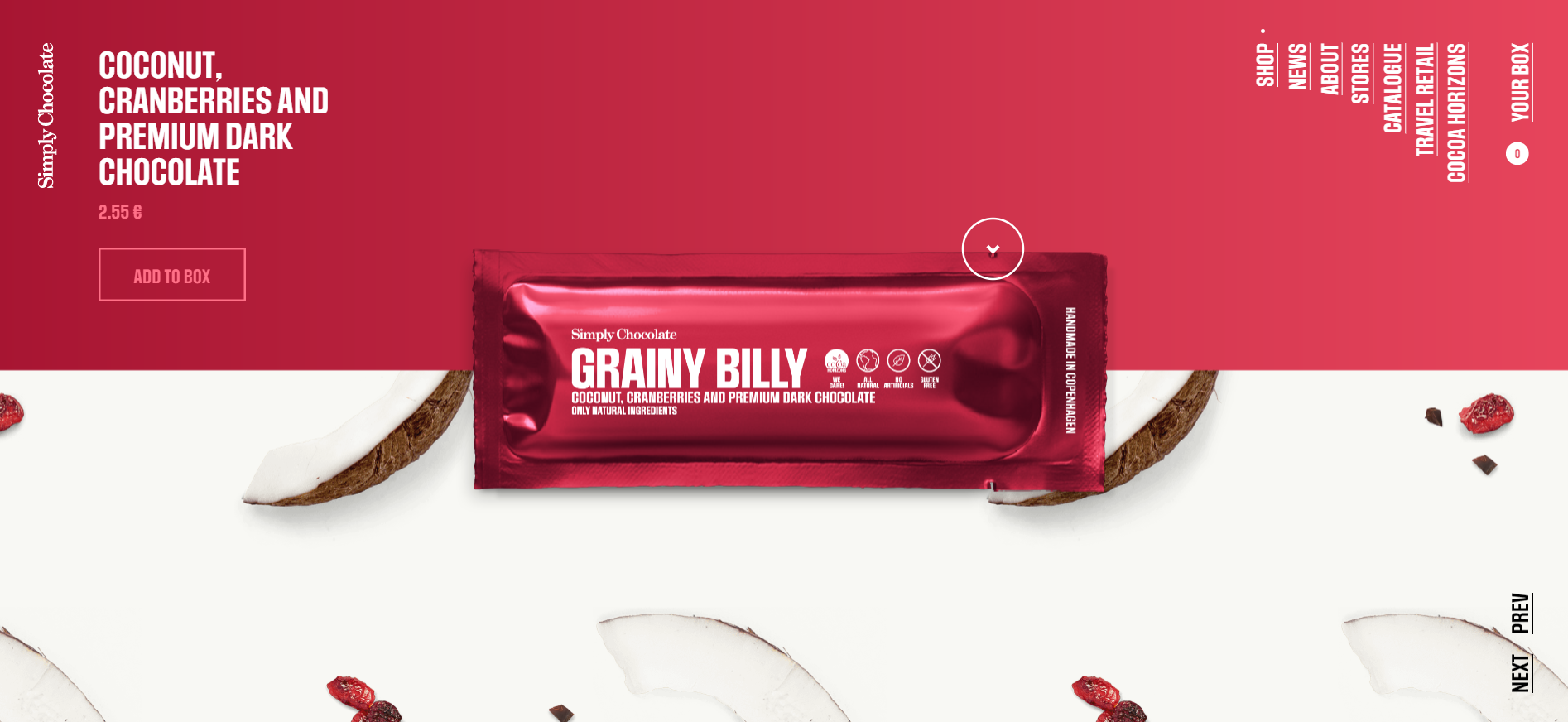 Visitors can open the chocolate bar and discover more about each flavor. It’s almost like a fun game for their audience!
The theme is relevant for the brand, stimulating their visitors’ appetites with vibrant colors and delicious images.
The brand also includes its social media links and contact information at the end of the page to allow customers to reach them easily.
5. Knotty Tie
Knotty Tie has come up with a beautiful website design that’s both attractive and easy to digest.
The brand leverages a clean navigation bar to allow potential customers to search for what they’re looking for on the spot. 
Furthermore, the copy stands out, making the brand’s UVP more attractive.
However, what makes this homepage design interesting is the blend of the product with the background that increases the efficiency of the UVP and incentivizes visitors to click.
Homepage Design Matters
The adage “don’t judge a book by its cover” just doesn’t apply to websites.
If your design fails to make a great first impression, visitors are more likely to bounce.
Implement the tips outlined here, and you’ll be well on your way towards creating a high-converting eCommerce homepage design that brings in more sales!
Now you are ready to conquer the world, one eCommerce website design at a time!



 Published by
