What Is a Splash Page? How to Create Yours + Examples [2026]
What is a splash page and how can you use it to your advantage?
Small businesses and entrepreneurs often ask themselves how to make these pages work, make them engaging, and not somehow hurt the user experience with the website in the process.
Fret no! Today, we’ll go over the basics of splash pages, look over their pros and cons, and compare them with other common web pages.
You’ll also find some great examples to inspire you and tips on using splash pages more effectively.
What Is a Splash Page?
Splash pages are digital marketing tools that introduce visitors to the main website.
They appear before any other web page to grab attention. Splash pages serve multiple purposes, depending on your exact needs, such as:
- Offering a promotion, discounts, or limited-time offers.
- Announcing an upcoming product or some other significant news.
- Collecting emails or other contact information, helping companies build their email list.
- Providing a sneak peek or teaser for an upcoming product or service.
- Directing visitors to different versions of the site based on their preferred language or location.
- Acting as gateways and age verification tools, requesting visitors to confirm their age or other relevant information.
- Presenting a disclaimer.
- Setting the tone by introducing the brand to visitors and making a good first impression.
Let’s take a closer look at how splash pages compare to landing and homepages.
Splash page vs. homepage vs. landing page
If you’re not an expert in web design and digital marketing, it can be a bit confusing to make a clear distinction between these three types of pages.
Here’s an example of a splash page from Blume.
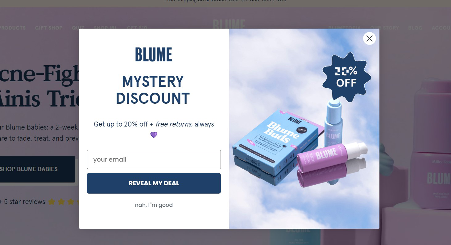
This page precedes a landing or homepage and has the purpose of building an email list by getting visitors to enter their email addresses in exchange for a discount and free returns.
Visitors can either accept or refuse the deal and move on to the rest of the site.
By comparison, here’s one of their standalone landing pages.
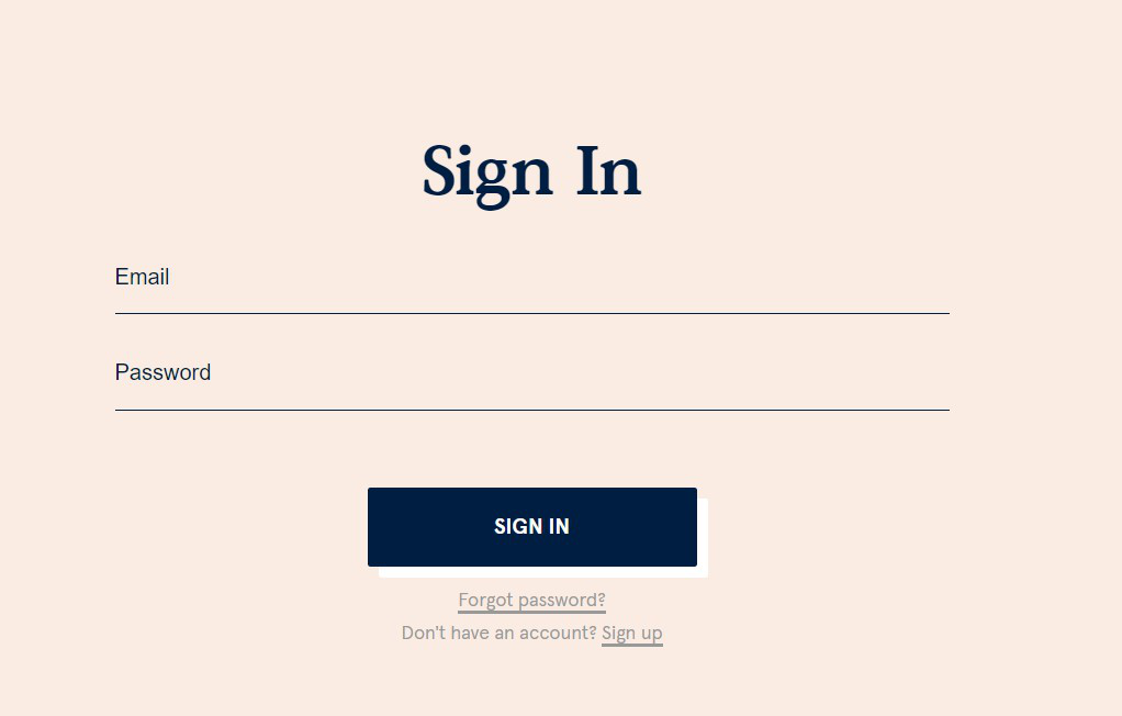
Similar to the splash page above, the account registration landing page has an email address field.
Yet its purpose is not to build an email list but for the visitor to make an account.
There’s no skip or exit button anywhere on the landing page either. That’s because landing pages aim to convert no matter what.
Now, here’s Blume’s homepage.
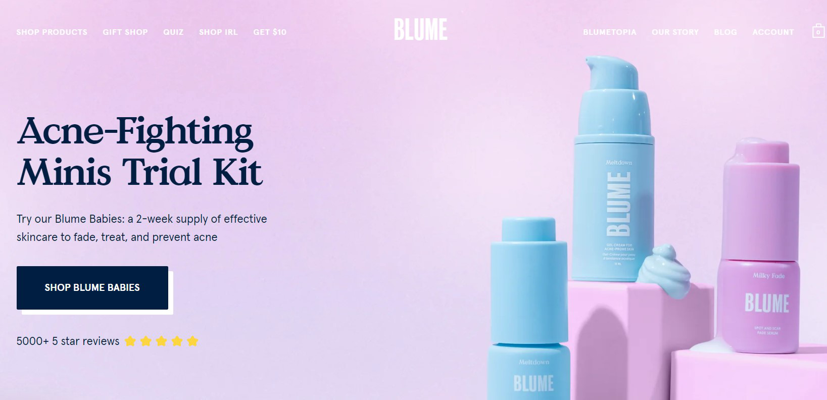
The homepage is chock-full of information and acts as the central hub for the entire site.
Splash and landing pages are generally focused on a single goal and have only one call to action.
The homepage has links to many other pages and sections of the website.
Splash pages do not.
However, when done right (in this case, giving discounts and free returns), splash pages can help start the sales process even before the visitor gets to the homepage.
So, what are the pros and cons of splash pages?
Pros and Cons of a Splash Page
Splash pages have seen some changes over the years.
Back in the day, most were hardcoded – just like any other webpage on a site.
Nowadays, most websites use full-screen popups for their splash page needs.
This is thanks, in large part, to the appearance of landing page builders. These tools make it easy to create and deploy splash screens and pages wherever necessary.
The main difference between a regular popup and a splash page is that popups usually appear a few seconds after the homepage or landing page has loaded.
Splash pages are standalone pages that are already there when you enter the site. They’re the first thing you see.
These types of pages can do wonders for your website but there’s a time and place to use them.
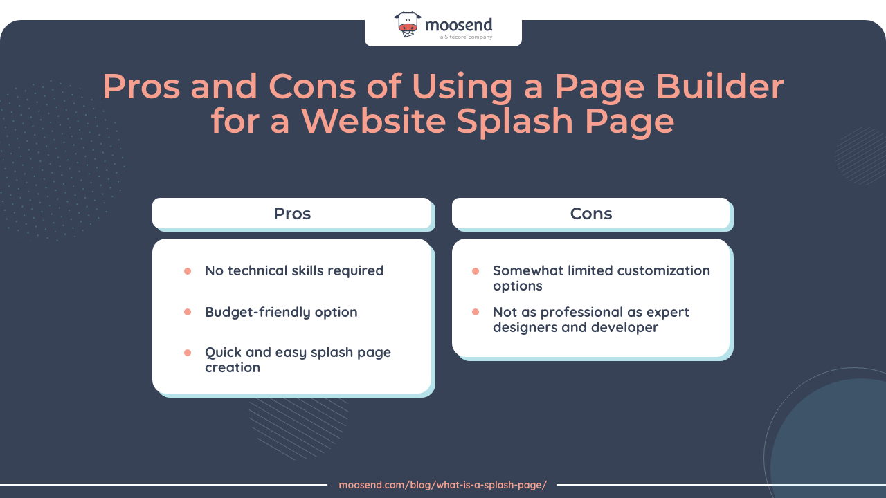
There are both pros and cons you need to be aware of:
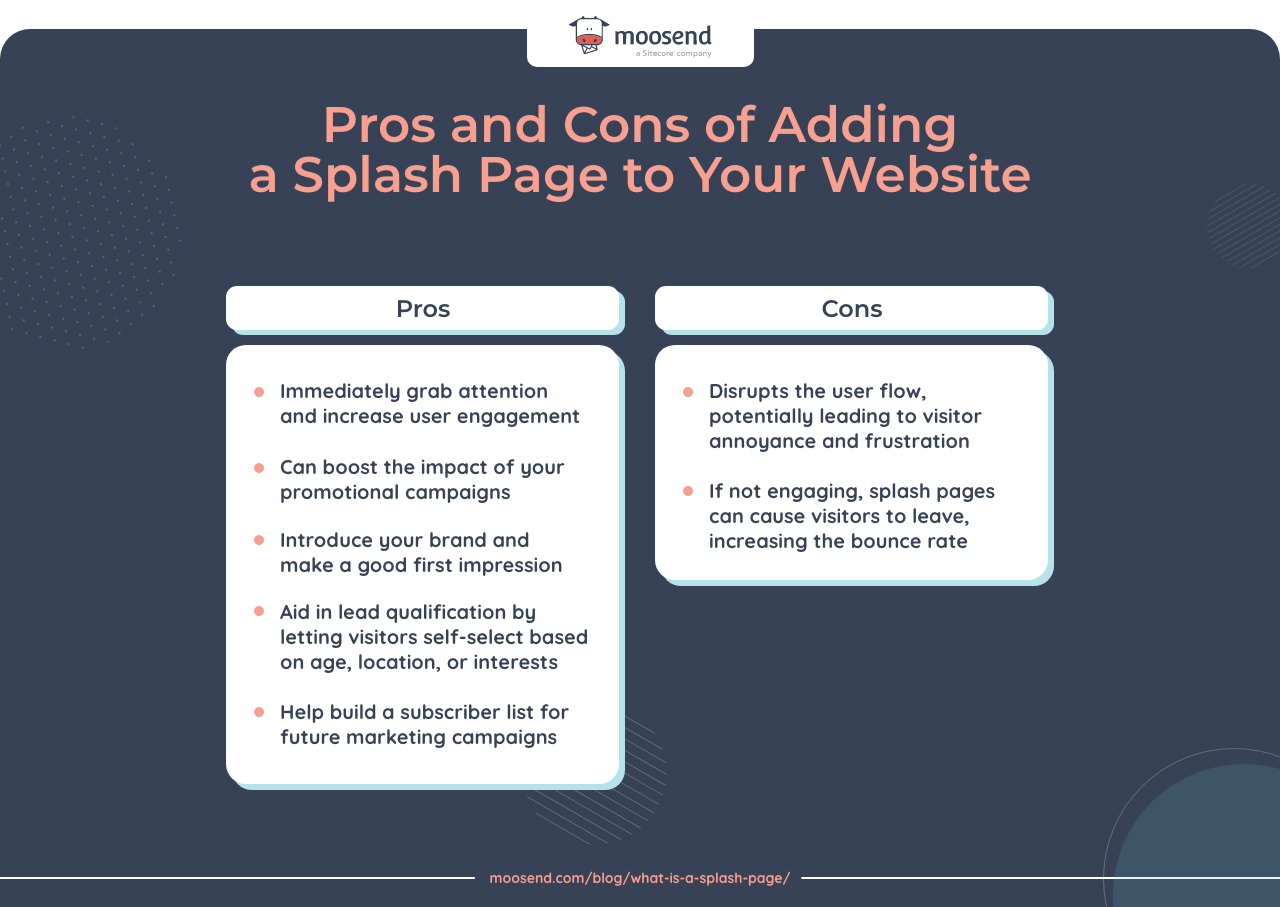
So, what should these pages contain for you to get the most benefit and minimize the risk of visitor frustration or increased bounce rate?
What Should a Splash Page Contain?
Splash pages are great for captivating and guiding site visitors to where you want them to go.
They can differ based on what you hope to achieve but they all need to:
- Look intriguing
- Immediately give their message
- Prompt action
- Quickly get out of the way
There are several key elements that every splash page should contain.
Clear and concise message
Splash pages are like doormen at fancy establishments. They greet visitors and open the door, making a great first impression in the process.
They don’t engage in lengthy conversations with guests, keeping them outside in the cold.
Your splash page should do the same. It needs to be brief and immediately convey its purpose or value proposition.
Whether you’re promoting a new product or an upcoming event, collecting emails, or just introducing yourself, splash pages deliver their crystal-clear message in seconds.
Eye-catching visuals
Visuals are the initial hook and can make or break your splash page.
A picture is worth a thousand words, after all, and will often do most of the talking on a splash page.
They are the first thing people see and associate with your brand – especially first-time visitors.
That’s why you need to ensure that these visuals represent your brand, are easy on the eye, and are relevant to your target audience.
So, make sure these elements include the right fonts and colors in the theme of your brand or event you’re promoting.
Splash page visuals typically include:
- Background image
- High-quality product photos and other design elements
- Short videos, GIFs, animations, or plugins (more on these a bit later)
Striking visuals complement the message, form an emotional connection, and leave a lasting impression.
Poor quality or improper visuals, on the other hand, can push people away and lower your conversion rates.
Call-to-action (CTA)
One of the main goals of splash pages is to prompt some kind of action from visitors.
This is what CTAs are for.
The CTA button should be prominently displayed, concise, compelling, and action-oriented.
Typical splash page CTA examples include:
- Go to website: Splash pages with this type of CTA usually act only as introductions to the brand, or a new product, or make some sort of announcement like a sensitive content warning.
- Verify your age: For age verification purposes.
- Enter your email: Usually in exchange for a discount, access to gated content, or subscribing to the newsletter.
- Get started: Subscription-based service providers sometimes use splash pages for quick and easy registration.
Responsive design
You also need to ensure your splash pages are responsive and display seamlessly across both desktop and mobile devices.
This means the splash page should adapt to different screen sizes and orientations for an optimal user experience.
An unresponsive page design isn’t only an inconvenience for visitors. It’s not even just about risking losing potential customers.
Poorly designed pages also run the risk of affecting your search engine optimization (SEO).
Pages that don’t conform to Google’s Core Web Vitals, popup, and mobile-first indexing guidelines rank lower in search results.
Be careful when using videos or animations on your splash pages. If they’re too big, they can slow down load times.
Plus, they may not show to viewers who are using ad blockers – lowering their engagement with the page.
Easy exit or skip option
Another important element in any effective splash page design is an exit link.
You need to include a straightforward skip option for visitors wanting to bypass the splash page and move to the main site.
The main exception here is if you have an age verification splash page, but even then the “go to website” button should be front and center.
A clear and easily accessible exit link prevents any potential frustration and keeps a positive user experience.
Each of these key elements plays a major role in maximizing the impact, usability, and effectiveness of your splash pages.
Let’s go over a few examples.
4 Outstanding Splash Page Examples to Learn From
Here are a few hand-picked examples that we think highlight exactly what splash page design should look like.
Example #1: Zara
This is the first page you see when you go to Zara’s website.
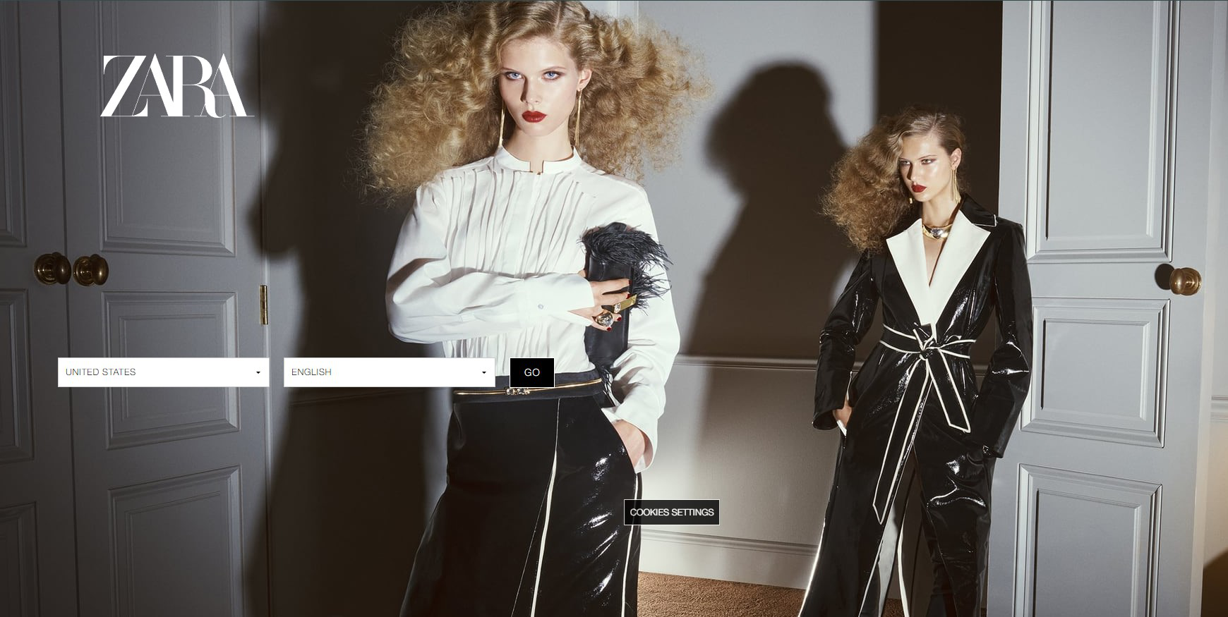
The purpose of this splash page is to redirect first-time visitors to the different versions of the site based on country and preferred language.
As you can see, it’s intuitive, easy to understand, and fits the fashion brand’s identity and image.
Visitors just have to choose their location and language, and click on “Go.”
What’s more, the site takes into account the visitor’s IP address and will prefill the country and language sections automatically.
This makes it more convenient for most users.
Key takeaways from this example:
- High-quality and thematic background image.
- Very clear call-to-action (it’s so clear they don’t even have to say anything).
- Cookies disclaimer button where visitors can customize their preferred website cookie settings.
Example #2: White Claw
White Claw needs to have an age verification mechanism in place due to its product. This is the main purpose behind their splash page.
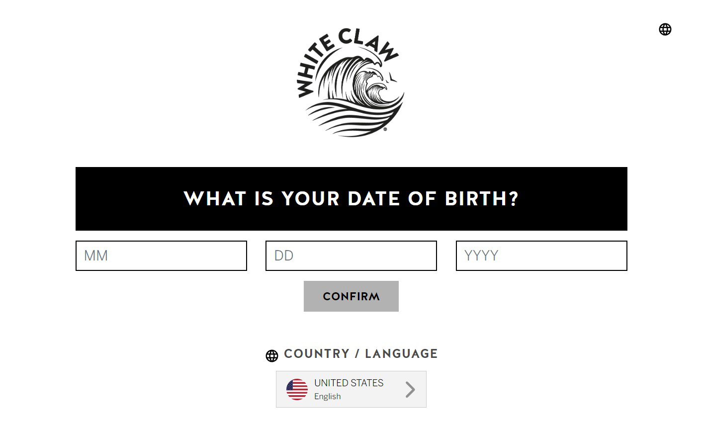
It’s simple and no-nonsense, meaning that it probably has a highly responsive design.
It’s highly unlikely that this page has trouble loading or doesn’t abide by any of Google’s best practices.
Since visitors just need to add their date of birth, there’s no other way to skip the page. But once they do and click on “Confirm,” they’ll hit the landing or homepage.
Similar to Zara, there’s also a country/language option for a more personalized experience.
Key takeaways from this example:
- A simple and responsive design.
- Very clear call-to-action.
- Optional country and language selection.
Example #3: Drake Waterfowl
One of the most common uses for splash pages is getting visitors to subscribe to newsletters.
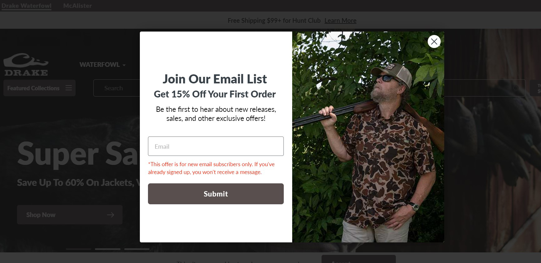
This example from Drake Waterfowl has a more popup look and feel because it is a popup in almost every way except the name. Since it shows up before the rest of the website, it is a splash page.
There are no age restrictions either so visitors can still get a sneak peak even before they get past the splash page.
The image on the right shows what the brand is all about (hunting gear).
The message is also very clear and to the point – subscribe to the newsletter and get a discount.
What’s different about this splash page compared to the previous two examples is the easy skip “X” button in the top right corner.
The great thing about it is that it’s white and sticks out from the background.
Imagine if they camouflaged the “X” to be more on theme with their brand! That would have been a sure way to frustrate many visitors.
Key takeaways from this example:
- Crystal-clear message.
- Highly visible skip button.
- Thematic background image.
Example #4: Species in Pieces
Species in Pieces is an experimental code-based interactive exhibition project that rearranges 30 geometrical design pieces to depict 30 different endangered animal species.
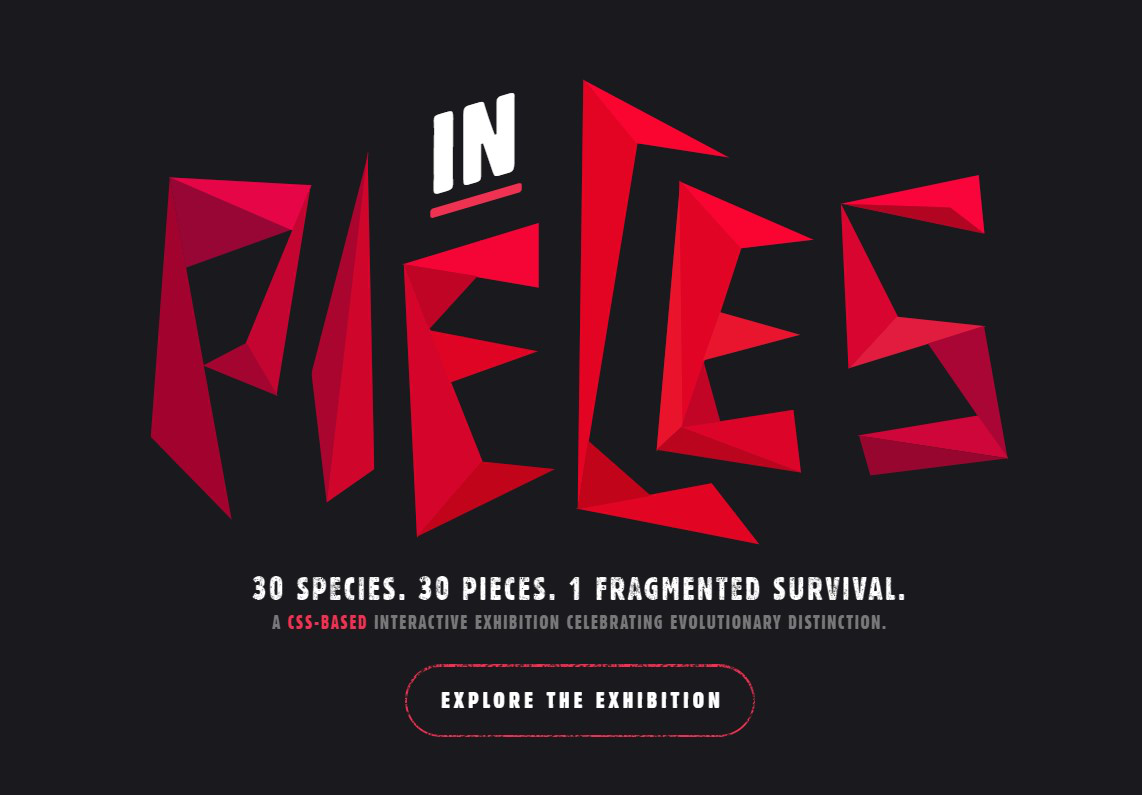
The splash page uses those exact 30 triangle pieces to spell out the word “Pieces.”
It also briefly explains the scope and purpose of the project, setting the stage for what’s to come.
Lastly, the page has a CTA button that invites visitors to explore the exhibition.
Key takeaways from this example:
- Clear and concise message.
- Clever use of visuals to get their point across.
- Simple CTA that invites people in.
How to Build a Splash Page
Building splash pages like in the examples above shouldn’t be too difficult.
You have three main options to go about it.
Option #1: Hire a web designer and developer
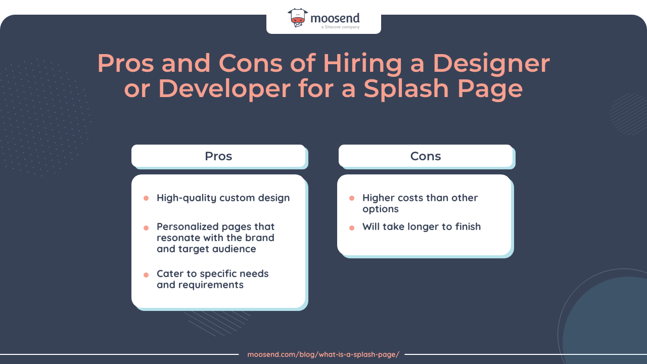
Working with professional web developers will usually generate high-quality and tailor-made content.
Depending on their experience, you may get truly personalized splash pages that resonate with both your brand and target audience.
However, this option also costs more and will typically take longer to finish. You also need to know how to communicate your wants and needs to ensure desired outcomes.
This option works best for large organizations with defined brand identities.
It’s also mostly for companies that have complex requirements and enough resources to invest in this service.
Generally, we’re talking about luxury brands and high-end niche services. They stand the most to benefit from a professional developer and custom-made designs.
Option #2: Code it yourself
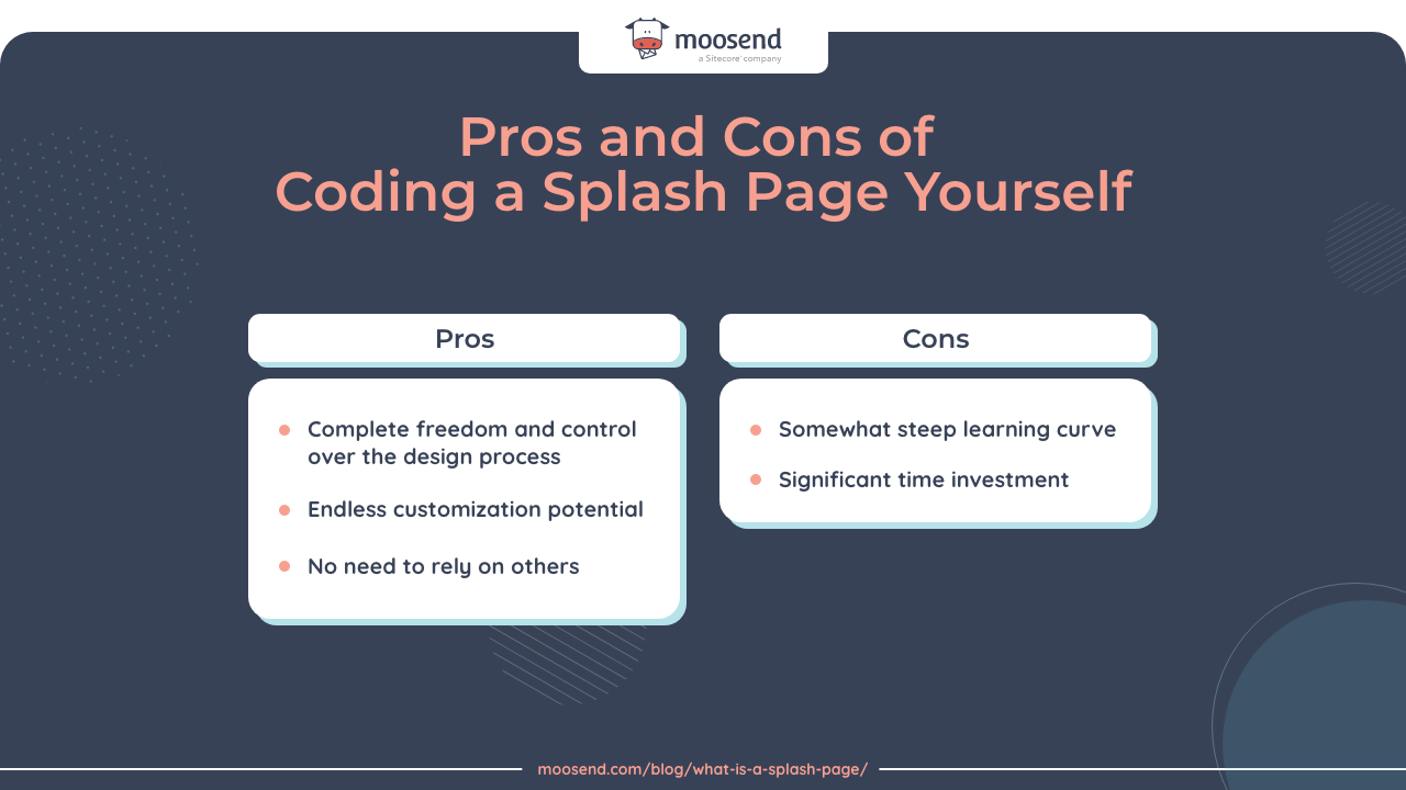
The do-it-yourself option for coding and designing the splash page grants complete creative freedom.
It lets you customize the page in any way you see fit. You also don’t need to worry about accurately communicating what you want to others.
You’ll code it yourself.
You can also take this opportunity to get a better understanding of the web development process and get some hands-on experience.
Unsurprisingly, though, you’ll need a certain level of coding and web development experience for this option.
It will also take longer to finish, especially if you’re new to coding and landing page design. There is a learning curve, after all.
Small to medium tech companies stand to benefit most from this option since they get to use their skills.
It’s best suited for those wanting some hands-on involvement and have a basic understanding of coding and web development.
Option #3: Use a page or website builder
Webpage and site builders are another alternative to creating splash pages able to fulfill your conversion goals.
They typically include user-friendly drag-and-drop features, giving users an intuitive experience. Even people with no technical skills can create professional-looking pages with minimal effort.
Still, you won’t have the same freedoms and customization options when compared to the in-house DIY option. You’ll be limited by the tool’s features and functionalities.
You also won’t get the same level of depth and professionalism from expert-tailored solutions.
Nevertheless, a landing page builder like Moosend provides tons of responsive customization options in the form of pre-made templates, widgets, or pre-design elements that provide the best of both worlds.
This option is best for businesses of all sizes and industries that want a quick, easy, and cost-effective solution to their splash page design needs.
Landing page and website builders are a great compromise between ease of use and professional design.
It’s up to you to choose which one of these three options works best to satisfy your splash page design needs and requirements.
Need a Shiny New Splash Page for Your Website?
When used correctly, splash pages can be a great addition to any website.
Acting as introductory pages, they’re often the first point of contact with visitors and potential customers. They need to make a good first impression.
Go ahead and register with Moosend for free and start creating your high-performing splash pages.


 Published by
