16 Types of Landing Pages for Email Campaign Success
Landing pages — companies love them as they’re an affordable way to persuade visitors to take action, such as subscribing to a newsletter or signing up for a demo.
But did you know that there are different types of landing pages?
You might’ve thought that one size fits all, but a modern landing page builder has the potential to create numerous landing page designs that drive higher conversion rates.
And today, we’re going to explore each of them, see what they’re for, and show you some examples.
Lead Generation Landing Pages
As the name suggests, marketers use lead generation landing pages to grow their email lists and increase conversions.
They’re the most common type of landing page, usually the first step in the sales process, as it’s an affordable way to generate high-quality leads.
Here, we can find two variants: squeeze and lead capture pages.
1. Squeeze page
With a squeeze landing page, you can easily snag a potential customer’s contact information, such as name, email address, and phone number.
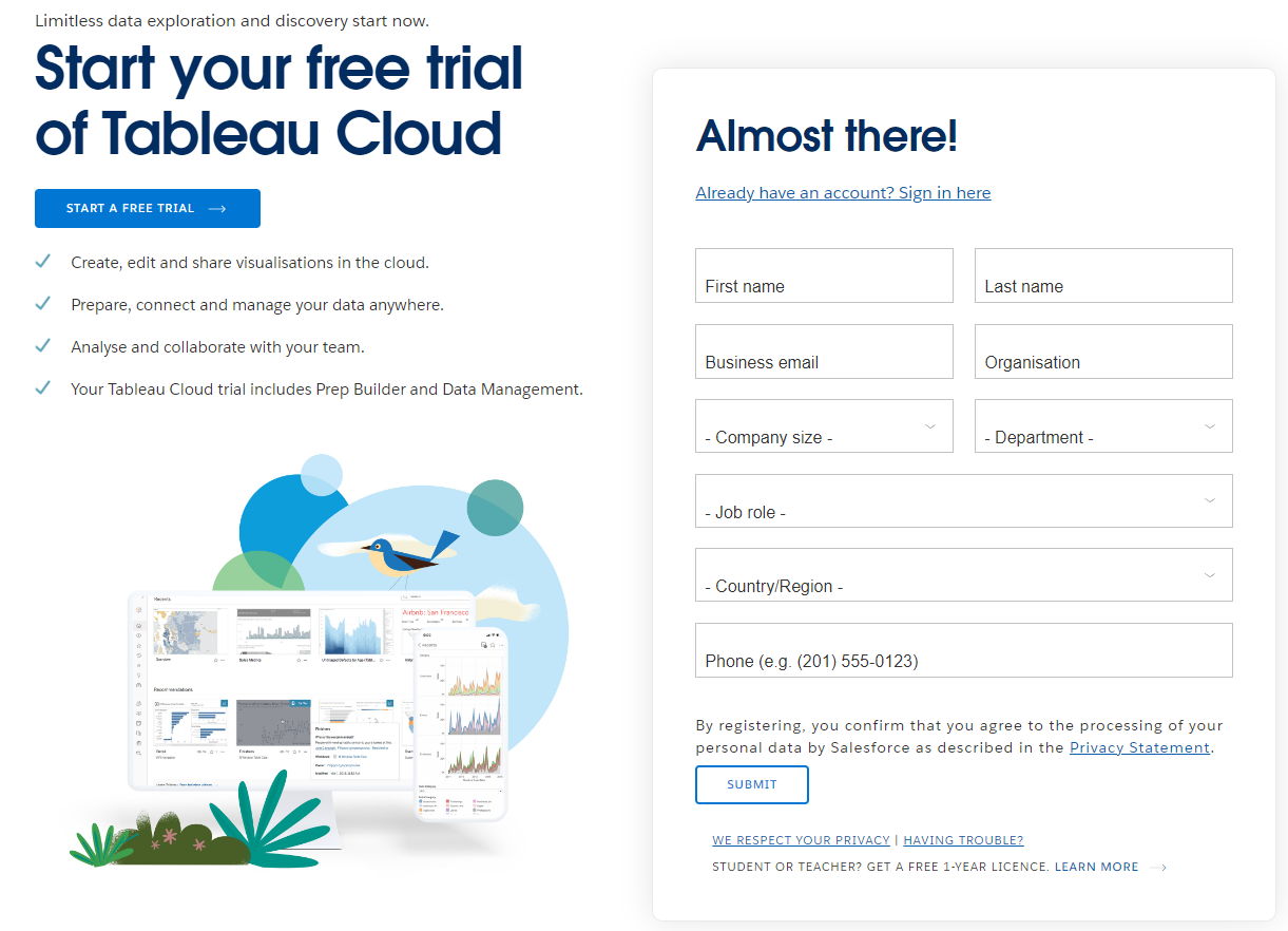
What it is: In short, it’s a way to incentivize visitors to give their personal data in exchange for gated content, like free trials and downloadable content (e-books, infographics, whitepaper, exclusive videos, etc.).
Typically, the squeeze page has a single call-to-action button at the end of the page (like in the example above) so visitors can submit their information.
When to use it: Use these pages to gather new leads and grow your mailing list by squeezing details about clients with a relevant lead magnet. This way, you learn more about your audience so you can improve your marketing efforts and target them with personalized offers.
Best practices:
- Make CTA buttons obvious
- Create compelling copy (use FOMO, add statistics, etc.)
- Pay attention to page text design
2. Lead capture landing page
A lead capture page is similar to the squeeze page, meaning its purpose is to collect information about visitors.
The difference is that squeeze pages are shorter and to the point while lead capture pages have longer forms that gather customer data relevant to the promoted product.

What it is: It’s a page that captures comprehensive user data to qualify leads and move them further up the sales funnel.
Typical information includes name, job title, business name, industry, email address, etc., depending on your needs.
When to use it: Use these long forms after the client has become slightly more familiar with your brand and has shown genuine interest in your products or services.
After gleaning the required data, you can qualify your leads and create more targeted email campaigns.
Best practices:
- Include strong headlines
- Be visual but not overwhelming
- Ask only for the information you need
Conversion-Driven Landing Pages
Persuasive copy. Eye-popping design. Genuinely riveting testimonials.
These are the secret ingredients for creating a high-converting landing page that makes a good first impression on visitors.
Below, let’s explore the landing page types that focus on boosting conversion rates.
3. Click-through landing page
Simple but effective, a click-through landing page bridges the gap between email content and more detailed information.
It acts like a product page where visitors can find information about a new item or service.

What it is: So, a click-through page is a web page your visitors land on when clicking on an ad or trying to access your website.
The structure usually consists of a unique selling proposition, no form, and a single clickable element: the CTA.
For example, let’s look at McAfee’s example. When users click the ‘Get protection now’ button, the site will redirect them to a page where they can see the product’s price, features, and benefits.

When to use it: Use click-through landing pages when you want to promote a new product or service, and you want to encourage users to convert.
Best practices:
- Present all the benefits of the product
- Have a unique selling proposition
- Make the product the star
4. Long-form sales page
We’ve all seen ads for a product that caught our attention. Even if we didn’t really need it, curiosity got the best of us, and we clicked on it to find out more about the item.
The longer we read about it, the more interested we became in the product. Soon, we found ourselves considering buying it.
Sounds familiar? Well, this is what long-form sales pages are for.
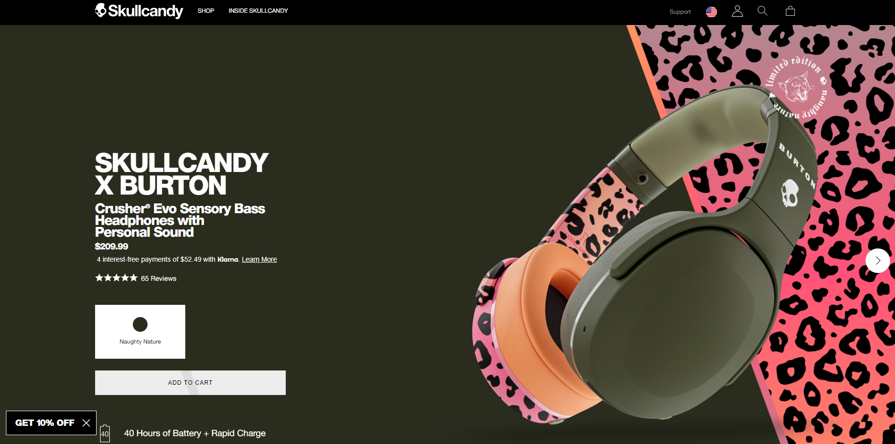
What it is: A long-form sales landing page promotes and offers information about a certain product and uses length to persuade users to take action.
When to use it: If you’re a company with a complex product (or service) that requires a huge investment or commitment, then you can use these landing page templates to persuade users to complete the sale.
Generally, these landing pages work best with users at the bottom of the sales funnels, where you ask them to make a purchase instead of giving you their contact information.
Best practices:
- Add visuals, such as videos and images
- Use customer testimonials, reviews, or case studies
- Include as much information about the product as possible
5. ‘Get started’ landing page
This landing page’s purpose is simple: to onboard and convert people into active clients.

What it is: In a nutshell, this kind of page leads with the offer above the fold. Take the above example from Omnisend.
They lead with a compelling headline, followed by a subheading that details their services and persuades visitors to invest in their solutions.
The pièce de résistance — and the most important part — is the CTA, which they highlighted to make it visible.
When to use it: Use ‘get started’ landing pages when you want to hook visitors just as they enter a specific page, to encourage them to invest in the service.
For instance, if they enter a page dedicated to marketing automation, you can describe the features and benefits of this service to catch their attention right away.
Don’t forget to include a CTA button, as it entices users to perform the desired action.
Best practices:
- Always include a CTA button
- Hook readers with compelling copy
6. Pricing page
An interested lead will want to know the price of your service, so a pricing page is perfect for this purpose.
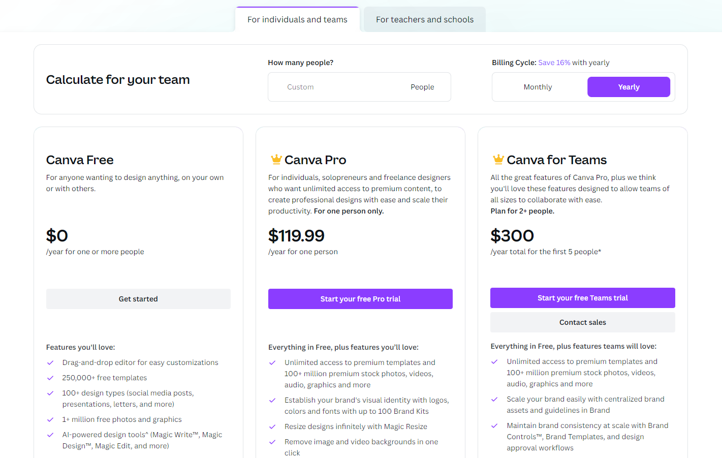
What it is: A pricing page is a web page on your site where you display product or service pricing to encourage conversions.
Most businesses have different pricing plans, varying from free subscriptions to paid options for small or large companies.
What’s important is to clearly define your plans and what features come with each, just like Canva does. You can plainly see that the software offers three tiers you can test before committing to a subscription.
When to use it: Only use the pricing page if it applies to your business. For instance, if you’re an e-commerce company, there’s no reason to include a pricing page other than the online shop.
Best practices:
- Have a clean layout
- Use simple language
- Include testimonials from real users
- Insert FAQ section
- Have a wide variety of pricing packages
Engagement and Information Landing Pages
Let’s be honest: no one has time to scour an entire website when they visit it for the first time.
That’s why landing pages need to contain all the vital points to encourage potential customers to stay more than 10 seconds or view the page more than once.
So, let’s look at the different landing pages that drive engagement.
7. Splash page
Let’s say you want to announce a new webinar to your target demographic.
A splash page can easily fulfill this purpose, as it’s the first thing the user encounters when they access your website before they arrive on the homepage.
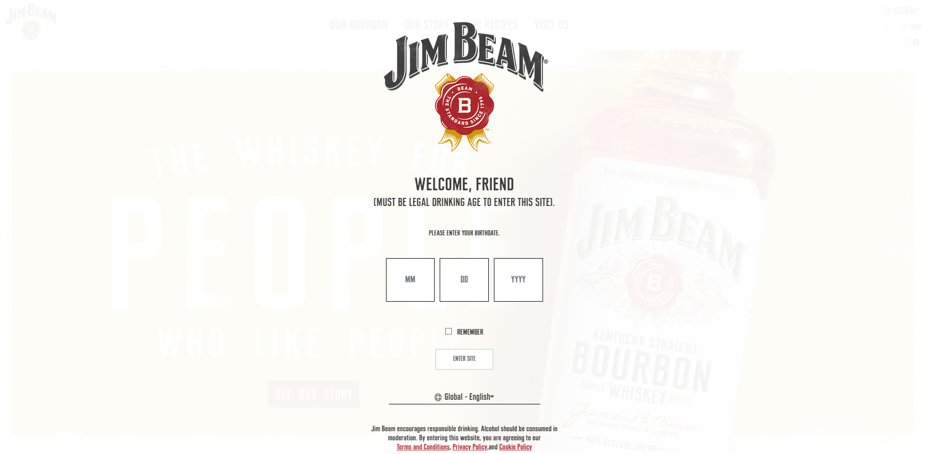
What it is: Splash pages act as an intermediary page where businesses can make an announcement about events, products, or promotions.
But that’s not all — splash landing pages can ask for a visitor’s age or language preference before allowing them access to the website.
These types of pages feature a background image and minimal text, asking for little information about the user.
When to use it: If you want to promote a new product or upcoming event, use these pages to make a splash.
You can also use them if you’re an international company with worldwide clients or sell products requiring age verification.
Best practices:
- Keep design elements to a minimum
- Use action-oriented copywriting
- Have a clear CTA
8. Educational landing page
The Internet is not just for shopping or promoting products — it’s the first source of information many people turn to when they need to educate themselves on a topic.
So why not ‘sell’ educational content?

What it is: Educational landing pages provide valuable content, resources, or guides to educate and build trust.
Basically, it’s anything that teaches something new to your audience. It can be as easy as a ‘How to’ guide or an in-depth e-book.
The main benefit of branded educational content is that it generates new leads and drives traffic to your website.
When to use it: Educational content works well if you’re an expert on a topic — and you want to build credibility.
Best practices:
- Know your audience
- Maintain a consistent voice and tone
9. Social proof landing page
People seek proof that a brand is genuine and that their product works.
You probably also do the same since humans gravitate toward others with similar beliefs, values, and interests.
So, for instance, when you’re interested in something, you most likely ask friends and peers for opinions or look at customer reviews before making your choice.

What it is: A social proof landing page showcases testimonials, case studies, celebrity endorsements, or social media content to build credibility.
When to use it: Add testimonials, ratings, and case studies if you want to back up your claims and build trust in your brand.
It doesn’t necessarily need to be an entire landing page, as you can include a small review section on any webpage.
Best practices:
- Write case studies to add to your site
- Focus on quality rather than quantity
- Add awards, certifications, or trusted partners
10. ‘About us’ page
People are curious about who runs a business.
They want to know the story behind the scenes, or what inspired the owner to start a company, or they’re simply looking for social proof that it’s worth investing in the business’ services.

What it is: An ‘About us’ section on a website is a page that provides info about a company or individual, including its mission, values, history, or team.
As you can see above, the ‘About us’ page doesn’t have to be just informative. You can add a CTA button that generates leads to push people to act, such as joining a newsletter or seeing the brand’s services.
When to use it: Every company needs an ‘About us’ landing page that builds trust and humanizes the brand.
With this type of page, you let your target audience know who’s behind the brand and create a long-lasting connection with customers, while also generating the desired leads.
Best practices:
- Be genuine and approachable
- Share interesting stories and facts
- Find a mission statement
11. ‘Coming soon’ page
Are you launching a new product but want to keep the suspense around it?
This is what a ‘coming soon’ (or pre-launch) page does, as it helps you collect early impressions and sign-ups.
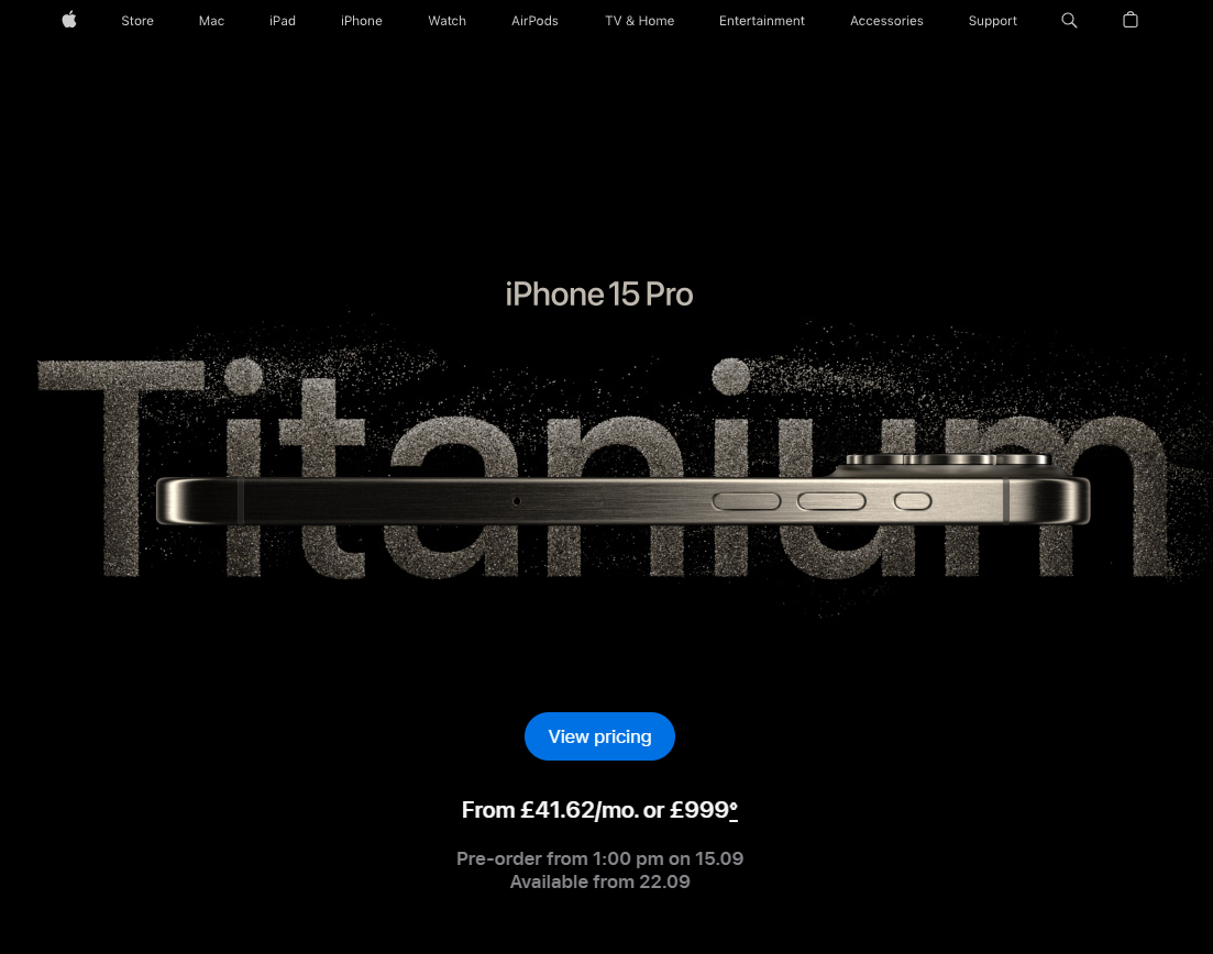
What it is: With a ‘coming soon’ page, you can tease an upcoming product, service, or event and generate buzz around it.
You can add a brief description of the product and a countdown timer so people know when to come back. A form also helps you contact prospects when it launches.
When to use it: Ideal for promoting an upcoming event, business launch, etc., as you create hype around it for those interested.
It’s also helpful for creating an email list for your future digital marketing strategies.
Best practices:
- Use eye-catching visuals
- Have a bold call to action
- Include referral links
Utility & User Experience Landing Pages
Aside from generating leads, engaging prospects, and driving conversions, landing pages are helpful and improve the user experience.
We’re talking about the unsubscribe and 404 error page, so let’s see what they’re about.
12. Unsubscribe page
We know how heartbreaking it is to say ‘goodbye’ to a valuable subscriber — and how you’d do anything to win them back.
A clever and compelling unsubscribe page may do the trick.
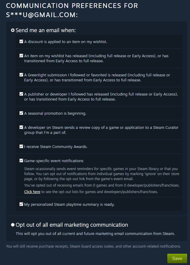
What it is: An unsubscribe page allows users to opt out of email subscriptions or adjust communication preferences.
On this page, you can promote your product or service one last time in an attempt to change the user’s mind.
Offer an incentive, such as a discount — it might be the key to their return.
Keep in mind that this doesn’t mean people will stop using your product (unless they unsubscribe from a paid plan), but you might be simply sending them too many emails with irrelevant content.
It’s an excellent opportunity to see what works and what doesn’t so you can adjust your marketing strategy accordingly.
When to use it: Use it when people unsubscribe from your service. It’s a way to collect the feedback necessary to refine your strategy.
Best practices:
- Make the process easy
- Give them other channels to stay in touch
- Ask for feedback
13. 404 page
You’ve surely encountered these error pages before and while it’s frustrating to receive them, they’re still useful for establishing your brand.

What it is: A 404 page redirects users from broken or non-existent pages, as well as provides assistance or navigation options.
While you want to avoid situations where users land on these pages, you can still make them fun.
Add a joke or an interactive aspect. You can even include engaging visuals but don’t forget to redirect them to your homepage or other resources that might help visitors find what they’re looking for.
When to use it: Always have such a page at hand to distract users from the error. Users might not access them often, but sometimes links get broken or pages expire.
Best practices:
- Add humor
- Get users to explore the website
- Include fun visuals
Feedback & Interaction Landing Pages
You want customer feedback because you can gauge their reaction and satisfaction with your product or service.
With this insight, you can work to improve your strategy and see what does and doesn’t work.
To collect ratings and impressions, use these landing pages.
14. Survey landing page
It’s easy to develop a survey — and they’re cost-effective!
However, some respondents might ignore your survey if your surveys are too frequent or irrelevant to your target audience.
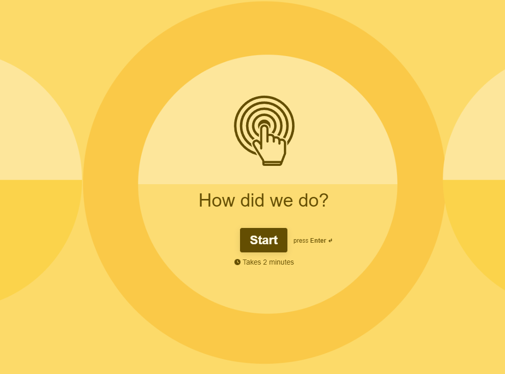
What it is: A survey landing page invites users to participate in surveys or polls that aim to collect data or feedback.
What’s nice about surveys is that you can send links to them in an email or put them on your website as a pop-up.
Think clearly about the goal of the survey and only ask relevant questions.
When to use it: Use surveys after the client purchases products from you or when they’ve been with you for a while.
The objective is to find areas of improvement and see where you stand in your customers’ eyes.
Best practices:
- Keep them simple and brief
- Know your demographic
- Don’t ask loaded questions
15. Review request landing page
Go deeper into specifics and ask your customers to leave a review or rating for a certain product.
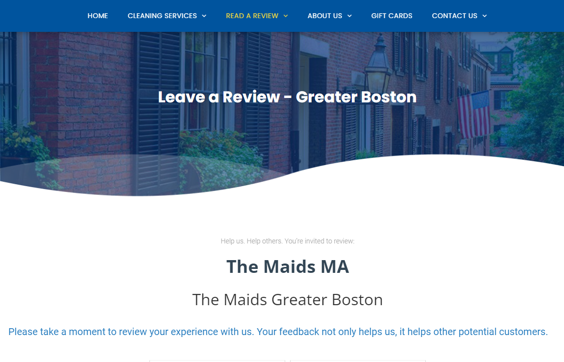
What it is: Unlike surveys (which might be for your brand as a whole), review requests solicit user reviews or testimonials after a purchase or interaction.
When to use it: You can use surveys after a client buys your product so you can see whether they’re satisfied with it or not, what they like or don’t, etc.
They might even offer ideas on how to make it better.
Best practices:
- Keep your request short and simple
- Make use of personalization
- Ask for a rating right away
16. Interactive landing page
Your landing page can go beyond an image here, and a text there.
You can play with it and add interactive elements, such as a ‘hover over a button’, to convert visitors from PPC (Pay-per-click) ads and attract organic traffic.
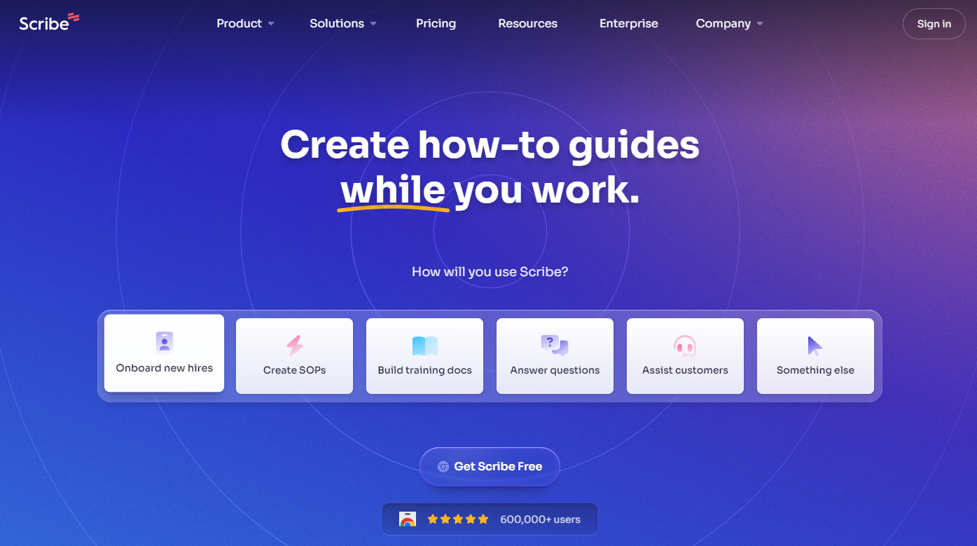
What it is: So, an interactive landing page uses quizzes, calculators, or tools to engage users and gather data.
You can also have landing pages where you give visitors choices, such as clicking a button on the landing page that switches to the service they prefer.
Try videos, use GIFs, and harness the power of storytelling to create an exciting experience. Be careful not to overuse them, though!
When to use it: Create an interactive landing page and unique user experience to stay a step ahead of the competition.
Best practices:
- Have interactive videos
- Create personality tests and quizzes
- Design a custom calculator
Build Your Greatest Landing Page
It might be overwhelming to remember all the types of landing pages right now, but this guide will always be here for you if you need a refresher.
The secret to creating a landing page is knowing your end goal: do you want to boost your mailing list or gain more impressions?
After your decision, the only thing left is to find a good landing page builder.
Design your greatest landing page yet with Moosend!
Moosend has an easy-to-use landing page builder with an intuitive drag-and-drop editor that you can use to create beautiful landing pages in just a few minutes.
Try it for free now.


 Published by
