Onboarding Emails: Tips and Examples [2026 Edition]
One of the first emails a new user receives from your business is the onboarding email. And this email is key in starting a strong new relationship with your audience, thus having a direct impact on customer success and customer retention.
So, if you want to learn how to craft highly effective onboarding emails and see insightful onboarding examples from famous brands stay with us!
What Is An Onboarding Email?
Onboarding emails, as the name suggests, are emails that facilitate the onboarding process. They are sent right after someone signs up for a service or a new customer purchases a product in order to help familiarize themselves with it (e.g., the features, user interface).
These emails are very important to ensure a smooth customer experience since they can serve multiple purposes. These purposes include:
- welcoming new users to your brand
- giving advice about how to use the product/service
- cross-selling or upselling other available products
- encouraging further interaction with the brand
- answering frequently asked questions that new users have
Since onboarding emails are among the first interactions of your brand with your audience, they are a vital part of a successful email marketing strategy. This is true, especially if you want to boost your conversion rates (for SaaS businesses).
So, let’s see some of the most notable benefits of using effective onboarding emails.
Why Are Onboarding Emails So Important?
Acquiring a new subscriber (or a new customer) takes significant time and effort. You certainly don’t want all this effort to go to waste and disappoint those new users.
Onboarding emails give you the chance to show that your business is worth people’s time and that it can provide value to their business. Let’s see some benefits in more detail.
Create a great first impression
Upon signup, people usually provide their email addresses. So, it’s only natural to expect some kind of communication to arrive in their inboxes. What’s more, this is one of the best channels to contact you if they run into any kind of problem.
Since users have this “expectation” we mentioned, businesses must be ready to meet it in order to make a good first impression. So, whether it’s a simple warm welcome or a whole onboarding email sequence, it needs to be there.
Help users learn your product/service
New users that have just signed up or purchased your product usually know some of the key features or an overview of your offering. You can use onboarding email campaigns to highlight distinctive features and illustrate how users can apply them in their business to get more value.
If your onboarding strategy is good, you deliver a “step-by-step” introduction to your product or service and you have more chances at successful conversions (if you’re offering a trial or freemium plan) or satisfied customers in the long run. This leads us to our next benefit!
Reduce churn
A great user experience depends on how well the user can navigate the product or service without unnecessary friction. Furthermore, a well-designed onboarding experience can turn your users into loyal customers. And we all know how important loyal customers are for the longevity and success of a brand!
In fact, statistics speak for themselves as 86% of people believe they have high chances to remain loyal to a business that welcomes and educates them during the onboarding process.
This tells us that well-onboarded customers are less likely to churn, while with poor onboarding you risk losing customers sooner or later.
8 Brilliant Onboarding Email Examples
Below we have collected a few outstanding onboarding email examples to get you inspired and show you how onboarding emails work in action!
1. Welcome Email
Goal: Introduce new users to the brand & make a great first impression
When to send: After the user signs up
The onboarding welcome email is arguably the most important email in the customer onboarding journey. It’s going to have the highest open rate among all emails in your onboarding sequence since users are most engaged right after they sign up or purchase a product.
The purpose of a welcome email is to make a good first impression, introduce people to your offering, and set the right expectations.
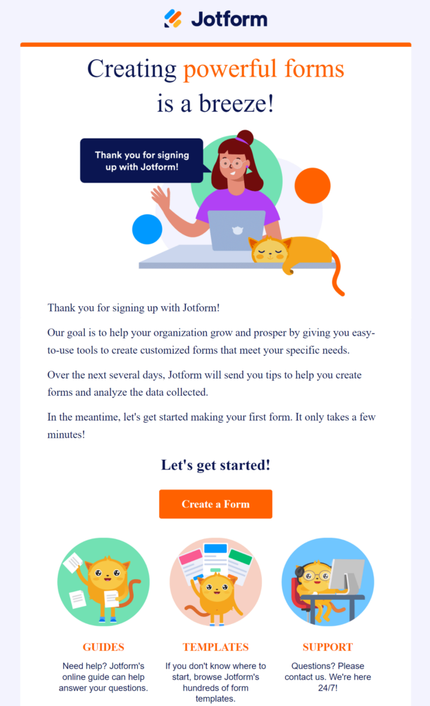
Here is an example from Jotform:
Subject Line: Welcome to Jotform
What’s great about this email:
- This welcome message is short and easy to read. It focuses on the value the user will get from the software and the team behind it.
- It sets the right expectations (what happens over the next couple of days).
- It includes a nice visual to make the email more engaging
- There is a single CTA button (no need for more) that takes users back to the software and urges them to start testing it. The button is also in the brand’s colors for consistency.
Additional resources to check:
- Top welcome email examples to fuel your inspiration
- Welcome email templates that you can copy and customize to your needs
2. Instructions & Product Tips Emails
Goal: Highlight key features & move users to the next step of the onboarding journey
When to send: Every other day (depending on your onboarding schedule)
As we mentioned before, educating users about how to make the most of your product is vital in ensuring a smooth customer experience and retaining your paying customers. Sometimes users may get overwhelmed (or lost in the UI), thus needing a “nudge” towards exploring the product more.
The goal of the product tips emails is to have users explore specific key features and give actionable directions that enable them to experience the product’s capabilities and value themselves.
To that end, you can use the following together with your product tip email:
- webinars
- help articles
- product training videos
- GIFs
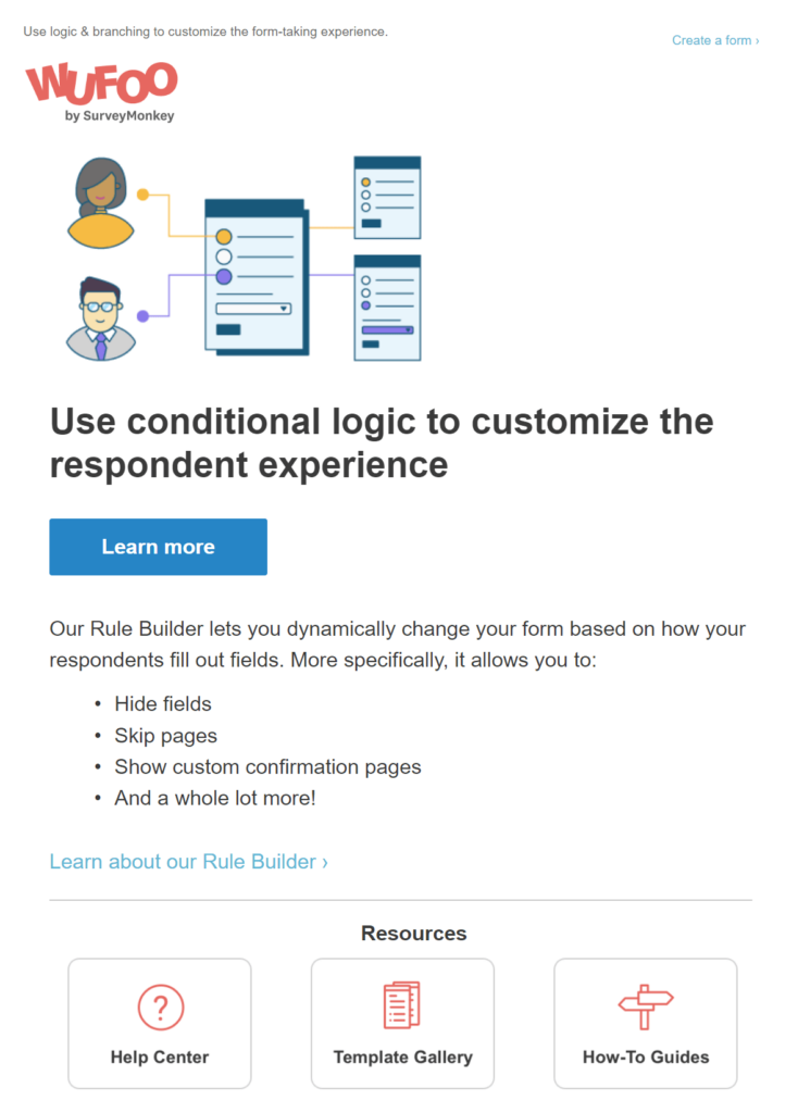
Let’s see an example of this kind of onboarding email from Wufoo:
Subject Line: Build forms that adapt to every respondent
What’s great about this email:
- The email is skimmable and focuses on a single product feature that’s very important for users to know how to use, in order to fully leverage Wufoo’s platform.
- Bullet points illustrate potential applications of the feature.
- The image on top helps users “visualize” how the feature works.
- The email subject line is to-the-point and focuses on the value of the feature.
- The call-to-action is placed right after the headline for maximum visibility.
3. Community Building Email (Case Study Suggestion)
Goal: Make the user a member of the community and provide social proof
When to send: 1 or 2 case study emails during your entire onboarding journey
You may have the best product in the market. But still, for some users, this may not be enough to persuade them to convert.
Letting your customers speak for you (via a simple testimonial or case study) can eliminate potential objections your potential customers have and put their minds at ease.
You can leverage 5-star reviews from popular review sites like G2, video testimonials or even a simple conversation your customer support has with a happy client.
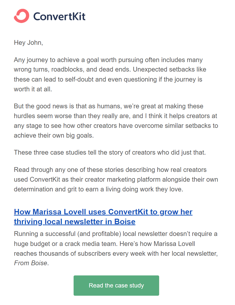
Here is a prime example from the email newsletter software Kit:
Subject Line: Ready to join these successful creators?
What’s great about this email:
- It shows different use cases of the product.
- It drives traffic back to the blog, so the user becomes more familiar with the brand.
- It works as powerful social proof that includes data and numbers from real people using the product, not just influencers that may be paid to promote it.
- It illustrates how the product solves another user’s pain points.
4. Personalized Onboarding Email
Goal: Start a conversation with new users and find out what they hope to achieve
When to send: As soon as possible (after signup) to increase effectiveness
These emails go beyond the scope of the typical onboarding email campaigns. Their difference with regular onboarding emails is how personal they feel and are. They are almost as if they were written specifically for the recipient.
Some companies choose to send their personalized emails from their employee’s email addresses rather than the company ones.
In the example below, we’ll take a look at a unique example of personalized onboarding from Bonjoro. I received a personalized welcome email from the founder himself, Matt Barnett!
Subject Line: A personalized welcome to Bonjoro from Australia, just for you 🐻🎉
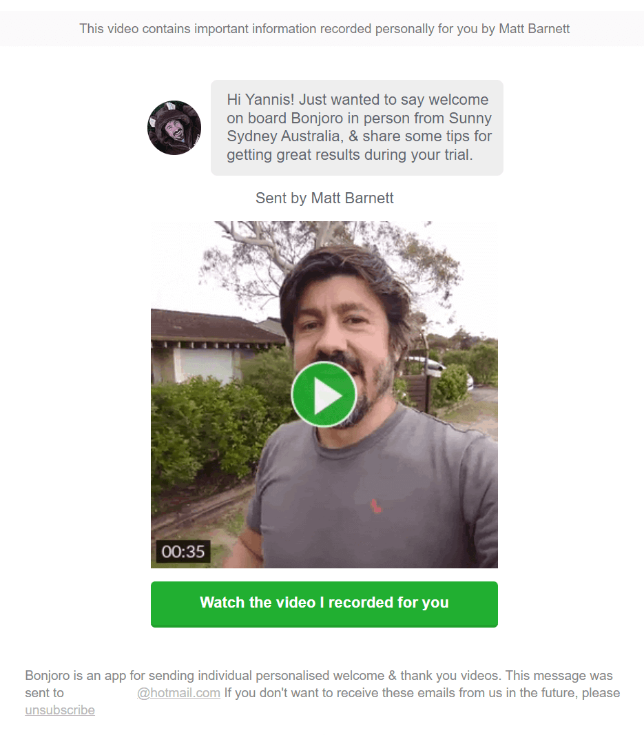
What’s great about this email:
- It’s a whole new experience since you get a personalized video to welcome you to the brand.
- The short video helps you feel more “comfortable” with the brand.
- The subscriber’s first name is mentioned both in the text message and by the founder himself live.
5. Free Trial Expiring
Goal: Encourage users to act quickly (promote immediate action)
When to send: 24-72 hours before free trial expiration
This is practically your last chance to persuade your leads to convert. Urgency is a great ally for you if you play your cards right. It’s all about the timing!
Free trial expiration emails are typically sent 1-3 days before the trial is over. If your trial period is longer (let’s say you have a 30-day trial), you can also send a reminder email about being “halfway through.”
To make these emails effective, you need to convince users that life will be harder if they miss their chance to upgrade now. For example, you could suggest that they will forfeit any data they have or that they won’t have access to them unless they upgrade.
Nothing motivates people more than the fear of losing something they’ve worked on.
Are you ready to see an example from the course platform LearnWorlds?
Subject Line: Your LearnWorlds trial is expiring soon!
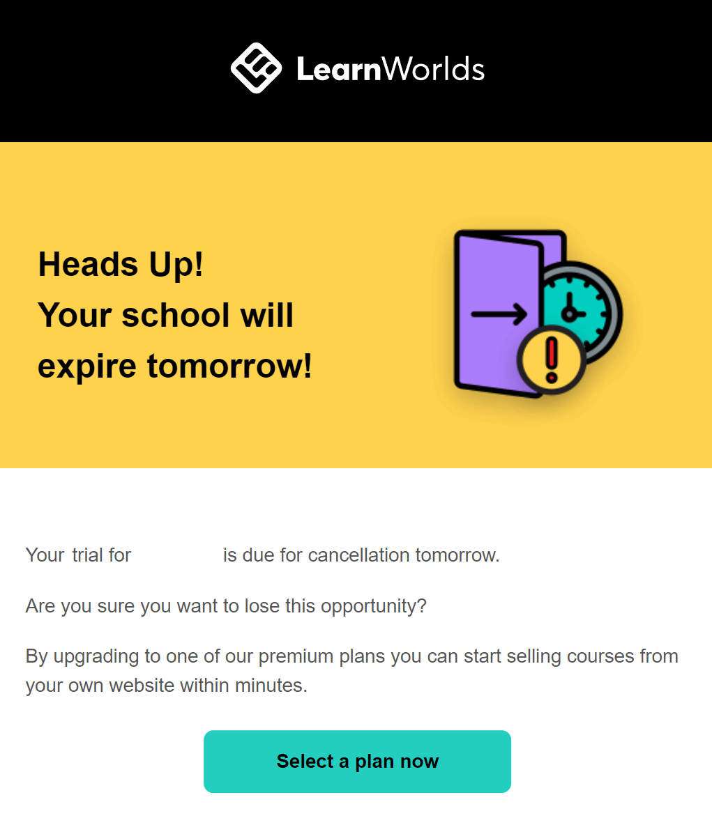
What’s great about this email:
- The company leverages urgency to encourage action (both in the subject line and in the email copy).
- There is an emphasis on the “negative outcome of missing out (i.e., you lose this opportunity).
- There is a clear call-to-action that promotes immediate action.
- The visual chosen for this campaign further promotes urgency.
6. Expired Trial Nurture Email
Goal: Extend the trial/ Push users to check out your product again
When to send: Up to 3 months after the trial period
The free trial period may be over. But people chose your product as a potential solution to their problems. This means that you can still continue sending nurturing messages including recent product updates, webinars and special events, or even blog post digests.
There is one caveat, though. Most companies simply continue sending regular newsletters to those subscribers.
Try to deliver product-centered campaigns that may persuade those users to revisit your product.
Even if your goal is to have users spend more time with your product by extending the trial period, that can still be a win.
Let’s see an example from ActiveCampaign:
Subject Line: Let’s keep this going!
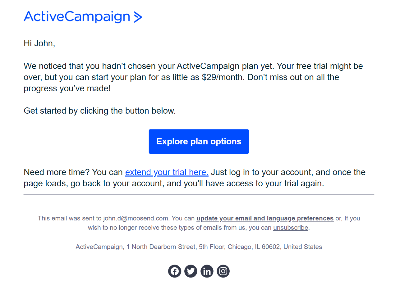
What’s great about this email:
- It tries to influence the reader’s psychology by reminding them how bad it would be to lose all the progress made if they don’t upgrade to a paid plan.
- It gently provides the solution of extending the trial period.
- The brand leverages the white space of the email to make it skimmable and make the CTA stand out.
7. Post-Trial Survey Email
Goal: Get insights into why people didn’t purchase
When to send: 1-3 days after the trial has expired
If users end up not purchasing your product after the free trial period, you can still leverage the situation to improve and optimize your onboarding sequence.
People may hate doing surveys, but they love being heard! So, give them a chance to explain what they didn’t like.
The answers you get will also help you target them in the future with win-back campaigns once you’ve fixed those pain points they had.
Note: You can tempt users who complete the survey to give you a second chance by offering them a discount. However, you should avoid doing this when the reason for not purchasing is the price tag.
Here is an example of what we’re talking about from Instapage:
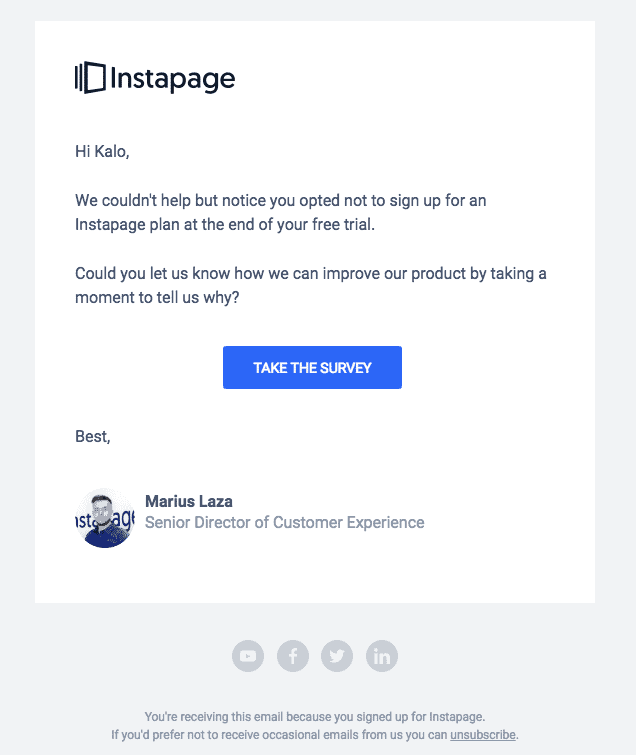
What’s great about this email:
- Easily skimmable email that’s straight to the point
- Clear, visible CTA button
- Actionable wording
8. Upgrade Email
Goal: Convert free users to paying customers
When to send: Once every week or every two weeks
This user onboarding email aims to push active users of the product/app to upgrade to a paid version or plan. So, this kind of email campaign is sent to free users that take advantage of available free plans or use the product actively until they commit.
With these emails, you want to emphasize the value the user will get by upgrading. If the user has a satisfactory experience with the trial chances are they’ll want to capitalize on that.
Alternatively, you can “mask” your upgrade emails as activity update emails. Specifically, you can summarize what the user has done in the app/product and show these metrics in a nice way. You can also put a note stating how much more you could be doing with a premium plan.
We’ll take a look at 2 distinct examples of what we discussed here.
Here is an upgrade onboarding email sent from Kit:
Subject Line: Still doing everything manually? It’s time to upgrade to the Creator Plan.
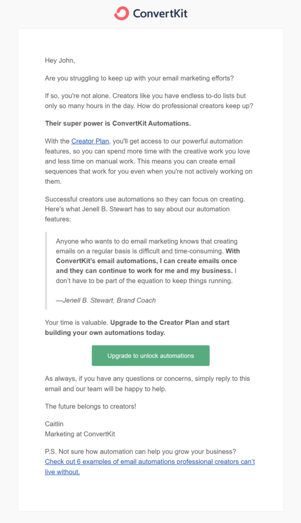
What’s great about this email:
- Starting with the subject line, it stresses that it’s time to eliminate manual work (which we all hate) and embrace automation (thus saving time and effort).
- Despite the long wall of text, the email copy explains why it would be valuable for users to add automation to their email marketing efforts. The included testimonial helps increase the effectiveness of the message.
Let’s see another one from RescueTime:
Subject Line: Your weekly RescueTime report
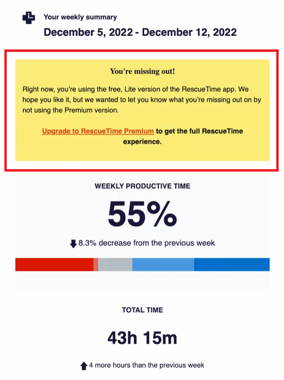
What’s great about this email:
- This is an easy onboarding email template that the brand has customized to fit its purpose.
- The productivity report is useful for the app users, while it also nudges them to consider upgrading to get more benefits.
5 Tips To Create Effective Onboarding Emails
We’ve gathered some really helpful tips to create onboarding emails that promote user action.
1. Craft a catchy email subject line
Subject lines are particularly important for a successful onboarding email experience because they attract attention and ensure high open rates.
With an actionable subject line that catches the user’s attention, you can make them curious about your content (or the next steps of the onboarding process). You can include emojis to make the email stand out or help reinforce the message.
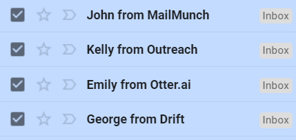
Here is an example:
The purpose here is for the user to know that the email is from the specific brand they subscribed to, so that every time a new email arrives, a subconscious connection is made.
Finally, be sure to keep your subject lines short and concise since longer subject lines will be cut off if users view the message on a mobile device.
2. Personalize your onboarding experience
Personalization is an absolute necessity for a great customer experience. The more data you have from your leads and customers the more you can personalize your onboarding.
The first step is to use your subscribers’ first names in your emails to make them feel more personal and intimate.
The next step is to set up automated messages in your email marketing software that will be triggered in response to user actions in your product or service.
For example, in your onboarding sequence, you may have a campaign promoting a specific feature you want your leads to check out. If subscribers open the campaign or click through your email, they can receive an email encouraging them to purchase a paid plan. Alternatively, if they don’t interact with the email at all, they can receive a follow-up email with a case study or pre-recorded webinar to nurture them further.
All these may look complicated at first glance, but they become extremely easy to implement if your email marketing solution has a visual automation workflow editor. Moosend is a great tool for the job due to its straightforward and user-friendly interface. Every automation step can be seen like a piece of a map, so you can create sophisticated sequences in mere minutes.
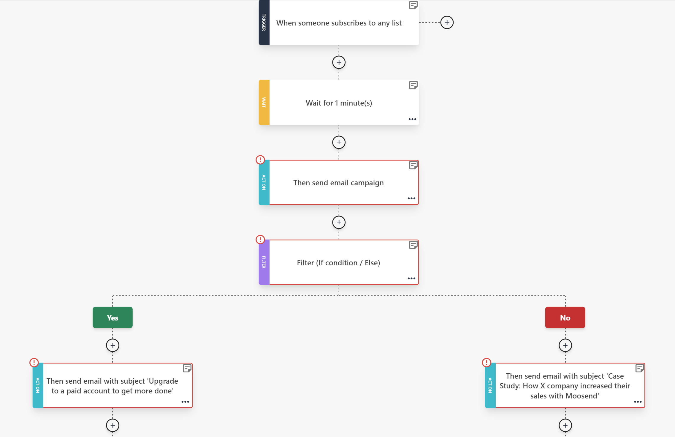
What’s more, you can automatically tag subscribers based on their actions so that you can target them again in the future in case they don’t successfully convert right away.
3. Stick to a single CTA in your emails
You may think that using more than one CTA button in your onboarding emails increases the chances of users clicking on them. This is a common mistake since readers may feel overwhelmed by the plethora of choices, thus ending up taking no action.
For this reason, we recommend including only one CTA per email. Sometimes simple is better!
Remember: Focus all your efforts on your CTA copy. Use actionable wording and structure your onboarding email around the action you want your readers to take.
4. Lead users to the “Aha” moment
The “Aha” moment in marketing is when the user suddenly realizes the value of your product and the reason they need it. This makes your product memorable and it creates the emotional “foundation” for a great customer journey later on.
You need to identify your product’s core value and guide users through the steps they have to complete to receive that value.
The sooner users reach those Aha moments, the better for your business. You may even “prevent” them from checking out other competing products in the market.
5. A/B test your messages
There may be some general guidelines for your onboarding emails as we saw in the examples of the previous section, but the truth is there is no one size fits all recipe. As a result, you need to A/B test your messages to establish which elements yield higher open and click-through rates.
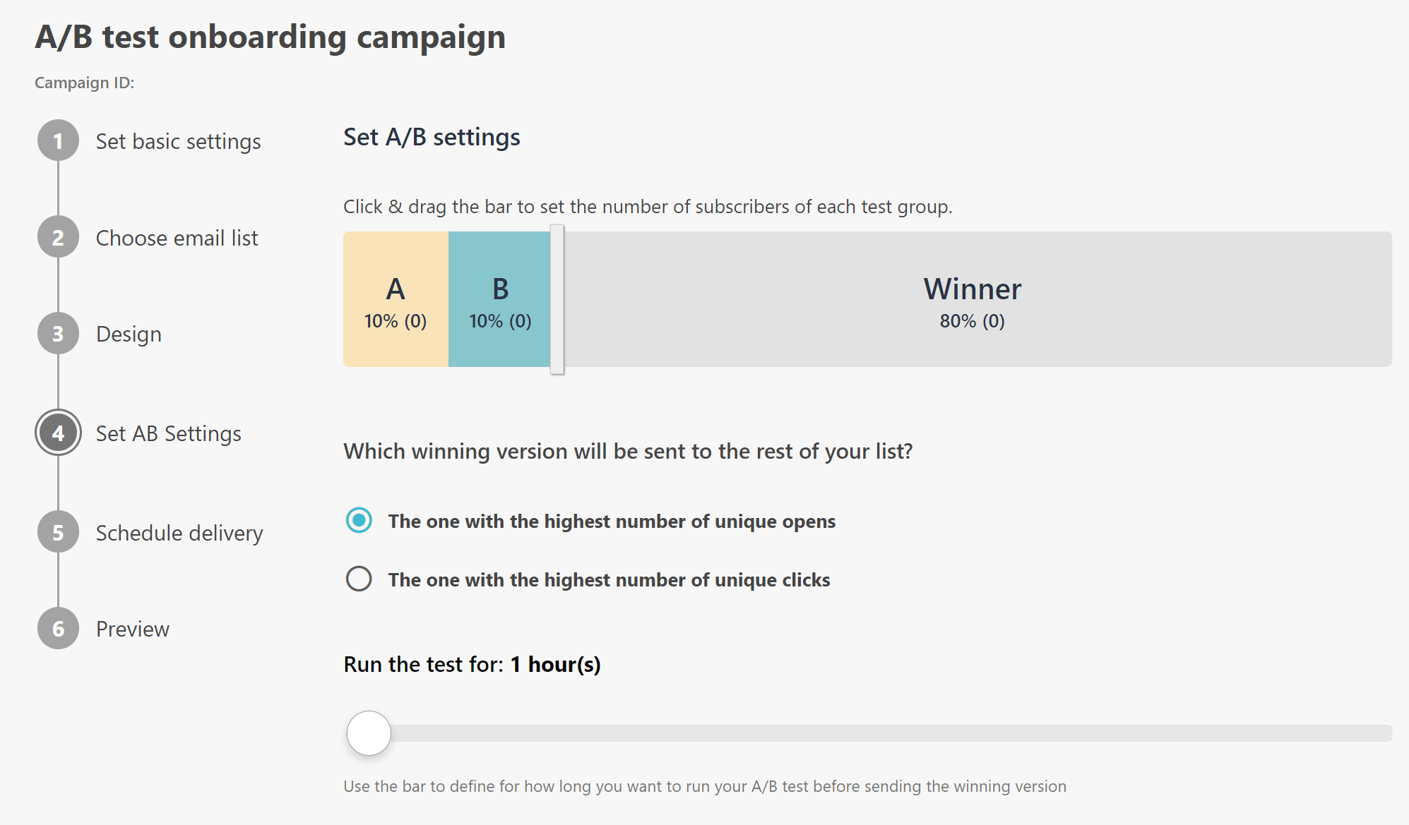
To run an effective a/b test, you create one or more variations of your initial email. It’s important to change only one element at a time (e.g. the visual, or the copy of the CTA) so as to know what change brought those improved results.
Then, you send each variation to a different segment of your subscribers and use the winning variation for the rest of your audience or customer base.
A/B testing is a dynamic process that helps you optimize your whole email marketing strategy and get increasingly better results.
If you want reliable A/B testing functionality, you can do this with Moosend which allows you to test your email copy, visuals and CTAs apart from your email subject lines (unlike other alternatives that only allow subject line a/b testing).
Last Thoughts
With a great onboarding experience, you can bring to your business long-lasting customers that stay loyal to the brand. Not only do you engage with new users, but you also build a stronger connection with them, thus having higher chances of retaining them.
If you want to build a solid onboarding sequence for your business without much hassle, you can create a free Moosend account and hop into the Automation editor to craft your onboarding experience. You can also use one of the available pre-made templates (including the onboarding automation) to save time and see your onboarding sequence live faster than you could have imagined!


 Published by
