Landing Page Best Practices For Higher Conversions [2026]
There’s no shortage of information on what landing page best practices you should follow. However, underneath all the hype and buzzwords, a few key principles make up the best landing page design.
If you want to capture your visitors’ attention, boost conversions, and build trust, then you need to optimize your landing pages the right way.
In this ultimate guide, we’ll dive into the following categories:
- Mobile landing page best practices
- B2B landing page best practices
- PPC landing page best practices
- SEO landing page best practices
- eCommerce landing page best practices
Let’s get converting!
Mobile Landing Page Design Best Practices
Did you know that only 50% of landing pages are optimized for mobile? This means that 50% of businesses are missing out on potential customers because of a simple design oversight.
Just by optimizing landing pages for mobile devices, you’ll boost user experience, reduce your bounce rate, and capture your target audience.
Let’s look at some practical ways to optimize your pages for mobile users.
1. Make your forms simple
Forms aren’t a one-size-fits-all lead magnet – you shouldn’t be using the same forms for mobile landing pages as you do for desktop. Forms are tedious to fill out, especially on a mobile device.
Thankfully, email marketing services like Moosend make it super easy for you to create optimized landing pages for your mobile users. All you have to do is switch from desktop to mobile view with the push of a button and adjust your elements accordingly.
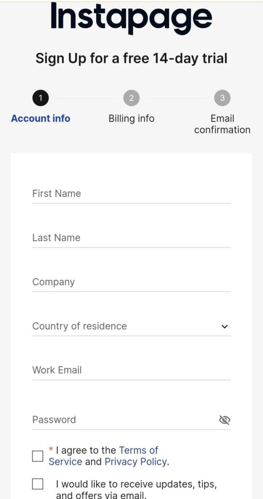
If your forms have a lot of dropdown boxes and extra fields, you might find that it’s turning leads off of your landing page. A great tactic to make your forms more appealing is by adding ‘white space’, i.e. reducing the number of fields you have on both your desktop and mobile landing page forms. Doing so also reduces the loading time of your landing page.
Look at your current opt-in form, and delete anything that can be followed up by a member of your sales team later. You should be left with a skeleton form on your mobile landing page that collects your user’s contact information – and that should make it perfect. Look how Instapage did it:
Looking for an easy-to-use landing page builder to get started? Sign up for a free Moosend account and experiment with our user-friendly features.
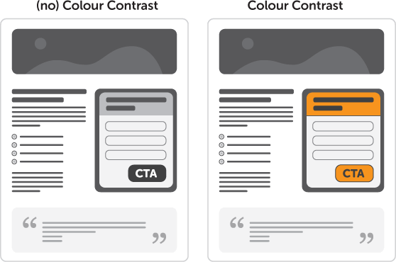
2. Add a contrasting color to your CTA button
Having a CTA button in a contrasting color will help your mobile landing page visitors follow whatever conversion goal you’ve planned for them, especially lead generation.
It’s also easier to connect important copylines with your CTA by giving them the same contrasting color. Users will combine that information faster and are more likely to convert.
Remember, mobile users are a huge part of your audience. Don’t mess around with amateur blunders like this; otherwise, they’ll bounce.
Pro tip: Make sure your CTA is the right size. A full-width button should be at least 44 pixels.
3. Use the “Arm’s Length” rule
How many times have you arrived on a landing page that is clearly not optimized for mobile? It’s probably one of the biggest turn-offs for prospects. It gives the vibe that the company didn’t make an effort for mobile devices. And that’s a massive way to turn customers away from converting.
Look at this example by Domino’s:
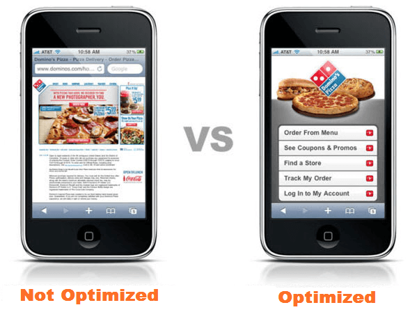
Which one is better for the customer to navigate? It’s easy to tell that the left one is not mobile-friendly and could be a massive turnoff to anyone who is looking to become a customer. To avoid this, you need to use the “arm’s length” rule on any mobile landing page before it goes live.
Check out these bullet points:
- Load your landing page on your mobile device
- Hold your arm out straight
- Check if everything still looks like it should from that distance
- If it doesn’t, change whatever doesn’t look 100% clear
- Get a second opinion; have someone else in your team do the arm’s length test as well
With this simple approach, you’ll know how to build a high-converting landing page for mobile.
Pro tip: Keep any font on your mobile landing page at least 16 pixels in size to make it readable. This will ensure the copy is easy to read on mobile devices.
4. Wrap your CTA in copy
If you’re trying to convert users on a mobile device, chances are you’ve dramatically reduced the copy on the landing page, too. Less copy means you need to be smarter and leverage the psychology of driving conversions.
This is where you can use your CTA to increase conversions by ‘wrapping’ it in the copy. Make your CTA pop out by putting a supporting statement underneath. Tell the user exactly what they’re going to get by clicking on the CTA:
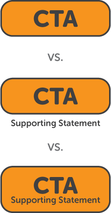
Doing this will help in two ways. First, it’ll break up your copy into two parts: a conversion goal paired with a supporting statement such as a value proposition. Second, it’ll communicate what you want your landing page visitor to do, without breaking up the design of the page.
5. Have a scrolling CTA
Everyone is obsessed with having a call-to-action (CTA) above the fold. While it’s important on a desktop landing page, it becomes a different story on a mobile device.
Even though you should always have a CTA somewhere in the users’ view when they first land on your page, instead of just having it above the fold, try having a scrolling CTA on your landing page as well.
Here’s how it works: When your prospect scrolls down your mobile landing page to read the copy, your call-to-action button will be pinned to the top of their screen. This is a great method to capture goal-oriented mobile users. And it’ll save them time from scrolling back to find your opt-in form, too.
B2B Landing Page Best Practices
B2B companies seem to mess up when it comes to using landing pages effectively. For example, 4 out of 10 clicks lead users to the brand’s home page instead of a relevant landing page. Also, 52% of PPC ads by B2B companies go to their home pages instead of dedicated landing pages.
These are basic mistakes you can fix with ease. Here are four ways B2Bs can build a great landing page and skyrocket their sales.
6. Use specific copy
If a customer is looking at your landing page, they are probably in the middle of their buyer’s journey. So avoid including the copy you’d normally have at the beginning of the buyer journey or sales funnel.
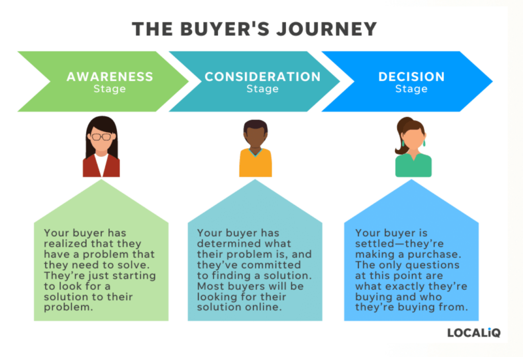
Instead, write specific, high-quality copy that reflects the stage of the buyer’s journey that the customer is in. For example, while your home web page may talk about your brand, your landing page should address how your product or service will resolve the user’s pain points.
You’re wasting your conversion efforts by repeating your copy from your homepage to your landing page. Instead, use relevant and tailored landing page copy to push your prospects in the direction you want them to go.
7. Use a unique call-to-action
The main reason landing pages are so efficient is because they focus on a single desired action. It might be that a visitor has landed there to download a free eBook, sign up for a trial, or subscribe to a product with a limited-time offer.
Whatever it is, a good landing page that converts follows the 1:1 ratio – one landing page for one conversion goal. So if you’ve got a landing page telling leads to do more than one thing, there’s a big chance a lot of them will bounce back.
Look at this BFCM campaign we recently created at Moosend:
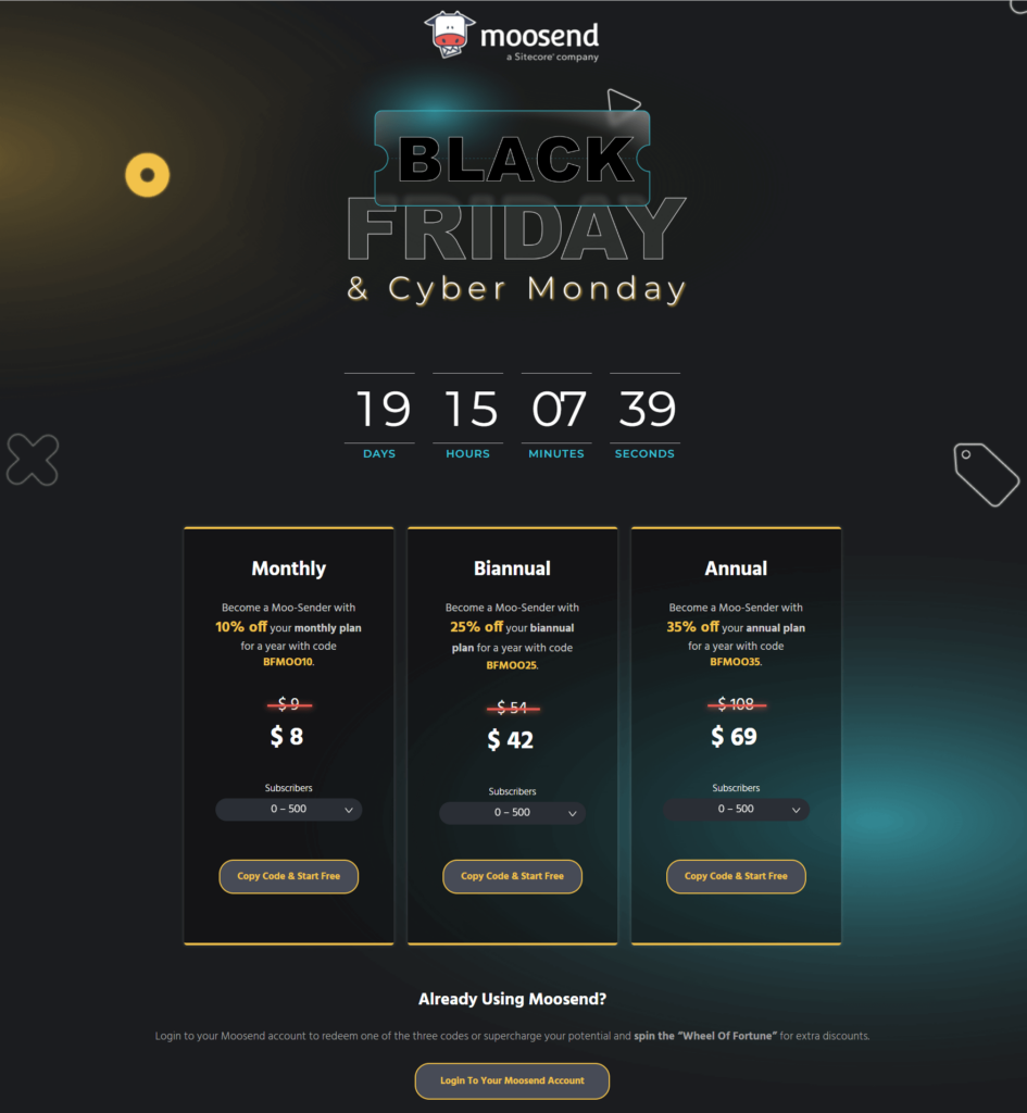
It’s pretty clear what this landing page is all about. The copy and design show the visitors what they have to do to claim the discounts, while the countdown timer adds a sense of urgency for better conversions.
Moreover, for every unique marketing campaign you’ve got running, you need a dedicated landing page to boost your conversions. Otherwise, you’re just throwing your money away.
Pro tip: Make sure to boost your conversion rate by giving your customers an easy way to get in touch with you. I recommend adding an ‘exit-intent’ to your opt-in popup. Also, get your customers to get in touch with you at the right time.
How? Install a callback widget that analyzes the behavior of your website visitors and prompts an immediate call when the visitor is most likely to convert.
8. Add testimonials and social proof
Social proof in the form of testimonials, reviews, and case studies is one of the easiest ways to skyrocket sales on your landing page. By showing customers that other businesses are willing to promote your product, you’ll build trust and credibility in your brand.
And the bigger the brand name in the testimonial, the better.
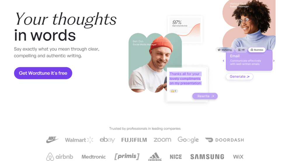
Check out the landing page example above. The writing assistant WordTune features social proof in the form of its customers immediately below the hero section of the landing page.
Pro Tip: If you’ve got a client who loves your product, ask them for a testimonial as well as a headshot you can use. People connect more with a testimonial if they’re able to put a face to the name. Bonus points if you can get it from a company’s key decision-maker.
PPC Landing Page Best Practices
According to research, 97% of PPC ads get clicked and end up with no conversion. Here are four landing page best practices to stop you from wasting your PPC budget and start winning more conversions.
9. Ensure your copy matches the ad
When a prospect clicks on an ad, they expect whatever offer or product they’ve clicked on to appear on your landing page. And if it doesn’t, they just leave.
Therefore, you need to ensure that your landing page reflects the content of the ad your audience clicked on. People should immediately be able to tell that they’ve landed on the right page to find whatever product, deal, or offer they clicked on.
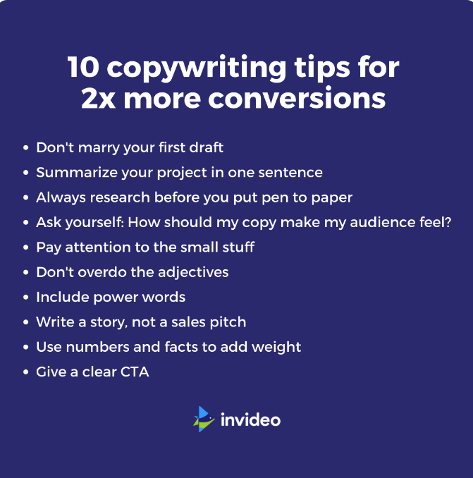
So create a strong headline or CTA that matches the ad copy to get rid of any confusion.
10. Remove unnecessary links
Do you have social media links on your landing page? How about links to your home page or another product? If yes, then it’s time to rethink that choice.
Whoever has clicked on your ad has a goal in mind, and you need to address it successfully:
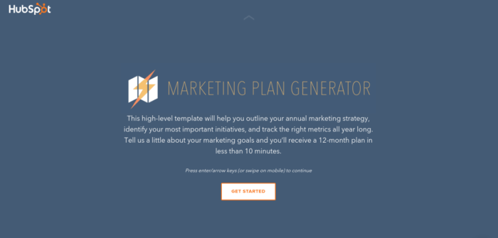
Here’s a classic Hubspot landing page that meets the criteria. So create your next landing page with this parameter in mind.
11. Not writing enough ads
Are you currently running ads with 10 different variants rather than 10 separate, targeted ads? If you are, then your ads are generic. And it means your landing pages won’t be anywhere near as targeted as they need to be.
Let’s search for “PPC managers” and see what comes up:
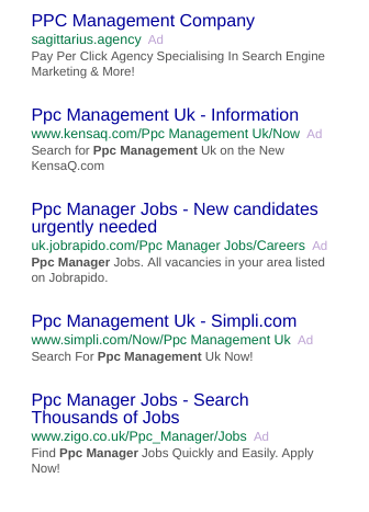
What do you get from these ads? They’re all the same. None of them are original. And none of them are inspiring clicks. In fact, one of the ads led us to a generic homepage:
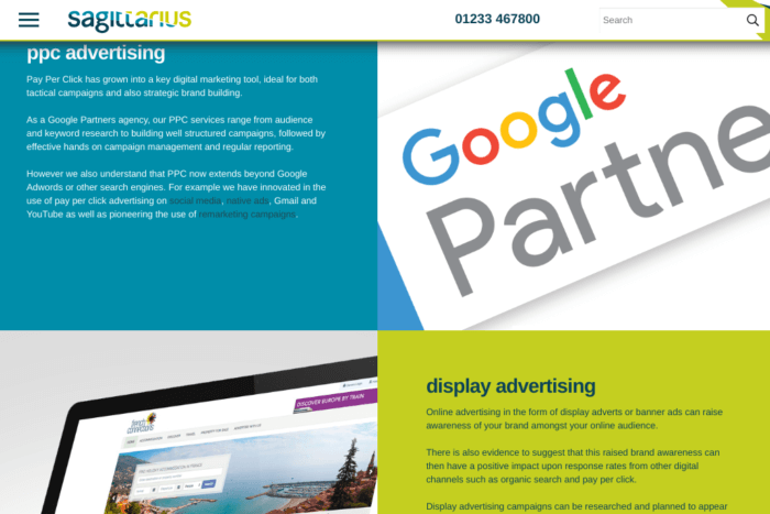
Hence, make sure that your PPC landing pages are as targeted as possible to reach better outcomes.
12. Retargeting is essential
If you’re going to pay to get people to your landing page, you’d better make the most out of your spending. And you can do that by retargeting visitors who visit specific landing pages.
Retargeting is a game changer when it comes to landing page conversions. Why? Because of how personalized you can make your ads and landing pages. You’ve got the inside knowledge of the very product or service the user was looking for because they landed on a specific landing page.
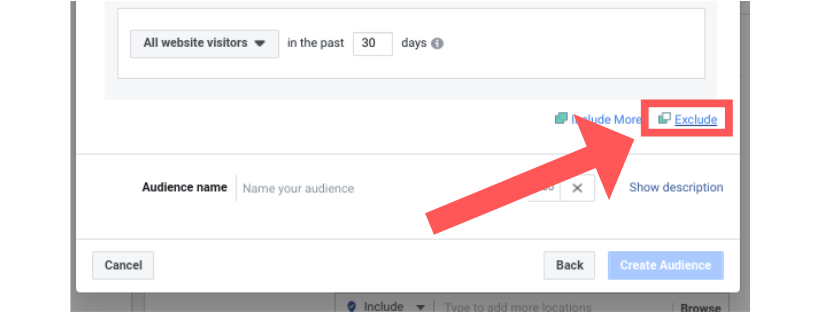
Pro tip: Avoid retargeting people who follow through with your conversion goal. On Facebook, you can do this in a few clicks in your Ads Manager.
SEO Landing Page Best Practices
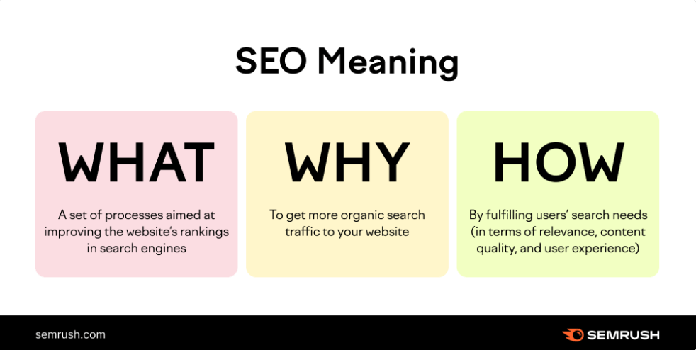
Search engines like things their way. They crawl, look, and select landing pages that play by the rules.
So, if you want your landing page to make sales, you need to make it search-engine friendly. Let’s dig into the best ways you can do this.
13. Optimize your page headlines
Your headline is the first thing a search engine will crawl through, so if you get it wrong, you’ll never be shown in the results. A perfect headline should be clear and concise, and also attract users enough so that they click on it.
Pro tip: If you’re struggling to find the right way to write a killer headline, use a free tool like CoSchedule’s Headline Analyzer to tell you how good your headline is, and how to improve it.

14. Make your keywords count
Putting your keywords in the right place on your landing page is one of the main ways to optimize it. Where possible, the main keywords on your landing page should be placed in:
- Your body text
- Your headers
- In your page title, URL, and meta description
By placing your target keywords in the places Google is looking at, you’re more likely to make them count.
15. Optimize your images for SEO
Google doesn’t understand images. So if you don’t add text descriptions to them, search engines will have a hard time understanding what they are.
If you don’t have much time to invest in this process, you can try giving the images on your landing page the same name as the page they’re being placed on. Plus, to get the most out of them, incorporate keywords into your text descriptions.
This will boost your chances of the page being selected by Google. But avoid overstuffing your content with keywords. Try to describe what the image is about as simply and accurately as possible.
Pro tip: If you’re unsure whether your landing page images have text descriptions, check quickly by right-clicking the images and selecting “inspect”. You’re in business if the image has an “alt” attribute!
16. Nail your metadata
Metadata refers to the title of the page, URL, and meta-description – the three elements that will determine if someone will click on your landing page in the first place.

The reason your metadata matters is that it’s a preview of what the user is going to find on your landing page. It’s your opportunity to entice people to visit you.
Hence, you need to provide as much value as possible. Let the searcher know you’re a better choice than your competitors by making your meta data informative. And make sure the meta description is less than 160 characters.
17. Answer your user’s search intent
If users are clicking through to your landing page from their search query, they need to get the answer to the “who, what, or why” as soon as they arrive.
So first, search for something that will prompt a particular landing page on your site right now. Then ask yourself:
- Is it obvious what the page is for?
- Is it obvious what your brand is and what you’re all about?
- Are you providing visitors a clear reason to convert?
- Are you tempted to stick around?
If you hesitated on any of these, it’s time for landing page optimization.
18. Have a hero image
Your hero shot is your header image. If your main goal is to get your prospect to download an eBook, for example, this is where you should showcase it:
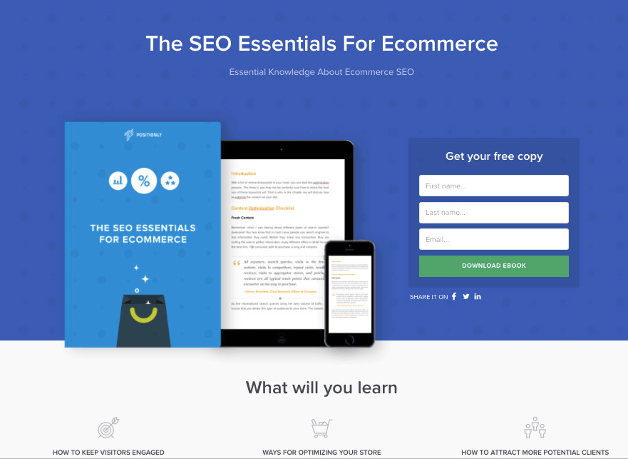
Make your hero image enticing, and show your prospect the best image of the offer to maximize your conversion chances.
Pro tip: Make sure your hero shot is at the right size to meet optimization requirements. And give it a text description with keywords to increase your rankings in search engine results.
E-commerce Landing Page Best Practices
Don’t be alarmed by this, but 96% of visitors aren’t ready to buy when they visit a product page. The good news? They’re less likely to bounce if they’re taken to a landing page instead.
So, let’s learn how to drive sales on e-commerce landing pages.
19. Make converting easy
A lot of e-commerce stores do all the right things. They make their ads enticing, their copy is on point. But then they fall at the final hurdle. They don’t make the checkout process easy for their customers, resulting in cart abandonment.
Get your customers past the finishing line by making your checkout process fast and simple. To improve your customer experience, remember to keep the page load time low and optimize the checkout process for all screen sizes. Without these simple but effective functionalities, your eCommerce landing page won’t convert.
Here’s how to do it right on your landing page according to Designrr:

It’s simple:
- The checkout page copy states the value offered and product information clearly.
- It has only the necessary number of form fields.
- The CTA or checkout button is in a contrasting color compared to the page background.
- It offers two common and easy-to-use payment options.
- The landing page is simple but attractive.
20. Don’t hide your shipping costs
If you’ve got a bunch of carts that were abandoned at the checkout, your shipping costs could be a contributor:
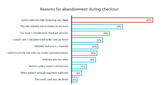
No matter how well you’ve designed your landing page templates or how powerful your copy is, your buyer is likely to leave if you add extra costs at the checkout page. Any extra taxes should be included in the price you market to people. Also, offer free shipping or include it in the cost of your product.
Just don’t surprise your customers with a larger number than they expected. Show your shipping costs from the start or include them in the overall value offering. This way, they can decide whether they want to continue with the purchase or not.
21. Have a social login option
The secret sauce to e-commerce success is making it as easy as possible for customers to give you their money. That means if you can take the pain away from having the customer create an account for your shop – do it.
And this is best done by giving the customer an option to log in with a social account:
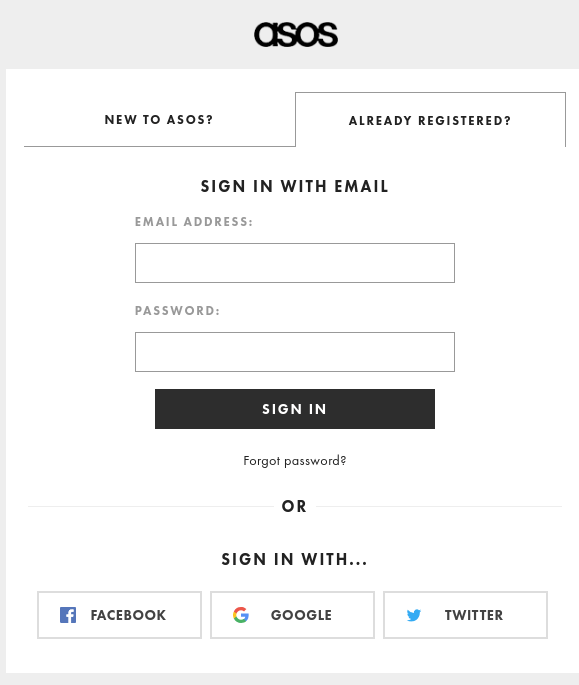
For example, the e-commerce giant ASOS users three different social options at the checkout. Not only will customers be able to log in and start buying with a single click, but you’ll also provide the user an option to share their purchase with friends.
22. Enable a zoom-in option for product images
One of the biggest challenges of an e-commerce store is convincing people to buy a product when they’ve never even seen or touched it. Make it your mission to bridge every gap possible. By giving your customers the option to zoom in on your products, you’re giving yourself a head start.
Product zoom will give your customers a chance to see your products in as much detail as possible, as shown in the image below:
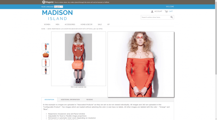
Pro Tip: Make sure your zoom is set to HD so your customer can see as much detail as possible.
23. Have a wish list option
Make sure each product on every landing page has an option to add to a wish list. This can serve as a reminder to a customer who loved a product they never ended up buying. Or entice them to come back to your store when they can afford the purchase.
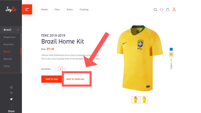
Some e-commerce stores, like Shopify, have a similar “want” button to share an item to a customer’s Facebook feed. This gives your store some free promo as well. A/B Testing different buttons can uncover what works best for your own landing pages.
Landing Page Best Practices = Boosted Conversions
Each industry has its unique way of improving conversions, but they all follow the same key rule: making the customer journey as easy as possible will boost your business’s bottom line.
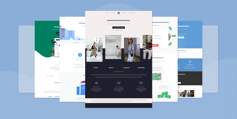
And we’ve shared the top landing best practices in this post that will work for any industry. Also, make the entire process easy by using the best landing page builders.
Want a quick solution? Sign up for a free Moosend trial and explore our drag-and-drop landing page builder to create converting pages.


 Published by
 Published by
