


Exit-Intent Popups: How to Turn Lost Visitors into Leads [2026]
Published By Nikolett Lorincz
March 11, 2025
11/03/25
You’ve poured your heart into your website, fine-tuned your SEO, crafted click-worthy ads, and built something you’re proud of. But then visitors arrive, browse a bit, and leave without signing up or making a purchase.
Frustrating, isn’t it?
Luckily, with the right strategy, you can stop those abandoning visitors in their tracks and turn them into leads and, hopefully, customers.
That’s where exit popups come in.
In this post, we’ll explore how exit forms work and why they’re so effective. We’ll also share real-life examples and actionable tips to ensure your popups are a powerful conversion tool.
What is an Exit-Intent Popup?
An exit-intent popup is a last-chance overlay that appears when a visitor is about to leave your website.
These popups might include discounts, free resources, newsletter sign-ups, or other offers tailored to re-engage the visitor.
For example, an eCommerce store might display a “Wait! Here’s 10% Off Your First Order” popup when a user moves to close the tab, encouraging them to complete their purchase.
How Do Exit Popups Work?
While it may feel like magic, exit-intent popups work by using exit-intent technology to track mouse movements and behaviors.
When the system detects that a user’s cursor is heading toward the browser’s close button or address bar, it triggers the popup.
On mobile devices, instead of tracking mouse movements, exit-intent technology deploys a popup when a user switches between tabs or uses the “Back” button.
Why are Exit-Intent Popups Effective?
Exit popups should be part of your re-engagement strategy, as they target site visitors who are about to leave.
Here are the main reasons why they’re so powerful.
- Recover lost conversions: They give hesitant visitors a reason to stay, whether through a discount, freebie, or reminder.
- Reduce cart abandonment: Offering last-minute incentives helps shoppers complete their purchases.
- Offer personalized engagement: Tailoring popups based on visitor behavior makes them more relevant to their journey.
- Boost lead capture: Encourages newsletter sign-ups by offering exclusive content, discounts, or early access.
- Increase brand value: Show visitors why your site is worth returning to by highlighting benefits or unique offerings.
- Create urgency: Limited-time deals or exclusive offers push visitors to take action before they leave.
Best Exit Popup Examples to Get Inspired
If you’re searching for inspiration, this section has you covered.
Here, we’ll share highly effective exit-intent popup examples from brands that nailed it with their creativity.
1. Hero Pet Health

Hero Pet Health stands out with a fullscreen exit-intent popup that’s hard to ignore.
Why it works:
- Visitors can choose “I’m not interested,” giving them a way out to minimize frustration.
- The orange CTA on a dark blue background makes the button impossible to miss.
- A clear 10% discount encourages visitors to stay and convert.
- The image of the two dogs enhances the popup’s effectiveness.
2. Pixie Wing

Pixie Wing takes advantage of curiosity with a mystery discount popup that keeps visitors engaged.
Why it works:
- The “You’ve just unlocked an exclusive discount” copy makes visitors feel special.
- The CTA button copy is urgent, prompting visitors to engage to reveal the offer.
- White space keeps the design clean, sophisticated, and on-brand.
- The product images enhance the exclusivity of the message.
3. Seoulbox

Seoulbox’s exit popup is another great example of using a conversational popup style to connect with visitors.
Why it works:
- The “What are you most interested in?” copy with options like Korean snacks, K-pop, and K-beauty allows the brand to personalize the experience.
- The product images correspond to the options offered to make the message more appealing.
- The vibrant CTAs attract attention at first glance.
4. The Turmeric Co.

The Turmeric Co. encourages shoppers to complete their purchase with a tiered discount based on cart value.
Why it works:
- The tiered discount strategy (20% off for higher totals, 10% for smaller ones) encourages higher spending.
- A countdown timer adds urgency, pushing users to act before the deal expires.
- The product image of a woman holding the item helps visitors visualize the product in use.
- The personalized CTA copy (“Get My 20% Off!”) feels engaging and action-driven.
5. The Oodie

The Oodie uses a creative twist, featuring a multi-step fullscreen popup.
Why it works:
- Options like “Myself” or “Someone else” add an interactive element, leading to a 10% discount for users who participate.
- The brightly-colored product image featuring a man and woman in the Oodie helps visitors picture themselves wearing the product.
- The “Exclusive App Deals” message in the right corner subtly encourages mobile app downloads.
Overall, this visually appealing full-screen design is on-brand and grabs attention without feeling intrusive.
6. Millie n Me

Millie n Me’s exit-intent popup suggests relevant products to visitors who browse but show signs of leaving without purchasing.
Why it works:
- It displays product images with actual and discounted prices, making the offer more compelling.
- White space keeps the design clean and visitor-friendly despite having multiple elements (images, copy, and buttons).
7. V1CE

V1CE has a simple exit popup that uses key persuasive elements to convert visitors.
Why it works:
- The “Save it before it’s gone” form copy introduces urgency.
- 15% discount on first orders gives visitors a strong incentive to stay and purchase.
- The use of social proof, “7,000+ 5-star reviews,” increases credibility and makes the value proposition more appealing.
8. NOTIQ

NOTIQ strategically uses an exit popup to suggest similar premium planners to visitors about to leave.
Why it works:
- The curated product recommendations are based on browsing behavior to keep visitors engaged.
- The use of white space ensures that the design is easy to navigate.
- Bold “Add to Cart” CTA buttons make purchasing easier for the visitor.
- The consistent branding creates a premium, high-end shopping experience.
9. Obvi

Obvi employs scarcity and urgency to achieve better results during a busy time of the year.
Why it works:
- The Black Friday branding with a 25% off badge highlights the deal.
- The headline, “Sure you want to leave?” followed by “Hurry, stock is limited,” adds a conversational and urgent tone to the message, encouraging visitors to act.
- The high-contrast color palette (black, pink, and white) creates a bold, energetic feel.
- The emojis make the form more unique and playful.
10. Kiss My Keto

Kiss My Keto combines multiple elements to create an attractive cart abandonment popup.
Why it works:
- The countdown timer creates urgency by limiting the offer to 15 minutes.
- It has a casual tone to make the message more engaging.
- The red CTA (“Can’t resist 🥺”) adds personality and nudges users to stay. Plus, the emoji makes it more relatable.
Further reading: Looking for more inspiration? Take a look at these newsletter signup examples.
Tips to Create a High-Converting Exit-Intent Popup
Now that we’ve seen some great exit popup examples, it’s time to create your own form.
1. Craft a compelling offer
Your value proposition is the heart of your exit-intent popup. So, it needs to answer the visitor’s question: “What’s in it for me?”
To make an impact, it should align with your audience’s interests and needs. A generic “Sign up for updates” won’t cut it. Instead, go for something more specific, like “Get 20% off your next order.”
Here are a few ideas for offers that convert:
- Discounts: Discounts remain one of the most popular and effective incentives, from X% off to free shipping.
- Freebies: A downloadable eBook, a free sample, or exclusive resources can add extra value.
- Exclusive access: Granting early access to a sale or membership perks taps into the power of FOMO (fear of missing out).
Pro tip: Keep your copy as short as possible to capture attention quickly and drive action. Since visitors are already leaving, concise copy increases their chances of staying and engaging.
2. Add a clear and strong CTA
Your call-to-action (CTA) is the driving force behind conversions. It needs to be action-oriented, simple, and visually prominent to grab attention and encourage clicks.
Use strong, actionable verbs like “Get,” “Claim,” or “Download” to guide visitors toward taking the next step. Also, ensure your creations stand out with bold, contrasting colors and large, easy-to-read fonts.
To make it even more compelling, pair your CTA with a persuasive subtext, such as “Limited time offer!” or “Don’t miss out,” to create a sense of urgency and excitement.
3. Make it mobile-friendly
With mobile traffic accounting for more than half of web activity, your exit popups need to perform flawlessly on mobile devices.
To do that, you need to keep the design clean and clutter-free, as mobile users prefer quick, to-the-point copy.
To help you out, you can use a form builder tool with mobile-specific editing options to fine-tune the experience for users on the go.

Remember, a popup that’s easy to read and interact with on mobile can make the difference between losing a visitor and gaining a conversion.
4. Delay the appearance of the “X” button
Delaying the exit button by a few seconds is a smart way to encourage abandoning visitors to read your popup’s content before dismissing it. This subtle pause gives them a moment to consider your offer without feeling rushed.
However, it’s essential not to overdo it. A 2-3 second delay strikes the right balance, while anything longer risks coming across as frustrating to your visitors.
This small adjustment can boost engagement and keep the user experience positive and respectful when used thoughtfully.
5. Segment based on visitor behavior or demographics
Not all website visitors are the same, so why should your popups be one-size-fits-all?
Tailoring your forms to specific audience segments ensures they feel relevant and impactful, increasing the chances of conversion.
Here are a few examples:
- You could offer new visitors a warm welcome with an introductory discount to make a great first impression.
- Returning visitors might appreciate loyalty rewards or alerts about restocked favorites.
- If someone abandons their cart, an extra discount or free shipping could be the nudge they need to complete their purchase.
- Asking for feedback on a customer’s experience after a purchase can show that you value their opinion while keeping them engaged with your brand.
6. Ensure quick loading times
Speed matters not just for your website but for your forms too.
A slow-loading popup can be an instant turnoff, and let’s be real, no one has the patience to wait. Optimize your images, remove unnecessary scripts, and avoid bulky designs to ensure nobody gets frustrated.
Also, don’t forget to test how they perform on different devices to make sure everything runs smoothly.
7. Add social proof
Trust is a powerful motivator, and adding credibility to your exit-intent popups can significantly increase their effectiveness.
Consider including a short quote from a satisfied customer to add authenticity. Certifications like “100% Secure Checkout” or “Satisfaction Guaranteed” can reassure visitors about your brand’s reliability.
Metrics such as “Join 10,000+ happy subscribers” provide social proof, making your offer even more compelling.
Remember V1CE’s exit-intent popup? It was a perfect example of including social proof. They highlighted “7,000+ 5-star reviews,” which helped build instant trust and encouraged visitors to take action.
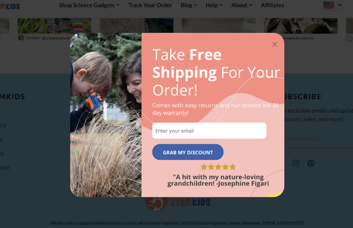
Here’s another example from StemKiDs, which uses a customer testimonial on its form to increase credibility.
Visitors who feel confident in your brand and offer are far more likely to convert.
8. Create urgency
A sense of urgency prompts immediate action. Use time-sensitive language and visuals to create FOMO.
This includes:
- Countdown timers: Show how long a sale or offer will last.
- Urgent copy: “Offer ends today” or “Only 3 spots left!”
- Limited-time deals: Highlight exclusive promotions that won’t last forever.
Urgency motivates visitors to act now instead of postponing their decision and forgetting your site entirely.
9. Run A/B tests
Even the best popup ideas require testing to ensure they deliver results. A/B testing is the key to refining your strategy by comparing different elements to see what resonates most with your audience.
Try testing various layouts, fonts, or color schemes to find the most visually appealing design. Experiment with variations in your headline, CTA, or offer text to discover which messaging drives the most engagement.
You can also evaluate whether your popup performs better when it appears after 10 seconds on the page or is triggered by exit intent.
Lastly, track key metrics, such as conversion rates and revenue generated, to discover the winning combination.
Exit-Intent Popups: Your Last Chance to Win Customers
When everything else fails, exit popups give you one final shot at turning a lost visitor into a loyal customer.
A well-crafted form can recover abandoned carts, boost sign-ups, and turn hesitation into action.
The key? Make it relevant, engaging, and impossible to ignore. Whether it’s a tempting discount, an exclusive offer, or a compelling offer, your popup should give visitors a reason to stay.
Similar Posts
 Published by

 Published by
Create, send and optimize your email marketing campaigns!