
Email CTAs: Best Practices & Examples [2026]
You’ve crafted the perfect subject line, your email copy is engaging and on point—but despite all that effort, conversions are still falling short.
Now, you’re left wondering why your audience isn’t taking that final step.
Your email call-to-action (CTA) could be the missing link. Why? Because, even with great content, your subscribers won’t move from curiosity to action if it isn’t compelling, clear, or well-placed.
In this post, we’ll explore the key elements of effective email CTAs, share examples, and provide best practices to help you turn your audience’s interest into action.
What is a CTA in Email Marketing?
An email call-to-action is a link or button within an email that encourages the recipient to take a desired action. This action can include clicking a link, purchasing, signing up for a service, or downloading content.
The CTA is usually short, clear, and action-oriented, guiding the subscriber toward a goal.
Types of Email CTAs
There are two main types of CTAs to consider, each serving a specific purpose in your marketing campaigns.
Primary CTAs
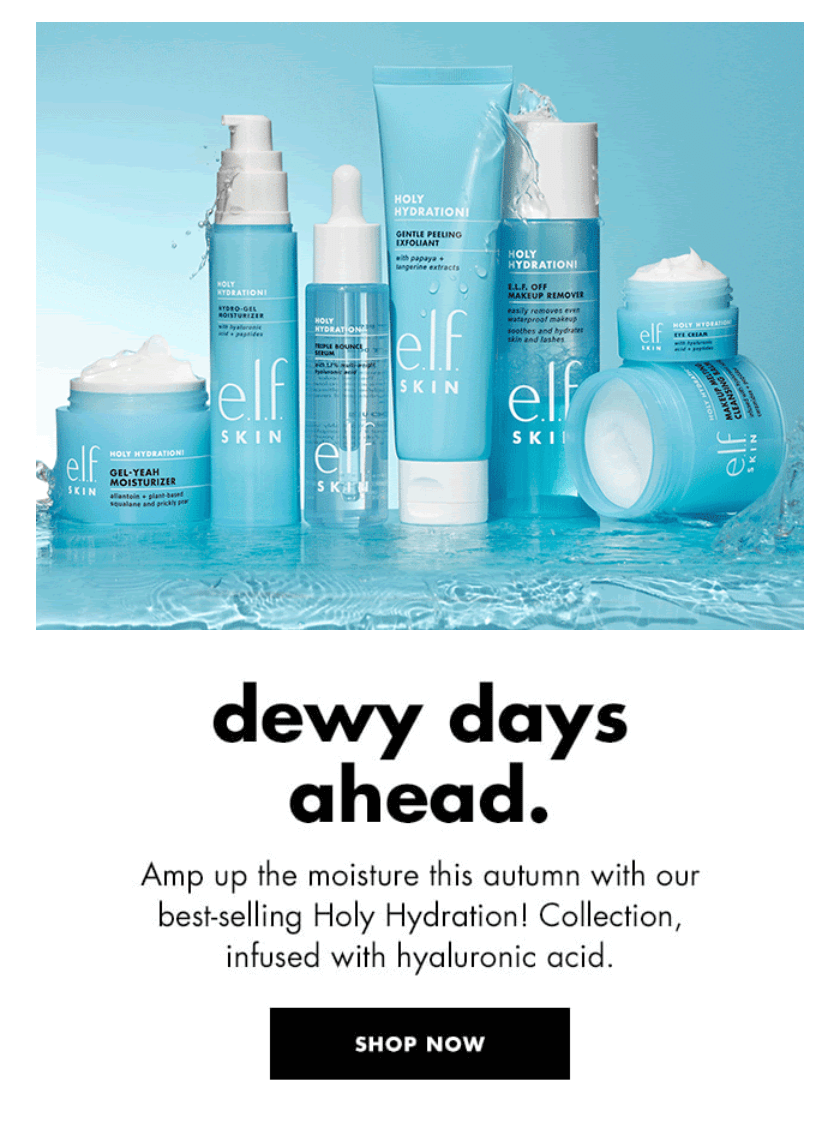
A primary CTA is the main action you want the recipient to take in the email. It’s usually placed above the fold, bold, and stands out in the body to ensure that the recipient notices it.
Purpose: Drive the main objective (e.g., a purchase, signup, or registration).
Example:
Secondary CTAs
A secondary CTA offers an alternative or supporting action for users who may not yet be ready to complete the primary action. It’s usually less prominent but still encourages engagement.
Purpose: Provide a backup option, often for nurturing leads (e.g., learning more, exploring products, and completing profiles).
Example:
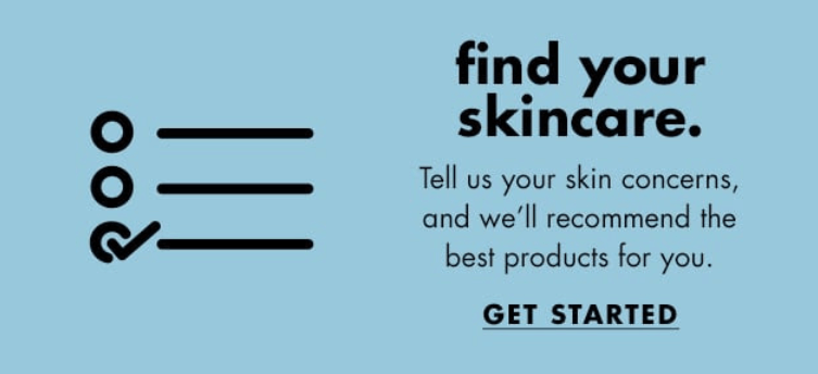
By using both primary and secondary CTAs, you can increase the chances of engagement, offering options for subscribers at different customer journey stages.
Email CTA Styles
There are various CTA styles you can choose from. Let’s see them below.
Bulletproof buttons
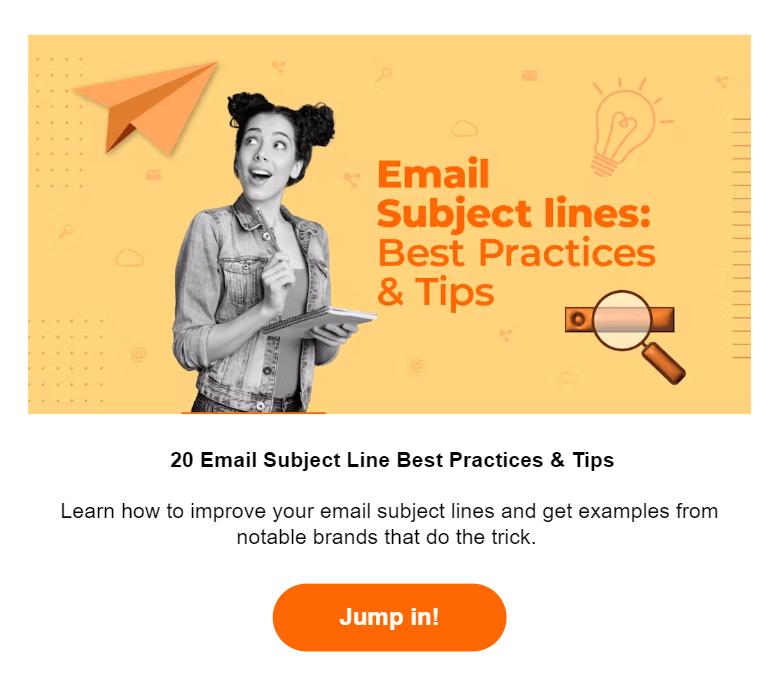
These buttons are created entirely with HTML and CSS rather than images, ensuring they display correctly in all email clients—even when images are turned off.
Here’s an example from Moosend’s newsletter:
Styled text links
These are regular clickable text elements (anchor tags.) They’re enhanced with CSS to make them more visually appealing and stand out from the rest of the content.
Instead of just having plain, underlined blue links, you can style them to match your design and branding.
Here’s one from American Giant:
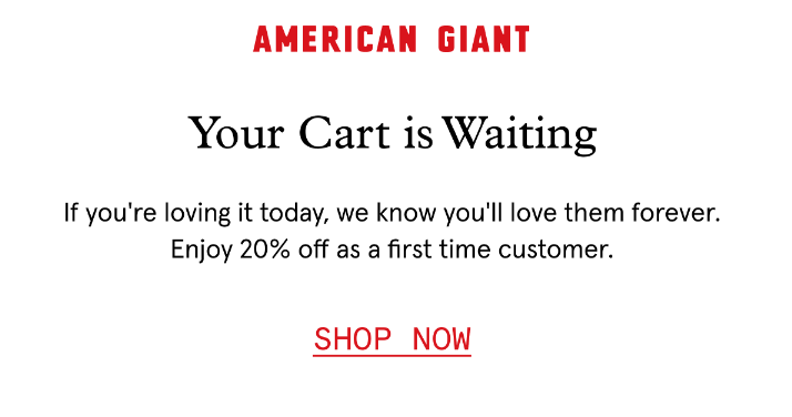
Image CTAs
Unlike bulletproof CTAs, these calls-to-action are clickable images with an integrated button.
The benefit is that it minimizes lost clicks since the recipient will be directed to the website whether they click the button or the image itself.
However, if the image fails to show, subscribers can’t interact with them.
Here’s an image CTA from Tommie Copper:

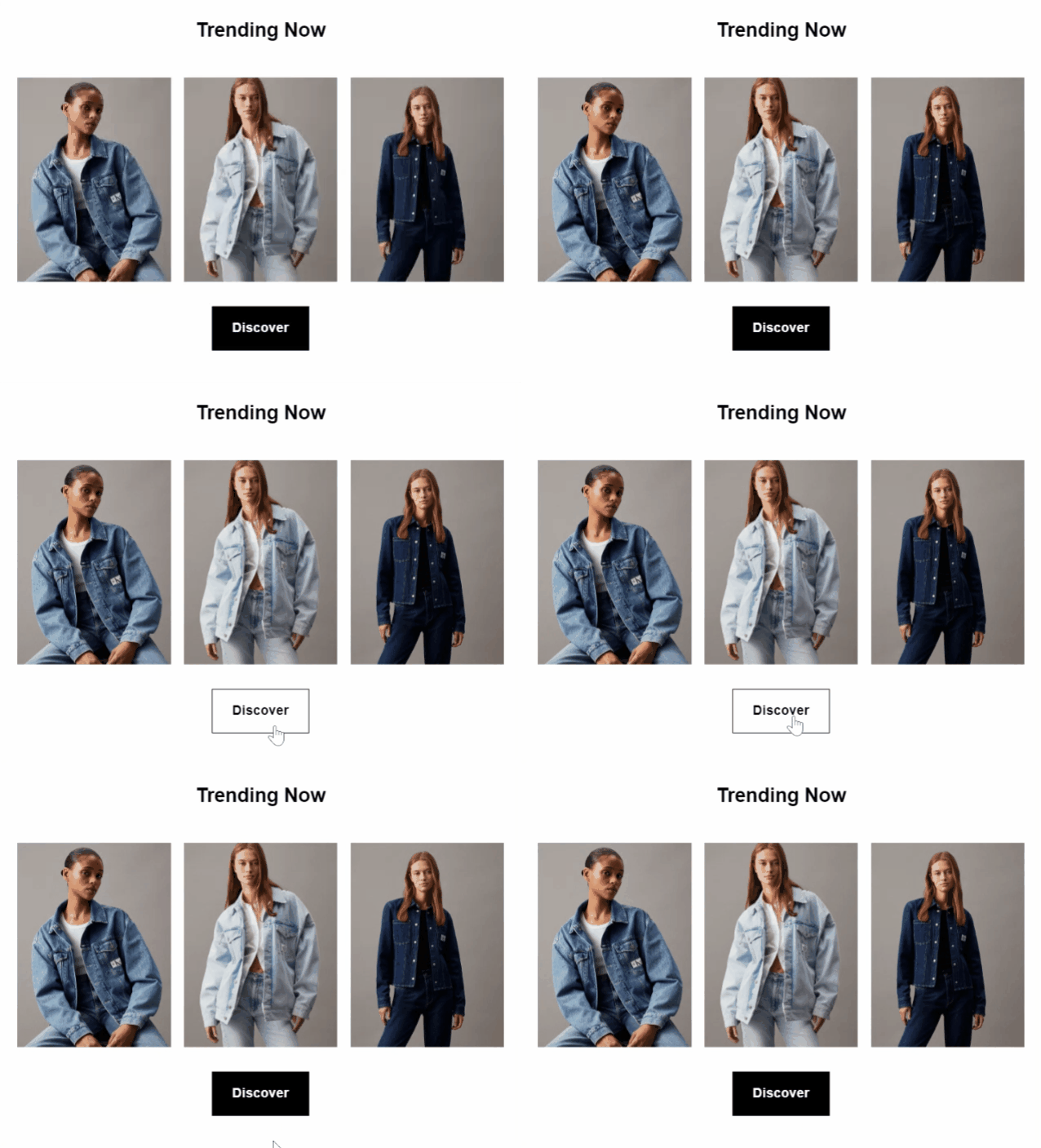
Rollover effect
To make your CTAs more special, you can use rollover effects to change their appearance when a user hovers over them. It can be as simple as changing colors or showing underlines when you hover over buttons or text links.
This effect makes the element clickable, improving user engagement and making the CTA more visually dynamic.
Here’s how Calvin Klein did it:
Email Call-to-Action Examples
Now that we’ve covered the basics let’s look at some powerful email CTA examples that can drive engagement and encourage your audience to take the next step.
1. Newsletter CTAs
These CTAs encourage readers to take various actions, such as exploring products or reading content on a blog.
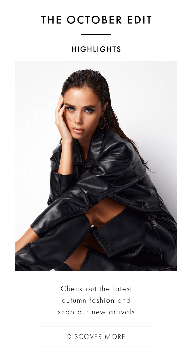
For example, Guess’ “Discover More” call-to-action button invites subscribers to learn more about new autumn fashion arrivals with a minimal button.
More examples:
- Update my preferences
- Get the full recipe
- Get started
- Learn more
- Find out more
- Learn tips & advice
- Read more
- Discover more
- Let’s go
- Read blog post
- Get the checklist
Further reading: Newsletters are the most popular email type to engage your audience. You can visit our newsletter checklist and examples for inspiration.
2. Transactional CTAs
Transactional email buttons guide customers to take further actions after a purchase, like tracking orders or visiting a store.
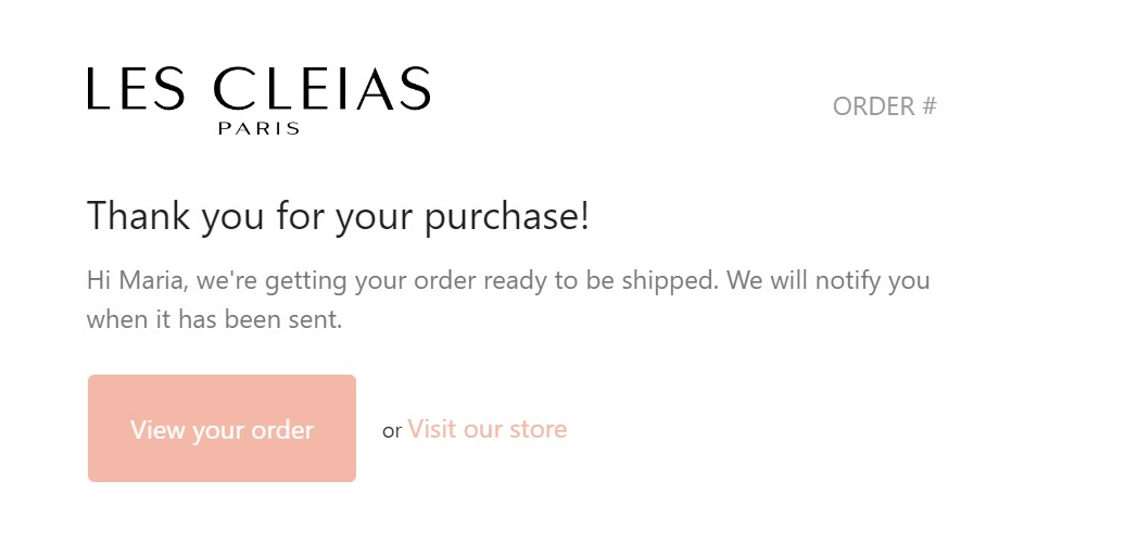
In Les Cleias’ example, the primary CTA, “View your order,” is supported by a secondary text link, “Visit our store,” offering two ways to engage.
More examples:
- Track your order
- View your receipt here
- Download your invoice
- Manage orders
- View subscription details
- Update your payment information
- Check your shipping status
- Complete your order here
- Confirm your booking now
- Redeem your gift card
- Download now
- View purchase history
- Update your delivery address
- Print your return label
- Confirm your details
Tip: Your transactional email campaigns need to be as transparent as possible with clear CTAs to help customers perform post-purchase actions.
3. Ecommerce CTAs
Your CTAs must be direct, compelling, and easy to spot to convert subscribers into buyers.
Bite’s bold “Shop Now” button encourages immediate action, while the copy highlights why customers should click and complete their purchase.

More examples:
- Enjoy X% off
- Buy now
- View the deals
- Shop [women’s/men’s/kids]
- Shop last hours
- Let’s eat
- See more
- Save up to X%
- Shop now to redeem
- Click to reveal
- Browse the collection
- Shop the collection
- Pre-order here
- Shop markdowns
- Shop weekly savings
- Shop early access
- Get X% off
- Join the waitlist
- Find out now
- Shop discounts
- See what’s available
- Preview collection
- Find a shop near you
4. Seasonal email CTAs
Holiday CTAs should be urgent and relevant, encouraging timely action for seasonal promotions.
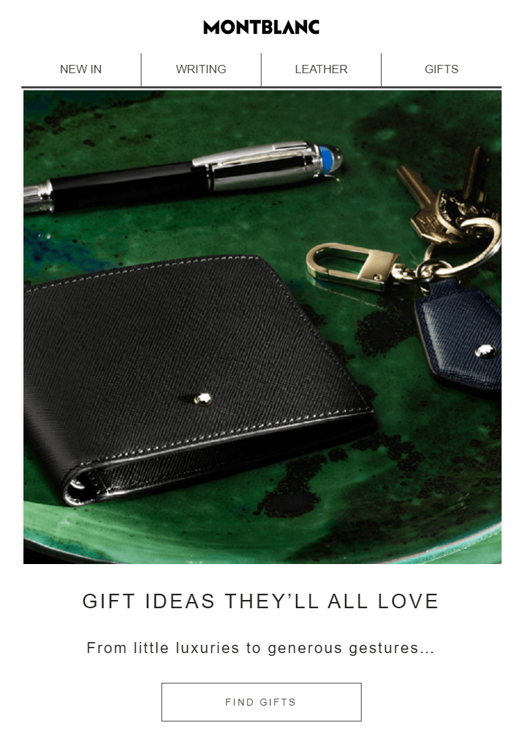
Montblanc’s “Find Gifts” button is perfect for gift-giving occasions, enticing customers to explore a curated selection.
The seasonal copy, “Gift Ideas They’ll All Love,” supports the CTA button and nudges users to shop for thoughtful presents.
More examples:
- Shop Black Friday
- More treats
- Shop Cyber Monday
- Shop the Harvest collection
- Fright this way
- Spooky savings await
- Get your bloody discount
- Gobble up the discounts
- Shop extended savings
- Make Valentine’s Day special
- Show love
- Red, white, and you
- Goodbye, [year]!
- Give a gift
- Shop Christmas
- Shop now with code 12days
- New Year, New You
- Start the year off right
- Celebrate Easter in style
- Last chance for year-end deals
5. Urgent CTAs
CTAs with a sense of urgency are perfect for encouraging potential shoppers to take specific action before time runs out.
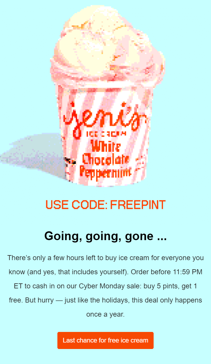
In this limited-time offer, Jeni’s Ice Creams uses a bold button to encourage shoppers to purchase and receive a free item.
The phrase “Going, going, gone…” amplifies their limited time, pushing customers to act fast. The email copy also supports the urgency by giving a deadline and emphasizing that the deal only happens once a year.
More examples:
- Save 15% now
- Shop all out deals now
- Act fast
- Limited stock available
- Don’t miss out
- Final hours
- Don’t wait
- Get it before it’s gone
- Claim your offer now
- Hurry up!
- Going, going, gone
6. Personalized CTAs
CTAs that address the recipient make the message feel more personal to them.
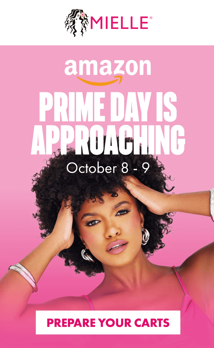
Below, Mielle Organics uses this simple call-to-action button to speak directly to Prime Day shoppers, urging them to prepare for the sale. And all they had to do was add “you.”
More examples:
- Handpicked just for you
- Redeem your offer
- Claim your offer
- Shop your Wishlist
- Find your next favorite
- Explore your picks
- Unlock your deal
Further reading: Personalization is one of the most efficient marketing strategies as it helps you tailor your content to customer preferences. Find out more about its benefits in our dedicated email personalization guide.
7. Event email CTAs
If you plan an online event, you need to give your email recipients the right options to register, find more information, or RSVP.
Below, Hootsuite uses a direct CTA that urges recipients to register for the webinar and gain actionable insights.

More examples:
- Register for the event
- Save your spot today
- Don’t miss out – RSVP now
- RSVP
- Get your ticket now
- Reserve your seat before it’s gone
- Add this event to your calendar
- Book your spot now
- Secure your place today
- Join the webinar
- Register for early access
- Sign up for event updates
- Confirm your attendance today
- Claim your spot before it’s full
8. Cart recovery CTAs
Abandoned cart emails without an actionable call-to-action won’t help you recover lost sales.
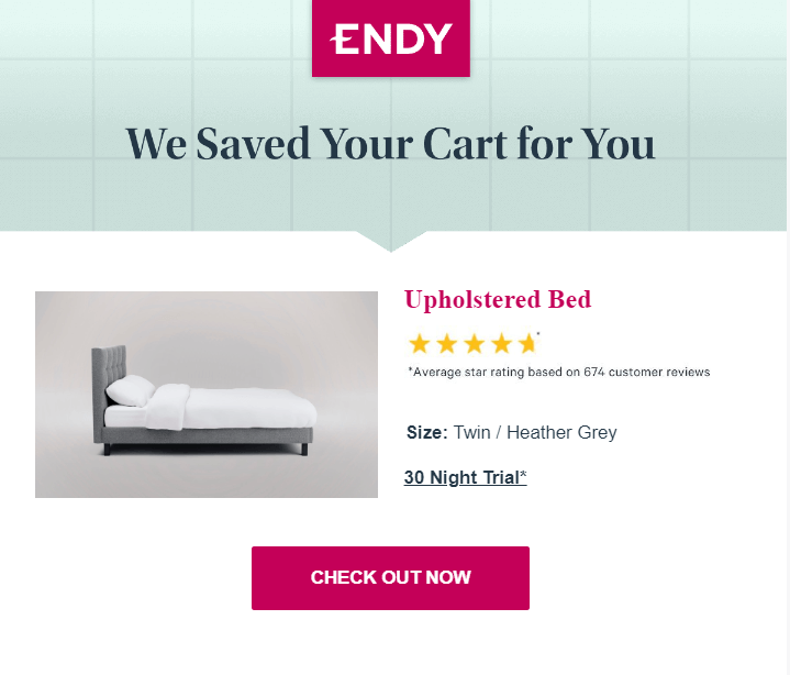
Here, Endy uses urgency (“now”) to get indecisive shoppers to check out. While there’s minimal email copy, the other elements, such as the product image and star rating, support the CTA efficiently.
More examples:
- Finish your purchase
- Almost there
- Complete your order
- Take me back to my cart
- Your cart is waiting
- Checkout now
- Hurry
- Continue shopping
- View my shopping bag
- Continue checkout
- Visit our store
9. Interactive CTAs
Interactive CTAs are ideal for engaging recipients and encouraging direct participation.
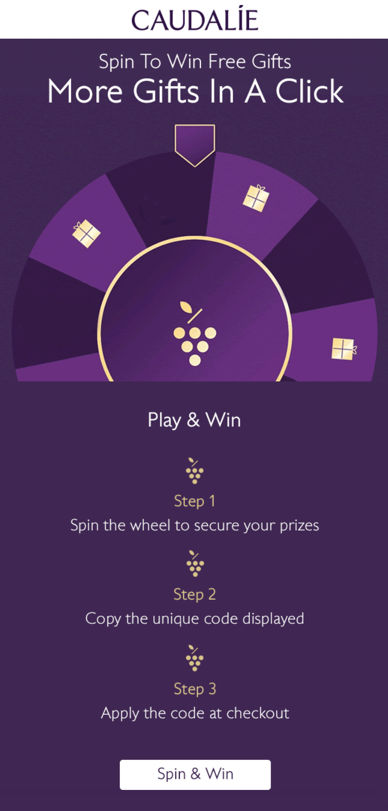
In this example, Caudalie uses a “Spin & Win” CTA to draw users in and offer immediate rewards. Recipients then spin the wheel, copy a code, and apply it at checkout to claim their prize.
More examples:
- Play and win
- Spin the wheel
- Click to see your results
- Find your match
- Test your knowledge
- Join the challenge
10. Customer feedback CTAs
These email calls-to-action encourage recipients to engage by sharing their experiences.
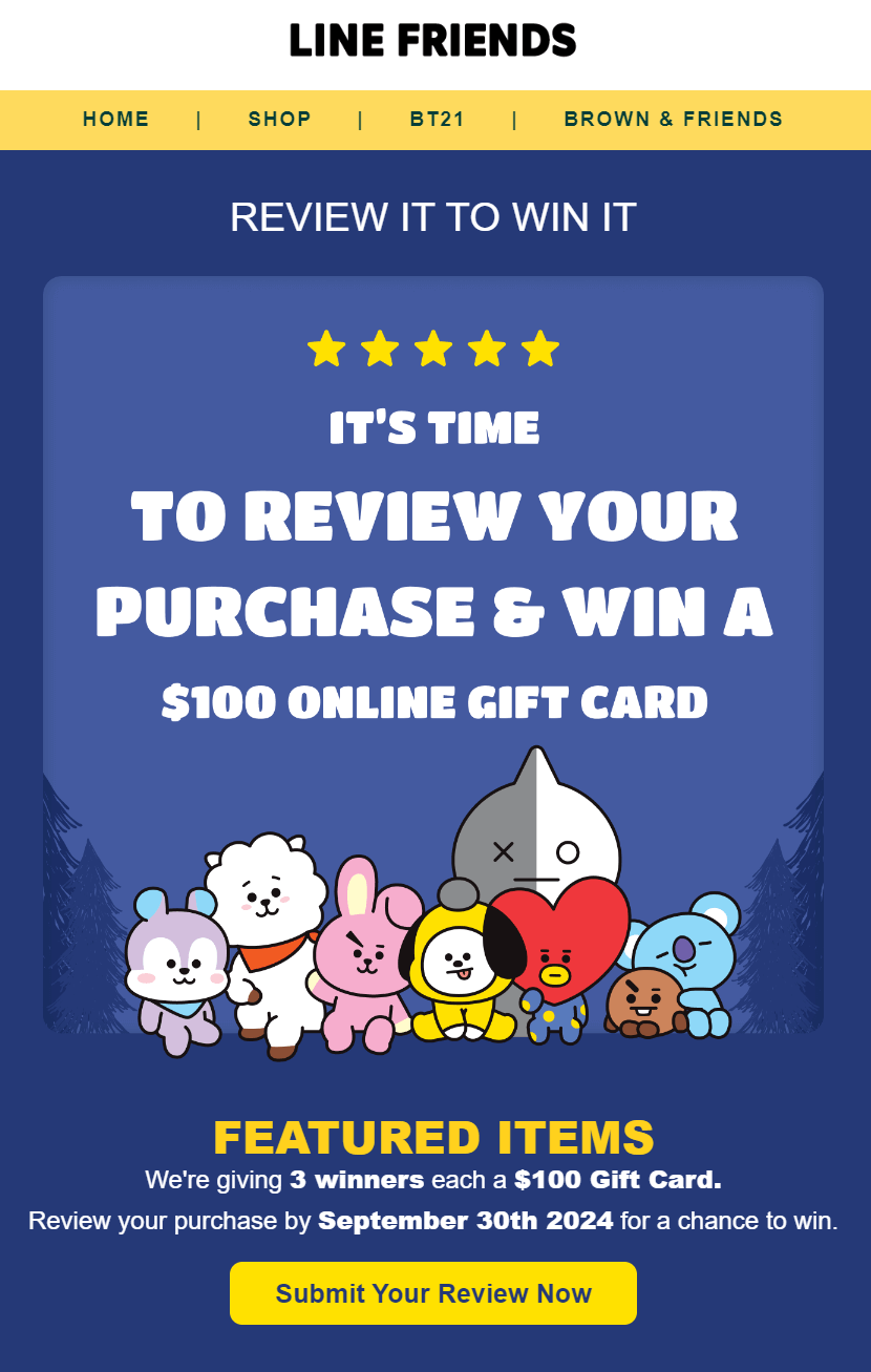
Line Friends invites customers to “Review Your Purchase & Win” by offering a chance to win a $100 gift card. The simple addition of “your” personalizes the request, making it feel relevant and compelling.
More examples:
- Share your thoughts
- Leave a review
- Tell us what you think
- Rate your experience
- Share your story
- Let us know how we did
- Write a testimonial
- Help us improve
- Submit your review now
11. SaaS-specific email CTAs
In SaaS and B2B emails, CTAs usually guide users toward signing up for a trial or demo, downloading a resource, checking new features and updates, and reading new blog posts.
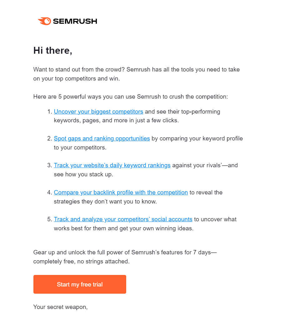
In the following example, SEMrush uses secondary calls-to-action to direct users to its tools. At the same time, the main “Start my free trial” CTA stands out to drive direct conversions.
More examples:
- Start your free trial now
- Get started
- Schedule a demo
- Upgrade your plan
- Explore premium features
- Try it free for 30 days
- Set up your account
- Unlock more features
- Discover what’s new
- Invite your team
- Connect your apps
- Finish your setup
- Manage your subscription
- Access your analytics
- Check out the latest updates
12. Repeat purchase CTAs
To encourage customers to make another purchase, you need urgent and action-driven calls-to-action.
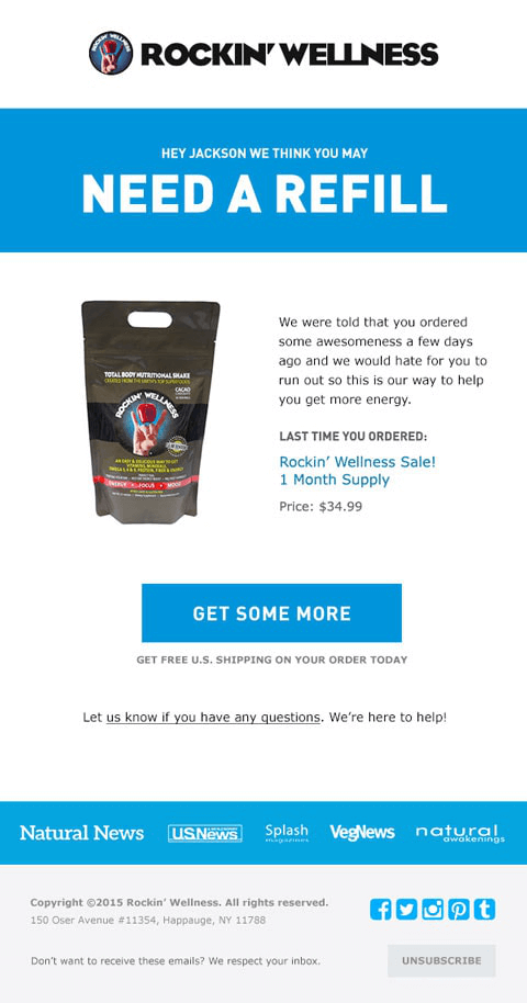
For example, Rockin’ Wellness uses a prominent “Get Some More” CTA to encourage customers to purchase their favorite product again. It also includes a secondary CTA, directing shoppers to find answers to any questions, enhancing the customer experience.
More examples:
- Buy again
- Restock your favorites
- One-click reorder
- Stock up
- Shop again
- Don’t run out
- Refill your cart
- Need more?
- Get it again
- Time to restock
13. Social media CTAs
Social CTAs can be used at the end of campaigns for cross-promotion to boost engagement across channels.
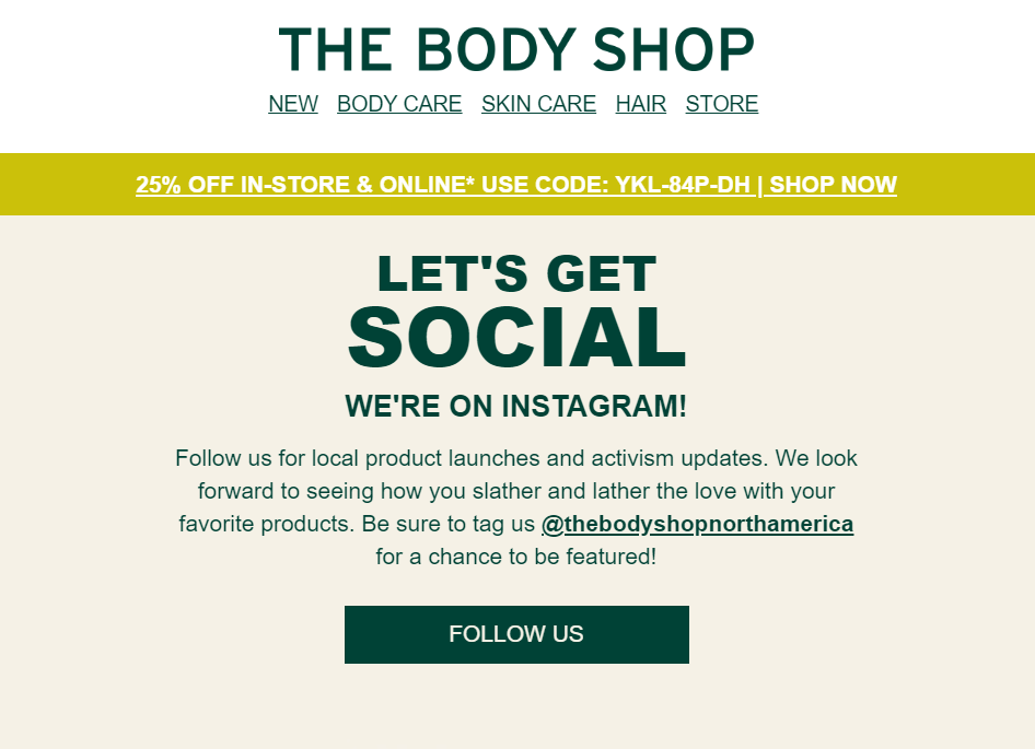
In this example, though, The Body Shop has a dedicated social media email and CTA to encourage customers to follow them on Instagram for updates.
More examples:
- Let’s connect
- Find us on [social channel]
- Tag us in your posts
- Join the conversation
14. Unique CTAs
Out-of-the-box CTAs can intrigue your audience with creative, brand-oriented language that resonates with them.
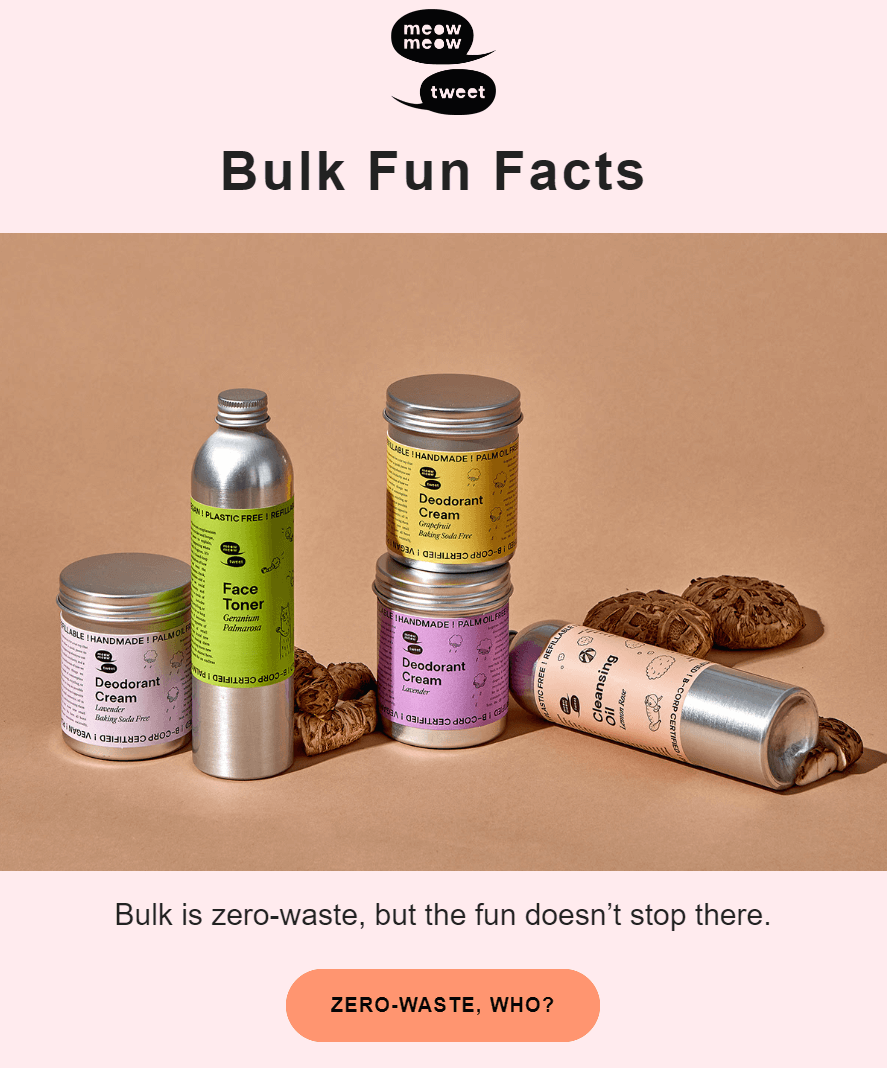
In this example, Meow Meow Tweet uses a playful, pun-filled CTA to encourage engagement, aligning with their eco-friendly values and making the interaction more memorable.
More examples:
- Shop meow
- Go Get’em, Tiger
- Email like it’s 1776
- Egg-citing deals await
- Be a rebel – click the button
- Donut wait
- This deal is on fire
Best Practices for Compelling Calls-to-Action
Effective CTAs require a perfect balance of elements, including copy, color, design, and placement.
Did you also know that the number of CTAs in your email can significantly impact their effectiveness?
Below, we’ll explore how to approach each step to create compelling CTAs that drive results.
Write good CTA copy for your marketing emails
Focus on being concise, valuable, and action-driven. Choosing the right words is important to convey value and convince the potential shopper to act.
Here’s how to ace your CTA copy:
- Keep it short and valuable: Avoid long phrases that can reduce readability. Ideally, your CTA text should be 2-4 words.
- Use action-oriented language: Words like “Get,” “Claim,” “Join,” or “Start” will encourage the recipient to click on the CTA.
- Use urgency: To drive quicker responses, add a sense of urgency with terms like “Now,” “Today,” or “Limited Time.”
- Personalization: Make the CTA more relatable by adding “your,” like “Claim Your Discount” or “Get Your Free Trial.” This creates a personal connection with the recipient, making the offer feel tailored to them.
Here’s an example from Caudalie’s promotional campaign:
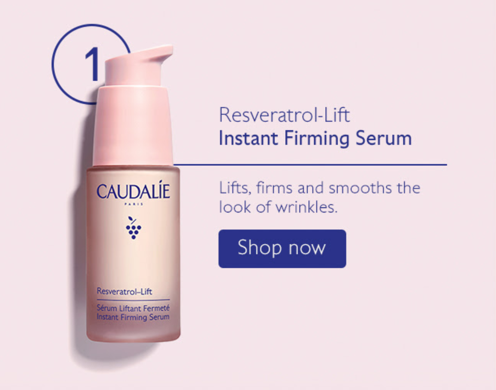
Here, the email copy highlights the product’s benefits, making the CTA more compelling and prompting immediate action. The product’s high-quality image also helps the copy convert the recipient.
In a nutshell, your email content should work together to create a seamless journey for your audience.
The subject line will grab their attention and spark curiosity, the copy will build interest by presenting the value proposition, and the CTA will nudge them to take action.
So, when you plan your CTA, do that with your subject line and copy in mind.
Choose the right CTA Color
The color of your CTA button plays a key role in attracting attention and influencing action.
Finding the right one, though, may be tricky. So, here are some handy tips to consider:
- Use contrasting colors: To make the CTA stand out, select a color contrasting with the background. Bold colors like red, green, or blue work best for light backgrounds.
- Leverage complementary colors: Ensure the CTA color complements your brand. Cool tones (blue, green) can be balanced with warm accents (orange, red).
- Use color psychology: Colors evoke emotions. For example, red creates urgency, green suggests trust and blue conveys reliability.
- Avoid clashing button colors: Don’t use colors that clash with your email design or are hard to read. Overly bright or mismatched hues can confuse users and weaken your CTA’s effectiveness.
If you’re unsure whether your background color complements your CTA or find it hard to decide, go with a white background and the color you prefer for the button.
White is a safe, neutral choice that allows almost any CTA color to stand out effectively. For instance, look at this CTA from The Breakers:

This vibrant green CTA could be hard to pair with another color, but using white space makes it stand out without overwhelming the recipient. It also aligns with the brand logo for a balanced look.
Pick the proper email CTA fonts
Now that you’ve chosen your CTA color, it’s time to select the proper email font and font color to ensure readability.
Select a clean, legible font for your CTA and avoid overly decorative ones that can be difficult to read.
- Font size: Your CTA font size should be large enough to stand out without overpowering the rest of the email. Typically, 16-20 pixels is a good range, but it can vary depending on your email’s overall design.
- Font color: Choose a color that contrasts well with the button’s background color to make it readable. For example, the text will stand out if your button is dark green, white, or light colored.
Ensuring the font aligns with your overall brand identity is also important. If you use specific fonts or styles, maintain consistency in the CTA for a seamless experience.
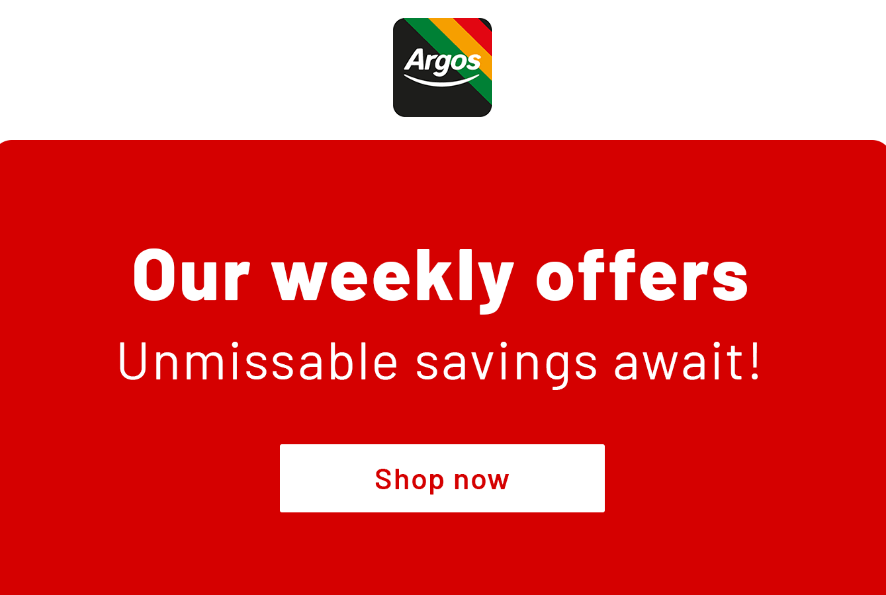
Below, you can see how Argos uses a white button with a red font to make their CTA more visually appealing and aligned with their branding.
Suggested fonts: Sans-serif fonts like Arial, Helvetica, or Roboto work well because they are simple, modern, and easy to read across all devices.
Select design and style
Regarding CTA design, it’s not just about aesthetics—it’s about effectively guiding your audience.
Whether you choose bulletproof buttons or styled text links, the key is to balance style and text without overwhelming the recipient.
- For primary CTAs, Opt for a bold, noticeable button that draws attention and makes it the focal point of your email. This button should stand out visually and encourage immediate action.
- For secondary or supporting CTAs: Make them less prominent by using styled text links or transparent buttons to differentiate them from the primary action.
Now let’s take a look at the following example by Happy Socks:

Do you think this is a good CTA example?
The orange button resembles a divider due to its flat, wide design, blending into the layout. Hence, it lacks the clickable appearance of a typical CTA, making it easy to overlook as a section header.
A more button-like design with rounded edges and clearer text would improve its visibility as a CTA.
A good email marketing platform will provide an intuitive editor to create such CTAs without needing coding skills.
It’ll allow you to easily customize button styles, adjust colors, and choose fonts that match your brand.
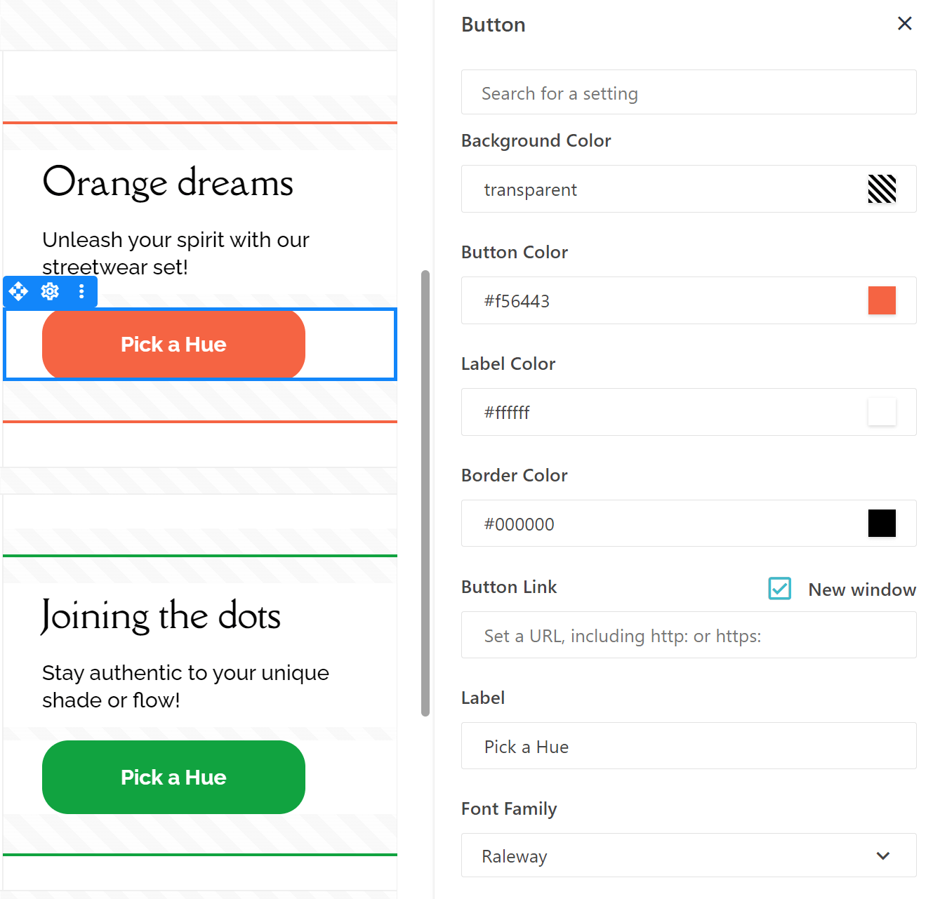
Moosend’s email editor will let you customize colors, fonts, and styles (bold, italics, etc.) to design CTAs that convert your audience.
If you’re ready to try creating your own CTA, sign up for a free Moosend account.
Find the best CTA placement
Did you know that where you place your CTA can make all the difference?
For the best results, place your primary CTA above the fold (upper half of your email) to make it immediately visible.
Also, as we mentioned, positioning your CTA after key information, such as product features or benefits, also helps guide users by providing context before asking them to do something.
Here’s an eye-catching CTA from Master & Dynamic:
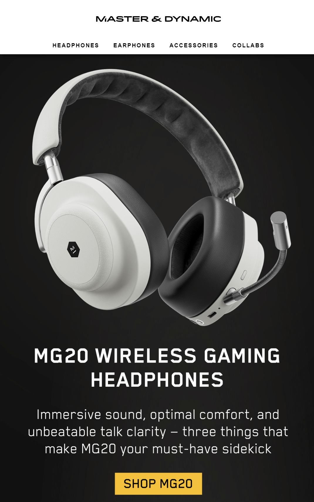
What to avoid: Don’t hide your email CTA at the bottom of a long email without any supporting text or context. Users may never scroll far enough to see it.
If you’re unsure about CTA placement, using email templates can be a great guide, especially when you’re new.
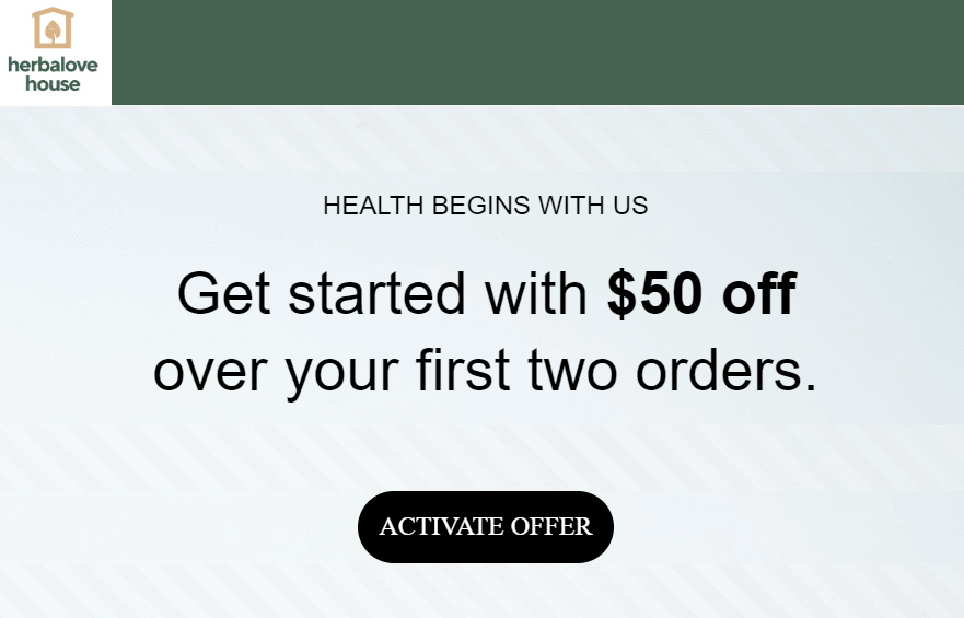
These newsletter templates are created and optimized by professionals, ensuring that your CTAs are placed in positions that drive engagement and conversions.
This way, they can help you follow best practices while giving you room to customize.
Consider the number of CTAs
While you can add as many as you want, focusing on a single prominent CTA prevents overwhelming the reader and keeps their attention on the desired action.
Here’s a chaotic example from Impossible Foods.
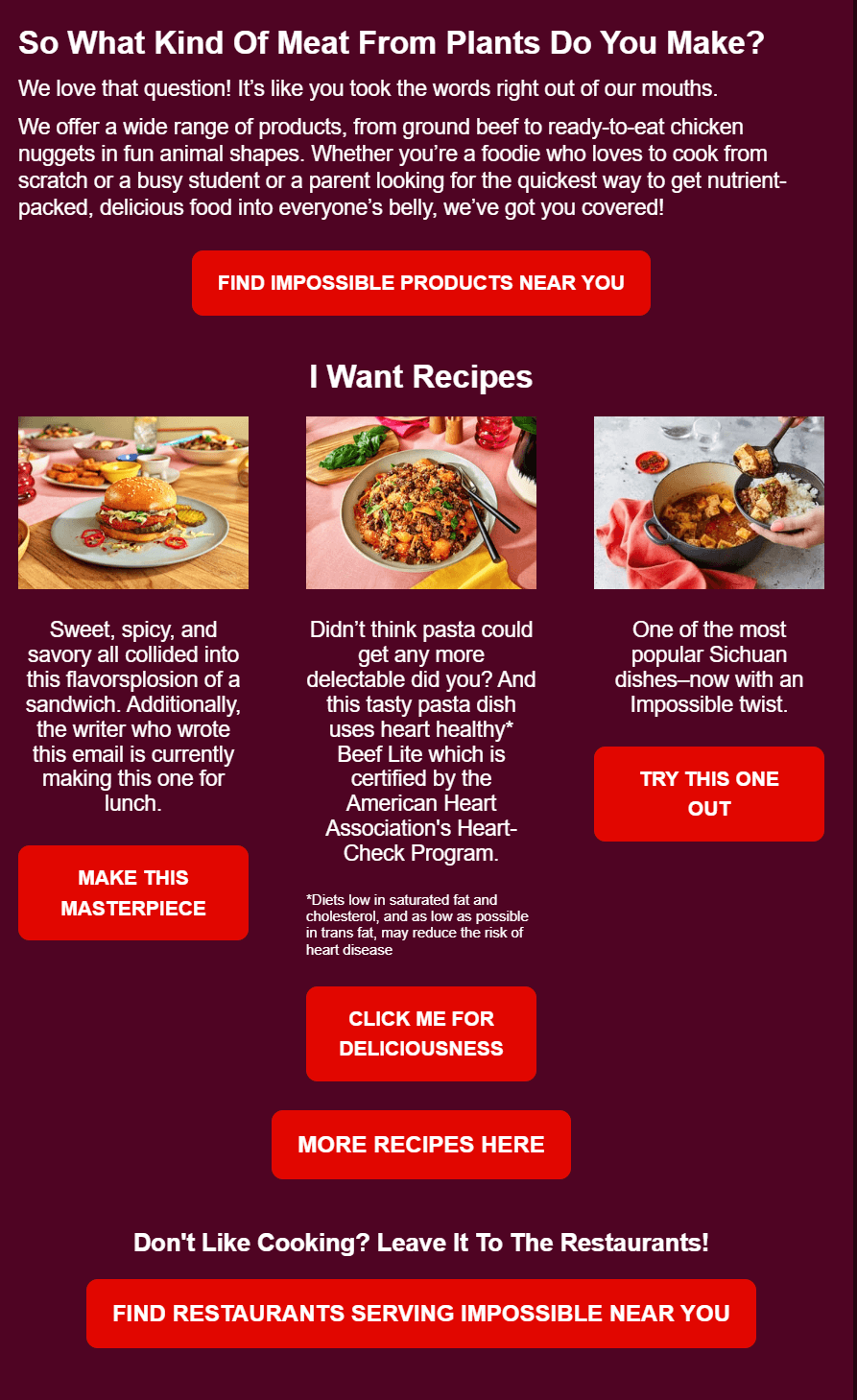
In this email marketing campaign, too many elements are competing for attention, leaving the subscriber unsure of what to do next.
While tempting, use secondary CTAs sparingly, ideally below the fold and in-text link format, to minimize clutter.
Tip: The ideal CTA setup is one above the fold for eager customers and a duplicate at the end for hesitant shoppers. In longer emails, duplicate buttons ensure everyone has a chance to take action.
Set up the destination URL
With your CTA ready, it’s time to add the final element: your destination URL.
This is where your CTA button or link directs your recipients after they click. It’s crucial that the destination aligns with the CTA’s intent—whether it leads to a landing page, sign-up form, blog post, or other targeted destination.
The goal is to ensure the user lands exactly where they expect, with minimal friction.
When implementing destination URLs, consider adding UTM parameters to track the performance of your email campaigns. UTM parameters are tags you add to your URL that provide additional information for tracking in platforms like Google Analytics.
Here’s how URLs with UTM parameters look like:
In this example:
- utm_source=email specifies that the traffic comes from an email.
- utm_medium=email identifies the medium as email marketing.
- utm_campaign=fall_promo tracks this particular email campaign (e.g., a fall promotion).
- utm_content=cta_top helps differentiate between CTAs (e.g., a CTA at the top of the email).
Optimize your CTA buttons
A/B testing allows you to experiment with different elements of your CTA to find the most effective combination.
- Copy: Test different action words to see which results in the highest click-through rates (CTR).
- Color: Experiment with color combinations (contrast or complementary) to determine what grabs your audience’s attention.
- Design: Try different design elements, such as button shapes, borders, or fonts, to find the most engaging options for your users.
- Placement: Compare placement effectiveness, testing above-the-fold versus below-the-fold or at the end of the email.
CTA optimization will help you identify the winning variation that maximizes engagement and conversions.
Keep mobile devices in mind
Since many users access emails via smartphones, ensure your CTA buttons are mobile-friendly.
Use larger, tappable buttons that are easy to click on small screens, and test how they render on different devices. Avoid placing CTAs too close to other elements to prevent accidental clicks.

Platforms like Moosend offer mobile previews to ensure your emails look good across devices.
You can use the feature to perform certain optimizations without changing your desktop version. This way, everyone is happy, and you don’t miss any conversions due to a bad CTA.
TL;DR
Didn’t read everything? Here’s the shorter version with the do’s and don’ts you need to keep in mind when building your call to action.
Dos
- Put your CTA above the fold so people see it even if they don’t scroll through your email.
- Keep your CTA copy concise—ideally 2-4 words.
- Use action-oriented language like “Get,” “Claim,” “Join,” or “Start.”
- Test mobile optimization to ensure your CTA is tappable and readable on all devices.
- Test your CTA for color contrast and visibility against the background.
- Use complementary or contrasting colors for your CTA to make it stand out.
- Ensure your CTA reflects the value of the action or product being offered.
- Use a clean, legible font for your CTA that aligns with your brand.
Don’ts
- Don’t use misleading copy. Be creative, but ensure the text accurately reflects the action readers will take or the result of that action (e.g., “Download Now,” “Save 20%”).
- Don’t overcrowd your email with too many CTAs. Focus on one prominent action.
- Don’t forget to consider font size and readability. Avoid overly decorative fonts that are hard to read.
- Don’t use clashing or hard-to-read colors for your CTA that might confuse users.
- Don’t overcomplicate your CTA’s design. Keep it simple and clean to avoid distraction.
- Don’t hide your CTA at the bottom of a long email without supporting text or context—users may not scroll far enough to see it.
- Don’t ignore your destination URL. Ensure it’s relevant to the CTA action and leads to the right place.
Quick Checklist: Best Practices for Effective Email CTAs
Here are a few questions to ask yourself before you send your emails.
- Is your CTA short enough to be easy to read?
- Does your CTA stand out from the rest of the email design (via color, contrast, or size)?
- Have you tested placement—above the fold or further down?
- Is the CTA action-driven (e.g., “Get Started,” “Claim Your Offer”)?
- Does the CTA reflect the value of the action or product being offered?
- Is the CTA mobile-friendly and easy to tap on small screens?
- Is there any ambiguity in your CTA copy? Is it clear what will happen when clicked?
Crafting Compelling CTAs for Your Emails
Your email’s CTA is the bridge between engagement and conversion.
Whether you’re aiming to drive sales, gather sign-ups, or boost interactions, mastering the elements of your CTA—copy, color, design, and placement—ensures that your email is compelling and actionable.
By strategically choosing a balance between primary and secondary CTAs, placing them thoughtfully, and refining them through A/B testing, you can create effective calls to action that will grab your reader’s attention.
Now, it’s time to implement these best practices and improve your marketing efforts. And if you need a hand, try Moosend’s email editor to easily design and test effective CTAs to drive results.
FAQs
You’ll find answers to common CTA-related questions for your email marketing strategy here.
1. How many CTAs are too many?
Limiting your email to one primary CTA is best to avoid overwhelming readers. If needed, you can add a secondary CTA, but multiple prominent CTAs can confuse users and reduce conversions. Focus on guiding your audience toward a clear action.
2. What metrics are associated with CTAs?
Key metrics to track for CTAs include click-through rate (CTR), which shows how many recipients clicked on your CTA, and conversion rate, which measures how many completed the desired action after clicking. Additionally, you can track bounce rate, engagement time, and A/B testing results to fine-tune your CTAs.
3. Does segmentation affect how you make your CTAs?
Segmentation allows you to tailor CTAs based on the target audience’s preferences, behaviors, or demographics. Personalized CTAs resonate more with specific segments, increasing relevance and engagement. For example, you might use different CTAs for new customers versus returning customers to align with their journey.
4. What kinds of CTAs work best with automated emails?
Action-driven CTAs that align with user actions work best in email automation. Examples include “Finish Your Order” for abandoned carts, “Update Your Preferences” in re-engagement campaigns, or “Claim Your Offer” for exclusive deals sent after a purchase.


 Published by
