
How InsuranceMarket Creates Advanced Email Performance Reports with Moosend’s API & Google Data Studio
Using powerful reporting and analytics is one of the best ways to keep track of your digital marketing efforts.
Not only that but collecting insightful data enables you to predict their next move and plan for the future, monitor email performance, and help you make better business decisions.
Keeping track of your engagement is crucial. But did you know that you can take your reporting to the next level with a few simple steps?
In this post, you will learn how you can use Moosend’s API to automatically build and update informative dashboards that generate data-informed insights. Let’s see!
How To Create Custom Reporting Trends

As mentioned above, creating email reports will let you track important email marketing metrics, including your:
- Open rates
- Click-throughs (CTR)
- Conversions
- Unsubscribes
Now if you are familiar with Moosend’s Custom Reports you probably know that there is no widget that shows the trend of a metric over a period of time (weekly, monthly, yearly).
Thankfully there’s a simple solution to do it until the actual feature rolls out!
Moosend’s comprehensive API will allow you to extract the data you want and build the report/dashboard you need.
To show you how it’s done, we are going to use Insurancemarket’s simple and efficient solution that everyone can replicate.
Ready to create your personalized dashboard to keep your data organized for easier monitoring and sharing? Let’s do this!
Step 1: Find Your Moosend API Key & Create A Google Apps Script
The first step is to open a new Google Sheet and then go to “Extensions.” Then, you need to click on the “Apps Script” option as you can see in the image below:

A new window will open and you will be transferred to the Apps Script platform.
Here, you need to copy and paste the following code as seen below:
</pre>
//made with <3 by insurancemarket.gr
function getData() {

let apiEndpoint = 'https://api.moosend.com/v3/campaigns.json?pageSize=2000&apikey=YOUR-API-KEY';

//Get the results from the API Call
let results = UrlFetchApp.fetch(apiEndpoint).getContentText();

//Parse the results from the API Call
let json = JSON.parse(results);

//Get the Campaign Data
let campaigns = json.Context.Campaigns;
let resultArray = [];

for (let i = 0; i < campaigns.length; i++){

resultArray.push([campaigns[i].Name, campaigns[i].TotalSent,
campaigns[i].UniqueOpens, campaigns[i].UniqueLinkClicks,
campaigns[i].RecipientsCount, campaigns[i].TotalComplaints,
campaigns[i].TotalUnsubscribes, campaigns[i].DeliveredOn])
}
return resultArray;
}
<pre>
Before you proceed, make sure that you change YOUR-API-KEY (found under “let apiEndpoint =” with your own API key. This is important to make it work so double check before you proceed.
Moreover, if you’re having trouble locating your Moosend API key, the following image will help you find it.
All you have to do is log in to your Moosend account and click on the “Settings” option on the top right corner.
Your API key can be found under the “API Key” tab on the left side menu. Click on it, hit copy, and then replace it in the above code.

After that, you need to save the script.
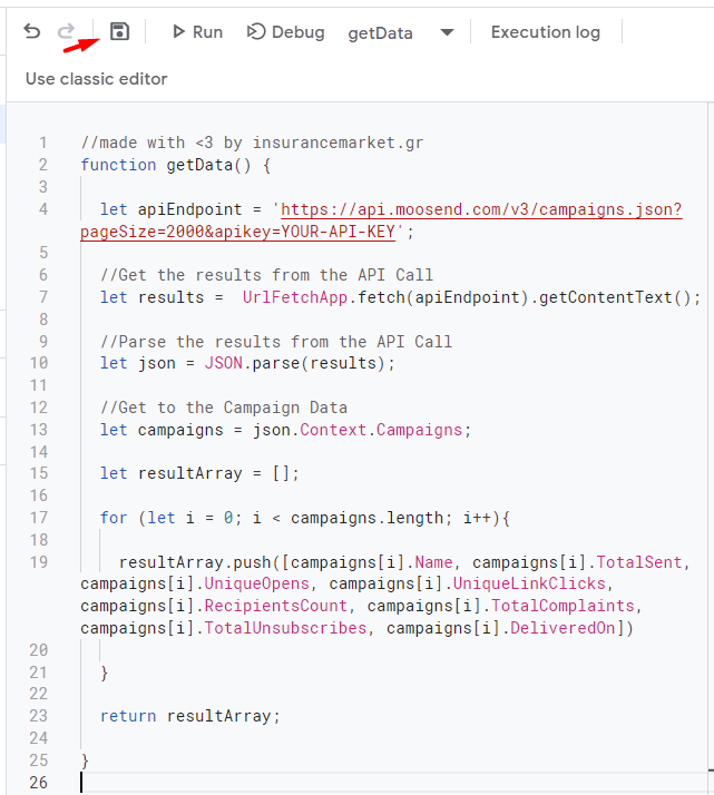
Now you are ready to move on to the next step.
Step 2: Call Your Script Through Google Sheets
After you save your script, go back to the Google Sheet you created. There you need to call your script using the function name you gave it. Here, the name used is “getData().”
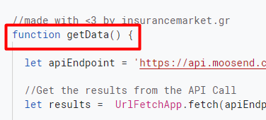
To fetch your data, you have to add the name of the function in a cell.
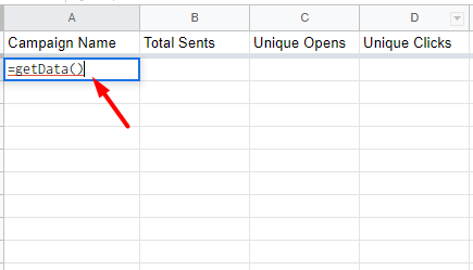
Then, the sheet will be populated with the campaign data you have. As you can see below, the total sends, opens, click, recipients, complaints, and unsubscribes are presented:

Now let’s move on to the third and final step.
Step 3: Visualize Your Data With Data Studio
Now that you have all the data, you can create your own data visualization.
In this example, we wanted to know the monthly trend for Open Rate% and the monthly trend for Total Emails Sent for the last 2 years. Using this representation, you can identify dips and peaks in your campaigns and optimize accordingly.
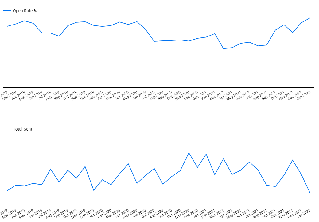
So to visualize the data you will need to use Data Studio and create a new report. Then, click on the “Resource” and select “Manage added data sources.”

Here, add the Google Sheet you created above to start the visualization process.
You need to select the spreadsheet and the worksheet where you extracted the data and click the 2 checkboxes:

And that’s all you need to create data visualizations using Moosend’s API and Google Suite!
Data Studio is the perfect tool to create whatever you need to simplify your reporting.
Custom Report Dashboard DIY
Finding solutions to common problems is essential for streamlining your email marketing efforts. With simple tools and Moosend’s API, you can easily create data visualizations to nail your reporting.
If you’re already using Moosend, you can give this process a try and let us know how it worked for you! If not, why not join us and see what Moosend and you can achieve together?




 Published by


