
Waitlist Landing Page: Examples & Best Practices
Building anticipation and capturing early interest is key for the successful launch of a product, service, or feature. That’s where waitlist landing pages come in.
You might think that these pages are just placeholders. The reality is that they are powerful tools to generate excitement, build trust, and gather leads before your product or service goes live.
But building a great waitlist landing page is no simple task if you don’t know what to include and what strategy to follow.
In this blog post, we’ll showcase standout examples of waitlist landing pages to get you inspired and break down best practices for creating your own.
From Template to Live in Minutes
Create professional waitlist landing pages without breaking a sweat.
Try MoosendWhat is a Waitlist Landing Page?
A waitlist landing page is a web page designed to generate interest and build anticipation for a product, service, or event that hasn’t launched yet. Its primary goal is to encourage landing page visitors to sign up and join the waitlist to be the first to know about what you’re offering once it launches. Waitlist landing pages are often also called coming soon landing pages or pre-launch landing pages.
Apart from new products, features, or services, a waitlist landing page can be used for:
- Early access to discounts
- Launching a website, webinar, or course
- Events and conferences
- Physical store openings
- Ebooks or whitepapers
- Beta testing
Now let’s see what components an effective waitlist landing page must have.
Essential Elements of a Waitlist Landing Page
To build a great waitlist landing page that captures attention and creates excitement, you need six key elements:
Unique value proposition
A compelling value proposition is the foundation of any successful waitlist landing page. It communicates the benefit of your upcoming product, service, or event and why potential customers should be excited about it. Instead of just stating what it is, focus on what it does for the user—whether it solves a problem, improves efficiency, or offers an exclusive advantage that competitors don’t.
For example:
- a SaaS tool might highlight how it saves time by automating a tedious process.
- a consumer product could emphasize its premium quality, innovative design, or limited availability.
- a conference or webinar might promote exclusive speaker access, networking opportunities, or early-bird pricing.
- a membership program could highlight VIP perks, special discounts, or early access to new content.
Your value proposition should be concise, benefit-driven, and aligned with your target audience’s needs. Pair it with a compelling headline and subheading to instantly capture attention. The more clearly you define your product’s unique benefits, the more likely visitors are to join your waitlist, eager to be among the first to access your offer.
Waitlist value proposition
Your product, service, or event may be great by itself. However, people need a reason to provide their email address and join the waitlist. The best waitlist landing pages create a sense of urgency, exclusivity, or reward to drive signups.
To incentivize users, consider offering:
- Early access
- Special pricing
- Exclusive content
- VIP perks
- Behind-the-scenes information
- Limited spots
For example, a SaaS company could promise beta access or a discount for early adopters, while a consumer brand could offer limited-edition products or behind-the-scenes previews.
Your messaging should clearly state, “Here’s what you get by signing up.” so that your waitlist feels valuable. Pairing this with a persuasive call-to-action (CTA)—like “Join Now for Exclusive Perks”—encourages immediate action and maximizes conversion rates.
Inspiring visuals
High-quality, purposeful visuals are essential to attract attention as well as reinforce your product’s value and brand identity. Strong visuals create anticipation, making users more likely to join your waitlist. They also act as proof that the product is actively being worked on.
A sleek, minimalistic design might appeal to professionals, while bold, vibrant imagery can energize consumer-focused products.
Your coming soon page can include:
- Product mockups or prototypes
- Lifestyle images showing the product in real-world use
- Countdown timers
- GIFs
- Animations
Compelling Call-to-Action (CTA)
Since what you’re promoting isn’t ready to launch yet, your CTA button should clearly communicate that visitors are signing up for a waitlist rather than gaining immediate access. Instead of a vague phrase like “Get early access,” opt for precise wording such as “Join the waitlist for early access” or “Sign up to be the first to know” to set the right expectations.
Additionally, CTA buttons should be visually distinct, easy to spot, and placed strategically throughout the page to maximize conversions. Use contrasting colors to make them stand out and ensure the surrounding copy reinforces what users can expect after signing up.
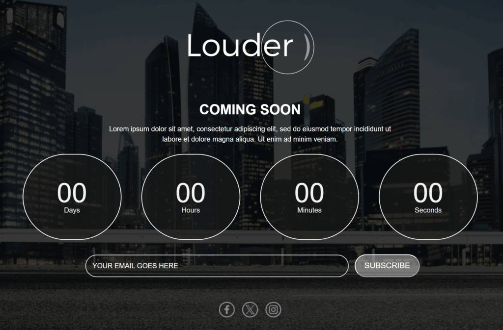
Deadline/launch date
The deadline or launch date helps create a sense of expectation and urgency. People will be eager to know when to expect your product or service or when it will become available.
Sometimes, providing an exact date for the product launch may be difficult. In these cases, you can opt for a rough timeframe of completion.
You can also use this as a benefit to encourage sign-ups. Let visitors know that by joining the waitlist, they’ll be the first to receive updates—no need to keep checking back. Phrases like “Be the first to know” or “Get launch updates straight to your inbox” can make signing up feel more valuable.
Social sharing buttons
Incorporating social sharing buttons in your waitlist pages can help make your page go viral. If your offer really stands out, people will want to share it with their friends and family.
Social sharing buttons are also a great way to build hype around the new product or service. With this strategy, your waitlist subscribers do the marketing for you while you prepare for the upcoming launch.
Bonus: Social Proof
This is a bonus element that you may be able to include in your waitlist landing pages. If you have feedback or other kinds of social proof (e.g., acquired through beta testing), you can include it in your pages to enhance credibility.
8 Effective Waitlist Landing Page Examples
Now, let’s explore 8 of the best waitlist landing page examples we found to inspire your designs.
1. Made In
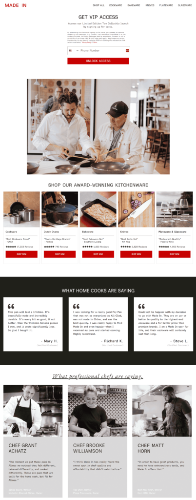
Here, we have a waitlist landing page from the cookware brand Made In. This is a prime example of how you can create excitement for a new product, showcase its limited-edition nature, and make people “fall in love” with the product before it even launches.
What works in this landing page example:
- Clear and compelling headline (GET VIP ACCESS) that immediately signals exclusivity.
- Strong value proposition with early access to a limited-edition item. High-quality visuals of the product with the popular chef make the offer feel premium and desirable.
- Frictionless sign-up form. The only field required is a phone number making it quick for users to join the waitlist.
- Bold and clear CTA (“UNLOCK ACCESS”) that drives action.
2. GetResponse

Here, we have a pre-launch landing page from GetResponse teasing the upcoming content monetization platform. We chose this campaign because it effectively highlights the value of the new service through clever messaging and the strategic use of headline colors.
What works in this landing page example:
- The first part of the page emphasizes early access, and the subheading reinforces the value proposition by mentioning key features (AI course creator, paid newsletters).
- Brief “hero video” that explains the platform visually.
- Important details stand out (e.g., CTAs, features at no extra cost for early birds, early bird pricing).
- Clever messaging that targets major pain points (monetization, automation, ease of use).
3. Miro

This is a coming soon landing page from Miro teasing their new feature “Intelligent Canvas”. We liked this landing page example because it is clean, to-the-point, and doesn’t tire the visitor. It’s also easy to create a similar landing page template for your business.
What works in this landing page example:
- Well-structured layout makes it easy to skim and digest information.
- Strategic use of white space to make the page professional and visually appealing.
- Focus on the visual side. The video section is large to ensure people watch it.
- Each section connects a feature with a tangible benefit.
- CTAs are repeated throughout the page to capture sign-ups at multiple touchpoints.
4. Anterior
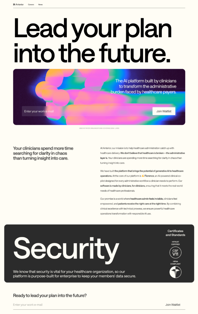
This waitlist landing page example is from Anterior. It is a highly effective page because it combines clarity, exclusivity, and a strong value proposition to drive sign-ups.
What works in this landing page example:
- Action-driven headline that targets decision-makers. It establishes an innovative brand image.
- Modern visual design with futuristic gradient background to reinforce the innovation and AI theme.
- Clear explanation of the product (“Florence, an AI-powered clinical co-pilot”)
- Security & Compliance section emphasizes enterprise-grade data protection and builds confidence.
5. Runway
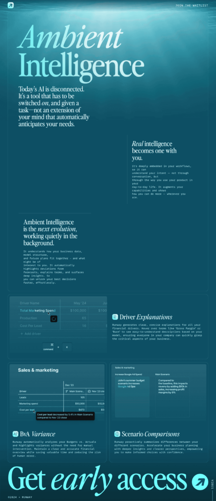
Here’s another great example from Runway. The page is visually striking and creates a futuristic, immersive experience. It excels in storytelling, branding, and evoking curiosity, but there are areas where clarity and conversion optimization could be improved.
What works in this landing page example:
- Immersive page design that reinforces the idea of AI working in the background, which is the product’s core concept.
- Interactive feature highlights that provide a realistic look at how the AI works.
- Well-placed CTA that stands out and promotes exclusivity.
What could be improved:
💡 Add a bullet-point list or small section detailing what waitlist members get (e.g., early product access, exclusive insights, beta testing opportunities).
💡 The large CTA at the bottom is great, but there should be a mid-page reminder CTA to capture users as they scroll.
6. Wand

Here we have a great coming soon page from Wand. It has great visual storytelling and presents the product as a simple solution to eliminate customer pain points.
What works in this landing page example:
- Powerful heading with a subheading that offers a concise explanation of the tool’s magic.
- The page guides visitors through the whole product experience in a simple yet appealing way.
- The “See How People Use Wand” section showcases real-world applications, making the tool relatable and trustworthy.
What could be improved:
💡 The landing page copy could create more FOMO with phrases like “Be the First to Try” or “Limited Spots Available.”
7. Teachermatic
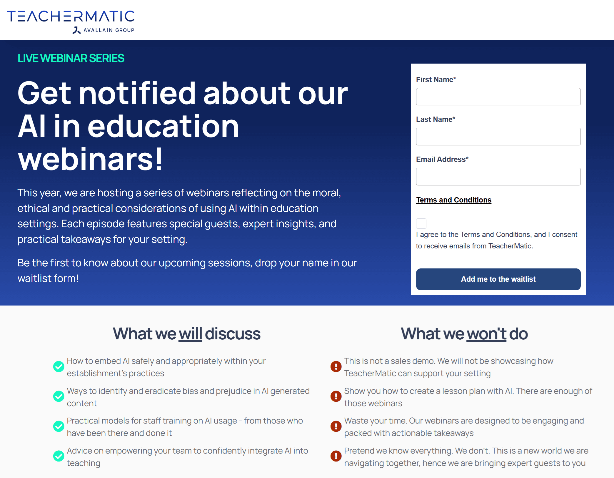
This is a webinar waitlist landing page example from Teachermatic, that encourages signups. Let’s see what we can learn from it.
What works in this landing page example:
- Frictionless signup process since the form is placed above the fold. Also, only three fields are required.
- Builds trust and transparency by clearly stating what users on the waitlist should and should not expect.
- Use of authentic language (“We don’t pretend we know everything”) to motivate users to sign up.
8. Agwa
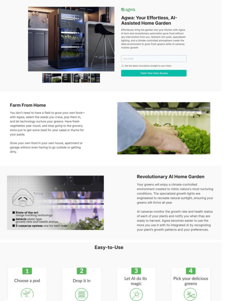
Here we have Agwa’s pre-launch landing page example. The purpose of this page was to assess the market need and generate interest for an innovative home garden solution.
What works in this landing page example:
- Strong value proposition that communicates innovation and ease-of-use.
- The CTA button is action-oriented, promotes exclusivity and has high contrast.
- Step-by-step product visualization with close-up images and diagrams that explain the key features.
How To Design a Waitlist Landing Page: Best Practices
By now, you must have a pretty good idea about how you could go about creating a waiting landing page for your business. In this section, we’ll share bite-sized best practices that can improve the effectiveness of your landing pages:
- Focus on a clean, appealing page design: Simplicity usually enhances the user experience. Select a layout that complements your brand and lets you showcase its key benefits without tiring the reader. Most landing page builders also offer pre-made designs created by professionals. You can pick a clean design and customize it to your specific needs.
- Show people the value they get: Don’t fall into the trap of simply stating the features of your offering. Connect actual pain points with the solution you provide and show the benefits of using it.
- Craft a bold yet concise headline: This is the first thing visitors see so it needs to capture attention. The message needs to inform about what’s in the making without being overly clever. So, make sure it speaks directly to your target customers and how it benefits them.
- Complement your copy with high-quality visuals: Showcase the product or service in action. If your product is digital, use UI mockups; if it’s physical, lifestyle images are great. Consider videos or animations for added engagement.
- Create a frictionless signup form: Ask for as little information as possible (email address only if possible). If you require additional fields, you can explain why. Avoid long forms since they tend to discourage sign-ups.
- Optimize your pages for mobile devices: Ensure the page looks great on mobile. Use large buttons and easy-to-read text. Also, make sure your pages are lightweight and fast-loading.
- Use a countdown timer: Create a strong sense of urgency for your pages. If you also tailor your landing page copy to add FOMO, you can increase signups significantly.
Ready To Start Creating?
Whether you’re creating a waitlist landing page for a new product, service, feature or event, make sure to use the strategies mentioned above. Selecting a user-friendly landing page builder will make the whole process easier.
And if you want to take things a step further, you can send updates through your email marketing platform and inform waitlist subscribers about the progress. This way, you’ll keep them interested until the launch day comes.
Frequently Asked Questions
Here are some frequently asked questions around waitlist landing pages.
1. How to create a waitlist landing page?
To create a waitlist landing page, choose a clear headline, explain your offer or product, and highlight the value of signing up early. Include a simple form (name and email) and a strong CTA. Add social proof or a countdown if relevant. Tools like Moosend, Mailchimp, and Carrd make the whole process easy.
2. What is the best landing page builder for waitlist landing pages?
If you want to create effective waitlist landing pages affordably and without coding knowledge, the best options to look at are Moosend, GetResponse, and MailerLite. These tools offer user-friendly drag-and-drop builders, email automation, and customizable templates—perfect for capturing early interest and growing your list before launch.

 Published by
 Published by