Editor Features to Boost Your Campaigns
Every small or big feature is based on our users’ feedback and is designed to make marketing even easier and better for everyone. Including features that aim to grab your audience’s attention.
Gamify your email capture
To attract future subscribers sometimes it takes more than a simple subscription form. And since people love games, that extra something that will make the difference in building your email list can be a wheel of fortune pop-up.

The Wheel of Fortune pop-up setting provides a fun and interactive experience for your web visitors. This way, they will find the registration more interesting, since they have a chance to win a specific discount or reward, and you will see your list increasing faster, and effortlessly. act, according to recent studies, game-based motivation increases user engagement by 48%. Why miss the chance?
You can trigger the Wheel of Fortune at any point you will define. You’ll find in the Subscription Form settings, and you can fully customize the text, color, and call-to-action buttons to match your brand and needs.
Make your offers stand out
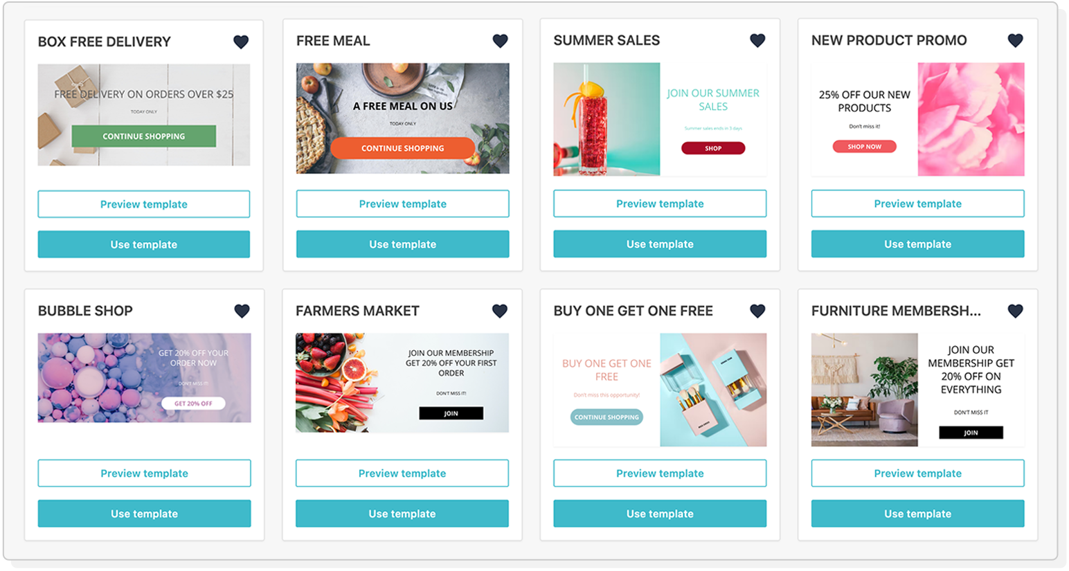 Looking for a way to display your new products? Is there a special-offer landing page that your visitors shouldn’t miss? We’ve got your back with the Promotion Pop-Up!
Entice shoppers with your best products and offers using a special form that will not only allow you to drive sales and gain new customers but will also help you measure your conversions and adjust your marketing strategy.
Our editor keeps getting better
If there’s one thing we will never stop improving that’s our Email Editor. Because, in a world where yours and your audience’s needs constantly shift, we want you to always stay ahead of your competition and create beautiful, professional campaigns that convert.
We’re helping you do this with the following enhancements:
Add an extra something to your newsletters

You can now change the position and width of your background images, for any separate layout.
Add style to your designs

When creating a Landing Page or Subscription Form, Moosend allows you to make any element like buttons and timers pop out by adding a shadow effect to them with just one click.
For code lovers
Previously only available in the Newsletter Editor, the Code Mode is now here also for Landing Pages and Subscription Forms. You can use it to get a read-only view of the HTML code of your design, copy it or download the JSON file to share it with other team members.
Choose your default font
Not all fonts are supported by email clients. Luckily, you can now set a default font that will be displayed in case your current font doesn’t render properly.
Your very own items
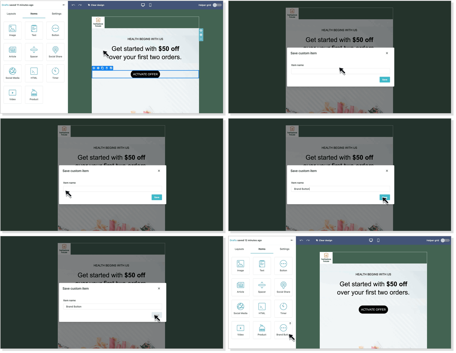
Same to saving custom Layouts, you can now save and load custom Items too. You will find all saved Items on the left panel of the editor. You can use them for your current or next campaign and delete them any time you wish by clicking the bin icon.
Choose width
We get it. Sometimes 600 pixels is just not enough for your fabulous newsletter design. That’s why we’ve added 4 new widths so you can experiment to your heart’s content. Please keep in mind that your design might show differently depending on your subscribers’ screen resolution and size.


 Published by
