Moosend’s Guide to Email Accessibility [2026]
When you think about email marketing, accessibility might not be the first thing that comes to mind. However, ensuring your emails are accessible means reaching every subscriber and creating a better experience for all, including those with disabilities.
Whether people with visual impairments navigate your email with a screen reader or someone with color blindness engages with your content, small changes can make a big difference. As a bonus, accessible emails are often clearer and more engaging.
In this guide, we’ll show you how to improve email accessibility with best practices and actionable tips to make your campaigns more inclusive for all readers.
What Factors Affect Email Accessibility?
Several key factors influence how accessible your emails are for all users. These include:
- Alt text: Descriptions for images help screen readers explain their purpose to users with visual impairments. Without alt text, important information in images may be lost.
- Color contrast: Poor contrast between text and background makes reading harder for people with low vision or color blindness.
- Fonts: Decorative or small fonts can be hard to read, especially for users with visual or reading difficulties.
- Links: Clear, descriptive link text helps users understand where a link will take them, especially when using screen readers.
- Content structure: Emails with clear sections and headings are easier to navigate, helping users and screen readers follow the flow of information.
- Animations: Fast or flashing animations can cause discomfort or seizures for some users. Slow, simple animations are safer and more inclusive.
These factors greatly influence how easy it is for everyone to read and enjoy your emails. Addressing them helps make your emails accessible and engaging for a wider audience.
How to Create Accessible Email Marketing Campaigns
Now that we’ve identified the factors influencing email accessibility, let’s explore how to design inclusive and engaging campaigns for a diverse audience.
1. Use descriptive alt text for images
Alt text plays a crucial role in making your emails accessible.
For users with visual impairments, screen readers rely on alt text to convey what an image represents.
To ensure everyone can engage with your content, provide descriptions for any newsletter image that adds value to your email, such as charts or product photos.
These descriptions should clearly explain the purpose of the image without being overly complex.
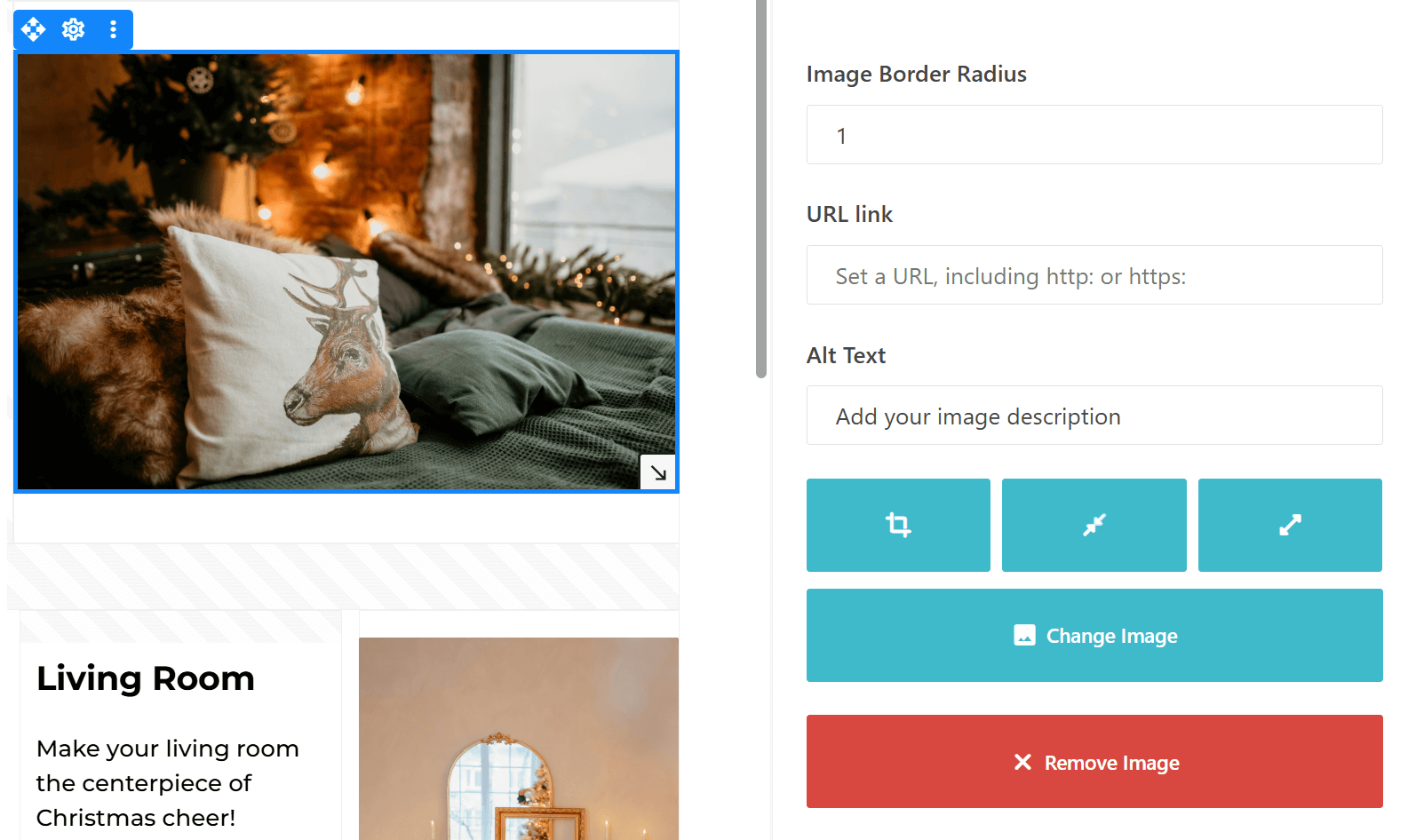
For decorative images that are purely aesthetic, it’s best to use an empty alt attribute (alt=””). This tells screen readers to skip over the image, keeping the experience smooth and distraction-free.
Tip: When writing alt text, avoid redundant phrases like “image of” or “picture of.” Screen readers already identify images, so focus on describing the content directly. For example, instead of “Image of a cozy living room,” simply write “Cozy living room with a fireplace and holiday decorations.”
2. Ensure proper color contrast
Color contrast is essential for making your emails readable for everyone, including people with color blindness or low vision.
Low contrast between text and background can make engaging with your content difficult for some users.
To improve readability, maintain a high contrast ratio of at least 4.5:1 for normal text and 3:1 for large text (18px bold or 24px regular).
Choosing colors that complement but don’t blend into each other ensures your text stands out and remains clear on all devices and screen settings.
Tip: Always test your color combinations to ensure they’re easy to read. Use tools like contrast checkers to evaluate your design. Remember, vibrant and contrasting colors not only improve accessibility but also enhance the visual appeal of your emails.
For accessibility purposes, here’s an example of a high-contrast, accessible color combination that meets the Web Content Accessibility Guidelines (WCAG):
- Text color: Black (#000000)
- Background color: Light Yellow (#FFFFE0)
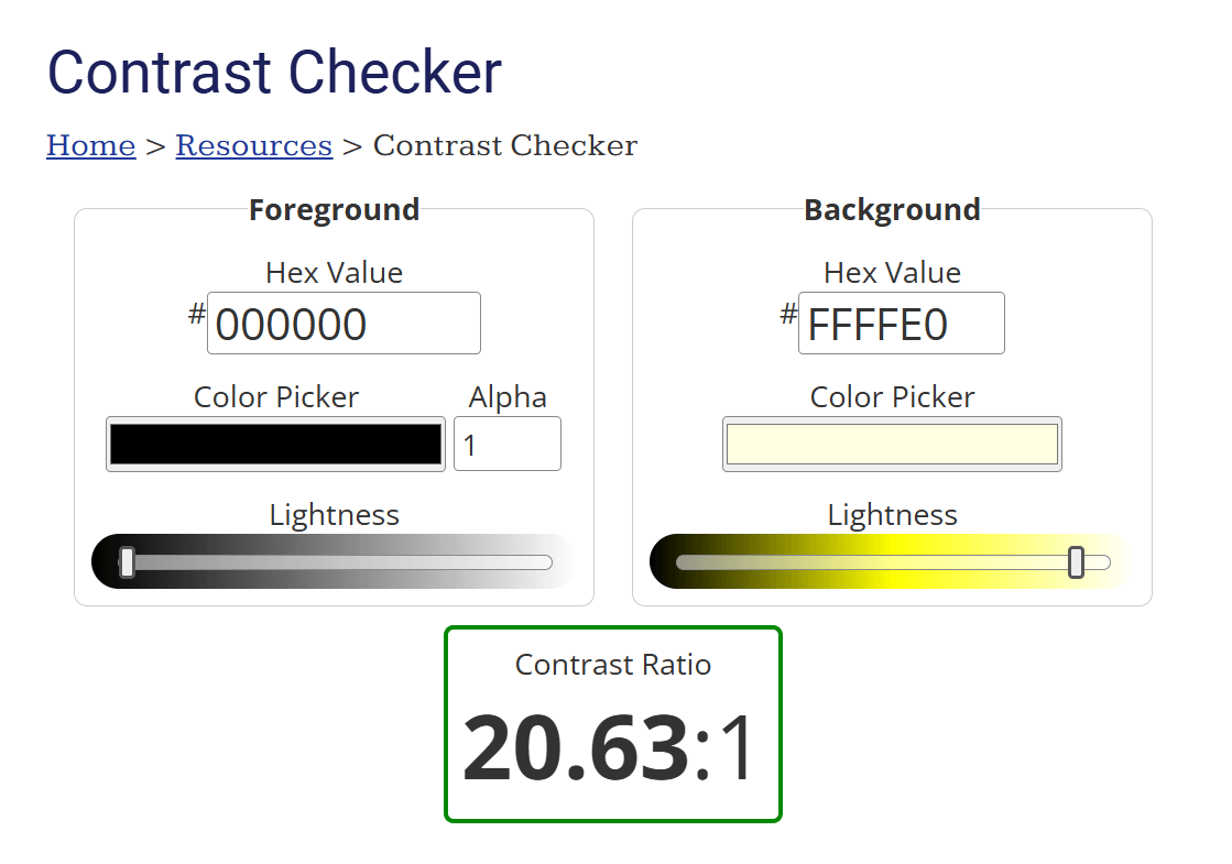
This combination ensures a contrast ratio above 4.5:1, making it accessible for users with visual impairments.
3. Opt for accessible fonts
The fonts you choose ensure your emails are easy to read and engaging for all subscribers.
Overly decorative or complex fonts can be difficult to decipher, especially for users with visual or cognitive impairments, reducing the effectiveness of your message.
Opt for simple, sans-serif fonts such as Arial, Verdana, or Helvetica for better screen legibility.
These fonts are easily read and widely supported across devices and email clients.
To further enhance readability, use a minimum font size of 14px for body text and larger sizes (18-24px) for headings, which helps users quickly navigate your content.
Tip: The right line spacing is just as important as font choice. Use spacing at least 1.5x the font size to improve readability and make your emails more visually appealing.
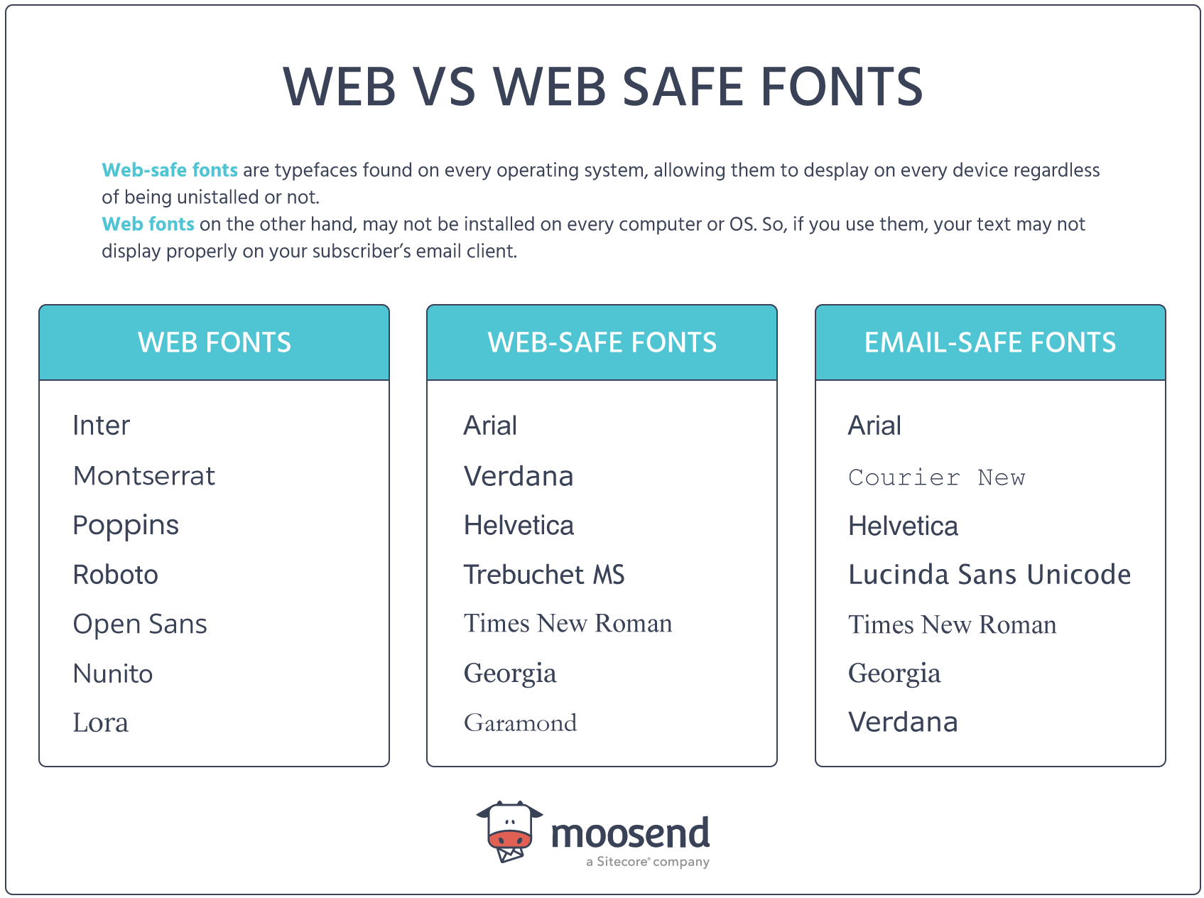
Here are some email-safe and accessible fonts to consider:
- Arial: A clean, sans-serif font that’s highly readable and supported across email clients.
- Verdana: Designed for screen readability, it has wide letter spacing for clarity.
- Helvetica: A modern, professional font that works well for headers and body text.
- Georgia (serif option): If a serif font is needed, Georgia is highly readable on screens.
4. Structure content with headings and semantic HTML
Proper HTML structure will make your messages easier to engage with.
Logical heading tags (H1, H2, and H3) create a clear content hierarchy, helping screen readers and assistive technologies correctly interpret your email. This improves navigation, allowing users to jump to relevant sections effortlessly.
To implement this, use heading tags sparingly and intentionally. Reserve H1 for your main email headline, followed by H2 or H3 for subheadings within sections.
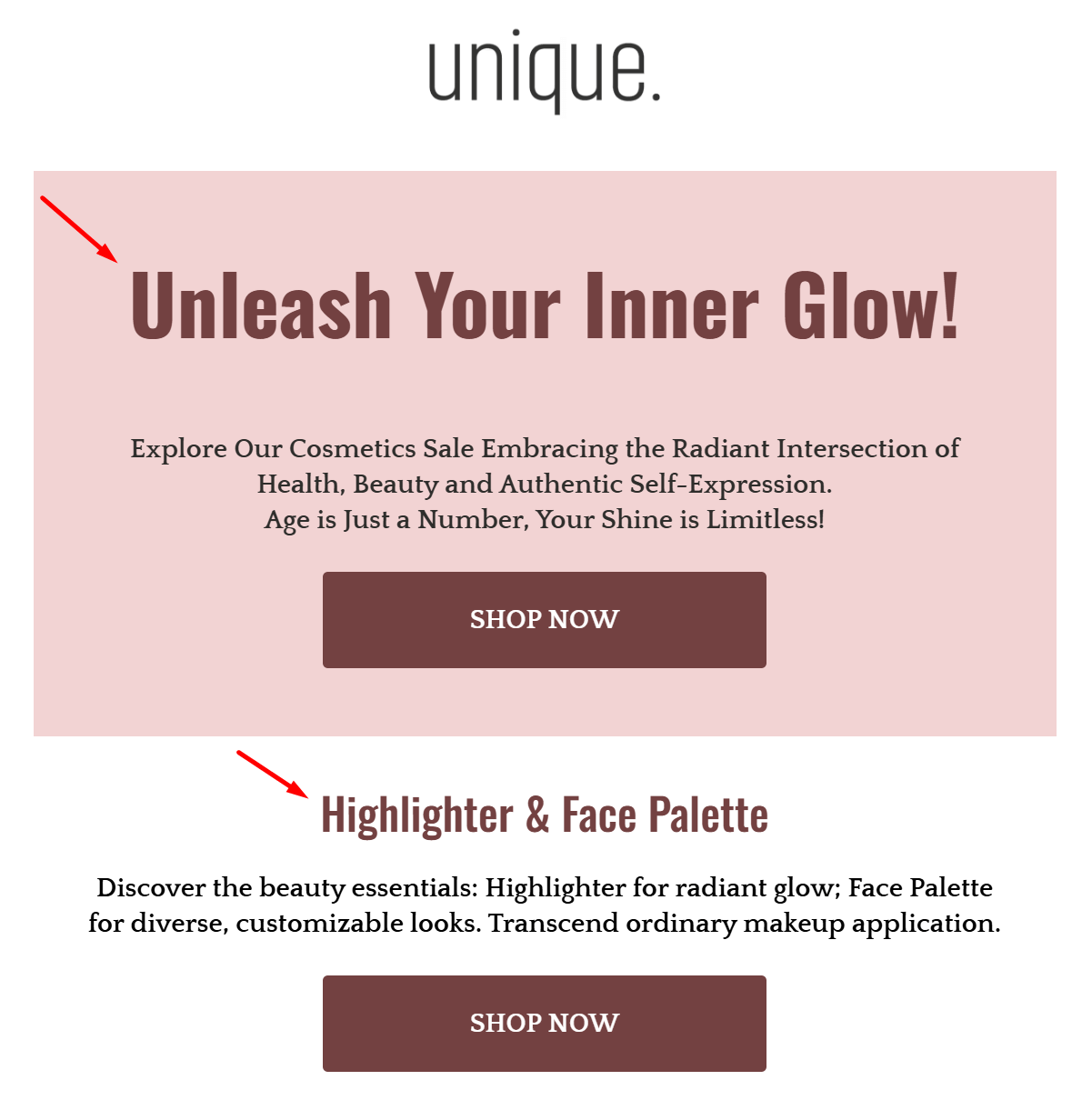
Avoid using heading tags purely for styling purposes, as this can confuse screen readers and disrupt the logical flow of your email.
Tip: For styling needs, rely on CSS or inline styles instead of misusing headings. This ensures a seamless experience for all readers while maintaining an organized structure.
By combining proper HTML structure with content hierarchy, you’ll create emails that are visually appealing and accessible to everyone.
5. Make links descriptive
Have you ever clicked on “Click here” and wondered what you were clicking on?
For users relying on screen readers or keyboard navigation, vague links like that can be frustrating and confusing. On the other hand, descriptive links provide clear context and improve the accessibility of your emails.
Instead of generic phrases like “Read more” or “Click here,” use specific and actionable language that explains where the link will take the user. For instance, say, “Download our accessibility guide” or “Explore our holiday email templates.”
This ensures your links make sense on their own, even when read out of context by assistive technologies.
Tip: Avoid cramming too many links together in a single section or paragraph. This can overwhelm users navigating with a keyboard or screen reader, making it harder for them to interact with your email effectively. Instead, space out your links and make sure each one serves a distinct purpose.
6. Choose accessible button designs
Buttons might seem like a small detail, but they play a big role in how users interact with your emails.
Clear and well-designed buttons make all the difference for subscribers using assistive devices or those with limited dexterity.
To create accessible CTA buttons, start with actionable text that tells users exactly what will happen when they click. Phrases like “Subscribe Now,” “Shop the Sale,” or “Download the Guide” work far better than vague terms like “Click here.”
Actionable text eliminates guesswork and encourages engagement.
Now, design is just as important as text. Here’s an example from MVMT’s email marketing campaign:

Buttons should be large enough for easy tapping—at least 44×44 pixels is the recommended size. Ensure they are placed with enough space around them to prevent accidental clicks and use high-contrast colors so they stand out against the background.
Tip: Pay attention to accessibility for touchscreens as well as keyboards. Use visible focus indicators (e.g., an outline when the button is selected) so users navigating with a keyboard know exactly where they are.
7. Ensure keyboard navigation
Not all users rely on a mouse or touchpad to browse their emails.
For many, especially those with physical disabilities or visual impairments, the keyboard is their primary tool for navigation.
That’s why it’s essential to ensure every interactive element in your email—buttons, links, and forms—can be accessed and used with a keyboard alone.
Keyboard-friendly navigation means users can move through your email using the Tab key, seamlessly jumping from one clickable element to the next. Ensure all interactive elements are properly coded to be part of the natural tab order so no one gets “stuck” on an inaccessible section.
Focus indicators are also a must. These are visual cues (like a border or highlight) that show which element is currently selected. Without these, keyboard users may struggle to identify where they are on the page.
Checklist for keyboard-friendly emails:
- Buttons and links are tab navigable.
- Forms can be completed without a mouse.
- Focus indicators are visible and easy to spot.
Tip: Test your emails by navigating with only a keyboard. Use the Tab and Enter keys to interact with every element. If you find any inaccessible or confusing areas, make adjustments to your email’s structure or coding. Small tweaks can make a big difference in creating an inclusive experience.
8. Avoid flashing or flickering content
Eye-catching GIFs and animations can make your emails more interactive, but they come with a risk: flashing or rapidly changing visuals can trigger seizures in individuals with photosensitive epilepsy.
Creating accessible emails means ensuring everyone, including those sensitive to flashing content, can safely enjoy your campaigns.
When using animations, simplicity is key. Opt for smooth, slow-paced transitions that enhance your email’s design without overwhelming the viewer.
For example, a gently looping animation of falling snow or a glowing “Shop Now” button can add interest without causing discomfort.
Here’s a simple example from BIKO:

Tip: If you’re unsure whether an animation is safe, follow the “three flashes per second” rule—never include visuals that flash more than three times in one second. You can also offer an option to pause or stop animations if they loop continuously, giving users more control over their experience.
9. Keep language simple
Regarding email marketing, simplicity isn’t just a style choice—it’s an accessibility feature. Clear and concise email copy ensures that your campaigns can be understood by all your subscribers, including those with cognitive disabilities or those who speak English as a second language.
The easier your content is to read, the more effectively it communicates your message.
Avoid industry jargon, long-winded sentences, or overly complex words. Instead, focus on getting straight to the point with actionable and straightforward language.
For example, instead of saying, “Utilize this opportunity to explore our extensive product offerings,” try “Explore our top products today.”
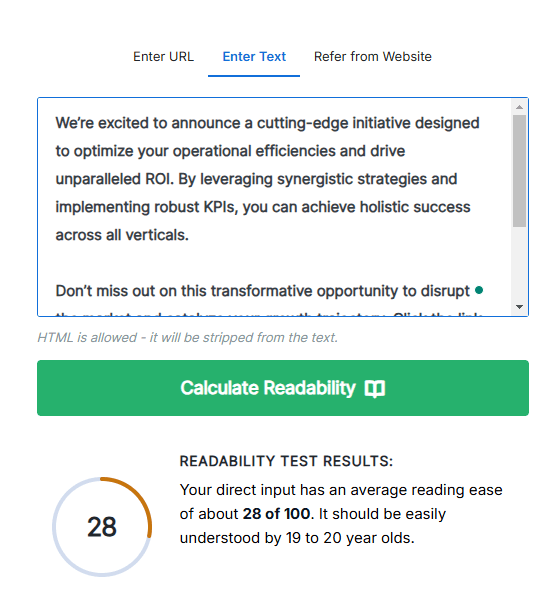
Tip: Use tools like readability checkers to ensure your content is simple and clear. Aim for a reading level of Grade 8 or below to make your emails accessible to the widest audience possible.
Email Inclusivity Drives Results
Implementing these best practices in your email campaigns doesn’t just make them accessible—it makes them impactful.
Accessibility ensures every subscriber can engage with your content, helping you connect with a wider, more diverse audience. By creating inclusive emails, you’re not only doing what’s right—you’re building a stronger, more loyal customer base.
Ready to elevate your email marketing game? Our team is here to help you craft inclusive, high-performing strategies that make a difference. Start creating emails that everyone will love and remember.
FAQs
Below, you’ll find some common questions regarding email accessibility.
1. How do I make my email more accessible?
To make your email more accessible, you should consider the following best practices:
- Use clear, descriptive alt text for images.
- Ensure high color contrast between text and background.
- Choose readable, sans-serif fonts like Arial or Verdana.
- Keep your language simple and avoid jargon.
- Structure your content with proper headings and a logical layout.
- Make all interactive elements (links, buttons) keyboard-friendly.
2. How to test an email for accessibility?
Start by using a screen reader to check how your email is read aloud, verifying that the flow is logical and alt text is accurate. Next, test color contrast with tools like WebAIM’s Contrast Checker to confirm your text is easily visible against its background. Use only the Tab and Enter keys to navigate your email and ensure all interactive elements, like buttons and links, are functional for keyboard users. Finally, preview your email on various devices and email clients to ensure consistent formatting and usability across different platforms.
3. Does WCAG apply to emails?
Yes, the Web Content Accessibility Guidelines (WCAG) provide helpful insights for making emails accessible. While WCAG is primarily aimed at web content, many of its recommendations—like color contrast, alt text, and logical structure—are directly applicable to emails, ensuring inclusivity for all users.



 Published by
 Published by
