


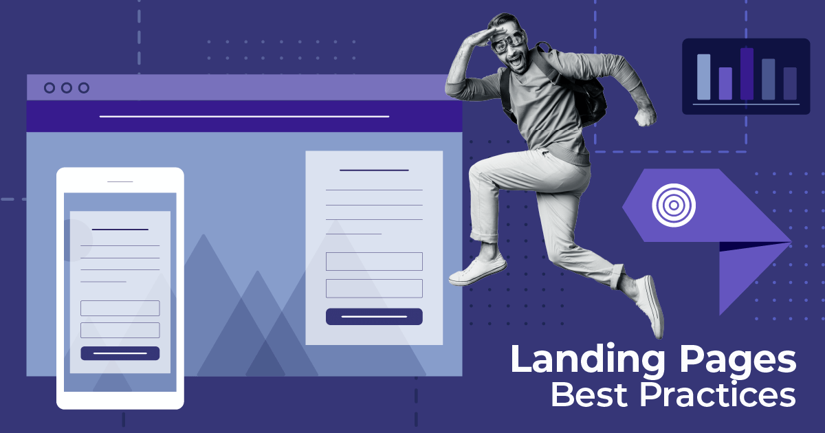
The Anatomy Of A Landing Page: Key Elements & Examples
Published By Alexandra Marinaki
January 8, 2024

08/01/24
A top-notch digital marketing strategy consists of many assets to move prospects down the funnel. Landing pages are an essential part of this process, aiming to convert a target audience quickly by removing distractions.
In this guide, we’ll explain the anatomy of a landing page, its core elements, and how to nail them. You’ll also find important landing page design and optimization tactics to meet your conversion goals.
For those who’re new to this brand asset, we’ll provide you with a quick definition followed by the main benefits of creating them.
What Is A Landing Page?
A landing page is a standalone web page with a single call-to-action. Its main purpose is lead generation and conversions. For example, you can create a landing page to promote a special offer, e.g., a sale or free ebook, to customers and prospects and share it via marketing channels, such as emails and social media.
Most marketers and business owners use landing page builders, such as Unbounce or other marketing platforms with built-in builders like Moosend with customizable premade templates to save time and effort. Most of them include the elements we’ll explain later, but it’s important to double-check the templates you choose to ensure everything looks spotless.
Ready to build your next landing page? Sign up for a Moosend account, pick one of our ready-made templates, and customize it based on your needs.
Why Should I Use A Landing Page?
One of the main reasons to add landing pages to your existing marketing strategy is to increase the conversion rates. Channels like your website and social media come with many distractions and it’s hard to maintain your visitor’s attention there. However, landing pages have a single CTA and make it easy to find.
Plus, landing pages can help you target your messaging and clarify your value proposition to your buyer personas. Finally, they’re easier to track and analyze, so you can get better insights into your audience’s behaviors and needs to optimize your marketing outreach going forward.
What Is The Structure Of A High-Converting Landing Page?
So this is what the anatomy of a high-converting landing looks like. Let’s dive into more details, exploring the key elements that secure optimal user experience based on the structure below:

1. Main headline
First impressions matter, so your landing page headline should be powerful enough to attract your readers’ attention. Plus, it should be reflective of the campaign goal, with clear and concise copy that leaves no room for second-guessing.
Here’s a great example by Calm. The reader realizes straightaway what this app is about and where it stands among its competitors:

Sometimes landing pages include subheadings, too, based on the blocks of text they have and each of them should serve the main purpose of this page.
2. Unique selling proposition (USP)
After the headline lies the so-called unique selling proposition. It’s an organic follow-up of the headline shedding more light on the product/offer and the customer pain points it addresses.
Along with the headline, this block of text attracts readers more so it should form the right expectations and reflect the call-to-action before their attention span starts to fade away.
Look at this landing page by DropBox. The copywriting team has stated the value proposition clearly so that the prospects understand the main features and the benefits they’ll reap if they use this product:

3. Hero image/ video
Not only do first impressions matter, but also an image is worth a thousand words. To adhere to both wise sayings, add an attractive image demonstrating the offer your landing page or a quick video/GIF to make it more fun and engaging.
For instance, if you want to demonstrate a new product/service to your audience you can give them a sneak peek of how it looks to entice them to try it. If you are a small business owner with limited access to design resources, you can also use stock photos.
Just make sure that your creatives are high-quality and complement your copy perfectly. Otherwise, you might confuse your readers. Look how Talkspace portrayed its business service on this landing page:

4. Signup form
All the examples shared earlier have a call-to-action under the value proposition which makes absolute sense. However, if you want to ensure readers will complete the desired action, it’s best to include a signup form at the top of the page for faster conversions.
Remember to add the minimum number of form fields possible as many prospects are in a hurry or even hesitant to share excessive information.
This is the landing of a webinar we hosted at Moosend. People who are interested in this event can sign up quickly and save the date:

5. Call-to-action button
Whether you add a sign-up form or a plain CTA button, it’s important to make them stand out from the rest of the test. To craft a converting call-action, use a more vibrant color compared to the background that aligns with your brand guidelines.
Plus, the copy should be short and written in actionable language like the example by VANMOOF below. Also, words like “free” and “now” usually ring a bell to consumers and they click on them faster.

6. Supporting copy
Extra copy can be placed in different sections of your landing page for clarification. For example, you might want to write a short text in your signup form to ensure readers have understood the assignment. Here’s an example by Midwest Sea Salt:

Overall, your landing page copywriting should be concise and clear to showcase different page elements in a meaningful way. If you want to optimize your landing page for search engines, add keywords at strategic places throughout the text emphasizing headings, but avoid overstuffing it, as this might hinder performance.
7. Social proof
Customer testimonials are among the most powerful tools that help businesses build trust with prospective buyers. Therefore, you can use some of your top customer reviews on your landing page to earn valuable points from prospects.
If you have reviews from big brands that belong to your target audience, it’s best to use them to attract your buyer personas.
Here’s how GOBY, an electric toothbrush brand used reviews from dentists to gain more authority:

8. Offer benefits/features
To create effective landing pages that convert, you also need to mention the benefits or the features of your offer. Thus, readers will understand if the product/service soothes their pain points and is suitable for them.
You can mention them in the form of bullet points or related icons/images with short supportive copy emphasizing the gains. Here’s how Shopify showcases their top features:

9. Footer
Finally, you can use the landing page footer for different purposes based on your goals. For instance, if you’re promoting a sale or a competition you can add the terms and conditions. Or you can add an FAQ section to address your prospects’ queries on the spot.
Just remember that the landing page should have a particular CTA so avoid sending users to different web pages that could distract or confuse them.
For example, Netflix used this on their landing page footer:

Landing Page Best Practices For Higher Conversions
Now that you have a better grasp of the anatomy of a high-converting landing page, let’s see some of the tactics you can follow to increase your conversions:
1. Set a SMART goal
As mentioned above, a good landing page usually serves a particular purpose which is evident through the copy and imagery. If you want to ensure that your goal is effective, you can follow the well-known SMART framework when shaping your landing page.
It stands for Specific, Measurable, Attainable, Relevant, and Time-bound and by checking all these boxes, you’ll manage to clarify your messaging, deliver it successfully, and measure it appropriately.

2. Use a landing page builder
If you want to save time and eliminate the resources you need to create a great landing page, you can use a landing page builder. They offer premade templates with customizable building blocks for different purposes and needs.

Here are some well-known landing page tools to check out:
- Unbounce
- Leadpages
- Moosend
- Instapage
So find a ready-made template that matches the landing page examples shared earlier to create your own without extra energy. Plus, most builders provide mobile-responsive templates to ensure an optimal user experience for mobile users as well.
3. Add brand elements
A landing page supports your brand awareness efforts, so it should be rather similar to other marketing venues, such as your homepage. Share imagery that matches your brand guidelines and ensure that your landing page copy is similar to your messaging in other channels.
This way, you’ll ensure that your prospects and customers receive a consistent user experience and know what to expect from your brand. Plus, if you use AI writing tools to produce new copy, edit it wisely to match your overall brand style.
4. Conduct A/B Testing
AB or split testing is one of the strongest weapons in the digital marketing field. It enables you to test different versions of your landing page and other assets and find the one that will appeal the most to your target audience.

For example, you can test copy and image variations and the most attention-grabbing will prevail. Thus, you’ll boost your engagement metrics without losing valuable time.
5. Analyze your metrics
What metrics should a marketer track to improve their landing page strategy over time? Let’s have a look:
- Conversion rate
- Bounce rate
- Page views
- Sessions by source
- Form abandonment
Diving into those data will help understand what moves you need to make in the future to increase engagement and conversions. For example, you may decide to shorten your copy or move the signup form higher to make it more visible depending on the metrics.
The Takeaways
We hope our guidelines and landing page examples gave you some inspiration for your own landing pages. Add these elements, customize them based on your goals and needs, and you’ll convert your landing page visitors into subscribers sooner than you expect.
Ready to craft your first or next landing page? Sign up for a free Moosend account and take our builder for a spin!
Similar Posts

 Published by

 Published by
 Published by

Create, send and optimize your email marketing campaigns