


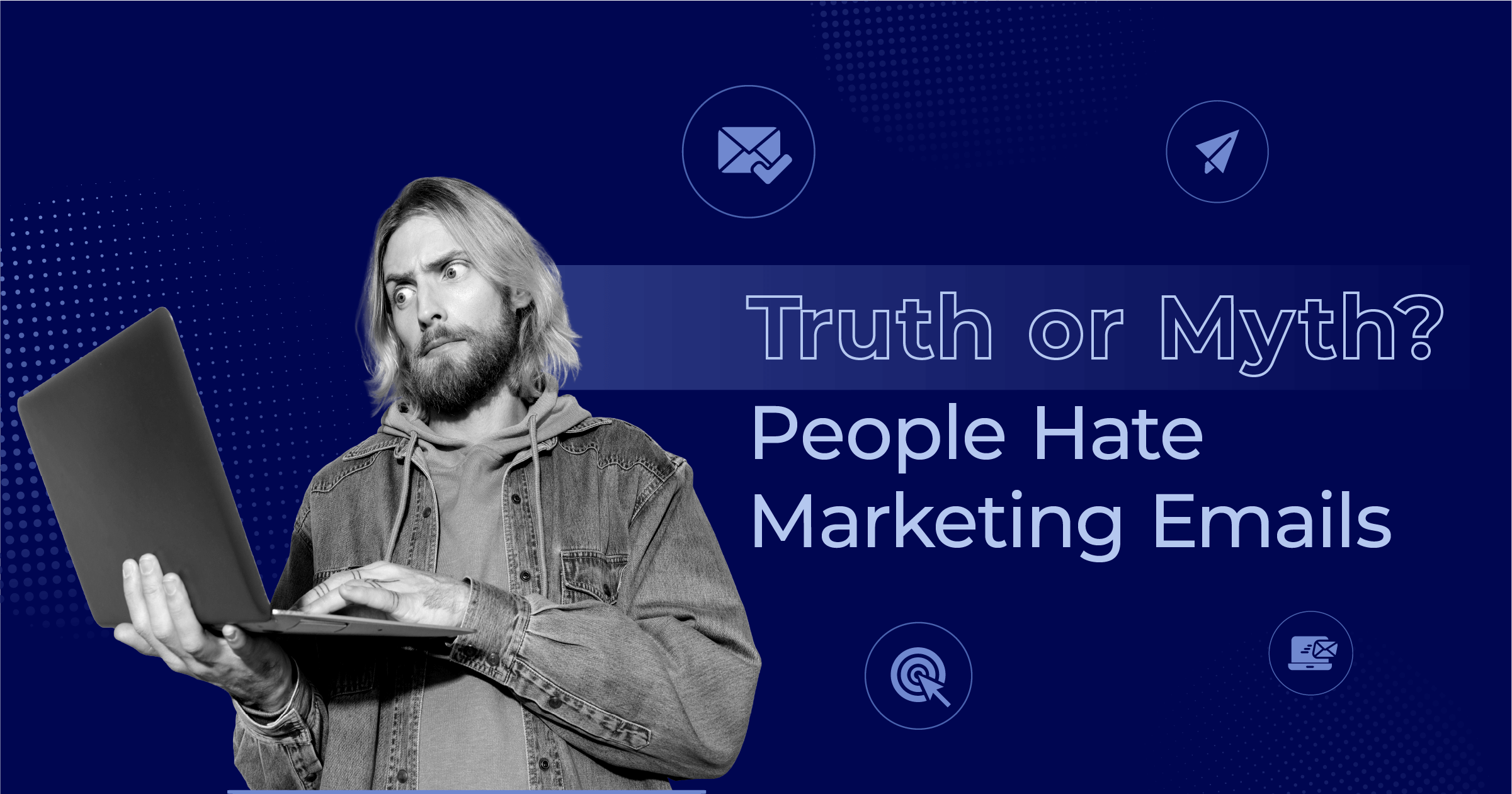
Truth or Myth? Long Emails Don’t Work
Published By Alexandra Marinaki
November 14, 2025

14/11/25
We’ve all heard the golden rule of email marketing: Keep your emails short and to the point, or risk losing your readers’ attention.
But what if this widely accepted wisdom is actually a myth? What if the real secret to email engagement isn’t brevity, but value?
Attention isn’t a given; it’s earned. And when you consistently deliver meaningful content that matches your audience’s interests and needs, they’re more likely to invest time in what you have to say.
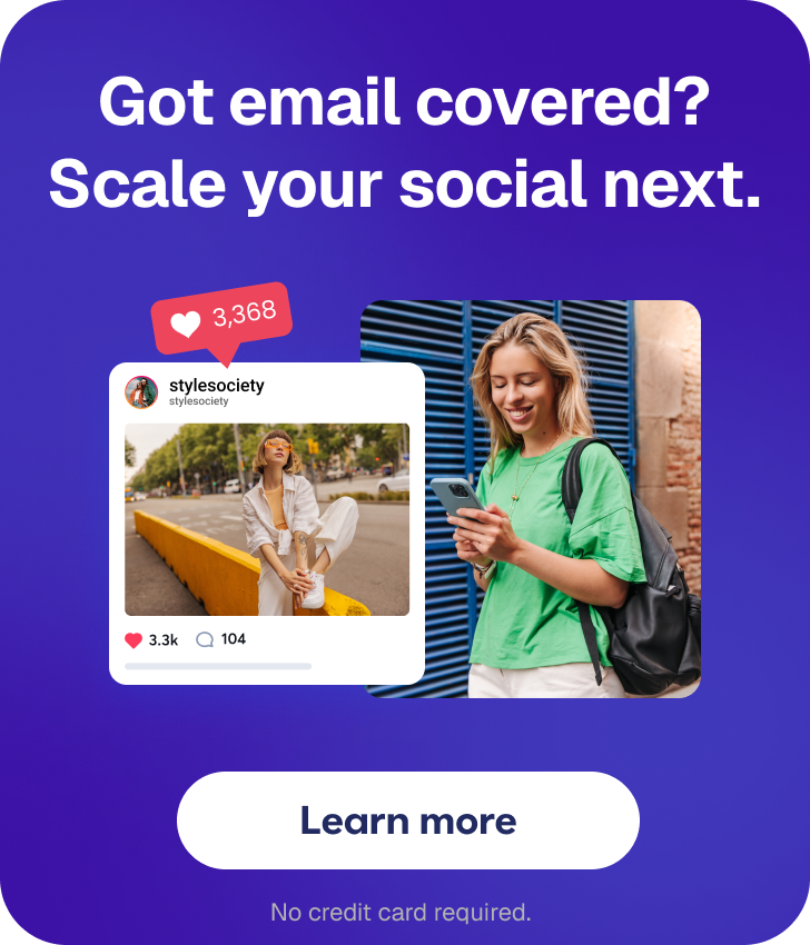
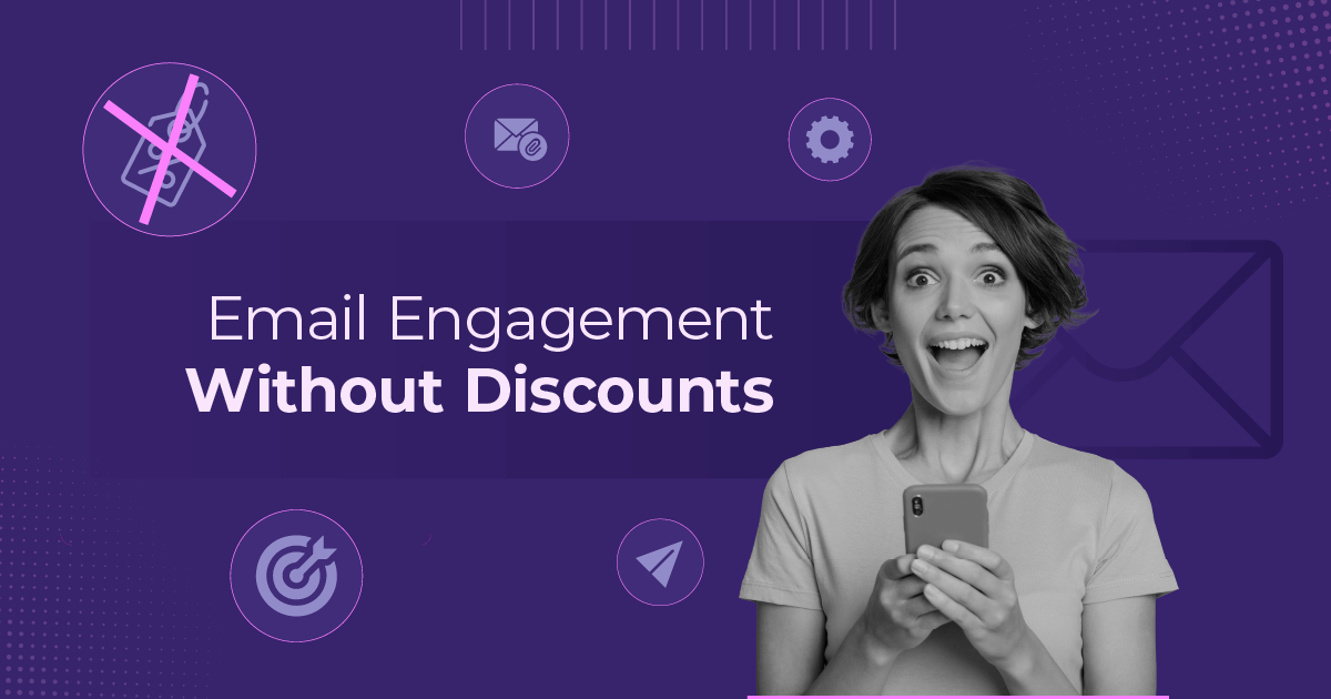
Make your emails count regardless their word count
Personalize your messages with Moosend.
Start freeWhere The Myth Lies
Why has this common belief gained rock-solid ground over the last years? Mainly, it’s because we live in a world of instant gratification. The factors that reinforce this myth are hard to deny:
- Short attention spans: With the sheer volume of emails and notifications received daily, it’s hard to focus on a long email. We skim content, move on quickly, and prioritize tasks that feel more valuable.
- Information overload: People might feel overwhelmed by the excess of information provided in a long email, especially if it’s not well-structured or visually appealing. Deleting or ignoring it becomes the easy option.
- Time constraints: Many people check their emails on the go or during brief breaks at work. On these occasions, they hardly ever have the time to spare in reading a lengthy resource.
- Lack of immediate action: We’re used to expecting a clear call-to-action in our emails. When this action is hard to find at first glance, we’re likely to skip to the next one, hoping we’ll find time to come back later. A promise we hardly ever keep.
- Device limitations: Long emails that aren’t optimized for mobile are harder to read. Considering that 64% of email recipients open their emails on mobile devices, they have a poor experience and are highly likely to skip or delete.
- Social media habits: With the rise of platforms like IG and TikTok we’ve become more used to consuming quick, digestible content in the form of posts or reels. A long-form email can feel out of place or even alienating.
Yes, the quick digital world we live in doesn’t leave much space for long emails to breathe. But does that mean we should abandon them entirely?
When Short Emails Make Total Sense
Short and sweet messages don’t just fit our fast, digital world. They’re perfect for cases like:
Promotional emails
When launching a flash sale or a limited-time offer, you want to ensure that the reader will find all important information without even scrolling down. Otherwise, you put conversions at stake.
If you want to create a longer version to add more details, such as social proof or product recommendations, the primary CTA button should be placed high up. This way you’ll grab the attention of people who don’t have more time or energy to invest, but are into your offer.
Check out this “last chance” email by Fender and take notes:

Transactional emails
Transactional emails, the automated messages sent to recipients after a specific action, such as a purchase or password reset, are by default, short. They provide essential information to the person who triggered the action to reassure them.
Certain brands also add promotional sections in some of these messages, such as order confirmations, to benefit from a consumer’s purchasing momentum. But again, this information must be considered secondary.
Here’s a great email example by Hers—compact, but detailed:

Abandoned cart emails
Abandoned cart emails are triggered when a website visitor has added an item to their cart but never completed checkout. A cleverly written notification, followed by a product image, a short description, and a clear CTA button, is all they need to convert into customers.
Would a longer version work? Probably not, unless the product is high-value and requires more detail for purchase, such as specific shipping and return policies.
Check out this example by Aventon, written in urgent language to drive action:

When Long Emails Win The Stage
But what happens with emails that simply have more to say? Think of newsletters like the Morning Brew and The Good Trade. With so many fans around the globe it’s hard to deny their popularity. What’s more, the rise of Substack newsletters indicates that many email users are more than willing to spend time reading content-heavy emails, as long as the content resonates with them.
Certain email types, in fact, would lose their value entirely if we tried to shorten them. Let’s look at some examples:
Educational emails
Educational campaigns provide valuable and actionable insights about a specific process or product. They usually consist of text content, visuals, and calls-to-action (CTAs) appealingly structured to encourage subscribers to read through.
The more personalized these emails are, the higher the engagement. Crucially, people prefer emails with resonant content, presented in a way that doesn’t exhaust the reader, even when the text is long.
Check out this educational email we created for Mental Health Awareness Month. The bullet points and checklist make the format easier for the reader. And even though it’s coupled with a promotional offer, the focus remains on the information:

Storytelling
Not all emails are promotional or action-oriented. Sometimes, marketers use this channel to build a stronger connection with subscribers through narrative techniques and storytelling. For example, they might use nostalgic language in a campaign to evoke emotion, which, in turn, drives brand awareness and customer retention.
You cannot replace most of these emails with shorter alternatives without either missing the core goal or compromising on quality and authenticity.
Here’s an amazing example by Charity Water, which aims to evoke gratitude and generosity in its readers:

Complex information
You can’t always explain a complex, multi-step process to readers in just a few lines. Sometimes, you need to clearly explain each step to avoid confusion.
Consider onboarding emails, for example. You must include as many details as needed to set new users or customers up for success. If you don’t, you may end up increasing support tickets, or worse, generating dissatisfied customers.
In the example below, Miro shared an email that included information about a feature, incorporating a user story to help readers fully understand certain platform capabilities:

Premium offers
When presenting prospects with a more premium product or service, you can’t convince them to invest more in your brand with just a few words. You need to be detailed and clearly articulate all the benefits they’ll gain if they follow your advice.
Therefore, when crafting upselling emails or promoting premium products, share all the necessary evidence to make readers take your offer more seriously, especially if they’re already customers or qualified leads.
Here’s how Canva approached it. Every detail a soon-to-be Pro customer will need is included:

Turning Long Emails into Messages People Actually Read
Yes, some emails need more words. But the way you put those words to your message matter.
1. Use a captivating subject line and introduction
The first impression is formed in the inbox, starting with the subject line. Great subject lines reflect the email’s content and should evoke curiosity in readers. While character limits vary, aiming for 20 to 40 characters helps maintain readability on mobile devices.
Next, make sure your introduction hooks the reader and makes them want to learn more. This way, they’ll willingly invest the time and energy needed to read through the entire message.
Let’s explore Moosend’s email for a better grasp. The subject line, “😟Are Your Emails Adding to Inbox Fatigue?”, addresses the reader directly and makes them wonder if they’re part of the problem. The worried-face emoji evokes emotion, motivating subscribers to open the campaign.
In the body, the reader learns about a concerning issue and is offered a discount to honor Mental Health Awareness Month and take active steps to tackle it.
Not sure how to start wowing your audience? Use an AI writer to experiment with different subject lines and introductions to find what resonates best.
2. Prioritize well-defined structure and layout
To create a better reader experience for longer emails, you must ensure that navigation is smooth and easy. Use headings for each section, generous white space to clearly divide content, and relevant visuals to enhance the experience.
Two popular patterns that marketers often use are the F and Z layouts. These scan patterns help readers quickly identify key sections without causing fatigue. The good news is that most email marketing services offer pre-made, professionally designed templates that prioritize clear navigation. You can then use their editors to customize these templates based on your specific needs.

But what if your newsletter is focused solely on storytelling, with few or no visuals? You can still make navigation easier by bolding key terms, creating lists (listicles), and writing shorter sentences that create more “breathing room” and are easier to process.
3. Use strategic headlines and subheaders
Just as the subject line determines whether a subscriber will open an email, the headline plays a key role in guiding them through the content. Introduce the topic in a motivational way to help readers identify with the material immediately.
Adding a pain point or a key benefit to the headline will make it more impactful. For example, Miro used “Keep your projects moving forward” to entice readers who want to improve work efficiency to continue reading.
Subheaders are also vital for navigation. You can try different styles for variety, such as questions or wordplay, to make your content more engaging. However, keep the underlying tone consistent to avoid a confusing reading experience that distracts from the email’s main goal.
This email by The School of Life, for example, has nailed navigation through its strategic use of headlines and subheaders:

4. Incorporate complementary design elements
Visuals, GIFs, and videos can transform a long email into a much more engaging experience. When using images, choose themes that complement your copy to help readers visualize a process, a situation, or even a feeling.
If you are guiding users through a process, consider using a GIF or embed a short video. This also contributes to a more interactive and creative experience. However, be sure to place them at strategic points. When placed at the very top, they might grab all the attention and prevent readers from engaging with the text.
And of course, ensure that all visual elements align with your brand guidelines to create a consistent experience across all channels.
5. Use distinct CTA buttons
While some longer newsletters are zero-click (focused purely on content consumption), others are designed to motivate readers to take specific actions. To optimize your use of CTA buttons, consider these key questions:
- How many actions do you want to promote through this email?
- Which is the primary, most important action to prioritize?
- What colors will make your buttons stand out?
- Where should you place them to maximize visibility?
For example, if you’re in SaaS and your goal is to drive people to the pricing page, place this primary button at the top. This ensures high visibility and generates clicks, even from readers who don’t have time to read the entire email. If the email is very long, you can repeat the primary CTA once more and use secondary CTA buttons with a less dominant color.
As for the copy, a good rule of thumb is to use actionable language for primary buttons (e.g., “Join Today” or “Start Free Trial”) and reserve more generic options like “Explore More” for secondary actions.
Count Added Value, Not Words
It’s time to stop counting words and start measuring value. The length of your email isn’t the true metric; what truly counts is the substance it delivers.
When you prioritize delivering meaningful content that solves a pain point or offers new knowledge, your audience will gladly invest their time. They’ll stop seeing your emails as a chore and start viewing them as a source of genuine value, no matter the final word count.
Similar Posts
 Published by

Create, send and optimize your email marketing campaigns