
How to Build Dark Mode Friendly Email Campaigns
Dark mode has become increasingly popular among users. Their preference seems to derive from the need to reduce eye strain and make content more readable. That’s why, it’s important for marketers to know how to build dark mode friendly email campaigns.
In this blog post, we’ll explain everything about dark mode email and provide useful tips to optimize your email campaigns for dark mode.
Create stunning dark mode email campaigns with Moosend.
Enjoy intuitive email building from $9/month.
Join MoosendWhat is Dark Mode in Emails?
Dark mode in email is a display setting that inverts the colors in your email client and email content. Specifically, this inverted color scheme uses light-colored text, UI elements, and email icons on a dark background.
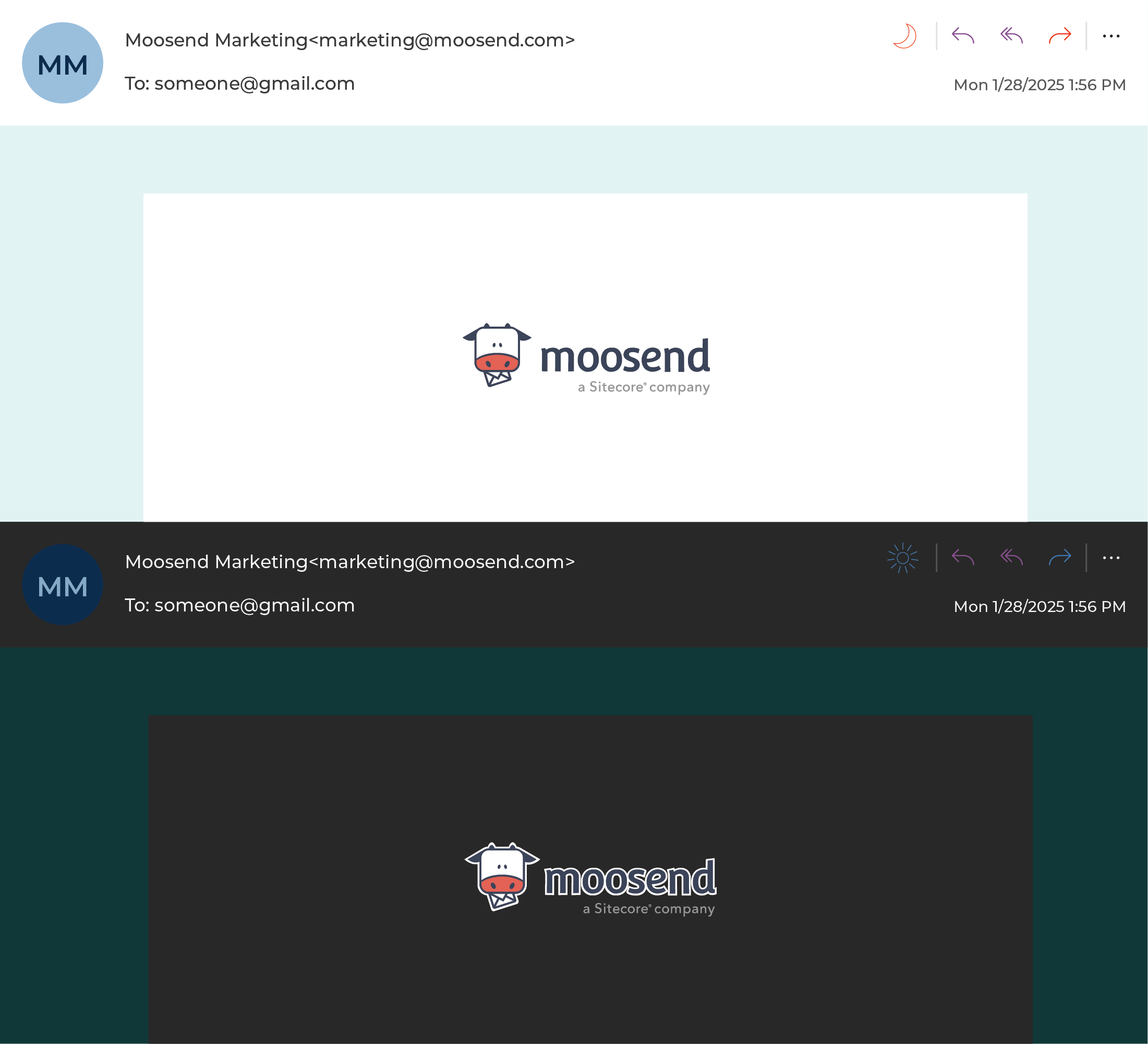
Here’s an example of the same email in dark mode and light mode.
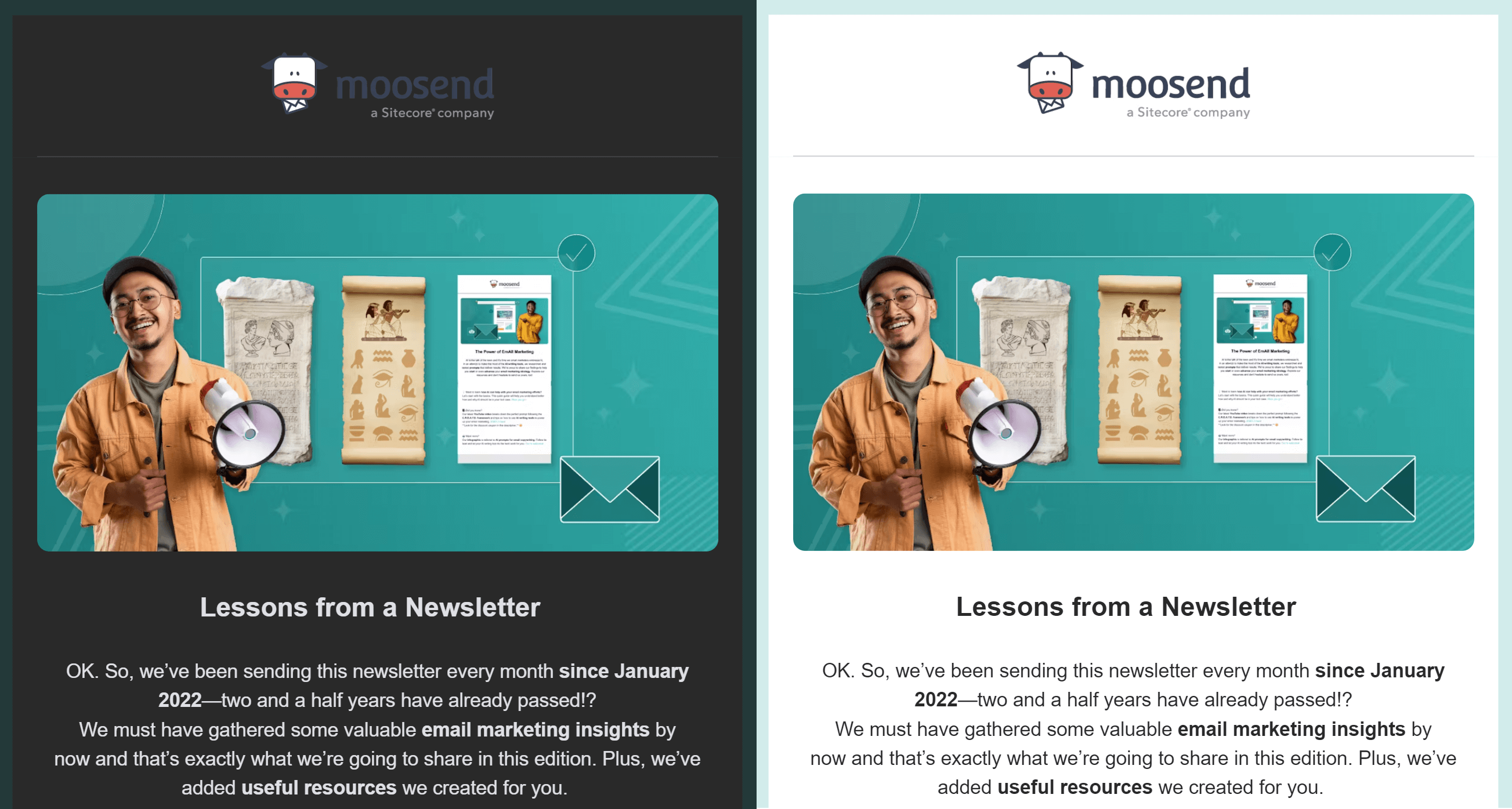
Arguably, this is one of the biggest digital design trends in recent years. But why are users so fond of dark mode?
Here are some of the main reasons behind this:
- Reduced eye strain: Light text on a dark background minimizes eye strain, especially in low-light conditions. It also makes reading emails for extended periods easier.
- Battery saving: Dark mode helps reduce energy usage by your device’s battery (for OLED devices). OLED screens turn off pixels in dark mode, thus drawing no power. However, this isn’t true for LCD screens.
- Better reading experience: Dark mode can improve content legibility due to the high contrast between dark backgrounds and light text. This also benefits users with vision impairments.
Do Email Clients Support Dark Mode?
Email clients support the dark mode feature in different ways.
Specifically, some email clients partially or fully convert your emails into dark mode, whereas others show no color change for HTML emails in dark mode.
Let’s explore each color scheme in more detail.
1. No color change in dark mode
These email clients let you change the UI to dark mode, but this has no effect on how the HTML email is rendered. Only plain text emails change into dark mode.
Examples of such email clients are Apple Mail, Gmail Desktop, AOL, and Yahoo mail.
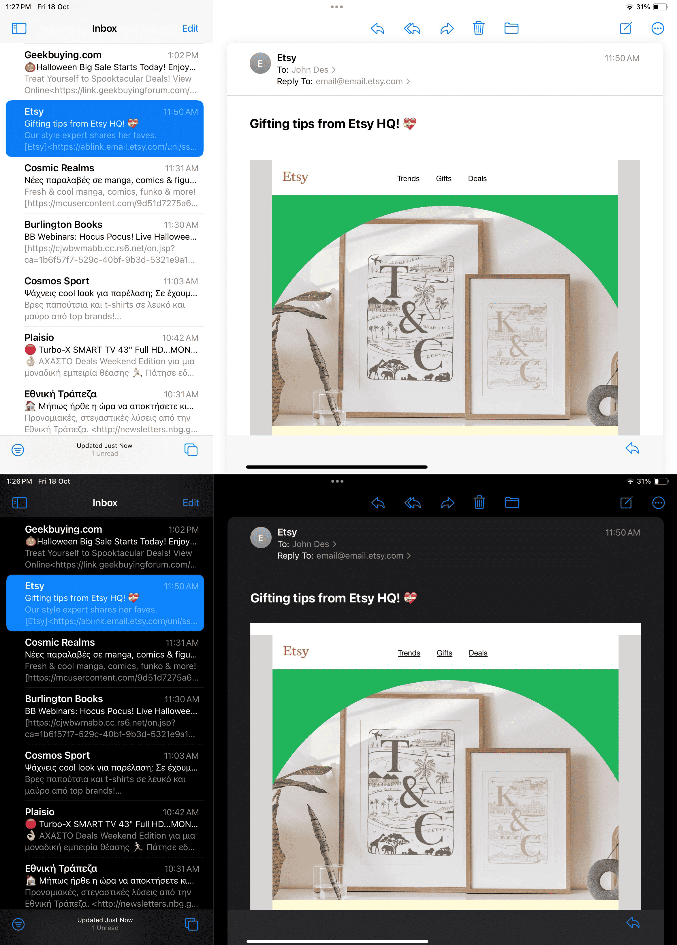
For these clients, it’s advisable to convert pure white (#ffffff) background to a dark grey one by including a <meta> tag for dark mode. But if you don’t change it, you can use an off-white (#fffffe) background instead.
2. Partial color invert
Partial color invert is when email clients detect areas with light backgrounds and convert them into dark backgrounds while making the dark text light in color.
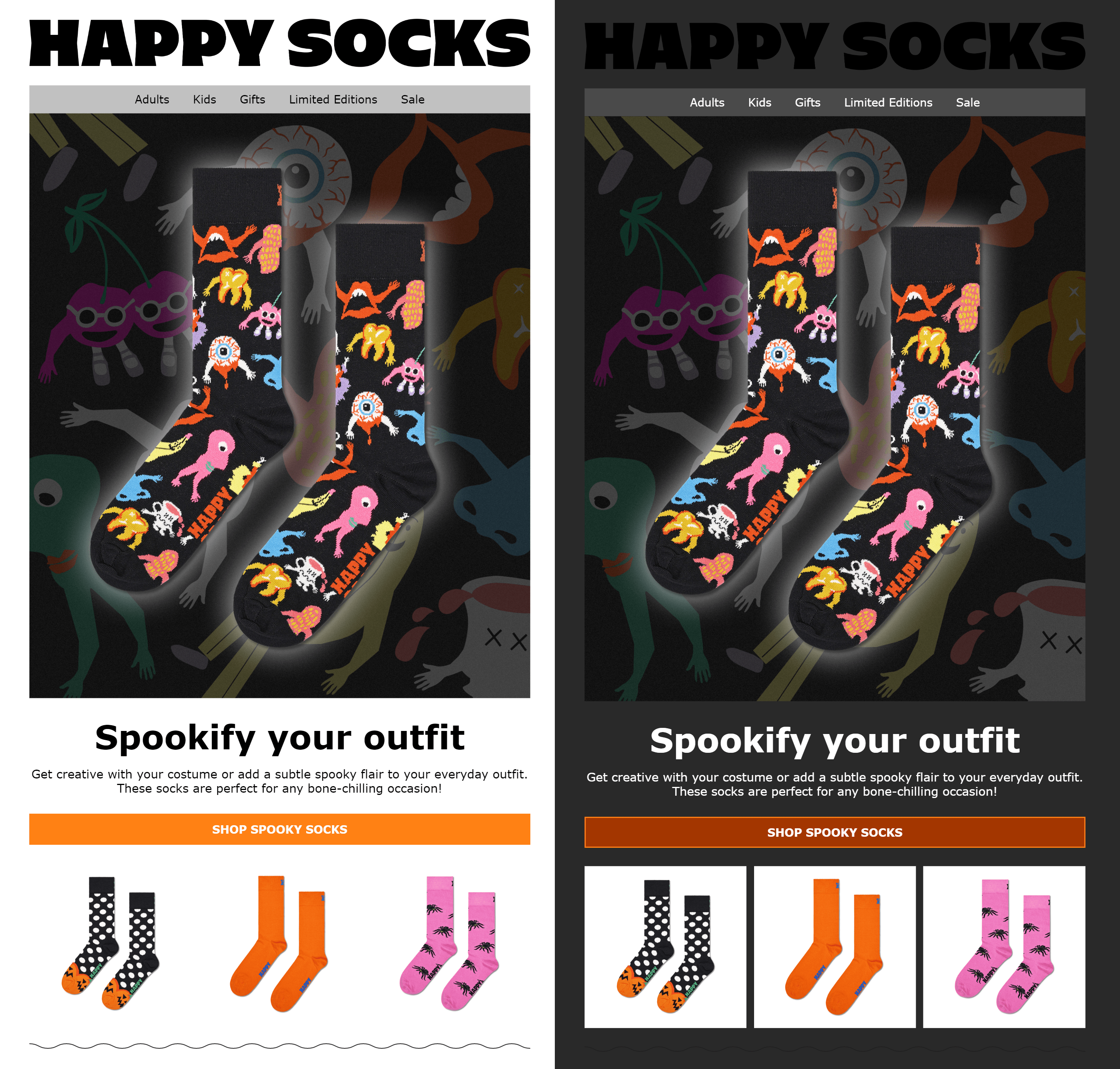
This color scheme generally leaves areas that already have dark backgrounds as is. In any case, most of these clients also support Dark Mode targeting, so you can override the client-default dark theme and display custom dark mode email campaigns.
Examples of email clients that use partial inversion are Outlook.com, Outlook app (iOS & Android), Outlook 2019 (macOS), Gmail app (Android).
3. Full color invert
Default full-color inversion is the most troublesome color scheme amongst all the other default changes. It inverts both light and dark backgrounds.
So even if you have designed an email with a dark theme, this scheme will (ironically) make it light.
Unfortunately, some of the most popular email clients use this tactic, such as Outlook 2021 (Windows), Office 365 (Windows), Windows Mail, and Gmail app (iOS).
Below we have the example of an email from Blizzard. This campaign has a dark theme by default to match the vibe of the game and its new expansion.
Look how dark backgrounds have been converted to light versions of the original colors. You’ll also notice that areas with a dark background and light text before are now light with dark text.
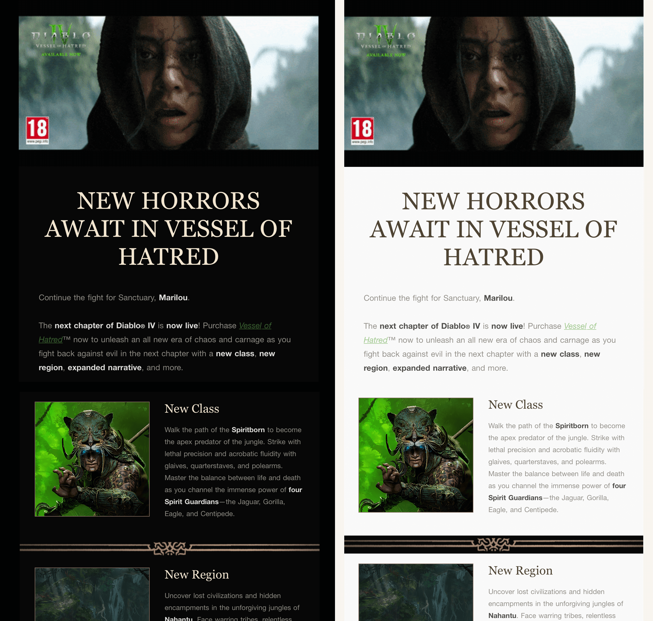
It’s crucial to remember that email clients using this logic also don’t allow Dark Mode targeting at the moment.
Email Client Dark Mode Support Chart
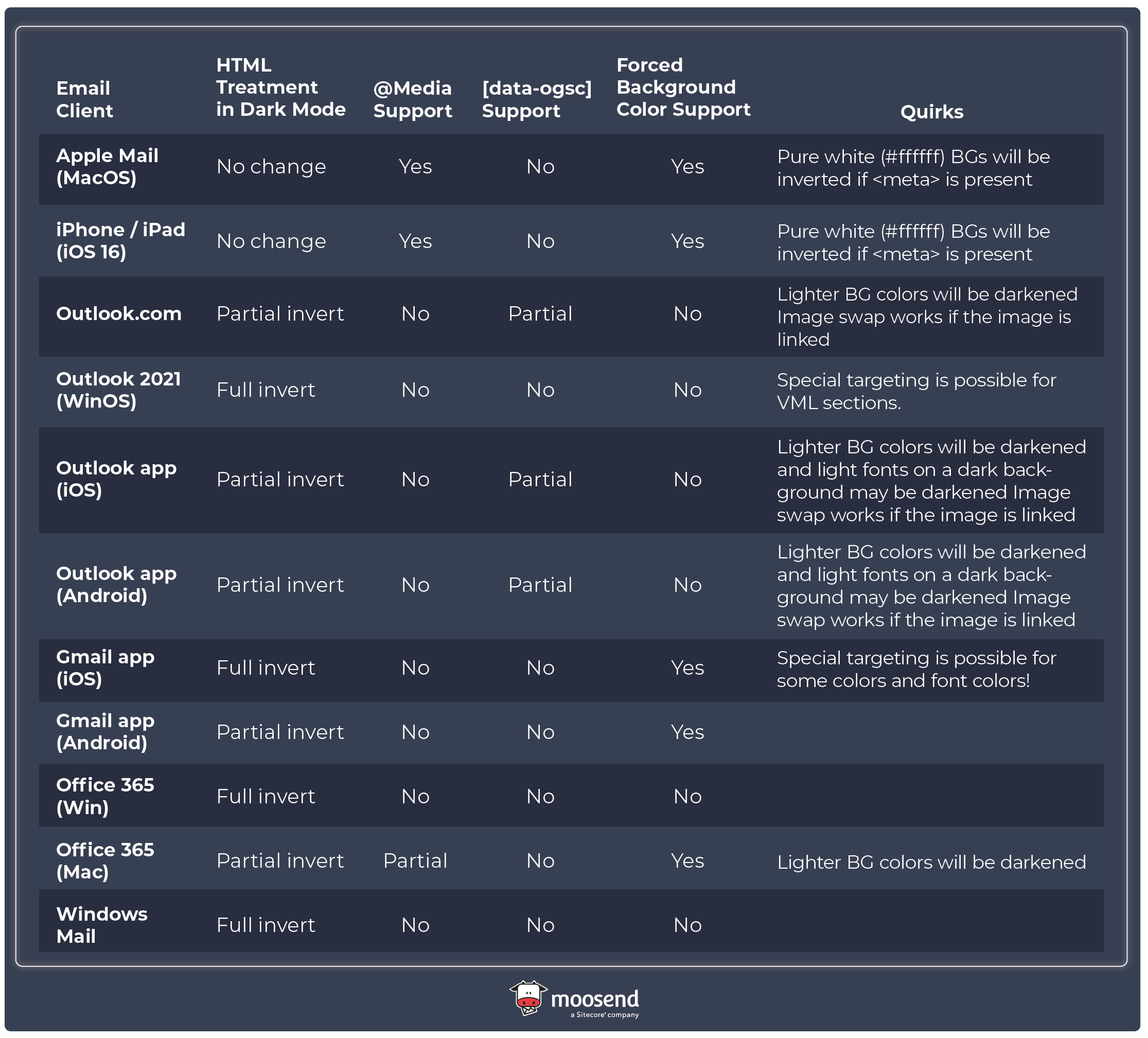
Our team tested the Dark Mode settings in popular email clients to see how they can impact a regular email that doesn’t have any Dark Mode-specific targeting and support for targeting Dark Mode. Here are the results:
How to Optimize Your Email for Dark Mode?
As we saw before, email clients automatically convert your emails. The problem is that this automatic conversion doesn’t always work to your advantage.
So, you need to optimize your emails for dark mode to offer a seamless email experience to your subscribers.
1. Use transparent PNGs
Transparent PNGs are images with no background color. They are usually indicated by a checkerboard pattern (see below). It’s recommended to use this type of image for your logo.

Using a transparent PNG ensures the natural appearance of images in emails with both white and black backgrounds when email clients convert them to dark mode.
Tip: Reduce the size of transparent PNGs before adding them to the email, since they tend to have a larger file size.
2. Add a translucent outline to transparent PNGs with dark text
If the transparent image of the logo/text is in black, then it might disappear into the background in dark mode settings.
To avoid this, you can add a white stroke or border around the black elements so that the logo/text is visible even in dark mode. Here is an example:
3. Crop images the right way
If your images are not transparent and include backgrounds, ensure there is enough padding around your focal point.
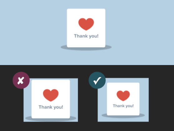
This way, your email will look professional both in light and dark mode.
4. Enable dark mode in email client user agents
To ensure that email clients recognize that you have a dark mode email version for subscribers that have dark mode turned on, include the following metadata in your <head> tag.
<meta name=”color-scheme” content=”light dark”> <meta name=”supported-color-schemes” content=”light dark”>
If you want a custom dark mode style in clients like iOS, Outlook.com, Outlook App (iOS), Apple Mail, Outlook 2019 (macOS), then you can add the media query [@media (prefers-color-scheme: dark )] to the embedded <style> section in your email code.
For example:
@media (prefers-color-scheme: dark ) /* Shows Dark Mode-Only Content, Like Images */
.dark-img { display:block !important; width: auto !important; overflow: visible !important; float: none !important; max-height:inherit !important; max-width:inherit !important; line-height: auto !important; margin-top:0px !important; visibility:inherit !important; }
/* Hides Light Mode-Only Content, Like Images */
.light-img { display:none; display:none !important; }
/* Custom Dark Mode Background Color */
.darkmode { background-color: #272623 !important; }
/* Custom Dark Mode Font Colors */
h1, h2, p, span, a, b { color: #ffffff !important; }
/* Custom Dark Mode Text Link Color */
.link { color: #91ADD4 !important; }
5. Test the dark mode emails
Email clients are constantly evolving, so changes in rendering logic can be frequent. This is why you need to test the dark mode email you create and see if it renders well for all popular email clients.
You can conduct these tests with tools like Moosend and Litmus and get a preview of how your emails will look before you hit “send”. Don’t forget to test what your email looks like in both light and dark mode to see whether the changes you’ve implemented work for both versions.
Note: Previews are not always accurate, so we recommend that you send a test email to yourself if you have enabled dark mode on your devices.
Building inclusive emails
The most important thing is to respect your subscribers’ preferences, whether that is light or dark mode.
Our responsibility as email marketers is to create emails that render well in every mode and every device. And provide a great user experience for all readers.




 Published by

 Published by

 Published by